Introducing SW 7642 Pavestone by Sherwin Williams, a versatile paint color that brings a unique blend of warmth and sophistication to any space.
This specific shade is a part of the Sherwin Williams collection, known for its high-quality and durable paint options.
Pavestone stands out for its ability to complement a wide range of decor styles, making it a go-to choice for homeowners and interior designers alike.
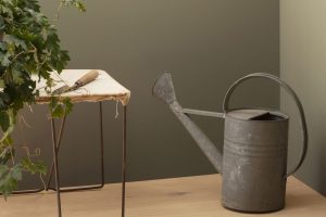
The beauty of Pavestone lies in its balanced hue, which straddles the line between a cozy grey and a comforting beige. This neutrality makes it incredibly adaptable, fitting seamlessly into various rooms, from kitchens and living rooms to bedrooms and bathrooms.
Whether you’re aiming for a modern minimalist look or a more classic appeal, Pavestone provides a solid foundation that can be easily accented with different textures and colors.
Beyond aesthetics, choosing a color like SW 7642 Pavestone from Sherwin Williams means investing in quality. Their paints are renowned for their durability and coverage, ensuring that your chosen color stays true and vibrant for years to come.
If you’re looking for a paint color that combines ease of use with elegant results, Pavestone might just be the perfect pick for your next project.

What Color Is Pavestone SW 7642 by Sherwin Williams?
Pavestone by Sherwin Williams is a unique and versatile color that brings a blend of warmth and sophistication to any room.
This subtle shade, a harmonious mix of gray with underlying brown and taupe hints, offers a perfect backdrop for various interior styles, especially those seeking a balance between modern and classic.
Its muted quality makes it an excellent choice for creating a cozy, inviting atmosphere without overwhelming the space.
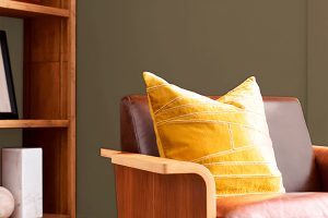
This color works exceptionally well in interior styles like minimalist, Scandinavian, and rustic, as well as transitional and modern farmhouse.
Its neutral yet deep tone provides a solid foundation for incorporating different textures and materials, adding depth and interest to the decor.
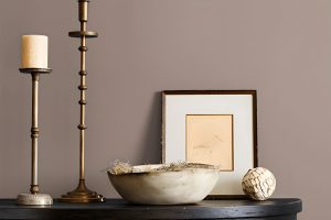
Pavestone pairs beautifully with natural wood, from light oak to richer, darker tones, enhancing the wood’s texture and warmth. It also complements metallic accents, such as brass and copper, adding a touch of elegance and sophistication.
For textiles, Pavestone allows for versatility. Soft, plush fabrics in rich, dark colors or lighter, airy materials both work well, providing contrast or continuity, respectively.
It’s also an excellent backdrop for bold patterns or colors, allowing them to pop without competing for attention. In essence, this Sherwin Williams color is a dynamic yet understated choice that can bring a sense of calm and refinement to any space.
Ever wished paint sampling was as easy as sticking a sticker? Guess what? Now it is! Discover Samplize's unique Peel & Stick samples.
Get paint samples

Is Pavestone SW 7642 by Sherwin Williams Warm or Cool color?
Pavestone SW 7642 by Sherwin Williams is a versatile paint color that brings a unique blend of warmth and sophistication to any room.
Perfect for those looking to strike a balance between a cozy atmosphere and a refined aesthetic, this color works well in various spaces, from living rooms to bedrooms.
Its subtle gray tones with earthy undertones make it an excellent choice for complementing both modern and traditional decor.
What makes Pavestone especially effective in homes is its ability to adapt to different lighting conditions, showcasing lighter or darker shades throughout the day.
This dynamism adds depth and interest to your walls, enriching the overall look of your interior.
Whether paired with bright whites for a crisp, clean appearance or used alongside darker hues for a more dramatic effect, Pavestone proves to be a flexible backdrop that enhances furnishings and decor elements.
Its neutral yet impactful nature allows homeowners to experiment with colorful accents, textures, and patterns without the fear of overwhelming the space.
This color encourages a relaxing environment, making it perfect for areas where comfort and tranquility are priorities.
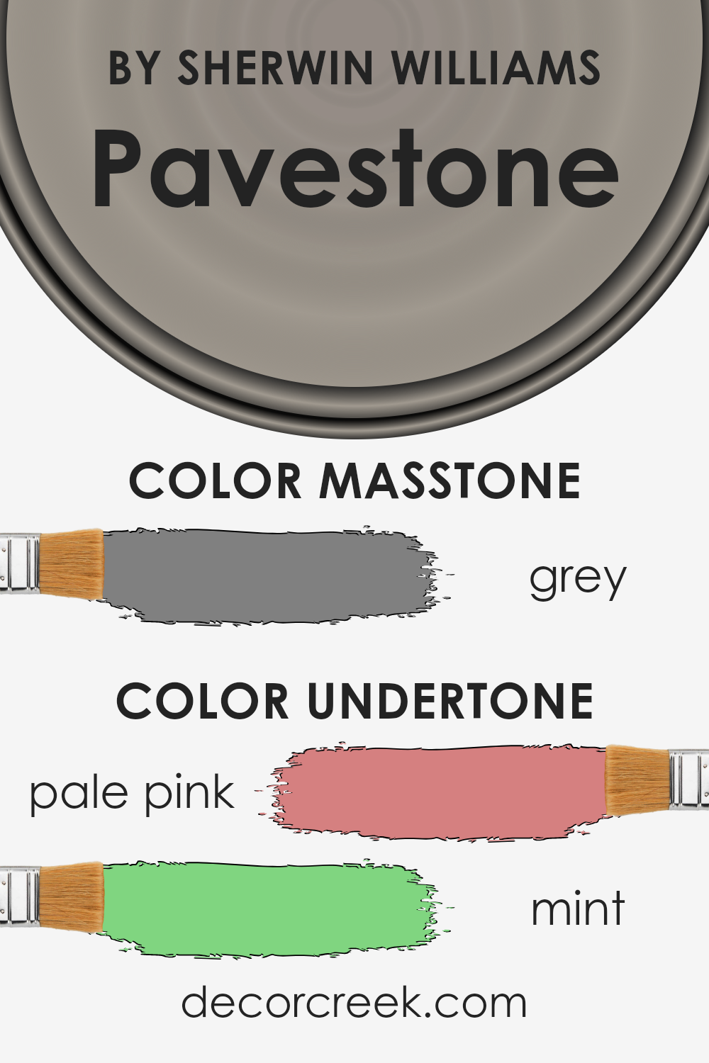
Undertones of Pavestone SW 7642 by Sherwin Williams
Pavestone, a unique paint color, carries subtle touches of pale pink and mint. These undertones are not always upfront but have a big role in how we perceive the color.
Normally, a color feels different depending on the light and the colors around it. This happens because of its undertones. They’re like a color’s hidden depths that can change its vibe in a room.
Pale pink and mint undertones, in particular, give this paint a warm yet fresh feel. Pale pink adds a soft, cozy warmth, making a space feel welcoming.
It’s that hint of warmth that can make a room feel more intimate without using a truly warm color. On the other side, mint brings in a touch of freshness. It’s like a gentle nudge of spring that can make a room feel airy and light.
When this paint goes on interior walls, these undertones play with the light and other colors in the room. During the day, when there’s a lot of sunlight, the mint might make the walls look more lively.
In artificial light or during the evening, the pale pink might come forward, giving the room a snug vibe. This makes the color versatile, fitting various styles and feelings you might want your space to have.
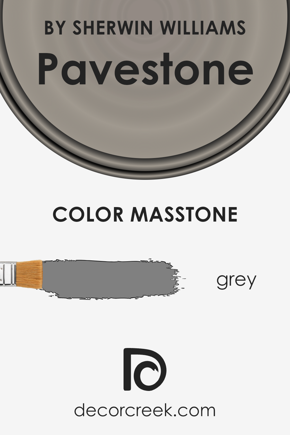
What is the Masstone of the Pavestone SW 7642 by Sherwin Williams?
Pavestone SW 7642 by Sherwin Williams has a masstone, or main underlying color, of grey. This neutral shade is incredibly versatile, making it perfect for home interiors.
Grey, especially this balanced #808080 tone, acts like a chameleon, easily pairing with a wide variety of other colors, from bright and bold to soft and subtle.
This means you can use Pavestone in numerous settings: it can serve as a calm backdrop in a busy family room, add sophistication to a dining area, or offer a serene ambience in a bedroom.
Because of its neutrality, this grey doesn’t overwhelm spaces. Instead, it complements existing furniture and decorations, allowing homeowners to switch up their accents without worrying about clashing colors.
Whether you’re aiming for a modern minimalist look or a cozy, eclectic vibe, this color can handle it all.
It’s particularly effective in rooms that get a lot of natural light, as the shifting brightness throughout the day subtly changes the perception of the color, adding depth and interest to your walls without any extra effort.
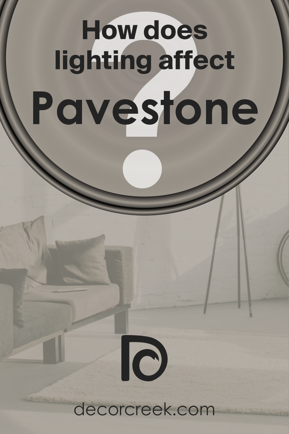
How Does Lighting Affect Pavestone SW 7642 by Sherwin Williams?
Lighting plays a crucial role in how we perceive colors. The same color can appear different under various types of light due to the light’s temperature and intensity.
For instance, a color like Pavestone, a neutral and versatile gray from Sherwin Williams, can show a range of shades based on the lighting it’s exposed to.
In artificial light, Pavestone’s appearance can vary significantly depending on the type of bulbs used. Warm, yellow-toned bulbs can make it look warmer and more inviting, enhancing its beige undertones.
In contrast, cool, blue-toned lighting can highlight its cooler, gray aspects, giving it a more modern and crisp look. This makes it a flexible choice for interior spaces, adapting well to different moods and settings based on artificial lighting choices.
Natural light brings its own dynamic to Pavestone. In north-facing rooms, which get less direct sunlight and therefore have cooler, softer light, Pavestone might appear more as a true gray, creating a calm and serene atmosphere. It can help make these spaces feel more spacious and tranquil.
South-facing rooms, bathed in abundant, warm sunlight throughout the day, can bring out the warmer tones in Pavestone, making the color appear softer and more lively. This can create an inviting and cozy feel in these spaces, ideal for living rooms or kitchens.
East-facing rooms enjoy bright morning light, which can make Pavestone look quite warm and vibrant in the morning, shifting to a cooler tone in the afternoon as the direct sunlight moves away. This natural shift can add a dynamic quality to the space throughout the day.
Conversely, in west-facing rooms, Pavestone may display its cooler gray characteristics during the morning and become gradually warmer and richer towards the evening as it catches the warmer afternoon and sunset light.
This transformation can add a comforting warmth to bedrooms or dining areas, perfect for unwinding at the end of the day.
Indeed, the interaction between Pavestone and different lighting conditions showcases how lighting can significantly influence the appearance and feel of a color within a space.
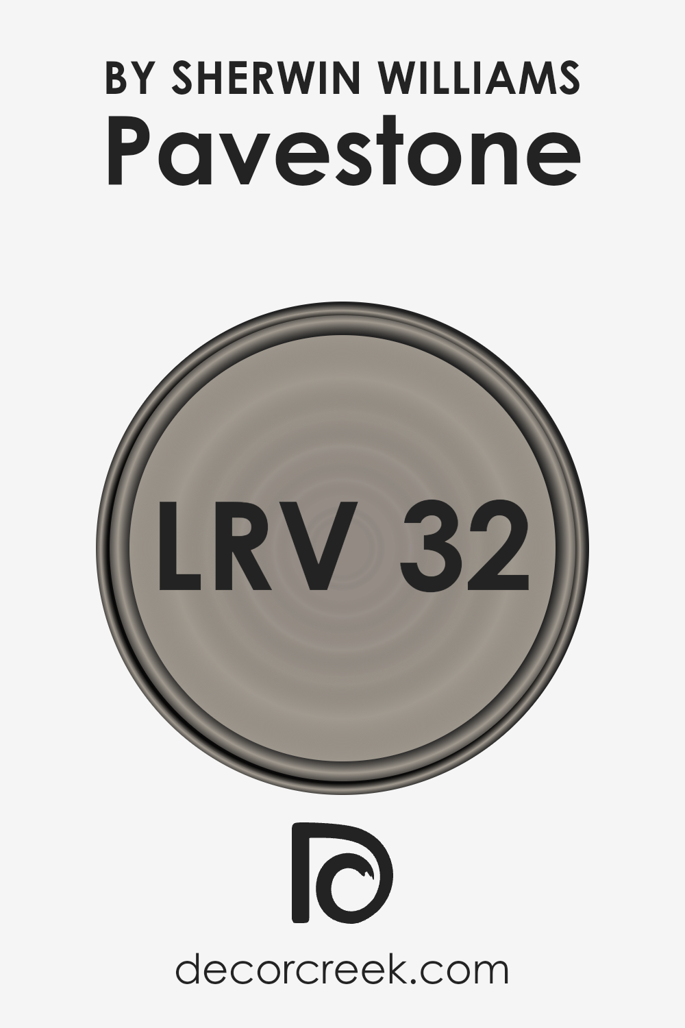
What is the LRV of Pavestone SW 7642 by Sherwin Williams?
LRV stands for Light Reflectance Value, which is a number on a scale from 0 to 100. This scale tells us how much light a color reflects and how much it absorbs. A color with an LRV of 0 would be pure black, absorbing all light, while a color with an LRV of 100 would be pure white, reflecting all light back.
This is important because it gives us an idea of how light or dark a color will look on the walls of a room. It also helps to understand how big or small a space might feel when painted in a particular color.
Lighter colors can make a room feel more open and airy, as they reflect more light, while darker colors can make a space feel more cozy or smaller because they absorb more light.
With the LRV of 32.347 for Pavestone by Sherwin Williams, we’re looking at a color that’s on the darker side of the scale. This means it won’t reflect a lot of light.
In rooms with less natural light, this color might appear even darker and could make the space feel smaller or more enclosed.
However, in a well-lit room or an area with plenty of natural light, Pavestone can add a rich, sophisticated tone without making the space feel too cramped. The choice to use this color depends on the amount of light in your space and the effect you’re aiming for.
If you want to add drama or create a cozy corner, this LRV could work well. If you’re aiming for a light, spacious feel, you might consider a color with a higher LRV.
LRV – what does it mean? Read This Before Finding Your Perfect Paint Color
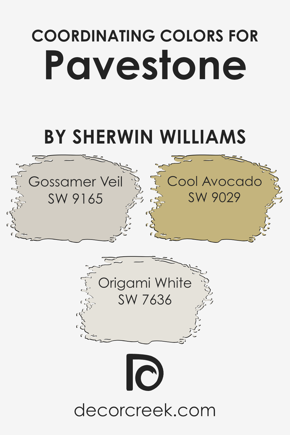
Coordinating Colors of Pavestone SW 7642 by Sherwin Williams
Coordinating colors are a selection of hues designed to complement each other and bring harmony to a space. When we talk about coordinating colors for a specific shade, in this case, Pavestone by Sherwin Williams, we’re referring to a palette that has been carefully curated to enhance and balance the base color’s characteristics.
By incorporating coordinating colors into a design, you create a visually cohesive and appealing environment.
These companion shades are chosen based on their ability to support the main color, ensuring that none of them compete for attention but rather complement each other to elevate the overall aesthetic.
For this particular Pavestone shade, Sherwin Williams suggests Gossamer Veil, Origami White, and Cool Avocado as coordinating colors.
Gossamer Veil is a subtle, warm greige that brings a soothing presence to the room, offering a versatile backdrop that pairs seamlessly with the depth of Pavestone.
Origami White is a soft, clean hue, providing a crisp contrast that highlights the rich tones of Pavestone, making it perfect for trims or accent walls.
Lastly, Cool Avocado adds a refreshing pop of green, introducing a natural element that harmonizes beautifully with the earthy undertones of Pavestone, adding vibrancy and life to the space.
Together, these colors work in concert to create environments that feel balanced and inviting, enhancing the beauty of the primary shade without overwhelming it.
You can see recommended paint colors below:
- SW 9165 Gossamer Veil
- SW 7636 Origami White
- SW 9029 Cool Avocado
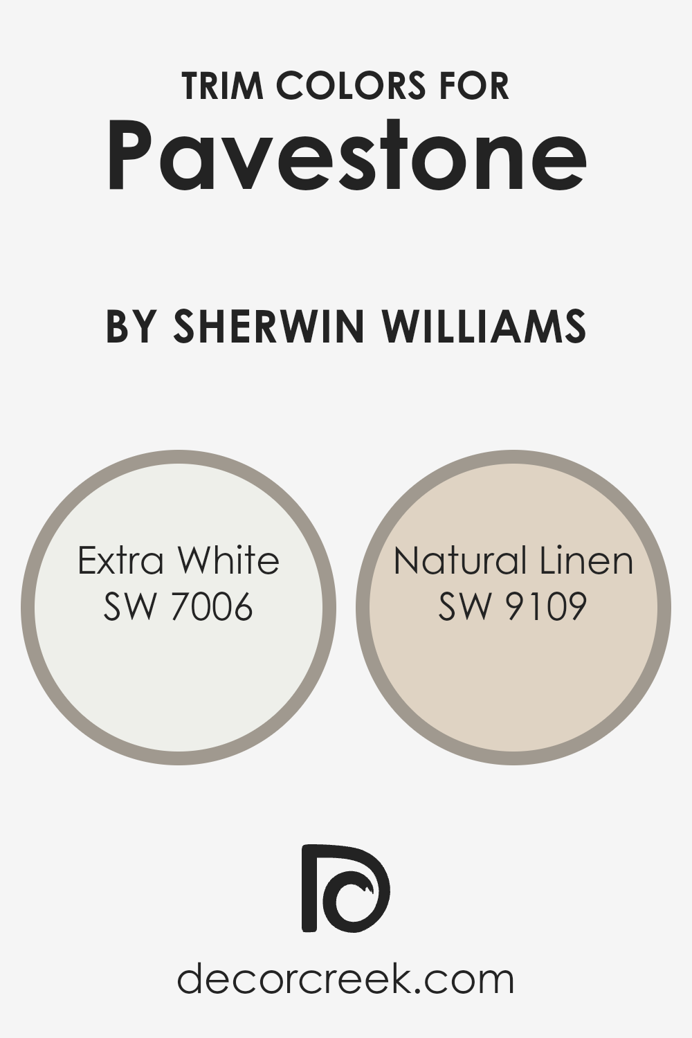
What are the Trim colors of Pavestone SW 7642 by Sherwin Williams?
Trim colors are essentially the accent colors used on the architectural elements of a home’s exterior or interior, such as window trims, door frames, and baseboards, to complement or contrast the main color scheme.
When it comes to Pavestone by Sherwin Williams, picking the right trim color is crucial because it can enhance the architectural features of your home and bring balance to the overall color scheme.
The right trim color acts as a frame for the wall color, highlighting the building’s design and elevating its aesthetic appeal.
For Pavestone, a sophisticated and versatile gray hue, choosing trim colors like SW 7006 – Extra White or SW 9109 – Natural Linen can significantly impact the look of your space.
Extra White is a bright and crisp white that offers a stark contrast, making it perfect for creating a clean, modern edge around pavestone-colored walls.
It reflects light beautifully, making spaces appear larger and more inviting. On the other hand, Natural Linen is a soft, warm beige that offers a subtle contrast. It adds warmth to the cooler tones of Pavestone, creating a cozy and welcoming environment without overpowering the main color.
Both choices provide distinct effects, catering to different design preferences while enhancing the visual appeal of the home.
You can see recommended paint colors below:
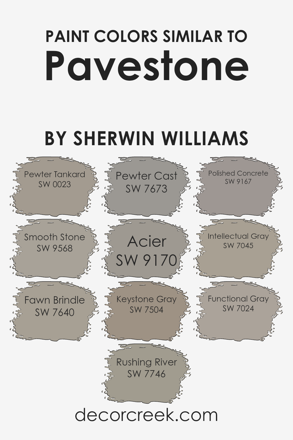
Colors Similar to Pavestone SW 7642 by Sherwin Williams
Similar colors, like those around Pavestone by Sherwin Williams, play a crucial role in design and aesthetics. They create a harmonious look by gently transitioning between shades, often leading to a sophisticated and cohesive space.
Colors such as Pewter Tankard and Smooth Stone are great examples; Pewter Tankard brings a subtle depth with its muted gray tone, perfect for creating a serene environment, while Smooth Stone offers a lighter, airier gray, adding a fresh and modern vibe to any room.
These colors work together seamlessly, giving designers and homeowners the flexibility to mix and match hues to achieve the desired atmosphere.
Fawn Brindle and Rushing River, for instance, introduce more depth and complexity into this palette, with Fawn Brindle giving off a warm, earthy gray that’s both inviting and comforting, and Rushing River adding a touch of sophisticated green-gray, perfect for an elegant backdrop.
Pewter Cast, Acier, and Keystone Gray further extend the range, from Pewter Cast’s striking cooler gray that adds a contemporary edge, to Acier’s balanced and neutral gray that works well in various lighting conditions, and Keystone Gray’s slightly warmer tone that brings coziness into the mix.
Completing this palette, Polished Concrete, Intellectual Gray, and Functional Gray each offer unique takes on gray – from the clean and minimalistic feel of Polished Concrete, to the deep and thought-provoking hue of Intellectual Gray, and the versatile and unassuming charm of Functional Gray.
Together, these colors provide a comprehensive spectrum of grays, each with their own character yet collectively creating a fluid and adaptable color scheme that can elevate any space.
You can see recommended paint colors below:
- SW 0023 Pewter Tankard
- SW 9568 Smooth Stone
- SW 7640 Fawn Brindle
- SW 7746 Rushing River
- SW 7673 Pewter Cast
- SW 9170 Acier
- SW 7504 Keystone Gray
- SW 9167 Polished Concrete
- SW 7045 Intellectual Gray
- SW 7024 Functional Gray
How to Use Pavestone SW 7642 by Sherwin Williams In Your Home?
Pavestone SW 7642 by Sherwin Williams is a color that offers a versatile palette for homeowners looking to add a touch of elegance and warmth to their living spaces.
This particular shade is a muted gray that leans towards the warmer side, making it ideal for creating cozy environments without feeling too dark or overwhelming.
One way to use Pavestone in your home is by applying it to living room walls. This creates a neutral backdrop that complements both modern and traditional furniture, allowing for a wide range of decorating styles.
It’s especially good for rooms that get a lot of sunlight, as the color can help balance the brightness without making the room feel stark.
In addition, Pavestone works well in bedrooms, providing a serene and restful ambiance that’s perfect for relaxation. It pairs beautifully with crisp white trim for a clean and sophisticated look, or you can match it with bold colored accents like blues or greens for a more dynamic space.
Finally, consider using Pavestone in kitchens or bathrooms. Its understated elegance pairs well with marble countertops, stainless steel fixtures, or wood cabinets, offering a timeless appeal that’s both beautiful and practical.
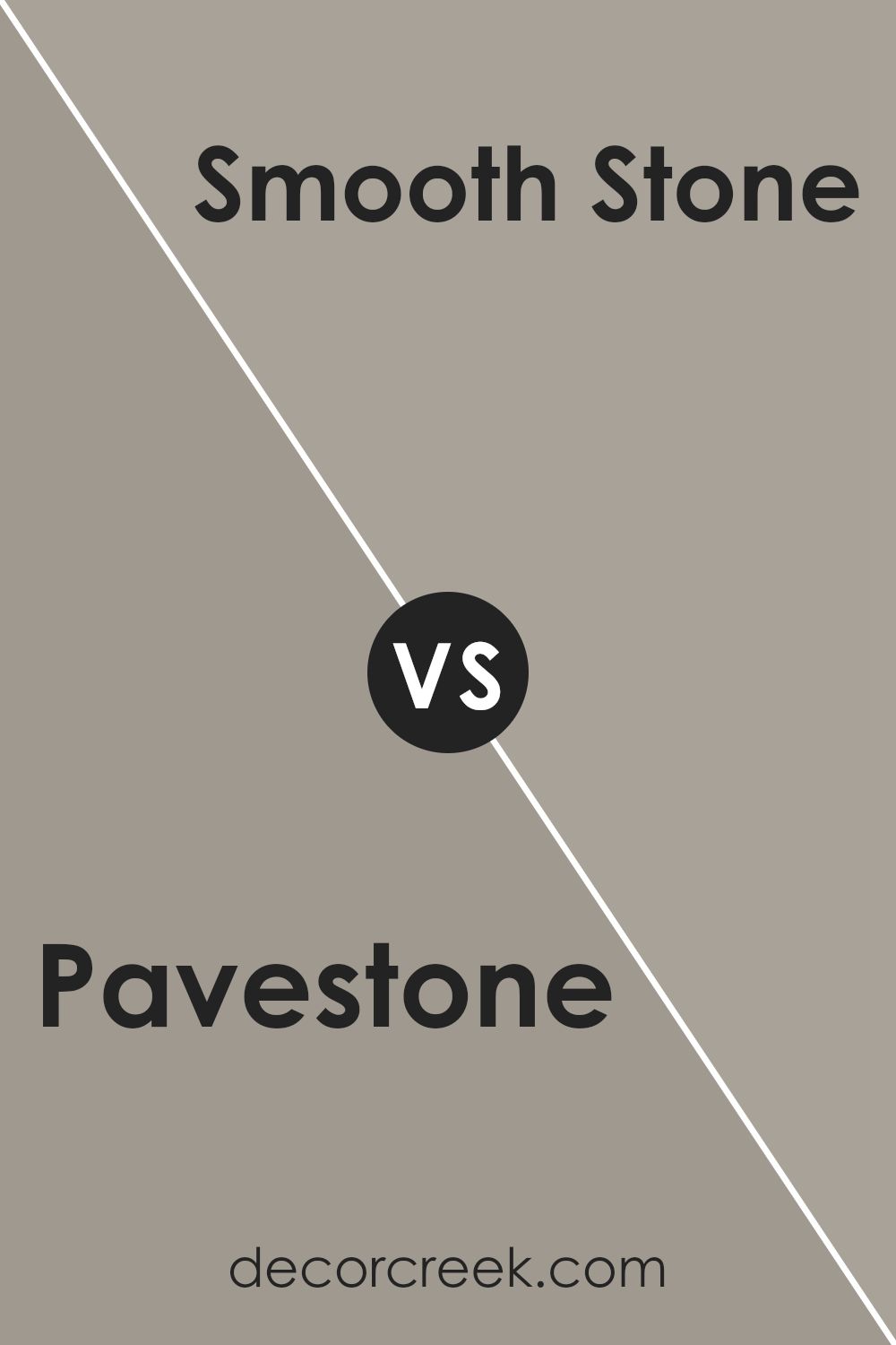
Pavestone SW 7642 by Sherwin Williams vs Smooth Stone SW 9568 by Sherwin Williams
Pavestone and Smooth Stone are two colors by Sherwin Williams that share a subtle elegance but differ in tone and warmth. Pavestone is a richer, deeper gray that adds a sense of sophistication and strength to spaces. It’s a color with enough depth to make a statement, yet it remains versatile enough to pair with various decor styles, from modern to traditional.
On the other hand, Smooth Stone has a lighter, airier feel. It leans more towards a neutral, soft gray that brings a sense of calm and serenity to rooms. Smooth Stone is perfect for creating a bright, open space, making it an excellent choice for small rooms or spaces with limited natural light.
While both colors offer a beautiful canvas for interiors, Pavestone provides a bold, grounding effect, whereas Smooth Stone offers a lighter, more uplifting atmosphere.
You can see recommended paint color below:
Pavestone SW 7642 by Sherwin Williams vs Intellectual Gray SW 7045 by Sherwin Williams
Pavestone and Intellectual Gray are both popular Sherwin Williams colors, but they have their own unique qualities. Pavestone is a warm, earthy tone with a hint of gray, giving it a cozy and inviting look.
It’s perfect for creating a comfortable environment in any room. On the other hand, Intellectual Gray is a bit lighter and leans more towards a true gray. It has subtle green undertones that make it versatile and sophisticated.
This color works well in spaces where you want a neutral backdrop that still brings a bit of complexity and depth to the décor. When comparing the two, Pavestone feels warmer and more grounded, making it great for a traditional or rustic setting.
Intellectual Gray, with its cooler vibe, fits modern and transitional spaces beautifully. Both colors offer a solid foundation for decorating, allowing for a wide range of complementary colors in furniture and accents.
You can see recommended paint color below:
- SW 7045 Intellectual Gray
Pavestone SW 7642 by Sherwin Williams vs Fawn Brindle SW 7640 by Sherwin Williams
Pavestone and Fawn Brindle, both from Sherwin Williams, are like close relatives in the world of colors, sharing a subtle, sophisticated vibe. Pavestone stands out as a slightly darker shade, offering a robust, grounding feeling that’s perfect for creating a cozy, yet elegant atmosphere in any room.
It’s like the color of wet clay – rich, earthy, and warm with a hint of sophistication. On the other hand, Fawn Brindle is lighter, leaning more towards a soft, welcoming gray with a touch of warmth.
This color is akin to the gentle hues of a deer’s coat, providing a serene and inviting ambiance.
While Pavestone brings depth and a sense of stability to spaces, Fawn Brindle offers a lighter, airier feel, making it ideal for those looking to brighten up a room while maintaining an essence of understated elegance.
Both are incredibly versatile but serve slightly different moods and themes in interior design.
You can see recommended paint color below:
- SW 7640 Fawn Brindle
Pavestone SW 7642 by Sherwin Williams vs Keystone Gray SW 7504 by Sherwin Williams
The two colors, Pavestone and Keystone Gray, offer subtle yet distinct vibes. Pavestone leans towards a cooler, more muted tone with hints of taupe, making it versatile for any room seeking a calm and collected atmosphere. Its understated elegance allows for easy pairing with a wide range of decor, from modern to classic.
On the other hand, Keystone Gray, while also flexible, brings a slightly warmer and deeper feel. Its gray base is touched with earthy brown, creating a cozy and welcoming ambiance without overpowering a space.
This color can work well in areas where you want a bit more warmth or a rustic touch. Both colors share a sophisticated gray foundation, but their nuances steer them towards different aesthetic directions.
Pavestone offers a cooler, laid-back look, while Keystone Gray adds warmth and depth, making each fit for unique interior moods.
You can see recommended paint color below:
- SW 7504 Keystone Gray
Pavestone SW 7642 by Sherwin Williams vs Rushing River SW 7746 by Sherwin Williams
Pavestone and Rushing River, both by Sherwin Williams, offer unique shades for anyone looking to refresh their space. Pavestone, a deep, warm gray, brings a cozy and sophisticated feel to any room. It pairs well with soft whites and rich woods, providing a grounded and comforting atmosphere.
On the other hand, Rushing River is a cooler, mid-tone gray with subtle blue-green undertones, giving off a serene and refreshing vibe. This color is perfect for creating a calm and inviting space, working beautifully with lighter grays, blues, and natural materials.
When comparing the two, Pavestone leans towards a warmer, more enveloping feel, ideal for creating a snug retreat. Rushing River, with its cooler, lighter hue, offers a breath of fresh air, suggesting a more open and tranquil setting.
Both colors have their charm and can dramatically change the mood of a space, depending on what you’re looking for – warmth and coziness with Pavestone, or a refreshing and calm atmosphere with Rushing River.
You can see recommended paint color below:
- SW 7746 Rushing River
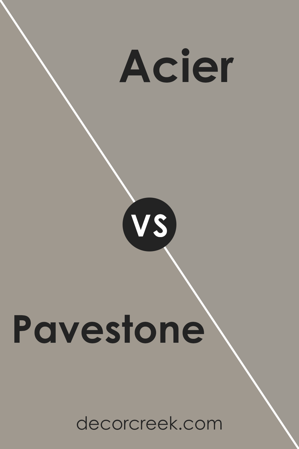
Pavestone SW 7642 by Sherwin Williams vs Acier SW 9170 by Sherwin Williams
When looking at Pavestone and Acier, both by Sherwin Williams, we see two sophisticated shades that share some similarities but also have their own unique character. Pavestone brings a warm, welcoming feel with its rich, earthy tones.
It’s like the color of a well-worn path in a sunlit forest, inviting and cozy. On the other hand, Acier offers a cooler, more muted approach. It’s reminiscent of the sleek, refined look of modern steel, providing a calm and collected atmosphere.
Both colors are versatile, fitting well in various spaces, from living rooms to bedrooms, offering a subtle backdrop for decor and furniture to stand out.
Pavestone tends to add warmth, making a room feel more intimate, while Acier creates a more detached, serene environment, ideal for those aiming for a minimalist or modern aesthetic.
In essence, while both colors offer elegance and a sense of tranquility, the choice between them depends on the ambiance you wish to create. Pavestone warms a room, and Acier coolly sophisticates it.
You can see recommended paint color below:
- SW 9170 Acier
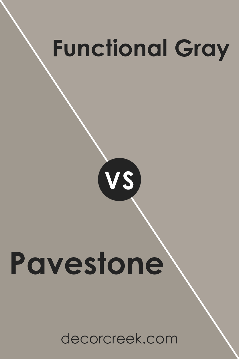
Pavestone SW 7642 by Sherwin Williams vs Functional Gray SW 7024 by Sherwin Williams
Pavestone and Functional Gray, both by Sherwin Williams, are two beautiful shades of gray that offer distinct vibes for any space. Pavestone sits on the warmer side of the gray scale, bringing a soft and cozy feel to rooms.
It’s like a gentle hug for your walls, making spaces feel more inviting and homey. Perfect for living rooms or bedrooms, it has a soothing presence.
On the other hand, Functional Gray is a bit cooler and sharper, offering a more modern and sleek look. This color is ideal for those who prefer a more contemporary style, making it great for offices or minimalist living spaces.
It provides a neutral backdrop that’s versatile, pairing well with various decor styles and colors.
When comparing the two, Pavestone leans towards a warmer, earthier tone, making spaces feel snug and welcoming.
Functional Gray, with its cooler undertones, gives a more refined and crisp appearance, suitable for a modern aesthetic. Both are incredibly versatile but cater to different preferences in ambiance and style.
You can see recommended paint color below:
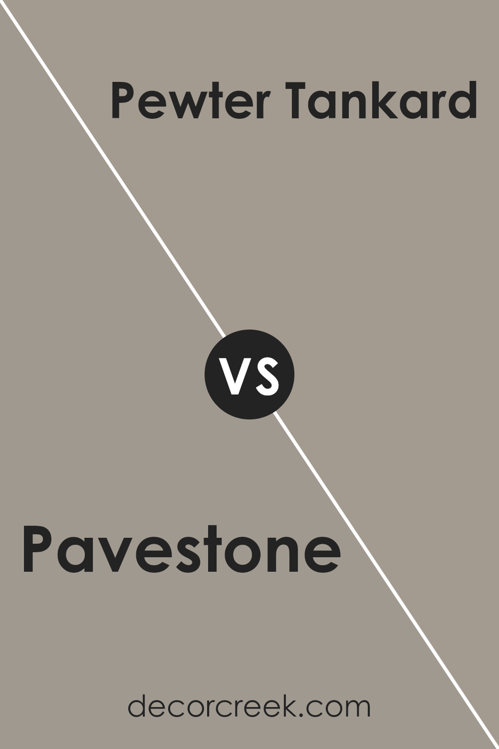
Pavestone SW 7642 by Sherwin Williams vs Pewter Tankard SW 0023 by Sherwin Williams
Pavestone and Pewter Tankard by Sherwin Williams are both beautiful, versatile grays that can bring a sense of calm and sophistication to any space. Pavestone has a slightly warmer, earthy tone that feels welcoming and cozy. It’s a great option if you want a room to feel more like a snug retreat.
On the other hand, Pewter Tankard leans a bit cooler and has a hint of steeliness that gives spaces a more contemporary vibe. This color is perfect for those looking to add a modern touch to their home without it feeling too cold or industrial.
Both colors work well with a variety of decor styles and can serve as neutral backdrops for both bold and subdued color schemes.
Whether you’re decorating a bedroom, living room, or even a kitchen, Pavestone and Pewter Tankard offer great foundations that can be built upon with different textures and accent colors to create a space that’s uniquely yours.
You can see recommended paint color below:
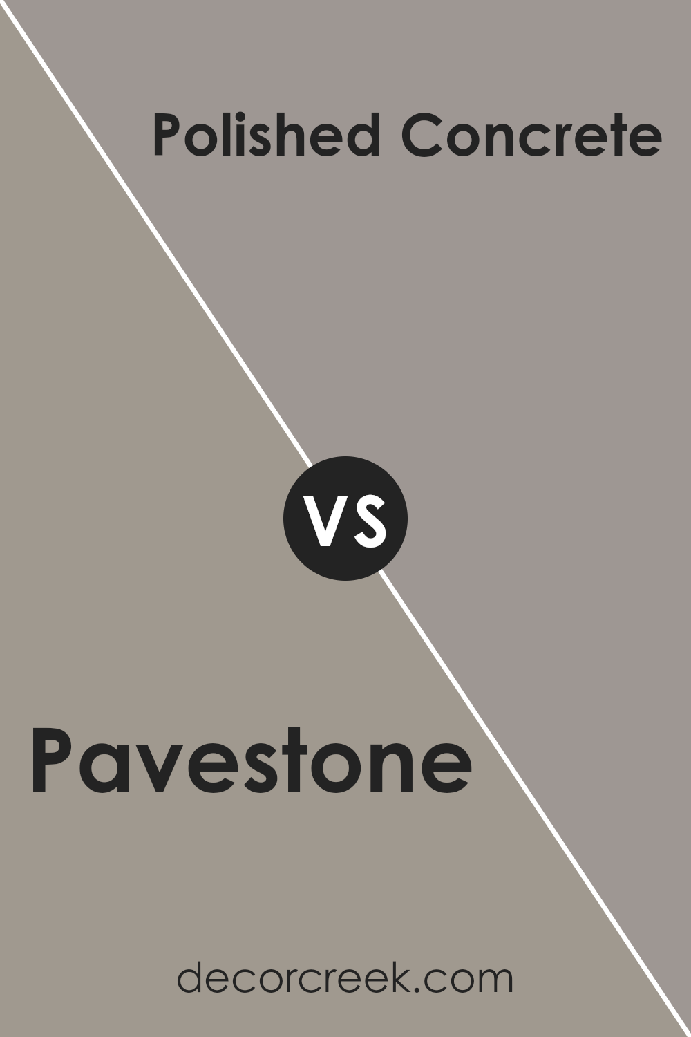
Pavestone SW 7642 by Sherwin Williams vs Polished Concrete SW 9167 by Sherwin Williams
Pavestone and Polished Concrete by Sherwin Williams are both unique, yet they serve different vibes in interior spaces. Pavestone leads with a warmer tone, bringing a cozy and welcoming feel to rooms.
It’s like a soft hug from your favorite blanket, offering comfort and a sense of security. This color works great in living areas or bedrooms where you want a dash of warmth without overwhelming the senses.
On the other hand, Polished Concrete carries a cooler, more modern edge. It’s the sleek silver of a cityscape at twilight, perfect for spaces that aim for a minimalist or industrial aesthetic.
This color fits well in kitchens, bathrooms, or offices, delivering a clean, sharp look that pairs nicely with metal finishes and modern furnishings.
While both colors share a subtle elegance and versatility in design, Pavestone leans towards a traditional, earthy palette, whereas Polished Concrete offers a contemporary, chic vibe.
Choosing between them depends on the atmosphere you’re aiming to create—warm and inviting, or cool and sophisticated.
You can see recommended paint color below:
- SW 9167 Polished Concrete
Pavestone SW 7642 by Sherwin Williams vs Pewter Cast SW 7673 by Sherwin Williams
Pavestone and Pewter Cast, both by Sherwin Williams, offer distinct shades for anyone looking to add elegance to their spaces. Pavestone comes off as a warm, muted greige, blending gray with soft beige undertones, creating a cozy and inviting ambiance.
Its versatility shines through, making it an excellent choice for living rooms, bedrooms, or any space desiring a touch of warmth and sophistication. On the other hand, Pewter Cast carries a cooler tone, leaning more towards a true gray.
This color is perfect for those who prefer a more modern or industrial vibe, as it brings a sharper contrast, particularly in well-lit areas or against white trim. While Pavestone offers a subtle warmth, Pewter Cast steps into the room with a bolder statement, making them both unique choices depending on the desired mood and aesthetic.
Together, they cater to a wide spectrum of preferences, from softer, earthy feels to striking, contemporary looks.
You can see recommended paint color below:
- SW 7673 Pewter Cast
Conclusion
In conclusion, the color Pavestone by Sherwin Williams stands out as a versatile and warm shade that adds a sophisticated touch to any space. Its neutral tone makes it an excellent choice for those looking to create a cozy and inviting atmosphere in their homes.
Whether applied in living rooms, bedrooms, or even exterior spaces, this color provides a solid foundation for various decor styles, from modern to rustic.
Moreover, the adaptability of Pavestone allows homeowners and decorators to pair it with a wide range of colors and materials. Whether you’re looking to contrast it with bright colors or complement it with other neutrals, this color proves to be a reliable and stylish choice.
Its consistency in offering a soothing backdrop makes it a go-to color for those looking to achieve a serene and balanced aesthetic in their interior or exterior design projects.
Ever wished paint sampling was as easy as sticking a sticker? Guess what? Now it is! Discover Samplize's unique Peel & Stick samples.
Get paint samples