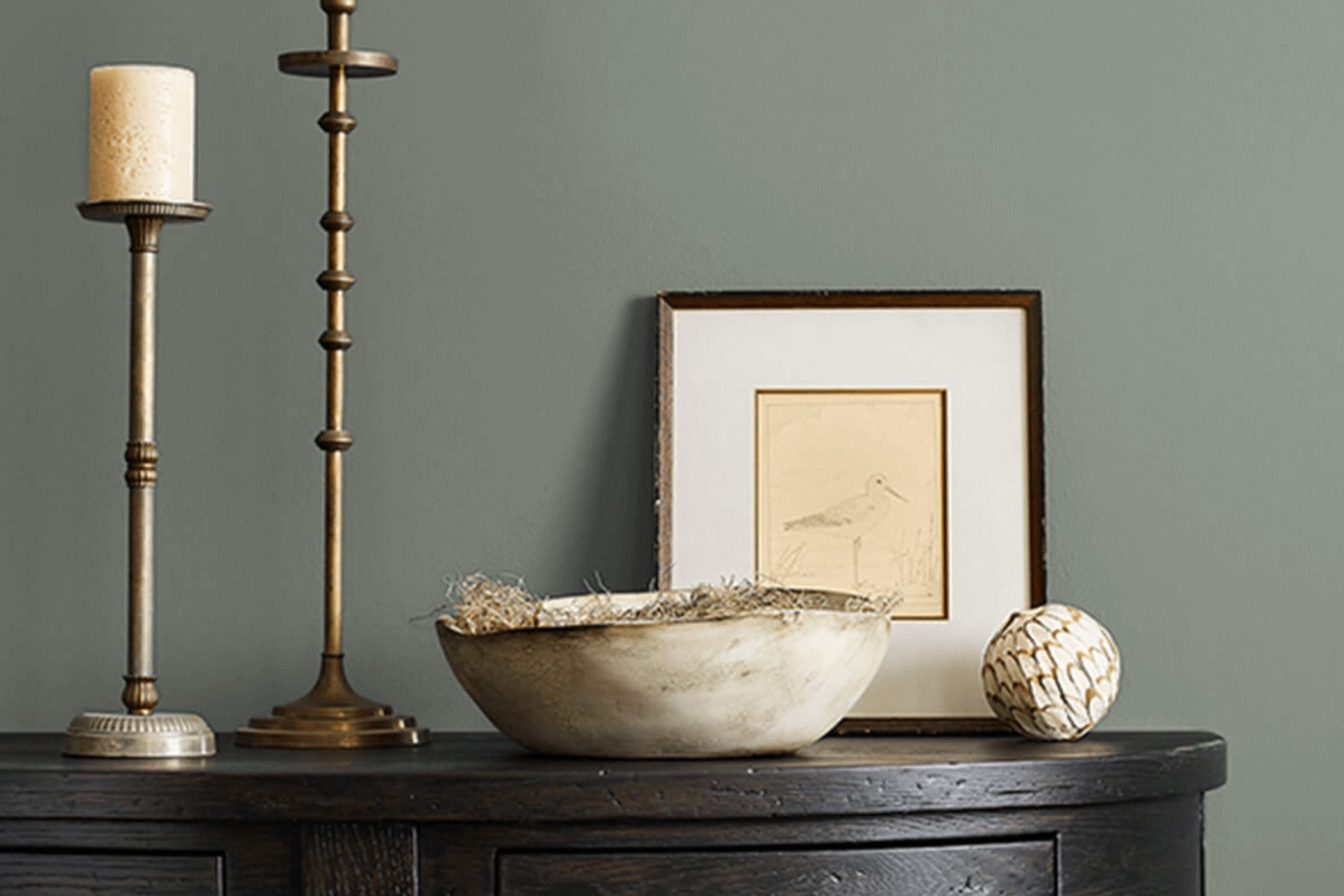
If you’re considering updating your home with a new paint color, “Retreat” SW 6207 by Sherwin Williams could be a top contender. Before you pick up that paintbrush, let me share some insights into why this shade might catch your eye and suit your room.
Retreat is not just another green; its unique blend gives it a calming presence which can bring a peaceful and grounded feel to any room. From personal experience, this color works beautifully in areas where calm is key, like bedrooms or home offices. Its adaptable nature also means it fits various decor styles, from rustic to modern minimalism.
Understanding how lighting affects Retreat might also guide your decision. In rooms with ample natural light, Retreat tends to appear more vibrant, while in dimmer areas, it can provide a more subtle and organic touch. Accompanying this adaptable quality, it pairs well with natural materials such as wood and stone. If you love adding personal touches to your home, Retreat provides a beautiful backdrop for artwork or vibrant fabrics.
It’s important to consider the overall feel of your room; Retreat could be the perfect color to bring your decorating vision to life.
Is Retreat SW 6207 Right for My Home?
Sherwin Williams Retreat is a rich and warm green that truly brings a sense of calm and coziness to any room. It reminds me of a dense forest canopy, which makes it perfect for creating a natural, earthy feel in a home. The depth of this color works wonders in providing a backdrop that is both inviting and grounding.
From my experience, Retreat is incredibly adaptable but shines particularly well in rustic and traditional styles. It has the unique ability to make large rooms feel more intimate and small areas appear more enveloped and cozy.
This color pairs beautifully with natural wood, whether it be dark walnut furniture or lighter oak floors, enhancing the overall warmth of a room. Textures like linen or wool also complement this shade very well, adding a layer of softness that contrasts nicely with its deep tone.
In terms of accents, creamy whites and soft grays make for a lovely contrast, ensuring that the room doesn’t feel too dark. Incorporating elements of brushed brass or copper can also add a touch of refinement without being too flashy. I like using Retreat in living rooms or bedrooms because it helps to establish a relaxing atmosphere. It’s a color that makes you want to sit down with a good book and just unwind for the evening.
decorcreek.com
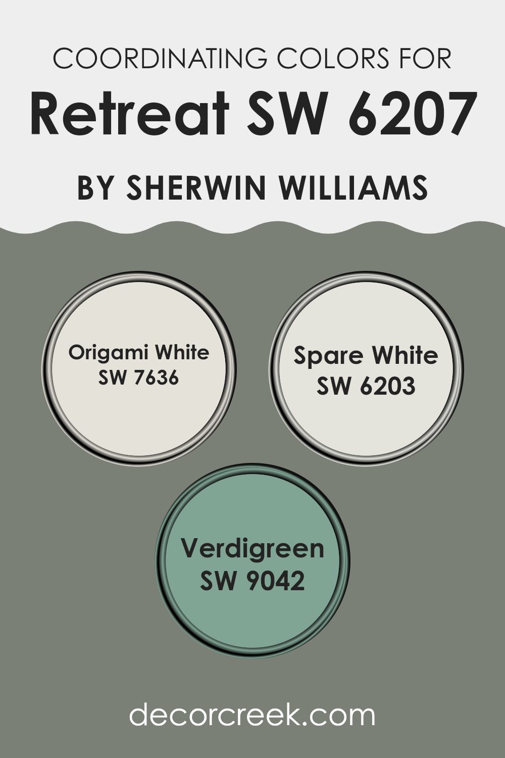
Best Coordinating Colors to use with Retreat SW 6207 by Sherwin Williams this year.
Coordinating colors are shades that complement or enhance each other when used together in decor or design. These supporting colors harmonize with the main color, helping to create a balanced and aesthetically pleasing environment. Sherwin Williams offers a variety of these coordinating colors that align beautifully with their varied base paints.
For example, for a color like Retreat SW 6207 by Sherwin Williams, certain coordinating shades suggested are SW 7636 – Origami White, SW 6203 – Spare White, and SW 9042 – Verdigreen, each adding its unique touch while maintaining a cohesive look.
Origami White SW 7636 is a soft, warm white with a subtle hint of beige, making it an excellent backdrop that allows other colors to stand out without feeling too intense. It’s particularly effective in rooms that aim for a light, neutral atmosphere that’s easy on the eyes. Spare White SW 6203 is a cooler, airy white with blue undertones that offers a crisp, refreshing feel, ideal for modern rooms that benefit from a clean, simplistic approach.
Lastly, Verdigreen SW 9042 is a deep, rich teal that provides a striking contrast to lighter tones, offering a touch of drama and depth to enhance the visual interest of a room. Each of these colors works to support and highlight without overpowering, creating engaging and harmonious rooms.
You can see recommended paint colors below:
- SW 7636 Origami White
- SW 6203 Spare White
- SW 9042 Verdigreen
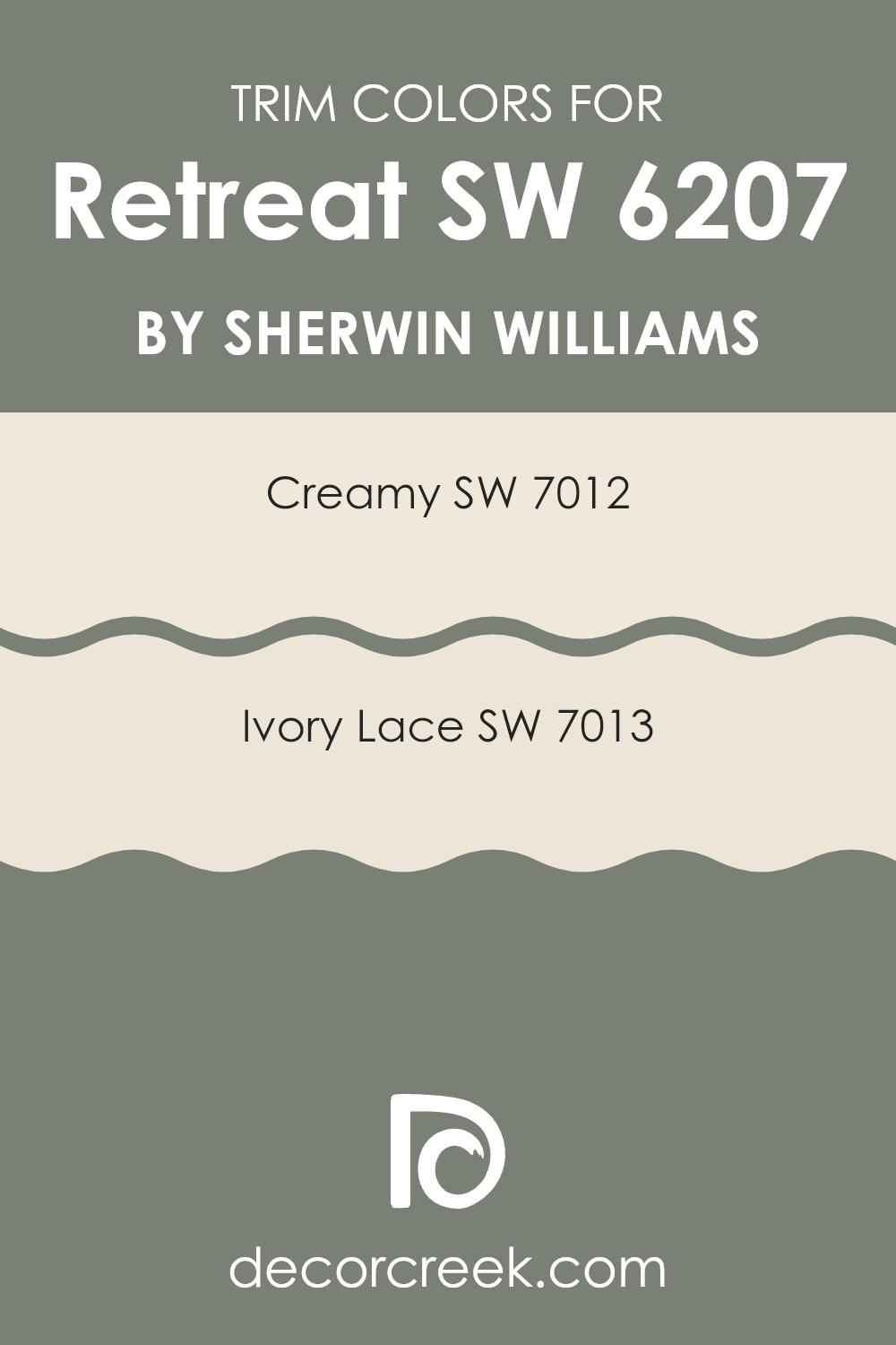
Trendy Trim Colors of Retreat SW 6207 by Sherwin Williams to use this year.
Trim colors play a vital role in any painting project, especially when complementing a base color like Retreat SW 6207 by Sherwin Williams. Trim colors, such as SW 7012 – Creamy and SW 7013 – Ivory Lace, are used on door frames, skirting boards, window casings, and other architectural features to add distinction and coherence to the overall color scheme.
These colors, when selected appropriately, create a smooth transition between the walls and the trim, enhancing the visual aesthetic and drawing attention to the details of the room. By using light trim colors around darker wall colors, you effectively frame the room, giving it a clean and finished appearance.
Sherwin Williams’s SW 7012 – Creamy is a gentle off-white with a soft, warm tone that provides a subtle contrast against richer and deeper hues, enriching the overall warmth of a room. It pairs beautifully with the calming green of Retreat, offering a hint of coziness without feeling too intense against the primary color.
SW 7013 – Ivory Lace is another excellent choice for trim, with its slightly brighter and crisper feel than Creamy, adding a delicate and fresh border that highlights the architectural features of a room. Both colors allow for a seamless look that brings together the elements of the room, ensuring every detail is noticed without overpowering the primary hue.
You can see recommended paint colors below:
- SW 7012 Creamy
- SW 7013 Ivory Lace
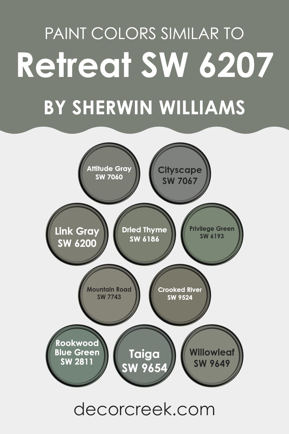
Evergreen Colors Similar to Retreat SW 6207 by Sherwin Williams
Choosing complementary shades similar to a primary color like Retreat by Sherwin Williams can have a profound effect on your room, ensuring consistency while subtly enhancing the aesthetic appeal. Similar colors are not only pleasing to the eye but they also create a harmonious environment by smoothly transitioning from one shade to another. This subtle blend prevents abrupt clashes between colors, lending a more cohesive and put-together look to any room.
For instance, Attitude Gray has a dusky, almost stormy feel that provides a muted contrast against lighter tones, making it perfect for creating depth in a room. Cityscape offers a cooler, nearly slate-like appearance, ideal for those looking to incorporate smoother, more neutral backgrounds in their design. Link Gray is a lighter, airier gray that pairs well with brighter or darker furniture, giving adaptability in decorating.
Dried Thyme has an earthy, herbal quality that works beautifully in areas that need a touch of nature’s calm. Privilege Green is lush and slightly vibrant, suitable for adding a splash of elegant color without feeling too intense. Mountain Road displays a richer, more nuanced hue that can stand as a focal point or support bolder colors.
Crooked River brings in browns and subdued orange hints, reminiscent of autumn sceneries, perfect for warmer palettes. Rookwood Blue Green draws slightly aquatic tones into the mix, providing a fresh, inviting feel. Taiga mimics the deep, dark greens of dense forests, excellent for adding an enigmatic yet comforting touch to rooms.
Lastly, Willowleaf, with its light, breezy green, suggests springtime freshness, fantastic for brightening up dim areas or smaller rooms. Each of these colors helps create a dynamic yet unified aesthetic, allowing for personal but harmonized decor choices.
You can see recommended paint colors below:
- SW 7060 Attitude Gray
- SW 7067 Cityscape
- SW 6200 Link Gray
- SW 6186 Dried Thyme
- SW 6193 Privilege Green
- SW 7743 Mountain Road
- SW 9524 Crooked River
- SW 2811 Rookwood Blue Green
- SW 9654 Taiga
- SW 9649 Willowleaf
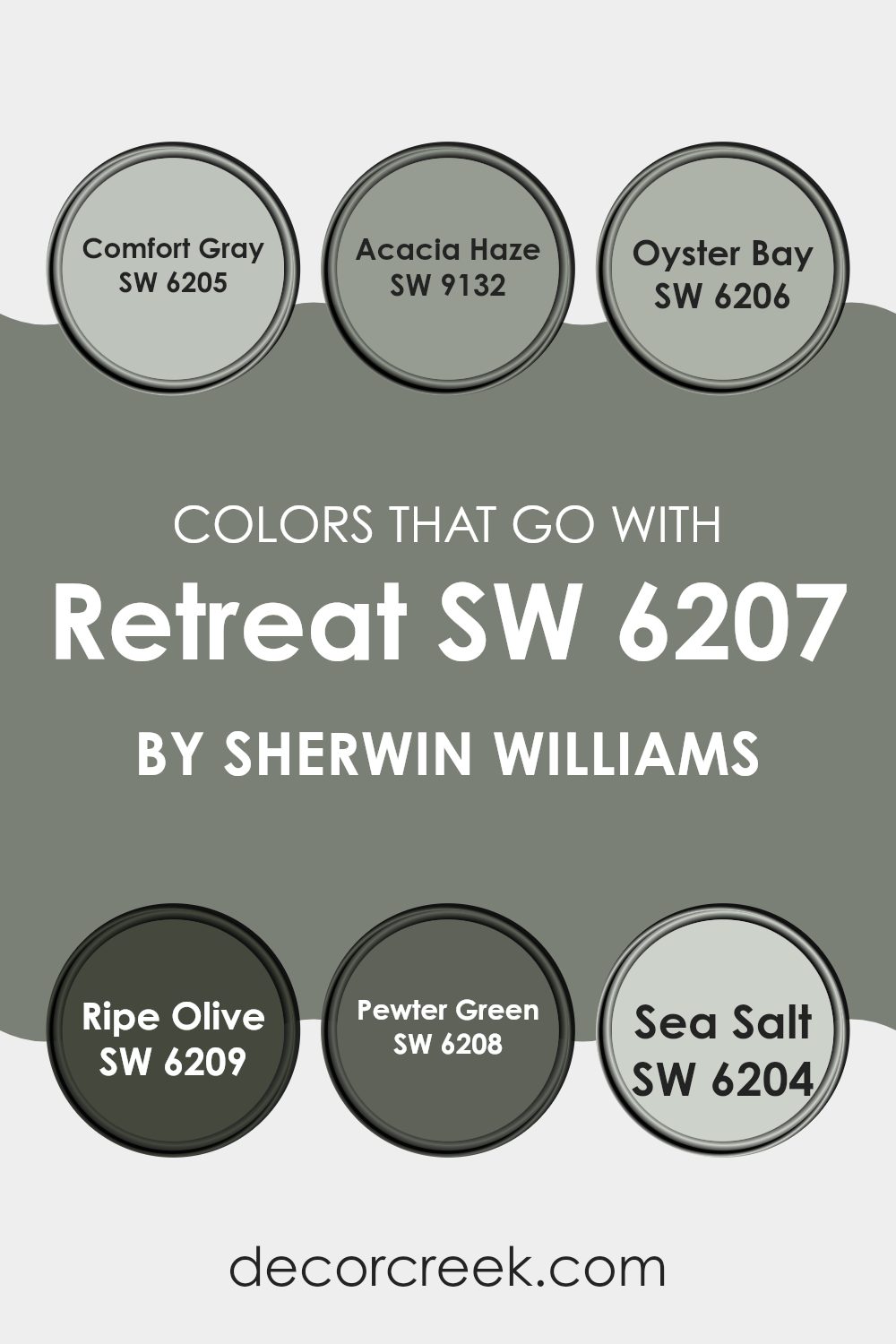
Colors that Go With Retreat SW 6207 by Sherwin Williams
Choosing the right colors that complement Retreat SW 6207 by Sherwin Williams is essential for creating a harmonious and appealing aesthetic in any room. The selected palette enhances the overall look by providing depth, contrast, or soothing continuity depending on your design goals.
For example, Comfort Gray SW 6205 is a gentle gray with a subtle hint of green, making it an adaptable partner for the muted green tones of Retreat. Acacia Haze SW 9132 offers a darker, more intense green-gray that can add a dramatic flair, perfect for accent walls or furniture pieces.
Colors like Oyster Bay SW 6206 provide a lighter, fresher contrast with a touch of blue, which can brighten rooms without feeling too intense against the calming nature of Retreat. For deeper tones, Ripe Olive SW 6209 presents a rich, dark olive green that is ideal for creating cozy corners or adding weight to a light-filled room.
Pewter Green SW 6208 leans towards a darker grayish-green, effective for grounding the room or adding a touch of masculinity. Lastly, Sea Salt SW 6204 serves as a crisp and clean option, with its light and airy feel it can help to open up a room, working well in smaller rooms or areas with plenty of natural light. These companions to Retreat not only complement but also enhance the main color, creating a cohesive and inviting environment.
You can see recommended paint colors below:
- SW 6205 Comfort Gray
- SW 9132 Acacia Haze
- SW 6206 Oyster Bay
- SW 6209 Ripe Olive
- SW 6208 Pewter Green
- SW 6204 Sea Salt
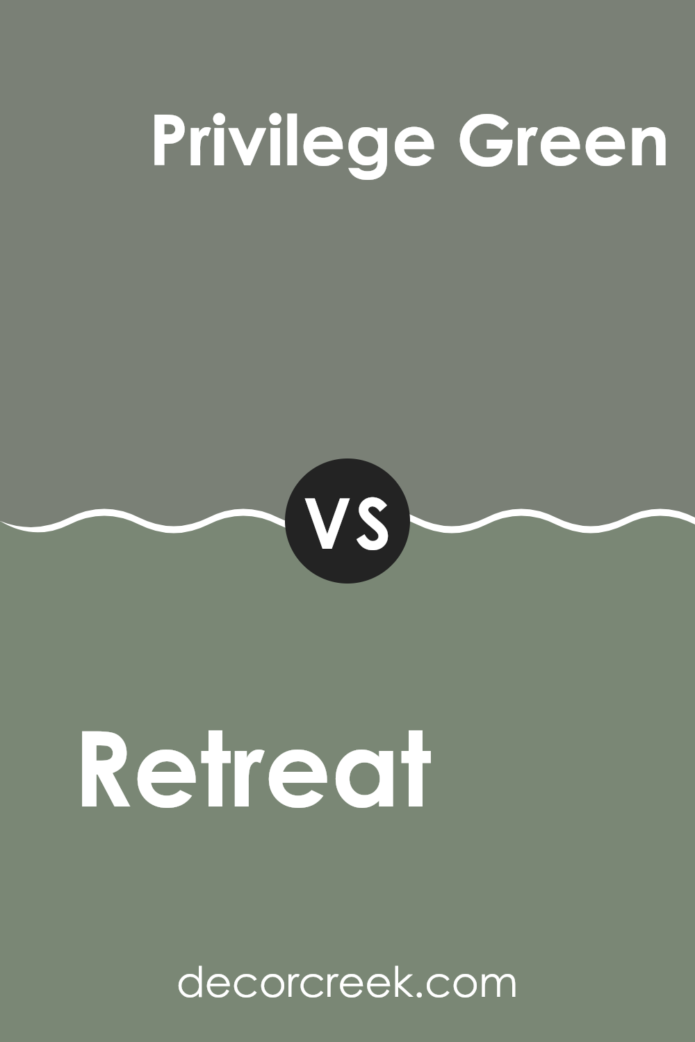
Retreat SW 6207 by Sherwin Williams vs Privilege Green SW 6193 by Sherwin Williams
Retreat and Privilege Green are two different hues by Sherwin Williams that both bring unique vibes to any room. Retreat is a deep, soothing blue with gray undertones.
It appeals to those looking to create a calm and grounded atmosphere, ideal for rooms meant to be relaxing, like bedrooms or living rooms. On the other hand, Privilege Green is a muted green with subtle gray hints.
It’s a bit lighter compared to Retreat and brings a breath of freshness to an area, making it a great choice for kitchens or studies where you seek a touch of natural elements without excessive brightness. Both colors pair well with light or dark furniture and can help in making a room feel more connected to nature.
You can see recommended paint color below:
- SW 6193 Privilege Green
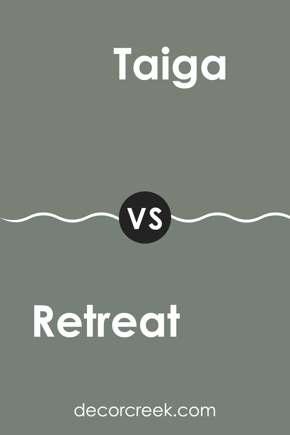
Retreat SW 6207 by Sherwin Williams vs Taiga SW 9654 by Sherwin Williams
Retreat SW 6207 and Taiga SW 9654 are two distinct paint colors from Sherwin Williams with their unique appeal and atmosphere. Retreat is a deep, muted blue with green undertones, creating a calm and gentle feel in a room.
This color is adaptable and can work well in various rooms, especially where a calming vibe is desired, like bedrooms or living areas. On the other hand, Taiga is a darker color that leans more towards green, giving off a rich and earthy feel.
It is an ideal choice for creating a cozy and warm atmosphere, suitable for rooms where you’d like a more enveloped feeling, such as dens or libraries. Both colors can be used to make a room feel more grounded and connected to nature, but their different tones will impact the mood and style of the room.
You can see recommended paint color below:
- SW 9654 Taiga
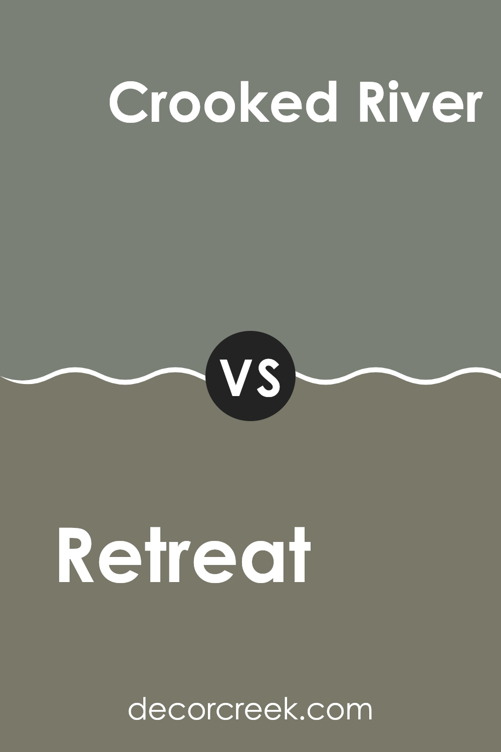
Retreat SW 6207 by Sherwin Williams vs Crooked River SW 9524 by Sherwin Williams
Retreat SW 6207 and Crooked River SW 9524 by Sherwin Williams are two distinct colors that can greatly influence the mood of any room. Retreat is a soft, muted teal with gray undertones.
It gives off a calm, soothing vibe, perfect for creating a peaceful and relaxing environment in rooms like bedrooms or bathrooms. In contrast, Crooked River is a dark, rich brown that leans towards earthiness.
This color is excellent for adding warmth and a feeling of stability to rooms such as living rooms or studies. It pairs well with natural textures like wood or leather, enhancing a cozy, inviting atmosphere. Overall, while Retreat leans towards a lighter, airier feel, Crooked River offers depth and warmth, making each suitable for different rooms depending on the desired ambience.
You can see recommended paint color below:
- SW 9524 Crooked River
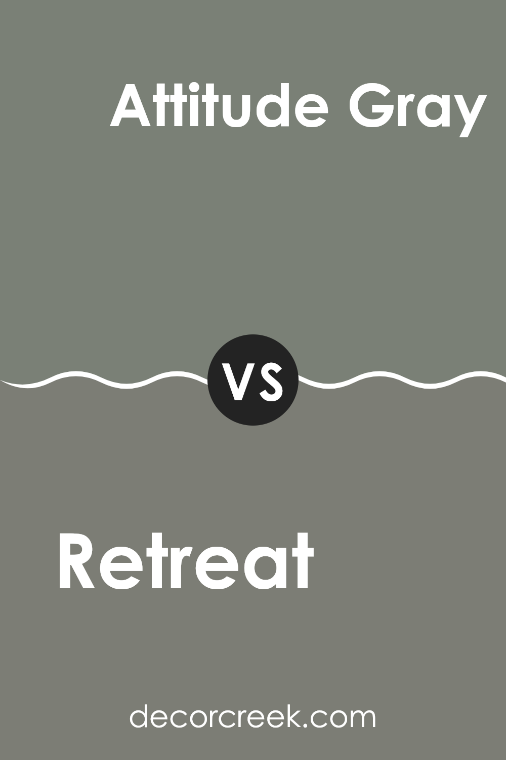
Retreat SW 6207 by Sherwin Williams vs Attitude Gray SW 7060 by Sherwin Williams
The main color, Retreat, is a calming shade of green with hints of gray, creating a peaceful and earthy feel. This color works well in rooms where you want to establish a cozy and relaxing atmosphere.
On the other hand, Attitude Gray is a deeper, bolder gray with a touch of green. This color gives off a stronger presence and can add a touch of elegance to any room. While both colors have green and gray elements, Retreat is lighter and more understated, making it perfect for relaxed and quiet settings.
Attitude Gray, being darker, is more striking and suits areas where a statement is desired. In summary, Retreat is ideal for a gentle, nature-inspired vibe, while Attitude Gray suits rooms that need a dramatic, yet elegant touch.
You can see recommended paint color below:
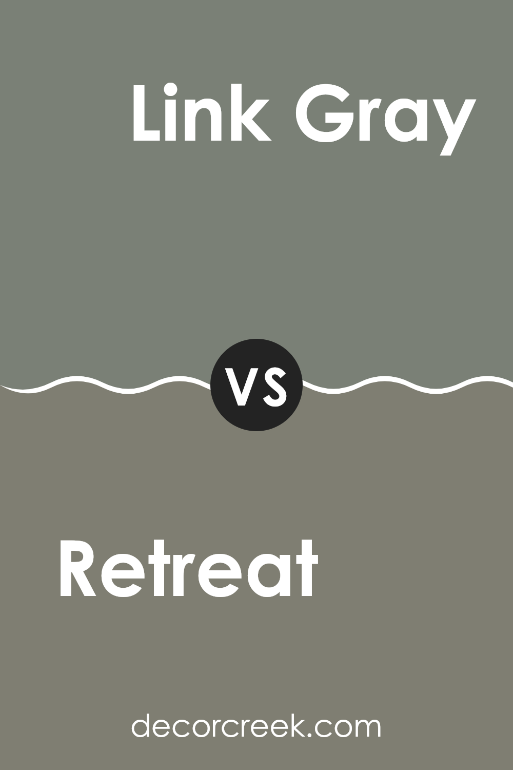
Retreat SW 6207 by Sherwin Williams vs Link Gray SW 6200 by Sherwin Williams
Retreat and Link Gray are both calm, soothing colors by Sherwin Williams, perfect for many rooms. Retreat is a greenish-gray with a touch of blue. It’s slightly darker and warmer, making it great for creating a cozy atmosphere in rooms like living areas and bedrooms. Its rich tone works well with both light and dark furniture, adding a cozy touch to any room.
On the other hand, Link Gray is a pure gray color that leans towards the cool side. It’s lighter than Retreat, which makes it excellent for smaller rooms or areas that don’t get much natural light, as it helps make the room appear brighter and more open. Link Gray pairs beautifully with modern decor, bringing a clean and airy feel to a room.
Both colors are adaptable, but Retreat offers warmth, while Link Gray provides a crisp backdrop for contemporary styles. Choosing between them depends on the mood you want to create and the characteristics of the room.
You can see recommended paint color below:
- SW 6200 Link Gray
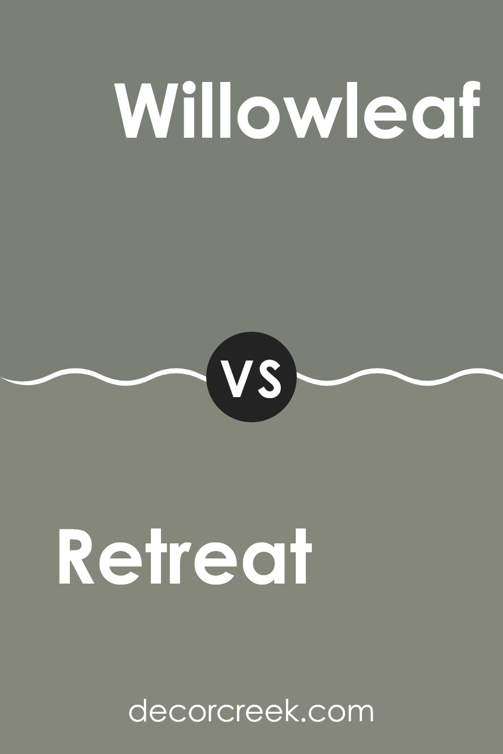
Retreat SW 6207 by Sherwin Williams vs Willowleaf SW 9649 by Sherwin Williams
Retreat SW 6207 by Sherwin Williams and Willowleaf SW 9649 are both beautiful yet distinctly different colors. Retreat has a deep, rich teal hue that can add a cozy and calming feeling to any room. It’s an adaptable shade that works well in rooms meant for relaxation or concentration.
On the other hand, Willowleaf boasts a lighter, more leafy green tone. It’s fresh and vibrant, perfect for bringing a bit of the outdoors inside. This color can brighten up a room and works especially well in areas that receive a lot of natural light.
Essentially, if you’re looking for a color that adds depth and a touch of warmth, Retreat is a great choice. If you prefer something lighter and refreshing, Willowleaf might be the way to go. Each brings its unique vibe to interiors, depending on what atmosphere you aim to create.
You can see recommended paint color below:
- SW 9649 Willowleaf
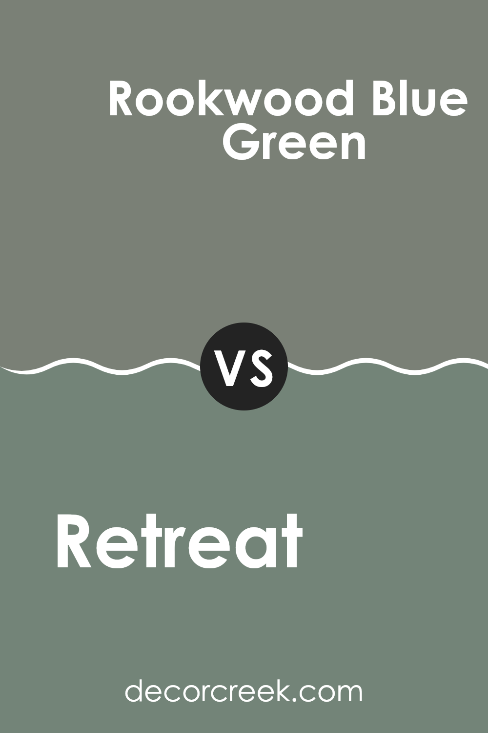
Retreat SW 6207 by Sherwin Williams vs Rookwood Blue Green SW 2811 by Sherwin Williams
“Retreat” by Sherwin Williams is a soft, calming gray with hints of blue that creates a peaceful atmosphere in any room. It’s a gentle color that easily pairs with both bold and neutral palettes, making it adaptable for various decorating styles.
On the other hand, “Rookwood Blue Green,” also by Sherwin Williams, is a deeper shade that blends blue and green with gray undertones. This color is richer and more pronounced, ideal for making a statement in a room.
While “Retreat” brings a light, airy feel, “Rookwood Blue Green” offers a bit more drama and depth, perfect for accent walls or for rooms that benefit from a darker, cozier feel. Both colors reflect a modern yet timeless appeal, but their impacts are distinctly different based on their depth and tone.
You can see recommended paint color below:
- SW 2811 Rookwood Blue Green
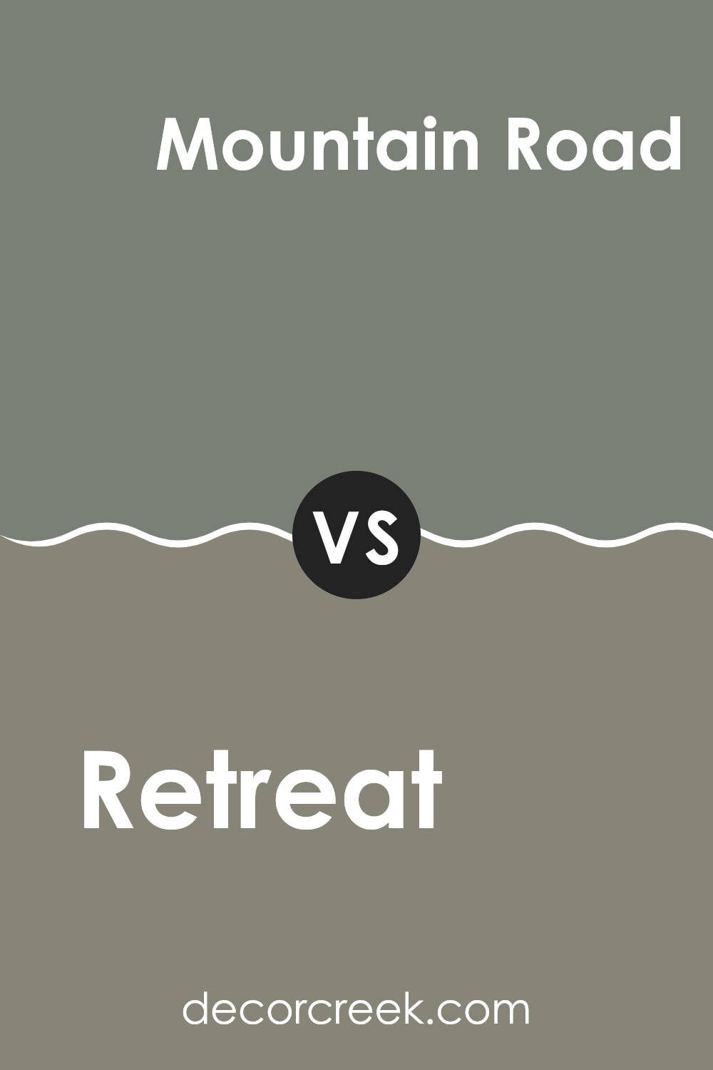
Retreat SW 6207 by Sherwin Williams vs Mountain Road SW 7743 by Sherwin Williams
Retreat SW 6207 and Mountain Road SW 7743, both by Sherwin Williams, offer distinct shades that could suit different tastes and rooms. Retreat is a soft, smoky blue with a subtle coolness that can give a room a calm, inviting feel. It’s great for creating a relaxed atmosphere, particularly well-suited for bedrooms or bathrooms where you want a hint of color without feeling too intense.
On the other hand, Mountain Road presents a deeper, grayish-green hue. This color is more grounded and earthy, ideal for those looking to add a touch of nature-inspired richness to their room. It works well in living areas or as an accent wall, providing a strong backdrop that pairs well with both light and dark furnishings.
Both colors offer unique vibes – Retreat leaning towards a lighter, airier feeling, and Mountain Road offering a more anchored, richer presence. Each can uniquely define a room depending on the mood you wish to create.
You can see recommended paint color below:
- SW 7743 Mountain Road
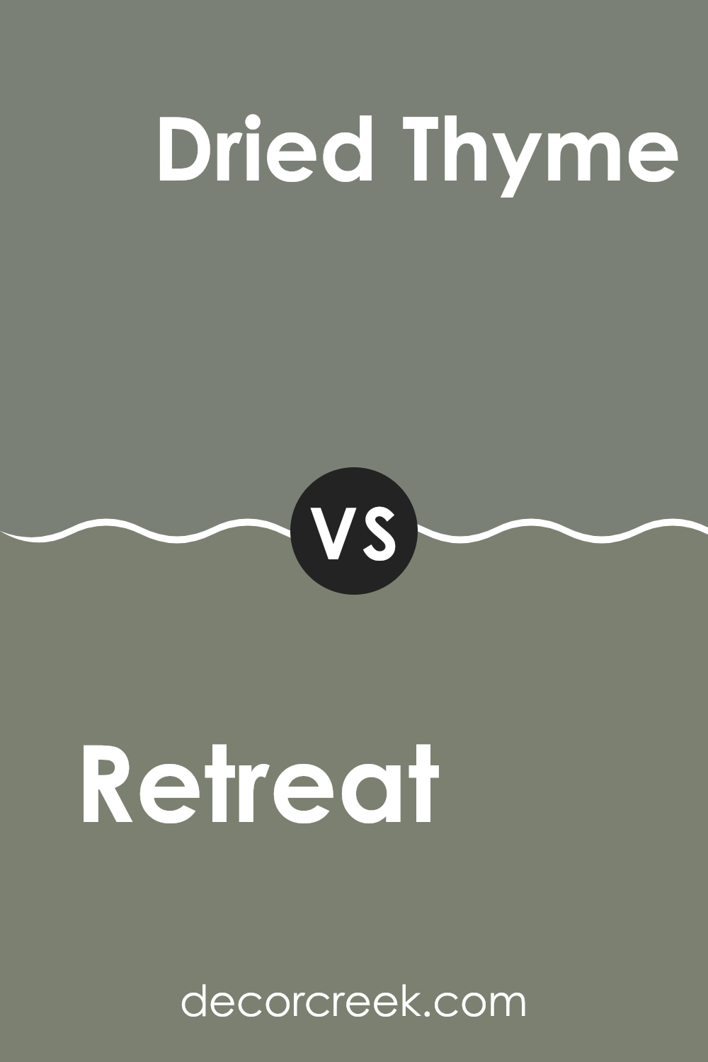
Retreat SW 6207 by Sherwin Williams vs Dried Thyme SW 6186 by Sherwin Williams
Retreat SW 6207 and Dried Thyme SW 6186 by Sherwin Williams are two distinct shades that offer unique atmospheres to any room. Retreat is a calming blue-green color, leaning more towards a gentle blue with subtle green undertones. This color is light and airy, making it perfect for creating a peaceful and welcoming environment in rooms like bedrooms or bathrooms.
In contrast, Dried Thyme is a darker, more earthy green. It has a stronger presence due to its deeper tone, which can add a sense of grounding and stability to a room. This color works well in areas that are meant for concentration and productivity, like home offices or studies.
Both colors bring nature-inspired tones into your home but in different ways. Retreat has a light, refreshing vibe, while Dried Thyme offers a more rich and earthy feel. Whether you prefer the lighter, softer blue of Retreat or the deep, rich green of Dried Thyme, each color has its charm and can enhance the overall aesthetic of your living rooms.
You can see recommended paint color below:
- SW 6186 Dried Thyme
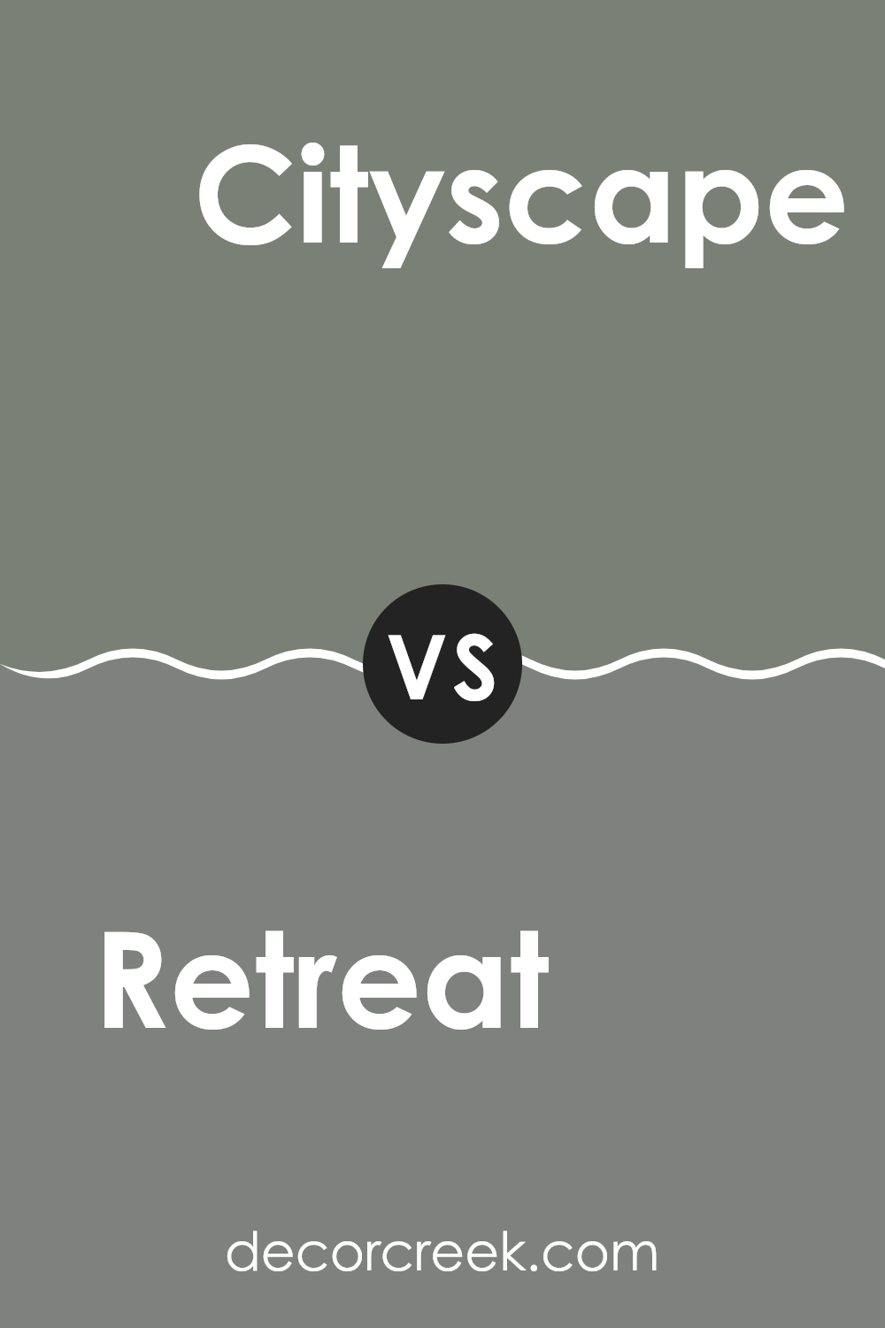
Retreat SW 6207 by Sherwin Williams vs Cityscape SW 7067 by Sherwin Williams
Retreat and Cityscape are two paint colors by Sherwin Williams that contrast in tone and mood. Retreat is a muted green with a calming effect, making it a great choice for rooms where relaxation is key, like bedrooms or living areas.
Its green undertone adds a touch of nature and softness to any room. On the other hand, Cityscape is a cooler, darker gray that offers a modern and straightforward feel. It works well in both home and business environments, providing a neutral backdrop that complements various decor styles.
While Retreat brings warmth and a natural vibe to a room, Cityscape gives a clean and contemporary look, perfect for those who prefer minimalism and modernity. Together, these colors can create a balanced and harmonious look when used in the same room or separately to achieve specific styles in different rooms.
You can see recommended paint color below:
- SW 7067 Cityscape
After reading about SW 6207 Retreat by Sherwin Williams, I’ve learned that it’s a unique kind of green paint. This shade is not just any green; it’s like the dark green you see on forest trees.
It’s calm and cool, making it perfect for places where you relax, like a bedroom or a cozy reading corner. Plus, this color goes well with lots of other colors. You can match it with light colors like beige for a soft look, or with dark colors like brown for a more nature-inspired vibe.
Retreat could be a good choice if you want to make a room feel like a safe and quiet spot, like your own little hideaway. I think using this paint could make any room feel more comfortable and a bit like being outside in nature, which is pretty nice. So, if you’re thinking about changing up your room, SW 6207 Retreat could be a fun and peaceful color to try!
decorcreek.com
Ever wished paint sampling was as easy as sticking a sticker? Guess what? Now it is! Discover Samplize's unique Peel & Stick samples.
Get paint samples

