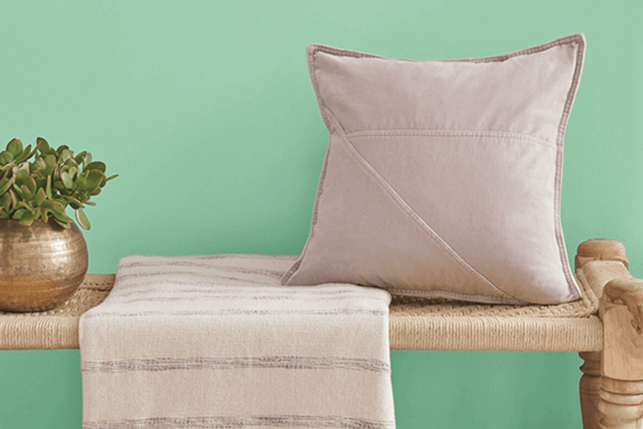
As you contemplate refreshing your space, SW 9036 Retro Mint by Sherwin Williams deserves your attention. This shade carries the essence of a gentle nostalgia mixed with a modern twist, making it an excellent choice for anyone looking to add a unique touch to their home. The color Retro Mint blends effortlessly into various interior styles, from retro-inspired kitchens to contemporary living rooms.
The cool, soothing tone of Retro Mint offers a subtle vibrancy without overwhelming the senses, making it ideal for creating a calm yet inviting atmosphere. Whether you’re thinking about painting an entire room or just accentuating a small area, this color provides a refreshing update while maintaining a soft, approachable feel.
Pairing it with contrasting colors can enhance its visual appeal, creating a dynamic environment that feels both fresh and familiar.
Through my personal experience, I can say that applying SW 9036 Retro Mint can instantly uplift the mood of a room.
It’s like giving your living space a breath of fresh air. So if you’re eager to rejuvenate your home with a color that is both soothing and spirited, Retro Mint might just be what you’re looking for.
What Color Is Retro Mint SW 9036 by Sherwin Williams?
Retro Mint by Sherwin Williams is a fresh and lively shade that adds a cheerful pop of color to any room. The color, a soft yet vibrant green with a hint of blue, brings a cool, retro vibe that is invigorating and welcoming. It’s light enough to create a sense of spaciousness but vibrant enough to make a statement. Retro Mint works beautifully in a variety of interior styles, particularly in mid-century modern, contemporary, and Scandinavian decors.
Its playful, vintage feel complements the clean lines and organic forms typical of mid-century modern furniture. In contemporary settings, this color adds a dash of brightness that contrasts well with neutral tones like gray, white, and black. For Scandinavian interiors, it enhances the minimalist look while adding a touch of warmth and nature-inspired liveliness.
When it comes to materials and textures, Retro Mint pairs well with natural wood, which balances its brightness with earthy warmth. Smooth metals like brushed nickel or chrome also work well, providing a modern touch that complements the color’s retro feel. Textiles in soft textures, such as wool or cotton in muted colors, help soften the overall look, creating a cozy and inviting space.
With its cheerful and refreshing tone, Retro Mint is a great choice for living rooms, kitchens, and bedrooms looking for a splash of unique color.
Is Retro Mint SW 9036 by Sherwin Williams Warm or Cool color?
Retro Mint SW 9036 by Sherwin Williams is a vibrant and fresh color that brings a cheerful vibe to any room. Its light and airy feel makes it perfect for kitchens and bathrooms, where it adds a sense of cleanliness and freshness.
This particular shade of green has a playful touch that can liven up a space, yet is soft enough to maintain a relaxed atmosphere. Retro Mint is versatile enough to pair well with both bright and neutral colors, allowing for a variety of decorating styles from modern to vintage.
In a bedroom, it can help create a refreshing ambiance, particularly when combined with soft whites or other light pastels. In living spaces, combining it with darker woods or metals can create an interesting contrast, yet still keep the room feeling light and open. Overall, Retro Mint is an excellent choice for anyone looking to add a burst of energy and cheer to their home without overwhelming it.
Undertones of Retro Mint SW 9036 by Sherwin Williams
Retro Mint is a vibrant shade that is enriched through a complex mixture of undertones. Undertones are subtle colors that influence the main shade, affecting how it appears under different lighting conditions and when paired with other colors. The primary undertone of Retro Mint is mint itself, which gives it a fresh and lively character.
Other undertones like light gray and pale yellow add a gentle brightness and warmth, making the color versatile and soft. Lilac and light purple introduce a touch of coolness, contributing to a balanced look. These cooler undertones can help the hue blend well in spaces that aim for a calm atmosphere.
Gray and pale pink bring some neutrality and softness, where gray can tone down the brightness, and pale pink adds a subtle warmth. Turquoise and light turquoise afford a more aquatic feel that enhances the freshness of the hue, perfect for creating a rejuvenating space. Dark turquoise and blue deepen the complexity, providing depth and richness.
On interior walls, these undertones can significantly influence the room’s ambiance. In natural light, the lighter and warmer undertones can make the room feel more open and airy, while artificial lighting can accentuate the cooler undertones, lending a soothing effect to the space.
The blend of undertones in Retro Mint ensures that it will adapt dynamically within various decors and lighting setups, always offering a fresh yet balanced touch to interior spaces.
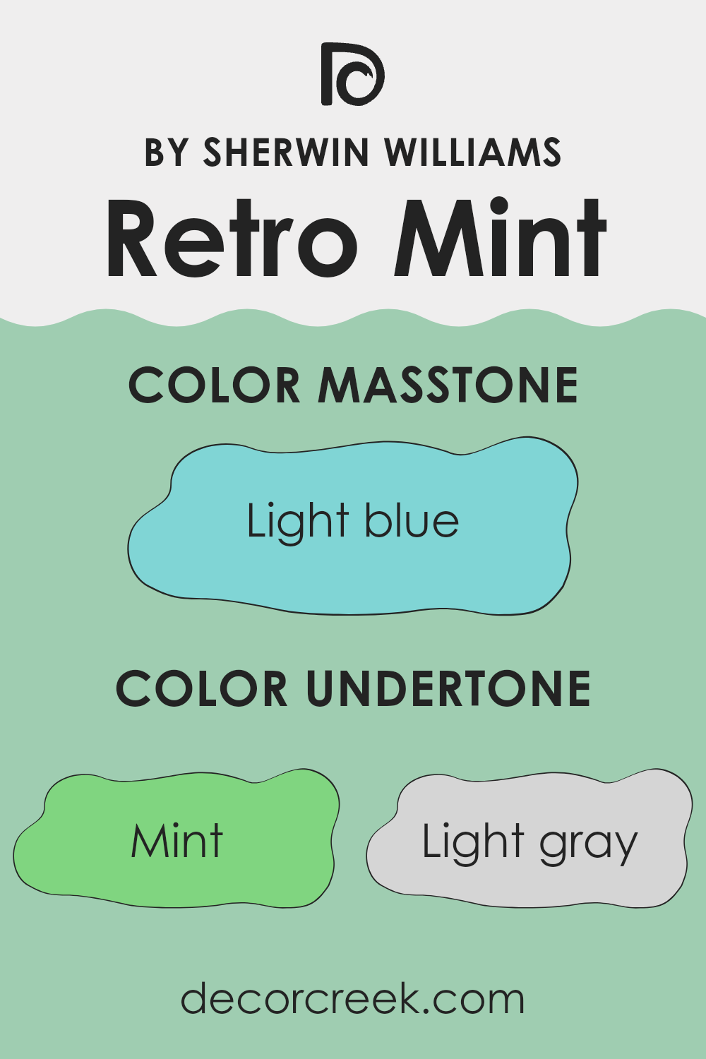
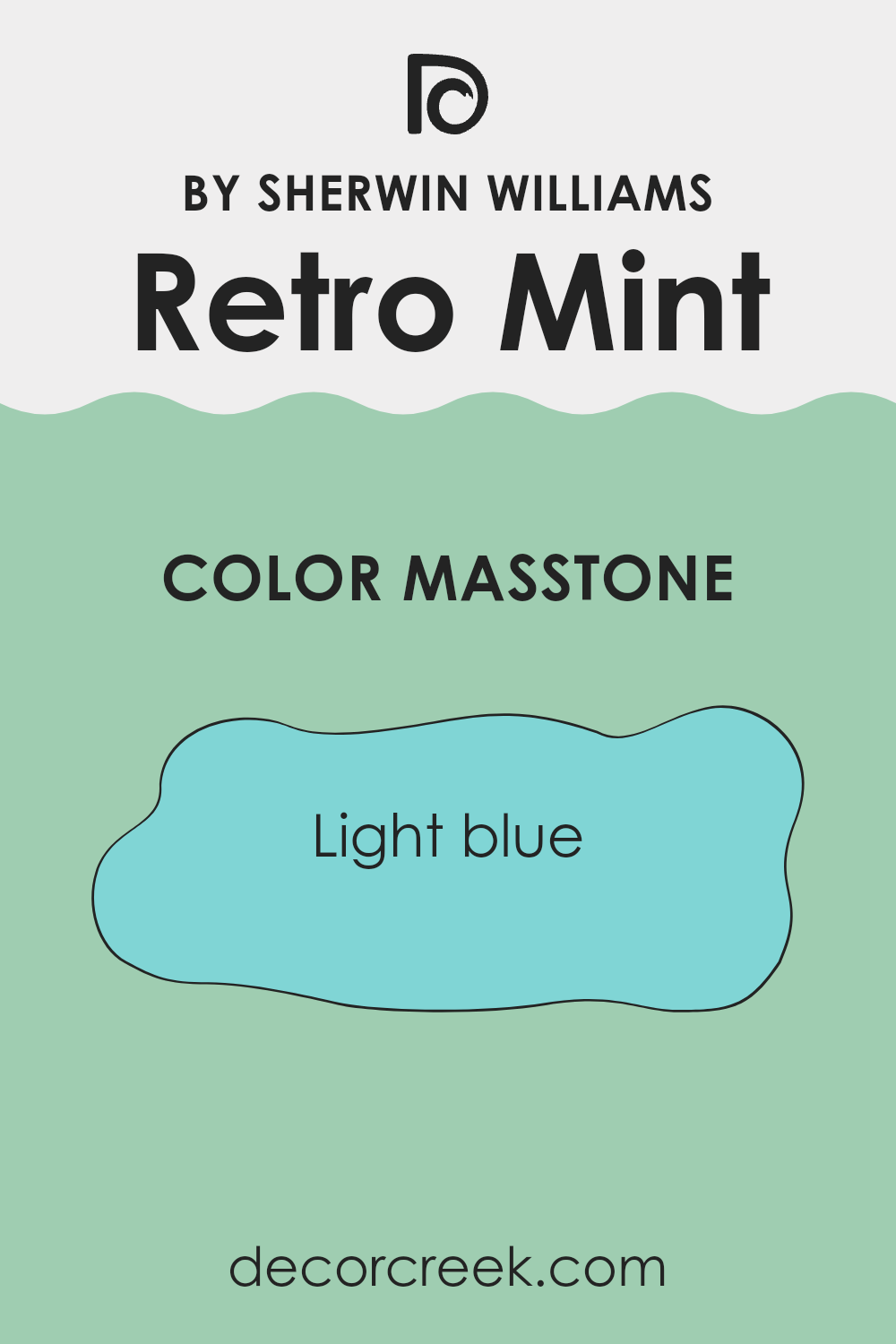
What is the Masstone of the Retro Mint SW 9036 by Sherwin Williams?
Retro MintSW 9036 has a light blue masstone that can brighten up any space in a home. This light blue shade has a fresh and soft vibe, making it perfect for creating a welcoming atmosphere. When used on walls, it can help rooms feel more airy and spacious. This effect is especially useful in smaller rooms or areas with limited natural light.
Because it’s so gentle and light, it pairs well with various colors, from neutrals like whites and grays to more vibrant hues. This makes it a versatile choice in homes, suitable for living rooms, bathrooms, and even kitchens.
It provides a clean backdrop that allows furniture and decor items to stand out, making it an excellent choice for those looking to refresh their space without a dramatic change. Moreover, due to its lightness, it can be a good choice for helping people feel relaxed and calm in their environment.
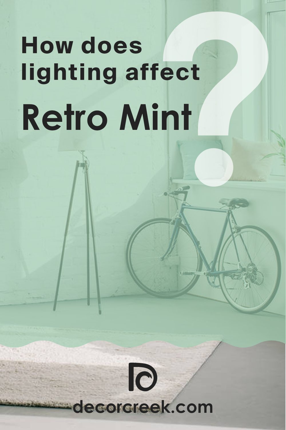
How Does Lighting Affect Retro Mint SW 9036 by Sherwin Williams?
Lighting plays a crucial role in how we perceive colors. The type of light and its intensity can significantly change how a color appears in a space. For instance, a specific shade like Retro Mint can look different under various lighting conditions due to this interplay between light and color.
First, consider how Retro Mint appears under artificial light, which usually includes LED or fluorescent lighting. Artificial light can either enhance or mute the vibrancy of Retro Mint, depending on the type of bulb. Fluorescent lights, for instance, tend to give off a cooler tone, making Retro Mint appear crisper and more vivid.
LED lights, which can range from warm to cool, might render this color slightly differently; a warmer LED can soften the mint tone, making it feel more subdued.
In contrast, natural light brings out the truest version of Retro Mint. Sunlight varies throughout the day and affects how colors look.
In the morning and evening, when the sun casts a warmer glow, Retro Mint may look softer and warmer. At noon, when the sun is brightest, the color will appear sharper and more vibrant.
Room orientation also affects how Retro Mint looks throughout the day. Rooms facing north receive less direct sunlight, making colors appear slightly cooler and more consistent throughout the day. Here, Retro Mint will maintain a subtle and soft appearance. Southern exposure, conversely, benefits from more intense light, where the color can look brighter and more lively.
East-facing rooms get morning light, which is warmer. Here, Retro Mint can start the day looking gentle and warm, becoming cooler as the day progresses. West-facing rooms experience the opposite; the color will appear cooler in the morning and gain warmth in the afternoon and evening light.
Each lighting scenario and room orientation brings out a different facet of Retro Mint, making it a versatile choice for various uses around the home.
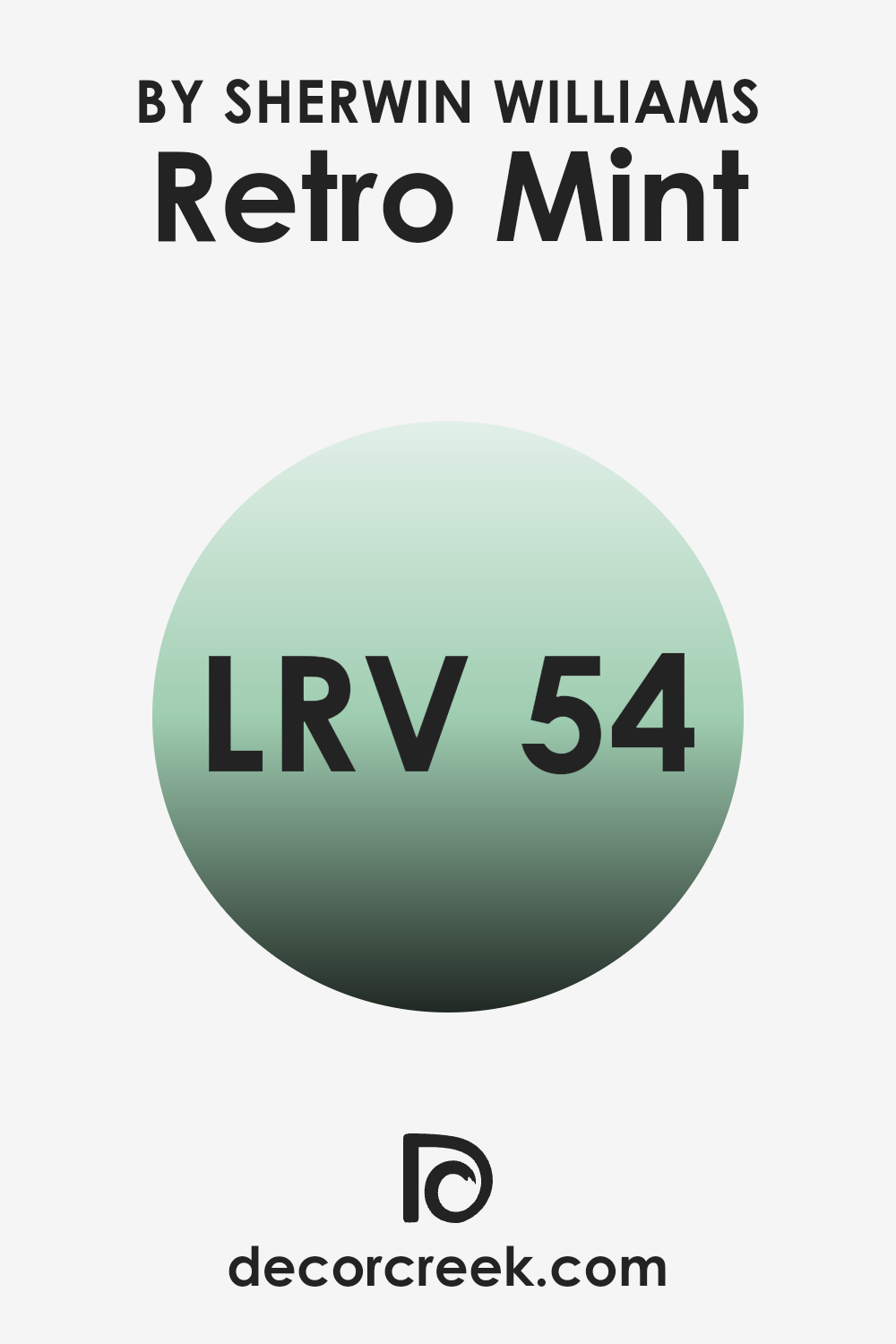
What is the LRV of Retro Mint SW 9036 by Sherwin Williams?
LRV stands for Light Reflectance Value, which measures the percentage of light a paint color reflects back into a room, compared to the amount it absorbs. This value ranges from a low of zero, where a color absorbs all light, to a high where it reflects all light back.
This factor is crucial because it helps determine how light or dark a color will appear when applied to your walls. A higher LRV means the color will appear lighter and can help brighten a room, while a lower LRV means it will look darker and might make a room feel smaller or more closed in.
Regarding the specific color with an LRV of 54.166, this means it is moderately light-reflective. It strikes a balance, not being too bright or too subdued, making it a versatile choice for spaces that need a refreshing touch without being overwhelming. In rooms with less natural light, this LRV can help in making the space feel airy and more open.
Conversely, in a very brightly lit room, this value ensures that the color maintains its distinctiveness without looking washed out. This balance can really influence the mood and visual size of an interior space, making it a practical choice for various home settings.
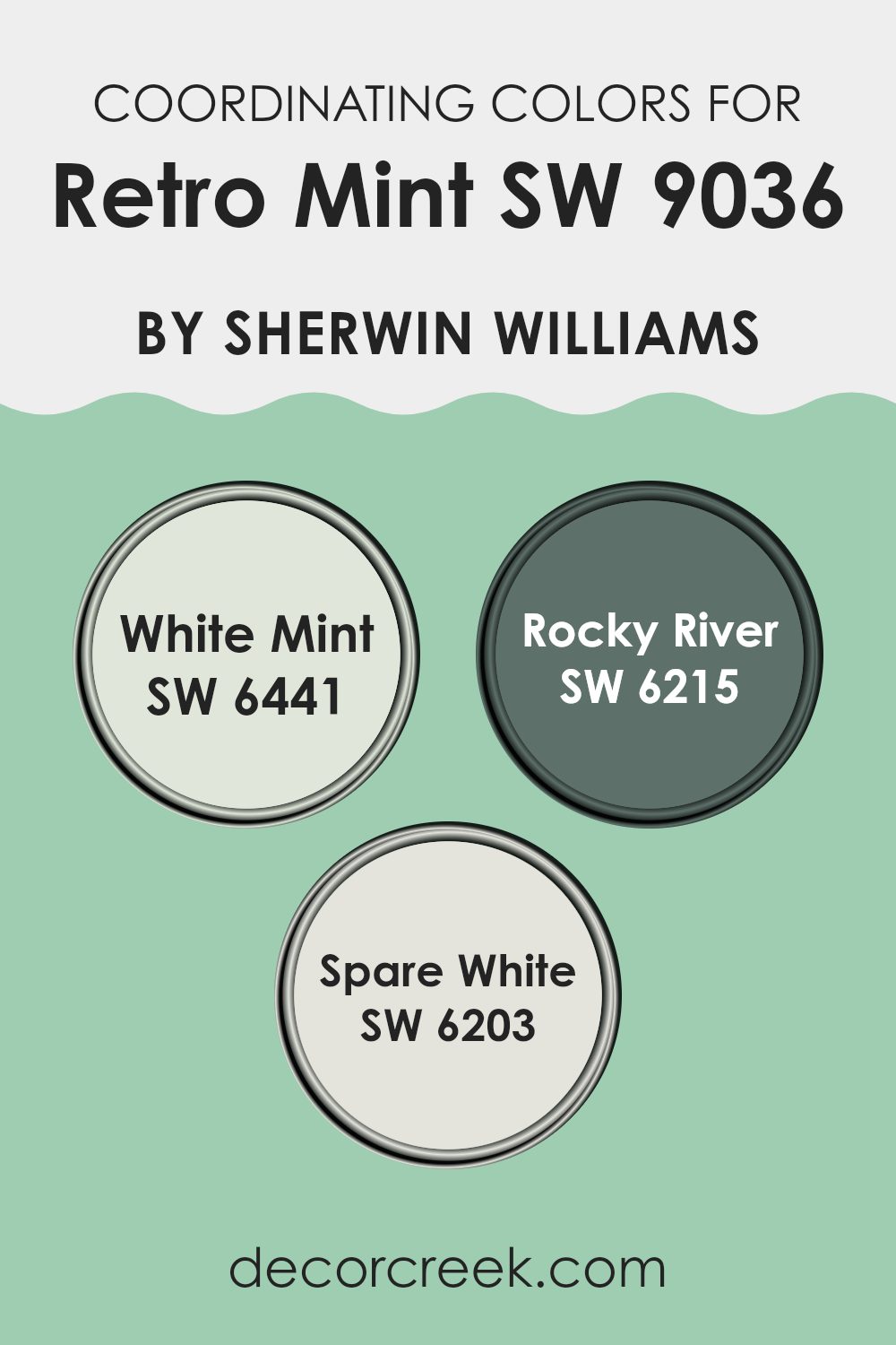
Coordinating Colors of Retro Mint SW 9036 by Sherwin Williams
Coordinating colors are shades that complement each other while sharing some common hues to create a visually appealing palette. When it comes to painting or decorating spaces, choosing coordinating colors can help achieve a harmonious and balanced look. For example, Retro Mint, a gentle green shade, pairs wonderfully with certain coordinating colors chosen to enhance its appeal without overwhelming its subtle tone.
White Mint is a lighter, softer version that can brighten spaces while maintaining the calm and relaxed vibe set by Retro Mint. The color creates a clean and airy feeling, perfect for opening up smaller areas or serving as a refreshing background.
Rocky River, on the other hand, offers a deeper, more dramatic contrast. Its rich, blue-green hues can add depth and interest, making it ideal for accent walls or furniture pieces that draw the eye. Finally, Spare White offers a neutral, very light grey shade that works great to balance out the brighter tones of Retro Mint and its coordinating colors. It acts as a subtle backdrop that allows other colors to stand out. Together, these coordinating colors create a cohesive and inviting environment.
You can see recommended paint colors below:
- SW 6441 White Mint
- SW 6215 Rocky River
- SW 6203 Spare White
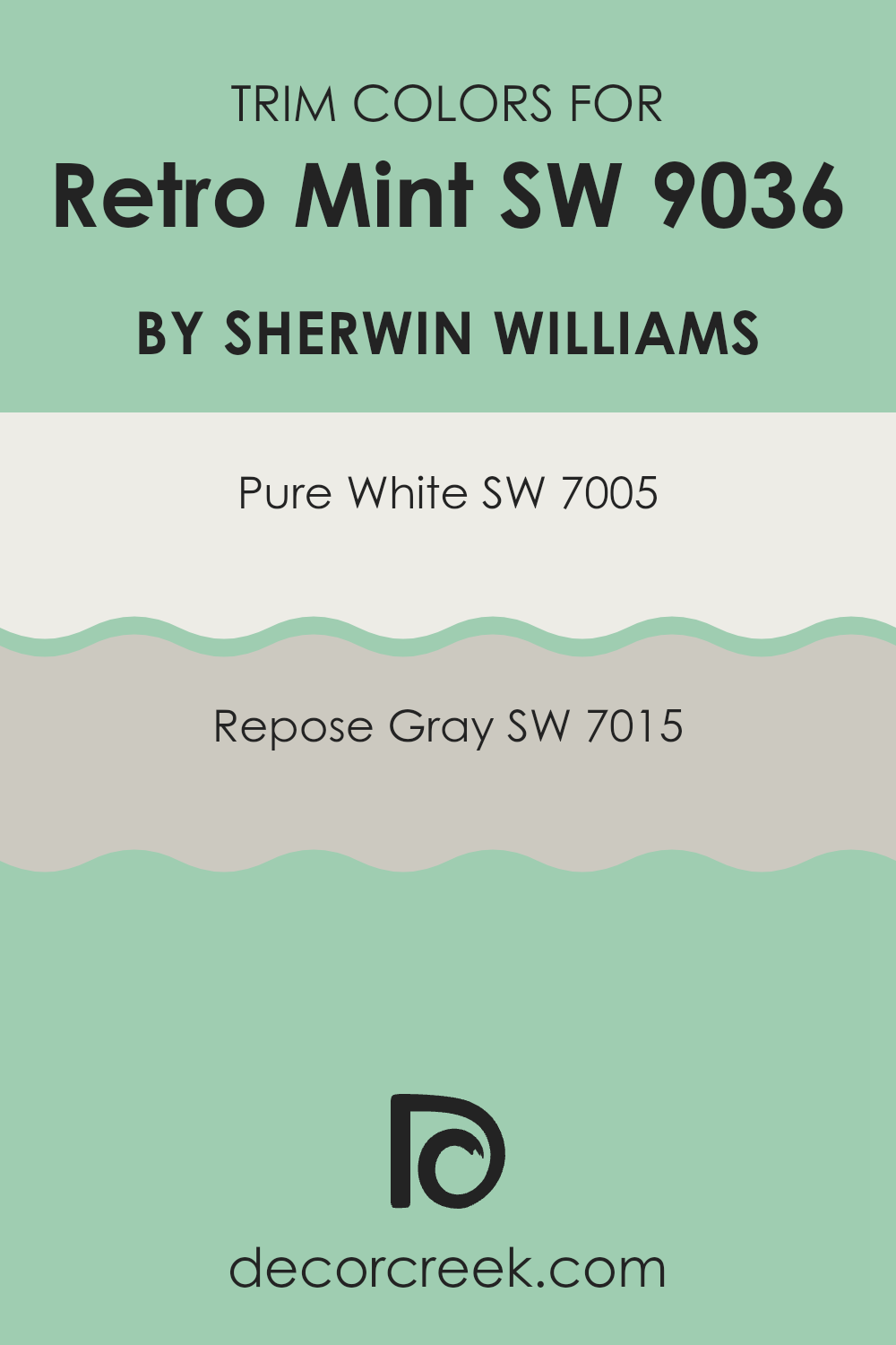
What are the Trim colors of Retro Mint SW 9036 by Sherwin Williams?
Trim colors are selected to complement or contrast the main color of a room, creating a finished look around doors, windows, and baseboards. For Sherwin Williams’ Retro Mint, a fresh and lively shade, both SW 7005 – Pure White and SW 7015 – Repose Gray can serve as excellent trim choices.
Pure White is a crisp and clean white that works wonderfully to frame the vibrant Retro Mint, making it stand out even more on your walls. Meanwhile, Repose Gray offers a gentle balance with its soft, warm gray tone, providing a subtle contrast that enhances the green without overpowering it.
Pure White is an ideal selection for creating a sharp, clear boundary around the more vivid Retro Mint, helping to enhance its visual impact and make the space appear brighter and more refreshing. On the other hand, Repose Gray offers a versatile shade that allows for a milder transition from the unique tone of Retro Mint to the trim, enriching the overall softness and warmth of a room.
Selecting the right trim color helps in achieving a cohesive look that ties together the various elements of the decor.
You can see recommended paint colors below:
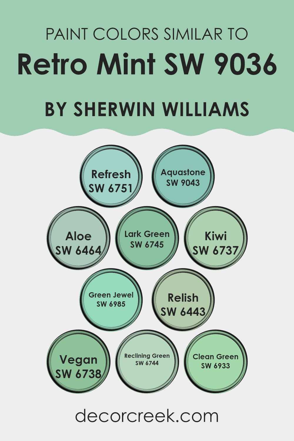
Colors Similar to Retro Mint SW 9036 by Sherwin Williams
Similar colors play a crucial role in creating visually appealing and cohesive spaces. When colors like those similar to Retro Mint by Sherwin Williams are used together, they create a harmonious look that is pleasing to the eye. This is because similar colors share common hues, making it easy to combine them without clashing. Using variations of a single color brings depth and subtlety to a design while maintaining a unified and coherent atmosphere.
For instance, Refresh is a light and breezy turquoise that adds a fresh vibe to any room. Aquastone, slightly richer, offers a touch of depth while keeping the airy feel alive. Aloe is a soft, green hue that gives a gentle, soothing touch to interiors.
Lark Green has a vibrant, leafy character that energizes a space subtly. Kiwi is brighter and injects a cheerful, lively spirit into designs. Green Jewel, with its deep, lush tone, provides a more dramatic and intense color punch.
Relish is a dark green that brings a grounded, nature-inspired feel to the environment. Vegan offers a pure and clean look with its straightforward green. Reclining Green is soft and mild, perfect for a calm and restful ambiance. Lastly, Clean Green is vibrant and bold, ideal for making a striking impression without overwhelming. By choosing any of these similar colors, you can ensure your space feels cohesive yet dynamic.
You can see recommended paint colors below:
- SW 6751 Refresh
- SW 9043 Aquastone
- SW 6464 Aloe
- SW 6745 Lark Green
- SW 6737 Kiwi
- SW 6985 Green Jewel
- SW 6443 Relish
- SW 6738 Vegan
- SW 6744 Reclining Green
- SW 6933 Clean Green
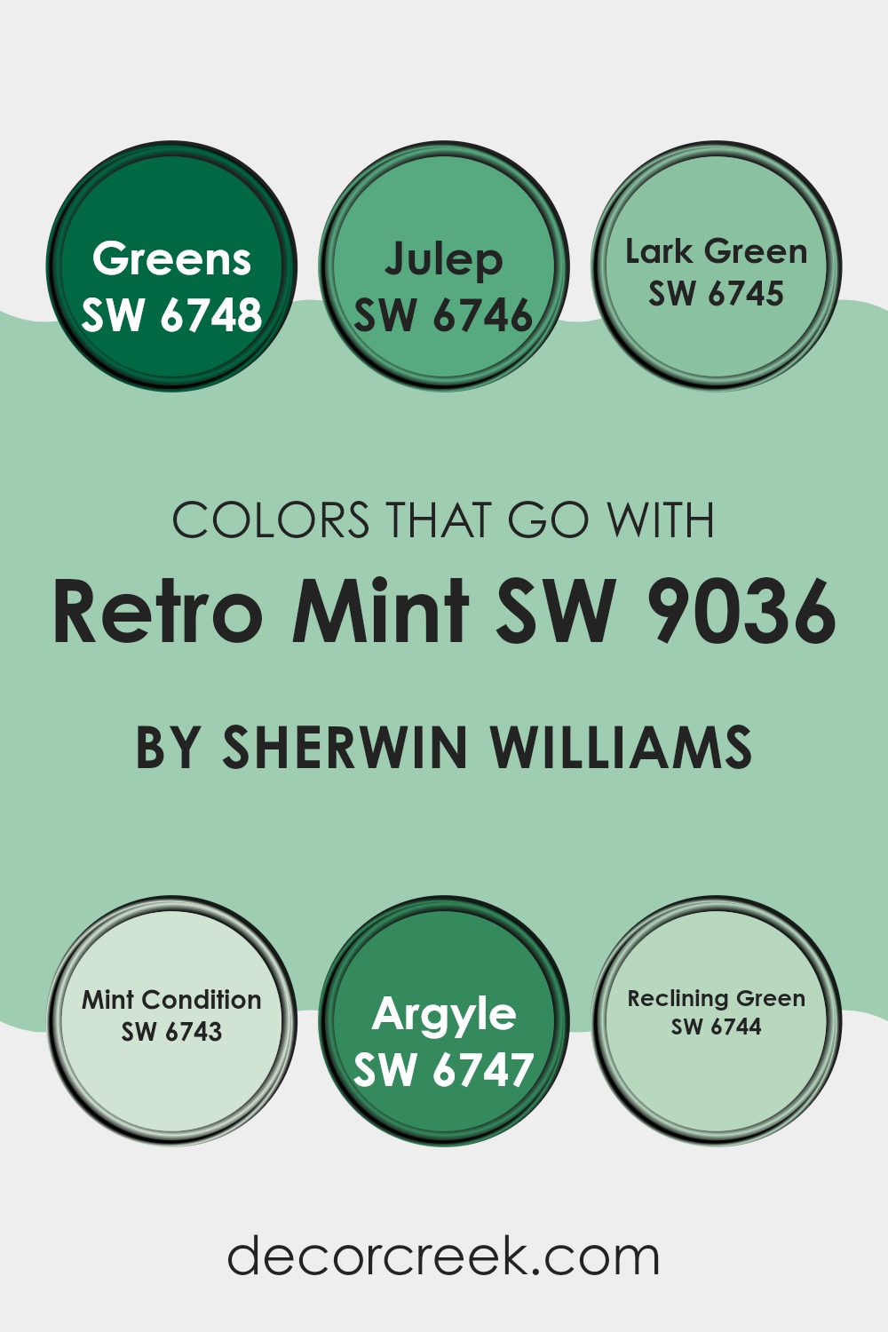
Colors that Go With Retro Mint SW 9036 by Sherwin Williams
Colors that complement Retro Mint SW 9036 by Sherwin Williams are vital because they provide balance and enhance the look of a room without overwhelming it. The right color combinations can harmonize a space, making it feel coherent and visually pleasing.
These selected colors from Sherwin Williams perfectly blend with Retro Mint, each offering its own unique appeal while maintaining a cohesive aesthetic. Selecting the correct shades to accompany Retro Mint ensures that the space maintains a fresh, coordinated look.
SW 6748 – Greens is a vibrant, lively shade that injects energy into any space. It is especially effective in adding a pop of color in rooms where Retro Mint acts as a more muted backdrop. SW 6746 – Julep is slightly softer, providing a cheerful brightness that’s easy on the eyes, great for creating a light-hearted and friendly ambiance.
SW 6745 – Lark Green is richer and darker, offering depth and contrast when paired with the lighter Retro Mint, ideal for adding a touch of sophistication. SW 6743 – Mint Condition has a similar lightness to Retro Mint, and when used together, they produce an effortlessly fluid visual flow, enhancing the space with gentle energy.
SW 6747 – Argyle presents a bold, statement green that stands out against Retro Mint, perfect for accent walls or decorative highlights. Lastly, SW 6744 – Reclining Green is a calm and comforting hue that aligns closely with Retro Mint, ensuring a soothing continuity throughout the room.
Together, these colors contribute to a balanced, refreshing palette that enhances the overall atmosphere of any interior.
You can see recommended paint colors below:
- SW 6748 Greens
- SW 6746 Julep
- SW 6745 Lark Green
- SW 6743 Mint Condition
- SW 6747 Argyle
- SW 6744 Reclining Green
How to Use Retro Mint SW 9036 by Sherwin Williams In Your Home?
Retro Mint SW 9036 by Sherwin Williams is a gentle and fresh color that can make any room look more welcoming. This soft, minty green shade is perfect for creating a lively yet soothing atmosphere. It’s ideal for bathrooms and kitchens where you want a clean and bright feel.
Applying it on cabinets or walls can instantly refresh the space. In a living room or bedroom, Retro Mint works well as an accent color, maybe on one wall or through decor items like cushions or curtains.
It pairs nicely with white, which enhances its freshness, or with darker colors like navy blue for a striking contrast. Remember, a few touches of Retro Mint can also liven up small spaces such as hallways or a home office, making them feel more open and airy. So, when you’re thinking about a new paint color, consider Retro Mint for a charming and fresh look in your home.
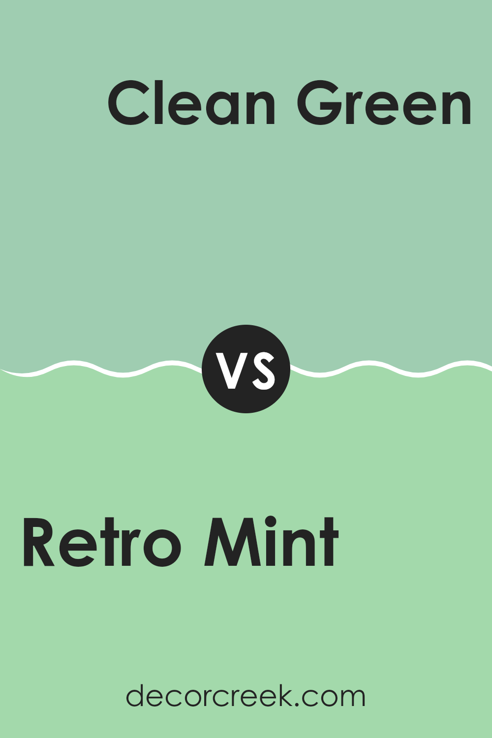
Retro Mint SW 9036 by Sherwin Williams vs Clean Green SW 6933 by Sherwin Williams
Retro Mint and Clean Green by Sherwin Williams are two distinct shades. Retro Mint is a softer, more subdued color with a slightly muted tone that gives a calm and friendly vibe to a room. Its subtle hue makes it ideal for spaces meant to feel relaxed and inviting.
In contrast, Clean Green is a bolder and brighter color. It stands out more vibrantly, which can energize a space and make it feel lively and playful. This makes Clean Green perfect for areas where you want to inject some vitality and fun.
Whether you choose Retro Mint for its gentle appeal or Clean Green for its lively punch, both colors offer unique atmospheres and can greatly influence the mood and style of a space.
You can see recommended paint color below:
- SW 6933 Clean Green
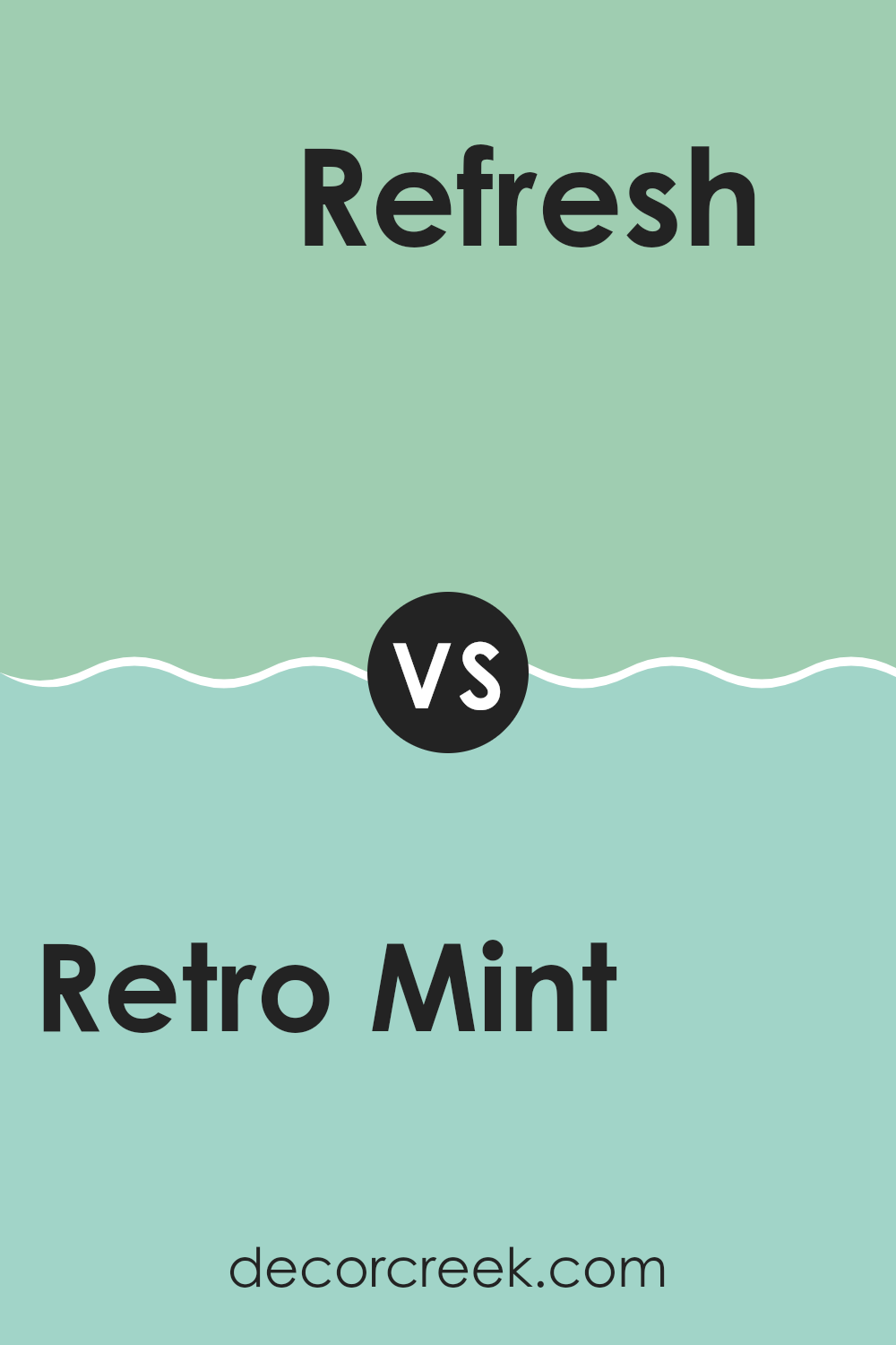
Retro Mint SW 9036 by Sherwin Williams vs Refresh SW 6751 by Sherwin Williams
Retro Mint and Refresh by Sherwin Williams are both refreshing shades of green but each has its unique vibe. Retro Mint has a softer, more muted tone which gives it a vintage feel.
It leans slightly towards a pastel, making it ideal for creating a gentle and cozy atmosphere in spaces like living rooms or bedrooms. On the other hand, Refresh is a brighter, more vibrant color. It has a more lively and energetic quality to it, perfect for injecting some cheerfulness into a space like a kitchen or a study.
While Retro Mint might be seen as more relaxing due to its subdued nature, Refresh stands out for its ability to add a pop of brightness. Both colors could complement a modern home well, each bringing its distinct personality to interiors.
You can see recommended paint color below:
- SW 6751 Refresh
Retro Mint SW 9036 by Sherwin Williams vs Kiwi SW 6737 by Sherwin Williams
Retro Mint and Kiwi by Sherwin Williams are two distinct shades of green, each with its unique vibe. Retro Mint is a soft, subdued green with a hint of gray. It adds a gentle freshness to spaces without overwhelming them, making it ideal for creating a calm, relaxing atmosphere in rooms such as bedrooms or bathrooms.
On the other hand, Kiwi is a vibrant, energetic green. It’s brighter and has a more youthful feel compared to Retro Mint. This makes Kiwi perfect for areas where you want to inject some liveliness, like a kitchen or a children’s playroom.
Overall, the choice between Retro Mint and Kiwi depends on the mood you want to set in your space. If you’re going for a more laid-back and neutral environment, Retro Mint is the way to go. For adding a pop of fun and vitality, Kiwi is the better option. Both colors offer freshness but in distinctly different tones and moods.
You can see recommended paint color below:
- SW 6737 Kiwi
Retro Mint SW 9036 by Sherwin Williams vs Green Jewel SW 6985 by Sherwin Williams
Retro Mint and Green Jewel, both from Sherwin Williams, offer distinct vibes for any space. Retro Mint is a light, fresh green with a subtle vibrancy that can make a room feel airy and bright. It’s the kind of color that works well in a kitchen or bathroom, giving a clean and refreshing look without overwhelming the senses.
On the other hand, Green Jewel is a much deeper and vivid shade of green. It has a boldness to it that can make a strong statement in a space. This color is perfect for an accent wall or in an area where you want to add a dash of drama and flair. Due to its richness, Green Jewel can also bring a sense of warmth to a room, making it a great choice for living areas or reading nooks.
Both colors bring their unique character to a space, with Retro Mint leaning towards light and breezy, and Green Jewel standing out as bold and dynamic.
You can see recommended paint color below:
- SW 6985 Green Jewel
Retro Mint SW 9036 by Sherwin Williams vs Lark Green SW 6745 by Sherwin Williams
Retro Mint and Lark Green by Sherwin Williams are two distinct shades that bring their unique flair to spaces. Retro Mint is a soft, pastel green that feels light and airy. It creates a refreshing atmosphere in a room, making it perfect for spaces where you want a calm, gentle vibe. This color has a hint of blue, which adds a cool touch to its appearance.
On the other hand, Lark Green is a much deeper and vivid shade of green. It’s bolder and can make more of a statement in a room. Its rich hue is great for adding a touch of drama and liveliness to a space without overwhelming it. Lark Green works well in areas that can benefit from a splash of color, such as an accent wall or a well-lit kitchen.
Both colors offer a way to freshen up your environment, but the choice between a subtle pastel and a vibrant green depends on the mood and style you’re aiming for in your space.
You can see recommended paint color below:
- SW 6745 Lark Green
Retro Mint SW 9036 by Sherwin Williams vs Vegan SW 6738 by Sherwin Williams
Retro Mint and Vegan are two distinct shades by Sherwin Williams. Retro Mint has a fresh, light mint green color that adds a breezy and contemporary feel to any space. It’s subtle enough not to overpower, but it can certainly brighten up a room and make it feel more airy.
On the other hand, Vegan is a bolder, more saturated shade of green. It leans towards a vibrant, leafy tone, which can infuse a space with energy and a sense of nature. This color is perfect for those who want to make a strong statement or add a punch of vitality to their environment.
Both colors work well in spaces that crave a touch of green, but the choice between them depends on the desired impact. Retro Mint is suitable for a softer, lighter look, while Vegan is ideal for creating more lively and dynamic spaces.
You can see recommended paint color below:
- SW 6738 Vegan
Retro Mint SW 9036 by Sherwin Williams vs Relish SW 6443 by Sherwin Williams
Retro Mint and Relish by Sherwin Williams are two very distinct colors that each bring their own unique vibe to a space. Retro Mint is a soft, subdued green with a hint of gray that gives it a soothing and light feel. This color is perfect for creating a calm, peaceful atmosphere in any room. It’s great for spaces where you want to relax, such as bedrooms or living areas.
On the other hand, Relish is a vibrant, rich green that packs a punch. This color is much bolder and stands out more compared to Retro Mint. Relish works well in spaces where you want to add energy and draw attention, like in an accent wall or in a creative space where you need inspiration.
In summary, if you’re looking for a gentle, calming green, Retro Mint is the way to go. If you prefer something that makes more of a statement and infuses vitality, Relish is your go-to shade. Both colors offer fresh takes on green, but with markedly different impacts.
You can see recommended paint color below:
Retro Mint SW 9036 by Sherwin Williams vs Aquastone SW 9043 by Sherwin Williams
Retro Mint and Aquastone are two paint colors from Sherwin Williams, both offering a fresh, appealing look. Retro Mint is a light, soft green with a gentle, inviting feel. It’s the kind of color that brightens up a space without overpowering it, making rooms feel clean and lively. Think of it as a subtle hint of nature’s vibrant greens, perfect for creating a calm but cheerful atmosphere.
On the other hand, Aquastone is a slightly deeper shade that leans towards a more bluish-green hue. This color adds a bit more depth to walls, being vibrant enough to stand out, yet still retains a refreshing vibe. It’s ideal for someone wanting to add a touch of color that feels both soothing and energetic.
Both these colors are great for bringing a light and airy feel to any room, but they offer slightly different moods. Retro Mint suits spaces that benefit from a softer, more understated charm, while Aquastone is perfect for making a bit more of a statement while keeping things cool and refreshing.
You can see recommended paint color below:
- SW 9043 Aquastone
Retro Mint SW 9036 by Sherwin Williams vs Reclining Green SW 6744 by Sherwin Williams
Retro Mint and Reclining Green are both green shades by Sherwin Williams. However, Retro Mint is a more muted tone that leans towards a soft, pastel-like green, offering a subtle and calming presence. It’s great for anyone looking to add a gentle splash of color without overwhelming a space.
Reclining Green, on the other hand, is much bolder and vibrant. It presents a lively and bright shade of green that can instantly perk up any room. This makes it a perfect choice for areas where you want to inject some energy and cheer, like a kitchen or a playroom.
In summary, while both colors are green, Retro Mint provides a more understated and gentle hue, ideal for peaceful and quiet areas. Reclining Green is more suited for spaces where a bright, enthusiastic atmosphere is desired.
You can see recommended paint color below:
- SW 6744 Reclining Green
Retro Mint SW 9036 by Sherwin Williams vs Aloe SW 6464 by Sherwin Williams
Retro Mint and Aloe by Sherwin Williams are two distinct yet subtly harmonious shades of green. Both colors bring their unique charm to any space, offering freshness and calmness to the environment. Retro Mint is lighter, infused with a gentle, almost nostalgic vibe, perfect for achieving a quaint and cheerful ambiance. Its freshness can brighten up small spaces and adds a soothing touch to busy areas of the home.
On the other hand, Aloe is slightly deeper and richer, making it ideal for creating a cozy and welcoming atmosphere. It has the ability to add a touch of nature-inspired calmness and is versatile enough to blend well with both light and dark accents. It works particularly well in spaces that demand a bit more depth and grounding.
In summary, while Retro Mint lights up a room with its subtle vibrancy and retro flair, Aloe offers a deeper connect to nature with its richer tone. Both colors can beautifully transform a space depending on the desired effect, whether it’s airy and light or warm and grounding.
You can see recommended paint color below:
In conclusion, SW 9036 Retro Mint by Sherwin Williams is a really neat paint color that can make any room look fresh and cool, like a minty breath of air on a hot day. I think it’s perfect if you want to give your room a cheerful boost without making it too bright.
It works well in bathrooms and kitchens because it has a clean and lively feel, but it could also be a great choice for a bedroom where you want to relax. It’s fun to think how this one color, Retro Mint, can change the mood of a room with just a few strokes of a brush.
Plus, it’s not too bold or too dull, which makes it just right for anyone looking to add a little bit of uniqueness to their home without going too crazy.
I’m glad I got to share about it, and I hope it helps you imagine how it might look in your own home!
Ever wished paint sampling was as easy as sticking a sticker? Guess what? Now it is! Discover Samplize's unique Peel & Stick samples.
Get paint samples

