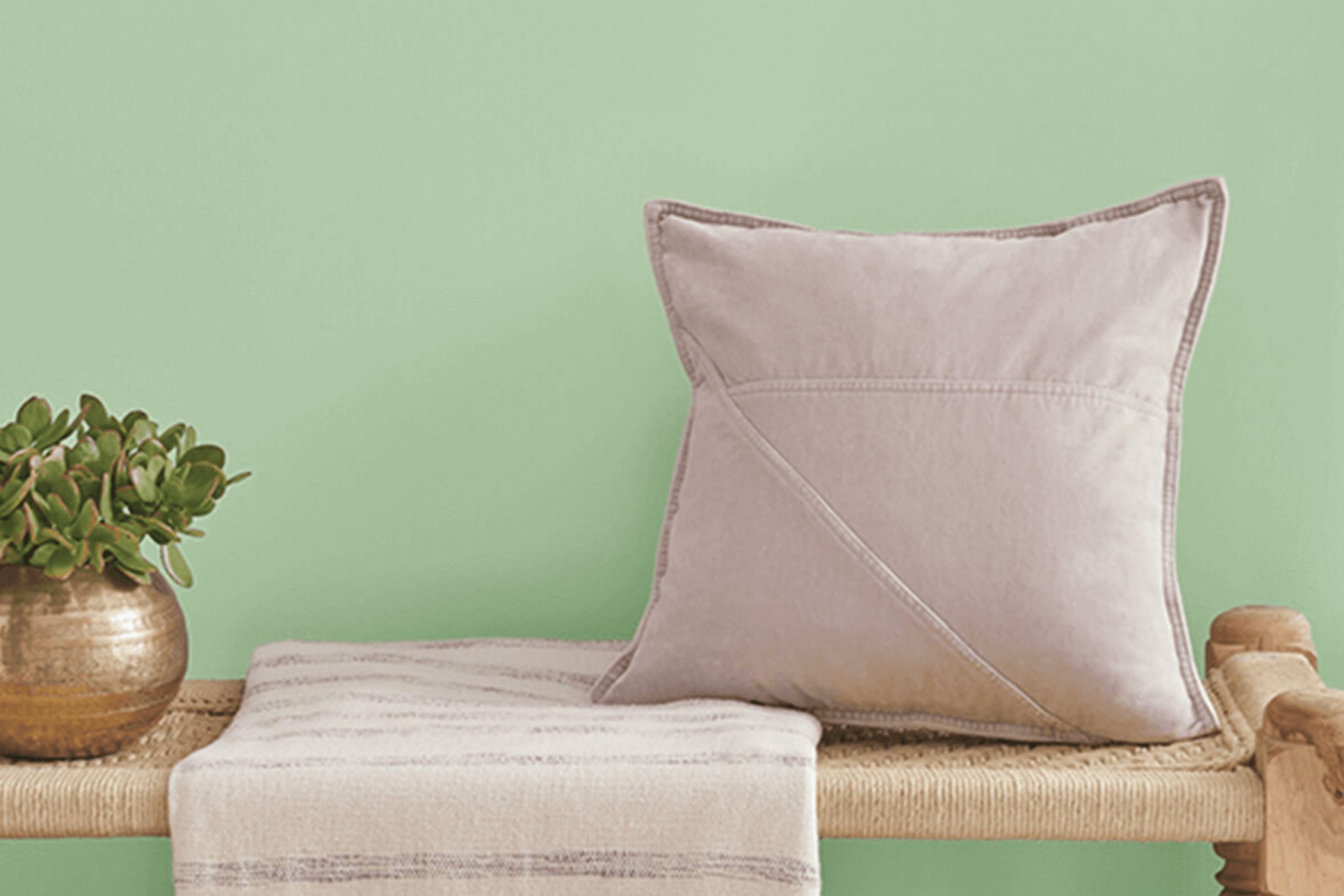
As you research the perfect shade of green paint for your next project, you might come across SW 6443 Relish by Sherwin Williams. A unique blend of vibrancy and depth, Relish stands out with its rich, leafy tones that can add personality to any space. Using Relish, you instantly infuse energy into a room without overwhelming it with boldness typical of more traditional greens.
This shade works wonders in spaces that demand a touch of nature’s calm while still aiming for a modern feel. Whether you’re looking to refresh your kitchen, add some flair to your living room, or create a welcoming atmosphere in your entryway, Relish offers a versatile palette base.
Its ability to complement both rustic and contemporary decor makes it a go-to choice for many. The richness of Relish also means it pairs beautifully with a wide range of colors, extending your creative possibilities.
As you plan your design, consider how natural light interacts with this color in your chosen space to fully take advantage of its dynamic character.
What Color Is Relish SW 6443 by Sherwin Williams?
Relish by Sherwin Williams is a vibrant green hue that adds a fresh and lively touch to any space. This color leans towards a deep, leafy green, making it an excellent choice for those who want to introduce a natural, earthy element into their home. As a natural yet bold color, it draws inspiration from the outdoors, providing a grounding atmosphere to rooms.
The rich green color works remarkably well in various interior styles, especially in rustic, bohemian, and modern spaces. In a rustic setting, Relish pairs beautifully with raw materials like wood, leather, and woven textiles, enhancing the cozy, homey feel of the room.
For a bohemian look, it combines well with vibrant patterns and eclectic decorations, adding depth and intensity to the lively mix of colors and textures. In modern interiors, this green can be used as an accent wall to provide a pop of color amongst minimalistic, clean lines.
Material-wise, Relish pairs well with natural elements such as wood, stone, and clay, highlighting their organic beauty. Texturally, it complements both matte and glossy finishes which allows for flexibility in designing with metals or glass to create a more dynamic space. This versatile color breathes life into any room, making it feel more connected with nature while maintaining a stylish, updated look.
Is Relish SW 6443 by Sherwin Williams Warm or Cool color?
Relish SW 6443, a color by Sherwin Williams, is a vibrant and fresh shade of green. This bright hue adds a lively touch to any room, making spaces feel cheerful and full of energy. It works particularly well in kitchens and dining areas where its freshness can enhance the feeling of cleanliness and vivacity, encouraging a welcoming atmosphere for cooking and eating.
In living areas or bedrooms, this shade helps to bring a sense of nature and freshness indoors, which can be especially nice in urban environments or during colder months when outdoor greenery is sparse. It’s a great choice for adding a pop of color to a room without overwhelming it, especially when used on a feature wall or through decorative accents like cushions or vases.
Relish is also versatile enough to pair with a wide range of decor styles and colors. Whether combined with bright whites for a crisp look, or neutral browns and grays for a balanced feel, this color remains appealing and functional.
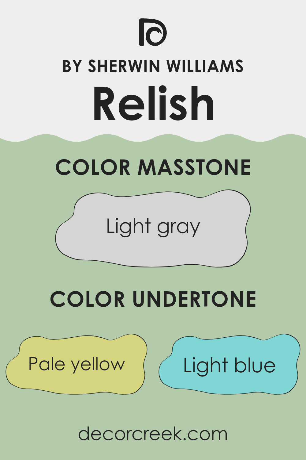
Undertones of Relish SW 6443 by Sherwin Williams
Relish, a unique shade of green, carries hints of various subtle undertones like pale yellow, light blue, mint, light purple, pale pink, grey, and lilac. These undertones play a vital role in how the color appears under different lighting conditions and when paired with various decor elements. For example, in a room with ample natural light, the pale yellow and light blue undertones may make the color appear brighter and more vibrant. Meanwhile, in dimmer lighting, grey and lilac tones could give it a more muted and subdued look.
In interior design, undertones can significantly influence the atmosphere of a room. When used on interior walls, the undertones of this particular green can create varied effects depending on the room’s other colors and lighting conditions. For instance, when paired with cool-toned furnishings, the mint and light blue undertones could make the room feel more cohesive and refreshing. However, when matched with warmer colors, the pale yellow and pale pink undertones might come to the forefront, fostering a welcoming, gentle ambiance.
Overall, this green’s complexity allows for flexibility in design choices, presenting different faces in response to its environment. Recognizing and considering these undertones is crucial when choosing color schemes for decorating, as they help ensure the chosen paint complements a room’s overall aesthetic.
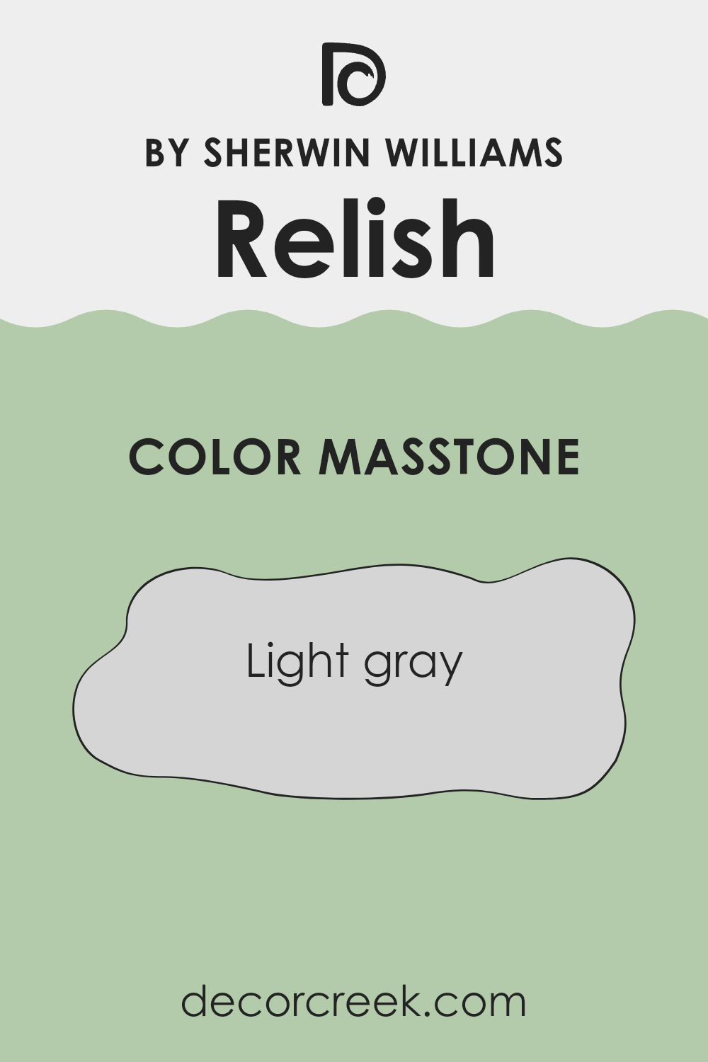
What is the Masstone of the Relish SW 6443 by Sherwin Williams?
RelishSW 6443 by Sherwin Williams has a light gray masstone, a color tone that is incredibly flexible for home decorating. This shade of gray, which is gentle on the eyes, works well in almost any space because it doesn’t overpower other colors. Instead, it provides a neutral background that allows other decor elements such as furniture, artwork, and fabrics to stand out.
In living areas, this light gray creates a calm and welcoming environment. It’s great for bedrooms too, as its neutrality promotes a restful atmosphere. In busier areas like kitchens and bathrooms, this color remains practical, as it tends to hide minor smudges and splashes better than a pure white.
Overall, this shade’s lightness brings a fresh feeling to spaces while giving homeowners the flexibility to pair it with both bold and pastel accents. This adaptability makes RelishSW 6443 a popular choice for those looking to refresh their home without committing to strong or niche colors.
How Does Lighting Affect Relish SW 6443 by Sherwin Williams?
Lighting plays a crucial role in how we perceive colors, significantly impacting their appearance in different settings. This effect is vital to consider when choosing paint, such as the Sherwin Williams color coded SW 6443, a vibrant shade of green.
In artificial lighting, the type of bulb used can change how this color is seen. For instance, LED or fluorescent lights can bring out the brightness in the green, making it appear more vivid and lively. In contrast, incandescent lighting can warm it up slightly, giving it a softer feel.
Natural light, on the other hand, shifts throughout the day and affects how we see this green. In the morning light, it might look crisp and bright, while during a sunset, it might take on a more muted tone. The quality and direction of natural light also matter significantly depending on the room orientation:
- North-Faced Rooms: These rooms receive less direct sunlight, which can make colors appear cooler and slightly more muted. In north-facing rooms, SW 6443 might appear a bit darker and less vibrant.
- South-Faced Rooms: These rooms benefit from ample sunlight for most of the day. Here, the green can truly pop, displaying its full brightness and vibrancy, and maintaining a lively look throughout the day.
- East-Faced Rooms: With sunlight in the morning, east-facing rooms can make this green look very bright and fresh in the morning, gradually fading in intensity as the day progresses.
- West-Faced Rooms: Receiving intense evening light, the color in west-faced rooms can appear warm and glowing in the afternoon and evening, possibly showing more depth.
Understanding how lighting impacts colors can help in choosing the right paint for a room, ensuring you get the desired effect regardless of the lighting conditions.
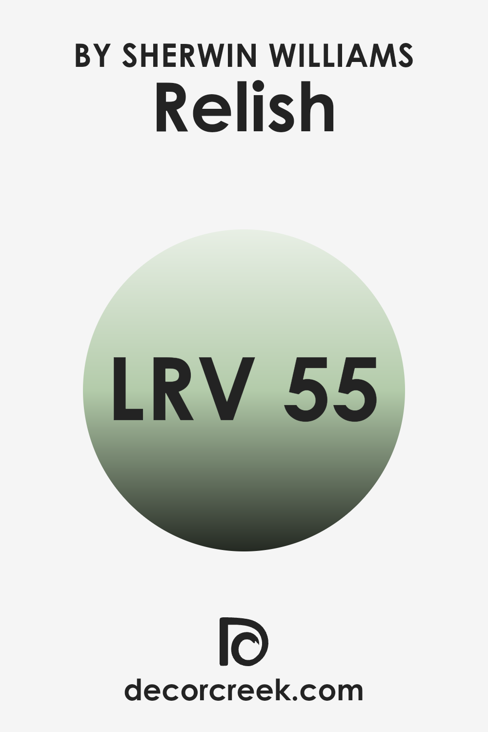
What is the LRV of Relish SW 6443 by Sherwin Williams?
LRV stands for Light Reflectance Value, which measures the percentage of light a paint color reflects back into a room compared to how much it absorbs. LRV values range from 1 to 99, with lower numbers reflecting less light and appearing darker, while higher values reflect more light and tend to appear brighter.
This measurement is useful when choosing paint colors because it helps you understand how light or dark a color will look on your walls, affecting the overall feel of a room. A color with a high LRV can make a small room feel more open and airy, while a color with a low LRV might make a large room feel cozier and more intimate.
The LRV of 55.214 for the paint color we’re discussing suggests that it’s at the midpoint of light reflection, making it neither too bright nor too dark. It will reflect a moderate amount of light, which can be beneficial in spaces that don’t receive a lot of natural sunlight, helping to make the space feel illuminated without the need for excessive artificial lighting.
This balanced LRV makes it a versatile choice, capable of complementing various room sizes and styles without overpowering with brightness or feeling too heavy. In practical terms, this means the color can adapt well to many settings, providing a pleasant visual balance that enhances the room’s aesthetic without dominating it.
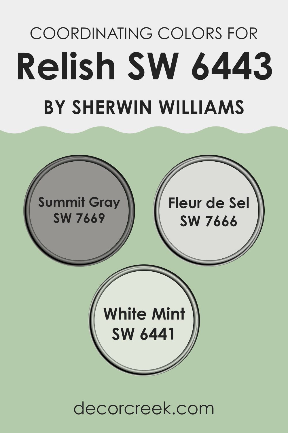
Coordinating Colors of Relish SW 6443 by Sherwin Williams
Coordinating colors are hues that complement or enhance each other when used together in a space. The idea is to create a harmonious color palette that brings balance and cohesion to a room. The colors selected as coordinating options for a specific base color should either contrast with or subtly enhance it, depending on the desired effect. When selecting coordinating colors, it’s essential to consider how they interact with each other and the feelings or atmosphere they create in a space.
Relish by Sherwin Williams pairs splendidly with colors like Summit Gray, Fleur de Sel, and White Mint. Summit Gray is a deep, distinguished gray that offers a grounded contrast to the vibrant green of Relish, ideal for creating a balanced and visually appealing space.
Fleur de Sel is a soft, airy gray with a delicate hint of warmth, perfect for infusing a light and breezy feel into a room when used alongside more pronounced hues. White Mint is a gentle, very pale green that provides a subtle whisper of color, enhancing spaces with a bright and fresh vibe. These choices offer a range of possibilities, from significant contrast to gentle enhancement, allowing for customization of the room’s overall feel.
You can see recommended paint colors below:
- SW 7669 Summit Gray
- SW 7666 Fleur de Sel
- SW 6441 White Mint
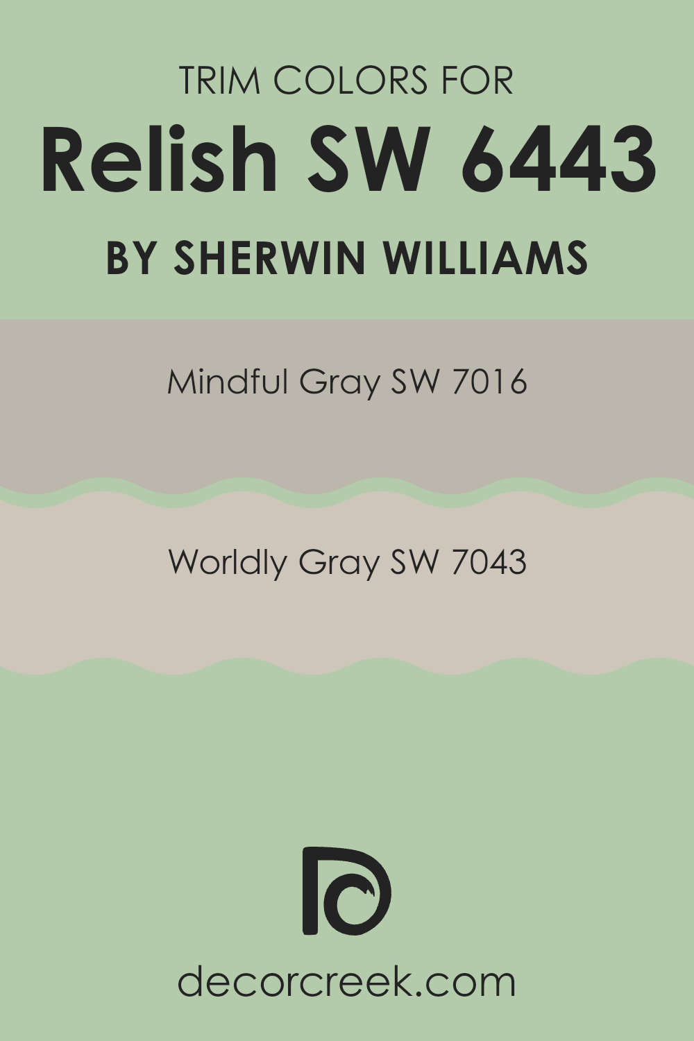
What are the Trim colors of Relish SW 6443 by Sherwin Williams?
Trim colors refer to the hues used for the architectural details and accents of a room, such as baseboards, moldings, window and door frames. These colors are crucial in defining the visual boundaries in a space and enhancing the overall aesthetic appeal. For Relish SW 6443 by Sherwin Williams, a vibrant green shade, choosing the right trim colors is essential to create a balanced look. Using softer neutral colors like SW 7016 – Mindful Gray and SW 7043 – Worldly Gray as trim provides a subtle contrast that allows the boldness of Relish to stand out, while maintaining a harmonious atmosphere within the room.
Mindful Gray SW 7016 is a warm gray that exudes a natural calmness, making it an excellent choice for trim as it softly outlines green walls without causing a harsh contrast. It blends well with many different color palettes, supporting the vibrant Relish without overpowering it.
Worldly Gray SW 7043, on the other hand, is a bit deeper and cooler than Mindful Gray. This color offers a slightly more pronounced frame for Relish, enriching the green’s intensity and adding depth to the space. Both these shades of gray work well to subtly enhance the room’s dimensions and highlight its architectural features.
You can see recommended paint colors below:
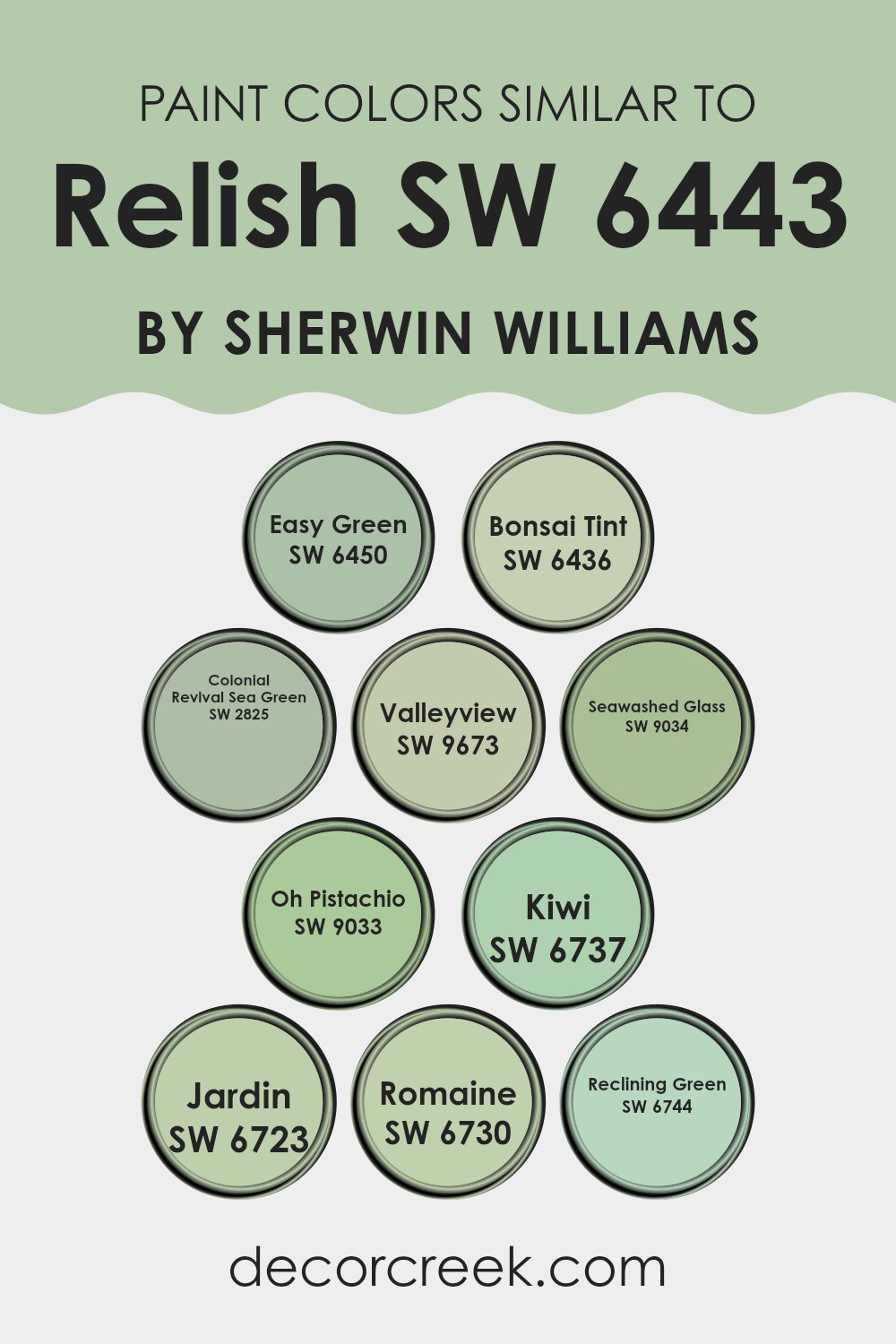
Colors Similar to Relish SW 6443 by Sherwin Williams
Similar colors play a crucial role in design by creating a harmonious and cohesive atmosphere. For instance, when decorating a space around a specific shade like green, incorporating shades that can blend well while adding subtle variety enhances the overall aesthetic without overpowering the senses. Similar colors to a particular shade, like Relish by Sherwin Williams, provide opportunities to subtly differentiate spaces within the same environment, create visual depth, or highlight architectural features subtly without clashing.
Among the similar colors to Relish by Sherwin Williams, Easy Green is a fresh and lively option that injects a sprightly energy into spaces that crave a touch of youthful vibes. Bonsai Tint, another shade, offers a more muted, gentle green that works well in areas where a calmer feel is desired.
Colonial Revival Sea Green brings a classic touch with its slightly more subdued and traditional tone, ideal for elegant spaces. Valleyview has an earthy deepness to it, great for grounding designs or adding weight to lighter palettes. Seawashed Glass projects a light, airy feel, perfect for creating a breezy, open atmosphere.
Oh Pistachio is playful and light, suitable for injecting vibrancy into playful spaces. Kiwi is a bright, striking green that can act as a focal point or accent. Jardin pulls in a more mysterious, deep hue that enriches spaces with a touch of drama. Romaine is fresh and vibrant, mirroring the natural look of green leafy vegetables, encouraging a lively ambiance.
Lastly, Reclining Green is soft and soothing, great for areas meant for relaxation and quiet reflection. All these shades, while maintaining their unique characteristics, complement and enhance each other when used thoughtfully throughout a design scheme.
You can see recommended paint colors below:
- SW 6450 Easy Green
- SW 6436 Bonsai Tint
- SW 2825 Colonial Revival Sea Green
- SW 9673 Valleyview
- SW 9034 Seawashed Glass
- SW 9033 Oh Pistachio
- SW 6737 Kiwi
- SW 6723 Jardin
- SW 6730 Romaine
- SW 6744 Reclining Green
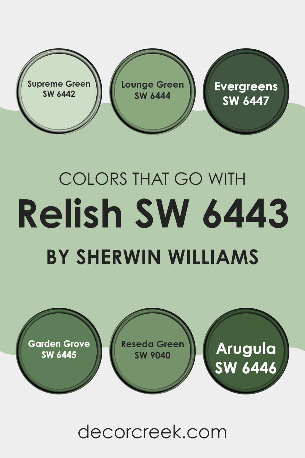
Colors that Go With Relish SW 6443 by Sherwin Williams
Choosing complementing colors for Relish SW 6443 by Sherwin Williams is crucial for creating a harmonious and visually appealing space. These colors such as Supreme Green, Lounge Green, Evergreens, Garden Grove, Reseda Green, and Arugula each add a unique touch while maintaining a coherent look. They work effectively by either providing a subtle contrast or enhancing the vibrancy when paired with Relish, ensuring that the environment remains balanced and inviting.
For instance, a color like Supreme Green offers a slightly darker shade that can be used to provide depth to a room, making it ideal for accent walls or furniture pieces. Similarly, Lounge Green presents a muted tone, perfect for creating a calming backdrop that complements the brighter or darker tones of other furnishings.
Evergreens introduce a robust and lively green that injects vibrancy into spaces, perfect for accent pieces or textile decorations that want to stand out. On the other hand, Garden Grove provides a lighter, refreshing hint of green which can brighten up spaces and bring a fresh feel. Reseda Green, with its subtle, understated tone, works well in areas that demand a less intense color presence, helping to maintain a balanced color scheme without overwhelming the senses.
Lastly, Arugula offers a lively, refreshing take that can instantly perk up any space, making it great for accessories or areas where a splash of energy is desired. By effectively pairing these colors with Relish SW 6443, you can create a cohesive and pleasing aesthetic in your home.
You can see recommended paint colors below:
- SW 6442 Supreme Green
- SW 6444 Lounge Green
- SW 6447 Evergreens
- SW 6445 Garden Grove
- SW 9040 Reseda Green
- SW 6446 Arugula
How to Use Relish SW 6443 by Sherwin Williams In Your Home?
Relish SW 6443 by Sherwin Williams is a vibrant green paint color that can add a lively touch to any room. This bright shade works well if you want to inject some energy and freshness into your space. For example, painting an accent wall with Relish can make your living room or bedroom pop.
This color also pairs nicely with natural elements like wooden furniture or house plants, enhancing the overall feeling of liveliness in your home. If you’re someone who enjoys a bit of boldness in decor, you might consider using Relish in your kitchen or dining area.
The color can liven up cabinets or a kitchen island, making the space feel inviting and fun. Additionally, in smaller areas like a bathroom or hallway, using Relish can give the illusion of a larger, more open space. Overall, Relish SW 6443 is perfect for anyone looking to add a splash of color and freshness to their home.
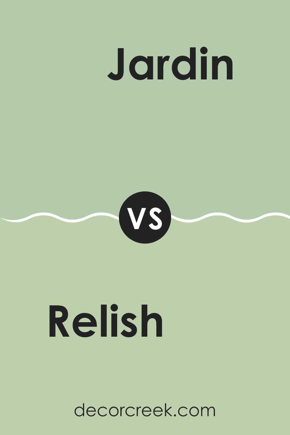
Relish SW 6443 by Sherwin Williams vs Jardin SW 6723 by Sherwin Williams
Relish SW 6443 and Jardin SW 6723 are two vibrant green hues from Sherwin Williams. Relish is a darker, more intense green. It resembles the lush, deep tones found in a forest, making it a great choice for creating a cozy and inviting space.
On the other hand, Jardin is lighter and has a fresher look. It mirrors the cheerful vibrancy of a garden in spring, ideal for brightening up a room and adding a lively touch. While both colors can refresh any space, Relish offers a feeling of warmth and security, suitable for areas where a calming yet rich atmosphere is desired, like in a study or living room.
Jardin, with its lighter and brighter feel, is perfect for kitchens, bathrooms, or other areas where a clean, energetic environment is preferred. Both colors work well with natural materials and can complement a variety of decor styles, from rustic to modern.
You can see recommended paint color below:
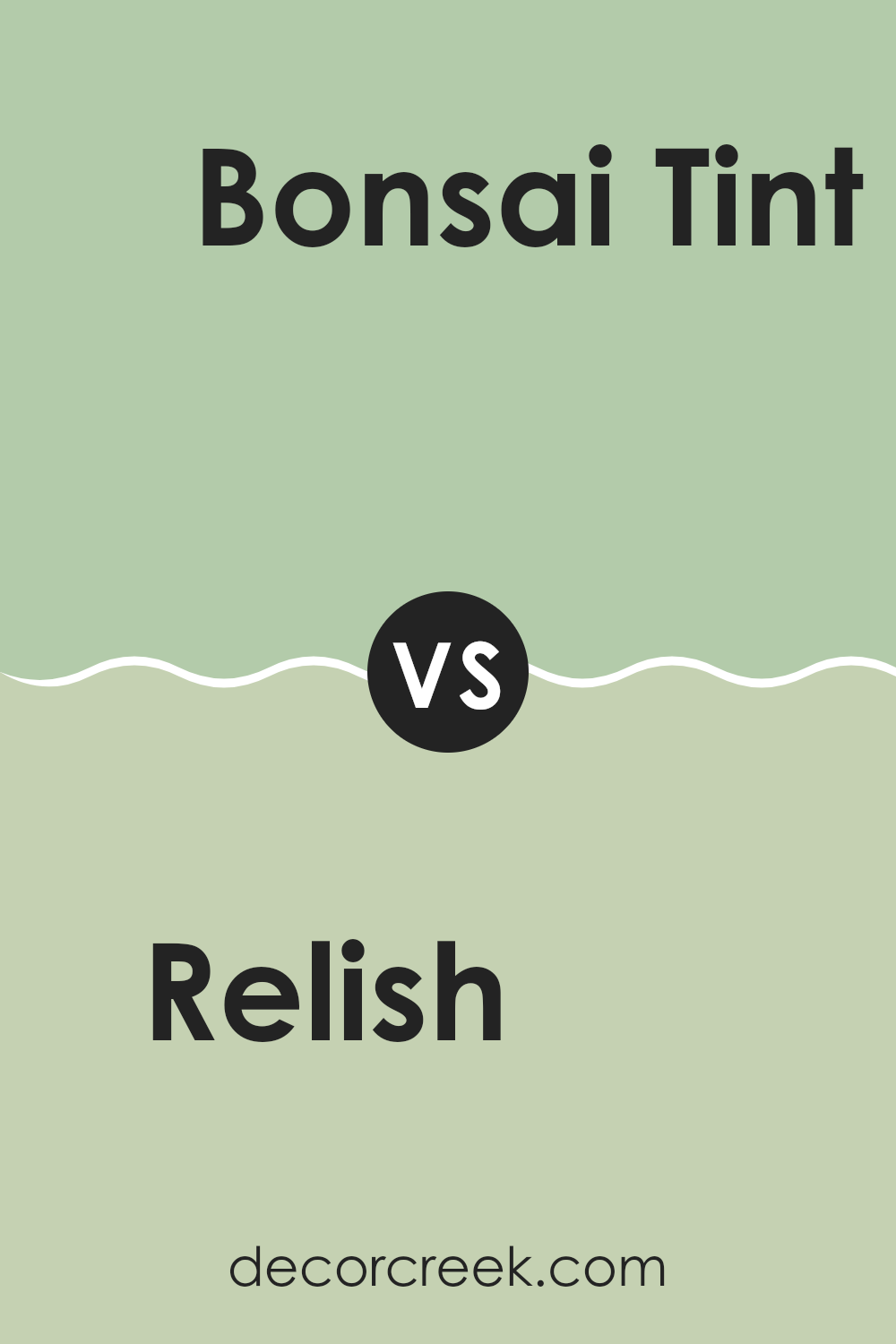
Relish SW 6443 by Sherwin Williams vs Bonsai Tint SW 6436 by Sherwin Williams
Relish SW 6443 and Bonsai Tint SW 6436 by Sherwin Williams are two distinct green hues. Relish is a deeper, more vibrant green that brings a lively and energetic feel to any space. It stands out more and can make a strong statement whether used on an accent wall or for a whole room.
On the other hand, Bonsai Tint is lighter and softer. This color is more subtle and can work beautifully in rooms where you want a hint of color without overwhelming the senses. It creates a relaxed atmosphere, making it perfect for spaces where you want to feel calm, like bedrooms or bathrooms.
When comparing both, Relish is more likely to draw the eye and set a distinct mood, while Bonsai Tint is better for adding a gentle touch of nature’s peacefulness to your surroundings. Each color offers unique possibilities depending on what feeling you want to achieve in your decorating project.
You can see recommended paint color below:
Relish SW 6443 by Sherwin Williams vs Valleyview SW 9673 by Sherwin Williams
Relish SW 6443 and Valleyview SW 9673 are two unique colors from Sherwin Williams. Relish is a deep, rich green that might remind you of a dense forest. It’s perfect for creating a cozy and inviting atmosphere. It lends a strong sense of nature and can make a bold statement in a room.
On the other hand, Valleyview is a light beige color that brings a soft and neutral look to spaces. This shade is incredibly versatile and works well in many settings, providing a calm, clean backdrop that pairs easily with other colors.
While Relish sets a mood with its intensity, Valleyview offers a subtle, laid-back vibe. Both colors serve different purposes and can dramatically change the feel of a room depending on how they are used.
You can see recommended paint color below:
Relish SW 6443 by Sherwin Williams vs Kiwi SW 6737 by Sherwin Williams
Relish SW 6443 by Sherwin-Williams is a deep, rich green that carries a strong sense of elegance and traditional style. It is a green that leans towards the darker side, making it a good choice for spaces where you want to create a cozy and somewhat formal atmosphere. It pairs well with natural wood tones and can make white trim really pop.
On the other hand, Kiwi SW 6737, also by Sherwin-Williams, is a bright, vibrant green. It’s much lighter compared to Relish and brings a lively, energetic feel to any room. This shade is perfect for areas where you want to add a cheerful touch and is especially effective in spaces that could use a burst of brightness, like a kitchen or a child’s playroom.
In summary, while both greens, Relish is darker and more reserved, lending itself well to traditional décor, whereas Kiwi is lively and fun, ideal for creating a bright and inviting space.
You can see recommended paint color below:
- SW 6737 Kiwi
Relish SW 6443 by Sherwin Williams vs Easy Green SW 6450 by Sherwin Williams
Relish SW 6443 and Easy Green SW 6450 by Sherwin Williams are two distinct shades of green that offer unique vibes for different spaces. Relish is a deeper, more intense green, resembling the rich color of forest foliage. This shade is ideal for creating a cozy, inviting atmosphere in a space, working well in areas like dining rooms or studies where its depth can make the room feel more grounded.
On the other hand, Easy Green is a lighter, more vibrant shade. It has a fresh, lively feel that can brighten up a space significantly. This color is perfect for places like kitchens or sunrooms, where its cheerful brightness can energize the room.
While both colors share a green base, their intensities and tones set them apart, offering varied options for different decorating styles and preferences. Whether looking for something bold and cozy or light and cheerful, these colors cater to a wide range of tastes.
You can see recommended paint color below:
Relish SW 6443 by Sherwin Williams vs Romaine SW 6730 by Sherwin Williams
Relish SW 6443 by Sherwin Williams is a rich, deep green that has a vibrant and lively feel. It’s the kind of color that stands out in a room, bringing a fresh and energizing atmosphere. It’s perfect for adding a bold statement to spaces like living rooms or dining areas where a splash of color can really liven up the environment.
On the other hand, Romaine SW 6730 by Sherwin Williams has a lighter and more subdued shade of green. It leans towards a more natural green, giving a calm and soothing effect that works well in areas where you want to relax, such as bedrooms or bathrooms. It’s less intense than Relish, making it easier to pair with a variety of decors and styles.
Both colors share a base of green, but their different tones can influence the mood and style of a room quite differently. Relish, with its deeper hue, commands attention and adds energy, while Romaine offers a gentle touch and a more laid-back vibe.
You can see recommended paint color below:
- SW 6730 Romaine
Relish SW 6443 by Sherwin Williams vs Seawashed Glass SW 9034 by Sherwin Williams
Relish SW 6443, by Sherwin Williams, is a rich, vibrant green that brings a bold pop of color to any space. It has a deep, slightly jewel-toned quality that makes it stand out. This color is perfect for adding some energy to a room or as an accent wall, giving the space a lively and dynamic feel.
On the other hand, Seawashed Glass SW 9034 is a much lighter and subdued shade. It’s a soft green with hints of blue, creating a calm and refreshing vibe. This color works well in areas where you want to promote a relaxed atmosphere, like bathrooms or bedrooms.
When comparing the two, Relish is definitely more eye-catching with its deeper, more pronounced hue. Seawashed Glass, in contrast, offers a gentler approach with its muted tones. Both colors can effectively enhance a room but serve different moods and functions.
You can see recommended paint color below:
- SW 9034 Seawashed Glass
Relish SW 6443 by Sherwin Williams vs Oh Pistachio SW 9033 by Sherwin Williams
Relish SW 6443 by Sherwin Williams is a rich, deep green that has a vibrancy which can add a lot of character to a space. It’s bold and has a certain warmth to it, which makes it great for areas where you want to add a splash of nature-inspired color.
On the other hand, Oh Pistachio SW 9033 also by Sherwin Williams, is a much lighter and softer green. It gives off a fresh and gentle feel, making it ideal for creating a light and airy atmosphere.
This shade can be particularly good in smaller rooms or spaces where you want to enhance the sense of space without overwhelming it with too strong a color. While Relish brings depth and intensity, Oh Pistachio offers a subtle and soothing presence, making each ideal for different purposes in home decor.
You can see recommended paint color below:
- SW 9033 Oh Pistachio
Relish SW 6443 by Sherwin Williams vs Colonial Revival Sea Green SW 2825 by Sherwin Williams
Relish SW 6443 and Colonial Revival Sea Green SW 2825 by Sherwin Williams are two distinct shades that can create different moods and styles in a space. Relish is a deep, vibrant green that’s bold and can make a strong statement in a room. It could be perfect for an accent wall or to bring a pop of color to a muted space, adding a cheerful touch to the atmosphere.
On the other hand, Colonial Revival Sea Green is a much lighter and subdued shade. This pale green has a hint of gray, giving it a more reserved and subtle look compared to Relish. It’s ideal for a calm, soft background in a room, providing a gentle splash of color without overwhelming the senses. It might be well-suited for bedrooms or bathrooms where a light and airy feeling is desired.
Both colors offer unique possibilities but cater to different tastes and room functionalities. Whether you prefer the lively touch of Relish or the gentle tone of Colonial Revival Sea Green, each brings its own character to your space.
You can see recommended paint color below:
- SW 2825 Colonial Revival Sea Green
Relish SW 6443 by Sherwin Williams vs Reclining Green SW 6744 by Sherwin Williams
Relish SW 6443 and Reclining Green SW 6744 are two distinct shades from Sherwin Williams that bring unique vibes to any space. Relish is a deeper, more subdued green that provides a grounding, earthy feel, perfect for creating a cozy and inviting atmosphere. It works well in settings where you want a touch of nature without overwhelming brightness.
On the other hand, Reclining Green is much brighter and more vibrant. Its lively hue injects energy into a room, making it a great choice for areas where you want to add a splash of cheerfulness and freshness. This color can help liven up spaces that feel too dull or are lacking in natural light.
Both colors offer great ways to bring the outdoors into your home, with Relish leaning towards a more muted, natural look and Reclining Green offering a punchier, more energized vibe. Depending on your room’s needs and your personal style, either color can create a beautiful, green backdrop.
You can see recommended paint color below:
- SW 6744 Reclining Green
In conclusion, SW 6443 Relish by Sherwin Williams is a beautiful shade of green that can make any room feel lively and fresh. After trying it in my own home, I definitely think it brings a touch of nature indoors, making spaces feel more vibrant and cozy.
Whether it’s used on a small accent wall or throughout a whole room, this color has a comforting feel that turns a plain room into a nice, inviting space. I found that it works well with many other colors. Light woods and creamy whites look really great with it.
For anyone thinking about changing up a room with a new color, SW 6443 Relish is an excellent choice. It’s not too bold but has enough character to make a noticeable difference in your home décor.
All in all, choosing this color was a fantastic decision for me, and I am thrilled to see how much it improved the look and feel of my space.
Ever wished paint sampling was as easy as sticking a sticker? Guess what? Now it is! Discover Samplize's unique Peel & Stick samples.
Get paint samples

