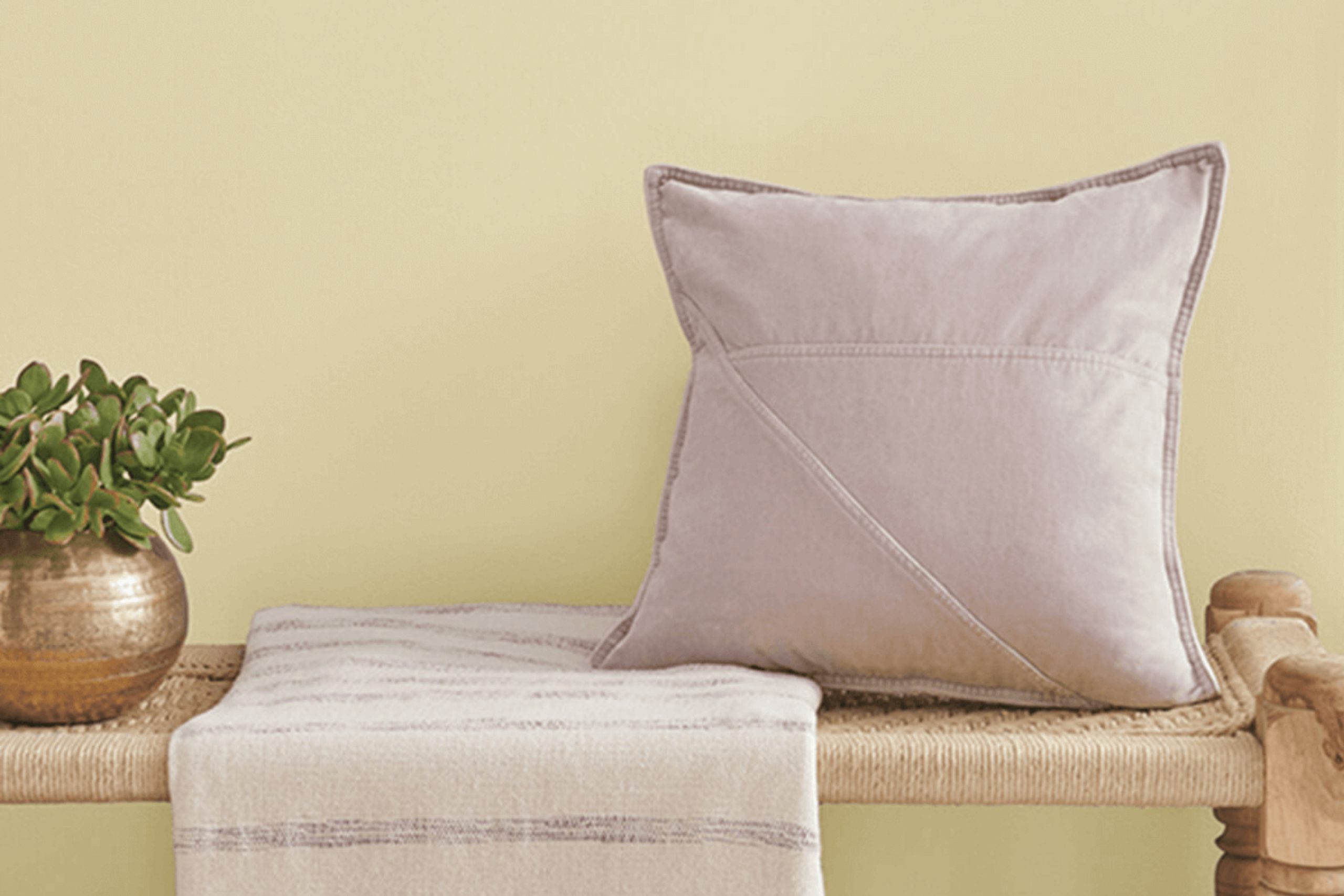
When you come across the color SW 6414 Rice Paddy by Sherwin Williams, it offers a gentle and calming presence that can instantly enhance any room. Rice Paddy is a delicate, soft green with a hint of warmth, reminiscent of young rice plants growing in a lush field. It has a soothing quality that invites you to relax and unwind, making it an excellent choice for creating a peaceful atmosphere in any room.
Imagine a morning mist lingering over a vibrant field, bringing a sense of freshness and renewal. That’s the essence that Rice Paddy brings into your home. Whether you’re painting a cozy living room, a calming bedroom, or a peaceful office room, this shade creates harmony and balance. Its flexibility works well with both modern and traditional styles, complementing a variety of textures and other colors.
Add natural elements like wood and plants, and you have a setting that feels both alive and grounding. SW 6414 Rice Paddy isn’t just another color on the paint spectrum; it’s a way to invite nature indoors, fostering an environment that prioritizes calmness and nature-inspired elegance.
It’s more than paint – it’s an opportunity to create a haven where you can truly feel at ease.
What Color Is Rice Paddy SW 6414 by Sherwin Williams?
Rice Paddy by Sherwin Williams is a soft, muted green that evokes a sense of calm and freshness. This gentle hue feels like a breath of fresh air, making it perfect for areas where you want a peaceful atmosphere. The green shade has a touch of warmth, which prevents it from feeling too cold or stark. It suits a variety of interior styles, particularly those that lean towards natural and organic aesthetics.
In a modern farmhouse or rustic setting, Rice Paddy works wonderfully with wooden accents. Think of reclaimed wood furniture or oak floors that complement its natural vibe. In a minimalist area, this color provides just enough softness to add interest without taking away from the simplicity. It also pairs nicely with white trim to create a clean, light look.
For materials, consider pairing this color with rattan, wicker, or linen. These textures add depth and create a cozy, inviting room. Metallic accents in a brushed gold or antique brass can bring out its warm undertones, offering a touch of elegance. Whether in a living room, bedroom, or even a kitchen, Rice Paddy can bring an understated yet delightful sense of the outdoors inside. It’s a flexible choice that harmonizes with a variety of elements.
Is Rice Paddy SW 6414 by Sherwin Williams Warm or Cool color?
Rice Paddy SW 6414 by Sherwin Williams is a soft, muted green color that brings a sense of calm and freshness to a room. This shade is flexible, making it a great choice for various rooms in a home. In living areas, Rice Paddy can provide a gentle backdrop that complements natural wood tones and other earthy colors.
It works well in bedrooms, creating a soothing environment that is perfect for relaxation. In kitchens, it can add a touch of nature, pairing nicely with white or cream-colored cabinets. The subtle green hue also makes smaller areas feel airy and open, as it reflects light without overpowering a room.
Overall, Rice Paddy is an approachable color that blends seamlessly with both modern and traditional décor, adding a quiet splash of color while maintaining a refreshing and welcoming atmosphere. Its understated nature ensures it remains an enduring choice for any home.
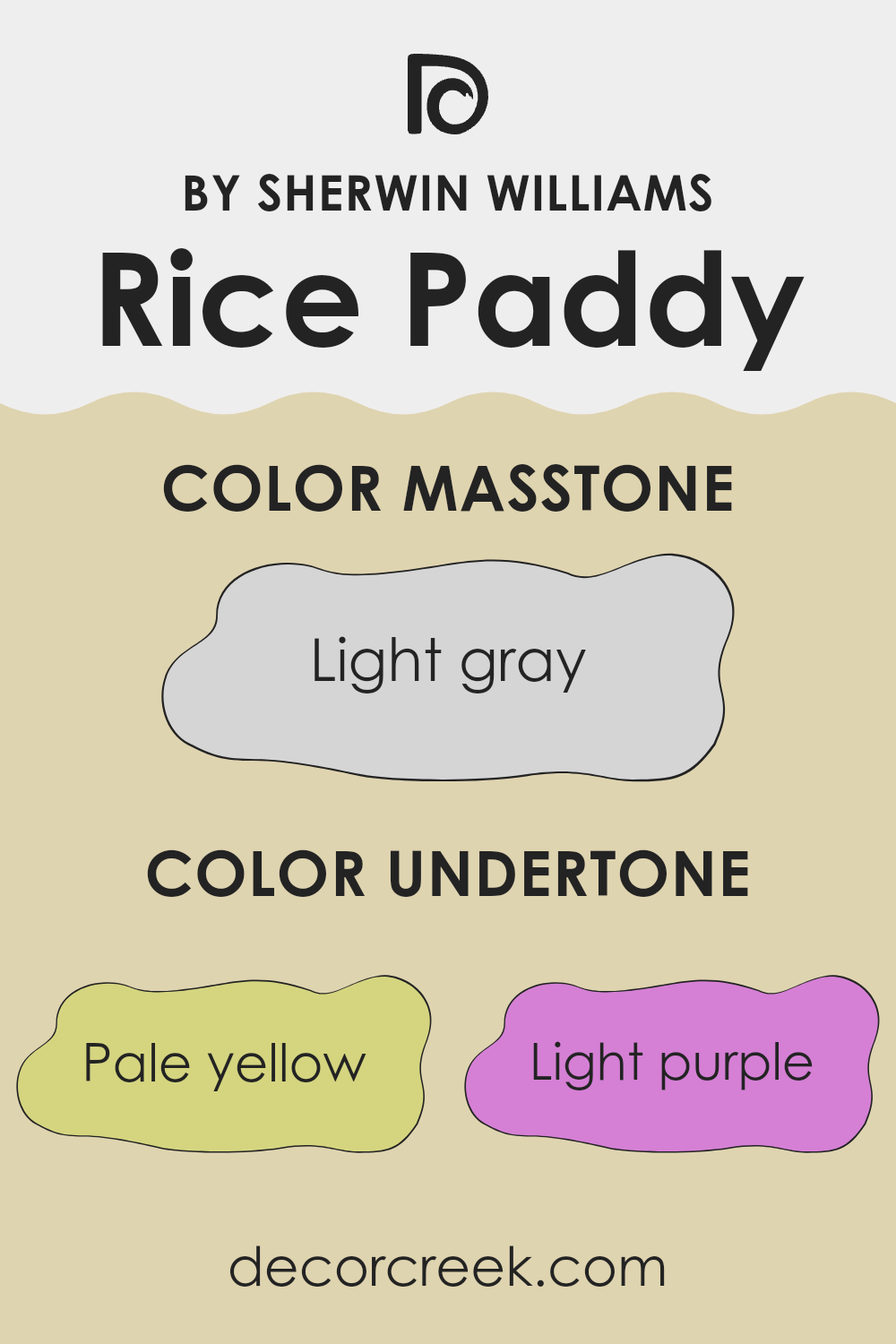
Undertones of Rice Paddy SW 6414 by Sherwin Williams
Rice Paddy (SW 6414) by Sherwin Williams is a complex and interesting color with various undertones that influence how it is perceived on interior walls. This color appears to be a light, muted green with a hint of warmth. Undertones play a crucial role in how we see any color because they add subtle shades that can shift the overall look, depending on the lighting and surrounding colors.
In the case of Rice Paddy, the pale yellow undertone adds warmth and a slightly sunny feel, making areas feel cozy and inviting. The light purple undertone can introduce a soft, unexpected dimension, giving the color depth and preventing it from being too flat.
Meanwhile, subtle hints of pale pink and light blue can further soften the appearance, making the color feel gentle and calming. The mint undertone adds a fresh and clean quality, while lilac can bring a touch of sophistication. Lastly, the grey undertone helps neutralize the color, allowing it to blend well with various color schemes.
In a room, this paint color can create a soft, relaxing atmosphere. It pairs well with natural materials and other muted colors. These undertones make Rice Paddy a flexible choice for anyone looking to add a gentle touch of color to their walls.
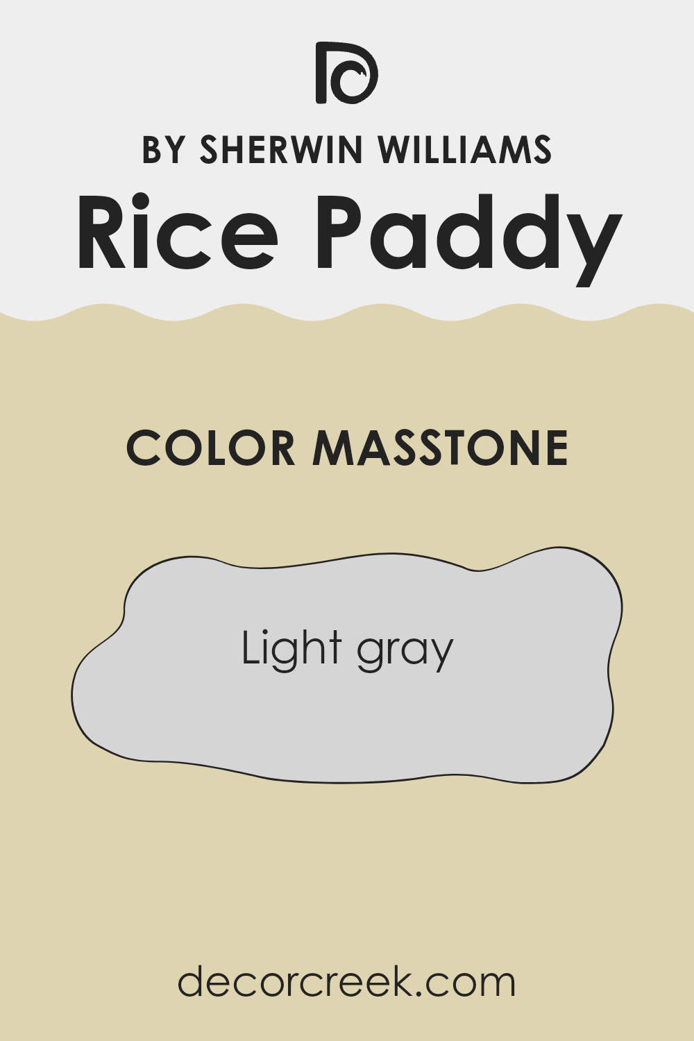
What is the Masstone of the Rice Paddy SW 6414 by Sherwin Williams?
Rice Paddy (SW 6414) by Sherwin Williams is a flexible light gray color (#D5D5D5) that is perfect for creating a calm and neutral atmosphere in homes. Its subtle shade provides a gentle backdrop that works well in any room, whether it’s the living room, bedroom, or kitchen.
This color has a way of making rooms feel more open and airy, thanks to its lightness. It reflects light beautifully, which can brighten up smaller areas or rooms with limited natural light, making them feel more inviting and spacious.
Rice Paddy’s neutral tone makes it easy to pair with other colors and decor styles. Whether you prefer bold accents or subtle hues, this shade complements a wide range of palettes. It’s an excellent choice for those who want a simple yet effective way to refresh their home with a color that feels both modern and enduring.
How Does Lighting Affect Rice Paddy SW 6414 by Sherwin Williams?
Lighting has a significant impact on how we perceive colors. The type and direction of light can change how a color appears in a room. For instance, a paint color like Rice Paddy by Sherwin Williams can look different under various lighting conditions.
In natural light, Rice Paddy, a gentle green with a hint of warmth, can show different sides of its personality based on where your windows face. In a north-facing room, the light is cooler and doesn’t change much throughout the day.
This can make Rice Paddy look more muted and perhaps a bit cooler than in other lighting conditions. The subtle brightness and warmth of the color might not be as noticeable. A south-facing room gets a lot of daylight through the day, which tends to be warmer. Here, Rice Paddy can appear lighter and more vibrant. The natural warmth in the light can really enhance the slight yellow undertone in the color, making the room feel cozy and inviting.
In east-facing rooms, the intense morning sun starts off warm and becomes cooler as the day goes on. Early in the day, Rice Paddy can have a lively, fresh appearance, but as the sun moves, the light softens, and the color might settle into a gentler tone.
West-facing rooms get the benefit of the evening sun, which casts a warm, rich glow. Later in the day, Rice Paddy can take on a deeper, warmer feel, highlighting its richness as the afternoon turns to evening.
Artificial lighting affects Rice Paddy differently. Under warm incandescent lighting, it leans towards a softer, slightly yellowish green, emphasizing its warmth. With cooler LED lights, the color might look a bit crisper, presenting more of its green aspects. It’s a flexible color that changes with the light, offering different moods in different areas.
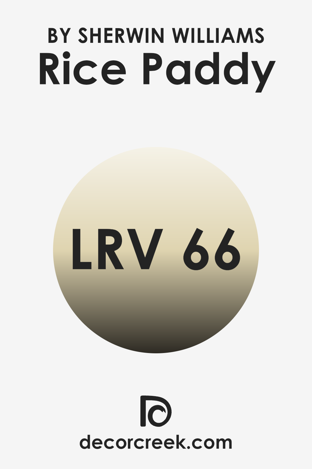
What is the LRV of Rice Paddy SW 6414 by Sherwin Williams?
LRV stands for Light Reflectance Value, and it’s a measurement used to determine the percentage of light a color reflects. On a scale from 0 to 100, 0 represents absolute black, which absorbs all light, while 100 stands for pure white, which reflects all light.
Essentially, LRV helps understand how light or dark a color will appear and how much it will brighten up a room. Colors with high LRV will reflect more light and make a room feel larger and more open, whereas colors with low LRV absorb more light, making a room appear cozy and intimate.
For the color Rice Paddy from Sherwin-Williams, with an LRV of 66.164, it means that this shade reflects a fair bit of light, brightening up areas without being overly stark or glaring. This specific LRV suggests that the color will contribute to an airy and open atmosphere, allowing rooms to feel warm and welcoming while still having an uplifting quality. It will generally enhance natural light present in the room, making it feel more inviting without overwhelming the room.
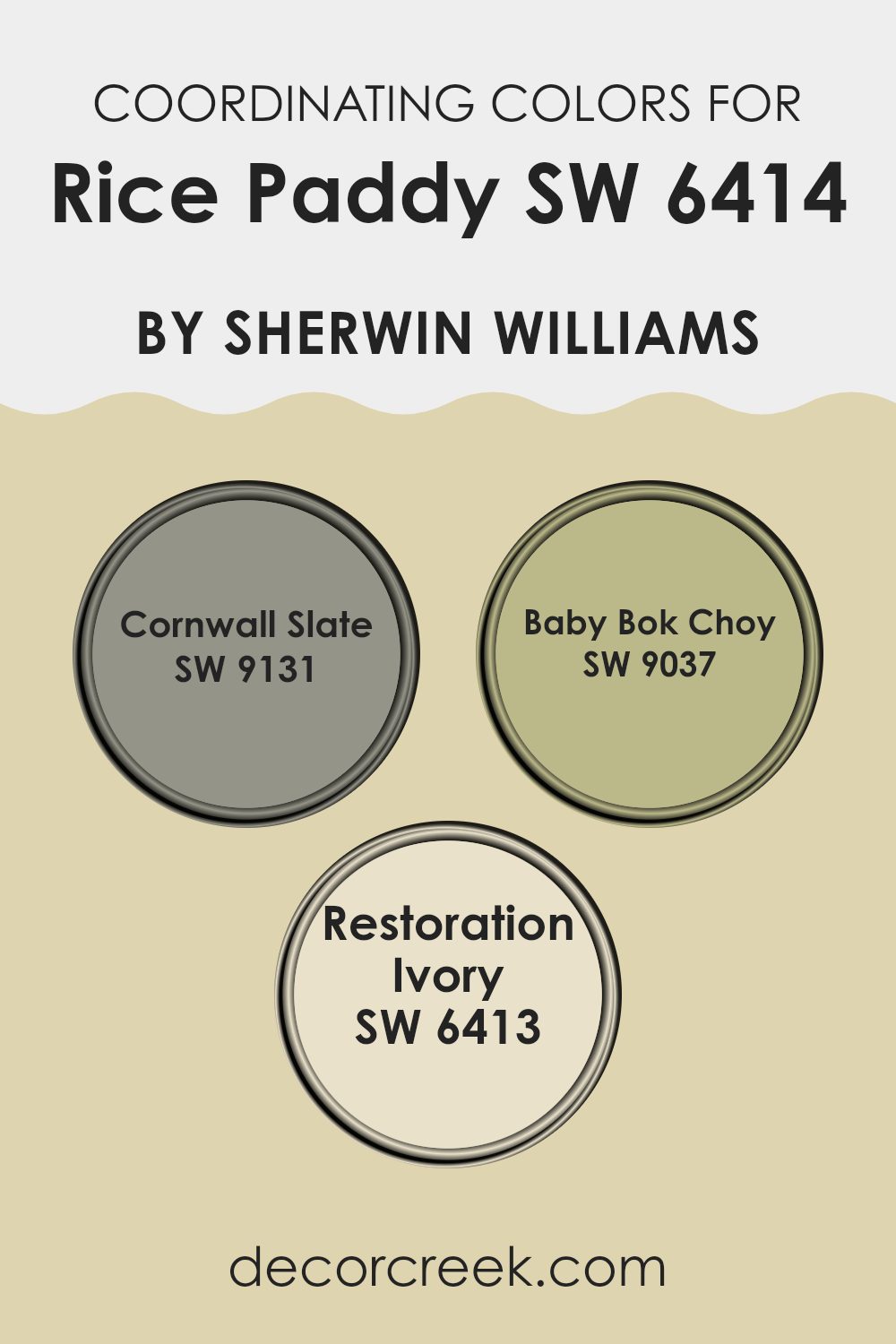
Coordinating Colors of Rice Paddy SW 6414 by Sherwin Williams
Coordinating colors are shades that work well together to create a harmonious look in a room. These colors often share similar undertones or complementary hues, making them visually pleasing when paired. When using coordinating colors with Rice Paddy by Sherwin Williams, you can achieve a balanced design.
Cornwall Slate, for example, offers a muted gray-green, bringing depth without overpowering a room. Its subtle elegance creates a perfect backdrop, enhancing the freshness of Rice Paddy. Baby Bok Choy adds a vibrant touch with its lively green-yellow shade.
It’s ideal for brightening up areas, infusing energy, and drawing attention. Meanwhile, Restoration Ivory acts as a soft neutral, providing warmth and a sense of calm. It works as an excellent pairing color, grounding brighter or bolder shades like Baby Bok Choy, while still complementing the soothing qualities of Rice Paddy. Together, these coordinating colors come together to make a cohesive and inviting room, offering both contrast and complementarity.
You can see recommended paint colors below:
- SW 9131 Cornwall Slate
- SW 9037 Baby Bok Choy
- SW 6413 Restoration Ivory
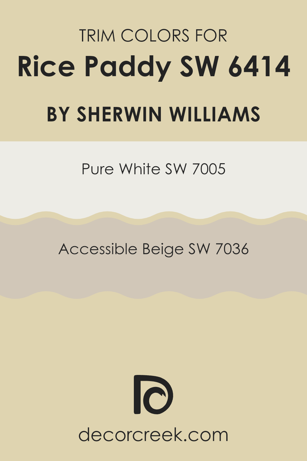
What are the Trim colors of Rice Paddy SW 6414 by Sherwin Williams?
Trim colors are accent colors used to highlight architectural features like baseboards, moldings, and window frames. They are essential in interior design because they add contrast and definition to a room. Using trim colors around the walls painted in Rice Paddy by Sherwin Williams can enhance the overall look of a room. Rice Paddy itself is a soft, muted green that brings a sense of calmness and subtlety. When paired with the right trim colors, it can create a balanced and inviting environment.
Painting trims in Pure White, for instance, provides a clean, crisp edge that beautifully offsets the gentle tones of Rice Paddy. Pure White is a bright, clear white that works well to define areas without drawing too much attention to itself.
On the other hand, Accessible Beige offers a warmer, more inviting trim option. This beige has undertones that complement Rice Paddy, adding a cozy layer to the room’s design. Whether using Pure White for a more classic touch or Accessible Beige for a softer look, the right trim color can complete the room’s appearance, making it feel both complete and welcoming.
You can see recommended paint colors below:
Colors Similar to Rice Paddy SW 6414 by Sherwin Williams
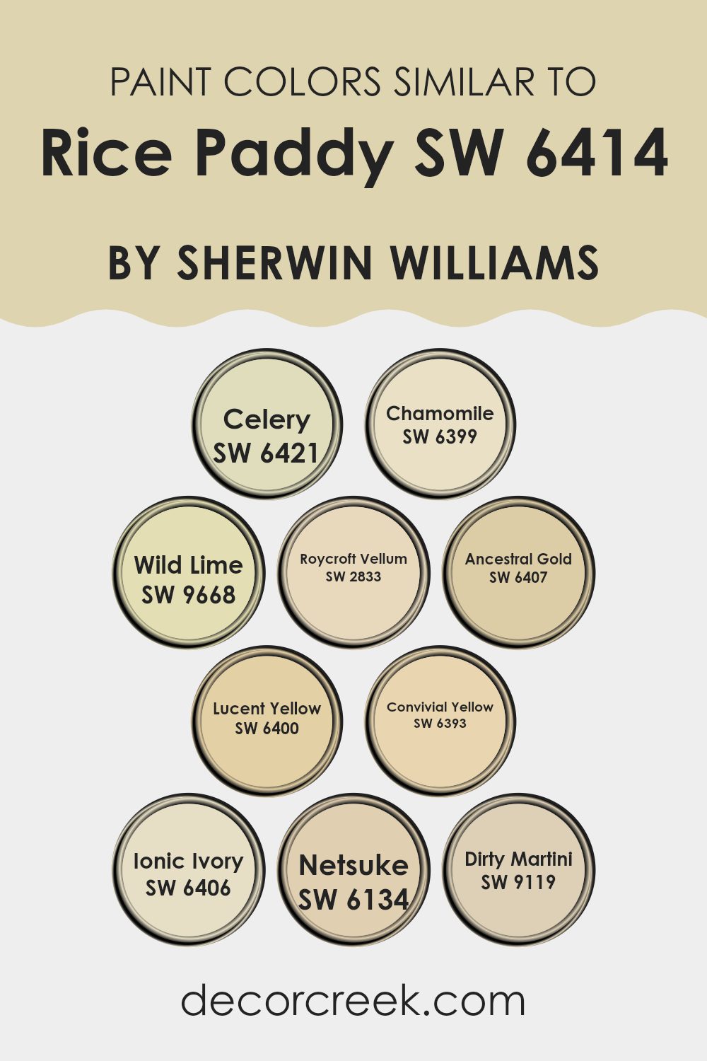
Similar colors are key in design because they help create a cohesive, harmonious look. These colors have slightly different tones but share a common base, making them easy to pair together. For Rice Paddy SW 6414 by Sherwin Williams, some similar colors include Celery, Chamomile, Wild Lime, Roycroft Vellum, Ancestral Gold, Lucent Yellow, Convivial Yellow, Ionic Ivory, Netsuke, and Dirty Martini.
These shades, while varied, all carry warm, inviting undertones that can make a room feel more welcoming and comfortable. When you use these colors together, they can subtly enhance each other and add depth to a room without making it feel too intense.
Celery is a soft, muted green with a hint of freshness, while Chamomile carries a cozy, golden hue that reminds you of a sunny day. Wild Lime adds a bit of zing with its lively green tone. Roycroft Vellum gives a nod to history with its deep cream color, perfect for adding warmth. Ancestral Gold shines with its rich, golden quality, and Lucent Yellow is bright and cheerful.
Convivial Yellow brings energy with its vibrant, sun-kissed hue, and Ionic Ivory offers a creamy, understated backdrop. Netsuke, with its gentle beige tone, adds subtle sophistication, and Dirty Martini rounds it all out with its quietly bold mix of green and gray. Together, these colors create a palette that is balanced, inviting, and effortlessly stylish.
You can see recommended paint colors below:
- SW 6421 Celery
- SW 6399 Chamomile
- SW 9668 Wild Lime
- SW 2833 Roycroft Vellum
- SW 6407 Ancestral Gold
- SW 6400 Lucent Yellow
- SW 6393 Convivial Yellow
- SW 6406 Ionic Ivory
- SW 6134 Netsuke
- SW 9119 Dirty Martini
Colors that Go With Rice Paddy SW 6414 by Sherwin Williams
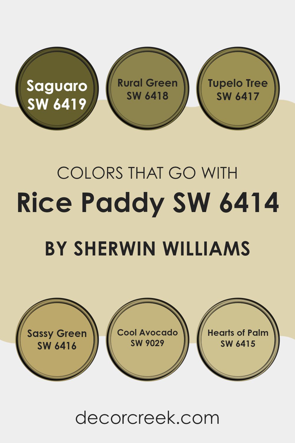
When you’re decorating a room and using Rice Paddy SW 6414 from Sherwin Williams, choosing the right colors to go with it is important because they create a harmonious look. Rice Paddy is a gentle, soft green that looks great when combined with certain shades. These colors enhance the overall warmth and vibe of a room.
Saguaro SW 6419, a muted, earthy green, pairs well with Rice Paddy by adding depth without overpowering its softness. Rural Green SW 6418 is a more vibrant green that adds a lively touch, while still complementing the subtlety of Rice Paddy. Tupelo Tree SW 6417 brings in a darker olive tone, which adds richness and makes lighter shades pop.
Sassy Green SW 6416, a lively, cheerful green, works well as an accent that energizes the room. Cool Avocado SW 9029 is a muted, slightly grayish green that balances the lighter tone of Rice Paddy by offering a calm contrast. Meanwhile, Hearts of Palm SW 6415, a refreshing green with a hint of yellow, injects brightness and a bit of fun. Together, these colors create a blend of natural hues that give any room a welcoming and balanced look, making it easy to feel at home.
You can see recommended paint colors below:
- SW 6419 Saguaro
- SW 6418 Rural Green
- SW 6417 Tupelo Tree
- SW 6416 Sassy Green
- SW 9029 Cool Avocado
- SW 6415 Hearts of Palm
How to Use Rice Paddy SW 6414 by Sherwin Williams In Your Home?
Rice Paddy SW 6414 by Sherwin Williams is a soothing, muted green that can bring a sense of calm and nature into your home. This gentle color works well in various rooms, creating a peaceful environment. In a bedroom, it can provide a restful and relaxing atmosphere. Pair it with white or cream-colored bedding and natural wood furniture for a fresh look.
In the living room, Rice Paddy can help make the room feel inviting and cozy. It pairs nicely with neutral tones and soft textiles, like beige or light gray rugs and cushions. Kitchen walls painted in this color can add a fresh feel, especially when combined with light cabinetry and open shelving.
Bathrooms can also benefit from this color, as it mimics the calming presence of nature. Add plants and simple fixtures to create a spa-like feel. Rice Paddy SW 6414 brings subtle color without being too intense, making it a flexible choice for any home.
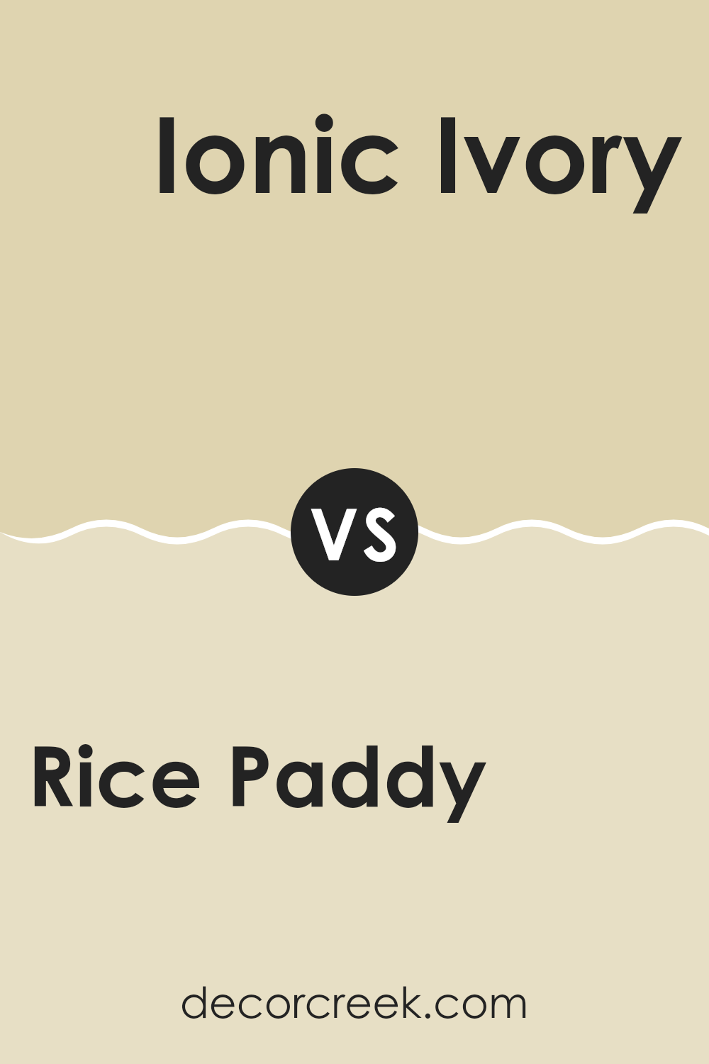
Rice Paddy SW 6414 by Sherwin Williams vs Ionic Ivory SW 6406 by Sherwin Williams
Rice Paddy SW 6414 and Ionic Ivory SW 6406 by Sherwin Williams are both soft, neutral colors, but they have distinct characteristics. Rice Paddy is a gentle green with a touch of warmth, reminiscent of a calming, natural landscape.
It’s a great choice for adding a hint of nature’s freshness into a room. On the other hand, Ionic Ivory leans more towards a creamy, off-white tone with the slightest hint of warmth. This makes it flexible and ideal for creating an airy and open feel in a room.
While Rice Paddy offers a subtle pop of color, Ionic Ivory is more subdued and can serve as a perfect backdrop for other colors or design elements. Together, these colors can complement each other well, with Ionic Ivory providing a light and neutral base and Rice Paddy adding a slight touch of color.
You can see recommended paint color below:
- SW 6406 Ionic Ivory
Rice Paddy SW 6414 by Sherwin Williams vs Ancestral Gold SW 6407 by Sherwin Williams
Rice Paddy SW 6414 and Ancestral Gold SW 6407 by Sherwin Williams are two warm, inviting colors that bring different vibes to a room. Rice Paddy is a light and soft green with a hint of yellow, making it feel fresh and uplifting. It’s perfect for creating a natural and calming atmosphere, reminiscent of early spring growth.
On the other hand, Ancestral Gold is a rich, warm gold with earthy undertones. It exudes a cozy and welcoming feeling, adding a touch of warmth and elegance to any room. This color can create a sense of richness and depth, making it ideal for areas where you want to add a touch of classic charm.
While both colors are warm and inviting, Rice Paddy leans towards a fresh, gentle green, whereas Ancestral Gold provides a more opulent, earthy tone. Both can be used to create different moods and styles in a home.
You can see recommended paint color below:
- SW 6407 Ancestral Gold

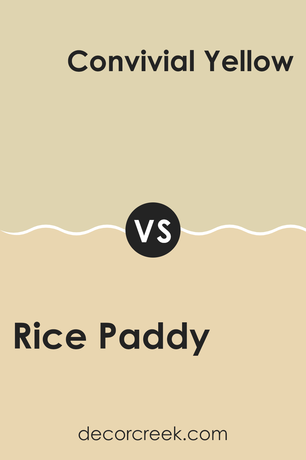
Rice Paddy SW 6414 by Sherwin Williams vs Convivial Yellow SW 6393 by Sherwin Williams
Rice Paddy (SW 6414) and Convivial Yellow (SW 6393) by Sherwin Williams are both warm and inviting colors, though they carry different vibes. Rice Paddy is a soft, muted green with a hint of warmth that feels refreshing and natural. It is calm and earth-like, reminiscent of grass or leaves on a sunny day. It’s an excellent choice for creating a soothing and relaxed environment.
Convivial Yellow, on the other hand, is a warm, cheerful yellow. It’s brighter and more vibrant than Rice Paddy, bringing a sense of energy and warmth to a room. This color is uplifting and perfect for areas where you want to feel upbeat and energized, like a kitchen or living room.
Together, Rice Paddy offers a grounded, subtle feel, while Convivial Yellow injects brightness and cheer, making them an interesting pair for contrasting or complementary designs.
You can see recommended paint color below:
- SW 6393 Convivial Yellow
Rice Paddy SW 6414 by Sherwin Williams vs Chamomile SW 6399 by Sherwin Williams
“Rice Paddy” and “Chamomile” are two distinct yet complementary colors by Sherwin Williams. “Rice Paddy” is a soft, muted green with a hint of yellow. It feels calming and fresh, like a gentle breeze in a meadow. This color reminds one of nature, bringing a bit of the outdoors inside.
On the other hand, “Chamomile” is a warm, inviting yellow. It carries a cozy, comforting vibe, similar to the soothing tea it’s named after. This color can brighten up a room and add warmth, making a room feel welcoming.
When used together, “Rice Paddy” and “Chamomile” create a harmonious palette. The gentle green of “Rice Paddy” pairs well with the cheerful warmth of “Chamomile.” They can be used in any room where you want both freshness and comfort. These colors work well in living areas, kitchens, or bedrooms, offering a balanced and natural look.
You can see recommended paint color below:
Rice Paddy SW 6414 by Sherwin Williams vs Lucent Yellow SW 6400 by Sherwin Williams
Rice Paddy SW 6414 and Lucent Yellow SW 6400 by Sherwin Williams are both warm colors but differ in their character and feel. Rice Paddy is a soft, muted green with hints of gray, making it a peaceful, nature-inspired shade.
It’s ideal for creating a calm and relaxed environment, often used in areas where you want a gentle, grounding effect. Lucent Yellow, on the other hand, is a bright and cheerful yellow that brings a sense of energy and light into a room.
It’s vibrant and catches the eye, making it perfect for areas where you want to add warmth and a lively atmosphere. While Rice Paddy leans towards a subtle elegance perfect for understated elegance, Lucent Yellow is all about drawing attention and adding a pop of color. Both colors can complement different styles and moods, depending on what you’re aiming for in a room.
You can see recommended paint color below:
Rice Paddy SW 6414 by Sherwin Williams vs Celery SW 6421 by Sherwin Williams
Rice Paddy SW 6414 and Celery SW 6421 are both nature-inspired greens from Sherwin Williams, but they differ in tone and feel. Rice Paddy SW 6414 is a soft, muted green with a hint of yellow, which gives it a warm and inviting vibe.
It’s like the gentle green you might find in a rice field under soft sunlight. On the other hand, Celery SW 6421 is a brighter, more vivid green, reminiscent of fresh celery stalks. It has a lively and refreshing appearance, making it a more energetic choice compared to the subtle and calming nature of Rice Paddy.
While Rice Paddy offers a soothing background perfect for relaxation, Celery brings a more upbeat and lively energy to a room. Both colors are flexible, but their different intensities mean they can set distinct moods within a room.
You can see recommended paint color below:
Rice Paddy SW 6414 by Sherwin Williams vs Wild Lime SW 9668 by Sherwin Williams
Rice Paddy SW 6414 and Wild Lime SW 9668 by Sherwin Williams are two unique shades of green. Rice Paddy is a softer, muted green. It has a subtle, earthy tone that feels calm and in harmony with nature. It’s a flexible color often used in areas where a gentle, soothing atmosphere is desired.
On the other hand, Wild Lime is a more vibrant and energetic shade of green. It’s brighter and bolder, bringing a lively burst of color. This can make a room feel fresh and full of life. It’s perfect for someone who wants to add a pop of color to their room and enjoys a lively environment.
While Rice Paddy is subtle and restrained, Wild Lime is dynamic and attention-grabbing. The choice between the two depends on the mood and energy you want to create in your room. Both can bring the essence of nature indoors in their own unique ways.
You can see recommended paint color below:
- SW 9668 Wild Lime
Rice Paddy SW 6414 by Sherwin Williams vs Roycroft Vellum SW 2833 by Sherwin Williams
Rice Paddy SW 6414 is a soft, fresh green that brings a subtle touch of nature indoors. It has a light and airy feel, evoking a sense of freshness, like a field of young rice plants. This color can brighten up a room, making it feel more open and inviting.
On the other hand, Roycroft Vellum SW 2833 is a warm, creamy off-white with a hint of yellow. It creates a cozy and welcoming atmosphere, reminiscent of aged parchment or vellum. This color pairs well with traditional and classic decor, adding a sense of warmth and comfort to a room.
When compared, Rice Paddy offers a more vibrant and fresh vibe, while Roycroft Vellum feels warmer and more inviting. Both colors work beautifully in different settings; Rice Paddy brings the outside in, and Roycroft Vellum offers a classic, enduring appeal. Together, they can complement each other, creating a harmonious balance of freshness and warmth.
You can see recommended paint color below:
- SW 2833 Roycroft Vellum
Rice Paddy SW 6414 by Sherwin Williams vs Netsuke SW 6134 by Sherwin Williams
Rice Paddy SW 6414 and Netsuke SW 6134 are both colors from Sherwin Williams, but they have distinct personalities. Rice Paddy is a light, refreshing green with a hint of yellow, giving it a lively and cheerful vibe. It can brighten up a room, making it feel more natural and airy.
On the other hand, Netsuke is a warmer, muted beige that leans towards a creamy, sandy tone. It’s more subdued, creating a cozy and soothing environment. While Rice Paddy brings energy and freshness, Netsuke offers warmth and subtlety.
Both colors are flexible, but they convey different moods. Rice Paddy is ideal for areas where you need a touch of nature and vibrancy, such as kitchens or bathrooms. Meanwhile, Netsuke is perfect for living rooms or bedrooms, where you want a comfortable and relaxed atmosphere. Together, they can balance each other, with Rice Paddy adding a pop of color and Netsuke providing a calm backdrop.
You can see recommended paint color below:
- SW 6134 Netsuke
Rice Paddy SW 6414 by Sherwin Williams vs Dirty Martini SW 9119 by Sherwin Williams
Rice Paddy SW 6414 by Sherwin Williams and Dirty Martini SW 9119 are two distinct shades of green. Rice Paddy is a lighter, softer green that often evokes a fresh, natural feel reminiscent of new leaves or springtime. It’s flexible and can create a calm and welcoming atmosphere in a room, making it a popular choice for living areas or bedrooms.
On the other hand, Dirty Martini is a darker, more muted green with gray undertones. This shade offers a cozy and warm feel, which can add depth and richness to a room. It works well in areas where you want to create an intimate and comfortable mood, such as a study or dining room.
While both colors belong to the green family, Rice Paddy brings in a light, airy feel, whereas Dirty Martini provides a deeper, more grounded presence. They each have their place, depending on the mood you want to set.
You can see recommended paint color below:
- SW 9119 Dirty Martini
In conclusion, I find that SW 6414 Rice Paddy by Sherwin Williams is a really nice color. It’s a soft green that reminds me of nature, like fields or gardens. I like how it feels calm and fresh, making any room feel more lively. This color is not too bright or too dark, which makes it friendly for walls in the bedroom, living room, or even the kitchen.
When I think about using Rice Paddy, it reminds me of springtime or a peaceful park. It can make people feel relaxed and happy. This shade of green goes well with other colors, too, like white, beige, or even wood tones, which can make a room look balanced and warm.
If I had to choose a color that helps make a home feel welcoming and cheerful, Rice Paddy would be a good choice. It’s like bringing a bit of the outdoors inside and making everyone feel more at ease. Whether painting the whole room or just adding some Rice Paddy accents, I think it would help make a home feel comfortable and pleasant.
It’s pretty cool how a simple color can have such a nice effect on our surroundings.
Ever wished paint sampling was as easy as sticking a sticker? Guess what? Now it is! Discover Samplize's unique Peel & Stick samples.
Get paint samples

