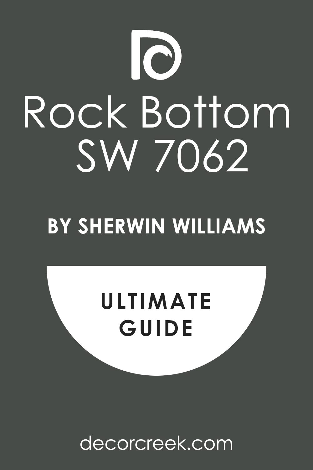
If you’re searching for a versatile and sophisticated shade of paint, let me introduce you to SW 7062 Rock Bottom by Sherwin Williams. I’ve found this color to be a robust, deep charcoal gray that adds a touch of elegance to any space. Perfect for creating a grounding atmosphere, Rock Bottom serves as an excellent backdrop in a variety of settings, from modern living rooms to cozy bedrooms.
In my use, Rock Bottom provides just the right depth to complement both bright accents and subtle neutrals. Whether you want to paint an entire room or just an accent wall, this shade adapts beautifully, ensuring your space looks polished and cohesive.
It pairs wonderfully with natural materials like wood and stone, enhancing their textures without overwhelming them.
Moreover, this paint has practical advantages too. It covers existing wall colors well and its matte finish helps in hiding minor surface imperfections. So if you’re looking to refresh your space with a color that’s both stylish and forgiving, Rock Bottom might just be what you need.
Plus, its durability makes it a smart choice for busy areas in your home.
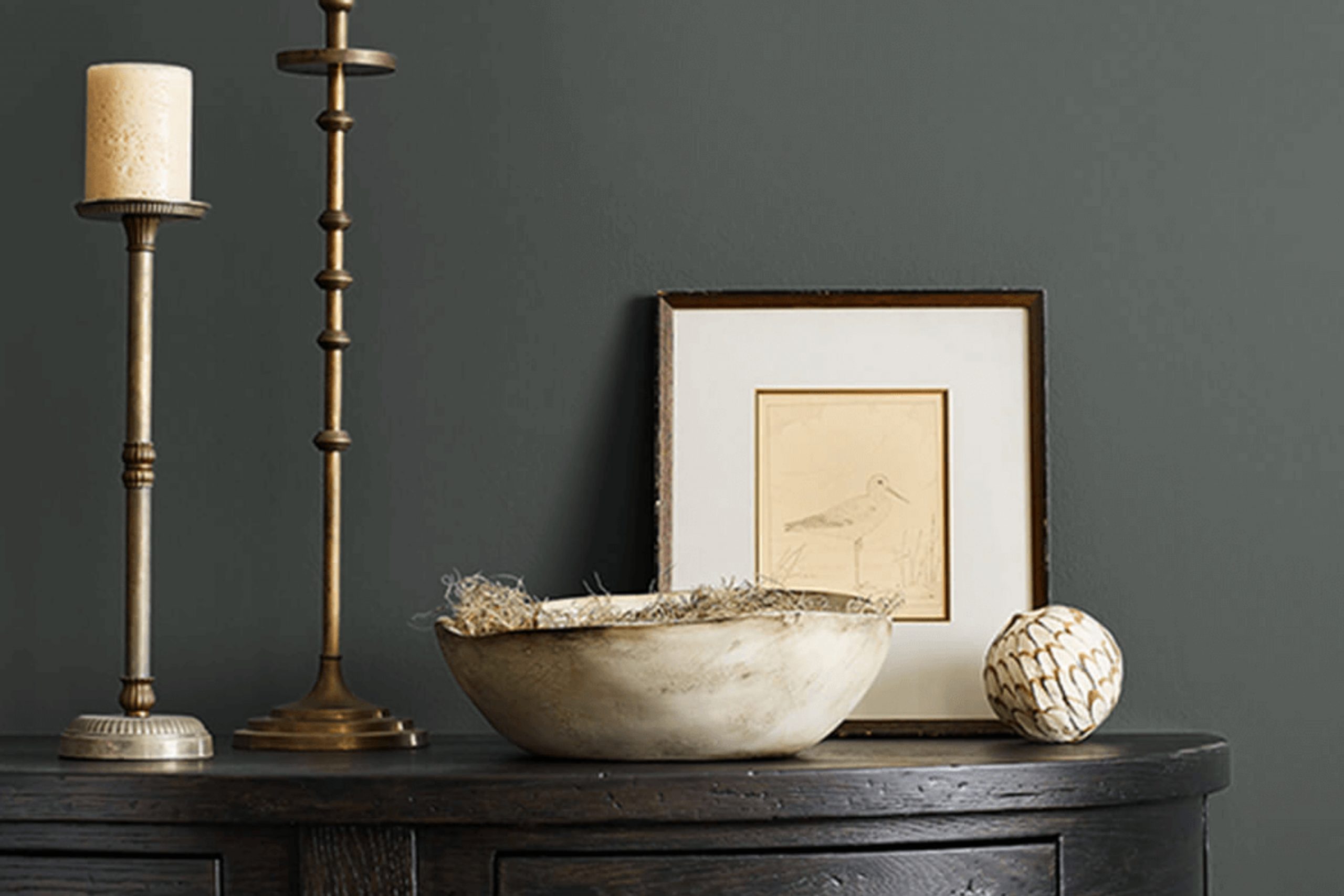
What Color Is Rock Bottom SW 7062 by Sherwin Williams?
Rock Bottom by Sherwin Williams is a deep, charcoal gray hue that carries a hint of blue undertones, making it a striking yet versatile choice for any interior space. This color is known for its ability to add depth and grounded sophistication to any room. It works exceptionally well in modern and minimalist designs because of its bold, clear tone that complements a streamlined aesthetic.
The depth of Rock Bottom makes it ideal for pairing with a variety of materials and textures to create a visually appealing space. It looks stunning when combined with natural wood, as the warmth of wood tones contrasts beautifully with its cool depth.
This color also works well with metals like brushed nickel or stainless steel, adding a sleek, industrial vibe to the decor.
Additionally, Rock Bottom pairs nicely with softer textures like velvet or wool, which can soften its strong character and add a touch of coziness to a room. In terms of compatibility with other colors, it complements whites and creams for a sharp, clean appearance, or it can be paired with vibrant colors like mustard or teal for a more dynamic and lively space.
Overall, Rock Bottom is a solid choice for those looking to create a stylish, contemporary look in their home or office. It provides a foundational strength that supports a wide range of design elements, from modern furniture to classic accents.
Is Rock Bottom SW 7062 by Sherwin Williams Warm or Cool color?
Rock Bottom by Sherwin Williams (SW 7062) is a deep, rich gray shade that adds a strong sense of grounding to any room. It’s the kind of color that works well in spaces where you want to promote focus and a sense of sobriety, such as home offices or libraries. Because it’s a darker shade, Rock Bottom can make smaller rooms feel a bit more enclosed. However, when used in a large, well-lit area, it offers warmth and a cozy atmosphere, making spaces like living rooms feel more inviting.
Pairing this shade with lighter colors or vibrant accents can prevent it from overwhelming the space. It’s particularly striking when combined with crisp whites or metallic decor elements which can help liven up the room. This color is versatile enough to fit into various design styles, whether you’re going for a modern, minimal look or something more traditional.
Using Rock Bottom in your home can provide a strong, stylish backdrop that lets your other decor elements stand out.
Undertones of Rock Bottom SW 7062 by Sherwin Williams
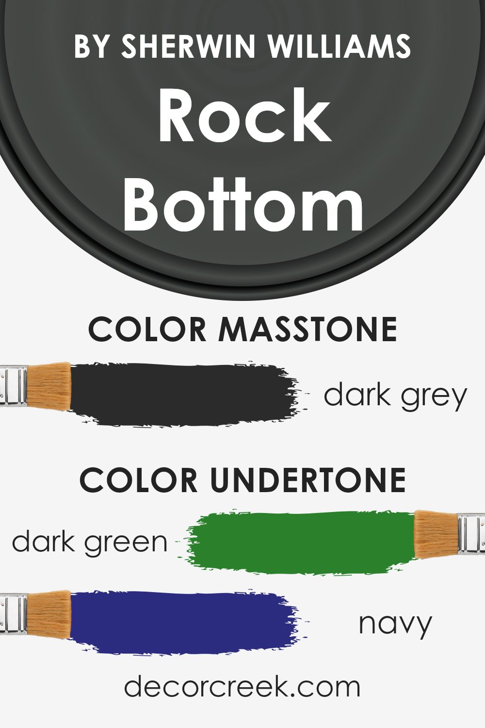
Rock Bottom SW 7062 by Sherwin Williams is a unique color that holds complex undertones. These undertones include dark green, navy, brown, dark turquoise, olive, purple, and grey. Undertones are subtle colors that influence the main hue, impacting how it appears under different lighting conditions and when paired with various decor elements.
In the case of Rock Bottom SW 7062, these undertones play a pivotal role in defining the overall look of the paint when applied to interior walls. For example, navy and dark green undertones might make the color appear cooler, adding a depth that can make a room feel more grounded and cozy. On the other hand, brown and olive undertones can warm up the space, giving it a more welcoming atmosphere.
Moreover, the complexity of these undertones can change the perception of the paint color throughout the day. In natural daylight, the color might lean more towards its cooler undertones, while at night under artificial light, the warmer tones might become more dominant.
Choosing a color like Rock Bottom SW 7062 for your walls means considering these undertones and how they complement your room’s lighting and furnishings.
Since undertones subtly influence the primary color, they can greatly affect the mood and aesthetic appeal of the space, making the choice of color critical in achieving the desired effect in a room.
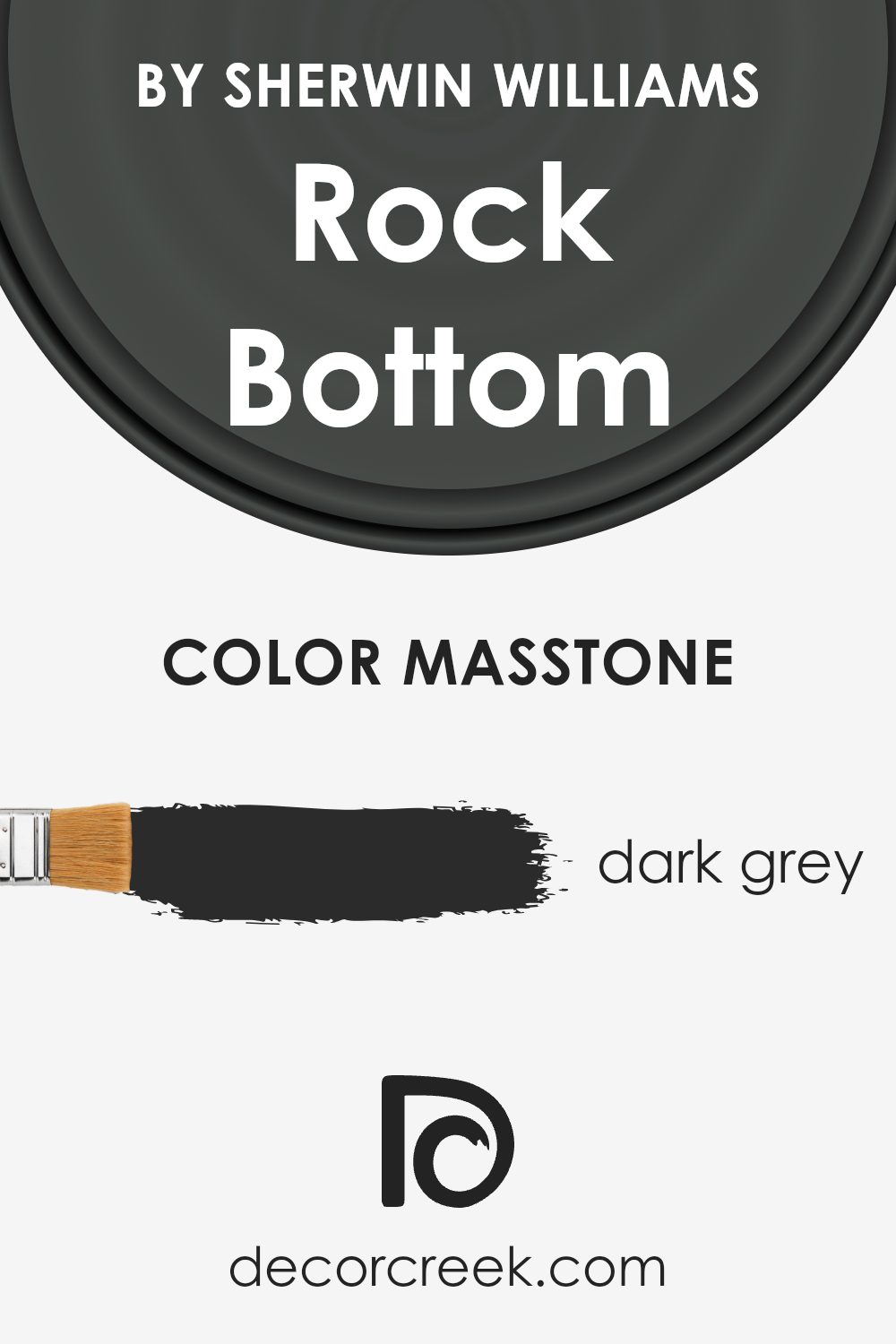
What is the Masstone of the Rock Bottom SW 7062 by Sherwin Williams?
Rock Bottom SW 7062 by Sherwin Williams has a masstone of dark gray, specifically coded as #2B2B2B. This rich, deep gray color brings a solid and grounded feel to any room. It is versatile enough to work in various spaces, whether in a modern setting or a more traditional one. When used in homes, this dark gray provides an excellent backdrop for both bright and muted colors, allowing furniture and art to stand out. It adds depth and definition to spaces, making rooms appear more defined and structured.
Because of its deep tone, it can make small rooms feel a bit cozier, and large rooms more dramatic. In well-lit areas, it adds an aesthetically pleasing contrast, while in less-lit areas, it can make the space feel more intimate and warm.
Overall, Rock Bottom SW 7062 is a practical choice for adding character and modernity to homes.
How Does Lighting Affect Rock Bottom SW 7062 by Sherwin Williams?
Lighting plays a crucial role in how colors appear in any space, as the type and amount of light can significantly influence our perception of color. Colors can look very different under various light sources. For instance, the color Rock Bottom by Sherwin Williams may appear differently when illuminated by natural light versus artificial light.
Under artificial light, depending on the type of bulb (e.g., LED, incandescent, fluorescent), Rock Bottom might appear slightly altered. LED lights, which often have a cooler tone, can make this color look sharper and more defined. In contrast, incandescent bulbs, which emit a warmer glow, could give the color a softer and cozier feel.
In natural light, Rock Bottom will change throughout the day depending on the sun’s position and intensity. In the morning and late afternoon, when the sunlight is softer and warmer, the color may have a more welcoming and warm appearance. Around noon, when the sun is brightest, the color could appear stronger and more vivid.
The direction of room exposure also affects how Rock Bottom will look:
- 1. North-facing rooms often receive less direct sunlight, which can make colors seem slightly cooler and more shadowed. In these rooms, Rock Bottom might appear as a true deep gray, maintaining a consistent look throughout the day.
- 2. South-facing rooms get more direct sunlight, which can make colors look brighter and more vibrant. Here, Rock Bottom will very likely transform under the intense light, displaying a lighter and perhaps slightly warmer tone during the day.
- 3. East-facing rooms capture the morning sun, which is warmer. This color will look bright and warm in the morning, transitioning to cooler tones as the day progresses and natural light decreases.
- 4. West-facing rooms experience the opposite effect compared to east-facing rooms; the color will be cooler in the morning and get progressively warmer and more dynamic as the evening approaches, peaking with the setting sun.
In conclusion, Rock Bottom’s appearance can vary significantly based on lighting conditions, which should be considered when choosing this color for a room to achieve the desired atmosphere.
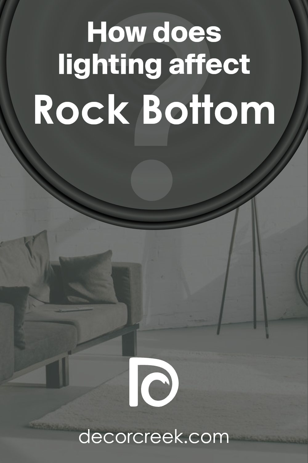
What is the LRV of Rock Bottom SW 7062 by Sherwin Williams?
LRV stands for Light Reflectance Value, which is a measure of the amount of visible and usable light that a paint color reflects when it’s on the walls, ranging on a scale from 0 to 100, with higher values representing brighter, more reflective colors. This measurement is crucial in determining how light or dark a color will look in a specific environment and can significantly affect the ambiance of a room.
For instance, a high LRV color will make a room feel more open and airy, as it reflects more light around the space. Conversely, a low LRV color absorbs more light, which can make a room feel smaller and cozier.
The LRV of 7.035 for a specific dark shade indicates that it is on the darker end of the spectrum, reflecting only a small percentage of light. This characteristic makes it a better choice for areas where a moody, intimate ambiance is desired. In spaces lacking natural light, this color might make the room feel even smaller and darker.
However, in well-lit or large spaces, using a color with such a low LRV can add a dramatic flair without overwhelming the overall aesthetics. Choosing lighting and decor that complements such a dark color will be key to achieving a balanced look.
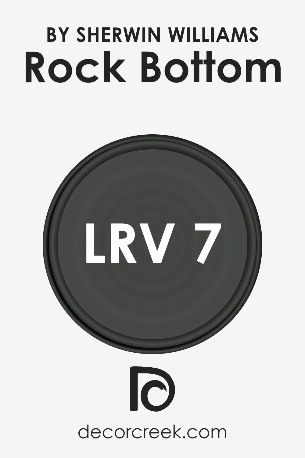
Coordinating Colors of Rock Bottom SW 7062 by Sherwin Williams
Coordinating colors are selected hues that complement a primary color, enhancing the overall aesthetic appeal without overpowering the main shade. In interior design, using coordinating colors effectively can create a harmonious and visually interesting space.
For example, when using Rock Bottom (SW 7062) by Sherwin Williams, a deep, rich gray with a touch of blue, designers often select additional colors that either contrast or blend smoothly with this primary shade.
One of the coordinating colors for Rock Bottom is Silver Strand (SW 7057), a light gray hue with subtle green undertones. This color is gentle and works well to balance the depth of Rock Bottom, providing a peaceful backdrop that allows furniture and decor to stand out.
Another excellent coordinating color is Reserved White (SW 7056), a clean and crisp white that offers a fresh contrast and highlights the boldness of Rock Bottom.
It can make any room feel more spacious and light. Felted Wool (SW 9171) serves as a complement too, bringing a warm and inviting sage-like tone that enriches the environment, ensuring the space feels cozy and put-together. These colors, when used together, create a sense of continuity and flow throughout a room, supporting a cohesive and inviting atmosphere.
You can see recommended paint colors below:
- SW 7057 Silver Strand (CHECK A SAMPLE)
- SW 7056 Reserved White (CHECK A SAMPLE)
- SW 9171 Felted Wool (CHECK A SAMPLE)
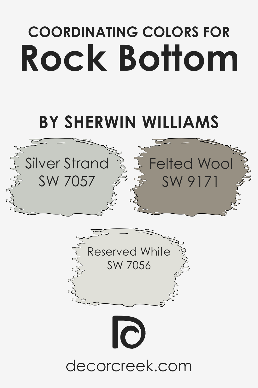
What are the Trim colors of Rock Bottom SW 7062 by Sherwin Williams?
Trim colors, such as Sherwin Williams’ SW 2832 – Colonial Revival Gray and SW 9587 – Mushroom, play a significant role in defining and accentuating the architectural elements of a home. By selecting complementary trim colors for Rock Bottom SW 7062, a distinct contrast can be created that highlights the features of the building, such as door frames, window trims, and skirting boards.
This contrast helps to frame the main color, making the walls stand out and giving the house a more polished and well-rounded appearance.
Colonial Revival Gray is a neutral gray that offers a subtle contrast when used with darker shades like Rock Bottom, providing a clean and classic look. Meanwhile, Mushroom is a warm, earthy tone that adds a touch of warmth to the overall color scheme, making it ideal for creating a welcoming atmosphere. Both colors are versatile and can effectively enhance the aesthetic appeal of a home when paired correctly with a strong base color like Rock Bottom.
You can see recommended paint colors below:
- SW 2832 Colonial Revival Gray
- SW 9587 Mushroom (CHECK A SAMPLE)
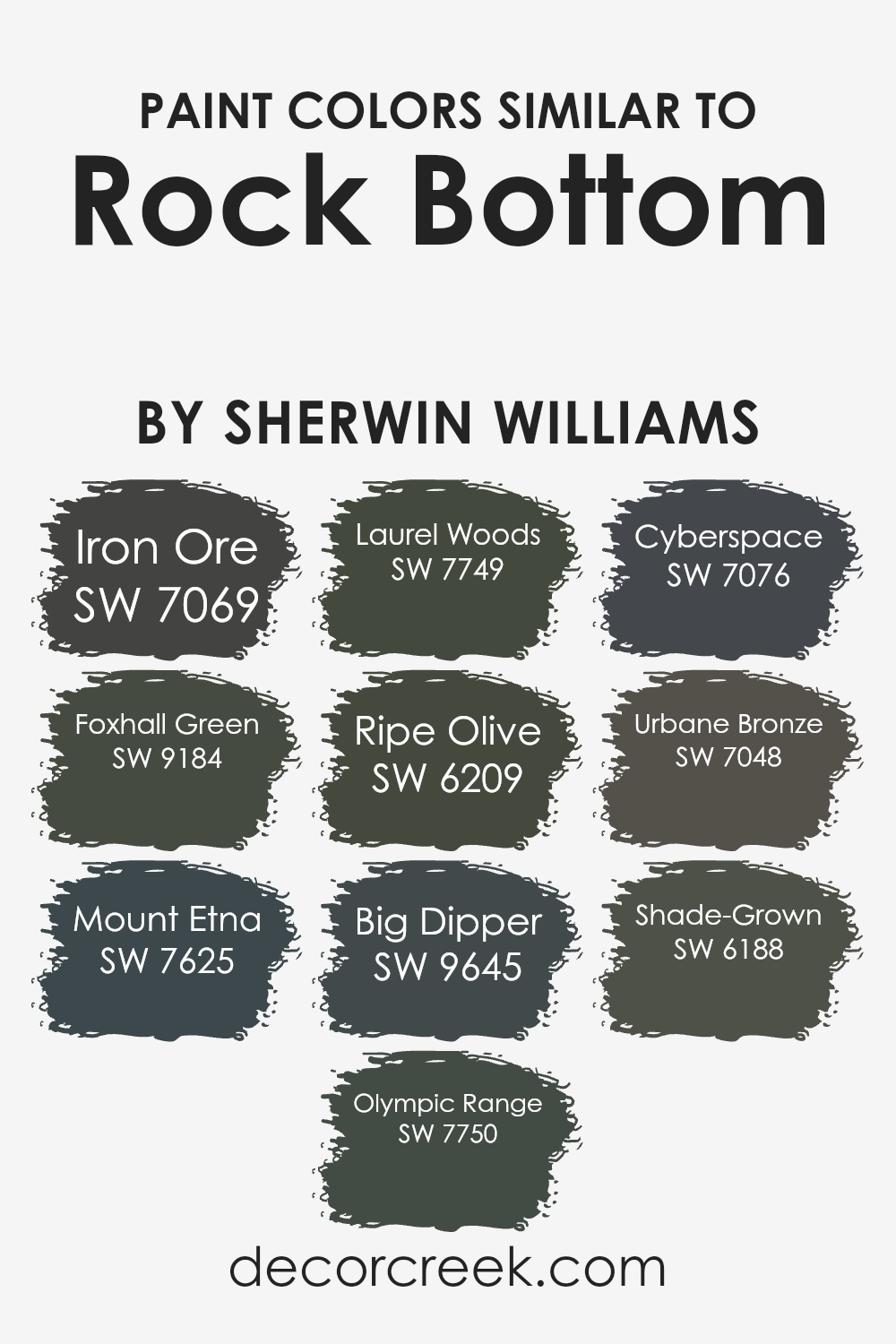
Colors Similar to Rock Bottom SW 7062 by Sherwin Williams
Choosing similar colors can create a cohesive and harmonious atmosphere in any space. Similar colors, such as those that resemble Rock Bottom by Sherwin Williams, work well together because they share common undertones that provide a subtle continuity, making the transition between spaces smooth and pleasing to the eye. These colors can also enhance the aesthetic depth and complexity of a room without overpowering it with high contrast.
For example, Iron Ore is a dark gray with a slight metallic undertone that brings a grounded feel to the environment. Its rich depth pairs well with the muted dark hues of similar colors. Foxhall Green offers a dusky, forest-like shade that exudes a natural, calming influence in spaces needing a touch of earthiness.
Mount Etna is another powerful choice, presenting a stormy charcoal that adds a dramatic flair subtly. Olympic Range, with its misty green-gray tone, reflects the colors found in a dense, fog-covered forest, providing a muted backdrop that complements natural materials like wood or stone.
Laurel Woods is like a deep, dark forest green, giving a feeling of being surrounded by lush foliage. Ripe Olive offers a deep, dark olive green that is both bold and grounding, perfect for creating a more secluded and intimate atmosphere. Big Dipper is a subtle black with soft hints of blue, rendering it ideal for spaces intended to foster focus and depth.
Cyberspace and Urbane Bronze both lean towards the cooler side of the spectrum, with Cyberspace offering a deep blue-black and Urbane Bronze offering a subtly warm, dark bronze tone, ideal for sophisticated accents. Lastly, Shade-Grown depicts a rich, deep chocolate brown that conveys warmth and richness, perfect for enveloping a room in coziness.
All these colors share a depth and intensity that, when used together, can create a space that is both cohesive and rich in layers.
You can see recommended paint colors below:
- SW 7069 Iron Ore (CHECK A SAMPLE)
- SW 9184 Foxhall Green (CHECK A SAMPLE)
- SW 7625 Mount Etna (CHECK A SAMPLE)
- SW 7750 Olympic Range (CHECK A SAMPLE)
- SW 7749 Laurel Woods (CHECK A SAMPLE)
- SW 6209 Ripe Olive
- SW 9645 Big Dipper (CHECK A SAMPLE)
- SW 7076 Cyberspace (CHECK A SAMPLE)
- SW 7048 Urbane Bronze (CHECK A SAMPLE)
- SW 6188 Shade-Grown (CHECK A SAMPLE)
Colors that Go With Rock Bottom SW 7062 by Sherwin Williams
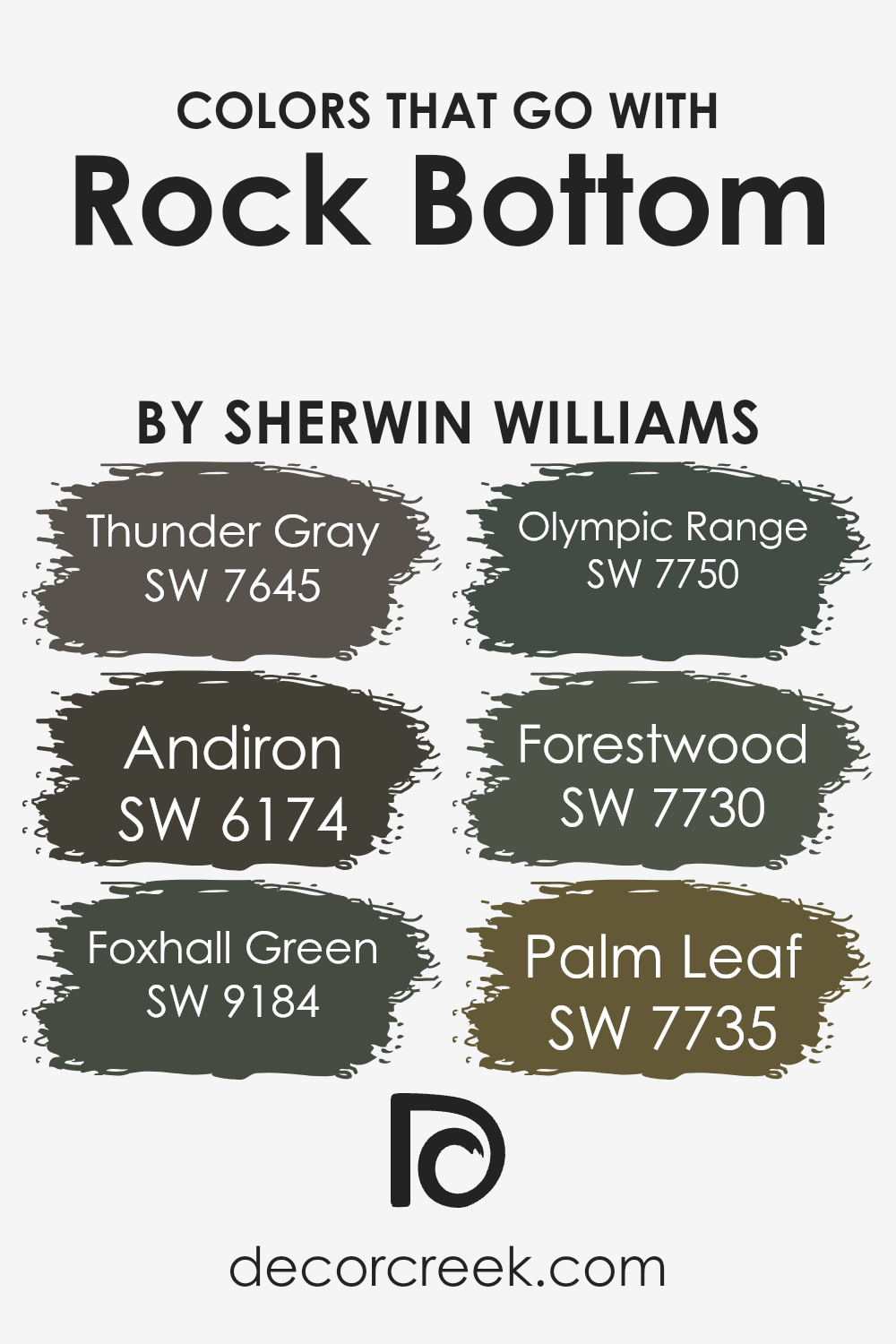
Choosing the right colors to complement Rock Bottom SW 7062 by Sherwin Williams is crucial because it helps create a harmonious and visually pleasing space. Rock Bottom is a deep, moody gray that serves as a sophisticated backdrop for many other hues. By pairing it with compatible colors, you can enhance the overall aesthetic of your room and highlight architectural details effectively.
Thunder Gray SW 7645 is a slightly lighter shade of gray that provides a subtle contrast to Rock Bottom, making it a perfect match for creating a soothing gradient effect in any living space. Andiron SW 6174, on the other hand, offers a much darker, almost black appearance, adding depth and drama when paired with Rock Bottom.
Foxhall Green SW 9184 lends a natural, earthy vibe as it introduces a soft, warm green, reminiscent of a lush forest, that perfectly offsets the cooler tones of Rock Bottom. Olympic Range SW 7750 brings a touch of the wild outdoors inside with its rich, green-gray tone that pairs well with more neutral grays for a comfortable, woodsy feel.
Forestwood SW 7730 is another forest-inspired shade, though slightly deeper and bluer than Olympic Range, providing a majestic and refreshing touch to spaces needing a hint of nature.
Lastly, Palm Leaf SW 7735 offers a bolder, more vibrant green that draws the eye, creating a lively contrast against the dark and dignified Rock Bottom, perfect for adding a dash of freshness to any area.
You can see recommended paint colors below:
- SW 7645 Thunder Gray (CHECK A SAMPLE)
- SW 6174 Andiron (CHECK A SAMPLE)
- SW 9184 Foxhall Green (CHECK A SAMPLE)
- SW 7750 Olympic Range (CHECK A SAMPLE)
- SW 7730 Forestwood (CHECK A SAMPLE)
- SW 7735 Palm Leaf (CHECK A SAMPLE)
How to Use Rock Bottom SW 7062 by Sherwin Williams In Your Home?
Rock Bottom SW 7062 by Sherwin Williams is a deep, rich gray that boasts a striking tone, perfect for adding a touch of drama and elegance to any space. This versatile color can be used in various ways around your home. For example, it’s an excellent choice for a feature wall in a living room or bedroom, adding depth and focus to the room. You can also use it in a home office to create a stylish yet focused atmosphere that’s ideal for concentration.
Additionally, Rock Bottom works well on kitchen cabinets, paired with lighter walls and countertops to offer a modern, contrasting look. If you prefer a cohesive aesthetic, consider using this shade for your exterior trim or doors, complementing lighter house colors with its boldness.
It’s also a suitable option for a bathroom, where it can provide a grounding effect amidst lighter tiles and fixtures. Overall, Rock Bottom SW 7062 is a practical choice for those looking to introduce a strong, stylish shade into their decorating scheme.
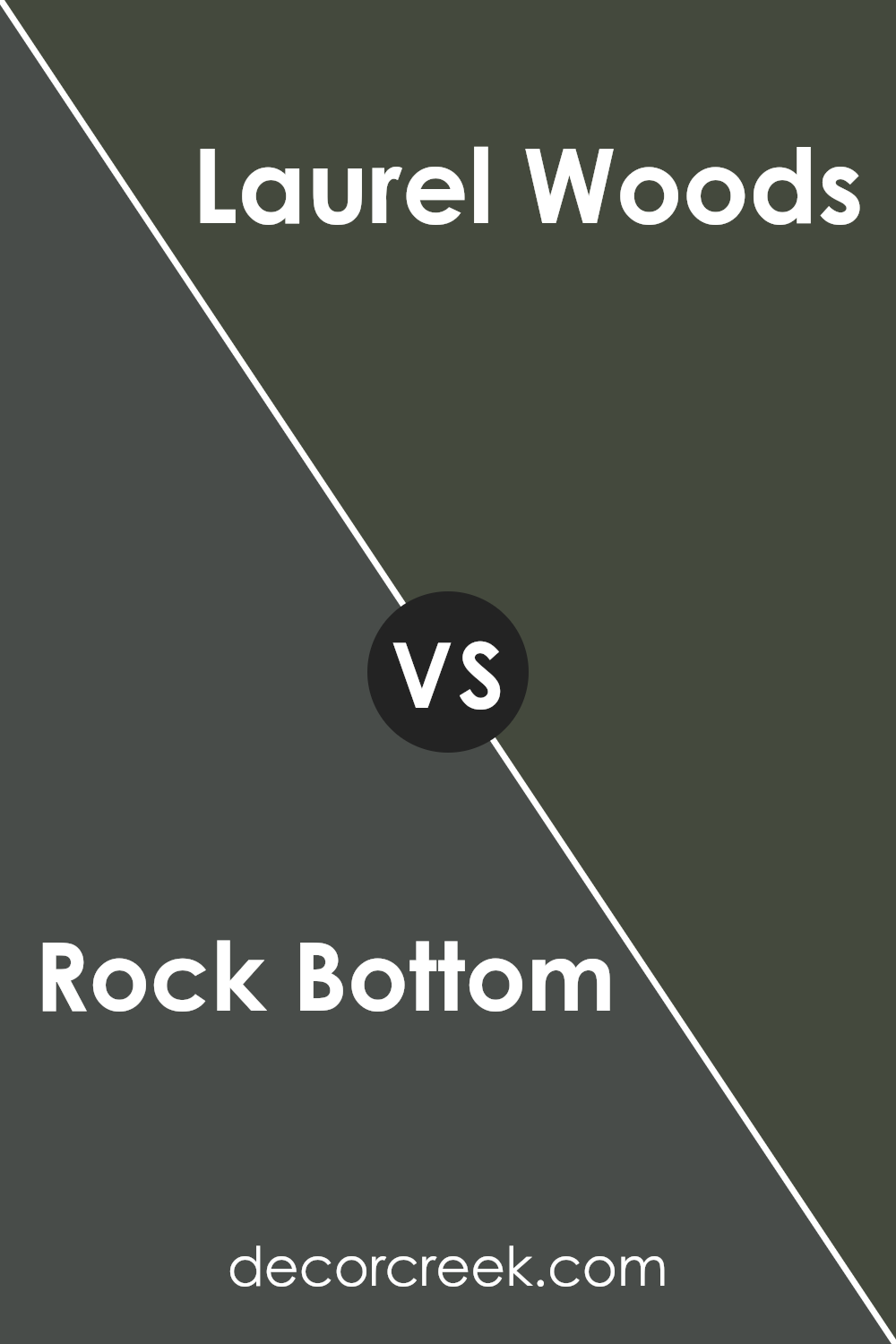
Rock Bottom SW 7062 by Sherwin Williams vs Laurel Woods SW 7749 by Sherwin Williams
Rock Bottom and Laurel Woods, both by Sherwin Williams, are unique in their hues and moods. Rock Bottom is a deep, almost charcoal gray that carries a strong presence. It’s perfect for creating a bold statement in spaces, particularly when used on accent walls or for exterior details.
On the other hand, Laurel Woods is a rich, dark green that tends to blend warmth with nature-inspired tones. It suits well in environments where you want a touch of nature’s calm without using typical green shades.
Although both colors are dark, Rock Bottom leans towards a cooler spectrum, while Laurel Woods brings a hint of warmth due the subtle brown undertones in its green.
These colors can work beautifully together or stand alone, depending on the vibe you’re aiming for in a room.
You can see recommended paint color below:
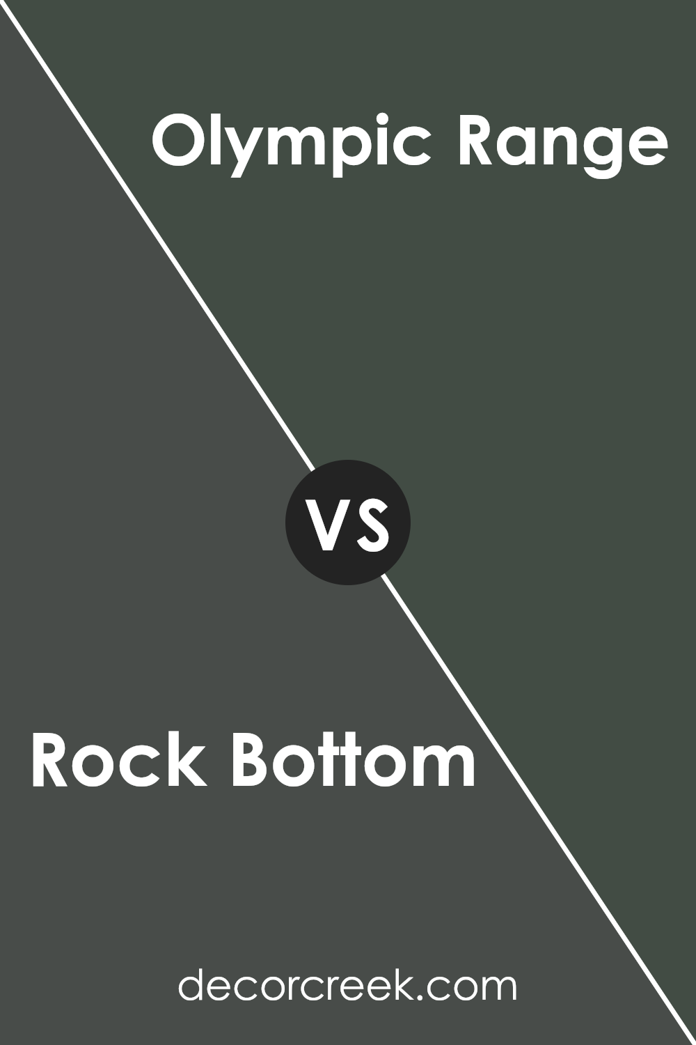
Rock Bottom SW 7062 by Sherwin Williams vs Olympic Range SW 7750 by Sherwin Williams
Rock Bottom by Sherwin Williams is a deep, rich gray with a hint of brown, giving it a warm and cozy feel. It’s perfect for creating a snug and inviting atmosphere in any space. In contrast, Olympic Range is a darker color, leaning more towards a true, deep green.
This color is excellent for adding a bold and grounding effect to a room, providing a touch of nature-inspired beauty.
While Rock Bottom has a versatility that works well in living rooms, bedrooms, or offices, Olympic Range tends to stand out more strikingly and could be ideal for accent walls or spaces where you want to make a statement.
Both colors present an opportunity to create a dignified and welcoming environment, but the choice between them depends on the mood you want to set and the other colors you plan to use in your décor.
You can see recommended paint color below:
- SW 7750 Olympic Range (CHECK A SAMPLE)
Rock Bottom SW 7062 by Sherwin Williams vs Foxhall Green SW 9184 by Sherwin Williams
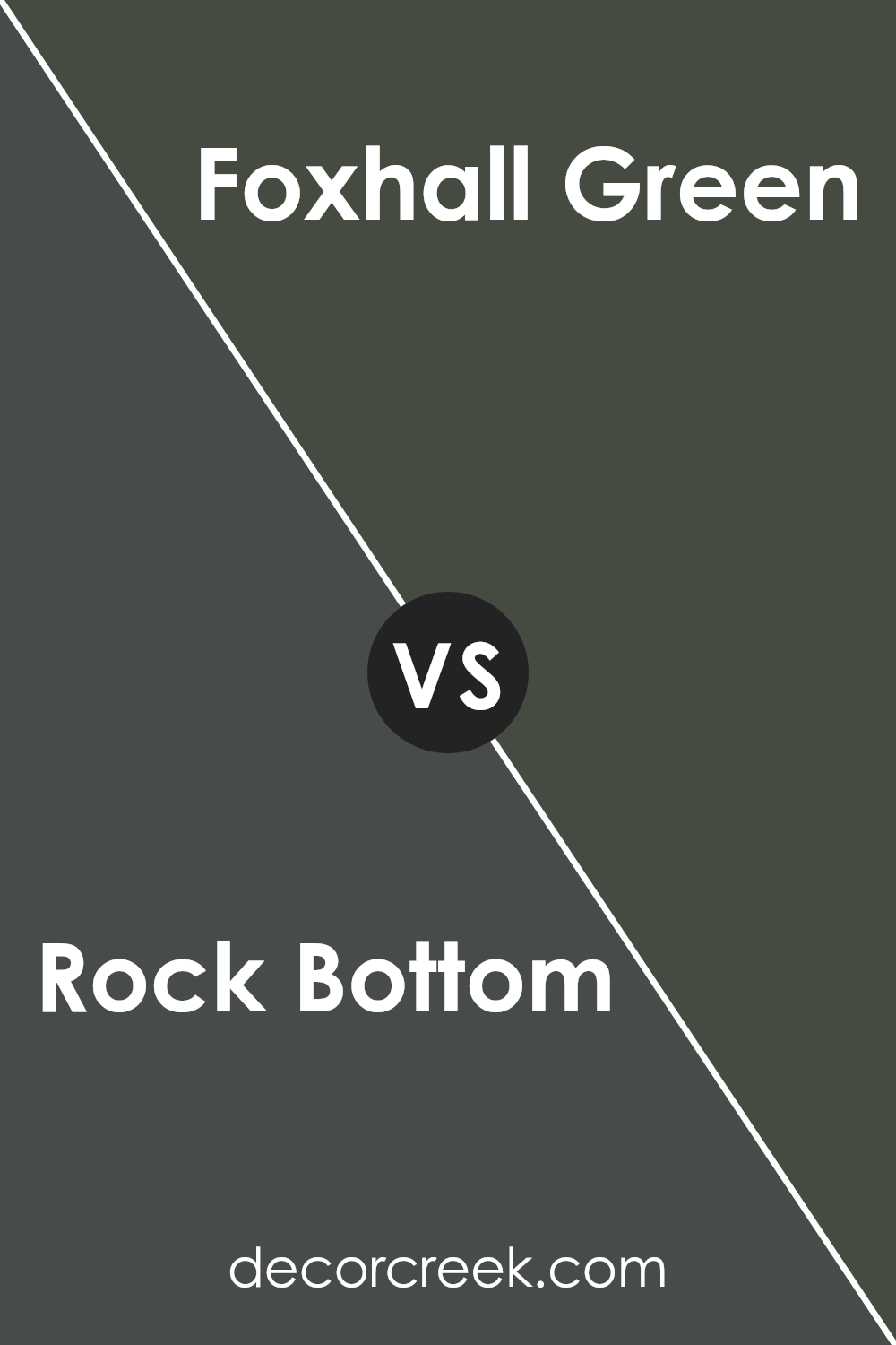
Rock Bottom and Foxhall Green, both by Sherwin Williams, are distinct in their tones and the moods they set. Rock Bottom is a deep, rich gray with a hint of blue. It’s perfect for creating a strong, grounded atmosphere in a space, making it feel secure and cozy.
In contrast, Foxhall Green has an earthy, subtle green tone that leans towards a natural, soothing vibe. It’s lighter than Rock Bottom and brings in a fresh, calm feeling, ideal for spaces where you want a touch of nature-inspired simplicity.
While Rock Bottom can anchor a room with its darker, cooler undertones, Foxhall Green offers a lift with its gentle, warmer hues. Combining the two could provide a balanced visual experience, with Foxhall Green potentially softening the intensity of Rock Bottom.
However, each color holds its own in settings that require a specific ambience—Rock Bottom in more modern, sleek areas, and Foxhall Green in relaxed, casual environments.
You can see recommended paint color below:
- SW 9184 Foxhall Green (CHECK A SAMPLE)
Rock Bottom SW 7062 by Sherwin Williams vs Iron Ore SW 7069 by Sherwin Williams
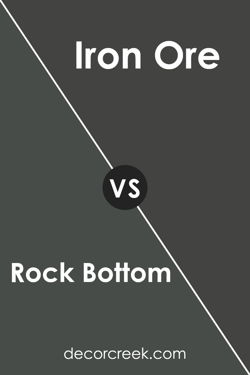
Rock Bottom and Iron Ore, both by Sherwin Williams, are distinguished by their deep, near-black tones that add a strong presence to any space. Rock Bottom has a cooler undertone, leaning slightly towards a charcoal gray. This makes it a great choice for a modern look that still feels warm.
On the other hand, Iron Ore includes more brown in its base, giving it a warmer, more inviting feel compared to Rock Bottom.
When used in a room, Rock Bottom can make the space feel more spacious and open despite its darkness, because of its cooler undertones. Meanwhile, Iron Ore, with its warmer undertones, creates a cozy atmosphere that can make large rooms feel more intimate. Both colors work well for exteriors too, providing a dramatic and modern look but with slight emotional or visual temperature differences influenced by their undertones.
This means they can both be very versatile, but your choice might depend on the mood you want to set or the other colors and materials you plan to use.
You can see recommended paint color below:
Rock Bottom SW 7062 by Sherwin Williams vs Mount Etna SW 7625 by Sherwin Williams
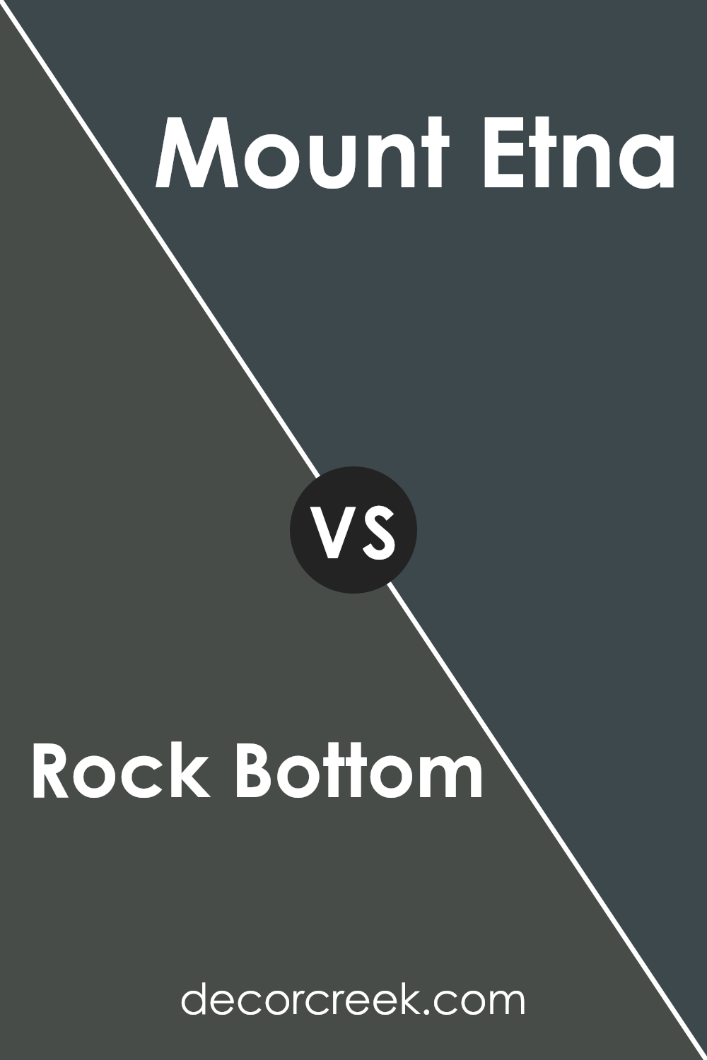
Rock Bottom SW 7062 and Mount Etna SW 7625, both from Sherwin Williams, offer distinct vibes for room settings. Rock Bottom has a deep gray hue with subtle blue undertones, giving it a strong presence without overpowering a space. It works well in various areas, balancing well with both bright and muted accents.
On the other hand, Mount Etna is a robust navy with a greenish tint. This color adds drama and depth, making it a great choice for feature walls or furniture pieces.
Compared to Rock Bottom, Mount Etna provides a bolder statement and can dominate a space if not balanced correctly with lighter tones or complementary colors.
Both colors offer unique characteristics, with Rock Bottom leaning towards a subtle, versatile backdrop and Mount Etna standing out more prominently.
You can see recommended paint color below:
- SW 7625 Mount Etna (CHECK A SAMPLE)
Rock Bottom SW 7062 by Sherwin Williams vs Urbane Bronze SW 7048 by Sherwin Williams
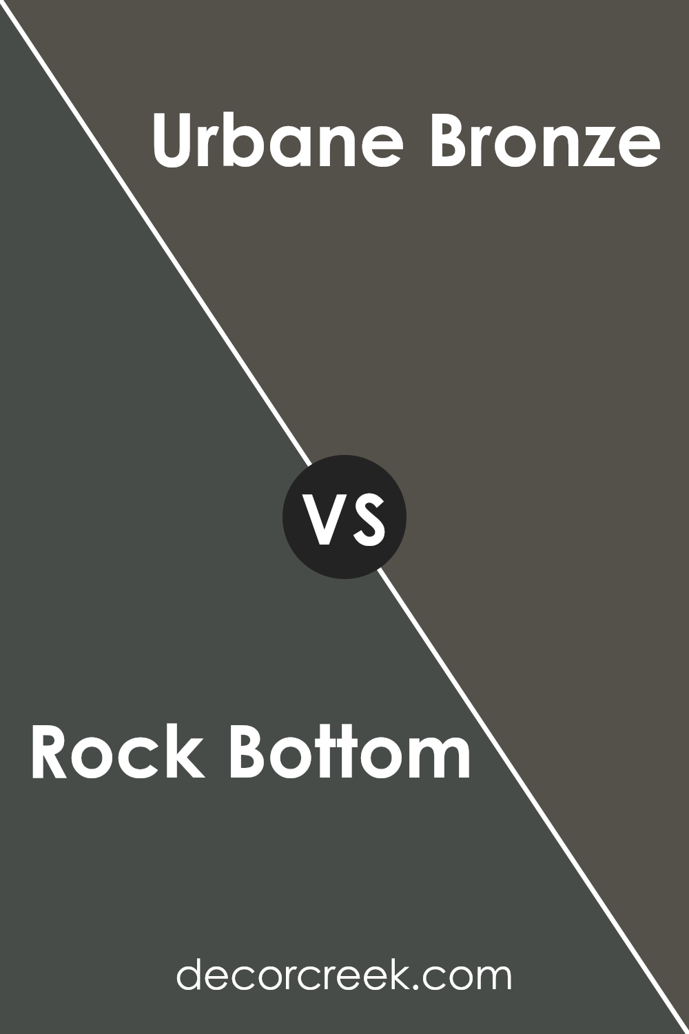
The main color, Rock Bottom, is a deep gray with hints of blue, giving it a calming and cool feel. It’s a versatile color that works well in various spaces, from living rooms to bedrooms, adding a touch of modernity while maintaining a comfortable atmosphere.
On the other hand, Urbane Bronze, the second color, is darker and warmer, leaning more towards a brownish-gray. This color offers a strong, grounding presence, making it ideal for accent walls or for spaces where you want a cozy, enclosed feel. Both colors are quite neutral but bring different vibes due to their underlying tones.
Rock Bottom’s blue undertones offer a cooler appearance, whereas Urbane Bronze, with its brown undertones, provides warmth. Both can be used effectively in home decor to create either a more open, airy space or a snug, comforting one.
You can see recommended paint color below:
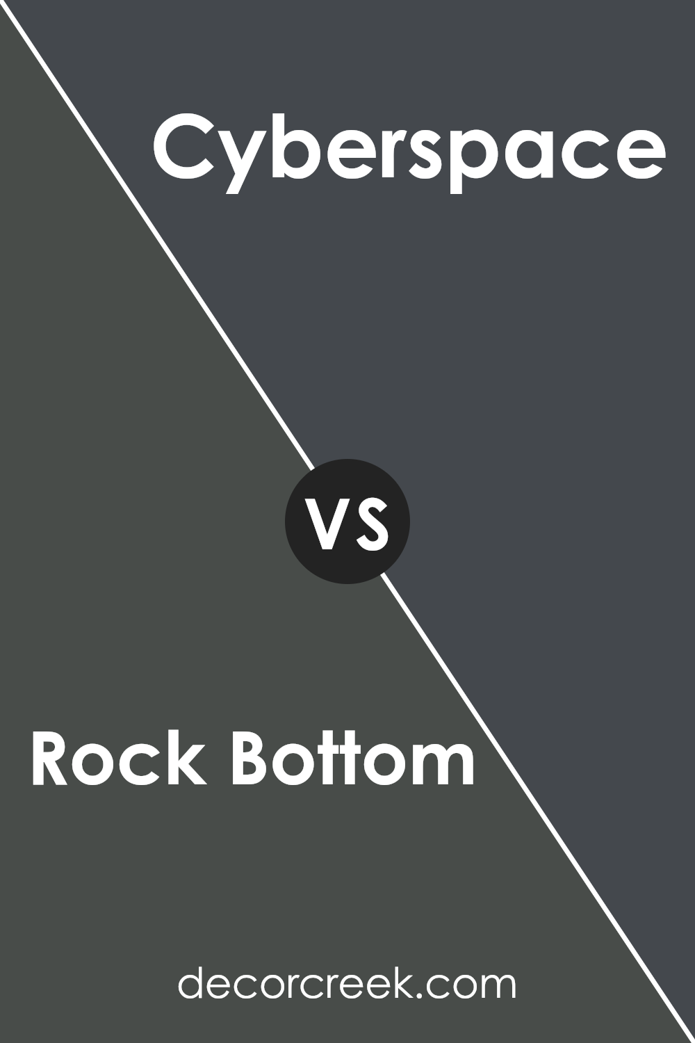
Rock Bottom SW 7062 by Sherwin Williams vs Cyberspace SW 7076 by Sherwin Williams
Rock Bottom and Cyberspace are two shades by Sherwin Williams that share a dark, moody vibe but offer distinct undertones that set them apart. Rock Bottom is a deep, warm gray with a subtle brown undertone that gives it a cozy and inviting feel. This color works well in spaces where you want a touch of warmth without overwhelming the room with too dark a shade.
On the other hand, Cyberspace is darker and leans towards a cooler, almost navy-like gray. It feels more like a modern, stark shade that can give spaces a strong, bold look. The cooler undertones of Cyberspace create a sleek look that is perfect for a more contemporary or industrial style.
Both colors are versatile and can be used in various settings to achieve different looks. Rock Bottom suits areas where you want warmth and a welcoming atmosphere, while Cyberspace is better suited for a modern and clean aesthetic.
You can see recommended paint color below:
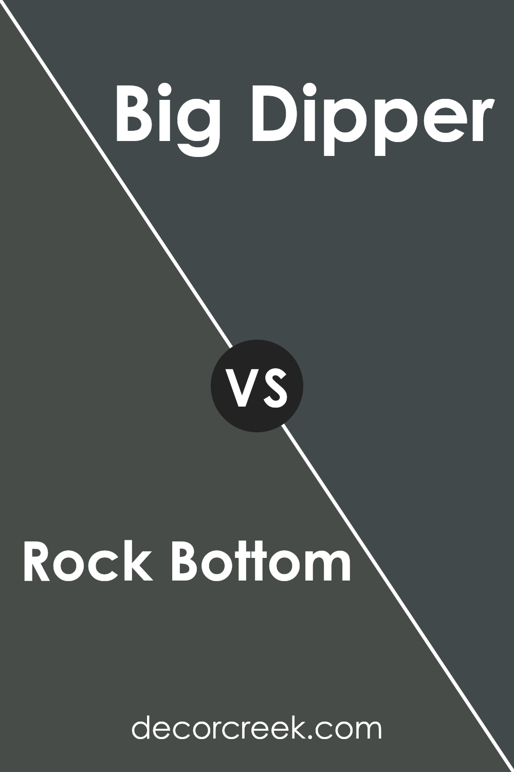
Rock Bottom SW 7062 by Sherwin Williams vs Big Dipper SW 9645 by Sherwin Williams
Rock Bottom and Big Dipper by Sherwin Williams are two distinct colors that offer different vibes for room settings. Rock Bottom is a deep, dark gray with a hint of warmth, making it perfect for creating a cozy and inviting atmosphere in spaces like living rooms or bedrooms. It’s subtle enough to be versatile, yet strong enough to make a statement.
On the other hand, Big Dipper is a lighter and cooler gray. Its airy feel can make small rooms appear more spacious and refreshing. This color is great for areas that need a bright and clean look, such as kitchens and bathrooms.
When comparing the two, Rock Bottom provides a more grounded and homey feel, whereas Big Dipper offers a crisp and modern touch. The choice between them depends on the mood and space you are aiming to create. Both colors work well with a variety of decor styles, making them flexible options for any home.
You can see recommended paint color below:
- SW 9645 Big Dipper (CHECK A SAMPLE)
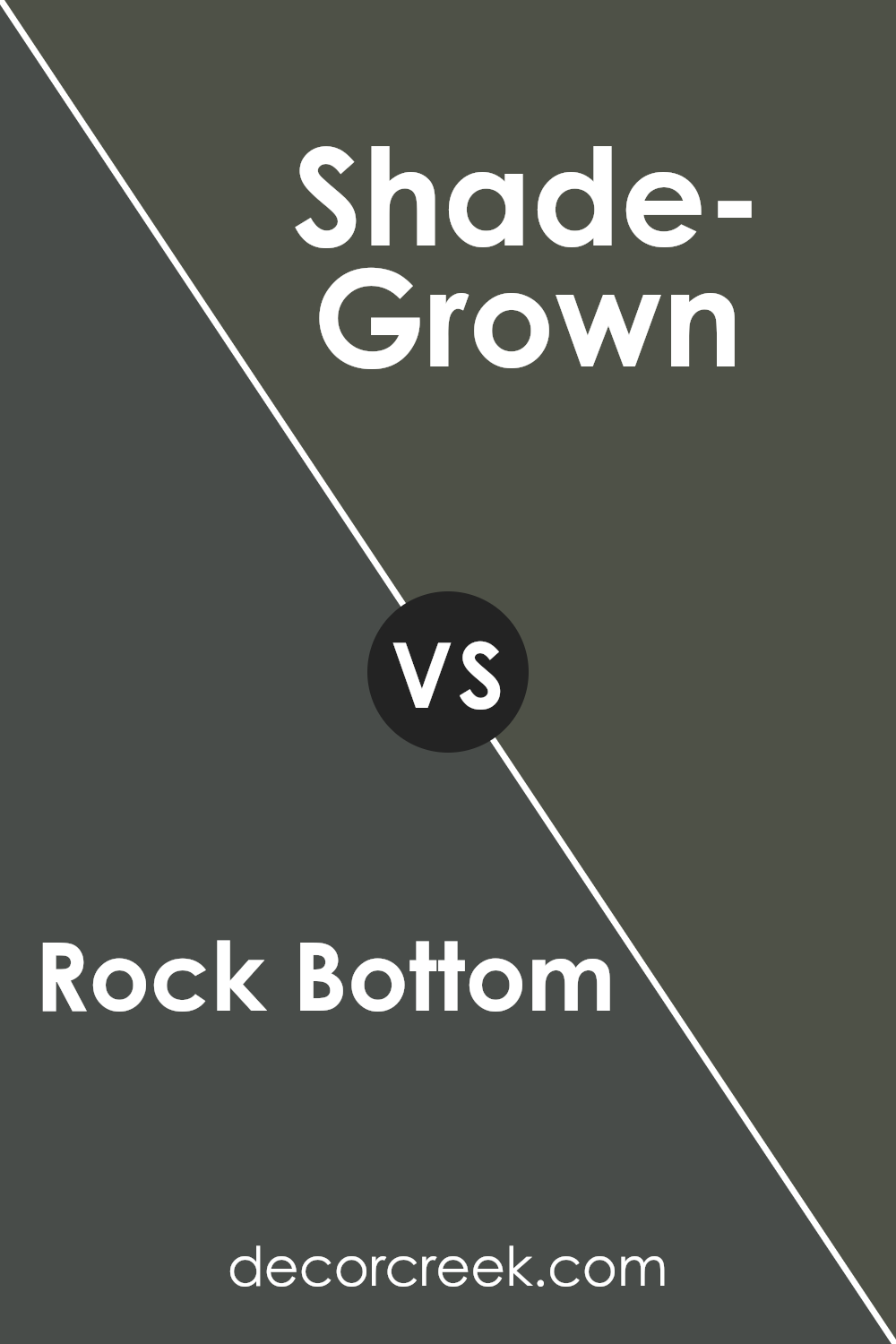
Rock Bottom SW 7062 by Sherwin Williams vs Shade-Grown SW 6188 by Sherwin Williams
Rock Bottom and Shade-Grown, both by Sherwin Williams, are dark, nature-inspired hues, but they have distinct undertones that set them apart. Rock Bottom has a deep charcoal base with a slightly bluish tint, giving it a cooler feel. This makes it an excellent choice for spaces where you want a strong, grounding presence without going completely black.
In contrast, Shade-Grown leans towards a deep, earthy green, reminiscent of dense foliage in a forest. This color has a warmer tone due to its green and brown influences, which can make a room feel cozy and inviting. Both colors work well in spaces that seek to establish a mood of focus and calm, such as studies or bedrooms.
Depending on your decor, such as lighting and furniture, each color can dramatically influence the ambiance of a room.
You can see recommended paint color below:
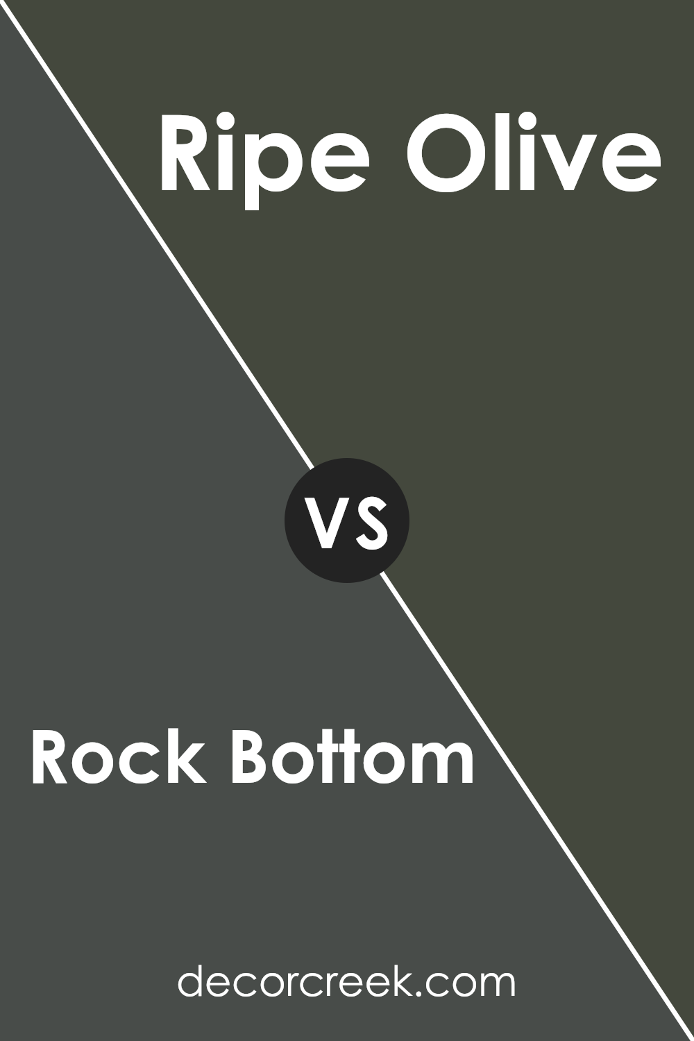
Rock Bottom SW 7062 by Sherwin Williams vs Ripe Olive SW 6209 by Sherwin Williams
Rock Bottom by Sherwin Williams and Ripe Olive by the same company are both dark and rich colors, but they give off different vibes and have distinct tones. Rock Bottom is a deep, dark gray with a hint of blue. This color is perfect for delivering a strong and bold statement in a space, making it ideal for accent walls or furniture.
On the other hand, Ripe Olive is a dark, earthy green. This color gives a room a cozy and inviting atmosphere, akin to being in a lush forest or a peaceful natural setting.
It’s great for spaces where you want to add warmth and a connection to nature. Where Rock Bottom leans towards a cooler tone, Ripe Olive provides a touch of warmth, making them suitable for different types of rooms depending on the mood you want to create.
Both are versatile but serve best when matched with the right surroundings and accents.
You can see recommended paint color below:
Conclusion
In conclusion, after learning all about SW 7062 Rock Bottom by Sherwin Williams, I think it’s a great choice for anyone who wants to make their room look calm and cool. This color is a dark gray that can make a room feel cozy, like giving it a big, warm hug. It works well in places where you want to relax, like your bedroom or living room.
Rock Bottom is not only pretty, but it also goes well with other colors. You can pair it with light colors like white or cream to make a space feel bigger and brighter, or you can match it with other dark colors for a room that feels more private and snug. It’s easy to use in different parts of the house too, not just on the walls.
Some people might even paint furniture or cabinets with it to give them a fresh, new look.
If you’re thinking about painting something in your home and you like the color gray, SW 7062 Rock Bottom could be a perfect pick. It’s simple, looks good, and makes the room feel just right.
Whether you want a place to chill out or just a nice background color that doesn’t get in the way, this paint can do the job.
So, if you’re ready for a change, why not give it a try and see how it goes?
Ever wished paint sampling was as easy as sticking a sticker? Guess what? Now it is! Discover Samplize's unique Peel & Stick samples.
Get paint samples


