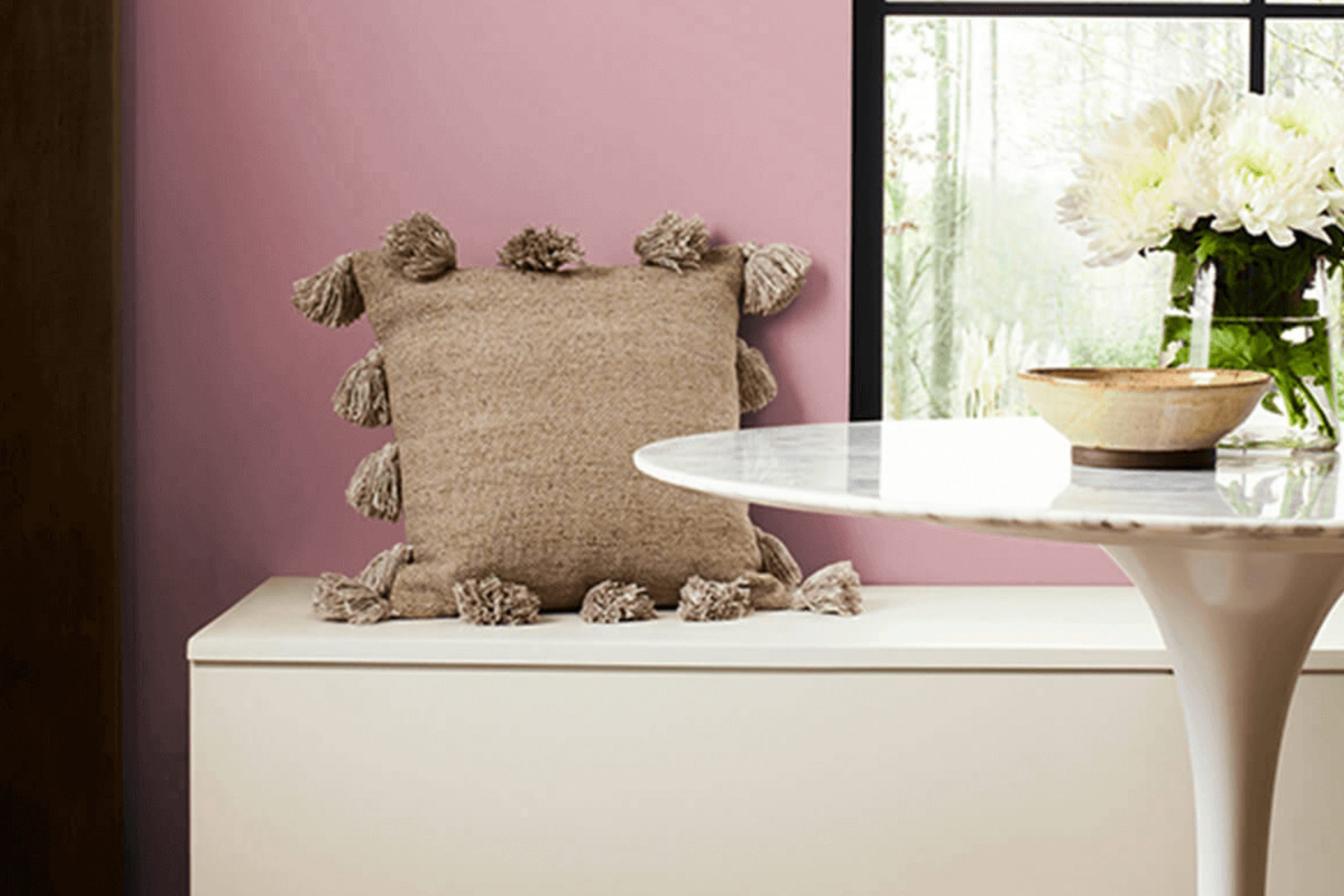
The moment I learned about SW 6297 Rose Embroidery by Sherwin Williams, I was immediately drawn to its soothing charm. This color isn’t just a shade of pink; it feels like a gentle hug from a loved one. Rose Embroidery evokes warmth and invites a sense of peacefulness into any room. When you introduce it to a room, it has the magical ability to make everything feel more welcoming and inviting.
Its subtle, yet elegant presence serves as the perfect backdrop for both modern and traditional settings. While some colors can be too intense, Rose Embroidery strikes the right balance—adding character without overpowering the room.
It has a unique way of adapting to different light conditions, sometimes offering soft pink hues and at other times revealing warmer undertones, which keeps things interesting.
Imagine using it in a cozy living room or a peaceful bedroom. It pairs beautifully with various materials and textures, from plush fabrics to sleek metallic accents.
This makes it adaptable, whether you’re aiming for a contemporary look or something more classic.
SW 6297 Rose Embroidery is like a quiet yet powerful conversation starter, subtly changing your surroundings while maintaining a sense of harmony.
As you consider ways to bring more warmth and personality to your rooms, this color might just become your new favorite ally.
What Color Is Rose Embroidery SW 6297 by Sherwin Williams?
Rose Embroidery by Sherwin Williams is a warm and inviting color, filled with charm and a touch of romance. It’s a soft, muted pink that leans slightly towards mauve, providing an elegant backdrop without being overly bright or intense. This shade works beautifully in various interior styles, offering versatility with a comforting depth.
In a shabby chic interior, Rose Embroidery can complement vintage furniture, lace accents, and faded floral patterns, creating a cozy and nostalgic atmosphere. It also fits well within a bohemian setting, where its gentle warmth can enhance eclectic collections of art and textiles. For a more contemporary look, pairing it with clean lines and minimalist decor adds a subtle touch of color without overpowering the room.
Rose Embroidery pairs nicely with a variety of materials and textures. It complements natural wood finishes, adding warmth to the room. Soft fabrics like velvet, linen, and cotton in neutral hues or soft grays create a harmonious blend with the color. Metallic accents in gold or brass can add a bit of shine and sophistication, highlighting the color’s rosy undertones.
Whether in a bedroom, living room, or even a kitchen, Rose Embroidery provides a cozy and inviting backdrop that can suit various tastes and styles.
Is Rose Embroidery SW 6297 by Sherwin Williams Warm or Cool color?
Rose Embroidery by Sherwin Williams is a warm, inviting shade that brings a cozy feel to any room. This color adds a sense of comfort and charm to a room, making it ideal for living areas, bedrooms, or dining rooms.
Its soft, pinkish hue can brighten a room without being too intense, creating a welcoming atmosphere for both residents and guests. It pairs well with neutral colors like whites and grays, allowing for adaptable design options with furniture and decor. Natural lighting works beautifully with Rose Embroidery, enhancing its gentle glow and adding vibrancy to the room.
This color can also complement wooden furniture and accessories, creating a harmonious and well-balanced look. By using Rose Embroidery, homeowners can create a cozy and inviting home environment, making it feel like a safe and pleasant retreat. This color option can suit a variety of tastes and styles, from traditional to modern settings.
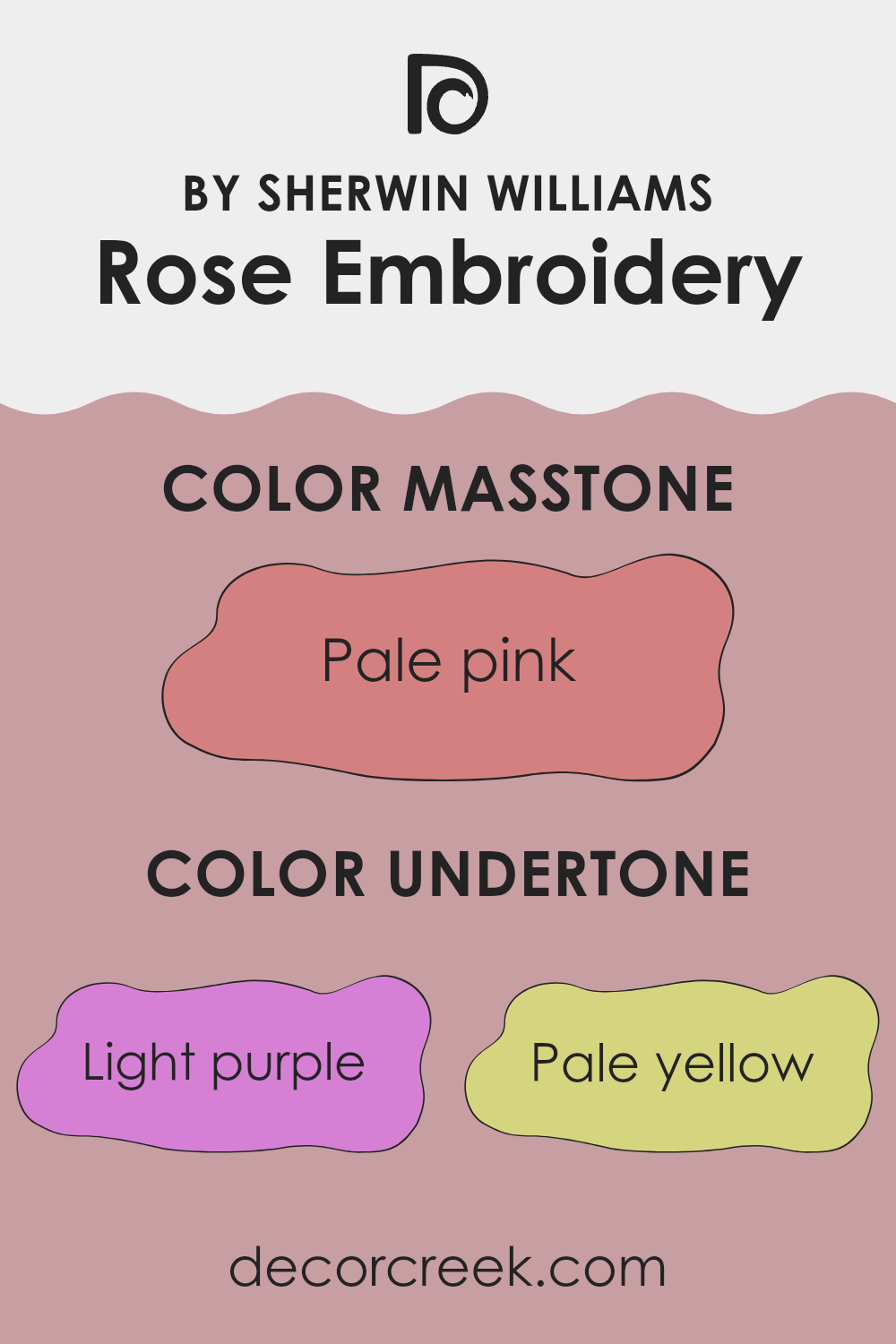
Undertones of Rose Embroidery SW 6297 by Sherwin Williams
Rose Embroidery by Sherwin Williams is a rich and complex color. Its undertones make it interesting and adaptable for interior walls. These undertones include purple, lilac, and violet, lending a cool and calming effect to the color. This can make rooms feel more spacious and relaxed. The red, pink, and fuchsia hints add warmth, giving the color a lively and energetic feel.
The presence of light blue and mint undertones can introduce a fresh and airy vibe, perfect for making smaller rooms seem larger. Meanwhile, the pale yellow and olive provide subtle warmth. These undertones ensure the color doesn’t feel too cold or stark, adding a touch of comfort to any room.
Gray and light gray undertones provide neutrality and balance, allowing Rose Embroidery to pair well with a wide range of other colors and decor styles. This makes it a flexible choice for different home settings, from modern to traditional.
On interior walls, Rose Embroidery can set a welcoming and cheerful tone. Its multiple undertones ensure that it can adapt to varying light conditions, sometimes appearing more warm and lively, other times more cool and calm. This dynamic nature makes it a great choice for living rooms, bedrooms, or any room where a touch of warmth and comfort is desired.
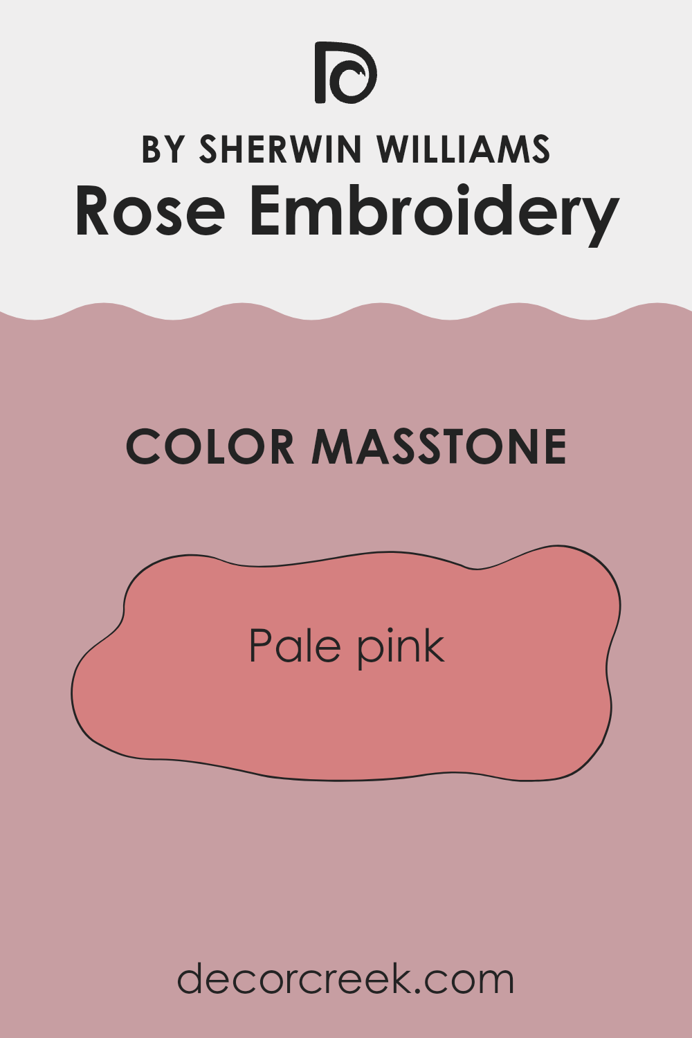
What is the Masstone of the Rose Embroidery SW 6297 by Sherwin Williams?
Rose Embroidery by Sherwin Williams is a soft, pale pink that brings warmth and charm to any room. The color’s masstone, a gentle pink (#D58080), gives areas a cozy and inviting feel. This tone works beautifully in living rooms or bedrooms, creating a calming and comfortable atmosphere.
It can be paired with neutral colors like grays or whites for a balanced look or with deeper tones for a bit of contrast. The pale pink undertone makes it adaptable, allowing it to fit both modern and traditional styles.
In well-lit rooms, it can glow gently, adding a light, airy feeling, while in dimmer areas, it adds a cozy touch. Whether used on walls, furniture, or as an accent, this color can make a home feel more welcoming, perfect for those looking to add a hint of warmth and softness to their interiors.
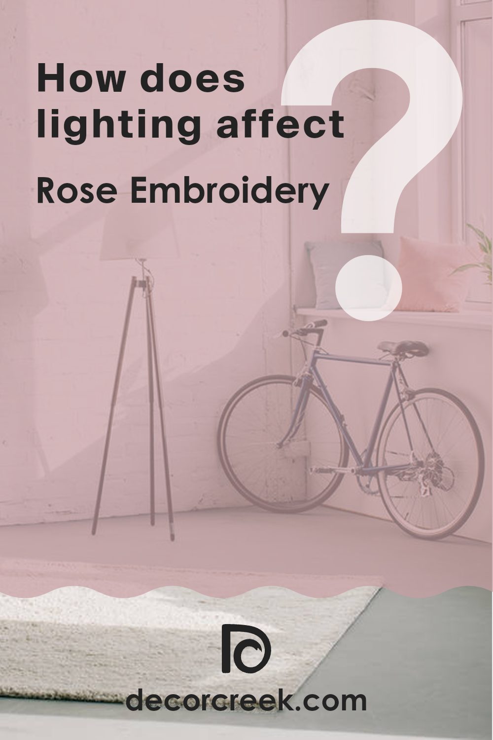
How Does Lighting Affect Rose Embroidery SW 6297 by Sherwin Williams?
Lighting plays a crucial role in how we perceive colors, impacting their appearance significantly. The color Rose Embroidery by Sherwin Williams, for instance, can look different depending on the type of light it is exposed to. In natural light, this color might appear more vivid and bright, while under artificial lighting, it could look duller or warmer, depending on the light’s temperature.
In north-facing rooms, natural light tends to be cooler and less direct. As a result, Rose Embroidery might appear slightly muted or toned down, as the cooler light can make the warm undertones of the color less noticeable. It might seem more subdued, which could be quite pleasant if you’re aiming for a softer look.
In contrast, south-facing rooms benefit from bright and warm natural light throughout the day. Here, Rose Embroidery is likely to show its true richness and depth, appearing vibrant and cheerful. The ample sunlight enhances its warm undertones, making the room feel cozy and inviting.
East-facing rooms receive warm, morning light that gradually turns cooler as the day progresses. In such rooms, Rose Embroidery might look particularly lively in the morning, reflecting the warm sunlight, and then shift to a softer tone in the afternoon.
West-facing rooms catch the warm, golden light of late afternoon and early evening. During these times, Rose Embroidery can look exceptionally warm and rich, but it might appear slightly shadowed or muted in the morning when there’s less direct light.
Artificial lighting also plays a significant part. Incandescent bulbs can enhance the warm tones, making Rose Embroidery look more intense, while fluorescent lighting, which is cooler, could make it appear less vibrant. LED lighting varies, so the effect depends on the bulb’s color temperature. Overall, lighting changes the perception of Rose Embroidery, impacting its mood and suitability for different settings.
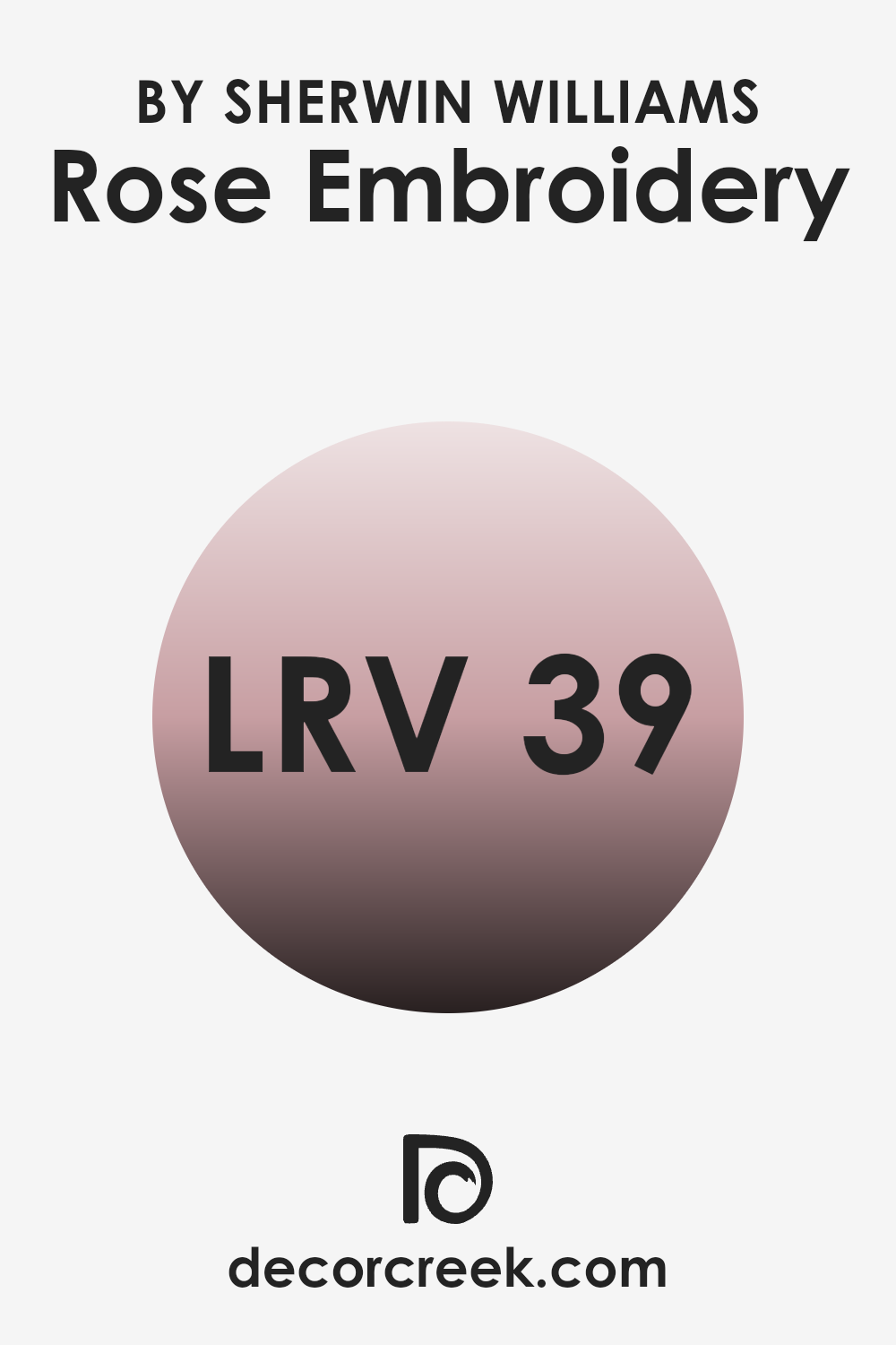
What is the LRV of Rose Embroidery SW 6297 by Sherwin Williams?
Light Reflectance Value (LRV) is a measurement that shows how much light a color reflects and absorbs. It is given as a percentage from 0 to 100, with 0 meaning the color absorbs all light (like true black) and 100 meaning it reflects all light (like pure white).
High LRV colors reflect more light, making a room feel brighter and more open, while low LRV colors absorb more light, creating a cozier and more intimate room. When choosing paint colors for a room, understanding the LRV can help you anticipate how the color will interact with the light in the room and how it might affect the overall atmosphere.
With an LRV of 39.091, Rose Embroidery is a mid-range color that absorbs more light than it reflects. This makes it a slightly darker shade, which is likely to add warmth and richness to a room. Colors with this LRV can give an area depth and character without making it feel too dark or enclosed.
Rose Embroidery’s LRV suggests that it will provide a comfortable balance between bright and muted, making it adaptable enough for different lighting conditions. It can enhance the cozy feel of a room, especially in areas with good natural light, which can help brighten the color slightly.
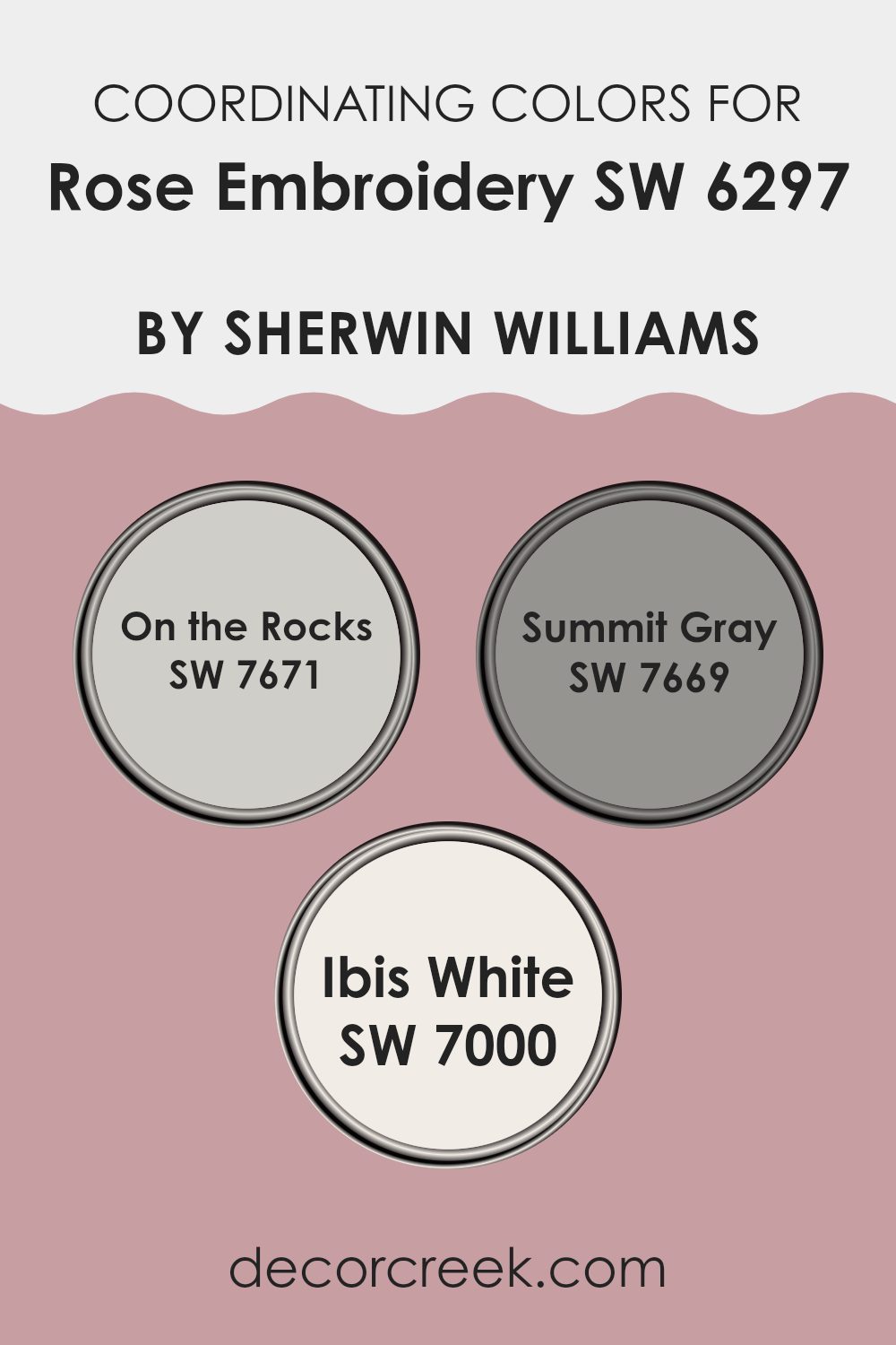
Coordinating Colors of Rose Embroidery SW 6297 by Sherwin Williams
Coordinating colors are shades that are chosen to work together harmoniously. They enhance each other and create a balanced look in a room. When you use coordinating colors with a shade like Rose Embroidery by Sherwin Williams, they enhance its warm pink tone, offering interesting contrasts and depth.
On the Rocks (SW 7671) is a soft gray with a hint of warmth, making it an adaptable partner. It brings a gentle and calm backdrop that complements the richer Rose Embroidery without being too intense. Meanwhile, Summit Gray (SW 7669) offers a slightly deeper gray tone, adding a touch of elegance and working well next to the muted pink.
Ibis White (SW 7000) is a classic white that’s crisp and clean, providing a bright and airy contrast against the more vivid Rose Embroidery. Its simple elegance ensures that it doesn’t compete for attention, instead allowing the pink hue to stand out while still tying the entire palette together. Together, these colors create a harmonious look that’s both inviting and stylish, perfect for those looking to add a comfortable and cohesive feel to their room.
You can see recommended paint colors below:
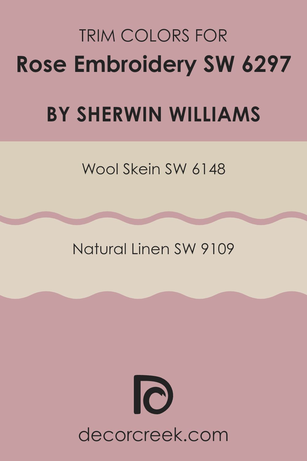
What are the Trim colors of Rose Embroidery SW 6297 by Sherwin Williams?
Trim colors are the accent colors used to highlight and complement the main wall color in a room. For Rose Embroidery by Sherwin-Williams, using trim colors can enhance its warm and inviting feel. Trim colors can be applied to moldings, baseboards, and other architectural features to give a room a more distinct and polished look.
When you use trim colors like Wool Skein and Natural Linen, it adds depth and dimension to a room, making the soft pink hue of Rose Embroidery stand out while maintaining a cohesive color scheme.
Wool Skein by Sherwin-Williams is an adaptable neutral with a touch of warmth, reminiscent of lightly toasted oatmeal. It pairs nicely with Rose Embroidery, creating a soft boundary without stark contrast. Natural Linen offers a similar neutral palette but with a slightly cooler undertone, bringing to mind the subtle elegance of fine, undyed linen fabric. It provides a more earthy, peaceful border that still works seamlessly with the inviting charisma of Rose Embroidery, ensuring that the room feels relaxed yet refined.
You can see recommended paint colors below:
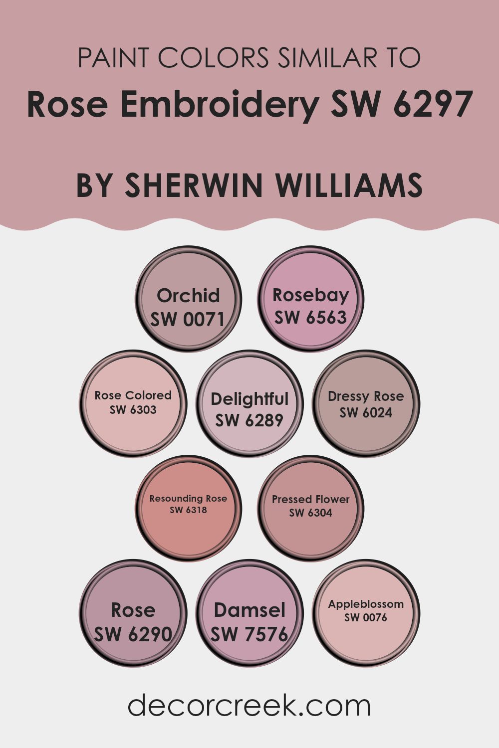
Colors Similar to Rose Embroidery SW 6297 by Sherwin Williams
Similar colors are essential in design because they create harmony and balance. They work well together by sharing a base hue, which makes them visually compatible and pleasing. For instance, colors similar to Rose Embroidery by Sherwin Williams, such as Orchid, Rosebay, and Rose Colored, offer variations of soft pinks and purples that can enrich any room. Orchid is a gentle purple that adds a graceful touch, while Rosebay is a slightly deeper pink that brings warmth. Rose Colored is a classic, rich pink that gives an area a bold, romantic feel.
Other shades like Delightful, Dressy Rose, and Resounding Rose add to this family of colors. Delightful is a sweet, light pink that’s perfect for playfulness. Dressy Rose is a more refined shade, elegant and stylish in its soft pink tone.
Resounding Rose is a louder pink, full of life and energy. Pressed Flower, a muted, dusty pink, provides a vintage charm, while Rose offers a bright and cheerful pink. Damsel is a soft, peachy pink that brings a gentle calm, and Appleblossom, a light, pastel pink, adds a fresh and airy touch
. Together, these colors complement Rose Embroidery by allowing flexibility and creativity in design.
You can see recommended paint colors below:
- SW 0071 Orchid
- SW 6563 Rosebay
- SW 6303 Rose Colored
- SW 6289 Delightful
- SW 6024 Dressy Rose
- SW 6318 Resounding Rose
- SW 6304 Pressed Flower
- SW 6290 Rose
- SW 7576 Damsel
- SW 0076 Appleblossom
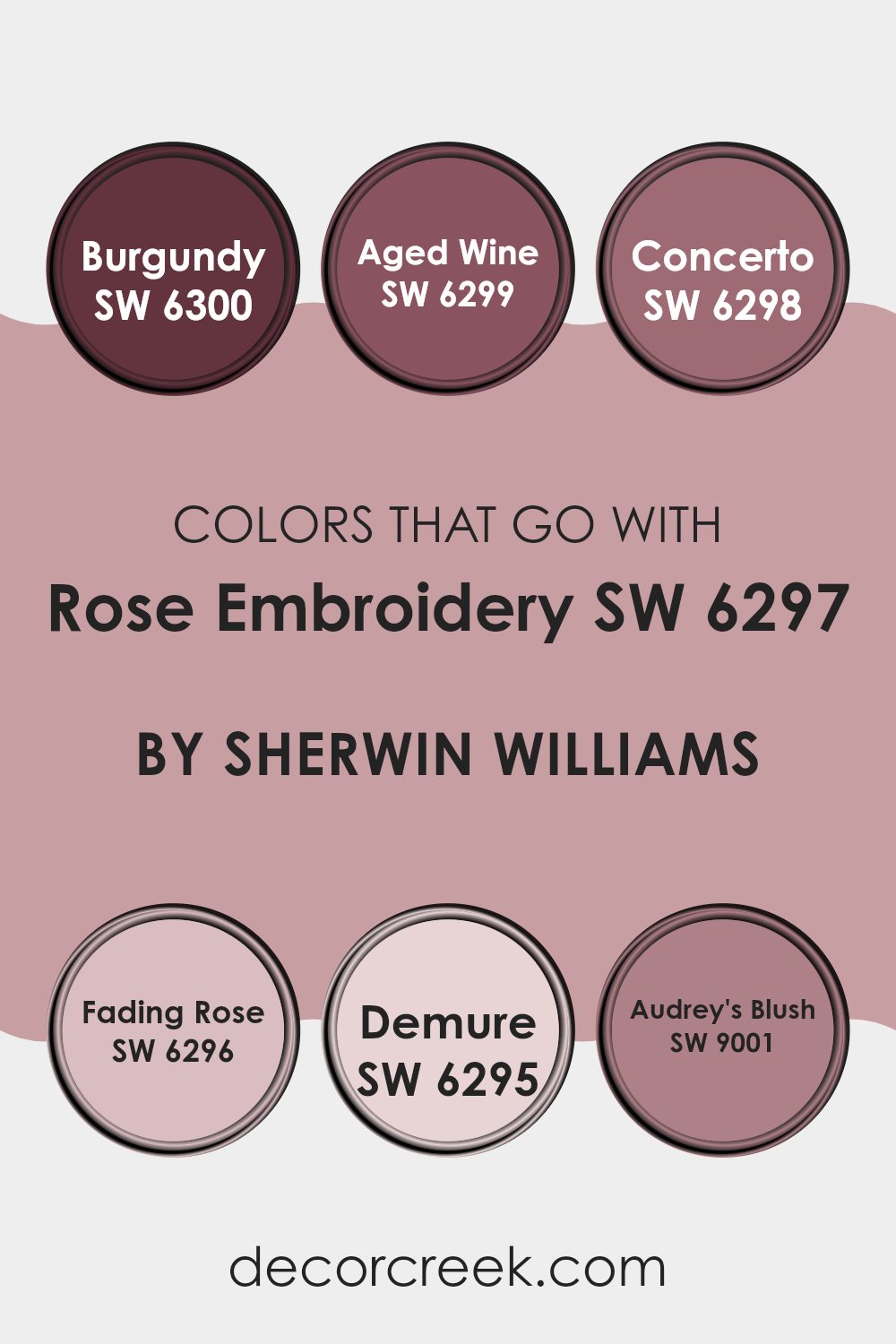
Colors that Go With Rose Embroidery SW 6297 by Sherwin Williams
Colors that go with Rose Embroidery by Sherwin Williams play an important role in creating a harmonious and inviting room. They set the mood and feeling of a room. SW 6300 – Burgundy is a rich, deep red that adds warmth and elegance to a room, making it feel cozy and inviting.
SW 6299 – Aged Wine is a refined shade with hints of purple, which pairs beautifully with Rose Embroidery, adding depth and interest to the palette. SW 6298 – Concerto offers a slightly lighter tone that complements the rich hues of Rose Embroidery, providing a balanced contrast that enhances the overall color scheme.
SW 6296 – Fading Rose provides a soft, gentle blush that adds a romantic touch to the palette. This shade brings a sense of calmness and comfort, making it perfect for creating a soothing atmosphere. SW 6295 – Demure is a light, neutral pink that blends seamlessly with Rose Embroidery, offering a subtle background that highlights the bolder shades.
Lastly, SW 9001 – Audrey’s Blush is an elegant pink with a hint of peach, adding brightness and a touch of playful charm.
Together, these colors create a balanced and pleasing environment, where every shade complements each other, making the room feel warm and cohesive.
You can see recommended paint colors below:
- SW 6300 Burgundy
- SW 6299 Aged Wine
- SW 6298 Concerto
- SW 6296 Fading Rose
- SW 6295 Demure
- SW 9001 Audrey’s Blush
How to Use Rose Embroidery SW 6297 by Sherwin Williams In Your Home?
Rose Embroidery SW 6297 by Sherwin Williams is a warm and welcoming shade of pink. It is an adaptable color that can add a cozy and inviting feel to different rooms in a home. This color works beautifully in bedrooms, creating a peaceful and soothing atmosphere.
In the living room, it pairs well with neutral furniture, adding a pop of soft color without being too intense. For a more adventurous look, pairing it with deep greens or navy can create a striking contrast. In a child’s room or nursery, Rose Embroidery offers a playful yet gentle backdrop.
This shade can also enhance smaller areas like bathrooms or hallways, providing a touch of warmth. Whether painting an entire room or just an accent wall, Rose Embroidery is a great choice for those looking to infuse a bit of warmth and charm into their home without using bold or bright colors.
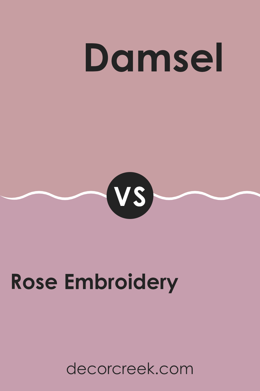
Rose Embroidery SW 6297 by Sherwin Williams vs Damsel SW 7576 by Sherwin Williams
Rose Embroidery SW 6297 by Sherwin Williams is a soft and warm hue that carries a gentle pink tone. It’s inviting and cozy, making it a great choice for rooms where you want to create a comforting and welcoming atmosphere.
On the other hand, Damsel SW 7576 is a more neutral and muted tone with hints of brown and gray. This color is more understated and adaptable, fitting well in various settings without being too intense.
While Rose Embroidery adds a touch of warmth and color, making a room feel lively and cheerful, Damsel provides a calm and balanced backdrop that can make an area feel grounded and stable. Use Rose Embroidery if you want to add personality and warmth to a room, whereas Damsel would be suitable for a more modern and minimalist look. Both colors have their distinct appeal, and the choice depends on the mood and style you want to achieve.
You can see recommended paint color below:
- SW 7576 Damsel
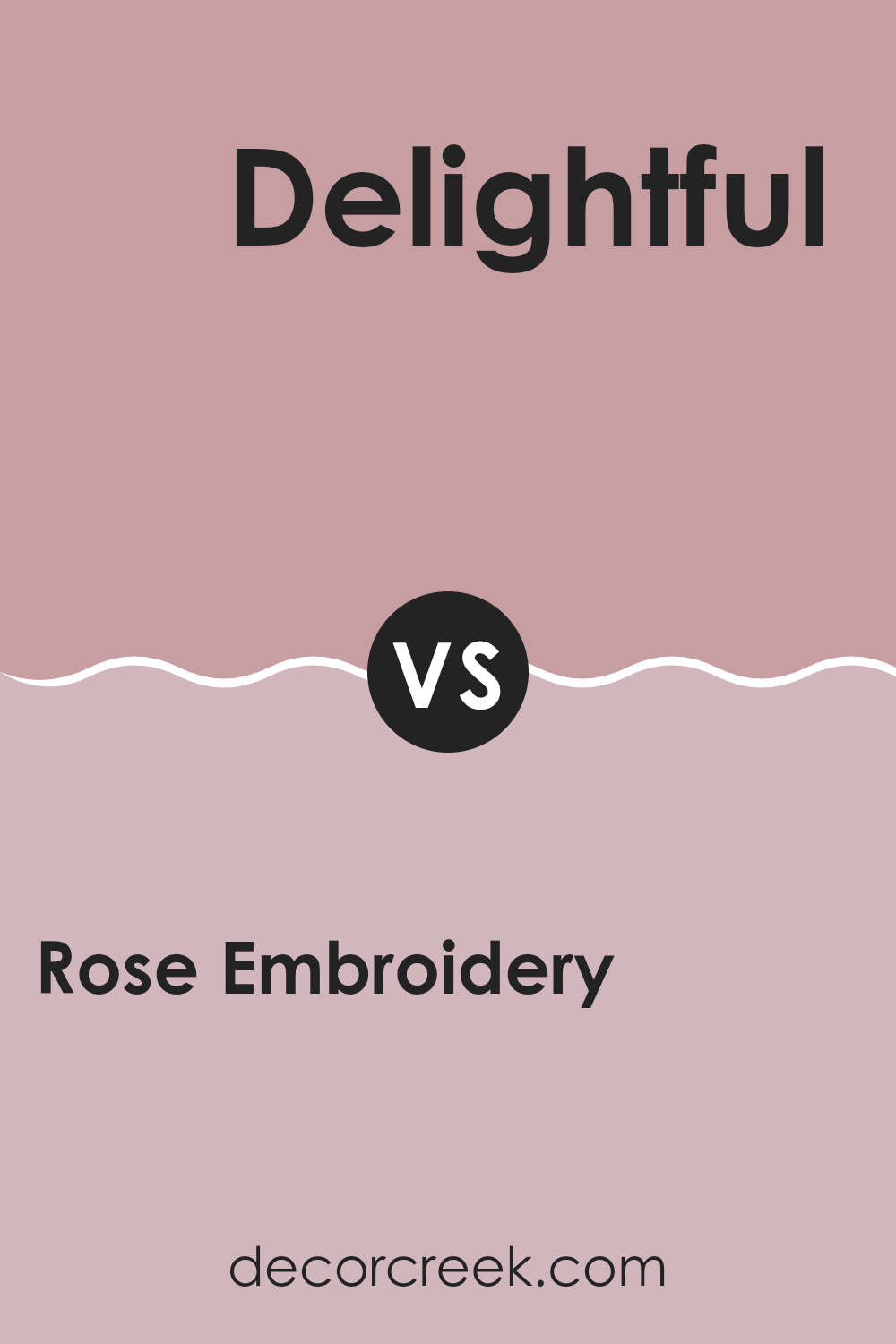
Rose Embroidery SW 6297 by Sherwin Williams vs Delightful SW 6289 by Sherwin Williams
Rose Embroidery SW 6297 and Delightful SW 6289 by Sherwin Williams are both shades of pink but have distinct personalities. Rose Embroidery is a softer, muted pink with a hint of mauve, giving it a gentle and calming presence. It’s an adaptable color that can create a warm and welcoming atmosphere in any room.
On the other hand, Delightful is a brighter and more playful pink. It has a lively energy, making it an excellent choice for rooms that aim to feel cheerful and vibrant. While Rose Embroidery might suit areas where you want a touch of elegance and calm, Delightful is perfect for adding a fun and lively touch.
In summary, Rose Embroidery offers a calm, understated elegance with its muted tone, while Delightful brings a sense of fun and brightness to a room with its lively hue. Both can be used to convey different moods and styles, depending on your preference.
You can see recommended paint color below:
- SW 6289 Delightful
Rose Embroidery SW 6297 by Sherwin Williams vs Resounding Rose SW 6318 by Sherwin Williams
Rose Embroidery and Resounding Rose are two shades of pink offered by Sherwin Williams, each bringing its unique flair. Rose Embroidery is a softer, muted pink with a gentle, calming essence, making it adaptable for both walls and accents. Its subdued nature lends a touch of warmth and elegance without being too intense, suiting areas that aim for a cozy or soothing atmosphere.
In contrast, Resounding Rose is a bolder, more vibrant pink. This shade commands attention with its lively and spirited tone, perfect for adding a pop of color to a room. It’s ideal for feature walls or statement pieces where a stronger presence is desired.
While both colors belong to the pink family, Rose Embroidery leans towards subtlety and gentleness, whereas Resounding Rose is bright and lively. Choosing between them depends on the mood and energy you wish to create in your room.
You can see recommended paint color below:
- SW 6318 Resounding Rose
Rose Embroidery SW 6297 by Sherwin Williams vs Pressed Flower SW 6304 by Sherwin Williams
Rose Embroidery SW 6297 and Pressed Flower SW 6304 by Sherwin Williams are both beautiful shades of pink, but with some differences. Rose Embroidery is a soft, muted pink with a slight hint of warmth, making it feel cozy and inviting. It’s subtle enough to use in a variety of settings, adding a gentle touch of color to any room.
Pressed Flower, on the other hand, is a little bolder and more vibrant. It has a deeper rosy tone that stands out more compared to the gentler Rose Embroidery. Pressed Flower can make a statement and is great for adding a pop of color to a room, while still maintaining a warm and friendly atmosphere.
Both colors have their charm, with Rose Embroidery being the more understated option and Pressed Flower providing a bit more visual interest. Choosing between them depends on whether you prefer a softer look or a richer hue.
You can see recommended paint color below:
- SW 6304 Pressed Flower
Rose Embroidery SW 6297 by Sherwin Williams vs Appleblossom SW 0076 by Sherwin Williams
Rose Embroidery and Appleblossom are two distinct colors by Sherwin Williams that offer different vibes and uses. Rose Embroidery is a soft, muted pink with a gentle warmth that makes a room feel inviting and cozy. It’s an adaptable shade, perfect for living rooms or bedrooms, where you might want a soft touch of color without being too intense.
On the other hand, Appleblossom is a soft, creamy peach with more warmth and a slightly sunny feel. It adds a cheerful and fresh atmosphere to any room, making it great for kitchens or bathrooms where you want an uplifting energy.
Both colors bring a gentle, comforting feel to a room, but while Rose Embroidery leans more into a gentle elegance, Appleblossom offers a slightly brighter and more refreshing look. Depending on the mood you wish to achieve, either color can complement different styles and furnishings beautifully.
You can see recommended paint color below:
- SW 0076 Appleblossom
Rose Embroidery SW 6297 by Sherwin Williams vs Orchid SW 0071 by Sherwin Williams
Rose Embroidery SW 6297 is a soft, warm pink that brings a cozy and inviting feeling to a room. It’s gentle and calming, making it a great choice for bedrooms or living areas where relaxation is key. On the other hand, Orchid SW 0071 is a deeper, more vibrant hue with a purple undertone.
This color adds a touch of elegance and drama to any room, making it suitable for accent walls or rooms where you want to create a striking impression. While Rose Embroidery offers a subtler and more understated look, Orchid provides a bold and lively atmosphere.
Both colors are adaptable, but they deliver different moods. Rose Embroidery can make an area feel warm and comforting, while Orchid can make it feel more dynamic and glamorous. Choosing between the two depends on whether you prefer a room that feels soft and soothing or one with more energy and boldness.
You can see recommended paint color below:
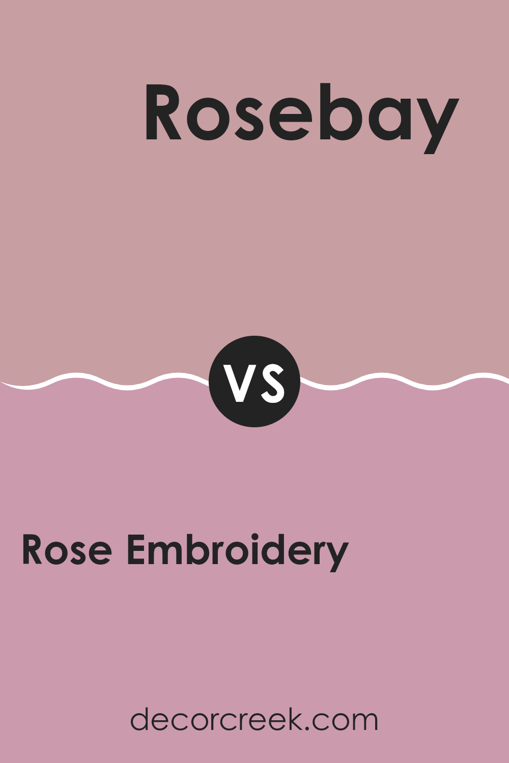
Rose Embroidery SW 6297 by Sherwin Williams vs Rosebay SW 6563 by Sherwin Williams
Rose Embroidery (SW 6297) and Rosebay (SW 6563) are two colors from Sherwin Williams that both fall within the rose and pink color family, yet they have distinct characteristics. Rose Embroidery is a soft, muted pink with subtle undertones that give it a gentle and warm feel. It’s adaptable and can create a cozy atmosphere in living areas.
On the other hand, Rosebay is a brighter, more vibrant pink with a hint of boldness. It has an energetic tone that can add a pop of color and create a lively environment. While Rose Embroidery leans towards a more subtle, understated look, Rosebay stands out more with its intensity.
Both colors are beautiful in their own right but serve different purposes in design due to their differing shades and strengths. Rose Embroidery is great for a calm setting, whereas Rosebay suits areas needing a lively and cheerful touch.
You can see recommended paint color below:
- SW 6563 Rosebay
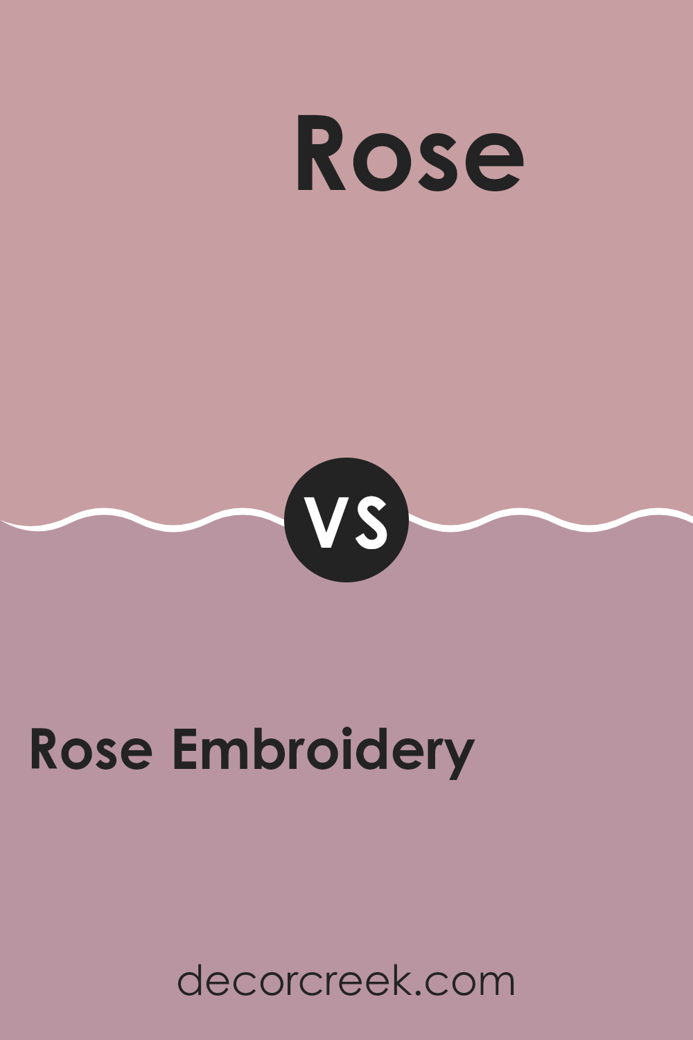
Rose Embroidery SW 6297 by Sherwin Williams vs Rose SW 6290 by Sherwin Williams
Rose Embroidery SW 6297 and Rose SW 6290 by Sherwin Williams are both shades of pink, but they have different vibes. Rose Embroidery is a softer, more muted pink with a touch of warmth. It feels gentle and subtle, making it great for creating a cozy and welcoming atmosphere in any room. This color can add a hint of elegance without being overpowering.
On the other hand, Rose SW 6290 is a deeper, more vibrant pink that feels lively and bold. It has a stronger presence and can bring a sense of energy and passion to a room. This color is perfect for making a statement and adding a touch of playfulness to your decor.
In summary, Rose Embroidery is the choice for a softer, calming look, while Rose is ideal for those looking to inject a bit more excitement and vibrancy into their room.
You can see recommended paint color below:
- SW 6290 Rose
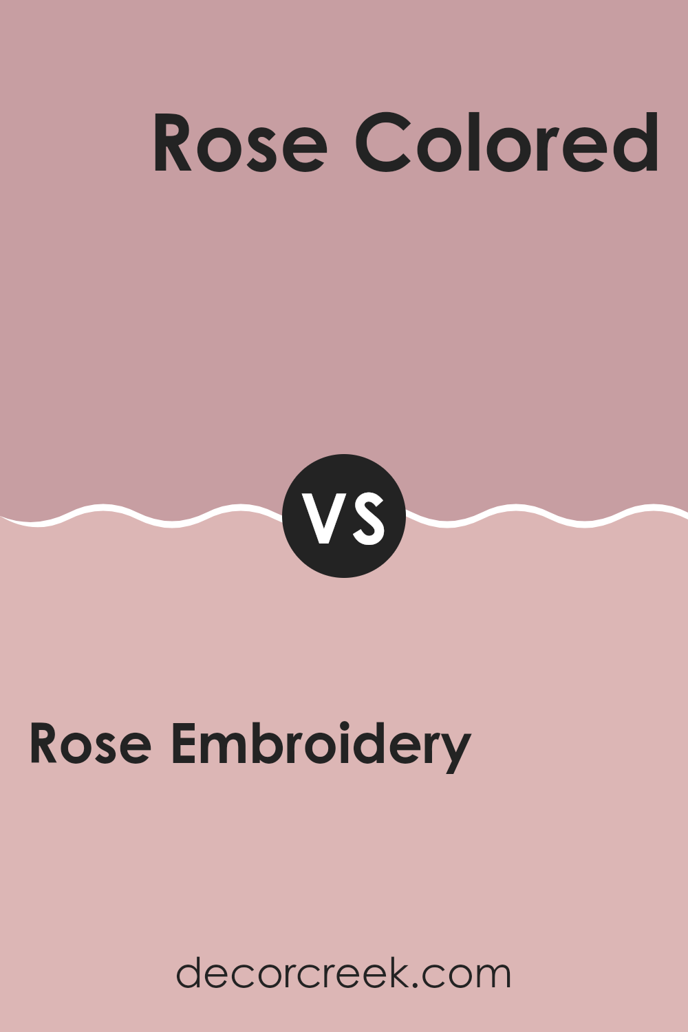
Rose Embroidery SW 6297 by Sherwin Williams vs Rose Colored SW 6303 by Sherwin Williams
Rose Embroidery (SW 6297) and Rose Colored (SW 6303) by Sherwin Williams offer distinct yet complementary vibes. Rose Embroidery is a rich and deep shade of pink, exuding warmth and coziness. It’s perfect for rooms that aim to feel inviting and snug.
Think of a comforting, velvety pink that adds depth and character to any room. On the other hand, Rose Colored is a lighter and more delicate pink. It feels airy, fresh, and soft, suitable for creating a more gentle and romantic atmosphere.
The shade has a breezy quality that can make a room feel open and cheerful. While Rose Embroidery is bold and striking, Rose Colored brings a softer, more delicate touch. Together, these colors can provide a striking contrast in a design scheme. Each stands out on its own but can also complement each other beautifully, depending on the ambiance you want to create.
You can see recommended paint color below:
- SW 6303 Rose Colored
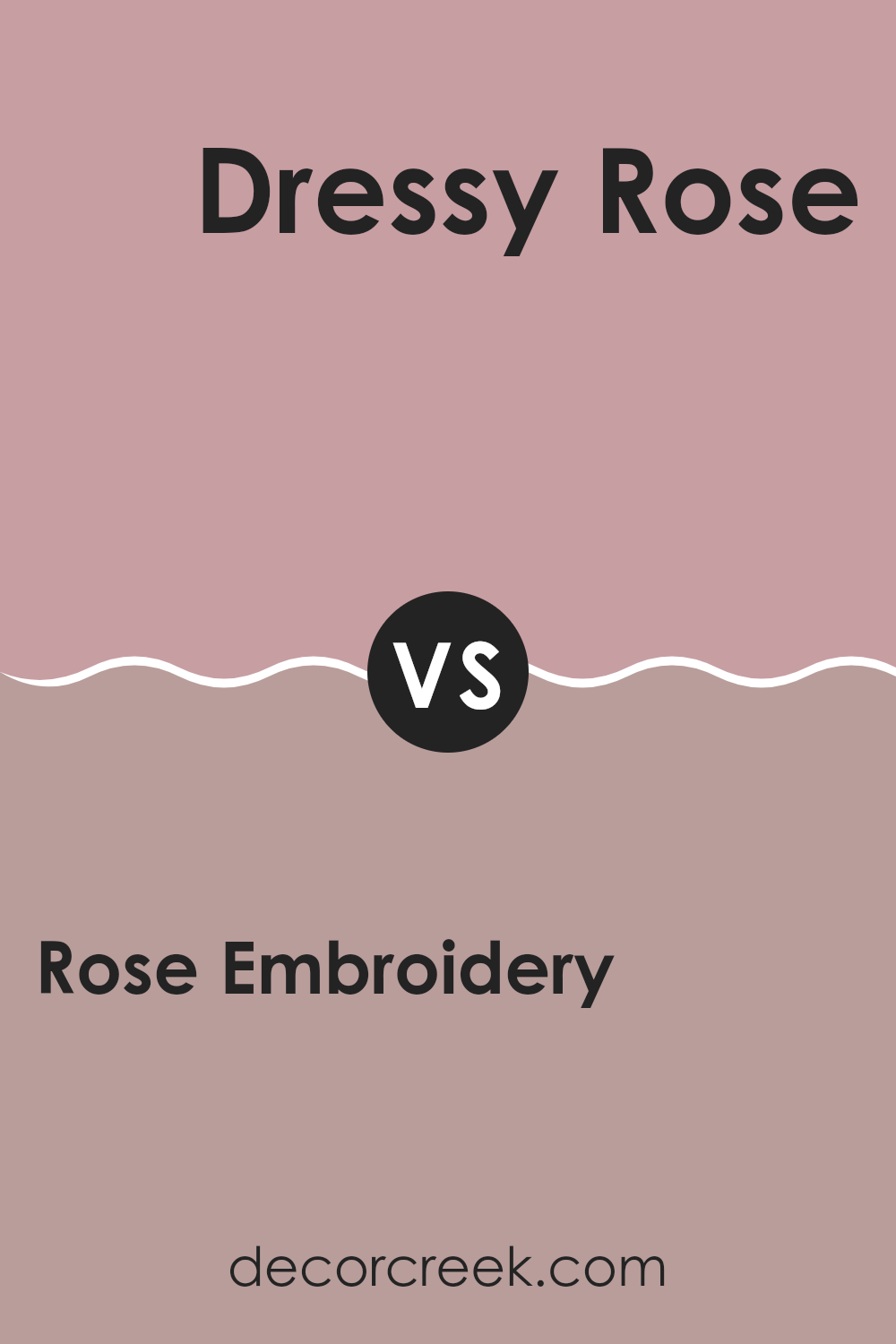
Rose Embroidery SW 6297 by Sherwin Williams vs Dressy Rose SW 6024 by Sherwin Williams
Rose Embroidery and Dressy Rose are two lovely shades of pink by Sherwin Williams. Rose Embroidery is a deeper, richer pink with a slightly purplish undertone. It feels cozy and elegant, making it a great choice for creating a warm and inviting room.
In contrast, Dressy Rose is a lighter and softer pink. It has a brighter and more playful feel, which can add a cheerful and uplifting vibe to a room. While Rose Embroidery brings depth and a touch of sophistication, Dressy Rose offers a light, airy ambiance.
Both colors can be used in various settings, but choosing between them depends on the mood you want in your room. Rose Embroidery suits areas where you want warmth and depth, while Dressy Rose is ideal for rooms where you prefer lightness and brightness. Both are great choices, depending on your style.
You can see recommended paint color below:
- SW 6024 Dressy Rose
After learning all about SW 6297 Rose Embroidery by Sherwin-Williams, I feel like I’ve found a really special color. It’s a shade of pink that reminds me of the quiet beauty of a blossoming rose. What’s amazing about Rose Embroidery is how it can make any room feel gentle and welcoming. It’s not too bright and not too dull, making it perfect for almost any room or project.
If you paint a room with this color, it can make a great place to relax or hang out with friends and family. It’s a warm color, so it can also make cold rooms feel cozy. I think it would look great in a bedroom or living room, perhaps even a study corner, because it has such a soft and calming look.
It’s also neat that this shade of pink goes well with many other colors. So, if you have furniture or decorations in blues, greens, or even neutral shades like gray or beige, they’ll all get along nicely with Rose Embroidery.
In conclusion, Rose Embroidery by Sherwin-Williams is like a friendly hug in color form. I think it’s an amazing choice if you want a paint that’s comforting and easy to love. This color helps to make places feel snug and inviting, which I believe everyone can appreciate.
Ever wished paint sampling was as easy as sticking a sticker? Guess what? Now it is! Discover Samplize's unique Peel & Stick samples.
Get paint samples

