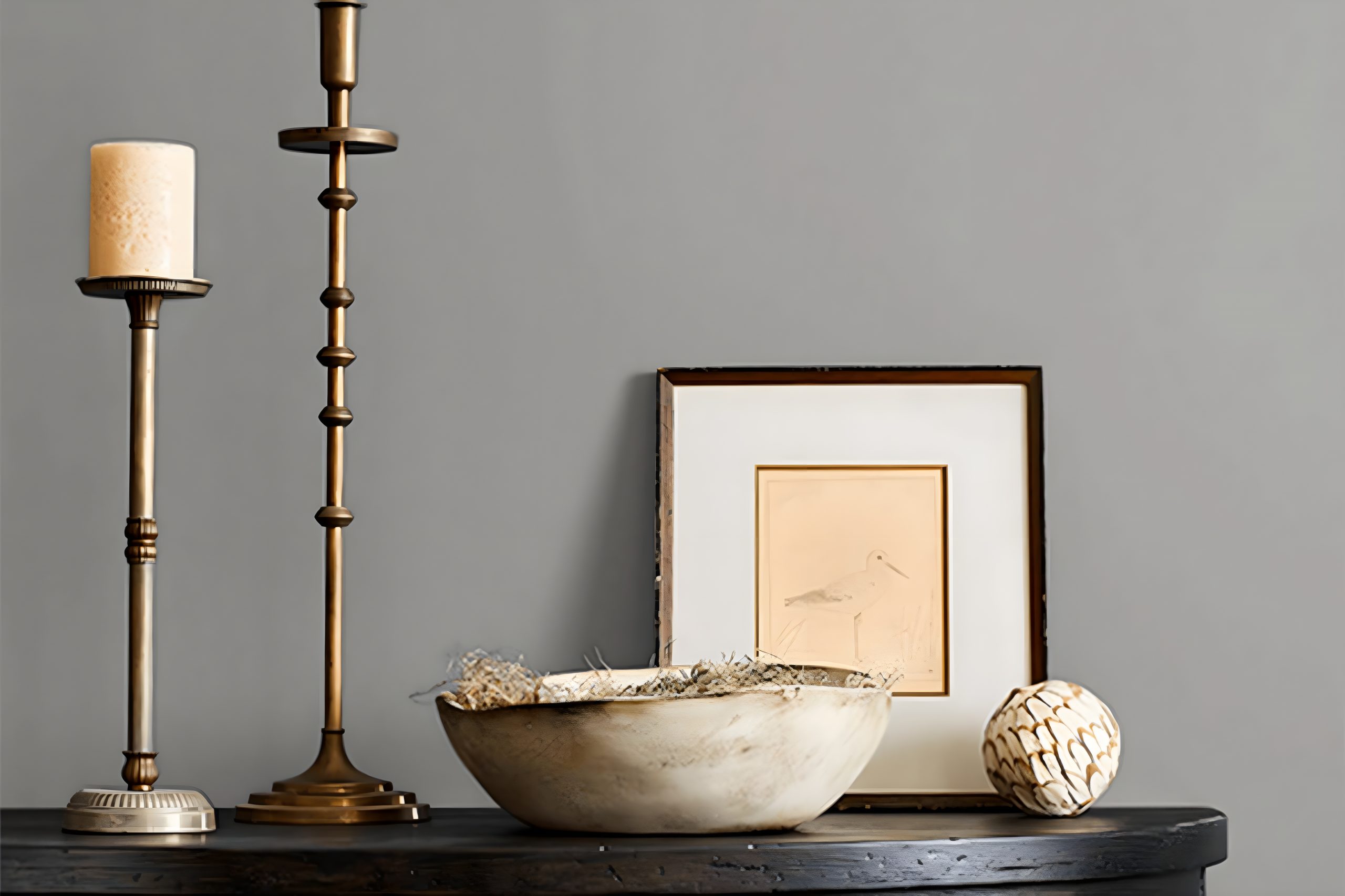
When it comes to picking the perfect paint color for your space, it’s all about finding that ideal shade that combines style and versatility. That’s where SW 7669 Summit Gray by Sherwin Williams steps in as a top contender.
This unique shade of gray stands out for its ability to blend seamlessly into a variety of decor styles, making it a popular pick among homeowners and decorators alike.
Summit Gray isn’t just any gray; it’s a balanced mix that hits just the right note between cool and warm tones. This means it can easily complement different lighting situations and design elements, from modern and sleek furniture to more rustic, wood-based themes.
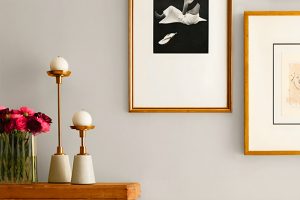
Whether you’re updating a cozy living area, giving a fresh look to your kitchen, or adding a touch of sophistication to your bedroom, Summit Gray offers a sophisticated backdrop that enhances the overall appeal of your space.
Moreover, this color from Sherwin Williams doesn’t overwhelm; instead, it creates a soothing atmosphere that makes rooms feel more inviting.
It’s perfect for those looking to add a neutral, yet deeply thoughtful hue to their walls without steering too far into the stark territory.
With Summit Gray, your decorating possibilities are virtually endless, opening up a world of interior design options that will suit any taste and style.
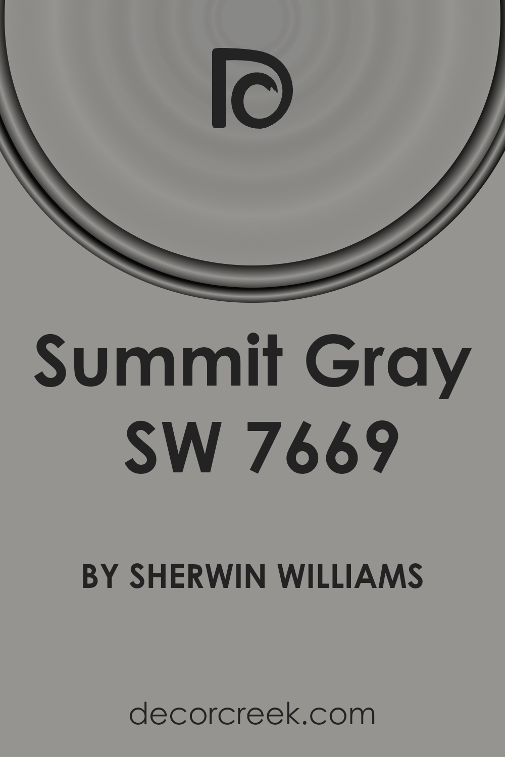
What Color Is Summit Gray SW 7669 by Sherwin Williams?
Summit Gray by Sherwin Williams is a versatile and sophisticated shade of gray that brings a sense of calm and refinement to any space.
This color has a unique balance, not too dark nor too light, making it perfectly suited for a variety of interior styles, from modern to traditional and everything in between.
It possesses a quietly confident charm that can transform rooms into serene havens or dynamic spaces, depending on the accompanying decor.
This gray works exceptionally well with natural materials and textures, enhancing the beauty of wood, stone, and metal in a subtle yet striking manner.
Pair it with light woods for a breezy, Scandinavian look, or with dark, rich woods for a more traditional or luxurious feel. Metals like brushed nickel, chrome, and even matte black can add a modern twist to this color, making rooms look chic and well-put-together.
In terms of interior styles, Summit Gray shines in minimalist, contemporary, and even rustic settings due to its adaptability. Its inherent neutrality allows it to serve as a stunning backdrop for bold colors and patterns in more eclectic or bohemian decors.
For a cohesive look, use it in combination with soft white or creamy tones for a gentle contrast or alongside bold hues for a more dramatic effect. Fabrics in velvet, silk, or soft cotton can complement its understated elegance, creating spaces that feel both inviting and stylish.
Ever wished paint sampling was as easy as sticking a sticker? Guess what? Now it is! Discover Samplize's unique Peel & Stick samples.
Get paint samples

Is Summit Gray SW 7669 by Sherwin Williams Warm or Cool color?
Summit Gray by Sherwin Williams is a versatile gray paint color that can bring a sophisticated and modern feel to any room in your home.
Its unique balance means it works beautifully in spaces with lots of natural light, as well as in rooms that might need a little boost of brightness.
Unlike some grays that can feel too cold or impersonal, Summit Gray has a warmth to it, making spaces feel inviting and cozy without looking dark or dreary.
This is particularly beneficial in living rooms or bedrooms where you want a peaceful, relaxing atmosphere.
What sets Summit Gray apart is its ability to adapt to various decorating styles, from contemporary to rustic. It pairs well with a wide range of colors, from bold hues to soft pastels, allowing for flexibility in design choices.
Whether you’re painting walls, cabinets, or using it as an accent color, Summit Gray can help to unify your space and add a touch of sophistication. It’s a fantastic choice for anyone looking to refresh their home with a color that’s both stylish and practical.
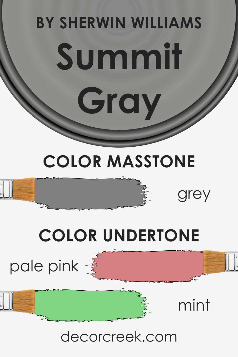
Undertones of Summit Gray SW 7669 by Sherwin Williams
Summit Gray is a unique paint color because it has subtle undercurrents that can change how it looks in different lighting or when paired with various decor elements. The undertones in this case are pale pink and mint.
Understanding undertones is important because they can influence our perception of the main color. For Summit Gray, this means that under certain lighting conditions or when next to specific colors, you might notice a slight hue of pink or a hint of mint peeking through.
These undertones are not always obvious at first glance. Instead, they subtly shift the way the main color appears.
In well-lit rooms, for instance, the pale pink might make the gray feel warmer and softer, adding a gentle, almost cozy vibe to the space.
In contrast, the mint undertone could provide a fresher, crisper look, especially in natural light, making the room feel more vibrant and lively.
When applied to interior walls, the interplay of these undertones with the main gray color can create depth and complexity, preventing the color from feeling flat or monotonous.
It’s like having a dynamic backdrop that gently shifts in character throughout the day or in different lighting conditions. This can add an intriguing layer to your home’s aesthetic, making the walls not just a background but an integral part of your overall decor.
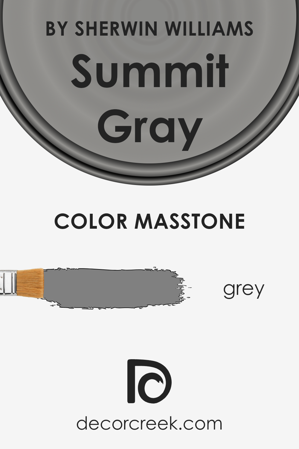
What is the Masstone of the Summit Gray SW 7669 by Sherwin Williams?
Summit Gray by Sherwin Williams, with a masstone akin to classic Grey (#808080), stands out for its versatile and timeless appeal. This particular shade of grey is perfect for homeowners seeking a neutral yet striking color that can complement various decors and settings.
Its neutral base ensures that it works seamlessly in a multitude of environments, from modern to traditional, without overwhelming the space.
The beauty of this grey lies in its balanced nature. It doesn’t lean too cool or too warm, making it an ideal backdrop for both vibrant and subdued accents.
Whether you’re revamping your living room, bedroom, or even your kitchen, this color provides a solid foundation that can support a range of color schemes and furniture styles.
By integrating this exquisite grey into your home, you create a sophisticated and welcoming atmosphere. Its ability to adapt and enhance the surrounding elements makes it a smart choice for those looking to update their space with a color that’s both stylish and enduring.
How Does Lighting Affect Summit Gray SW 7669 by Sherwin Williams?
Lighting plays a crucial role in how we perceive colors. It can significantly alter the appearance of a color, making it look entirely different under various lighting conditions.
This phenomenon is essential to consider when choosing paint colors, such as the popular Summit Gray by Sherwin Williams, for your home.
In artificial light, the impact on Summit Gray can vary depending on the type of bulbs used. Warmer bulbs can make it appear softer and slightly more inviting, adding a cozy feel to the room.
In contrast, cooler bulbs might highlight its gray tones more starkly, giving it a more modern and crisp look.
Natural light brings its dynamics into play with colors. The amount and angle of sunlight a room receives can change the appearance of Summit Gray throughout the day.
In north-facing rooms, which receive less direct sunlight, this color might look more profound and cooler, potentially emphasizing its gray qualities without making the space feel too dark.
South-facing rooms bathe in abundant light for most of the day, which can lighten the appearance of Summit Gray, making the space feel brighter and airier.
The warm light can soften the color, potentially drawing out any underlying warmer tones in the paint.
In east-facing rooms, the morning light can make Summit Gray look particularly soft and warm, creating a welcoming atmosphere.
As the day progresses, the color might lose some of its warmth but still maintain a gentle quality due to the even, diffused light typical in these rooms.
West-facing rooms experience the opposite effect, with the color possibly appearing cooler in the morning. However, as the sun sets, the intense evening light can warm up the color significantly, highlighting any subtle warm undertones and transforming the room into a cozy retreat.
In summary, the way Summit Gray looks can drastically change depending on the lighting, affecting its mood and the overall feel of the room.
Whether in artificial or natural light, and regardless of the room’s orientation, this color displays a versatile range of tones, matching various settings and preferences.
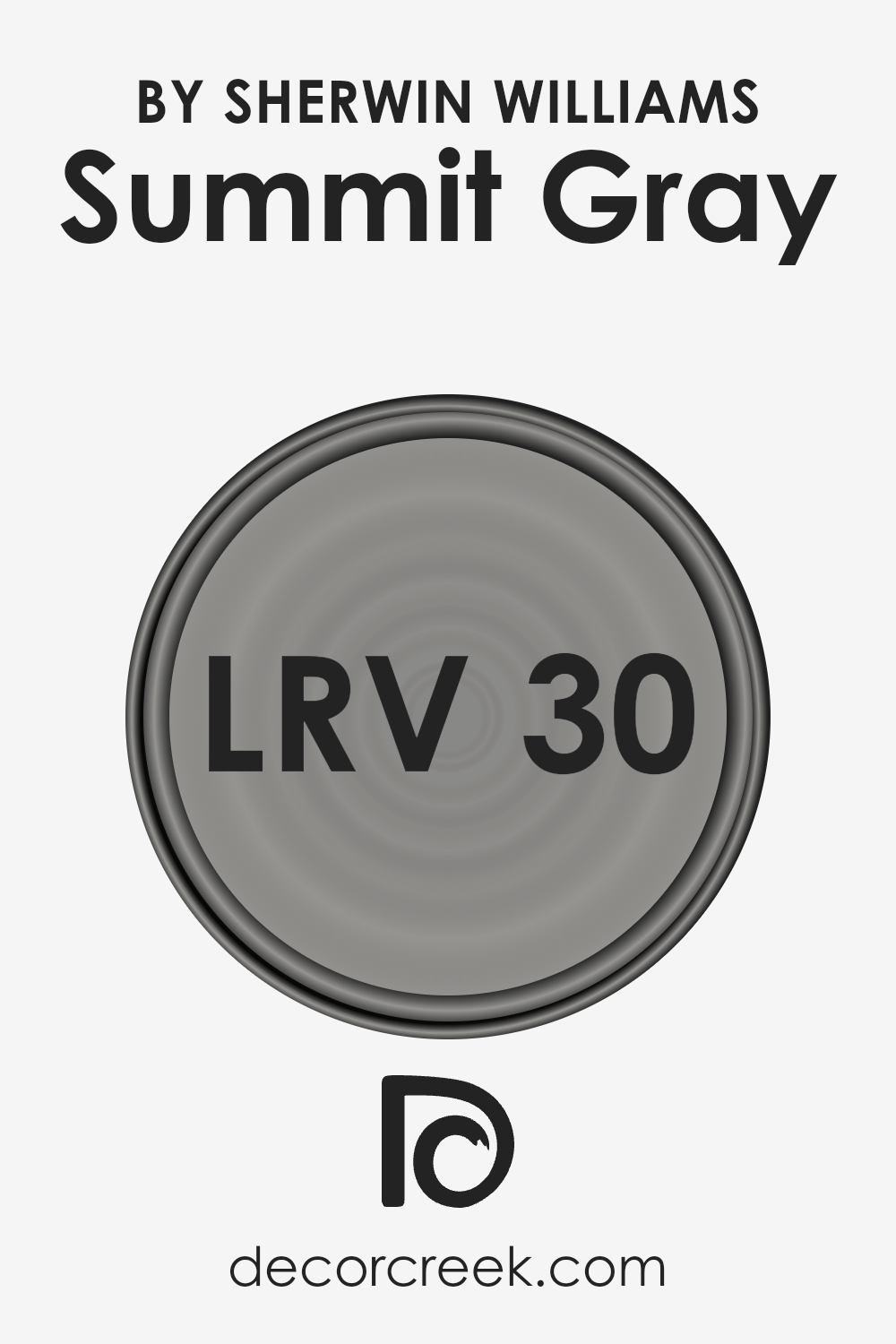
What is the LRV of Summit Gray SW 7669 by Sherwin Williams?
LRV stands for Light Reflectance Value, which is a number that measures how much light a paint color reflects compared to how much it absorbs.
This value ranges from 0 to 100, with 0 being completely black (absorbing all light) and 100 being pure white (reflecting all light).
Understanding the LRV of a paint color is important because it helps you predict how light or dark a color will look on your walls, and how it will feel in different lighting conditions.
Basically, the higher the LRV, the lighter the color will appear in your space, making it feel more open and airy. Conversely, a lower LRV means the color will look darker, which can create a cozy or more intimate feeling in a room.
The LRV of the color in question, which is 29.556, suggests that it’s on the darker side of the scale. This means that when applied to walls, this color will absorb more light than it reflects, creating a darker ambiance in the space.
In rooms with plenty of natural light, this color might appear as a deep, rich gray, potentially adding a sophisticated and grounded feel.
However, in spaces with less natural light, it could make the room feel a bit closed in or more intimate.
So, if you’re considering this color for your walls, it’s essential to consider the amount of light your room gets to ensure the color works as intended and enhances the overall mood and feel of the space.
LRV – what does it mean? Read This Before Finding Your Perfect Paint Color
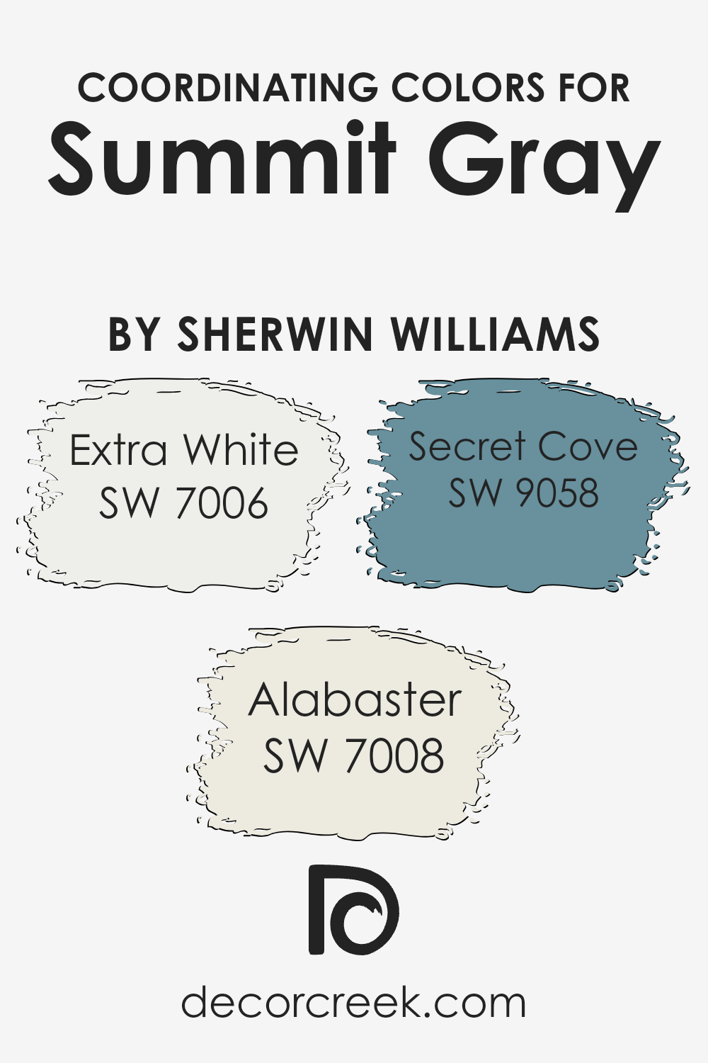
Coordinating Colors of Summit Gray SW 7669 by Sherwin Williams
Coordinating colors work together in harmony to enhance the aesthetic appeal and ambiance of a space. These are hues that, when combined, offer a balanced and cohesive look, ensuring that no single color overwhelms the others.
The art of selecting coordinating colors involves understanding the nuances of each hue and how they interact.
For instance, when working with a versatile and sophisticated color like Summit Gray by Sherwin Williams, choosing the right companions can either elevate the elegance or maintain a subdued charm depending on the chosen palette.
Among the coordinating colors for Summit Gray, Extra White (SW 7006) offers a crisp and clean backdrop, allowing for a fresh and airy feel that can make spaces appear larger and more inviting.
It works seamlessly with Summit Gray to create a modern and minimalistic look. Alabaster (SW 7008) has a softer, warmer undertone compared to Extra White, providing a cozy and serene setting that complements the depth of Summit Gray without creating stark contrasts.
Secret Cove (SW 9058) adds an unexpected splash of color, introducing a serene blue with subtle green undertones that evoke a sense of calm and tranquility.
This refreshing shade can inject a touch of nature-inspired beauty, making it an ideal accent for spaces seeking a blend of sophistication and whimsical charm alongside the stability of Summit Gray.
You can see recommended paint colors below:
- SW 7006 Extra White
- SW 7008 Alabaster
- SW 9058 Secret Cove
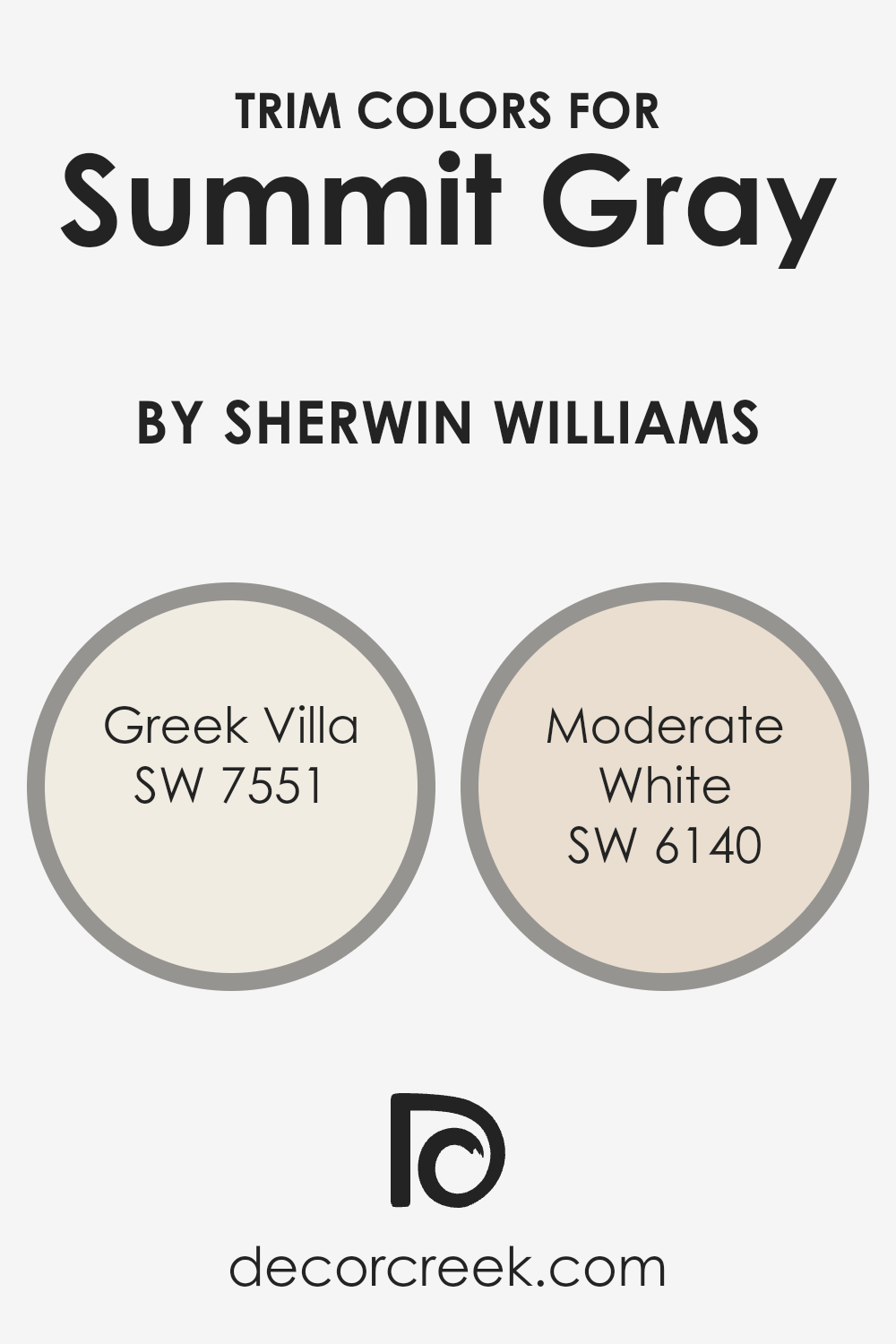
What are the Trim colors of Summit Gray SW 7669 by Sherwin Williams?
Trim colors refer to the hues selected for painting the architectural details of a room or exterior, such as skirting boards, door frames, window frames, and moldings.
They are pivotal because they frame and define the spaces, highlighting contrasts or complementing the overall design aesthetic.
For a sophisticated and balanced look with a base color like Summit Gray by Sherwin Williams, choosing the right trim color can enhance the depth and character of the gray, grounding it within the space or giving it a crisp, defined edge.
Greek Villa SW 7551 is a soft, warm white with a slight beige undertone that offers an inviting warmth to the cooler tones of Summit Gray, ensuring a harmonious balance between the two.
It brings a gentle brightness to rooms, appearing almost sunlit in spaces with ample natural light.
On the other hand, Moderate White SW 6140, a neutral off-white with a hint of taupe, adds a subtle depth to the trim, creating a seamless transition that softens the contrast with Summit Gray yet still defines the space with a quiet elegance.
Both Greek Villa and Moderate White act as versatile trim choices that can enrich and refine the sophisticated palette of Summit Gray, making it stand out without overwhelming the senses.
You can see recommended paint colors below:
- SW 7551 Greek Villa
- SW 6140 Moderate White
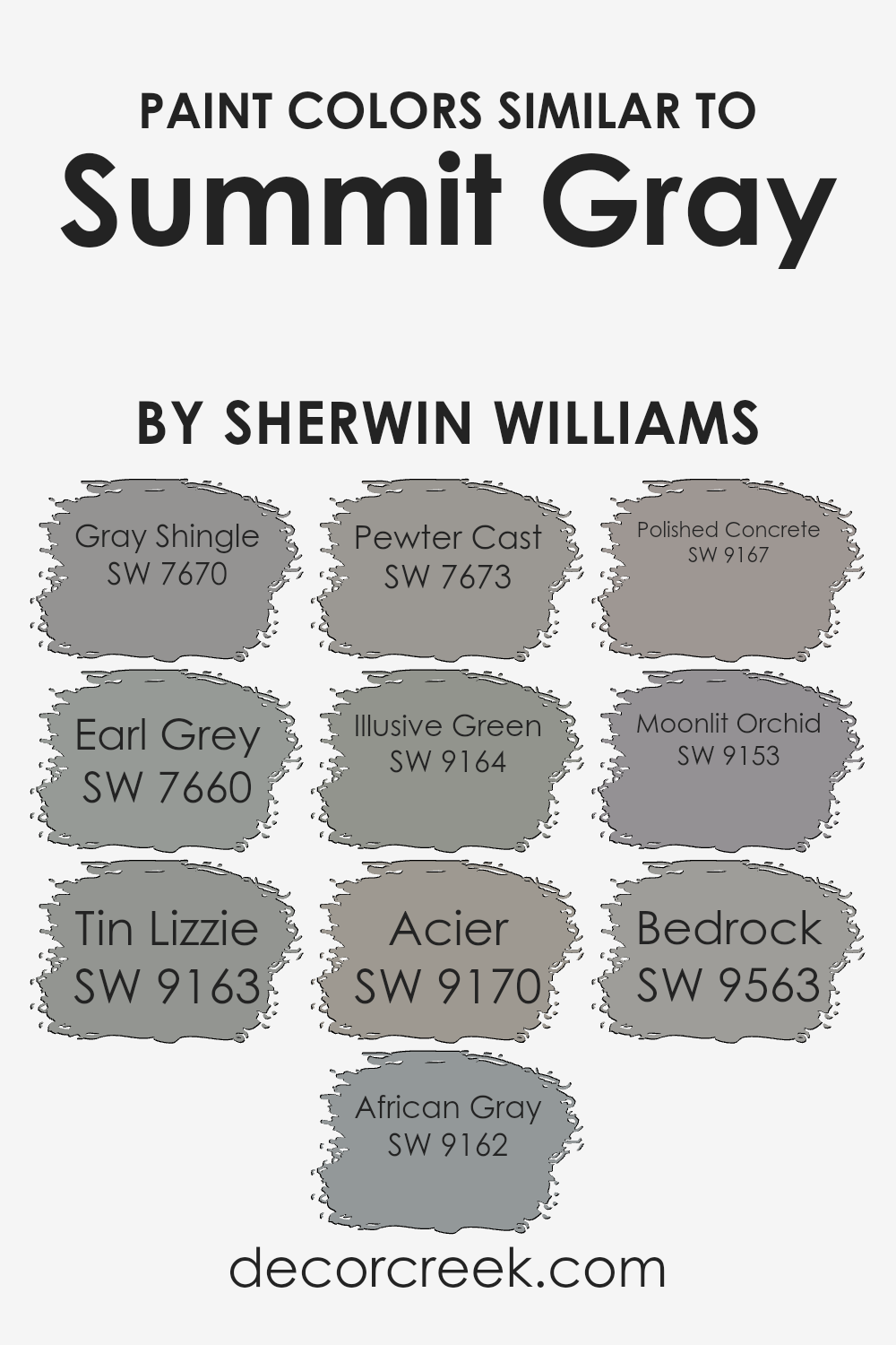
Colors Similar to Summit Gray SW 7669 by Sherwin Williams
Choosing similar colors, like those in the family of Summit Gray, is essential for creating a seamless and harmonious look in any space. These colors, while distinct, share a common base that allows them to work together effortlessly.
When used in a room, they can add depth and sophistication without the risk of clashing. This is because their underlying tones complement each other, providing a smooth transition from one color to the next.
Such coordination is ideal for creating a themed or layered look, whether for a single room or a whole house, making the environment feel cohesive and thoughtfully designed.
For instance, Gray Shingle is a soft, muted gray that offers a tranquil backdrop, akin to the serene mood of a rainy afternoon. Earl Grey, with its slightly darker tone, evokes the comforting warmth of the beloved tea, adding a cozy depth to spaces.
Tin Lizzie shines as a mid-tone gray that has the versatility to blend well with both cool and warm palettes, reminiscent of vintage metalwork. African Gray and Pewter Cast sway towards the cooler spectrum, providing a crisp, modern edge ideal for contemporary settings.
Illusive Green has a unique gray-green hue that mirrors the natural elegance of aged patina, perfect for creating a subtle, organic vibe. Acier showcases a bold, steel-like presence that anchors rooms with its strength.
Polished Concrete captures the raw, industrial chic appeal, offering texture and grit in a sophisticated package. Moonlit Orchid presents a gentle, ethereal touch of gray with a soft purple undertone, introducing a whisper of color to a neutral scheme.
Finally, Bedrock grounds the palette with its rich, earthy essence, offering a solid foundation to build upon. Together, these colors provide a versatile canvas to express personal style while maintaining a unified and inviting atmosphere.
You can see recommended paint colors below:
- SW 7670 Gray Shingle
- SW 7660 Earl Grey
- SW 9163 Tin Lizzie
- SW 9162 African Gray
- SW 7673 Pewter Cast
- SW 9164 Illusive Green
- SW 9170 Acier
- SW 9167 Polished Concrete
- SW 9153 Moonlit Orchid
- SW 9563 Bedrock
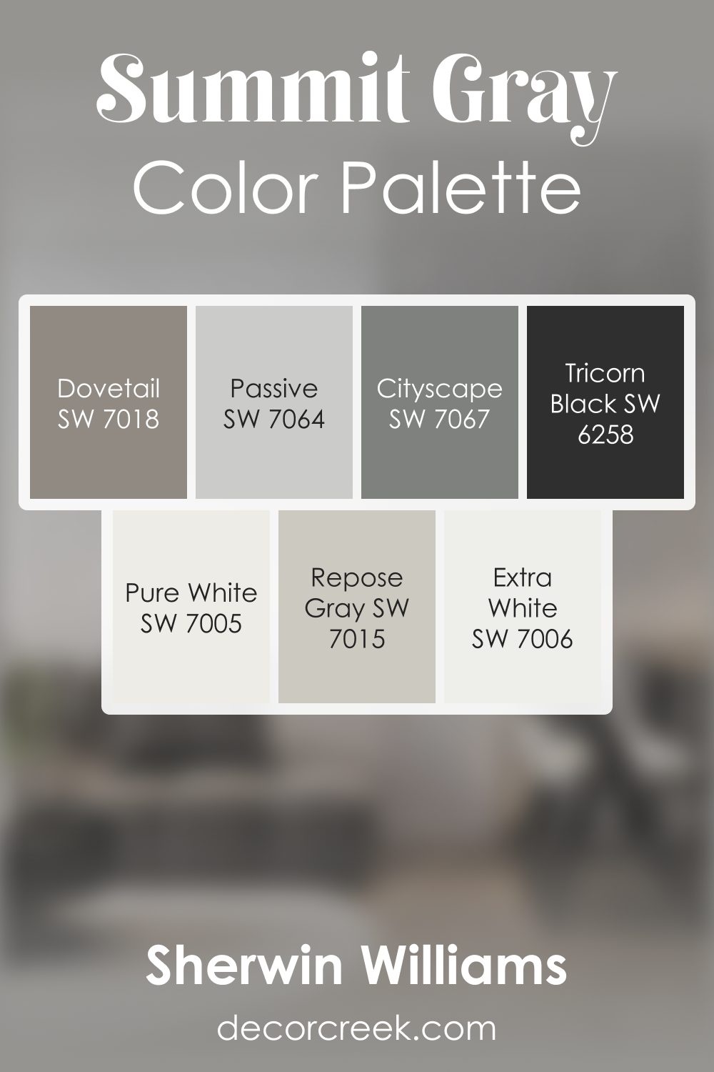
Summit Gray SW 7669 by Sherwin Williams Color Palette
Summit Gray offers a cool, refreshing foundation supported by crisp whites and deep charcoals, creating a layered look that feels steady and clean. Extra White, Pure White, and Passive add brightness that keeps the palette airy, while Repose Gray brings gentle softness for smooth transitions.
Tricorn Black and Cityscape introduce strong accents that ground the palette with bold strength, adding a sense of structure.
Dovetail adds a warm note that balances the cooler tones, giving the palette a friendly and comfortable finish.
This combination works wonderfully for clean, modern homes that appreciate clear contrast and soft neutral layers.
How to Use Summit Gray SW 7669 by Sherwin Williams In Your Home?
Summit Gray is a versatile paint color from Sherwin Williams that homeowners can use to add elegance and depth to their spaces. This shade is a balanced gray that can work wonders in various rooms, creating a cozy and inviting atmosphere.
It’s neither too dark nor too light, making it just right for those who want a modern yet timeless feel.
You can apply Summit Gray in your living room for a sophisticated backdrop. It pairs well with white trim for a crisp look, or you can match it with wooden elements for a warmer vibe.
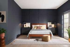
In bedrooms, this color promotes tranquility, turning the space into a peaceful retreat where you can relax and recharge.
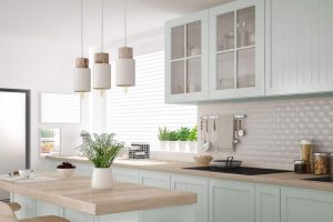
The kitchen also benefits from Summit Gray, especially on cabinets or walls, giving the area a sleek update. And let’s not forget the bathroom, where this color can transform the space into a spa-like sanctuary.
Summit Gray’s flexibility means it suits various decor styles, from contemporary to rustic, and enhances furniture and art, making it a smart choice for anyone looking to refresh their home.
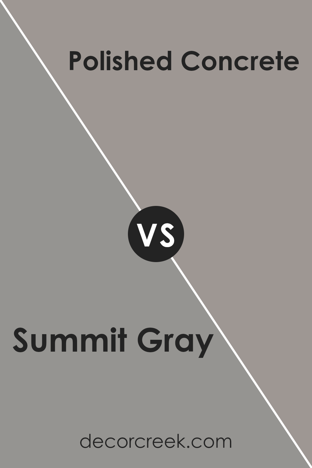
Summit Gray SW 7669 by Sherwin Williams vs Polished Concrete SW 9167 by Sherwin Williams
Summit Gray and Polished Concrete are two Sherwin Williams colors that share some similarities but have distinct differences. Summit Gray is a deeper, more pronounced gray that adds a strong, yet elegant presence to any space.
It has a slightly warm undertone, making it inviting and versatile for different lighting conditions and room settings. On the other hand, Polished Concrete is a lighter, cooler gray that mimics the look of actual concrete – hence the name.
It offers a modern and clean vibe, ideal for minimalist or contemporary designs. While Summit Gray provides a bit of warmth and depth, making spaces feel cozy, Polished Concrete leans towards a more industrial and sleek look, giving rooms an open and airy feeling.
Choosing between them comes down to the mood you want to create: cozy and sophisticated with Summit Gray or modern and sharp with Polished Concrete.
You can see recommended paint color below:
- SW 9167 Polished Concrete
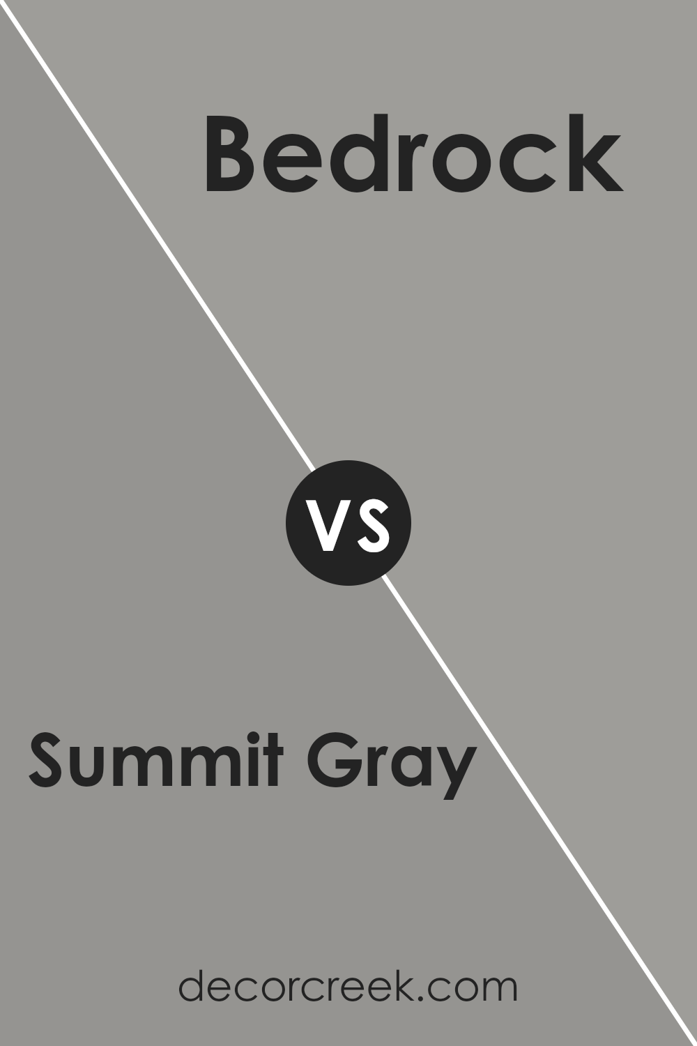
Summit Gray SW 7669 by Sherwin Williams vs Bedrock SW 9563 by Sherwin Williams
Summit Gray and Bedrock, both from Sherwin Williams, are distinct in their tones and vibes they bring to spaces. Summit Gray sits comfortably in the middle of the gray spectrum, neither too dark nor too light.
It’s versatile, fitting seamlessly in almost any room, adding a touch of sophistication without feeling overwhelming. On the flip side, Bedrock leans towards a deeper, warmer tone, suggesting a more grounded feel to interiors.
This color can add depth and a sense of coziness to spaces, making it excellent for areas where you want warmth and comfort.
While Summit Gray can be seen as a more neutral choice, easily paired with a variety of decor styles, Bedrock offers a strong presence, possibly best suited for those looking to make a bolder statement.
Both colors reflect elegance in their own way, but your choice between them might boil down to the type of atmosphere you’re aiming to create: light and airy with Summit Gray or warm and inviting with Bedrock.
You can see recommended paint color below:
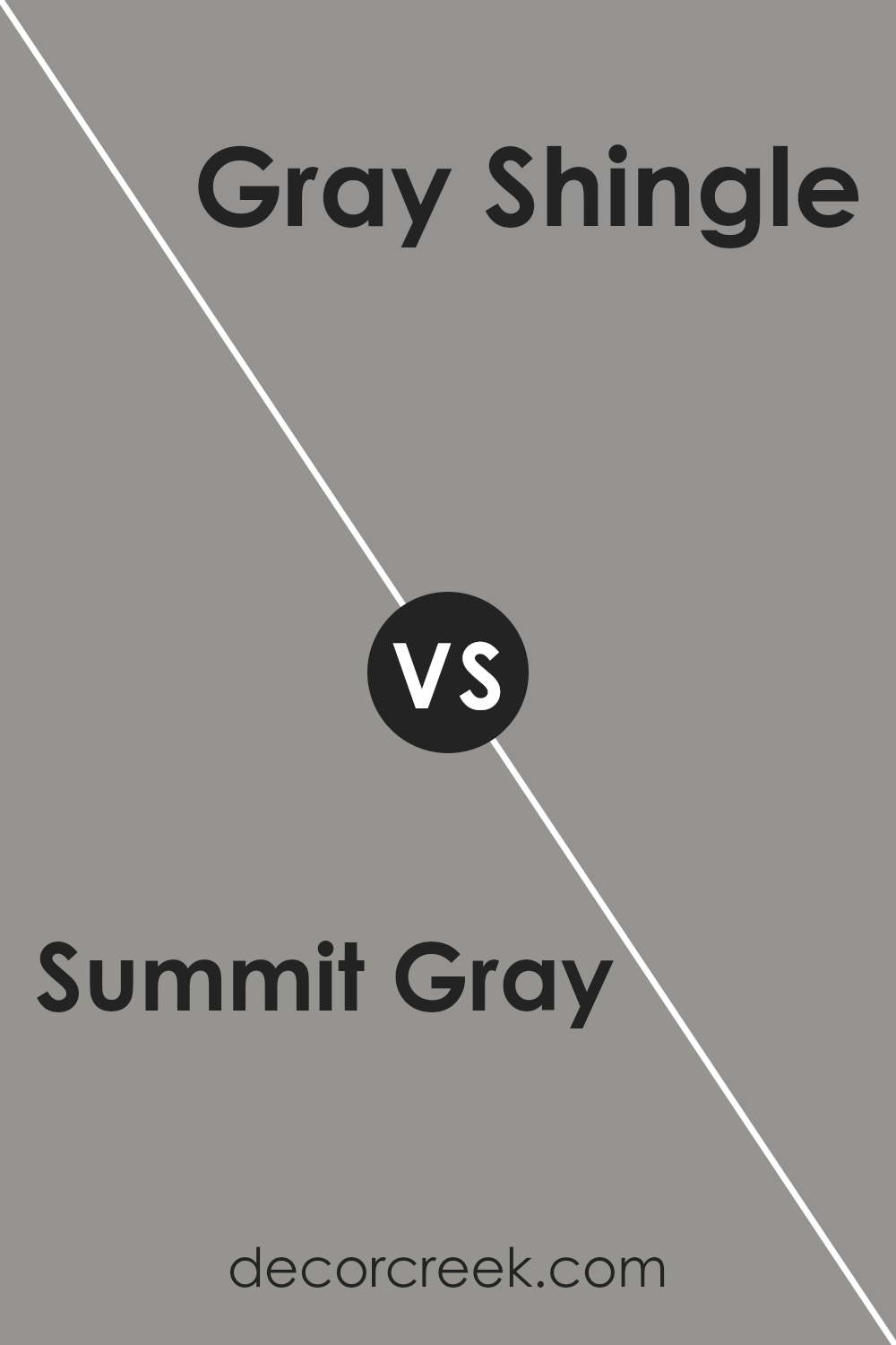
Summit Gray SW 7669 by Sherwin Williams vs Gray Shingle SW 7670 by Sherwin Williams
Summit Gray and Gray Shingle, both by Sherwin Williams, are two distinct shades of gray that offer subtle yet noticeable differences. Summit Gray stands out with its deeper, more pronounced gray tone.
It’s the type of color that makes a statement in a room, bringing a sense of sophistication and depth. Its stronger presence can anchor a space, providing a solid foundation for various decor styles.
On the other hand, Gray Shingle is a lighter, softer gray. It has a more muted presence, which makes it versatile and easy to pair with different color schemes and design elements.
It’s the kind of color that brightens spaces while still keeping the calm and neutrality that gray is known for.
While both colors share the same base hue, the main difference lies in their intensity and depth. Summit Gray is richer and more striking, making it ideal for those who prefer a bold aesthetic.
Gray Shingle, with its lighter approach, offers a more relaxed and airy feel, perfect for creating a tranquil and inviting environment.
You can see recommended paint color below:
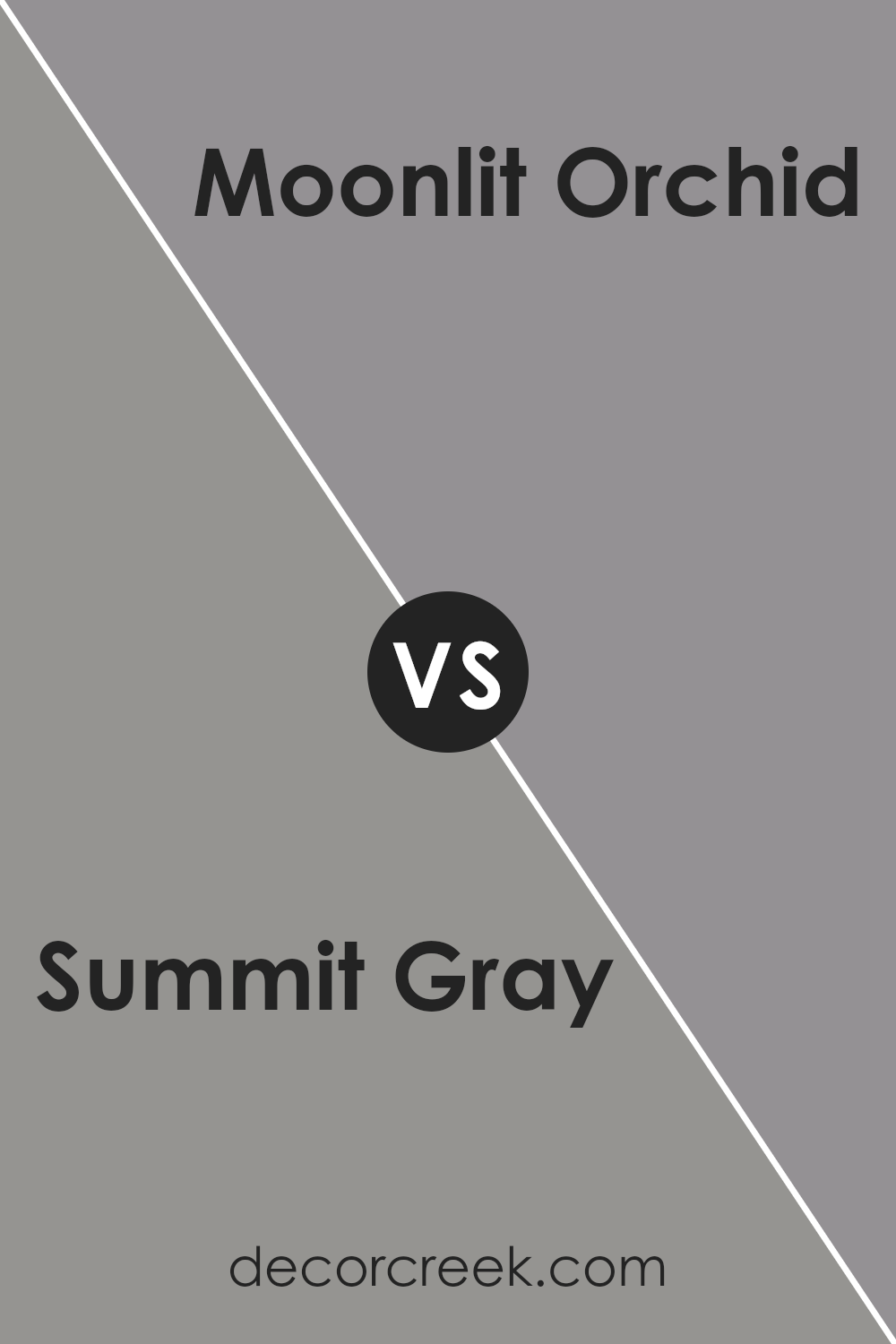
Summit Gray SW 7669 by Sherwin Williams vs Moonlit Orchid SW 9153 by Sherwin Williams
Summit Gray and Moonlit Orchid are two paint colors by Sherwin Williams that stand out for their unique characteristics. Summit Gray is a versatile gray shade with a subtle warmth, making it perfect for those looking to create a cozy yet sophisticated space.
Its ability to balance between light and dark tones means it can work well in various settings, from living rooms to bedrooms, adding a refined backdrop to any decor.
In contrast, Moonlit Orchid offers a softer, more romantic vibe. This color has a gentle purple hue, reminiscent of a serene twilight sky, providing a touch of elegance and tranquility to any room.
It’s ideal for spaces where you want to add a bit of color without overwhelming the senses, such as a reading nook or a bathroom.
When comparing the two, Summit Gray leans towards a neutral, adaptable base, while Moonlit Orchid introduces a special hint of color that’s both soothing and stylish.
Each offers a distinct mood and atmosphere, depending on what you’re aiming to achieve in your space.
You can see recommended paint color below:
- SW 9153 Moonlit Orchid
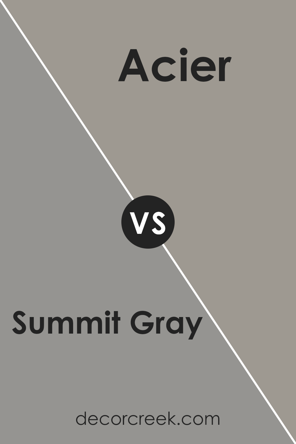
Summit Gray SW 7669 by Sherwin Williams vs Acier SW 9170 by Sherwin Williams
Summit Gray and Acier, both from Sherwin Williams, offer distinct vibes for any space. Summit Gray leans towards a light, soft gray that brings a breezy and airy feel.
It’s ideal for those looking to brighten up a room without steering too far into stark white territories. Its subtle warmth means it pairs well with a variety of decor styles, making spaces feel more open and welcoming.
Acier, on the other hand, presents a darker, more pronounced gray. This hue offers a grounding effect, perfect for creating cozy, more intimate atmospheres.
Its depth adds sophistication and can serve as a stunning backdrop for both bold and muted color schemes. Acier works well in areas where a stronger character is desired, without overwhelming the senses.
While both colors share a gray base, Summit Gray offers a lighter, uplifting feel whereas Acier provides depth and coziness.
Choosing between them depends on the mood you’re aiming to achieve: airy and light, or cozy and anchored.
You can see recommended paint color below:
- SW 9170 Acier
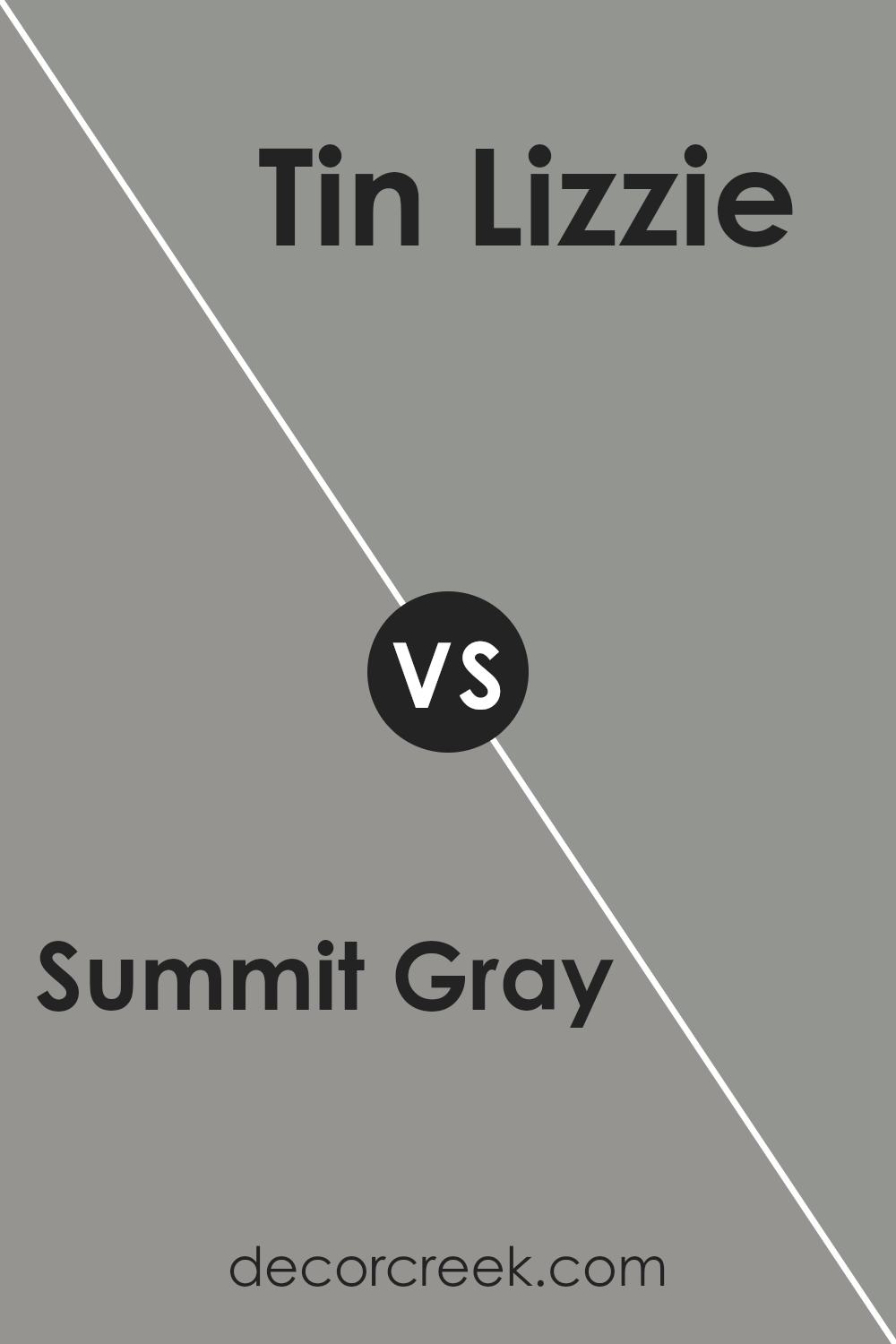
Summit Gray SW 7669 by Sherwin Williams vs Tin Lizzie SW 9163 by Sherwin Williams
Summit Gray and Tin Lizzie, both by Sherwin Williams, offer unique vibes for spaces. Summit Gray sits comfortably in the cool gray family, providing a calm and understated elegance.
It’s the sort of color that’s versatile, fitting well in a variety of settings, from modern to traditional. Its neutrality means it pairs easily with both bold and soft accessories, making it a reliable choice for those looking to create a serene environment.
On the other hand, Tin Lizzie steps into the room with a slightly deeper, steelier presence. It’s a gray that leans towards the sophisticated end, offering a bit more of a statement.
While still in the gray family, Tin Lizzie has the knack to act as a stronger backdrop, perfect for highlighting decor elements or for serving as an accent wall that doesn’t shout but confidently speaks.
Choosing between them comes down to the desired mood and the specific use in a space. Summit Gray brings a light, airy feel, promoting a sense of peace, whereas Tin Lizzie, with its slightly more pronounced personality, crafts a setting with a bit more depth and character.
You can see recommended paint color below:
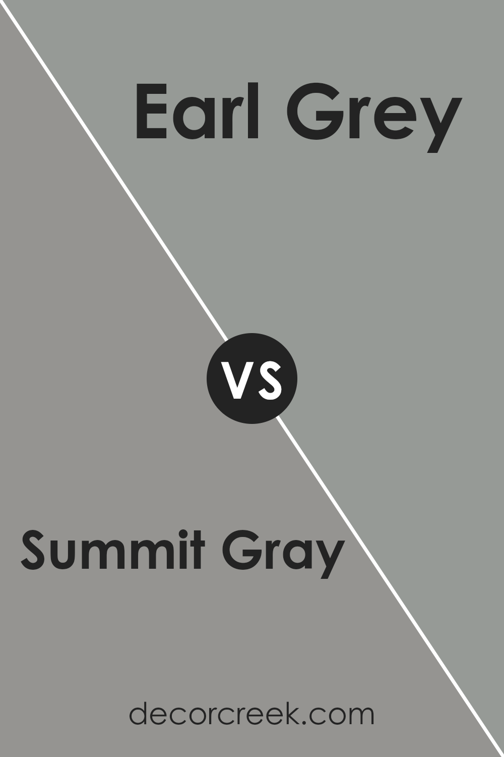
Summit Gray SW 7669 by Sherwin Williams vs Earl Grey SW 7660 by Sherwin Williams
Summit Gray and Earl Grey from Sherwin Williams are both sophisticated colors, but they bring different vibes. Summit Gray is like a cloudy morning, offering a cool, serene feel.
It’s a bit on the lighter side, giving rooms a breezy and open feel, perfect for spaces where you want calmness. On the other hand, Earl Grey is the darker of the two, reminiscent of the stylish color of the tea after which it’s named.
This color adds a richer, more grounded touch to spaces, providing a cozy atmosphere that’s great for areas where you want to relax or gather.
While both colors share a gray base, Summit Gray leans toward a softer, lighter palette, making spaces feel more spacious and airy. Earl Grey, with its deeper tone, creates an elegant backdrop, ideal for adding depth and sophistication.
The choice between them really depends on the mood you’re looking to create: refreshing and open with Summit Gray, or warm and inviting with Earl Grey.
You can see recommended paint color below:
- SW 7660 Earl Grey
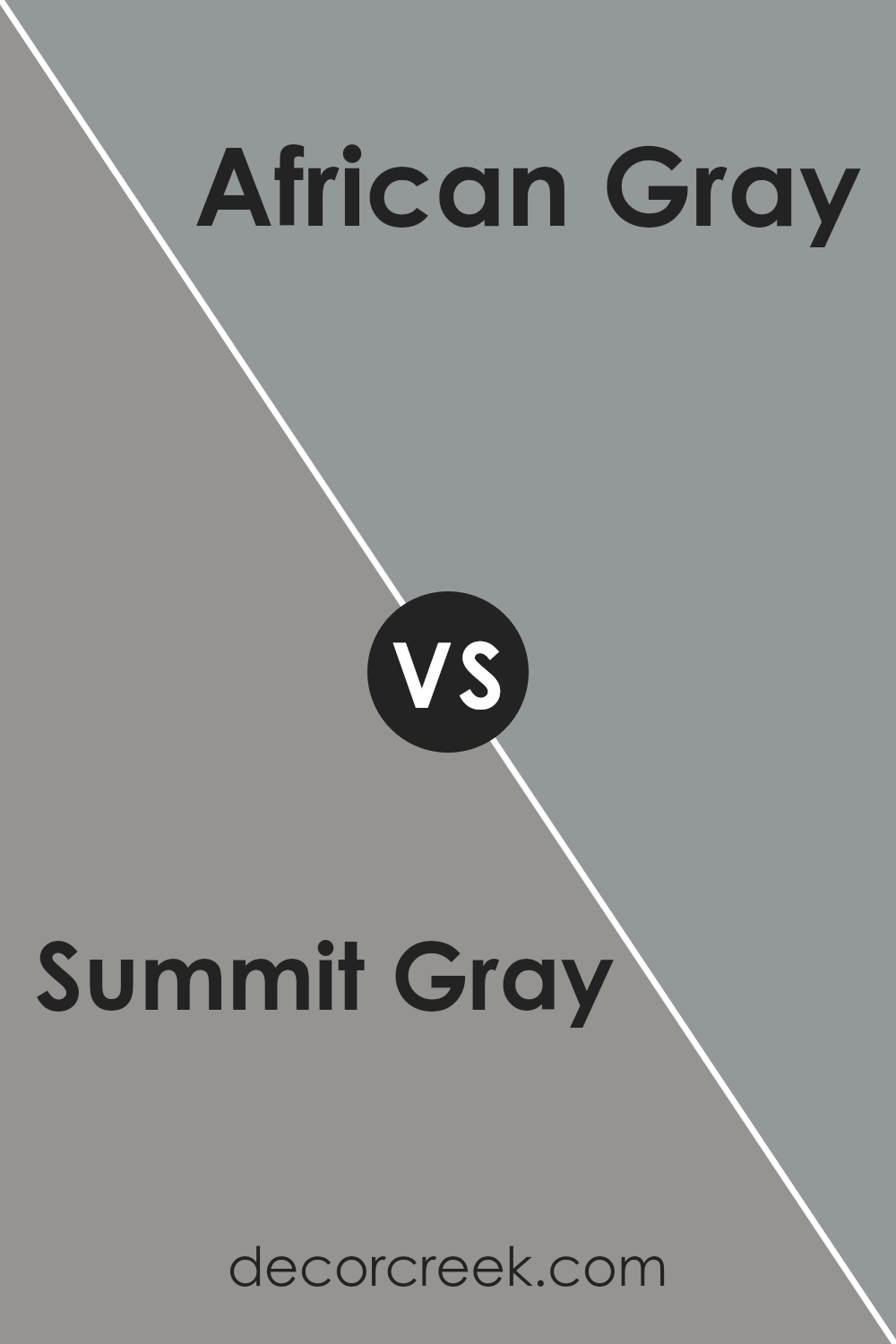
Summit Gray SW 7669 by Sherwin Williams vs African Gray SW 9162 by Sherwin Williams
Summit Gray and African Gray, both by Sherwin Williams, offer unique tones for those looking to add a touch of sophistication to their spaces.
Summit Gray stands out with its cool, balanced hue, providing a calm and serene backdrop perfect for any modern home.
This shade is versatile, effortlessly complementing both bright accents and subdued decor, making it a great choice for living rooms or bedrooms seeking a contemporary feel.
On the other hand, African Gray brings a warmer tone to the table, with subtle hints of taupe that add depth and warmth to any room.
This color is ideal for creating a cozy atmosphere, making it perfect for spaces where comfort is key, such as family rooms or dens. Its understated elegance ensures it pairs well with a wide range of decor styles, from rustic to modern.
In comparison, while both shades offer a beautiful gray base, Summit Gray leans more towards a cooler palette, and African Gray towards a warmer, more inviting tone.
Depending on the ambiance you’re aiming for, each color has its own charm to offer.
You can see recommended paint color below:
- SW 9162 African Gray
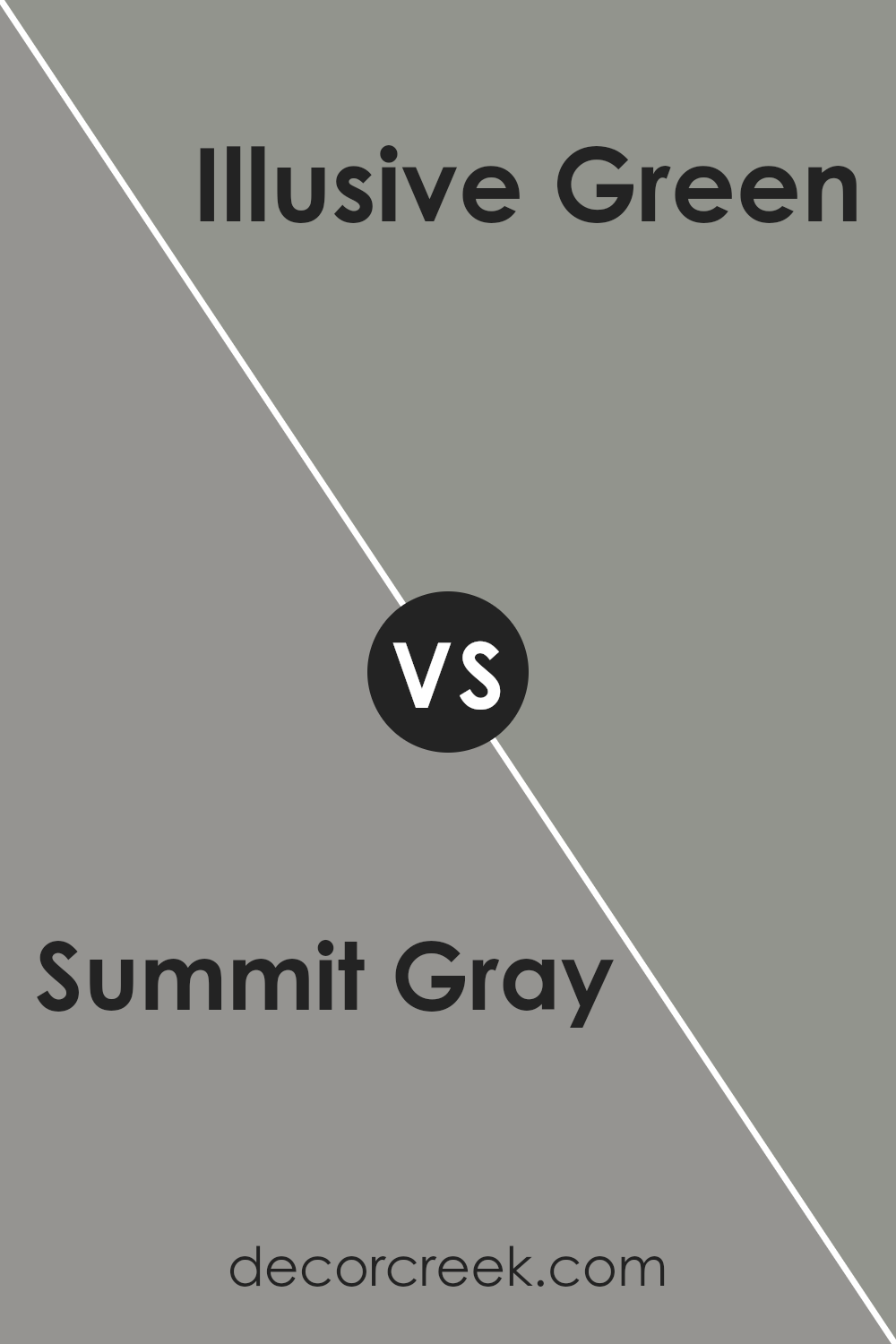
Summit Gray SW 7669 by Sherwin Williams vs Illusive Green SW 9164 by Sherwin Williams
Summit Gray and Illusive Green, both from Sherwin Williams, offer unique vibes for spaces. Summit Gray is a versatile medium gray that balances cool and warm tones, making it perfect for creating a soothing, neutral backdrop in any room.
It’s a go-to color if you’re looking for a classy, timeless look that complements various decor styles, from modern to traditional.
On the other hand, Illusive Green has a soft, subtle green hue that brings a touch of nature indoors. It leans towards a serene, calming effect, ideal for bedrooms or offices where a peaceful atmosphere is desired.
Unlike the more straightforward neutrality of Summit Gray, Illusive Green adds a gentle splash of color, providing a fresh and uplifting feel without overwhelming the space.
When choosing between these two, consider the mood you want to create. Summit Gray offers a solid, grounding base, while Illusive Green introduces a light, refreshing energy.
You can see recommended paint color below:
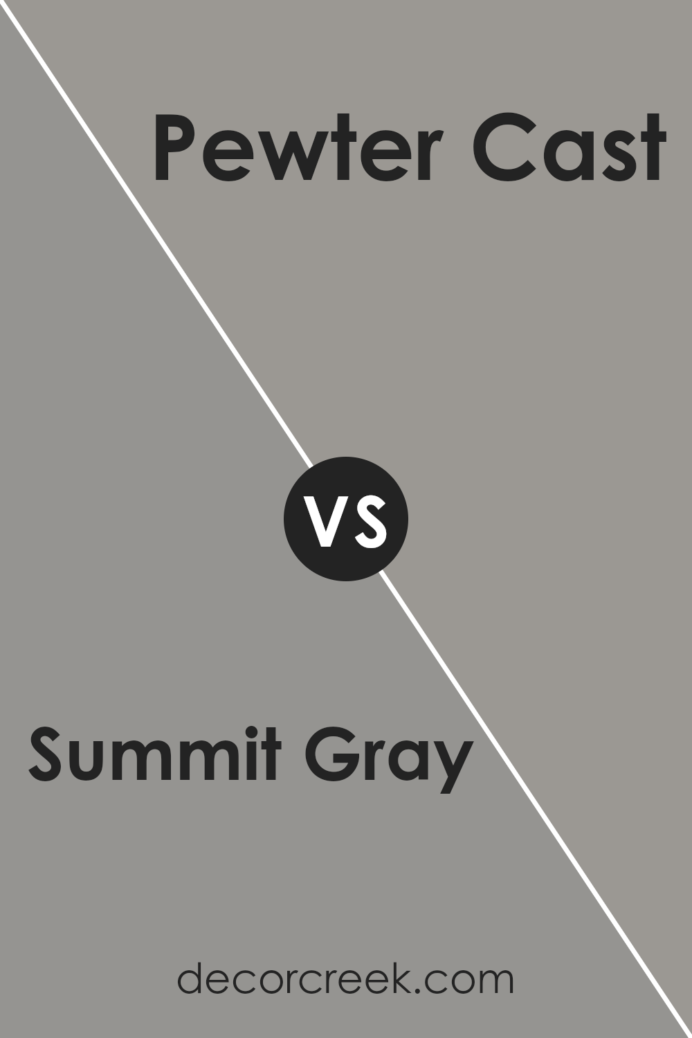
Summit Gray SW 7669 by Sherwin Williams vs Pewter Cast SW 7673 by Sherwin Williams
Summit Gray and Pewter Cast, both by Sherwin Williams, are two distinct gray tones that offer their unique charm. Summit Gray stands out as a warm, welcoming gray with slight undertones that can bring a soft, cozy feel to any space.
It’s the type of color that works well in various settings, offering a versatile backdrop for decor ranging from modern to traditional.
Pewter Cast, on the other hand, sports a cooler vibe. This shade leans towards a more neutral, steel-like appearance, making it a great choice for those seeking a sleek, contemporary look.
It can add a touch of sophistication to rooms, especially when used in well-lit areas where its subtle undertones can really shine.
While both colors share the base of being gray, their individual undertones set them apart, making Summit Gray a warmer, cozier option and Pewter Cast a cooler, more modern pick.
Depending on the atmosphere one wishes to create, either color can serve as a fantastic choice for bringing a room to life.
You can see recommended paint color below:
- SW 7673 Pewter Cast
Conclusion
In conclusion, Summit Gray by Sherwin Williams stands out as a versatile color selection for those looking to enhance their spaces with a shade that effortlessly blends with various decor styles and preferences.
This particular gray offers a balance that can refresh a room, providing a subtle, yet impactful presence that works well in both modern and traditional settings.
The charm of Summit Gray lies in its adaptability; it can serve as a calming backdrop for bold accents or act as the main focus with its understated elegance.
Whether used in a living area, bedroom, or an office, it introduces a sophisticated and contemporary feel that’s both welcoming and stylish. This color proves to be a smart choice for anyone aiming to elevate their interior with a touch of minimalistic beauty.
Ever wished paint sampling was as easy as sticking a sticker? Guess what? Now it is! Discover Samplize's unique Peel & Stick samples.
Get paint samples