Choosing the right paint color for your home can sometimes feel overwhelming with so many options available. One standout choice for those looking to add a fresh, modern touch to their space is SW 7671 On the Rocks by Sherwin Williams. This versatile shade is a subtle mix of gray with just a hint of warmth, making it a perfect choice for any room in your home.
On the Rocks is not just any gray; it’s a carefully balanced color that offers a neutral backdrop that can either calm or invigorate your space, depending on how it’s used. Its understated elegance makes it an ideal option for living rooms, bedrooms, and kitchens alike, pairing well with both bold and subdued accents.
Whether you’re updating a single room or transforming your entire home, this shade provides a solid foundation that can match nearly any decor style, from modern to traditional.
In this article, we’ll explore how SW 7691 On the Rocks by Sherwin Williams can enhance different rooms in your home. With insights on the best lighting conditions, complementary colors, and decor tips, you’ll see how this paint can easily become a go-to choice for your decorating needs.
If you’re looking for a color that combines sophistication with versatility, On the Rocks could be the perfect pick for your next project.
What Color Is On the Rocks SW 7671 by Sherwin Williams?
On the Rocks by Sherwin Williams is a versatile neutral color that stands out for its understated elegance. It’s a grey tone with a subtle balance of cool and warm undertones, making it a perfect backdrop for various interior styles. This paint color brings a sense of calm and sophistication to any space, be it a modern living room, a cozy bedroom, or an elegant kitchen.
On the Rocks works exceptionally well in minimalistic, contemporary, and Scandinavian-inspired interiors. It has a way of complementing the clean lines and simple forms associated with these styles. This color also finds its place in more traditional settings, where it adds a fresh, modern twist without overwhelming the classic elements.
When it comes to pairing with materials and textures, On the Rocks shows remarkable flexibility. It goes beautifully with natural wood, whether it’s light oak or darker walnut, enhancing the warmth of the wood. This color also pairs well with metallic accents like brass or copper, adding a touch of luxury. For textiles, consider soft, plush fabrics in rich colors for a contrast or light, airy linens for a more harmonious look. Its versatility allows for a wide range of decor options, making it a go-to color for anyone looking to create a space that feels both sophisticated and welcoming.

Is On the Rocks SW 7671 by Sherwin Williams Warm or Cool color?
On the Rocks by Sherwin Williams is a versatile and subtle paint choice that brings a soft, soothing atmosphere to any room in a home. Its light grey hue has a calming effect, making it an excellent backdrop for both vibrant and muted color schemes.
This paint’s adaptability allows it to fit seamlessly into a variety of spaces, whether you’re aiming for a modern, clean look or a cozy, traditional vibe. Since it’s such a neutral color, it pairs well with almost any furniture and decor, offering a cohesive look throughout the home. It also enhances natural light, making spaces appear brighter and more open, a particularly beneficial feature for smaller or darker rooms.
The understated elegance of On the Rocks helps in creating a serene environment, ideal for bedrooms, living rooms, and even kitchens, demonstrating its broad appeal and functionality in home design.
Undertones of On the Rocks SW 7671 by Sherwin Williams
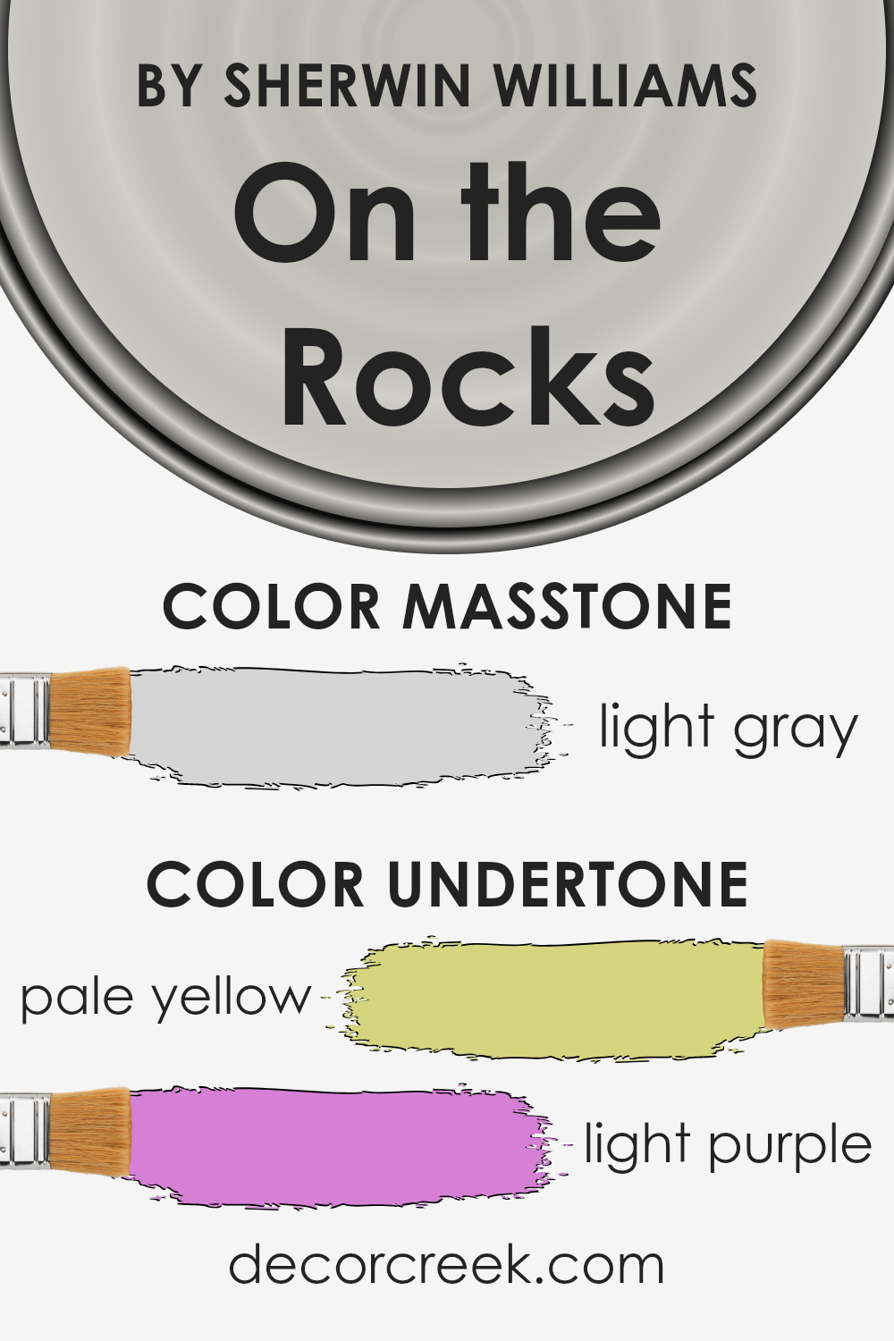
On the Rocks is a unique and versatile paint color by Sherwin Williams that looks beautifully neutral at first glance. What makes this color special, though, are its subtle undertones. The pale yellow and light purple undertones are not immediately obvious, but they have a significant influence on how the color appears in different settings.
Undertones are like a color’s hidden personality. Even though you might see “just gray” at first, the undertones affect the color’s warmth, coolness, and overall vibe. For On the Rocks, the pale yellow gives it a slight warmth, making it inviting and cozy. On the other hand, the light purple adds a touch of coolness, making the color more complex and sophisticated.
When used on interior walls, these undertones play with the light in the room. In natural daylight, the pale yellow might make the walls seem softer and slightly warmer. Meanwhile, under artificial lighting, the light purple could bring forward a cooler, more serene ambiance. This interplay means that On the Rocks can easily adapt to different furnishings and decoration styles, from modern and minimalistic to warm and rustic.
Understanding the influence of these undertones can help when deciding on the color for a room. It ensures that the chosen hue will complement the space, furniture, and overall design aesthetic, creating the desired atmosphere in any room.
What is the Masstone of the On the Rocks SW 7671 by Sherwin Williams?
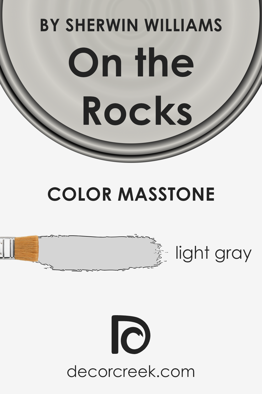
On the RocksSW 7671 by Sherwin Williams is a light gray color with a masstone, or main tone, of #D5D5D5. This popular shade is subtle and versatile, making it a fantastic choice for homes looking to achieve a modern, clean look. The light gray tone has a calming effect, perfect for creating a serene environment in any room. Its neutrality means it pairs well with a wide range of other colors, from bright and bold hues to softer, pastel shades. This makes it incredibly easy to incorporate into existing decor or to use as a base for a new design scheme.
Because of its lightness, On the Rocks can help to make small spaces appear larger and more open, as it reflects natural light beautifully. It’s particularly effective in living rooms, bedrooms, and bathrooms where homeowners seek a peaceful and relaxing atmosphere. Additionally, its understated elegance adds a touch of sophistication without overwhelming a space, making it an ideal backdrop for artwork, furniture, and accessories.
How Does Lighting Affect On the Rocks SW 7671 by Sherwin Williams?
Lighting plays a critical role in how we perceive colors, fundamentally altering their appearance. Imagine a color, let’s call it a soft, neutral grey from Sherwin Williams, known as On the Rocks. This particular hue can look vastly different under varying light sources, showcasing the fascinating interplay between lighting and paint colors.
When exposed to artificial light, which typically has a yellowish tone, this grey can take on a warmer, more inviting look. The inherent coolness of the grey becomes subtly softened, making the room feel cozy and more intimate. This is especially true in environments with soft, incandescent bulbs. In contrast, with LED or fluorescent lighting, which often have a cooler, bluish tint, On the Rocks might lean towards its cooler, more true grey nature, giving spaces a more modern and crisp ambiance.
- Natural light, on the other hand, has a dynamic quality that changes with the time of day and weather conditions, affecting the perception of colors in its own unique way. In a north-faced room, where light tends to be cooler and more indirect, this grey may appear more true to its cool nature, maintaining a serene and calm vibe. North-facing light can enhance the color’s sophistication and subtlety.
- In south-facing rooms, bathed in warm, abundant sunlight for most of the day, this paint color can appear lighter and slightly warmer, losing some of its cool edge and taking on a softer appearance. This can make the room feel brighter and more welcoming.
- East-facing rooms receive the morning light, which is warm and golden, thus making the grey appear slightly warmer in the mornings and then returning to its true, cooler shade as the day progresses. This dual-tone effect brings a refreshing dynamic to the space.
- West-facing rooms, illuminated by the warmer, often more intensely colored afternoon light, can make the color appear much warmer and richer during this time. This highlights the adaptive nature of On the Rocks, showcasing different facets of its character depending on the time of day.
Understanding how lighting affects colors, particularly a versatile grey like On the Rocks, highlights the importance of considering both artificial and natural light when choosing paint colors for any space.

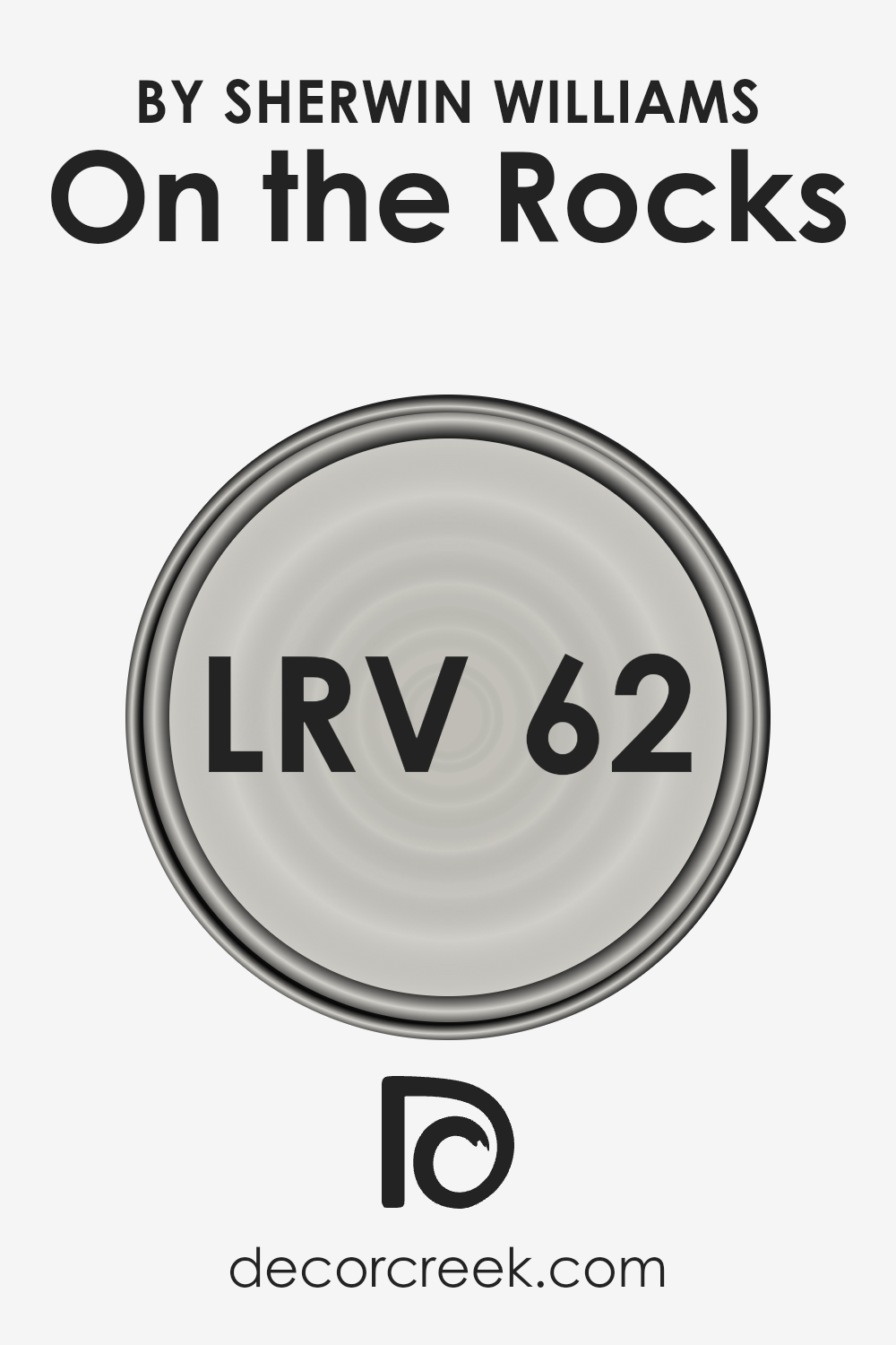
What is the LRV of On the Rocks SW 7671 by Sherwin Williams?
LRV stands for Light Reflectance Value, which is a measure of the amount of visible and usable light that gets reflected by a painted surface. The scale for LRV runs from 0 to 100, where 0 is absolute black and doesn’t reflect any light, while 100 is pure white, reflecting the most light. This value is crucial when choosing paint colors because it tells you how bright or dark a color will look on your walls.
A higher LRV means the color will appear lighter, making spaces feel more open and airy, while a lower LRV means the color will absorb more light, creating a cozier, more intimate atmosphere.
For the color “On the Rocks” with an LRV of 61.609, it falls into the category of lighter shades, meaning it has a good capacity to reflect light. This makes it a great option for rooms that you want to feel spacious and well-lit. Whether the room gets a lot of natural light or relies on artificial lighting, this color will help in making the space appear brighter.
The LRV of 61.609 also means that “On the Rocks” is versatile and can adapt well in various settings, enhancing the space without overwhelming it with too much brightness. In rooms without a lot of light, it can help to make the space feel more inviting by reflecting what light there is available.
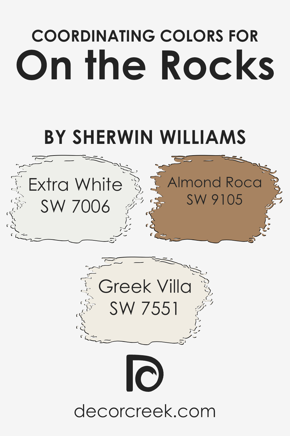
Coordinating Colors of On the Rocks SW 7671 by Sherwin Williams
Coordinating colors are hues that work harmoniously alongside each other to enhance the overall aesthetic of a space, creating a balanced and visually appealing look. When pairing with a versatile neutral like On the Rocks by Sherwin Williams, selecting the right coordinating colors can either soften or accentuate the base color, depending on the desired effect. This synergy between colors allows for a seamless blend of shades, making a room feel complete and thoughtfully designed.
For instance, SW 7006 – Extra White, is a crisp and clean shade that can brighten spaces when used alongside On the Rocks, giving a fresh and airy feel to the environment. It works particularly well in areas where natural light is abundant, reflecting it to make rooms appear more spacious.
On the other hand, SW 7551 – Greek Villa, offers a slightly warmer tone, a soft, off-white with creamy undertones.
This color introduces warmth into a space, creating a cozy and inviting atmosphere without overwhelming the sense of calmness that On the Rocks establishes. Lastly, SW 9105 – Almond Roca, adds a nutty brown hue to the palette, grounding the scheme with its earthy, yet rich, presence. It’s perfect for adding depth and interest, ensuring the space feels anchored and well-rounded. Together, these coordinating colors offer a versatile palette that can transform any room into a harmonious haven.
You can see recommended paint colors below:
- SW 7006 Extra White
- SW 7551 Greek Villa
- SW 9105 Almond Roca
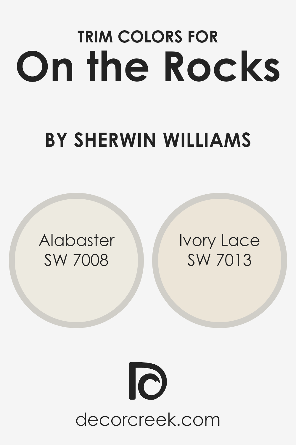
What are the Trim colors of On the Rocks SW 7671 by Sherwin Williams?
Trim colors play a crucial role in interior design, especially when used with a neutral base like On the Rocks by Sherwin Williams. These colors, essentially used for painting the molding, door frames, windows, and other architectural features, act as accents that can either subtly complement or contrast the wall color.
Choosing the right trim color enhances the overall aesthetics, defines the architectural details of the room, and can even influence the perception of the space, making it appear more cohesive and well-thought-out. With a shade like On the Rocks, which serves as a versatile and calming backdrop, selecting suitable trim colors becomes important to add depth and character without overwhelming the space.
SW 7008 – Alabaster and SW 7013 – Ivory Lace are excellent choices for trim colors to pair with On the Rocks.
Alabaster, a warm and soft off-white, has a natural ability to bring a gentle, welcoming ambiance to the space. Its creamy undertone makes it easy to blend with On the Rocks, providing a subtle transition between the wall and the trim that’s pleasing to the eye.
On the other hand, Ivory Lace is a slightly lighter and cooler tone, offering a fresh and clean look that contrasts more distinctly with On the Rocks, thereby highlighting architectural features with elegance and simplicity. These trim colors are carefully chosen to complement On the Rocks, ensuring that the space remains balanced and inviting, with just the right amount of contrast and visual interest.
You can see recommended paint colors below:
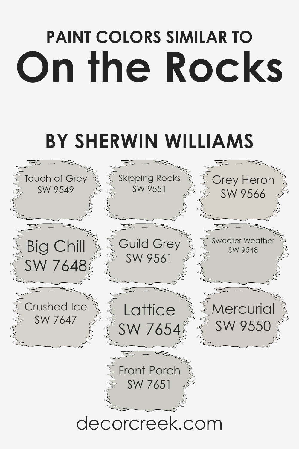
Colors Similar to On the Rocks SW 7671 by Sherwin Williams
When selecting paint colors for a room, choosing similar colors can create a harmonious and cohesive look that’s pleasing to the eye. Colors like Touch of Grey and Big Chill share a subtle relationship with cool undertones that bring a serene and calming effect to any space.
They work well together because they share a commonality in saturation and lightness, making transitions between rooms feel smooth and intentional. Crushed Ice and Front Porch add to this palette by providing slightly lighter options, which can make a room feel airy and more spacious without a stark contrast.
Skipping Rocks and Guild Grey offer deeper tones, grounding the space with a bit more depth, which is perfect for creating focal points without overwhelming the senses. Lattice and Grey Heron introduce complexity with their unique undertones, ensuring the space doesn’t feel monotonous or flat.
These colors blend well with the rest, adding layers to the design that are subtle yet impactful. Lastly, Sweater Weather and Mercurial bring richness and warmth, acting as perfect complements to the cooler shades in the group. Together, these colors function seamlessly, offering a balanced and sophisticated color scheme that enhances the aesthetics of any room.
You can see recommended paint colors below:
- SW 9549 Touch of Grey
- SW 7648 Big Chill
- SW 7647 Crushed Ice
- SW 7651 Front Porch
- SW 9551 Skipping Rocks
- SW 9561 Guild Grey
- SW 7654 Lattice
- SW 9566 Grey Heron
- SW 9548 Sweater Weather
- SW 9550 Mercurial
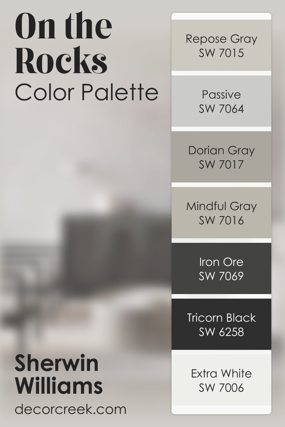
On the Rocks SW 7671 by Sherwin Williams Color Palette
On the Rocks feels clean, modern, and softly cool, bringing a sense of calm organization into any room. Extra White and Pure White brighten the palette beautifully, keeping the look fresh. Repose Gray and Dorian Gray add thoughtful layers of depth that make the palette feel complete and grounded.
Passive introduces a cool smoothness, while Mindful Gray softens everything with a warmer touch.
For strong contrast, Iron Ore and Tricorn Black anchor the palette with bold, steady notes. Together, these shades create a crisp, refined, and beautifully structured palette.
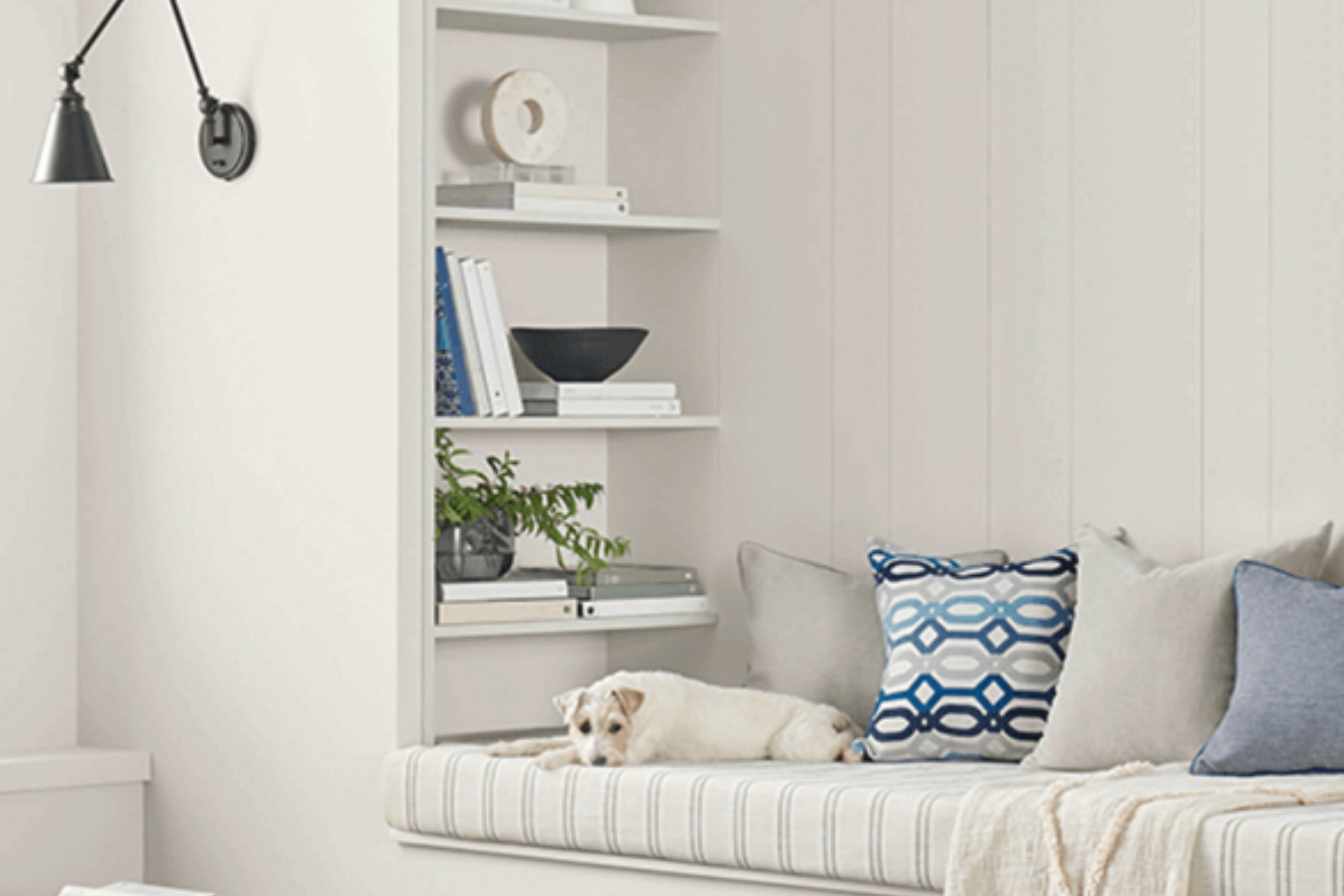
How to Use On the Rocks SW 7671 by Sherwin Williams In Your Home?
On the Rocks by Sherwin Williams is a unique gray paint that stands out because of its versatility. This cool-toned gray can make any room feel serene and spacious. If you’re looking to give your home a fresh, modern look, this color is a perfect choice.
For your living room, it can act as a calm backdrop for vibrant furniture or art, making them pop without overpowering the space. In a bedroom, On the Rocks can help create a peaceful and relaxing atmosphere, ideal for unwinding after a long day.
This color also works well in kitchens and bathrooms, bringing a clean and crisp vibe to these areas. Pair it with white trim or cabinetry for a classic, timeless look, or combine it with dark wood for a more dramatic effect. It’s an excellent way to refresh your home without making a bold statement that might tire over time.
On the Rocks SW 7671 by Sherwin Williams vs Mercurial SW 9550 by Sherwin Williams
On the Rock is a soothing, soft grey with a hint of warmth, making it a versatile choice for any space. It’s light enough to make rooms feel more open and airy, yet it has enough depth to add a cozy, grounding effect. This color works well in various settings, adding a gentle, calming vibe.
Mercurial, on the other hand, is a deeper, moodier grey. It has a more pronounced presence, creating a statement wherever it’s used. This shade brings a sense of sophistication and drama, perfect for making an impact. While still in the grey family, it leans towards a more intense and bold look compared to On the Rock.
Comparing the two, On the Rock is ideal for a light, breezy feel, offering a backdrop that complements a wide range of decor. Mercurial serves those looking for a stronger, more definitive character in their space. Both colors provide a modern and stylish palette but cater to different moods and settings.
You can see recommended paint color below:
- SW 9550 Mercurial
On the Rocks SW 7671 by Sherwin Williams vs Grey Heron SW 9566 by Sherwin Williams
On the Rocks and Grey Heron by Sherwin Williams are both neutral colors, but they have distinct differences. On the Rocks is a lighter shade, offering a soft, warm vibe that’s ideal for making spaces feel airy and open. It’s a versatile color that works well in various rooms, adding a subtle touch of warmth without overpowering the space.
On the other hand, Grey Heron is a darker gray that brings a stronger presence to a room. It can give a space a more grounded, sophisticated look. Due to its deeper tone, Grey Heron can make large rooms feel cozier and more inviting. It’s perfect for creating a statement wall or for use in areas where you want to add a bit of drama.
When choosing between the two, consider the mood you want to set and the size of your space. On the Rocks is great for brightening small rooms, while Grey Heron is better suited for larger spaces or accentuating areas with its bolder character.
You can see recommended paint color below:
- SW 9566 Grey Heron
On the Rocks SW 7671 by Sherwin Williams vs Crushed Ice SW 7647 by Sherwin Williams
On the Rocks and Crushed Ice, both by Sherwin Williams, are subtle and sophisticated gray shades, yet each brings its own unique vibe to a space. On the Rocks is a touch warmer, offering a cozy feel that’s versatile enough to suit a wide range of decor styles. It’s like a soft, comfortable gray blanket that can make any room feel more inviting.
On the other hand, Crushed Ice is cooler and gives off a crisper, more refreshing feel. It’s like the difference between the warm fuzziness of being wrapped up on a chilly evening and the refreshing coolness of a brisk morning walk. This cooler hue can help make a small space appear more open and airy, or give a modern edge to a room’s aesthetic.
Although both colors are beautifully understated, the choice between On the Rocks and Crushed Ice will depend on the atmosphere you’re aiming to create. Warm and welcoming or crisp and refreshing, each color has the potential to transform your space in its own way.
You can see recommended paint color below:
- SW 7647 Crushed Ice
On the Rocks SW 7671 by Sherwin Williams vs Big Chill SW 7648 by Sherwin Williams
Sure. Comparing “On the Rocks” to “Big Chill,” both by Sherwin Williams, we find subtle but interesting differences. “On the Rocks” is a light, airy gray that feels soft and gentle. It gives spaces a calm and soothing mood, making it perfect for creating a tranquil environment. Think of it as a light, almost whisper-soft background that doesn’t demand attention but beautifully complements other colors.
On the other hand, “Big Chill” leans a bit cooler and has a slightly stronger presence. It’s still light and neutral but with a tad more depth than “On the Rocks.” This makes “Big Chill” great for adding a touch of sophistication without overwhelming a space. It’s like a quiet, confident voice in a room, offering a bit more personality while maintaining a serene and welcoming atmosphere.
In essence, while both colors share a foundation in light, neutral gray, “On the Rocks” offers a warmer, softer feel, whereas “Big Chill” brings a cooler, slightly more pronounced gray to the table. Both are excellent choices for creating peaceful, stylish spaces.
You can see recommended paint color below:
- SW 7648 Big Chill
On the Rocks SW 7671 by Sherwin Williams vs Touch of Grey SW 9549 by Sherwin Williams
On the Rocks and Touch of Grey by Sherwin Williams are two distinct shades that both bring a unique vibe to a space. On the Rocks is a light, airy gray that feels fresh and modern. It has a subtle warmth to it, making it versatile for various rooms, from kitchens to bedrooms, creating an inviting atmosphere. Touch of Grey, on the other hand, leans towards a cooler palette. Though still light, this color has a slightly more pronounced gray tone, giving it a modern edge that’s perfect for a contemporary look.
In comparing the two, On the Rocks tends to blend seamlessly into spaces, offering a neutral backdrop that’s easy to accessorize with bolder colors or textures.
Touch of Grey, with its cooler undertone, might be a bit more specific in its appeal, lending itself well to minimalistic or modern designs where the cooler nuances of the color can be appreciated.
In essence, both colors offer a fresh take on gray, but your choice between them might come down to the warmth and ambiance you want to achieve. On the Rocks feels warmer and more adaptable, while Touch of Grey offers a crisp, contemporary vibe.
You can see recommended paint color below:

On the Rocks SW 7671 by Sherwin Williams vs Sweater Weather SW 9548 by Sherwin Williams
When comparing “On the Rocks SW 7671” and “Sweater Weather SW 9548” by Sherwin Williams, there’s some interesting points to note. “On the Rocks” is a very light gray that feels clean and airy. It’s almost like a soft backdrop that can make any room feel bigger and more open. It’s good for anyone who wants a subtle hint of color without overwhelming the space.
On the other side, “Sweater Weather” is a darker, more defined gray. It gives a cozy vibe, kind of like the feeling you get wearing your favorite sweater on a cool day. This color adds more depth and character to a room, making it feel warm and inviting.
So, if you’re deciding between the two, think about the mood you want to set. If you prefer a bright and open space, “On the Rocks” is the way to go. However, if you’re aiming for a snug and cozy atmosphere, “Sweater Weather” might just be the perfect pick. Both are great choices but cater to different style preferences and room functionalities.
You can see recommended paint color below:
- SW 9548 Sweater Weather
On the Rocks SW 7671 by Sherwin Williams vs Guild Grey SW 9561 by Sherwin Williams
On the Rock and Guild Grey, both by Sherwin Williams, are two unique shades that offer distinct vibes for spaces. On the Rocks is a soft, light gray color. It has a subtle hint of warmth, making it a flexible choice for many rooms, giving a calm and soothing feel without making spaces feel cold. This color works well in areas where you want a gentle, neutral backdrop that isn’t too stark or overwhelming.
On the other hand, Guild Grey is deeper and more pronounced. It’s a medium gray that carries a bit more weight and presence. This color can add a touch of sophistication and depth to a space. It’s perfect for creating a strong, yet inviting atmosphere.
Guild Grey can anchor a room with its richer tone, standing out more than On the Rocks, and is ideal for accent walls or spaces that can handle a bit more drama.
In summary, while On the Rocks offers a light, airy feel, Guild Grey brings depth and sophistication. Both colors are versatile, but your choice depends on the mood you wish to create in your space.
You can see recommended paint color below:

On the Rocks SW 7671 by Sherwin Williams vs Skipping Rocks SW 9551 by Sherwin Williams
On the Rocks and Skipping Rocks from Sherwin Williams are two shades that can create a calm and beautiful space. On the Rocks is a light, airy gray that has a cool undertone, making it perfect for a modern look. It reflects light well, making any room feel more open and spacious. This color works great in living rooms or bedrooms where you want a peaceful, serene vibe.
Skipping Rocks, on the other hand, is a bit darker and has a hint of taupe in it. This makes it warmer and more inviting compared to On the Rocks. It’s a cozy color that’s ideal for creating a snug, welcoming space, like a family room or a reading nook. The warmth of Skipping Rocks can help make large rooms feel more intimate.
In summary, On the Rocks offers a cooler, brighter feel, making spaces feel bigger and more refreshing. Skipping Rocks, with its warmer, taupe-like hue, provides a sense of coziness and comfort, perfect for more enclosed, personal spaces. Choosing between them depends on the mood and feel you want for your room.
You can see recommended paint color below:
- SW 9551 Skipping Rocks
On the Rocks SW 7671 by Sherwin Williams vs Lattice SW 7654 by Sherwin Williams
On the Rocks SW 7671 by Sherwin Williams and Lattice SW 7654 are two popular paint colors that share a soothing vibe but differ in tone and mood. On the Rocks is a gentle, light gray that brings a feeling of calmness and cleanliness to any space. It’s almost like a soft blanket of fog on an early morning, making it perfect for creating a peaceful and serene environment. Its lightness allows it to reflect more light, making rooms appear brighter and more spacious.
On the other hand, Lattice falls into the category of mid-tone grays. It carries a bit more depth compared to On the Rocks, offering a slightly warmer and more inviting feel. This warmth makes Lattice an excellent choice for those wanting to add a bit of coziness to their room without overwhelming it with color.
While both colors lend themselves beautifully to a variety of decor styles, On the Rocks might be better suited for those seeking a minimalist, airy feel, whereas Lattice could be the go-to for someone looking to inject a subtle hint of warmth into their space. Together, they exemplify how different shades of gray can evoke distinct atmospheres while maintaining a sophisticated and versatile palette.
You can see recommended paint color below:
- SW 7654 Lattice
On the Rocks SW 7671 by Sherwin Williams vs Front Porch SW 7651 by Sherwin Williams
On the Rocks and Front Porch by Sherwin Williams are two popular choices if you want a fresh, modern look for your walls. They seem pretty similar at first glance, but when you start comparing, the differences stand out. On the Rocks has a lighter, almost airy feel to it. It’s the kind of color that makes a small room feel a bit more spacious or brings a bright and open feel to any space. This makes it a perfect pick if you’re aiming to lighten up a room or give it a subtle, sophisticated vibe without going too bold.
Front Porch, on the other hand, brings a bit more depth to the table. It’s still light but has a slightly bluer tone that adds a calming, serene atmosphere. It’s amazing for places where you want to relax, like bedrooms or bathrooms.
It’s not dramatically darker, but it’s enough to give a more defined look and can be a great choice if you want a color that’s easy on the eyes but still adds character.
Both colors offer a clean, neutral backdrop, but your choice might come down to the mood you’re aiming for – light and airy with On the Rocks or calm and serene with Front Porch.
You can see recommended paint color below:
- SW 7651 Front Porch
Conclusion
In conclusion, “On the Rocks” is a versatile color provided by Sherwin Williams that stands out for its ability to complement a wide range of design palettes. Its neutrality brings a sophisticated and airy feel to any space, enabling it to blend seamlessly with various decor styles and color schemes.
This quality makes it a popular choice among homeowners and interior designers looking for a reliable and adaptable shade that enhances the overall ambiance of a room without overwhelming it.
Moreover, this color exudes a sense of calm and serenity, making it an excellent selection for areas where a peaceful atmosphere is desired. Whether it’s used as a primary color for walls or as an accent to highlight specific features, “On the Rocks” adds a touch of elegance and understated sophistication.
Its universal appeal ensures that it remains a go-to option for those aiming to create inviting and harmonious spaces.

Ever wished paint sampling was as easy as sticking a sticker? Guess what? Now it is! Discover Samplize's unique Peel & Stick samples.
Get paint samples

