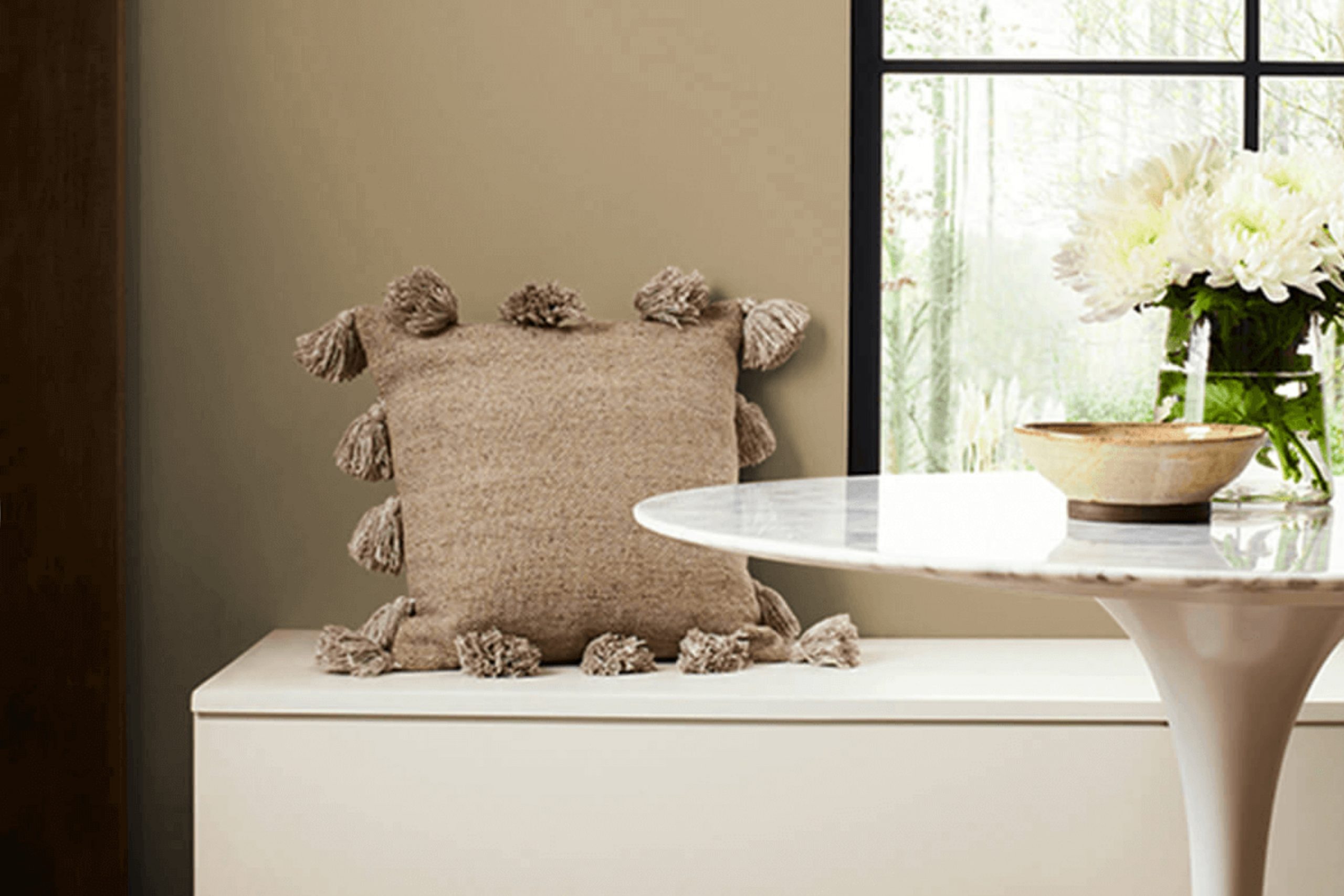
When I see SW 2842 Roycroft Suede by Sherwin Williams, I feel an immediate sense of comfort and warmth. This color effortlessly combines earthiness with a touch of elegance, creating a feeling of balance and calm in any room. It’s a versatile shade that works beautifully in both modern and traditional settings.
The warm undertones of Roycroft Suede remind me of a cozy evening spent by the fire or a serene walk through a peaceful, wooded path. There’s something genuinely inviting about this hue that makes it perfect for creating a welcoming atmosphere in your home.
In living rooms, Roycroft Suede can anchor the space, providing a harmonious backdrop for furniture and decor. In bedrooms, it’s soothing enough to help unwind after a long day. Even in less conventional areas like a study or hallway, it brings a sense of character and sophistication without being overpowering.
What draws me to Roycroft Suede is its ability to adapt. Whether paired with crisp whites, deep blues, or vibrant accents, it maintains its own presence while complementing other elements beautifully. It’s a color that encourages creativity and comfort, making it a delightful choice for anyone looking to infuse their home with warmth and style.
What Color Is Roycroft Suede SW 2842 by Sherwin Williams?
Roycroft Suede SW 2842 by Sherwin Williams is a warm, muted brown shade with subtle undertones. It’s reminiscent of the earthy feel of natural suede, bringing in a cozy and inviting atmosphere to any room. This color works beautifully in traditional, rustic, or craftsman-style interiors, where warmth and comfort are key.
In traditional areas, Roycroft Suede can complement rich wood tones, enhancing the depth of wooden furniture and paneling. For rustic decor, it pairs well with natural materials such as leather, linen, and stone, creating a harmonious and grounded environment. This shade also suits the arts and crafts movement’s focus on handmade quality and intricate details.
When considering materials and textures, Roycroft Suede blends well with metal accents in bronze or wrought iron, adding a touch of contrast and sophistication. It can coordinate nicely with soft, textured fabrics like knits or woven materials, creating a layered and tactile feel. Additionally, incorporating plants or greenery can offer a fresh pop of color against this warm backdrop, enriching the overall aesthetic.
Overall, Roycroft Suede is versatile and timeless, lending itself to areas where warmth and a natural feel are desired, making it a great choice for living rooms, dens, or study areas.
Is Roycroft Suede SW 2842 by Sherwin Williams Warm or Cool color?
Roycroft Suede SW 2842 by Sherwin Williams is a warm, earthy brown that can add a cozy and inviting feel to a home. This color works well in homes because it brings a sense of comfort and warmth to any room.
It is a versatile shade that complements many styles, from traditional to contemporary. When used in living rooms or bedrooms, this color can create a relaxing atmosphere, making it perfect for unwinding after a long day.
Additionally, Roycroft Suede pairs nicely with a variety of other colors, including creams, whites, and muted tones, allowing it to fit seamlessly into different color schemes. It works well on accent walls, where it can add depth and character to a room without being overwhelming. Overall, this color is a great choice for anyone looking to add a touch of warmth and richness to their home decor, making feel more welcoming and lived-in.
Undertones of Roycroft Suede SW 2842 by Sherwin Williams
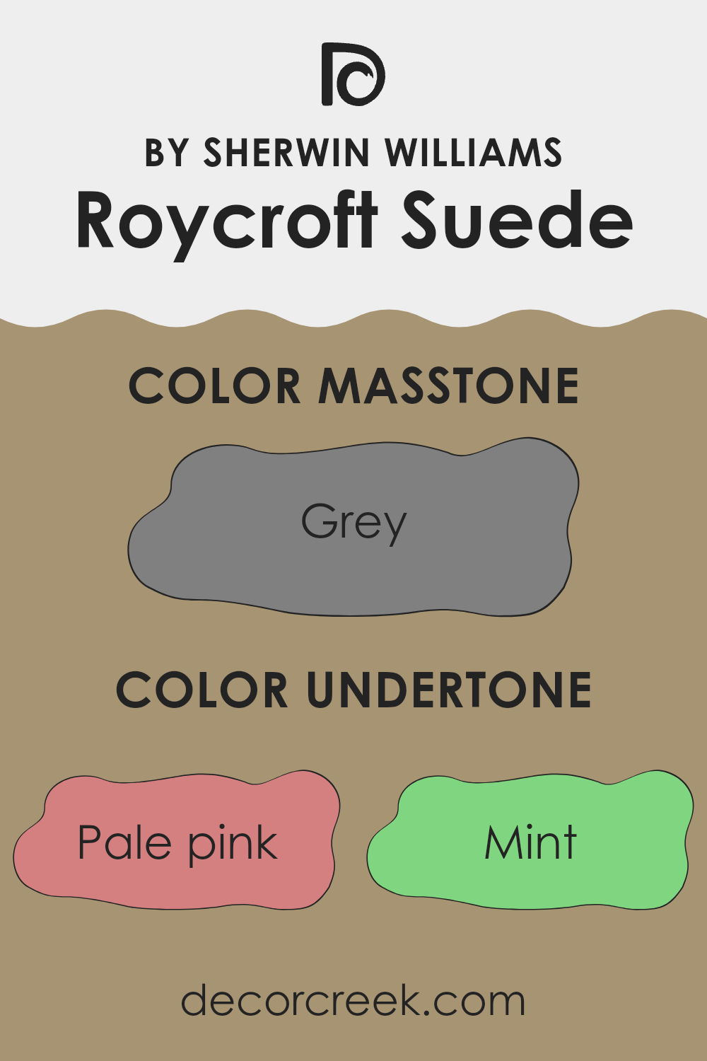
Roycroft Suede (SW 2842) by Sherwin Williams is a rich and complex hue with a variety of undertones. These undertones include shades like pale pink, mint, olive, orange, lilac, light blue, light gray, brown, red, and many others. Each of these colors subtly influences how Roycroft Suede appears on a wall. Undertones are the pigments beneath the main color that can change how the color looks under different lighting and in various environments.
For instance, the presence of a pale pink undertone can add a warm and inviting feel, while hints of mint or light turquoise can give a fresher, cooler aspect to the room. The olive and darker greens can lend an earthier sensation. Light gray undertones can make the color feel more neutral, allowing it to mesh well with other colors in the room.
When Roycroft Suede is used on interior walls, these numerous undertones ensure the color adapts to various lighting conditions throughout the day. In natural daylight, it may seem warmer due to the subtle brown and red influences. Under artificial lighting, the cooler undertones like blue or dark turquoise might become more noticeable, adding depth to the space without overwhelming it. Overall, the variety of undertones makes Roycroft Suede a versatile color choice for different styles and moods in home decor.
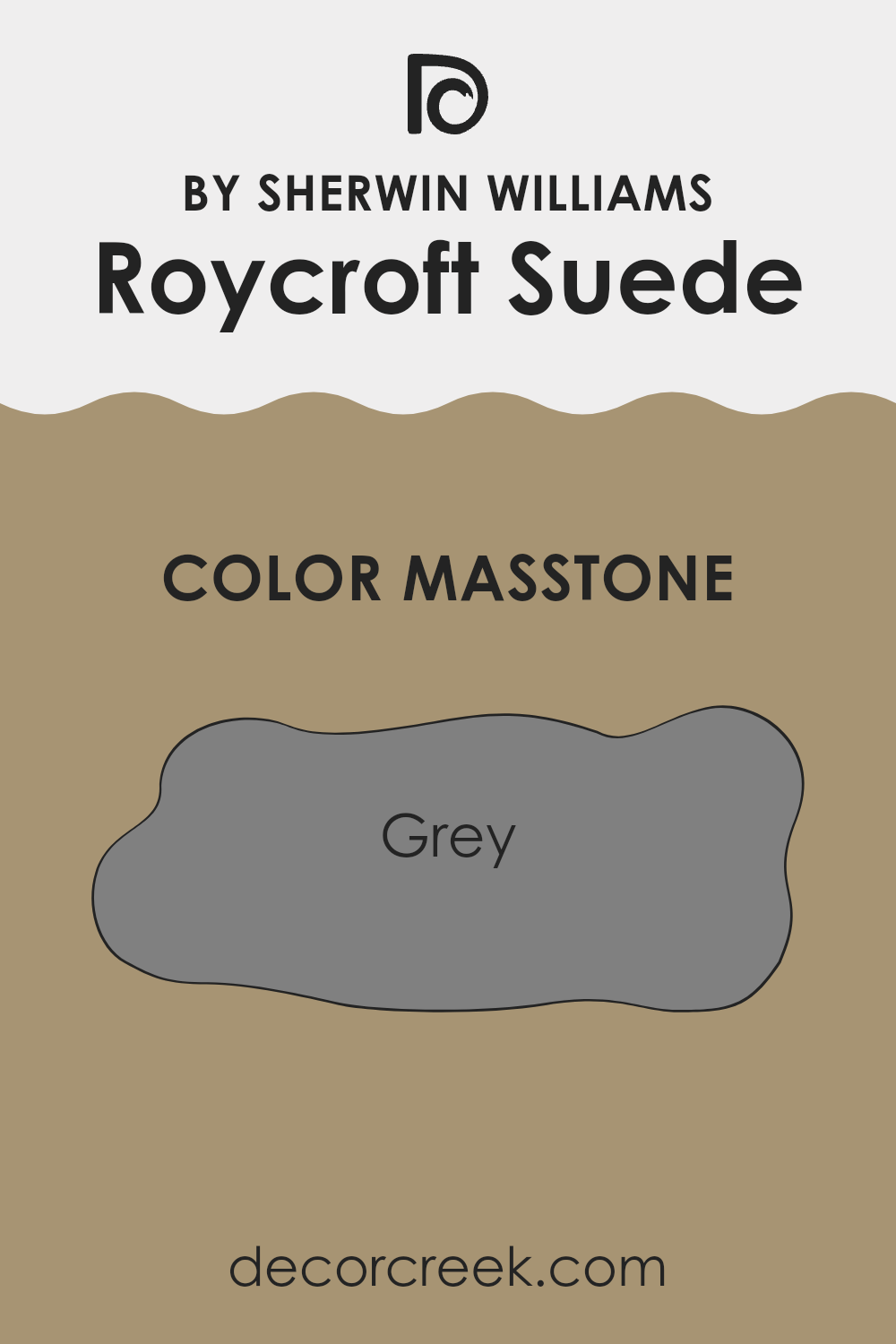
What is the Masstone of the Roycroft Suede SW 2842 by Sherwin Williams?
Roycroft Suede (SW 2842) by Sherwin Williams is a neutral shade that falls within the grey color family (#808080). Its masstone of grey means it has a balanced, middle-of-the-road appearance without strong undertones of other colors. This makes it incredibly versatile for home use, as it can suit various styles and room functions.
In terms of interior design, Roycroft Suede’s grey tone provides a calm and balanced backdrop, allowing furnishings and decor pieces to stand out. It works well in living rooms, bedrooms, and kitchens, creating a cozy atmosphere without feeling overwhelming.
Its neutral quality also makes it a good choice for open plan areas, as it can seamlessly transition between different areas. Moreover, this grey can pair well with both warm and cool colors, offering flexibility in coordinating with other elements like wood, metal, or colorful accents, making rooms feel welcoming and cohesive.
How Does Lighting Affect Roycroft Suede SW 2842 by Sherwin Williams?
Lighting can significantly change how colors appear in your home. The color Roycroft Suede by Sherwin Williams is a deep, muted brown with some green undertones. Its appearance can vary greatly depending on the lighting conditions.
In artificial light, such as incandescent or LED lights, Roycroft Suede may look warmer. Incandescent lights tend to bring out the brown tones, making the color feel cozy and inviting. LED lights can vary, but cooler LEDs might make the color appear slightly greener or muted, while warmer LEDs enhance the earthy warmth.
Natural light changes throughout the day and affects how we perceive color. In rooms facing different directions, the light changes in specific ways:
- 1.North-facing room: These rooms receive consistent, cool light throughout the day. Colors in these rooms may look more subdued. Roycroft Suede might appear darker and greener in these rooms, as the cool light emphasizes any cool undertones.
- 2. South-facing rooms: These rooms get bright, warm light, especially midday. This kind of light can make Roycroft Suede appear warmer and more vibrant. The color will feel richer, with the brown tones coming out more strongly.
- 3. East-facing rooms: Morning light in east-facing rooms is bright but cool, changing to warmer hues as the day progresses. Roycroft Suede might look more muted and cooler in the morning, becoming warmer and fuller later in the day.
- 4. West-facing rooms: These rooms have a different dynamic, with cooler light in the morning and warm, soft light in the afternoon and evening. Here, Roycroft Suede might look calm and subtle in the morning, gaining warmth and depth as the sun sets.
Understanding how lighting affects this color helps you choose complementary decor and adjust lighting to suit the mood you want to create.
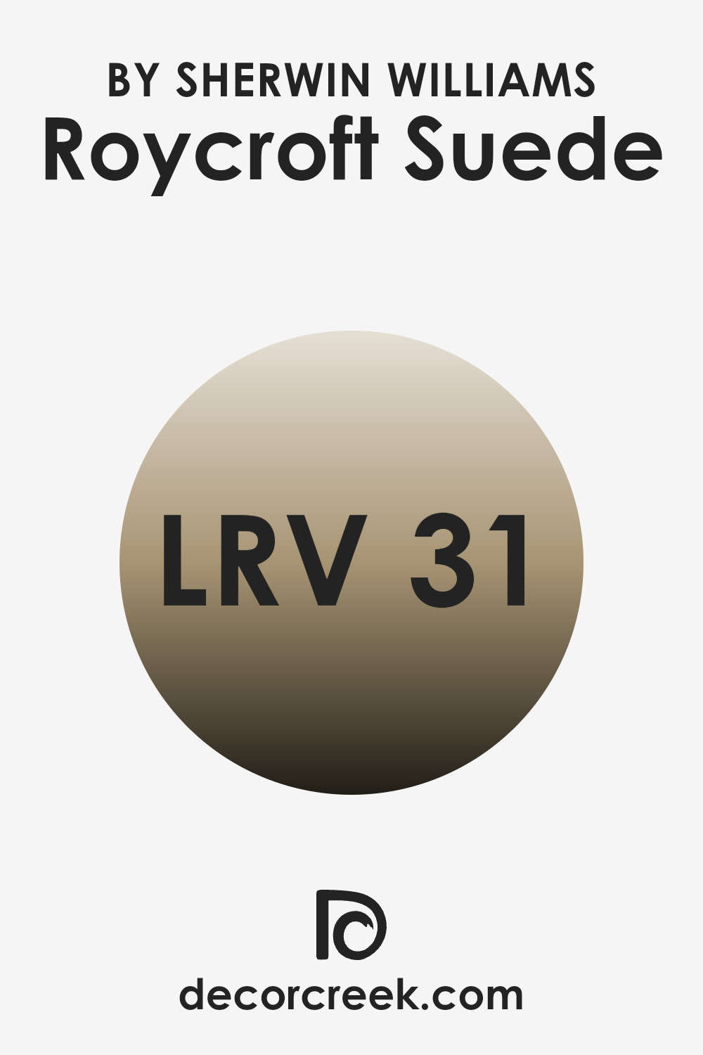
What is the LRV of Roycroft Suede SW 2842 by Sherwin Williams?
LRV stands for Light Reflectance Value, which is a measurement of how much light a color reflects. The scale ranges from 0 to 100, where 0 is absolute black that absorbs all light, and 100 is pure white that reflects all light. Colors with higher LRV numbers reflect more light and can make a room feel brighter and more spacious.
Conversely, colors with lower LRV values absorb more light, making areas feel cozier and warmer. The color Roycroft Suede by Sherwin Williams has an LRV of 30.699, meaning it falls on the darker side of the scale.
This means it will absorb more light than it reflects, giving rooms a warm and inviting feel. Because of its lower LRV, this color is ideal for creating a cozy atmosphere, particularly in larger areas where there is plenty of natural light to offset its richness. However, in smaller or dimly lit rooms, it might make the room feel more enclosed unless paired with lighter accents or adequate lighting.
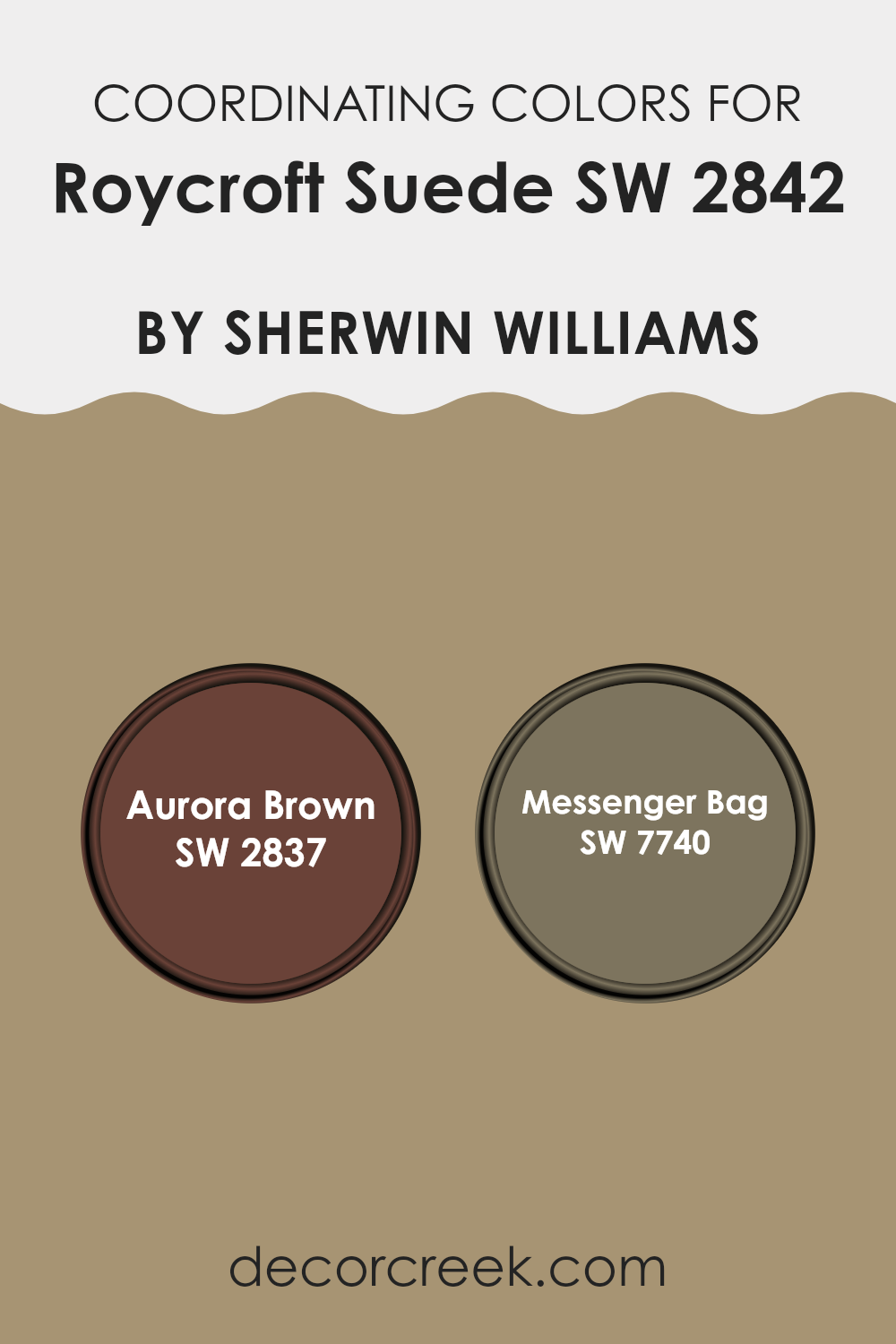
Coordinating Colors of Roycroft Suede SW 2842 by Sherwin Williams
Coordinating colors are hues that are chosen to complement each other because they create a pleasing harmony when used together. When selecting colors to go with Roycroft Suede, you want shades that enhance its warm, earthy tones without overpowering them. Roycroft Suede is a rich and muted brown that carries an old-world charm.
Its versatility makes it a perfect base color for both interior and exterior designs. Aurora Brown and Messenger Bag are wonderful choices that work well with Roycroft Suede. Aurora Brown is a deep, robust hue that brings to mind the richness of dark chocolate. It adds depth and a sense of coziness, making it excellent for creating a warm and inviting atmosphere.
On the other hand, Messenger Bag is a subdued green with a hint of warmth. It provides a refreshing contrast while still maintaining harmony with the warm undertones of Roycroft Suede. These colors together create a cohesive palette that feels balanced and inviting, perfect for spaces where you want to feel at home and at ease.
You can see recommended paint colors below:
- SW 2837 Aurora Brown
- SW 7740 Messenger Bag
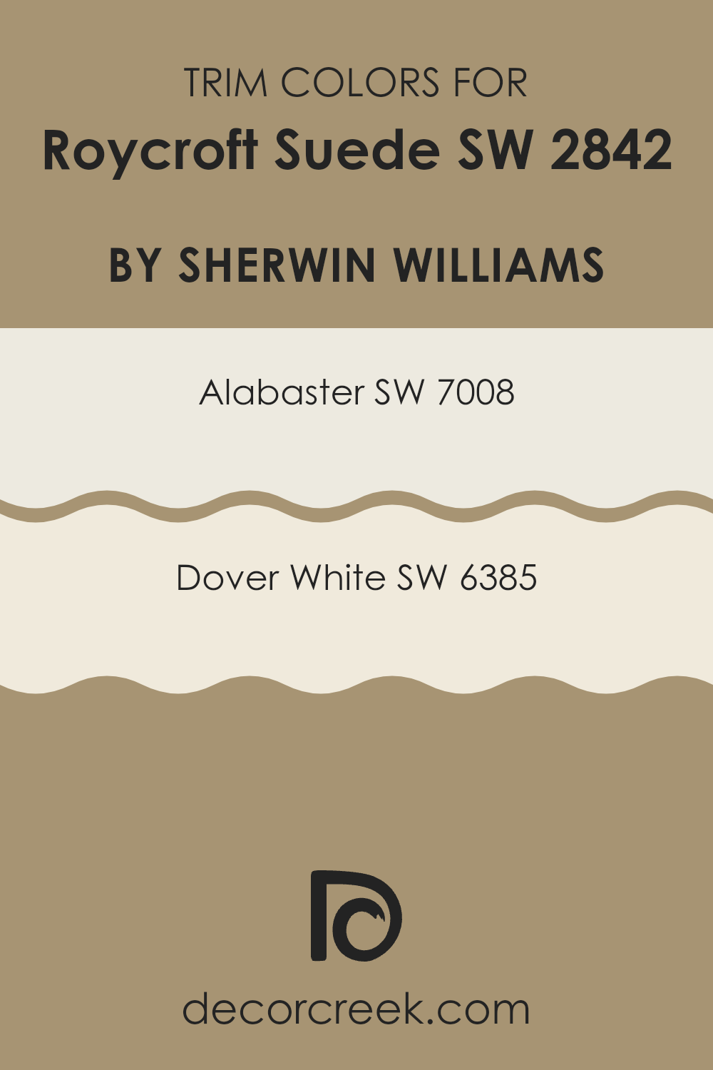
What are the Trim colors of Roycroft Suede SW 2842 by Sherwin Williams?
Trim colors refer to the colors used on the edges and borders of a room, such as window frames, door frames, and baseboards. They play an important role in highlighting architectural details and defining areas, making them essential in interior design. For a color like Roycroft Suede by Sherwin Williams, neutral trim colors like Alabaster and Dover White are perfect choices.
These colors offer a subtle contrast that enhances the warm complexity of Roycroft Suede, adding depth to the room without overwhelming the main color. The trims provide a visual break, helping to frame the rich tones of the walls and create a sense of balance and cohesion.
Alabaster (SW 7008) is an off-white with a soft, creamy undertone that adds warmth without being too stark or cool. It is versatile and can adapt to many different styles, making it an excellent choice for those looking to keep their room light and inviting. Dover White (SW 6385), on the other hand, is a warm, welcoming white with a hint of buttery yellow. It brings in a touch of warmth that pairs beautifully with earthy tones like Roycroft Suede. Both Alabaster and Dover White work exceptionally well as trim colors by providing a gentle contrast that complements rather than competes with the main wall color.
You can see recommended paint colors below:
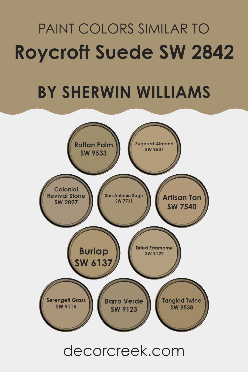
Colors Similar to Roycroft Suede SW 2842 by Sherwin Williams
Using similar colors creates a harmonious and pleasing environment. Colors like Rattan Palm and Sugared Almond offer a cozy and warm touch, complementing the main shade by adding a soft golden hue or a sweet, neutral tone. Colonial Revival Stone brings an elegant taupe that ties together these tones, while San Antonio Sage contributes a gentle, earthy green that pairs beautifully with the natural warmth of the palette. Artisan Tan introduces an amicable balance with its soft, grounding brown, making the overall look more cohesive.
Burlap and Dried Edamame introduce depth with a muted beige and a light olive green, which blend seamlessly into the mix. Serengeti Grass and Barro Verde add vibrant, nature-inspired greens, enhancing the overall palette’s connection to the outdoors.
Tangled Twine rounds out the ensemble with a neutral taupe, reminiscent of natural fibers, providing texture and charm to the color scheme. Together, these colors create a balanced look that is both inviting and versatile, perfect for creating a comfortable and aesthetically pleasing area. Their subtle differences complement and enrich the main shade, allowing for a refined and natural finish in any room.
You can see recommended paint colors below:
- SW 9533 Rattan Palm
- SW 9537 Sugared Almond
- SW 2827 Colonial Revival Stone
- SW 7731 San Antonio Sage
- SW 7540 Artisan Tan
- SW 6137 Burlap
- SW 9122 Dried Edamame
- SW 9116 Serengeti Grass
- SW 9123 Barro Verde
- SW 9538 Tangled Twine
How to Use Roycroft Suede SW 2842 by Sherwin Williams In Your Home?
Roycroft Suede SW 2842 by Sherwin Williams is a warm, earthy brown color that brings a cozy feel to any room. This versatile shade can make a space feel inviting and comfortable, making it an excellent choice for living rooms, bedrooms, or dens.
In a living room, it pairs well with cream or beige furniture and accents like throw pillows or rugs, creating a relaxing atmosphere. In a bedroom, Roycroft Suede can be used on one wall as an accent color, or throughout the room to set a peaceful tone, complementing wood furniture and soft, neutral bedding.
Adding metallic or green accents can enhance the room’s natural vibe. This color can also be a great backdrop for artwork or family photos, as its rich tone helps other colors pop. Overall, Roycroft Suede is perfect for those looking to add warmth and comfort to their home decor.
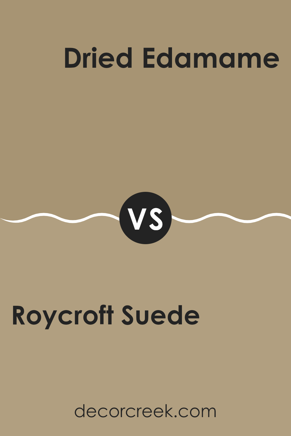
Roycroft Suede SW 2842 by Sherwin Williams vs Dried Edamame SW 9122 by Sherwin Williams
Roycroft Suede SW 2842 is a rich, warm brown with a hint of earthiness. It carries a strong presence, making it ideal for creating cozy and inviting spaces. This color can give a room a classic and timeless feel, making it suitable for traditional or rustic settings.
On the other hand, Dried Edamame SW 9122 is a softer, muted green. This shade offers a more natural and relaxed feel. It evokes a sense of freshness and calm, perfect for areas where you want to add a touch of nature. Dried Edamame has an understated charm that can make a room feel more open and peaceful.
When comparing the two, Roycroft Suede brings warmth and depth, while Dried Edamame introduces a gentle, organic touch. They can work well together, with Roycroft Suede grounding a room and Dried Edamame adding lightness and balance.
You can see recommended paint color below:
- SW 9122 Dried Edamame
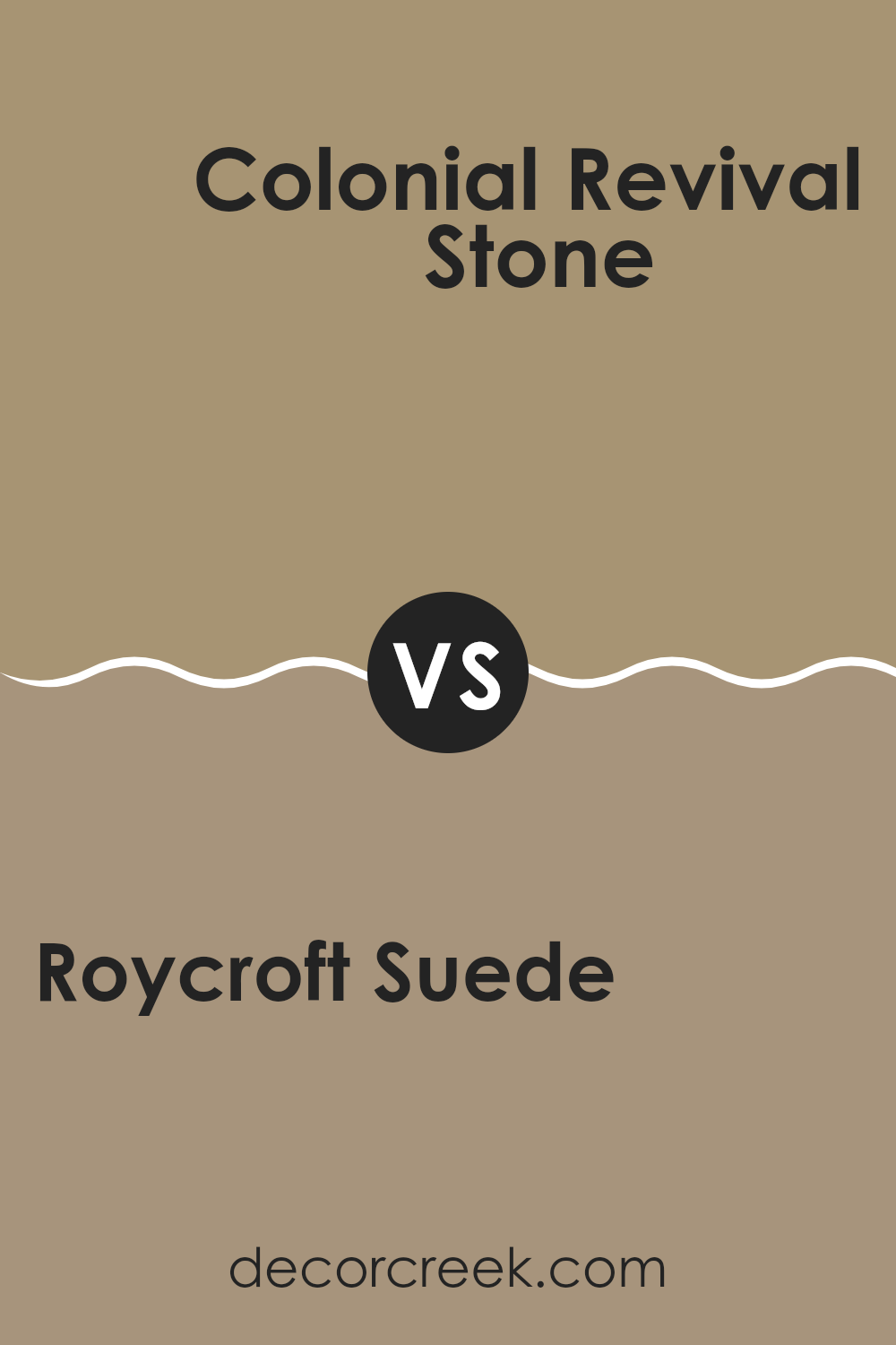
Roycroft Suede SW 2842 by Sherwin Williams vs Colonial Revival Stone SW 2827 by Sherwin Williams
Roycroft Suede SW 2842 and Colonial Revival Stone SW 2827 by Sherwin Williams are both warm, neutral colors, but they have distinct differences. Roycroft Suede is a deep, rich brown with warm undertones. It’s great for adding a cozy and inviting feel to a room. It works well in area where you want a grounded, earthy vibe.
On the other hand, Colonial Revival Stone is a lighter, softer greige. It combines gray and beige for a versatile look that fits many styles. This color brightens up a room while still maintaining a warm, inviting atmosphere. It’s perfect for creating a neutral backdrop that allows other colors to stand out.
While Roycroft Suede provides a bold, dramatic statement, Colonial Revival Stone offers a lighter and more subtle touch. Both colors are versatile and work well in different settings, but their impact on the mood of a space can be quite different due to their tones.
You can see recommended paint color below:
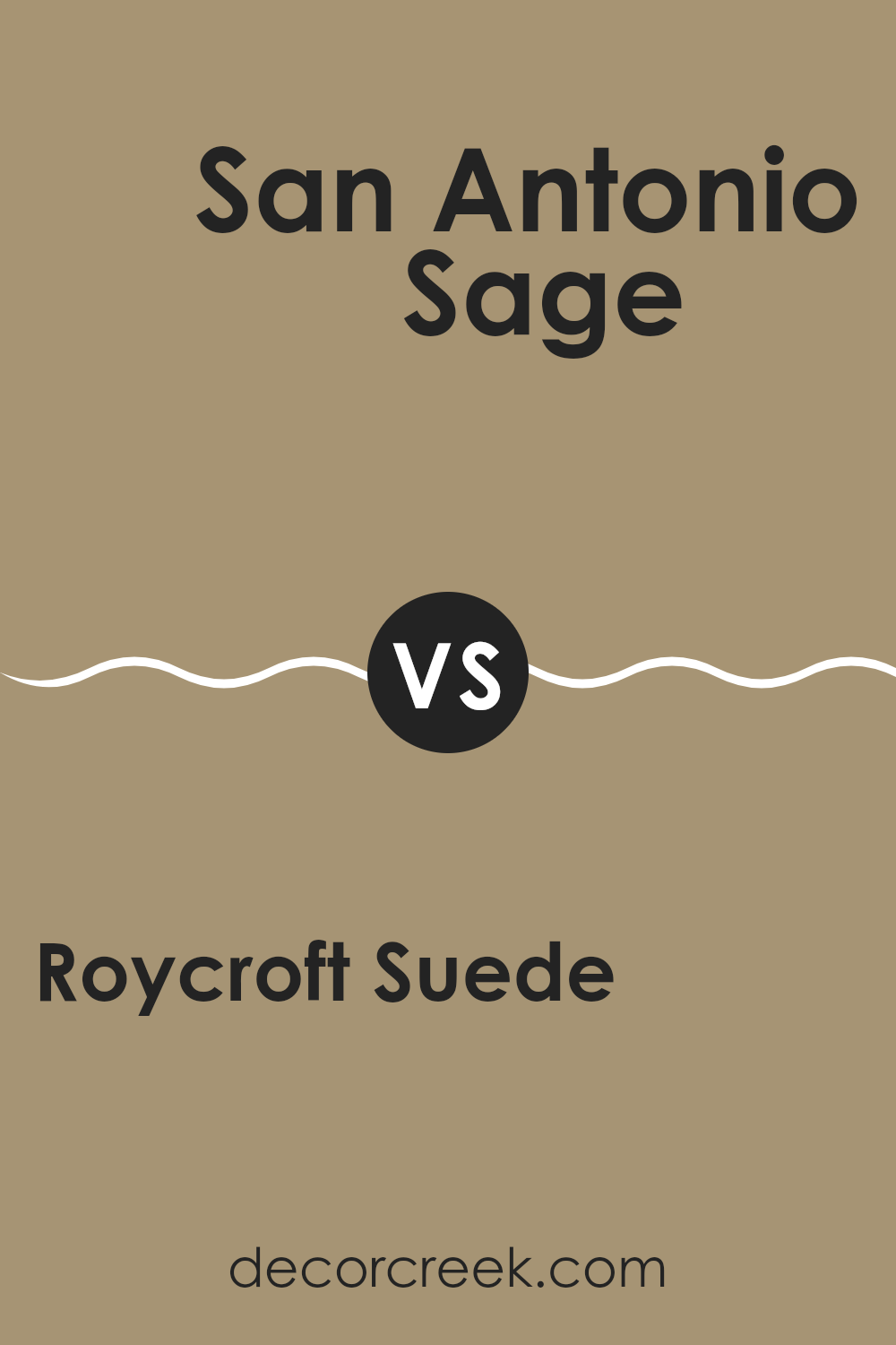
Roycroft Suede SW 2842 by Sherwin Williams vs San Antonio Sage SW 7731 by Sherwin Williams
Roycroft Suede SW 2842 and San Antonio Sage SW 7731 by Sherwin Williams offer distinct styles for any space. Roycroft Suede is a warm, earthy brown with a cozy feel, making it a great choice for creating a comfortable and inviting room. It’s versatile and pairs well with a variety of color palettes, adding a touch of richness and warmth.
San Antonio Sage, on the other hand, is a soft, muted green with gray undertones. This color brings a subtle sense of calm and freshness to a room. It’s perfect for areas where you want a gentle, natural vibe. San Antonio Sage works well with natural materials like wood and complements neutral tones beautifully.
Both colors have their own charm. Roycroft Suede is ideal for areas needing warmth and depth, while San Antonio Sage is perfect for those who prefer a hint of nature and softness in their interiors.
You can see recommended paint color below:
- SW 7731 San Antonio Sage
Roycroft Suede SW 2842 by Sherwin Williams vs Serengeti Grass SW 9116 by Sherwin Williams
Roycroft Suede SW 2842 by Sherwin Williams is a deep, warm brown that brings a sense of coziness and tradition. It feels rich and earthy, making it great for creating a welcoming atmosphere in any room. The color can add depth to your area, giving it a classic touch.
On the other hand, Serengeti Grass SW 9116 is a soft, muted green that has a calming and natural vibe. It resembles the gentle tones of grassy landscapes, offering a soothing backdrop that works well in spaces meant for relaxation. This green color can make a room feel fresh and airy.
When these two colors are compared, Roycroft Suede stands out with its warm intensity, while Serengeti Grass shines with its cool, laid-back charm. Both colors bring their own unique qualities, and together, they can balance each other beautifully in a design scheme, with brown providing a strong base and green adding a refreshing touch.
You can see recommended paint color below:
- SW 9116 Serengeti Grass
Roycroft Suede SW 2842 by Sherwin Williams vs Rattan Palm SW 9533 by Sherwin Williams
Roycroft Suede SW 2842 by Sherwin Williams is a rich and warm brown that brings a cozy and grounded feel to any room. It resembles a soft leather tone and adds a touch of elegance and comfort. This color works well in living rooms or libraries, creating a warm and inviting atmosphere.
On the other hand, Rattan Palm SW 9533 by Sherwin Williams is a soft, earthy beige with green undertones that give it a natural and calming vibe. This color is perfect for creating an airy and light environment and fits well in spaces like bedrooms or kitchens where you want a relaxed feel.
Both colors provide a sense of warmth and nature, but Roycroft Suede is deeper and richer, adding a touch of sophistication, whereas Rattan Palm offers a lighter, more casual and refreshing look. They can complement each other, with one as a main color and the other as an accent.
You can see recommended paint color below:
Roycroft Suede SW 2842 by Sherwin Williams vs Sugared Almond SW 9537 by Sherwin Williams
Roycroft Suede SW 2842 is a deep, earthy brown with a classic and rich tone. It gives rooms a warm and cozy atmosphere, making spaces feel inviting and grounded. This color works well in traditional settings, adding a sense of comfort and depth.
On the other hand, Sugared Almond SW 9537 is a lighter, softer shade with a creamy, neutral appearance. It provides a gentle and calming backdrop that can brighten a room without being overpowering. Sugared Almond is versatile and works well in a variety of spaces, offering a subtle and airy feel.
While Roycroft Suede is bold and enveloping, Sugared Almond offers a light and fresh contrast. Together, they can create a balanced and harmonious look, with Roycroft Suede adding depth and Sugared Almond providing brightness. They cater to different moods, with one being more intense and the other providing a soft, serene touch.
You can see recommended paint color below:
Roycroft Suede SW 2842 by Sherwin Williams vs Burlap SW 6137 by Sherwin Williams
Roycroft Suede SW 2842 and Burlap SW 6137, both by Sherwin Williams, offer unique vibes for home interiors. Roycroft Suede is a rich, warm brown that can create a cozy and inviting atmosphere. It works well in spaces where you want a sense of comfort and stability, like a living room or study.
On the other hand, Burlap is a lighter, warm beige that adds a soft, natural touch to a room. It’s versatile and pairs well with many other colors. Burlap’s lightness can make a room feel more open and airy compared to the deeper tone of Roycroft Suede.
If you’re looking for a grounding color with a strong presence, Roycroft Suede is a good choice. For a more subtle, adaptable shade that brings warmth without being overpowering, Burlap is ideal. Each color has its strengths, making them useful for different design goals.
You can see recommended paint color below:
- SW 6137 Burlap
Roycroft Suede SW 2842 by Sherwin Williams vs Tangled Twine SW 9538 by Sherwin Williams
Roycroft Suede SW 2842 and Tangled Twine SW 9538, both by Sherwin Williams, offer distinct color options for different design needs. Roycroft Suede is a deep, warm brown with rich undertones that create a cozy, inviting atmosphere. It’s perfect for making areas feel intimate and comfortable. This color pairs well with earthy tones and can add a touch of elegance without overwhelming a room.
On the other hand, Tangled Twine is a lighter, more muted shade. It’s a soft taupe with subtle gray and brown undertones, providing a neutral backdrop that’s versatile and easy to work with. This makes it suitable for rooms where you want a calm and balanced feel.
While Roycroft Suede might be better for a room needing warmth and depth, Tangled Twine offers a lighter, more neutral option for areas that require a fresh and airy feel. Both colors complement natural materials and can enhance various design styles.
You can see recommended paint color below:
Roycroft Suede SW 2842 by Sherwin Williams vs Artisan Tan SW 7540 by Sherwin Williams
Roycroft Suede SW 2842 and Artisan Tan SW 7540 by Sherwin Williams are both warm, earthy tones, but they have distinct characteristics. Roycroft Suede is a darker, richer brown that provides a cozy and grounded feel. It’s striking and works well in spaces where a strong, comforting presence is desired, such as a living room or study.
Artisan Tan, on the other hand, is a lighter, subdued hue. It has a soft, inviting nature that can make a room feel more spacious and airy. This color is versatile, suitable for bedrooms and kitchens where a gentle, pleasing backdrop enhances the overall ambiance.
When paired together, Roycroft Suede can be used to add depth and a focal point, while Artisan Tan serves to balance and soften the atmosphere. Both colors work well in traditional and modern settings, offering different takes on warmth and comfort.
You can see recommended paint color below:
- SW 7540 Artisan Tan
Roycroft Suede SW 2842 by Sherwin Williams vs Barro Verde SW 9123 by Sherwin Williams
Roycroft Suede SW 2842 by Sherwin Williams is a warm, earthy brown that brings a cozy feeling to any space. It feels like the color of natural leather or aged wood, giving off a sense of comfort and stability. This color works well in traditional or rustic settings, where it can enhance the feeling of warmth and homeliness.
On the other hand, Barro Verde SW 9123 is a muted green with earthy undertones. It brings in a connection to nature, offering a calm and refreshing vibe. This color is versatile and can pair well in both modern and classic spaces. It’s soothing and can make a room feel more open and relaxed.
When comparing the two, Roycroft Suede brings warmth and earthiness, while Barro Verde offers a touch of nature and calmness. Together, they can create a balanced and harmonious look.
You can see recommended paint color below:
- SW 9123 Barro Verde
After talking a lot about SW 2842 Roycroft Suede by Sherwin Williams, I’ve noticed just how special this color is. It’s like a warm hug from a soft blanket. Imagine a color that feels both cozy and fancy at the same time. When I think about it, it’s just like when you mix warm chocolate with a hint of milk. This color can make any room in your house feel inviting, like when friends or family visit, and everyone gathers around.
What I find interesting is how it changes depending on what it’s around. Next to reds and browns, it feels like autumn leaves. With blues, it reminds me of a calm beach. Even next to bright colors, it stands out without being too much.
When you have SW 2842 Roycroft Suede on your walls, it feels like your room is giving you a big smile every time you walk in. It’s neither too loud nor too quiet. Using this color feels like a gentle reminder of a simple joy in life you love. It whispers warmth and friendliness.
Overall, this color acts like a calm friend who makes you feel happy and relaxed all at once. I’m very much in love with it because of the amazing vibe it brings to any room.
Ever wished paint sampling was as easy as sticking a sticker? Guess what? Now it is! Discover Samplize's unique Peel & Stick samples.
Get paint samples

