When I think about the color SW 7656 Rhinestone by Sherwin Williams, it’s a shade that instantly brings a sense of calmness and freshness to any space. It’s the kind of color that makes me feel as if I’ve opened a window and let in a soft, clean breeze. This subtle gray has hints of blue and green, creating an atmosphere that feels both modern and timeless.
Whenever I’m choosing a color for a room, I want something that feels airy and light, yet has enough personality to stand on its own. Rhinestone does exactly that. It brightens up the space without overwhelming it, offering a gentle backdrop that works seamlessly with almost any decor style.
Whether I’m updating the living room, bedroom, or even a small nook, this color never fails to bring a sense of freshness and openness.
Besides its inherent charm, Rhinestone is incredibly versatile. It pairs well with natural woods, metallics, and more vibrant accent colors, allowing me to play around with different styles and moods. In spaces where I seek peace and relaxation, Rhinestone provides that perfect quiet elegance without fuss.
It’s like wearing your favorite cozy sweater – it just feels right, every single time.
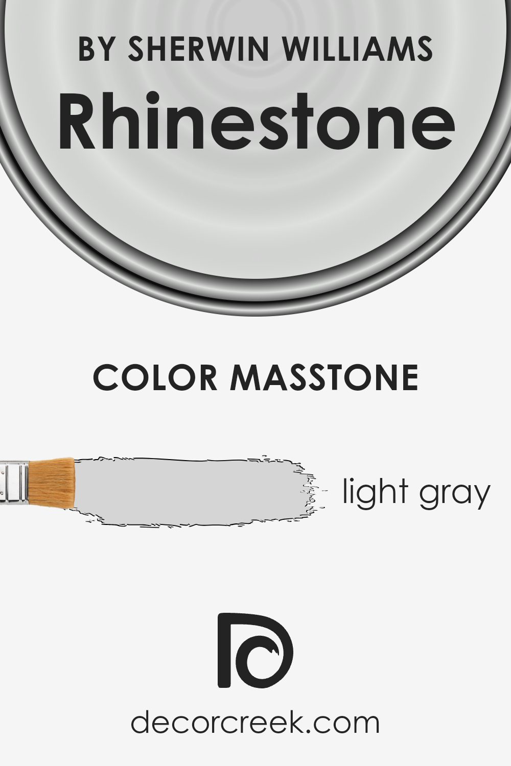
What Color Is Rhinestone SW 7656 by Sherwin Williams?
Rhinestone by Sherwin Williams is a very light gray color with subtle, cool undertones, making it a versatile choice for various interior styles. This gentle hue is perfect for those who prefer a crisp and clean look without the starkness of pure white. It works exceptionally well in modern, minimalist, and Scandinavian interiors, where a sense of space and simplicity is essential.
Rhinestone can also complement coastal and transitional styles, providing a fresh backdrop that harmonizes with various design elements.
Pair this color with natural wood tones for a cozy balance or use it alongside metal accents like silver and chrome for a more contemporary feel. It looks stunning against bright white trim, which adds definition and contrast without overwhelming the room. Rhinestone is also a great partner for soft textures like linen and cotton, which add warmth and depth to a space.
In terms of flooring, light oak or ash complements the color nicely, enhancing its cool undertone without clashing. For those who favor something a bit bolder, consider pairing Rhinestone with deep blues or charcoals. This pairing adds depth to your space while keeping the overall ambiance light and airy.
Is Rhinestone SW 7656 by Sherwin Williams Warm or Cool color?
Rhinestone SW 7656 by Sherwin Williams is a soft, neutral paint color that can enhance the appearance of any home. It’s a light gray shade with cool undertones, providing a clean and modern look. This color is versatile and can adapt to various styles and settings. In a home, Rhinestone can be used to make spaces feel larger and more open due to its lightness. It works well with both warm and cool accents, allowing homeowners to experiment with different furniture and decor options.
In living rooms, Rhinestone creates a balanced backdrop that can highlight colorful artwork or textiles. In bedrooms, it helps in making the space feel calm and inviting. Kitchens and bathrooms also benefit from its fresh look, as it pairs well with white cabinets or natural wood.
Overall, Rhinestone SW 7656 is a practical choice for those wanting a clean, neutral color that harmonizes with various interior design elements.
Undertones of Rhinestone SW 7656 by Sherwin Williams
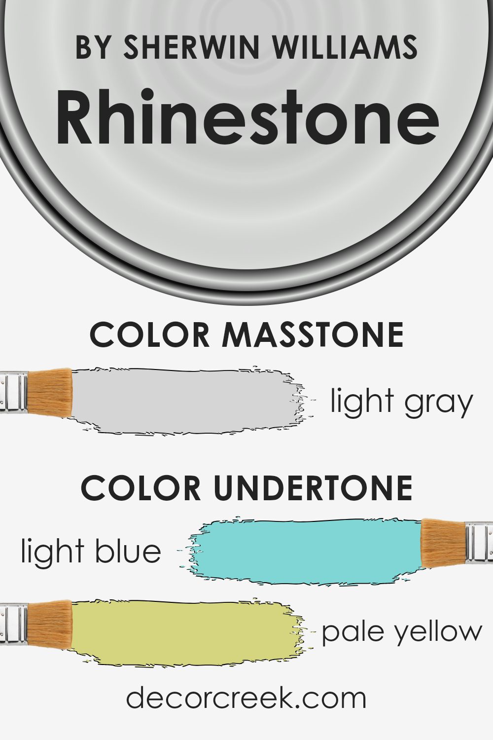
Rhinestone by Sherwin Williams is a paint color that presents itself as a soft, cool gray with subtle undertones that can shift the perception of the color depending on lighting and surrounding decor. The undertones in Rhinestone include light blue, pale yellow, light purple, mint, lilac, pale pink, and gray. These undertones play a crucial role in how the color appears on your walls.
Undertones are the subtle shades that exist beneath the main color and can affect how we perceive the paint. For example, light blue undertones can make a color feel cooler or more refreshing, while pale yellow can bring warmth. Mint and lilac might add a playful or soothing touch, and gray brings a neutral balance.
When Rhinestone is applied on interior walls, the presence of natural or artificial lighting can highlight different undertones, changing the color’s appearance throughout the day. In a well-lit room, you might notice more of the light blue or lilac, lending a fresher or softer vibe. In rooms with warmer lighting, the pale yellow or pale pink undertones might come through, adding a touch of warmth and comfort.
Overall, Rhinestone’s undertones give it a versatile quality, allowing it to adapt to various settings and decor styles.
What is the Masstone of the Rhinestone SW 7656 by Sherwin Williams?
Sherwin Williams’ Rhinestone has a light gray masstone, which creates a subtle and soft atmosphere in a room. Its gentle hue can make living spaces feel more open and airy without overwhelming the area. Light gray has the versatility to pair well with both modern and traditional decor, providing a neutral backdrop that complements various styles and colors.
This shade reflects natural light, which can brighten a room and make it feel welcoming. It works particularly well in rooms that receive plenty of sunlight, enhancing the lightness of the space.
Additionally, it can soften the appearance of rooms with less natural light, preventing the space from feeling too shadowy or dark.
Rhinestone SW 7656 is a great choice for those looking to create an understated yet sophisticated look. It pairs beautifully with accent colors, allowing homeowners to introduce more vibrant colors through furniture and accessories.
How Does Lighting Affect Rhinestone SW 7656 by Sherwin Williams?
Lighting plays a significant role in how we perceive colors, and it can greatly affect how paint colors appear in different settings. Rhinestone (SW 7656) by Sherwin Williams, a subtle and light gray, is no exception.
Under artificial lighting, colors often look different than they do in natural light. For Rhinestone, artificial lighting such as incandescent bulbs can bring out warm undertones, making the color appear slightly cozier. In contrast, fluorescent lighting, which is cooler, might cause Rhinestone to appear more crisp and bluish.
In natural light, Rhinestone’s true tones can be seen more clearly. However, this also depends on the orientation of the room. In north-facing rooms, which typically receive cooler, less intense natural light, Rhinestone may look cooler and more blue-toned. This is because northern light tends to have more blue undertones, which can enhance the color’s coolness.
South-facing rooms get more intense sunlight, especially in the middle of the day. This warm and bright light can enhance the warmth within Rhinestone, making it look lighter and sometimes giving it a slightly warmer appearance.
East-facing rooms have warm, bright light in the morning and cooler light later in the day. In these rooms, Rhinestone can look warmer and brighter in the morning, while appearing cooler and more subdued in the afternoon.
West-facing rooms receive cooler light in the morning and warm, glowing light in the late afternoon and evening. Here, the color might appear more neutral in the morning but take on rich, warmer tones as the day progresses.
Understanding these lighting effects can help you choose how and where to use Rhinestone in your home to achieve the desired ambiance. It’s a versatile color that changes subtly with the light, offering different nuances in each room orientation.
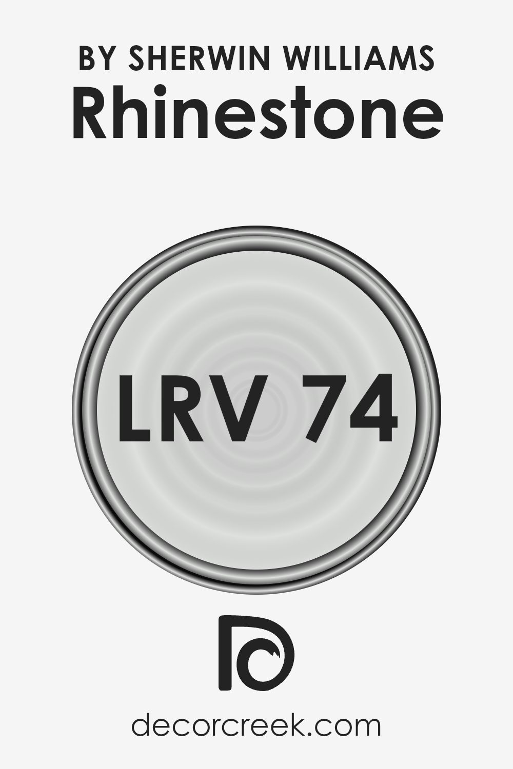
What is the LRV of Rhinestone SW 7656 by Sherwin Williams?
LRV stands for Light Reflectance Value, which is a measurement that tells you how much light a color reflects. It ranges from 0, which means the color absorbs all light, to 100, meaning it reflects all light like a pure white. A higher LRV indicates a lighter color that reflects more light, making a space feel more open and bright.
A lower LRV, on the other hand, suggests a darker color that absorbs more light, giving a room a cozier and more intimate feel. Understanding LRV is helpful when choosing paint colors because it can affect how a color looks in different lighting conditions and how it interacts with other colors in the space.
For the color Rhinestone with an LRV of 74.358, this means it is a fairly light color that reflects a good amount of light. On the walls, Rhinestone will make a room feel airy and spacious. Its high LRV helps to bounce light around, making it a suitable choice for rooms that you want to feel bright and open, even if there’s not a lot of natural light.
Because it reflects a significant amount of light, Rhinestone can cause the perceived color to shift slightly throughout the day as lighting conditions change, maintaining a fresh and clean look. This makes it a versatile color that can complement various design styles and color schemes.
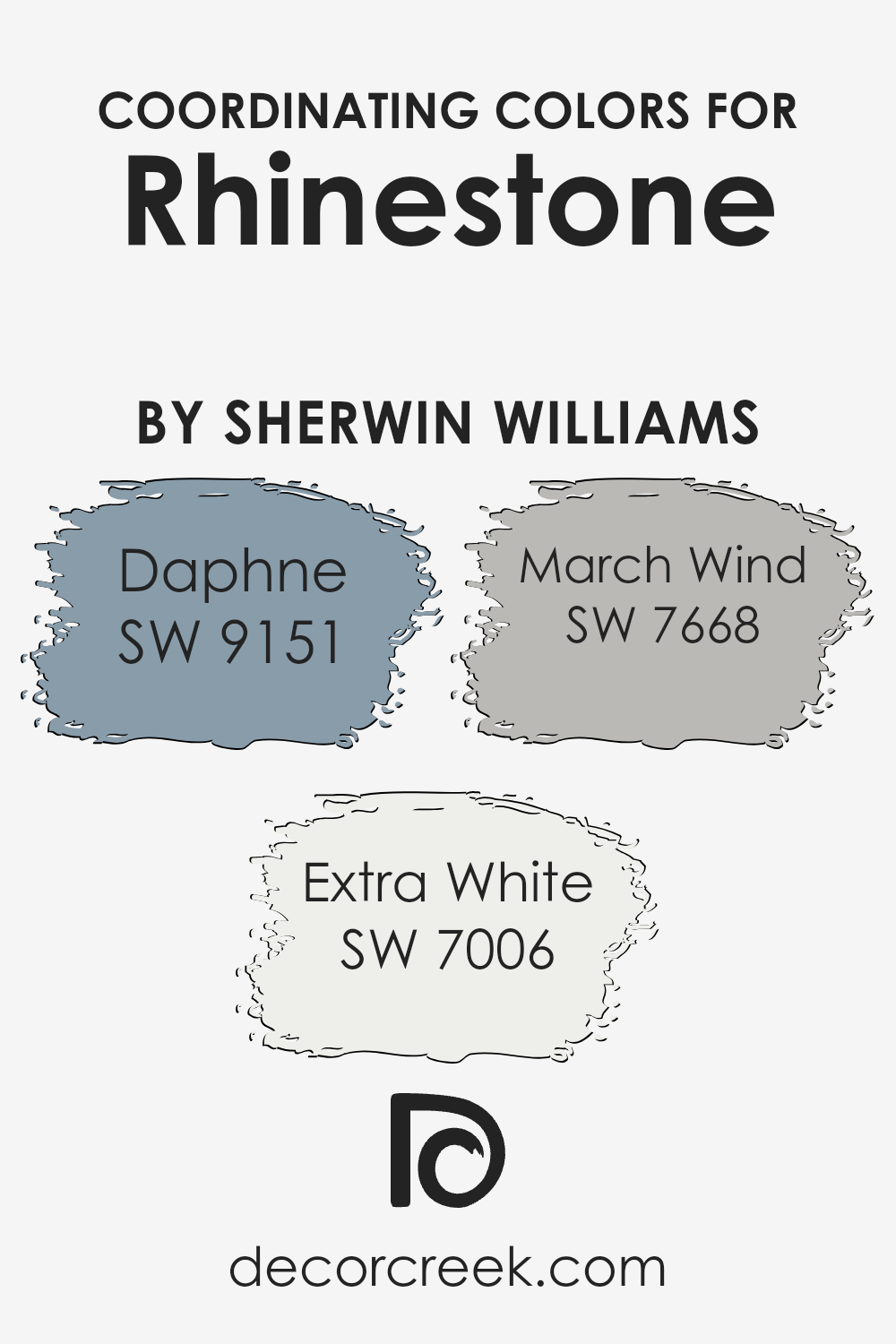
Coordinating Colors of Rhinestone SW 7656 by Sherwin Williams
Coordinating colors are colors that go well together and create a balanced look in a space. They work by complementing a primary color, enhancing its appeal without clashing. When selecting coordinating colors, consider the mood and feel you want to achieve, as well as the purpose of the room.
For Rhinestone by Sherwin Williams, suitable coordinating colors include Daphne, Extra White, and March Wind. These colors come together to create a harmonious environment that feels both inviting and cohesive.
Daphne is a soft, muted blue that adds a touch of calmness and understated elegance to any room. It works beautifully alongside Rhinestone, offering a subtle contrast without overwhelming the space. Extra White is a fresh, crisp shade that brightens up the room, providing a clean backdrop that enhances the overall lightness of the space.
March Wind, on the other hand, is a gentle gray that brings a sense of grounding and balance. It pairs well with both the blue and white tones, rounding out the color scheme with its neutral yet warm presence.
Together, these colors offer a harmonious blend that makes any space feel welcoming and well put-together.
You can see recommended paint colors below:
- SW 9151 Daphne
- SW 7006 Extra White
- SW 7668 March Wind
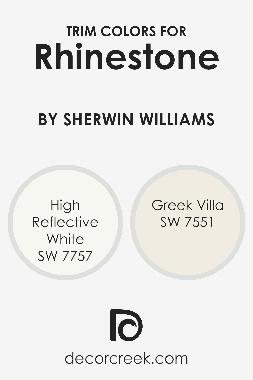
What are the Trim colors of Rhinestone SW 7656 by Sherwin Williams?
Trim colors are the hues that are used on the edges and borders in a room to create a clean and crisp separation between walls, ceilings, doors, and other architectural features. For a color like Sherwin-Williams’ Rhinestone, a trim color is essential to highlight the subtle blues and greys in the paint, adding depth and definition to the space.
Trim colors serve as a critical tool in interior design to emphasize features and create contrasts, thus enhancing the overall look of the room. Having a clear and complementary trim color not only frames the main wall color but also ensures that each element of a room stands out appropriately.
Using Sherwin-Williams’ “High Reflective White” and “Greek Villa” as trim colors with Rhinestone can enrich any room’s appearance. High Reflective White is a bright, clean white that provides a sharp contrast, making it perfect for adding a modern, polished look while emphasizing the Rhinestone color’s cool undertones.
On the other hand, Greek Villa offers a softer, warm white that complements Rhinestone by adding a gentle, inviting touch, which can make a room feel more balanced and cohesive. Both these colors enhance Rhinestone’s subtle charm, making them excellent choices for trim.
You can see recommended paint colors below:
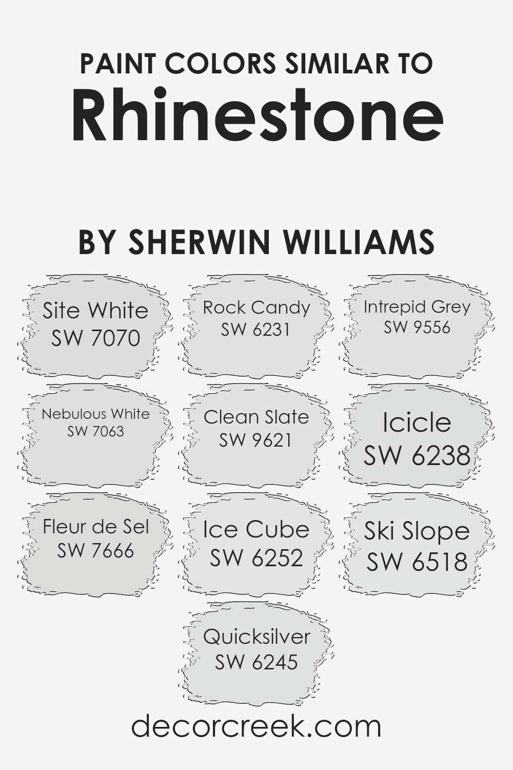
Colors Similar to Rhinestone SW 7656 by Sherwin Williams
Similar colors play an essential role in design by subtly creating harmony and balance in a space. When you look at colors close to Rhinestone by Sherwin Williams, they blend well together to form a cohesive feel. For instance, Site White is a crisp, clean shade that adds brightness without feeling stark, making it perfect for enhancing light and space.
Nebulous White offers a gentle, soft touch, bringing warmth to a room without overpowering. Fleur de Sel is an airy shade that introduces a hint of green, giving a sense of freshness. Quicksilver adds a touch of modern coolness with its muted tone, while Rock Candy’s pale blue tone is soothing and calming.
Other complementary colors include Clean Slate, offering a deeper, balanced gray that anchors a room. Ice Cube is a light, icy tone, bringing in an airy feel to a space. Intrepid Grey provides a bit more depth while keeping a neutral ground. Icicle wraps surfaces in a whisper of blue, evoking a sense of freshness.
Lastly, Ski Slope delivers a serene backdrop with just a hint of coolness. Together, these colors create a unified palette that feels naturally pleasing and inviting, perfect for crafting a welcoming environment.
You can see recommended paint colors below:
- SW 7070 Site White
- SW 7063 Nebulous White
- SW 7666 Fleur de Sel
- SW 6245 Quicksilver
- SW 6231 Rock Candy
- SW 9621 Clean Slate
- SW 6252 Ice Cube
- SW 9556 Intrepid Grey
- SW 6238 Icicle
- SW 6518 Ski Slope
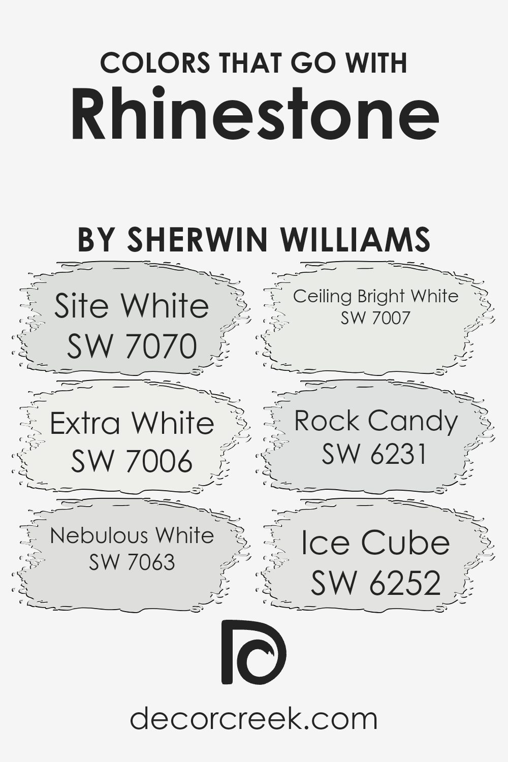
Colors that Go With Rhinestone SW 7656 by Sherwin Williams
Choosing the right colors to pair with Rhinestone SW 7656 by Sherwin-Williams can greatly enhance the overall look of a space. Rhinestone is a soft, pale gray that has a clean and modern appearance. Pairing it with colors that complement its subtlety can create a harmonious and inviting environment.
SW 7070, Site White, is a gentle off-white that brings a sense of warmth and neutrality that goes well with Rhinestone without overpowering it. SW 7006, Extra White, is a crisp and pure white that adds brightness and is perfect for areas where you want a fresh, clean look.
SW 7063, Nebulous White, offers a slightly darker tone that adds depth while still keeping the overall palette light and airy. SW 7007, Ceiling Bright White, as its name suggests, is ideal for ceilings, providing a bright finish that makes rooms feel open and spacious. SW 6231, Rock Candy, has a cool undertone that pairs beautifully with the gray tones of Rhinestone, adding a subtle hint of blue.
Lastly, SW 6252, Ice Cube, is a light gray that compliments Rhinestone by enhancing its soft, understated characteristics. Together, these colors create a balanced and cohesive space that feels both modern and welcoming.
You can see recommended paint colors below:
- SW 7070 Site White
- SW 7006 Extra White
- SW 7063 Nebulous White
- SW 7007 Ceiling Bright White
- SW 6231 Rock Candy
- SW 6252 Ice Cube
How to Use Rhinestone SW 7656 by Sherwin Williams In Your Home?
Rhinestone SW 7656 by Sherwin Williams is a soft, cool gray paint color. It’s a versatile choice that works well in many rooms and styles. This color is light enough to keep spaces feeling open and airy, making it a great option for living rooms or bedrooms. Its subtle undertones can enhance modern or minimalist décor, pairing well with whites or muted pastels for a calm and balanced look.
In the kitchen, Rhinestone can complement stainless steel appliances and white cabinetry, giving a clean, crisp feel. It can also serve as a neutral backdrop in home offices or study areas, where it encourages focus without being distracting.
Bathrooms can benefit from its fresh, inviting tone, creating an atmosphere that’s both relaxing and rejuvenating.
Overall, Rhinestone SW 7656 is a great choice for anyone looking to create a peaceful, inviting environment in their home.
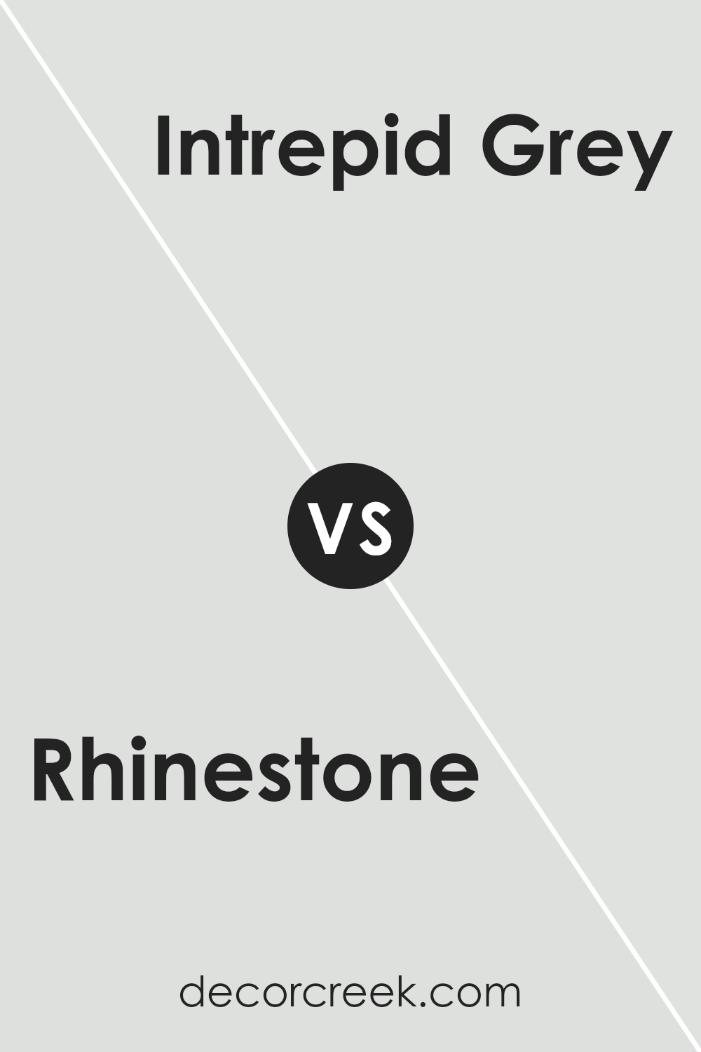
Rhinestone SW 7656 by Sherwin Williams vs Intrepid Grey SW 9556 by Sherwin Williams
Rhinestone SW 7656 and Intrepid Grey SW 9556 by Sherwin Williams are two distinct colors that can impact a space differently. Rhinestone is a light, cool gray, offering an airy and bright feel. It works well in spaces that seek an open and light atmosphere. Its subtle tone allows it to blend seamlessly into various settings without dominating the room.
On the other hand, Intrepid Grey is a darker, richer gray. This color adds depth and can create a cozy and warm environment. It’s ideal for spaces where you want to introduce a sense of intimacy or sophistication without being overpowering.
While Rhinestone can make a room feel larger and more open, Intrepid Grey offers a more grounded, enveloping feel. Both colors are versatile and can complement many styles. Choosing between them depends on the mood and atmosphere you want to achieve in your space.
You can see recommended paint color below:
Rhinestone SW 7656 by Sherwin Williams vs Clean Slate SW 9621 by Sherwin Williams
Rhinestone and Clean Slate are two unique colors from Sherwin Williams. Rhinestone is a soft, light gray with subtle blue undertones, creating a calm and airy feel. It’s excellent for making spaces feel larger and more open, working well in living rooms or bedrooms where you want a light and refreshing atmosphere.
Clean Slate, on the other hand, is a muted blue-gray. It’s deeper and more pronounced compared to Rhinestone, giving it a richer and more grounded appearance. This color can add depth and is perfect for spaces like home offices or dining rooms, where a more substantial presence is desired.
While Rhinestone offers a more neutral and versatile backdrop, Clean Slate provides a stronger, more defined look. Both colors offer a modern touch, but the choice depends on whether you prefer a lighter, softer scheme or a moodier, more refined ambiance.
You can see recommended paint color below:
- SW 9621 Clean Slate
Rhinestone SW 7656 by Sherwin Williams vs Ski Slope SW 6518 by Sherwin Williams
Rhinestone (SW 7656) by Sherwin Williams is a cool, light gray. It often feels calm and neutral, making it versatile for many spaces. It has a gentle, soft appearance, reflecting light and opening up smaller rooms. On the other hand, Ski Slope (SW 6518) is a light blue. It has a refreshing, airy feel, reminiscent of clear skies or peaceful waters.
While Rhinestone stays more on the neutral side, Ski Slope brings a bit more color and energy into a room. The gray tone of Rhinestone can pair well with almost any color scheme, adding a subtle backdrop. Ski Slope’s blue shade might be best suited for spaces where you want a fresh and lively yet soothing atmosphere—like a bathroom or a nursery.
Both colors offer a light, airy touch but differ in the moods they set: one is neutral, the other with a hint of playful blue.
You can see recommended paint color below:
- SW 6518 Ski Slope
Rhinestone SW 7656 by Sherwin Williams vs Site White SW 7070 by Sherwin Williams
Rhinestone (SW 7656) and Site White (SW 7070) are both light, neutral colors by Sherwin Williams, making them versatile choices for various spaces. Rhinestone is a soft gray with a hint of blue, giving it a cool and calming effect. It’s perfect for creating an airy and open feel in a room, making it a great option for both modern and traditional styles.
In contrast, Site White is a crisp, light gray that leans more towards true gray without strong undertones. Its clean and fresh appearance makes it an excellent background color, providing a neutral canvas that can complement a wide range of other colors.
While both are neutral, Rhinestone has a slightly cooler tone due to its bluish undertones, whereas Site White maintains a balanced, classic gray presence. These subtle differences can influence the mood of a space, with Rhinestone adding a touch of coolness and Site White offering a straightforward, clean look.
You can see recommended paint color below:
- SW 7070 Site White
Rhinestone SW 7656 by Sherwin Williams vs Rock Candy SW 6231 by Sherwin Williams
Rhinestone (SW 7656) and Rock Candy (SW 6231) by Sherwin Williams are two soft and subtle colors that add a touch of calmness to any space. Rhinestone is a cool, light gray with a slightly blue undertone, making it feel fresh and modern. It’s a versatile color that pairs well with both warm and cool tones.
On the other hand, Rock Candy is an even lighter, airy gray with a hint of blue, almost appearing off-white in certain lights. It’s perfect for creating a clean and bright atmosphere without looking too stark or cold.
Both colors have a cool, calming vibe but differ in intensity. Rhinestone has a bit more depth, allowing for more contrast with white trims, while Rock Candy offers a softer, almost ethereal look. Choosing between them depends on whether you want a bit more color (Rhinestone) or a gentle, barely-there presence (Rock Candy).
You can see recommended paint color below:
Rhinestone SW 7656 by Sherwin Williams vs Icicle SW 6238 by Sherwin Williams
Rhinestone (SW 7656) by Sherwin Williams is a soft and neutral light gray color. It’s versatile and can be used to create a calm, modern look in any room. Rhinestone works well in spaces with lots of natural light, as it reflects the light and adds a sense of openness.
On the other hand, Icicle (SW 6238) is a cool, icy blue-gray. It’s slightly more colorful compared to Rhinestone, offering a bit of a refreshing feel to a room. Icicle is great for spaces where you want a touch of color while still maintaining a neutral backdrop.
When comparing the two, Rhinestone is more of a straightforward gray, perfect for those who prefer a classic and clean aesthetic. Icicle offers a hint of coolness, adding a subtle pop of color without being overwhelming. Both colors are excellent for creating peaceful and inviting environments, with Rhinestone keeping it more muted and Icicle introducing a gentle touch of blue.
You can see recommended paint color below:
Rhinestone SW 7656 by Sherwin Williams vs Quicksilver SW 6245 by Sherwin Williams
Rhinestone (SW 7656) and Quicksilver (SW 6245) by Sherwin Williams are two distinct shades of gray. Rhinestone is a light, crisp gray with subtle blue undertones, making it feel fresh and airy. It’s a versatile color that works well in both modern and traditional settings, giving spaces a clean and bright appearance.
On the other hand, Quicksilver is also a light gray but leans more towards a neutral tone with slight hints of blue and green. This gives it a soft and calming effect. Quicksilver can create a more relaxed and cozy atmosphere, which suits bedrooms or living rooms.
The main difference between the two is their undertones—Rhinestone’s blue hints make it cooler and sharper, while Quicksilver’s subtle green adds softness. Both colors can complement a variety of color schemes, but selecting one over the other depends on whether you prefer a brisk vibe or a more gentle, peaceful look.
You can see recommended paint color below:
Rhinestone SW 7656 by Sherwin Williams vs Ice Cube SW 6252 by Sherwin Williams
Rhinestone SW 7656 and Ice Cube SW 6252 are both light, neutral colors by Sherwin Williams, but they have distinct characteristics. Rhinestone is a cool, pale gray with slight blue undertones, giving it a crisp and modern feel. It works well in spaces where a subtle, calming backdrop is desired, making rooms feel open and airy.
Ice Cube, on the other hand, is a slightly warmer light gray with soft undertones of blue and green. This makes it slightly more inviting and versatile, as it can adapt to different lighting conditions and styles. It adds a touch of warmth while maintaining a modern aesthetic.
When comparing the two, Rhinestone tends to be more straightforward and cool, perfect for contemporary spaces, whereas Ice Cube adds a hint of warmth, making it ideal for spaces that aim to be cozy yet modern. Both colors are excellent choices for neutral walls, but their subtle differences can greatly affect the mood of a room.
You can see recommended paint color below:
Rhinestone SW 7656 by Sherwin Williams vs Nebulous White SW 7063 by Sherwin Williams
Rhinestone (SW 7656) by Sherwin Williams is a soft, cool gray with a hint of blue. It feels clean and modern, making it a good choice for a minimalist look. It pairs well with many colors because it’s neutral but adds a subtle touch of color due to its blue undertone.
Nebulous White (SW 7063), on the other hand, is a warmer off-white with gentle gray undertones. It’s a bit creamier compared to Rhinestone, offering a cozy and warm feeling to a space. This makes it a versatile choice for those who want a light color that isn’t too stark.
When comparing both, Rhinestone is more crisp and cool, ideal for a contemporary setting. Nebulous White offers a softer, warmer look, fitting well in spaces where you want a more inviting atmosphere. Both colors are versatile, but the decision depends on whether you want a cooler or warmer vibe in your space.
You can see recommended paint color below:
Rhinestone SW 7656 by Sherwin Williams vs Fleur de Sel SW 7666 by Sherwin Williams
Rhinestone SW 7656 and Fleur de Sel SW 7666 by Sherwin Williams are both subtle, versatile paint colors, but they have their own distinct qualities. Rhinestone is a soft, cool gray with slight blue undertones, giving it a crisp and fresh appearance. It works well in spaces where a modern, clean look is desired. This color reflects light beautifully, making rooms feel open and airy.
On the other hand, Fleur de Sel is a light, warm gray with a hint of beige. It leans more towards a creamy off-white, offering a cozy and inviting feel. This color is perfect for creating relaxed spaces, bringing warmth and softness without being overpowering.
Both colors can serve as excellent neutrals, complementing a variety of furnishings and decor. Rhinestone is ideal for a sleek, contemporary look, while Fleur de Sel adds comfort and warmth, making it perfect for more traditional or transitional spaces.
You can see recommended paint color below:
Conclusion
After looking closely at SW 7656 Rhinestone by Sherwin Williams, I’ve gathered that this paint color is like a special type of gray. It’s not just any gray—it kind of has a hint of blue and can make a room feel very light and airy. That makes it a great choice for many parts of a house.
Whether it’s the living room, kitchen, or even a bedroom, Rhinestone makes the place look fresh and clean. It’s like when you wash a window, and suddenly everything seems brighter.
What I really like about Rhinestone is how it works so well with other colors. Imagine you have a favorite blue chair or a sunny yellow cushion; they both look nice next to walls painted with Rhinestone. It’s almost like it makes other colors pop out more. Also, it doesn’t matter if you get a lot of sunlight or a little—this paint still looks good.
Overall, I feel like SW 7656 Rhinestone is a fantastic color choice. It’s a little special, and it has a way of making any room feel pleasant and inviting. If you’re thinking of trying a new color for a room, Rhinestone is a smart and safe choice. It’s simple, but it makes a big difference!
Ever wished paint sampling was as easy as sticking a sticker? Guess what? Now it is! Discover Samplize's unique Peel & Stick samples.
Get paint samples

