When choosing the perfect shade of paint for your home, Oyster White SW 7637 by Sherwin Williams stands out as a versatile option. This charming shade of white offers a soft, welcoming backdrop for any room in your house.
Its subtle warmth brings a cozy atmosphere, making spaces feel more inviting and homely.
Unlike stark whites, Oyster White has a creamy undertone that pairs well with a wide array of decor styles, from modern minimalist to rustic country.
It’s a color that complements various materials and textures, whether you’re looking to highlight natural wood elements, sleek metal finishes, or soft, plush fabrics.
In this article, we will explore how Oyster White can enhance different spaces, its compatibility with other colors, and tips for incorporating it into your decorating scheme.
Whether you’re refreshing a single room or planning a complete home makeover, understanding the nuances of this shade will help you create a harmonious interior you’ll love spending time in.
What Color Is Oyster White SW 7637 by Sherwin Williams?
Oyster White by Sherwin Williams is a subtle and warm shade that leans towards a soft, creamy white with a hint of beige undertones. This color manages to strike an elegant balance, offering a cozy yet sophisticated vibe to any room it graces.
It’s quite versatile, making it a fantastic choice for those looking to infuse their space with a sense of calmness and warmth without overwhelming it with color.
When it comes to interior styles, Oyster White shines in environments where a serene and inviting atmosphere is desired.
It’s particularly well-suited for modern farmhouse, minimalist, and Scandinavian decors, thanks to its understated elegance and natural appeal.
This color has a way of making spaces feel open and airy, providing a clean canvas that still feels rich and welcoming.
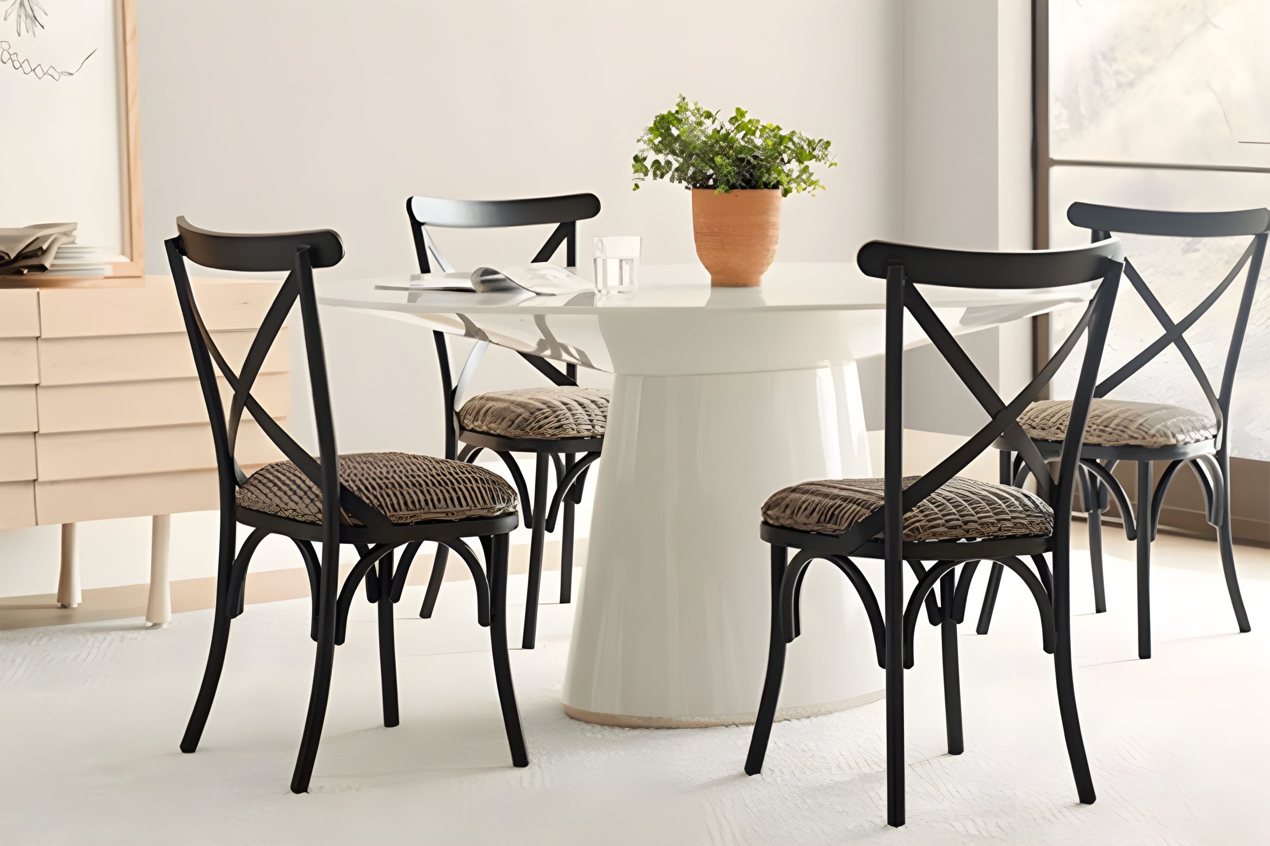
Pairing this color with materials and textures can truly bring a room to life. It goes beautifully with natural wood, from light oak to richer walnut tones, enhancing the warmth of the space.
Linen fabrics in soft neutrals or even muted blues and greens complement Oyster White wonderfully, adding to the tranquil ambiance.
Metallic accents, especially in brushed gold or copper, can add a subtle glam touch, while stone textures like marble or granite introduce an element of sophistication.
Together, these combinations can create a space that feels both grounded and uplifted, making Oyster White a versatile and appealing choice for a wide range of homes.
Ever wished paint sampling was as easy as sticking a sticker? Guess what? Now it is! Discover Samplize's unique Peel & Stick samples.
Get paint samples

Is Oyster White SW 7637 by Sherwin Williams Warm or Cool color?
Oyster White by Sherwin Williams is a beautiful, soft shade that brings a warm and inviting feel to any room. This color is like a cozy blanket for your walls, making spaces feel more comfortable and welcoming.
The genius of Oyster White lies in its versatility. It works well in all types of lighting, adapting subtly to the mood of natural sunlight during the day and the soft glow of indoor lighting at night.
Whether your home is filled with modern decor or classic pieces, this shade complements various styles, acting as a backdrop that lets your furnishings and art pieces stand out.
One of the best things about Oyster White is its ability to make small spaces appear larger and more open. It reflects light in just the right amount, not too bright but enough to give rooms a fresh, airy feel.
For homeowners looking for a color that adds warmth without overwhelming, Oyster White is a perfect choice. It’s like a gentle hug for your home, offering a sense of peace and tranquility.
This color truly transforms a house into a home, making every nook and cranny feel lived in and loved.
Undertones of Oyster White SW 7637 by Sherwin Williams
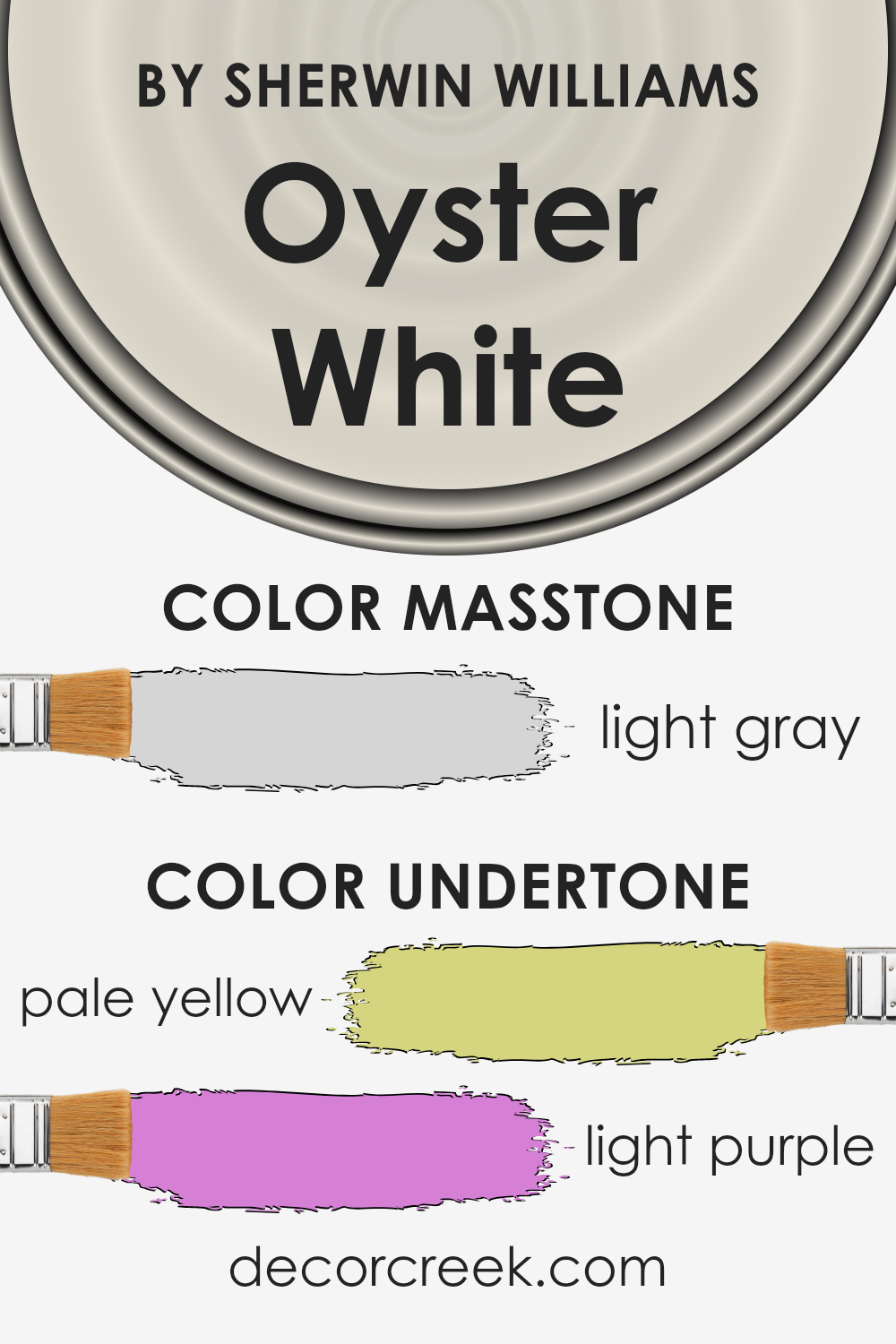
Oyster White by Sherwin Williams is a unique color with subtle undertones that can significantly influence the appearance of a room. This color has hints of pale yellow and light purple.
These undertones are not always directly noticeable but they do affect how we perceive the main color.
Undertones work like a silent language in colors. They can make a color feel warmer or cooler and affect how it pairs with other colors or materials.
For instance, pale yellow brings a soft warmth, suggesting a gentle sunlight effect, making spaces feel more inviting.
On the other hand, the light purple undertone adds a touch of sophistication and depth, preventing the color from feeling flat or dull.
When applied to interior walls, Oyster White unfolds in surprising ways depending on the lighting and time of day. Morning light might highlight its yellow undertones, bringing a subtle cheerfulness to a room.
In the evening, as natural light fades, its light purple undertones might become more pronounced, adding a layer of elegance and tranquility.
These undertones also mean that Oyster White is versatile, able to complement a wide range of décor and styles.
However, it’s important to test this paint in your specific space since its subtle undertones may appear differently under various lighting conditions or when paired with different furniture and fabrics.
This approach will help you understand how its complex undertones can enhance your home’s interior.
What is the Masstone of the Oyster White SW 7637 by Sherwin Williams?
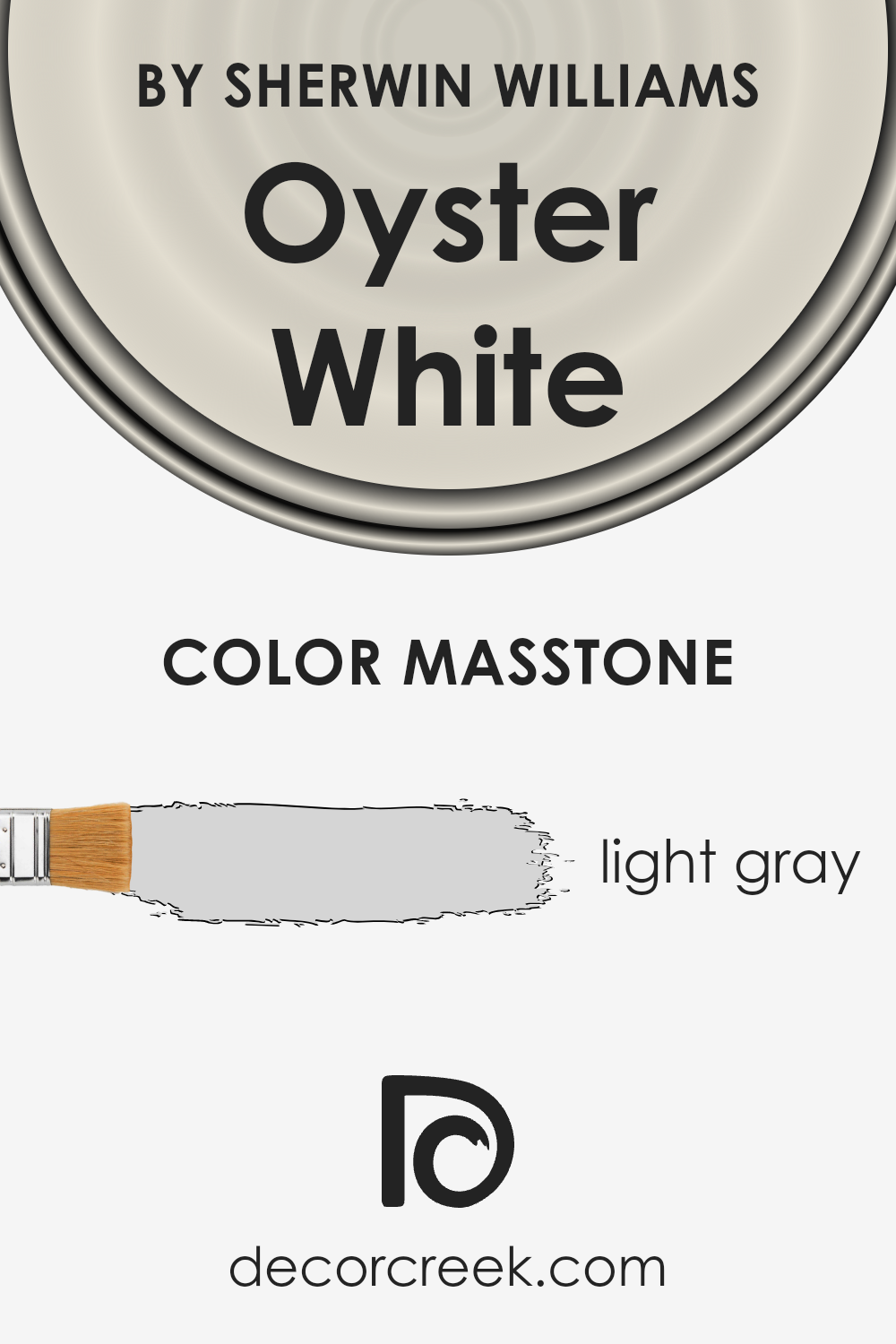
Oyster White SW 7637 by Sherwin Williams has a masstone of light gray, represented by the color code #D5D5D5. This subtle and soothing shade brings a sense of calm and elegance into any home.
Its light gray essence makes it incredibly versatile, allowing it to work well in a variety of spaces and with many decor styles.
From modern minimalist to cozy farmhouse, this color lays a perfect backdrop that doesn’t overpower but instead complements the space.
In homes, this light gray can make rooms feel larger and brighter, as it reflects natural light beautifully. It’s an excellent choice for living areas, bedrooms, and even kitchens, providing a clean and fresh look.
Furthermore, this shade acts as a neutral base, making it easy to incorporate accent colors or textures through furniture, art, and accessories.
For those looking to create a peaceful and inviting home environment, this color achieves that balance perfectly, offering both warmth and sophistication.
How Does Lighting Affect Oyster White SW 7637 by Sherwin Williams?
Lighting plays a crucial role in how we perceive colors, often altering their appearance dramatically under different conditions. This is particularly evident with paint colors on your walls, such as Oyster White from Sherwin Williams.
This color, with its subtle blend, can look significantly different depending on the type of light it’s exposed to – be it artificial or natural.
Under artificial light, which includes LED, fluorescent, or incandescent bulbs, Oyster White may shift in appearance. For example, in warm LED lighting, it can take on a cozier, creamier tone, making spaces feel inviting.
In cooler fluorescent light, this color could lean more towards a crisper, brighter appearance, which might make it seem more neutral and versatile.
Natural light brings its own spectrum of influences. In north-facing rooms, which receive less direct sunlight and therefore have a cooler, bluer light, Oyster White may appear slightly more muted and cooler, emphasizing its understated elegance without becoming stark or cold.
South-facing rooms, basked in warm sunlight for most of the day, can make this color look warmer and brighter, enhancing its creamy qualities and making the space feel light and airy.
East and west-facing rooms offer a mix of effects throughout the day. In east-facing rooms, morning light can make Oyster White look soft and warm, welcoming the day with a gentle brightness.
As the day progresses, the light diminishes, and the color can appear more neutral and true to its base.
In west-facing rooms, the situation reverses: the color may start the day cooler and more neutral, then warm up significantly in the afternoon to evening light, creating a cozy and inviting atmosphere.
In sum, Oyster White’s versatility under different lighting conditions makes it an excellent choice for many spaces, adapting its tone from the warmth of the sun to the subtleties of artificial lighting, and providing a beautiful backdrop to any room’s evolving atmosphere throughout the day.

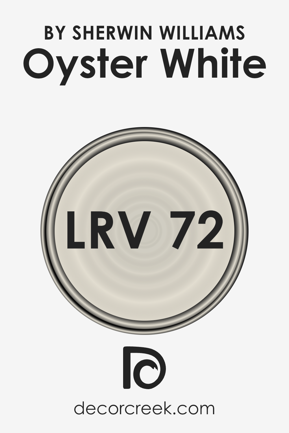
What is the LRV of Oyster White SW 7637 by Sherwin Williams?
Light Reflectance Value, or LRV, is a measure used to describe how much light a color reflects or absorbs.
Think of it as a scale from 0 to 100, where 0 means the color is really dark and absorbs a lot of light, like a deep black, and 100 means it reflects all the light, just like a bright white does.
This value is super helpful when you’re trying to figure out how a paint color will actually look in your space. Colors with higher LRV make rooms feel brighter and more open because they bounce more light around.
On the other hand, colors with low LRV can make a room feel cozier and more intimate because they soak up more light.
With an LRV of 72.49, Oyster White falls into the category of colors that reflect quite a bit of light. This means in a well-lit room, Oyster White will look bright and airy, making the space feel welcoming and larger.
The high LRV ensures that it doesn’t turn dull or too shadowy, even in areas that don’t get a ton of natural sunlight.
For this particular color, such a high LRV value means it’s a great choice if you’re aiming for a light and neutral backdrop that has a little more warmth and character than a stark white, without overwhelming the space or making it feel too cold.
LRV – what does it mean? Read This Before Finding Your Perfect Paint Color
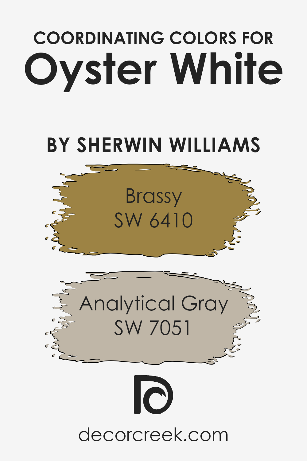
Coordinating Colors of Oyster White SW 7637 by Sherwin Williams
Coordinating colors work together to create a harmonious look and feel in any space. They are chosen based on how well they complement each other, considering their tones, undertones, and overall impact on the ambiance of a room.
When we talk about coordinating colors for something like Oyster White by Sherwin Williams, we are looking for hues that not only enhance but also subtly contrast or enrich the primary color without overwhelming it.
This approach ensures that the space feels balanced and aesthetically pleasing, with each color having its place without causing visual clutter.
Among the coordinating colors for Oyster White, we have Brassy and Analytical Gray, both by Sherwin Williams as well. Brassy is a vibrant, lively shade that adds a touch of warmth and cheerfulness to the space.
It’s like a ray of sunshine, offering a perfect balance of energy and sophistication when paired with the calmness of Oyster White. On the other hand, Analytical Gray is a sophisticated, muted color that brings a sense of serenity and depth.
Its understated elegance makes it a versatile partner to Oyster White, ensuring the space feels grounded yet spacious.
Together, these coordinating colors create a palette that’s both inviting and cohesive, easily enhancing the overall atmosphere of any room.
You can see recommended paint colors below:
- SW 6410 Brassy
- SW 7051 Analytical Gray
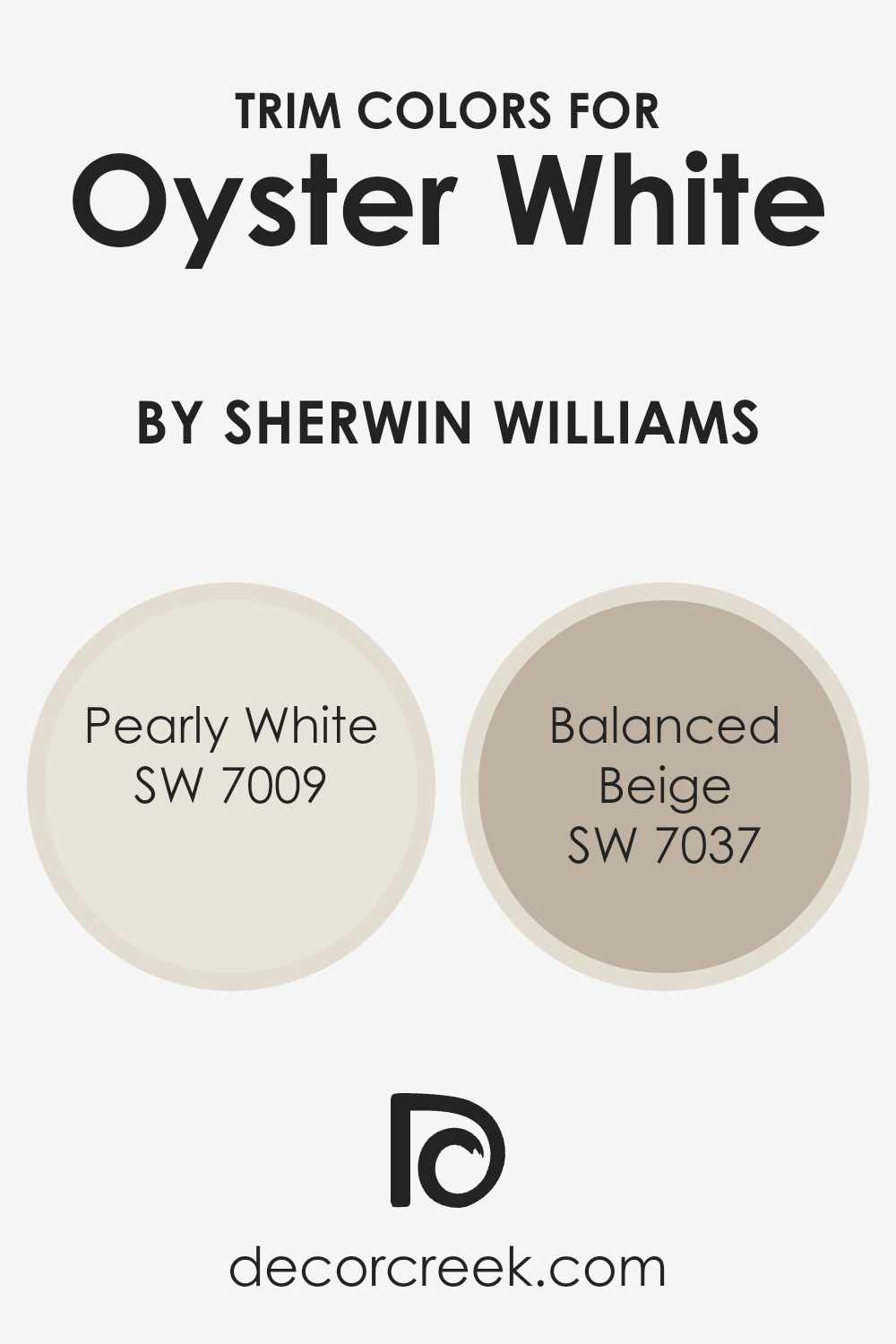
What are the Trim colors of Oyster White SW 7637 by Sherwin Williams?
Trim colors are selected to complement or contrast the main color of a wall, enhancing the overall aesthetic appeal of a room.
In the case of Oyster White by Sherwin Williams, choosing the right trim color can elevate the elegance of this subtle, warm shade, making the space feel inviting and cohesive.
Trim colors highlight the architectural features of a room, drawing attention to the details that might otherwise go unnoticed.
They create a visual frame for the walls, defining spaces within a home and adding depth and character to the design.
For a gentle and harmonious look alongside Oyster White, Pearly White offers a soft, almost ethereal touch that brightens spaces without overwhelming them.
It’s a quiet whisper of color, subtle yet enhancing, making it ideal for bringing out the warmth of Oyster White without causing a stark contrast.
On the other hand, Balanced Beige steps in as a bolder choice, grounded and earthy, offering a stronger delineation between wall and trim which complements the welcoming nature of Oyster White.
It provides a neutral but deeper tone that pairs beautifully, adding richness to the room and creating a sophisticated backdrop that highlights the architectural elements of the space.
You can see recommended paint colors below:
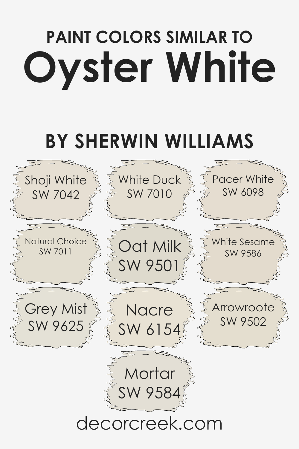
Colors Similar to Oyster White SW 7637 by Sherwin Williams
Similar colors play a vital role in interior design and painting, providing subtle variations that can significantly enhance the mood and aesthetic of a space.
These variations allow for a cohesive look that is visually appealing and harmonious. For example, Shoji White brings a light and airy feel, making it perfect for creating a serene and spacious atmosphere.
Natural Choice, on the other hand, has a slightly warmer tone, offering a cozy and inviting ambiance that feels like home.
Grey Mist adds a hint of sophistication with its muted elegance, while Mortar introduces a bolder depth without overwhelming a room. White Duck is another gentle option that complements various decor styles with its versatile warmth.
Oat Milk’s slightly creamy tone infuses spaces with a soft, nurturing vibe, perfect for rooms meant for relaxation. Nacre whispers elegance and subtlety, making it ideal for a refined look.
Pacer White shifts towards a cooler palette, offering a crisp, clean finish that brightens spaces effortlessly.
White Sesame and Arrowroot provide unique alternatives; the former brings a light, almost ethereal quality to spaces, while the latter offers a grounded, almost earthy feel without compromising on lightness.
Together, these colors work in harmony to achieve a balanced and cohesive interior, allowing for personalized adjustments without straying too far from the desired mood and style.
You can see recommended paint colors below:
- SW 7042 Shoji White
- SW 7011 Natural Choice
- SW 9625 Grey Mist
- SW 9584 Mortar
- SW 7010 White Duck
- SW 9501 Oat Milk
- SW 6154 Nacre
- SW 6098 Pacer White
- SW 9586 White Sesame
- SW 9502 Arrowroote
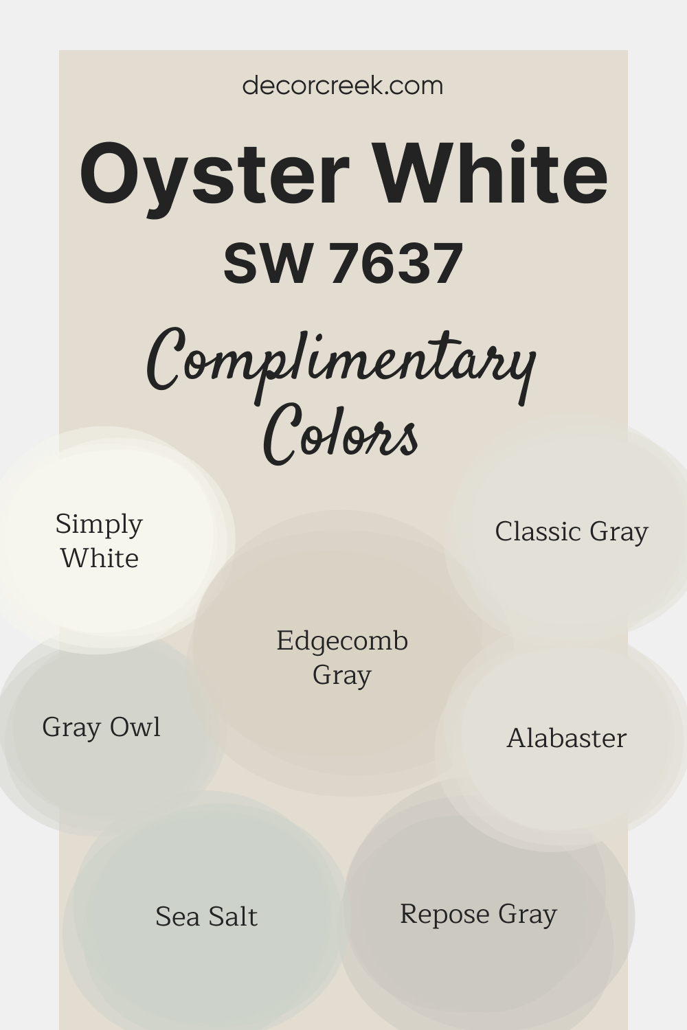
Complimentary Colors for Oyster White SW 7637 Paint Color by Sherwin Williams
Oyster White SW 7637 by Sherwin-Williams is a warm off-white that lends a cozy and inviting feel to any room. Its subtle undertones make it an ideal choice for creating a calm, neutral backdrop.
Whether used on walls, cabinetry, or trim, this color pairs effortlessly with a variety of complementary shades. For a fresh and bright look, Simply White OC-117 and Alabaster SW 7008 provide clean, crisp accents.
Edgecomb Gray HC-173 and Repose Gray SW 7015 bring neutral warmth and depth, while Classic Gray OC-23 and Gray Owl OC-52 add a refined touch.
To introduce a soft, calming hue, Sea Salt SW 6204 completes the palette with its gentle, nature-inspired tone.
Oyster White SW 7637 by Sherwin Williams Color Palette
Oyster White brings a quiet softness that feels gentle and welcoming in any room. City Loft and Agreeable Gray add warmth that helps the palette feel cozy. Snowbound and Extra White brighten the overall look, giving contrast without harshness.
Iron Ore and Urbane Bronze introduce dark accents that feel rich and grounded.
Alabaster adds warmth that brings everything together. This palette suits bright interiors, light woods, and soft natural fabrics.

How to Use Oyster White SW 7637 by Sherwin Williams In Your Home?
Oyster White by Sherwin Williams is a versatile paint color that offers a soft, warm touch to any space in your home. Its subtle ivory shade contains hints of beige, making it perfect for creating a cozy and inviting atmosphere.
Whether you’re aiming to refresh your living room, bedroom, or kitchen, Oyster White serves as an excellent backdrop, complementing various decor styles and color palettes.
In the living room, Oyster White can help enhance natural light, making the space appear brighter and more spacious. For the bedroom, pairing it with soft textiles and warm wood tones can create a tranquil retreat.
In the kitchen, this color can add warmth to modern or traditional cabinetry, contributing to a welcoming environment for family gatherings.
Using Oyster White on walls allows for flexibility in decorating with art, fabrics, and accessories of all colors. It acts as a neutral canvas, enabling you to easily update your decor without having to repaint.
Whether you aim for a minimalist aesthetic or a more eclectic vibe, Oyster White adapts effortlessly, ensuring your home feels both stylish and comfortable.
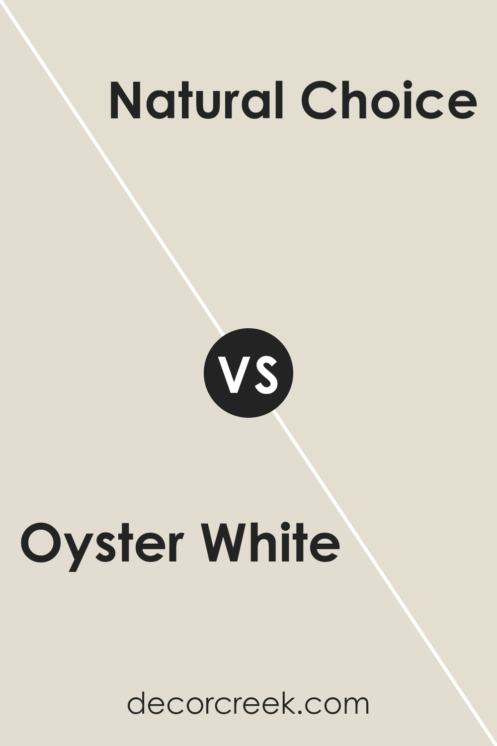
Oyster White SW 7637 by Sherwin Williams vs Natural Choice SW 7011 by Sherwin Williams
Oyster White and Natural Choice, both from Sherwin Williams, offer subtle differences that make them unique. Oyster White is a soft, warm white with a hint of beige.
It creates a cozy and inviting atmosphere, making it a great choice for living spaces and bedrooms. On the other hand, Natural Choice leans towards a light beige with grey undertones, giving off a tranquil and calm vibe.
This color is versatile, perfect for any room seeking a touch of serenity. While Oyster White provides a slightly brighter and warmer feel, Natural Choice offers a more subdued and neutral look.
Both colors are excellent for creating a relaxed and comfortable space, but your final choice depends on the specific mood you want to set.
Oyster White adds warmth to a room, whereas Natural Choice brings a gentle neutral background.
You can see recommended paint color below:
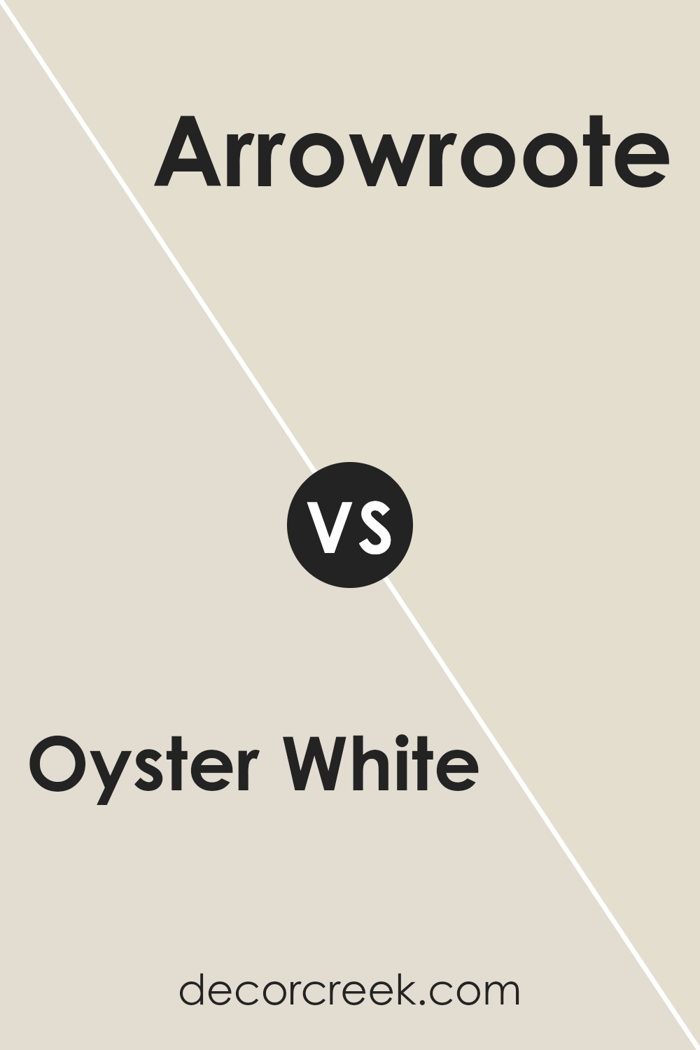
Oyster White SW 7637 by Sherwin Williams vs Arrowroote SW 9502 by Sherwin Williams
Oyster White and Arrowroot both come from Sherwin Williams, offering a unique charm to any space. Oyster White sits on the lighter end, providing a soft, welcoming feel.
It’s almost like a gentle hug from your surroundings, making rooms feel larger and airier. This color is a go-to if you’re aiming for a clean, tranquil vibe.
Arrowroot, on the other hand, brings a bit more depth. It’s a shade that balances between being distinct yet subtle, adding a touch of warmth without overwhelming the senses.
This color works great for those looking to add a hint of coziness to their space without darkening it too much.
When you compare them, Oyster White is your pick for that bright, open feel, whereas Arrowroot offers a warmer, slightly more grounded atmosphere.
Both colors offer their own kind of beauty, fitting different moods and styles.
You can see recommended paint color below:
- SW 9502 Arrowroote
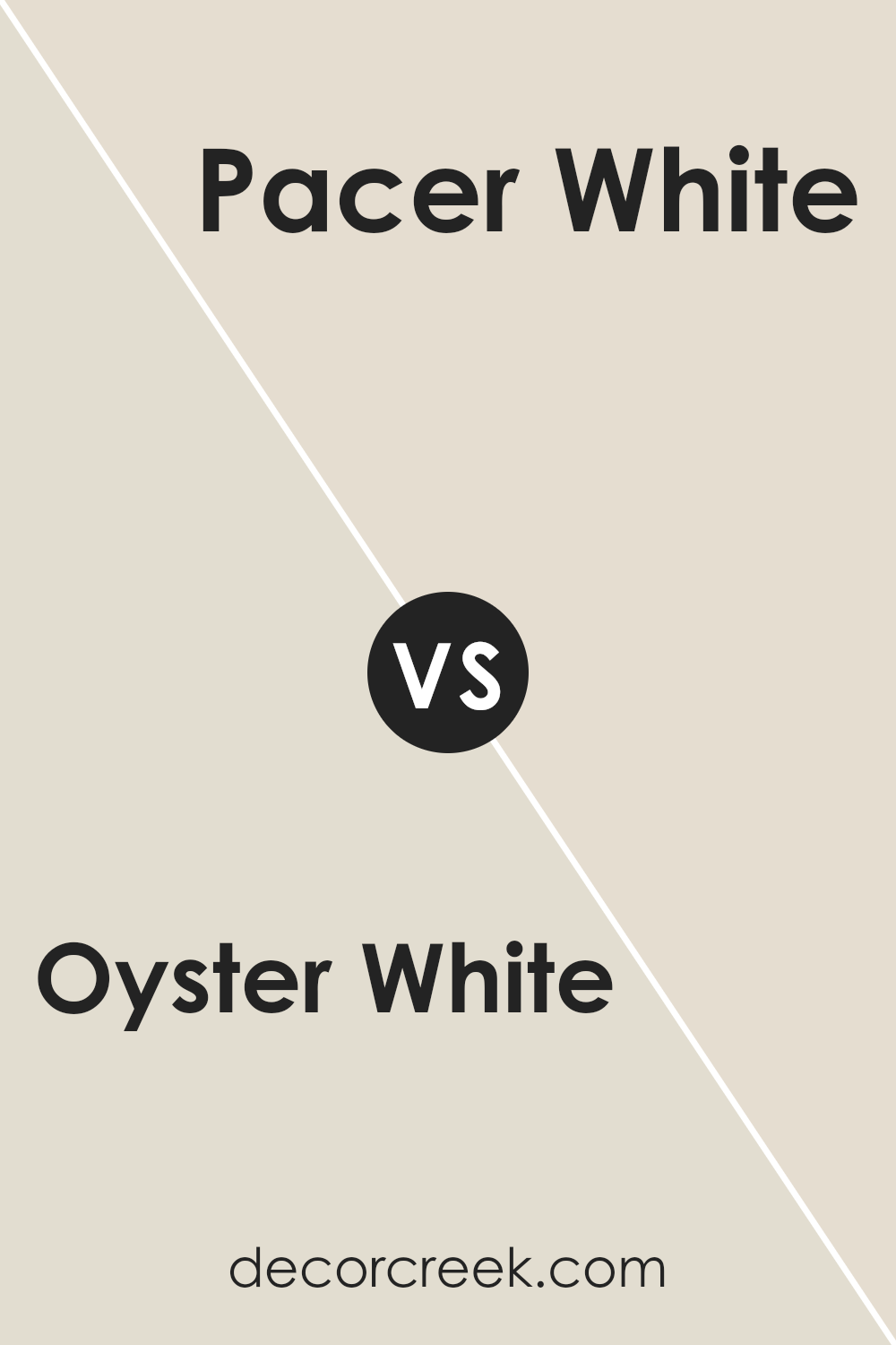
Oyster White SW 7637 by Sherwin Williams vs Pacer White SW 6098 by Sherwin Williams
Oyster White and Pacer White are two colors by Sherwin Williams that, while both are considered whites, have subtle differences. Oyster White is a warm, cozy white with a slight taupe undertone.
It gives spaces a welcoming, soft vibe, perfect for rooms where you want a touch of warmth without overwhelming color.
On the other hand, Pacer White leans more towards a true white but with a hint of creaminess, adding a smooth, gentle feel to spaces without being stark or cold.
This color works well in areas where you’re aiming for a bright, airy look. While both colors are versatile, Oyster White is more suited for those seeking a hint of warmth and comfort in their decor, and Pacer White is ideal for creating a fresh, clean look.
The choice between them depends on the atmosphere you want to achieve in your space.
You can see recommended paint color below:
- SW 6098 Pacer White
Oyster White SW 7637 by Sherwin Williams vs White Duck SW 7010 by Sherwin Williams
The main color, Oyster White, and the second color, White Duck, both from Sherwin Williams, have subtle differences worth noting. Oyster White is a soft, soothing shade that leans towards a light gray with warm undertones.
It’s perfect for creating a cozy and inviting space without feeling stark. On the other hand, White Duck is a slightly warmer color, with a touch more beige in its mix.
This makes it an excellent choice for rooms that aim for a warm, neutral backdrop, offering a bit more depth than the cooler Oyster White. Both colors are versatile and work well in various settings, from modern to traditional.
While Oyster White might be preferred for a more muted, serene environment, White Duck is ideal for spaces that seek a welcoming, comforting feel.
Ultimately, the choice between them comes down to the desired mood and the specific undertones you wish to highlight in your space.
You can see recommended paint color below:
- SW 7010 White Duck
Oyster White SW 7637 by Sherwin Williams vs Nacre SW 6154 by Sherwin Williams
Oyster White and Nacre, both from Sherwin Williams, are pretty close relatives in the color family, but they’re not twins. Think of Oyster White as the lighter, slightly brighter sibling.
It’s soft and subtle, making spaces feel fresh without trying too hard. On the other side, Nacre steps in with a bit more depth. It’s still in the light arena but brings a touch more warmth to the table, creating a cozy vibe.
When you’re looking at both, you might say Oyster White is like a gentle morning glow, while Nacre is more like the rich, warm light of late afternoon.
Both are fantastic for creating a serene and inviting atmosphere, but your choice really boils down to the mood you’re aiming for. Oyster White keeps things airy and open, while Nacre adds a touch of warmth, making spaces feel more anchored and homey.
You can see recommended paint color below:
- SW 6154 Nacre
Oyster White SW 7637 by Sherwin Williams vs Mortar SW 9584 by Sherwin Williams
Oyster White and Mortar, both by Sherwin Williams, offer distinct vibes for any space. Oyster White is a soft, welcoming hue with a hint of warmth that makes a room feel cozy and inviting without overwhelming it.
It’s like the gentle embrace of sunlight on a lazy afternoon, perfect for creating a relaxed, airy feeling in spaces that crave a touch of brightness.
Mortar, on the other hand, brings a stronger, more grounded energy. It’s a deep, rich gray that adds a serious, sophisticated touch.
Think of Mortar as the shadow to Oyster White’s light; it’s the color that offers a solid, comforting anchor in a design, making it ideal for creating depth and contrast.
When put side by side, Oyster White and Mortar represent a classic combination of light and dark, each bringing out the best in the other.
Oyster White adds lightness and softness, while Mortar provides depth and strength, together creating a balanced, harmonious look.
You can see recommended paint color below:
- SW 9584 Mortar
Oyster White SW 7637 by Sherwin Williams vs Shoji White SW 7042 by Sherwin Williams
Oyster White and Shoji White by Sherwin Williams are both popular neutral paint colors, but they have their unique traits. Oyster White has a slightly warmer tone, making it feel cozy and inviting in a room.
It’s the kind of color that brings a soft, subtle elegance, perfect for creating a welcoming atmosphere in living spaces or bedrooms.
On the other hand, Shoji White leans towards a cooler side, with a hint of gray that gives it a more modern and clean appearance. This makes Shoji White an excellent choice for those wanting a neutral backdrop that feels fresh and contemporary.
Both colors are versatile and can blend well with various decor styles, but the choice between them depends on the desired mood and aesthetic.
Oyster White creates a warm, cozy vibe, while Shoji White offers a crisp, modern ambiance.
You can see recommended paint color below:
Oyster White SW 7637 by Sherwin Williams vs Grey Mist SW 9625 by Sherwin Williams
Oyster White and Grey Mist are two paint colors from Sherwin Williams that offer subtle but distinct tones for any space. Oyster White is a soft, warm white with a hint of beige, making it versatile and inviting.
It brings a cozy feel to rooms, working well in spaces that aim for a relaxed and welcoming atmosphere. On the other hand, Grey Mist is a light grey that leans towards the cooler side.
It’s perfect for achieving a serene and peaceful ambiance. This color can make spaces feel more spacious and open while still adding a touch of warmth, avoiding the starkness some pure greys can bring.
When comparing the two, Oyster White offers warmth and a hint of color to brighten rooms without becoming overwhelming. Grey Mist provides a fresher, more neutral backdrop, giving a clean and modern feel.
Both colors work well in various settings and can complement each other nicely in a color scheme.
You can see recommended paint color below:
- SW 9625 Grey Mist
Oyster White SW 7637 by Sherwin Williams vs Oat Milk SW 9501 by Sherwin Williams
Oyster White and Oat Milk are two paint colors from Sherwin Williams. They both bring a sense of calm and simplicity to a room. Oyster White is a soft, warm white with a hint of beige.
It’s like the smooth inside of an oyster shell, bringing a natural, gentle feel to spaces. Oat Milk, on the other hand, is a bit creamier. It has a touch of yellow, like the color of a warm, milky tea.
This makes it a cozy choice for creating a welcoming atmosphere.
Comparing them, Oyster White leans more towards a neutral backdrop. It’s versatile, fitting well in many rooms without dominating the space. Oat Milk is slightly richer, offering a bit more warmth.
It’s perfect for someone looking to add a subtle, soothing pop of color. Both are fantastic options, but your choice depends on the mood you want to set.
Oyster White keeps things more balanced and understated, while Oat Milk adds a hint more cheer and warmth.
You can see recommended paint color below:
- SW 9501 Oat Milk
Oyster White SW 7637 by Sherwin Williams vs White Sesame SW 9586 by Sherwin Williams
Oyster White and White Sesame are two colors by Sherwin Williams that, while both light and neutral, have their own unique features. Oyster White is a soft, warm hue with a creamy touch.
It brings a cozy and inviting feel to rooms, making spaces feel comfortable and serene. On the other hand, White Sesame has a slightly cooler tone.
It’s a fresh, clean color, leaning a bit more towards a pure, crisp white. This makes it versatile for spaces that aim for a bright and airy look.
The main difference between the two lies in their undertones: Oyster White offers a gentle, welcoming warmth, whereas White Sesame provides a clearer, more neutral backdrop.
Depending on what vibe you want to create, Oyster White works well in settings where a touch of warmth is desired, and White Sesame is great for creating a crisp, open feel.
You can see recommended paint color below:
- SW 9586 White Sesame
Conclusion
Oyster White by Sherwin Williams is a versatile color that has gained popularity for its ability to bring a calm and welcoming feel to any space.
Its subtle warmth makes it a perfect choice for those looking to create a cozy and inviting atmosphere in their homes. This particular shade of white stands out for its adaptability, effortlessly complementing a wide range of decor styles and color palettes.
Whether used as a primary color on walls or as an accent to highlight architectural features, Oyster White offers a blend of simplicity and sophistication, making it a go-to option for both designers and homeowners alike.
Moreover, the ease with which Oyster White integrates into various settings also extends to its compatibility with natural light.
Depending on the lighting conditions, it can appear slightly warmer or cooler, adding depth and interest to the space without overwhelming it.
Its universal appeal is further enhanced by its ability to pair seamlessly with both bold and subtle hues, providing a solid foundation for any design scheme.
In summary, Oyster White is more than just a simple paint color; it’s a dynamic backdrop that elevates the look and feel of a room while maintaining an atmosphere of understated elegance.

Ever wished paint sampling was as easy as sticking a sticker? Guess what? Now it is! Discover Samplize's unique Peel & Stick samples.
Get paint samples