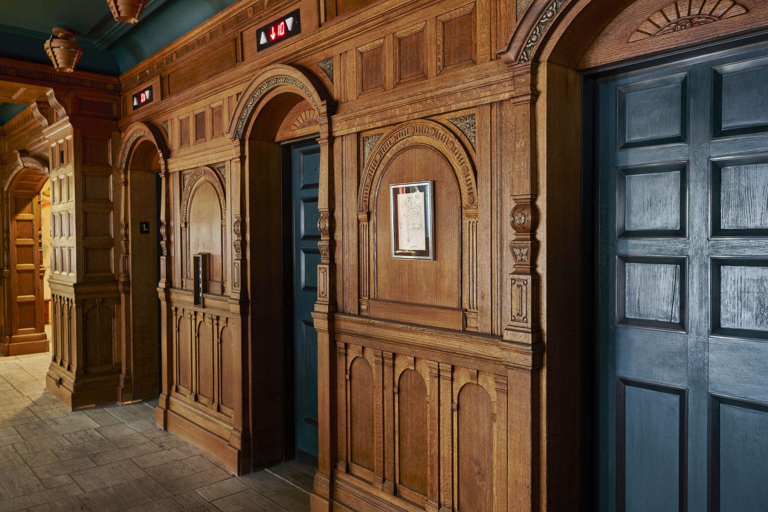
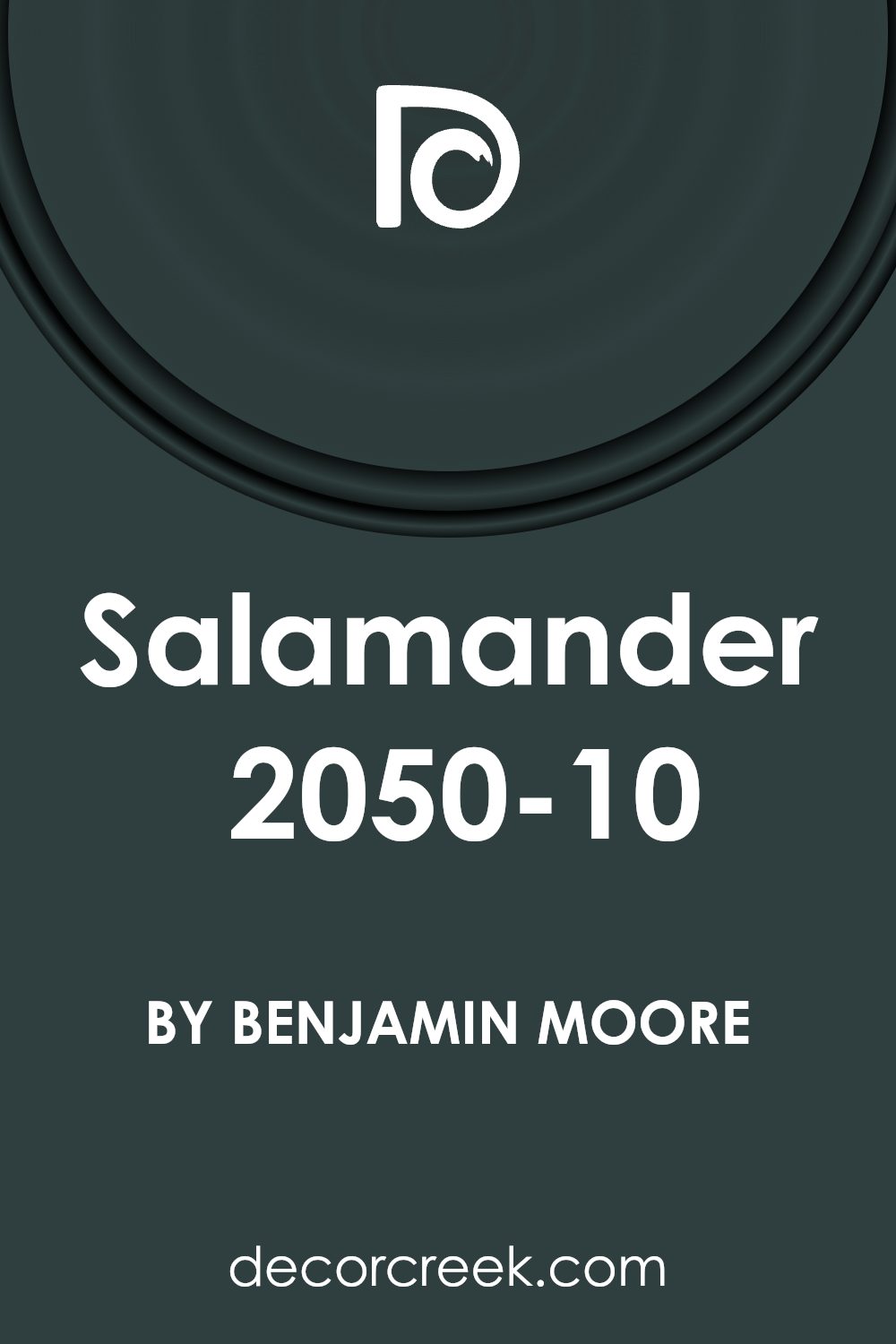
Get ready to learn about a unique shade that’s caught everyone’s attention: 2050-10 Salamander by Benjamin Moore. This shade isn’t just your regular paint color. Picture a color so deep and rich, it’s like stepping into a lush, secret garden at midnight. Salamander brings a level of sophistication and depth to spaces that few other colors can achieve.
It’s a dark, moody green that has the power to create an atmosphere of elegance and mystery in any room.
Whether you’re thinking about painting a feature wall, redoing an entire room, or just curious about what makes Salamander stand out, you’re in the right place. We’ll cover how this color behaves in different lighting, what colors it pairs well with, and how to use it in various parts of your home. From cozy living rooms to serene bedrooms, Salamander has the versatility to fit a wide range of styles and preferences.
If you’re ready for a color that makes a statement while bringing warmth and depth to your living space, let’s get started with discovering the beauty of 2050-10 Salamander by Benjamin Moore.
What Color Is Salamander 2050-10 by Benjamin Moore?
The color Salamander by Benjamin Moore is a deep, rich green with a hint of black, which gives it a sophisticated look. This unique color brings a sense of calm and grounding to any space, making it ideal for creating a cozy and inviting atmosphere. Salamander’s depth allows it to act as a neutral, pairing well with a variety of materials and textures such as natural wood, leather, velvet, and metallic finishes like brass or gold. This versatility means Salamander can fit seamlessly into many interior styles, including traditional, modern, and especially moody and eclectic themes.
For a traditional look, pairing Salamander with warm wood tones and rich textures can create a timeless and elegant space. In modern and minimalist designs, pairing it with sleek furniture and clean lines can add a dramatic focal point without overwhelming the space. This color also works exceptionally well in eclectic interiors, where its depth can tie together a variety of colors and patterns for a cohesive look.
Natural light brings out the complexity of Salamander, accentuating its green undertones, while artificial lighting can make it appear almost black, providing a dynamic change throughout the day. Overall, Salamander by Benjamin Moore is a versatile color that pairs beautifully with a wide range of materials and textures, offering flexibility in design across various interior styles.
Is Salamander 2050-10 by Benjamin Moore Warm or Cool color?
Benjamin Moore’s Salamander 2050-10 is a rich, deep green that almost seems to blend into a black shade in certain lighting. This unique color brings a sense of sophistication and depth to any space in a home. Its versatility means it works well in many areas – from making a bold statement in a living room to creating a cozy, den-like atmosphere in bedrooms. Salamander has the power to make large spaces feel more intimate and small spaces look incredibly stylish.
Because it’s such a dark hue, it pairs beautifully with a wide range of colors, from soft creams and whites, which make it pop, to vibrant pinks and golds that complement its depth. Using Salamander in a home can give furniture and decor a standout backdrop, highlighting pieces you want to showcase, while also serving as a grounding element in rooms with lots of natural light or high ceilings.
Its application isn’t limited to just walls; it’s also great for accent pieces, cabinets, or even a statement ceiling, adding a touch of drama and elegance. Whether you’re going for a modern, traditional, or eclectic look, Salamander 2050-10 offers a stylish and bold choice that brings rooms to life in a sophisticated way.
Undertones of Salamander 2050-10 by Benjamin Moore
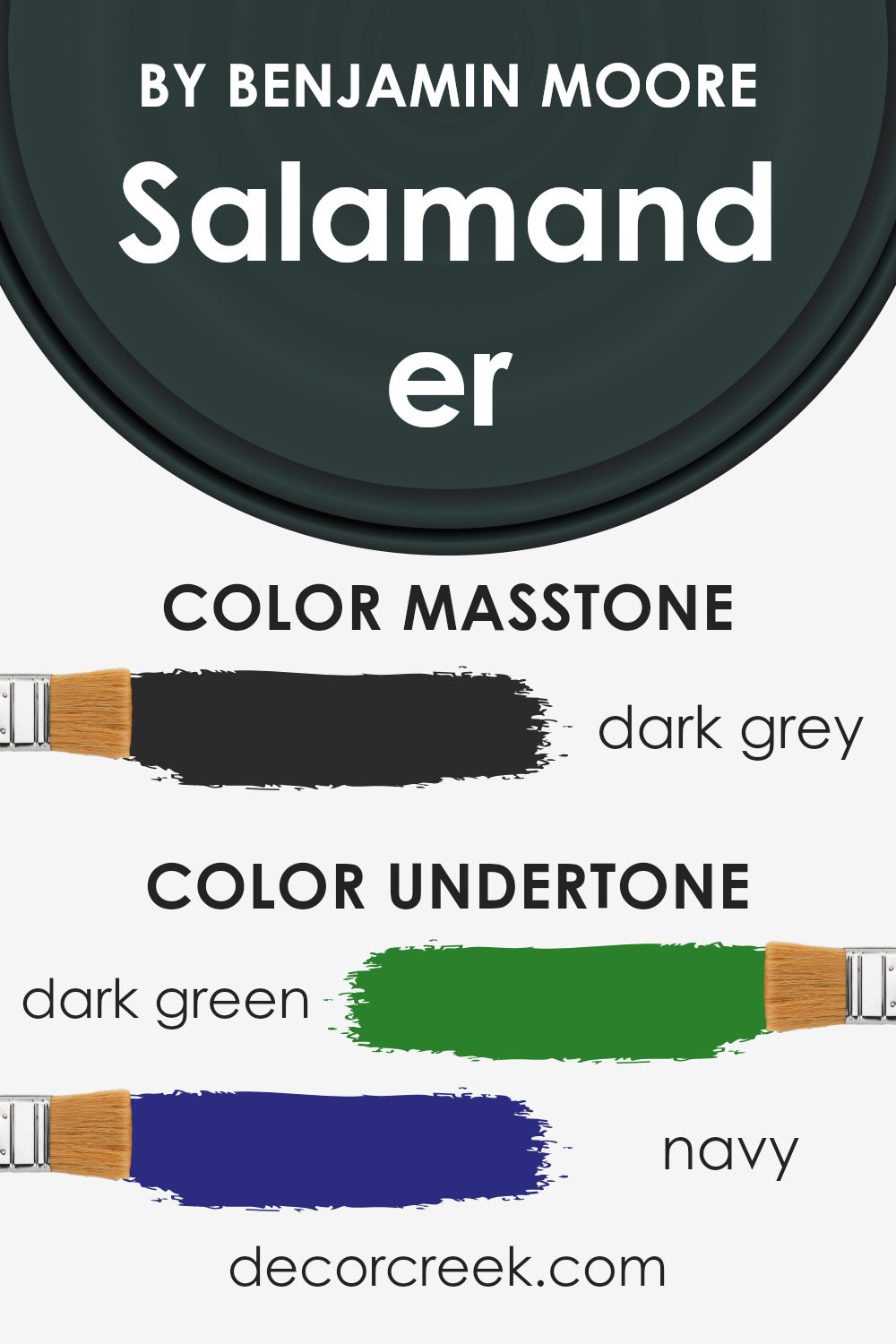
Salamander 2050-10 is a unique color created by Benjamin Moore, featuring a rich blend of undertones that add depth and complexity to its appearance. The undertones in this paint include dark green, navy, brown, dark turquoise, purple, olive, and grey. These undertones are not the main color you see at first glance but play a significant role in how the color is perceived under different lighting conditions and when paired with various decor elements.
When we talk about undertones, we’re referring to the subtle colors that lie beneath the surface of what we consider the “actual” color. These undertones can significantly influence how we interpret the main color, often shifting our perception based on surrounding elements or lighting. For example, in bright, natural light, the dark green or turquoise might become more prominent, giving the color a lively, vibrant feel.
In contrast, under artificial lighting, the brown or navy undertones might become more dominant, lending the color a more subdued or cozy vibe.
Regarding interior walls, the complex undertones of Salamander 2050-10 add a sophisticated and dynamic character to any room. The presence of dark green and navy can promote a sense of calm and depth, making it ideal for creating a serene bedroom or office space. The brown and olive undertones can warm up the space, making it feel welcoming and comfortable, perfect for a living room or dining area. The touches of purple and dark turquoise can inject a bit of vibrancy and intrigue, suitable for spaces intended to spark creativity or conversation.
In summary, the intricate blend of undertones in Salamander 2050-10 enables this color to adapt and respond to its environment, making it an exceptionally versatile option for interior walls. It can create various moods and atmospheres, depending on how it’s used and what it’s paired with, providing endless possibilities for personalizing your space.
What is the Masstone of the Salamander 2050-10 by Benjamin Moore?
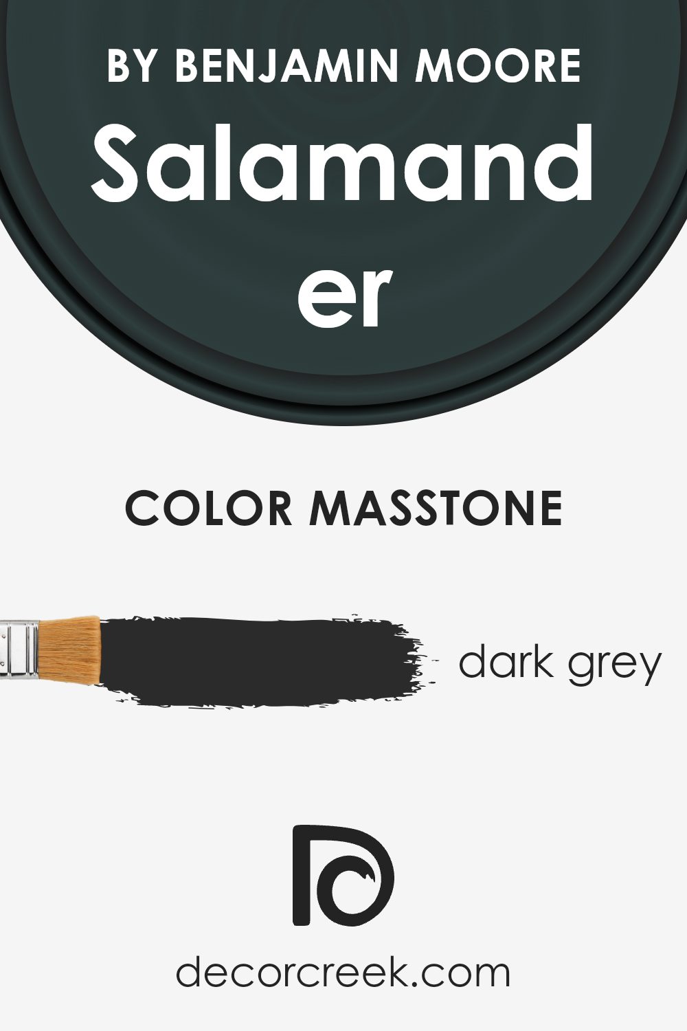
Salamander 2050-10 by Benjamin Moore has a masstone, or base color, that is a dark grey, specifically #2B2B2B. This rich, deep shade has a strong presence and brings a powerful and sophisticated vibe into any home. When used inside houses, this particular shade of grey can make a room feel cozy and grounded.’
It works particularly well in spaces that aim for a modern, sleek look without feeling too cold or impersonal. Because of its depth, it pairs beautifully with brighter colors, adding a striking contrast, or with softer, lighter shades for a more subtle balance.
In well-lit areas, Salamander 2050-10 can look stunning and dynamic, while in rooms with less natural light, it can create an intimate and enveloping atmosphere. It’s perfect for accent walls, cabinets, or even as a bold choice for all four walls in a room, providing a backdrop that makes furniture and décor pop. This color proves that a dark shade can be versatile and incredibly stylish in home design.
How Does Lighting Affect Salamander 2050-10 by Benjamin Moore?
Lighting plays a huge role in how we see colors. Think of it as a filter that can change the way a color looks, depending on whether the light is natural (like from the sun) or artificial (like from a bulb). Now, let’s talk about a specific color, Salamander 2050-10 by Benjamin Moore, and see how lighting affects it.
First up, artificial light. Depending on the type of bulb (like LED or fluorescent), Salamander 2050-10 can look different. Bright LED lights can make it appear more vibrant, highlighting its deep, rich qualities. On the other hand, softer, warmer bulbs might tone it down a bit, giving it a more cozy feel.
In natural light, the story changes throughout the day. Morning light, which is cooler, can make Salamander 2050-10 look more lively and energetic. As the day goes on, and the light becomes warmer, the color might appear softer and more muted.
Now, how does this color work in rooms facing different directions? North-faced rooms get cooler, indirect light, which can make Salamander 2050-10 look more serious and profound. It doesn’t get that bright sunshine, so the color can seem more consistent throughout the day.
South-faced rooms, however, are the opposite. They get a lot of direct sunlight, making Salamander 2050-10 light up with a lively vibrance. The color can really pop in these rooms, especially in the middle of the day.
East-faced rooms get bright morning light. This means Salamander 2050-10 will start the day looking bright and cheerful but might lose some of that punch as the day goes on and the light shifts away.
West-faced rooms experience the reverse. The color may start off more subdued in the morning and then grow richer and more intense in the afternoon to evening as the sun sets.
In conclusion, lighting can really change how Salamander 2050-10 by Benjamin Moore is perceived. Whether in artificial or natural light, knowing how the color interacts with the light direction can help you decide the best way to use it in your space.
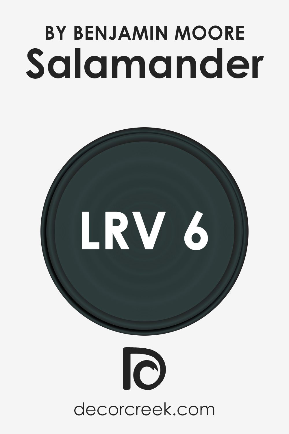
What is the LRV of Salamander 2050-10 by Benjamin Moore?
When picking paint for your walls, understanding LRV can help you figure out how light or dark a color will appear once it’s up on your walls. It’s a handy tool for imagining the mood and brightness of your rooms before committing to a color.
With an LRV of 5.72, the color Salamander 2050-10 is quite dark, meaning it absorbs a lot of light instead of reflecting it. This can make rooms painted this color look cozier and more intimate, but it can also make them seem smaller or darker, especially if they don’t get a lot of natural daylight.
When using a low LRV paint like this, good lighting becomes essential to ensure the space doesn’t feel too confined. It’s perfect for creating a dramatic or snug atmosphere, but it’s worth considering how the rest of your room’s design, including lighting and furnishings, will work with such a deep, absorbing color.
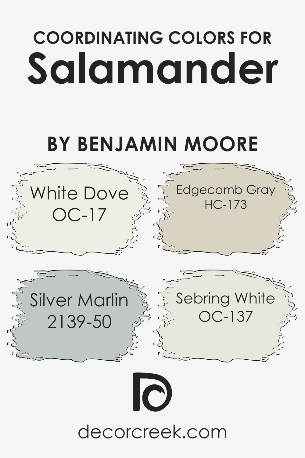
Coordinating Colors of Salamander 2050-10 by Benjamin Moore
Coordinating colors are essentially hues that harmonize well with a primary color, enhancing the overall aesthetic of a space without overwhelming it. They are chosen to complement the main color, in this case, Salamander by Benjamin Moore, to create a balanced and appealing look. Whether for a room or an art project, understanding how to select and apply these coordinating colors can significantly impact the final outcome.
They can either be contrasting to bring a vibrant look or closely related shades that offer a subtle and refined appearance.
OC-17 White Dove is a soft, warm white with a hint of creaminess, offering a versatile backdrop that brightens spaces while inviting warmth. It’s like a gentle hug for your walls, providing a peaceful and serene foundation that pairs beautifully with the boldness of Salamander. On the other hand, 2139-50 Silver Marlin is a muted green with gray undertones, resembling the calmness of a serene sea, perfect for creating a soothing yet sophisticated environment.
HC-173 Edgecomb Gray is a soft, light gray that walks the line between beige and gray, bringing an elegant neutrality to spaces that complements the depth of Salamander without competing for attention. Lastly, OC-137 Sebring White presents a crisp, clean look with a slightly warm undertone, ensuring a bright and inviting space that harmonizes effortlessly with the other colors.
Using these colors together with Salamander sets a foundation for a space that’s both inviting and stylish, creating rooms that are full of character yet harmoniously balanced.
You can see recommended paint colors below:
- OC-17 White Dove
- 2139-50 Silver Marlin
- HC-173 Edgecomb Gray
- OC-137 Sebring White
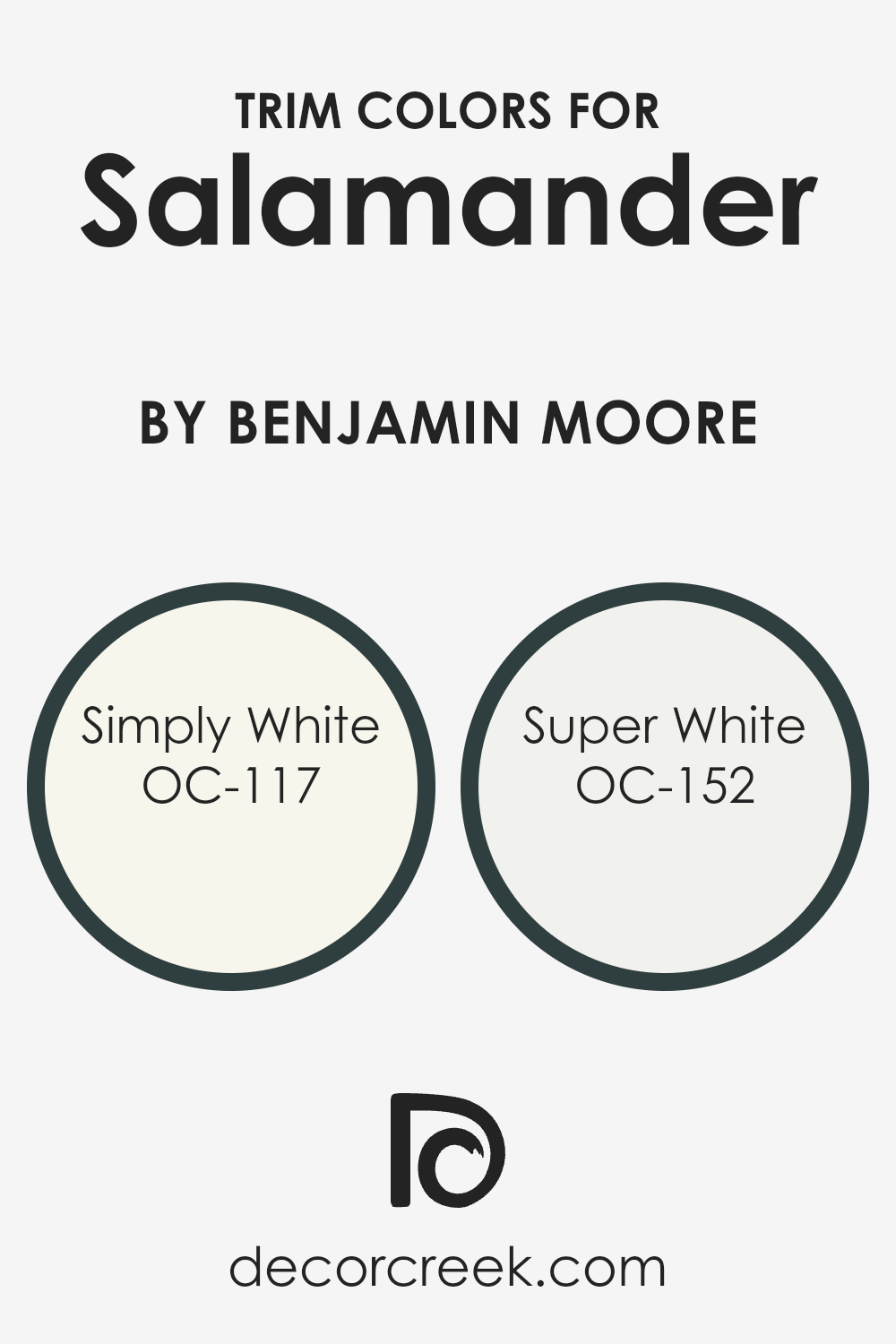
What are the Trim colors of Salamander 2050-10 by Benjamin Moore?
Trim colors are those specific shades used on the borders of a room, such as on door frames, baseboards, and moldings, to define and accentuate architectural details. They play a crucial role in interior design by adding contrast and depth, helping to visually separate walls from other elements or enhance cohesiveness in a space’s color scheme.
When it comes to a rich, deep shade like a dark green, choosing the right trim colors can significantly impact the overall look and feel of a room. Using lighter trim colors with such a bold wall color ensures that the space doesn’t feel overwhelming and maintains a fresh and balanced aesthetic.
OC-117, known as Simply White, is a clean and warm white that offers a subtle hint of warmth, making it a versatile choice for trim. It pairs beautifully with darker hues, softening the contrast with its inviting and understated nature, thus ensuring that the rich wall color stands out without competing for attention.
On the other hand, OC-152, or Super White, is a crisp and bright white with a slightly cooler undertone. This color is perfect for creating a sharp, clear delineation between the walls and trim, providing a refreshing pop that highlights architectural features with precision. Both Simply White and Super White are excellent choices for complementing a bold wall color, like a dark green, by ensuring the room feels open and bright while drawing attention to the details that make the space unique.
You can see recommended paint colors below:
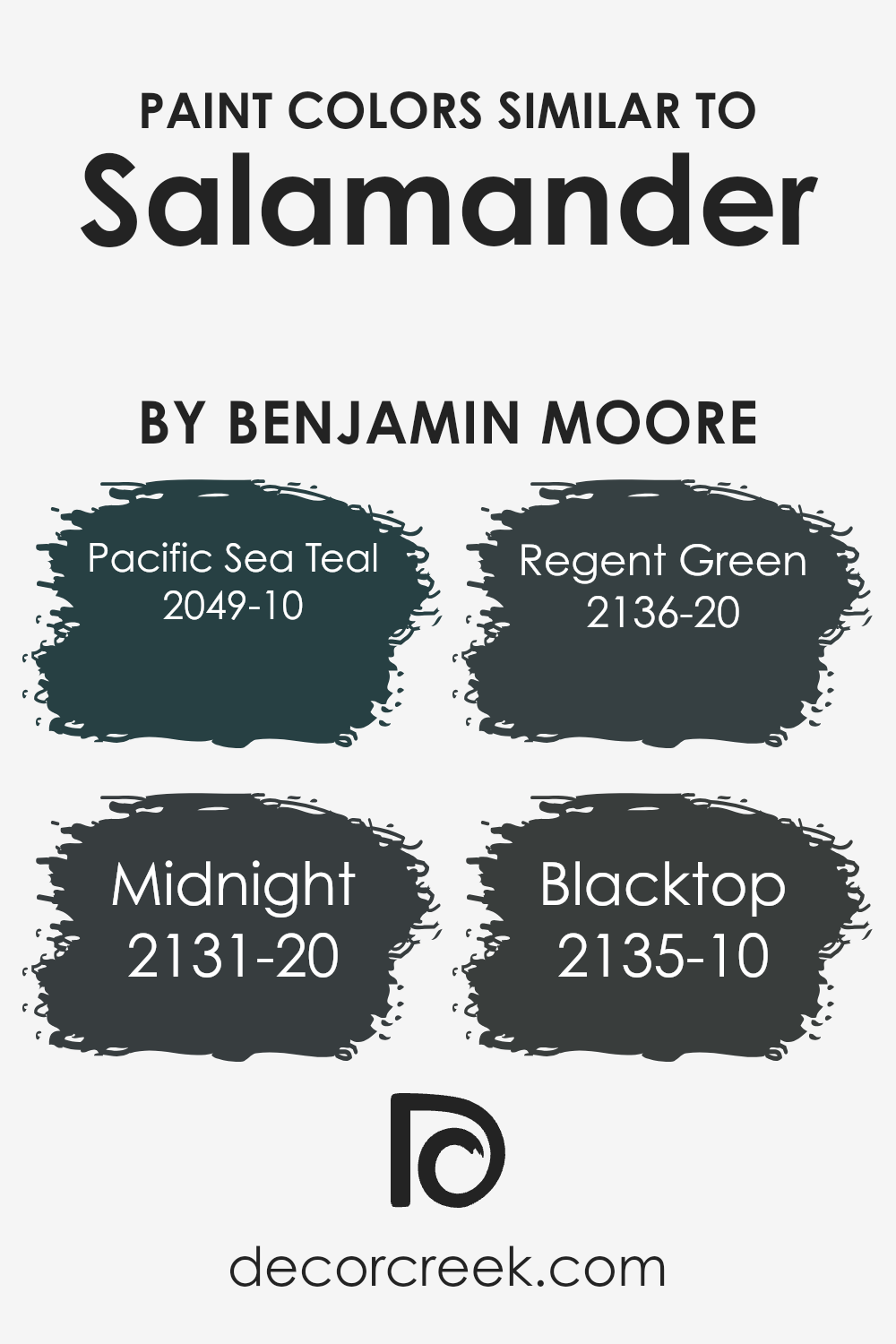
Colors Similar to Salamander 2050-10 by Benjamin Moore
Similar colors play a crucial role in design and aesthetics because they create harmony and balance. When colors closely relate to each other, like those similar to Salamander2050-10 by Benjamin Moore, they can seamlessly blend together, offering a soothing visual experience.
This cohesive look is essential in spaces where the goal is to foster a calming environment or make a room appear more coordinated and thoughtfully put together. Using similar shades allows for subtle differentiation without the risk of clashing, enabling the creation of depth and dimension in a space.
In essence, these colors work together by sharing a common hue, intensity, or saturation level, which makes them naturally pleasing to the eye.
Among the colors that share a kinship with Salamander2050-10 is Pacific Sea Teal 2049-10, a deep teal that reminds one of the expansive and mysterious ocean. It has a richness that pairs well with the earthiness of Salamander. Another color, Midnight 2131-20, offers the profound and infinite feel of the night sky, bringing an intense depth when used alongside or in replacement of Salamander in a design scheme.
Regent Green 2136-20, with its dignified green hue, adds a natural and grounding element, complementing Salamander by amplifying its connection to nature and the outdoors. Lastly, Blacktop 2135-10 provides a stark, powerful essence of asphalt, offering a solid foundation when used with similar colors, grounding the palette and bringing all elements together in harmony.
Each of these colors, while possessing its unique character, shares a visual connection with Salamander2050-10, making them perfect for creating cohesive and resonant spaces.
You can see recommended paint colors below:
- 2049-10 Pacific Sea Teal
- 2131-20 Midnight
- 2136-20 Regent Green
- 2135-10 Blacktop
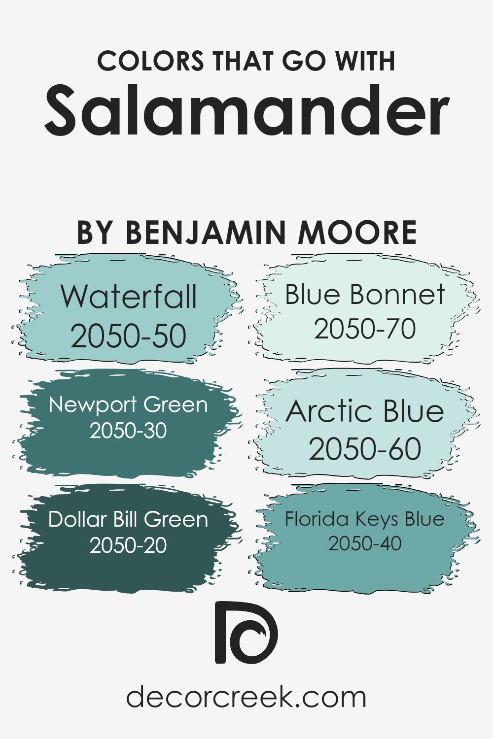
Colors that Go With Salamander 2050-10 by Benjamin Moore
Colors that complement Salamander 2050-10 by Benjamin Moore play a significant role in interior design because they help create a balanced and cohesive aesthetic. When paired correctly, these colors can enhance the depth and character of Salamander 2050-10, a rich and vibrant hue, by either providing a striking contrast or by subtly blending with its tones.
For instance, Waterfall 2050-50, a soft and serene shade of blue, adds a tranquil vibe to spaces, making it an excellent choice for bedrooms and bathrooms where relaxation is key. Its gentle presence can soften the intensity of Salamander 2050-10, creating a soothing atmosphere. On the other hand, Newport Green 2050-30, with its deep and lush green hue, draws inspiration from nature and injects vitality into a room, complementing the earthy undertones of Salamander 2050-10.
Dollar Bill Green 2050-20 offers a muted, sophisticated green that can ground the room’s color scheme, while Blue Bonnet 2050-70 introduces a light, airy feel with its delicate and almost ethereal quality. This contrast of light versus dark, or subtle versus bold, can bring dimension and interest to any space.
Arctic Blue 2050-60, with its cool and refreshing tone, pairs beautifully with Salamander 2050-10, providing a crisp, clean look reminiscent of clear skies. Lastly, Florida Keys Blue 2050-40, which evokes the vibrant hues of tropical waters, creates a dynamic visual impact when used alongside Salamander 2050-10, offering a stunning palette that is both inviting and energizing.
Together, these colors work harmoniously to enhance the beauty and uniqueness of Salamander 2050-10, allowing for endless creative possibilities in decorating and design.
You can see recommended paint colors below:
- 2050-50 Waterfall
- 2050-30 Newport Green
- 2050-20 Dollar Bill Green
- 2050-70 Blue Bonnet
- 2050-60 Arctic Blue
- 2050-40 Florida Keys Blue
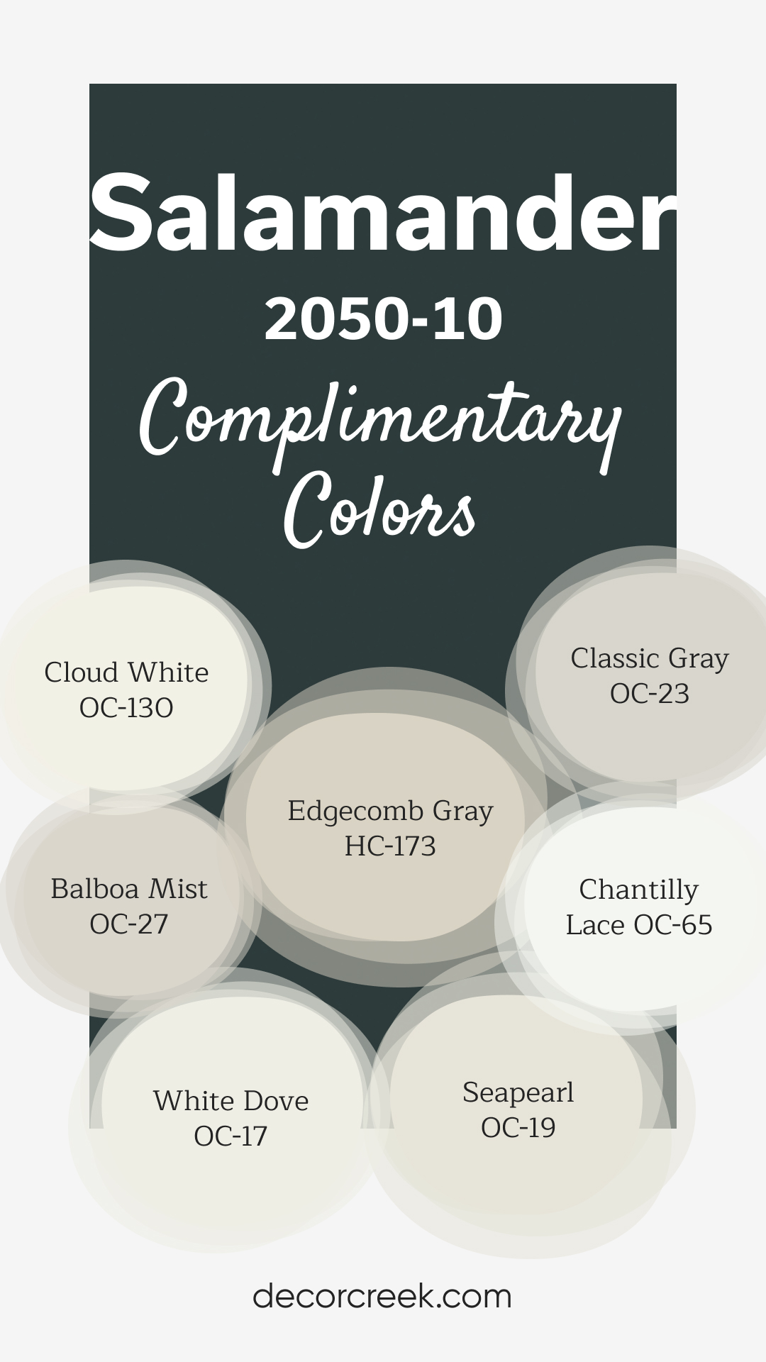
Complimentary Colors for Salamander 2050-10 Paint Color by Benjamin Moore
Salamander by Benjamin Moore is a deep, luxurious green that makes a bold statement in any room. To balance its intensity, pair it with softer tones like White Dove or Chantilly Lace for bright, clean accents. Edgecomb Gray and Classic Gray offer gentle neutrals that create a harmonious and calming effect when combined with Salamander’s rich hue.
For a softer transition, Balboa Mist and Seapearl introduce warm and natural shades that add depth without overwhelming the space.
Cloud White complements the palette with a fresh, airy feel, ensuring the perfect balance between bold and subtle. This combination works well in living rooms, bedrooms, or any space where you want to blend elegance with a touch of nature.
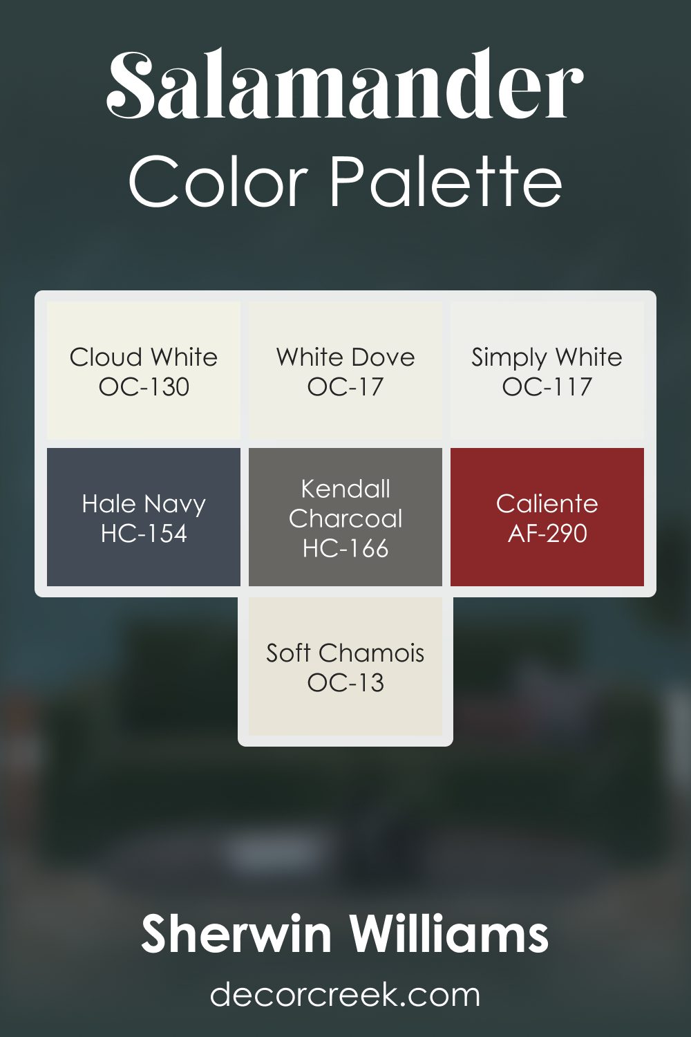
Salamander 2050-10 by Benjamin Moore Color Palette
Salamander brings a deep, dramatic green that feels rich, expressive, and full of presence. This palette highlights that bold depth with a thoughtful mix of warm whites, grounding neutrals, and strong accent tones.
Cloud White and White Dove brighten the palette with gentle, soft light that softens the intensity of Salamander while keeping the overall look inviting. Simply White adds crisp clarity that helps the palette feel balanced and well-lit.
Hale Navy introduces a cool, deep note that blends beautifully with the green base, creating a layered, moody harmony. Kendall Charcoal strengthens the palette with confident structure, grounding the darker tones with steady depth.
Caliente adds a warm touch of energy, lifting the palette with a lively spark that brings personality to the deep green foundation.
Soft Chamois softens transitions with warm, natural lightness, helping the palette feel smooth and balanced.
Together, these shades create a palette that feels dramatic yet approachable—perfect for offices, libraries, dining rooms, and any space where you want warmth and depth to work together with expressive color.
How to Use Salamander 2050-10 by Benjamin Moore In Your Home?
Salamander 2050-10 by Benjamin Moore is a unique and striking paint color. It’s a deep, rich green that can bring a sense of elegance and nature into your home. This color is perfect for creating a cozy and intimate atmosphere in spaces like living rooms or bedrooms. It can also add a bold statement if used on an accent wall, potentially transforming the room into a more stylish and sophisticated space.
Using Salamander 2050-10 in your home allows for a lot of creativity. It pairs well with light wood tones and neutral colors, making it adaptable to various decor styles. If you have a room that feels too big or impersonal, painting it in this color can make the space feel more enclosed and comfortable.
Additionally, you could use it on kitchen cabinets or bathroom walls for a touch of luxury and to bring the beauty of the outdoors inside. With its versatility, Salamander 2050-10 can help personalize your space, making it truly yours.
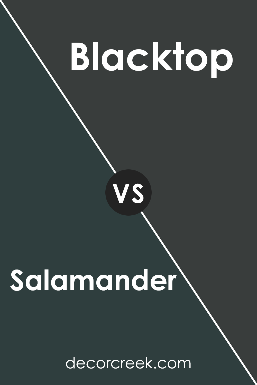
Salamander 2050-10 by Benjamin Moore vs Blacktop 2135-10 by Benjamin Moore
Salamander 2050-10 and Blacktop 2135-10, both by Benjamin Moore, are two dark shades that might look similar but have distinct differences. Salamander is a deep, rich green with a hint of black that gives it a unique vibe. It’s perfect for creating cozy, elegant spaces with a touch of nature.
On the other hand, Blacktop is a true, deep black with a slight undertone that keeps it from feeling flat. It’s ideal for making bold statements, adding drama, and giving a modern touch to spaces. While Salamander brings a luxurious, earthy feel, Blacktop offers a sleek, sophisticated look.
Choosing between them depends on whether you want the warmth and depth of a dark green or the timeless, classic appeal of black. Both colors can transform a space but in different ways—Salamander with a hint of color and Blacktop with stark elegance.
You can see recommended paint color below:
- 2135-10 Blacktop
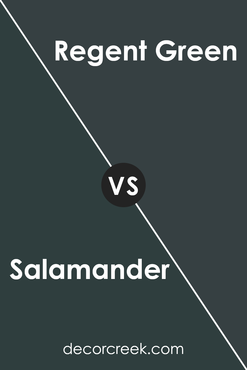
Salamander 2050-10 by Benjamin Moore vs Regent Green 2136-20 by Benjamin Moore
Salamander 2050-10 by Benjamin Moore is a deep, rich green that almost feels like it has a bit of black mixed into it. It’s a strong color that can make a bold statement in any room. On the other hand, Regent Green 2136-20 is also a dark green, but it has a different vibe.
It leans towards a more traditional green with a hint of navy blue, giving it a slightly more elegant and refined appearance. While both colors are on the darker side, Salamander tends to stand out more because of its intensity and depth, making it a perfect choice for someone looking to create a dramatic effect.
Regent Green, however, is a bit softer and more versatile, making it easier to blend with different decors. Essentially, if you’re aiming for a deep, almost mysterious look, Salamander is your go-to, but if you prefer something classically dark yet a bit lighter, Regent Green is the better choice.
You can see recommended paint color below:
- 2136-20 Regent Green
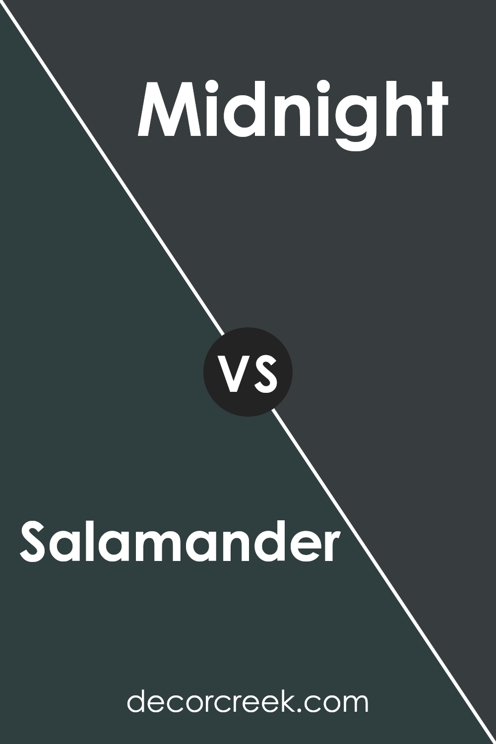
Salamander 2050-10 by Benjamin Moore vs Midnight 2131-20 by Benjamin Moore
Salamander 2050-10 and Midnight 2131-20 by Benjamin Moore are two unique colors that stand out for their depth and character. Salamander is a rich, dark green that mimics the natural hues of a dense forest. It’s the kind of color that makes a bold statement, bringing an earthy and serene vibe to any space. It’s like looking into the depths of an old, mossy forest.
On the other hand, Midnight 2131-20 is a deep, dark blue that resembles the sky on a clear, starry night. It’s a color that adds mystery and sophistication to a room, making it feel more intimate and cozy. While it’s dark like Salamander, Midnight carries a cooler tone, reminiscent of the night sky’s vastness.
Both colors are dark and bold, but they bring different feelings to a space. Salamander draws from the earth’s natural greens, providing a grounding effect, whereas Midnight offers a sense of infinite possibility, like looking up at the night sky. They can work beautifully together for a rich, layered look or stand strong on their own, depending on the atmosphere you want to create.
You can see recommended paint color below:
- 2131-20 Midnight
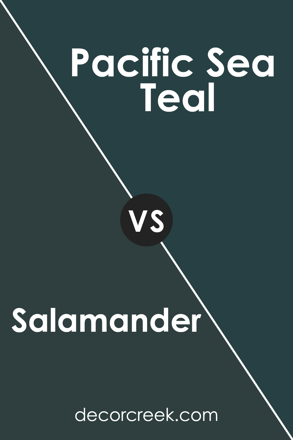
Salamander 2050-10 by Benjamin Moore vs Pacific Sea Teal 2049-10 by Benjamin Moore
“Salamander 2050-10” and “Pacific Sea Teal 2049-10” are both unique colors by Benjamin Moore, but they have their own special vibes. If you think of “Salamander,” imagine a deep, dark green that’s almost like the rich, velvety greens you see in a dense forest. It’s a color with a lot of depth, making any space feel cozy and grounded.
On the other hand, “Pacific Sea Teal” has that cool, refreshing feel like you’re looking at the ocean from a sunny beach. It’s a tad brighter than “Salamander” and leans more towards the beautiful mix of blue and green you see in teal. This color brings a vibrant, but still calm energy to a room, like a nice balance between excitement and relaxation.
While both colors bring their own unique charm, “Salamander” is all about creating a snug, secure atmosphere with its darker tone. “Pacific Sea Teal” offers a lively but soothing touch, making it perfect for a space that you want to feel bright and cheerful.
You can see recommended paint color below:
- 2049-10 Pacific Sea Teal
Conclusion
In summary, Salamander 2050-10 by Benjamin Moore stands out as a unique and versatile color choice for anyone looking to add a touch of elegance and depth to their spaces. Its rich, dark green hue offers a sophisticated backdrop that can easily complement a wide range of decor styles, from modern to traditional. This color brings a sense of calm and groundedness to interiors, making it ideal for creating serene and inviting environments in homes or offices.
Moreover, the versatility of Salamander 2050-10 allows it to be used in various applications, from accent walls and furniture pieces to exterior finishes. Its ability to pair well with both neutral tones and more vibrant colors provides endless possibilities for creating stylish and cohesive looks. Overall, choosing this color from Benjamin Moore can elevate the aesthetic appeal of any space, offering a blend of luxury and comfort that is both tasteful and timeless.

Ever wished paint sampling was as easy as sticking a sticker? Guess what? Now it is! Discover Samplize's unique Peel & Stick samples.
Get paint samples

