There’s something undeniably charming about the warm, honeyed hue of SW 6370 Saucy Gold by Sherwin Williams. It instantly reminded me of golden sunsets over a peaceful landscape. This flexible color brings a feeling of comfort and optimism to any room, making it a delightful choice for both modern and traditional settings.
In imagining this shade on walls or accent pieces, it has an ability to create an inviting atmosphere. It’s a color that encourages creativity and conversation, perfect for living areas where you gather with family and friends. Saucy Gold pairs beautifully with rich browns and deep greens, creating a harmonious and balanced look that feels grounded yet lively.
Choosing this color isn’t just about painting a wall; it’s about adding character and warmth to your home. Its rich tones work well with a variety of materials, from wood to metal, providing a flexible backdrop that complements different textures and styles. Plus, its sunny disposition helps brighten up even the gloomiest of days, bringing a touch of sunshine into your daily life.
When I think about Saucy Gold, I think about creating areas that are as welcoming as they are inspiring. It’s amazing how a simple color choice can enhance your living room and enrich your everyday experiences.

What Color Is Saucy Gold SW 6370 by Sherwin Williams?
Saucy Gold by Sherwin Williams is a warm, rich color that brings a lively and cozy vibe to any room. This shade has a golden mustard tone, making it quite flexible and inviting. It’s perfect for adding a splash of warmth and brightness to areas without being overpowering.
This color works wonderfully in interior styles like boho, eclectic, and mid-century modern. It pairs beautifully with earthy tones and materials, such as wooden furniture, wicker, and natural textiles. Saucy Gold adds a wonderful contrast to deep greens and blues, creating a harmonious and well-balanced look. Additionally, it complements décor elements like brass or bronze fittings, adding a touch of depth and charm.
In terms of textures, Saucy Gold shines when paired with soft, plush fabrics, like velvets, as well as textured cotton or linen. It also pairs well with leather, providing a balance between rugged and refined.
Whether used on an accent wall, in a small cozy nook, or throughout an entire room, this golden hue is perfect for creating a warm and inviting atmosphere. It’s an excellent choice for living rooms, bedrooms, or dining areas where people gather and want to feel comfortable and relaxed.
Is Saucy Gold SW 6370 by Sherwin Williams Warm or Cool color?
Saucy Gold SW 6370 by Sherwin Williams is a warm, vivid shade of gold with a hint of spice. This color can create a cozy and inviting atmosphere in homes. Its rich, warm tone makes it perfect for living rooms, dining areas, or kitchens, where people gather and spend time together. Saucy Gold works well with natural light, enhancing its glow and creating a welcoming feel.
When paired with neutral colors like beige or cream, Saucy Gold can add warmth and brightness, making areas feel larger and more open. It also pairs nicely with deep browns and soft whites for a balanced look. Using Saucy Gold on an accent wall can create a focal point in a room, drawing attention and adding interest.
Its warm undertones make it a flexible choice that complements various design styles, from traditional to modern, and can easily work with wood accents and furniture, enhancing their natural beauty.
Undertones of Saucy Gold SW 6370 by Sherwin Williams
Saucy Gold by Sherwin Williams is a warm, rich color that has various undertones which influence how it appears. The undertones include olive, pale pink, red, grey, brown, yellow, pink, light green, purple, pale yellow, and mint. These undertones can significantly change how the paint looks on a wall, depending on the lighting and surrounding colors.
Olive and brown contribute to Saucy Gold’s earthiness, making it feel natural and grounded. This means that in a room, the color might give a cozy and inviting atmosphere. The pale pink and pink undertones add a hint of softness and playfulness, which could make a room feel more welcoming and cheerful. The red and purple undertones introduce a subtle vibrancy, energizing a room without being overpowering.
The grey undertones provide balance, bringing in a touch of neutrality that can help the color blend well with other elements in the room. Yellow and pale yellow brighten the color, making it appear sunnier and more refreshing, perfect for uplifting darker areas. Finally, the mint and light green undertones can add a fresh, lively touch, offering a sense of renewal and calmness. Overall, the undertones of Saucy Gold give it depth and versatility, allowing it to adapt to different interior styles and moods.
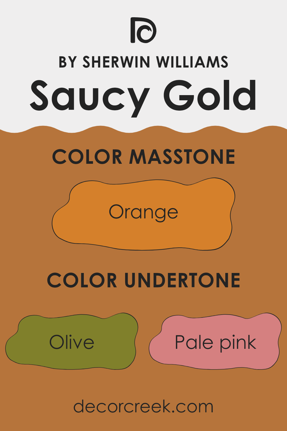
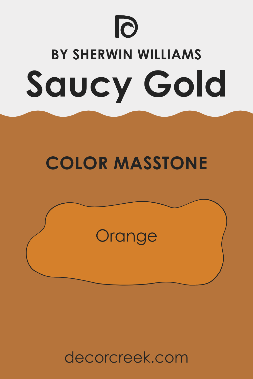
What is the Masstone of the Saucy Gold SW 6370 by Sherwin Williams?
Saucy Gold (SW 6370) by Sherwin Williams is a bold and warm paint color. The masstone, which is the main color you see, is a rich orange (#D5802B). This orange tone brings warmth and energy into a home. When used on walls, Saucy Gold can make a room feel cozy and inviting.
It is ideal for areas where you want to encourage lively interaction, such as living rooms or dining areas. However, its vibrant nature means it should be used thoughtfully. Pairing it with neutral shades, like soft grays or creamy whites, helps balance its intensity.
This color can also be used for accents, providing a pop of warmth when applied to a feature wall or even furniture. In rooms with plenty of natural light, Saucy Gold adds a glowing warmth, enhancing the brightness of the room. Overall, it’s a powerful color that adds character and energy to a home.
How Does Lighting Affect Saucy Gold SW 6370 by Sherwin Williams?
Lighting plays a significant role in how we perceive colors. Different light sources can change the way a color looks. For instance, natural sunlight generally provides the most balanced light, allowing colors to appear as they are. Artificial lighting, on the other hand, can have different temperatures that alter colors. Warm lights tend to enhance red, yellow, and orange tones, whereas cool lights can highlight blues and greens.
For the color Saucy Gold (SW 6370) by Sherwin Williams, its appearance can shift depending on the type of light it is exposed to. In natural light, particularly with ample sunlight, Saucy Gold can appear warm and vibrant. However, in artificial light, the intensity and warmth of the bulb can influence the color’s appearance.
Under warm incandescent lighting, this gold might look richer and more intense. With cooler fluorescent lights, it might appear a bit muted or duller. In north-facing rooms, where the light is cooler, Saucy Gold may take on a slightly subdued look. The cooler natural light could make the golden tones appear less vibrant, giving the room a more subtle glow. In south-facing rooms, which receive stronger sunlight throughout the day, Saucy Gold will likely look bright and lively, with its warm tones fully shining.
East-facing rooms get morning light that is warm and soft, so Saucy Gold might appear softer in the morning, enhancing its cozy nature. As the day progresses, the color might become slightly muted as direct sunlight fades. In west-facing rooms, the afternoon and evening light is warm and intense.
Here, Saucy Gold can look very bright and inviting in the late daylight, emphasizing its warm characteristics. Overall, the interplay of light and color is complex, and the time of day and type of lighting will influence how Saucy Gold, or any color, truly appears in a room.

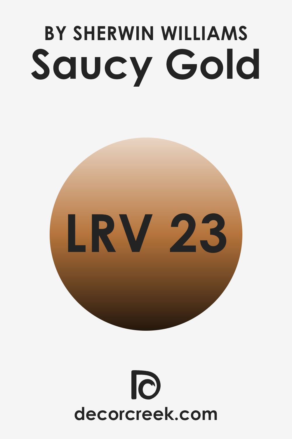
What is the LRV of Saucy Gold SW 6370 by Sherwin Williams?
Light Reflectance Value, or LRV, is a measurement used to determine how much light a color reflects or absorbs. It’s expressed as a percentage, ranging from 0 to 100, where 0 means the color absorbs all light (and is completely black) and 100 means it reflects all light (and is perfectly white). An LRV of 22.785, like that of the color Saucy Gold, indicates that this color reflects a relatively low amount of light, meaning it absorbs more light than it reflects.
This is typical for darker, richer colors, which often appear more intense and moody when applied to walls. Colors with low LRV values can make a room feel cozy and intimate but might also make a room appear darker and smaller, depending on the lighting.
For Saucy Gold, with its 22.785 LRV, this means it will display as a warm, rich, and somewhat deep golden hue on walls. In areas with ample natural light or bright artificial lighting, the color may appear vibrant and welcoming, adding warmth and character to the room.
However, in rooms with limited lighting, it could appear more muted and might lend a refined, cozy atmosphere rather than a bright, airy feel. When choosing this color, consider the size of the room and the amount of light it gets to ensure that the ambiance created by its low LRV complements your vision for the room.
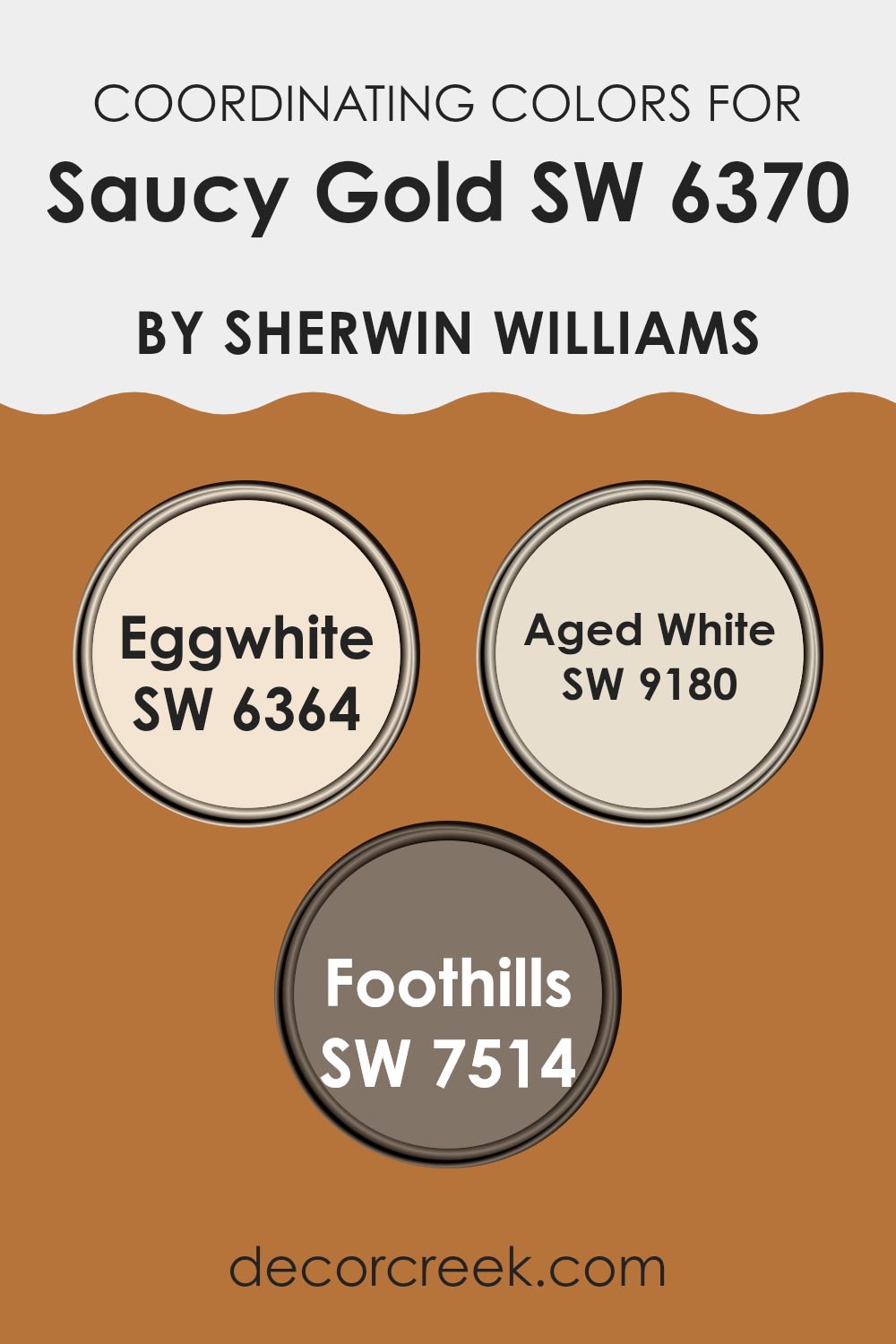
Coordinating Colors of Saucy Gold SW 6370 by Sherwin Williams
Coordinating colors are hues that complement each other and work well together in a room. They create a harmonious look, drawing out the best qualities in each color and balancing the overall aesthetic. For instance, Saucy Gold by Sherwin Williams is a warm and inviting color that can bring a cheerful feel to any room. When paired with coordinating colors, it becomes part of a palette that feels well-planned and visually appealing.
One such coordinating color is Eggwhite, a lovely soft neutral that provides a light and airy backdrop, making the golden tones of Saucy Gold stand out even more. Aged White is another great option; it has a subtle warmth that ties in beautifully with Saucy Gold’s sunny disposition, offering a touch of elegance and brightness.
Foothills, on the other hand, adds depth with its earthy undertones, grounding the overall look. Together, these colors create a balanced combination that can make any room feel cozy and welcoming, enhancing the mood and the ambiance without overpowering each other.
You can see recommended paint colors below:
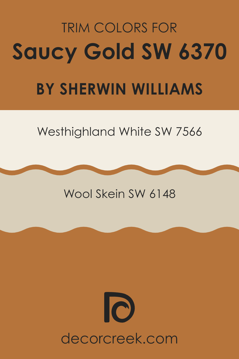
What are the Trim colors of Saucy Gold SW 6370 by Sherwin Williams?
Trim colors play a vital role in home design by highlighting architectural details and adding contrast to wall colors. Saucy Gold by Sherwin Williams, a warm and inviting shade, benefits significantly from well-chosen trim colors to balance its richness. By framing Saucy Gold with the right trim, you create a polished and cohesive look that enhances the room’s overall aesthetic.
For Saucy Gold, using SW 7566 Westhighland White as a trim color can create a clean and classic look. This white offers a subtle warmth, preventing the room from feeling too stark or cold, and complements the golden tones beautifully.
Alternatively, SW 6148 Wool Skein is another excellent choice for trim when working with Saucy Gold. Wool Skein is a soft, neutral beige that harmonizes well with the warm tones of Saucy Gold, offering a more muted and seamless transition between colors. This combination provides a cozy and inviting atmosphere, making areas feel comfortable and welcoming. Choosing the right trim color isn’t just about aesthetics; it’s also about creating a balanced environment where the colors work together to enhance the rooms overall feel.
You can see recommended paint colors below:
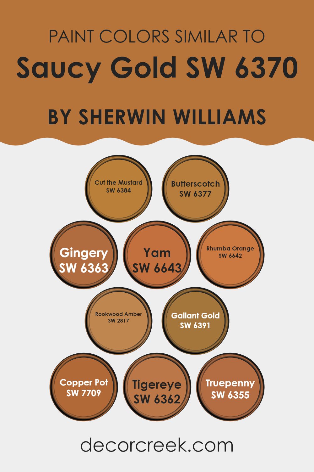
Colors Similar to Saucy Gold SW 6370 by Sherwin Williams
Using similar colors to Saucy Gold, like SW 6384 – Cut the Mustard and SW 6377 – Butterscotch, is important because they can create a harmonious and cohesive look. Cut the Mustard is a warm, mellow yellow, perfect for adding a touch of sunshine to any room, while Butterscotch has a slightly richer tone that brings a cozy feel. Pairing these colors with Saucy Gold can create a balanced and lively atmosphere.
SW 6363 – Gingery and SW 6643 – Yam offer more vibrant options. Gingery has a gentle spice, while Yam brings a bright and bold orange hue. These colors can add energy to areas without overpowering other elements.
SW 6642 – Rhumba Orange is a bolder choice with a touch of red, ideal for making a statement. If you’re looking for something with a historical feel, SW 2817 – Rookwood Amber offers a deep and inviting tone reminiscent of golden amber. For a touch of refinement, SW 6391 – Gallant Gold offers a classic appeal, while SW 7709 – Copper Pot lends a warm, earthy richness.
Rounding out these options, SW 6362 – Tigereye captures the eye with its vibrant orange-brown, and SW 6355 – Truepenny brings in a classic copper tone perfect for accents. Each color interacts differently with Saucy Gold, offering unique ways to enhance your room.
You can see recommended paint colors below:
- SW 6384 Cut the Mustard
- SW 6377 Butterscotch
- SW 6363 Gingery
- SW 6643 Yam
- SW 6642 Rhumba Orange
- SW 2817 Rookwood Amber
- SW 6391 Gallant Gold
- SW 7709 Copper Pot
- SW 6362 Tigereye
- SW 6355 Truepenny
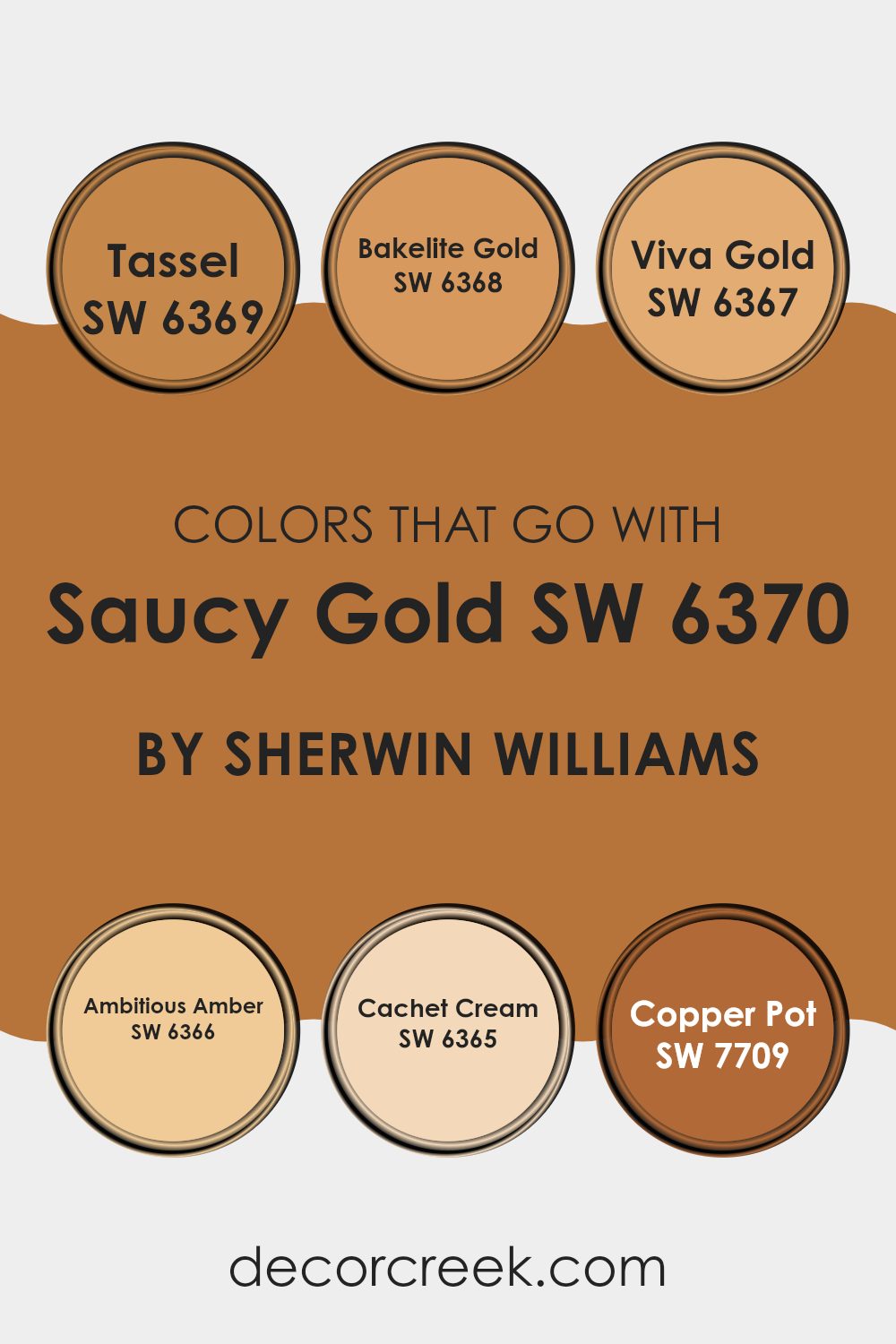
Colors that Go With Saucy Gold SW 6370 by Sherwin Williams
Choosing the right color combinations for Saucy Gold SW 6370 by Sherwin Williams is key to creating a balanced and appealing room. Colors like SW 6369 Tassel complement Saucy Gold with its soft, neutral hue, providing a perfect backdrop that doesn’t overpower. SW 6368 Bakelite Gold adds a slightly richer and deeper tone, enhancing the warm and inviting feel of a room.
Meanwhile, SW 6367 Viva Gold is a vibrant color that brings energy and enthusiasm into the mix. For a touch of warmth without being overpowering, SW 6366 Ambitious Amber lends a glowing, cheerful aura. These colors help create an environment that feels harmonious and well-thought-out.
On the lighter side, SW 6365 Cachet Cream offers a soothing contrast that can make Saucy Gold pop, while still maintaining a calm atmosphere. If you’re looking for something with a more earthy and rustic tone, SW 7709 Copper Pot complements with its deep, warm essence that ties the palette together beautifully.
Each of these colors works alongside Saucy Gold to either enhance or balance its richness. Using these combinations strategically in your room can result in a setting that feels cohesive and welcoming, making every area interesting yet comfortable.
You can see recommended paint colors below:
- SW 6369 Tassel
- SW 6368 Bakelite Gold
- SW 6367 Viva Gold
- SW 6366 Ambitious Amber
- SW 6365 Cachet Cream
- SW 7709 Copper Pot
How to Use Saucy Gold SW 6370 by Sherwin Williams In Your Home?
Saucy Gold SW 6370 by Sherwin Williams is a warm, welcoming color that can add a cozy and vibrant touch to any home. It’s a rich gold hue with a hint of spice, making it perfect for creating a lively and inviting atmosphere.
This color can work well in various rooms. In the living room, it can make the room feel warm and inviting, making it a great spot for family gatherings or relaxing with friends. In the dining room, Saucy Gold can create an upbeat and cheerful ambiance, setting the stage for enjoyable meals and conversations.
Additionally, this color can be a great choice for an accent wall in a bedroom or hallway, adding a touch of character and interest. Pairing it with neutral tones, such as whites or grays, can balance its richness, while using complementary colors, like deep reds or greens, can create a more dynamic and vibrant look.
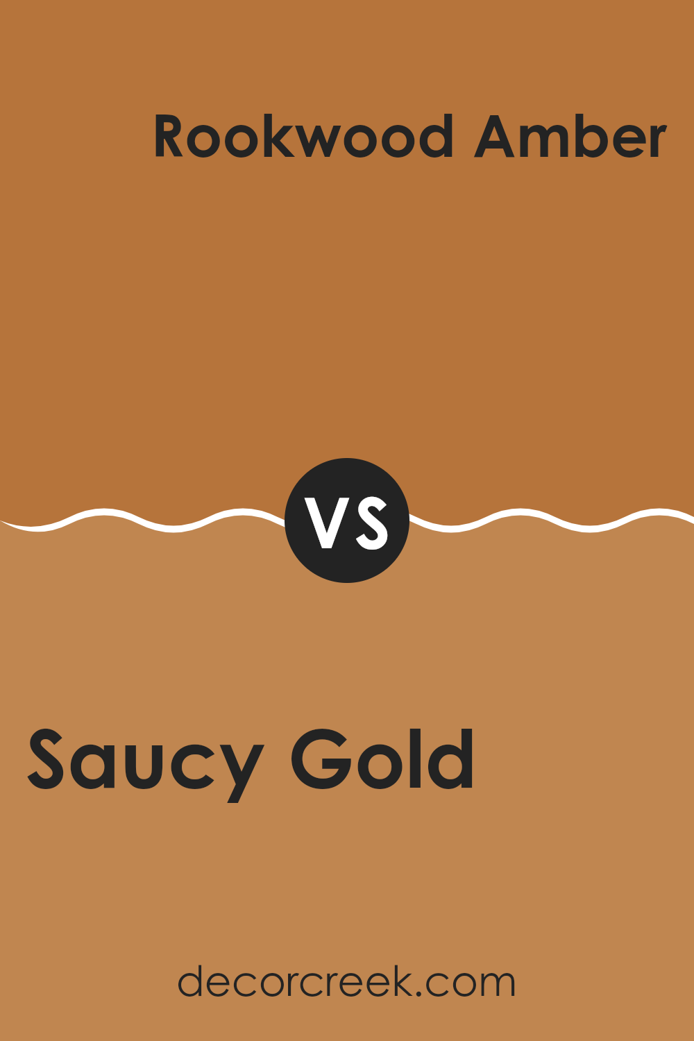
Saucy Gold SW 6370 by Sherwin Williams vs Rookwood Amber SW 2817 by Sherwin Williams
Saucy Gold and Rookwood Amber are two beautiful shades from Sherwin Williams. Saucy Gold is a warm, inviting yellow with a hint of orange, giving it a golden sun-like glow. It feels cheerful and bright, making areas feel lively and energizing.
On the other hand, Rookwood Amber is richer with a deeper orange undertone that gives it an earthier, more rustic vibe. While Saucy Gold can make a room feel sunny and upbeat, Rookwood Amber gives off a cozy, autumnal warmth.
When placed side by side, Saucy Gold might stand out more in a light-filled room, while Rookwood Amber would shine in areas needing a bit of warmth and depth. Both colors work well for various settings, but their distinct tones lead to different atmospheres: one is radiant and lively, and the other is warm and comforting.
You can see recommended paint color below:
- SW 2817 Rookwood Amber
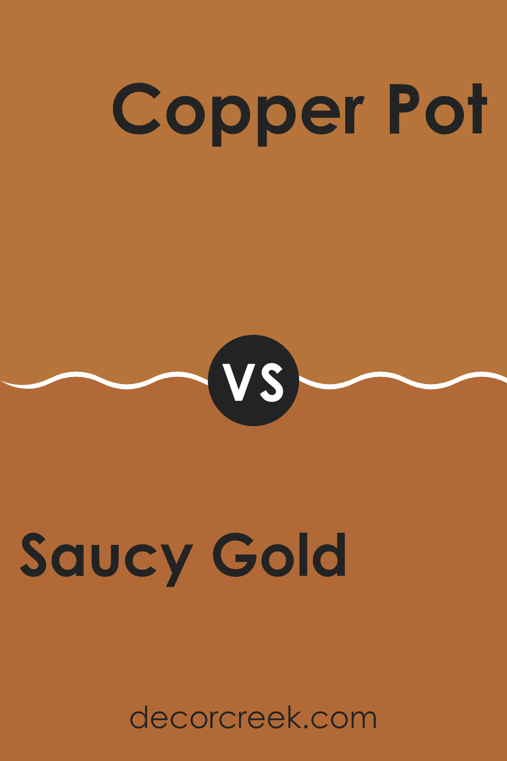
Saucy Gold SW 6370 by Sherwin Williams vs Copper Pot SW 7709 by Sherwin Williams
Saucy Gold and Copper Pot are warm, inviting colors, each with its unique character. Saucy Gold is a vibrant, sunny yellow that adds brightness and cheer to a room. It’s like bringing a bit of sunshine indoors, creating a lively and energetic atmosphere. This color works well in areas where you want to feel awake and inspired.
Copper Pot, on the other hand, leans towards a rich, earthy hue. It’s a deep, reddish-brown that adds warmth and a sense of coziness to a room. Copper Pot has a grounding quality, making areas feel snug and welcoming. It’s an excellent choice for places where you want a touch of elegance without being too formal.
While both colors are warm, Saucy Gold is more playful and bold, enhancing the mood of joy, whereas Copper Pot provides a more relaxed and earthy feel, perfect for comforting environments. Together, they can balance each other beautifully.
You can see recommended paint color below:
- SW 7709 Copper Pot
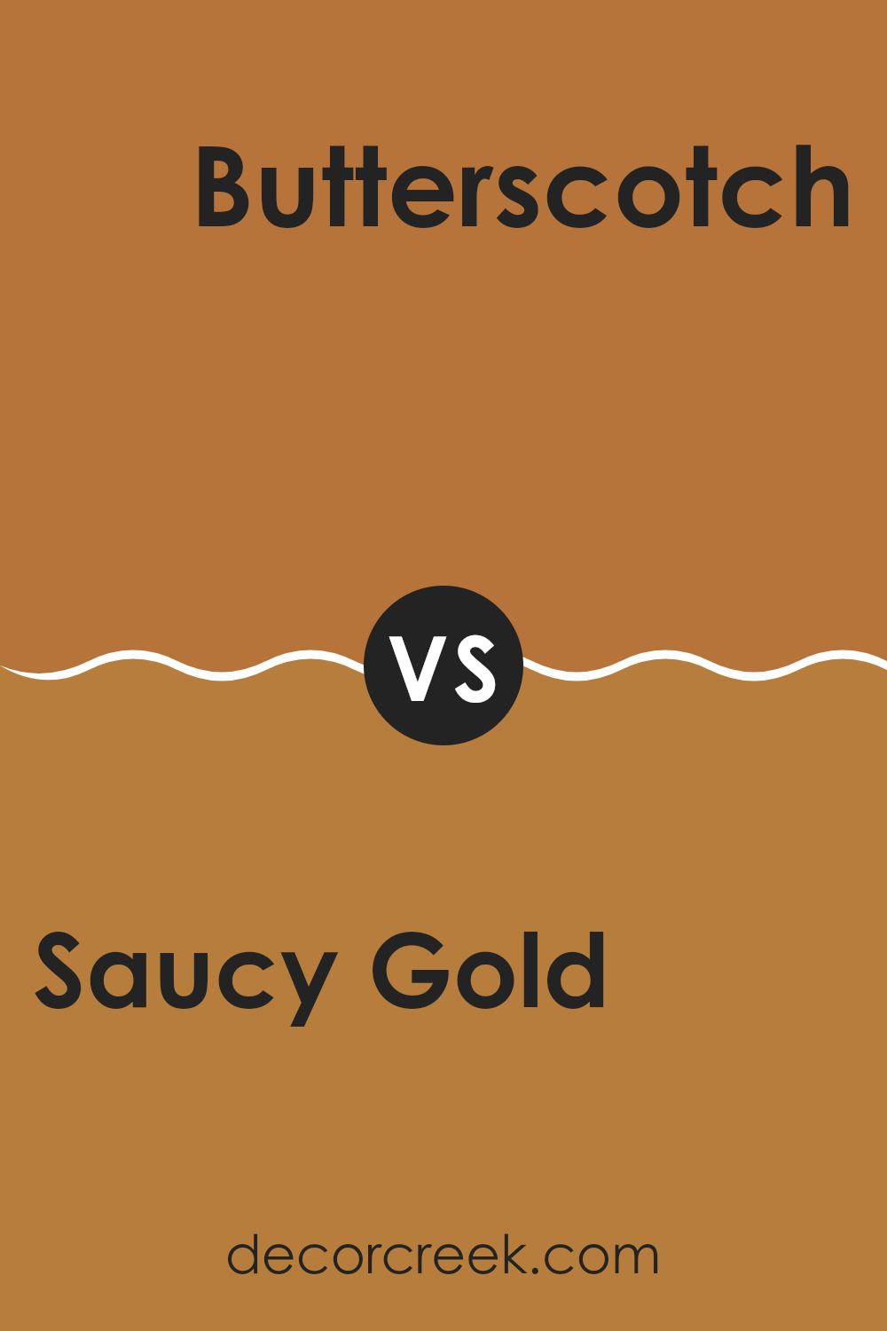
Saucy Gold SW 6370 by Sherwin Williams vs Butterscotch SW 6377 by Sherwin Williams
Saucy Gold SW 6370 and Butterscotch SW 6377 by Sherwin Williams are both warm, inviting shades that add a touch of brightness to any room. Saucy Gold is a rich, deep golden hue that exudes warmth and elegance. It has a slightly reddish undertone, giving it a cozy and luxurious feel. This color works well in areas where you want to create a lively and energetic atmosphere.
On the other hand, Butterscotch is a lighter, softer shade with a hint of orange. It feels cheerful and welcoming, making it an excellent choice for areas where you want to encourage comfort and creativity. Its lighter tone can help brighten up a room without overpowering other elements in the decor.
When comparing the two, Saucy Gold offers more depth and intensity, while Butterscotch provides a lighter, more playful vibe. Both colors are excellent for adding warmth, but the choice depends on whether you prefer a bold or subtle look.
You can see recommended paint color below:
- SW 6377 Butterscotch
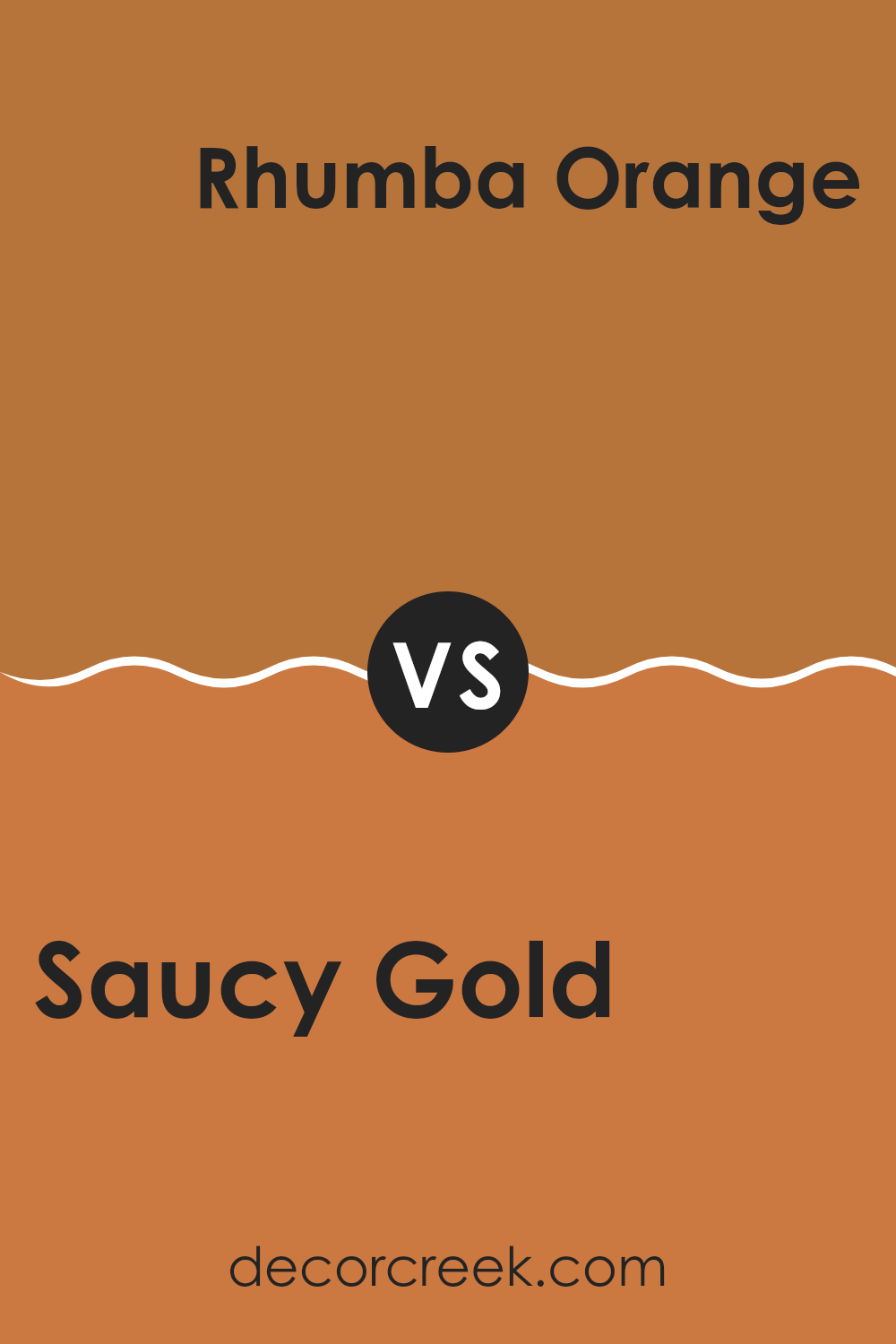
Saucy Gold SW 6370 by Sherwin Williams vs Rhumba Orange SW 6642 by Sherwin Williams
Saucy Gold and Rhumba Orange are two vibrant colors from Sherwin Williams that each bring their own unique flair. Saucy Gold is a warm, rich yellow with hints of brown, giving it a more subdued and earthy feel. It’s a color that adds warmth and an inviting atmosphere to any room, making it great for cozy and welcoming rooms.
On the other hand, Rhumba Orange is a lively and energetic shade. It’s a brighter and more vivid orange with a touch of red, which makes it stand out. This color is bold and can add a playful and energetic vibe to any area. It works well in areas where you want to create a sense of excitement or inspire creativity.
In essence, Saucy Gold offers a more mellow and warm feeling, while Rhumba Orange is all about energy and excitement. Choosing between them depends on the mood you want to create.
You can see recommended paint color below:
- SW 6642 Rhumba Orange
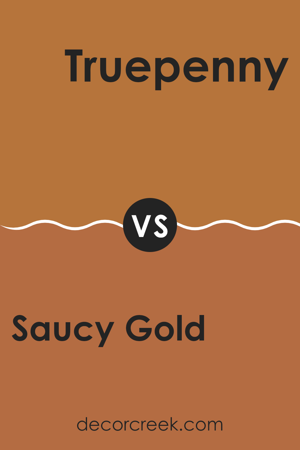
Saucy Gold SW 6370 by Sherwin Williams vs Truepenny SW 6355 by Sherwin Williams
Saucy Gold SW 6370 and Truepenny SW 6355, both by Sherwin Williams, are warm, inviting colors with distinct personalities. Saucy Gold is a vibrant, golden hue that radiates energy and spirit. It’s perfect for areas that aim to evoke warmth and cheerfulness, making it a great choice for kitchens or living rooms.
In contrast, Truepenny is a more subdued, earthy tone that leans towards a terracotta or clay-like appearance. Its muted nature brings a sense of calm and comfort, making it ideal for cozy bedrooms or intimate dining areas.
While both colors are rich in warmth, Saucy Gold stands out with its boldness and brightness, while Truepenny offers a more relaxed and grounded feel. Together, they can complement each other beautifully, with Saucy Gold adding a splash of liveliness and Truepenny providing a soothing balance.
You can see recommended paint color below:
- SW 6355 Truepenny
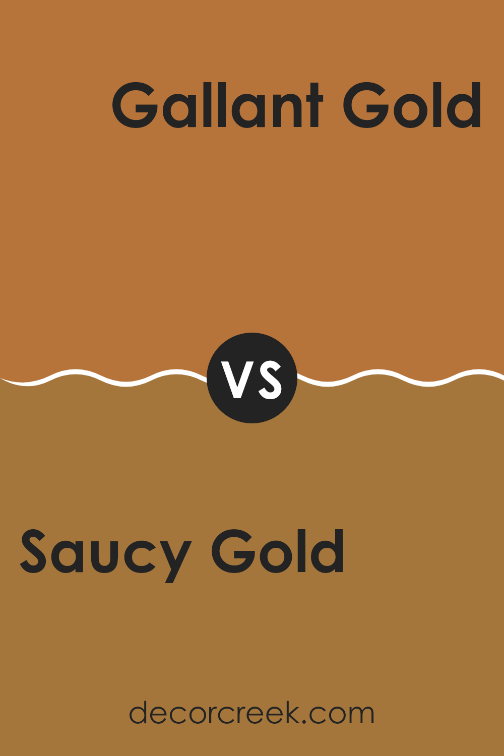
Saucy Gold SW 6370 by Sherwin Williams vs Gallant Gold SW 6391 by Sherwin Williams
Saucy Gold SW 6370 and Gallant Gold SW 6391 by Sherwin Williams are warm, inviting colors, but they have distinct differences. Saucy Gold is a rich, bold color with a deep golden hue that adds warmth and energy to a room. It’s vibrant and can create a cozy environment, making it ideal for living rooms where you want a welcoming feel.
On the other hand, Gallant Gold is softer and slightly lighter. It carries a gentle warmth and is more subdued than Saucy Gold. This makes it suitable for areas where you want a touch of elegance without overpowering the room.
In summary, Saucy Gold is a strong, energetic color that stands out, while Gallant Gold offers a more understated and gentle golden tone. Both colors can enhance a room, with Saucy Gold being more daring and Gallant Gold providing a calmer backdrop.
You can see recommended paint color below:
- SW 6391 Gallant Gold
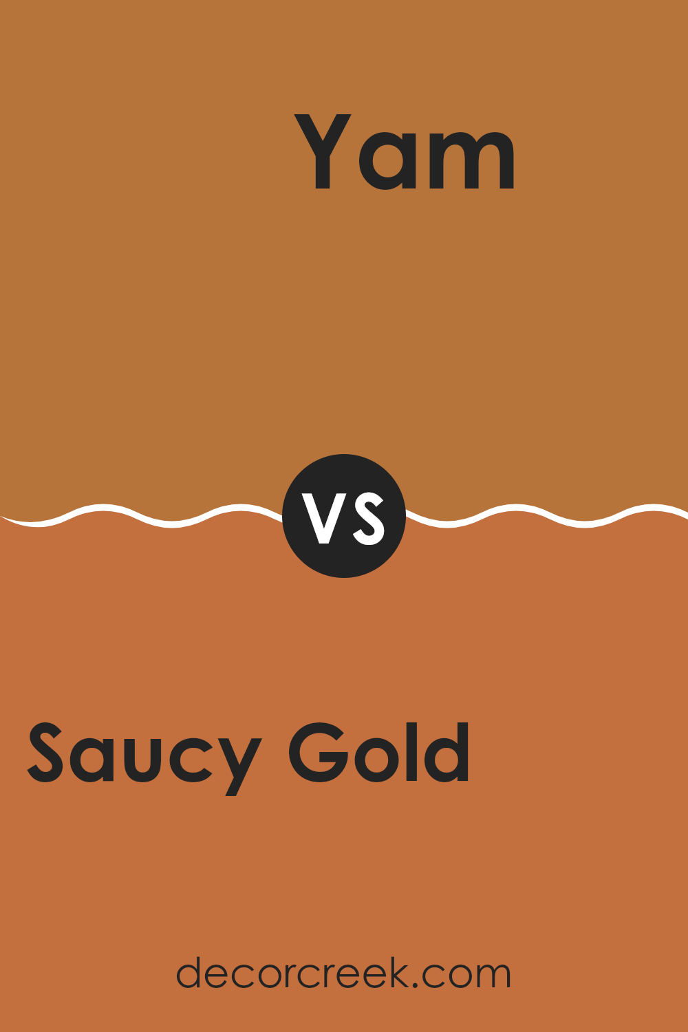
Saucy Gold SW 6370 by Sherwin Williams vs Yam SW 6643 by Sherwin Williams
Saucy Gold SW 6370 is a warm, golden hue with rich undertones. It brings a sense of warmth and comfort to a room. This color is cozy and can brighten up a room without being overpowering. It’s flexible and works well in living rooms or kitchens, adding a touch of sunshine to everyday life.
On the other hand, Yam SW 6643 is more of an orange shade with a brighter, more lively feel. It’s a bolder choice compared to Saucy Gold and can make a room feel energetic and vibrant. Yam is perfect for areas where you want to create a lively atmosphere, like dining areas or playrooms.
When comparing the two, Saucy Gold offers a more subtle warmth, while Yam delivers a punch of colorful excitement. Both are great choices, but they cater to different moods and settings. Whether you want coziness or energy, each color has something unique to offer.
You can see recommended paint color below:
- SW 6643 Yam
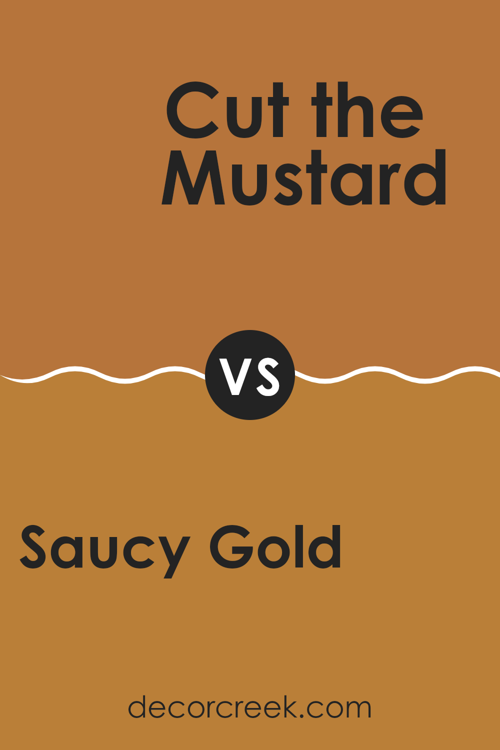
Saucy Gold SW 6370 by Sherwin Williams vs Cut the Mustard SW 6384 by Sherwin Williams
Saucy Gold SW 6370 and Cut the Mustard SW 6384 are both vibrant yellows from Sherwin Williams, but they have distinct differences. Saucy Gold is a rich, warm gold that brings a sense of warmth and coziness to a room.
It’s like a sunlit afternoon, with a hint of orange that gives it depth. Cut the Mustard, on the other hand, is a brighter, more intense yellow. It feels lively and energetic, more like a sunny morning that invigorates a room. While Saucy Gold leans towards a burnt gold hue, making it slightly more subdued, Cut the Mustard is bold and vivid.
Both colors can add cheerfulness to a room, but Saucy Gold might suit rooms where a relaxed, welcoming feel is desired, while Cut the Mustard works well in areas needing a pop of lively color. Each has its charm, depending on the mood you want to set.
You can see recommended paint color below:
Saucy Gold SW 6370 by Sherwin Williams vs Gingery SW 6363 by Sherwin Williams
Saucy Gold SW 6370 and Gingery SW 6363 are both warm, inviting colors from Sherwin Williams, perfect for adding vibrancy to a room. Saucy Gold is a rich, golden shade that brings a sunny warmth to any room. It’s bold and tends to stand out, making it great for accent walls or areas where you want a lively touch.
Gingery, on the other hand, is slightly softer and lighter than Saucy Gold. It has an earthy tone, reminiscent of spices and autumn leaves. Gingery is a bit more muted, making it flexible for larger areas where you want warmth without overpowering the senses.
Together, these two colors can create a dynamic and cozy atmosphere. While Saucy Gold makes a statement, Gingery offers balance, making them an excellent pair for a harmonious yet vibrant setting. They work well in living rooms, dining areas, or anywhere a warm and welcoming vibe is desired.
You can see recommended paint color below:
- SW 6363 Gingery
Saucy Gold SW 6370 by Sherwin Williams vs Tigereye SW 6362 by Sherwin Williams
Saucy Gold (SW 6370) and Tigereye (SW 6362) are both warm colors from Sherwin Williams’ palette, but they have distinct personalities. Saucy Gold is a rich, warm golden hue that exudes a sense of energy and vibrancy.
It’s a bold choice that can bring a lively, cheerful atmosphere to a room. On the other hand, Tigereye is a deeper, more muted shade with a brownish undertone, giving it an earthy, grounded feel. While both colors can add warmth to a room, Saucy Gold stands out more due to its brightness, whereas Tigereye provides a calmer, more subdued warmth.
These differences make Saucy Gold suitable for areas where you want to make a statement or add a bright touch, like an accent wall or a lively kitchen, while Tigereye is ideal for creating a cozy, inviting feel in living rooms or bedrooms. Both colors can work well together or separately, depending on the mood you want to set.
You can see recommended paint color below:
- SW 6362 Tigereye
When I think about the color SW 6370 Saucy Gold by Sherwin Williams, it makes me feel warm and happy. This color reminds me of a sunny day or a cozy, warm hug. It’s a bright and cheerful yellow with a little bit of orange, kind of like the color of ripe peaches or marigold flowers.
Imagine painting your room with Saucy Gold. It could make the room feel more cheerful and lively, just like how you feel when the sun is shining, and it’s a perfect day for playing outside. This color would look great in a room where you play games, do crafts, or just hang out because it would make it feel bright and exciting.
Saucy Gold is also a color that likes to have fun with other colors. You could pair it with white to make the room look fresh and clean, or you could match it with some dark brown or deep green for a more cozy feeling. It’s like having a color that can play or work with whatever you choose to put next to it.
In the end, Saucy Gold is a color that can be happy, warm, and make any room feel more inviting. Whether playing make-believe or hanging out with your friends, this color makes the place feel even better.
Ever wished paint sampling was as easy as sticking a sticker? Guess what? Now it is! Discover Samplize's unique Peel & Stick samples.
Get paint samples

