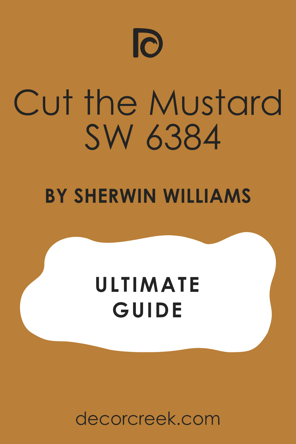
When I laid my eyes on SW 6384 Cut the Mustard by Sherwin Williams, I was struck by its vibrant warmth. This color stands out with a bold and rich yellow that feels both lively and cozy. It reminds me of those comforting, sunlit afternoons that make everything seem just right. There’s an undeniable energy to it, one that can turn any room into a cheerful room. It’s perfect for those who want a splash of enthusiasm on their walls without it being overpowering.
Instead of fading into the background, Cut the Mustard brings a sense of personality and zest. It has a versatility that allows it to work well in different areas, from kitchens where you gather with family to living rooms where you host friends. Whether paired with neutral tones or other bold colors, it adds flair and character.
Using this color feels like adding sunshine into my home. It draws attention and makes any room more inviting.
When you want more warmth, joy, and positivity around you, Cut the Mustard might just do the trick.

What Color Is Cut the Mustard SW 6384 by Sherwin Williams?
Cut the Mustard (SW 6384) by Sherwin Williams is a rich, earthy yellow that brings warmth and a touch of boldness to any room. It has a mustard tone, striking a balance between bright and muted, making it a flexible choice for various design styles. This color is perfect for Bohemian or eclectic interiors, where its vibrant yet grounded nature can complement the mix of patterns and styles. It also works well in traditional settings, adding a lively pop that doesn’t overpower.
When pairing Cut the Mustard with materials, think of warm woods like oak or walnut. These materials complement its warm tone, creating a cozy and inviting atmosphere. In terms of textures, consider pairing it with natural fibers such as jute, linen, or wool. These textures highlight the natural warmth of the color and add depth to the room.
In modern or industrial areas, you can use metals like brass or copper for accents, which harmonize beautifully with the yellowness of Cut the Mustard. For a playful and fresh look, pair it with white or light gray.
Whether it’s in living rooms, dining areas, or even a bold hallway, Cut the Mustard can bring lively energy and warmth to a variety of interior designs.
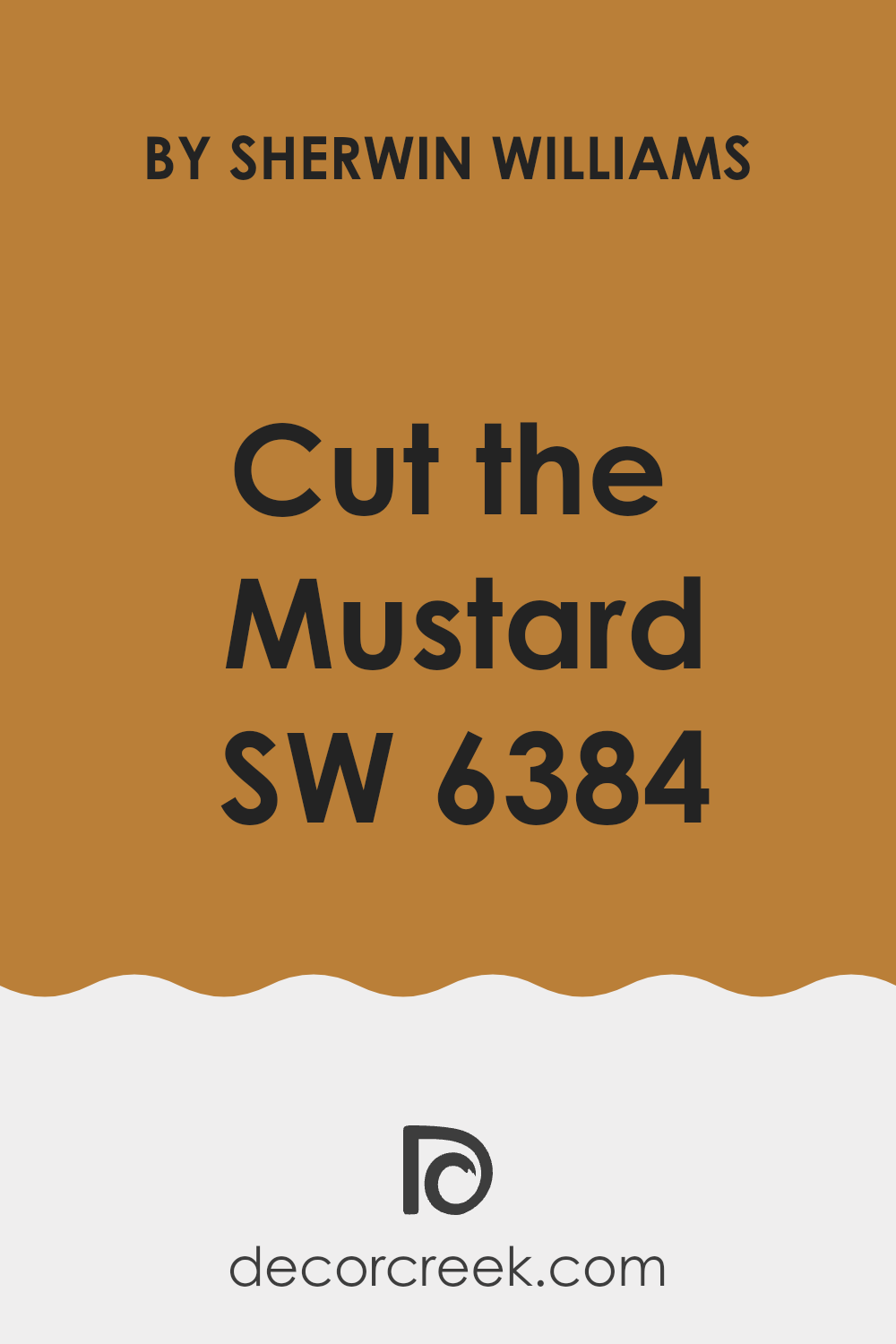
Is Cut the Mustard SW 6384 by Sherwin Williams Warm or Cool color?
Cut the Mustard SW 6384 by Sherwin Williams is a warm, golden yellow that brings a cheerful and inviting feel to any room. This color can brighten up areas and create a lively atmosphere. When used in a living room or kitchen, it can make the area feel more welcoming and energizing.
In rooms with natural light, Cut the Mustard can add a sunny glow, enhancing the brightness of the room. It pairs well with neutral colors such as whites, creams, and greys, as well as with rich browns for a cozy look.
This flexible shade can be used to create an accent wall or as the main color in a room. Its vibrant tone adds personality without being too intense. Cut the Mustard can also complement rustic or vintage decor, adding a dash of color that feels both stylish and lasting. This paint color offers a lively touch to any home setting.
Undertones of Cut the Mustard SW 6384 by Sherwin Williams
Cut the Mustard by Sherwin Williams is a warm, bold color with a mix of interesting undertones. The primary color is a rich mustard yellow, which is warm and inviting. However, the undertones can significantly influence how the color appears in different settings. Undertones like olive and light green add a slightly earthy and natural feeling, which can make the color feel more grounded. This can be appealing if you’re aiming for a rustic or vintage look.
The presence of pale pink and pink undertones can soften the color slightly, giving the mustard a warmer, more inviting feel. The red and brown undertones add depth and richness, which can lend a cozy and comforting atmosphere to a room. The pale yellow and mint undertones can make the color seem lighter and fresher, adding a hint of brightness.
Meanwhile, the gray undertone provides a subtle neutral balance, which can prevent the color from feeling too bold. These undertones play an important role in how this mustard color will look on interior walls. Depending on the lighting and surrounding decor, Cut the Mustard can appear more vibrant or more soft, making it a flexible choice for a variety of interior design styles.
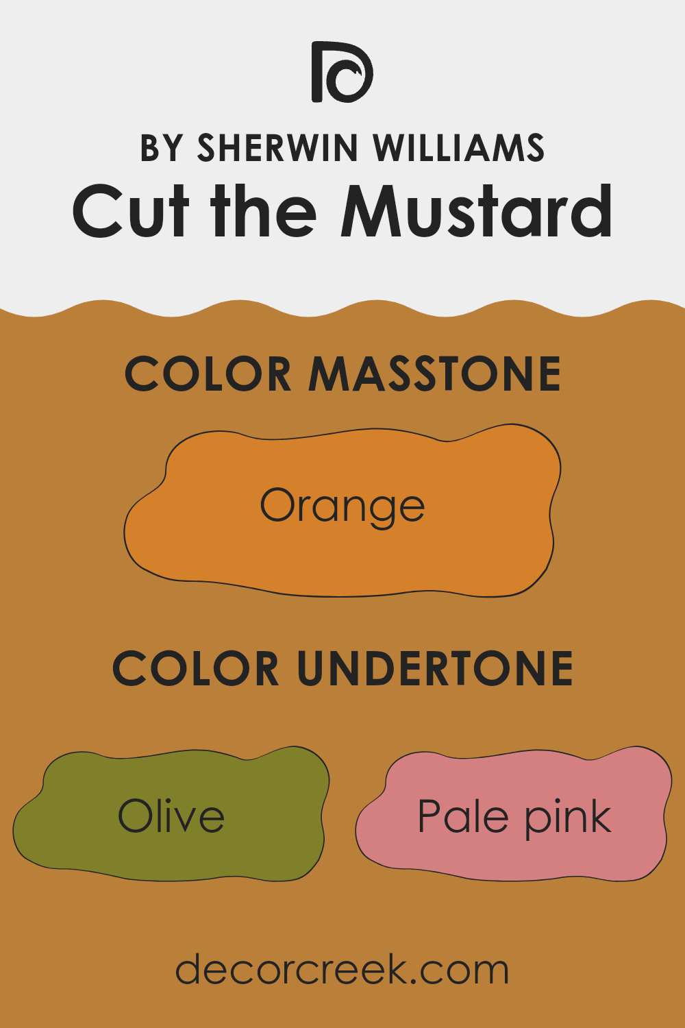
What is the Masstone of the Cut the Mustard SW 6384 by Sherwin Williams?
Cut the Mustard by Sherwin Williams, with its rich orange masstone, adds a warm and inviting feel to any room. This bold hue can create a cozy atmosphere, making areas feel more intimate and welcoming.
The orange undertones give it a vibrant energy, perfect for areas where you want to encourage social interaction, like living rooms or dining rooms. It pairs beautifully with neutral colors, such as whites or beiges, allowing the color to stand out without being too intense.
In rooms with ample natural light, this color can enhance the brightness, while in dimmer areas, it retains its warmth, preventing the room from feeling too dark. For those who want to make a statement, using Cut the Mustard on an accent wall can add a pop of color and draw the eye, making it a flexible choice for various home settings.
How Does Lighting Affect Cut the Mustard SW 6384 by Sherwin Williams?
Lighting significantly influences how colors look in a room. Natural and artificial light can change the appearance of wall colors, impacting the mood and design of a room. Sherwin Williams’ Cut the Mustard (SW 6384) is a rich, warm yellow that can shift depending on the light source.
In natural light, Cut the Mustard changes throughout the day. In rooms facing north, which generally receive less direct sunlight, this color might appear muted or cooler. The light in north-facing rooms often has a more bluish tone, which can affect how warm colors, such as yellows, show up. As a result, Cut the Mustard may feel more subdued and less vibrant in these rooms.
South-facing rooms benefit from strong, warm natural light throughout the day. Here, Cut the Mustard will appear at its warmest and most vibrant. The abundance of sunlight enhances the rich golden tones, making south-facing rooms feel cozy and welcoming.
In east-facing rooms, morning light tends to be bright with a yellow hue, which can make Cut the Mustard come alive in the early part of the day. As the sun moves west, the light in these rooms becomes softer and cooler, possibly toning down the warmth of the color in the afternoon.
West-facing rooms receive warm, golden light in the late afternoon and early evening. In these rooms, Cut the Mustard may start off looking a bit muted in the morning, but as the sun sets, the color will intensify and glow warmly, creating a striking visual effect.
Artificial lighting also plays a crucial role. Incandescent bulbs give off warm, yellow light that can enhance the warmth of Cut the Mustard, making it appear more vibrant and golden. LED or fluorescent lights, especially those with cooler tones, may somewhat dull its warmth, giving the color a softer, more neutral look. Different light sources will dramatically change how this color is perceived in any given room.

What is the LRV of Cut the Mustard SW 6384 by Sherwin Williams?
LRV stands for Light Reflectance Value, which is a measure of how much light a color reflects. It is a scale that runs from 0 to 100, where 0 means no light is reflected (pure black) and 100 means all light is reflected (pure white). The LRV can help you understand how a color will look in different lighting.
Colors with high LRV values generally make rooms feel brighter and more open, as they reflect more light back into the room. Conversely, colors with low LRV values absorb more light, making them appear darker and cozier. So, when choosing paint, it’s important to consider the LRV to see how the color will interact with light in your room.
Cut the Mustard by Sherwin Williams has an LRV of 25.998, which means it is on the lower end of the LRV scale. This color absorbs more light than it reflects, making it a warmer and more intense choice for walls. In areas with ample lighting, the color can still look vibrant and rich, but in dimly lit areas, it can make the room feel smaller and more intimate.
It’s important to test this color in your specific lighting conditions to see how it behaves throughout the day. Rooms with large windows or good overhead lighting will show off the richness of the mustard hue, while cozier rooms may feel more enveloping with this color choice.

Coordinating Colors of Cut the Mustard SW 6384 by Sherwin Williams
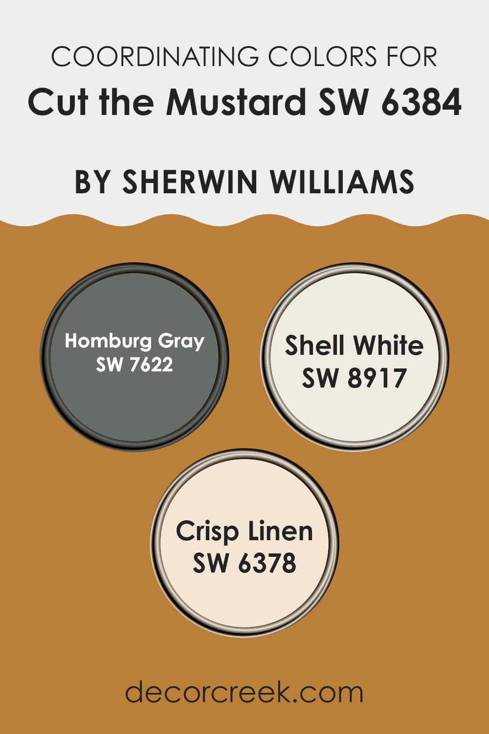
Coordinating colors are hues that complement and harmonize with a primary color, enhancing its overall look without clashing or overpowering it. When selecting coordinating colors for Cut the Mustard by Sherwin Williams, we have choices that work well together and create a balanced, appealing palette. Homburg Gray (SW 7622) is a deep gray with blue undertones, adding a sense of depth and richness to the palette. Its muted tone provides a strong, yet subtle, contrast to the warmth of the yellow mustard shade.
Shell White (SW 8917) is a soft, off-white color with a hint of cream. This gentle hue brightens the overall color scheme, giving it a light and airy feel. Meanwhile, Crisp Linen (SW 6378) is a warm, creamy beige that adds a touch of coziness while maintaining a neutral presence.
Together, these coordinating colors create a harmonious blend that enhances the vibrancy of Cut the Mustard. They work together to provide a pleasing visual balance that’s ideal for various rooms—whether in home decor or commercial settings. Each color brings its unique quality, making them flexible and complementary choices for a unified look.
You can see recommended paint colors below:
- SW 7622 Homburg Gray
- SW 8917 Shell White (CHECK A SAMPLE)
- SW 6378 Crisp Linen (CHECK A SAMPLE)
What are the Trim colors of Cut the Mustard SW 6384 by Sherwin Williams?
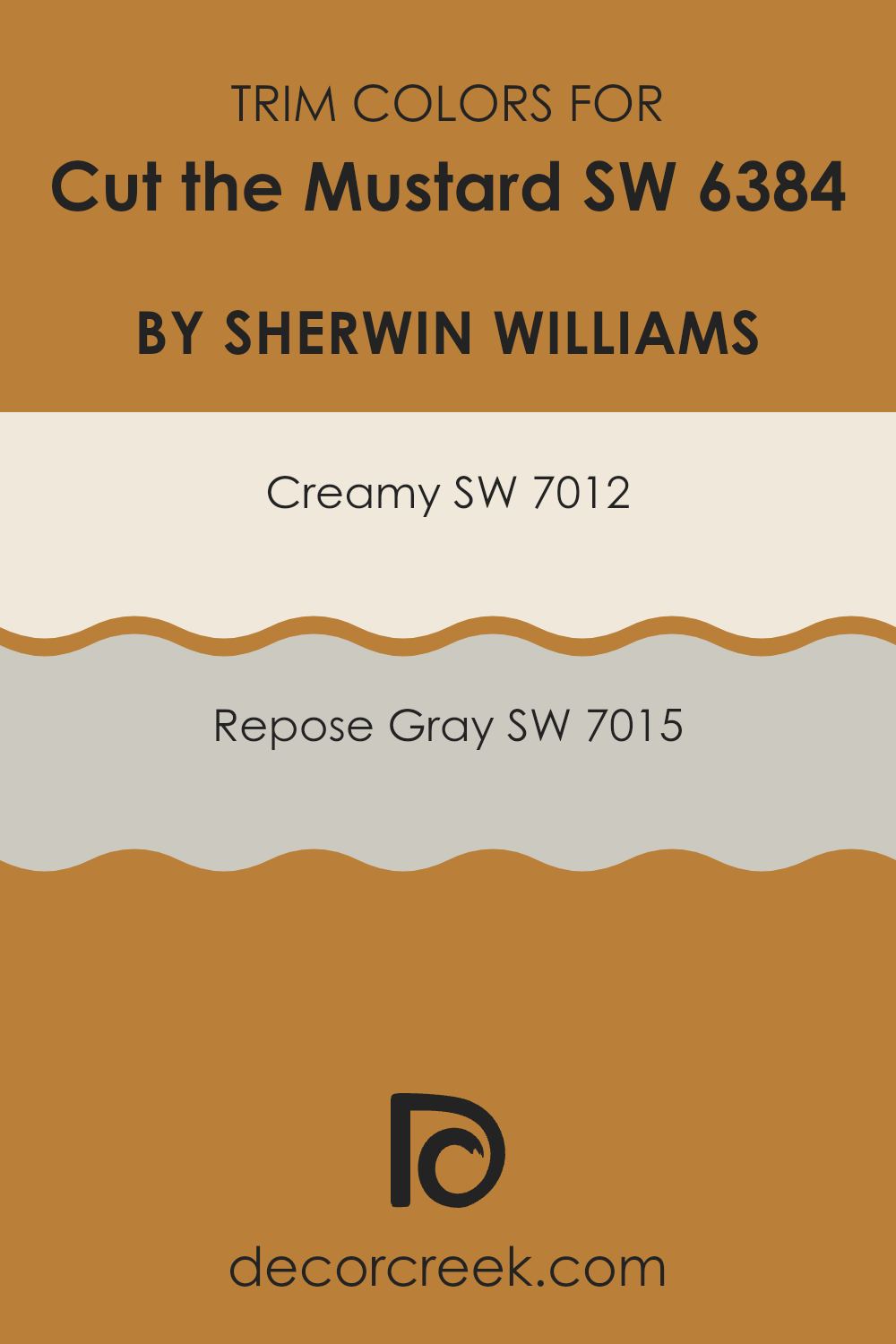
Trim colors are the shades used for doors, moldings, and other accents around a room or a building, primarily to create a visual contrast or harmony with the main wall color. They play a crucial role in defining areas and highlighting architectural features. When paired with Cut the Mustard, a bold and rich yellow from Sherwin Williams, trim colors like Creamy and Repose Gray can add balance and depth.
Creamy, a warm and inviting off-white, softens the intensity of Cut the Mustard while providing enough contrast to gently frame the room without being too intense. Repose Gray, on the other hand, is a light gray with a touch of warmth, offering a modern and flexible contrast that complements the vivid yellow and adds a refined touch to the overall decor.
Choosing the right trim colors is essential when using a strong color like Cut the Mustard as the main wall color. Trim colors can either enhance the visual appeal of the wall color or clash with it if not selected carefully. Creamy offers a gentle transition between the yellow walls and other elements in the room, working well in both traditional and contemporary settings.
Repose Gray serves as an excellent choice if you’re aiming for a neutral trim that adds a bit of character without taking away the spotlight from the main wall color.
Together, these trim colors allow Cut the Mustard to stand out while creating a harmonious and inviting atmosphere in any room.
You can see recommended paint colors below:
Colors Similar to Cut the Mustard SW 6384 by Sherwin Williams
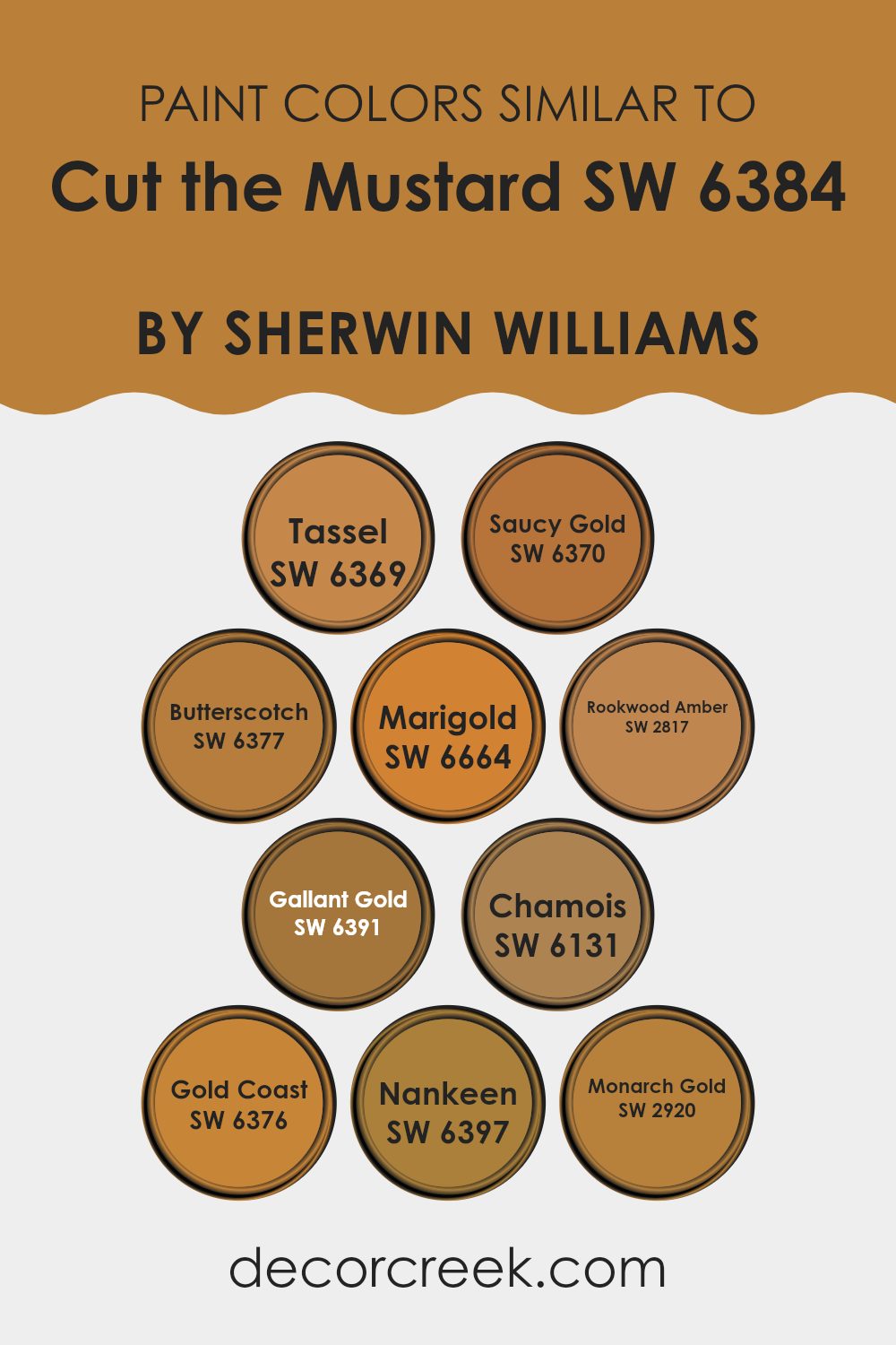
Similar colors play a vital role in design and decor because they create harmony and continuity within a room. When colors that are close in shade are used together, they enhance each other subtly, providing a cohesive look that is pleasing to the eye. For example, colors like Tassel and Saucy Gold each bring a warm, rich tone akin to Cut the Mustard, but with individual flair.
Butterscotch offers a slightly deeper shade that adds depth, while Marigold incorporates a vibrant brightness that can energize a room. Rookwood Amber rounds out the palette with a historical touch, giving a sense of grounded elegance.
Gallant Gold brings out a lively brightness, adding light and warmth, while Chamois delivers a soft, calming touch with its subtle warmth. Gold Coast’s gentle glow introduces a sunlit ambiance that feels inviting and cozy. Nankeen provides a balanced mustard hue, slightly muted, perfect for creating understated harmony, and Monarch Gold stands out with its regal depth, adding a sense of luxury and richness.
These similar shades work together to create harmony and balance, allowing each to stand out while maintaining a sense of unity with Cut the Mustard, forming an inviting and aesthetically pleasing environment.
You can see recommended paint colors below:
- SW 6369 Tassel (CHECK A SAMPLE)
- SW 6370 Saucy Gold (CHECK A SAMPLE)
- SW 6377 Butterscotch (CHECK A SAMPLE)
- SW 6664 Marigold (CHECK A SAMPLE)
- SW 2817 Rookwood Amber
- SW 6391 Gallant Gold (CHECK A SAMPLE)
- SW 6131 Chamois (CHECK A SAMPLE)
- SW 6376 Gold Coast (CHECK A SAMPLE)
- SW 6397 Nankeen (CHECK A SAMPLE)
- SW 2920 Monarch Gold
Colors that Go With Cut the Mustard SW 6384 by Sherwin Williams
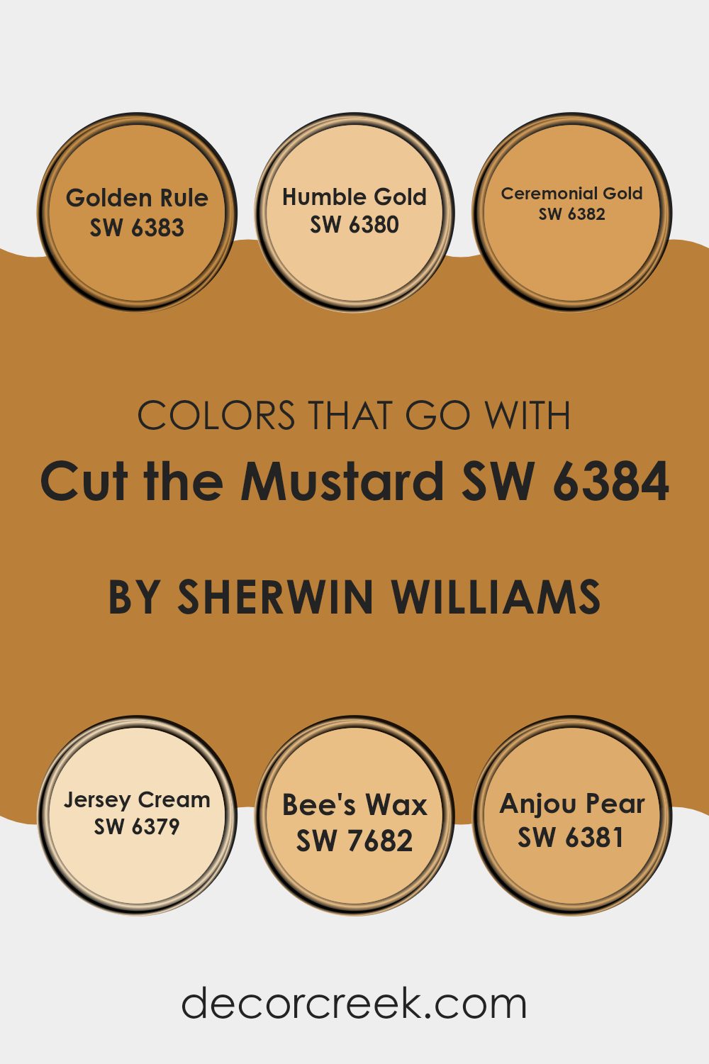
Colors that match Cut the Mustard SW 6384 by Sherwin Williams are crucial because they enhance the overall look and feel of a room. These complementing tones can create harmony, add depth, and provide subtle nuances that work together to make a room welcoming and cohesive. When paired effectively, these colors promote balance and visual appeal, making them suitable for various rooms in a home or office.
Golden Rule SW 6383 is a warm, amber shade that pairs well with Cut the Mustard, adding a rich, comforting depth. Humble Gold SW 6380 has a mellow, soft tone that gently brightens a room without overpowering other elements. Ceremonial Gold SW 6382 brings a bold yet earthy vibe that can energize and engage a room.
Jersey Cream SW 6379 is a lighter shade, offering a creamy, soothing contrast that can highlight other colors beautifully. Bee’s Wax SW 7682 provides a subtle, honey-like warmth, making it flexible for room accents. Anjou Pear SW 6381 offers a hint of green that enlivens the palette, adding life and variety. Together, these tones can help create a warm, inviting environment that feels cozy and visually satisfying.
You can see recommended paint colors below:
- SW 6383 Golden Rule (CHECK A SAMPLE)
- SW 6380 Humble Gold (CHECK A SAMPLE)
- SW 6382 Ceremonial Gold (CHECK A SAMPLE)
- SW 6379 Jersey Cream (CHECK A SAMPLE)
- SW 7682 Bee’s Wax (CHECK A SAMPLE)
- SW 6381 Anjou Pear (CHECK A SAMPLE)
How to Use Cut the Mustard SW 6384 by Sherwin Williams In Your Home?
Cut the Mustard SW 6384 by Sherwin Williams is a warm and inviting color. It brings a rich golden-yellow hue that can add a cheerful and cozy vibe to your home. This color is perfect for adding a pop of warmth to your living room or kitchen.
You can use it as an accent wall to make a room feel lively and energetic, without overpowering the room. Pair it with neutral tones like grays or whites to balance its brightness and make your room feel welcoming.
For a more daring look, consider using Cut the Mustard on cabinets or a front door to create a bold statement. It also works well with natural wood finishes, bringing out the earthy tones in the wood. Whether you want to brighten up a small room or add depth to a larger room, this color offers a flexible option that enhances any area with its sunny disposition.
Cut the Mustard SW 6384 by Sherwin Williams vs Tassel SW 6369 by Sherwin Williams
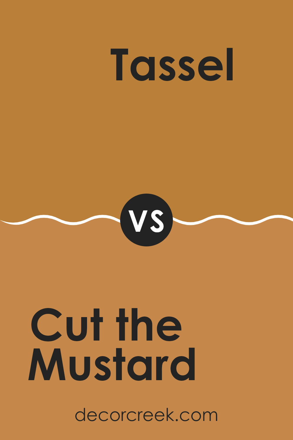
“Cut the Mustard SW 6384” by Sherwin Williams is a bold, warm yellow shade. It is vibrant and exudes energy, making it great for areas where you want to create a lively atmosphere. This color can brighten up a room and is perfect for those who enjoy a cheerful and dynamic environment.
On the other hand, “Tassel SW 6369” by Sherwin Williams is a softer, more muted hue. It carries a gentle warmth without being overpowering. This color can make a room feel cozy and inviting while maintaining a relaxed vibe.
While “Cut the Mustard” grabs attention with its intensity, “Tassel” offers subtle warmth. Together, they can complement each other well; use the first to highlight accents and the second for main walls. This pairing provides a balanced look, mixing lively energy with calm warmth, making areas feel both welcoming and cheerful.
You can see recommended paint color below:
- SW 6369 Tassel (CHECK A SAMPLE)
Cut the Mustard SW 6384 by Sherwin Williams vs Nankeen SW 6397 by Sherwin Williams
“Cut the Mustard” SW 6384 by Sherwin Williams is a bold, warm color with a strong yellow base. It’s vibrant and can bring a lively feel to a room. This color often adds energy and is a great choice for areas where you want to create a cheerful atmosphere, like a kitchen or dining room.
On the other hand, “Nankeen” SW 6397 is a softer, more muted yellow. It has a subtle touch that gives it a calmer presence. “Nankeen” might be better suited for areas where you’d like a light and airy feel, like a bedroom or a quiet reading nook, as it’s less intense than “Cut the Mustard.”
Both shades have their own charm: “Cut the Mustard” is dynamic and bold, demanding attention, while “Nankeen” is gentle and soothing, ideal for places where relaxation is key. The choice between the two depends on the mood you want to create in your room.
You can see recommended paint color below:
- SW 6397 Nankeen (CHECK A SAMPLE)
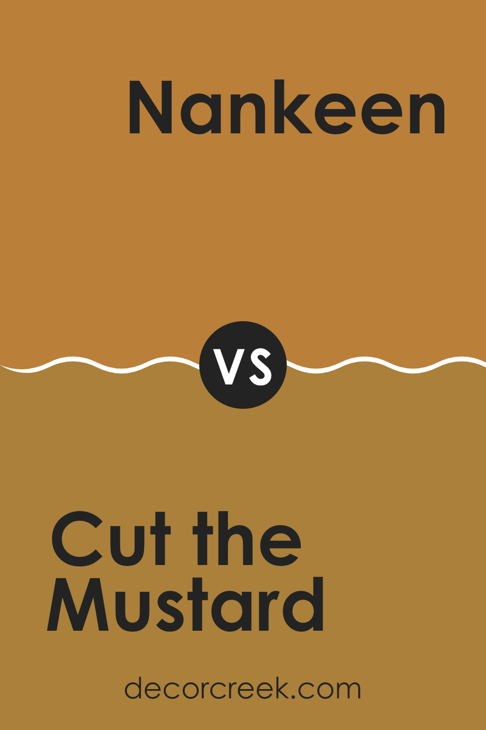
Cut the Mustard SW 6384 by Sherwin Williams vs Chamois SW 6131 by Sherwin Williams
Cut the Mustard (SW 6384) and Chamois (SW 6131) are both unique shades from Sherwin Williams, but they offer different vibes. Cut the Mustard is a bold, warm yellow with an energetic and cheerful feel. It’s a statement color that can brighten up any room and add a sense of playfulness and liveliness.
On the other hand, Chamois is a softer, muted tone. It’s more subdued and leans towards a warm beige. This color adds a cozy and inviting atmosphere, making it great for creating a more relaxed and comfortable setting.
While “Cut the Mustard” is great for adding a pop of color and drawing attention, “Chamois” works well as a neutral backdrop. It can complement other colors without competing with them. In summary, if you want something lively, go for “Cut the Mustard.” For a calmer, more neutral look, choose “Chamois.”
You can see recommended paint color below:
- SW 6131 Chamois (CHECK A SAMPLE)
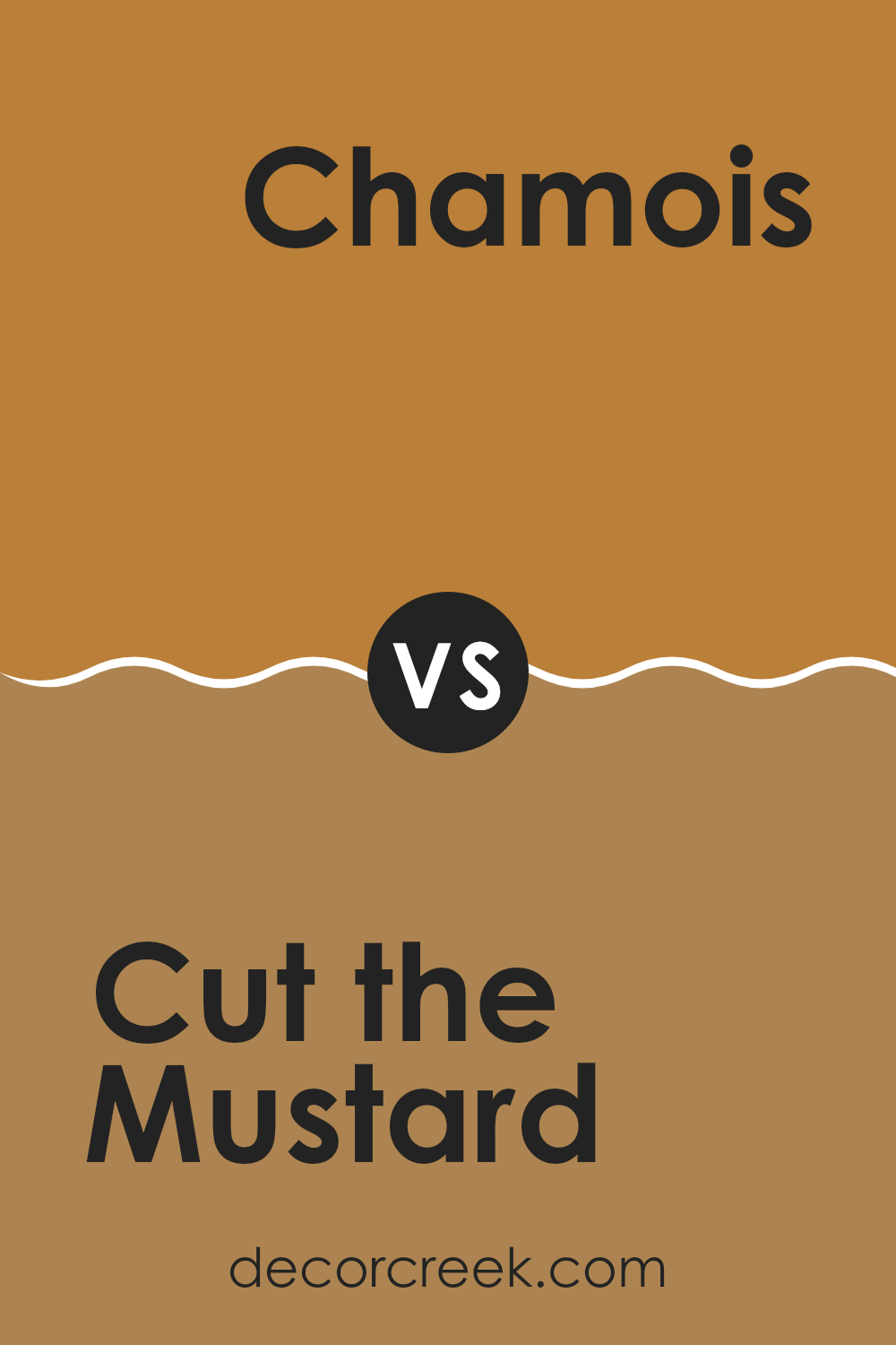
Cut the Mustard SW 6384 by Sherwin Williams vs Butterscotch SW 6377 by Sherwin Williams
“Cut the Mustard” and “Butterscotch” are both warm, yellow-toned colors from Sherwin Williams, but they have different vibes. “Cut the Mustard” SW 6384 is a rich mustard yellow that feels bold and vibrant. It adds energy and warmth to a room, making it a great choice for areas where you want to feel lively and cheerful.
On the other hand, “Butterscotch” SW 6377 is a softer, more muted yellow. It’s reminiscent of buttery caramel tones and brings a cozy and comforting feeling to a room. It’s inviting without being overpowering.
While both colors brighten a room, “Cut the Mustard” is more intense and stands out, whereas “Butterscotch” tends to blend in subtly, creating a calm backdrop. Together, these colors could complement each other well, with “Cut the Mustard” used for accents or focal points, and “Butterscotch” for larger areas.
You can see recommended paint color below:
- SW 6377 Butterscotch (CHECK A SAMPLE)
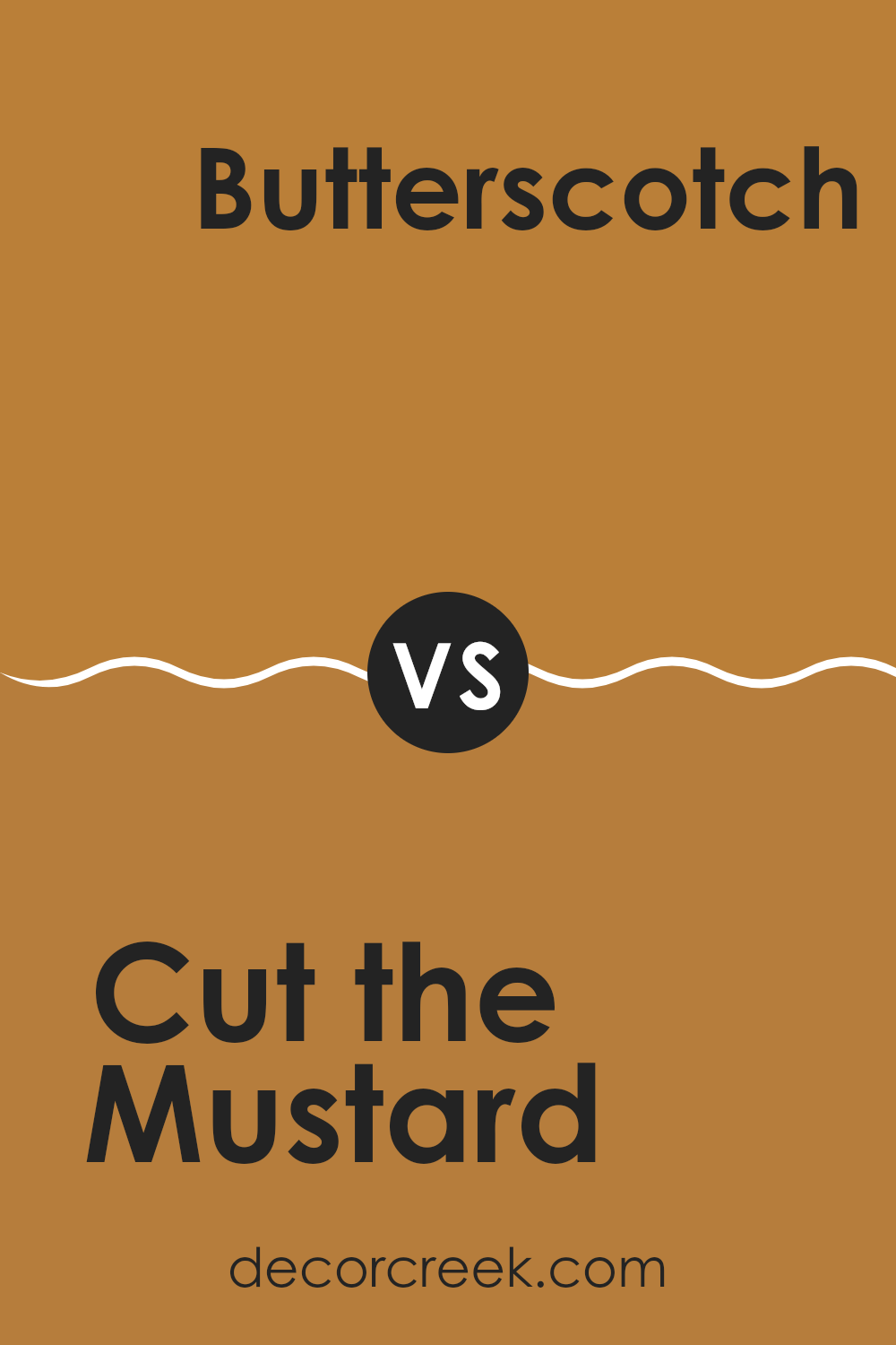
Cut the Mustard SW 6384 by Sherwin Williams vs Marigold SW 6664 by Sherwin Williams
Cut the Mustard SW 6384 and Marigold SW 6664 are both yellow-based colors by Sherwin Williams, but they have distinct personalities. Cut the Mustard is a rich, warm, golden yellow with a hint of earthiness, making it feel cozy and inviting. It’s a bold color that can bring warmth to a room without being overly bright.
Marigold SW 6664, on the other hand, is a brighter and more vivid hue. It has an energetic and cheerful feel, resembling the vibrant petals of a marigold flower. This color can add a lively pop to any room, making it feel more dynamic.
While both colors are warm and sunny, Cut the Mustard leans more toward a muted and refined look, perfect for creating a cozy atmosphere. Marigold is more about bringing energy and vibrancy to a room, making it a great choice for areas where you want to encourage activity and cheerfulness.
You can see recommended paint color below:
- SW 6664 Marigold (CHECK A SAMPLE)
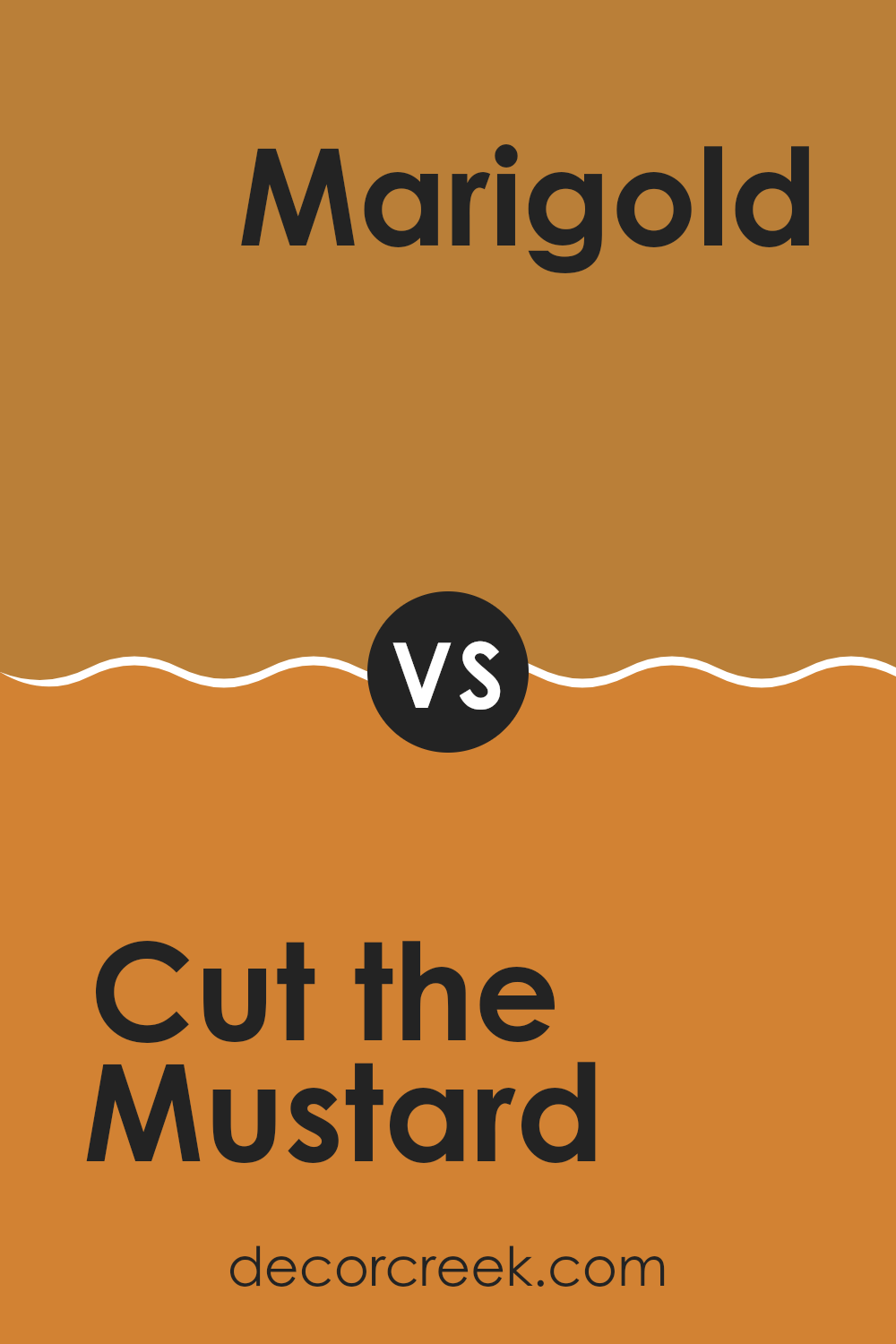
Cut the Mustard SW 6384 by Sherwin Williams vs Monarch Gold SW 2920 by Sherwin Williams
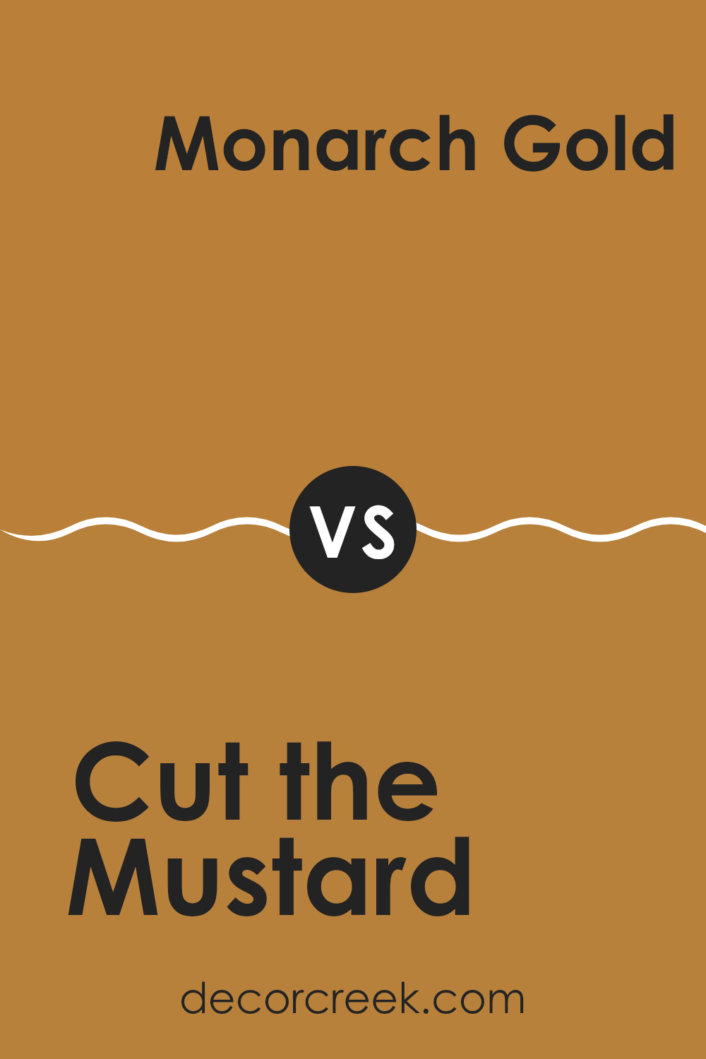
“Cut the Mustard” SW 6384 is a warm and bold yellow with a hint of mustard tones, making it a lively and cheerful color choice. It’s bright enough to energize a room but has depth that keeps it from being too intense. This color works well in rooms where you want to create a cozy and inviting atmosphere, such as kitchens or dining rooms.
On the other hand, “Monarch Gold” SW 2920 carries more golden and earthy undertones compared to “Cut the Mustard.” While still bright, Monarch Gold has a slightly muted quality, giving it a more subdued and elegant feel. It works well in living rooms or areas where a touch of warmth is desired without being too striking.
Both colors bring warmth, but while “Cut the Mustard” is more vibrant and playful, “Monarch Gold” offers a softer, more understated look. Choosing between the two depends on whether you’re aiming for a lively or a gentle ambiance.
You can see recommended paint color below:
- SW 2920 Monarch Gold
Cut the Mustard SW 6384 by Sherwin Williams vs Gold Coast SW 6376 by Sherwin Williams
“Cut the Mustard” (SW 6384) and “Gold Coast” (SW 6376) by Sherwin Williams are both warm yellow hues but have distinct characteristics. “Cut the Mustard” is a bold mustard yellow, offering a rich and vibrant tone that can add a pop of color to any room. It’s a more saturated color with a hint of earthiness, making it ideal for creating an energetic and lively atmosphere.
On the other hand, “Gold Coast” is a softer, more muted yellow with a hint of gold. It has a warm and pleasant undertone that feels cozy without being overpowering. This softer shade can work well in areas where you want a subtler hint of yellow, providing warmth and brightness without being too intense.
While “Cut the Mustard” can be striking and bold, “Gold Coast” offers a more gentle and understated vibe. Both colors bring warmth, but their intensity and impact can vary significantly.
You can see recommended paint color below:
- SW 6376 Gold Coast (CHECK A SAMPLE)

Cut the Mustard SW 6384 by Sherwin Williams vs Saucy Gold SW 6370 by Sherwin Williams
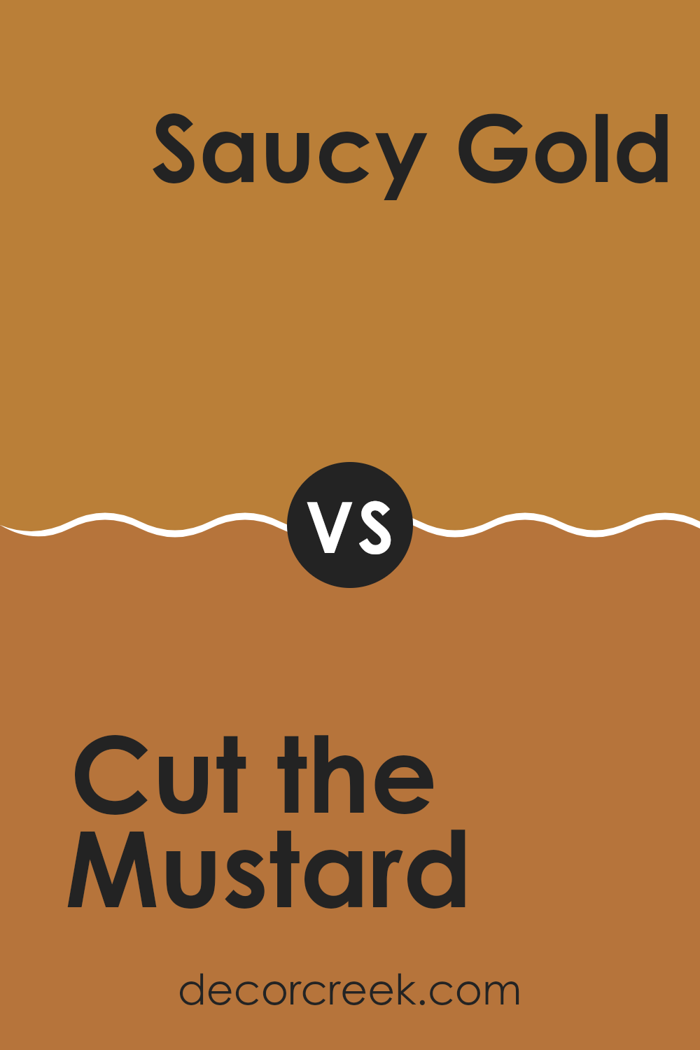
“Cut the Mustard” (SW 6384) and “Saucy Gold” (SW 6370) by Sherwin Williams are both warm, vibrant yellows, but they have their own unique traits. “Cut the Mustard” is a bold, spicy yellow with strong undertones of mustard and a bit of orange. It can add energy and warmth to a room, making it feel lively and inviting. It pairs well with neutral tones or darker shades for a striking contrast.
“Saucy Gold,” on the other hand, is a softer, more subdued yellow with gold undertones. It has a slightly more muted and classic feel compared to “Cut the Mustard.” It brings a touch of elegance and can add a cozy glow to rooms. It works well alongside other warm colors or light neutrals, creating a harmonious and relaxed atmosphere.
Both colors are excellent choices for adding warmth and character to a room, but the choice depends on the desired mood: vibrant and lively versus warm and mellow.
You can see recommended paint color below:
- SW 6370 Saucy Gold (CHECK A SAMPLE)
Cut the Mustard SW 6384 by Sherwin Williams vs Rookwood Amber SW 2817 by Sherwin Williams
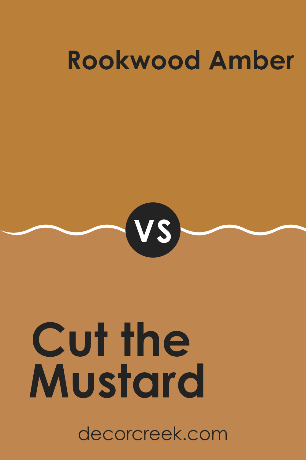
“Cut the Mustard” SW 6384 and “Rookwood Amber” SW 2817 by Sherwin Williams are both warm colors, but they have distinct characteristics. “Cut the Mustard” is a bold, sunny yellow with a hint of earthiness, making it vibrant and energetic. It’s perfect for creating a lively and cheerful atmosphere, whether in a kitchen or a playroom.
On the other hand, “Rookwood Amber” is a deeper, more orange-toned hue. It carries a sense of warmth and richness that can add a touch of coziness to any room. This color is ideal for a living room or dining area where you want to create a welcoming and inviting ambiance.
When comparing them, “Cut the Mustard” is more striking and bright, while “Rookwood Amber” provides a more subdued and elegant feel. Both colors can add warmth to a room, but the mood they create will differ based on their intensity and undertones.
You can see recommended paint color below:
- SW 2817 Rookwood Amber
Cut the Mustard SW 6384 by Sherwin Williams vs Gallant Gold SW 6391 by Sherwin Williams
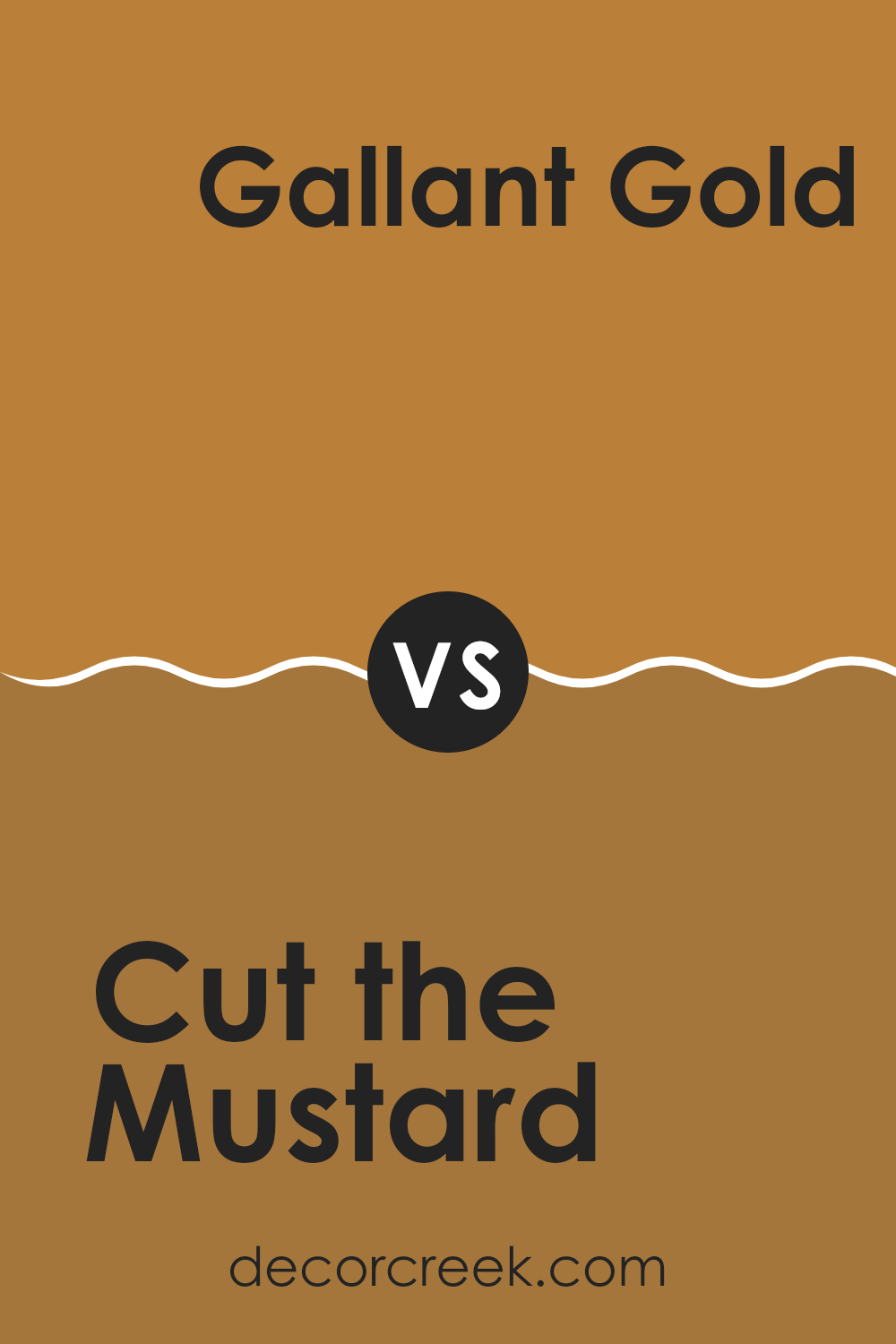
Cut the Mustard SW 6384 and Gallant Gold SW 6391 are both warm, sunny colors by Sherwin Williams, but they each have their own character. Cut the Mustard is a rich, golden yellow that feels cozy and vibrant.
It’s a strong, assertive color that can brighten up a room without being too intense. On the other hand, Gallant Gold is slightly softer and lighter. It has more of a mellow yellow tone, evoking a cheerful and welcoming atmosphere. While both colors bring warmth and energy, Cut the Mustard leans toward a more bold and daring look, while Gallant Gold offers a softer, more subtle touch.
These differences make them suitable for different areas, depending on the feel you want to achieve. Cut the Mustard might be great for a statement wall, while Gallant Gold could work well in a living room or bedroom for a cozy ambiance.
You can see recommended paint color below:
- SW 6391 Gallant Gold (CHECK A SAMPLE)
In the world of colors, SW 6384 Cut the Mustard by Sherwin Williams stands out like a bright smile on a rainy day. I feel this color can truly make a room come alive. Imagine a warm, golden glow wrapping around you; that’s the magic of Cut the Mustard. It’s like having a splash of sunshine inside your home.
When I think about how this color works inside a room, I picture happy days and cheerful moments. It’s perfect for areas where we like to gather, play, or just have a good time. With Cut the Mustard, you can give a room a cozy feeling without it being too bold or too plain. It’s just right.
The secret of this color lies in its ability to mix well with other colors. Whether you have white furniture or dark wood, Cut the Mustard can create a lovely balance. It’s like a friendly hug for all your other colors!
So, whenever you’re thinking about painting a room, remember this sunny color. It welcomes everyone with warmth and joy. SW 6384 Cut the Mustard feels like bringing a bit of sunshine home, which makes it a fantastic choice for brightening up any room.
Ever wished paint sampling was as easy as sticking a sticker? Guess what? Now it is! Discover Samplize's unique Peel & Stick samples.
Get paint samples


