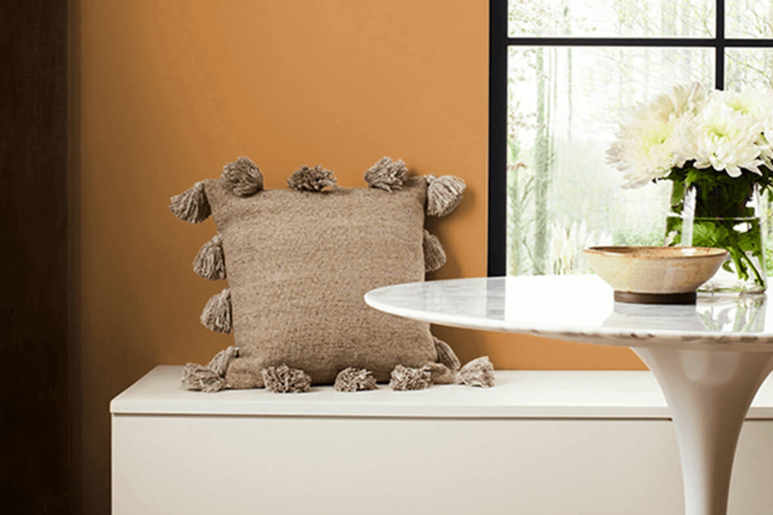
There’s something uniquely comforting about a good color choice, and SW 6369 Tassel from Sherwin Williams delivers just that. When I first laid eyes on it, I was drawn to its warm, inviting presence. This shade strikes a perfect balance, offering the kind of subtle richness that turns a house into a home. It evokes a sense of calm and warmth, without overpowering the senses.
Think of sunny afternoons in late summer, where every corner fills with a golden hue. Tassel brings this feeling inside, blending seamlessly with various design styles and color palettes. Whether you’re updating a cozy reading nook or refreshing a spacious living room, SW 6369 provides the perfect backdrop.
What I appreciate most is its adaptability—it pairs beautifully with both neutral and bold accents. It works well with natural elements like wood and stone, adding an organic vibe, but also complements modern setups with metallics and clean lines. SW 6369 Tassel is more than just a color; it’s an opportunity to infuse your room with warmth and comfort.
It’s inviting, grounding, and ever so slightly adventurous, making it an ideal choice for anyone looking to create a welcoming atmosphere.
What Color Is Tassel SW 6369 by Sherwin Williams?
Tassel by Sherwin Williams is a warm, muted shade that leans towards a golden beige. This color brings a cozy and inviting feel to any room. Tassel has rich undertones that can create a comfortable atmosphere while adding a touch of elegance. It works beautifully in traditional and rustic interiors, where its warm tones can complement wooden furniture and earthy materials like stone.
Pairing Tassel with natural materials such as leather, wool, and linen can enhance its warmth. It matches well with wooden floors, especially those with a medium to dark stain. The color also blends nicely with rich textures, like plush rugs and thick curtains, creating a harmonious and homey vibe.
In more modern or contemporary areas, consider using Tassel as a backdrop to metal or glass accents. It can provide a subtle contrast to sleek, minimalistic furniture, adding a bit of warmth without overpowering the clean lines.
Tassel also works well with neutral colors, such as cream, light gray, or soft white. These combinations can help maintain a balanced look, offering a pleasing environment that feels both stylish and grounded. This color is adaptable enough to be used in living rooms, dining areas, and even bedrooms, where a cozy ambiance is desired.
Is Tassel SW 6369 by Sherwin Williams Warm or Cool color?
Tassel SW 6369 by Sherwin Williams is a warm, inviting beige that works beautifully in many home settings. Its versatility makes it an excellent choice for both walls and accents. The color’s earthy undertones bring a cozy and welcoming feel to any room.
Because it’s a neutral shade, it pairs well with a wide range of other colors, allowing homeowners to easily match it with existing furniture and decor. In living rooms, it creates a comforting atmosphere, perfect for relaxing with family and friends. In bedrooms, its soft hue promotes a sense of relaxation, making it a great backdrop for rest.
In a kitchen, Tassel SW 6369 can provide a warm backdrop that complements wooden cabinets and countertops. Its ability to adapt to different lighting conditions means that it will look good throughout the day, whether in natural daylight or under artificial lighting. This makes it a reliable choice for any home design.
Undertones of Tassel SW 6369 by Sherwin Williams
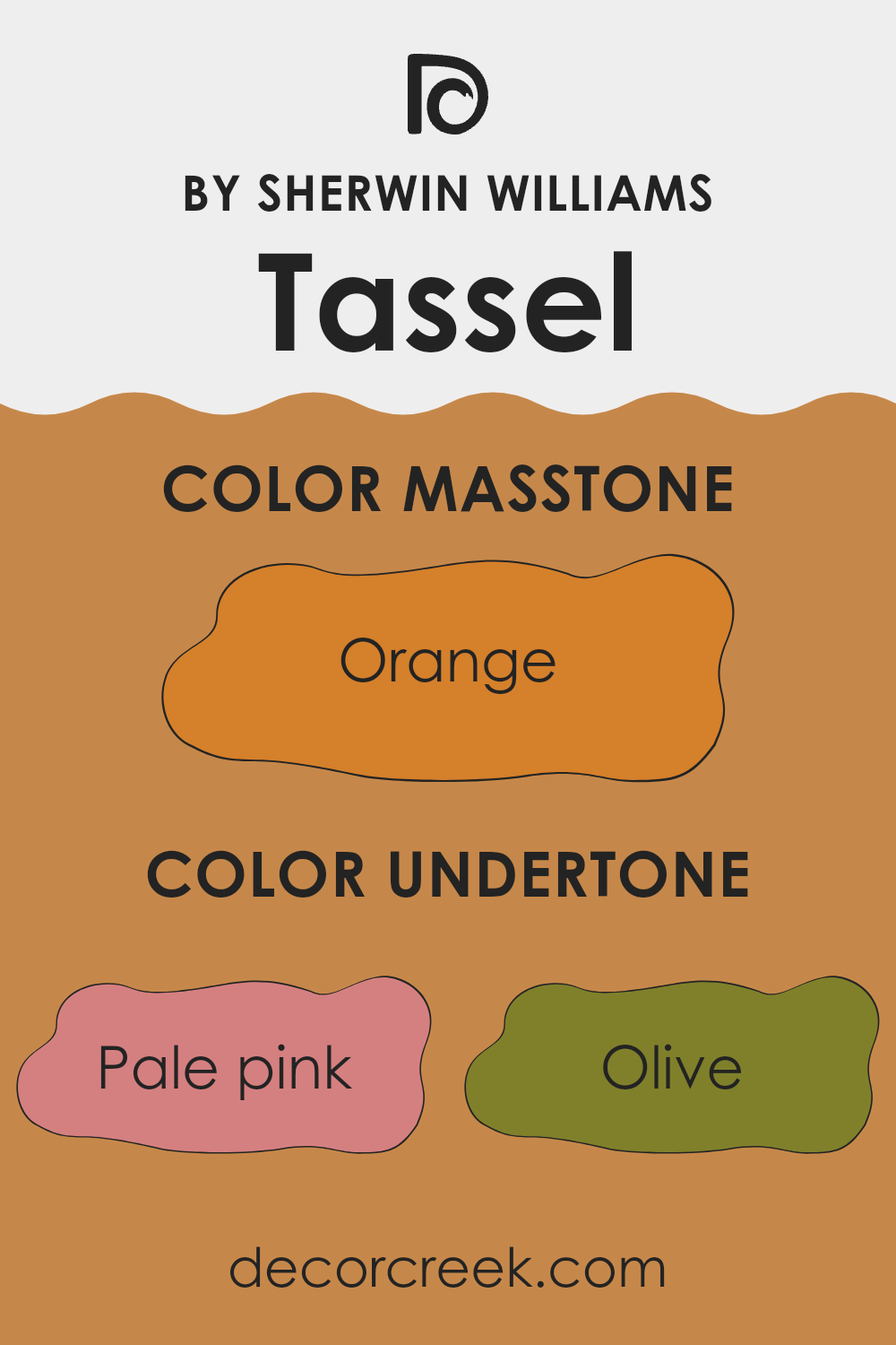
Tassel SW 6369 by Sherwin Williams is a warm, inviting paint color with complex undertones. These undertones include shades of pale pink, olive, yellow, gray, pale yellow, red, light green, pink, mint, brown, and purple. Each of these undertones plays a subtle role in shaping how we perceive the color.
The presence of pale pink and pink undertones can add a soft, warm touch to the overall hue, giving it a slightly rosy or blushing appearance. Olive and brown undertones might add some earthiness, grounding the color and making it feel more natural. The yellow and pale yellow elements can brighten the hue, making rooms feel larger and more cheerful, while the gray provides a balancing effect, muting the vibrancy and adding a touch of sophistication.
When applied to interior walls, these undertones allow the color to adapt and change according to lighting conditions and surrounding decor. In a well-lit room, the yellow and light green undertones may stand out, creating a warm, sunlit atmosphere. In dim lighting, gray and brown undertones might become more noticeable, giving the color a cozier and more intimate feel. Thus, Tassel’s diverse undertones make it an adaptable choice for various rooms, offering a dynamic appearance that interacts gracefully with its surroundings.
What is the Masstone of the Tassel SW 6369 by Sherwin Williams?
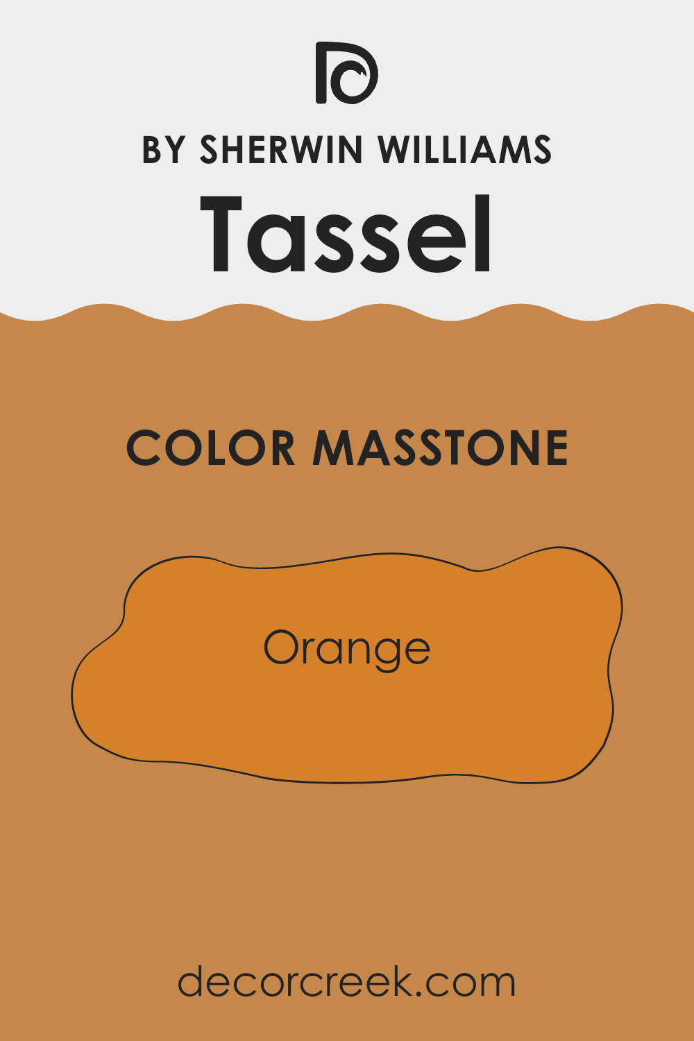
The color Tassel SW 6369 by Sherwin Williams is a warm and inviting shade of orange (#D5802B). This masstone creates a lively and cheerful atmosphere in homes. Its vibrant hue can make any room feel more welcoming and energetic, making it a wonderful choice for living rooms or kitchens where people gather and spend time together.
Tassel’s rich, earthy undertone pairs nicely with neutral shades like beige or cream, allowing it to stand out without overpowering the room. It also complements natural materials such as wood, enhancing their beauty and bringing warmth into the room.
When used as an accent wall, Tassel can draw attention and brighten an area, adding depth to a room with otherwise soft or muted colors. Overall, this color is great for creating a cozy, inviting environment that feels both fresh and warm, making it an adaptable choice for home interiors.
How Does Lighting Affect Tassel SW 6369 by Sherwin Williams?
Lighting plays a crucial role in how we perceive colors. The type and direction of light can change the appearance of a paint color, making it look different at various times of the day. This is especially true for a color like Sherwin Williams’ Tassel SW 6369, a warm, inviting hue that can appear differently depending on the lighting conditions.
In natural light, colors are often more vibrant and true to their swatches. In a room with a lot of natural light, like those facing south, Tassel SW 6369 will likely appear warm and cheerful. South-facing rooms receive the most consistent daylight throughout the day, and this warm color will complement the warm, intense light, creating a cozy and welcoming atmosphere.
North-facing rooms, however, receive cooler and less direct sunlight. Tassel SW 6369 may seem a bit more muted and subdued in these areas, as the cooler light can dull the warmth of the color. It might appear slightly grayer, so it can be a good idea to pair it with warm artificial lighting to maintain its friendly hue.
East-facing rooms get warm, direct sunlight in the morning and cooler light in the afternoon. In the morning, the room will highlight the warm undertones of Tassel, giving it a sunny and bright look. As the day progresses, the color may start to feel more neutral or even slightly cool as the natural light changes.
West-facing rooms have the opposite effect, with cooler light in the morning and warm, golden light in the late afternoon and evening. In early hours, Tassel SW 6369 may appear softer, while in the late afternoon, the warm sunlight will enhance its richness.
Under artificial light, the type of bulb can make a big difference. Incandescent lights tend to bring out warmer tones, while fluorescent lights might add a cooler tint to the color. It’s essential to test paint colors in different lighting situations to find the perfect balance for your room.

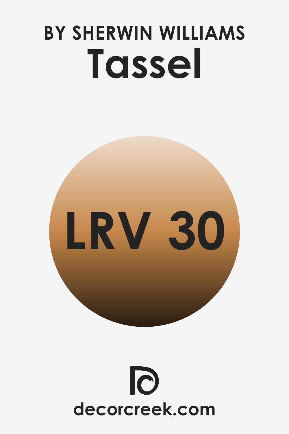
What is the LRV of Tassel SW 6369 by Sherwin Williams?
LRV, or Light Reflectance Value, is a measure that tells you how much light a color reflects or absorbs. It’s a percentage on a scale where 0 means the color absorbs all light (which would be pure black), and 100 means it reflects all light (like pure white). The LRV helps you figure out how bright or dark a color will look once it’s on your walls.
Colors with higher LRV numbers will generally make a room feel lighter and more open because they reflect more light. On the other hand, lower LRV values mean a color will absorb more light, often making a room feel cozier or smaller.
For Tassel SW 6369 from Sherwin Williams, with an LRV of 30.24, the color is likely in the medium to darker range. This means it will absorb more light than it reflects, which can give a grounded, warm feeling to a room. It will not make a room feel overly bright or airy but will instead offer a more intimate and rich atmosphere. This kind of color can suit rooms where you want a cozy vibe, like a living room or bedroom, providing a soothing backdrop without being too overpowering or dark.
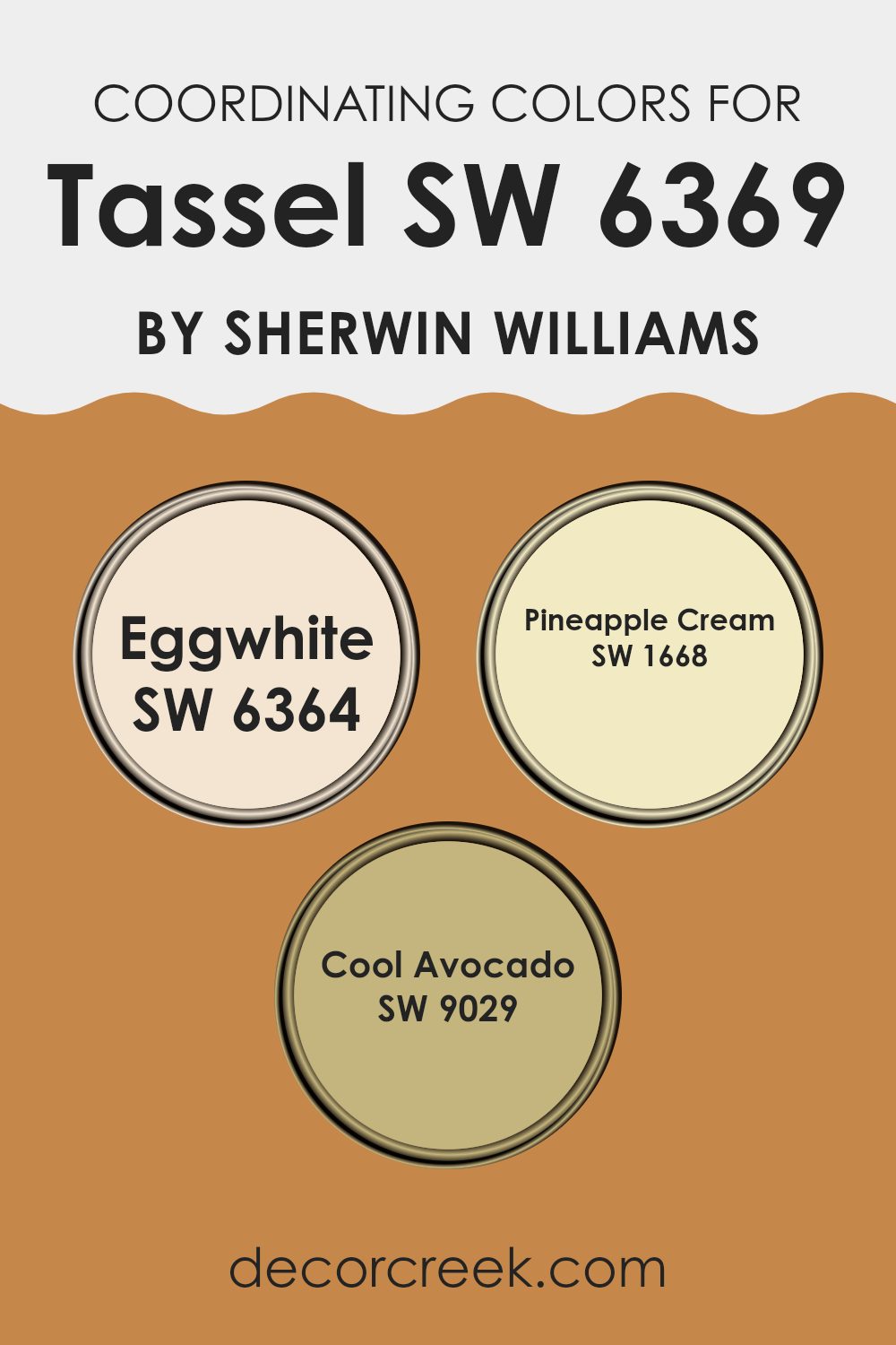
Coordinating Colors of Tassel SW 6369 by Sherwin Williams
Coordinating colors are carefully chosen hues that work well together to create a harmonious look in a room. They have similar undertones or complementary qualities that make them visually appealing when used together. When coordinating colors with Tassel by Sherwin Williams, shades like Eggwhite, Pineapple Cream, and Cool Avocado come into play. Each color brings something unique to the palette, enhancing the overall aesthetic of a room.
Eggwhite is a soft, warm off-white that offers an inviting, neutral backdrop while adding a touch of elegance. It pairs beautifully with the golden tones of Tassel, creating a refined balance of light and warmth. Pineapple Cream is a sunny, cheerful yellow that brings a burst of energy and brightness, complementing the muted gold of Tassel without overpowering it.
It’s perfect for adding a touch of optimism and freshness to the room. Cool Avocado introduces a gentle, earthy green that rounds out the trio, offering a sense of calm and grounding to the overall color scheme. Together, these colors create a well-balanced and inviting environment with layers of warmth, cheer, and serenity.
You can see recommended paint colors below:
- SW 6364 Eggwhite
- SW 1668 Pineapple Cream
- SW 9029 Cool Avocado
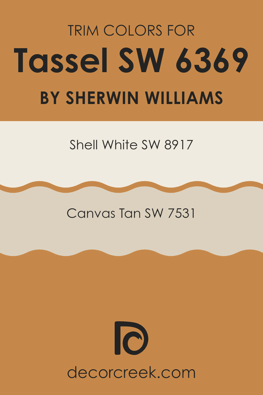
What are the Trim colors of Tassel SW 6369 by Sherwin Williams?
Trim colors are the shades used to paint the edges and details of rooms, such as baseboards, door frames, and window sills. They are important because they can either blend with the wall color for a seamless look or provide a contrasting accent that draws attention to architectural details.
For a color like Tassel SW 6369 by Sherwin-Williams, which is a warm, earthy tone, choosing the right trim colors can help enhance the overall feel of the room. Trim colors like Shell White and Canvas Tan can add dimension and interest without overpowering the main wall color.
Shell White SW 8917 is a soft, pale shade that adds a subtle touch of brightness that can make the edges of a room feel polished and clean. Its lightness provides a gentle contrast against the warmth of Tassel, highlighting details without standing out too starkly. On the other hand, Canvas Tan SW 7531 is a cozy, neutral hue that complements the warmth of Tassel, offering a harmonious, cohesive look to the room. Both colors work to highlight the structure of a room and ensure the main color, Tassel, shines as the focal point.
You can see recommended paint colors below:
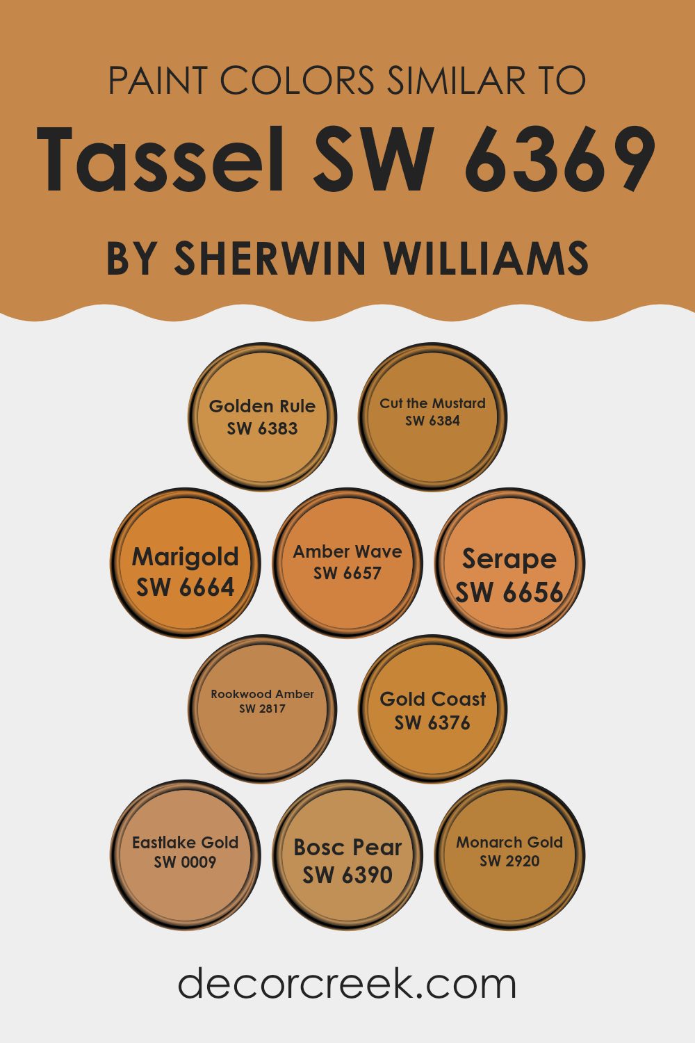
Colors Similar to Tassel SW 6369 by Sherwin Williams
Similar colors play a crucial role in design and decoration, helping to create harmony and balance in a room. These colors are often chosen for their ability to work well together without clashing, offering a cohesive visual effect that can make a room feel more inviting and comfortable. The colors related to Tassel by Sherwin Williams provide an excellent illustration of this concept. Each color, while distinct, shares a warm, golden undertone that ties them together, making them adaptable choices for any design project.
Golden Rule is a warm and inviting shade with a rich, honey-like glow. Cut the Mustard offers a bolder, mustard yellow hue that can add a touch of playfulness to a room. Marigold brings in a bright, sunflower yellow tone that radiates warmth and cheerfulness. Amber Wave is a softer, muted amber that can create a calming effect.
Serape presents a deeper, burnt orange shade, perfect for adding depth and richness. Rookwood Amber delivers a classic amber look that feels classic. Gold Coast and Eastlake Gold both offer variations of radiant gold, adding a touch of elegance, while Bosc Pear displays a soft, greenish-yellow that adds a natural element.
Lastly, Monarch Gold shines with a regal touch, offering a deeper golden hue. Together, these colors create a palette that can bring warmth and unity to any room.
You can see recommended paint colors below:
- SW 6383 Golden Rule
- SW 6384 Cut the Mustard
- SW 6664 Marigold
- SW 6657 Amber Wave
- SW 6656 Serape
- SW 2817 Rookwood Amber
- SW 6376 Gold Coast
- SW 0009 Eastlake Gold
- SW 6390 Bosc Pear
- SW 2920 Monarch Gold
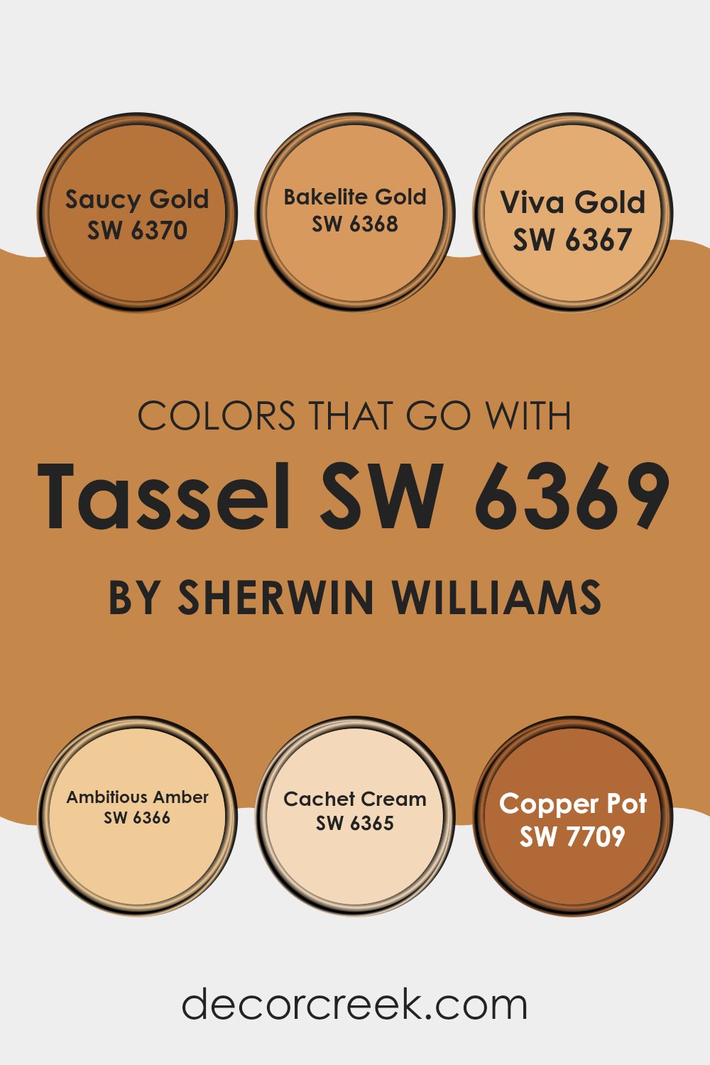
Colors that Go With Tassel SW 6369 by Sherwin Williams
Colors that go with Tassel SW 6369 by Sherwin Williams are important because they enhance the warm and inviting atmosphere created by the main color. These complementary colors add depth and personality to a room, making it feel more dynamic and complete.
SW 6370 – Saucy Gold is a bold and lively shade that adds a vibrant touch, perfect for bringing energy into a room. SW 6368 – Bakelite Gold, with its rich golden hue, exudes a sense of warmth and opulence, perfectly complementing Tassel’s golden undertones. SW 6367 – Viva Gold is a bright, sunny color that brings a cheerful vibe, making any room feel more lively and welcoming.
SW 6366 – Ambitious Amber, a rich amber shade, adds a layer of sophistication and pairs beautifully with the warmth of Tassel. For a softer touch, SW 6365 – Cachet Cream provides a gentle, creamy hue that balances the deeper, richer colors, offering a soft contrast that lightens up the room. Lastly, SW 7709 – Copper Pot adds a touch of earthy richness with its deep, warm tones, grounding the palette and adding a sense of coziness. Together, these colors create a harmonious blend that enhances the beauty and richness of Tassel, making any room feel more complete and inviting.
You can see recommended paint colors below:
- SW 6370 Saucy Gold
- SW 6368 Bakelite Gold
- SW 6367 Viva Gold
- SW 6366 Ambitious Amber
- SW 6365 Cachet Cream
- SW 7709 Copper Pot
How to Use Tassel SW 6369 by Sherwin Williams In Your Home?
Tassel SW 6369 by Sherwin Williams is a warm, earthy color often described as a light brown or taupe with subtle undertones. It’s an adaptable paint choice that can add a cozy feel to any room. One can use Tassel in the living room to create a welcoming atmosphere. It pairs well with natural materials like wood and stone, making it suitable for rustic or modern designs.
In the bedroom, Tassel can help create a calming environment, especially when combined with soft textiles in neutral tones. It can also be used in the kitchen, offering a clean look that complements white cabinetry and stainless steel appliances.
For those looking to refresh their home office, Tassel’s neutral shade promotes focus and productivity without being distracting. Additionally, it can be an excellent backdrop in a hallway or entryway, adding warmth as people enter the home. Overall, Tassel SW 6369 is a practical choice for various rooms in a home.
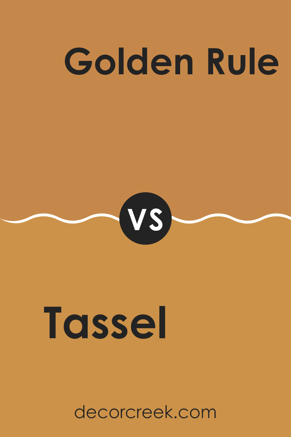
Tassel SW 6369 by Sherwin Williams vs Golden Rule SW 6383 by Sherwin Williams
Tassel SW 6369 and Golden Rule SW 6383, both by Sherwin Williams, are warm, inviting colors that can add comfort to a room. Tassel is a soft, muted orange with a hint of earthiness, perfect for creating a cozy atmosphere. It’s gentle and subtle, making it suitable for living rooms or bedrooms where you want to relax.
On the other hand, Golden Rule is a brighter, sunnier yellow with a richer tone. It brings energy and warmth and can brighten up a room, making it feel more lively and cheerful. This color works well in kitchens or dining areas where you want a bit more vibrancy and positivity.
Both colors work beautifully in areas that need a touch of warmth, but Tassel offers a more subdued, calming presence, while Golden Rule adds a splash of sunshine and energy. They each have their own unique way of enhancing a room’s ambiance.
You can see recommended paint color below:
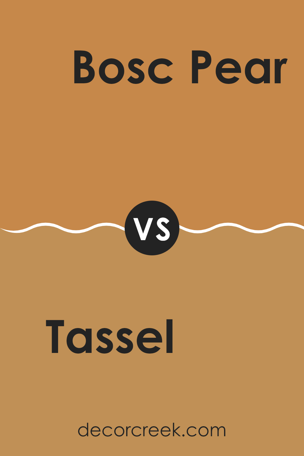
Tassel SW 6369 by Sherwin Williams vs Bosc Pear SW 6390 by Sherwin Williams
Tassel SW 6369 and Bosc Pear SW 6390 by Sherwin Williams are warm, inviting colors that offer a distinct feel. Tassel is a soft, muted golden hue that brings warmth and coziness into a room. It has a gentle, sunlit quality that makes areas feel welcoming and relaxed.
In comparison, Bosc Pear is a slightly deeper, more intense shade with hints of mustard and green undertones. It offers a richer look and can make a bold statement, adding a touch of vivacity and energy to a room.
While both colors are warm and earthy, Tassel is more muted and subtle, ideal for creating a soothing atmosphere. Bosc Pear, on the other hand, is vibrant and can stand out more, making it well-suited for accent walls or areas where you want to draw attention. Both colors work well together or individually, depending on the desired mood and aesthetic of the room.
You can see recommended paint color below:
- SW 6390 Bosc Pear
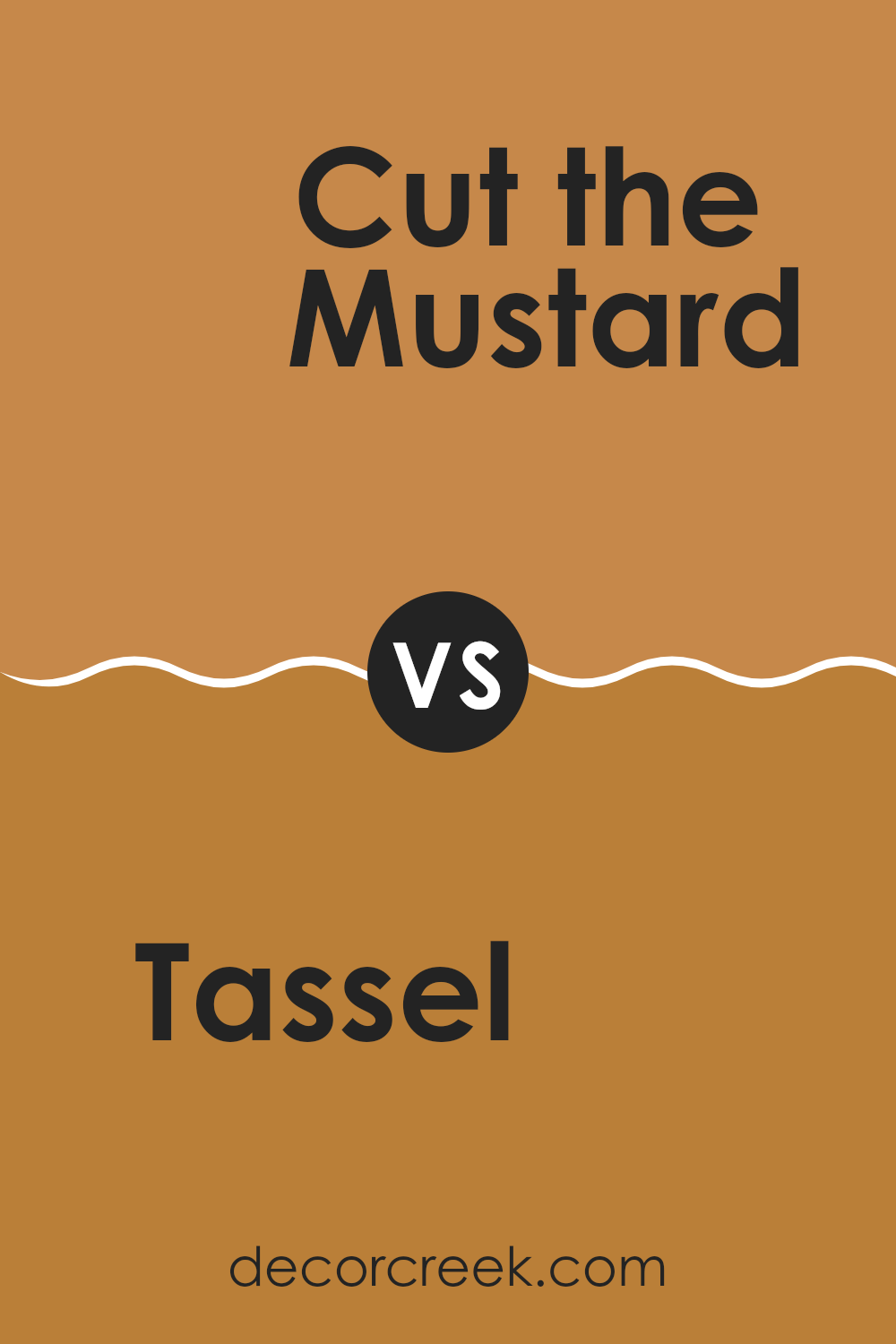
Tassel SW 6369 by Sherwin Williams vs Cut the Mustard SW 6384 by Sherwin Williams
Tassel SW 6369 and Cut the Mustard SW 6384 are two rich, warm colors by Sherwin Williams, each with its own charm. Tassel SW 6369 is a soft, golden beige. It gives off a cozy and relaxed vibe, perfect for areas where you want to feel comfortable and grounded.
Cut the Mustard SW 6384, on the other hand, is a bold, deep yellow. This color is more daring and vibrant, adding energy to a room. While Tassel is subtle and can blend easily with many other colors, Cut the Mustard stands out and makes a bold statement.
Both colors bring warmth, but Cut the Mustard has a more lively essence, while Tassel is understated and classic. Choosing between them depends on whether you want a room to feel more energetic or calm and inviting. Both colors can significantly affect the mood of a room.
You can see recommended paint color below:
Tassel SW 6369 by Sherwin Williams vs Marigold SW 6664 by Sherwin Williams
Tassel SW 6369 and Marigold SW 6664 are two warm, welcoming colors by Sherwin Williams. Tassel is a soft, muted yellow with a hint of beige, giving it a cozy, inviting feel. It’s like the color of a soft, warm blanket you might wrap yourself in on a chilly day.
On the other hand, Marigold is a brighter, more vibrant yellow with a hint of orange. It’s like the color of sunny marigold flowers in full bloom. While Tassel offers a more subtle and relaxed vibe, Marigold brings energy and cheerfulness to a room.
If you want a room that feels calm and comforting, Tassel might be your go-to. But if you’re looking to energize a room and make it feel lively, Marigold is the better choice. Both colors add warmth and can make a room feel more inviting, each in their own way.
You can see recommended paint color below:
- SW 6664 Marigold
Tassel SW 6369 by Sherwin Williams vs Gold Coast SW 6376 by Sherwin Williams
Tassel SW 6369 and Gold Coast SW 6376 are two warm, earthy tones from Sherwin Williams, but they each bring a unique feel to a room. Tassel is a rich golden hue that feels cozy and inviting. It’s an adaptable color that works well in living rooms and dining areas, offering a snug, welcoming ambience.
On the other hand, Gold Coast is a lighter, softer shade of gold. It has a sunny, cheerful vibe that can brighten up any room. Gold Coast might be a better choice for areas where you want a light, airy feel, such as kitchens or bathrooms.
While Tassel leans towards a deeper, more muted gold, Gold Coast has a brighter undertone, lending itself to a more vibrant atmosphere. Both colors are warm and comforting, but Tassel offers depth and richness, while Gold Coast provides lightness and cheer.
You can see recommended paint color below:
- SW 6376 Gold Coast
Tassel SW 6369 by Sherwin Williams vs Amber Wave SW 6657 by Sherwin Williams
Tassel SW 6369 and Amber Wave SW 6657 by Sherwin Williams are both warm, inviting colors, but they evoke slightly different feelings. Tassel SW 6369 is a soft, golden-yellow shade with a hint of warmth, making it feel comforting and cheerful. It can brighten up a room without being too overpowering and works well in living rooms or kitchens where a sense of coziness and friendliness is desired.
Amber Wave SW 6657, on the other hand, is a richer, deeper yellow with an amber undertone, giving it a more intense, earthy feel. This color can add a touch of richness and depth to a room, making it suitable for accent walls or areas where a bit more drama is needed.
In sum, Tassel is lighter and more subtle, while Amber Wave is bolder and more saturated. Both can create warm atmospheres but cater to slightly different moods and styles.
You can see recommended paint color below:
- SW 6657 Amber Wave
Tassel SW 6369 by Sherwin Williams vs Serape SW 6656 by Sherwin Williams
Tassel (SW 6369) and Serape (SW 6656) by Sherwin Williams are both warm colors but offer different vibes. Tassel is a soft, muted shade that brings a sense of warmth and comfort to a room. It has a gentle, golden undertone that makes areas feel cozy and inviting.
On the other hand, Serape is a brighter and more vibrant shade with a cheerful orange hue. This color adds energy and liveliness to any room, making it perfect for rooms where you want to feel uplifted and joyful.
While both colors can add warmth, Tassel is more subdued and calming, ideal for creating calm environments like bedrooms or living rooms. Serape, with its bold and sunny character, suits areas like kitchens or playrooms where you want to encourage activity and positivity. Both colors can complement earthy tones and natural materials, but Tassel tends to blend in gently while Serape stands out as a statement.
You can see recommended paint color below:
- SW 6656 Serape
Tassel SW 6369 by Sherwin Williams vs Eastlake Gold SW 0009 by Sherwin Williams
Tassel (SW 6369) and Eastlake Gold (SW 0009) are two warm, inviting colors from Sherwin Williams, but they have distinct characteristics. Tassel is a soft, muted yellow that brings a gentle warmth to a room, making it feel cozy and welcoming. It’s an adaptable color that fits well in living rooms or kitchens where a relaxed atmosphere is desired.
Eastlake Gold, on the other hand, is a richer, deeper gold that commands more attention. It adds a sense of history and richness to interiors. This color can work well in dining rooms or study areas, providing a touch of traditional elegance.
While both colors are warm and inviting, Tassel is more subdued, offering a subtle background warmth, whereas Eastlake Gold stands out more and gives a room a strong character. Depending on the mood you want to create, Tassel is great for a laid-back feel, while Eastlake Gold suits areas where a more classic look is desired.
You can see recommended paint color below:
- SW 0009 Eastlake Gold
Tassel SW 6369 by Sherwin Williams vs Monarch Gold SW 2920 by Sherwin Williams
Tassel SW 6369 by Sherwin Williams is a warm, golden yellow that brings a sense of brightness and cheerfulness to a room. It feels like a ray of sunshine, adding warmth and energy to a room without being overpowering. This color works well in rooms where you want to create a welcoming and cozy atmosphere, like kitchens or living rooms.
Monarch Gold SW 2920, on the other hand, is a richer, deeper gold. It carries a sense of elegance and luxury. While it also adds warmth, its slightly muted tone makes it more refined. Monarch Gold is perfect for adding a touch of opulence to a room, making it ideal for accents or feature walls.
Both colors share a warm, sunny vibe, but Tassel is more vibrant and lively, while Monarch Gold brings a touch of class and richness. Combining them can create a harmonious and inviting environment.
You can see recommended paint color below:
- SW 2920 Monarch Gold
Tassel SW 6369 by Sherwin Williams vs Rookwood Amber SW 2817 by Sherwin Williams
Tassel SW 6369 and Rookwood Amber SW 2817 by Sherwin Williams are warm, inviting colors, yet they have distinct personalities. Tassel is a soft, muted yellow with a gentle warmth that feels sunny and light.
It’s a great choice for creating a cheerful atmosphere in a room without being overpowering. On the other hand, Rookwood Amber is a deeper, richer golden hue. It carries a more dramatic presence, adding a sense of coziness and depth to areas.
While both colors are warm, Tassel brings a subtle brightness perfect for a fresh, airy feel, whereas Rookwood Amber offers a bold, comforting vibe that can make a room feel more intimate and grounded. Whether you’re after a light touch or a rich statement, these colors each bring their own unique charm to a room.
You can see recommended paint color below:
- SW 2817 Rookwood Amber
In wrapping up my thoughts on SW 6369 Tassel by Sherwin Williams, I find this color to be truly interesting. It’s a warm brown shade that makes a room feel cozy and inviting. Imagine a mug of hot chocolate on a chilly day—that’s the feeling Tassel brings.
If you’re looking to make your room feel friendly and calm, this color works well. It pairs nicely with lighter colors like soft cream or with darker hues if you want a bit of a bolder look. Tassel can be a great choice for living rooms where families gather and share stories or for a bedroom where you want to feel snug and comfortable.
What’s really nice about Tassel is its adaptability. It can look modern or traditional depending on what you put it with. You might want to combine it with green plants or wooden furniture to create a natural vibe in the house.
Overall, SW 6369 Tassel is a warm, reliable color choice that can help make any room in your home feel welcoming and warm. It’s like adding a hug to your walls, creating a room where you can relax and enjoy time with friends and family.
Ever wished paint sampling was as easy as sticking a sticker? Guess what? Now it is! Discover Samplize's unique Peel & Stick samples.
Get paint samples

