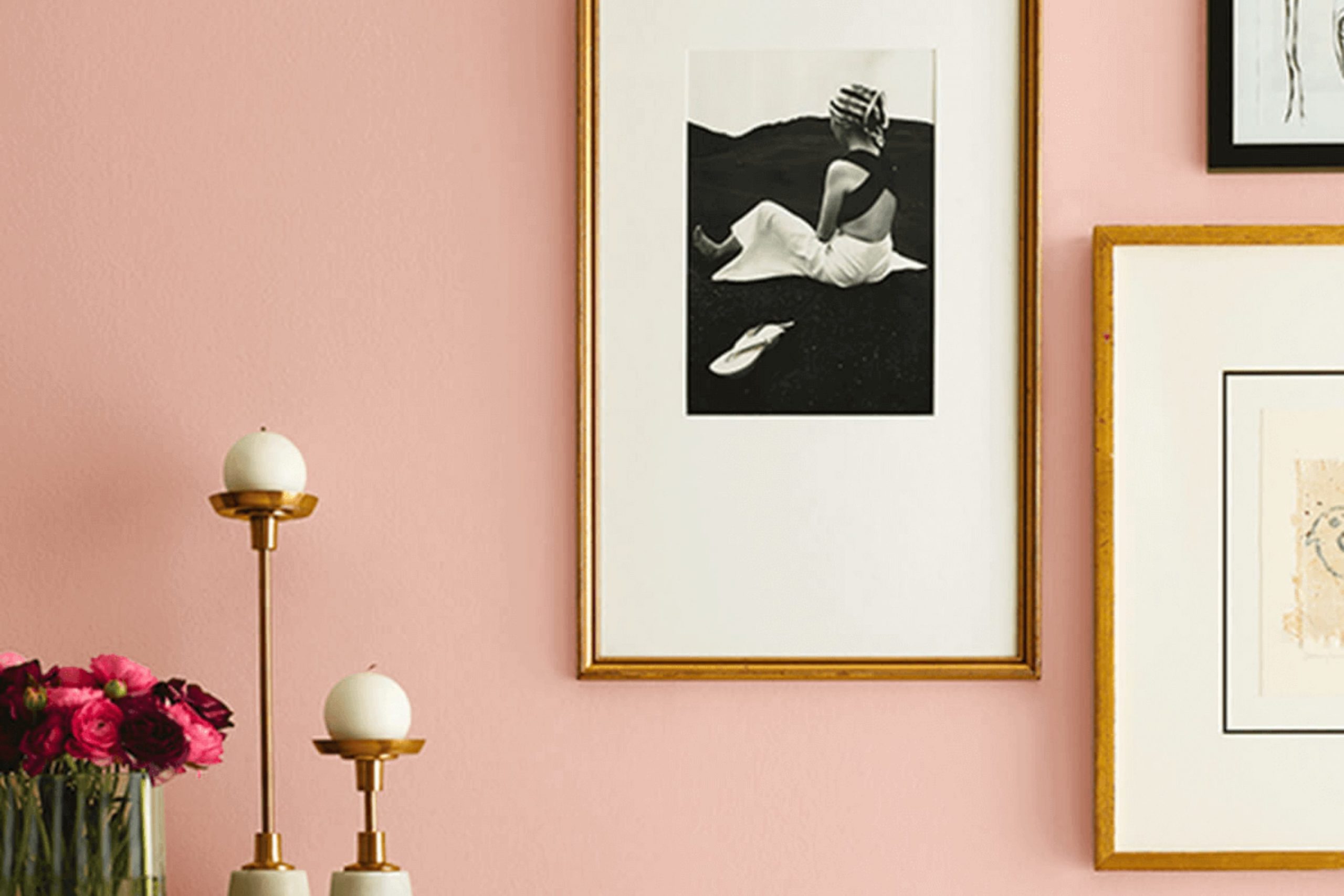
When you first glance at SW 6331 Smoky Salmon by Sherwin Williams, it’s clear that this isn’t just any ordinary color. It’s a unique blend that strikes a beautiful balance between a soft pink and a warm coral, giving off a feeling of warmth and comfort. If you’re thinking about reinvigorating your living area, this shade can offer a fresh but cozy vibe, making any room feel more inviting without being excessive.
The adaptability of Smoky Salmon is another aspect worth mentioning. Whether you’re painting a whole room or just an accent wall, this color has the potential to work wonders in various areas. It pairs well with both light neutrals and dark, rich colors, offering numerous decorating possibilities. From contemporary living rooms to charming kitchens, Smoky Salmon adapts beautifully, bringing a subtle yet impactful presence.
Adding this color to your home could be the perfect way to make your interior feel both modern and lasting.
It’s a choice worth considering for anyone wanting to bring a new energy into their living environment without opting for something too bold or out of the ordinary.
What Color Is Smoky Salmon SW 6331 by Sherwin Williams?
Smoky Salmon is a warm, inviting color that conjures the gentle hues of a sunset. This muted orange shade has an understated rosy tint that makes it very comforting and homely. It’s perfect for creating a cozy atmosphere in any room.
This color works wonderfully in traditional or rustic interior styles, lending itself well to areas that emphasize comfort like living rooms or bedrooms. Its earthy quality also complements bohemian décors, where it can add a soft pop of color among more neutral palettes.
When thinking about materials, Smoky Salmon pairs well with natural wood, whether it’s a light pine or a darker walnut. The warmth of wood enhances the coziness of the color. Soft textures such as woolen throws or cotton pillows also work nicely, adding layers of softness that make an area feel more welcoming. In terms of finishes, both matte and satin work well with this shade, helping to keep the overall look warm and inviting.
Accessorizing a room with Smoky Salmon colored walls can be fun too – consider touches like terracotta pots, leather accents, or even brass fixtures for a little shimmer. All these elements help to create a balanced, inviting area where this beautiful color can really shine.
Is Smoky Salmon SW 6331 by Sherwin Williams Warm or Cool color?
Smoky Salmon by Sherwin Williams is a warm, inviting color that brings a cozy, comfortable feeling to any room. This particular shade is a mix of orange and pink, which creates a soft, welcoming hue that works well in living areas, kitchens, or bedrooms. Since it’s not overly bright, it pairs well with both light and dark furniture, allowing for adaptable design options.
When used in small areas, Smoky Salmon can make the area feel more intimate and cheerful. In larger areas, it adds a touch of warmth to the expansive area, making it feel more connected. This color is especially good for areas where you spend a lot of time with family or friends, as it fosters a friendly, relaxed atmosphere.
Additionally, Smoky Salmon can complement natural wood tones, whites, and greys, making it easy to integrate into existing decor or to build a new palette around. It’s perfect for anyone looking to add a gentle splash of color without being excessive.
Undertones of Smoky Salmon SW 6331 by Sherwin Williams
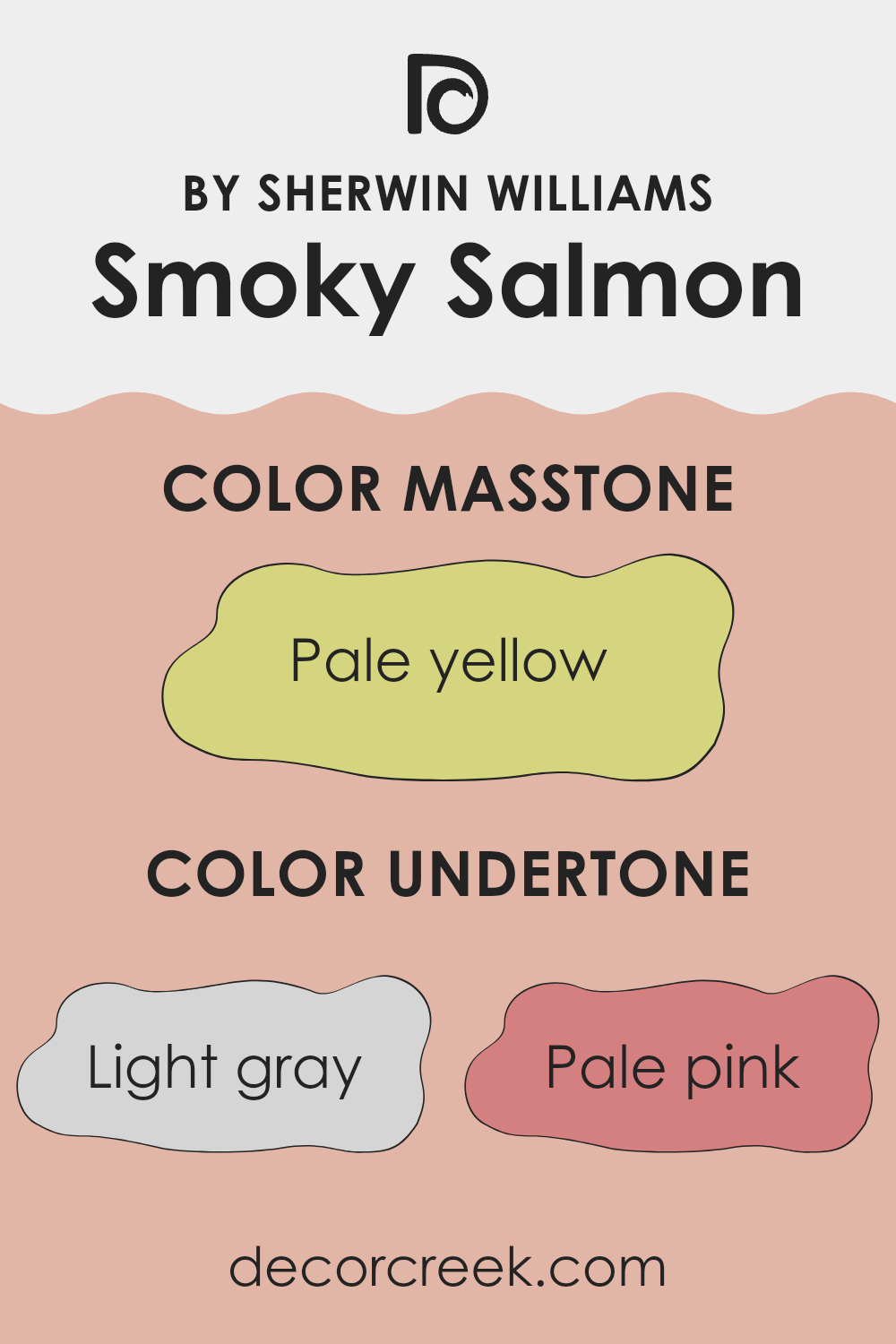
Smoky Salmon by Sherwin Williams is a unique color that can look different depending on the light and surroundings due to its diverse undertones. Undertones are the subtle colors that lie beneath the main color and can influence how we perceive it. Smoky Salmon’s undertones include light gray, pale pink, light purple, mint, light blue, grey, lilac, yellow, orange, light green, and olive. These undertones can make the color appear warmer or cooler and can shift how it complements other colors in a room.
For example, in a room with plenty of natural light, Smoky Salmon might highlight its pale pink or light purple undertones, giving the area a soft and welcoming feel. In artificial light, the grey or light blue undertones might become more prominent, making the wall color appear cooler. This adaptable nature makes Smoky Salmon an interesting choice for interior walls, as it can adjust to different settings and decor styles, playing off the colors of furniture and accessories.
In practice, when painting your walls with Smoky Salmon, consider the room’s lighting and other colors in the decor. Its rich blend of undertones can either complement your existing interior elements or provide a subtle contrast, enhancing the overall aesthetic of the area. This flexible quality is what makes this color so useful in interior design, accommodating various styles and tastes while adding depth and interest to the room.
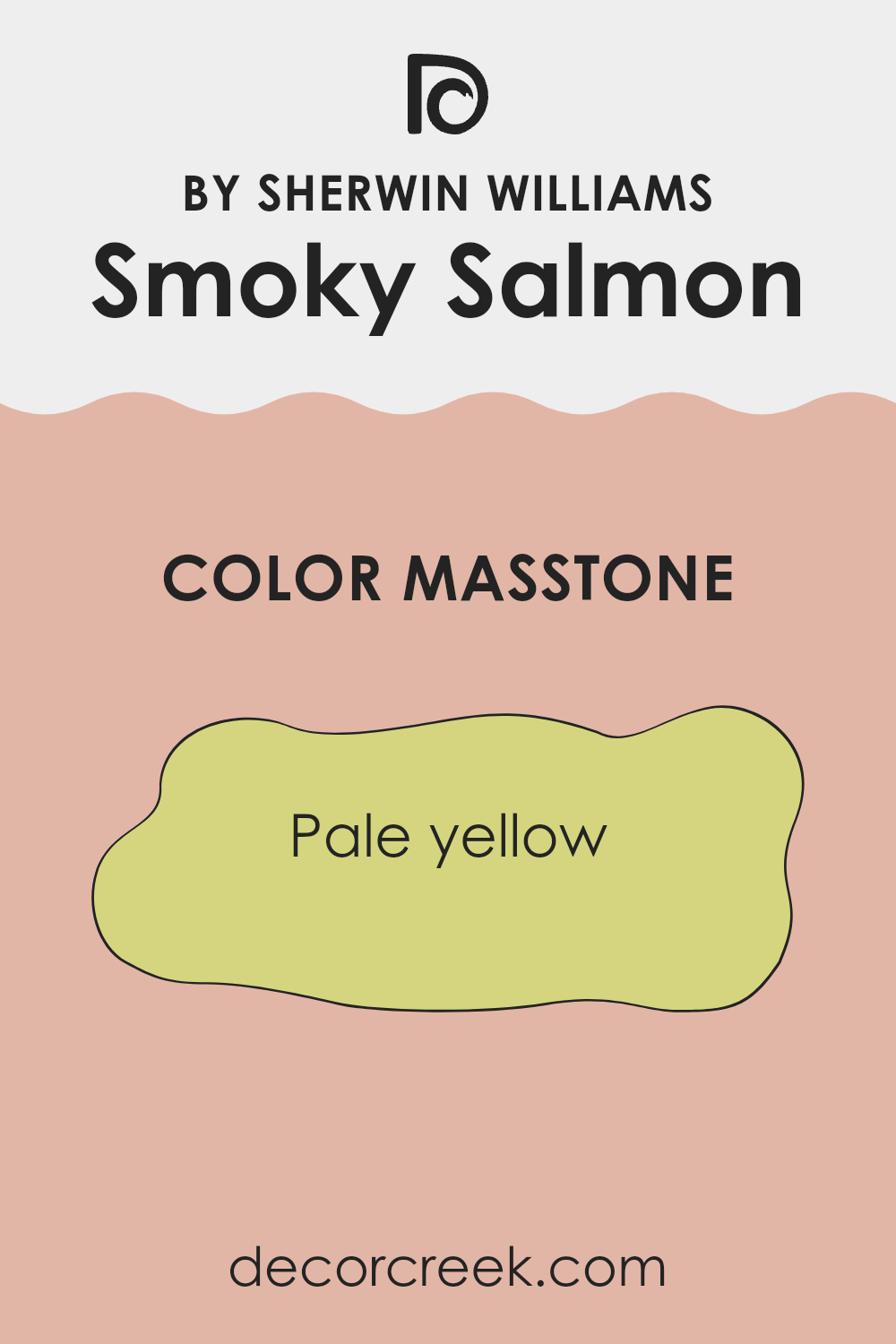
What is the Masstone of the Smoky Salmon SW 6331 by Sherwin Williams?
Smoky Salmon SW 6331 from Sherwin Williams has a masstone that presents as pale yellow, specifically a hue close to #D5D580. This subtle yellow shade can influence the ambience of a home in various positive ways.
When applied to walls, it brings in a light, airy feel that makes areas appear larger and more open. Because the tone is soft and not overly bright, it provides a warm backdrop that is easy on the eyes, making it ideal for living areas and bedrooms where comfort is key.
This pale yellow color works well in both natural and artificial lighting. In daylight, it takes on a lively, fresh appearance, while under indoor lighting, it maintains its warm glow, adding coziness to the room. Additionally, it pairs beautifully with numerous other colors, allowing for adaptable decor options. It works particularly well with whites, greys, and even darker shades for a contrast that is still harmonious.
decorcreek.com
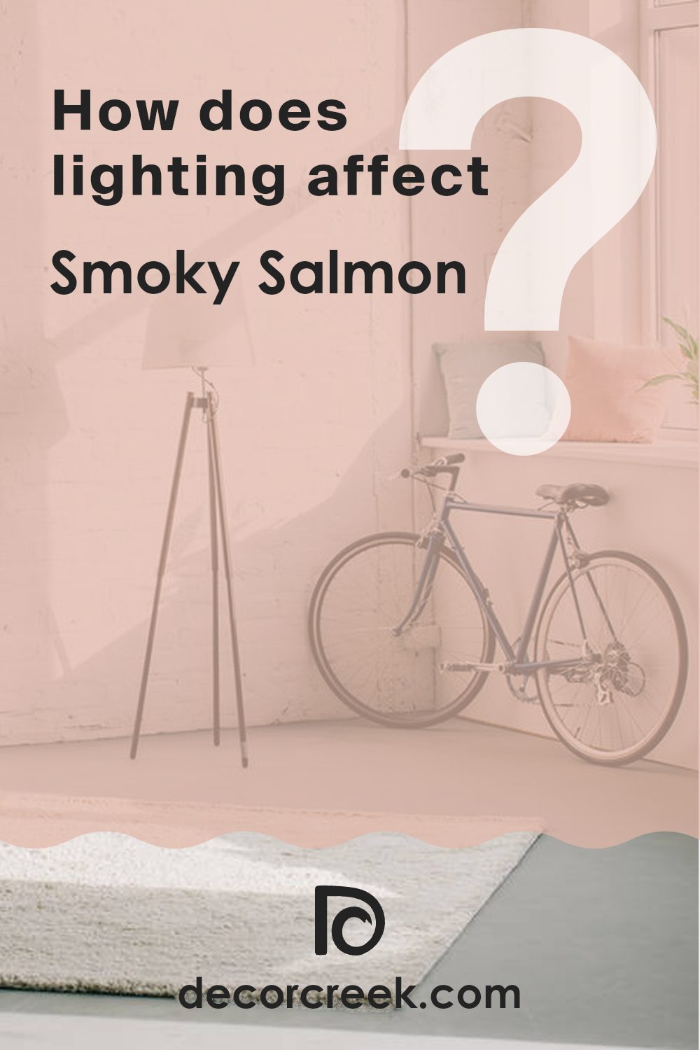
How Does Lighting Affect Smoky Salmon SW 6331 by Sherwin Williams?
Lighting plays a crucial role in how colors appear in different environments. The way light interacts with color can significantly change its appearance, affecting both its intensity and hue. The color in question today is from Sherwin Williams – a warm shade with hints of pink and orange.
In artificial light, this smoky salmon color tends to look softer and warmer. Artificial light, especially if it has a yellow tint commonly found in incandescent bulbs, can make this color seem more muted and cozy. It’s an excellent choice for rooms where you want a welcoming and comfortable atmosphere, like living rooms or dining areas in the evenings.
In natural light, however, the true vibrancy of the color can shine through. Under sunlight, the color appears brighter and more vivid. The quality of daylight can bring out the pink and orange undertones, making the color feel fresher and more dynamic.
Room orientation also affects how this color is perceived:
- North-faced rooms don’t receive direct sunlight, which results in a cooler light. This can make the smoky salmon color appear slightly more subdued and less vibrant. It’s still warm, but with a softer tone that could be ideal for a calm and soothing area.
- South-faced rooms receive a large amount of direct sunlight, enhancing the color’s warmth and making it pop. The vibrant pink and orange hues become more pronounced, creating a lively and cheerful area.
- East-faced rooms get sunlight in the morning. This morning light is generally softer and bluer, which means the color will appear brighter early in the day but fade into a softer tone as the day progresses.
- West-faced rooms experience evening light, which is warm and golden. This enhances the warm tones of the color, making it appear richer and more intense during sunset hours.
Overall, the appearance of this smoky salmon hue can shift noticeably based on the lighting conditions, bringing an adaptable character to any area depending on its orientation and the type of light it receives.
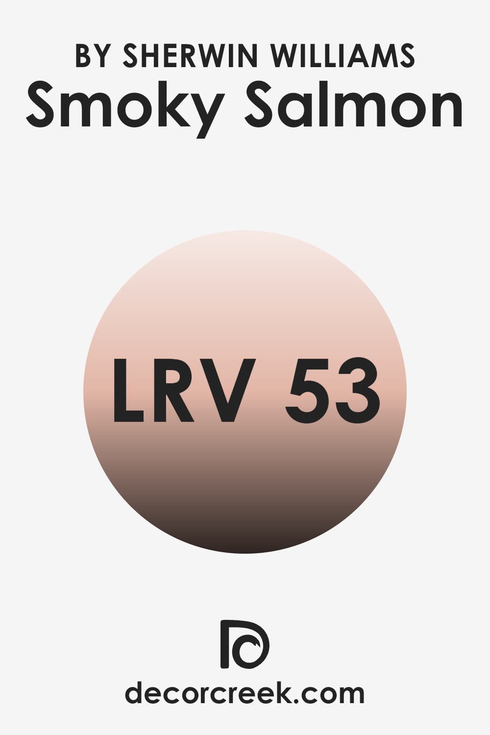
What is the LRV of Smoky Salmon SW 6331 by Sherwin Williams?
LRV stands for Light Reflectance Value, which is a measure of the percentage of light a paint color reflects back into a room. This measurement ranges from 1 to 99, where higher values indicate that the color reflects more light back into the area, making the room appear brighter. LRV is critical for choosing the right paint color because it helps determine how light or dark a color will look on your walls under various lighting conditions. It is especially useful when deciding on colors for smaller or darker areas where maximizing light is essential.
In the case of the color with an LRV of 52.515, such as the one mentioned, it stands in the middle range of the LRV scale. This means it reflects a moderate amount of light but also absorbs a fair portion. In practical terms, this middle-range LRV allows the color to bring warmth to a room without making the area feel too dark.
It’s an adaptable choice that can work well in various settings, not too bright to overpower a room and not too dark to make it feel confined. Choosing a paint color like this can create a balanced ambiance in most home settings, combining a sense of warmth with a welcoming atmosphere.
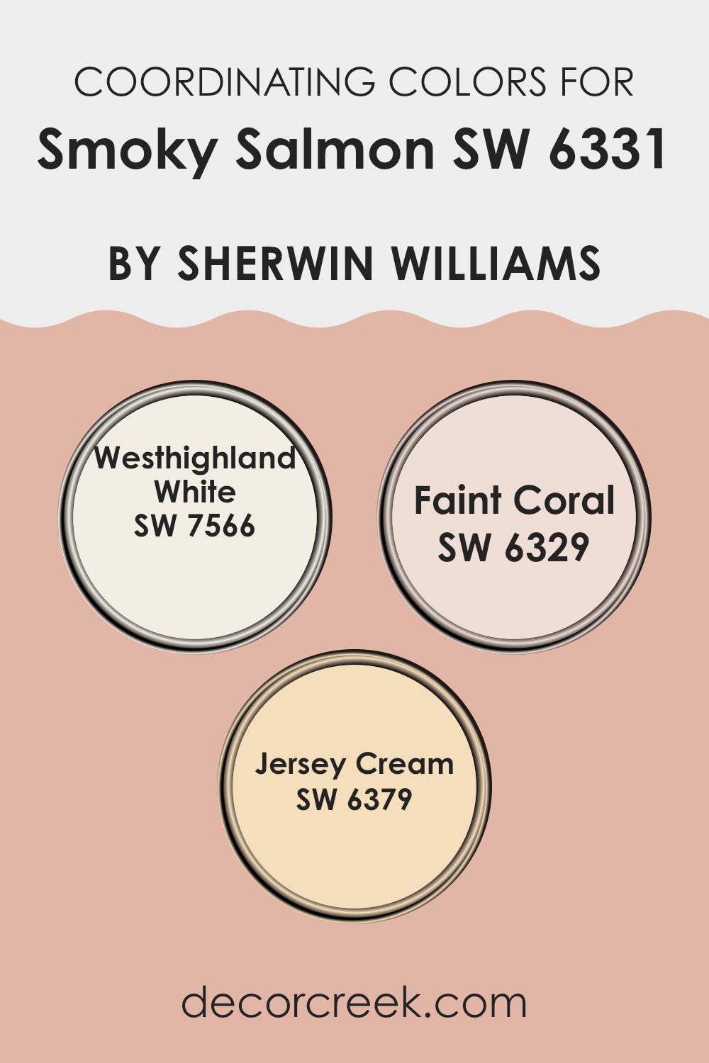
Coordinating Colors of Smoky Salmon SW 6331 by Sherwin Williams
Coordinating colors are selected to harmonize within a color scheme, enhancing the appeal and balance of the environment. For Smoky Salmon by Sherwin Williams, an inviting warm pink, the coordinating colors are chosen to create a cohesive look. These colors include Westhighland White, Faint Coral, and Jersey Cream, each bringing their own unique touch while maintaining a seamless color flow throughout the area. This approach ensures that all elements in a room work together, contributing to a unified and aesthetically pleasing atmosphere.
Westhighland White is a soft and clean shade, often used to add a fresh, bright quality to areas without being too stark. It pairs beautifully with Smoky Salmon, providing a gentle contrast that highlights the richer tones of the pink.
Faint Coral is a subtly lighter pink than Smoky Salmon, offering a harmonious blend that enriches the overall warmth of an area. Jersey Cream, on the other hand, introduces a creamy, yellow-toned backdrop that works well to soften the intensity of bolder colors, ensuring the decor is inviting and not too saturated. Together, these colors create a balanced and appealing palette that enhances the charm and warmth of any living area.
You can see recommended paint colors below:
- SW 7566 Westhighland White
- SW 6329 Faint Coral
- SW 6379 Jersey Cream
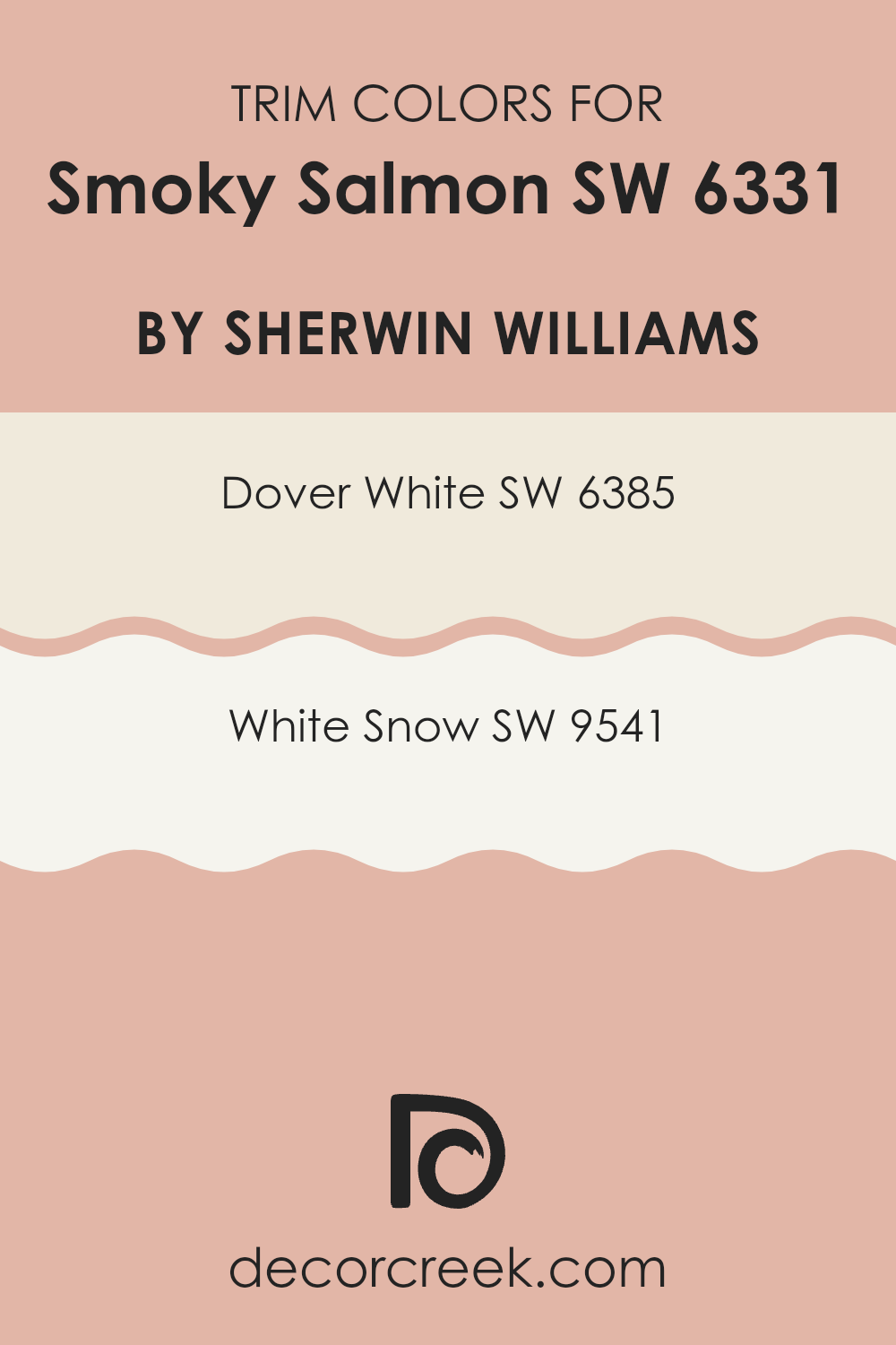
What are the Trim colors of Smoky Salmon SW 6331 by Sherwin Williams?
Trim colors are used to highlight and accentuate the architectural features of a room such as baseboards, moldings, window and door frames, and can often add a touch of contrast or complement the main wall color for added visual appeal. Choosing the right trim color is crucial because it frames the wall and helps define the area, enhancing the overall aesthetic of a room. When paired with a color like Smoky Salmon by Sherwin Williams, which is a warm, inviting shade, the right trim color can make the walls really pop and give a neat and finished look to any area.
For Smoky Salmon, using Dover White (SW 6385) as a trim color offers a subtle contrast that is gentle yet effective in bringing out the richness of the salmon hue. Dover White has a creamy undertone that meshes beautifully with warmer tones, promoting a cozy and welcoming atmosphere.
Another great option for trim is White Snow (SW 9541), which presents a brighter and crisper edge to the walls, giving a fresh and clean appearance that distinctly separates the trim from the richer, deeper tones of Smoky Salmon. This color can add a lively spark to the area’s decor without overpowering the primary color scheme.
You can see recommended paint colors below:
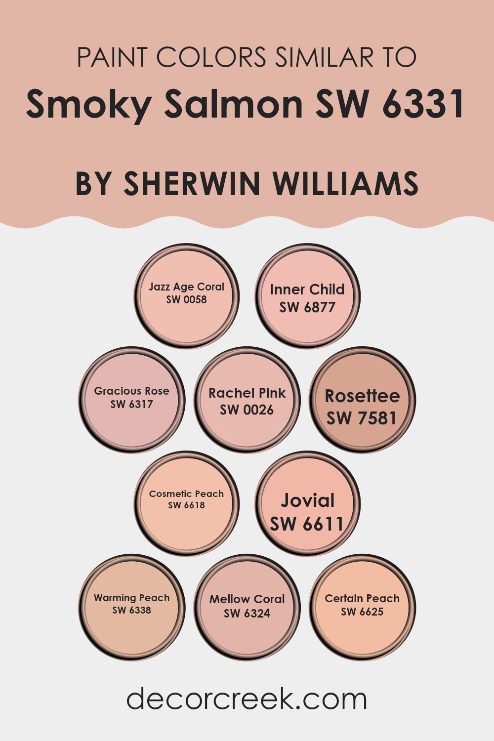
Colors Similar to Smoky Salmon SW 6331 by Sherwin Williams
Choosing similar colors when decorating can create a cohesive and harmonious look in your area, which is pleasing to the eye. It helps various elements in a room tie together seamlessly, making the atmosphere feel unified and coherent.
For example, Smoky Salmon creates a warm, inviting ambiance, and pairing it with colors such as Jazz Age Coral or Inner Child enhances this effect without overpowering the room’s overall aesthetic. Using tones like Gracious Rose or Rachel Pink allows subtle variations that keep the visual interest alive while maintaining a soothing continuity.
Jazz Age Coral is a lively peachy pink that adds a playful but gentle touch, perfect for a vibrant yet soft look. Inner Child is a soft blush tone, lighter and more ethereal, ideal for creating a subtle uplift in mood. Gracious Rose offers a muted, deeper pink, providing a rich backdrop that complements lighter shades. Rachel Pink is a gentle rose hue, ideal for crafting a soft, feminine area.
Rosette adds a slightly richer, berry-infused pink, creating depth and warmth. Cosmetic Peach has a soft, flesh-toned appeal that works brilliantly for creating a neutral, understated elegance. Jovial introduces a cheerful coral that energizes areas without overpowering them. Warming Peach, as the name suggests, adds a cozy, inviting touch, perfect for areas meant for relaxation.
Mellow Coral is subtle yet distinctive, providing a touch of color without dominating the design. Lastly, Certain Peach offers a subdued, almost pastel peach, perfect for contributing to a calming, gentle environment. These variants of Smoky Salmon can be mixed and matched for a nuanced yet cohesive color theme, which makes the area aesthetically pleasant and emotionally comforting.
You can see recommended paint colors below:
- SW 0058 Jazz Age Coral
- SW 6877 Inner Child
- SW 6317 Gracious Rose
- SW 0026 Rachel Pink
- SW 7581 Rosettee
- SW 6618 Cosmetic Peach
- SW 6611 Jovial
- SW 6338 Warming Peach
- SW 6324 Mellow Coral
- SW 6625 Certain Peach
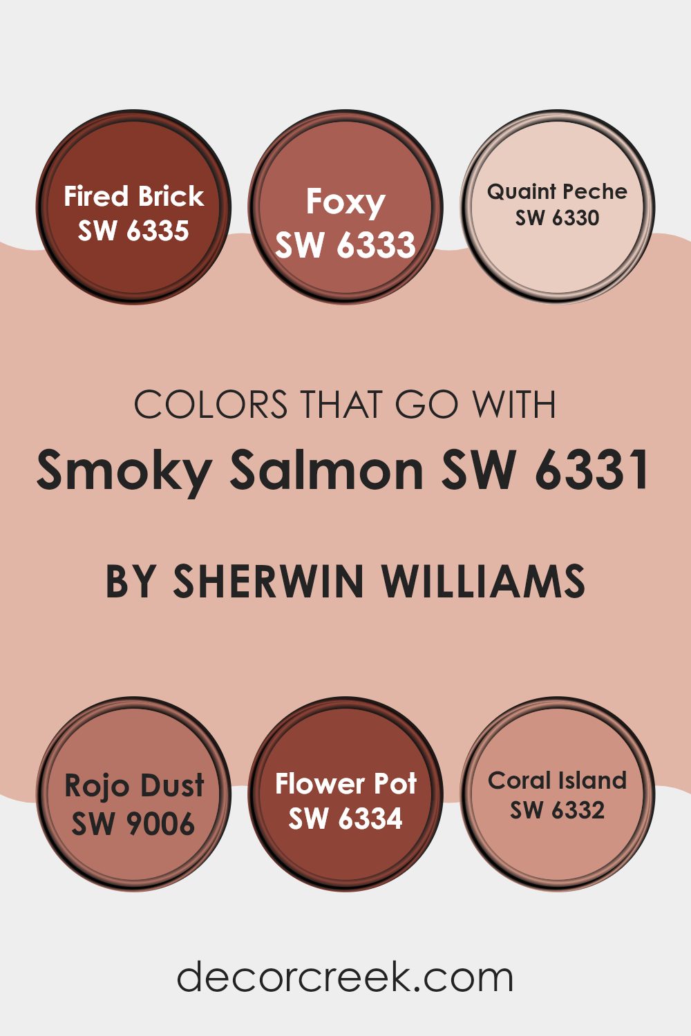
Colors that Go With Smoky Salmon SW 6331 by Sherwin Williams
Choosing complementary colors for Smoky Salmon SW 6331 by Sherwin Williams is crucial as it helps in creating a harmonious and appealing color scheme in any area. These colors are essential because they balance, enhance, or subtly blend with Smoky Salmon, depending on their tone and saturation.
For instance, Fired Brick SW 6335 is a deep, warm red that provides a bold contrast, making Smoky Salmon pop when used together in a room. Foxy SW 6333, being a vibrant reddish-orange, injects energy and could be perfect for accents that need to draw attention without overpowering Smoky Salmon.
Quaint Peche SW 6330 is a soft peach that pairs beautifully with Smoky Salmon, offering a gentle and inviting feel to areas like bedrooms or living rooms where you seek a calm atmosphere. Rojo Dust SW 9006 presents a muted, earthy red tone that works well with the softness of Smoky Salmon, perfect for creating a comfortable and welcoming area.
Flower Pot SW 6334, similar to Fired Brick but with a touch of orange, gives a warm, pleasant contrast that is fantastic for lively areas. Lastly, Coral Island SW 6332 is a lighter, more subdued coral that echoes the qualities of Smoky Salmon, ideal for creating a cohesive look in larger areas or across multiple connecting rooms. These colors, when used thoughtfully, help create settings that are both enjoyable and stylish.
You can see recommended paint colors below:
- SW 6335 Fired Brick
- SW 6333 Foxy
- SW 6330 Quaint Peche
- SW 9006 Rojo Dust
- SW 6334 Flower Pot
- SW 6332 Coral Island
How to Use Smoky Salmon SW 6331 by Sherwin Williams In Your Home?
Smoky Salmon SW 6331 by Sherwin Williams is a rich, warm paint color that adds a cozy, inviting touch to any room. This color blends orange and salmon tones to create a welcoming atmosphere.
If you’re looking to add some warmth to your home, Smoky Salmon is a great choice for living rooms and dining areas where you gather and relax with family or friends. It pairs beautifully with neutral shades like soft whites or grays, allowing for a balanced look. In a bedroom, using this color can help you create a snug, comfortable area, perfect for unwinding after a long day.
You can also use Smoky Salmon in smaller doses, such as on an accent wall or for furniture pieces, to inject some personality into an area without overpowering it with color. Accessories like cushions and curtains in this shade will tie a room’s look together nicely.
Smoky Salmon SW 6331 by Sherwin Williams vs Mellow Coral SW 6324 by Sherwin Williams
The two colors, Smoky Salmon and Mellow Coral, both by Sherwin Williams, have subtle yet distinct differences. Smoky Salmon is a muted pink with a touch of orange, creating a soft and warm hue that gives off a cozy feel. It’s perfect for rooms where you want a gentle pop of color without being excessive.
On the other hand, Mellow Coral is brighter and leans more towards orange than pink, offering a more cheerful and energetic vibe. This makes it great for areas where you want to stimulate activity and liveliness, such as a kitchen or playroom.
Both colors are adaptable, but Smoky Salmon tends to bring a softer, more understated look, while Mellow Coral adds a bit more zest and brightness to an area. Choosing between them would depend on the mood and function you aim to achieve in your room.
You can see recommended paint color below:
- SW 6324 Mellow Coral
Smoky Salmon SW 6331 by Sherwin Williams vs Rosettee SW 7581 by Sherwin Williams
The main color, Smoky Salmon, is a warm, muted shade of pink with a hint of orange, creating a cozy and inviting feel. It’s soft enough to add a gentle ambiance to any room without overpowering other design elements.
On the other hand, Rosettee is a deeper, more pronounced pink with a richer and more traditional rose tone. This makes Rosettee a stronger choice for adding a vibrant pop of color to an area.
While Smoky Salmon is subtle and can blend easily with neutrals and other soft hues, Rosettee stands out more and can be the focal point in a decor scheme. Both colors can work beautifully in various settings, but Smoky Salmon is better for those looking for a lighter, airier feel, and Rosettee suits those who prefer something bolder and more striking.
You can see recommended paint color below:
- SW 7581 Rosettee
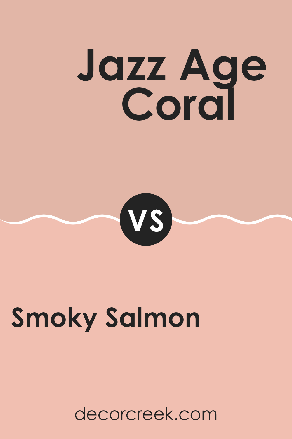
Smoky Salmon SW 6331 by Sherwin Williams vs Jazz Age Coral SW 0058 by Sherwin Williams
Smoky Salmon and Jazz Age Coral are two unique colors from Sherwin-Williams, each offering its own charm. Smoky Salmon is a soft, muted shade with a blend of pink and orange tones that creates a warm, cozy feeling in any room. It’s perfect for areas where you want a gentle, inviting atmosphere.
On the other hand, Jazz Age Coral is a much bolder, vibrant color. It has a lively, playful quality to it, thanks to its deeper coral hues that grab attention. This color is great for adding a splash of energy and personality to an area.
When comparing the two, Smoky Salmon is more understated and adaptable, making it easier to pair with different decor styles and colors. Jazz Age Coral, with its vividness, is likely to be the star of the show and works well in areas designed for creativity and excitement. In essence, your choice between the two depends on what mood or style you’re aiming to achieve in your area.
You can see recommended paint color below:
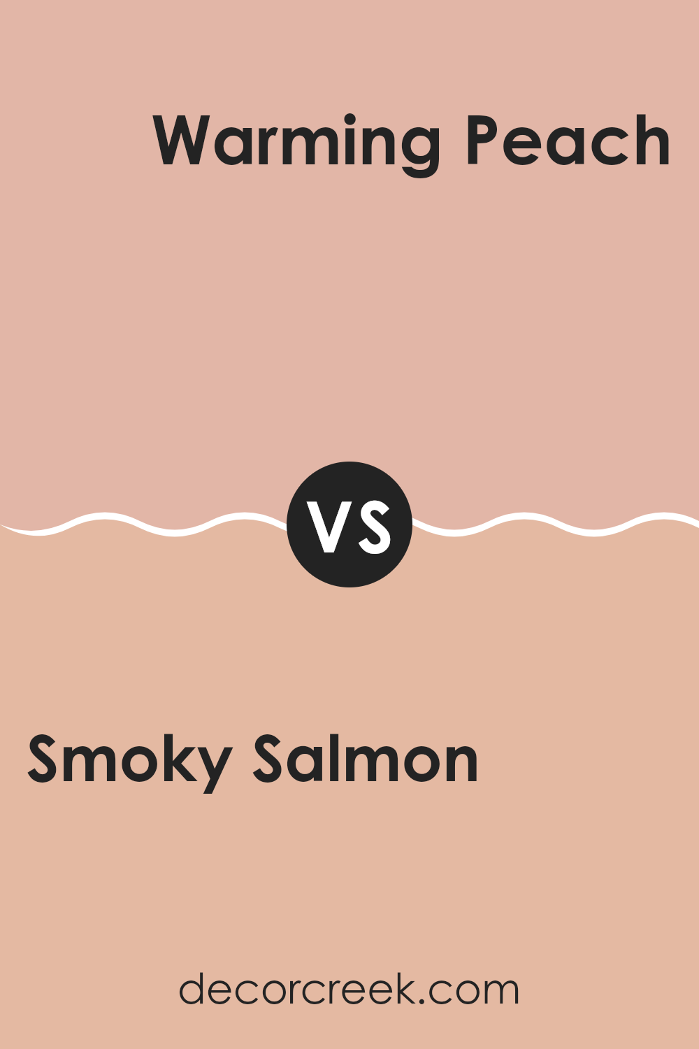
Smoky Salmon SW 6331 by Sherwin Williams vs Warming Peach SW 6338 by Sherwin Williams
Smoky Salmon and Warming Peach by Sherwin Williams are both warm, inviting colors, but they have distinct differences. Smoky Salmon has a gentle pink tone with a touch of gray, giving it a muted, soft look. This color is great for creating a cozy and welcoming atmosphere without being too bold.
On the other hand, Warming Peach is a brighter, more vibrant shade. It leans more towards an orange hue, infusing areas with energy and warmth. This makes it an excellent choice for places where you want to add a cheerful touch.
Both colors work well in living areas and bedrooms, but Smoky Salmon might be better for those seeking a subtle, calming effect, while Warming Peach is ideal for lively, active areas. Mixing these colors in decor can bring balance, using the liveliness of Warming Peach to perk up the restrained beauty of Smoky Salmon.
You can see recommended paint color below:
- SW 6338 Warming Peach
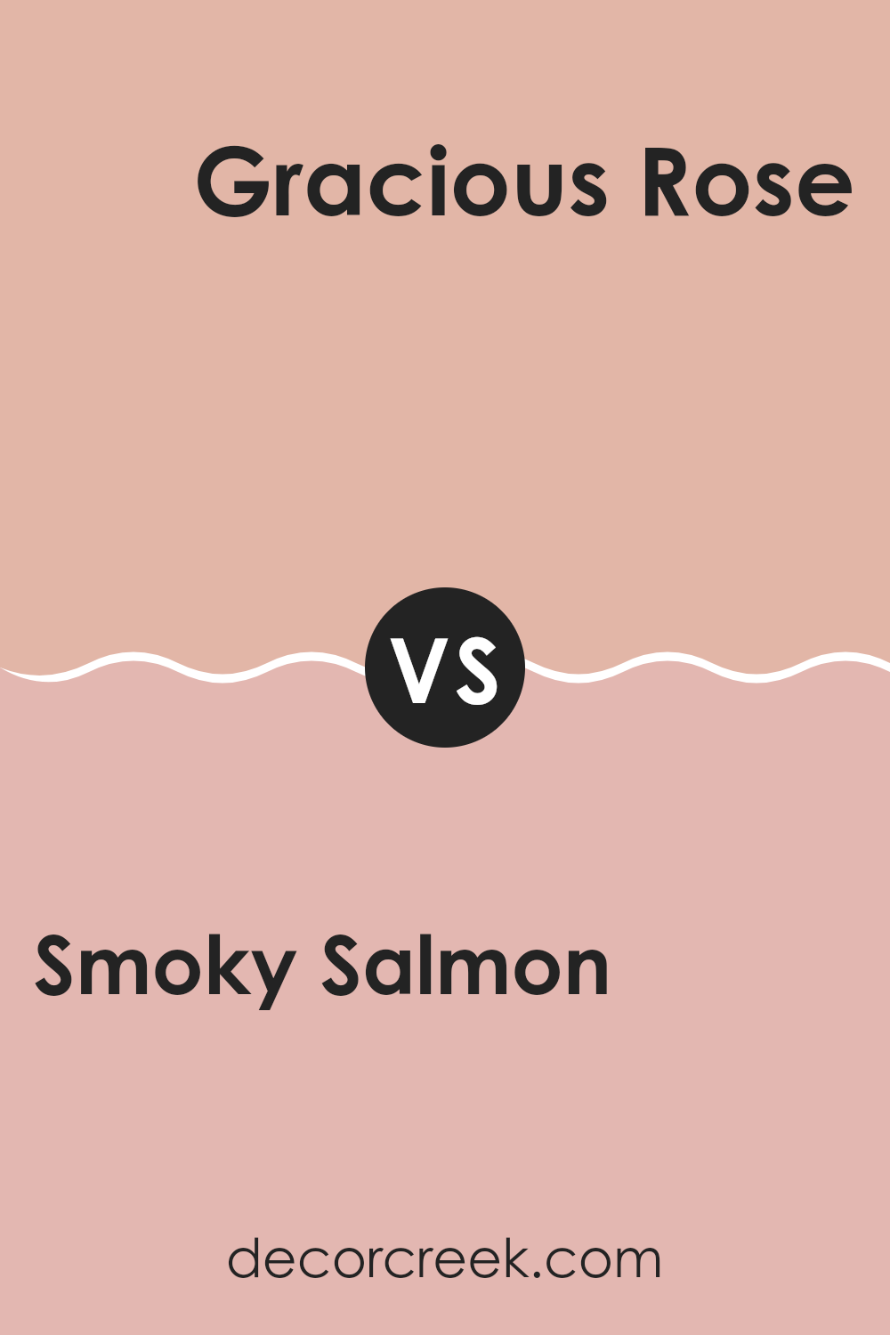
Smoky Salmon SW 6331 by Sherwin Williams vs Gracious Rose SW 6317 by Sherwin Williams
The colors Smoky Salmon and Gracious Rose from Sherwin Williams both offer a warm appeal, yet they hold distinct tones that set them apart. Smoky Salmon, as the name suggests, has a subtle orange pink hue reminiscent of the fish, which gives a cozy and inviting feel to areas. This makes it perfect for living rooms or dining areas where a soft, friendly vibe is desired.
On the other hand, Gracious Rose leans more towards a traditional pink with a hint of peach. It’s a lighter shade compared to Smoky Salmon and brings a fresh, cheerful touch to any area. This color works well in bedrooms or places where a gentle, uplifting atmosphere is needed.
Overall, Smoky Salmon has a deeper, richer tone, which might be favored in areas seeking a bit more warmth and depth. Whereas, Gracious Rose offers a lighter, breezier feel, ideal for creating a bright and airy area. Both colors can enhance a home beautifully, but the choice depends on the mood and style you’re aiming to achieve.
You can see recommended paint color below:
- SW 6317 Gracious Rose
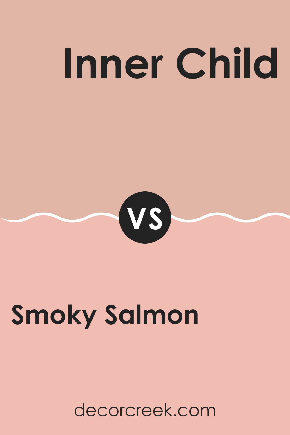
Smoky Salmon SW 6331 by Sherwin Williams vs Inner Child SW 6877 by Sherwin Williams
Smoky Salmon and Inner Child are both vibrant colors from Sherwin Williams but create very different moods. Smoky Salmon is a warm, muted orange with a hint of pink.
It gives off a cozy, welcoming vibe, perfect for areas where you want a soft, gently cheerful atmosphere. It pairs well with neutral and earthy tones, making it a great choice for living rooms or bedrooms looking to add a touch of warmth without overpowering the area.
On the other hand, Inner Child is a bright, vivid green. This color is lively and energetic, ideal for areas that aim to inspire creativity and vitality. It works especially well in places like playrooms or creative studios where you might want to spark imagination and fun. This shade can bring a room to life and is fantastic for creating focal points through accent walls or furniture.
You can see recommended paint color below:
- SW 6877 Inner Child
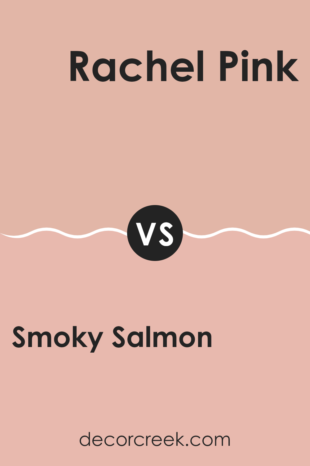
Smoky Salmon SW 6331 by Sherwin Williams vs Rachel Pink SW 0026 by Sherwin Williams
Smoky Salmon is a warm and gentle hue that leans towards a blend of orange and pink, giving it a cozy and inviting feel. This color is perfect for creating a friendly and welcoming area in any room. It has a muted quality which makes it easy on the eyes and adaptable for decorating, fitting well with both modern and traditional designs.
On the other hand, Rachel Pink is a vibrant and lively pink that’s brighter and more intense. It brings a cheerful and energetic vibe to an area, making it great for places that could use a pop of color. This hue stands out more starkly compared to the softer tones of Smoky Salmon and is ideal for those looking to make a more bold statement.
Both colors have their unique appeal and can greatly influence the mood and style of a room. Smoky Salmon is more subdued and calming, while Rachel Pink is fun and vivacious.
You can see recommended paint color below:
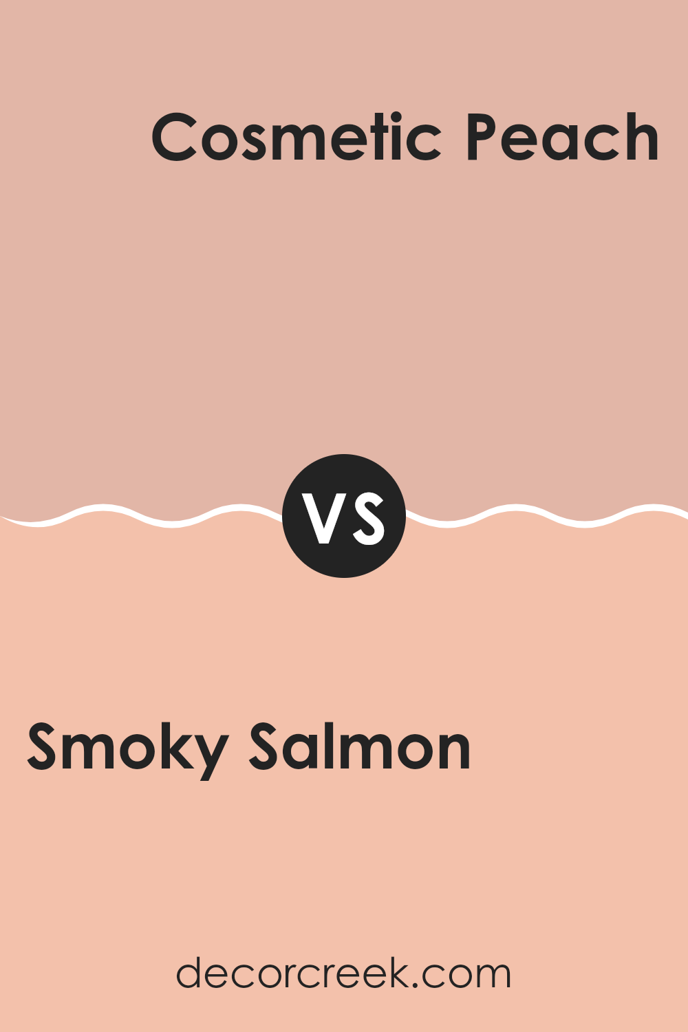
Smoky Salmon SW 6331 by Sherwin Williams vs Cosmetic Peach SW 6618 by Sherwin Williams
Smoky Salmon is a warm, muted shade with soft salmon tones. This color is cozy and welcoming, reminiscent of a gentle sunset or a rosy blush. It’s an adaptable color that works beautifully in living areas, especially those with ample natural light which enhances its warm undertones.
On the other hand, Cosmetic Peach has a brighter, more pronounced peach tone, which gives it a fresher and more vibrant look. It’s a cheerful color that can instantly lighten up a room, making it feel more lively and energetic. Cosmetic Peach is ideal for areas like kitchens or bathrooms where you want a clean, invigorating atmosphere.
Both colors share a warm base but differ in vibrancy and mood setting. Smoky Salmon creates a softer, more subtle ambiance, whereas Cosmetic Peach offers a punchier, more cheerful vibe. Each can create a distinctly pleasant feel depending on the room’s purpose and the desired aesthetic.
You can see recommended paint color below:
- SW 6618 Cosmetic Peach
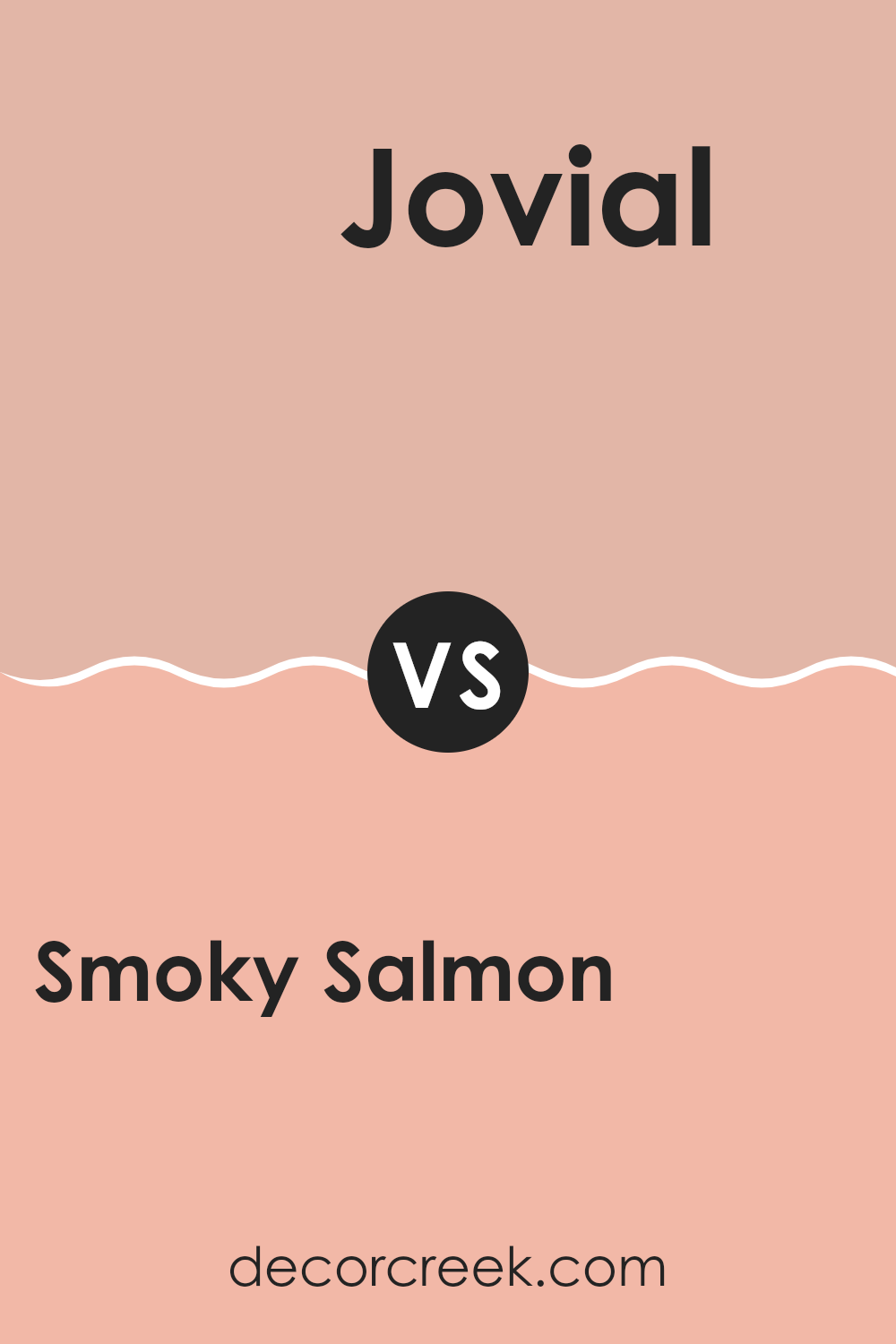
Smoky Salmon SW 6331 by Sherwin Williams vs Jovial SW 6611 by Sherwin Williams
The main color, Smoky Salmon, is a soft, muted shade of pink with a hint of peach. It creates a warm, welcoming feel in an area, making it perfect for living rooms or bedrooms where a cozy atmosphere is desired. On the other hand, Jovial is a much brighter and more vivid pink. It packs a punch and is best suited for areas where you want to inject energy and cheerfulness, like a kids’ room or a creative workspace.
While Smoky Salmon has a subtle, understated charm that pairs well with neutral and earth tones, Jovial stands out and works well with other equally lively colors or sharp contrasts like bright whites or deep blues.
Essentially, the choice between these colors depends on the mood and function of the area. Smoky Salmon is for a quiet, calming feel, and Jovial is for an area full of life and vibrancy.
You can see recommended paint color below:
- SW 6611 Jovial
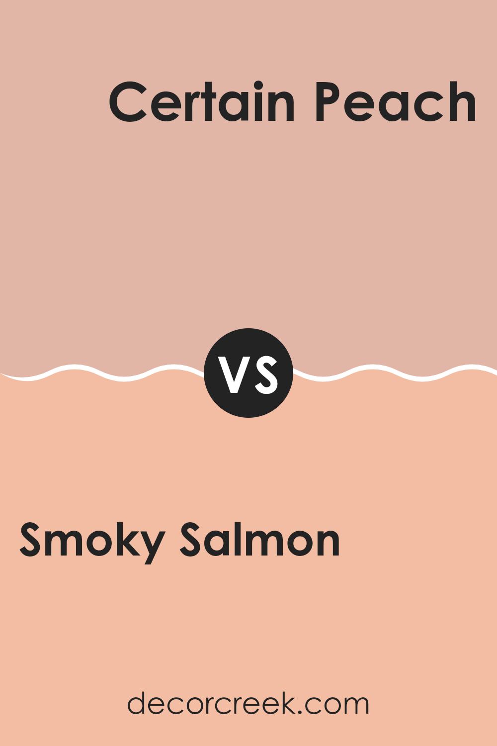
Smoky Salmon SW 6331 by Sherwin Williams vs Certain Peach SW 6625 by Sherwin Williams
Smoky Salmon and Certain Peach, both from Sherwin Williams, are both warm and welcoming colors, but they have their own distinct vibes. Smoky Salmon has a deeper, muted tone that makes it feel more grounded and cozy, giving a room a more intimate, welcoming presence. It’s like the glow of a sunset, adding soft warmth to the area it adorns.
In contrast, Certain Peach is lighter and has a brighter presence. This color is more vibrant and energetic, making areas feel lively and cheerful. It carries the fresh, invigorating quality of a sunny day, perfect for adding a playful touch to any room.
Both colors work well in living areas where you want to create a friendly and inviting atmosphere, but your choice depends on the mood you want to set: calming and subdued with Smoky Salmon, or cheerful and bright with Certain Peach.
You can see recommended paint color below:
- SW 6625 Certain Peach
In wrapping up, SW 6331 Smoky Salmon by Sherwin Williams is a charming paint color that’s like a peachy orange hue. It has a warm and welcoming feel that can light up any room. After reading all about it, I’ve come to see why it’s a popular choice. It’s not too bright but has just enough dash of color to make areas lively and cozy.
This color works really well in rooms where you want a sense of happiness and comfort, like living rooms or even kitchens. It could make these areas feel more like a warm hug when you walk in. Plus, it pairs nicely with lots of other colors, so you can have fun picking furniture and decorations that go with it.
All in all, Smoky Salmon seems like a great pick if you’re thinking of adding a splash of warm color to your home. It brings out a cheerful yet calm atmosphere, making it easy to understand why many would choose it to paint their walls. Whether you’re freshening up a single room or changing the look of your whole house, this color could definitely do the trick!
Ever wished paint sampling was as easy as sticking a sticker? Guess what? Now it is! Discover Samplize's unique Peel & Stick samples.
Get paint samples

