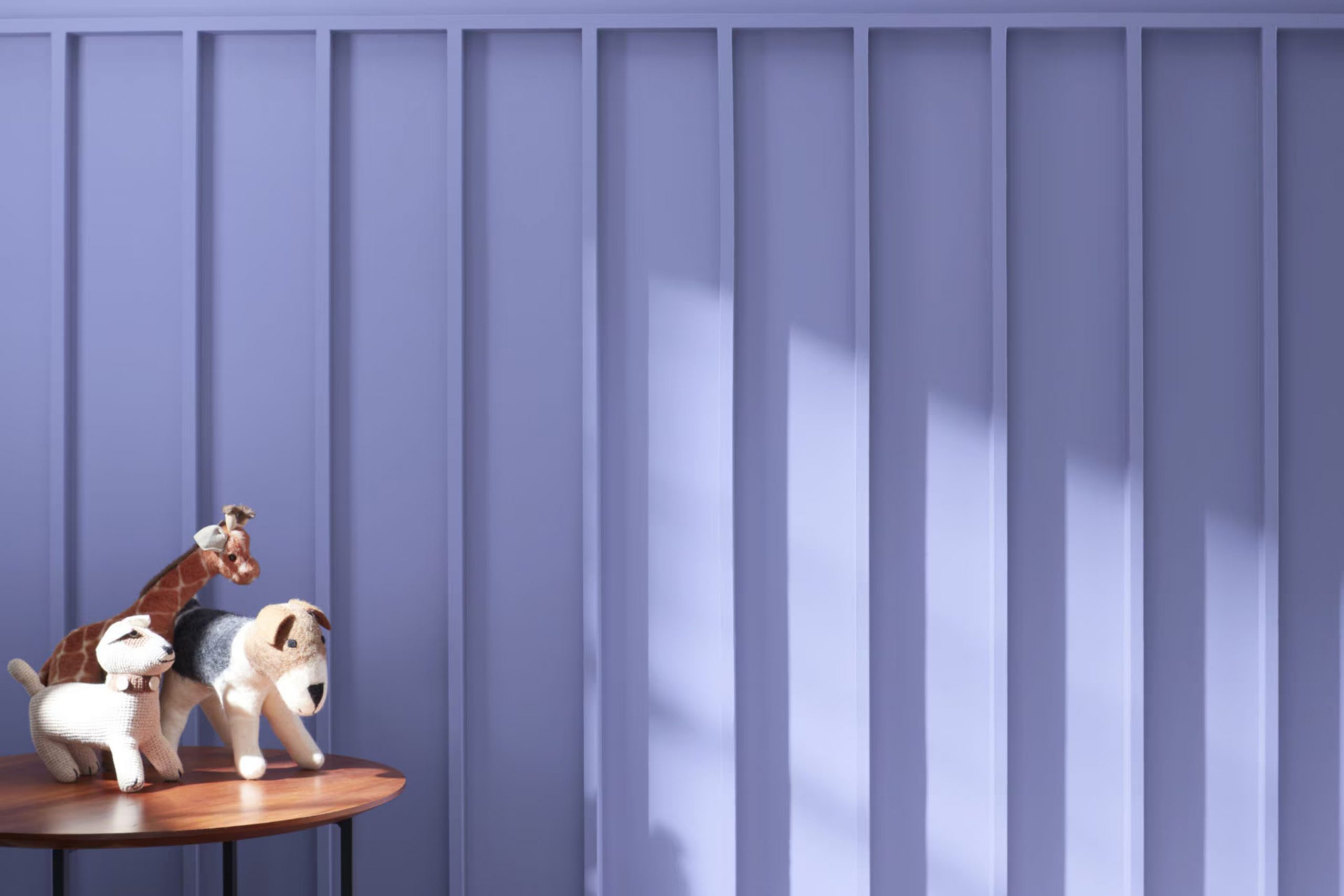
I recently came across 1420 Softened Violet by Benjamin Moore, and it struck me as a unique shade you might enjoy. It’s a gentle blend of lilac tones that evokes a sense of calm and simplicity, excellent for creating a peaceful room in your home. As someone who’s always keen to freshen up my living area, Softened Violet appeals to me for its flexibility—it works beautifully in bedrooms and living rooms alike, setting a calm backdrop.
If you’re considering a new paint color, consider how 1420 Softened Violet could complement your existing decor and furnishings. Whether pairing it with soft neutrals or contrasting it against bold furniture pieces, this color maintains its soothing essence.
Plus, it’s subtle enough not to overpower the room but stands out with a distinct personality. I find it particularly useful for rooms needing a touch of softness without sacrificing modernity.
So, if you’re looking to refresh your room’s look with a color that’s both soft and refined, Softened Violet might just be the perfect choice.
What Color Is Softened Violet 1420 by Benjamin Moore?
Softened Violet (1420) by Benjamin Moore is a gentle and soothing shade that strikes a beautiful balance between blush and lavender. Its subtle undertones make it a flexible choice for adding a touch of calm and coziness to any room. This light violet hue works particularly well in interior styles that favor soft, pastel color palettes, including traditional, modern, and shabby chic designs.
When considering materials and textures to pair with Softened Violet, natural wood with a light to medium finish complements its warmth perfectly, creating a seamless aesthetic. Fabrics like linen and cotton in neutral shades can keep the room feeling light and airy, while adding velvet or silk elements can introduce a dash of luxury without overpowering the room’s gentle vibe. Woven textures, like wicker or rattan, also pair nicely, adding an element of earthiness that contrasts subtly with the softness of the violet.
This color also works well with metallic finishes such as brushed nickel or soft gold, which enhance the room without detracting from the color’s calming effect. Overall, Softened Violet can create a room that feels cozy, welcoming, and gently colorful, perfect for rooms intended for relaxation and comfort.
decorcreek.com
Is Softened Violet 1420 by Benjamin Moore Warm or Cool color?
Softened Violet 1420 by Benjamin Moore is a unique shade of purple that adds a subtle touch of warmth and cheer to any room. This color is flexible enough to work in various rooms of a home, whether you’re painting a bedroom, bathroom, or even a living area. Its gentle hue isn’t overpowering, making it easy to pair with different decor styles and colors.
When applied to walls, Softened Violet brings a cozy, welcoming vibe, which is great for rooms where you want to relax and feel at ease. It’s especially good for smaller rooms, as the lightness of the color can make the room appear larger and more open. Additionally, this shade can be a great background for artworks or furniture pieces, helping them stand out more prominently.
Overall, using Softened Violet 1420 can be a smart choice for anyone looking to freshen up their home with a touch of color that’s both pleasant and stylish, without being too bold or striking.
Undertones of Softened Violet 1420 by Benjamin Moore
Softened Violet by Benjamin Moore is a unique paint color that appears primarily as a gentle violet but carries a variety of undertones which significantly influence how it is perceived in different settings. Undertones are the subtle colors lurking beneath the surface of a paint color, affecting its reflection under various lighting conditions and when paired with different decor elements.
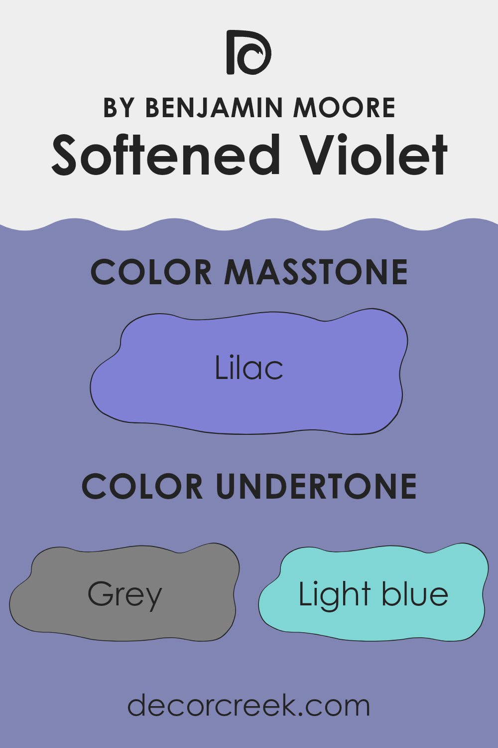
This particular shade has undertones of grey, light blue, light purple, blue, mint, violet, pale pink, dark turquoise, purple, light gray, turquoise, pale yellow, light turquoise, fuchsia, dark blue, pink, and navy. These undertones make Softened Violet a highly flexible color. For instance, the grey and light gray can cool down a room, giving it a muted feel, which is great for creating a calm atmosphere. The hints of blues and turquoise add a refreshing touch, which can make the room feel more airy and open.
When applied to interior walls, Softened Violet’s diverse undertones can help in complementing various decor styles and color palettes. In a room with ample natural light, the lighter undertones like light blue and pale pink might become more pronounced, thus softly enlivening the room. In contrast, in a room with less natural light or during the evening under artificial lighting, the darker undertones such as navy and dark blue might stand out more, giving the room a cozier and more enveloped feel.
Understanding these undertones can help in selecting furniture and decorations that either accentuate or balance these hidden hues for the desired effect in the room. For instance, pairing this color with light-colored woods or metallic finishes can highlight its cooler undertones, while combining it with rich textures like velvet in dark colors can draw out its deeper tones.
decorcreek.com
What is the Masstone of the Softened Violet 1420 by Benjamin Moore?
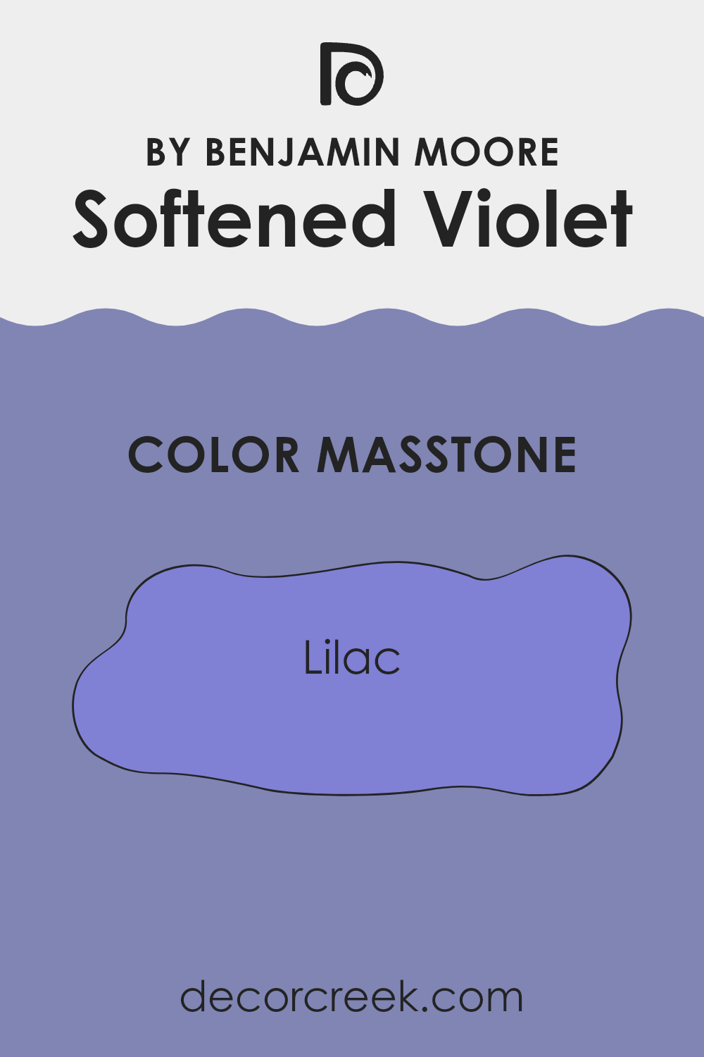
Softened Violet 1420 by Benjamin Moore, with its masstone, Lilac (#8080D5), brings a gentle and easygoing vibe to any room. This color has a light purple hue with hints of blue that makes it perfect for creating a cozy and inviting room.
When used in homes, this shade works well in bedrooms or living areas where a calm and relaxed atmosphere is desired. Since it isn’t too bright or overpowering, it pairs easily with softer whites or even contrasting darker colors, like navy blues or rich greens, for a well-rounded look.
Additionally, because of its soft nature, it can help small rooms appear slightly bigger and more open, without making the room feel chilly. This flexibility means you can use it in different items such as walls, furniture, or even accent decor. Overall, Softened Violet has a refreshing but subtle presence that adds character without overpowering your home’s overall style.
decorcreek.com
How Does Lighting Affect Softened Violet 1420 by Benjamin Moore?
Lighting plays a crucial role in how we perceive colors. The type of light—whether natural or artificial—can significantly influence how a color looks in a particular setting. Typically, natural light provides the truest representation of colors, while artificial light can vary in how it impacts color perception depending on the light bulbs used (LED, incandescent, fluorescent, etc.).
Softened Violet 1420 by Benjamin Moore is a subtle shade that reacts uniquely under different lighting conditions. In natural light, Softened Violet tends to reveal its true color, which is a gentle and muted purple that can create a calming effect in any room. However, under artificial light, the nuances of this shade can shift. For instance, in warm artificial light, Softened Violet might appear slightly richer and deeper, while in cooler artificial light, it might lean toward a more bluish tone.
The orientation of a room also affects how Softened Violet is perceived:
- North-faced rooms: These rooms get less direct sunlight, which means the natural light is often cooler and more subdued. In such rooms, Softened Violet may appear more shadowy and less vibrant, giving off a cooler feel.
- South-faced rooms: These rooms benefit from ample sunlight, which can make Softened Violet look brighter and more vivid. The warm southern light can make the color feel warmer and more inviting during the day.
- East-faced rooms: Such rooms enjoy morning light, which is generally bright and warm. Softened Violet in east-facing rooms looks very lively and welcoming in the morning, while it might turn softer and more subdued as the day progresses.
- West-faced rooms: These rooms receive evening light, which can be very warm. Softened Violet may appear softer and more muted in the mornings but can look more dynamic and richer in the evenings as the sun sets.
Overall, Softened Violet’s flexible nature makes it a great choice for various rooms and orientations, but its perception dramatically depends on the light it is exposed to. This leads to the conclusion that when choosing paint colors, considering the room’s orientation and the type of light it receives can help achieve the desired effect.
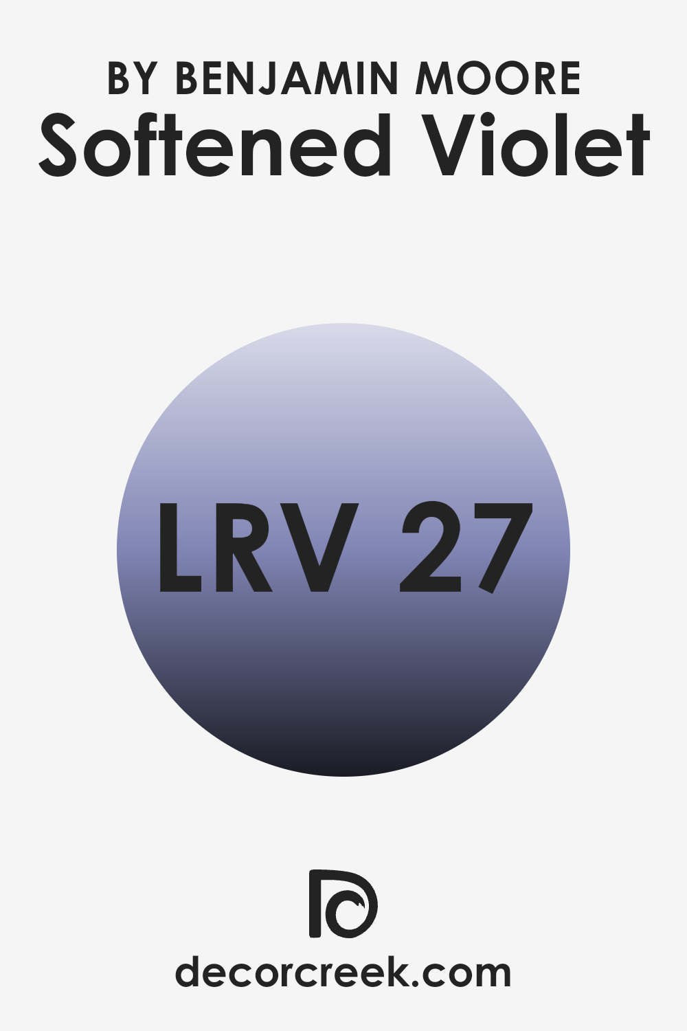
What is the LRV of Softened Violet 1420 by Benjamin Moore?
LRV stands for Light Reflectance Value, which measures the percentage of light a paint color reflects back into a room. This value is crucial when choosing a paint color because it affects how light or dark the color will appear on your walls.
A higher LRV means the color reflects more light and appears brighter, while a lower LRV means the color absorbs more light and appears darker. This measurement helps in deciding if a color is suitable for a small or large room, or a room with lots of natural or limited light.
The LRV of Softened Violet is 26.77, indicating it is on the darker side of the scale and will absorb more light than it reflects. This means that in rooms with less natural light, Softened Violet will appear even darker, making the room feel smaller or cozier. In a well-lit area, however, the true beauty of the color can show better, creating a richer hue on the walls. It is important to consider this while planning your room to ensure that the room complements the color’s properties without dimming its potential.
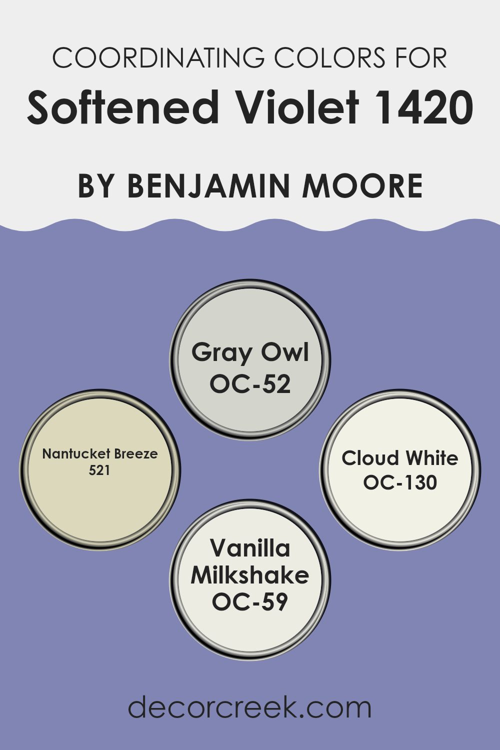
Coordinating Colors of Softened Violet 1420 by Benjamin Moore
Coordinating colors are shades that complement each other and help enhance the overall aesthetic of a room. This concept relies on using colors that either contrast or blend well with the main hue to create a harmonious interior design. For example, with a base color like Softened Violet from Benjamin Moore, choosing the right coordinating colors can enrich the ambiance of a room. These coordinating shades add depth, highlight architectural features, and create a visually pleasing environment that feels balanced and coordinated.
For instance, OC-52 Gray Owl is a gentle, neutral gray that works well to soften the intensity of bolder colors while providing a subtle contrast. This makes it a perfect companion to enhance the soothing qualities of Softened Violet. Meanwhile, 521 Nantucket Breeze offers a refreshing hint of blue that can evoke the feel of a breezy seaside retreat, bringing a light and airy complement to the cooler undertone of violet.
OC-130 Cloud White is a crisp and clean white that provides a fresh backdrop, making any accompanying color pop and giving the room an open, airy feel. Lastly, OC-59 Vanilla Milkshake has a creamy, soft tone that exudes warmth and comfort, pairing beautifully with more subdued shades like Softened Violet to offer a cozy atmosphere. Together, these coordinating colors by Benjamin Moore create a cohesive and inviting room.
You can see recommended paint colors below:
- OC-52 Gray Owl
- 521 Nantucket Breeze
- OC-130 Cloud White
- OC-59 Vanilla Milkshake
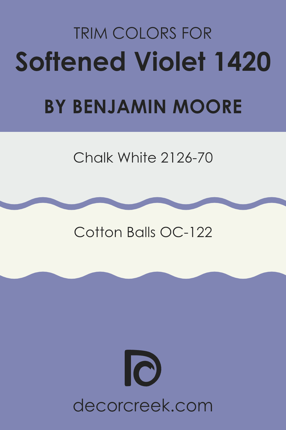
What are the Trim colors of Softened Violet 1420 by Benjamin Moore?
Trim colors are specific shades used to paint the architectural details such as door frames, moldings, and skirtings of a room or a building. These colors are essential in interior design as they highlight and define the lines and features of the room, enhancing the overall aesthetic and ensuring that the structural details stand out.
When paired with a main wall color like Softened Violet from Benjamin Moore, choosing the right trim color can significantly impact the look and feel of the room by providing a crisp, clean contrast that complements the primary hue.
For Softened Violet, trim colors like 2126-70 – Chalk White and OC-122 – Cotton Balls are excellent choices. Chalk White is a pure, bright white that brings a fresh and clear boundary against the more subdued tones of Softened Violet, offering a stark contrast that makes the wall color pop while maintaining a clean and orderly appearance. Cotton Balls, on the other hand, is a softer white with a touch of warmth, providing a more subtle transition from wall to trim, which helps in creating a gentle and inviting atmosphere while still allowing the main color to stand out prominently.
You can see recommended paint colors below:
- 2126-70 Chalk White
- OC-122 Cotton Balls
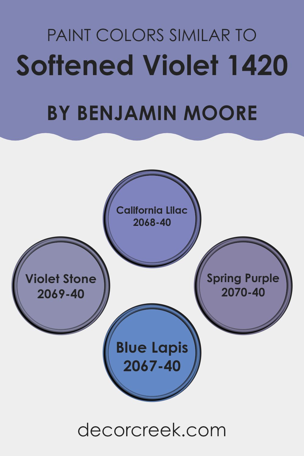
Colors Similar to Softened Violet 1420 by Benjamin Moore
When choosing colors for a room, opting for similar shades can create a harmonious and cohesive look. Colors like 2068-40 California Lilac, 2069-40 Violet Stone, 2070-40 Spring Purple, and 2067-40 Blue Lapis all share a closeness to Softened Violet, which makes them perfect for blending together in a room.
This method of using similar colors allows for a smooth visual flow, making the room feel unified without stark contrasts that might disrupt the visual continuity. Though each color maintains its unique identity, their similar tones help unify diverse design elements and textures in a room, making the room more appealing and comfortable.
California Lilac is a vibrant shade that provides a pop of richness mimicking the blooming petals of its namesake flower, adding a lively zest to the surroundings. Violet Stone, on the other hand, offers a deeper hue that brings a sense of depth and grounding — ideal for accent walls or furniture pieces. Spring Purple injects a playful energy, brightening rooms with its cheery vibe, while Blue Lapis introduces a subtle hint of blue, softening the overall appearance and providing a soothing counterbalance to the warmer purples. Together, these colors weave a visual tapestry that is both inviting and visually stimulating.
You can see recommended paint colors below:
- 2068-40 California Lilac
- 2069-40 Violet Stone
- 2070-40 Spring Purple
- 2067-40 Blue Lapis
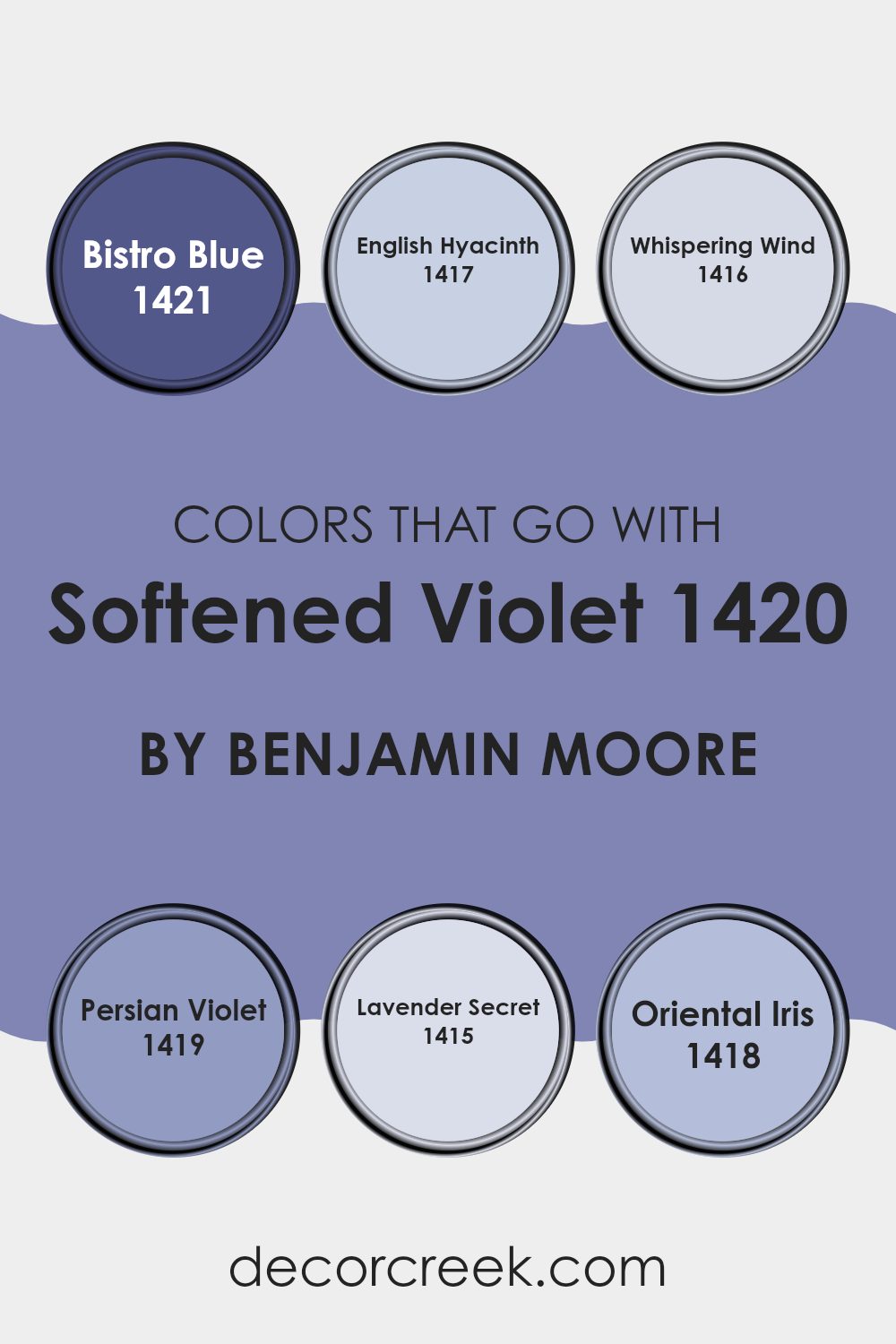
Colors that Go With Softened Violet 1420 by Benjamin Moore
Choosing the right colors to pair with Softened Violet 1420 by Benjamin Moore is essential for creating a harmonious and appealing room. Softened Violet itself is a gentle and subtle hue, and when paired with the right colors, it can enhance the mood of any room. Colors like Bistro Blue, English Hyacinth, Whispering Wind, Persian Violet, Lavender Secret, and Oriental Iris are ideal companions as they complement or contrast beautifully with Softened Violet, depending on what atmosphere you want to achieve.
Bistro Blue offers a fresh, airy feel that can lighten up a room when paired with Softened Violet, making it feel more open and welcoming. English Hyacinth brings a soft touch of cheer with its muted floral tone, which adds a delicate charm when used alongside Softened Violet. Whispering Wind is a very light, almost ethereal color that can help create a calm and relaxed atmosphere, perfect for bedrooms or quiet areas.
Persian Violet is a deeper tone that adds depth and interest, providing a striking contrast that makes both colors stand out. Lavender Secret has a hint of mystique and is slightly richer, which adds a layer of warmth to the cooler Softened Violet. Lastly, Oriental Iris is a vivid color that adds a punch of energy to any room, making it lively and vibrant when coupled with the more subdued Softened Violet. Together, these colors work in harmony to create a room that is both inviting and visually appealing.
You can see recommended paint colors below:
- 1421 Bistro Blue
- 1417 English Hyacinth
- 1416 Whispering Wind
- 1419 Persian Violet
- 1415 Lavender Secret
- 1418 Oriental Iris
How to Use Softened Violet 1420 by Benjamin Moore In Your Home?
Softened Violet 1420 from Benjamin Moore is a gentle purple shade that can add a touch of calmness and freshness to any room in your house. This color is flexible, perfect for creating a cozy atmosphere in bedrooms or a relaxing feel in bathrooms. You can use it as the main color on walls to set a peaceful mood or as an accent to highlight specific areas or features like alcoves or a single wall.
Pairing Softened Violet with neutral tones like whites, grays, or light woods in furniture and decor items can help maintain a light and airy feel while still adding a subtle color note.
It’s also great for adding character to smaller rooms like a reading nook or a home office, providing just enough color to make the area interesting without overpowering it. Whether you’re painting an entire room or just using it for touches here and there, Softened Violet can give your home a fresh and inviting feel.
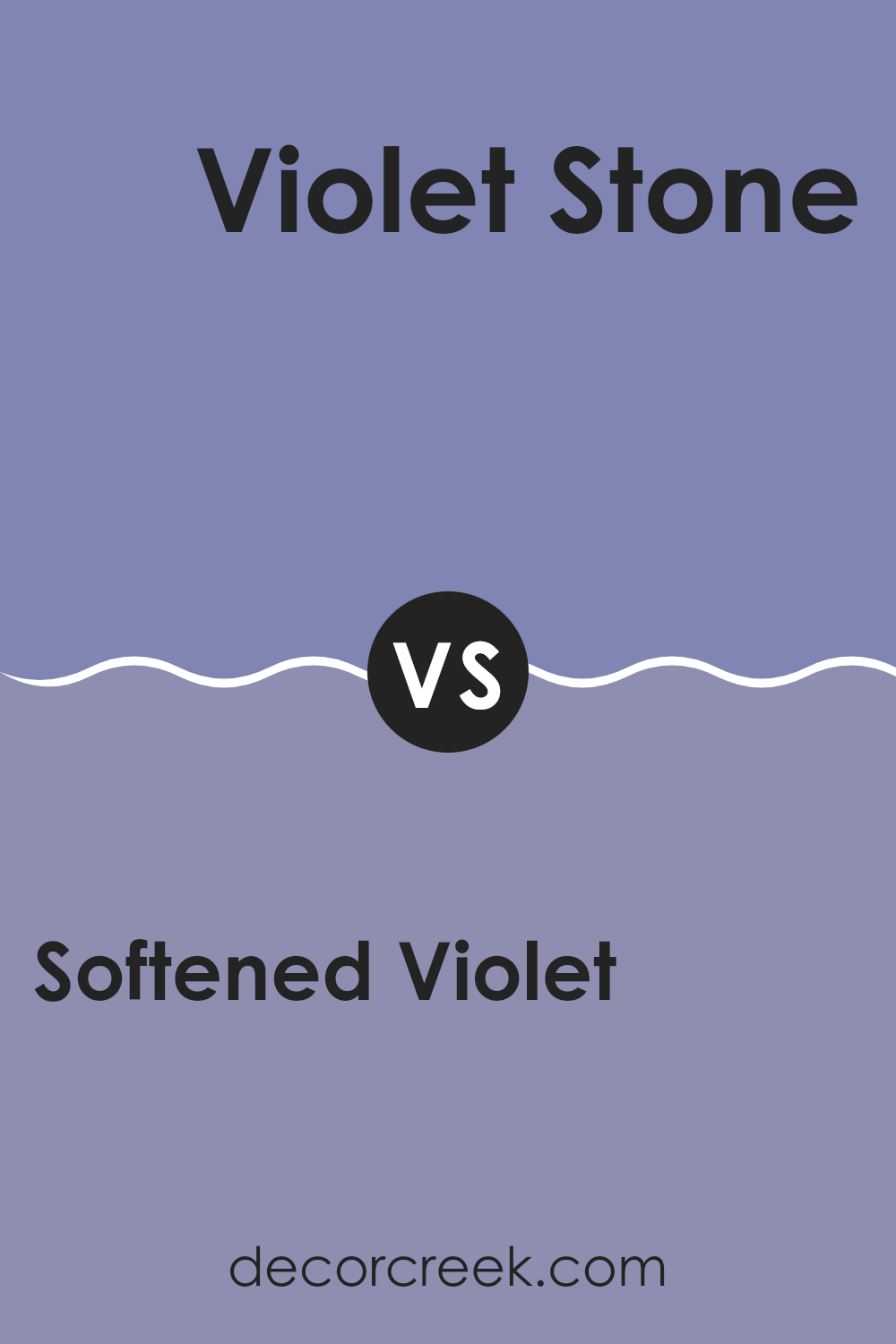
Softened Violet 1420 by Benjamin Moore vs Violet Stone 2069-40 by Benjamin Moore
Softened Violet by Benjamin Moore is a gentle and subtle hue, giving a room a light and breathable feeling. This color is muted, lying comfortably between lavender and a pastel pink, which makes it perfect for creating a calming atmosphere in rooms where you want to relax.
On the other hand, Violet Stone by Benjamin Moore is darker and richer. It has a more definite purple tone that adds a touch of vibrancy to any room without being overpowering. This makes it a great option if you wish to add some color to a room while maintaining a balanced and inviting environment.
Both colors play well with light and can change subtly depending on the lighting conditions, giving your room varying looks at different times of the day. While Softened Violet leans toward a softer, more neutral feeling, Violet Stone can give a room a more striking presence while still keeping things cozy.
You can see recommended paint color below:
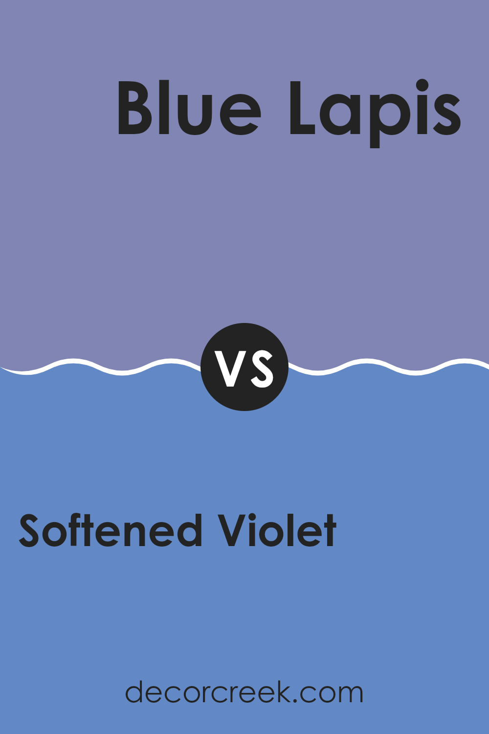
Softened Violet 1420 by Benjamin Moore vs Blue Lapis 2067-40 by Benjamin Moore
The color Softened Violet by Benjamin Moore is a gentle, muted shade of violet that creates a calming atmosphere in any room. It has a subtle tone that isn’t too overpowering, making it flexible for both small and large rooms. It pairs well with soft neutrals and can also balance out darker accents.
On the other hand, Blue Lapis by Benjamin Moore is a brighter, more vibrant color. This shade of blue has a noticeable depth that can make a bold statement when used in interior design. It’s ideal for those looking to add a pop of color to their room without going too bright. Because of its richness, it works beautifully in rooms that benefit from a dynamic aesthetic, like living rooms or dining areas.
Both colors have their unique charm and utility, each setting a different mood and atmosphere depending on where and how they are used.
You can see recommended paint color below:
- 2067-40 Blue Lapis
Softened Violet 1420 by Benjamin Moore vs California Lilac 2068-40 by Benjamin Moore
Softened Violet by Benjamin Moore is a gentle and muted shade of purple with a subtle hint of gray. This color feels airy and light, making it ideal for creating a calm and soothing atmosphere in a room. It’s flexible enough to be used in various rooms, like bedrooms or living areas, where a touch of softness is desired.
On the other hand, California Lilac by Benjamin Moore is a brighter and more vivid purple. This color has a lively vibe that makes it perfect for adding a pop of color to a room. It’s especially good for energizing a room that could use a little lift or where you want to make a strong visual statement.
While both colors share the base of purple, Softened Violet is more subdued and blends easily with neutral tones, whereas California Lilac stands out more and pairs well with other vibrant colors or deeper shades. The choice between them depends on whether you prefer a softer background or a bold highlight in your decor.
You can see recommended paint color below:
Softened Violet 1420 by Benjamin Moore vs Spring Purple 2070-40 by Benjamin Moore
Softened Violet by Benjamin Moore is a gentle, muted shade of purple with a grayish tone. This color gives a calm and soothing feel, making it perfect for bedrooms or places where you want a relaxing atmosphere. It’s quite subtle and works well if you prefer colors that aren’t too bright or overpowering.
On the other hand, Spring Purple by Benjamin Moore is a lot more vivid and brighter. This color is what you might think of when you imagine a typical purple: bold and more pronounced. It’s great for adding a pop of color to a room that needs to be livened up, such as a playroom or an accent wall in a living room.
Both colors offer a unique feel; Softened Violet, with its more understated look, creates a soothing room, while Spring Purple brings energy and vibrancy. Depending on what you need in a room, either color can help set the right mood and style.
You can see recommended paint color below:
After carefully looking at 1420 Softened Violet by Benjamin Moore, I think it’s a beautiful color choice for making any room feel special. This shade of violet has a gentle and calming quality that makes it perfect for places where you want to relax, like bedrooms or a cozy corner in the living room. It’s soft enough to soothe you and adds just the right touch of color without being too bright or bold.
In my experience, 1420 Softened Violet works wonderfully with other colors. You can pair it with light yellows, grays, or even whites for a clean and inviting look. It’s especially good if you are tired of plain old colors and want something different but not too crazy.
For anyone thinking about repainting a room or starting a small project, I would recommend giving 1420 Softened Violet a try. It’s easy on the eyes and has a way of making a room feel just right. Whether you are sprucing up an old room or just adding a dash of new color, this shade is a great choice.
In conclusion, I’m very pleased with how 1420 Softened Violet looks and feels. It’s a wonderful color that can really change up a room in a subtle but impactful way. If you’re looking for a color that’s comforting and pretty, this might just be the one for you.
Ever wished paint sampling was as easy as sticking a sticker? Guess what? Now it is! Discover Samplize's unique Peel & Stick samples.
Get paint samples

