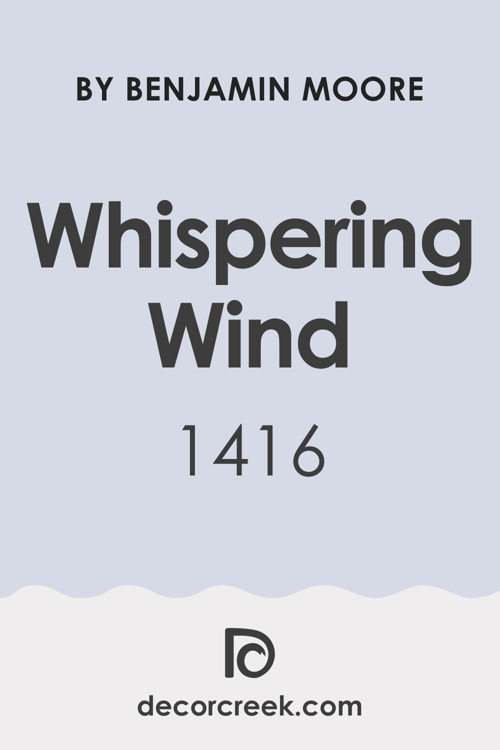
Color is more than a visual experience; it is a dynamic participant in the ambiance of a room, influencing emotion and interaction. Whispering Wind 1416 by Benjamin Moore is no exception. This essay will delve into the intricacies of Whispering Wind 1416, exploring its hues, undertones, the warmth or coolness it exudes, how lighting transforms it, and the importance of its Light Reflectance Value (LRV).
Additionally, we’ll examine how to coordinate it with other colors and why selecting appropriate trim and complementary colors is vital in creating a harmonious space.

What Color Is Whispering Wind 1416?
Whispering Wind 1416 is a chameleon of a color, encapsulating the ethereal beauty of an early morning sky. It’s a soft, muted tone that sits at the threshold of gray and blue. This elusive color brings a breath of fresh air to interiors, making it perfect for a serene and inviting atmosphere. Its versatility shines in various interior styles, from the minimalist approach of Scandinavian design to the relaxed feel of coastal aesthetics.
It pairs exquisitely with natural materials like light woods, adding a touch of warmth, while with metals and glass, it underscores a modern vibe. Fabrics with a slight sheen or textures like linen and chunky knits enhance its multidimensional nature.
Ever wished paint sampling was as easy as sticking a sticker? Guess what? Now it is! Discover Samplize's unique Peel & Stick samples.
Get paint samples

Is It a Warm Or Cool Color?
Whispering Wind 1416 is predominantly a cool color, owing to its gray and blue composition. Cool colors are known for their calming effect, making them ideal for bedrooms and bathrooms where relaxation is key. In a home environment, Whispering Wind 1416 serves as a serene backdrop that can make spaces feel more spacious and open.
Its coolness provides a sense of tranquility and freshness, which is often sought after in interior design to create a soothing atmosphere.
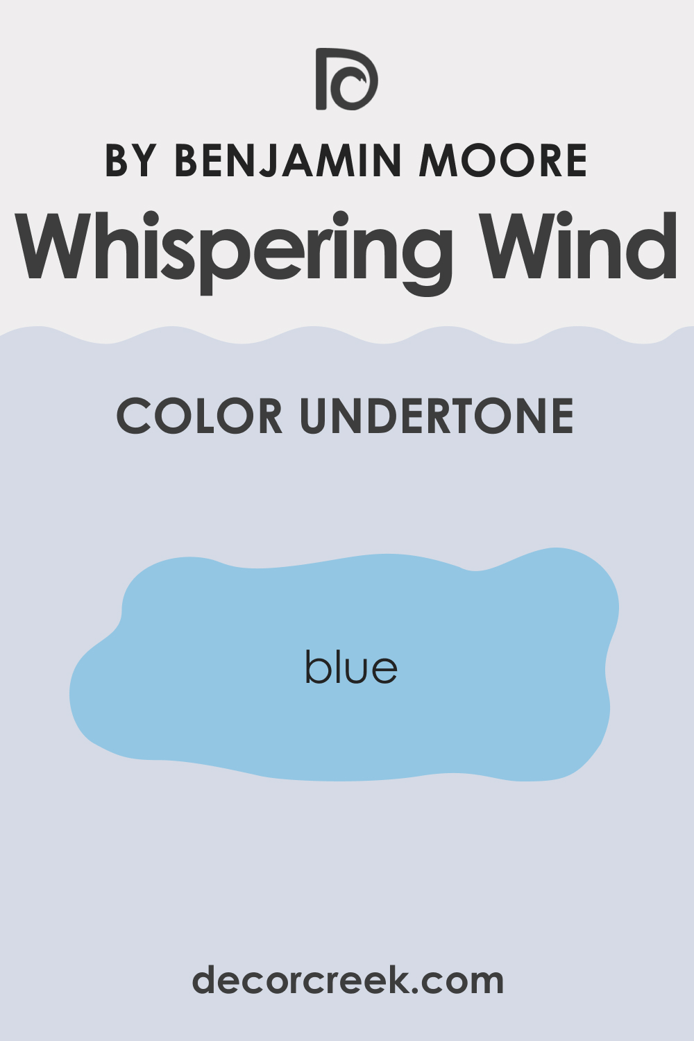
Undertones of Whispering Wind 1416
Every color has a secret, and Whispering Wind 1416’s secret lies in its subtle undertones. Primarily, it carries a blue undertone that can surface vivaciously depending on adjacent colors and lighting. Undertones are crucial as they can shift a color from merely existing to taking on a life of its own, affecting our perception and the overall aesthetic.
On interior walls, the undertones of Whispering Wind 1416 can make a room feel more spacious or intimate, depending on its application and the colors it’s paired with.
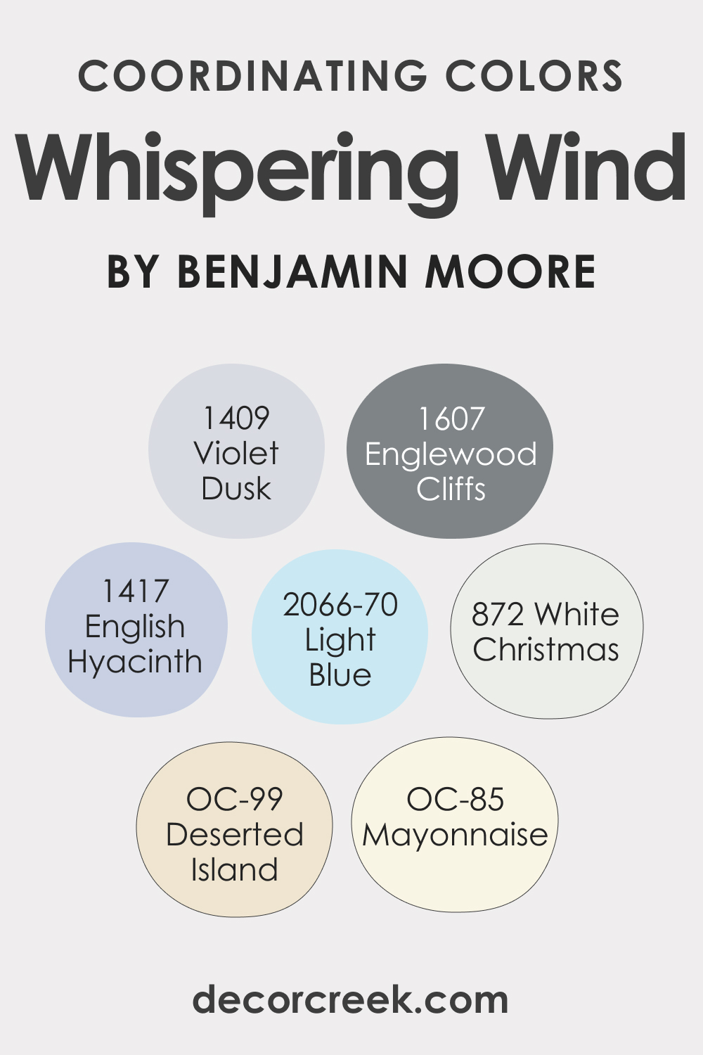
Coordinating Colors of Whispering Wind 1416
Understanding coordinating colors is key to a cohesive interior design scheme. Whispering Wind 1416 works harmoniously with a palette of colors, including BM 872 White Christmas – a pure, bright white; BM 1607 Englewood Cliffs – a deep, sophisticated gray; OC-85 Mayonnaise – a creamy, almost buttery white; and OC-99 Deserted Island – a rich, earthy beige. Each of these coordinating colors complements Whispering Wind by either providing contrast or enhancing its muted tones.
For an expanded palette, consider these additional colors:
- BM 1417 English Hyacinth – A gentle lavender that whispers elegance.
- BM 2066-70 Light Blue – A soft, sky-like blue that calms and refreshes.
- BM 1409 Violet Dusk – A dusky violet that adds depth and mystery.
How Does Lighting Affect Whispering Wind 1416?
Lighting can play a pivotal role in how Whispering Wind 1416 is perceived. Under artificial light, its blue undertones can become more pronounced, while natural light brings out its gray aspect, showcasing the color’s adaptability. The orientation of a room also impacts how Whispering Wind manifests – with north-facing rooms accentuating its cooler tones, and south-facing ones basking it in warmth.
East-facing rooms highlight its freshness in the morning light, whereas west-facing rooms can imbue it with a cozier glow in the evening.

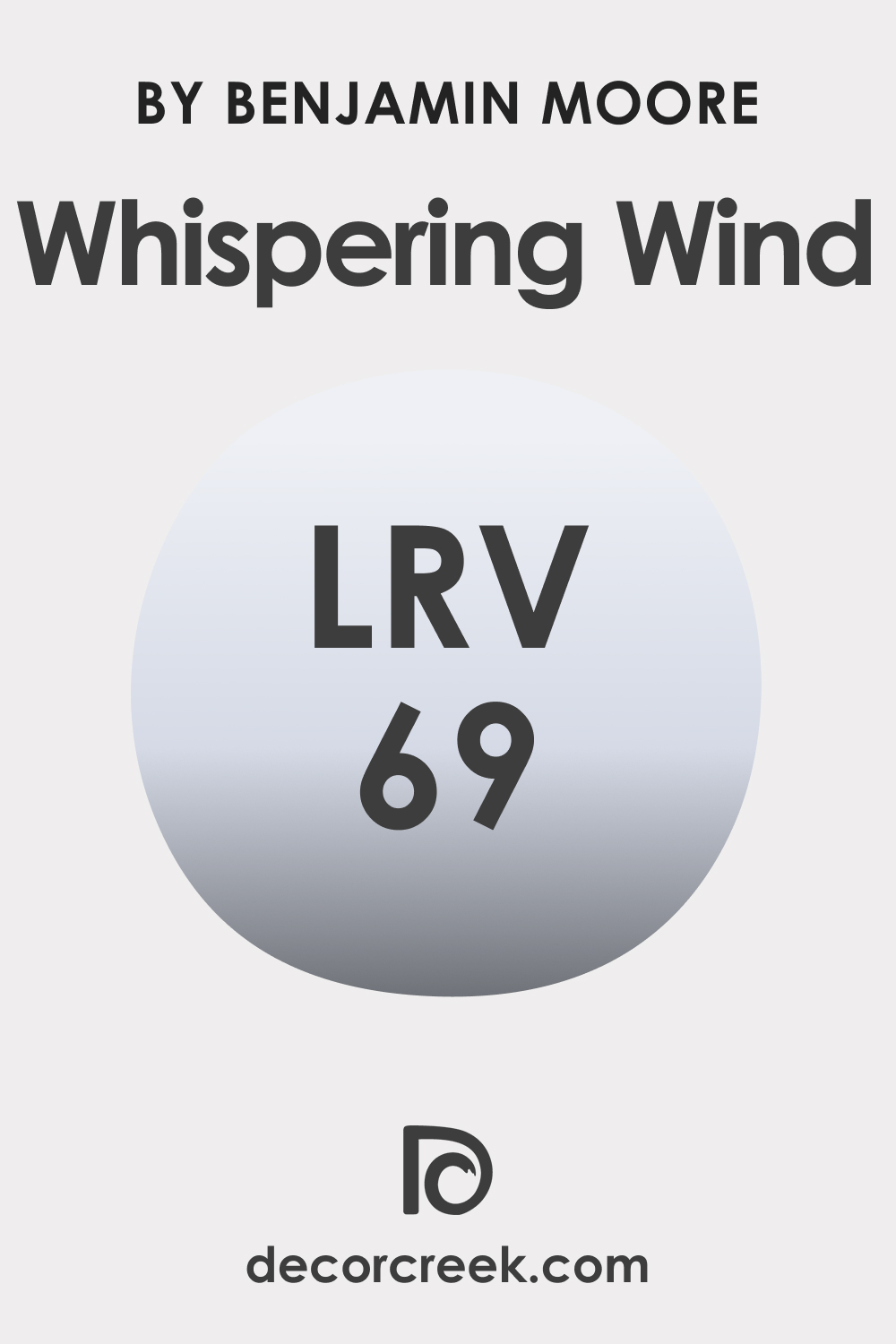
LRV of Whispering Wind 1416
The Light Reflectance Value (LRV) of a paint color indicates the amount of light it reflects. An LRV of 69 for Whispering Wind 1416 means it reflects a substantial amount of light, contributing to a feeling of airiness and space in a room.
This mid-range LRV makes Whispering Wind highly versatile, working well in various lighting conditions and making it an excellent choice for many spaces.
LRV – what does it mean? Read This Before Finding Your Perfect Paint Color
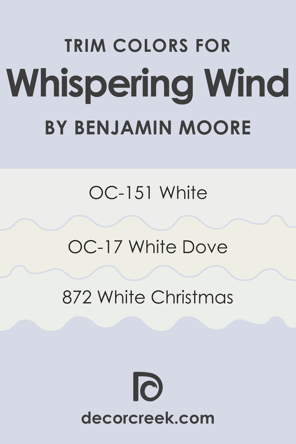
Trim Colors of Whispering Wind 1416
Trim colors are the accents that frame the architecture of a room and define transitions between walls, ceilings, and flooring.
With Whispering Wind 1416, trim colors should be chosen carefully to enhance its character.
Shades of white are particularly effective. Consider BM 872 White Christmas for a sharp, contrasting frame, OC-151 White for a softer transition, or OC-17 White Dove for a smooth, classic finish.
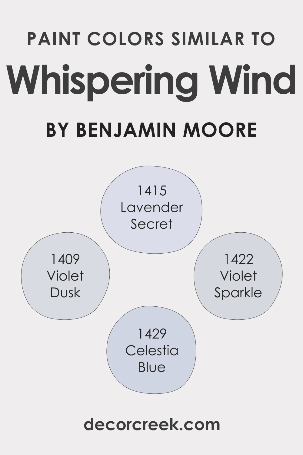
Colors Similar to Whispering Wind 1416
Identifying colors similar to Whispering Wind 1416 can expand a designer’s palette while maintaining a unified look. BM 1415 Lavender Secret is a whisper of purple that provides a soft, romantic ambiance. BM 1429 Celestia Blue offers a serene and clear sky-like effect. BM 1409 Violet Dusk brings in a touch of the evening sky’s mystery, and BM 1422 Violet Sparkle lends a subtle, enchanting shimmer.
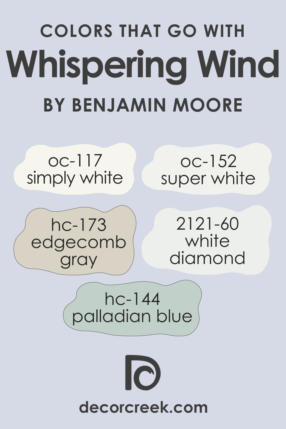
Colors That Go With Whispering Wind 1416
The art of pairing colors can elevate the design of a room from ordinary to extraordinary. Colors that complement Whispering Wind 1416 create a cohesive and inviting space. Benjamin Moore offers a range of colors that blend beautifully with it:
- OC-152 Super White: A crisp white that brings clarity and brightness.
- HC-173 Edgecomb Gray: A soft, warm gray that adds depth and complexity.
- BM 2121-60 White Diamond: A pale, icy blue that reinforces the coolness of Whispering Wind.
- OC-117 Simply White: A clean, versatile white that provides a fresh contrast.
- HC-144 Palladian Blue: A light, airy blue with a touch of green that harmonizes with the tranquility of Whispering Wind.
By understanding and utilizing the unique characteristics of Whispering Wind 1416, from its undertones and LRV to coordinating and trim colors, designers and homeowners alike can create spaces that are both beautiful and reflective of their personal style.
How to Use BM Whispering Wind In Your Home?
Whispering Wind 1416’s versatility allows it to thrive in spaces that call for calmness, openness, and a touch of modernity. It fits seamlessly into bedrooms, creating a peaceful sanctuary, and bathrooms, where it adds a spa-like serenity. Living rooms come alive with its airy feel, inviting relaxation. In contemporary, minimalist, or coastal design styles, it aligns with clean lines and light-filled spaces. Its adaptability even extends to exteriors, complementing natural elements and lighting.
Kitchens, too, can benefit from its freshness, whether on walls or cabinetry, pairing beautifully with marble or wooden countertops for a look that’s both inviting and stylish.
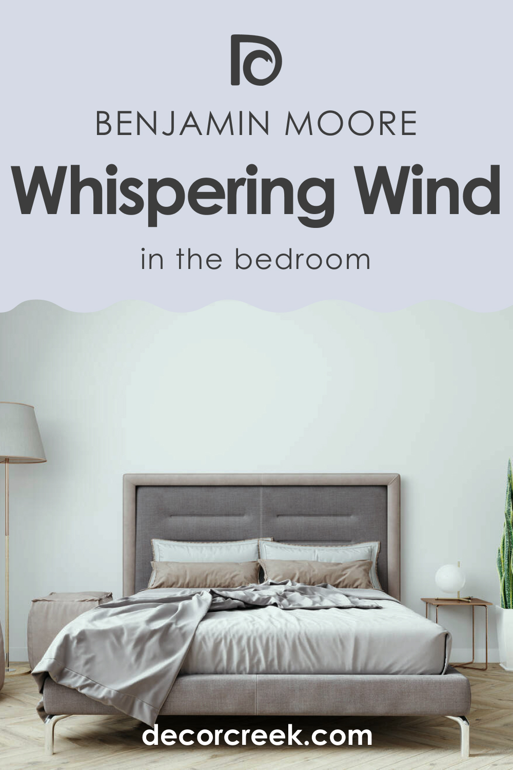
Whispering Wind 1416 in the Bedroom
In the bedroom, Whispering Wind 1416 serves as a backdrop for tranquility and rest. This color supports a restful sleep environment when paired with soft textiles and subtle lighting. It’s especially effective in rooms with ample natural light, where its subtle undertones can play throughout the day. Accent with darker blues or grays for depth or keep things airy with whites and light woods for a Scandinavian touch.
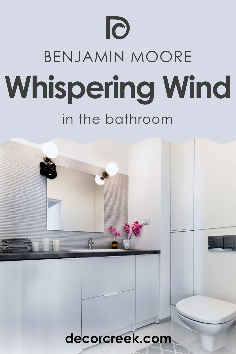
Whispering Wind 1416 in the Bathroom
Whispering Wind 1416 transforms bathrooms into serene retreats. Its light-reflecting quality can make small spaces appear larger, while its cool undertones evoke a clean, hygienic feel. Pair with sleek fixtures, white towels, and a touch of greenery for a modern, spa-like atmosphere. This color is particularly effective in bathrooms with natural stone or tiles.
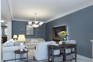
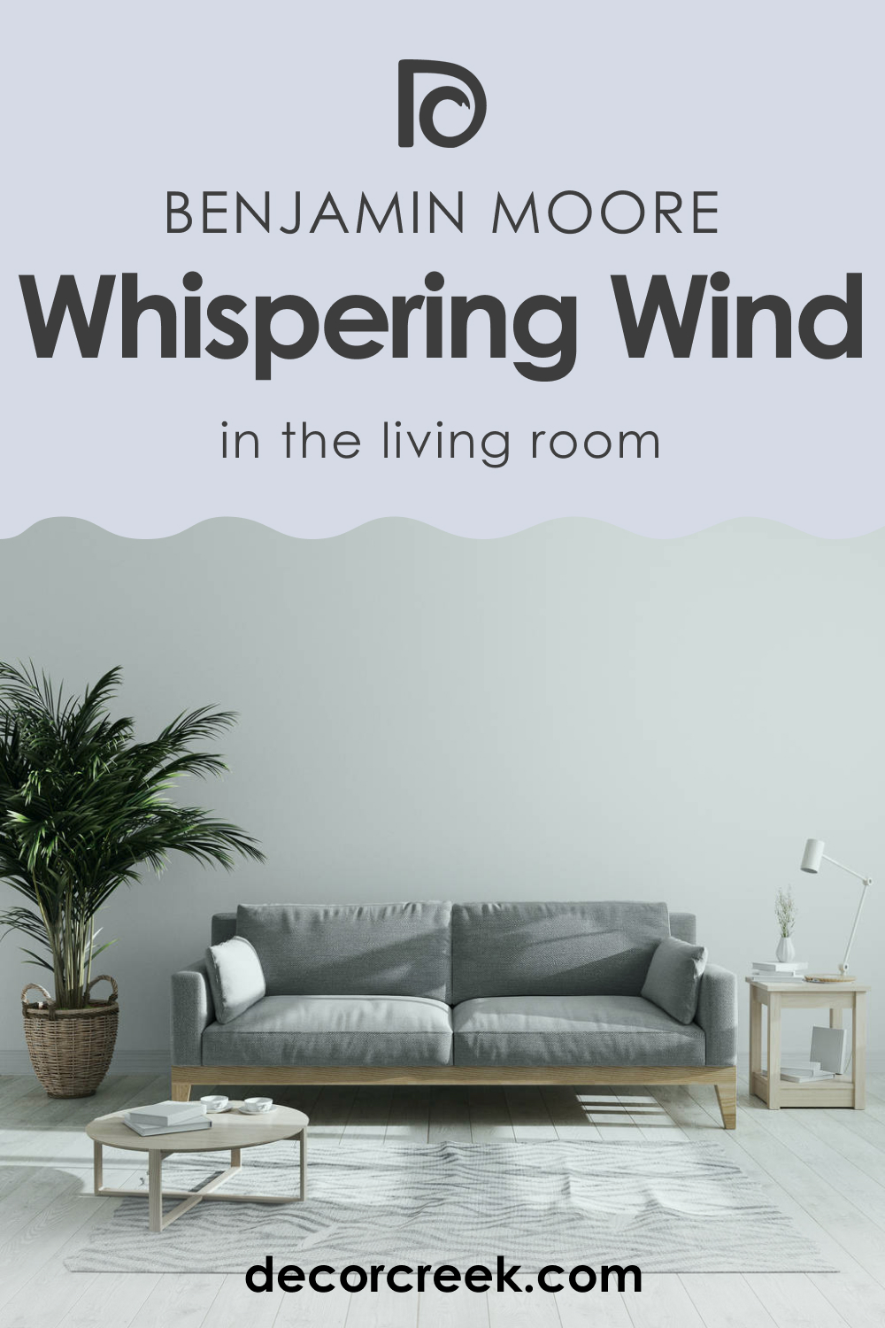
Whispering Wind 1416 in the Living Room
In the living room, Whispering Wind 1416 provides a refreshing canvas for both art and life. It complements a broad range of furnishings, from contemporary modular sofas to vintage wood tables, allowing for flexibility in design choices. Accentuate with rich textures and a mix of metallics for a sophisticated space that feels both welcoming and elegant.
Whispering Wind 1416 for an Exterior
For exteriors, Whispering Wind 1416 offers a fresh, inviting presence that harmonizes with natural surroundings. It’s well-suited for traditional and modern homes alike, blending with brick, stone, or siding. This color can enhance architectural details and stands out against green landscaping, providing a timeless and enduring curb appeal.

Whispering Wind 1416 in the Kitchen
Whispering Wind 1416 in the kitchen evokes cleanliness and freshness, making the heart of the home feel even more welcoming. It works well with stainless steel appliances, white countertops, and wooden accents. The color can also serve as a subtle contrast to bolder hues, allowing for a dynamic space that’s both functional and beautiful.

Whispering Wind 1416 on Kitchen Cabinets
On kitchen cabinets, Whispering Wind 1416 creates a sense of openness and light. It pairs delightfully with both modern and traditional hardware and can serve as a unifying neutral in a two-toned cabinet scheme. This shade on cabinets can brighten a space without overwhelming it, providing a perfect balance between a welcoming warmth and a clean aesthetic.

Comparing BM Whispering Wind With Other Colors
Comparing different paint colors is crucial as it provides a deeper understanding of their individual characteristics and how they influence mood, perception of space, and design cohesion. Whispering Wind 1416’s comparison with other colors will showcase its unique identity and help in making informed decisions about color schemes that reflect personal taste and the desired ambiance within a space.
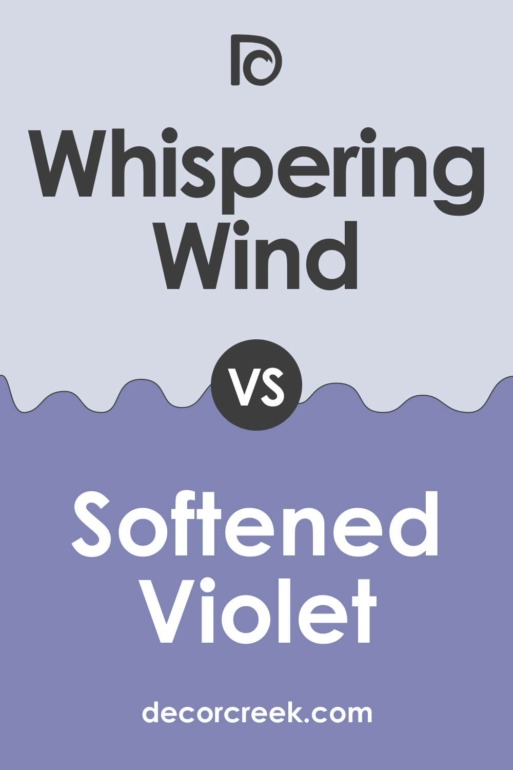
Whispering Wind 1416 vs. BM 1420 Softened Violet
Whispering Wind 1416 is a gentle hue that leans towards a breezy blue, while BM 1420 Softened Violet introduces a subtle, romantic lilac tone. Softened Violet provides a warmer presence compared to the cool freshness of Whispering Wind. Where Whispering Wind can make a space feel more open and airy, Softened Violet brings an enveloping warmth that’s soothing and comforting.
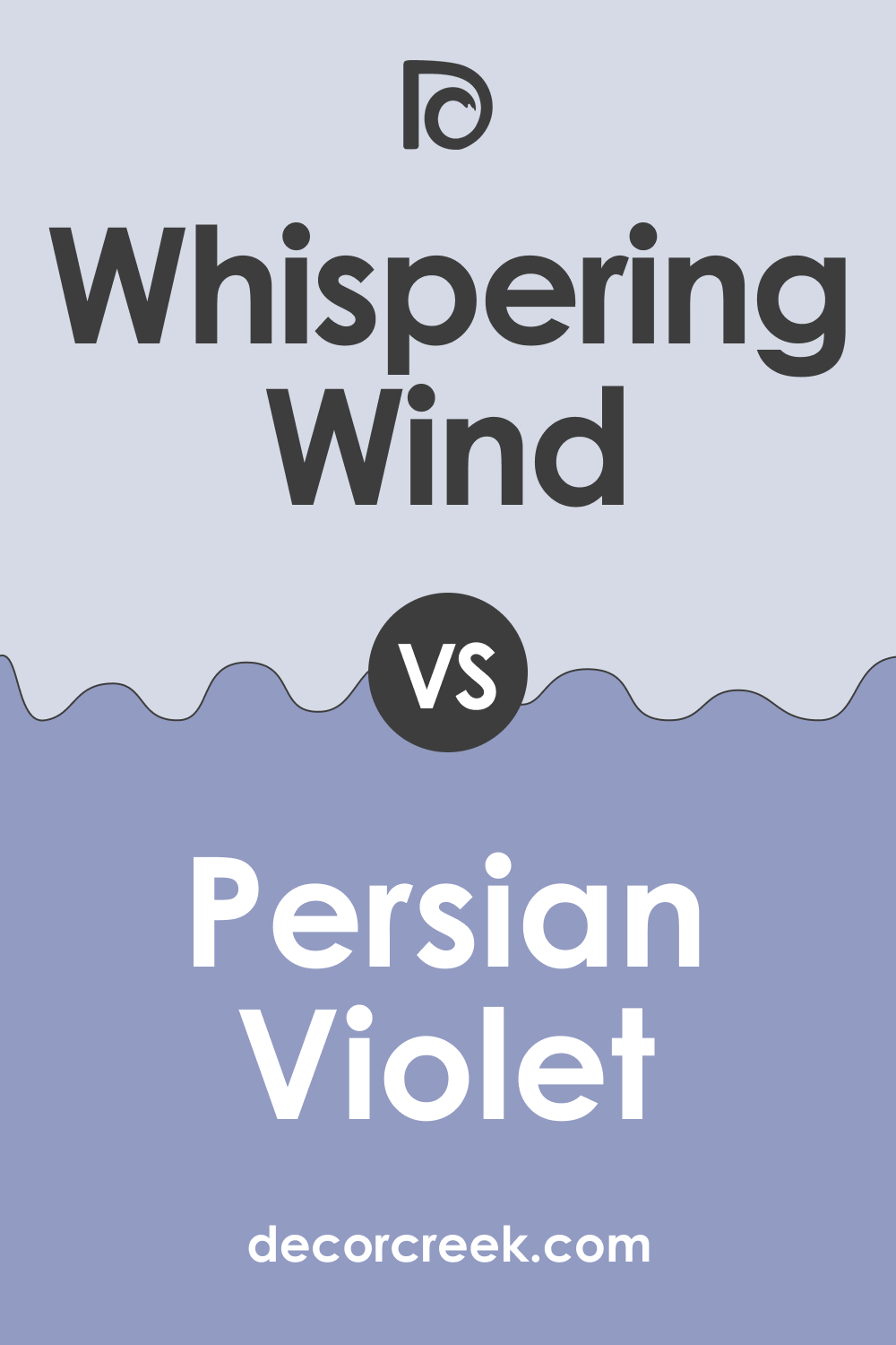
Whispering Wind 1416 vs. BM 1419 Persian Violet
Persian Violet is a deeper, more saturated color, offering a sense of luxury and depth compared to the airy lightness of Whispering Wind 1416. While Whispering Wind reflects light, Persian Violet absorbs it, creating a more intimate atmosphere. Together, they could create a dynamic and sophisticated palette, with Persian Violet anchoring the space and Whispering Wind offering a breath of fresh air.
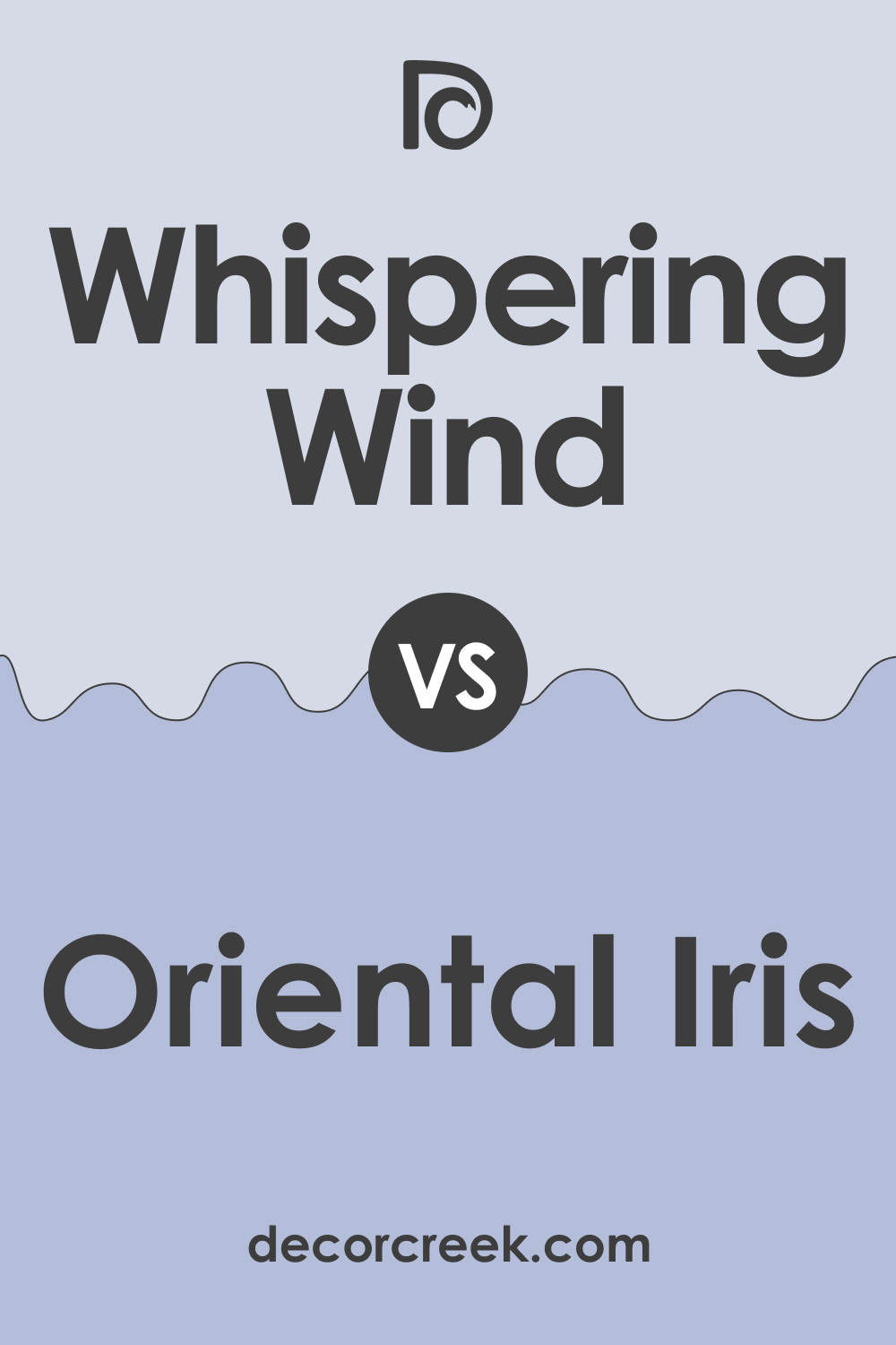
Whispering Wind 1416 vs. BM 1418 Oriental Iris
Oriental Iris is bolder and more assertive, with a presence that can dominate a space, unlike the subtlety of Whispering Wind 1416. Oriental Iris has the potential to make a strong statement in a room, whereas Whispering Wind is the epitome of understatement.
Whispering Wind’s softness would allow Oriental Iris to stand out as a striking feature in a complementary scheme.
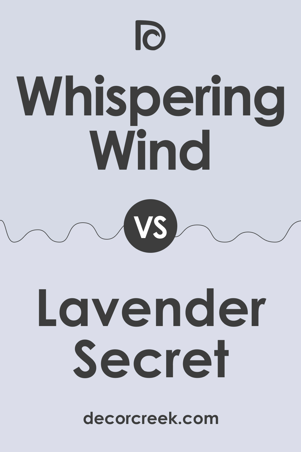
Whispering Wind 1416 vs. BM 1415 Lavender Secret
Lavender Secret shares a similar lightness to Whispering Wind but tilts towards the purple spectrum, offering a warmer, floral-inspired ambiance. Whispering Wind is more neutral and versatile, providing a cooler background that can suit various decor styles. In contrast, Lavender Secret brings a specific thematic flair that whispers of spring and elegance.
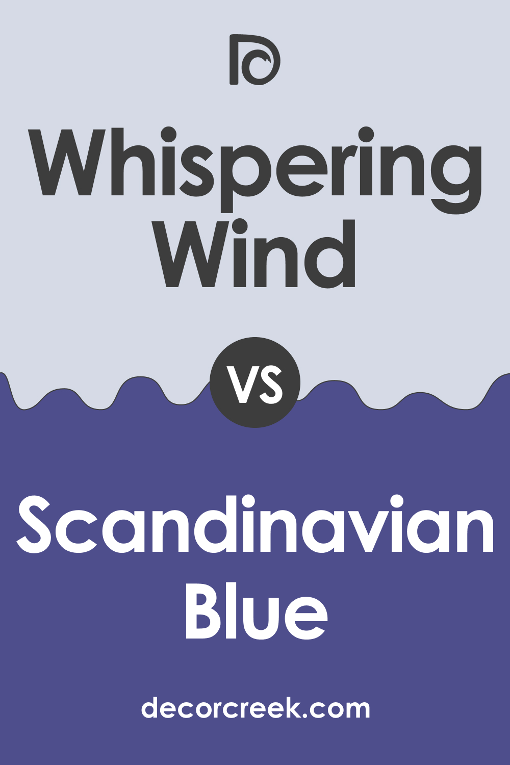
Whispering Wind 1416 vs. BM 2068-30 Scandinavian Blue
Scandinavian Blue is a rich, deeper blue, emanating a traditional vibe that can make spaces feel more anchored and centered than Whispering Wind 1416. The latter’s lightness interacts with spaces by adding an expansive quality, whereas Scandinavian Blue creates a focal point, drawing the eye and holding attention with its depth.
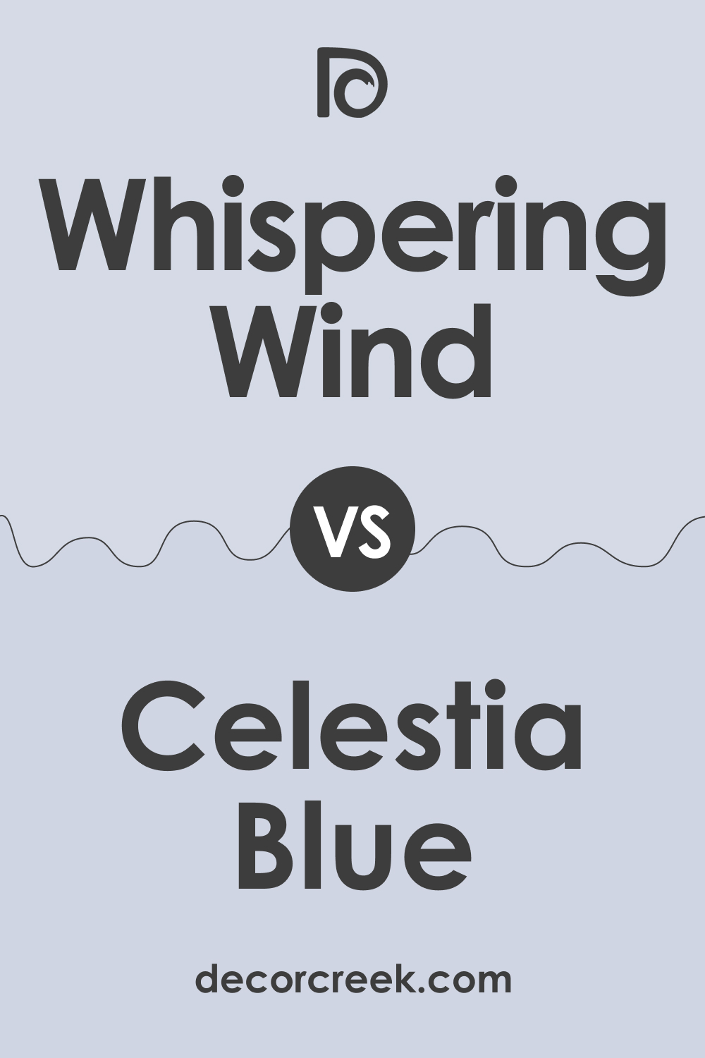
Whispering Wind 1416 vs. BM 1429 Celestia Blue
Celestia Blue is a pale, ethereal color that shares a kindred spirit with Whispering Wind but with a clearer blue tone that might be perceived as cooler. Both colors can create a serene atmosphere, yet Celestia Blue is the one that could potentially impart a crisper, more refreshing feel compared to the soft, muted embrace of Whispering Wind.
Conclusion
Whispering Wind 1416 offers a unique blend of subtlety and versatility that makes it a distinguished choice among its peers. Its ability to complement a wide range of styles and accents without overpowering them is a testament to its adaptability. The comparison with other colors not only highlights its unique qualities but also illustrates the importance of context in color selection.
Choosing the right color is about balance, harmony, and the desired emotional response one aims to evoke within a space. Whether seeking tranquility, warmth, or vibrancy, understanding the nuanced differences between shades like Whispering Wind and its counterparts is key to achieving a cohesive and personalized interior design.
Ever wished paint sampling was as easy as sticking a sticker? Guess what? Now it is! Discover Samplize's unique Peel & Stick samples.
Get paint samples