As you look for the perfect color to refresh your living space, consider SW 9610 Stony Creek from Sherwin Williams. This shade offers a subtle, natural elegance that can transform any room into a serene and inviting space.
Ideal for those who appreciate a hint of nature’s beauty indoors, Stony Creek blends well with a variety of decor styles, from rustic to contemporary. It’s a versatile choice that complements wood finishes, metals, and textiles, creating a cohesive look effortlessly.
Whether you are updating your kitchen, living room, or bedroom, this color provides a soft backdrop that enhances other design elements.
As you think about your next home improvement project, think about how Stony Creek can add a touch of calm and sophistication to your home.

What Color Is Stony Creek SW 9610 by Sherwin Williams?
Stony Creek is a unique paint shade that brings a cozy and earthy feel to any room. This color has a soft green undertone, creating a natural and calming environment, reminiscent of a peaceful riverbed or a lush forest floor.
The subtlety of Stony Creek makes it an excellent choice for various interior styles, particularly rustic, modern farmhouse, and contemporary designs. It blends seamlessly with natural materials such as wood, stone, and linen, enhancing their textures without overpowering them. This color also pairs wonderfully with metallic accents, like copper or brushed nickel, adding a touch of elegance to the earthy palette.
In a living room, Stony Creek can be used on a feature wall to provide a backdrop that highlights wooden furniture or terracotta pots. In a bedroom, it works well to create a soft, cozy atmosphere, perfect for relaxing. The color is also ideal for kitchens or dining areas, where it can complement wooden cabinets or stone countertops.
Overall, Stony Creek is a versatile color that adds a warm, inviting touch to a space, pairing well with a variety of materials and textures to create a cohesive and appealing interior.

Is Stony Creek SW 9610 by Sherwin Williams Warm or Cool color?
Stony Creek is a paint color by Sherwin Williams known for its rich and earthy green tone. This color has a vibrant yet calming effect, making it great for creating a cozy atmosphere in rooms.
It pairs well with natural materials like wood and stone, enhancing the comfort and warmth of spaces like living rooms or bedrooms. The deepness of Stony Creek allows it to stand out as an accent wall or blend subtly with other earthy tones for a more harmonious look.
In homes, this color also works well in spaces that benefit from a connection to nature, helping indoor spaces feel more open and fresh. Its versatility makes it a practical choice for many decorating styles, from rustic to modern. Overall, Stony Creek is a friendly and adaptable color that can add character and warmth to a home.
Undertones of Stony Creek SW 9610 by Sherwin Williams
Undertones are subtle hues mixed into the main color of paint that influence its overall appearance and how it reacts under different lighting conditions. These undertones can make the color shift in appearance under various light sources, whether it’s natural daylight or artificial lighting.
For the specific color in question, which comes from a popular paint brand, the undertones include a range of shades such as dark grey, olive, dark green, purple, navy, grey, dark turquoise, red, orange, pink, and pale pink. These various undertones play a crucial role in how the color appears when applied to interior walls.
For instance, an undertone like olive or dark green might make the wall paint appear more nature-inspired and calming, especially in a well-lit room or near large windows. On the other hand, undertones like purple or navy may give the walls a richer, deeper look, which becomes noticeable under artificial lighting, making the space feel cozy and intimate.
The presence of multiple undertones within this paint means that the color can appear differently based on the room’s lighting and the surrounding colors. This can be particularly advantageous for those looking to create a specific mood or complement various decor styles without having to change the base color.
Since every undertone reacts uniquely to light, the walls can offer an engaging visual experience, continually shifting subtly as the day progresses and as different sources of light illuminate the room. Thus, choosing a color with such complex undertones can add dynamic elements to any interior space, subtly enhancing the aesthetic and feel of the area.
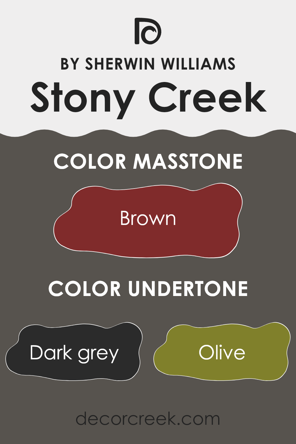
What is the Masstone of the Stony Creek SW 9610 by Sherwin Williams?
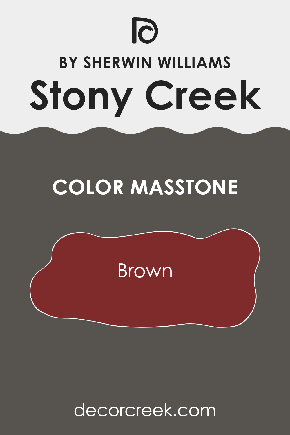
Stony Creek, designated by its rich masstone of brown (#802B2B), is a warm and inviting paint color. This deep, reddish-brown hue brings a cozy and comfortable feel to any room, making it a popular choice for living spaces.
The color’s natural earthiness allows it to blend well with various decor styles, from rustic to modern. When used on walls, this shade can make large spaces feel more intimate, while in smaller areas, it adds depth and warmth. Stony Creek’s ability to harmonize with natural materials like wood and leather enhances its appeal, providing a grounded look to interiors.
This color also pairs beautifully with lighter shades, such as creams and beiges, creating a balanced, welcoming environment. Its versatility makes it suitable for bedrooms, living rooms, and study areas, where a calm atmosphere is often desired.
How Does Lighting Affect Stony Creek SW 9610 by Sherwin Williams?
Lighting plays a crucial role in how colors appear in our surroundings. Different types of light can change the way we perceive a color’s hue, intensity, and mood. Each lighting condition can either enhance or mute the colors around us. Specifically, the color Stony Creek, a warm and earthy tone, exhibits varying characteristics depending on the lighting environment.
In natural light, Stony Creek looks warm and inviting. The natural sunlight highlights its rich, earthy tones, making the space feel cozy and welcoming. The quality of natural light changes throughout the day and affects how this color is perceived.
In rooms that face south, where abundant sunlight is available most of the day, Stony Creek maintains a vibrant and warm appearance. This makes it ideal for living spaces or kitchens where a lively atmosphere is desirable.
Conversely, in north-facing rooms, which receive less direct sunlight, Stony Creek tends to appear slightly muted and cooler.
This can create a more subdued and calm atmosphere suitable for bedrooms or study rooms, where a less intense color atmosphere is preferable.
In east-facing rooms, Stony Creek benefits from the morning light, which is softer and cooler. Here, the color will appear gently warm in the morning, providing a soft wake-up call which is soothing, particularly in bedrooms or breakfast nooks.
Meanwhile, in west-facing rooms, the color will transform throughout the day, since these rooms get the intense late afternoon sunlight. Stony Creek will glow warmly in the evenings, which can make living rooms or dining areas feel more welcoming and cozy as the day ends.
Artificial lighting, such as LED or incandescent bulbs, also affects how Stony Creek is perceived. Under warm artificial light, the color can look very similar to its appearance in natural, south-facing light, highlighting its warmer, richer tones. In cooler artificial light, such as that from fluorescent bulbs, the color might appear a bit less intense and slightly more neutral.
Understanding these effects can help you decide where and how to use this versatile color in your home to achieve the desired atmosphere in each room.

What is the LRV of Stony Creek SW 9610 by Sherwin Williams?
Light Reflectance Value, or LRV, is a measure used to indicate how much light a paint color reflects or absorbs when applied to a surface. Essentially, it’s a percentage scale, where a higher LRV means the color reflects more light, appearing lighter, and a lower LRV means it absorbs more light, appearing darker.
LRV can greatly influence the perception and ambiance of a room, as colors with higher values make spaces appear more open and bright, while lower values can make them seem cozier but smaller or more confined.
For the color with an LRV of 8.729, it falls on the darker end of the scale. This means it absorbs a lot of light rather than reflecting it. This particular shade, when used on walls, can significantly darken a room, making it more suitable for large, well-lit areas or spaces where a more intimate and enclosed feel is desired.
The darker nature of this color can also highlight wall textures and architectural details, creating a striking visual contrast with lighter colors used in décor or furnishings.
However, it’s also worth noting that such a low LRV might require more lighting elements in a room to balance the visual impact and avoid making the space feel too gloomy or oppressive.

What are the Trim colors of Stony Creek SW 9610 by Sherwin Williams?
Trim colors are the shades used for painting architectural trim elements such as door frames, window sills, and baseboards. They play a significant role in framing and accentuating the primary colors used on the walls, adding depth and distinction to the overall look of a space.
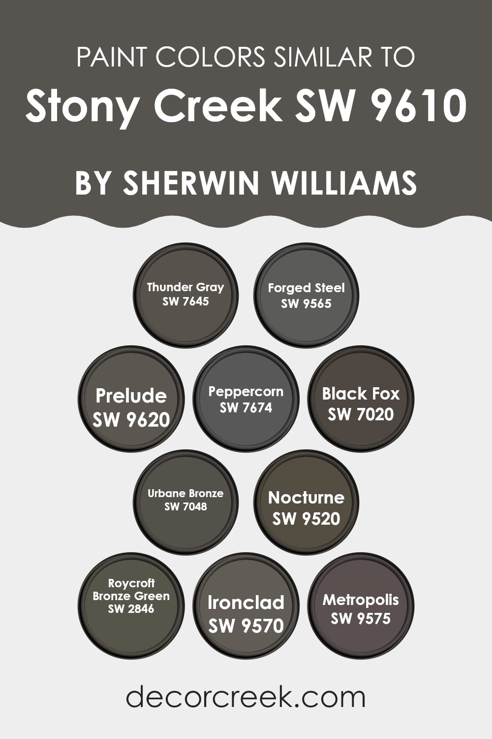
Using trim colors like Greek Villa SW 7551 or Repose Gray SW 7015 from Sherwin Williams can greatly enhance the aesthetic appeal of a room painted in Stony Creek, as these colors can either contrast with or complement the main hue, depending on the chosen shade.
Greek Villa SW 7551 is a warm, off-white color that provides a soft, muted boundary against the deeper tones of Stony Creek. This color is ideal for creating a gentle transition between walls and trim, lending a subtle, clean finish to the space.
On the other hand, Repose Gray SW 7015 offers a cooler, light gray shade that balances well with the richness of Stony Creek, giving a more defined and contemporary framing effect to walls and architectural details. This color can underscore a modern feel due to its neutral yet noticeable presence.
You can see recommended paint colors below:
Colors Similar to Stony Creek SW 9610 by Sherwin Williams
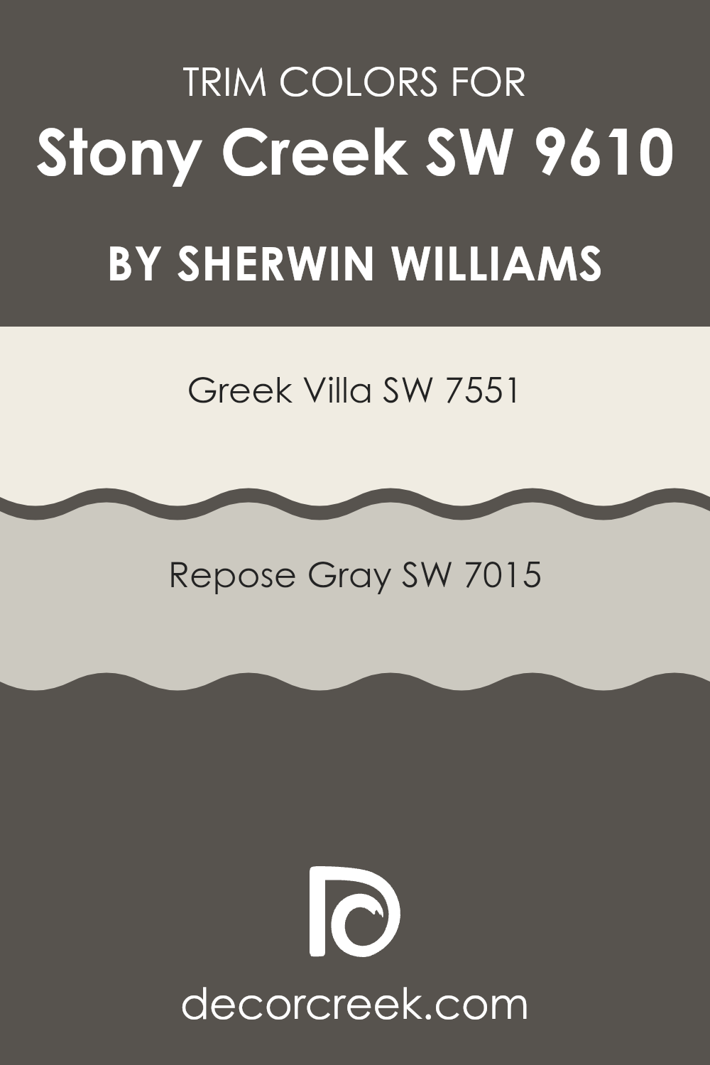
When selecting a paint color palette for a room or exterior, similar colors play a crucial role in achieving a harmonious and balanced look. Colors like Thunder Gray and Forged Steel add depth when paired with hues like Stony Creek, offering a rich tapestry of grays that seamlessly meld together. For instance, Thunder Gray is a deep charcoal that provides a stark, strong contrast, while Forged Steel is a lighter gray that softens spaces without demanding too much attention.
Further extending the palette, colors like Prelude and Peppercorn serve to create a smooth transition between lighter and darker tones. Prelude is a warm gray that brings a subtle coziness to the environment, perfect for living spaces.
On the darker end, Peppercorn brings a near-black shade that is bold yet not overpowering. Adding in shades like Black Fox and Urbane Bronze enriches a space by adding a variety of darker elements – Black Fox toes the line between gray and black, providing versatility, while Urbane Bronze offers a deep, almost mystical hue that anchors lighter shades.
Similarly, integrating Nocturne and Roycroft Bronze Green can inject personality into a space; Nocturne is a mysterious dark gray that adds drama, and Roycroft Bronze Green contributes a touch of natural green for a hint of color among neutrals. Ironclad and Metropolis, two sturdy grays, round out the selection with their industrial strength.
Ironclad offers a piercing charcoal that can intensify any design, while Metropolis serves as a muted steel, perfect for achieving understated elegance in the design scheme. Collectively, these similar shades of gray establish an aesthetic continuity that allows for creative expression while maintaining aesthetic unity.
You can see recommended paint colors below:
- SW 7645 Thunder Gray (CHECK A SAMPLE)
- SW 9565 Forged Steel (CHECK A SAMPLE)
- SW 9620 Prelude (CHECK A SAMPLE)
- SW 7674 Peppercorn (CHECK A SAMPLE)
- SW 7020 Black Fox (CHECK A SAMPLE)
- SW 7048 Urbane Bronze (CHECK A SAMPLE)
- SW 9520 Nocturne (CHECK A SAMPLE)
- SW 2846 Roycroft Bronze Green
- SW 9570 Ironclad (CHECK A SAMPLE)
- SW 9575 Metropolis (CHECK A SAMPLE)
How to Use Stony Creek SW 9610 by Sherwin Williams In Your Home?
Stony Creek SW 9610 by Sherwin Williams is a versatile paint color ideal for various spaces in your home. This shade is a deep, rich teal that adds a warm, cozy touch to any room. For those looking to refresh their living room or bedroom, Stony Creek provides a calming backdrop that works well with furniture in neutral colors like whites, grays, and browns.
This color is also excellent for creating a focal point, so consider using it on an accent wall or for painting cabinetry in your kitchen or bathroom.
This teal shade pairs beautifully with natural elements such as wood or stone, enhancing spaces that have good natural light, while in smaller or dimly lit areas, it introduces depth and warmth. Whether it’s applied to walls, used to update old furniture, or added via decorative accents, Stony Creek is flexible and easy to integrate into your decorating style, providing a rich and welcoming atmosphere to any space.
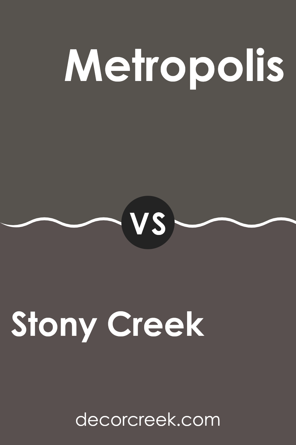
Stony Creek SW 9610 by Sherwin Williams vs Metropolis SW 9575 by Sherwin Williams
Stony Creek and Metropolis by Sherwin Williams are two distinct shades that bring unique vibes to any space. Stony Creek is a softer, earthy taupe—perfect for creating a cozy and inviting atmosphere. Its subtle warmth makes it ideal for living rooms or bedrooms where a calm, welcoming feel is desired.
On the other hand, Metropolis is a deeper gray with a strong presence. It leans more towards a modern and bold look, making it great for accent walls or spaces where a touch of drama is needed.
The cooler undertone of Metropolis can provide a sleek, contemporary backdrop, contrasting well with vibrant colors or metallic decor. Together, these colors can work beautifully in a home, depending on whether you want a nurturing, soft environment or a more striking, chic setting.
You can see recommended paint color below:
- SW 9575 Metropolis (CHECK A SAMPLE)
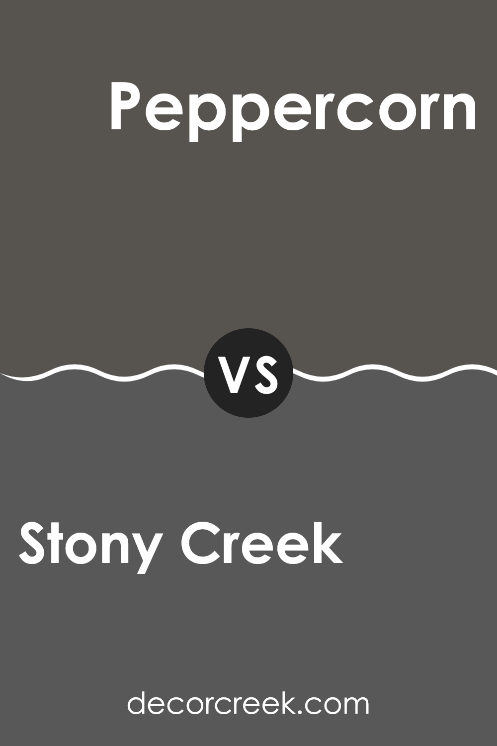
Stony Creek SW 9610 by Sherwin Williams vs Peppercorn SW 7674 by Sherwin Williams
Stony Creek and Peppercorn are two distinct paint colors by Sherwin Williams that offer different vibes for room settings. Stony Creek is a soft, earthy taupe that gives a room a warm and calming feel.
It’s versatile and works well in spaces where you want a neutral backdrop with a touch of organic warmth. On the other hand, Peppercorn is a much darker gray that carries a bold and strong presence. It’s perfect for creating dramatic accents in a room or when used on walls, it can make a striking statement.
This color can also make large, open spaces feel more cozy and defined. While Stony Creek suits those looking for a gentle and welcoming atmosphere, Peppercorn is ideal for areas where a touch of drama and modern flair is desired. Both colors are practical choices but cater to different aesthetic tastes and functions within a home.
You can see recommended paint color below:
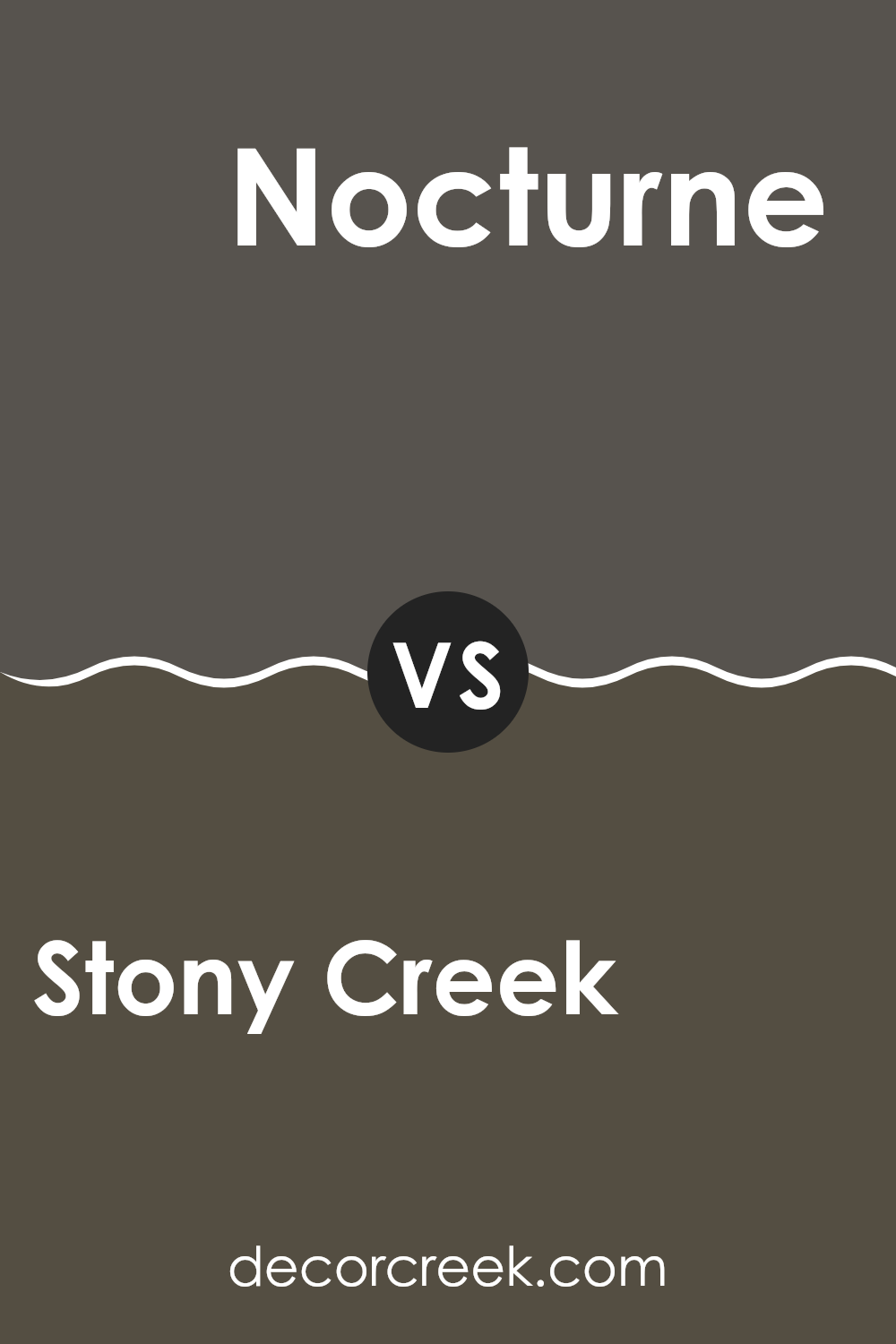
Stony Creek SW 9610 by Sherwin Williams vs Nocturne SW 9520 by Sherwin Williams
Stony Creek is a warm, muted olive green hue that adds a cozy and welcoming feel to any space. It pairs well with natural materials like wood, bringing a grounded and peaceful atmosphere to rooms. Its earthy tone makes it a great choice for common areas like living rooms or kitchens, creating a friendly vibe.
On the other hand, Nocturne is a dark navy blue color that gives a strong, bold impression. It works beautifully as an accent wall or for furniture pieces to add contrast and depth to lighter colored rooms. This deep shade of blue is also ideal for creating a dramatic and stylish look in spaces, particularly when used in bedrooms or dining areas.
Together, Stony Creek and Nocturne can complement each other in a room, achieving a balanced look with the warmth of the olive green and the depth of the navy blue.
You can see recommended paint color below:
- SW 9520 Nocturne (CHECK A SAMPLE)
Stony Creek SW 9610 by Sherwin Williams vs Black Fox SW 7020 by Sherwin Williams
Stony Creek and Black Fox are two unique colors offered by Sherwin Williams. Stony Creek is a soft, beige-gray shade, leaning more towards a natural stone color, which brings a calming, neutral feel to any space. It’s versatile and works well in areas where you want a gentle backdrop that blends easily with other colors and decor elements.
In contrast, Black Fox is a much darker shade with a deep charcoal tone. This color can add drama and depth to a space, making it perfect for accent walls or furniture pieces. It’s a strong color that commands attention and pairs well with lighter tones for a striking contrast.
These two colors can complement each other in a space, with Stony Creek brightening areas and Black Fox adding bold, defining elements. Whether used together or separately, both add their unique character to interiors depending on the mood or style desired.
You can see recommended paint color below:

Stony Creek SW 9610 by Sherwin Williams vs Ironclad SW 9570 by Sherwin Williams
Stony Creek and Ironclad, both by Sherwin Williams, present unique shades that could add distinct tones to any space. Stony Creek is a softer, beige color with a warm, inviting feel. It’s perfect for creating a cozy atmosphere in areas like living rooms or bedrooms, complimenting natural light beautifully.
On the other hand, Ironclad appears as a darker gray, offering a bolder and more striking appearance. This color is ideal for creating dramatic accents, suitable in modern kitchens or as an exterior color for a contemporary look.
Both colors come from the same manufacturer, ensuring quality and ease of application, and they provide great options depending on the mood and style you want to achieve. Their differences in shade and tone can cater to various design preferences, making them versatile choices for different projects or rooms.
You can see recommended paint color below:
- SW 9570 Ironclad (CHECK A SAMPLE)

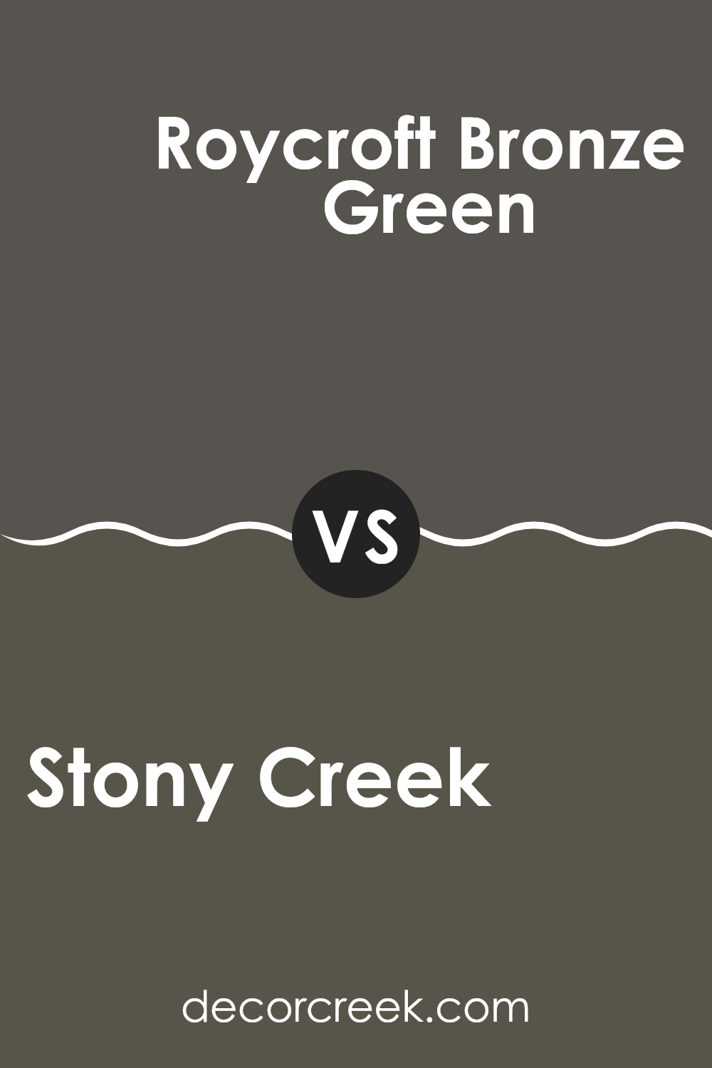
Stony Creek SW 9610 by Sherwin Williams vs Roycroft Bronze Green SW 2846 by Sherwin Williams
Stony Creek and Roycroft Bronze Green are two distinct hues from Sherwin Williams that offer unique vibes to any space. Stony Creek is a warm beige with gray undertones, providing a muted backdrop that’s versatile for various decorating styles. It reflects light gently, making rooms feel more open and airy.
On the other hand, Roycroft Bronze Green is a darker, richer color with a blend of green and bronze tones. This color can make spaces feel more cozy and grounded. It’s great for creating a focal point in a room or adding depth when used on accent walls.
Both colors have their own charm – Stony Creek is ideal for those who prefer subtle, lighter shades that don’t overpower the space, while Roycroft Bronze Green suits those looking for a bit more drama and warmth in their decor. When choosing between them, consider the amount of natural light in your room and the mood you want to create.
You can see recommended paint color below:
- SW 2846 Roycroft Bronze Green
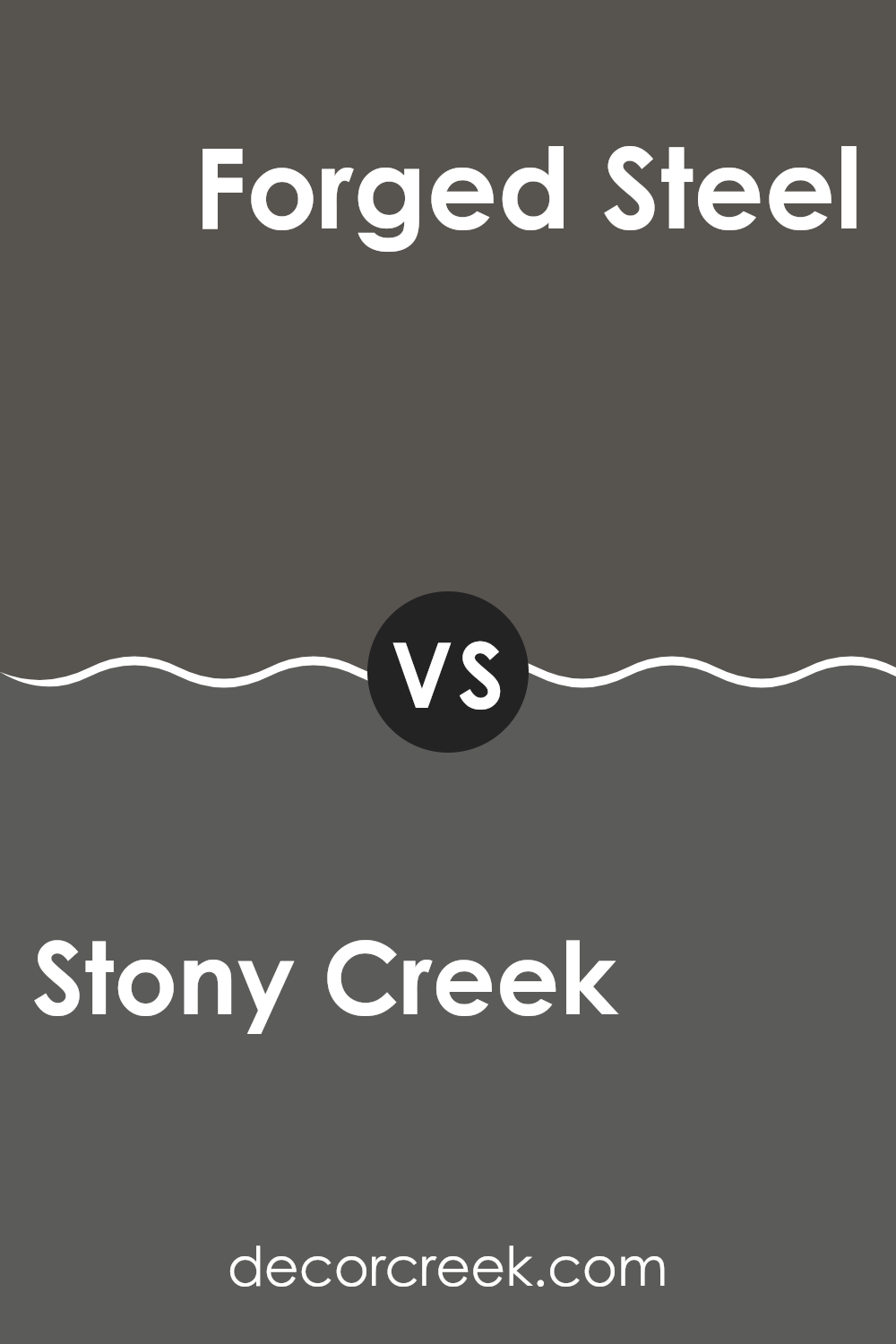
Stony Creek SW 9610 by Sherwin Williams vs Forged Steel SW 9565 by Sherwin Williams
Stony Creek and Forged Steel, both by Sherwin Williams, offer distinct tones suitable for various decorating styles. Stony Creek is a warm, earthy green with a hint of gray, providing a cozy and welcoming vibe. It’s an excellent choice for spaces where a touch of nature is desired without overwhelming greenery. This color fits well in living rooms, bedrooms, or study areas, lending a subtle, naturalistic feel.
Forged Steel, on the other hand, is a deep, almost black gray with strong, bold undertones. This color is ideal for making a statement or accentuating specific areas within a room. It works nicely for doors, trim, or even an accent wall, particularly in modern settings where a dramatic and stylish impact is desired.
Both colors serve different purposes in decor. Stony Creek leans towards a soft, more muted palette, whereas Forged Steel goes bold and strong, making each unique in creating mood and space definition.
You can see recommended paint color below:
Stony Creek SW 9610 by Sherwin Williams vs Prelude SW 9620 by Sherwin Williams
Stony Creek and Prelude, both offered by Sherwin Williams, present nuanced yet distinct tones that can noticeably affect the mood of a room. Stony Creek is a deep, rich beige that gives a cozy and warm feeling, making it perfect for spaces where you want comfort, like living rooms or bedrooms.
It pairs well with both bright accents and darker woods, offering versatility in decor styles. In contrast, Prelude is a lighter, more subdued beige with grey undertones. This color works great in spaces that require a neutral backdrop that still offers a touch of warmth.
It’s particularly effective in areas that receive a lot of natural light, as the color tends to reflect and amplify the light, making spaces appear larger and more open. Both colors are practical choices that can create inviting and relaxing atmospheres in the home, each bringing its unique vibe depending on the room’s use and the accompanying decor.
You can see recommended paint color below:

Stony Creek SW 9610 by Sherwin Williams vs Thunder Gray SW 7645 by Sherwin Williams
Stony Creek is a warm, medium brown with subtle green undertones that give it an earthy, natural feel. It’s a versatile color that works well in spaces where you want to create a cozy and welcoming atmosphere, such as living rooms or studies.
On the other hand, Thunder Gray is a deep, moody gray with bluish undertones that can give a strong, modern look to a space. It’s perfect for adding drama and depth to areas like bedrooms or home offices. While both colors offer a unique vibe, Stony Creek tends to be more subtle and grounding, whereas Thunder Gray makes a bolder statement.
Both shades can effectively enhance the mood and style of a room, depending on the desired effect. Whether you opt for the warm undertones of Stony Creek or the cool impact of Thunder Gray, each color has its own charm and can significantly impact the overall aesthetic of your home.
You can see recommended paint color below:
- SW 7645 Thunder Gray (CHECK A SAMPLE)

Stony Creek SW 9610 by Sherwin Williams vs Urbane Bronze SW 7048 by Sherwin Williams
Stony Creek by Sherwin Williams is a muted, earthy green shade with gray undertones. It provides a natural, calming feel to spaces due to its subtle blend. This color works well in areas where you want a touch of nature without overpowering green tones. On walls, it offers a soft backdrop that pairs easily with both modern and rustic decor.
Urbane Bronze by Sherwin Williams, on the other hand, is a deep, warm gray with brown undertones. It adds a strong, grounding feeling to a room and is often used to make a bold statement. Ideal for accent walls, exterior trims, or cabinets, Urbane Bronze stands out for its richness and depth. It works perfectly in a space where you want to highlight architectural features or create a cozy, enveloping atmosphere.
While Stony Creek brings in a lighter, airier quality, Urbane Bronze provides a bold, cozy impact. Both colors are versatile, but their applications quite differ based on the mood you wish to set.
You can see recommended paint color below:

Conclusion
Stony Creek is a beautiful and peaceful shade that can make any room in a house feel calm and cozy. What stands out the most is how well it works in different places, like the living room, bedroom, or even the bathroom. It is gentle on the eyes and fits in well with many different styles of furniture and decoration.
This color is also really good for people who want their home to feel warm and welcoming without being too bright or bold. It’s kind of like the color you see on smooth, round pebbles by a creek, which is probably why it feels so natural and pleasant. Whether you’re painting a whole room or just an accent wall, Stony Creek can definitely make a place feel more like home.
Overall, I think SW 9610 Stony Creek by Sherwin Williams is a great choice if someone is looking to refresh their home with a new color. It’s easy to see why many people would pick it to make their living spaces nicer.
Whether you’re doing a small project or repainting your whole house, this color could be a top choice.

Ever wished paint sampling was as easy as sticking a sticker? Guess what? Now it is! Discover Samplize's unique Peel & Stick samples.
Get paint samples


