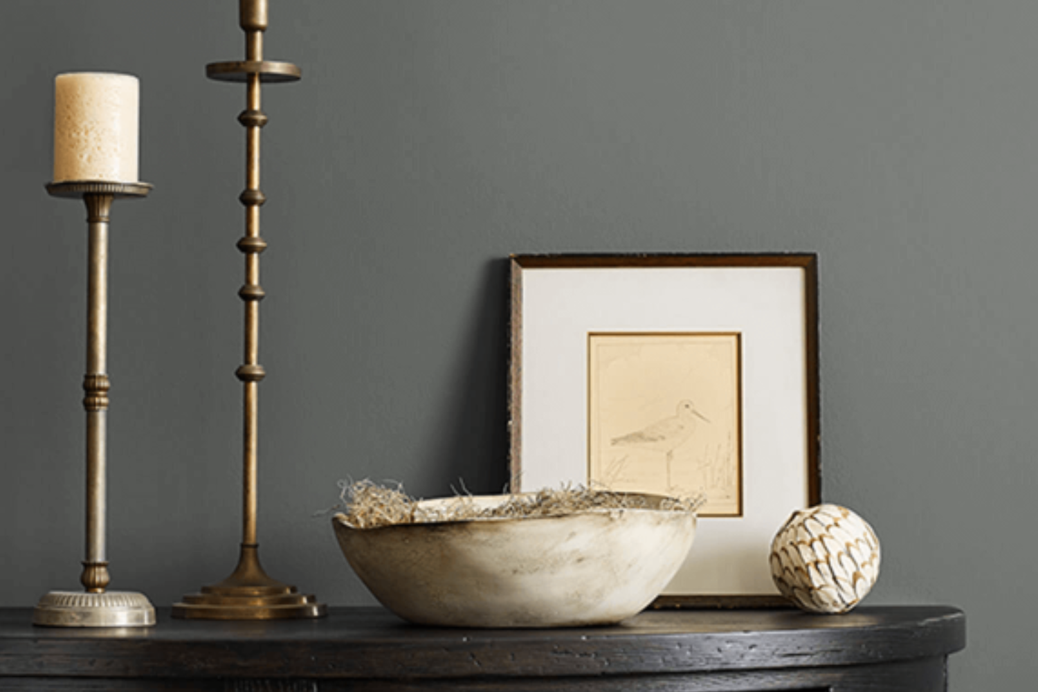
Introducing SW 7068 Grizzle Gray by Sherwin Williams, a color that effortlessly transforms any space into a statement of elegance and style. This paint color is a favorite among homeowners and designers alike for its versatility and understated beauty.
Grizzle Gray is a unique shade that strikes a perfect balance between a deep, rich gray and a lighter, more accessible tone, making it ideal for use in a variety of settings.
Whether you’re looking to update your living room, bedroom, or even an exterior facade, this color can provide a sophisticated backdrop that enhances your decor without overwhelming it.
Sherwin Williams’ SW 7068 Grizzle Gray works well in spaces that receive a lot of natural light, as well as in those that could use a bit of a boost, thanks to its ability to reflect light in a way that brightens and opens up a room.
Furthermore, its adaptability means it can pair beautifully with a wide range of color palettes, from bold and vibrant to soft and neutral. This makes it a go-to choice for anyone looking to refresh their space with a timeless and versatile hue.
Whether you’re a fan of minimalist design or prefer something more eclectic, Grizzle Gray offers a solid foundation upon which to build your unique aesthetic.
What Color Is Grizzle Gray SW 7068 by Sherwin Williams?
Grizzle Gray by Sherwin Williams is a unique and versatile shade that brings a sophisticated touch to any space. This gray color harbors a bold depth that makes it stand out from other grays. It’s not just any regular gray; it’s got a rich, almost mysterious vibe to it, making it perfect for those who want to add a bit of elegance and drama to their interior.
This shade works beautifully in a variety of interior styles. Whether you’re decking out a modern minimalist living room, a cozy Scandinavian nook, or even a traditional study with lots of wood elements, Grizzle Gray has got you covered. It’s particularly striking in industrial and contemporary settings, where its depth can play off metallic accents and sleek furniture designs.
When it comes to pairing with materials and textures, Grizzle Gray is a real team player. It looks stunning against the warmth of natural wood, whether it be light oak or rich walnut, creating a balanced and inviting atmosphere.
For a more luxurious feel, pair it with marble or metallic finishes like brass or copper; this adds a touch of glamour without overwhelming the space. Soft textiles in muted colors or even bold patterns also complement this gray, adding a layer of comfort and visual interest to the room.
In summary, Grizzle Gray is a dynamic and flexible color that can elevate a wide range of interior styles while pairing seamlessly with various materials and textures.
Ever wished paint sampling was as easy as sticking a sticker? Guess what? Now it is! Discover Samplize's unique Peel & Stick samples.
Get paint samples

Is Grizzle Gray SW 7068 by Sherwin Williams Warm or Cool color?
Grizzle Gray, coded SW 7068, is a color offered by Sherwin Williams, and it’s a unique shade that carries a blend of sophistication and rugged charm. Perfect for anyone looking to add a touch of elegance while maintaining a grounded, earthy feel to their space, this color strikes a fine balance.
Its ability to act as both a dominant room color or a complementary accent makes it versatile for various home settings.
When applied to walls, Grizzle Gray can make a room feel more spacious and airy, especially when paired with bright white trims or ceiling colors. This contrast not only highlights the architectural features of a room but also introduces a dynamic visual appeal.
In spaces with abundant natural light, Grizzle Gray evolves throughout the day, subtly shifting in hue to match the changing atmosphere, which adds an element of liveliness to the room.
Moreover, its neutrality means it fits well with a wide array of decor styles, from modern to rustic. By choosing this color, homeowners have the freedom to experiment with bold and vibrant furnishings without the risk of clashing, allowing personal style to shine through while maintaining a cohesive look. It’s this adaptability that makes Grizzle Gray a favored choice for creating inviting, stylish homes.
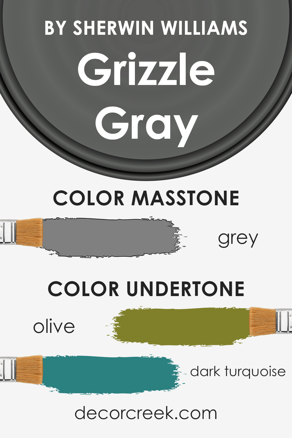
Undertones of Grizzle Gray SW 7068 by Sherwin Williams
Grizzle Gray is a unique color with interesting undertones that give it a special look. Its undertones, olive and dark turquoise, play a big role in how we perceive the color. These undertones can affect the appearance of the paint under different lighting conditions and when paired with various decor styles.
Undertones are like the color’s shadow; they add depth and complexity. In the case of Grizzle Gray, the olive undertone adds a hint of warmth, making the color feel more inviting and cozy. It’s subtle but can make a room feel more grounded.
On the other hand, the dark turquoise undertone can bring a touch of coolness, which might make the environment feel more serene and balanced. This cool undertone can also add a layer of sophistication to the space.
When applied to interior walls, these undertones influence the mood and style of the room. Natural light or artificial light can highlight different aspects of these undertones, changing the wall’s appearance throughout the day.
For instance, in a room with plenty of sunlight, the olive undertone might become more pronounced, enhancing a warm, cozy vibe. In a less lit area or during the evening, the dark turquoise could become more noticeable, lending the room a cooler, more tranquil atmosphere.
Understanding these undertones can help you choose décor and accessories that either complement or contrast with Grizzle Gray, allowing you to create a desired mood or style in your space. Whether aiming for a warm, comforting area or a more balanced, serene setting, taking these undertones into account is key to achieving your decor goals with this versatile color.
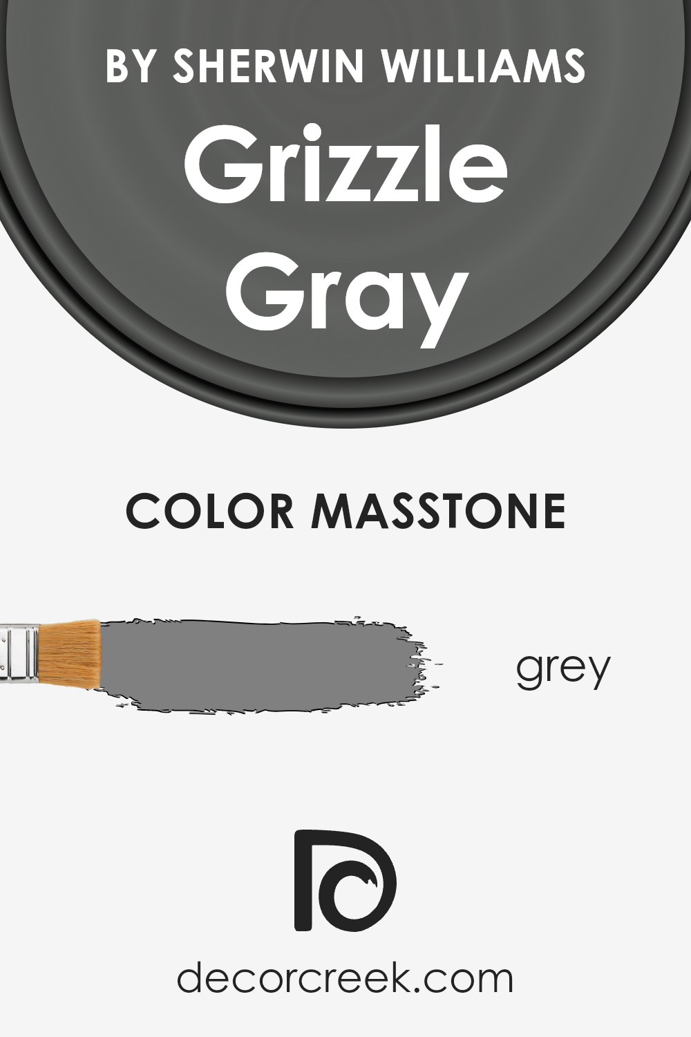
What is the Masstone of the Grizzle Gray SW 7068 by Sherwin Williams?
Grizzle Gray by Sherwin Williams is a unique shade with a base color that can be closely related to the standard grey (#808080). This masstone, being a true grey, offers a versatile and balanced foundation for any room in the house.
Its neutral tone means it can easily match with a wide range of colors, from bright and bold to soft and subtle. This makes it a perfect choice for those who like to change their decor often, as it won’t clash with new color schemes.
The true grey nature of Grizzle Gray ensures that it brings a calm and stable atmosphere into homes. It’s ideal for spaces where you want to promote a sense of relaxation and tranquility, like bedrooms and living rooms.
Additionally, its neutrality helps in making small rooms appear larger and more open, while giving larger spaces a cohesive look. Whether you’re aiming for a modern, minimalist vibe or a cozy, traditional feel, this color works well in various home styles, proving itself to be a truly versatile paint color choice.
How Does Lighting Affect Grizzle Gray SW 7068 by Sherwin Williams?
Lighting plays a huge role in how we see colors. Whether a room is basked in the glow of the sun or lit by bulbs and lamps, the colors around us can look different. The color Grizzle Gray is no exception. This specific tone from Sherwin Williams is quite versatile and reacts differently under various lighting conditions, affecting the mood and appearance of a space.
- When it comes to artificial light, the paint color can shift in appearance based on the type of bulbs used. Warm lights can make Grizzle Gray feel more welcoming and cozy, adding a slight warmth to its cool undertones. On the other hand, cool lights can enhance its gray qualities, making the color appear more crisp and modern.
- In natural light, the direction of your room plays a key role in how this color presents itself. North-faced rooms tend to receive less direct sunlight, which can make this color appear as a true deep gray, providing a sophisticated and calming atmosphere. The cooler, indirect light emphasizes the color’s depth and complexity.
- South-faced rooms enjoy abundant sunlight throughout the day. This exposure can warm up Grizzle Gray, softening it slightly and potentially pulling out any underlying warm tones. The color can appear lighter and more dynamic in these spaces, offering a different vibe during various times of the day.
- East-faced rooms get the morning sun, which is warm and welcoming. Here, Grizzle Gray can look softer and more inviting in the morning light, possibly showing hints of its underlying tones. As the day progresses and the natural light diminishes, the color can return to its deeper, true gray appearance.
- West-faced rooms are on the receiving end of the afternoon and evening sun. The intense, warmer late-day light can highlight the warmer elements of Grizzle Gray, making it appear slightly lighter than it might in the morning or in a room facing another direction.
Understanding how Grizzly Gray reacts to different lighting conditions can help you decide which room and which wall it might suit best, ensuring you achieve the desired effect in your space.
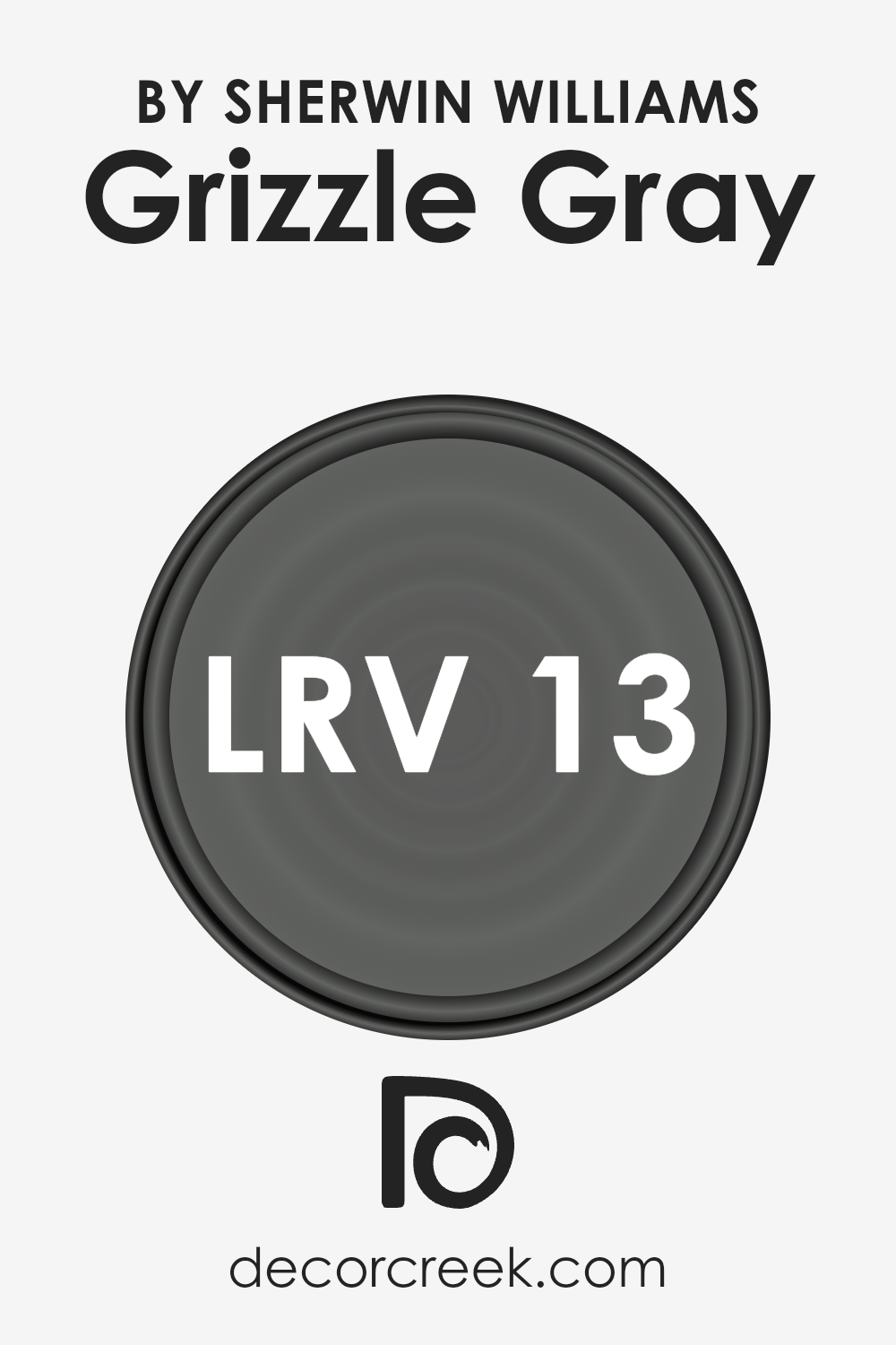
What is the LRV of Grizzle Gray SW 7068 by Sherwin Williams?
LRV stands for Light Reflectance Value, which is a measure used to indicate how much light a paint color reflects or absorbs. Think of it like a scale from 0 to 100, where 0 is completely black, absorbing all light, and 100 is pure white, reflecting all light. This value is crucial because it helps you understand how bright or dark a color will look on your walls, affecting the overall mood and ambiance of a room.
A higher LRV means the color will reflect more light, making a room feel brighter and more open, while a lower LRV means the color absorbs more light, creating a cozier or more enclosed feeling.
With an LRV of 12.835, the color in discussion falls on the darker end of the scale, meaning it doesn’t reflect much light. On walls, this can make a room feel more intimate or dramatic, depending on the size of the room and the lighting available.
In well-lit spaces or rooms with plenty of natural light, this color can add depth and sophistication. However, in smaller or poorly lit rooms, it might make the space feel smaller or more enclosed. When choosing this color, it’s important to consider the lighting in the room where it will be used, as this will significantly impact how the color ultimately appears and influences the room’s atmosphere.
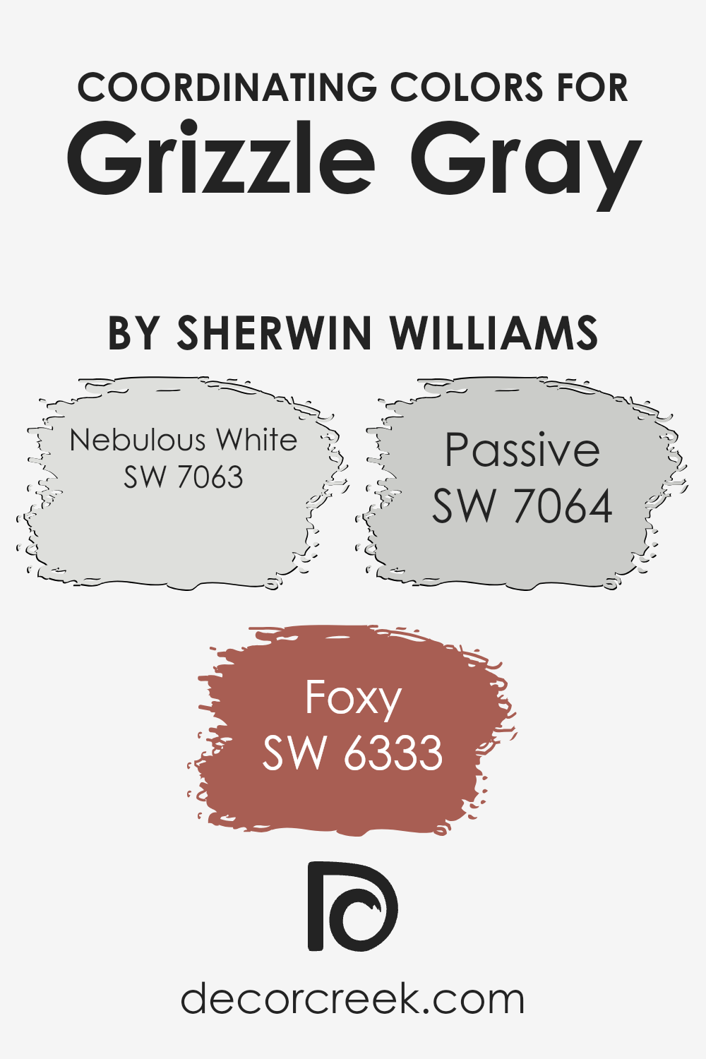
Coordinating Colors of Grizzle Gray SW 7068 by Sherwin Williams
Coordinating colors are hues that complement each other to create a harmonious and pleasing aesthetic in a space. They work by balancing each other out, either by pairing cool tones with warm ones or by using colors that sit close to each also on the color wheel, thus offering a visually appealing contrast without clashing.
When used thoughtfully, these colors can enhance the ambiance of a room, add depth to the design, and allow individual elements to stand out or blend seamlessly, depending on the desired effect.
Grizzle Gray is a versatile color that pairs wonderfully with a range of coordinating colors to elevate the look and feel of any space. One of such colors is Nebulous White, a soft, airy white with just a hint of warmth, making it perfect for creating a light and inviting environment. It acts as a gentle counterpoint to deeper shades, preventing them from overwhelming the space.
Then there’s Foxy, a rich, warm hue that adds a touch of earthiness and sophistication. Finally, Passive offers a light gray tone that bridges the gap between the warmth of Foxy and the crispness of Nebulous White.
It’s a subtle color that helps create a serene and cohesive look, ensuring that the overall design feels balanced and complete. Together, these colors offer a palette that can bring any room to life with elegance and ease.
You can see recommended paint colors below:
- SW 7063 Nebulous White
- SW 6333 Foxy
- SW 7064 Passive
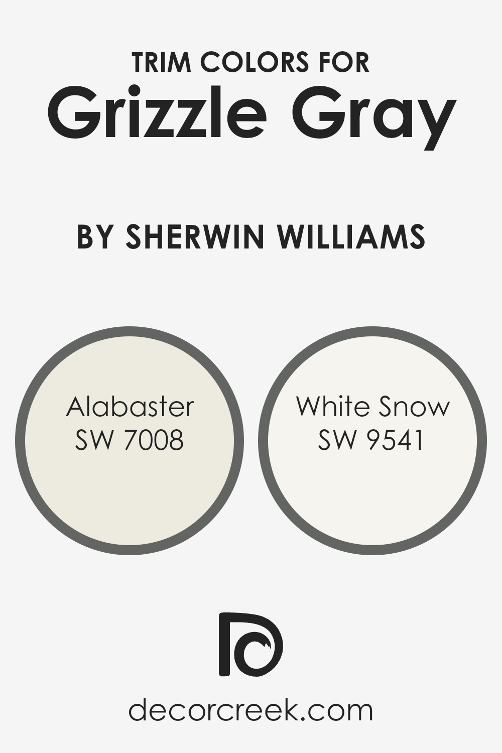
What are the Trim colors of Grizzle Gray SW 7068 by Sherwin Williams?
Trim colors are essentially the shades used to paint the trimmings of rooms, like baseboards, moldings, door and window casings, and sometimes even ceiling borders, which underline or frame the walls painted in a different hue. When considering a robust and versatile color like Grizzle Gray by Sherwin Williams, selecting the right trim color becomes crucial.
The appropriate trim hue can highlight the gray’s depth and complexity while ensuring the space feels cohesive and thoughtfully designed. Trim colors add a layer of sophistication or contrast, helping to emphasize the structural features of a room and create visual interest.
For a color like Grizzle Gray, Alabaster (SW 7008) and White Snow (SW 9541) are excellent trim choices. Alabaster presents a warm, soft white with subtle hints of beige, making it a perfect complement to the cooler undertones of Grizzle Gray; it soothes the room’s ambiance without competing for attention, offering a tranquil edge to the bolder wall color.
On the other hand, White Snow is a crisp, bright white with a refreshing purity. It provides a sharper contrast against Grizzle Gray, giving any room a more defined, contemporary look that can make the wall color pop and architectural details stand out beautifully. Selecting between these two depends on the desired effect, whether it’s a soft merge or a stark delineation between the walls and trim.
You can see recommended paint colors below:
- SW 7008 Alabaster
- SW 9541 White Snow
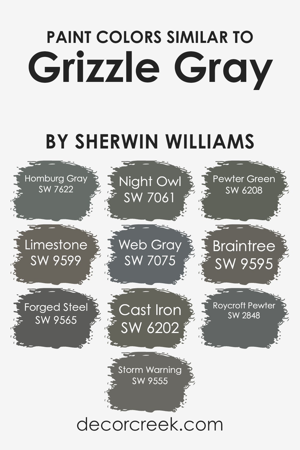
Colors Similar to Grizzle Gray SW 7068 by Sherwin Williams
Similar colors play a crucial role in design because they create a harmonious and balanced look, making spaces feel more cohesive and aesthetically pleasing. When it comes to shades like Grizzle Gray, finding colors that share similar undertones or intensity can enhance the overall design without creating a stark contrast.
This subtlety in variation allows for a sophisticated and layered approach to decorating, whether in fashion, interior design, or art.
Colors like Homburg Gray, Limestone, Forged Steel, Storm Warning, Night Owl, Web Gray, Cast Iron, Pewter Green, Braintree, and Roycroft Pewter work well with Grizzle Gray for this reason. They share a likeness in their cool undertones and muted expressions, yet each brings its unique character to the table.
- Homburg Gray has a deep, soothing quality, almost like a shadow that adds depth to spaces.
- Limestone is lighter, offering a soft breath of air to more grounding shades.
- Forged Steel and Storm Warning introduce a metallic sharpness and a hint of drama, respectively, perfect for accentuating details.
- Night Owl and Web Gray lean towards a mysterious vibe, similar to twilight skies, while Cast Iron offers solidity and strength with its weighty presence. Pewter Green stands out with its greenish tint, adding a natural element.
- Braintree mixes in a smidge of warmth, reminiscent of stone paths bathed in sunlight.
- Roycroft Pewter rounds out the collection with a historical depth, as if carrying stories within its pigments.
Together, these colors create a versatile palette that can be mixed and matched to achieve a serene, cohesive look with just enough contrast to keep it interesting.
You can see recommended paint colors below:
- SW 7622 Homburg Gray
- SW 9599 Limestone
- SW 9565 Forged Steel
- SW 9555 Storm Warning
- SW 7061 Night Owl
- SW 7075 Web Gray
- SW 6202 Cast Iron
- SW 6208 Pewter Green
- SW 9595 Braintree
- SW 2848 Roycroft Pewter
How to Use Grizzle Gray SW 7068 by Sherwin Williams In Your Home?
Grizzle Gray by Sherwin Williams is a unique and versatile paint color that can truly transform a room. This color is a perfect balance between a deep gray and a hint of blue. It’s not too dark, making it a great choice for anyone looking to add a touch of sophistication without overwhelming a space. You can use Grizzle Gray in various ways in your home.
For a cozy and inviting living room, consider painting the walls with this shade. It pairs beautifully with soft whites or creamy colors for trim and molding, creating a subtle, yet distinct, contrast.
In a bedroom, Grizzle Gray can help to create a calm and serene atmosphere, perfect for relaxing after a long day. It’s also an excellent choice for exterior doors or shutters, giving your home’s facade a modern and chic look.
The beauty of Grizzle Gray lies in its flexibility, working well in different lighting situations and complementing both modern and traditional decor seamlessly.
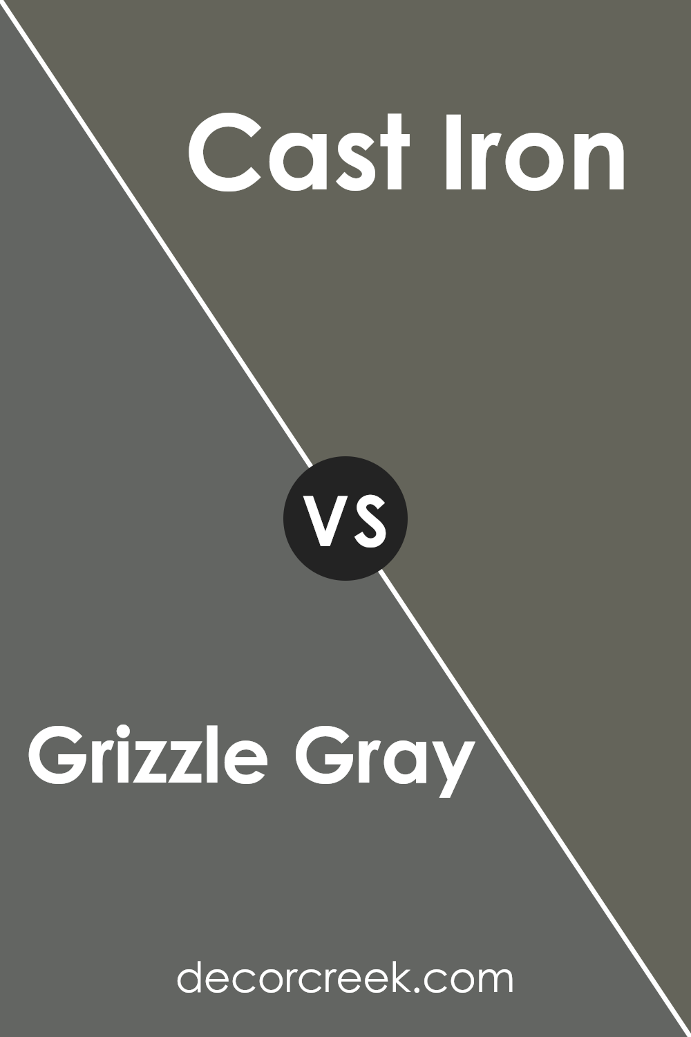
Grizzle Gray SW 7068 by Sherwin Williams vs Cast Iron SW 6202 by Sherwin Williams
Grizzle Gray is a unique shade that strikes a fine balance between a soft gray and a hint of warmth, making it versatile for various spaces. Its subtle warmth provides a cozy backdrop, ideal for rooms that aim for a soft, inviting feel without becoming too dark or overpowering.
On the other hand, Cast Iron is a darker, more pronounced gray that leans more towards a statement-making hue. It offers a bold and solid appearance, good for adding dramatic flair to a space or accentuating specific areas with a stronger color presence.
This deeper gray can create contrast against lighter colors, making it perfect for those looking to add depth and a focal point within their decor.
Both colors are excellent choices for those seeking sophistication and style in their spaces. Gradle Gray offers a lighter, softer approach for a calming atmosphere, while Cast Iron provides depth and drama for a more striking effect.
You can see recommended paint color below:
- SW 6202 Cast Iron
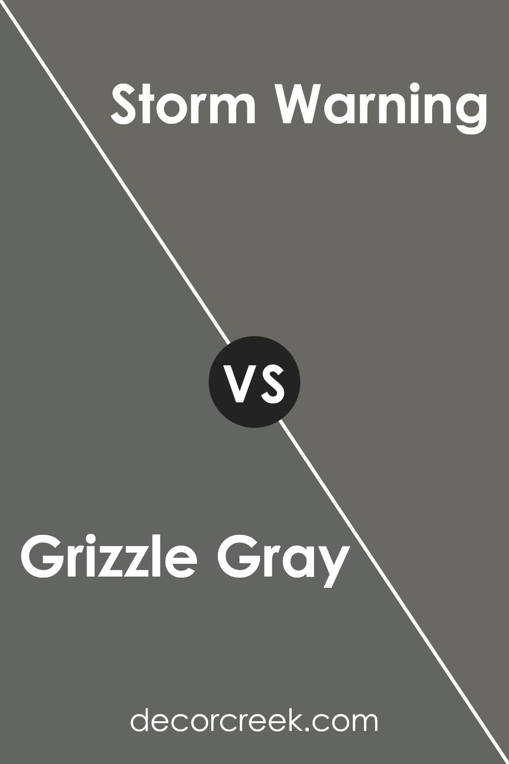
Grizzle Gray SW 7068 by Sherwin Williams vs Storm Warning SW 9555 by Sherwin Williams
Grizzle Gray and Storm Warning are two shades from Sherwin Williams that both offer a sophisticated and rich feel to any space. Grizzle Gray is a strong, muted gray with a slight warmth to it, making it flexible for various settings, from modern to classic.
It’s like a cozy blanket, offering a sense of calm and steadiness without overwhelming a room. On the other hand, Storm Warning leans towards a deeper, moodier side. It’s a bit like looking at a stormy sky, with a darker and more intense feel that brings drama and character.
While both grays, they serve different moods and aesthetics. Grizzle Gray is your go-to for a soft, serene backdrop, while Storm Warning is perfect for making a bold statement.
In essence, while both colors share a gray base, their individual tones and the moods they inspire set them apart, offering diverse options for decorators.
You can see recommended paint color below:
- SW 9555 Storm Warning
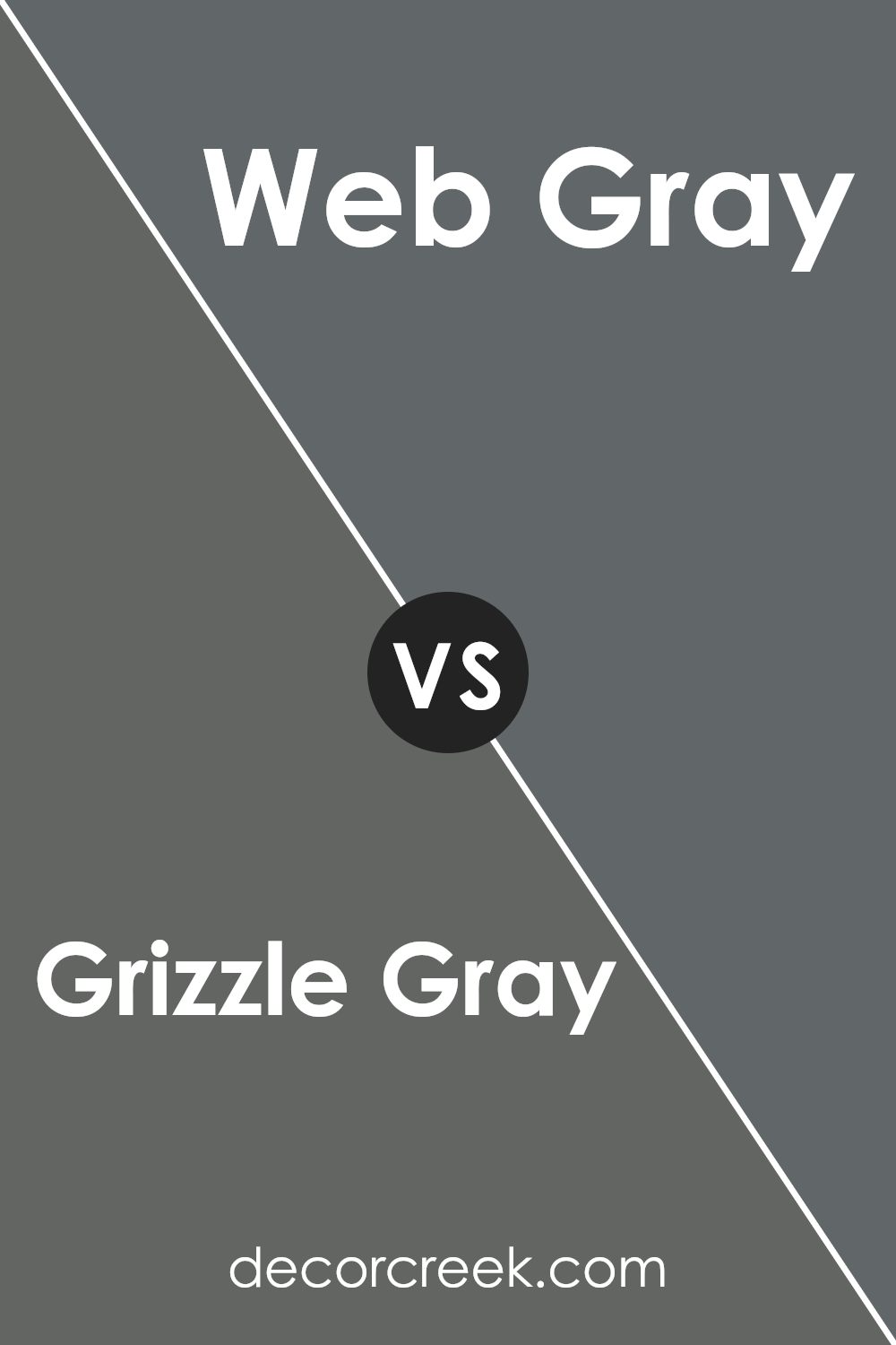
Grizzle Gray SW 7068 by Sherwin Williams vs Web Gray SW 7075 by Sherwin Williams
Grizzle Gray and Web Gray, both by Sherwin Williams, are two shades that share a gray family resemblance but have distinct tones that set them apart. Grizzle Gray is like a soft, cozy blanket on a rainy day.
It’s light enough to brighten a room yet has enough depth to add character and warmth, making it a versatile choice for many spaces. On the other hand, Web Gray walks in with a bolder statement. It’s deeper, almost mirroring the stormy sea, providing a striking contrast against lighter colors, which can make any space look more sophisticated and sharp.
While Grizzle Gray offers a gentle hug, Web Gray stands out with confidence. Whether you want a backdrop that’s soothing and understated or one that’s bold and demands attention, these two grays offer a spectrum of possibilities for transforming your space.
You can see recommended paint color below:
- SW 7075 Web Gray
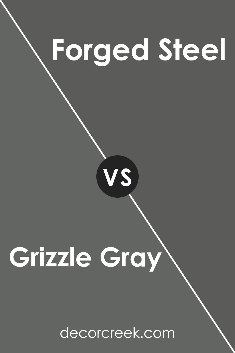
Grizzle Gray SW 7068 by Sherwin Williams vs Forged Steel SW 9565 by Sherwin Williams
Main color, Grizzle Gray, is a subtly warm gray with a touch of coziness, making it versatile for various spaces. Its balanced shade can enliven a room without overwhelming it, offering a neutral backdrop for both bright and subdued color schemes.
On the other hand, Forged Steel is a deeper, cooler gray that adds a bit of sophistication and modernity to spaces. This color tends to stand out more, providing a bold statement in design.
While Grizzle Gray brings a softer approach, Forged Steel leans into a more dramatic ambiance, perfect for accent walls or rooms seeking a profound visual impact.
Both colors offer unique qualities, with Grizzle Gray supporting a gentle, inviting feel and Forged Steel showcasing strength and contemporary flair. They cater to different tastes but are equally capable of creating beautiful, stylish spaces whether used alone or in combination.
You can see recommended paint color below:
- SW 9565 Forged Steel
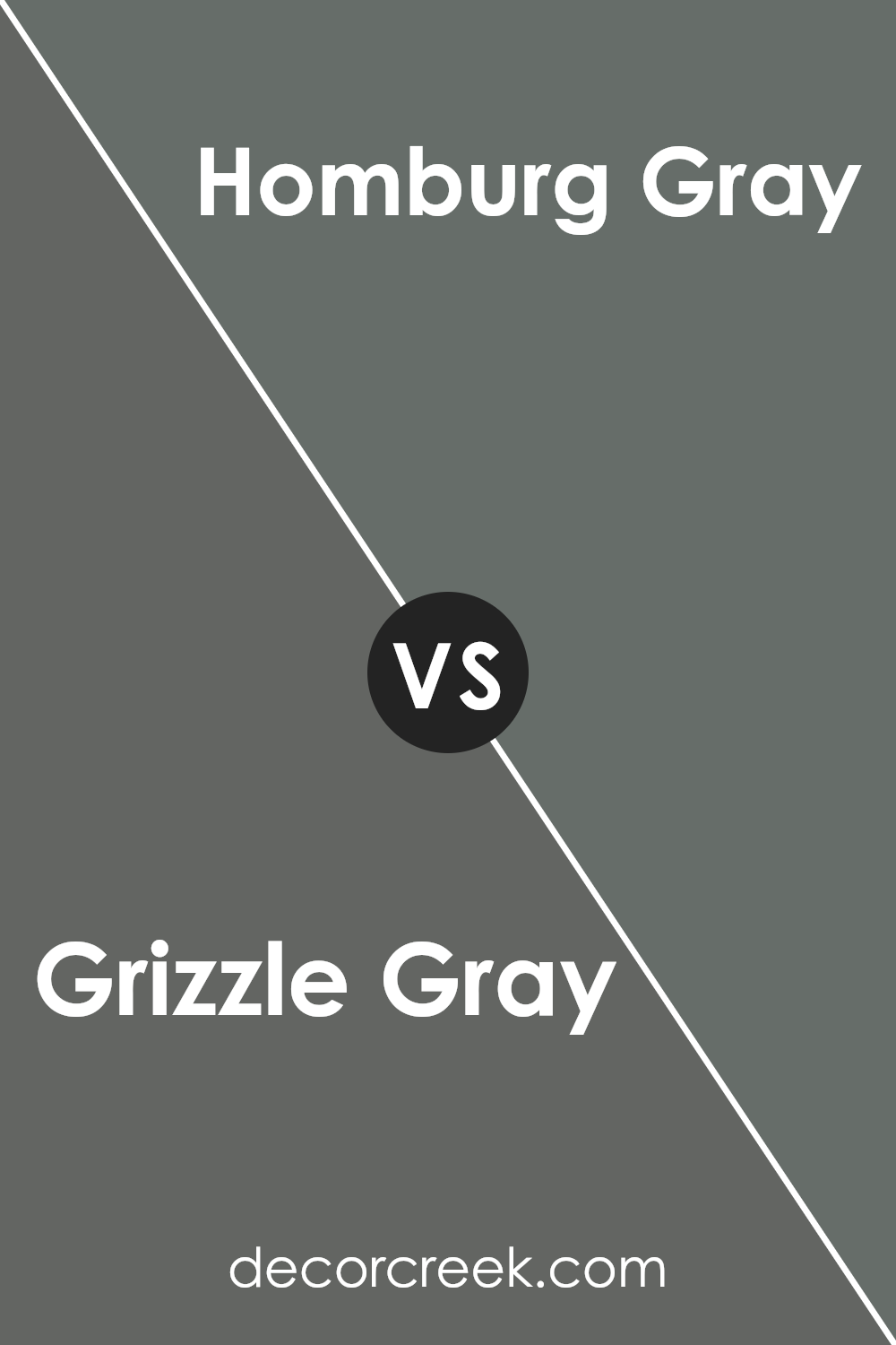
Grizzle Gray SW 7068 by Sherwin Williams vs Homburg Gray SW 7622 by Sherwin Williams
Grizzle Gray and Homburg Gray, both by Sherwin Williams, are sophisticated shades yet distinct in appearance. Grizzle Gray sits on the lighter side of the spectrum, giving off a cooler, more neutral vibe.
It’s flexible and can easily fit into various decor styles, from modern to classic, without overwhelming the space. On the other hand, Homburg Gray is darker, lending a richer and more pronounced presence in a room.
This shade feels more grounded and could be the go-to for creating a statement or anchoring a space with its depth. While both colors share gray as their base, Grizzle Gray leans towards a more understated elegance, whereas Homburg Gray offers a bolder and more dramatic flair.
In essence, if you’re looking for a gentle background hue, Grizzle might be your pick, but for a stronger impact or focal point, Homburg could be the better choice.
You can see recommended paint color below:
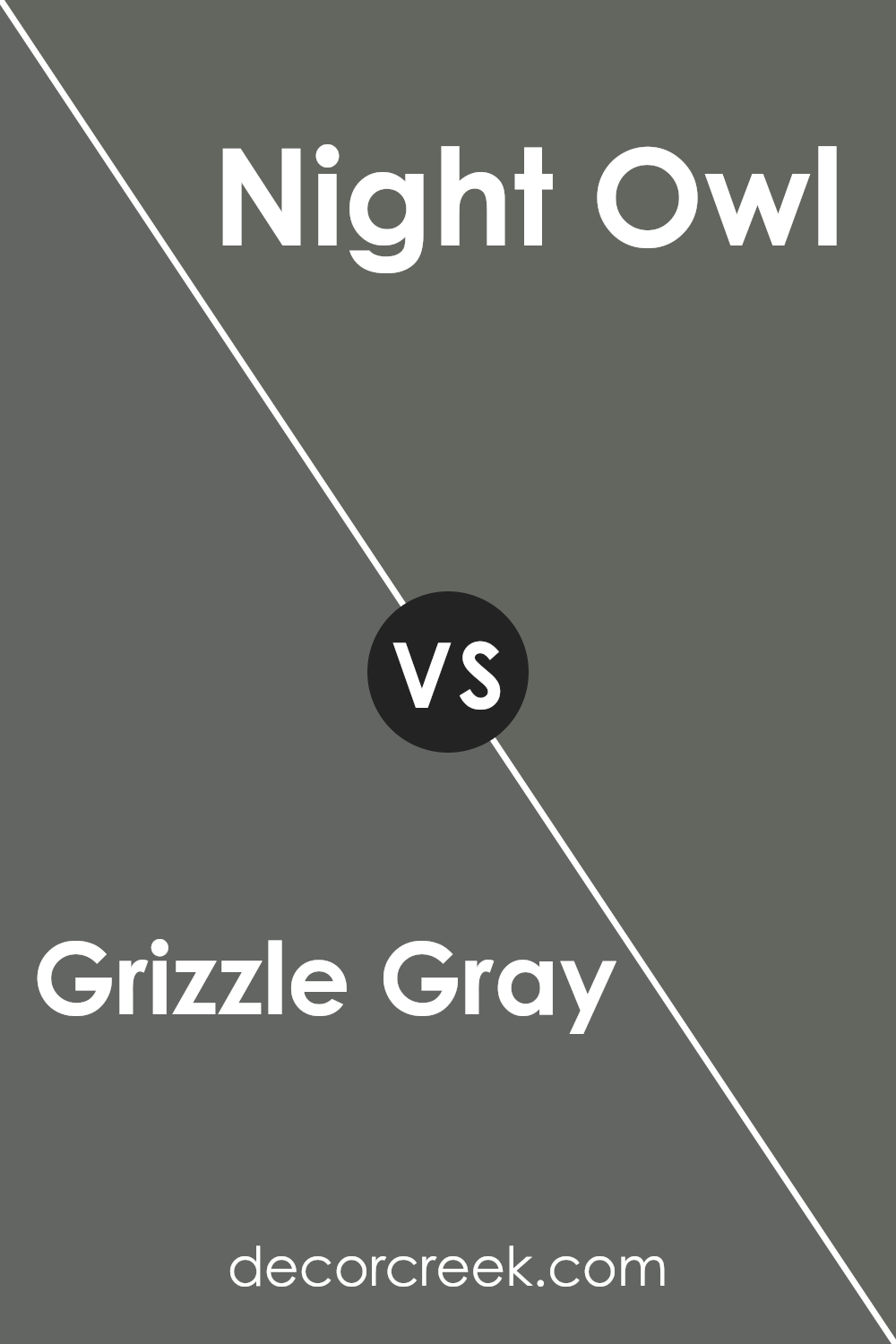
Grizzle Gray SW 7068 by Sherwin Williams vs Night Owl SW 7061 by Sherwin Williams
Grizzle Gray and Night Owl, both from Sherwin Williams, are two unique colors that offer distinct vibes for any room. Grizzle Gray is a medium-dark gray that has a balanced, versatile feel. It’s perfect for those looking for a color that’s not too overpowering but still adds a solid sense of elegance and modernity to the space.
On the other hand, Night Owl is a darker shade that leans more towards a deep, soft charcoal. It’s fantastic for creating a cozy, intimate atmosphere in a room, bringing a sense of warmth and comfort despite its darker hue.
While both colors can be used to make a statement, Night Owl tends to feel a bit more dramatic, providing a striking backdrop that highlights décor and furniture.
In summary, Grizzle Gray is your go-to for a softer, adaptable gray that meshes well in a variety of settings, from contemporary to traditional. Night Owl, with its deeper tones, offers a warm and enveloping feel, perfect for those looking to add a bit of mystery and depth to their spaces.
You can see recommended paint color below:
- SW 7061 Night Owl
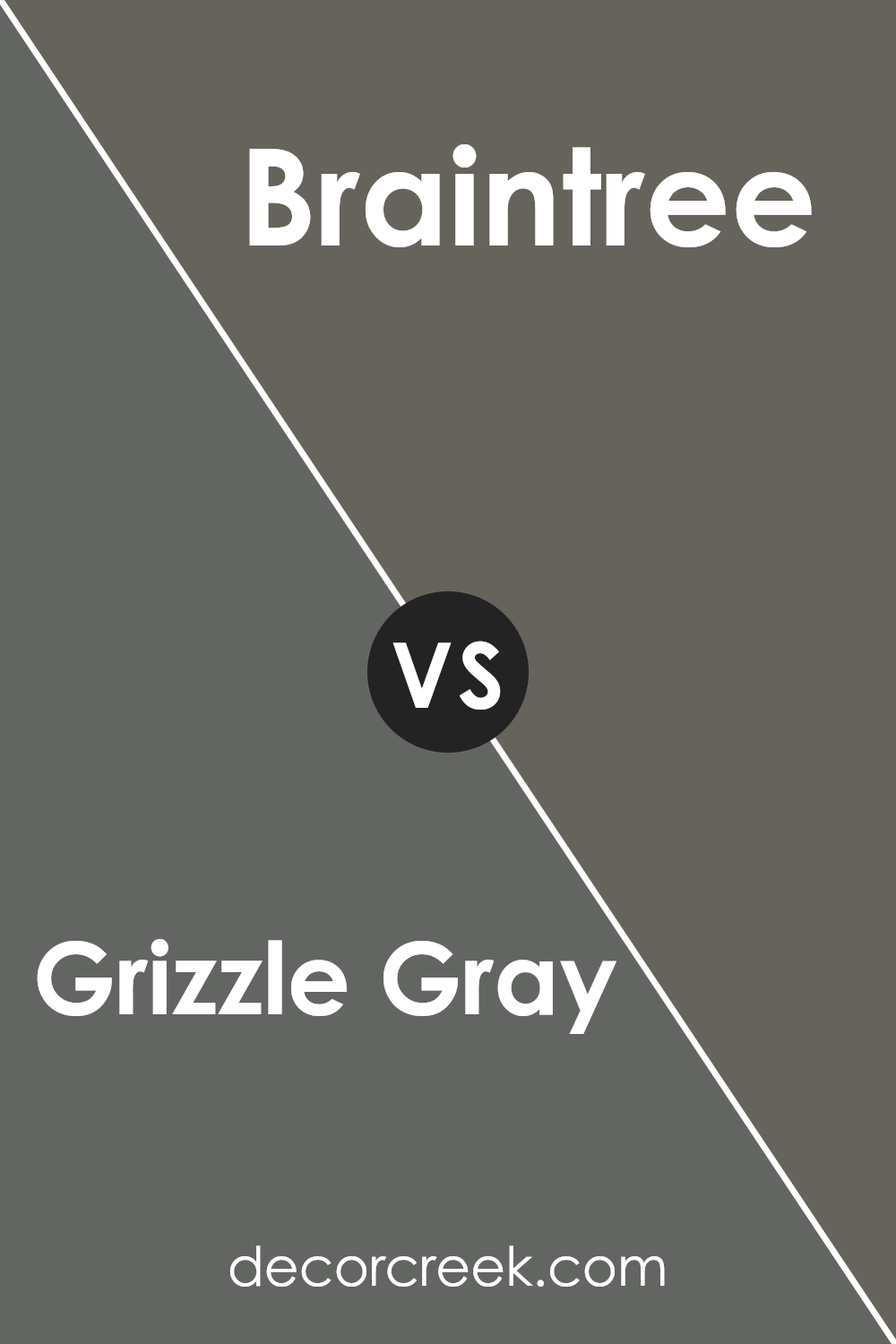
Grizzle Gray SW 7068 by Sherwin Williams vs Braintree SW 9595 by Sherwin Williams
Grizzle Gray and Braintree, both from Sherwin Williams, are distinct in their personalities. Grizzle Gray offers a strong and solid sensation, resembling the color of storm clouds just before a downpour.
It’s a perfect choice if you’re looking for something that brings a bold yet serene atmosphere to a space. On the other hand, Braintree is lighter, leaning towards a soothing, soft gray that brightens rooms without overwhelming them.
This color feels airy and can make small areas appear more spacious. While Grizzle Gray adds depth and a sense of drama to a room, Braintree offers a subtle elegance, creating a peaceful and relaxing environment.
If you’re trying to decide between the two, think about the mood you wish to create. For a cozy, anchored feel, Grizzle Gray is the go-to. But for a gentle lift that keeps things laid-back, Braintree is a perfect choice. Both colors have their unique appeal, making them versatile for various design purposes.
You can see recommended paint color below:
- SW 9595 Braintree
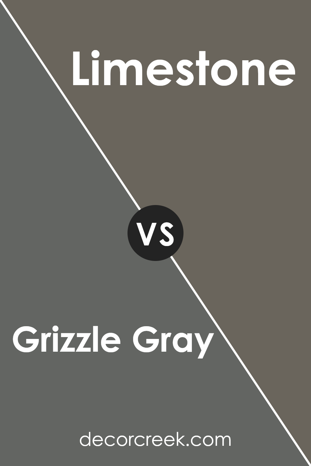
Grizzle Gray SW 7068 by Sherwin Williams vs Limestone SW 9599 by Sherwin Williams
Grizzle Gray and Limestone are two Sherwin Williams paints with unique appearances. Grizzle Gray is a deeper, medium-dark gray that brings a strong presence to a space. It has a solid, almost anchoring effect, making rooms feel grounded and sophisticated. This color works well in various settings, adding depth and a sense of maturity.
On the other hand, Limestone is much lighter, leaning towards a soft, warm gray or off-white. It’s perfect for creating a bright and airy feel in a room. The color has a subtle warmth that can make spaces feel more welcoming and expansive. It’s versatile, working well in small rooms to make them appear larger, or in spaces with abundant natural light to enhance an open, fresh look.
When comparing the two, the key difference lies in their impact on room ambiance. Grizzle Gray adds drama and depth, whereas Limestone introduces lightness and a sense of space. Depending on the mood you want to create, either color offers a distinct character and mood to interior designs.
You can see recommended paint color below:
- SW 9599 Limestone
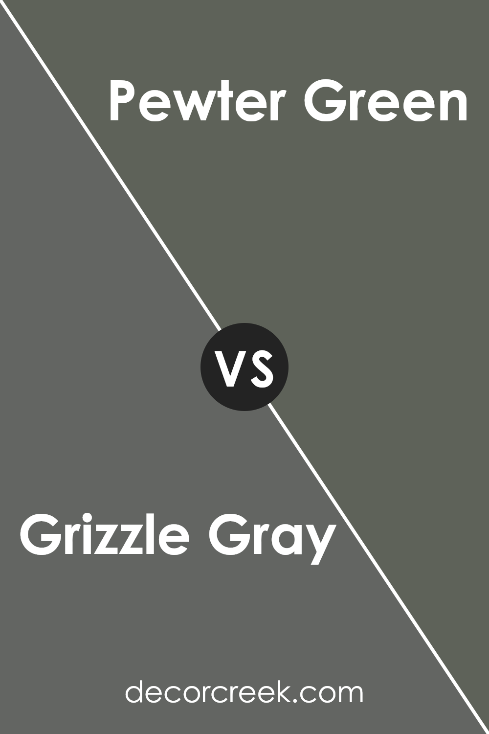
Grizzle Gray SW 7068 by Sherwin Williams vs Pewter Green SW 6208 by Sherwin Williams
Grizzle Gray and Pewrier Green are two distinct colors by Sherwin Williams, each offering a unique vibe for any space. Grizzle Gray is a versatile, subtle gray with a blend of cool and warm undertones, making it incredibly adaptable to various decor styles and color schemes. It’s like the perfect backdrop that can either stand out on its own or complement other colors, adding depth and sophistication without overwhelming.
On the other hand, Pewrier Green is a rich, deep green with gray undertones, providing a sense of calmness and elegance. It’s a color that can bring a touch of nature indoors, creating a cozy and inviting atmosphere. While Grizzle Gray can act as a neutral base, Pewrier Green tends to be more of a statement color, ideal for accent walls or cabinets.
Comparing the two, Grizzle Gray offers more flexibility in matching with other colors, suitable for those who like to change things up. Pewrier Green, with its distinctive hue, demands more commitment but rewards with character and style. Both colors can create beautiful, timeless environments, whether used separately or together.
You can see recommended paint color below:
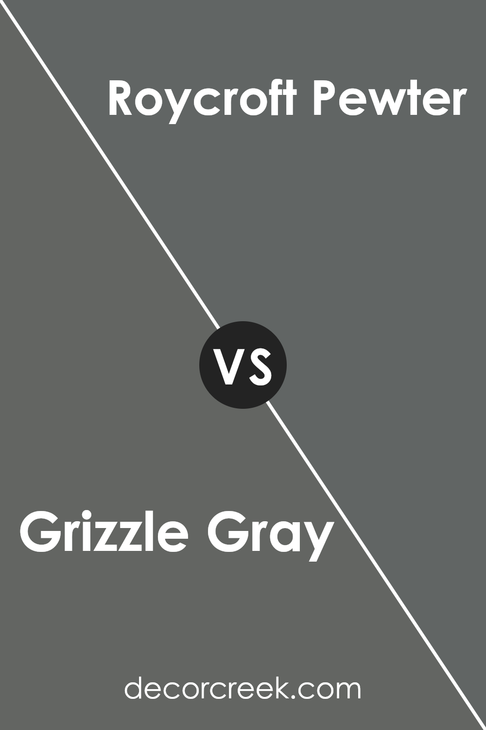
Grizzle Gray SW 7068 by Sherwin Williams vs Roycroft Pewter SW 2848 by Sherwin Williams
Grizzle Gray and Roycroft Pewter are two appealing shades from Sherwin Williams, each offering a unique touch to spaces. Grizzle Gray stands out as a versatile, medium-light shade of gray that exudes a subtle warmth and sophistication. It’s a color that can lighten up a room while maintaining a cozy vibe. Its understated elegance makes it a go-to for those seeking a modern and refined look.
On the other hand, Roycroft Pewter is a darker, richer tone that leans towards a traditional feel. It’s perfect for creating depth and drama in a space without overpowering it. This shade adds a hint of stateliness and is ideal for accent walls or rooms where a more grounded, anchored atmosphere is desired.
Despite their differences, both colors share a timeless quality. Grizzle Gray offers a lighter, airier feel, making it suitable for smaller rooms or spaces with limited natural light. Roycroft Pewter, with its deeper tone, provides a splendid backdrop for furniture and decor, inviting a more pronounced sense of elegance and warmth. When choosing between them, consider the mood and functionality of your space to make the most out of these beautiful colors.
You can see recommended paint color below:
- SW 2848 Roycroft Pewter
Conclusion
In conclusion, Grizzle Gray SW 7068 by Sherwin Williams stands out as a versatile and sophisticated option for those looking to refresh their spaces. Its unique ability to blend with various décor styles and color schemes makes it a popular choice among homeowners and designers alike.
Whether it’s used as a bold statement wall or a subtle backdrop for artwork and furniture, this shade offers a balance of warmth and modernity that can enhance any room’s aesthetic.
Moreover, the durability and high-quality finish associated with Sherwin Williams products mean that choosing Grizzle Gray SW 7068 is not only a stylistic decision but also a practical one. It’s a color that can easily adapt to changing trends and personal tastes, ensuring that spaces look current yet timeless.
For anyone considering a paint update, Grizzle Gray SW 7068 presents a reliable and stylish option that is sure to transform any space.

Ever wished paint sampling was as easy as sticking a sticker? Guess what? Now it is! Discover Samplize's unique Peel & Stick samples.
Get paint samples
