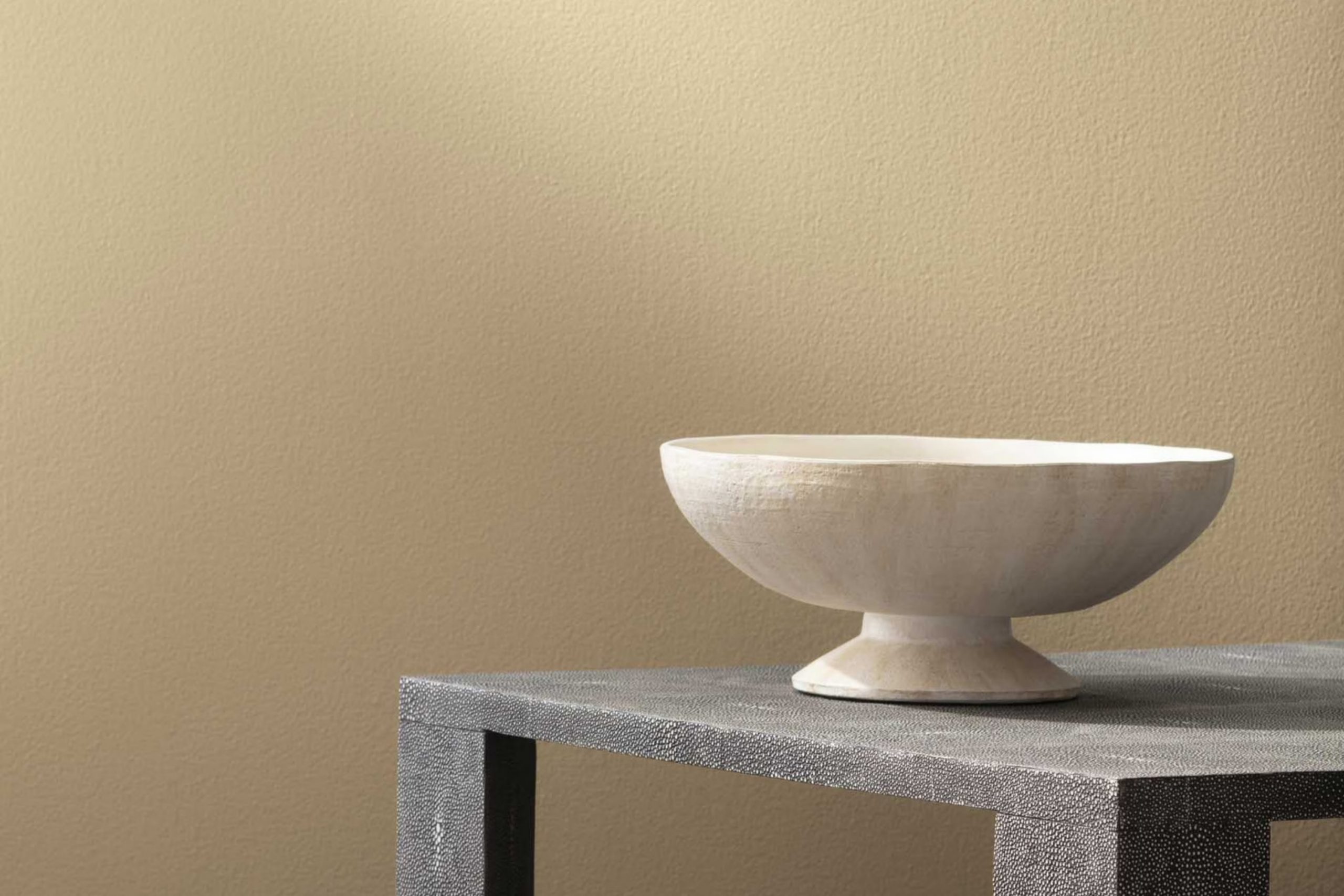
Imagine walking into a room bathed in the warm glow of the summer sun, with walls painted in a color that softly whispers relaxation and comfort. That’s the effect of Benjamin Moore’s “270 Straw Hat,” a shade that brings a cozy, yet undeniably cheerful aura into any room. As you paint your walls with this hue, each stroke seems to add a layer of sunlight, refreshing a mere room into a haven of warmth.
As someone who enjoys the subtle elegance that colors can bring to a home, I was delighted by how “270 Straw Hat” offers a perfect balance. It’s not too bold yet manages to make a statement of refined joy and light-heartedness.
In your journey to make your home a reflection of your personality and taste, consider how this particular shade can align with various decor styles, enhancing furniture and artwork without overpowering them. Whether you’re looking to freshen up a living room, bedroom, or even a kitchen, “270 Straw Hat” has a flexible charm that can lift your home’s ambiance beautifully.
Let me guide you through how this enchanting color can be a part of your living rooms.
What Color Is Straw Hat 270 by Benjamin Moore?
Straw Hat by Benjamin Moore is a warm, beige hue that radiates a cozy and inviting feel. This color has a subtle richness that looks like a sandy beach under the summer sun, making it excellent for creating a relaxed atmosphere in any room. Straw Hat is flexible enough to work with various interior styles but shines particularly well in country, rustic, and cottage decors. Its natural earthiness lends itself beautifully to areas that prioritize comfort and simplicity.
When pairing with materials, Straw Hat goes perfectly with natural wood, from light oak to darker walnut, enhancing the warmth of the wood grains. Textiles like linen, cotton, or wool in neutral colors also complement this paint color, adding to the overall softness and comfort of the interior. Incorporating wicker or rattan furniture can further accentuate the rustic vibe, making the room feel like a charming country home.
Accents in off-whites or soft pastels can help keep the room bright and airy, while darker earth tones like greens or browns can add depth and contrast to the room. Whether it’s the main color on the walls or used for accent features, Straw Hat creates a welcoming room that feels like an escape from the bustle of everyday life.
Is Straw Hat 270 by Benjamin Moore Warm or Cool color?
Straw Hat by Benjamin Moore is a warm, soft beige paint that brings a cozy and inviting atmosphere to any room. This color is flexible and works well in a variety of areas, whether it’s a living room, bedroom, or kitchen.
Because of its gentle and neutral shade, Straw Hat can easily match with different types of furniture and decor, making it an excellent choice for those looking to refresh their home without making drastic changes. One of the great things about Straw Hat is that it helps to brighten up areas that don’t get a lot of natural light, making the area feel more open and airy.
At the same time, in well-lit rooms, it adds a calm and warm tone that makes the room feel more comfortable. This color is also practical as it tends to hide small imperfections on the walls better than darker or more vibrant colors. Overall, Straw Hat is a great choice for creating a cozy, welcoming environment in your home without overpowering the room with color.
Undertones of Straw Hat 270 by Benjamin Moore
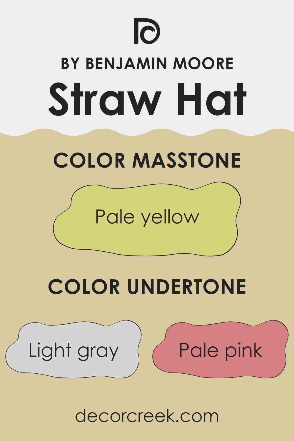
Straw Hat is a unique paint color that carries a blend of subtle undertones, each adding a distinct dimension to the shade. The undertones in a paint color affect how we perceive its main hue because they can slightly alter the color’s appearance under different lighting conditions or when paired with various decor elements.
In the case of Straw Hat, the light gray undertone helps in softening the overall brightness, giving a more muted feel. This makes the color flexible for use in various rooms without overpowering the aesthetic. Pale pink adds a hint of warmth, making the room feel more welcoming, while light purple offers a subtle touch of elegance and depth.
Mint and light blue undertones introduce a refreshing vibe, which can make a room feel airy and light. These cooler tones help balance the warmth from pink and orange undertones, providing a harmonious look on interior walls. Yellow and orange undertones bring a cheerful brightness, injecting energy and vibrancy into the room. This can be particularly appealing in darker or north-facing rooms.
With olive and light green undertones, there is an earthy quality that connects the interior room with natural elements, making it feel grounded. Grey and lilac further add to this balance, providing a calm backdrop that complements various types of furniture and decorations.
Overall, the various undertones of Straw Hat make it an adaptable color that can create different moods and styles depending on the surrounding elements and lighting conditions. This makes it a solid choice for anyone looking to enhance their home while keeping options open for future changes in decor.
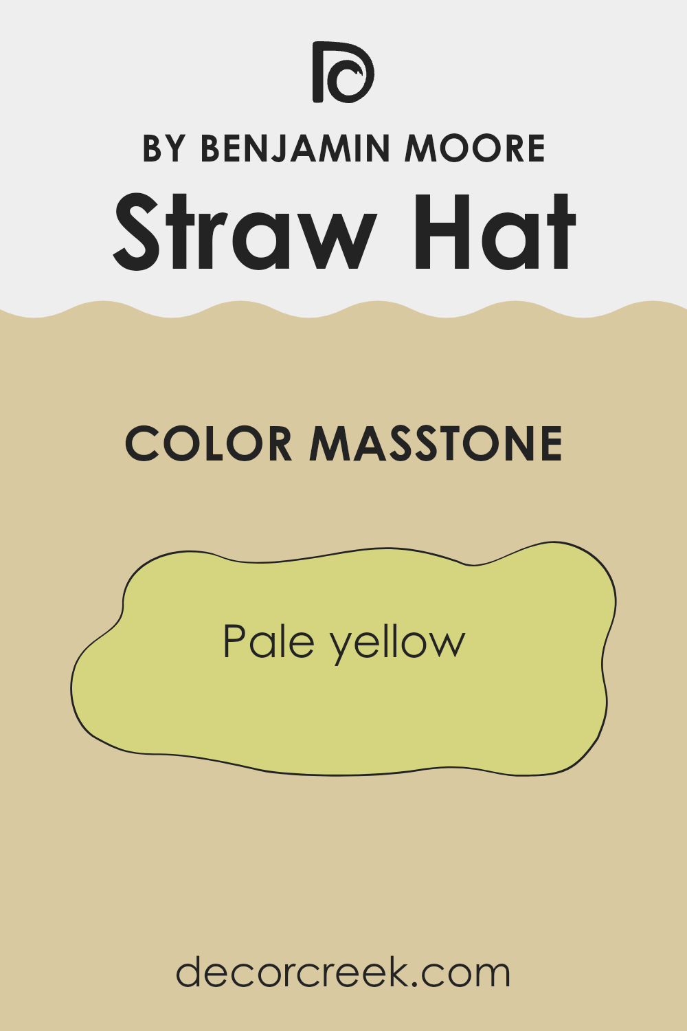
What is the Masstone of the Straw Hat 270 by Benjamin Moore?
Straw Hat 270 by Benjamin Moore, with its pale yellow masstone (#D5D580), offers a cheerful yet subtle hue that can brighten up rooms without overpowering them. This pale yellow tone is mild enough to act as a neutral, meaning it can fit into many home styles and pair easily with other colors.
Its lightness reflects more natural light, making small areas appear larger and more open, which is especially beneficial for apartments or rooms with limited sunlight. Since pale yellow is a calm color, it’s ideal for areas meant for relaxation and light activity, such as living rooms or kitchens.
In a bedroom, it can provide a soft backdrop that’s easy on the eyes, helping to create a restful environment. Whether used on a focal wall or throughout a room, Straw Hat 270 can help make a room feel more inviting and fresh without being too bold or demanding.
How Does Lighting Affect Straw Hat 270 by Benjamin Moore?
Lighting plays a crucial role in how we perceive colors. The same color can appear different under various light sources due to the way light impacts our color perception. This phenomenon is evident with the color Straw Hat 270 by Benjamin Moore.
Under artificial light, such as LED or fluorescent bulbs, Straw Hat 270 might look warmer and more intense. This is because artificial lighting tends to enhance warmer tones, making this color cozy and inviting in the evenings or in rooms without much natural light.
In contrast, under natural sunlight, Straw Hat 270 can display its true color. During the day, if it’s sunny, the color will be bright and vibrant, showing off its joyful and light nature. On cloudy days, it might look more muted and subtle.
The orientation of a room also affects how Straw Hat 270 looks:
1. North-facing rooms: These rooms get less direct sunlight and can often seem cooler or have a bluish tint. In these rooms, Straw Hat 270 may appear slightly more subdued and less warm, possibly taking on a more neutral tone.
2. South-facing rooms: These rooms receive a lot of natural light throughout the day, which tends to make colors look more vibrant and lively. Here, Straw Hat 270 will look warm and cheerful, potentially enhancing the room’s welcoming feel.
3. East-facing rooms: These rooms get stronger light in the morning. In the morning light, Straw Hat 270 will look very bright and warm, possibly feeling quite refreshing. As the day progresses and the natural light decreases, the color might shift to a softer and more muted tone.
4. West-facing rooms: These rooms have the strongest light in the late afternoon. Straw Hat 270 in west-facing rooms will stay more neutral in the morning, but it will glow warmly in the evening sunlight, creating a cozy atmosphere.
Overall, lighting shapes our experience of color, making room orientation and light sources important to consider when decorating with colors like Straw Hat 270. Depending on where and how it is used, this color can offer a variety of moods and visuals, complementing different areas uniquely.
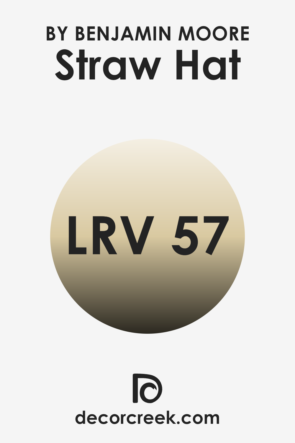
What is the LRV of Straw Hat 270 by Benjamin Moore?
LRV stands for Light Reflectance Value, and it’s a measure used to understand how much light a paint color reflects when it’s applied on a surface. It’s expressed on a scale from 0, meaning the color absorbs all light (like pure black), to 99, meaning it reflects all light (like pure white).
This value helps in choosing paint colors by indicating how light or dark a color might appear in a room. Colors with higher LRVs are generally brighter and make a room feel more open and airy, while lower LRVs create a more cozy and enclosed feel.
The LRV of 57.12 for the color we’re discussing means it’s a mid-range color, not too dark but not extremely light either. It will reflect a moderate amount of light, contributing to a balanced ambiance in the room. This can be particularly useful for areas that don’t have a vast amount of natural lighting, as it won’t absorb too much light but will also not be overpoweringly bright. This makes it a flexible choice for many types of rooms, striking a good balance between warmth and brightness.
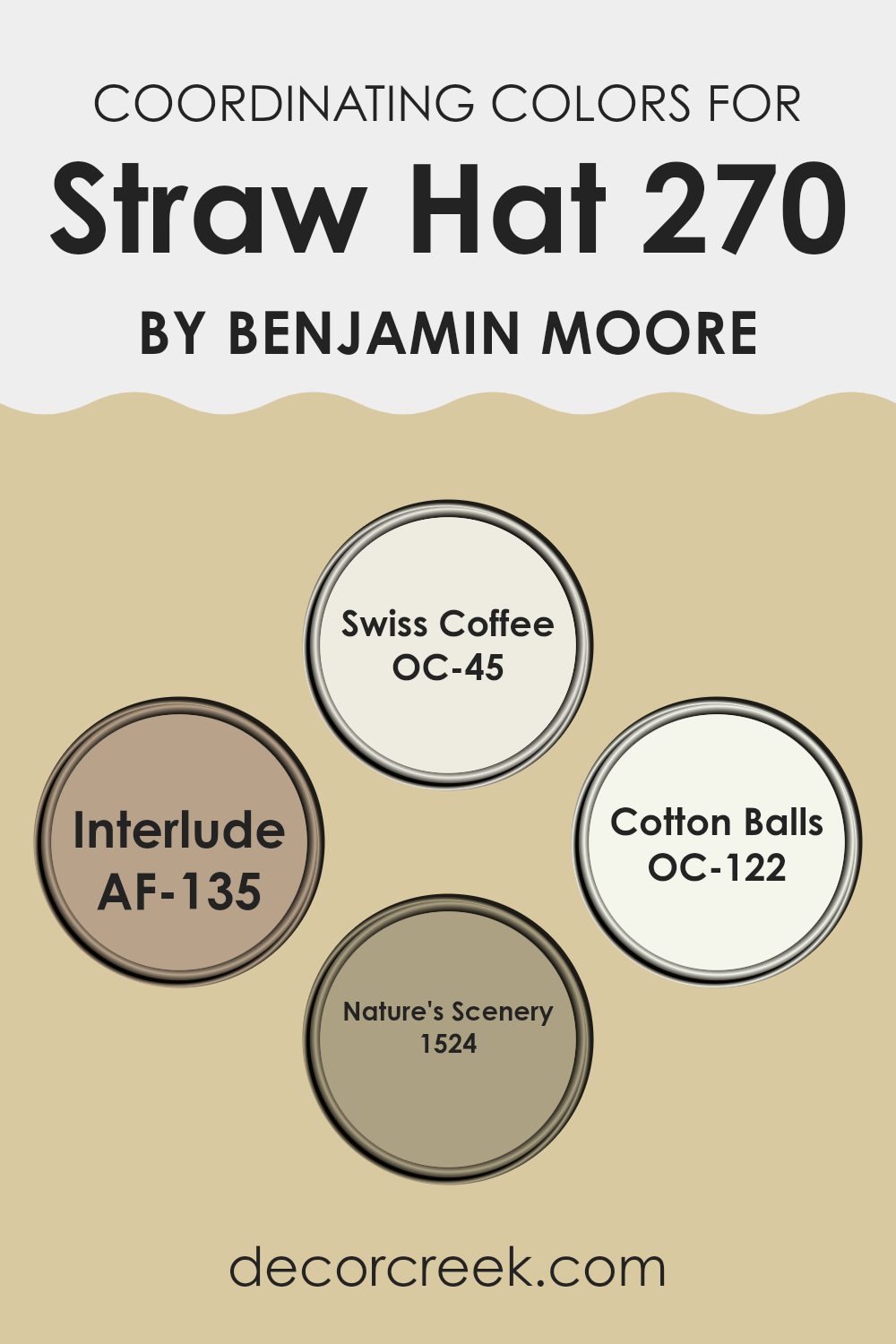
Coordinating Colors of Straw Hat 270 by Benjamin Moore
Coordinating colors are shades that complement each other and work well together to create a harmonious look in a room. These colors are specifically selected to enhance the main color you choose for your room.
For example, if your main color is the warm and welcoming Straw Hat by Benjamin Moore, you might choose coordinating colors like Swiss Coffee, Interlude, Cotton Balls, and Nature’s Scenery to complete the look. Each of these colors contributes to a cohesive overall design, ensuring that no single color overshadows another, but rather enriches the aesthetic.
Swiss Coffee is a soft off-white that has a very subtle warmth, making it an excellent background that doesn’t clash but gently supports bolder colors. Interlude is a deeper, neutral taupe that offers a grounding effect, providing depth and dimension to your area without overpowering it.
Cotton Balls, another off-white, has a crispness to it that can help to brighten and refresh a room, making it feel airy and open. Lastly, Nature’s Scenery is a deeper green that draws in a touch of nature, offering a refreshing pop of color that still aligns perfectly with earthy tones like Straw Hat. This careful selection of coordinating colors ensures a pleasant visual flow within your room.
You can see recommended paint colors below:
- OC-45 Swiss Coffee
- AF-135 Interlude
- OC-122 Cotton Balls
- 1524 Nature’s Scenery
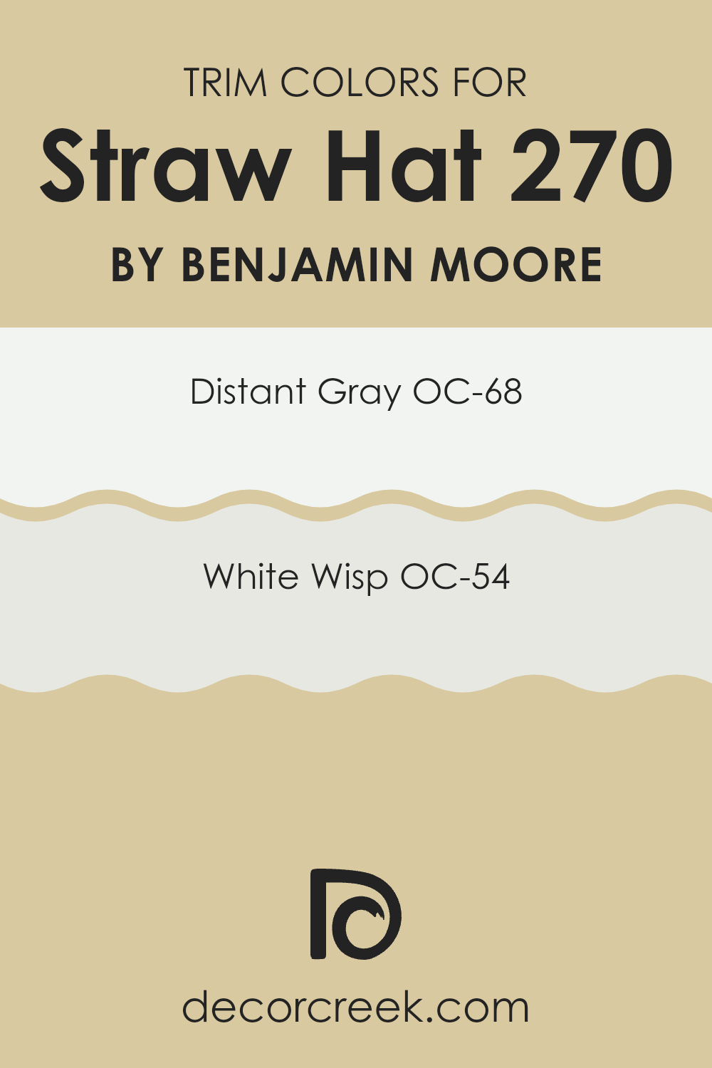
What are the Trim colors of Straw Hat 270 by Benjamin Moore?
Trim colors refer to the paint used on architectural elements like door frames, window sills, and baseboards, distinct from the primary wall color. These colors often act as a subtle, yet effective way to enhance the overall decor by outlining and defining room in a pleasing and functional manner.
When used properly, they accentuate the architectural features of a room, increasing the visual appeal and the perception of area. Trim colors selected well can complement and balance the primary wall colors, adding a touch of crispness and finish to the interiors.
For the color OC-68 – Distant Gray, this shade is a soft, neutral gray that provides a clean and understated border to more vivid or softly toned walls. It is light enough not to overpower the senses yet provides sufficient contrast with a variety of hues, making it a flexible choice for many rooms. On the other hand, OC-54 – White Wisp is a faint and airy white that offers a subtle hint of gray.
This color is ideal for trims, providing a gentle separation from the wall color while contributing to a fresh and open atmosphere in any room. Both these options perform exceptionally well with “Straw Hat” by Benjamin Moore, enhancing its warm undertones and ensuring a polished and harmonious interior look.
You can see recommended paint colors below:
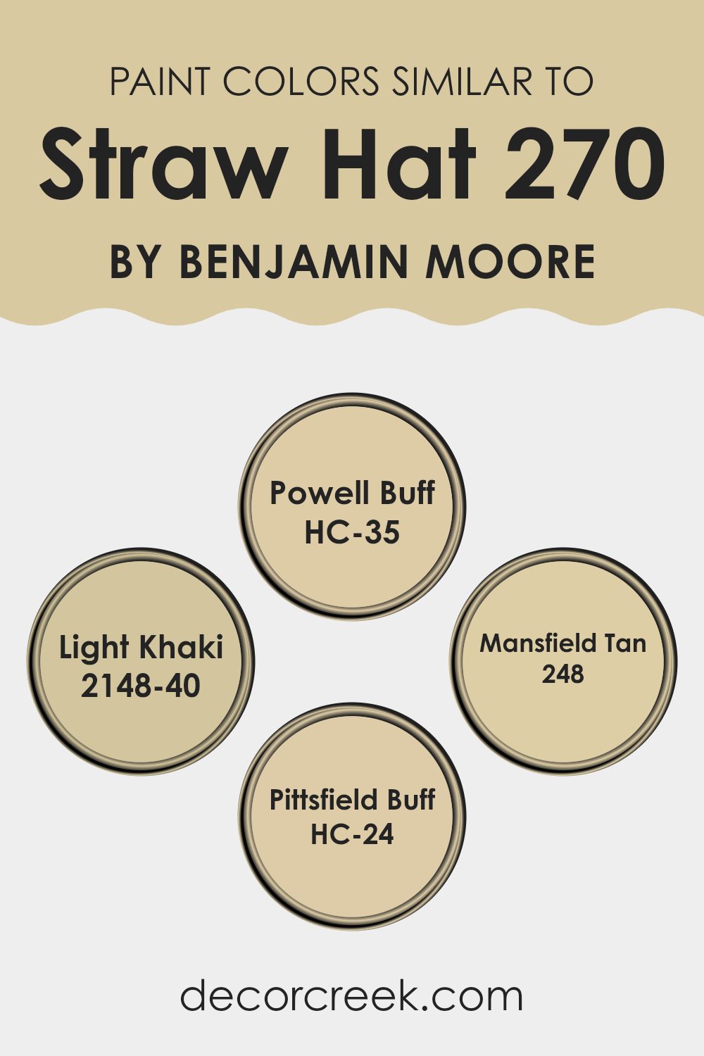
Colors Similar to Straw Hat 270 by Benjamin Moore
Choosing similar colors for a room or a home decor theme is essential because it helps create a cohesive and harmonious look. When colors like HC-35 Powell Buff, 2148-40 Light Khaki, 248 Mansfield Tan, and HC-24 Pittsfield Buff are used alongside each other, they naturally blend to form a soothing atmosphere.
These colors are variations of each other, subtly differing in tone and saturation, making it easy for them to work together without clashing. When such similar hues are combined, they also allow for a design that is pleasing to the eye, where no single color overpowers the other, resulting in a balanced and inviting room.
For example, HC-35 Powell Buff is a warm, sandy shade that brings a touch of earthiness into any room, making it feel grounded and cozy. On the other hand, 2148-40 Light Khaki is a lighter, more muted color that offers a subtle backdrop for richer decorations and furniture to stand out. 248 Mansfield Tan provides a slightly deeper and richer tone, perfect for accent walls or to highlight architectural features.
Lastly, HC-24 Pittsfield Buff is a soft, neutral tan that serves well as a main color palette, offering flexibility in decorating with various accessories and accent colors. Together, these shades provide a flexible foundation for interior decoration, lending themselves to a variety of styles and preferences while maintaining a unified look.
You can see recommended paint colors below:
- HC-35 Powell Buff
- 2148-40 Light Khaki
- 248 Mansfield Tan
- HC-24 Pittsfield Buff
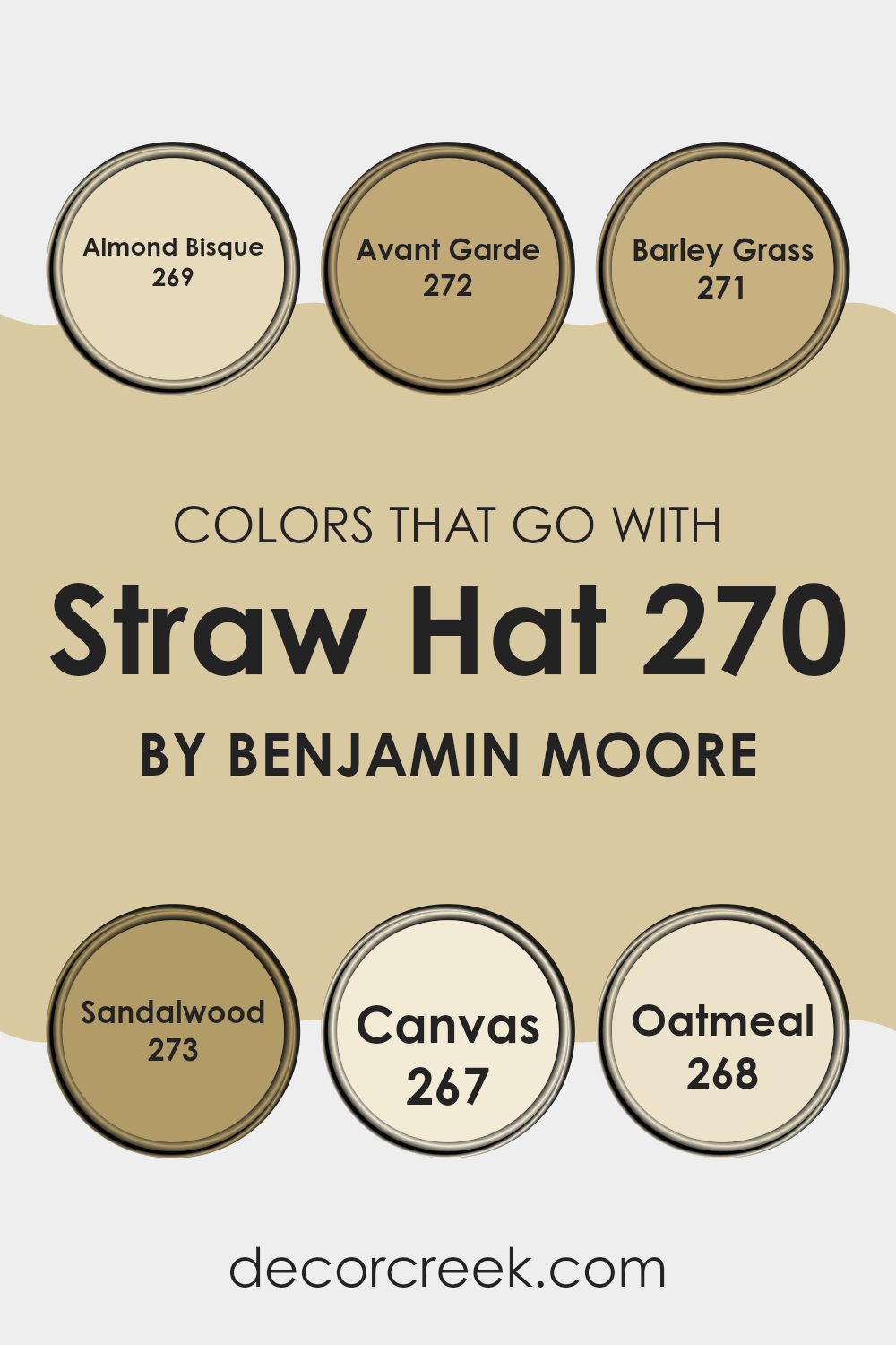
Colors that Go With Straw Hat 270 by Benjamin Moore
Selecting colors that harmonize with Straw Hat 270 by Benjamin Moore is crucial because it ensures a cohesive and aesthetically pleasing décor. When colors coordinate well, they create a balanced and inviting atmosphere. For instance, Almond Bisque 269, a gentle beige, brings a warm and subtle foundation that complements the softness of Straw Hat 270.
It acts like a quiet backdrop that allows other elements in the room to stand out. Similarly, Avant Garde 272, with its slightly bolder and earthy tone, pairs beautifully, adding a sense of groundedness to areas needing a touch of richness without overpowering the senses.
Moving on to Barley Grass 271, this color introduces a hint of nature’s calmness with its muted green, gently enriching the environment with a fresh and airy feel. Sandalwood 273, another harmonious choice, offers a deeper beige, reminiscent of warm sands and sunny days, enhancing the room with a cozy yet light atmosphere.
Canvas 267 provides a clean, almost pristine look, acting as a flexible base that makes any room look classic. Lastly, Oatmeal 268, with its comforting and soft hue, ensures a soothing presence. It’s perfect for areas where you want to promote relaxation and quietness. Together, these colors work seamlessly with Straw Hat 270 to create diverse yet unified interior themes, suitable for various living rooms.
You can see recommended paint colors below:
- 269 Almond Bisque
- 272 Avant Garde
- 271 Barley Grass
- 273 Sandalwood
- 267 Canvas
- 268 Oatmeal
How to Use Straw Hat 270 by Benjamin Moore In Your Home?
Straw Hat 270 by Benjamin Moore is a warm, neutral paint color that brings a cozy vibe to any room in your home. It’s like the light, sandy shade of a beach that can make rooms feel more inviting and relaxed. This color works well in living rooms or bedrooms where you want a calm atmosphere.
It pairs beautifully with soft white trim or even bolder colors for a little contrast. Using Straw Hat 270 in a small area like a bathroom or a hallway can also make the area seem larger and more open. It reflects light nicely, which helps to brighten up rooms that don’t get a lot of natural sunlight.
For those who like DIY projects, this paint is great for refreshing old furniture or kitchen cabinets to give your home a fresh look without doing a major renovation. Overall, Straw Hat 270 is a flexible choice that can help make your home feel warm and cozy while still keeping things light and airy.
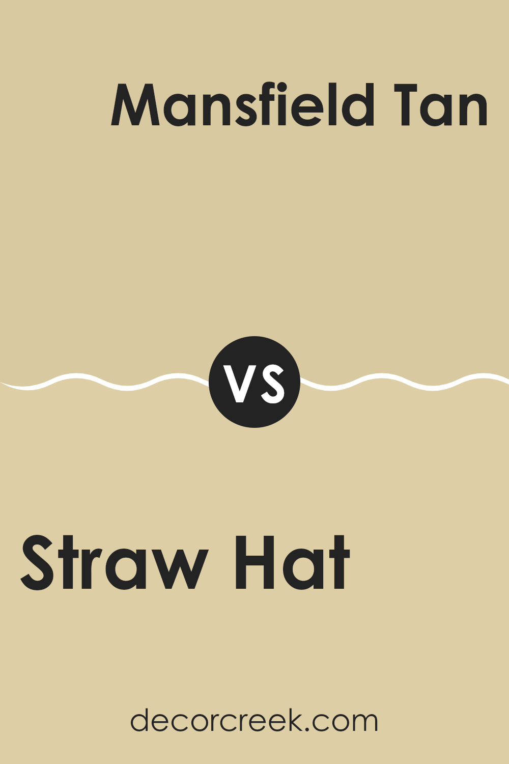
Straw Hat 270 by Benjamin Moore vs Mansfield Tan 248 by Benjamin Moore
Straw Hat is a warm and light beige color that gives a cozy and inviting feel to any room. It has subtle yellow undertones that make the room bright and cheerful. This color is perfect for creating a relaxed atmosphere in common areas like living rooms or kitchens.
On the other hand, Mansfield Tan is a bit deeper and richer than Straw Hat. It leans more towards a classic tan shade with a touch of olive, adding a bit of an earthy feel to the environment. Mansfield Tan is ideal for areas where you want a touch of warmth, but also some grounding, like in a study or dining room.
When comparing both, Straw Hat is lighter and brighter, making a room feel more open. Mansfield Tan offers more depth and can make large rooms feel more connected and cozy. Both colors work well in a variety of decorating styles, from modern to rustic, depending on the accompaniments like furniture and decor.
You can see recommended paint color below:
- 248 Mansfield Tan
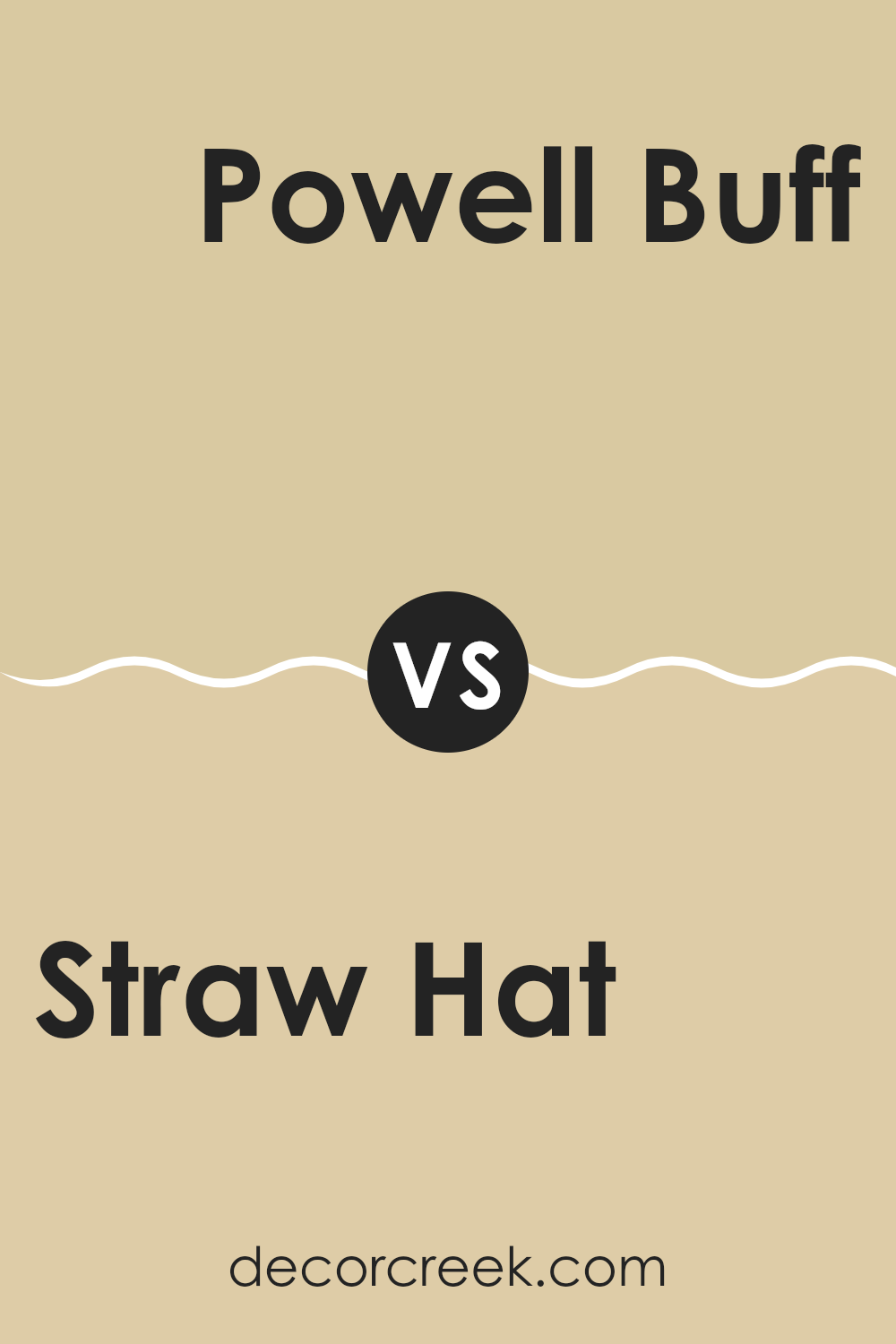
Straw Hat 270 by Benjamin Moore vs Powell Buff HC-35 by Benjamin Moore
Straw Hat 270 and Powell Buff HC-35, both by Benjamin Moore, present subtle yet distinct differences in their shades. Straw Hat 270 carries a lighter, softer yellow tone, giving a gentle, airy feel to areas. It’s perfect for creating a bright, welcoming atmosphere in a room.
On the other hand, Powell Buff HC-35 has a deeper, richer hue that leans more towards a warm beige. This color offers a cozy vibe, making it ideal for areas where a comforting and inviting ambiance is desired.
While both colors are neutral and flexible, Straw Hat 270 is more suited for those looking to add a touch of lightness to their décor, whereas Powell Buff HC-35 works well in settings that call for a bit more warmth and depth. Both can be effectively used in a variety of living rooms to achieve a pleasant, homely environment.
You can see recommended paint color below:
Straw Hat 270 by Benjamin Moore vs Light Khaki 2148-40 by Benjamin Moore
The two colors, Straw Hat and Light Khaki from Benjamin Moore, provide different vibes for interior room. Straw Hat is a soft, warm yellow with a sunlit quality, giving rooms a cozy and inviting feel. It resembles the gentle tone of a well-worn straw hat and works well in areas such as living rooms or kitchens where a friendly, welcoming atmosphere is desired.
On the other hand, Light Khaki is more subdued. It leans toward a neutral beige with hints of green, reminiscent of natural elements like sand and leaves. This color is excellent for areas where you want a calm and understated look but with a touch more warmth than a stark neutral.
Both colors are flexible and work well in various decorating styles, but Straw Hat adds a splash of cheerful warmth, while Light Khaki offers a more grounded, earthy foundation. Each would pair nicely with other natural textures and colors, depending on the desired feel of the room.
You can see recommended paint color below:
- 2148-40 Light Khaki
Straw Hat 270 by Benjamin Moore vs Pittsfield Buff HC-24 by Benjamin Moore
Straw Hat 270 by Benjamin Moore and Pittsfield Buff HC-24 are both warmly inviting colors, but they differ slightly in their tones and the mood they set in a room. Straw Hat 270 has a subtle yellow undertone, giving it a bright, sunny feel that’s cheerful and welcoming. It’s a light and airy color that can make a small room seem larger and more open.
On the other hand, Pittsfield Buff HC-24 leans more toward a beige tone, with a hint of yellow. This color is slightly deeper and warmer compared to Straw Hat, offering a cozy and comforting vibe. Pittsfield Buff is ideal for areas where you want a neutral backdrop that adds warmth without overpowering the room.
Both colors work well in a variety of settings, whether you want a fresh look in a living room or a calming hue in a bedroom. However, your choice between them might depend on the specific atmosphere you’re looking to create—lighter and brighter with Straw Hat, or more subdued and warm with Pittsfield Buff.
You can see recommended paint color below:
- HC-24 Pittsfield Buff
As I finish up talking about 270 Straw Hat by Benjamin Moore, I really think it’s a paint color worth thinking about for anyone wanting to give their room a fresh, sunny look. This shade, 270 Straw Hat, comes off as a soft, warm yellow that seems to light up a room just like a mild, sunny day. What’s cool about it is how it isn’t too bright or too dull; it’s just right to make your room feel cozy and welcoming.
I found out that this color not only looks good but also works well with lots of other colors. You can match it with greens, blues, or even grays, and it will still look great. This makes it a handy choice if you like changing how your room looks from time to time, because it will likely still go well with any new colors you choose.
Overall, if someone asked me whether they should consider painting their room with Benjamin Moore’s 270 Straw Hat, I would say yes! It’s a friendly and warm color that makes any room feel like a cheerful place to be.
Whether you want your room to feel relaxed or just want something that isn’t too strong, this color is an excellent pick.
Ever wished paint sampling was as easy as sticking a sticker? Guess what? Now it is! Discover Samplize's unique Peel & Stick samples.
Get paint samples

