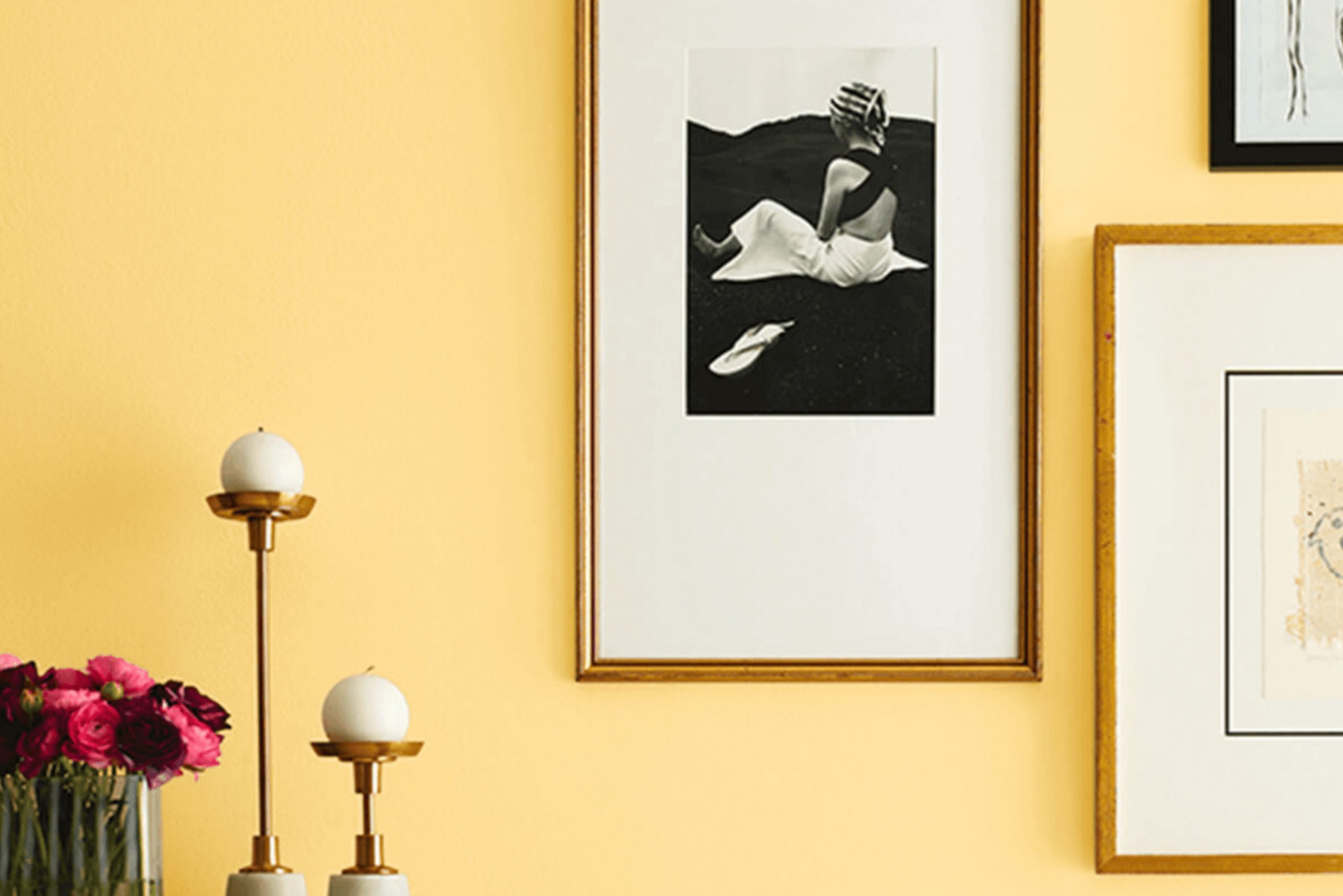
Sunny Veranda (SW 9017) by Sherwin Williams brings a feeling of warmth and joy to any room. Whether adding a splash of color to your living room or brightening up your home office, this shade is a perfect choice.
When applying Sunny Veranda, you immediately notice how it seems to draw the sunlight in and reflect it, making the whole room feel more cheerful and lively. It’s a color that works beautifully in both modern and traditional settings, offering versatility that is hard to ignore.
The yellow hue has an inviting quality that makes friends and family feel right at home. It’s like having a little piece of sunshine indoors, all year round. Pair it with whites or greys to create a fresh, clean look, or use it alongside darker colors for a more dramatic effect. Sunny Veranda’s ability to adapt to different styles makes it a favorite for anyone looking to brighten their environment.
Choosing Sunny Veranda means choosing warmth and energy, making it a wonderful option for refreshing any part of your home. Whether it’s the kitchen, the bedroom, or even a hallway, this shade will enhance the room and lift your spirits.
What Color Is Sunny Veranda SW 9017 by Sherwin Williams?
Sunny Veranda SW 9017 by Sherwin Williams is a lively, warm shade of yellow. This color exudes a cheerful and inviting vibe, perfect for brightening up any room. It’s reminiscent of a sun-drenched porch on a clear day, making it ideal for bringing a sense of warmth and positivity to your home.
In terms of interior styles, Sunny Veranda works wonderfully in rustic, country, or farmhouse-themed settings. Its warm tone pairs well with natural woods and whitewashed finishes, enhancing that cozy, lived-in feel. It’s also a great choice for eclectic or bohemian rooms, adding a pop of brightness that complements vibrant patterns and diverse textures.
This color pairs well with materials like light-colored wood, crisp white fabrics, and soft linen. Use it alongside woven baskets, rattan furniture, and brushed metals to create an inviting, sunny atmosphere. Textured elements like a braided rug or a fringed throw blanket can further enrich its warmth.
Sunny Veranda is a flexible choice for rooms such as kitchens or dining areas, where an energetic and pleasant ambiance is desired. It can also be used in children’s rooms, providing a bright and joyful environment. Overall, it’s a color that brings happiness and energy to various home interiors.

Is Sunny Veranda SW 9017 by Sherwin Williams Warm or Cool color?
Sunny Veranda SW 9017 by Sherwin Williams is a cheerful, warm yellow paint color perfect for brightening up any home. It brings a sense of warmth and positivity to rooms, making them feel cozy and inviting.
When used in living rooms or kitchens, Sunny Veranda creates an uplifting atmosphere that can make these areas feel more lively and welcoming. The soft yellow tone can also enhance natural light, making small or dark rooms appear bigger and brighter. This color works well in combination with whites and light woods, creating a fresh and airy look.
It also complements other warm tones if you prefer a more vibrant decor. In bedrooms or bathrooms, Sunny Veranda fosters a cozy, sunny haven. It’s a flexible color choice that fits well in various design styles, from modern to traditional. Whether used on all walls or as an accent, it adds a touch of sunshine to any home.
Undertones of Sunny Veranda SW 9017 by Sherwin Williams
When choosing paint colors, undertones play a crucial role in determining how we perceive them in different lighting conditions and alongside other colors. Sunny VerandaSW 9017 by Sherwin Williams is a warm, inviting shade, and its undertones contribute significantly to its overall character.
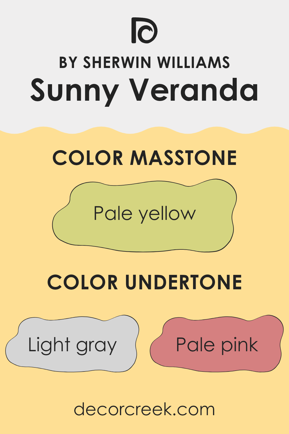
The undertones of Sunny Veranda include shades like light gray, pale pink, yellow, light purple, mint, light blue, orange, gray, light green, lilac, and olive. These subtle colors blend behind the main hue to subtly change how it looks in different rooms and under various lighting.
For instance, the presence of yellow and pale pink undertones makes the paint feel warmer and more cheerful. The light purple and lilac provide a soft touch, adding to a cozy, welcoming atmosphere. Meanwhile, gray and olive elements balance the warmth with a hint of neutrality, preventing it from appearing too bright or intense.
In a room, this color can adapt based on the surrounding decor and furniture. With natural light, the yellow and mint undertones might stand out, making rooms feel breezy and vibrant. Under artificial light, the gray and light blue undertones could mellow the color, offering a more relaxed ambiance without feeling stark. This versatility makes Sunny Veranda a great choice for different interior styles.
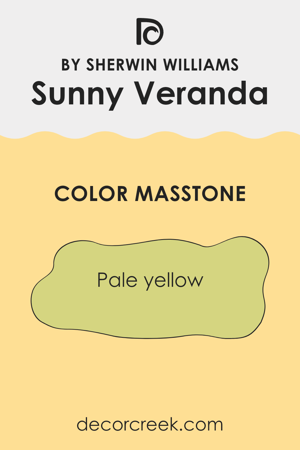
What is the Masstone of the Sunny Veranda SW 9017 by Sherwin Williams?
Sunny Veranda SW 9017 by Sherwin Williams is a pale yellow color with a masstone hex code of #D5D580. This shade works well in homes because it adds warmth and brightness to a room without being overpowering.
The soft yellow hue can make a room feel cheerful and inviting. It’s a great choice for kitchens or living areas where families and friends gather, as it creates a cozy atmosphere. In smaller rooms, this light shade can help make the room feel bigger and more open.
It pairs nicely with neutral colors such as whites and grays, providing a balance that keeps the overall look relaxed. Additionally, it can complement natural elements like wooden furniture and green plants, enhancing a fresh and lively environment. The gentle tone of Sunny Veranda promotes happiness and positivity, making it a wonderful option for creating a welcoming home.
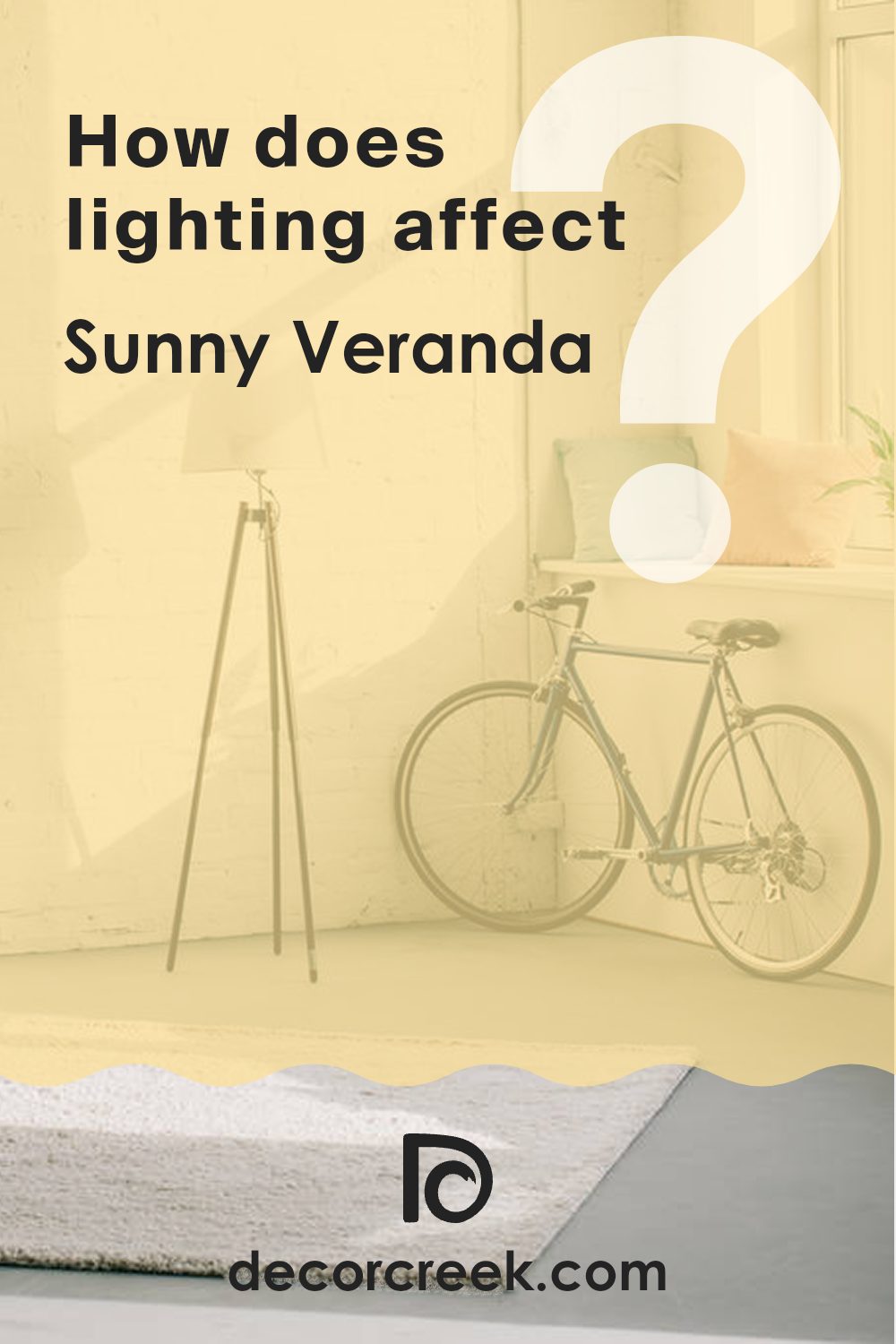
How Does Lighting Affect Sunny Veranda SW 9017 by Sherwin Williams?
Lighting plays a significant role in the way we perceive colors. Different light sources can make colors look different. For the color Sunny Veranda SW 9017 by Sherwin Williams, understanding how it looks under various lighting conditions helps in choosing the right spot for it in your home.
In natural light, Sunny Veranda can look quite different depending on the room’s orientation. In a north-facing room, which usually receives cooler, softer light, this color might appear a bit muted or toned down. It won’t be as bright or as warm as it might in other lighting situations. The cooler light will bring out more subtle aspects of the yellow tone, making it feel calm.
In a south-facing room, which gets stronger and warmer natural light for most of the day, Sunny Veranda will appear brighter and more vibrant. The warm light enhances the yellow hue, making it cheerful and inviting. This makes it an excellent choice for rooms that you want to feel warm and energizing.
East-facing rooms get warm, bright light in the morning, and then the light becomes softer and more muted as the day progresses. With Sunny Veranda, you’ll notice that the color looks brightest and more golden in the morning, reflecting the sunlight beautifully. By afternoon, the color will become softer and more subdued.
In west-facing rooms, Sunny Veranda will look warmer and may even glow in the afternoon and early evening when the sun is lower in the sky. The warmer afternoon light intensifies the yellow tones, making it a cozy choice for rooms where you spend time later in the day.
Under artificial light, such as incandescent or LED lights, the color can shift slightly. Incandescent bulbs may bring out warmer tones, making the color appear more yellow, while LED lighting might keep it more true to its paint chip appearance, depending on the bulb’s warmth or coolness.
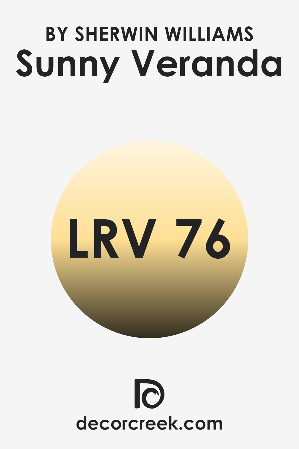
What is the LRV of Sunny Veranda SW 9017 by Sherwin Williams?
The Light Reflectance Value (LRV) of a paint color is a measure that tells you how much light the color reflects. It is represented by a number from 0 to 100, where 0 means the color absorbs all light and 100 means it reflects all light. Lighter colors have higher LRV because they reflect more light, helping to make a room feel brighter and more open.
Conversely, darker colors absorb more light, which can make a room feel smaller and cozier. The LRV is an important factor to consider when choosing paint because it affects how the color will look in different lighting conditions, influencing the overall feel of a room.
Sunny Veranda by Sherwin Williams has an LRV of 76.252, which is on the higher end of the scale. This means it is a light color that reflects a lot of light. With such a high LRV, Sunny Veranda will help to brighten up a room, making it feel airy and open. It’s especially beneficial in rooms that don’t get much natural light, as it can help to compensate by reflecting available light throughout the room.
Because it’s a light color, it can be paired with a variety of other colors without being too much, offering flexibility in interior design.
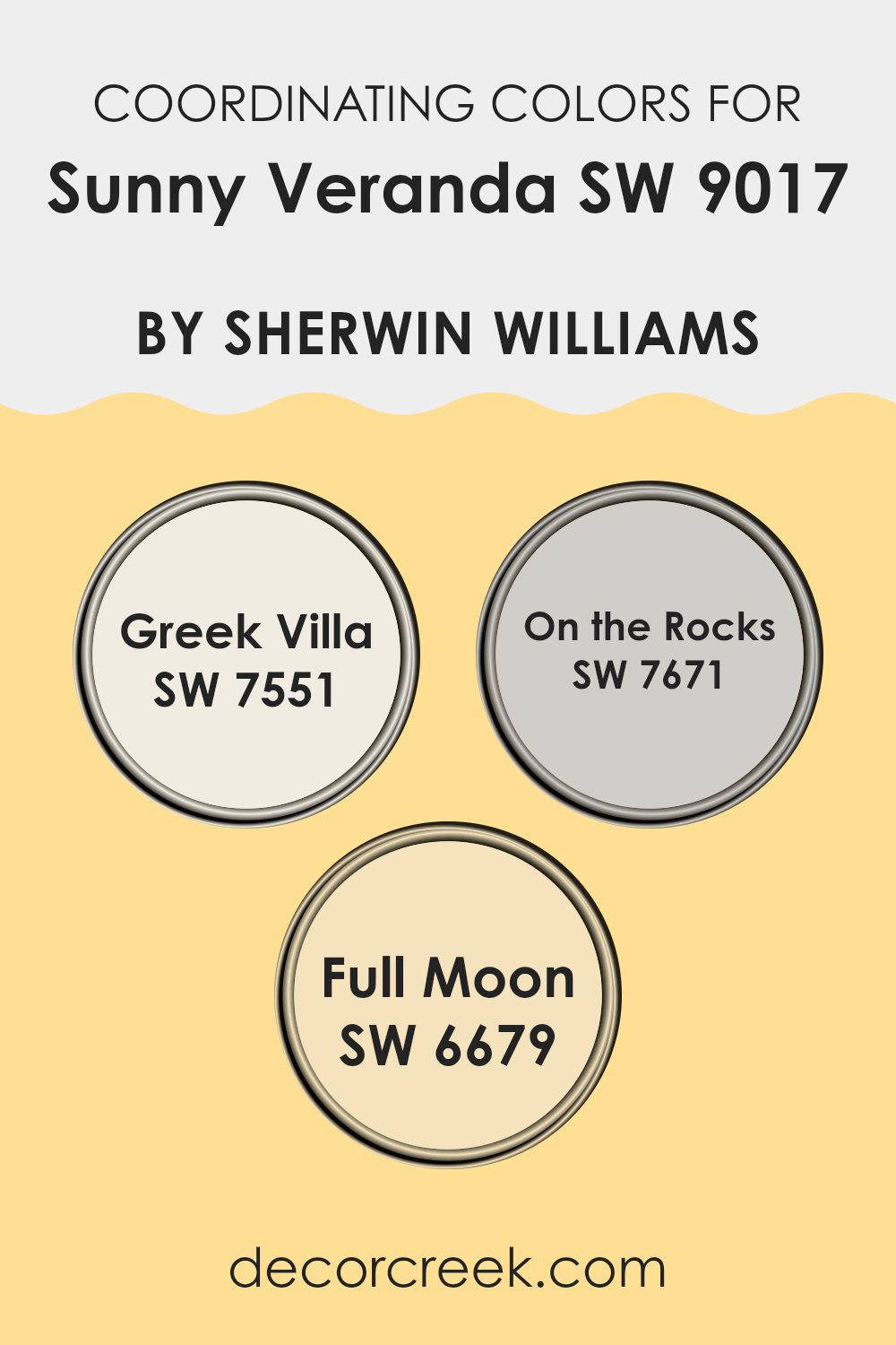
Coordinating Colors of Sunny Veranda SW 9017 by Sherwin Williams
Coordinating colors are hues that are selected to work harmoniously together. They often share undertones that complement the main color, creating a pleasant visual balance. For Sunny Veranda by Sherwin Williams, using coordinating colors can enhance its warm, welcoming vibe.
Greek Villa (SW 7551) is a soft, creamy white that pairs beautifully with Sunny Veranda’s cheerful tone, providing a clean and fresh backdrop that highlights the vibrant main color without overpowering it.On the Rocks (SW 7671) is a cool, light gray that offers a calm contrast. It softens the warmth of Sunny Veranda, adding depth and versatility.
Full Moon (SW 6679), a pale, buttery yellow, brings a gentle brightness that echoes the warmth of Sunny Veranda while still being distinct. Together, these colors create a cohesive and inviting room. By selecting coordinating colors thoughtfully, you can create a balanced and harmonious look that ties a room together beautifully.
You can see recommended paint colors below:
- SW 7551 Greek Villa
- SW 7671 On the Rocks
- SW 6679 Full Moon
What are the Trim colors of Sunny Veranda SW 9017 by Sherwin Williams?
Trim colors are the hues used on the edges and borders of walls, windows, doors, and other architectural features to add definition and highlight these details. Choosing the right trim color is important as it complements the main wall color and enhances the overall look of a room.
For Sunny Veranda, a cheerful and warm yellow hue, pairing it with the right trim colors can make the room balanced and inviting. Using trim colors like SW 6385 – Dover White and SW 6148 – Wool Skein can provide a gentle contrast that does not overpower the main wall color but instead highlights its cheerful nature.
Dover White is a soft, warm white that brings a classic touch to interiors. It’s flexible enough to work with many different wall colors, providing a clean, fresh outline without being too much for the main hue. Wool Skein, on the other hand, is a light, warm greige with subtle green undertones, which gives it a cozy, natural feel. Using these as trim colors for Sunny Veranda can create a room that is both bright and comforting, with the sunny yellow of the walls playing off the softer edges to create a harmonious and inviting environment.
You can see recommended paint colors below:

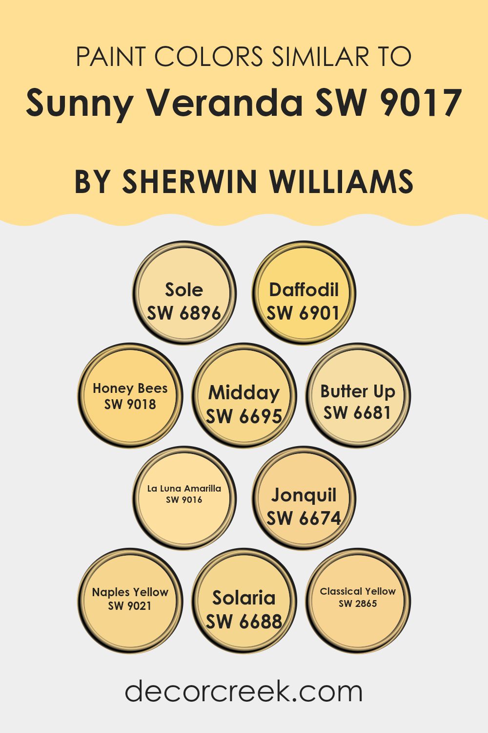
Colors Similar to Sunny Veranda SW 9017 by Sherwin Williams
Similar colors are essential in design and decoration because they create a sense of harmony and cohesion in a room. For instance, when paired with Sunny Veranda, colors like SW 6896 – Sole and SW 6901 – Daffodil offer a warm, cheerful backdrop. Sole has a deep, lively yellow that resembles the richness of a sunny afternoon.
Meanwhile, Daffodil is lighter and softer, evoking the gentle brightness of its namesake flower. These colors work beautifully together, enhancing each other without clashing, creating an inviting atmosphere.
Other colors such as SW 9018 – Honey Bees and SW 6695 – Midday continue this warm theme. Honey Bees is a golden hue, reminiscent of an autumn afternoon, while Midday offers a brighter yellow, like sunshine at its peak. SW 6681 – Butter Up and SW 9016 – La Luna Amarilla add a creamy richness, with Butter Up providing a mellow, buttery tint and La Luna Amarilla energizing the room with its bright and lively tone.
SW 6674 – Jonquil offers a more muted yellow, perfect for adding subtlety, while SW 9021 – Naples Yellow and SW 6688 – Solaria infuse rooms with vibrant energy and bold brightness. Lastly, SW 2865 – Classical Yellow adds a traditional touch with its deep, elegant tone, blending seamlessly to create a cohesive and lively environment. These colors together form a palette that is both inviting and warm, perfect for any room.
You can see recommended paint colors below:
- SW 6896 Sole
- SW 6901 Daffodil
- SW 9018 Honey Bees
- SW 6695 Midday
- SW 6681 Butter Up
- SW 9016 La Luna Amarilla
- SW 6674 Jonquil
- SW 9021 Naples Yellow
- SW 6688 Solaria
- SW 2865 Classical Yellow
Colors that Go With Sunny Veranda SW 9017 by Sherwin Williams
Choosing the right colors to complement Sunny Veranda SW 9017 by Sherwin Williams plays a vital role in crafting a harmonious and inviting room. Each accompanying color adds its own unique charm. SW 9019 – Golden Plumeria is a gentle and warm hue that pairs well with Sunny Veranda, enhancing the welcoming nature of any area.
Then there’s SW 9018 – Honey Bees, a bright and sunny shade that brings energy and liveliness, resonating well with Sunny Veranda’s cheerful disposition. These colors together can create a lively yet cozy atmosphere that feels inviting.
SW 9016 – La Luna Amarilla offers a softer and muted tone that can provide balance and relaxation, fitting snugly into both modern and traditional settings. Meanwhile, SW 9015 – They Call It Mellow has a laid-back and subdued quality, bringing a sense of calm that works seamlessly with Sunny Veranda’s brightness.
SW 6903 – Cheerful lives up to its name, adding an energetic and vibrant aspect that uplifts the mood of the room. Finally, SW 9020 – Rayo de Sol brings a burst of warmth and positivity, igniting the room with a sense of brightness and joy. These complementary colors work well together in creating rooms that feel cohesive, welcoming, and full of life.
You can see recommended paint colors below:
- SW 9019 Golden Plumeria
- SW 9018 Honey Bees
- SW 9016 La Luna Amarilla
- SW 9015 They call it Mellow
- SW 6903 Cheerful
- SW 9020 Rayo de Sol

How to Use Sunny Veranda SW 9017 by Sherwin Williams In Your Home?
Sunny Veranda SW 9017 by Sherwin Williams is a warm and inviting yellow shade that can brighten up any area in your home. It brings a cheerful and cozy feel, making it a great choice for rooms where natural light is limited or for rooms you want to feel more lively.
Consider using this color in living rooms or kitchens to create a welcoming atmosphere. It pairs nicely with whites, creams, and even soft grays, allowing for flexible decorating options. You can also use it in a child’s bedroom or a playroom to energize the area with a pop of bright color.
For smaller areas, like a bathroom or a hallway, this shade can make the room feel more open and sunny. With Sunny Veranda, you can easily add a touch of warmth and happiness to your home decor, creating rooms that feel open and welcoming.
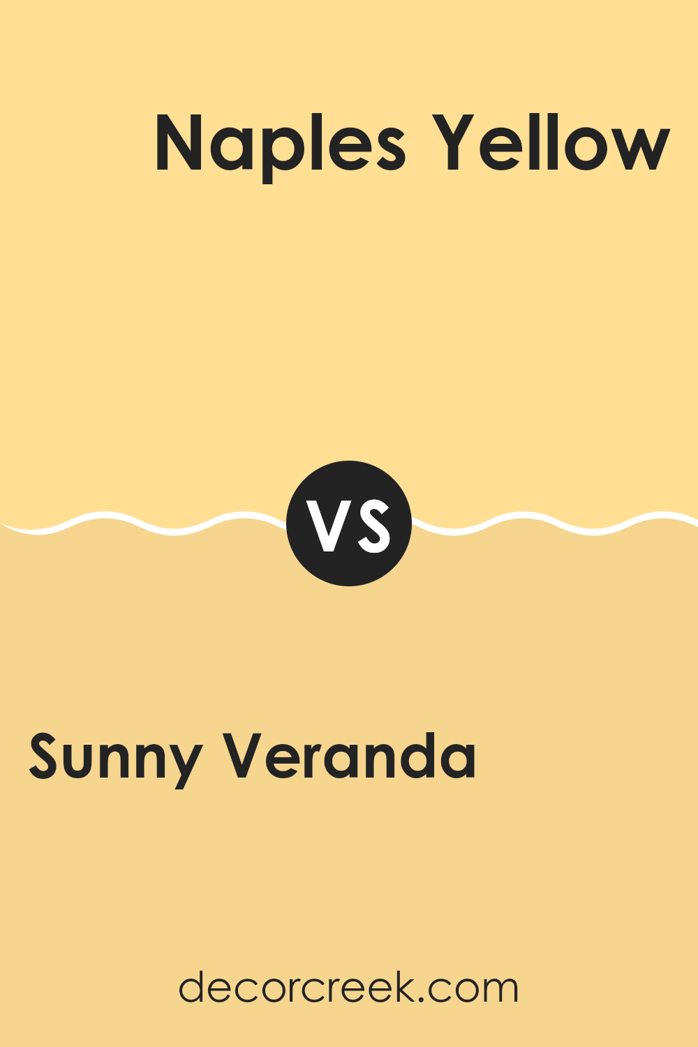
Sunny Veranda SW 9017 by Sherwin Williams vs Naples Yellow SW 9021 by Sherwin Williams
Sunny Veranda SW 9017 and Naples Yellow SW 9021 by Sherwin Williams are both cheerful yellows, but they have distinct characteristics. Sunny Veranda is a soft, warm yellow that brings a cozy and inviting feel to any room.
It’s flexible and can brighten up a room without being too overpowering. On the other hand, Naples Yellow is a bit bolder and has a rich, buttery tone. It stands out more and can act as a focal point in a room. While Sunny Veranda is subtle and understated, Naples Yellow is more pronounced and energetic.
Both colors can add warmth and positivity to a room, but the choice between them depends on whether you want a gentle, comforting vibe or a more vibrant, lively atmosphere. They can be used effectively in different areas depending on the mood you want to create.
You can see recommended paint color below:
- SW 9021 Naples Yellow
Sunny Veranda SW 9017 by Sherwin Williams vs Classical Yellow SW 2865 by Sherwin Williams
Sunny Veranda SW 9017 and Classical Yellow SW 2865, both by Sherwin Williams, are inviting and warm shades. Sunny Veranda is a light, soft yellow that gives off a cheerful and bright vibe, perfect for creating a welcoming area. It’s like a gentle ray of sunshine that can lighten up any room without being overpowering.
Classical Yellow, on the other hand, offers a slightly deeper and more traditional yellow tone. It has a richer hue, adding warmth and a touch of charm to any setting. Classical Yellow can make a room feel cozy and classic, ideal for areas where you want a comforting atmosphere.
Both colors are great for adding warmth to interiors, but Sunny Veranda feels more playful and bright, while Classical Yellow has a classic, warm presence. Depending on the mood you want, you can choose between the soft brightness of Sunny Veranda or the deeper warmth of Classical Yellow.
You can see recommended paint color below:
- SW 2865 Classical Yellow
Sunny Veranda SW 9017 by Sherwin Williams vs Sole SW 6896 by Sherwin Williams
Sunny Veranda SW 9017 and Sole SW 6896, both by Sherwin Williams, are vibrant and cheerful colors, yet each has its own character. Sunny Veranda is a soft, buttery yellow that feels warm and welcoming, evoking a sense of sunshine and comfort.
It’s perfect for rooms where you want a light, airy atmosphere without being too overpowering. On the other hand, Sole is a bright, bold yellow that demands attention. It’s rich and intense, making it ideal for adding a splash of energy to a room.
While Sunny Veranda provides a soothing background, Sole acts as an eye-catching feature. They both share the sunny hue but differ in intensity and impact. Sunny Veranda’s more muted tone is flexible and subtle, whereas Sole is striking and lively, suitable for accent walls or vibrant decor pieces. Both colors can brighten up a room, though in distinctly different ways.
You can see recommended paint color below:
- SW 6896 Sole

Sunny Veranda SW 9017 by Sherwin Williams vs Butter Up SW 6681 by Sherwin Williams
Sunny Veranda SW 9017 and Butter Up SW 6681 by Sherwin Williams are both warm, inviting yellows. Sunny Veranda is a vibrant, cheerful yellow with a slightly softer and sunlit appearance, making it perfect for areas that need a bright and lively atmosphere. It brings a sense of energy and freshness, ideal for kitchens or living areas where you want a welcoming feel.
On the other hand, Butter Up is a more muted, creamy yellow. It offers a cozy and warm feel, resembling the hue of softened butter. This shade is great for bedrooms or rooms where a soothing and comfortable atmosphere is desired. Butter Up has a slightly richer and deeper tone compared to the brighter Sunny Veranda.
Both colors work well in various settings, but Sunny Veranda is brighter and more energetic, while Butter Up provides a calm and comforting backdrop. They each offer a different mood, depending on the room’s needs.
You can see recommended paint color below:

Sunny Veranda SW 9017 by Sherwin Williams vs Solaria SW 6688 by Sherwin Williams
Sunny Veranda (SW 9017) and Solaria (SW 6688) by Sherwin Williams are both cheerful yellow shades, but they have distinct differences. Sunny Veranda is a softer, more muted yellow. It feels light, airy, and warm, making it a great choice for rooms looking to have a gentle and inviting atmosphere.
It’s like the subtle warmth of morning sunshine. On the other hand, Solaria is brighter and bolder. It’s a vivid, energetic yellow with an almost golden hue. This makes it suitable for areas meant to be lively and full of energy, like a playroom or creative room.
While Sunny Veranda offers a calm, softer approach to yellow, Solaria brings a more vibrant, dynamic feel. Both can add warmth and positivity to a room, but the mood they create will be different due to their lightness and intensity.
You can see recommended paint color below:
- SW 6688 Solaria
Sunny Veranda SW 9017 by Sherwin Williams vs Daffodil SW 6901 by Sherwin Williams
Sunny Veranda SW 9017 and Daffodil SW 6901 are two cheerful colors offered by Sherwin Williams, and both bring warmth to any area. Sunny Veranda is a soft, welcoming yellow with a hint of creaminess. It creates a cozy and inviting atmosphere, perfect for living rooms or kitchens where you want a touch of brightness without being too much.
On the other hand, Daffodil SW 6901 is a bolder, vibrant yellow. It has a more pronounced and lively presence, almost like the flower it’s named after. This color can add energy and life to a room, making it a good choice for accent walls or rooms where you want to inspire creativity and cheerfulness.
While both colors are warm and friendly, Sunny Veranda offers a gentler glow, whereas Daffodil makes a stronger statement with its vivid hue. Depending on your preference, you can choose the one that suits your room the best.
You can see recommended paint color below:

Sunny Veranda SW 9017 by Sherwin Williams vs Midday SW 6695 by Sherwin Williams
Sunny Veranda (SW 9017) and Midday (SW 6695) by Sherwin Williams are both warm, inviting yellows, but they have different vibes. Sunny Veranda is a softer, slightly more muted yellow, offering a gentle brightness that’s cozy and welcoming. It’s perfect for areas where you want a touch of sunshine without being too much.
On the other hand, Midday is a brighter, more vibrant yellow. It’s a color that stands out and brings energy and cheerfulness to any room. The boldness of Midday makes it suitable for lively areas like kitchens or playrooms, where you want to boost the mood.
While both colors brighten up rooms, the main difference lies in their intensity and feel. Sunny Veranda gives a gentle warmth, creating a calming backdrop, while Midday provides a lively punch that draws attention. Depending on the atmosphere you aim for, either color can beautifully enhance your home.
You can see recommended paint color below:
- SW 6695 Midday

Sunny Veranda SW 9017 by Sherwin Williams vs La Luna Amarilla SW 9016 by Sherwin Williams
Sunny Veranda SW 9017 and La Luna Amarilla SW 9016 are two yellow shades from Sherwin Williams, each bringing unique vibes to a room. Sunny Veranda is a bright, cheery yellow. It feels like a sunny day, adding warmth and energy.
This color is perfect for areas you want to feel vibrant and lively, like kitchens or playrooms. On the other hand, La Luna Amarilla is a softer, more muted yellow. It leans slightly towards a golden hue, feeling more gentle and soothing.
It’s a great choice for bedrooms or living areas where you want a calming atmosphere. While both colors are in the yellow family, Sunny Veranda stands out for its brightness while La Luna Amarilla offers a more subtle charm. Depending on the mood you want to set in a room, you can choose between the lively energy of Sunny Veranda or the gentle warmth of La Luna Amarilla.
You can see recommended paint color below:
- SW 9016 La Luna Amarilla

Sunny Veranda SW 9017 by Sherwin Williams vs Honey Bees SW 9018 by Sherwin Williams
Sunny Veranda (SW 9017) and Honey Bees (SW 9018) from Sherwin Williams are two beautiful shades of yellow. Sunny Veranda offers a bright, cheerful yellow that evokes warm, sunny days. This color feels light and airy, perfect for bringing energy into a room. Its vibrant nature makes it suitable for areas where you want a lively and welcoming atmosphere.
On the other hand, Honey Bees is a slightly deeper, richer yellow. It has a more golden tone, reminiscent of honey. This color can make a room feel cozy and warm, giving it a comforting, inviting touch. Compared to Sunny Veranda, Honey Bees provides a subtler brightness with a hint of earthiness.
Both colors work well in different areas, with Sunny Veranda being ideal for places needing a boost of energy, while Honey Bees is great for creating a cozy environment. They can also complement each other beautifully in a coordinated color scheme.
You can see recommended paint color below:
- SW 9018 Honey Bees

Sunny Veranda SW 9017 by Sherwin Williams vs Jonquil SW 6674 by Sherwin Williams
Sunny Veranda SW 9017 and Jonquil SW 6674 by Sherwin Williams are both warm yellow hues, but they each bring a distinct feel to a room. Sunny Veranda is a gentle, soft yellow that brings light and warmth without being too bold. It’s welcoming and works well in areas where you want to create a cheerful yet calm atmosphere.
On the other hand, Jonquil is a brighter and more vibrant yellow. It has a lively, energetic tone that can energize a room and make it feel sunny and cheerful. Jonquil is great for rooms where you want to add a burst of energy or a playful vibe, such as a creative workspace or a fun kitchen.
While both colors are inherently warm and inviting, Sunny Veranda leans towards a softer expression, ideal for relaxation, whereas Jonquil stands out with its vivid and spirited presence. They complement different moods and settings based on their intensity and brightness.
You can see recommended paint color below:
- SW 6674 Jonquil
After getting to know SW 9017 Sunny Veranda by Sherwin Williams, I can see why this color is a great choice for brightening up a room. It’s a yellow shade that reminds me of warm, sunny days, and it can make any area feel cheerful and inviting. Whether this is in a kitchen, a living room, or even a bedroom, Sunny Veranda seems to bring a burst of happiness that lifts the mood.
When this color is on the walls, it can make the room feel more lively and energetic. The yellow is not too bright or too pale; it hits a nice balance that can work well with different styles and decor. I can see how using this color can make people feel more awake and ready to take on the day, as if they’re being hugged by sunshine even when they’re indoors.
The beauty of Sunny Veranda also lies in its ability to go well with a lot of other colors, giving people the freedom to match it with different shades and accents. Whether paired with whites, blues, or even some grays, it holds its own and complements them nicely.
Overall, using SW 9017 Sunny Veranda feels like bringing a piece of outside sunshine inside the home. It’s a happy color that would make anyone smile and feel more positive, which is why I can see why it would be a popular choice for many.

Ever wished paint sampling was as easy as sticking a sticker? Guess what? Now it is! Discover Samplize's unique Peel & Stick samples.
Get paint samples

