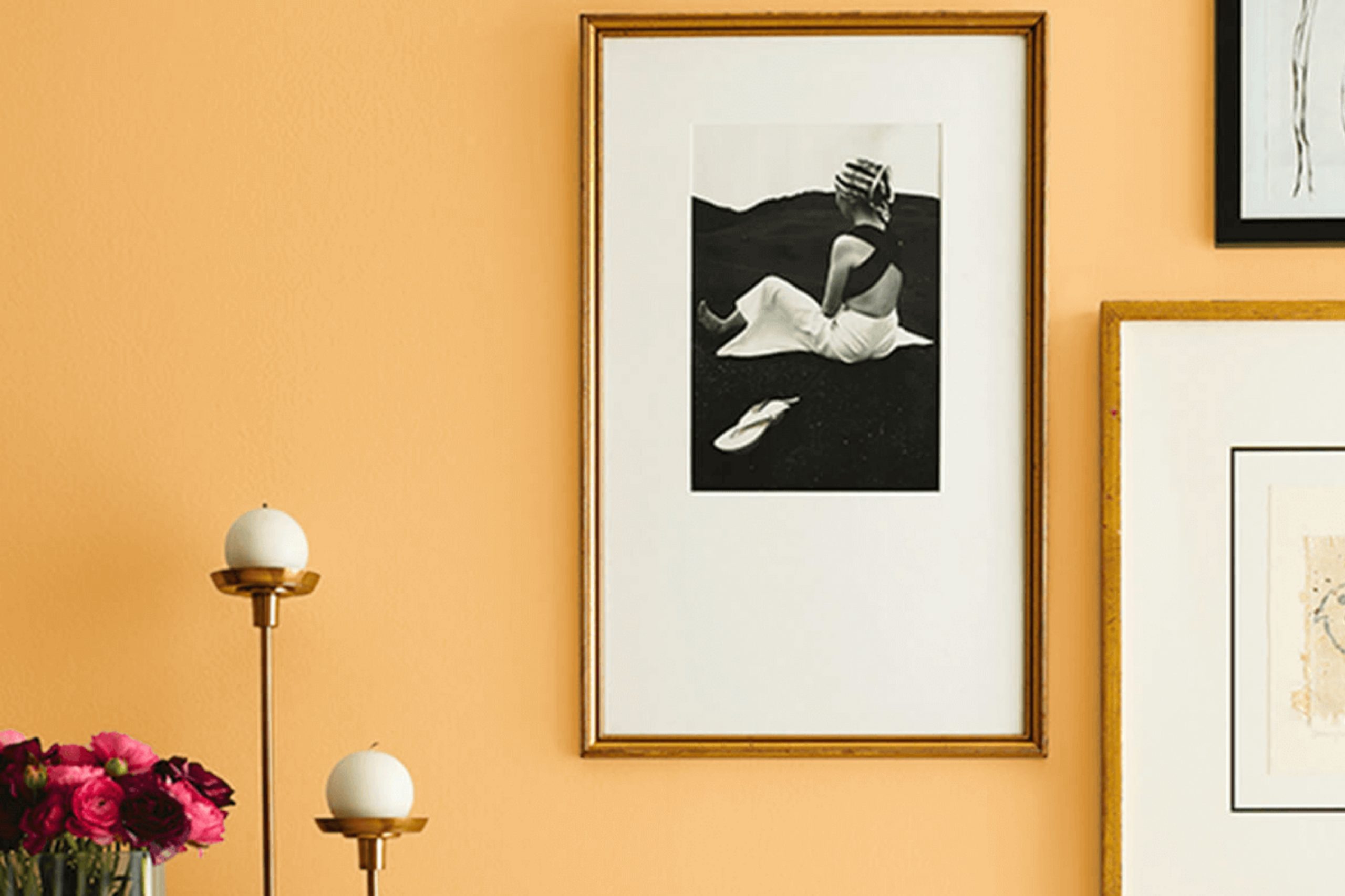
Imagine waking up each morning to a room aglow with the gentle hues of SW 6668 Sunrise by Sherwin Williams — a color that truly reflects the calm yet invigorating colors of daybreak. As a devoted home decorator, I recently painted my bedroom with this warm, radiant shade, and the effect has been nothing short of refreshing. The color carries the softness of early sunlight, infusing my room with a cozy, welcoming vibe that brightens even the cloudiest days.
Choosing the right paint color can often feel overpowering, but SW 6668 Sunrise made my decision easy. Its subtle yet cheerful yellow captures the essence of a fresh new day. Whether I’m sipping my morning coffee or deciding on an outfit for the day, this color sets a positive tone that lingers.
Incorporating SW 6668 Sunrise into your home decor not only enhances the room but also affects your mood. The lightness of this shade brings a sense of energy and optimism, perfect for areas where you start your day or unwind in the evening.
By painting your walls with SW 6668 Sunrise, you bring the beauty of the earliest daylight hours indoors, providing a continuous reminder of new beginnings and possibilities.
What Color Is Sunrise SW 6668 by Sherwin Williams?
Sherwin-Williams’ SunriseSW 6668 is a vibrant, warm shade resembling the early morning sun. This color brings a cozy, uplifting feeling to any room, making rooms feel more welcoming and cheerful. Its rich, golden undertones can illuminate dark areas and add a splash of joy to subdued decor.
SunriseSW 6668 pairs wonderfully in interiors that aim for a traditional or rustic look. It creates harmony when used in environments featuring natural wood, from light pine to richer walnut, enhancing the organic feel of the room. Additionally, this shade works well with materials like wicker and linen, adding to its rustic charm by amplifying a handcrafted, homely vibe.
Besides natural materials, Sunrise SW 6668 also matches well with matte finishes on metals such as brass or copper, which can help accentuate its warm, glowing properties. Textiles with a slight sheen, like silk or satin, can provide a delightful contrast to the color’s inherent brightness, adding layers and interest to the overall design. This color excels in kitchens and living rooms where warmth and energy are often welcomed.
It can also refresh bedrooms into cozy, sunlit retreats, enhancing the relaxing, joyful atmosphere of the room.

Is Sunrise SW 6668 by Sherwin Williams Warm or Cool color?
SunriseSW 6668 by Sherwin Williams is a vibrant and warm shade of orange that brings a lively and welcoming feel to any room. This particular color works well in areas that benefit from a cheerful and energetic vibe, such as kitchens and playrooms. The brightness of SunriseSW 6668 can make a room feel more open and inviting, which is great for areas that are intended for family gatherings and social activities.
Because it’s a strong color, using it in a small or overly cluttered room might feel overpowering. It pairs excellently with neutral tones like whites or soft grays, which help balance its intensity, and also looks appealing when contrasted with shades of teal or navy for a dynamic color scheme.
Applying it on an accent wall can be an effective way to introduce a pop of color without overpowering the room. Additionally, accessories and decor in this hue can energize a room without the commitment of painting. Overall, SunriseSW 6668 adds a touch of warmth and cheerfulness, making it a great choice for anyone looking to brighten up their home.
Undertones of Sunrise SW 6668 by Sherwin Williams
Sunrise SW 6668 by Sherwin Williams is a unique color due to its diverse undertones, which play a crucial role in how it is perceived in different settings. Undertones are the subtle colors that lie beneath the surface of the main color, influencing its overall hue and warmth.
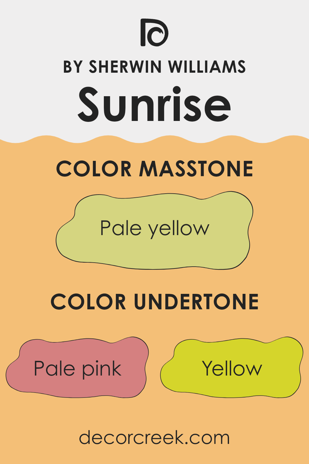
For Sunrise SW 6668, these undertones include pale pink, yellow, light gray, orange, light purple, mint, grey, light green, light blue, olive, and lilac. Each of these undertones adds a different dimension to the paint color, impacting the mood and aesthetic of any room.
When used on interior walls, the undertones of Sunrise can significantly affect the ambiance of a room. For instance, pale pink and light purple can bring a gentle, soothing feel, making the room feel more welcoming.
Yellow and orange undertones can inject a sense of brightness and energy, ideal for areas like kitchens or living rooms where you want a lively atmosphere. Grey and light gray provide a neutral backdrop, offering flexibility in decorating with different furniture and accent colors. Furthermore, the influence of lighting cannot be overstated.
Natural and artificial light can highlight different undertones at different times of the day, changing the color’s appearance. For example, in a room with ample sunlight, the yellow and light green undertones might become more pronounced, giving the walls a vibrant look, while in dimmer light, the grays and blues might become more dominant, creating a more subdued appearance.
Overall, the complex undertones of Sunrise SW 6668 make it a flexible color choice for interior walls, allowing it to complement a wide range of decors and styles while adapting to different lighting conditions.
What is the Masstone of the Sunrise SW 6668 by Sherwin Williams?
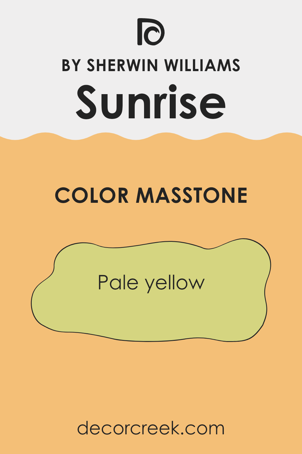
Sunrise SW 6668 by Sherwin Williams has a masstone of Pale Yellow (#D5D580). This gentle, soothing color is perfect for creating a warm and welcoming atmosphere in any home. Its light yellow shade is ideal for areas where you want to promote a sense of calm and happiness. Since it’s not too bright, it can be used in larger areas like living rooms and kitchens without overpowering the room.
This pale yellow works beautifully with various accent colors; soft blues or greens can complement it in a very natural way. Also, since it reflects light well, it helps in making small rooms appear bigger and brighter. This feature is especially beneficial in areas that don’t get a lot of natural sunlight.
Overall, Sunrise SW 6668 is a flexible color that provides a subtle background. It’s easy on the eyes and can help make your home feel more inviting, enhancing both the style and comfort of your living room.
How Does Lighting Affect Sunrise SW 6668 by Sherwin Williams?
Lighting plays a crucial role in how we perceive colors, as different types of light can greatly affect the appearance of a paint color on walls. One such color, SunriseSW 6668, can vary in appearance depending on whether it is viewed under artificial or natural lighting.
In artificial light, such as that from bulbs or LED lights, SunriseSW 6668 tends to appear warmer and more vibrant. The yellow and orange tones in the color become more pronounced, making the room feel cozy and welcoming. This makes it a great choice for living areas and rooms where you want a warm ambiance.
Under natural light, the true color of SunriseSW 6668 is more apparent. Natural sunlight can reveal the depth and richness of this shade, enhancing its vibrancy during the daytime when the sun is brightest. As the quality of natural light changes from dawn to dusk, the color will shift slightly, reflecting softer or brighter tones accordingly.
The orientation of a room also affects how SunriseSW 6668 will look:
1. North-Faced Rooms:
North-facing rooms receive less direct sunlight, which means this color might appear slightly muted and cooler. It won’t be as bright but will still provide a warm undertone that lightens up these typically shadowy rooms.
2. South-Faced Rooms:
Rooms that face south benefit from abundant sunlight most of the day, making SunriseSW 6668 look brighter and more vivid. In south-facing rooms, the paint color can truly shine, enlivening the room with its rich, sunny hues.
3. East-Faced Rooms:
In east-facing rooms, the color will look exceptionally warm and bright in the morning as the sun rises, giving the room a cheerful start to the day. However, as the day progresses, the intensity of the color will decrease as natural light fades.
4. West-Faced Rooms:
Conversely, in west-facing rooms, SunriseSW 6668 will show its full brilliance in the afternoon and evening as the sun sets. During morning hours, the color will appear softer and less intense.
Overall, Sunrise SW 6668 is a flexible color that can adapt to various lighting conditions, changing its mood and atmosphere throughout the day and in different room orientations.
What is the LRV of Sunrise SW 6668 by Sherwin Williams?
LRV stands for Light Reflectance Value, and it refers to the percentage of light a paint color reflects from a surface compared to the total amount of light the wall receives. This measurement helps determine how light or dark a color will look in a specific environment.
Colors with a higher LRV are better at reflecting light, making them appear brighter and more open, which can make smaller rooms feel larger. On the other hand, colors with a lower LRV absorb more light, which can make them look richer but also darker, potentially making the room feel more enclosed.
Considering the LRV of 57.752 for this specific paint, it falls in the middle range and reflects a balanced amount of light, neither too high nor too low. This means the color is flexible enough to work well in most areas, neither darkening a room too much nor overpowering it with brightness. In rooms with moderate to ample light, this color can make the room feel lively and cheerful without being too intense. This makes it a suitable choice for common areas like living rooms or kitchens, where a neutral yet inviting atmosphere is often desired.

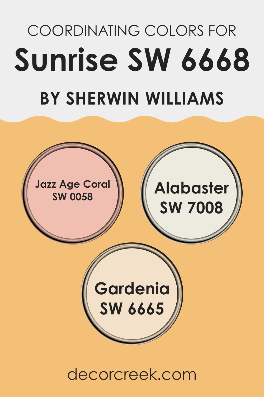
Coordinating Colors of Sunrise SW 6668 by Sherwin Williams
Coordinating colors are those chosen to work harmoniously with a primary color, enhancing the overall aesthetic of a room without overpowering it. In the case of Sunrise SW 6668 by Sherwin Williams, a vibrant and energetic shade, its coordinating colors are selected to complement and balance its intensity. These coordinating colors include Jazz Age Coral, Alabaster, and Gardenia, each contributing in their unique way to create a pleasing palette.
Jazz Age Coral, SW 0058, is a playful and lively color that echoes some of the warmth of SunriseSW 6668, making areas feel welcoming and cheerful. It pairs well with the boldness of SunriseSW 6668, providing a softer contrast that’s still filled with personality.
Alabaster, SW 7008, on the other hand, is a neutral white that offers a clean and calming counterpoint to the more vivid tones of SunriseSW 6668. It helps to lighten and brighten rooms, making them appear more spacious.
Lastly, Gardenia, SW 6665, is a soft, creamy hue that brings a gentle richness to the color scheme. It works seamlessly with SunriseSW 6668 by offering a subtle contrast that’s both soothing and elegant, completing the trio of coordinating colors effectively.
You can see recommended paint colors below:
- SW 0058 Jazz Age Coral
- SW 7008 Alabaster
- SW 6665 Gardenia
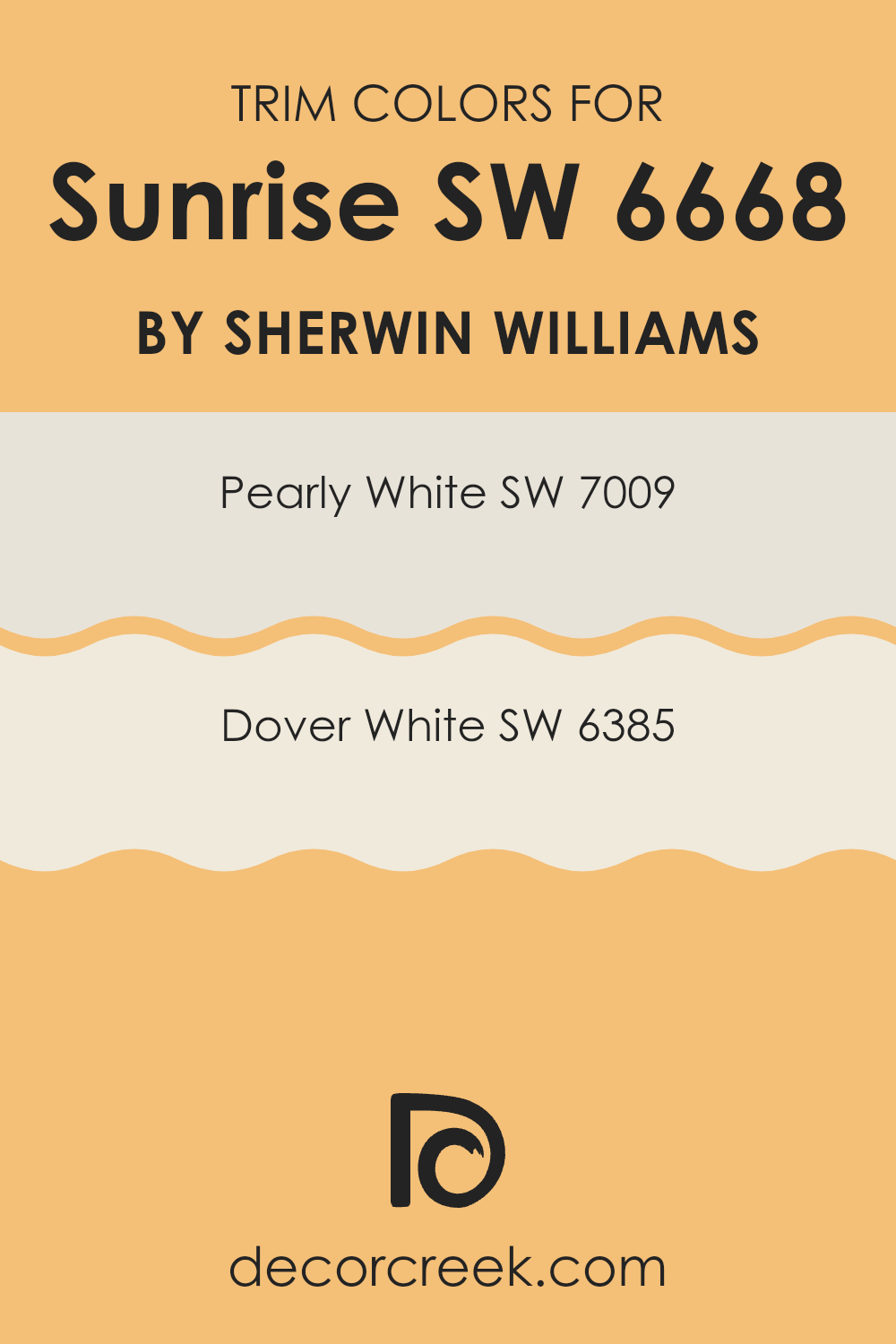
What are the Trim colors of Sunrise SW 6668 by Sherwin Williams?
Trim colors, such as SW 7009 – Pearly White and SW 6385 – Dover White by Sherwin Williams, play a vital role in framing and accentuating the primary wall colors of a room. They are specifically chosen to outline doors, windows, and baseboards, creating a visually pleasing contrast that highlights the architectural features of a room.
These colors are crucial because they help define the room and add a polished finish to the overall decor, ensuring that the wall colors, such as Sunrise by Sherwin Williams, stand out beautifully and the interior looks well-coordinated.
Pearly White is a soft, creamy white with a hint of warmth, making it a flexible choice that adds a subtle, inviting glow to any room. Dover White, slightly warmer and richer, provides a gentle, creamy backdrop that smoothly complements bolder, more vibrant colors. Both shades are excellent for providing a fresh and clean look while supporting the main hues to shine in their light, making them ideal trim options for any decorating style.
You can see recommended paint colors below:
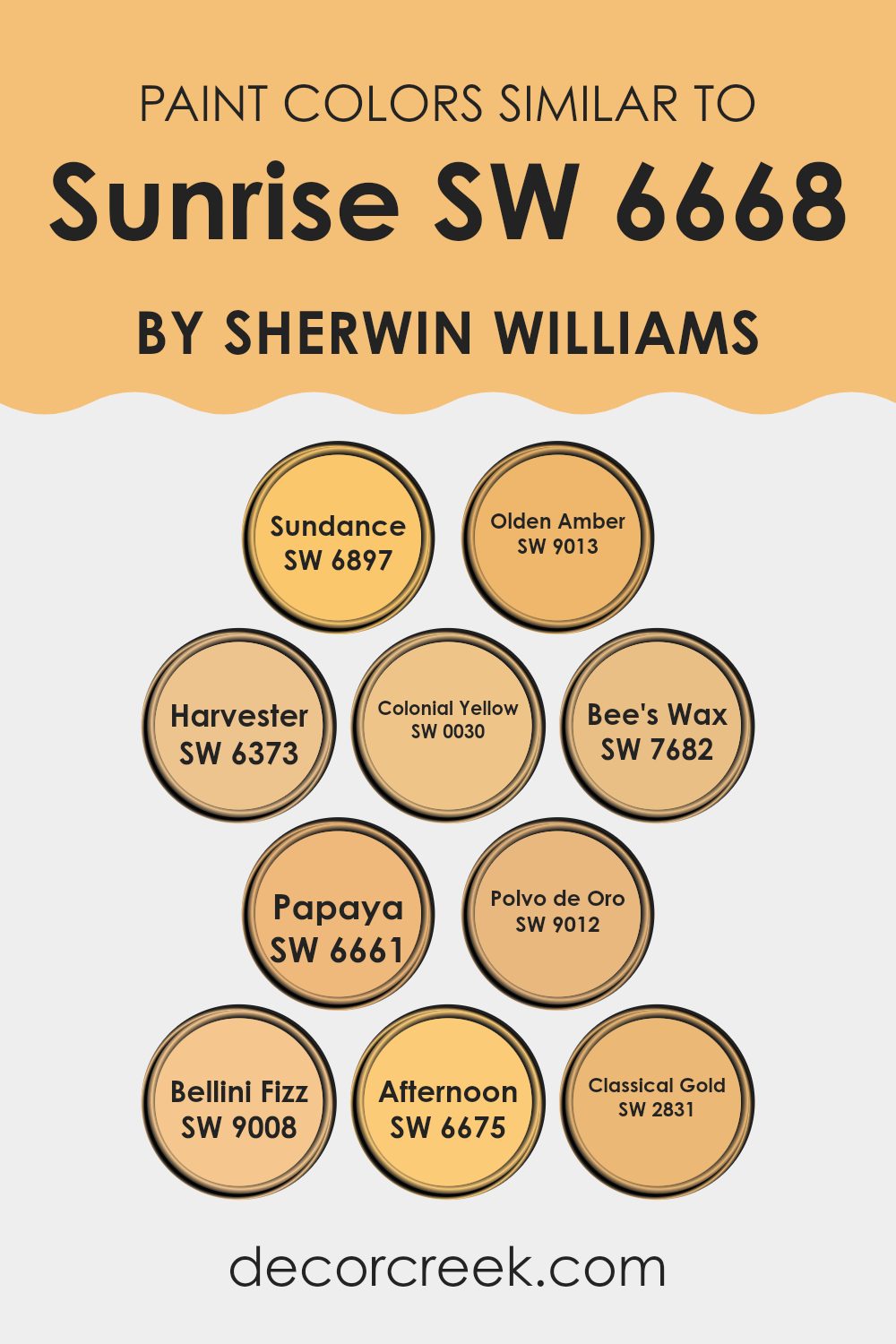
Colors Similar to Sunrise SW 6668 by Sherwin Williams
Using similar colors in design can create a unified and harmonious look, balancing the aesthetic of a room without overpowering it with contrast. For instance, when designing with a base color similar to Sunrise SW 6668 from Sherwin Williams, incorporating hues like Sundance, Olden Amber, or Harvester can enhance the warmth and coziness of a room.
These colors echo the vibrant yet soft tones of a morning sky, making them perfect for lively, inviting rooms. Colonial Yellow and Bee’s Wax offer slightly muted yellow tones, providing a subtle vibrancy that complements the primary color without straying far from the theme.
Colors like Papaya, Polvo de Oro, and Bellini Fizz introduce a soft, peachy contrast, enriching the visual interest of the décor. These shades are mild yet refreshing, adding a touch of brightness in a gentle, appealing manner. Meanwhile, Afternoon and Classical Gold deepen the palette, grounding lighter shades with their rich, golden hues.
They bring a sense of depth and warmth, perfect for accessories or feature walls that accentuate the main color. Integrating these similar hues allows for a cohesive yet diverse color scheme that enhances both the style and the atmosphere of any room.
You can see recommended paint colors below:
- SW 6897 Sundance
- SW 9013 Olden Amber
- SW 6373 Harvester
- SW 0030 Colonial Yellow
- SW 7682 Bee’s Wax
- SW 6661 Papaya
- SW 9012 Polvo de Oro
- SW 9008 Bellini Fizz
- SW 6675 Afternoon
- SW 2831 Classical Gold
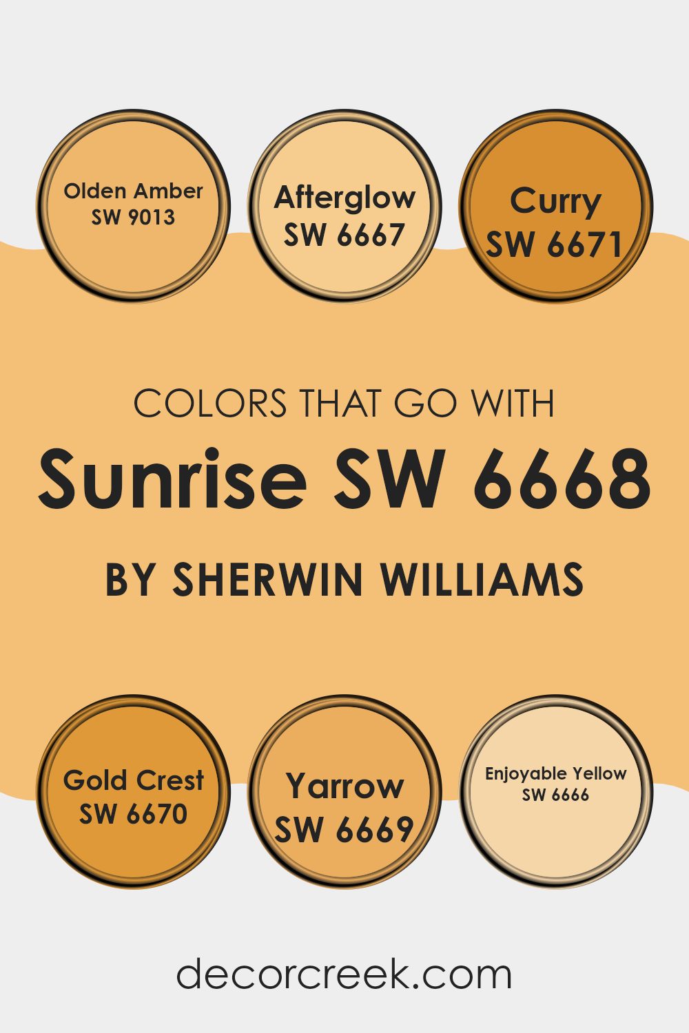
Colors that Go With Sunrise SW 6668 by Sherwin Williams
Colors that complement Sunrise SW 6668 by Sherwin Williams are crucial in design because they help create a harmonious and appealing environment. When you choose colors like Olden Amber, Afterglow, Curry, Gold Crest, Yarrow, and Enjoyable Yellow, you’re effectively setting the tone and mood for a room. These colors can smooth transitions between areas, enhance the visual impact, and even affect emotions and perceptions.
Olden Amber is a warm hue reminiscent of aged amber gems, offering a touch of antique charm to rooms. It pairs beautifully with Sunrise for a cozy, inviting feel. Afterglow, a muted orange, provides a soft backdrop that complements the vibrant tones of Sunrise, reflecting the calm of early morning skies.
Curry, a bold yellow with a spice-market vibe, injects energy and brightness when used alongside Sunrise, perfect for kitchens or dining areas. Gold Crest has a vivid, sunlit quality that mimics the first golden rays of dawn, enhancing the lightness of Sunrise.
Yarrow, a subtly vibrant yellow-tinted orange, adds a playful, floral-inspired pop of color, great for energizing a room. Enjoyable Yellow, with its cheerful radiance, offers a crisp contrast to the calmness of Sunrise, ideal for creating lively yet harmonious rooms. By coordinating these colors strategically, you can beautifully tailor the aesthetic and atmosphere of any room.
You can see recommended paint colors below:
- SW 9013 Olden Amber
- SW 6667 Afterglow
- SW 6671 Curry
- SW 6670 Gold Crest
- SW 6669 Yarrow
- SW 6666 Enjoyable Yellow
How to Use Sunrise SW 6668 by Sherwin Williams In Your Home?
Sunrise SW 6668 by Sherwin Williams is a warm, soft orange paint that brings a cozy feeling to any room. It’s a great choice if you want to add a splash of color without overpowering a room. This shade can make a living room or kitchen feel more welcoming and cheerful, perfect for rooms that get lots of use.
For those who want to add a little extra personality, Sunrise SW 6668 can also be a fantastic accent color. Consider painting one wall in this vibrant orange to create a focal point, or use it for smaller elements like doors or cabinets for a playful touch.
Since it’s a warm color, Sunrise works well with natural light, making areas feel bright and airy during the day. Pair it with neutral colors like white or gray to keep the balance, or match it with blues and greens for a bit of contrast. Sunrise is flexible and can help you make your home feel just right.
Sunrise SW 6668 by Sherwin Williams vs Classical Gold SW 2831 by Sherwin Williams
The color Sunrise by Sherwin Williams is a vibrant, warm orange hue that resembles the early morning sky. It’s lively and cheerful, perfect for areas where you want to add energy and a touch of playfulness.
On the other hand, Classical Gold by Sherwin Williams is a muted gold tone that exudes a sense of richness and warmth, without being too bold or overpowering. This shade works well in rooms where you want a hint of opulence but in a subdued manner.
While Sunrise adds a burst of brightness, Classical Gold provides a gentle golden glow, making them both unique in setting the mood of a room. These colors could complement each other in a room with Sunrise on an accent wall and Classical Gold on surrounding walls for a balanced, warm feel.
You can see recommended paint color below:
- SW 2831 Classical Gold

Sunrise SW 6668 by Sherwin Williams vs Polvo de Oro SW 9012 by Sherwin Williams
Sunrise SW 6668 is a vivid, energizing shade of orange that recalls the bright and bold hues visible at dawn. It has a dynamic and lively feel, perfect for areas where you want to inject enthusiasm and vibrancy, such as a kitchen or a child’s playroom.
On the other hand, Polvo de Oro SW 9012 is a subtle, muted gold tone that offers a sense of warmth and coziness. This more understated color pairs well in areas designed for relaxation such as a living room or bedroom, providing a soft backdrop that complements various decor styles.
While Sunrise is bold and can make a strong statement on a wall, Polvo de Oro is more reserved, creating a gentle ambiance that enhances the feeling of comfort. Each color serves distinct purposes based on the mood you want to set in your room.
You can see recommended paint color below:
- SW 9012 Polvo de Oro
Sunrise SW 6668 by Sherwin Williams vs Harvester SW 6373 by Sherwin Williams
Sunrise and Harvester are both warm, welcoming colors from Sherwin Williams but they bring different vibes to a room. Sunrise is a vibrant, deep coral that really stands out. It adds a burst of energy and freshness, kind of like the early morning glow when the sun first comes up. This color would be great for an accent wall or in a room that needs some lively touches.
On the other hand, Harvester is a softer, muted yellow. It’s like the gentle color of wheat fields and has a cozy and comforting feel. Harvester works really well in living rooms or bedrooms where you want a calm and inviting atmosphere.
So, if you’re looking for something bright and playful, Sunrise is a good choice. If you prefer something gentler and more subtle, then Harvester would be ideal. Both colors can make a room look nice, but they serve different moods and settings.
You can see recommended paint color below:
Sunrise SW 6668 by Sherwin Williams vs Afternoon SW 6675 by Sherwin Williams
The two colors from Sherwin Williams, Sunrise and Afternoon, each offer a unique ambiance. Sunrise is a vibrant, energetic yellow that is reminiscent of an early morning sun, bringing a bright and cheerful feel to any room.
It’s perfect for creating a lively and inviting atmosphere in areas like kitchens or breakfast nooks. On the other hand, Afternoon is a richer, more intense yellow. This color mimics the deeper, golden tones of a late day sun and can add a touch of warmth to rooms that need a cozy and welcoming vibe, such as living rooms or dining areas.
Both colors are yellow-based, but while Sunrise provides a sense of freshness and morning vitality, Afternoon offers a warmer, soothing feel, making it suitable for areas where you spend relaxing or social times later in the day.
You can see recommended paint color below:
- SW 6675 Afternoon
Sunrise SW 6668 by Sherwin Williams vs Colonial Yellow SW 0030 by Sherwin Williams
Sunrise and Colonial Yellow are two vibrant colors from Sherwin Williams that offer distinctly lively vibes for any room. Sunrise is a rich, warm pink with an energetic feel. It’s bright and cheerful, making it a perfect choice for areas where you want a burst of positivity, like a kitchen or a child’s room.
On the other hand, Colonial Yellow has a classic, sunny disposition. This color is reminiscent of sunlight and lends an airy, open feel to any room. It works exceptionally well in areas that receive a lot of natural light, enhancing the room with a bright, welcoming glow.
While Sunrise brings a more playful and bold pink hue, Colonial Yellow offers a more subdued yet cheerful yellow that can make a room feel more spacious and light. Together, these colors can create a joyful and lively environment.
You can see recommended paint color below:
- SW 0030 Colonial Yellow
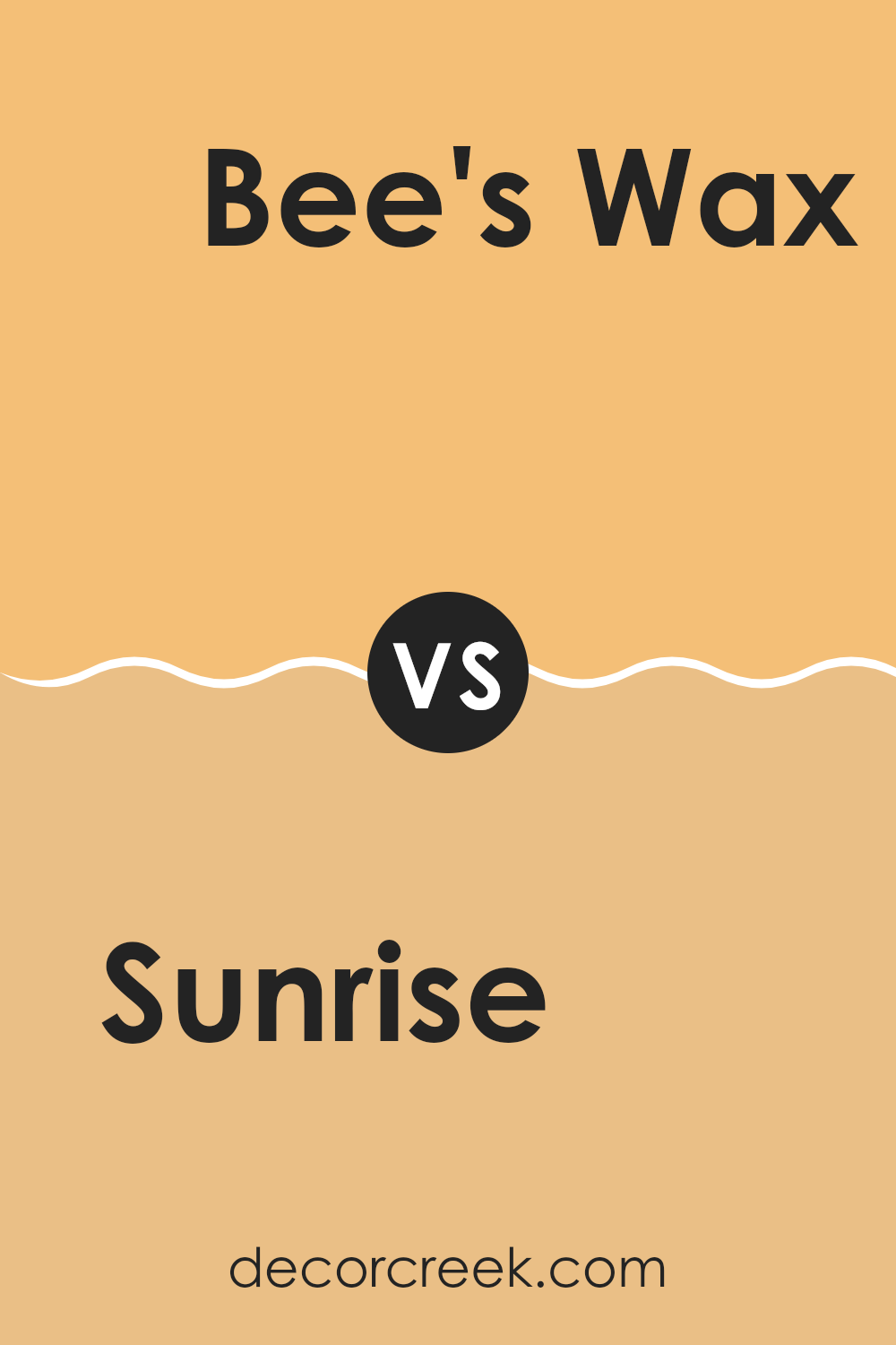
Sunrise SW 6668 by Sherwin Williams vs Bee’s Wax SW 7682 by Sherwin Williams
Sunrise is a vibrant, energizing shade of orange that closely resembles the warm hues you might see in the sky as the sun comes up. It’s bright and bold, perfect for making a statement in any room. This color can add a lively pop to areas that need a bit of cheer, like kitchens or playrooms.
On the other hand, Bee’s Wax is a subtle, muted yellow. It offers a soft and cozy feeling, making it great for creating a relaxed atmosphere in places like living rooms or bedrooms. The color mimics the natural tone of actual beeswax, which gives it a comforting and inviting quality.
Both colors are from Sherwin Williams, and each brings its own unique mood to the table. Sunrise is more about energy and playfulness, while Bee’s Wax is about warmth and comfort. Depending on what you’re looking for in a room, either could be a great choice.
You can see recommended paint color below:
- SW 7682 Bee’s Wax
Sunrise SW 6668 by Sherwin Williams vs Sundance SW 6897 by Sherwin Williams
Sunrise SW 6668 and Sundance SW 6897, both by Sherwin Williams, are vibrant and warm colors that bring different kinds of brightness to areas. Sunrise is a soft peach hue that offers a gentle and inviting ambiance. It’s like the light, refreshing tones you might see when the sun first comes up. This color works well in rooms where you want a subtle warmth without overpowering brightness.
On the other hand, Sundance is a bold, sunny yellow. It’s much brighter and can instantly make a room feel more lively and cheerful. It resembles the intense, joyful light of a sunny midday. This color is perfect for areas where you want to add energy and a sense of joy.
Both colors have their unique appeal and can be used creatively to enhance different rooms depending on the mood you’re aiming to create. While Sunrise brings a softer glow, Sundance offers an energetic burst, making each suitable for specific purposes in home or commercial decor.
You can see recommended paint color below:
- SW 6897 Sundance

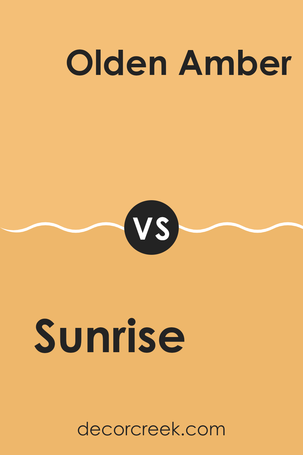
Sunrise SW 6668 by Sherwin Williams vs Olden Amber SW 9013 by Sherwin Williams
The main color, Sunrise, is a vibrant, cheerful shade of orange. It has a strong presence and can brighten up any room, making it feel lively and energetic. This color works well in social areas of a home, like living rooms or kitchens, where its upbeat tone can create a welcoming atmosphere.
On the other hand, Olden Amber is a more subdued, muted orange with hints of brown. This color provides a warm, cozy feeling, making it ideal for areas where you want to relax, such as bedrooms or dens. Olden Amber’s earthy quality pairs well with natural materials like wood or leather, enhancing its comforting essence.
Both colors are variations of orange but evoke different moods due to their intensity and saturation. Sunrise is bold and eye-catching, while Olden Amber is gentle and soothing, offering versatility depending on the desired ambiance in a room.
You can see recommended paint color below:
- SW 9013 Olden Amber
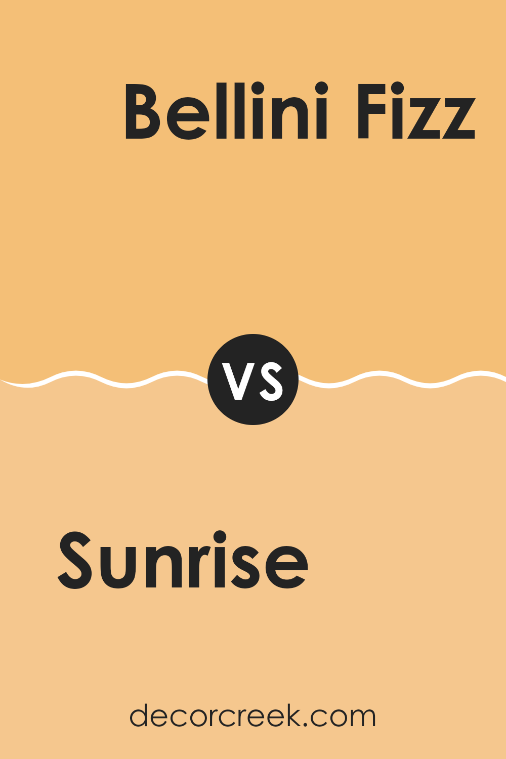
Sunrise SW 6668 by Sherwin Williams vs Bellini Fizz SW 9008 by Sherwin Williams
Sunrise SW 6668 and Bellini Fizz SW 9008, both from Sherwin Williams, have distinct tones that set different moods. Sunrise features a bold, vibrant orange that is reminiscent of a bright morning sky. It is lively and can add a burst of energy to any room, making it ideal for areas where you want excitement and warmth.
On the other hand, Bellini Fizz is a softer peach shade that brings a gentle and welcoming feel. This color is perfect for creating a relaxing atmosphere, suitable for living rooms or bedrooms where a calm and inviting environment is desired.
While both colors bring warmth to a room, Sunrise does so with a more intense punch of color, whereas Bellini Fizz offers a subtle and soothing hue. Depending on the vibe you want to achieve, you can choose the energetic and cheerful Sunrise, or the gentle and understated Bellini Fizz.
You can see recommended paint color below:
- SW 9008 Bellini Fizz
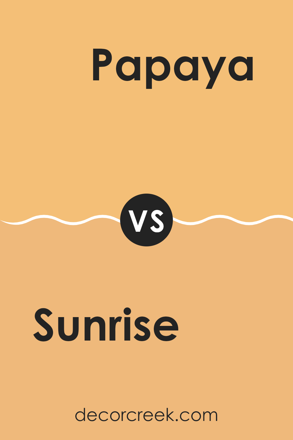
Sunrise SW 6668 by Sherwin Williams vs Papaya SW 6661 by Sherwin Williams
Sunrise SW 6668 and Papaya SW 6661, both by Sherwin Williams, offer vibrant options for sprucing up a room. Sunrise SW 6668 has a warm, cheerful aura that resembles the early morning sky. This shade can instantly make a room feel welcoming and bright due to its rich intensity.
On the other hand, Papaya SW 6661 is a subtler color. It strikes a lighter tone, similar to the flesh of the fruit it’s named after. It provides a fresh and cheerful mood without overpowering with brightness, making it perfect for creating a light and airy environment.
Both colors can boost the mood of a room, but while Sunrise brings a bolder, energetic punch, Papaya offers a gentler approach. Transitioning between these hues could depend on the desired impact and room utility.
You can see recommended paint color below:
- SW 6661 Papaya
In conclusion, SW 6668 Sunrise by Sherwin Williams is a lovely paint color that can bring a warm and friendly feel to any room. It’s like the soft glow of the morning sun, making areas cozy and inviting. This color is perfect for places where you spend a lot of time, like living rooms or bedrooms, because it makes them feel happy and bright.
Using SW 6668 Sunrise is a smart choice if you want to make a room feel more lively without it being too bold or shocking. It goes well with many other colors, so you can use it with furniture and decorations you already have. It’s especially nice when paired with soft whites or gentle greys, which help to keep the overall look soft and easy on the eyes.
So, if you’re thinking about giving a room in your house a new look, SW 6668 Sunrise might be just the right color. It’s like adding a little bit of sunshine indoors, making your room warm and welcoming for everyone who comes in.
Whether you’re having a lazy day at home or inviting friends over, this color will surely make your days a bit brighter.

Ever wished paint sampling was as easy as sticking a sticker? Guess what? Now it is! Discover Samplize's unique Peel & Stick samples.
Get paint samples

