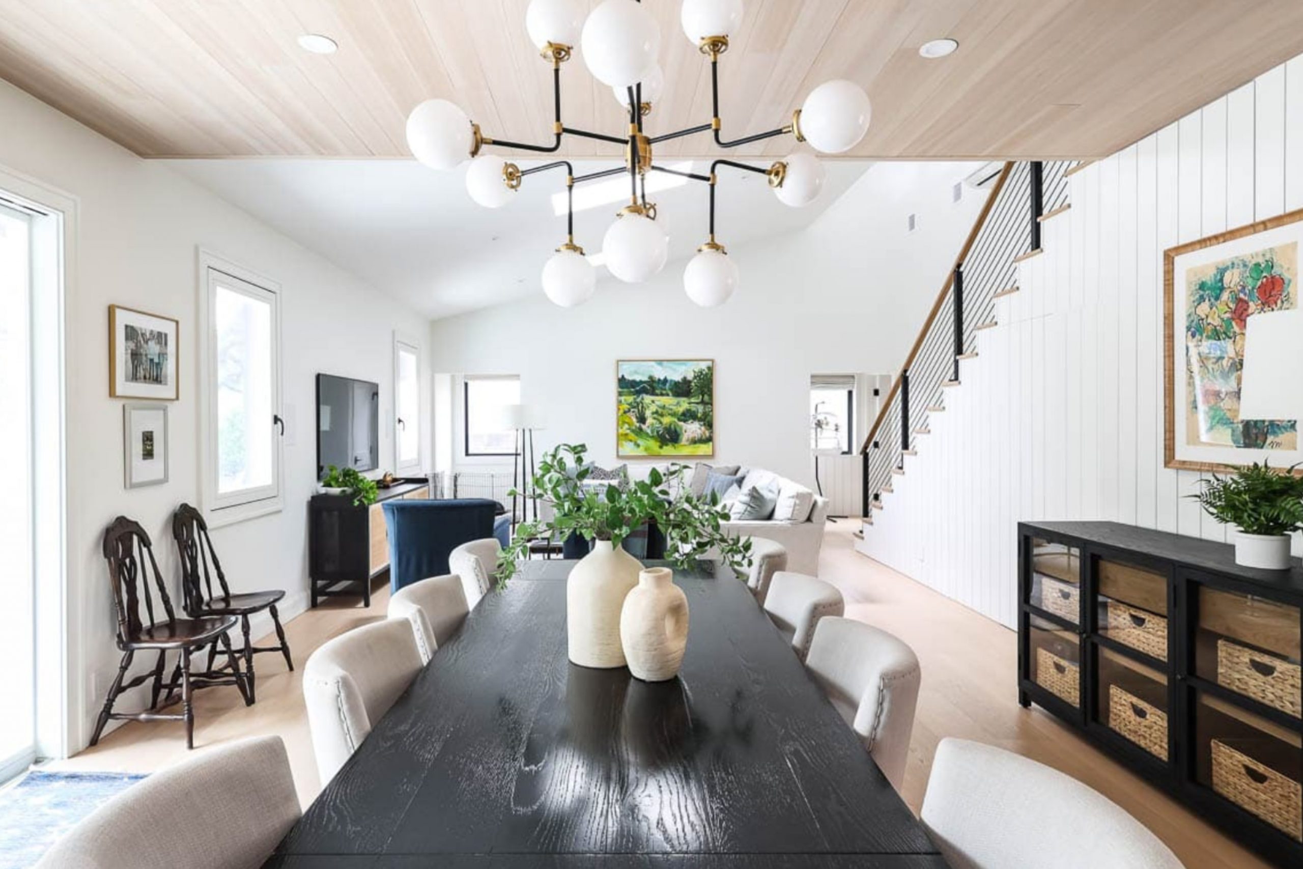
Choosing the right shade of white for your area can be surprisingly tricky, and SW 7005 Pure White by Sherwin Williams is a popular option you might be considering. Before you make the decision to color your walls with this shade, let’s talk about a few things that might help you decide if it’s the perfect fit for your home.
First, understand that despite the name, Pure White isn’t a stark, cold white. It has subtle warm undertones that make it a soft and adaptable choice, capable of brightening a room without feeling too sterile. It reflects light beautifully, which can make smaller areas appear larger and more inviting.
If you’re thinking about long-term appeal and ease of maintenance, Pure White is a practical choice. It pairs wonderfully with a wide range of colors and décor styles, from modern to rustic. Whether you’re planning to apply it on textured walls, smooth surfaces, or alongside detailed trims, Pure White tends to adapt well.
Lastly, consider the mood and ambiance you want to create. Pure White can contribute to a calm and peaceful atmosphere, ideal for areas like bedrooms or home offices where you prefer a clear and focused vibe. Keep these points in mind as you choose the right paint for your renovation project.
Is Pure White SW 7005 Right for My Home?
As someone who’s a fan of clean and crisp color schemes, I really appreciate the charm of Pure White. It’s a bright white paint but with just a hint of warmth, which makes it incredibly adaptable and welcoming. I’ve noticed it avoids that stark, clinical feel some whites have, lending a softness that works beautifully in a home.
In terms of interior styles, Pure White is my go-to for a modern minimalist look. It provides a smooth backdrop that allows other elements like furniture and artwork to really stand out. Also, it’s great for Scandinavian interiors where light and simplicity are key. I’ve seen it work wonders in coastal settings too, where it pairs well with blues and sandy hues.
When it comes to materials, Pure White pairs well with natural wood, which contrasts nicely against its brightness, enhancing the warm undertones of both. In kitchens, pairing it with marble countertops creates an enduring feel, and for a bit more texture, adding linens or soft fabrics makes areas feel cozy. I love using this color because it’s like a blank canvas, allowing me to mix and match different textures without worrying about the color overpowering the area.
What Are The Right Undertones Of Pure White SW 7005 ?
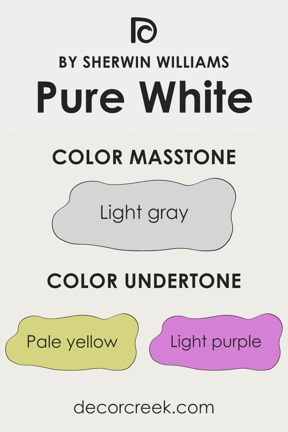
Pure White by Sherwin Williams is a popular paint choice for its adaptability and clean look. What makes this color unique, however, is its subtle undertones. Undertones are the colors that lurk beneath the surface of the paint and can significantly affect how a color appears in different lighting conditions.
Pure White has a mix of undertones including pale yellow, light purple, light blue, pale pink, mint, lilac, and grey. These undertones can influence the perception of the color on your walls. For instance, pale yellow undertones can make a room feel warmer, adding a cozy glow, especially in natural light. Light blue and mint undertones, on the other hand, might give a sense of freshness and calmness, perfect for creating a relaxed environment.
The light purple and lilac undertones can add a hint of playful charm, which might not be overt but subtly influences the ambiance of an area. Pale pink undertones provide a soft, gentle touch that can make a room feel inviting. Lastly, grey undertones bring a neutral balance to the paint, ensuring that it doesn’t lean too warm or too cool.
When Pure White is applied to interior walls, these undertones collaborate to create a dynamic experience, changing subtly with the light and the room’s specific furnishings and decorations. The room’s lighting, both natural and artificial, plays a crucial role in how these undertones display themselves, impacting the overall mood and feel of an area. Thus, choosing this color for your walls means you get a beautiful base that adapts subtly throughout the day, complementing various decor styles and personal tastes.
decorcreek.com
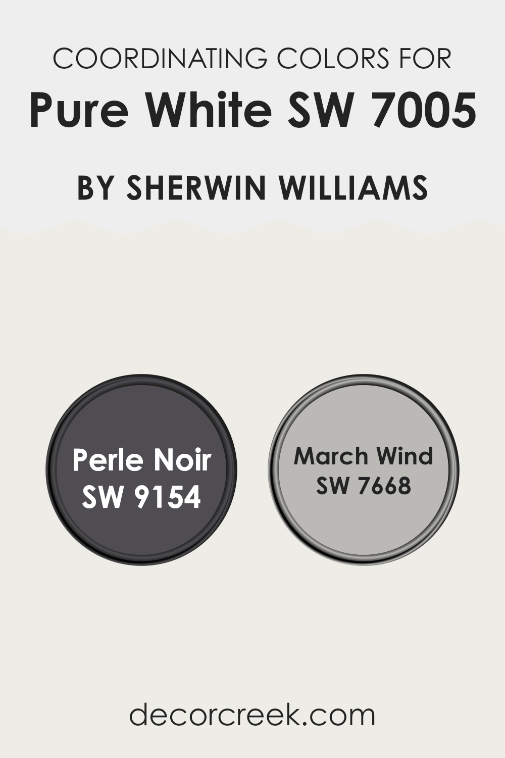
Best Coordinating Colors to use with Pure White SW 7005 by Sherwin Williams This Year
Coordinating colors are those that complement each other well when used together in a given area, often enhancing the overall aesthetic of a room without overpowering it with contrast. These colors can be similar in tone or contrast dramatically to draw attention to particular elements within an area. For example, when coordinating colors with a neutral base like Pure White, it is important to select shades that either create a subtle, harmonious look or offer a bold statement.
One coordinating color for Pure White is Perle Noir SW 9154, a deep, almost black shade that provides a striking contrast to the crispness of Pure White. This strong contrast can be used to highlight architectural features or furniture pieces, making them stand out in a predominantly light room.
On the other hand, March Wind SW 7668 offers a softer look when paired with Pure White. This is a gentle gray that blends smoothly with the brightness of Pure White, lending a light, airy feel to any area. This type of combination is perfect for creating a relaxed and welcoming atmosphere, where every element feels connected yet distinct.
You can see recommended paint colors below:
- SW 9154 Perle Noir
- SW 7668 March Wind
Trendy Trim Colors of Pure White SW 7005 by Sherwin Williams To Use This Year
Trim colors are essential for accentuating the architectural details of a room and helping to define the boundaries between different surfaces, which enhances the overall aesthetic appeal. For a neutral shade like Pure White SW 7005 by Sherwin Williams, selecting the right trim colors can add subtle distinctions that make the wall color pop and create a more polished look.
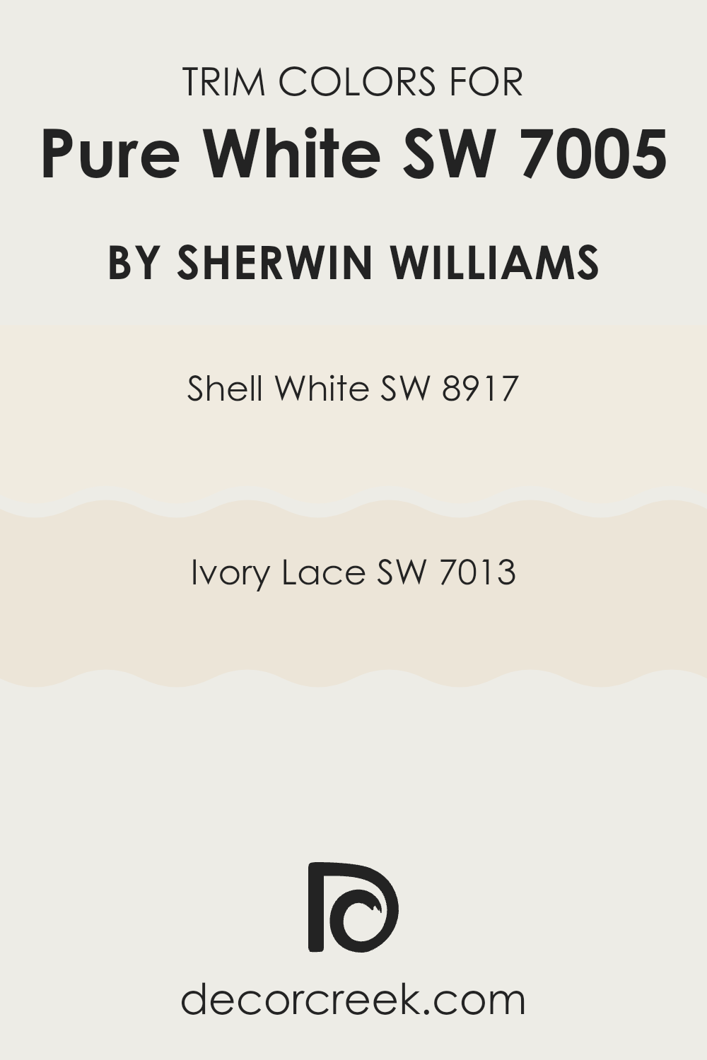
Using colors like Shell White SW 8917 and Ivory Lace SW 7013 as trim options can complement the clean, crisp tone of Pure White without overpowering it, offering a gentle contrast that highlights the beauty of the primary wall color.
Shell White SW 8917 is a soft, muted white with a gentle hint of warmth, making it ideal for creating a smooth transition between the pure starkness of Pure White and the more embellished elements of a room’s decor. On the other hand, Ivory Lace SW 7013 provides a slightly deeper tone, leaning towards a creamy, almost beige-like shade of white. This color can add a touch of richness to the overall scheme, working well to frame the Pure White in a way that adds depth while maintaining a harmonious and clean overall aesthetic.
You can see recommended paint colors below:
- SW 8917 Shell White
- SW 7013 Ivory Lace
Evergreen Colors Similar to Pure White SW 7005 by Sherwin Williams
Similar colors play a significant role in creating a harmoniously balanced and visually appealing area, especially when they are variations of a classic shade like Pure White by Sherwin Williams. A set of similar whites, such as Extra White or Natural White, can subtly bring out different moods and enhance the brightness in a room, proving beneficial in achieving design consistency without causing visual monotony. These colors serve as essential tools in layering hues for an enriched yet understated aesthetic, allowing each adjacent color to coordinate smoothly within any interior area.
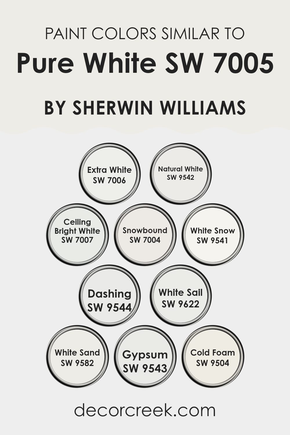
Extra White is a crisp and clean white that adds a fresh clarity compared to the more balanced Pure White, making it great for trims and moldings to create sharp contrasts. Natural White offers a slightly warmer tone, providing a cozy ambiance without drifting far from the pureness of white, ideal for living areas craving a hint of warmth.
Ceiling Bright White takes a step towards a luminous finish that makes ceilings appear higher and more expansive. Snowbound has subtle gray undertones that deliver a refined, soft look perfect for calming bedrooms. White Snow mirrors the brightness of freshly fallen snow, giving a pure, radiant vibe which can energize a smaller or darker room.
Dashing moves towards a soft off-white with a charming appeal, whereas White Sail introduces the faintest touch of cream, ideal for a softer edge in a contemporary home. White Sand incorporates a gentle beige hint, harmonizing beautifully in areas with natural materials like wood or linen.
Gypsum offers a neutral base, meshing well with nearly any color palette due to its undemanding and straightforward nature. Lastly, Cold Foam brings a touch of modernity with its slightly cooler tone, perfect for enhancing modern interiors with a sleek, clean look. Each of these colors complements the base Pure White in ways that can suit various decorating styles and preferences, while still maintaining a cohesive look throughout the area.
You can see recommended paint colors below:
- SW 7006 Extra White
- SW 9542 Natural White
- SW 7007 Ceiling Bright White
- SW 7004 Snowbound
- SW 9541 White Snow
- SW 9544 Dashing
- SW 9622 White Sail
- SW 9582 White Sand
- SW 9543 Gypsum
- SW 9504 Cold Foam
Colors that Go With Pure White SW 7005 by Sherwin Williams
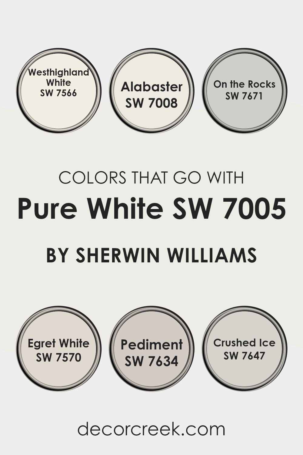
Colors that pair well with Pure White SW 7005 by Sherwin Williams are crucial for creating a cohesive look in your home when using this shade as a base. Since Pure White is such a clean and bright shade, working with the right accompanying colors can either warm up the area subtly or maintain a crisp, clean aesthetic depending on your preferences and decor. For instance, Westhighland White SW 7566 offers a slightly warmer tone, making it a great companion to Pure White for those wanting a hint of warmth without overpowering the neutral base.
On the other hand, Alabaster SW 7008 provides a touch of creaminess, introducing a cozy feel perfect for living rooms and bedrooms where you want a softer ambience. Moving to a light grey, On the Rocks SW 7671 complements Pure White by adding a sleek, modern vibe to the area, ideal for minimalistic or contemporary settings.
Egret White SW 7570 borders between grey and beige, lending a unique blend that enriches environments subtly. Pediment SW 7634 leans into a deeper, moodier grey, which crafts a striking contrast against the brightness of Pure White. Crushed Ice SW 7647 stays in the lighter zone, akin to On the Rocks, but with an even softer grey hue that works beautifully in areas seeking a hint of color without overpowering simplicity. Carefully selecting these colors to accompany Pure White can harmonize your areas while allowing flexibility in decor choices.
You can see recommended paint colors below:
- SW 7566 Westhighland White
- SW 7008 Alabaster
- SW 7671 On the Rocks
- SW 7570 Egret White
- SW 7634 Pediment
- SW 7647 Crushed Ice
In wrapping up my thoughts on SW 7005 Pure White by Sherwin Williams, I have to say that I really like how clean and simple this paint color is. It’s called “Pure White,” and it truly lives up to its name because it is a beautiful, clear white that can brighten up any room. Whether you’re painting a bedroom, living room, or even the kitchen, this color makes the room feel fresh and clean.
What’s great about Pure White is how well it works with other colors. You can pair it with dark blues, bright reds, or even soft pinks, and it still looks good. It doesn’t clash with other colors, which makes it easy to use no matter what your favorite color is or how your room looks.
Overall, SW 7005 Pure White is a solid choice if you’re thinking about giving a room a new look with a fresh coat of paint. It’s like the perfect blank canvas, allowing you to add all your favorite colors and decorations without worrying about the wall color getting in the way. Whether you’re just freshening up a single room or want to change the look of your whole house, this paint can do the job really well.

Ever wished paint sampling was as easy as sticking a sticker? Guess what? Now it is! Discover Samplize's unique Peel & Stick samples.
Get paint samples

