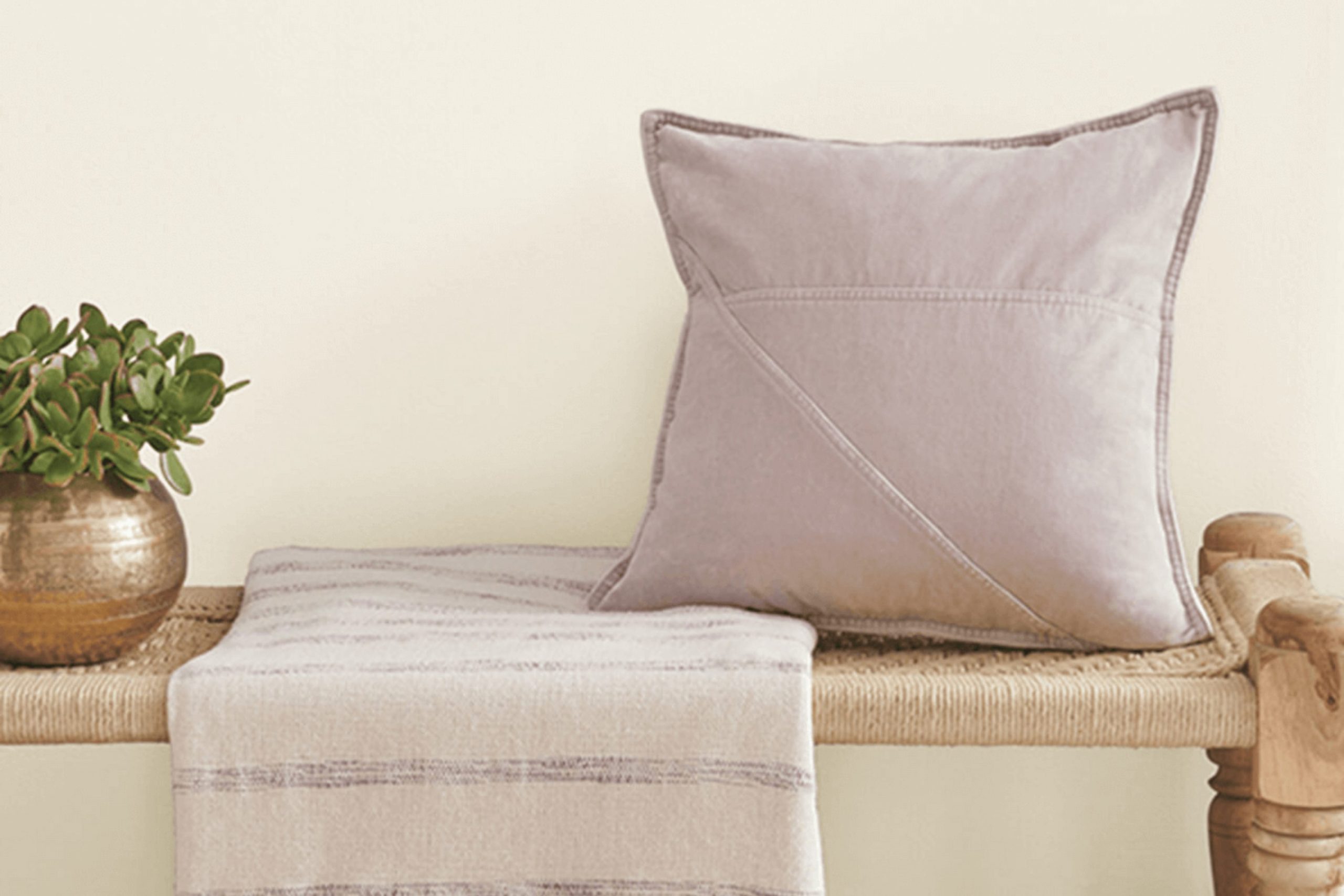
Choosing the perfect paint color can often feel stressful, especially with so many shades available. Let me share some insights on Sherwin Williams’ SW 7566 Westhighland White to help you decide if it’s the right choice for your room.
This particular shade is a nuanced white that carries a hint of warmth, making it a flexible option for various rooms in your home. It’s important to consider how this color behaves in different lighting conditions. While it appears bright and airy in well-lit rooms, its warmer undertones emerge in areas with less natural light, offering a cozy ambiance.
Additionally, Westhighland White pairs beautifully with a wide range of decor styles and other colors. Whether you’re aiming for a sleek, modern look or a more traditional feel, this color can adjust and support your design vision. Always test a sample on your walls and observe how it changes at different times of the day.
This step ensures you’ll be happy with the ambiance it creates, from sunny mornings to dim evenings, before making a full commitment.
Is Westhighland White SW 7566 Right for My Home?
Westhighland White is such a flexible color that truly shines in so many rooms. Personally, I find its creamy yet bright hue perfect for creating a welcoming atmosphere. It’s more than just plain white; it has this subtle warmth that makes a room feel instantly cozy.
I’ve seen it work wonders in a variety of interior styles. For a modern farmhouse look, Westhighland White complements natural wood accents beautifully, bringing out their rich textures. It’s also ideal for Scandinavian decor which relies on light, muted colors to enhance its minimalistic style. The brightness of this color helps to keep the decor light and airy, perfectly pairing with soft linens and muted metals.
In terms of materials, Westhighland White goes well with almost everything. Whether you’re looking at sleek marble countertops in the kitchen or rough, rustic wooden beams in the living room, this color provides a clean backdrop that allows these textures to stand out. Even in a more industrial setting with exposed brick and metal fixtures, it manages to soften harsher elements without clashing.
Overall, using Westhighland White in your home can help unify varying materials and styles, making it a staple choice for anyone looking to refresh their room. It’s like a trusted friend in my paint arsenal, ready to brighten up any corner with its subtle charm.
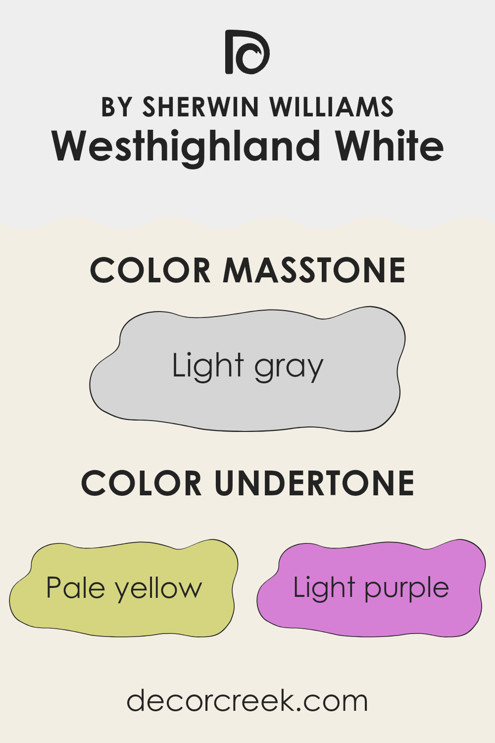
What are the right undertones of Westhighland White SW 7566 ?
Westhighland White by Sherwin Williams is a popular paint color for interior walls due to its clean and bright appearance. However, the way this color looks can change dramatically under different lighting conditions because of its subtle undertones. Undertones are the colors that sit beneath the surface of the main hue. They can affect how we perceive the main color, often causing the color to shift in appearance under various lighting conditions or when paired with different decor colors.
Westhighland White has undertones of pale yellow, light purple, light blue, pale pink, mint, lilac, and grey. These undertones can play a significant role in the color’s overall feel in a room. For instance, the pale yellow undertone can make the wall paint feel slightly warmer in a sunny room, adding a soft glow. Light blue and mint undertones might give a cooler, fresher look under certain artificial lighting or in rooms with less natural light.
Furthermore, the lilac and light purple undertones might be noticeable in transitional areas with fluctuating light, giving a subtle depth that prevents the color from appearing flat. The grey undertone helps to balance out the warmth and coolness, making Westhighland White a flexible choice for many homes as it can adjust subtly to different furnishings and decor styles.
When using this paint color on interior walls, it’s important to consider these undertones as they can influence the mood and aesthetic of your room. Soft, neutral furniture and decor can highlight its freshness, while vibrant colors might draw out or clash with its subtle undertones. Thus, understanding and considering these undertones can help you achieve the desired effect in your decorating projects.
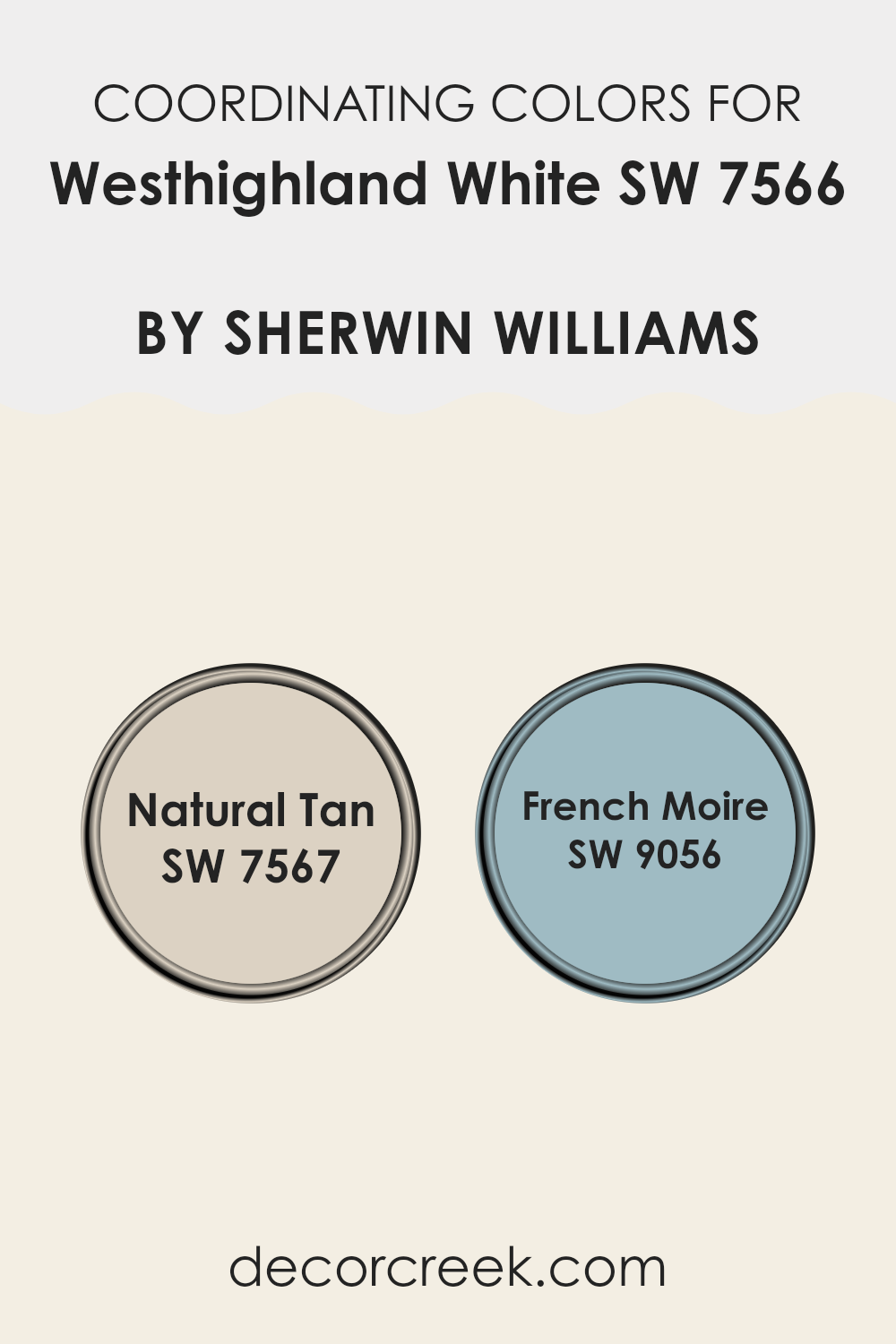
Best Coordinating Colors to use with Westhighland White SW 7566 by Sherwin Williams this year.
Coordinating colors are essentially hues that complement each other when used together, enhancing the overall aesthetic appeal of a room without feeling too heavy. For example, when decorating with a base color like Westhighland White from Sherwin Williams, choosing the right coordinating colors can create a harmonious look. It’s important to select shades that balance well with the main color, supporting the design without causing clashes. This method of selecting and combining colors is particularly effective in achieving a cohesive and pleasing environment.
When Westhighland White is the primary shade, two effective coordinating colors are Natural Tan and French Moire, both from Sherwin Williams. Natural Tan is a warm, welcoming beige that pairs beautifully with the crispness of Westhighland White, providing a grounded, earthy feel to any room. It’s an excellent choice for creating a cozy and inviting atmosphere.
On the other hand, French Moire offers a subtle hint of blue, adding a soft and gentle contrast to the sharpness of Westhighland White. This color is great for adding a slight color splash that’s neither too bold nor too subtle, making it perfect for rooms meant to feel calm and collected. Together, these coordinating shades work with Westhighland White to achieve a balanced and visually pleasing palette.
You can see recommended paint colors below:
- SW 7567 Natural Tan
- SW 9056 French Moire
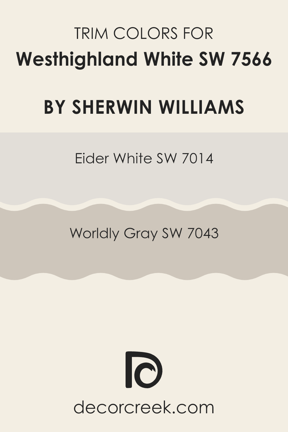
Trendy Trim Colors of Westhighland White SW 7566 by Sherwin Williams to use this year.
Trim colors are specific shades used to emphasize architectural details such as door frames, moldings, and baseboards. They play a crucial role in enhancing the overall aesthetic of a room by creating a visual contrast that defines and sharpens the transitions between walls and other elements.
When paired with Westhighland White by Sherwin Williams (SW 7566), selecting the right trim colors can greatly influence the room’s perception and atmosphere. Using either Eider White (SW 7014) or Worldly Gray (SW 7043) as a trim color provides a subtle yet impactful difference that complements the clean and bright nature of Westhighland White, ensuring that the room feels cohesive and well put together.
Eider White (SW 7014) is a light grayish white that offers a hint of warmth, making it an excellent choice for trims, as it can soften the transitions without clashing with the crispness of Westhighland White. Its subtle tone works well in providing a slight contrast, which brings out the architectural features without overpowering them.
On the other hand, Worldly Gray (SW 7043) is a warm gray that adds a touch of depth and character to rooms. Using this color for trims can create a more defined outline around Westhighland White, giving the room a grounded and balanced appearance while still maintaining a fresh and inviting look.
You can see recommended paint colors below:
- SW 7014 Eider White
- SW 7043 Worldly Gray
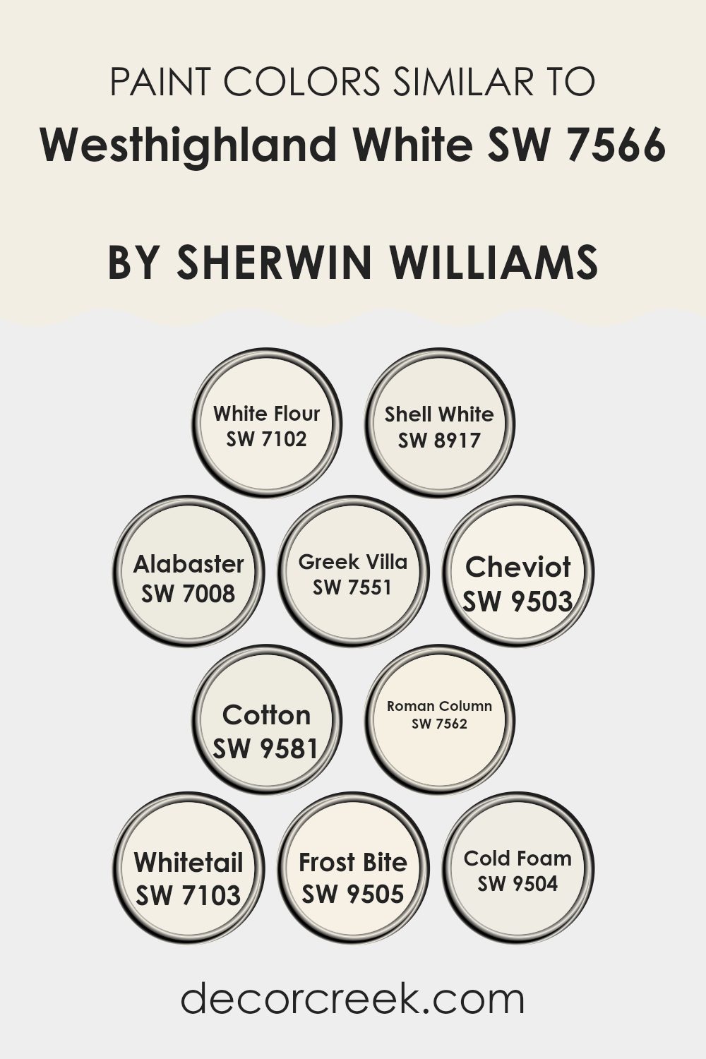
Evergreen Colors Similar to Westhighland White SW 7566 by Sherwin Williams
Similar colors are essential in design because they help create a harmonious and balanced look. When colors closely resemble each other, such as the variations of white inspired by Westhighland White SW 7566 by Sherwin Williams, they allow for a cohesive feel in a room while offering slight differences that add depth and interest without feeling too intense. Using shades that are closely aligned in tone can make a room feel larger and more open, and they provide a subtle backdrop that can enhance other features or furnishings.
For example, White Flour SW 7102 is a soft, gentle white that brings a fresh and airy feel to any room, whereas Shell White SW 8917 has a hint of warmth, making it perfect for rooms that seek a cozy atmosphere. Alabaster SW 7008 offers a touch of creaminess, ideal for creating a welcoming feel.
Greek Villa SW 7551 is slightly off-white with a hint of beige that suggests an inviting, slightly aged appearance similar to Mediterranean homes. Cheviot SW 9503 and Cotton SW 9581 lean toward a neutral palette, with Cheviot showing a faint gray undertone and Cotton presenting a clean, crisp finish. Roman Column SW 7562 combines creamy richness with a refined charm, while Whitetail SW 7103 offers a brighter approach to white with a hint of ivory.
Lastly, Frost Bite SW 9505 and Cold Foam SW 9504 present cooler undertones, with Frost Bite leaning into a silvery hue and Cold Foam reflecting a subtle, pale gray, excellent for modern rooms seeking a minimalistic and clean accent. These variations allow for customized design choices that can fit individual styles and preferences while maintaining visual coherence.
You can see recommended paint colors below:
- SW 7102 White Flour
- SW 8917 Shell White
- SW 7008 Alabaster
- SW 7551 Greek Villa
- SW 9503 Cheviot
- SW 9581 Cotton
- SW 7562 Roman Column
- SW 7103 Whitetail
- SW 9505 Frost Bite
- SW 9504 Cold Foam
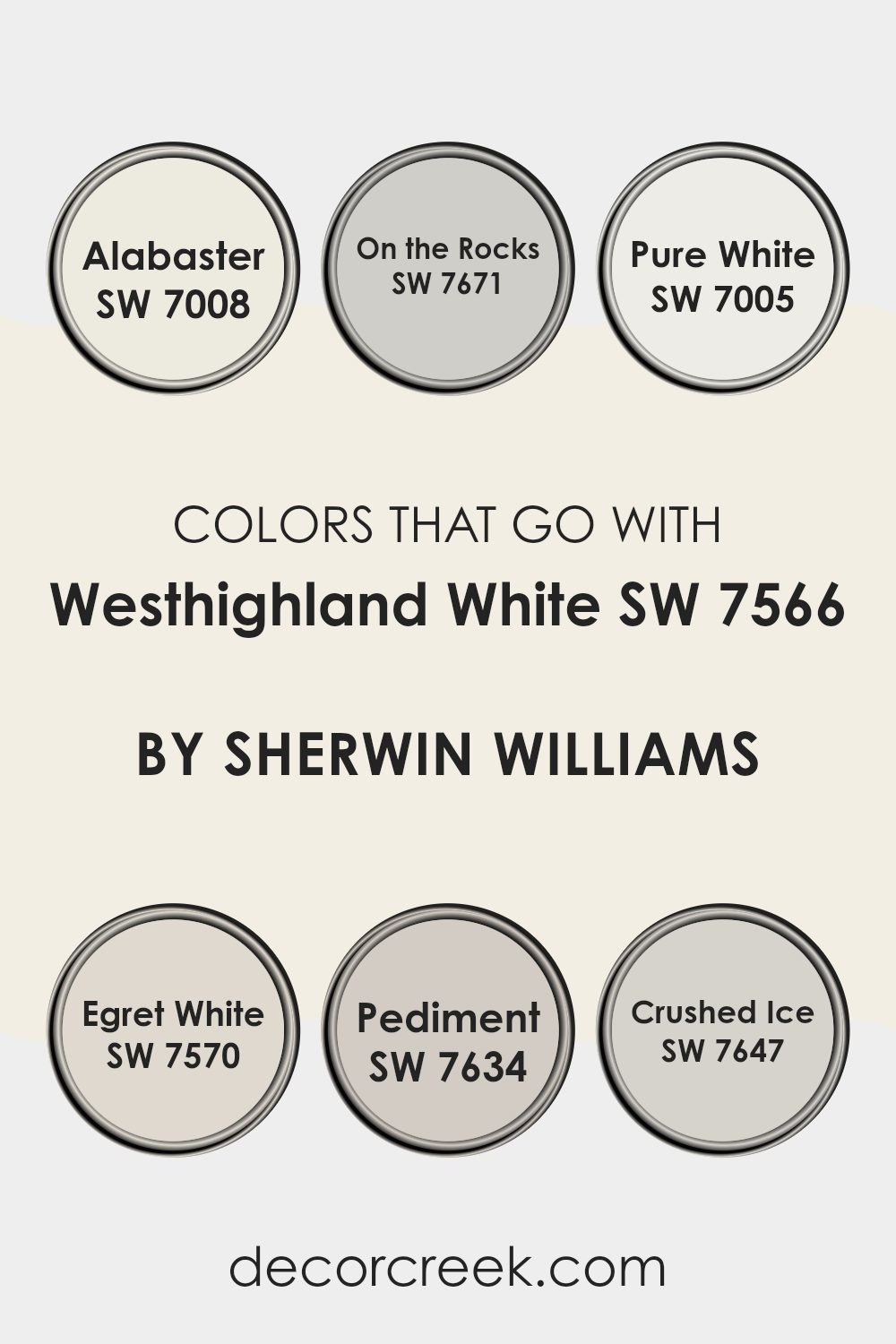
Colors that Go With Westhighland White SW 7566 by Sherwin Williams
Choosing the right colors to pair with Westhighland White SW 7566 by Sherwin Williams is crucial for creating a cohesive and appealing look in your room. Westhighland White is a clean and bright shade that serves as a flexible backdrop, allowing other colors to really stand out.
Pairing it with complementary colors like Alabaster SW 7008, which is a slightly creamier white, provides a subtle contrast that enriches the environment without feeling too intense. On the Rocks SW 7671 adds a touch of gray, offering a gentle depth that can help define areas and highlight architectural features.
Similarly, Pure White SW 7005 is another great match, as it is a crisp white that brings freshness to the room, enhancing the brightness when used alongside Westhighland White. Egret White SW 7570, which carries a hint of beige, introduces warmth, making the room feel more inviting and cozy.
Pediment SW 7634 has a dusky taupe tone that adds earthiness to the palette, perfect for those looking to bring in natural elements. Lastly, Crushed Ice SW 7647 is a soft gray that blurs the lines between white and gray hues, providing a sleek yet understated charm to any room. Each of these colors works with Westhighland White to create environments that feel harmonious while still offering enough contrast to visually engage and define different areas of a home or office.
You can see recommended paint colors below:
- SW 7008 Alabaster
- SW 7671 On the Rocks
- SW 7005 Pure White
- SW 7570 Egret White
- SW 7634 Pediment
- SW 7647 Crushed Ice
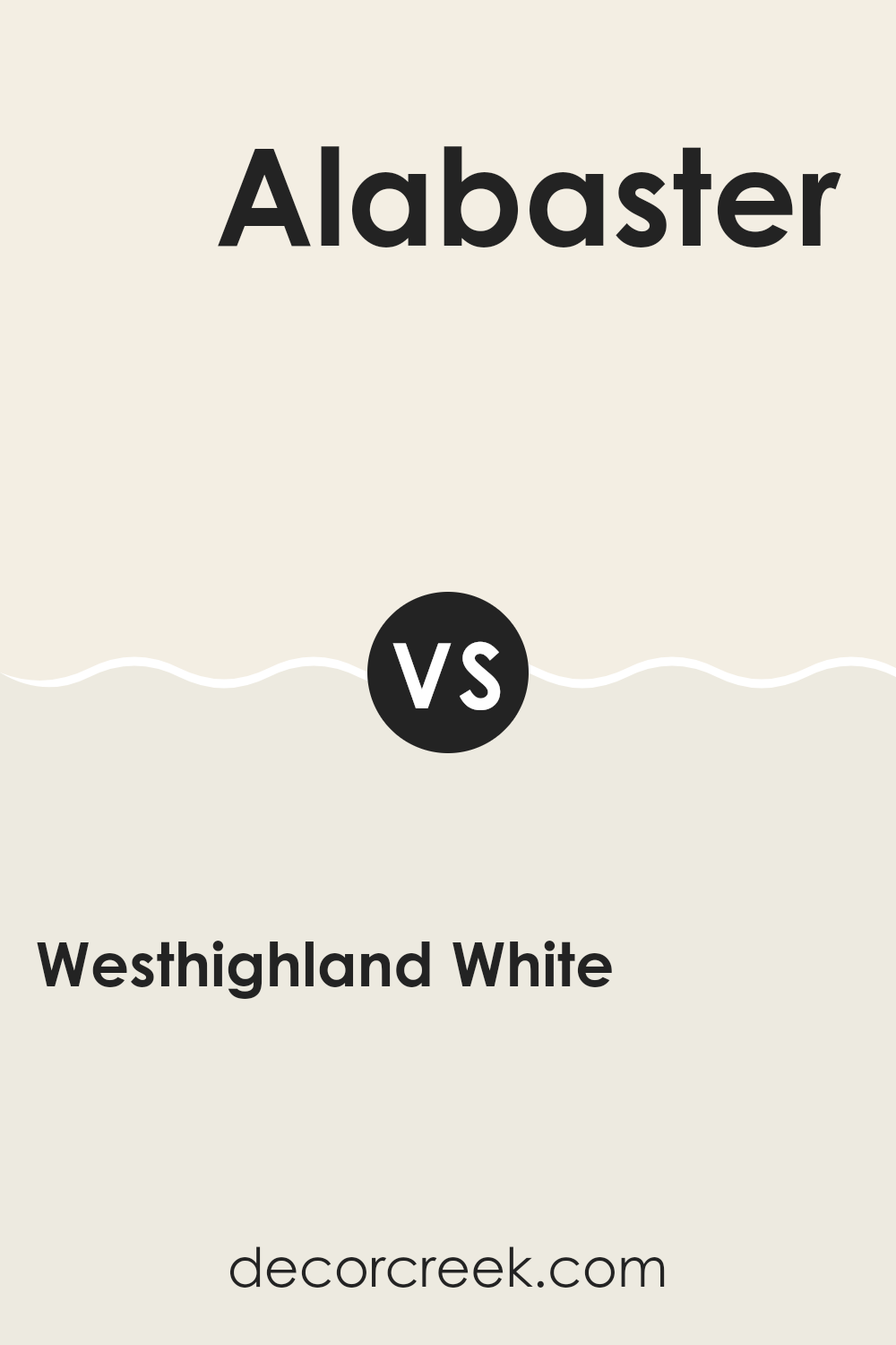
Westhighland White SW 7566 by Sherwin Williams vs Alabaster SW 7008 by Sherwin Williams
Both Westhighland White and Alabaster are popular choices from Sherwin Williams, known for their subtle yet impactful presence. Westhighland White has a bright, clean feel to it, slightly crisper compared to Alabaster. It leans more toward a pure white, making it an excellent choice for rooms that aim to capture a fresh and airy ambiance.
On the other hand, Alabaster, while still light and neutral, has a touch of warmth to it that gives it a soft and inviting quality. This makes it very flexible and suitable for rooms where a cozy, welcoming atmosphere is desired. It pairs well with a wide variety of decors, adding a gentle contrast without overpowering with color.
In terms of usage, Westhighland White works well in rooms with a lot of natural light, reflecting the light beautifully and making rooms appear larger. Alabaster, with its warmer undertones, is ideal for adding a subtle richness, enhancing rooms with a more intimate and cozy feel. Both colors support numerous design styles and preferences, allowing for personal flair and creativity.
You can see recommended paint color below:
Westhighland White SW 7566 by Sherwin Williams vs Whitetail SW 7103 by Sherwin Williams
Westhighland White and Whitetail are both shades of white by Sherwin Williams, each offering a slightly different mood for a room. Westhighland White leans toward a creamy, soft white without becoming too stark or bright. It’s particularly good for creating a cozy, warm feel in rooms that need a gentle touch of lightness.
On the other hand, Whitetail is a purer white with a hint of gray that gives it a clean, clear look. It’s an excellent choice for anyone wanting to brighten up a room while keeping a modern and fresh feel. This color works well in areas that need a more straightforward, crisp appearance.
Choosing between them depends on the kind of atmosphere you’re looking to achieve. Westhighland White can make a room more inviting and snug, while Whitetail is better for ensuring a room feels open and airy. Both colors are flexible, but your room’s lighting and style might tip the scale toward one or the other.
You can see recommended paint color below:
Westhighland White SW 7566 by Sherwin Williams vs Cheviot SW 9503 by Sherwin Williams
Westhighland White and Cheviot are two distinct colors from Sherwin Williams. Westhighland White is a very light, bright white with a hint of creaminess. It’s perfect for creating an open and airy feel in any room, making rooms look larger and more welcoming.
On the other hand, Cheviot is a slightly darker shade. It leans toward a soft gray with a touch of warmth, adding a hint of color to interiors without feeling too heavy. While Westhighland White is great for achieving a fresh, clean look, Cheviot offers a bit more depth and coziness, making it ideal for rooms where a touch of intimacy is desired.
Choosing between them depends on the mood and size of the room you are decorating; Westhighland White maximizes light and openness, whereas Cheviot brings warmth and subtle color to a room.
You can see recommended paint color below:
- SW 9503 Cheviot
Westhighland White SW 7566 by Sherwin Williams vs Shell White SW 8917 by Sherwin Williams
Westhighland White and Shell White are two paint options from Sherwin Williams, both offering a fresh, clean look, but with subtle differences in tone. Westhighland White has a slightly warmer, creamy feel to it, making rooms feel cozy and welcoming.
It works well in areas where you want a touch of warmth without making the room feel too heavy with color. On the other hand, Shell White leans more toward a neutral palette, with a cooler, more understated appearance.
It’s great for contemporary rooms or areas that get a lot of sunlight, as it helps maintain a bright, airy feel. Both colors are flexible and can be used in many settings, whether it’s a living room, kitchen, or hallway, but your choice might depend on the atmosphere you want to create. Choose Westhighland White for a softer, warmer ambiance or Shell White for a cleaner, crisper environment.
You can see recommended paint color below:
Westhighland White SW 7566 by Sherwin Williams vs Roman Column SW 7562 by Sherwin Williams
Westhighland White and Roman Column, both by Sherwin Williams, are subtle, classic shades of white that offer distinct room aesthetics. Westhighland White has a clean, bright feel that makes rooms seem more open and airy. On the other hand, Roman Column has a slightly warmer tone that can bring a cozy and welcoming vibe to a room.
This warmth in Roman Column contrasts with the crispness of Westhighland White, making it ideal for areas where a more inviting, less stark look is desired. Although both colors are flexible and work well in various settings, Westhighland White might be better suited for a modern, minimalist decor.
Roman Column could be a top choice for more traditional interiors or rooms that want to emphasize comfort without sacrificing lightness. When choosing between these two, consider how each would complement your furniture and decor, as well as the natural light in your room.
You can see recommended paint color below:
- SW 7562 Roman Column
Westhighland White SW 7566 by Sherwin Williams vs Cotton SW 9581 by Sherwin Williams
Westhighland White and Cotton are two paint colors from Sherwin Williams that, while similar, have distinct tones. Westhighland White is a warm and creamy white that provides a soft, inviting look. It’s perfect for creating a cozy and comfortable atmosphere in a room. This color has just enough warmth to make rooms feel homey without being overly yellow.
On the other hand, Cotton is a crisper and cleaner white. It leans more toward a true, neutral white without any strong undertones. This makes it a great choice for modern rooms that aim for a sharp and fresh look. Cotton works well in areas that get a lot of natural light, as it helps reflect the light and brighten the room even more.
Both colors are flexible and can work in many settings, from kitchens to bedrooms, depending on what feel you want in your room. Westhighland White suits more traditional or warm-toned decor, while Cotton fits well with contemporary or cooler-toned designs.
You can see recommended paint color below:
- SW 9581 Cotton
Westhighland White SW 7566 by Sherwin Williams vs Frost Bite SW 9505 by Sherwin Williams
Westhighland White SW 7566 and Frost Bite SW 9505, both by Sherwin Williams, offer distinct vibes for different decorating needs. Westhighland White is a creamy, warm white that brings a soft and welcoming feel to any room.
It is particularly good for living areas or bedrooms where a cozy atmosphere is desired. On the other hand, Frost Bite SW 9505 is a cooler, crisp white with subtle blue undertones that can make a room feel more fresh and clean. It’s ideal for bathrooms, kitchens, or any area where a sharp, clean appearance is appealing.
While Westhighland White tends to harmonize with warmer colors and natural materials like wood, Frost Bite pairs well with modern décor and cooler tones. Each color has its unique appeal, depending on what you need in your home. Whether you want a snug and homey look or a sleek, modern aesthetic, these colors could both work but in different contexts.
You can see recommended paint color below:
- SW 9505 Frost Bite
Westhighland White SW 7566 by Sherwin Williams vs Greek Villa SW 7551 by Sherwin Williams
Westhighland White and Greek Villa are both popular white paint colors from Sherwin Williams, but they have subtle differences. Westhighland White has a slightly cooler undertone, which makes it crisp and bright, perfect for modern rooms that aim to have a clean, fresh look. In contrast, Greek Villa has warmer undertones, giving it a softer and more inviting feel, which works well in cozy settings or where a gentle ambiance is desired.
The choice between the two often depends on the lighting and other colors in the room. Westhighland White is great for areas with lots of natural light, as it maintains its crispness without turning stark. Greek Villa, on the other hand, excels in rooms that may not get a lot of sunlight, as its warmth helps keep the room feeling bright and airy.
In summary, while both colors are white, Westhighland White offers a cooler, sharper tone, whereas Greek Villa provides a warmer, softer glow.
You can see recommended paint color below:
Westhighland White SW 7566 by Sherwin Williams vs Cold Foam SW 9504 by Sherwin Williams
Westhighland White and Cold Foam are both colors by Sherwin Williams, but they have different tones and vibes. Westhighland White is a soft, creamy white. It has a warm undertone, making it cozy and inviting. This color is great for making a room feel bright and airy without being too stark. It’s perfect for living rooms or bedrooms where you want a gentle, soothing atmosphere.
On the other hand, Cold Foam is a cooler shade, resembling the frothy top of a cappuccino. It’s a muted gray with hints of beige, giving it a neutral yet fresh appearance. This color is flexible and works well in modern settings where you want a clean, crisp look but not the sharpness of pure white or the darkness of deeper grays. It’s ideal for kitchens, bathrooms, or any room that benefits from a calm, collected feel.
Overall, while both colors are useful for creating light and welcoming rooms, Westhighland White leans toward warmth and comfort, whereas Cold Foam offers a more understated, contemporary look.
You can see recommended paint color below:
- SW 9504 Cold Foam
Westhighland White SW 7566 by Sherwin Williams vs White Flour SW 7102 by Sherwin Williams
Westhighland White and White Flour are both shades from Sherwin Williams, but they offer different nuances that could affect the vibe of your room. Westhighland White is a warmer white with creamy undertones, making it cozy and inviting. It’s great for creating a soft, comfortable feel in any room, especially in settings where you want a touch of warmth without going for a full-on beige or yellow.
On the other hand, White Flour is a purer white. It leans more toward a neutral, almost crisp finish compared to Westhighland White. This makes White Flour a solid choice for anyone looking for a more straightforward, clean look in their room. It reflects more light, which can make smaller rooms appear larger and brighter.
In essence, if you’re aiming for a snug, warm atmosphere, Westhighland White is the way to go. If you prefer a clearer, more distinct white that can give rooms a fresh feel, then White Flour is a better fit.
You can see recommended paint color below:
I just finished reading about a paint color called SW 7566 Westhighland White by Sherwin Williams, and I must say, it’s quite interesting! This paint shade is basically a gentle white that looks really clean and inviting. It’s like the kind of white you’d see on fluffy clouds on a bright sunny day.
From learning about this color, I realized that using Westhighland White in different rooms in your house can make the walls look fresh and neat. Whether you paint your whole room with it or just use it on one wall as an accent, it adds a bright and airy feel. It’s not just a simple white color; it has a bit of softness to it, which makes any room feel more cozy and welcoming.
It’s perfect for anybody wanting to freshen up their room without making it too bright or shocking. It’s good for places like living rooms, kitchens, or even bedrooms. The color can mix well with other colors too, so it’s easy to use with furniture and decorations you already have.
All in all, using this SW 7566 Westhighland White paint seems like a great choice if you’re looking to make your home feel happier and more comfortable. It kind of acts like a quiet background, letting the other colors around the house stand out and shine without competing for attention. This makes everything come together nicely.

Ever wished paint sampling was as easy as sticking a sticker? Guess what? Now it is! Discover Samplize's unique Peel & Stick samples.
Get paint samples

