SW 7570 Egret White by Sherwin Williams is a versatile and sophisticated shade that homeowners and designers love for its understated elegance.
This particular hue stands out for its unique ability to blend seamlessly with a variety of decor styles, from contemporary to traditional.
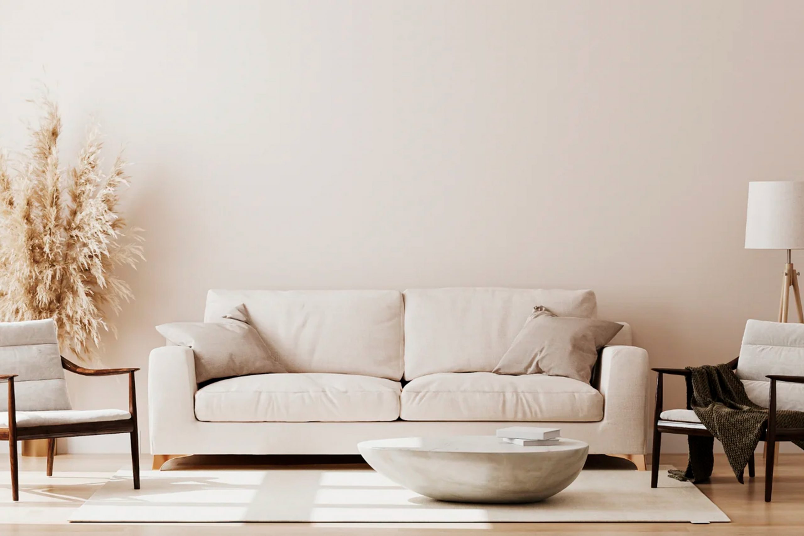
Egret White is a soft, warm white with a very subtle hint of gray, making it an ideal choice for creating a calm and welcoming atmosphere in any space.
Its neutral tone serves as a perfect backdrop, allowing furniture, artwork, and other elements to shine. Whether you’re looking to freshen up a living room, bedroom, or even a kitchen, Egret White offers a clean, crisp look without feeling too stark or sterile.
It works wonderfully in rooms with plenty of natural light as well as in spaces that could use a brightening touch.
For those considering a new paint project, SW 7570 Egret White by Sherwin Williams offers a timeless appeal that is hard to beat, promising to enhance the beauty of your home with its gentle warmth and refined simplicity.
What Color Is Egret White SW 7570 by Sherwin Williams?
Egret White is a soft and versatile color that brings a sense of calm and simplicity into any space. This shade is a subtle blend of off-white with a hint of warmth, making it perfect for creating a cozy yet bright atmosphere.
It’s like the early morning light filtering through a thin curtain, offering a fresh and inviting ambiance.
What stands out about Egret White is its ability to fit seamlessly into a variety of interior styles. Whether you’re looking to complement a modern minimalist design, enhance a rustic vibe, or add a fresh twist to a traditional setup, this color is your go-to choice.
It offers an understated backdrop that allows your decor and furniture pieces to truly shine.
In terms of materials and textures, Egret White pairs wonderfully with natural wood, bringing out its warm tones, from the honeyed hues of pine to the rich, deeper shades of walnut.
It’s equally at home with sleek metals like brushed nickel or aged bronze, giving a room that perfect blend of contemporary meets classic.
Soft furnishings in pastel tones or rich textures like velvet or wool work well with Egret White, adding depth and interest to the overall design.
This color’s ability to adapt and enhance makes it ideal for those looking to create a space that feels both welcoming and stylish, without leaning too heavily on passing trends.
Ever wished paint sampling was as easy as sticking a sticker? Guess what? Now it is! Discover Samplize's unique Peel & Stick samples.
Get paint samples

Is Egret White SW 7570 by Sherwin Williams Warm or Cool color?
Egret White by Sherwin Williams is a unique paint color that adds a touch of elegance and warmth to any room. Its subtle warmth comes from a blend of gray and beige, making it more than just a simple white.
This quality allows it to harmonize well with various decor styles and color palettes, making it a versatile choice for homeowners.
Whether you’re working with a modern, minimalist look or a cozy, traditional space, Egret White can effortlessly complement your design.
What’s great about this color is its ability to make small rooms feel larger and more open, thanks to its light-reflecting properties. In spaces with plenty of natural light, Egret White looks especially beautiful, creating a serene and inviting atmosphere.
However, it’s also capable of adding softness to rooms with less natural light, proving its adaptability.
Its understated elegance makes it ideal for main living areas, bedrooms, and bathrooms, offering a neutral backdrop that can be easily accented with bolder colors or patterns.
Choosing Egret White can bring a fresh and clean look to your home while maintaining a warm and welcoming vibe.
Undertones of Egret White SW 7570 by Sherwin Williams
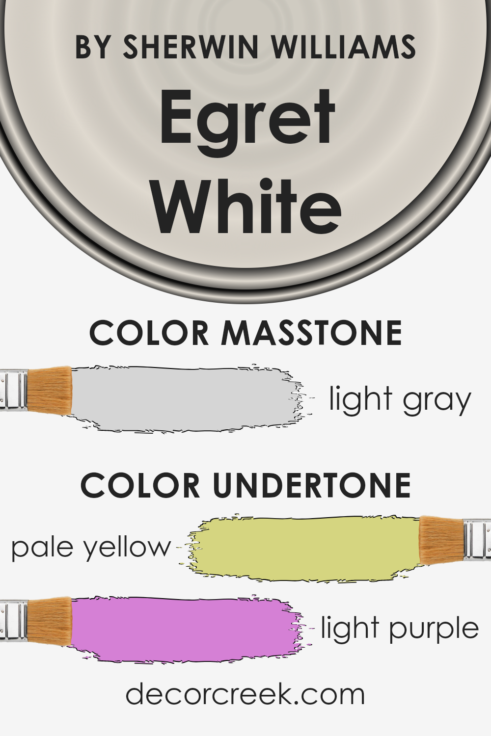
Egret White is a subtle, sophisticated color that may look simple at first glance but reveals complex undertones when observed more closely.
The unique undertones of pale yellow and light purple give this color a versatile appeal.
Undertones in paint colors are essentially the underlying hues that, though not always immediately noticeable, can significantly influence how a color appears in different lighting conditions and settings.
The pale yellow undertone in Egret White adds a warm, inviting quality to it. This warmth can make spaces feel cozy and illuminated, especially in natural light, creating an environment that feels both welcoming and calm.
On the other hand, the light purple undertone introduces a hint of coolness, which can add a subtle layer of sophistication and depth to the color. This balance between warmth and coolness makes this paint color quite dynamic.
When used on interior walls, the impact of these undertones becomes more evident. In rooms with ample sunlight, the pale yellow undertone will likely be more pronounced, making the space feel bright and airy.
Conversely, in areas with less natural light or during the evening when artificial lighting is used, the light purple undertone might become more visible, offering a gentle, tranquil ambiance to the room.
This interaction with light means that the color can slightly shift in appearance throughout the day, adapting to the changing environment and influencing the room’s mood and feel.
The versatility of Egret White, enriched by its distinctive undertones, allows it to blend seamlessly with various decor styles, making it a popular choice for creating inviting, elegant spaces.
What is the Masstone of the Egret White SW 7570 by Sherwin Williams?
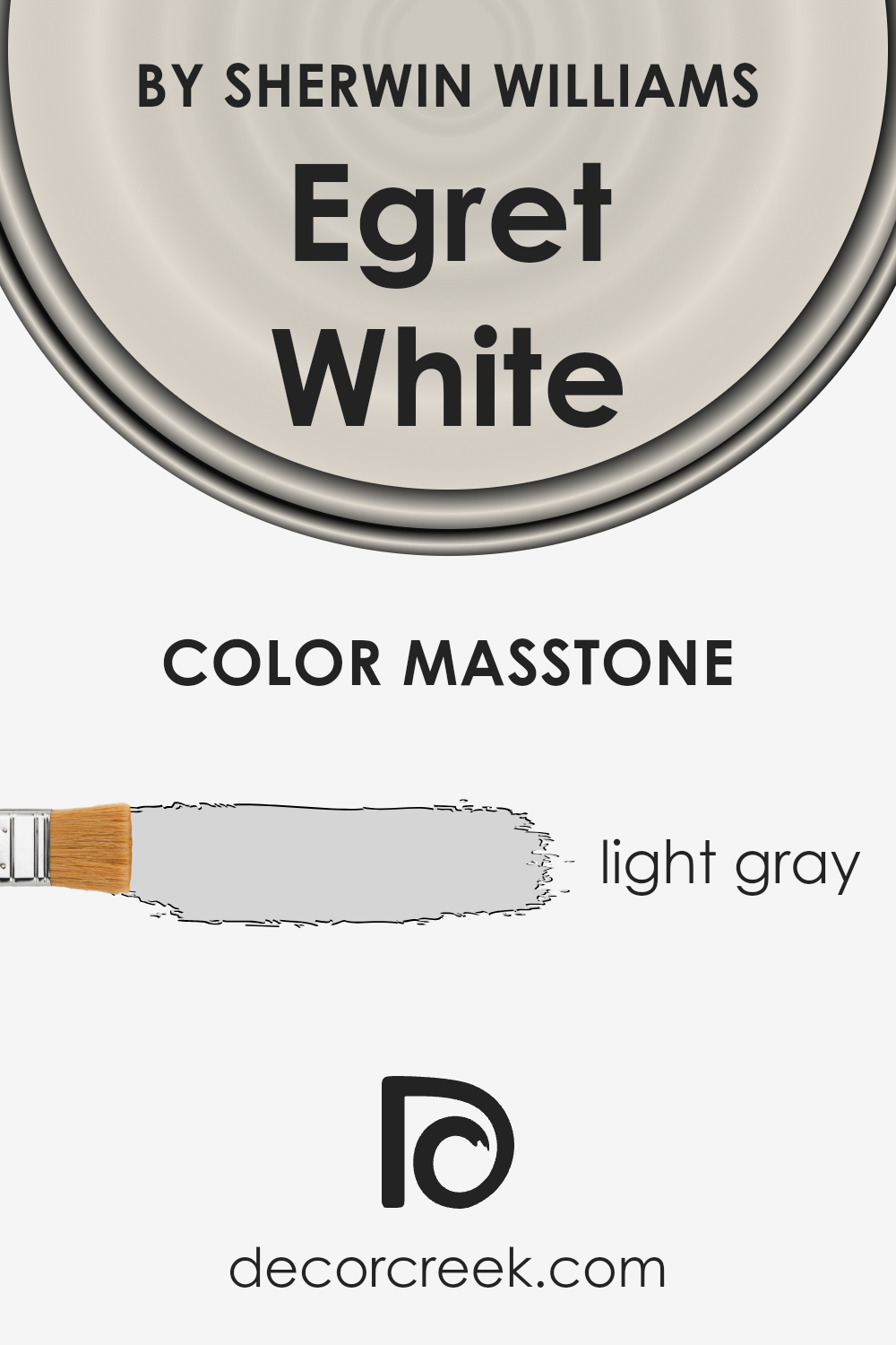
Egret White SW 7570 by Sherwin Williams has a masstone of light gray, carrying the code #D5D5D5. This neutral shade offers a versatile base for home interiors, making it ideal for creating a peaceful and welcoming environment.
The light gray tone of Egret White has a fresh look, seamlessly blending with a variety of decor styles, from modern minimalist to cozy farmhouse.
Its neutrality allows homeowners the flexibility to introduce color through furniture, textiles, and accessories without the worry of clashing hues.
In rooms with plenty of natural light, Egret White takes on a soft, airy quality, making spaces feel larger and more open. In areas with less light, it provides a subtle warmth, adding to the sense of comfort in the home.
Regardless of the room, this color works beautifully as a backdrop, enabling personal touches and decorative elements to stand out.
Its unobtrusive nature ensures that the space remains timeless, accommodating changes in trends and personal preferences with ease.
How Does Lighting Affect Egret White SW 7570 by Sherwin Williams?
Lighting plays a crucial role in how we perceive colors. The type of light, whether it’s natural or artificial, can significantly alter the appearance of a color. Understanding this can be especially helpful when deciding on paint colors for our homes.
Egret White is a versatile shade that can look different depending on the lighting. In artificial light, Egret White tends to appear warmer, bringing out its subtle undertones.
This can create a cozy and welcoming atmosphere, especially in the evening when the natural light fades, and the artificial lights take over.
Under natural light, Egret White showcases its true beauty and versatility. It can reflect the changing light throughout the day, presenting a slightly different look at various times. Its reaction to light, however, also depends on the direction the room faces.
In north-faced rooms, which receive less direct sunlight and have a cooler light, Egret White might appear more muted and slightly cooler. This can give a calm and serene feel to the room, making it ideal for bedrooms or study areas.
South-faced rooms are filled with warm, bright sunlight for most of the day, which can accentuate the warm undertones of Egret White, making the room feel brighter and more energetically inviting. It’s perfect for living rooms or kitchens where a brighter, cheerful ambiance is desirable.
East-faced rooms receive bright morning light, which can make Egret White look exceptionally vibrant and fresh in the morning, gradually transitioning to a softer tone as the day progresses. This natural progression provides a dynamic backdrop for any activity throughout the day.
West-faced rooms experience the warm glow of the setting sun, which can intensify the warm qualities of the color, creating a cozy and relaxing atmosphere perfect for winding down in the evening.
In conclusion, the perception of Egret White can vary significantly based on the lighting conditions. This adaptability makes it a great choice for various rooms, adapting uniquely to the changing light, thus offering different moods and atmospheres throughout the day and night.
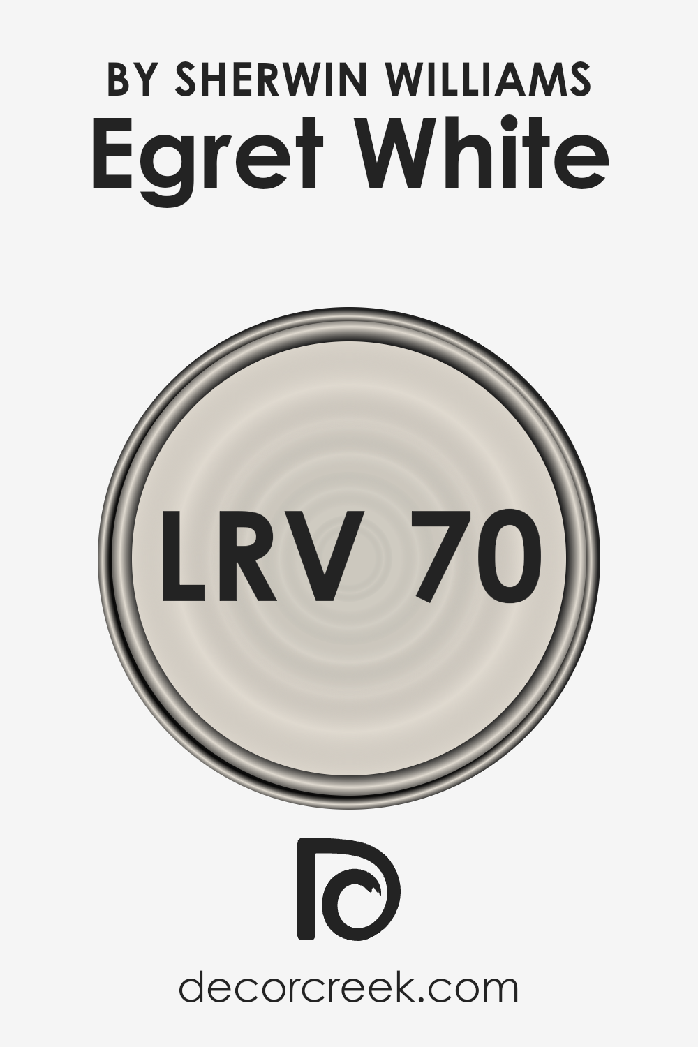
What is the LRV of Egret White SW 7570 by Sherwin Williams?
LRV stands for Light Reflectance Value, which is a measure on a scale from 0 to 100 that shows how much light a color reflects or absorbs.
A color with an LRV of 0 absorbs all light, making it a true black, while a color with an LRV of 100 reflects all the light, appearing as a bright white to our eyes.
This number is really handy when deciding on paint colors for your space because it helps you understand how light or dark a color will look once it’s up on your walls.
Natural and artificial lighting in your room can make a big difference in how a color appears, with higher LRV colors making spaces feel more open and airy because they reflect more light around the room.
Egret White, with its LRV of 69.642, sits towards the lighter end of the scale, meaning it has the ability to reflect a good amount of light. This makes it a fantastic choice for giving rooms a bright, fresh look.
The lightness of this color can help small or darker rooms feel more spacious and welcoming since it naturally bounces light around.
However, the actual effect can still vary depending on the room’s natural light levels, so it’s a good idea to test it out in different areas and times of day to see how it truly affects the look and feel of your space.
Egret White’s LRV suggests it will not overpower a room but will instead provide a soft, luminous backdrop, suitable for a range of decorating styles.
LRV – what does it mean? Read This Before Finding Your Perfect Paint Color
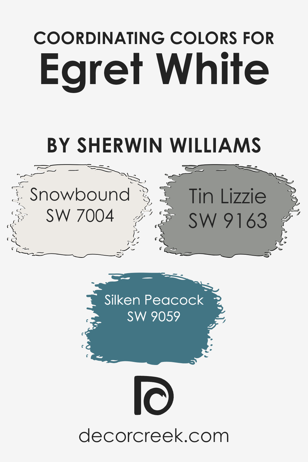
Coordinating Colors of Egret White SW 7570 by Sherwin Williams
Coordinating colors are those that complement and enhance the appearance of a main color, creating a cohesive and appealing color scheme. They work by balancing the main color with either contrasting shades or similar tones that blend harmoniously.
When considering Egret White SW 7570 by Sherwin Williams, a soft, warm white that offers a sense of calm and cleanliness, finding coordinating colors can significantly influence the room’s ambiance.
Coordinating colors like SW 7004 – Snowbound, SW 9059 – Silken Peacock, and SW 9163 – Tin Lizzie are great examples of how to achieve balance and add depth to spaces using Egret White as a base.
Snowbound SW 7004 is a slightly cooler shade of white with a hint of gray. It works perfectly with Egret White by providing a subtle contrast that highlights architectural features without overwhelming the space.
Silken Peacock SW 9059, on the other hand, is a bold, vibrant teal that offers a stunning pop of color. It brings energy and a touch of sophistication to rooms, making it excellent for accents.
Tin Lizzie SW 9163 is a smooth, deep gray that adds a sleek, modern feel. Its versatility complements Egret White by offering a grounding effect, making it ideal for creating serene and inviting environments.
Together, these coordinating colors can transform a space, making it feel intentional and put-together.
You can see recommended paint colors below:
- SW 7004 Snowbound
- SW 9059 Silken Peacock
- SW 9163 Tin Lizzie
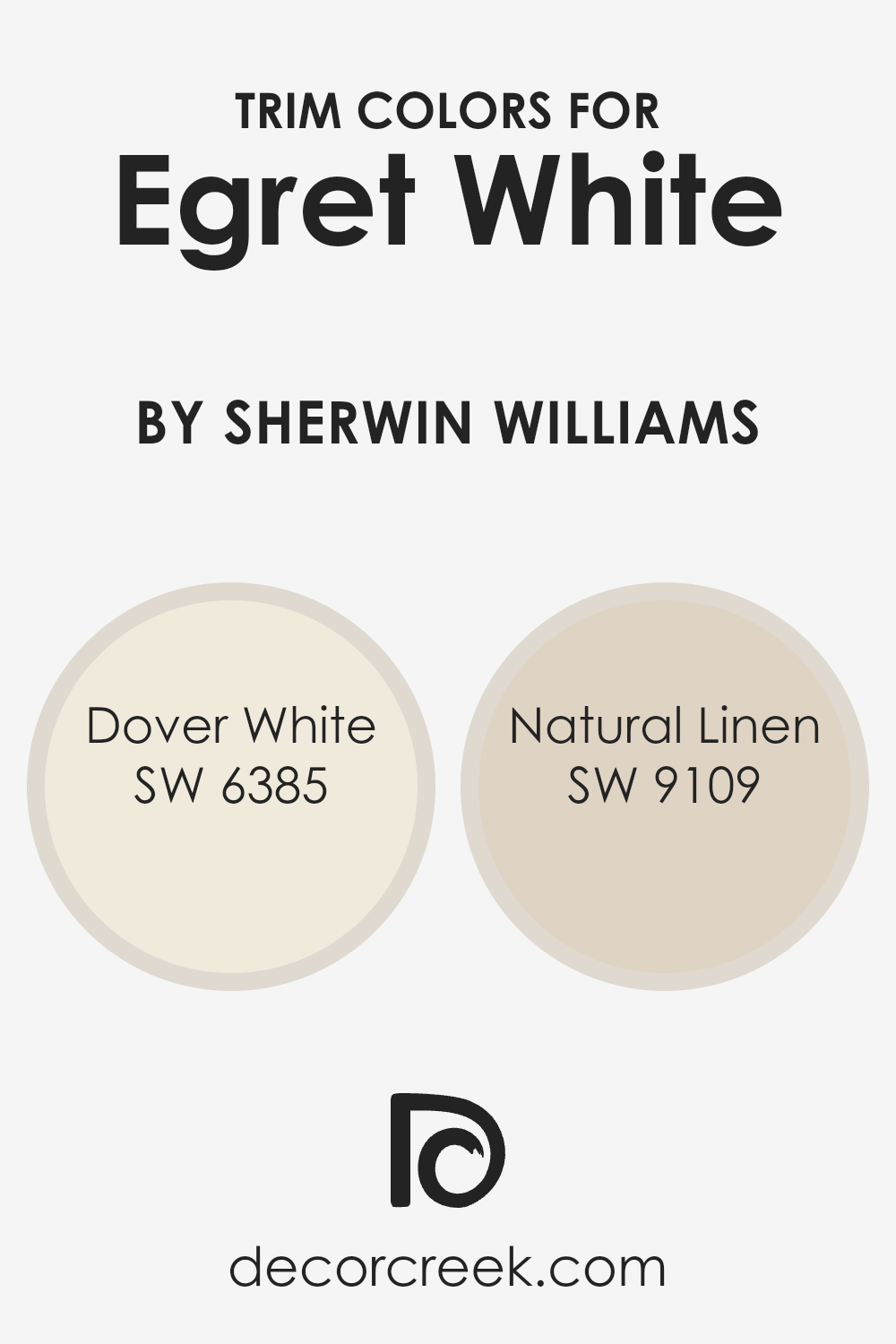
What are the Trim colors of Egret White SW 7570 by Sherwin Williams?
Trim colors refer to the hues selected for painting architectural elements like door frames, window trims, baseboards, and molding in a room or on a house’s exterior.
These colors are crucial because they frame and accentuate your main wall color, adding depth, contrast, and visual interest to your space.
Choosing the right trim color can highlight beautiful architectural features and create a cohesive, polished look.
In the context of Egret White by Sherwin Williams, a popular and versatile wall color, picking an appropriate trim color is key to enhancing this shade’s soft and airy quality, ensuring it doesn’t look flat or uninspired.
Dover White SW 6385 is a creamy, soft white that brings warmth without overwhelming the senses. This hue works beautifully as a trim color with Egret White because it offers a subtle contrast, enriching the overall palette without creating a stark or jarring transition.
On the other hand, Natural Linen SW 9109 offers a hint of beige, providing a more pronounced contrast that still remains in harmony with Egret White.
This color adds a layer of depth and complexity to the space, enriching the serene and inviting atmosphere created by the main wall color.
Both trim color options can add finesse and a refined touch to any room styled with Egret White, demonstrating the importance of choosing the right trim to enhance your main color’s best qualities.
You can see recommended paint colors below:
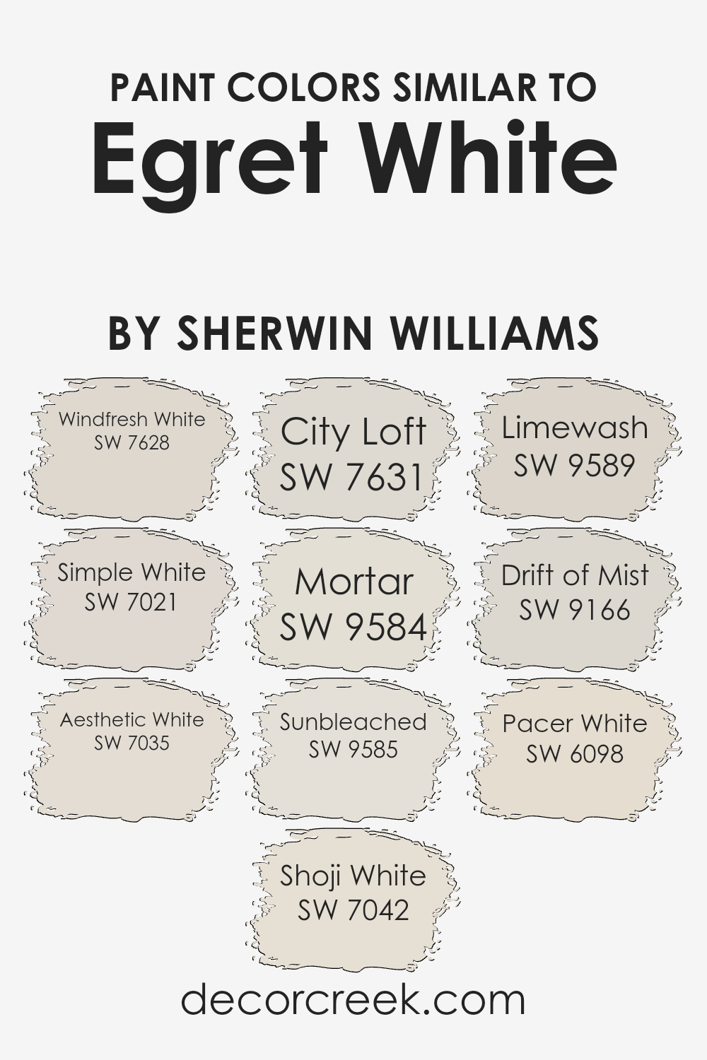
Colors Similar to Egret White SW 7570 by Sherwin Williams
In interior design, the importance of selecting similar colors cannot be overstated, especially when working with a base color like Egret White by Sherwin Williams.
Utilizing shades that harmonize well with it, such as Windfresh White and Simple White, creates a cohesive and seamless look throughout a space.
These similar colors have a unifying effect, allowing for a smooth transition from room to room, providing a serene and cohesive aesthetic. The subtle differences between these shades allow for depth and texture within the design, without overwhelming the senses.
Furthermore, incorporating shades like Aesthetic White and Shoji White adds layers to a design, giving it a refined and sophisticated appearance.
City Loft and Mortar offer a slightly more striking contrast while still maintaining that inherent connection to the calming nature of Egret White.
For spaces that aim for a more nuanced palette, options like Sunbleached, Limewash, Drift of Mist, and Pacer White ensure versatility and adaptability in decor.
These colors, slightly diverging in tone and warmth, grant designers the flexibility to create distinct yet harmonious spaces, achieving a balanced and inviting home environment.
You can see recommended paint colors below:
- SW 7628 Windfresh White
- SW 7021 Simple White
- SW 7035 Aesthetic White
- SW 7042 Shoji White
- SW 7631 City Loft
- SW 9584 Mortar
- SW 9585 Sunbleached
- SW 9589 Limewash
- SW 9166 Drift of Mist
- SW 6098 Pacer White
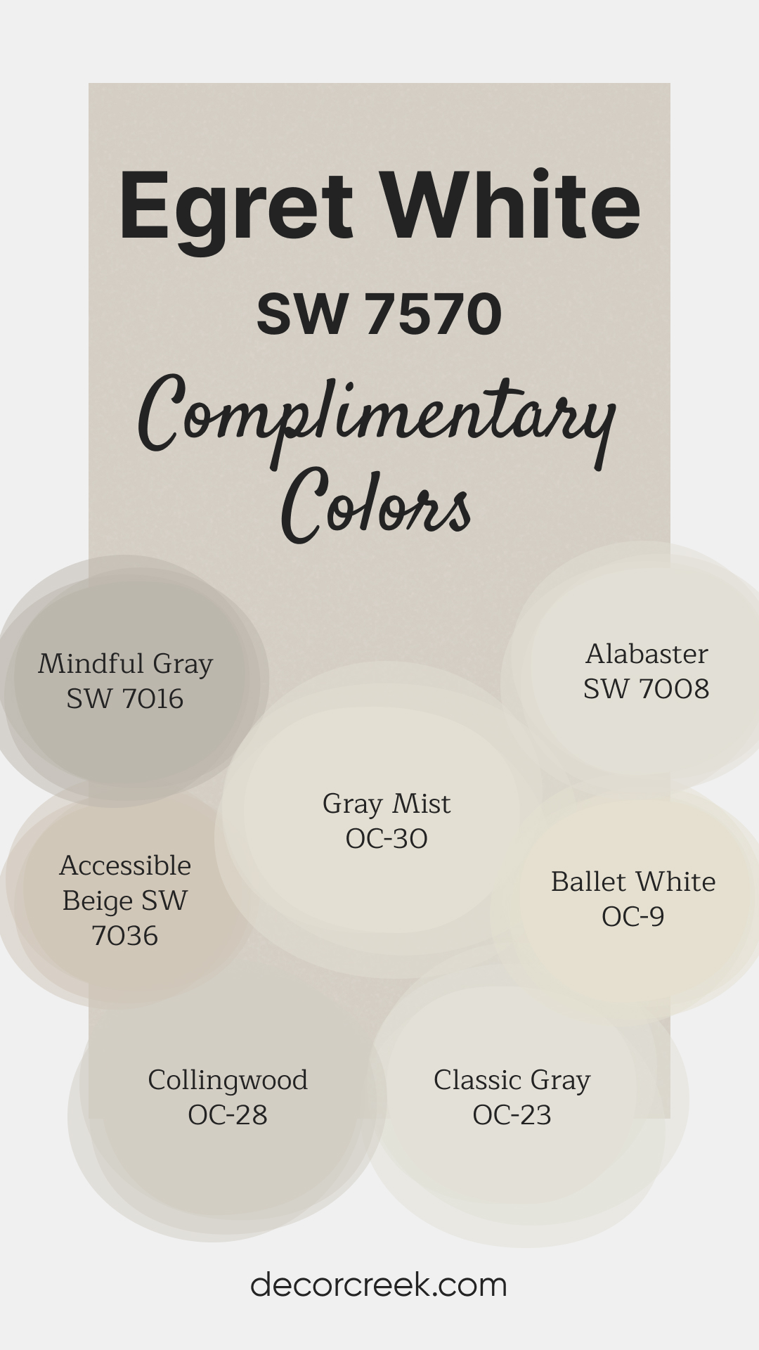
Complimentary Colors for Egret White SW 7570 Paint Color by Sherwin Williams
Egret White SW 7570 by Sherwin-Williams is a versatile warm neutral that creates a soft and inviting atmosphere. Its subtle undertones work well in both traditional and modern settings, offering a timeless backdrop for various spaces.
This shade pairs effortlessly with both light and dark complementary colors to achieve a balanced look.
For a bright and clean aesthetic, combine Egret White with Ballet White OC-9 or Alabaster SW 7008. Neutrals like Mindful Gray SW 7016 and Accessible Beige SW 7036 provide warmth and depth, while Classic Gray OC-23 and Collingwood OC-28 add a modern, understated touch.
Gray Mist OC-30 introduces a light, airy finish, perfect for achieving a harmonious and calming palette.
Egret White SW 7570 by Sherwin Williams Color Palette
Egret White SW 7570 is a soft, warm neutral that feels steady and easy to live with, and this palette brings out its best qualities. Pairing Egret White with Alabaster and Westhighland White creates a fresh and inviting foundation that suits almost any room.
Urbane Bronze adds a bold anchor that brings confidence and contrast, making the palette feel complete.
Agreeable Gray and Anew Gray add warmth and gentle depth, perfect for giving your layout a calm, balanced look.
Pure White keeps everything feeling tidy and bright, while Natural Linen brings comfort and a quiet sense of warmth.
This palette works beautifully in homes that need gentle color shifts and a relaxed feeling throughout. With soft neutrals and one strong accent, the palette feels both welcoming and stylish without being too strong.

How to Use Egret White SW 7570 by Sherwin Williams In Your Home?
Egret White by Sherwin Williams is a soft, warm white with a hint of beige, making it a perfect choice for creating a cozy and inviting atmosphere in your home.
This versatile color works remarkably well in various spaces, from living rooms and kitchens to bedrooms and bathrooms. Unlike a stark pure white, its slightly creamy tone adds warmth, making it ideal for areas where comfort is key.
You can use it all over a room to create a soothing, unified look, or pair it with darker colors for a beautiful contrast that still feels gentle and welcoming.
Egret White is also an excellent choice for trim, doors, and kitchen cabinets, providing a subtle, clean look without the harshness that sometimes comes with pure white.
It’s a fantastic backdrop for artwork and furniture, allowing colors and textures to pop without overwhelming. Whether you’re updating a single room or refreshing your entire home, Egret White offers a modern yet timeless appeal that’s easy to love.
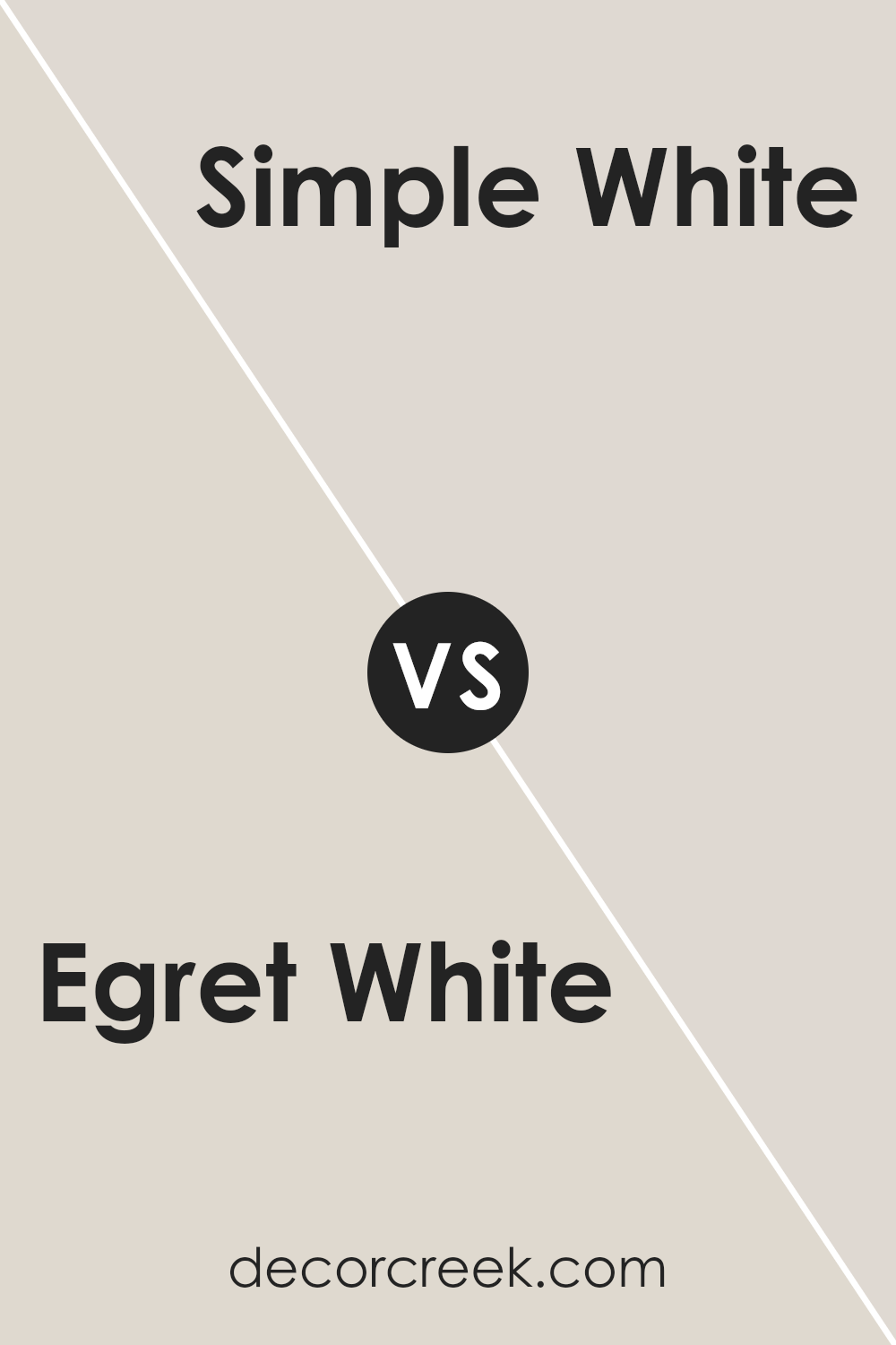
Egret White SW 7570 by Sherwin Williams vs Simple White SW 7021 by Sherwin Williams
Egret White and Simple White are two colors by Sherwin-Williams that at first glance might seem very similar but offer unique characteristics upon closer look.
Egret White leans towards a soft, warm tone with a hint of beige, making it cozy and versatile for spaces that aim for a calm and inviting atmosphere.
On the other hand, Simple White is closer to a true white, but with a subtle warmth that prevents it from feeling cold or stark. It’s excellent for brightening up a room and giving it a clean, fresh look.
While Egret White offers a hint of color that brings warmth, Simple White is more about purity and simplicity, making it easier to match with a wide range of colors.
Choosing between them depends on the desired mood and effect: Egret White for a soft, warm ambiance, and Simple White for a crisp, bright space.
You can see recommended paint color below:
- SW 7021 Simple White
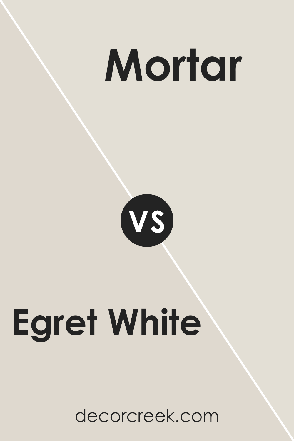
Egret White SW 7570 by Sherwin Williams vs Mortar SW 9584 by Sherwin Williams
Egret White and Mortar by Sherwin Williams are quite different in appearance, offering unique vibes for any space. Egret White is a soft, warm white with a hint of creaminess that gives off a cozy and inviting feel.
It’s perfect for creating a light and airy environment, making rooms feel more spacious and serene. On the other hand, Mortar is a much darker, gray shade that brings a strong, bold presence to walls.
This color adds depth and character, making it ideal for accent walls or spaces that could use a dose of drama and sophistication. While Egret White reflects more light, brightening up a room, Mortar absorbs light, providing a grounding effect.
These colors could complement each other well in a design scheme, with Egret White lightening up a space and Mortar adding contrast and interest.
You can see recommended paint color below:
- SW 9584 Mortar
Egret White SW 7570 by Sherwin Williams vs Pacer White SW 6098 by Sherwin Williams
Egret White and Pacer White are both paint colors by Sherwin Williams, but they have distinct differences. Egret White is a soft, warm white with a hint of gray. It’s a versatile color that can make rooms feel cozy and inviting.
On the other hand, Pacer White is slightly warmer and has a beige undertone, giving it a more traditional feel. This makes Pacer White an excellent choice for spaces where you want a classic, timeless look.
While Egret White works well in spaces with a modern or minimalist aesthetic due to its clean and neutral vibe, Pacer White suits spaces where warmth and comfort are priorities.
Both colors have their unique appeal and can transform a room depending on the mood you want to create. Choosing between them depends on the atmosphere you’re aiming for and the existing colors and decor in your space.
You can see recommended paint color below:
- SW 6098 Pacer White
Egret White SW 7570 by Sherwin Williams vs Drift of Mist SW 9166 by Sherwin Williams
Egret White and Drift of Mist are both colors by Sherwin Williams, but they have their unique characteristics. Egret White is a soft, warm white with a hint of beige, giving it a cozy and inviting feel.
It’s perfect for creating a light, airy space that still feels grounded and welcoming. On the other hand, Drift of Mist is a cooler, more neutral grey with a subtle blend of green and lavender undertones.
This color is great for spaces where you want to add a bit of sophistication without overwhelming the room with a dark or bold color. While Egret White adds warmth to a room, Drift of Mist offers a calm, serene atmosphere.
Both colors are versatile and can work well in various settings, from living rooms and bedrooms to kitchens and bathrooms.
Choosing between them depends on the mood you’re aiming for: warm and cozy with Egret White or calm and refined with Drift of Mist.
You can see recommended paint color below:
Egret White SW 7570 by Sherwin Williams vs City Loft SW 7631 by Sherwin Williams
Egret White and City Loft are two popular colors offered by Sherwin Williams that both bring a calm and soothing atmosphere to any space. Egret White is a light, airy color with a warm undertone that can make a room feel inviting and cozy.
It’s great for creating a serene and peaceful environment. On the other hand, City Loft has a slightly grayish tone, offering a modern and sophisticated look.
It’s a bit cooler compared to Egret White, making it ideal for those wanting a neutral backdrop with a hint of contemporary flair.
While both colors are versatile and can blend well with various decors, Egret White leans towards a traditional, comfortable vibe, whereas City Loft edges towards a chic, urban feel.
Choosing between them depends on the mood you want to set: Egret White for a soft, warm touch and City Loft for a clean, modern aesthetic.
You can see recommended paint color below:
Egret White SW 7570 by Sherwin Williams vs Sunbleached SW 9585 by Sherwin Williams
Egret White and Sunbleached are two paint colors from Sherwin Williams that offer subtle yet distinct vibes for any room.
Egret White is a soft, warm white with a hint of creaminess, making it a cozy choice for spaces where you want a touch of warmth without overwhelming brightness.
It’s perfect for living areas and bedrooms where a serene and inviting atmosphere is desired. On the other hand, Sunbleached is a lighter, neutral shade that leans more towards a faded beige, reminiscent of wood or textiles that have been gently faded by the sun.
This color is ideal for creating a relaxed, airy feel in a room, offering a backdrop that combines well with both vibrant and muted tones.
While both colors share a certain softness and neutrality, Egret White brings warmth and a creamy touch, whereas Sunbleached offers a more washed-out, neutral canvas, making each unique in setting the mood of a space.
You can see recommended paint color below:
- SW 9585 Sunbleached
Egret White SW 7570 by Sherwin Williams vs Windfresh White SW 7628 by Sherwin Williams
Egret White and Windfresh White are both colors from Sherwin Williams, but they carry distinct vibes. Egret White has a soft, creamy feel, making spaces cozy and inviting.
It’s perfect for someone aiming for a gentle, warm atmosphere in their home. It’s not just plain white; the touch of cream adds a layer of comfort and sophistication.
On the other hand, Windfresh White leans more towards a true, crisp white with a hint of blue undertones. This color is fantastic for creating a bright, airy feel in a room.
It reflects light beautifully, making spaces appear larger and more open. It’s an excellent choice for modern themes, giving off a clean, fresh vibe.
Both colors are versatile and can blend well with other hues, but the choice between them depends on what mood or style you’re aiming for. Egret White brings warmth and softness, while Windfresh White offers freshness and a sense of space.
You can see recommended paint color below:
- SW 7628 Windfresh White
Egret White SW 7570 by Sherwin Williams vs Aesthetic White SW 7035 by Sherwin Williams
Egret White and Aesthetic White are two paint colors by Sherwin Williams that offer subtle but distinct tones for walls. Egret White has a soft, warm vibe, leaning towards a very light beige or off-white.
It’s like a gentle morning light, making spaces feel open and airy. On the other hand, Aesthetic White is a bit darker, sitting comfortably between off-white and light gray.
It brings a cozy warmth to the room, making it feel inviting without the starkness sometimes associated with pure white.
While both colors are great for creating a neutral backdrop that lets furniture and art pop, they carry different moods.
Egret White is perfect for those wanting a hint of warmth in their bright spaces, whereas Aesthetic White works well for adding depth and sophistication to a room without overwhelming it with color.
Whether you prefer the lighter, ethereal quality of Egret White or the grounded, subtle richness of Aesthetic White depends on the room’s natural light and your personal taste in decor.
You can see recommended paint color below:
Egret White SW 7570 by Sherwin Williams vs Shoji White SW 7042 by Sherwin Williams
Egret White and Shoji White, both by Sherwin Williams, are two popular shades often chosen for their subtle and serene vibes. When comparing them, you’ll notice right away that Egret White offers a hint more warmth.
This is because it leans slightly towards a creamy off-white, providing spaces with a cozy atmosphere. On the other hand, Shoji White stands out for its versatility, carrying a balance between warm and cool tones.
This quality makes it a go-to option for various lighting situations, as it can adapt well, ensuring your room always feels inviting.
Though both colors share the commonality of being excellent choices for creating a light and airy feel in a room, the main difference comes down to their underlying tones.
If you’re aiming for a space that feels more snuggly and warm, Egret White is your match. However, if you prefer a more neutral backdrop that can easily pair with both warm and cool decor, Shoji White will not disappoint.
Choosing between them often depends on the mood and ambience you wish to achieve in your space.
You can see recommended paint color below:
Egret White SW 7570 by Sherwin Williams vs Limewash SW 9589 by Sherwin Williams
Egret White and Limewash are both colors by Sherwin Williams, yet they offer different vibes for spaces. Egret White is a soft, warm white with a hint of beige, making it cozy and inviting.
It’s perfect for creating a subtle, calming atmosphere in any room. On the other hand, Limewash has a more distinct character. It is a light, muted green with gray undertones, reminiscent of traditional limewash paints.
This color brings a natural, earthy feel to spaces, promoting a sense of tranquility and connection to the outdoors.
When comparing the two, Egret White serves as a versatile backdrop that can easily blend with various decor styles, from modern to classic. It helps illuminate rooms, making them appear more spacious and airy.
Limewash, while also versatile, leans towards creating a more specific aesthetic. It’s ideal for those looking to introduce a gentle splash of color to their spaces without overwhelming the senses.
Both colors offer unique ways to refresh and beautify homes, depending on the desired mood and design.
You can see recommended paint color below:
- SW 9589 Limewash
Conclusion
Egret White is a versatile paint color that offers a balance of warmth and brightness, making it an ideal choice for a variety of spaces and design styles.
Its soft, subtle hue has the ability to create a welcoming atmosphere in any room, whether it’s adding a touch of elegance to a living space or a calm, soothing presence in a bedroom.
This color stands out for its adaptability, seamlessly blending with different furnishings and decor items, which allows for easy personalization of any area.
The beauty of Egret White lies in its understated charm, providing a perfect backdrop that can either stand alone for a minimalist look or serve as a foundation for bolder decor choices.
It offers homeowners and designers a dependable option when looking for a color that contributes to a serene and inviting environment.
Its popularity is a testament to its ability to enhance the aesthetic appeal of a space without overwhelming it, making Egret White a go-to choice for those aiming to achieve a harmonious and refined interior.
Ever wished paint sampling was as easy as sticking a sticker? Guess what? Now it is! Discover Samplize's unique Peel & Stick samples.
Get paint samples