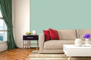
Every once in a while, a color comes along that seems to possess the ability to transform a room from ordinary to extraordinary. One such color is Sherwin Williams’ SW 6476 Glimmer. This versatile shade has the unique quality of lending rooms an ambiance of tranquility while simultaneously exuding a lively charm.
In this comprehensive guide, we delve into the characteristics of SW 6476 Glimmer, and explore its undertones, coordinating colors, and how it interacts with different lighting conditions.
We’ll also look at the best rooms and design styles where Glimmer can shine, making it easier for you to imagine how you might incorporate this exceptional color into your own home.
What Color Is SW 6476 Glimmer?
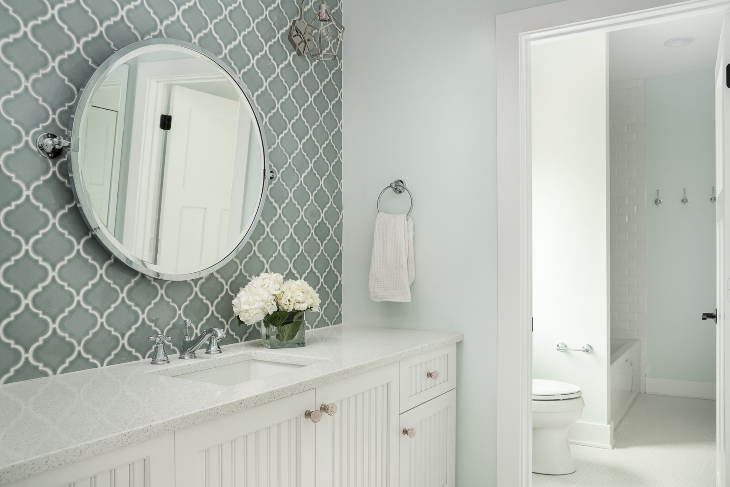
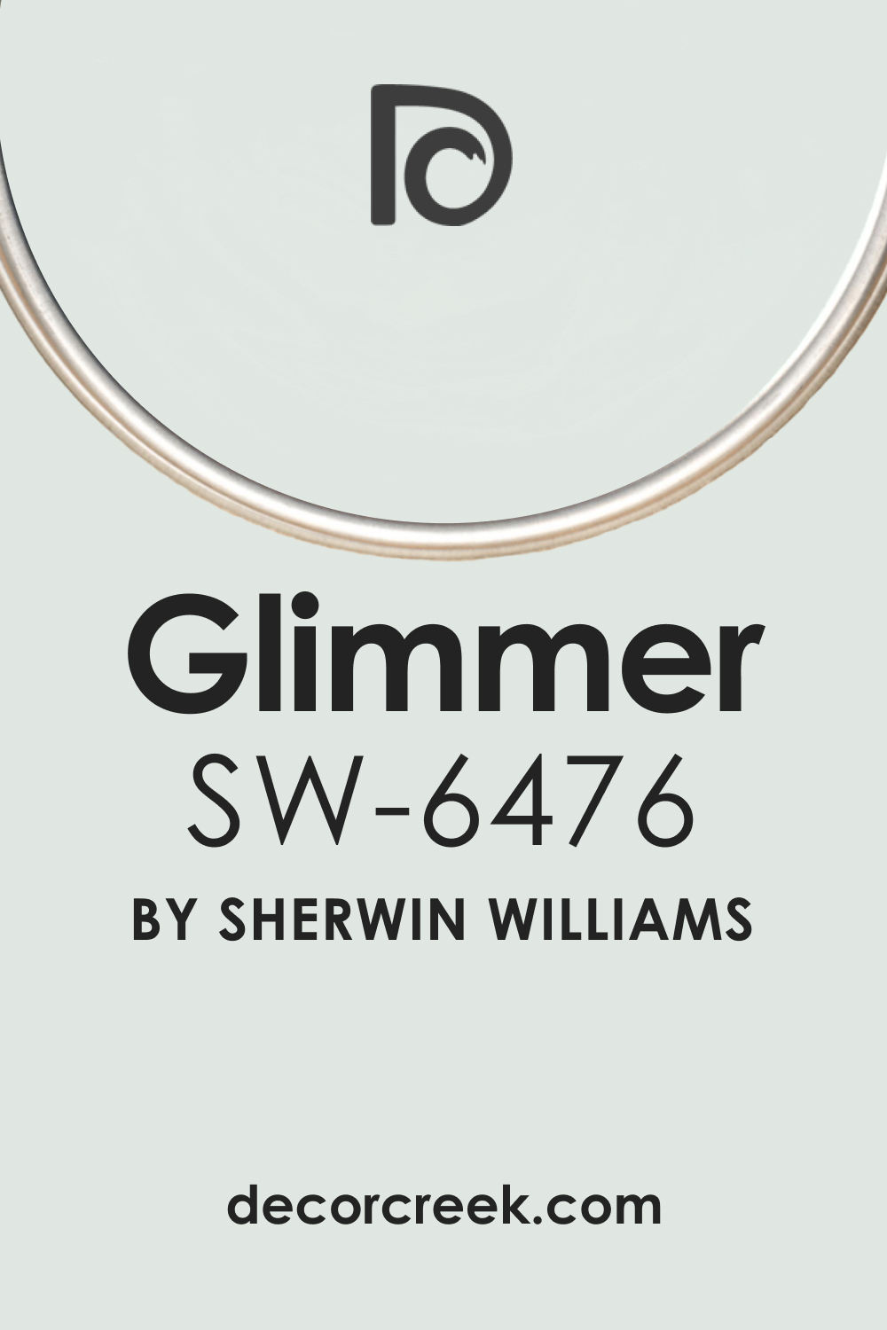
SW 6476 Glimmer is a soft and airy light blue color that can bring a calming and peaceful atmosphere to any space. It’s a hue that mirrors the clear sky on a sunny day or the gently rolling waves of a tranquil ocean, evoking feelings of relaxation and serenity. Glimmer manages to be both delicate and invigorating, depending on its surroundings and the lighting conditions.
Despite its tranquil quality, SW Glimmer is not a passive color. Instead, it has a playful side that comes to life, especially when paired with complementary colors. Its versatility makes it an excellent choice for various applications, from the calming aura of a bedroom to the dynamic backdrop of a lively living room.
Ever wished paint sampling was as easy as sticking a sticker? Guess what? Now it is! Discover Samplize's unique Peel & Stick samples.
Get paint samples
Is It a Warm Or Cool Color?
SW 6476 Glimmer is considered a cool color. It falls on the blue side of the color wheel, which is typically associated with feelings of calmness, relaxation, and serenity. This cool characteristic makes SW Glimmer a great choice for creating a soothing and tranquil ambiance in a space, especially suitable for areas where rest or concentration is key, such as bedrooms or home offices.
Undertones of SW 6476 Glimmer
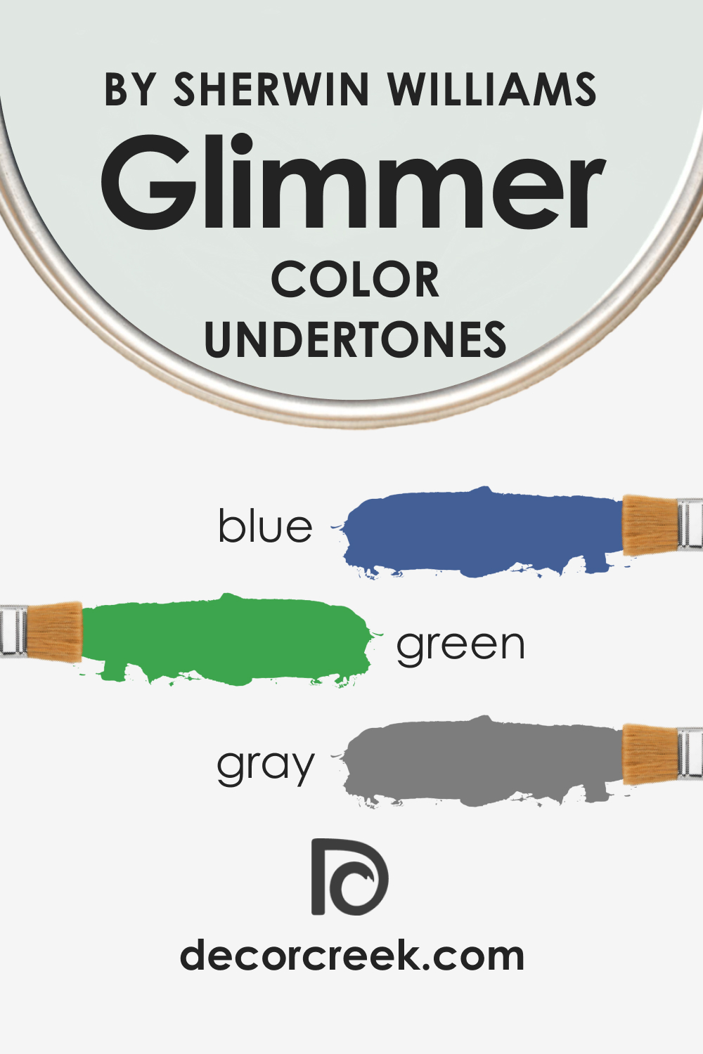
Understanding the undertones of color is crucial in determining how it will look and feel in a room. Here are three key undertones of SW 6476 Glimmer:
- Blue: The most prominent undertone of SW Glimmer is blue. This gives it its characteristic cool and calming effect.
- Green: There’s also a hint of green in SW Glimmer, adding a touch of freshness and vitality to its persona.
- Gray: Lastly, there is a slight gray undertone which brings a subtle neutrality to the color. This makes SW Glimmer versatile and allows it to blend well with various color schemes.
Undertones can greatly affect how we perceive color. Depending on the lighting and the colors it’s paired with, these undertones can become more or less apparent, subtly shifting the color’s overall appearance.
Coordinating Colors of SW 6476 Glimmer
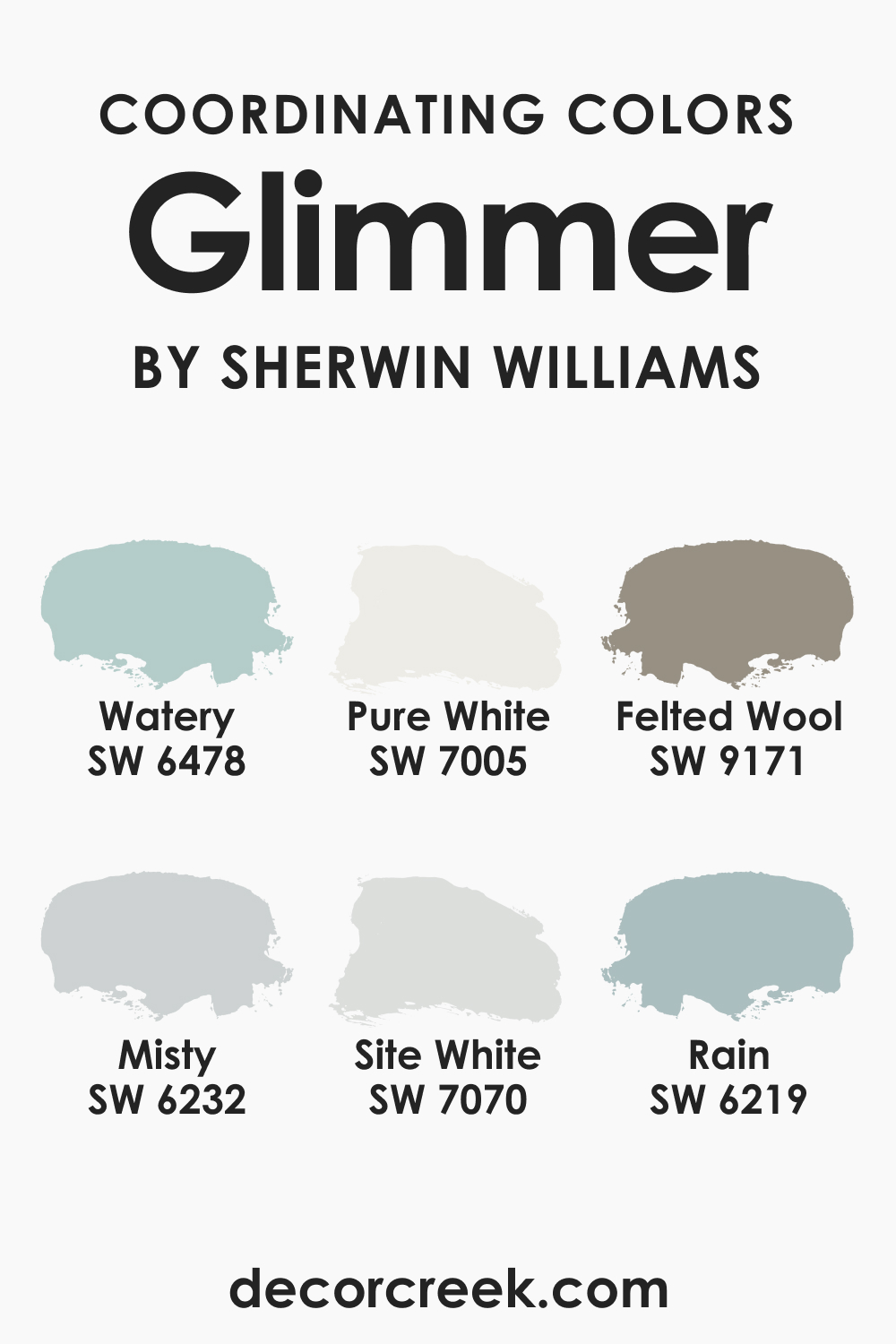
Coordinating colors are those that work harmoniously with a specific color. For SW 6476 Glimmer, these include:
- SW 7005 Pure White (CHECK A SAMPLE): Pure White is a neutral shade that can beautifully offset the soft coolness of SW Glimmer, enhancing its airy charm.
- SW 9171 Felted Wool (CHECK A SAMPLE): This warm gray tone pairs well with SW Glimmer, providing a sophisticated contrast and grounding the light blue shade.
- SW 6478 Watery (CHECK A SAMPLE): Watery is a deeper, more saturated version of SW Glimmer. It can create a layered, monochromatic look when used together with SW Glimmer.
To this list, we can add the following:
- SW 6232 Misty (CHECK A SAMPLE): Misty is a muted blue with a touch of gray. It harmonizes well with Glimmer and can add depth to your color scheme.
- SW 6219 Rain (CHECK A SAMPLE): Rain is a medium-toned blue-green that can bring an earthy balance to the airy nature of Glimmer.
- SW 7070 Site White (CHECK A SAMPLE): Site White is a soft neutral gray with a hint of green. It can act as a sophisticated and modern pairing with Glimmer.
Understanding coordinating colors is vital when designing a space, as it allows you to create a harmonious and balanced color scheme. These colors can be used for the trim, ceiling, furniture, or accents in the room.
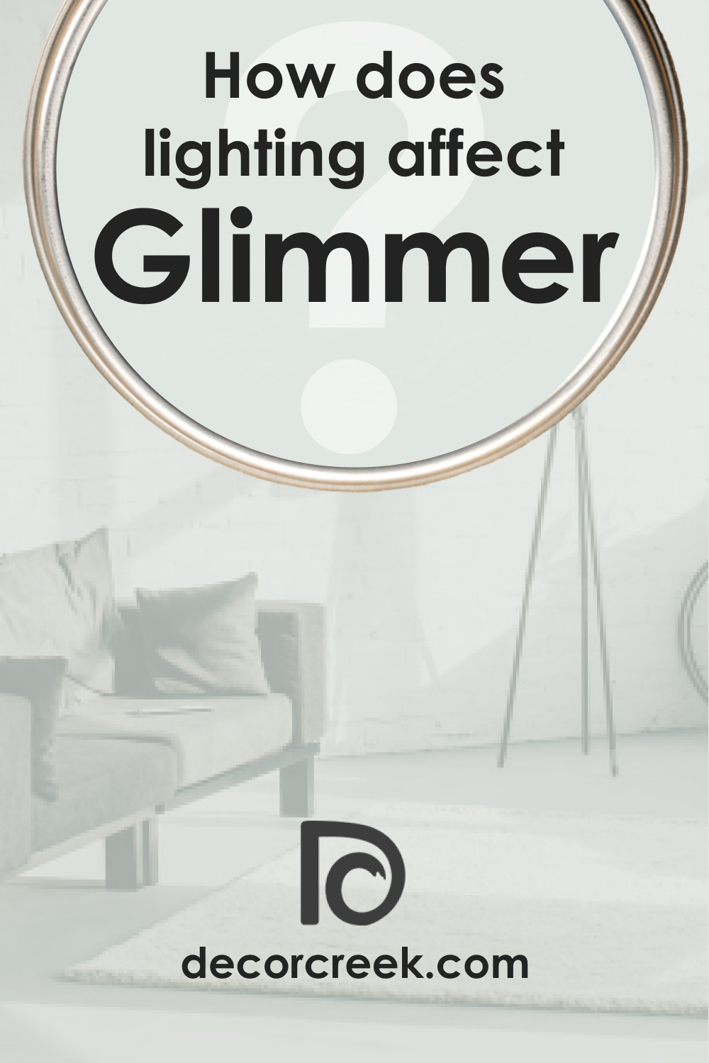
How Does Lighting Affect SW 6476 Glimmer?
Lighting significantly affects how we perceive colors, and SW Glimmer is no exception. In abundant natural light, Glimmer can appear brighter and more vibrant, with its blue undertone becoming more pronounced.
As the light dims or in spaces with less natural light, Glimmer tends to lean more towards its gray undertone, giving it a more subdued and tranquil feel. Artificial lighting can also affect how Glimmer is perceived. For instance, warm lighting might slightly neutralize Glimmer’s cool undertone, while cool lighting can accentuate it.
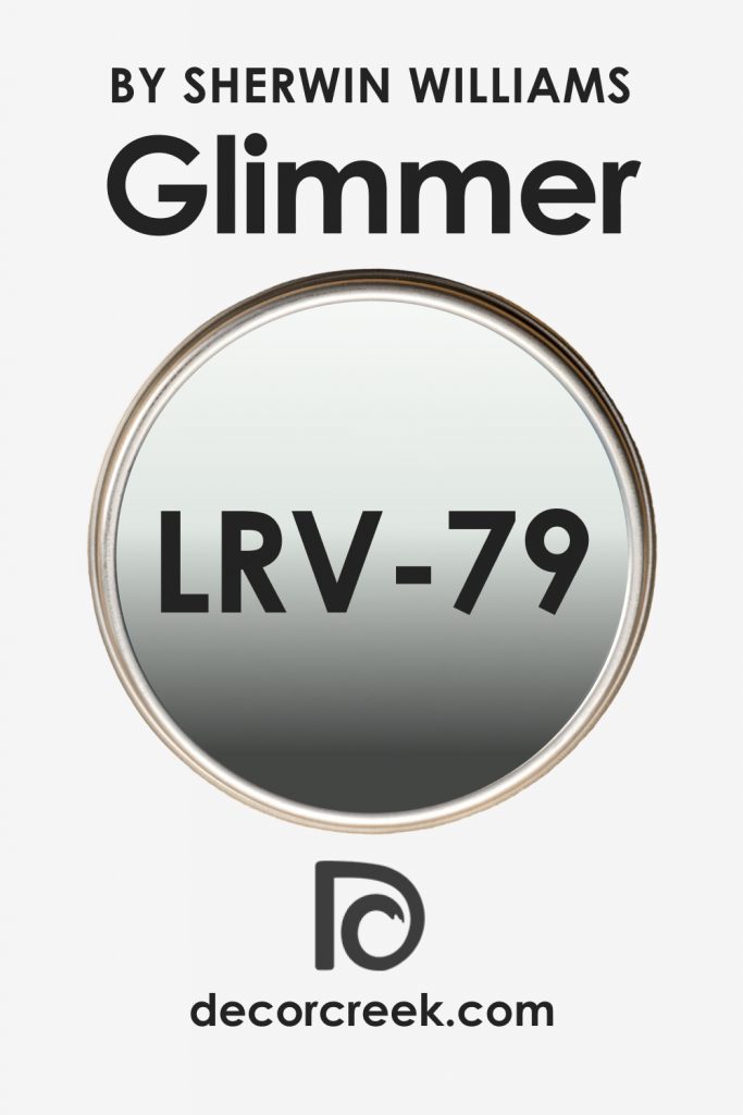
LRV of SW 6476 Glimmer
The Light Reflectance Value (LRV) of color measures how much light it reflects. SW 6476 Glimmer has an LRV of 79, which is relatively high. This means Glimmer is a light color that reflects a significant amount of light. As a result, it can help to brighten up a space and make it feel larger and more open.
A color with a high LRV like Glimmer is especially useful in rooms with limited natural light, as it can make the most of whatever light is available. However, it also works well in rooms with plenty of sunlight, contributing to a light, airy, and cheerful atmosphere.
Trim Colors of SW 6476 Glimmer
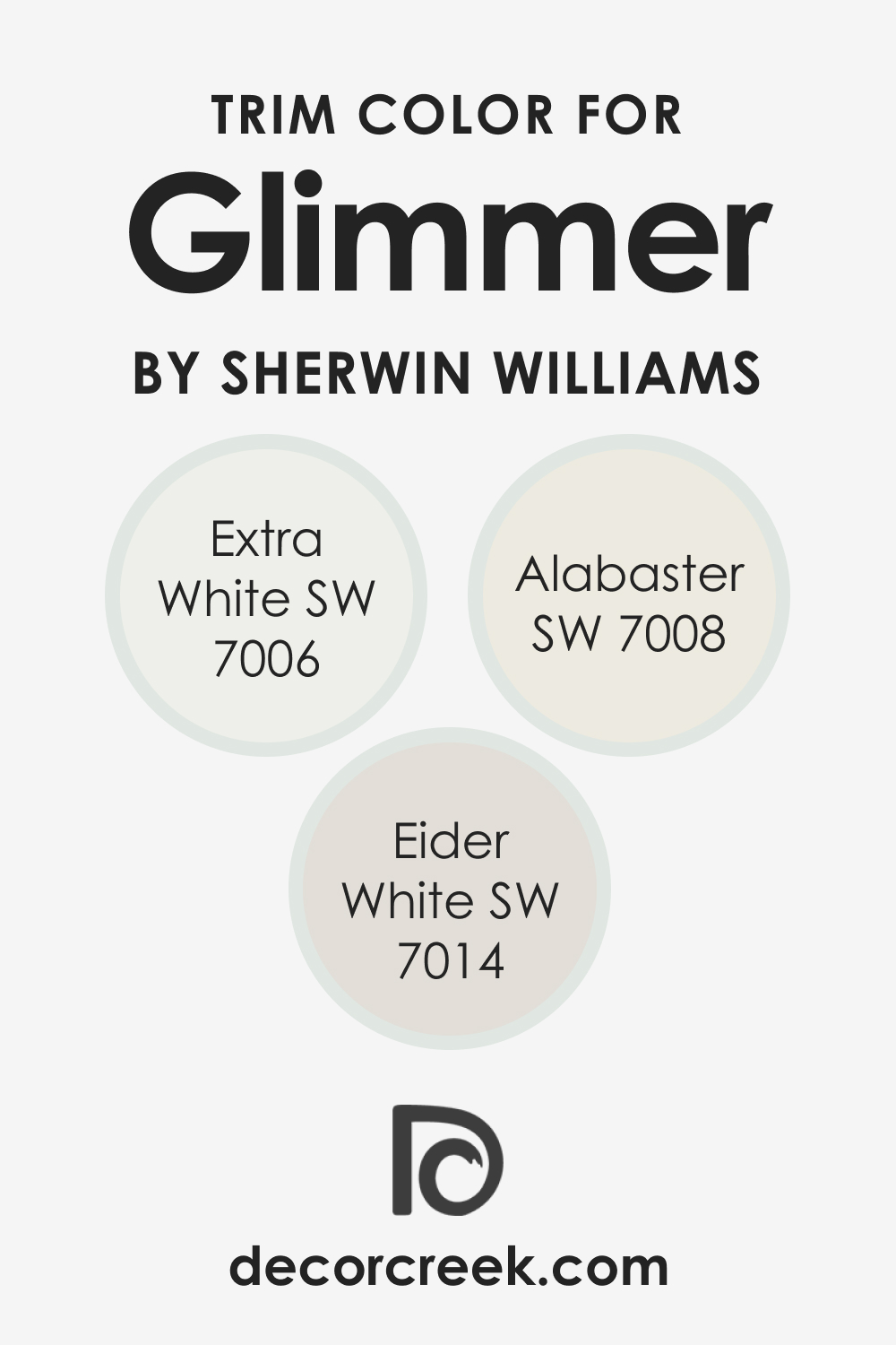
Choosing the right trim color can greatly enhance the overall look of a room. For SW 6476 Glimmer, consider the following options:
- SW 7006 Extra White (CHECK A SAMPLE): This clean, bright white can provide a crisp contrast to Glimmer’s cool undertones, giving the room a fresh and modern feel.
- SW 7014 Eider White (CHECK A SAMPLE): A soft gray-white like Eider White can subtly highlight the gray undertone in Glimmer, creating a harmonious and sophisticated look.
- SW 7008 Alabaster (CHECK A SAMPLE): Alabaster is a warmer white that can bring a cozy balance to Glimmer’s coolness.
Trim colors are important because they frame and accentuate the wall color. They can enhance the room’s design and tie the whole color scheme together.
Colors Similar to SW 6476 Glimmer
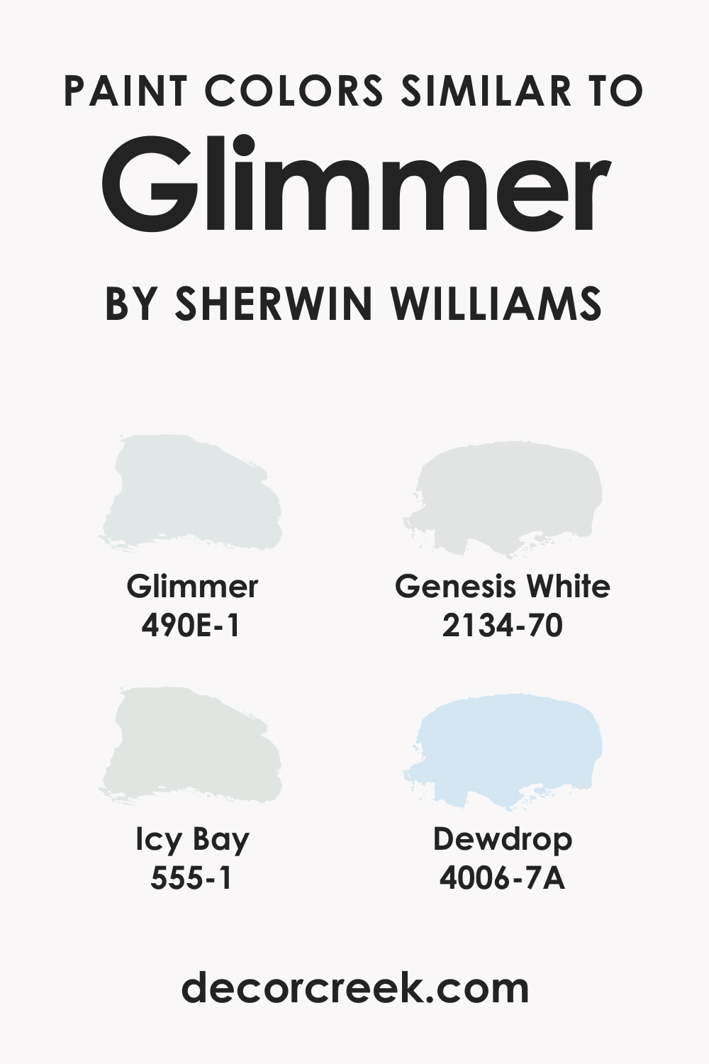
Knowing similar colors to the one you’re considering can be helpful, especially if you’re trying to achieve a certain effect or mood. It allows you to compare and see which hue you prefer or which one works better in your particular space. Similar colors to Glimmer include:
- Behr Glimmer
- BM Genesis White (CHECK A SAMPLE)
- PPG Icy Bay
- Valspar Dew Drop
All these shades share the light blue family traits, but each has its own unique undertones and characteristics.
Colors That Go With SW 6476 Glimmer
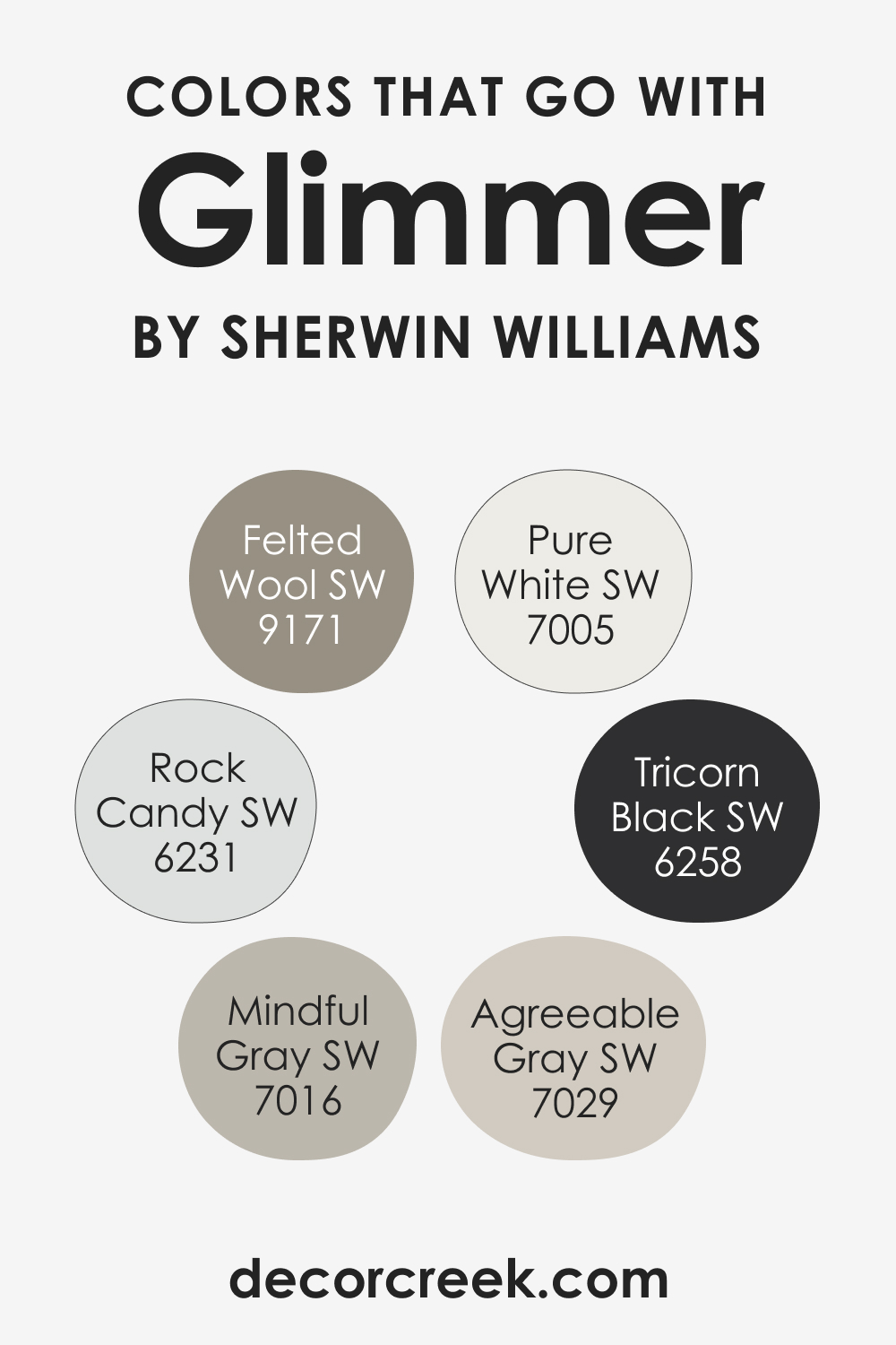
Several colors pair well with SW 6476 Glimmer, helping to create various moods and effects:
- SW 7029 Agreeable Gray (CHECK A SAMPLE): This warm, neutral gray provides a soothing contrast to Glimmer’s coolness.
- SW 6258 Tricorn Black (CHECK A SAMPLE): For a bold and dramatic contrast, consider Tricorn Black. This deep black can really make Glimmer pop.
- SW 7016 Mindful Gray (CHECK A SAMPLE): This neutral gray with a hint of warmth can balance Glimmer’s cool undertones.
- SW 6231 Rock Candy (CHECK A SAMPLE): A soft and neutral blue-gray, like Rock Candy can create a serene, monochromatic look with Glimmer.
- SW 7005 Pure White (CHECK A SAMPLE): As a crisp, clean white, Pure White can provide a refreshing contrast to Glimmer’s cool tones.
- SW 9171 Felted Wool (CHECK A SAMPLE): This sophisticated, warm gray can ground Glimmer, adding depth and maturity to the color scheme.
Using colors that look good together is crucial in creating a harmonious and aesthetically pleasing space. They can help to balance out the color scheme, highlight key features of the room, and guide the overall mood and atmosphere.
How to Use SW 6476 Glimmer In Your Home
SW 6476 Glimmer is versatile and can be used in various rooms and interior design styles. Its soothing nature makes it an excellent choice for bedrooms and bathrooms, promoting relaxation and tranquility. Its lively side can be highlighted in living rooms, children’s rooms, and kitchens, adding a cheerful and invigorating touch.
Regarding design styles, SW Glimmer can work well in coastal, Scandinavian, and modern interiors. Its refreshing hue embodies the breezy and laid-back feel of a coastal style. In Scandinavian design, Glimmer can complement the style’s love for light and airy spaces.
And for modern interiors, Glimmer can provide a subtle splash of color while still maintaining a sleek and clean aesthetic. Below, read how this color works in different spaces.
How to Use SW 6476 Glimmer in the Bedroom
The bedroom is an excellent place to showcase SW 6476 Glimmer. Its tranquil quality can help create a calming atmosphere that encourages rest and relaxation. Imagine waking up to a room bathed in this soft, refreshing hue—it’s like waking up to a clear, sunny sky.
For a more sophisticated look, you might consider pairing Glimmer with darker, more muted colors. For example, a bedspread in a deep navy or a charcoal gray rug can provide an excellent contrast to Glimmer’s light and airy quality. Alternatively, for a more romantic and dreamy feel, you could pair Glimmer with pastel colors, such as blush pink or lavender.

How to Use SW 6476 Glimmer in the Bathroom
In a bathroom, SW 6476 Glimmer can give a spa-like feel, transforming the space into a soothing escape. Its light, airy quality can help to open up smaller bathrooms, while its fresh and clean vibe is just what you want in a space dedicated to cleanliness and rejuvenation.
Pair Glimmer with white fixtures and accents for a classic, fresh look. For a more modern and upscale feel, consider incorporating chrome or brushed nickel fixtures. You might also introduce plants or nature-inspired decor to enhance the calming, refreshing ambiance that Glimmer brings.

How to Use SW 6476 Glimmer in the Living Room
The living room is a space where you want to encourage relaxation but also conversation and interaction. Here, SW 6476 Glimmer can provide the perfect backdrop. Its light, refreshing quality can make the room feel more spacious and inviting, while its subtle playfulness can stimulate a lively and cheerful atmosphere.
Consider pairing Glimmer with a mix of neutrals and pops of vibrant colors in your furniture and accessories. A neutral-colored sofa with colorful throw pillows, for example, can create an engaging and dynamic setting. Alternatively, wood elements can bring warmth and balance to Glimmer’s cool undertone.

How to Use SW 6476 Glimmer for an Exterior
As an exterior color, SW 6476 Glimmer can bring a cheerful and welcoming vibe to your home. It can make your house stand out, yet without being too loud or overpowering. Glimmer’s lightness can also work to your advantage if you want to make your house appear larger.
When using Glimmer for the exterior, consider the surrounding elements, such as the color of your roof, driveway, and landscape. Pair Glimmer with white or gray trim to highlight its refreshing hue. If you have a porch or patio, consider using warmer wood tones to balance Glimmer’s coolness.

How to Use SW 6476 Glimmer for the Kitchen
Using SW 6476 Glimmer in the kitchen can create a clean, fresh, and invigorating environment. It can brighten up the space, making it a pleasant place to cook and spend time in. If you have a small kitchen, Glimmer can help give the illusion of a bigger, more open space.
Pair Glimmer with white cabinets for a breezy and light feel. For the countertops, consider materials with warm undertones, like butcher block or warm gray granite, to balance Glimmer’s coolness. Stainless steel appliances would also look fantastic against a Glimmer backdrop, enhancing the kitchen’s modern and clean look.

How to Use SW 6476 Glimmer for the Kitchen Cabinets
If you’re feeling adventurous, why not use SW 6476 Glimmer for your kitchen cabinets? This can bring a delightful burst of color into your kitchen without overwhelming the space. It’s a great way to create a focal point and make your kitchen more memorable.
Pair your Glimmer cabinets with a neutral wall color like SW 7005 Pure White to let them truly shine. For the hardware, consider using brushed nickel or chrome to complement Glimmer’s cool undertone. And don’t forget to consider your countertop and backsplash—choose materials and colors that harmonize with Glimmer for a cohesive look.

Comparing SW 6476 Glimmer With Other Colors
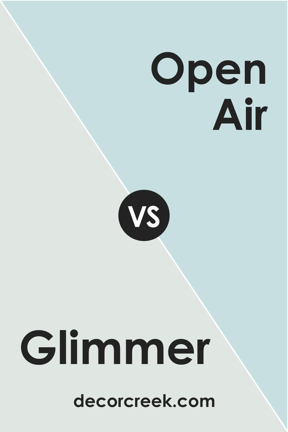
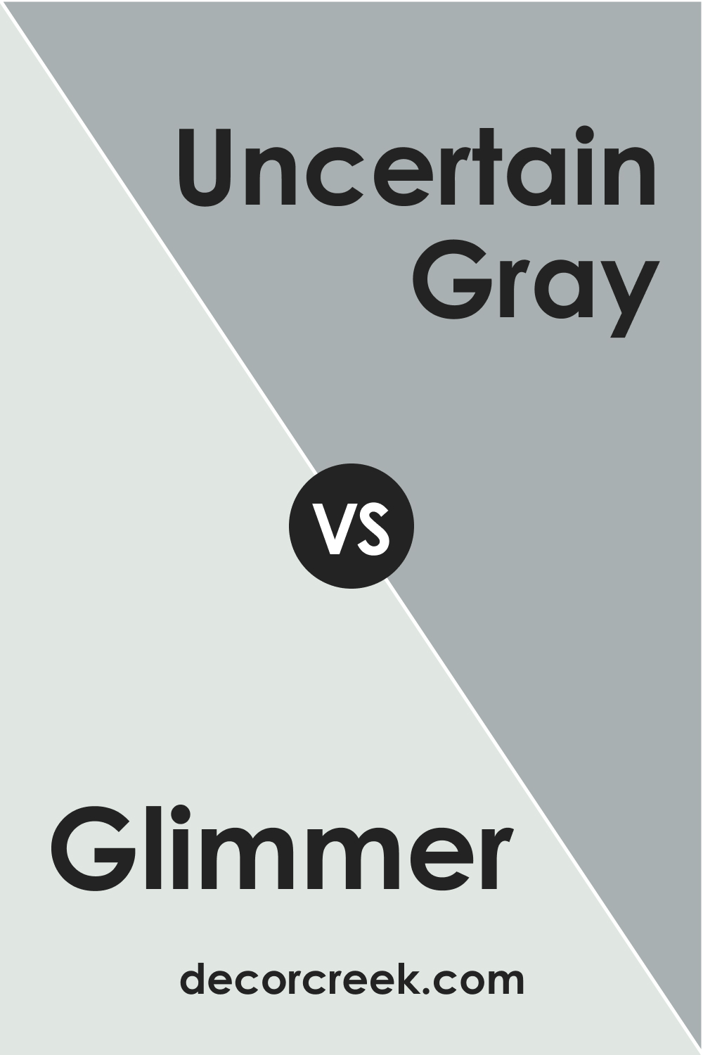
Comparing Glimmer with other colors can provide valuable insights. For instance, when compared with a color like SW 6491 Open Air, Glimmer might appear slightly grayer. Against a darker color like SW 6234 Uncertain Gray, Glimmer’s lightness and freshness become more pronounced.
Comparing colors can help you to understand better the unique characteristics of each and how they might interact with each other in a color scheme. It can also help you to explore different options and possibilities for your space. After all, the beauty of interior design lies in the myriad of options and the potential for creativity.
SW 6476 Glimmer vs. SW 6491 Open Air
Both Open Air (CHECK A SAMPLE) and Glimmer are light blue hues that can lend an airy and refreshing feel to a space. However, Open Air is a bit more saturated, bringing more color intensity, whereas Glimmer is slightly grayer, which can make it feel more muted and tranquil.
SW 6476 Glimmer vs. SW 6234 Uncertain Gray
SW Uncertain Gray (CHECK A SAMPLE) is a medium-tone gray with blue undertones. When compared to Glimmer, it’s significantly darker and more subdued, which can make Glimmer appear more vibrant and light. Using these two colors together could create a dynamic contrast in a space.
SW 6476 Glimmer vs. SW 6218 Tradewind
SW Tradewind (CHECK A SAMPLE) is a mid-tone blue with gray undertones. It has more depth than Glimmer and can bring a stronger color presence into a room. When comparing these two, you might find Glimmer to be a better fit if you’re aiming for a subtle and light color scheme.

SW 6476 Glimmer vs. SW 7005 Pure White
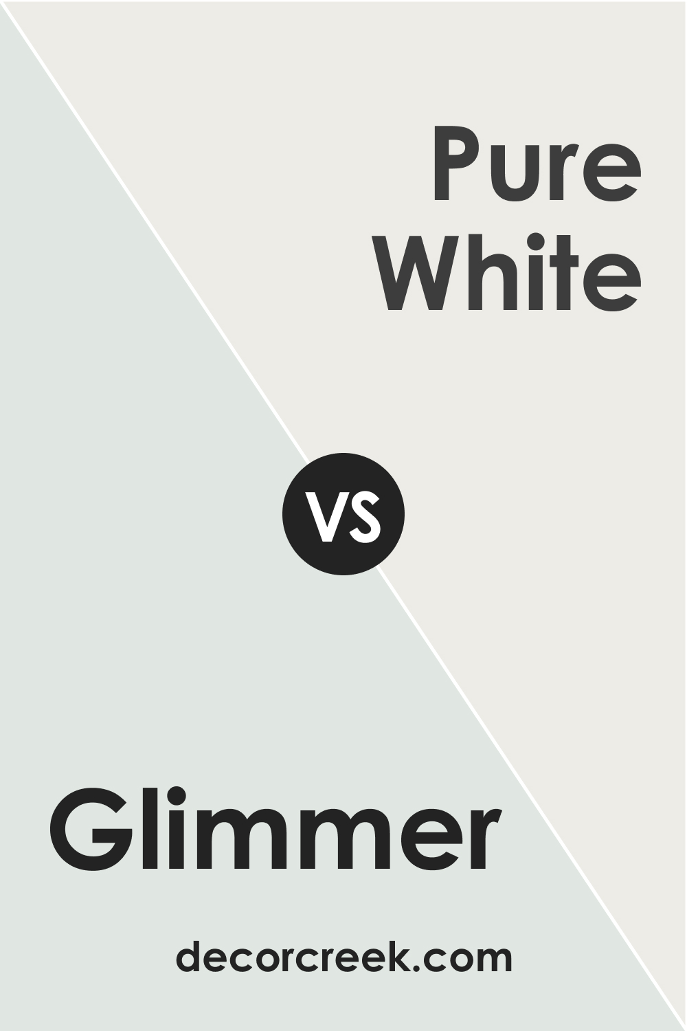
SW Pure White (CHECK A SAMPLE) is a neutral white that is often used for trim or ceilings. Comparing Glimmer with Pure White can highlight Glimmer’s blue and gray undertones, as Pure White serves as a blank canvas, making it easier to see Glimmer’s true hue.
SW 6476 Glimmer vs. SW 7029 Agreeable Gray
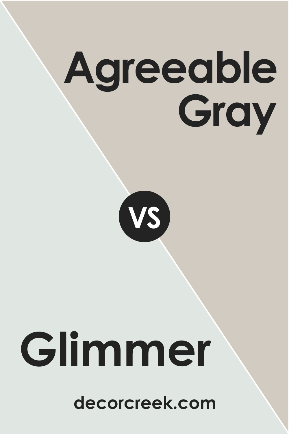
SW Agreeable Gray (CHECK A SAMPLE) is a warm, neutral gray that is quite versatile. Compared to Glimmer, Agreeable Gray is more neutral and warmer, which can make Glimmer appear cooler and more colorful. These two colors can work well together, with Agreeable Gray grounding Glimmer’s coolness.
SW 6476 Glimmer vs. SW 6478 Watery
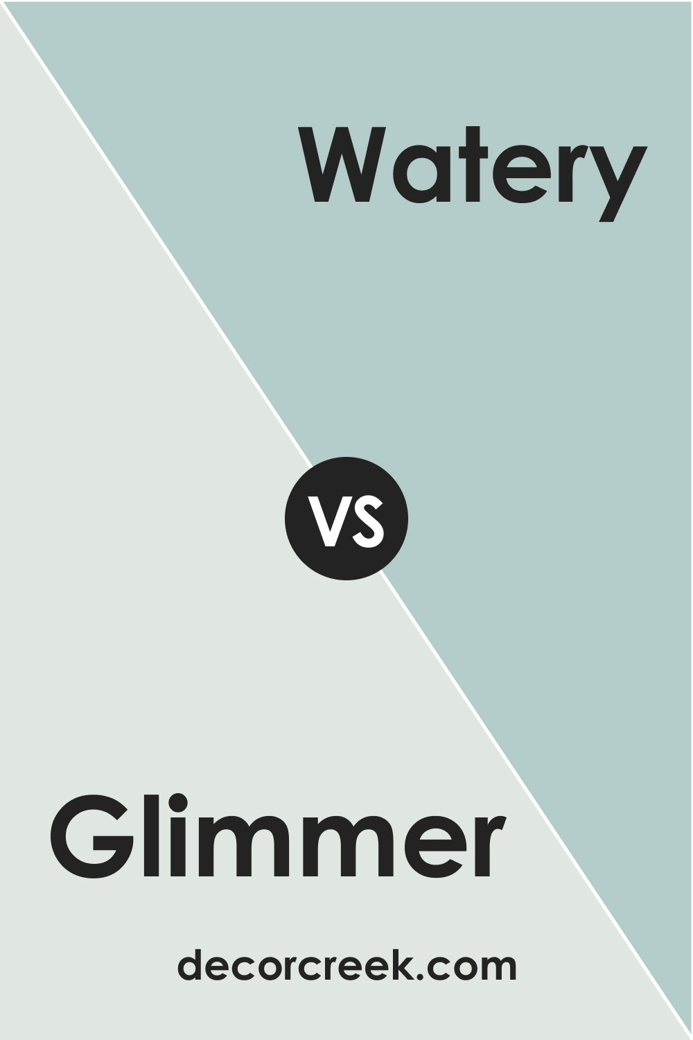
SW Watery (CHECK A SAMPLE) is light to medium blue with a touch of green. It’s more colorful and has a bit more depth compared to Glimmer. By comparing these two, you can better see how Glimmer provides a more subtle, airy feel, while Watery can bring more color and energy into a space.
Conclusion
In conclusion, SW 6476 Glimmer is a captivating paint color that masterfully straddles the line between cool and light-hearted. Its unique mix of blue and gray undertones makes it a versatile choice for various spaces and design styles, capable of imparting an aura of calm and serenity in one setting or of liveliness and vigor in another.
The wide array of colors that can harmonize with Glimmer further attest to its adaptability, while its high LRV ensures that it can effectively brighten up spaces. Whether you are aiming for a sleek, modern look, a refreshing coastal feel, or a cozy Scandinavian vibe, Glimmer can deliver.
It’s a color that invites creativity and leaves room for personal expression, making it a delightful choice for any home.
Ever wished paint sampling was as easy as sticking a sticker? Guess what? Now it is! Discover Samplize's unique Peel & Stick samples.
Get paint samples
Frequently Asked Questions
⭐What kind of mood does SW 6476 Glimmer create in a room?
SW 6476 Glimmer creates a calm, serene, and refreshing atmosphere in a room. It's light and airy, and can make a space feel more spacious and open. Its cool undertones also add a sense of tranquility and peace.
⭐What are some good trim colors to pair with SW 6476 Glimmer?
Some good trim colors to pair with Glimmer include SW 7005 Pure White, SW 7008 Alabaster, and SW 7011 Natural Choice. These colors provide a crisp, clean contrast to Glimmer's cool undertones.
⭐Can I use SW 6476 Glimmer for an exterior?
Yes, SW 6476 Glimmer can be a great choice for an exterior. Its light and refreshing hue can make your house stand out, yet without being too overpowering. It works well with white or gray trims and can complement many roof colors.
⭐What design styles does SW 6476 Glimmer fit into best?
SW 6476 Glimmer fits well in many design styles due to its versatility. It works particularly well in coastal, Scandinavian, and modern interiors due to its light, refreshing, and clean feel.
⭐What colors coordinate well with SW 6476 Glimmer?
SW 7005 Pure White, SW 9171 Felted Wool, and SW 6478 Watery coordinate well with Glimmer. Additionally, warmer neutrals, soft pinks, and even some deeper blues or grays can also work beautifully with this color.


