If you’re on the hunt for a paint color that adds a subtle and sophisticated touch to any room, Sherwin Williams’ SW 9165 Gossamer Veil might just be the perfect pick for you.
This lovely shade is part of Sherwin Williams’ vast palette, which offers an array of options to suit any decorating style, but Gossamer Veil stands out for its unique ability to blend into various spaces effortlessly.
The beauty of Gossamer Veil lies in its versatility. This color is like a chameleon, adapting to different environments and lighting conditions with ease.
It’s a warm gray with a hint of beige, making it an ideal choice for those seeking a neutral with a bit more depth and warmth than the standard gray.
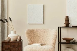
Whether you’re updating your living room, bedroom, or kitchen, Gossamer Veil brings a touch of elegance and a breath of fresh air into the space.
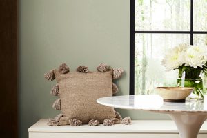
This subtle hue works well with a wide range of decor styles, from modern minimalist to rustic farmhouse. It can serve as a calming backdrop for bold statement pieces or blend seamlessly with a more subdued, monochromatic scheme.
Gossamer Veil is more than just a paint color; it’s a means to create a serene and inviting atmosphere in your home, reflecting your personal style while offering a timeless appeal.
What Color Is Gossamer Veil SW 9165 by Sherwin Williams?
Gossamer Veil by Sherwin Williams is a subtle, soft gray with just the right amount of warmth to create a cozy yet sophisticated atmosphere. It’s like the perfect middle ground between a pure gray and a gentle beige, often referred to as “greige.”
This color has a remarkable versatility, making it a go-to choice for anyone looking to refresh their space with a neutral that’s far from boring.
This particular shade works wonders in a variety of interior styles.
Whether you’re aiming for a modern minimalist look, a calm Scandinavian vibe, or a warm rustic feel, Gossamer Veil sets the perfect backdrop.
It’s like a chameleon, adapting and enhancing the character of any room it’s in.
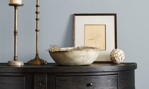
When it comes to pairing it with materials and textures, Gossamer Veil is equally flexible. It looks stunning with natural wood, whether it’s a light oak or a darker walnut, adding to the warmth and inviting nature of the space.
Metallic finishes, like brushed nickel or copper, pop against its subtle background, offering a touch of elegance. Soft textiles in rich colors or even a splash of vibrant accents work beautifully against this neutral palette, allowing for a wide range of decorative flexibility.
In summary, Gossamer Veil is a balanced, warm greige that serves as an excellent foundation for countless design directions, easily complementing various materials and textures to create a space that feels both stylish and welcoming.
Ever wished paint sampling was as easy as sticking a sticker? Guess what? Now it is! Discover Samplize's unique Peel & Stick samples.
Get paint samples

Is Gossamer Veil SW 9165 by Sherwin Williams Warm or Cool color?
Gossamer Veil by Sherwin Williams is a unique color that brings a soft, neutral vibe into any home. This shade is versatile, acting as a bridge between warmer tones and cooler shades, making it perfect for blending different styles and decorations.
When used on walls, it provides a calm, understated backdrop that allows furniture and artwork to stand out.
Its lightness also helps to make small spaces appear larger and more open, without making the room feel cold or impersonal.
In homes with a lot of natural light, Gossamer Veil takes on a slightly warmer hue, adding coziness to the space. For rooms with less light, it maintains its neutral base, ensuring the space feels bright and airy.
This adaptability makes it an excellent choice for almost any room, whether you’re updating a living area, bedroom, or even a kitchen.
Plus, it pairs beautifully with a wide range of colors – from bold and bright to soft and subdued – providing a seamless backdrop for any design style.
Undertones of Gossamer Veil SW 9165 by Sherwin Williams
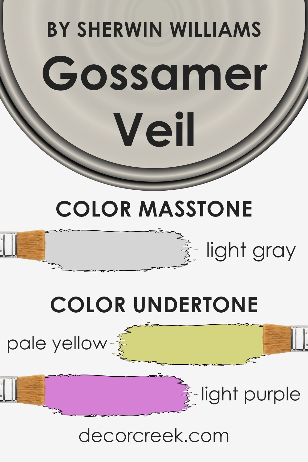
Gossamer Veil is a sophisticated shade that brings a unique balance of warmth and coolness to spaces, primarily because of its special undertones. Imagine two gentle whispers of color beneath the main hue: pale yellow and light purple.
These aren’t bold, in-your-face colors; instead, they subtly influence how Gossamer Veil looks under different lighting conditions.
Undertones work like a quiet background conversation. They can change the vibe of a color depending on the time of day or the type of light shining on it.
For instance, in bright, natural daylight, the pale yellow undertone might make the color appear slightly warmer and more welcoming.
On the other hand, in artificial light, the light purple undertone could give it a cooler, more serene feel. This duality allows for versatility in decorating and styling rooms.
When used on interior walls, Gossamer Veil’s nuanced undertones can truly transform a space. The slight yellow gives rooms a cozy, sunny glow, making them feel more spacious and cheerful.
Meanwhile, the touch of purple can bring a calming, sophisticated edge, perfect for creating a peaceful retreat.
This balance means that the color can adapt to different decors and furniture tones, from the warmth of wooden pieces to the coolness of metal accents, making it an incredibly versatile choice for any room.
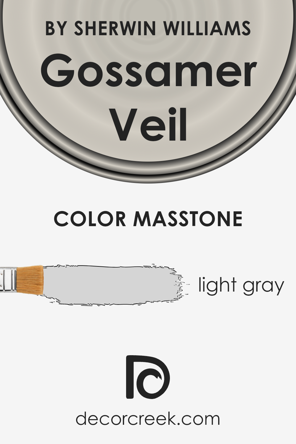
What is the Masstone of the Gossamer Veil SW 9165 by Sherwin Williams?
Gossamer Veil by Sherwin Williams is a light gray color with a masstone, or main tone, of #D5D5D5. This shade is perfect for those looking to create a calm and soothing ambiance in their home.
Light gray is versatile, working well in any room, from kitchens to bedrooms, and complements a wide range of decor styles, from modern to traditional.
Because of its neutrality, this color acts as a fantastic backdrop, allowing furniture and artwork to stand out.
It can make small spaces appear larger and brighter, as light gray reflects natural light beautifully. Additionally, this shade is great for creating a serene environment, perfect for relaxing after a long day.
Gossamer Veil’s light gray tone is also practical, hiding minor wall imperfections better than stark white would.
It offers a subtle warmth, making a room feel cozy without the heaviness darker colors can bring. Overall, this color is a smart choice for anyone looking to refresh their space with a clean, modern look.
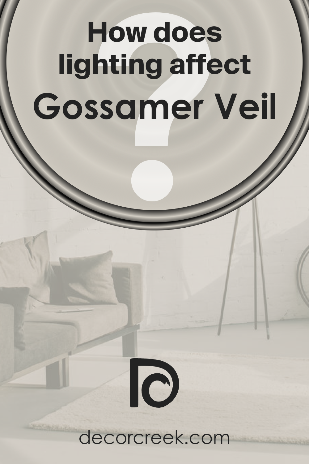
How Does Lighting Affect Gossamer Veil SW 9165 by Sherwin Williams?
Lighting plays a vital role in how we perceive colors. The same color can look different under various light sources. This is especially true for paint colors like Gossamer Veil by Sherwin Williams, which can change in appearance from one room to another depending on the light.
Let’s explore how this color reacts to different lighting conditions and how it looks in rooms with different orientations.
In artificial light, Gossamer Veil’s true tones can either be enhanced or dulled, depending on the type of bulb used.
LED or fluorescent lighting can make this color appear crisper and more vibrant, while incandescent lighting might give it a warmer, cozier feel.
This flexibility makes Gossamer Veil a popular choice for interior spaces, as it can easily adapt to various lighting setups.
Under natural light, Gossamer Veil reveals its full beauty and complexity.
In rooms facing north, which receive cooler, indirect light, this color might look slightly more muted and serene, creating a peaceful and calm atmosphere. It’s perfect for spaces where you seek relaxation and calmness.
In south-facing rooms, where the light is warmer and more direct, Gossamer Veil warms up too, revealing a softer, more inviting side. This makes it ideal for living rooms or dining areas that benefit from a cheerful and welcoming ambiance throughout the day.
East-facing rooms receive the morning light, which is cooler and brighter. Here, Gossamer Veil will appear slightly more vibrant in the morning, then softer as the day progresses.
This dynamic change can bring a refreshing energy to start the day, especially in bedrooms and bathrooms.
West-facing rooms get the evening light, which is warm and golden. In these rooms, Gossamer Veil can look especially luxurious and cozy late in the day, perfect for spaces used more during the evening.
Overall, Gossamer Veil demonstrates how lighting can influence color perception, adapting its character to match the mood of each room and its lighting conditions.
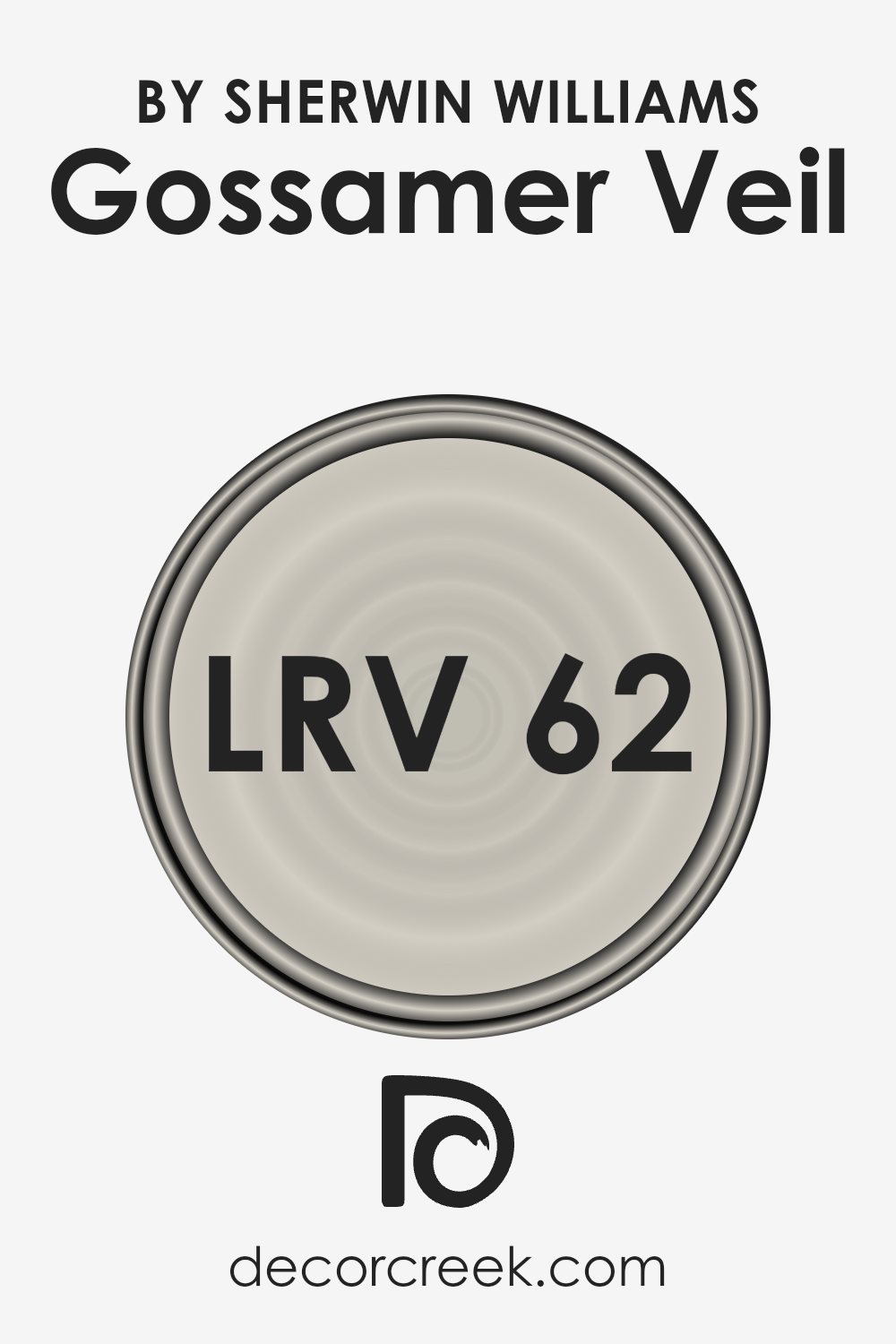
What is the LRV of Gossamer Veil SW 9165 by Sherwin Williams?
LRV stands for Light Reflectance Value. It’s a measure of the percentage of light a paint color reflects back into a room, on a scale from 0 to 100. A lower LRV means the color absorbs more light and appears darker, while a higher LRV means it reflects more light and looks lighter.
This value is important because it helps you understand how a paint color will look in your space under different lighting conditions.
For instance, a room with a lot of natural light can handle colors with a lower LRV without feeling too dark, whereas a room with less light might need a paint color with a higher LRV to make it feel brighter and more open.
Regarding the color with an LRV of 61.82, this places it in the lighter range, indicating it will reflect a good amount of light without being overly bright.
This makes it a versatile choice for many spaces, as it can help to make a room feel more open and airy without the starkness some very light colors can bring.
For a color like this, it means it has the flexibility to work well in various lighting conditions, from rooms that get plenty of sunlight to those relying more on artificial lighting.
Plus, its light-reflecting properties can help in subtly enhancing the overall ambiance of a space, making it feel more inviting.
LRV – what does it mean? Read This Before Finding Your Perfect Paint Color
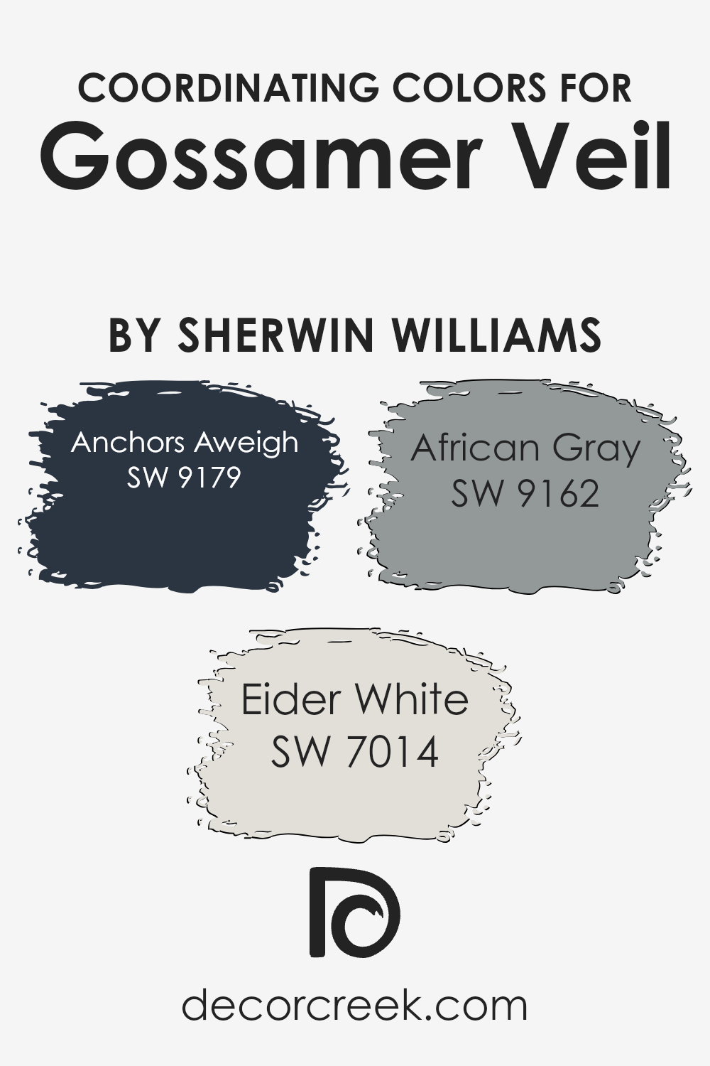
Coordinating Colors of Gossamer Veil SW 9165 by Sherwin Williams
Coordinating colors are those that work well together to enhance the overall aesthetic of a space. They are chosen to complement each other and the primary color in use, creating harmony and balance within a color scheme.
For instance, Gossamer Veil by Sherwin Williams is a versatile neutral that serves as a perfect canvas for adding depth and character when paired with its coordinating colors.
Understanding how to utilize these coordinating shades allows for a more cohesive and inviting environment.
Anchors Aweigh (SW 9179) is a deep, navy blue that brings a sense of sophistication and drama to any space. This color works beautifully with Gossamer Veil by providing a striking contrast that is both bold and elegant.
Eider White (SW 7014) offers a softer approach, with its delicate and airy feel. It’s a light, almost ethereal shade that can help to create a sense of spaciousness and tranquility, making it a great partner for the subtle tones of Gossamer Veil.
Lastly, African Gray (SW 9162) is a warm, mid-tone gray that bridges the gap between light and dark. Its earthy undercurrents add a comforting depth, enriching the palette without overwhelming it.
Each of these colors supports and enhances the beauty of Gossamer Veil, allowing for a seamless blend of shades that work in harmony to stylize a space.
You can see recommended paint colors below:
- SW 9179 Anchors Aweigh
- SW 7014 Eider White
- SW 9162 African Gray
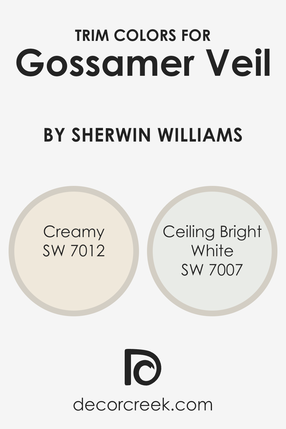
What are the Trim colors of Gossamer Veil SW 9165 by Sherwin Williams?
Trim colors play a crucial role in highlighting and complementing the main color on walls, in this case, Gossamer Veil by Sherwin Williams. By carefully selecting trim colors, one can enhance the beauty and character of the wall color, providing a finished look to the room.
The trim color can subtly define the space, highlight architectural details, and contribute to the overall ambiance of the room. It acts as a frame for the wall, making the color stand out and giving the room a polished appearance.
For Gossamer Veil, a soft and subtle gray tone, choosing the right trim colors is essential to elevate its elegance. Creamy (SW 7012) offers a warm, inviting feel with its rich, buttery undertone that softly contrasts with Gossamer Veil, providing a cozy atmosphere to any space.
On the other hand, Ceiling Bright White (SW 7007) is a crisp, clean white that brings a fresh and airy feel. When used as a trim, it creates a sharp contrast, making the walls pop and injecting a sense of brightness into the room.
These two colors complement Gossamer Veil beautifully, adding depth and dimension to the walls while enhancing the overall aesthetic of the space.
You can see recommended paint colors below:
- SW 7012 Creamy
- SW 7007 Ceiling Bright White
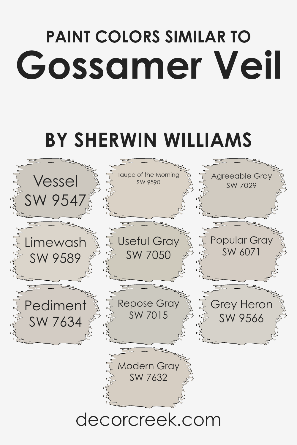
Colors Similar to Gossamer Veil SW 9165 by Sherwin Williams
Similar colors play a crucial role in interior design and home decoration because they create a sense of harmony and balance.
When colors closely resemble each other, like those akin to Gossamer Veil by Sherwin Williams, they help to weave a cohesive look throughout a space.
These shades, while distinct, share a base tone that makes them complementary to Gossamer Veil, allowing for a smooth transition between rooms or providing a subtle contrast within a single area without overwhelming the senses.
For instance, colors such as Vessel and Limewash offer a slight variation in hue that can highlight specific features of a room or add depth when used on different walls or in decor elements.
With colors ranging from the light and airy Pediment and Modern Gray, which give a fresh and clean look, to the deeper, more grounded tones of Taupe of the Morning and Useful Gray, there’s a spectrum of options to suit various aesthetic preferences.
Repose Gray and Agreeable Gray offer neutral bases that are incredibly versatile, fitting into almost any design scheme with ease.
Meanwhile, Popular Gray and Grey Heron extend the palette with their unique undertones, providing options for those looking to add a bit more personality.
Each color, while sharing similarities with Gossamer Veil, has its own character that can complement different design elements, making the selection of paints an essential step in achieving a harmonious home interior.
You can see recommended paint colors below:
- SW 9547 Vessel
- SW 9589 Limewash
- SW 7634 Pediment
- SW 7632 Modern Gray
- SW 9590 Taupe of the Morning
- SW 7050 Useful Gray
- SW 7015 Repose Gray
- SW 7029 Agreeable Gray
- SW 6071 Popular Gray
- SW 9566 Grey Heron
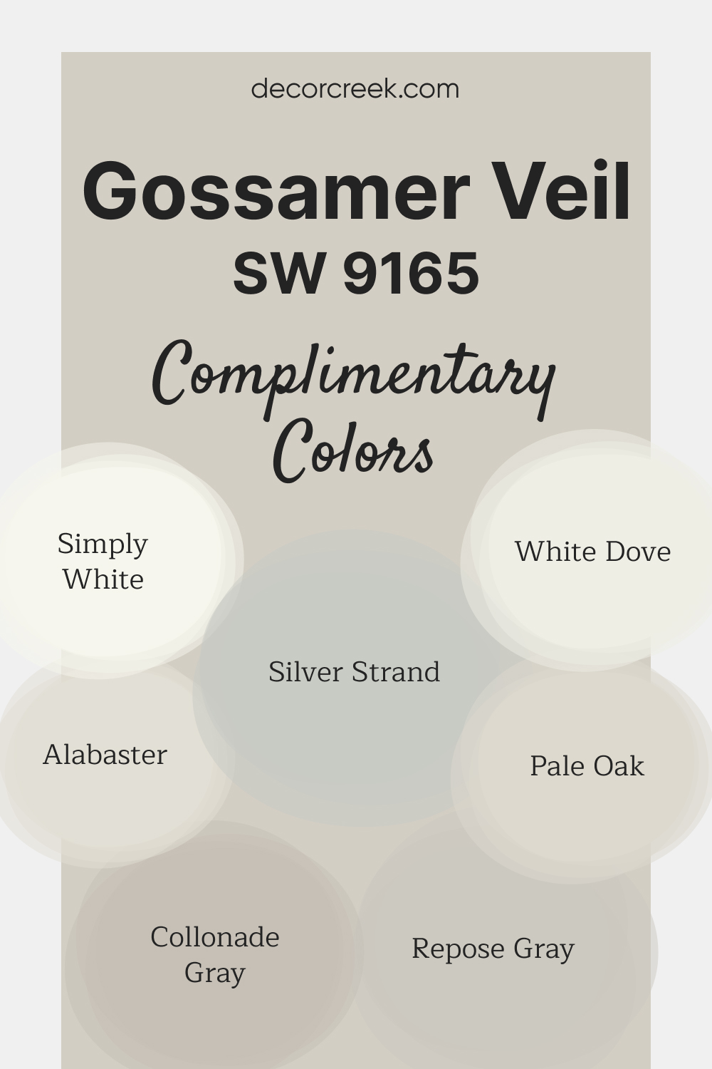
Complimentary Colors for Gossamer Veil SW 9165 Paint Color by Sherwin Williams
Gossamer Veil SW 9165 by Sherwin-Williams is a light, neutral shade that offers a perfect balance of warmth and softness. It creates a calm and inviting atmosphere, ideal for both modern and classic styles.
This color is versatile and pairs with a variety of other shades, making it easy to build a cohesive palette. For a bright and fresh look, Alabaster SW 7008 and Simply White OC-117 are excellent choices.
White Dove OC-17 and Pale Oak OC-20 add warmth and depth, while Collonade Gray SW 7641 and Repose Gray SW 7015 offer subtle contrast. For a cool touch, Silver Strand SW 7057 provides a soft, elegant finish.
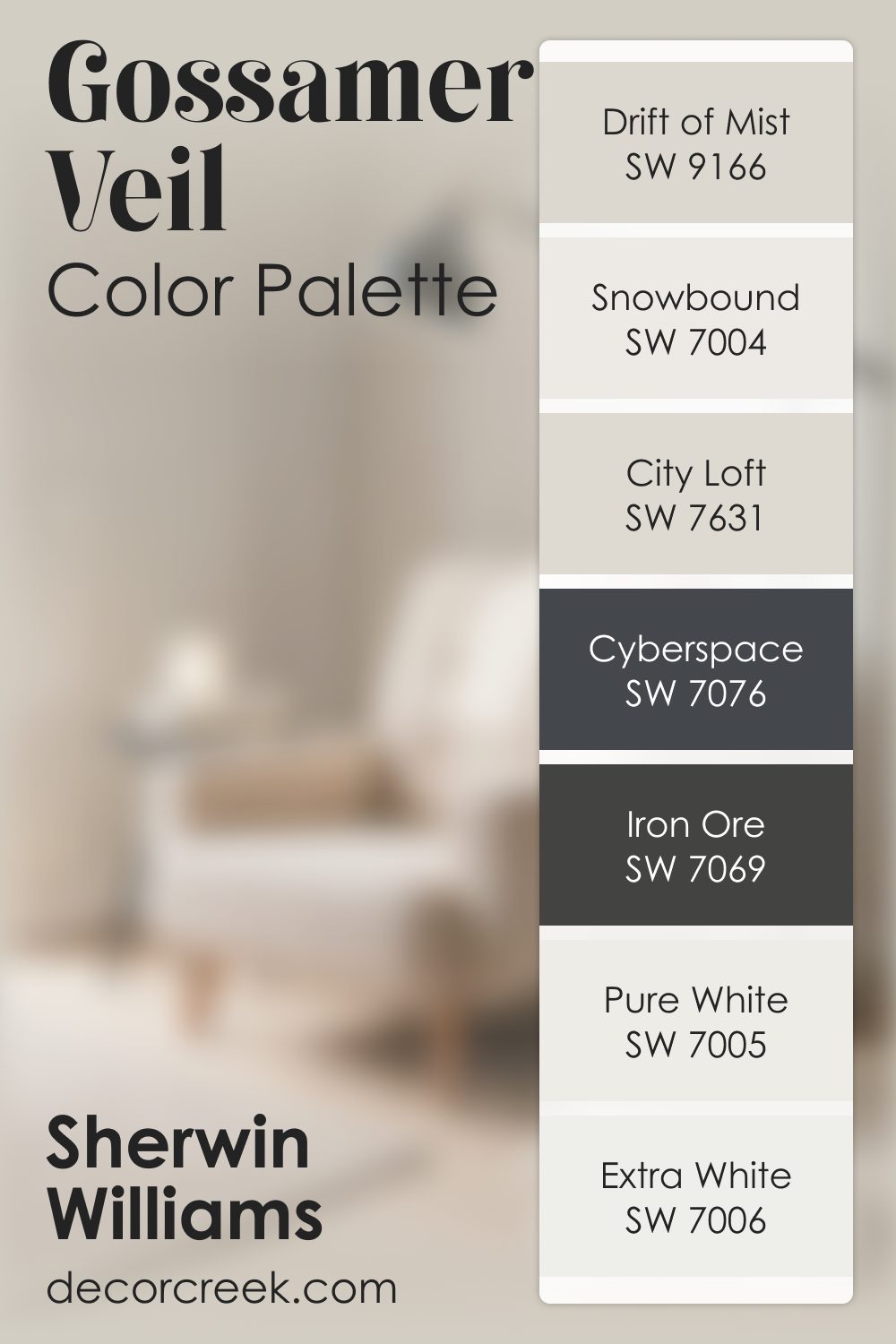
Gossamer Veil SW 9165 by Sherwin Williams Color Palette
Gossamer Veil has a light, airy softness that feels calm and effortless, bringing a quiet brightness to the room. It’s one of those shades that settles in gently, making the whole space feel peaceful and open. Drift of Mist blends with it beautifully, adding a soft layer that enhances its delicate look.
Snowbound and Extra White brighten the palette with clean light, helping the entire combination feel fresh and easy.
City Loft adds warmth in a subtle, tender way, giving the palette a cozy undertone.
Pure White keeps the look crisp, making sure everything stays light and smooth.
Iron Ore or Cyberspace bring rich contrast that gives the palette structure and presence, keeping the softness from feeling too faint. Together, these colors create a palette that feels airy, calm, and quietly refined.
How to Use Gossamer Veil SW 9165 by Sherwin Williams In Your Home?
Gossamer Veil by Sherwin Williams is a versatile paint color that brings a subtle yet elegant touch to any room in your home. It’s a soft gray with warm undertones, making it perfect for creating a cozy and inviting atmosphere.
This color works well in spaces where you want to add a hint of sophistication without overwhelming the room.
One of the best ways to use Gossamer Veil is in living areas or bedrooms. It pairs beautifully with both light and dark furnishings, allowing for flexibility in your decor.
For a more contemporary look, you can match it with crisp white trim or go for a monochromatic style by using varying shades of gray in your accessories and fabrics.
Kitchens and bathrooms also benefit from this neutral shade, as it provides a clean, fresh backdrop for cabinets, tiles, and countertops.
Whether your home style is modern, traditional, or anything in between, Gossamer Veil brings a timeless quality to your interior spaces, making it a go-to choice for anyone looking to update their home.
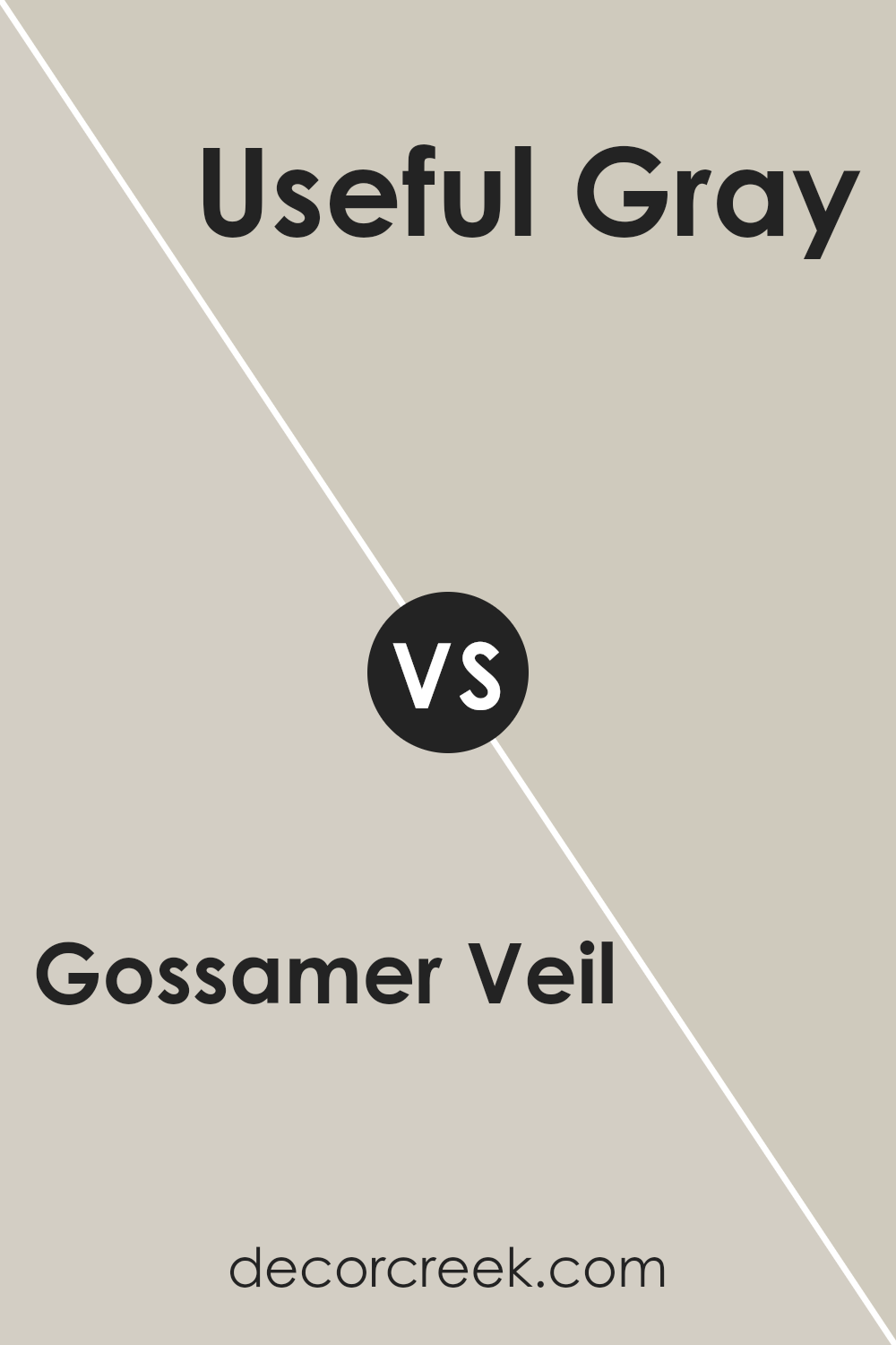
Gossamer Veil SW 9165 by Sherwin Williams vs Useful Gray SW 7050 by Sherwin Williams
Gossamer Veil and Useful Gray are two paint colors from Sherwin Williams that offer subtle yet distinct tones for home decor. Gossamer Veil presents as a soft, warm gray with a hint of beige, making it perfect for creating cozy and inviting spaces.
It’s a versatile color that pairs well with various decor styles, enhancing the room’s overall aesthetic without overpowering it.
On the other hand, Useful Gray has a more pronounced gray tone, leaning towards a cooler palette. This color can offer a contemporary feel, suitable for modern and minimalist designs.
It provides a neutral backdrop that complements bold and vibrant accents, making spaces feel more open and airy.
Both colors are great for creating a neutral canvas in rooms, but Gossamer Veil leans towards a warmer, softer look, while Useful Gray offers a sharper, cooler vibe.
Their understated elegance makes them suitable for various applications, from walls to cabinets, depending on the ambiance you wish to achieve.
You can see recommended paint color below:
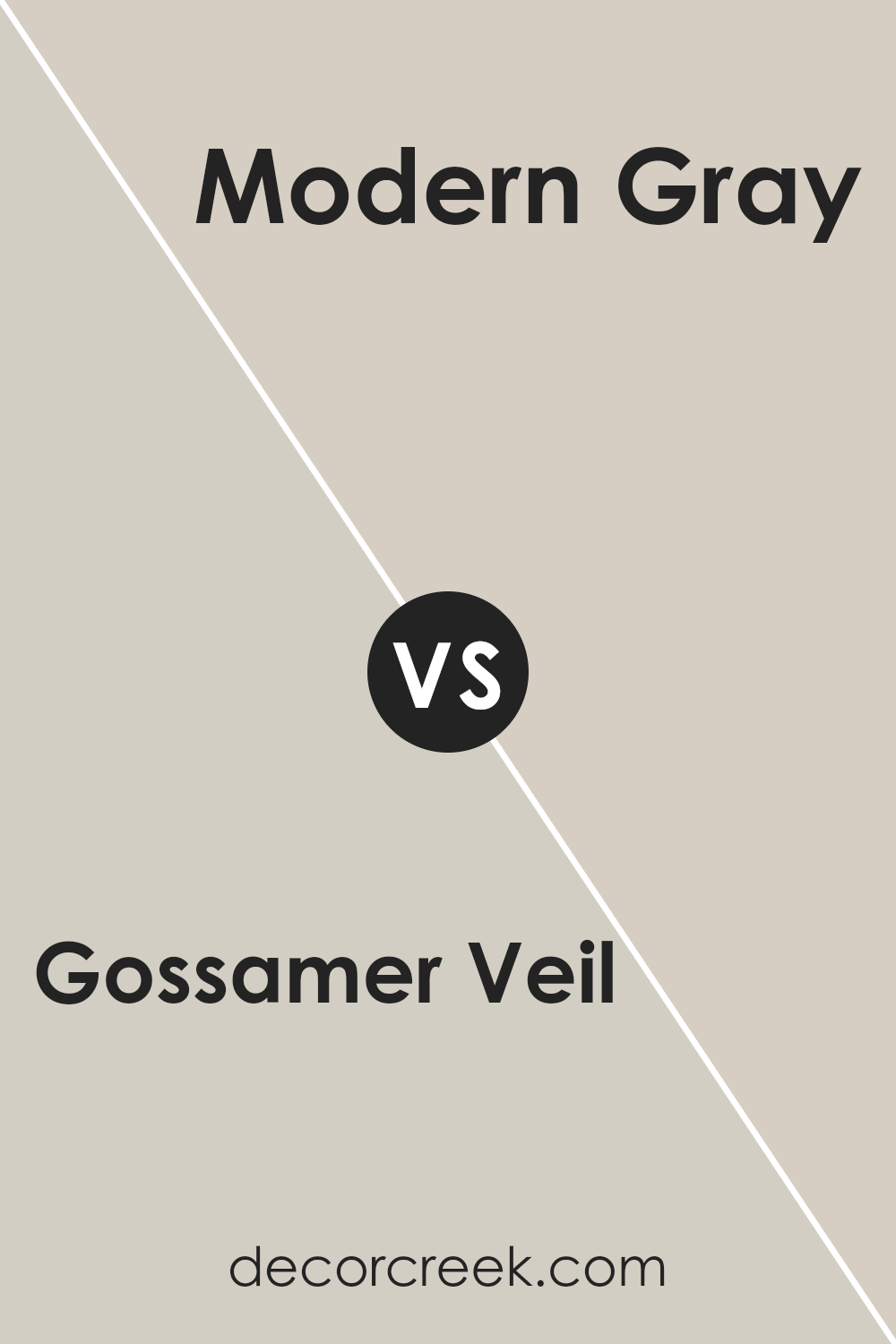
Gossamer Veil SW 9165 by Sherwin Williams vs Modern Gray SW 7632 by Sherwin Williams
Gossamer Veil and Modern Gray, both from Sherwin Williams, are two colors that homeowners often compare when they’re looking to create a peaceful and modern vibe in their space.
Gossamer Veil is a soft, warm gray that has a hint of beige, making it a perfect choice for those who want a cozy feel without the room looking too dark or too stark.
It’s like a hug from your favorite blanket; comforting and gentle. On the other hand, Modern Gray is a little cooler, with a stronger gray presence that brings a sleek, contemporary feel to a room.
It’s like the feeling of wearing a smart, crisp shirt that makes you feel put together.
While both colors share a gray base, Gossamer Veil leans towards a warmer, more inviting beige undertone, whereas Modern Gray offers a cleaner, more minimalist look.
They both can brighten up a space but in different ways; Gossamer Veil adds warmth and coziness, while Modern Gray gives a room a more polished, refined edge.
You can see recommended paint color below:
Gossamer Veil SW 9165 by Sherwin Williams vs Grey Heron SW 9566 by Sherwin Williams
Gossamer Veil and Grey Heron by Sherwin Williams are two unique colors that bring their own charm to any space.
Gossamer Veil is a softer, lighter grey that has a warm undertone, making it perfect for creating a cozy and inviting atmosphere. It’s a great choice if you want a room to feel spacious and serene.
On the other hand, Grey Heron steps into the room with a bit more confidence. It’s a darker grey that carries a cooler tone, giving it a modern and sophisticated edge.
This color is ideal for making bold statements, especially if you’re looking to add depth and a touch of drama to your space.
Both colors are versatile and can blend well with different decor styles, but the choice between the light, comforting Gossamer Veil and the bold, stylish Grey Heron depends on the mood you wish to set in your room.
You can see recommended paint color below:
- SW 9566 Grey Heron
Gossamer Veil SW 9165 by Sherwin Williams vs Repose Gray SW 7015 by Sherwin Williams
Gossamer Veil and Repose Gray are two popular colors by Sherwin Williams that people often choose for their walls. Gossamer Veil is a soft, light gray with warm undertones that can make a room feel cozy and inviting.
It’s pretty versatile, which means it can look good in a lot of different spaces, whether you want a modern vibe or something more traditional.
Repose Gray, on the other hand, is a bit darker than Gossamer Veil. It’s still a gray, but it has this nice, neutral balance that isn’t too warm or too cool.
This makes Repose Gray a solid choice for people who want something that goes well with both warm and cool colors in their furniture or decorations.
When you put them side by side, you can see that Gossamer Veil might light up a room a bit more because it’s lighter, while Repose Gray adds a bit more depth and can bring a stronger sense of sophistication.
So, if you’re trying to decide between the two, think about what kind of mood you’re going for in your space.
You can see recommended paint color below:
Gossamer Veil SW 9165 by Sherwin Williams vs Agreeable Gray SW 7029 by Sherwin Williams
Gossamer Veil and Agreeable Gray are two popular colors from Sherwin Williams, each with its own unique charm. Gossamer Veil stands out as a soft, warm gray with a touch of warmth, making it perfect for creating a cozy and inviting atmosphere in any room.
It carries a lightness that can brighten spaces while still providing that modern, neutral look many desire.
On the other hand, Agreeable Gray leans more towards a true gray, offering a slightly deeper tone that works wonderfully in a variety of lighting conditions.
This color has the versatility to complement both cool and warm palettes, making it an excellent choice for anyone looking to achieve a balanced and harmonious look.
Both colors are fantastic for those seeking neutral backgrounds that are easy on the eyes and can match a wide range of decor styles.
Gossamer Veil is slightly warmer, giving a softer feel, whereas Agreeable Gray brings a more classic gray appearance, providing a slightly stronger contrast against white trim or furniture.
Whether you’re decorating a living space, bedroom, or any part of your home, both these colors offer great foundations to build upon with your personal style.
You can see recommended paint color below:
Gossamer Veil SW 9165 by Sherwin Williams vs Pediment SW 7634 by Sherwin Williams
Gossamer Veil and Pediment by Sherwin Williams are two neutral shades with unique tones. Gossamer Veil leans towards a soft, warm gray with hints of beige, making it versatile for various spaces.
It creates a cozy and inviting atmosphere, perfect for living rooms or bedrooms.
On the other hand, Pediment has a slightly cooler tone, a light greige that combines gray with subtle beige undertones. This color is calm and soothing, ideal for creating a serene environment in your home.
Both colors offer a neutral palette, but their warmth levels differ, affecting the room’s mood. Gossamer Veil brings warmth to spaces, making them feel more welcoming, while Pediment provides a more understated elegance with its cooler hue.
Whether you’re aiming for a cozy vibe or a calm retreat, these colors have distinct personalities that can transform a room. Choosing between them depends on the specific atmosphere you want to achieve and how the room’s lighting will interact with the color.
You can see recommended paint color below:
- SW 7634 Pediment
Gossamer Veil SW 9165 by Sherwin Williams vs Limewash SW 9589 by Sherwin Williams
When comparing Gossamer Veil and Limewash, both from Sherwin Williams, it’s clear we’re looking at two unique shades. Gossamer Veil is a soft, warm gray with a hint of beige, creating a neutral backdrop that’s versatile and inviting in any space.
It’s the kind of color that blends seamlessly with various decor styles, making rooms feel open and airy.
On the other hand, Limewash has a lighter, more ethereal quality. It’s a very pale green with gray undertones, evoking the look of aged plaster or the subtle patina of time-worn surfaces.
This color adds a touch of nature-inspired freshness to interiors, bringing a calm, soothing vibe.
In essence, while Gossamer Veil offers a grounded, cozy feel, perfect for those seeking a classic, understated look, Limewash leans into a more delicate, serene aesthetic, ideal for creating a tranquil, light-filled space.
Depending on the ambiance you wish to create, both colors offer unique possibilities.
You can see recommended paint color below:
- SW 9589 Limewash
Gossamer Veil SW 9165 by Sherwin Williams vs Vessel SW 9547 by Sherwin Williams
Gossamer Veil and Vessel, both from Sherwin Williams, offer unique tones for spaces. Gossamer Veil is a soft, light gray with warm undertones that can illuminate a room without overwhelming it.
It’s perfect for those wanting a subtle backdrop that easily complements various decor styles and colors.
Think of it as a gentle hug for your walls, offering comfort without demanding attention.
On the other hand, Vessel brings a deeper, more pronounced presence. It’s more than just a gray; it’s a rich, earthy color with hints of green and blue, adding depth and sophistication to any space.
Vessel can stand alone as a statement wall or work well across an entire room, providing a solid foundation for both bold and muted accents.
While Gossamer Veil whispers serenity and light, Vessel speaks in tones of elegance and depth. Choosing between them depends on the mood you want to set: calming and airy with Gossamer Veil or grounded and bold with Vessel.
You can see recommended paint color below:
Gossamer Veil SW 9165 by Sherwin Williams vs Popular Gray SW 6071 by Sherwin Williams
Gossamer Veil and Popular Gray by Sherwin Williams are two neutral colors, but they have some clear differences when you look closely. Gossamer Veil is a delicate, light gray with a warm undertone that makes spaces feel cozy and welcoming.
It’s great for rooms where you want a hint of warmth without overwhelming the senses. It’s like a soft blanket on a chilly evening, subtle yet comforting.
On the other hand, Popular Gray is a bit darker and leans more towards a true neutral gray. It doesn’t swing too warm or too cool, making it a versatile choice for any room.
This color stands out more than Gossamer Veil, giving a stronger presence to walls and bringing a modern feel to interiors. It’s like the perfect middle ground if you’re unsure about going too light or too dark with your gray.
So, while both colors share the calmness of gray, Gossamer Veil adds a touch of warmth to make spaces feel homier, and Popular Gray offers a balanced neutrality that works in a wide range of decorating styles.
You can see recommended paint color below:
Gossamer Veil SW 9165 by Sherwin Williams vs Taupe of the Morning SW 9590 by Sherwin Williams
Gossamer Veil and Taupe of the Morning are two colors from Sherwin Williams that offer subtle yet distinct vibes for any room.
Gossamer Veil is a soft, light gray with a hint of warmth. It’s like a gentle morning mist, bringing a calm and serene feel to spaces.
This color works well in areas where you want to create a peaceful and inviting atmosphere. On the other hand, Taupe of the Morning steps in with a bit more depth. It’s still in the neutral zone but carries a richer, taupe base.
This color adds a cozy warmth, making it perfect for rooms where you want a bit more snug and comfortable feel.
While both colors are versatile and can blend well with various decors, Gossamer Veil leans towards a more open and airy feel, whereas Taupe of the Morning brings a touch of coziness and warmth.
Choosing between them depends on the mood you’re aiming for in your space.
You can see recommended paint color below:
- SW 9590 Taupe of the Morning
Conclusion
Gossamer Veil SW 9165 by Sherwin Williams is a versatile and elegant paint color that brings a subtle, sophisticated charm to any space.
Its soft, neutral hue makes it a perfect choice for homeowners and decorators looking to create a serene and inviting atmosphere in their homes.
The color is flexible enough to work in a variety of settings, from living rooms and bedrooms to kitchens and bathrooms, proving its adaptability and appeal.
The beauty of Gossamer Veil lies in its ability to complement a wide range of decor styles and color schemes.
Whether paired with bright and bold colors for a striking contrast or used alongside softer tones for a more cohesive look, this color serves as a fantastic backdrop.
Its understated elegance ensures that it won’t overpower your space, but rather enhance the overall aesthetic, making it a popular choice for those seeking a timeless and chic look.
Ever wished paint sampling was as easy as sticking a sticker? Guess what? Now it is! Discover Samplize's unique Peel & Stick samples.
Get paint samples