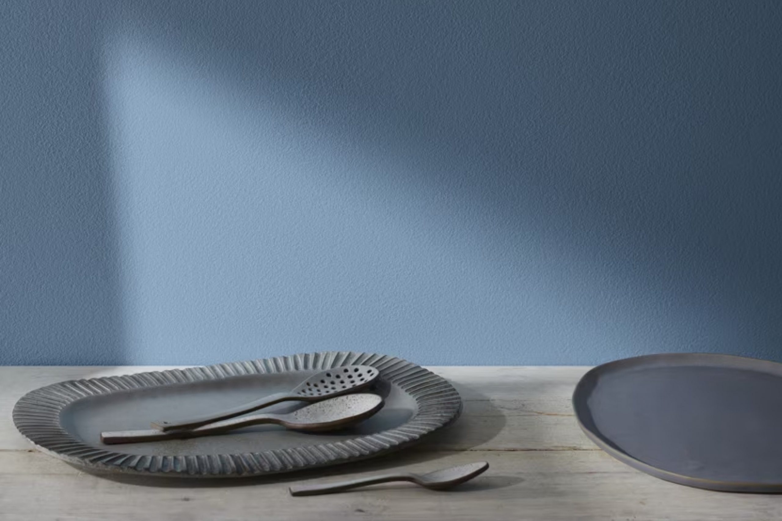
I have always been fascinated by the power of color in transforming a space. One of my recent favorites is HC-156 Van Deusen Blue by Benjamin Moore. This color has a rich and inviting quality that makes it both classic and versatile. Whenever I think about giving a room a fresh look, Van Deusen Blue comes to mind.
It’s a shade that strikes a perfect balance between bold and soothing, making it ideal for almost any space in my home. I love how it can make a statement without being overwhelming. Whether used on walls or as an accent, Van Deusen Blue adds depth and character to a room.
I find it pairs beautifully with both modern and traditional decor, offering endless possibilities for styling.
If you’re considering a refresh, this color might just be the perfect choice to bring a fresh and timeless appeal to your home.
What Color Is Van Deusen Blue HC-156 by Benjamin Moore?
Van Deusen Blue, by Benjamin Moore, is a rich and versatile navy blue that adds depth to any space. This color is a part of the Historical Collection and is known for its timeless appeal and classic feel. It is a deep blue with slight hints of gray, giving it a muted look that can blend well with various design styles.
In traditional interiors, Van Deusen Blue can create a cozy and elegant atmosphere, complementing wooden furniture and antiques. For modern spaces, it can serve as a bold accent against neutral walls and sleek lines, adding a touch of interest without overwhelming the room.
It’s also a great choice for coastal or nautical themes, pairing beautifully with crisp white trim and natural textures like jute or sisal rugs.
When it comes to materials, Van Deusen Blue works well with natural wood tones, either light or dark, as well as metallic accents such as brass or gold for a more luxurious touch. Textures like velvet or linen can enhance its depth, making it suitable for upholstering furniture or as a backdrop for art and decor pieces.
Whether used on walls, cabinetry, or doors, this color brings warmth and character to any interior space.
Is Van Deusen Blue HC-156 by Benjamin Moore Warm or Cool color?
Van Deusen Blue, also known as HC-156, is a paint color by Benjamin Moore that adds a cozy and welcoming feeling to any home. This deep shade of blue has hints of gray, which makes it versatile and easy to work with. It’s a color that fits well in many different settings, whether it’s a living room, bedroom, or even a kitchen.
In the home, Van Deusen Blue can create a calm atmosphere. Its muted tone makes it stylish without being overpowering. For those who like a classic look, this color pairs beautifully with neutral shades like white or beige.
It also goes well with natural wood finishes, bringing out the warmth of the material.
When used on walls, Van Deusen Blue provides a wonderful backdrop for various styles of decor.
Whether you prefer modern, traditional, or something in between, this paint color can make the space feel more inviting.
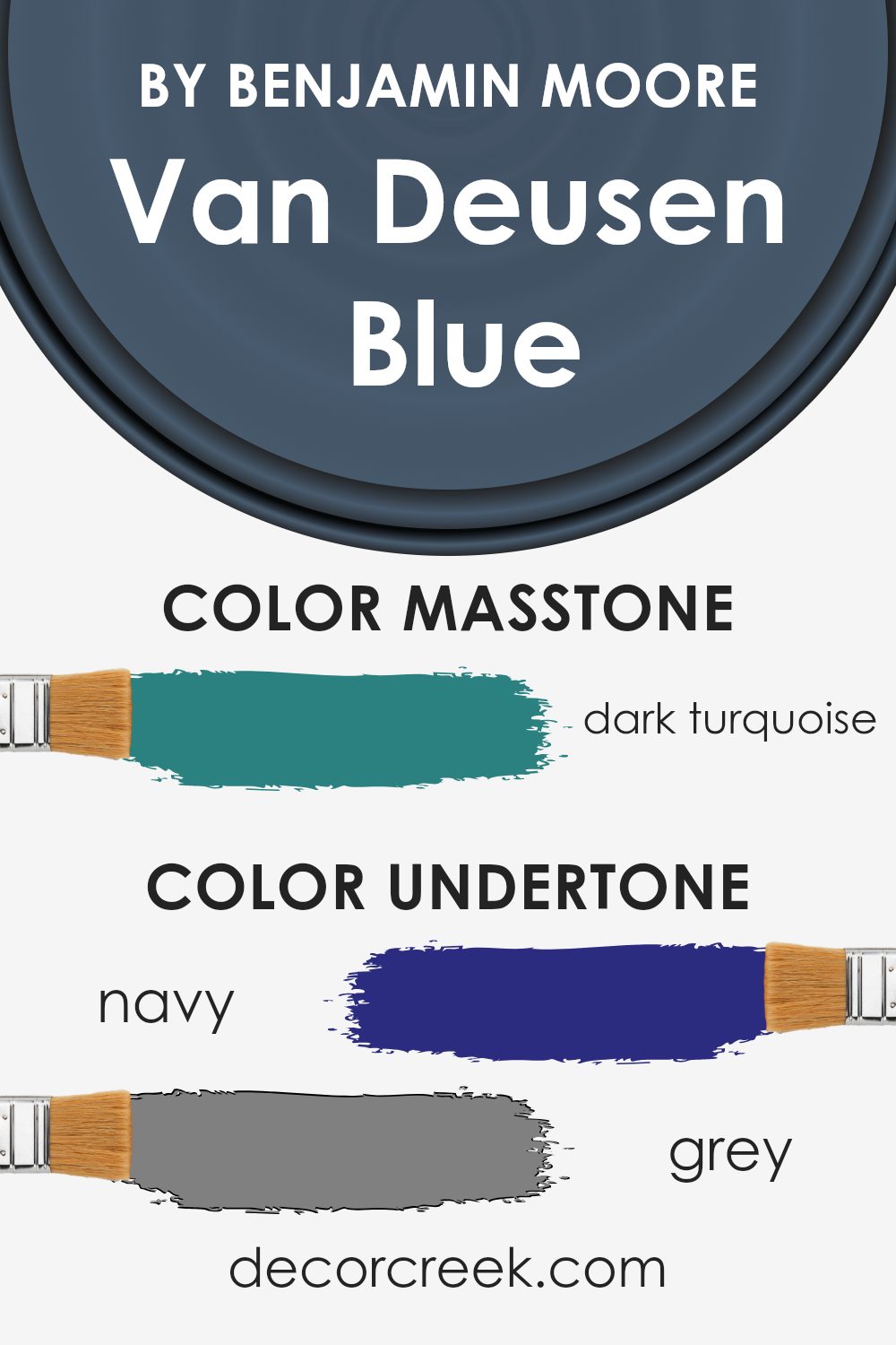
Undertones of Van Deusen Blue HC-156 by Benjamin Moore
Van Deusen Blue HC-156 by Benjamin Moore is a rich and versatile color with a complex array of undertones. These undertones include shades of navy, grey, and purple, which make the blue appear deep and moody. There are also hints of dark green, adding an earthy feel to the color, as well as touches of olive and brown, which bring warmth.
The grey and dark grey undertones contribute to its muted quality, making it less vibrant but giving it more depth. The presence of blue and dark blue hints emphasizes its main hue, while elements of lilac and violet impart a subtle complexity.
The light turquoise, mint, green, and light green add a slight coolness, creating variety in the shade.
When applied to interior walls, these undertones affect how we perceive Van Deusen Blue. The navy and grey tones make it grounding and stable, suitable for creating a cozy environment. The purple and violet elements bring a touch of elegance, especially under different lighting conditions.
Hints of dark green and olive can either cool down or warm up the space, depending on coordinating colors and surrounding décor. This paint color is adaptable and can work in various styles, from traditional to modern. Weighty but not overwhelming, it lends a refined and balanced atmosphere to any room.
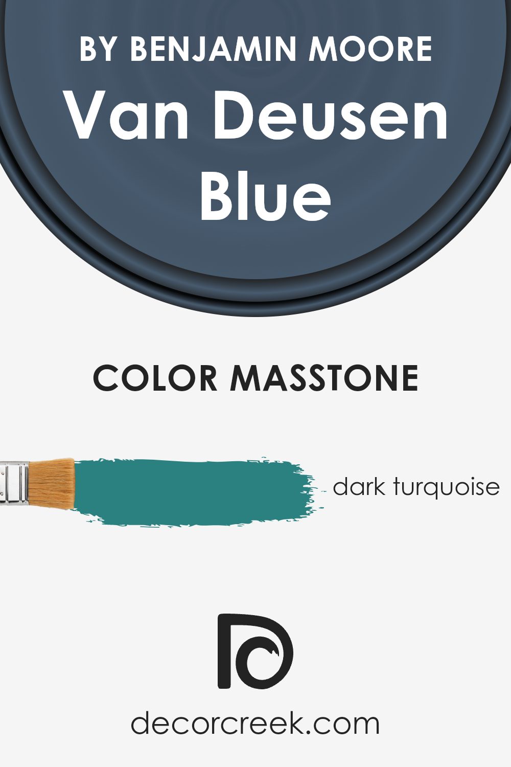
What is the Masstone of the Van Deusen Blue HC-156 by Benjamin Moore?
Van Deusen Blue (HC-156) by Benjamin Moore is an elegant shade of dark turquoise. Its masstone, which is the purest form of the color, provides a deep and rich hue that can add depth and character to any room in a home. This color works particularly well in spaces where you want to create a cozy and inviting atmosphere.
It can be used in living rooms, studies, or bedrooms to instill a sense of warmth and comfort. The dark turquoise tone complements both modern and traditional styles, making it versatile for various home decors.
When paired with lighter shades or neutral tones, Van Deusen Blue can create a striking contrast that highlights architectural features.
Additionally, using this color on an accent wall or cabinetry can add a dramatic touch without overwhelming the space.
Overall, Van Deusen Blue is a timeless color choice that enhances the aesthetic appeal of any interior setting.
How Does Lighting Affect Van Deusen Blue HC-156 by Benjamin Moore?
Lighting plays a crucial role in how we perceive colors. It can change the appearance, mood, and intensity of a color. Van Deusen Blue HC-156 by Benjamin Moore is a rich, deep blue with gray undertones. This color can shift dramatically depending on the lighting conditions.
In natural light, colors often look more vivid and true to their appearance. Van Deusen Blue can look cooler or warmer depending on the time of day and the direction a room faces.
In artificial light, such as incandescent or LED lighting, the color may take on a slightly different hue, appearing either warmer or cooler, depending on the bulb’s color temperature.
In north-facing rooms, which receive cooler, indirect light, Van Deusen Blue may appear more muted and grayish. This lighting can enhance the cooler tones in the color, giving it a serene and calming effect, though it might appear darker.
In south-facing rooms, which are blessed with warm, direct sunlight for most of the day, Van Deusen Blue looks brighter and more vibrant. The natural warm light can bring out a slight warmth in the color, highlighting its blue tones without losing its richness.
In east-facing rooms, you get bright, direct sunlight in the morning. Van Deusen Blue will seem more vibrant and lively during these hours, but as the day progresses, and the light becomes indirect, the color may appear more subdued.
West-facing rooms receive the warmest light in the late afternoon and evening. In these rooms, Van Deusen Blue can look warm and inviting during these hours, with the late-day sunlight casting a golden glow that enriches the blue tones.
Overall, Van Deusen Blue is versatile and can adapt to different lighting conditions, which can enhance or soften its look throughout the day and in different orientations of a room.
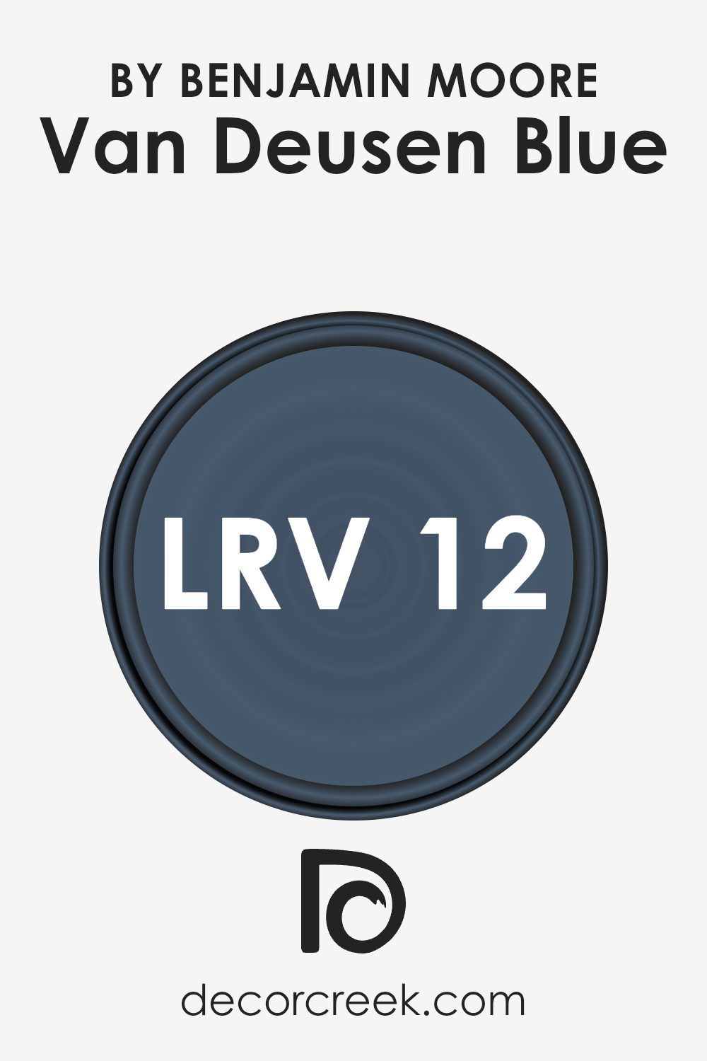
What is the LRV of Van Deusen Blue HC-156 by Benjamin Moore?
Light Reflectance Value (LRV) is a measure used to describe how much light a color reflects and absorbs. It is expressed on a scale of 0 to 100, where 0 represents true black, indicating no light is reflected, and 100 represents pure white, meaning all light is reflected.
The LRV helps you understand how bright or dark a color will look when applied to walls. Colors with high LRV values will reflect more light, making spaces feel brighter and larger, while those with low LRVs will absorb more light, often making rooms feel cozier and smaller.
For Van Deusen Blue, which has an LRV of 11.97, this means it is a deep, rich blue that absorbs most of the light that hits it. This low LRV contributes to the color’s intense and moody appearance, making it ideal for creating a snug and intimate atmosphere in a room.
In spaces with plenty of natural light, Van Deusen Blue can add a dramatic and sophisticated touch without overwhelming the room.
However, in dimly lit areas, it can make the space feel more enclosed and cozy. Understanding this helps when choosing the right color for a specific room, especially in balancing the light and mood you wish to create.
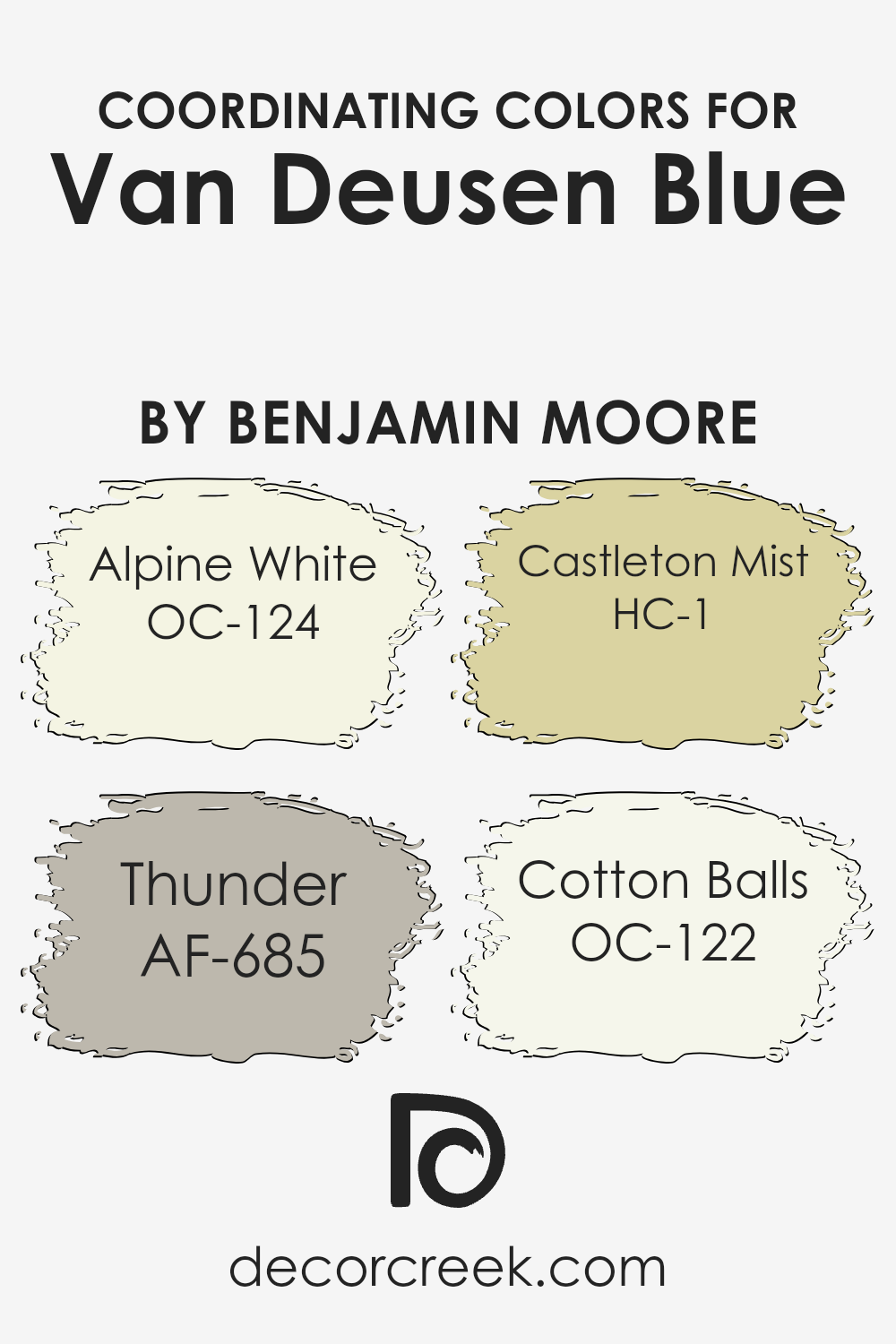
Coordinating Colors of Van Deusen Blue HC-156 by Benjamin Moore
Coordinating colors are hues that complement a main color, often used to create a harmonious and visually pleasing palette. In this case, Van Deusen Blue is a rich, classic shade of blue that pairs beautifully with a selection of coordinating colors.
The choice of these accompanying colors adds balance and character to any room, highlighting the deep blue’s elegance without overshadowing it. Each of these colors can be used on walls, furniture, or as accents to enhance the overall aesthetic.
Alpine White is a soft, creamy off-white that provides a warm and inviting contrast to the deep blue. It’s perfect for trim or ceilings, adding a touch of brightness. Thunder, a sophisticated gray, offers a modern, grounded touch that complements Van Deusen Blue’s depth. It’s a wonderful choice for an accent wall or a piece of furniture.
Castleton Mist is a lively green-yellow with a hint of earthiness, creating an interesting and refreshing contrast with the blue.
Cotton Balls is a pure white, which acts as a crisp, clean canvas, allowing Van Deusen Blue to shine. These colors work together to create a balanced and visually cohesive space, enhancing the beauty of each other.
You can see recommended paint colors below:
- OC-124 Alpine White
- AF-685 Thunder
- HC-1 Castleton Mist
- OC-122 Cotton Balls
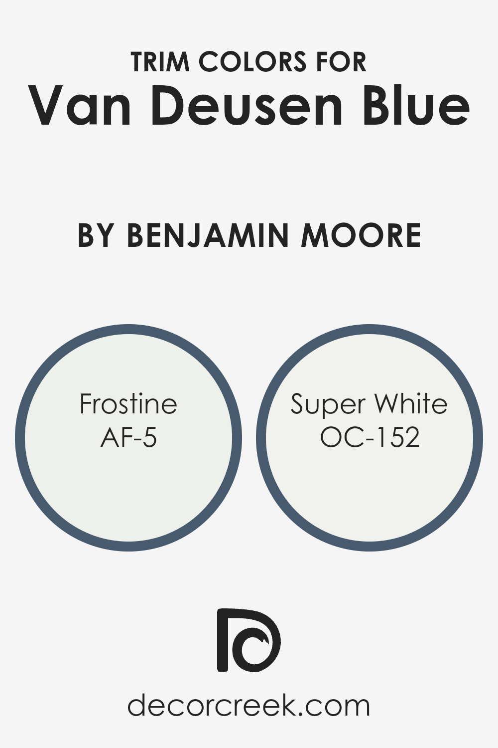
What are the Trim colors of Van Deusen Blue HC-156 by Benjamin Moore?
Trim colors are the complementary shades used around windows, doors, and baseboards to highlight or accentuate the main color of a room or building. In the case of Van Deusen Blue by Benjamin Moore, a deep and rich blue hue, choosing the right trim color is essential to balance and brighten the living space.
Trim colors like Frostine (AF-5) and Super White (OC-152) can make the deep blue of Van Deusen stand out beautifully. Frostine is a soft white with a hint of coolness, which provides a gentle contrast to the rich blue, making it appear even more vibrant.
Super White, on the other hand, is a pure, clean white that offers a stark contrast, making the blue pop and giving the room a crisp, fresh feel.
Using the right trim color is crucial, not just for aesthetics but for the overall ambiance of a space. Frostine, with its cool undertones, can add an element of subtle elegance to the room, while Super White can introduce a bright, airy feel.
Both trims serve to highlight the depth of Van Deusen Blue, enhancing its bold presence. A well-chosen trim color ensures that the blue doesn’t overwhelm the space but rather complements it, creating an inviting environment.
With these trim colors, you can achieve a perfect balance, ensuring the main color shines to its full potential while keeping the space visually appealing and comfortable.
You can see recommended paint colors below:
- AF-5 Frostine
- OC-152 Super White
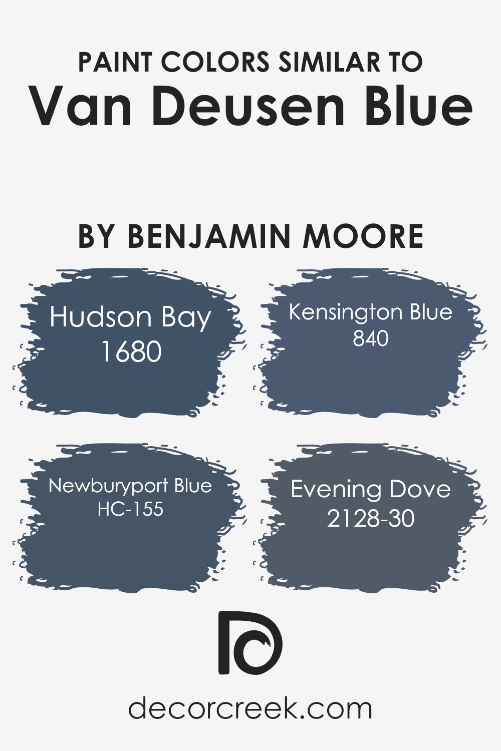
Colors Similar to Van Deusen Blue HC-156 by Benjamin Moore
Similar colors are crucial in creating harmonious and cohesive designs. They help tie different elements of a space together without creating a jarring effect. Van Deusen Blue, a deep and versatile shade, pairs beautifully with its similar colors like Hudson Bay, Newburyport Blue, Kensington Blue, and Evening Dove.
These shades add depth and richness while maintaining a soothing atmosphere. By using these related colors, one can create a unified look that feels well-thought-out and intentional. They can be particularly effective in interior design, fashion, and graphic design where the flow between colors is essential for a pleasing aesthetic.
Hudson Bay offers a touch of teal, bringing an aquatic vibe that refreshes any space with a hint of softness. Newburyport Blue is darker and richer, offering a classic and timeless feel, perfect for more traditional settings. Kensington Blue stands out with its brighter, more vibrant tone, adding energy to a color scheme while still keeping it sophisticated.
Evening Dove is a deep and moody shade, providing an elegant backdrop that enhances other colors without overpowering them. These colors, when used together, can create a dynamic yet balanced palette, offering versatility and an intrinsic sense of style.
You can see recommended paint colors below:
- 1680 Hudson Bay
- HC-155 Newburyport Blue
- 840 Kensington Blue
- 2128-30 Evening Dove
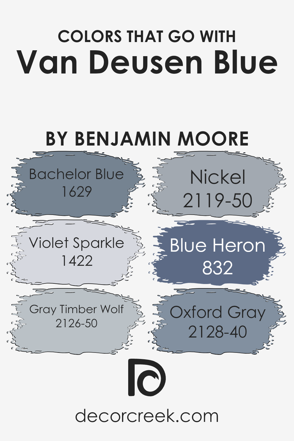
Colors that Go With Van Deusen Blue HC-156 by Benjamin Moore
Colors that pair with Van Deusen Blue HC-156 by Benjamin Moore play a key role in creating a well-balanced and appealing space. Each of these colors complements Van Deusen Blue, which is a rich, dark blue with a timeless, classic appeal. By blending these shades, you can add depth and interest to your space, helping to create a harmonious environment.
Bachelor Blue 1629 is a lighter blue that brings a gentle, calming touch, providing a comfortable contrast to the deeper Van Deusen Blue. Violet Sparkle 1422 introduces a hint of soft purple, offering a playful yet sophisticated touch.
Gray Timber Wolf 2126-50, a medium gray, pairs beautifully and helps neutralize the boldness of Van Deusen Blue, making it feel more grounded. Nickel 2119-50 is another gray but with a touch of warmth, adding subtle coziness.
Blue Heron 832, with its muted blue-green undertones, blends naturally, giving an earthy balance. Lastly, Oxford Gray 2128-40, a deep, smoky shade, echoes the richness of Van Deusen Blue while adding a dramatic flair.
Together, these colors enhance and complement the main shade, creating a cohesive and inviting atmosphere.
You can see recommended paint colors below:
- 1629 Bachelor Blue
- 1422 Violet Sparkle
- 2126-50 Gray Timber Wolf
- 2119-50 Nickel
- 832 Blue Heron
- 2128-40 Oxford Gray
How to Use Van Deusen Blue HC-156 by Benjamin Moore In Your Home?
Van Deusen Blue HC-156 by Benjamin Moore is a versatile and classic paint color. This deep, rich blue has a subtle gray undertone, giving it a timeless appeal. It’s perfect for creating a cozy atmosphere in your home. You can use it on an accent wall to add depth to a room without overwhelming the space. In a living room, Van Deusen Blue can complement neutral furnishings, adding a touch of elegance without being too bold.
In the bedroom, this shade can foster a calm and welcoming environment. Pair it with crisp white bedding or light-colored furniture for a pleasing contrast. For a more dramatic look, consider using it in your dining room to make the area feel intimate and inviting.
The color also works well in smaller spaces like bathrooms, where it can add character. When combined with white trim and fixtures, Van Deusen Blue creates a clean and stylish look in any home.
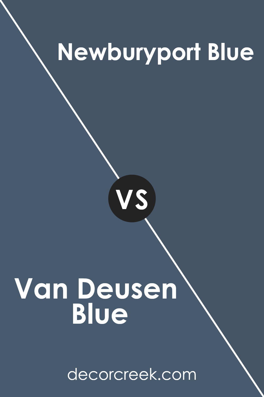
Van Deusen Blue HC-156 by Benjamin Moore vs Newburyport Blue HC-155 by Benjamin Moore
Van Deusen Blue HC-156 and Newburyport Blue HC-155, both by Benjamin Moore, are popular choices for those looking to add blue tones to their spaces. Van Deusen Blue is a deep, rich shade of blue with gray undertones, making it versatile and sophisticated. It brings a sense of calm and can be used in various rooms, including bedrooms and living areas.
On the other hand, Newburyport Blue is slightly lighter with a bit more brightness and a hint of warmth. It has a classic navy feel but isn’t too dark, allowing it to work well in spaces where you want a traditional yet lively look.
It pairs beautifully with whites and neutral tones for a crisp and clean finish. While both colors are part of the same color family, Van Deusen Blue feels moodier, whereas Newburyport Blue offers a fresher, more energetic vibe, ideal for different design preferences.
You can see recommended paint color below:
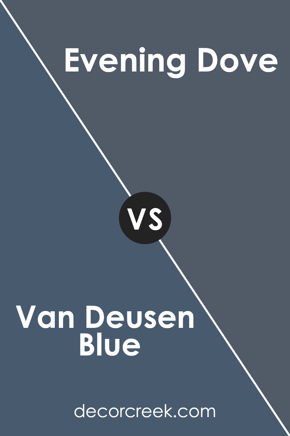
Van Deusen Blue HC-156 by Benjamin Moore vs Evening Dove 2128-30 by Benjamin Moore
Van Deusen Blue HC-156 and Evening Dove 2128-30 are two popular colors by Benjamin Moore, known for their rich, deep tones. Van Deusen Blue HC-156 is a classic blue with a touch of gray, making it versatile and easy to pair with other colors. It works well in both traditional and modern settings and can create a cozy, calming atmosphere.
Evening Dove 2128-30, on the other hand, is a dark, moody blue that leans more toward navy. It’s bolder and can add drama to a space. This color is often used in rooms where a more intense, intimate feel is desired.
Both colors offer a sense of depth and can make a strong statement in a room. Van Deusen Blue is better suited for spaces where a softer, more welcoming blue is needed, while Evening Dove is ideal for those looking to introduce a striking, more dramatic effect.
You can see recommended paint color below:
- 2128-30 Evening Dove
Van Deusen Blue HC-156 by Benjamin Moore vs Kensington Blue 840 by Benjamin Moore
Van Deusen Blue HC-156 and Kensington Blue 840 are two beautiful shades from Benjamin Moore that differ in their tones and appearances. Van Deusen Blue is a deep, rich navy with gray undertones. It has a classic and timeless appeal, making it a versatile choice for various spaces. This color works well in both traditional and modern settings, adding an elegant touch to any room.
On the other hand, Kensington Blue is a brighter, more vibrant blue with a hint of green. It feels lively and fresh, bringing a sense of energy and warmth to a space. Kensington Blue is ideal for creating a statement in a room or adding a pop of color in an otherwise neutral palette.
Both colors are stunning in their unique ways, with Van Deusen Blue offering a more subdued, sophisticated vibe and Kensington Blue providing a cheerful, dynamic look. Choosing between them depends on the mood and style you want to achieve in your space.
You can see recommended paint color below:
- 840 Kensington Blue
Van Deusen Blue HC-156 by Benjamin Moore vs Hudson Bay 1680 by Benjamin Moore
Van Deusen Blue HC-156 and Hudson Bay 1680 are two shades of blue from Benjamin Moore that can add style to a space, but they give different vibes. Van Deusen Blue is a deep, muted blue with subtle gray undertones, offering a classic and timeless feel. It’s rich and can provide a sense of coziness without being overpowering, making it suitable for living rooms, bedrooms, or even offices.
On the other hand, Hudson Bay is a more vibrant and slightly lighter blue. It consists of brighter tones, giving it an energetic and bold look. This color can bring a lively touch to spaces like children’s rooms or accent walls where you want a pop of personality.
While Van Deusen Blue creates a calm and grounded environment, Hudson Bay is more daring and uplifting. Choosing between them depends on whether you want to make a room feel comfortable and elegant or lively and spirited.
You can see recommended paint color below:
- 1680 Hudson Bay
Conclusion
After getting to know HC-156 Van Deusen Blue by Benjamin Moore, I see why so many people love it. It’s a rich blue that feels both inviting and elegant. Kinda like that deep blue sky right before night falls—calm, strong, and just a little dramatic.
People love using Van Deusen Blue in their homes. It’s great for painting walls because it makes rooms feel cozy and inviting. It’s also an excellent choice for the outside parts of houses because it stands out without being too loud.
It goes well with other colors, too, like whites and creams, so you can mix and match without any problems.
One of the neat things about Van Deusen Blue is how it changes a little bit depending on the light. During the day, when the sun is shining bright, it looks lighter and more cheerful. But when evening comes, it takes on a richer, warmer feeling. This makes it fun to have around.
So, if you’re thinking about painting something and want a color that will look nice for a long time, Van Deusen Blue is a fantastic idea.
It’s a blue that feels just right for lots of different places, which is why many people trust it to make their homes look special.

Ever wished paint sampling was as easy as sticking a sticker? Guess what? Now it is! Discover Samplize's unique Peel & Stick samples.
Get paint samples

