SW 2850 Chelsea Gray by Sherwin Williams stands out as a sophisticated and versatile shade of gray that has become a favorite among homeowners and interior designers alike.
This particular gray balances perfectly between a warming and cooling effect, making it an excellent choice for nearly any room in your home.
Whether you’re looking to create a cozy backdrop in your living room or a serene environment in your bedroom, Chelsea Gray brings a touch of elegance and contemporary flair to the space.
What sets SW 2850 Chelsea Gray apart is its ability to complement a wide range of decor styles and color palettes.
From pairing beautifully with crisp whites for a modern look to creating a striking contrast with bold hues, this color is adaptable and can help achieve various design themes.
Its depth adds character and sophistication, ensuring a polished and finished look that feels inviting and stylish.
If you’re considering a paint color that offers both functionality and aesthetic appeal, Chelsea Gray by Sherwin Williams is a fantastic option. It’s not just a gray; it’s a statement color that can transform your space and reflect your personal style.
Whether used as an accent wall or throughout an entire room, Chelsea Gray promises to bring a touch of class and a timeless charm to your home.
What Color Is Chelsea Gray SW 2850 by Sherwin Williams?
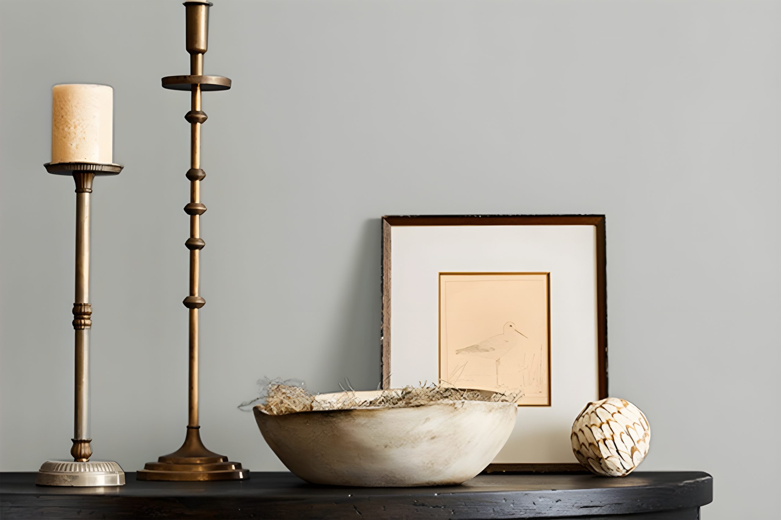
Chelsea Gray by Sherwin Williams is a timeless, elegant shade of gray that brings a sophisticated touch to any room it graces.
This color has a balanced warmth, making it versatile and inviting, capable of complementing various design aesthetics from modern to traditional. Its depth adds character and a sense of refinement without overwhelming a space.
Ideal for creating a cozy, yet refined atmosphere, Chelsea Gray works beautifully in living rooms, bedrooms, and even kitchens, offering a neutral backdrop that allows other colors to stand out.
It’s particularly stunning when paired with crisp whites or soft creams, creating a delightful contrast that highlights architectural features and moldings.
For those looking to add a bit of drama, pairing it with darker hues or vibrant pops of color can bring energy into the room without sacrificing sophistication.
When it comes to materials and textures, Chelsea Gray harmonizes wonderfully with natural wood, stone, and metals, adding to its versatility.
The warmth of wood, whether light or dark, enhances the coziness of the space, while metallic accents in gold, silver, or bronze introduce a touch of luxury and brightness.
Soft textiles like velvet or wool in complementary colors can also add layers of interest and comfort, making any room feel welcoming and well-designed.
Perfect for a range of interior styles including modern farmhouse, Scandinavian, and contemporary, Chelsea Gray is the go-to color for anyone looking to create a stylish, cohesive look that feels both grounded and uplifted.
Ever wished paint sampling was as easy as sticking a sticker? Guess what? Now it is! Discover Samplize's unique Peel & Stick samples.
Get paint samples

Is Chelsea Gray SW 2850 by Sherwin Williams Warm or Cool color?
Chelsea Gray SW 2850 by Sherwin Williams is a rich, sophisticated shade that brings a sense of elegance and depth to any space in a home. This particular gray has a warm undertone, making it incredibly versatile and welcoming.
It works exceptionally well in a variety of settings, from living rooms and bedrooms to kitchens and bathrooms.
Whether you’re aiming for a modern, minimalist look or something more classic and cozy, Chelsea Gray can adapt to your style.
One of the best things about this color is how it complements both natural light and artificial lighting. During the day, it can make a room feel grounded yet airy, and at night, it adds a layer of warmth and sophistication.
This shade pairs beautifully with crisp whites or soft neutrals, adding contrast without overwhelming the space. It also serves as an excellent backdrop for artwork, furniture, and accent pieces, allowing them to stand out.
In homes, Chelsea Gray brings a balanced, refined look that can make spaces seem more put together and thoughtfully designed.
Undertones of Chelsea Gray SW 2850 by Sherwin Williams
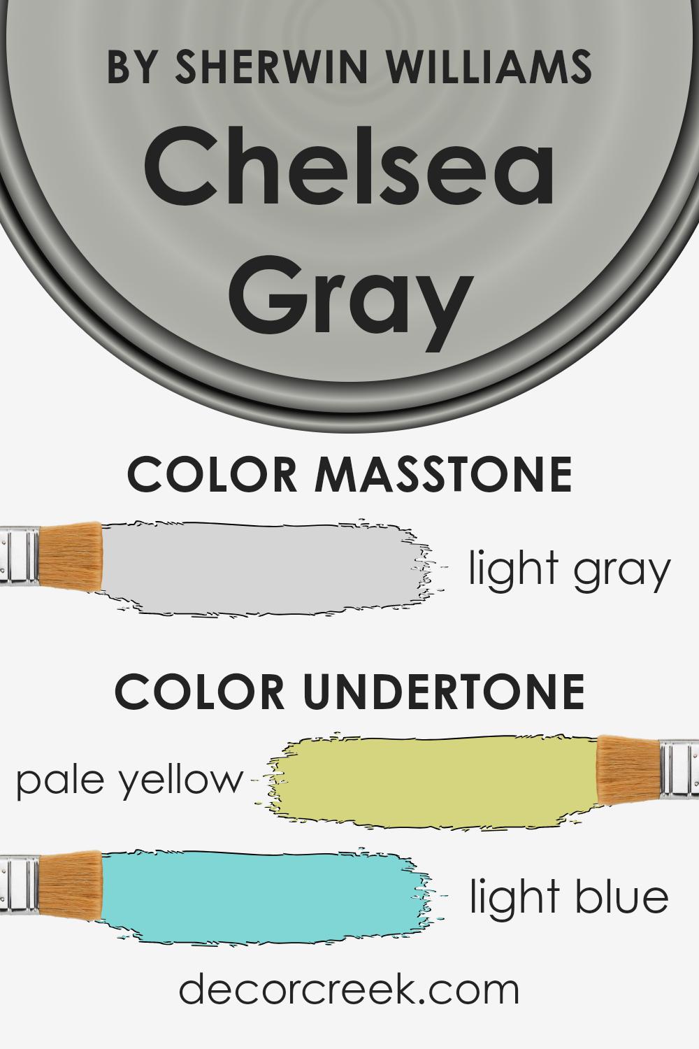
Chelsea Gray by Sherwin Williams is a rich, elegant gray that brings a sophisticated atmosphere to any space. The interesting thing about this color, however, lies in its undertones.
With subtle hints of pale yellow and light blue, Chelsea Gray transforms under different lighting conditions.
Undertones are like the hidden flavors in a dish – they can subtly influence the overall perception of a color, adding depth and complexity or affecting its warmth or coolness.
The pale yellow undertone in Chelsea Gray adds a touch of warmth. This makes the color more welcoming and less stark, which is especially important in living spaces where comfort is key.
It’s like having a bit of sunlight captured in the paint, bouncing softly around the room.
On the other hand, the light blue undertone brings a sense of calmness and serenity. It’s reminiscent of a clear sky on a sunny day.
This quality makes Chelsea Gray particularly appealing for bedrooms and bathrooms, where a peaceful ambiance is desired.
When applied to interior walls, Chelsea Gray’s unique blend of undertones ensures the color remains dynamic and versatile.
Depending on the room’s natural and artificial light, the gray can appear warmer, inviting a cozy feel, or it can lean towards a cooler, more serene vibe.
This adaptability makes it an excellent choice for various spaces, ensuring the color complements different decor styles and preferences.
The presence of both warm and cool undertones means Chelsea Gray will harmonize with a wide range of furnishings and accent colors, from bold and vibrant to soft and subdued.
What is the Masstone of the Chelsea Gray SW 2850 by Sherwin Williams?
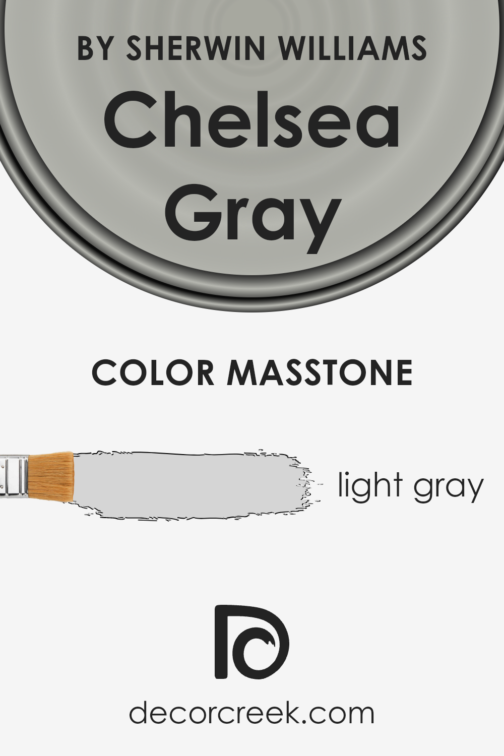
Chelsea Gray SW 2850 by Sherwin Williams has a masstone, or main color impression, of light gray, identified by the color code #D5D5D5.
This light gray tone offers a versatile backdrop that fits easily into various home styles and designs. Its lightness provides a sense of openness and airiness, making rooms appear more spacious and inviting.
This color works well in homes because it acts as a neutral base, pairing well with both bold and subtle colors. It means you can mix and match different furniture and decorations without worrying about clashing.
Moreover, the light gray shade brings a calm and soothing vibe to a space, making it ideal for bedrooms, living rooms, or anywhere you want a peaceful retreat.
Its simplicity and neutrality mean it can adapt as trends change, preventing your space from looking dated.
Whether you’re going for a modern, minimalist look or something more classic, this color can support your vision, adding a fresh and clean feel to any room.
How Does Lighting Affect Chelsea Gray SW 2850 by Sherwin Williams?
Lighting plays a crucial role in how we see and experience colors in any space. The color Chelsea Gray by Sherwin Williams is no exception.
Depending on the type of light, whether it’s artificial or natural, the perception of this color can change significantly, impacting the mood and aesthetic of a room.
In artificial light, Chelsea Gray may appear slightly warmer or cooler based on the type of bulbs used. Warm LED or incandescent lighting can bring out a cozier, more inviting tone in the color, making it feel more enveloping.
Conversely, cooler LED lights can make it lean towards a slightly more austere, crisp appearance, which could be great for creating a sleek, modern vibe.
Natural light, on the other hand, has a different effect throughout the day and depending on the room’s orientation. In north-faced rooms, the light tends to be cooler and more consistent throughout the day.
Here, Chelsea Gray might seem a bit more muted, allowing for a sophisticated, subtle backdrop that works beautifully in spaces meant for calmness and focus.
South-faced rooms bask in warmer and brighter light most of the day. In these rooms, Chelsea Gray can feel softer and more dynamic, revealing its warmer undertones and creating an inviting, lively space.
It’s perfect for living rooms or kitchens where a friendly, cozy atmosphere is desired.
East-faced rooms enjoy the morning sunlight, which is cooler and brighter. Here, Chelsea Gray can look particularly vibrant in the morning, providing a refreshing and calming start to the day.
As the light changes, the color may become more subdued, maintaining a balanced, neutral look ideal for bedrooms or offices.
West-faced rooms get the afternoon and evening light, which is warmer. Chelsea Gray can take on a richer, more nuanced appearance in these settings, glowing softly in the late afternoon light.
This warmth can make social spaces like dining rooms feel more welcoming and intimate as the day ends.
Overall, Chelsea Gray’s versatility under different lighting conditions makes it a favored choice for many homeowners. Its ability to adapt and change character with the light ensures it fits a myriad of spaces and styles.

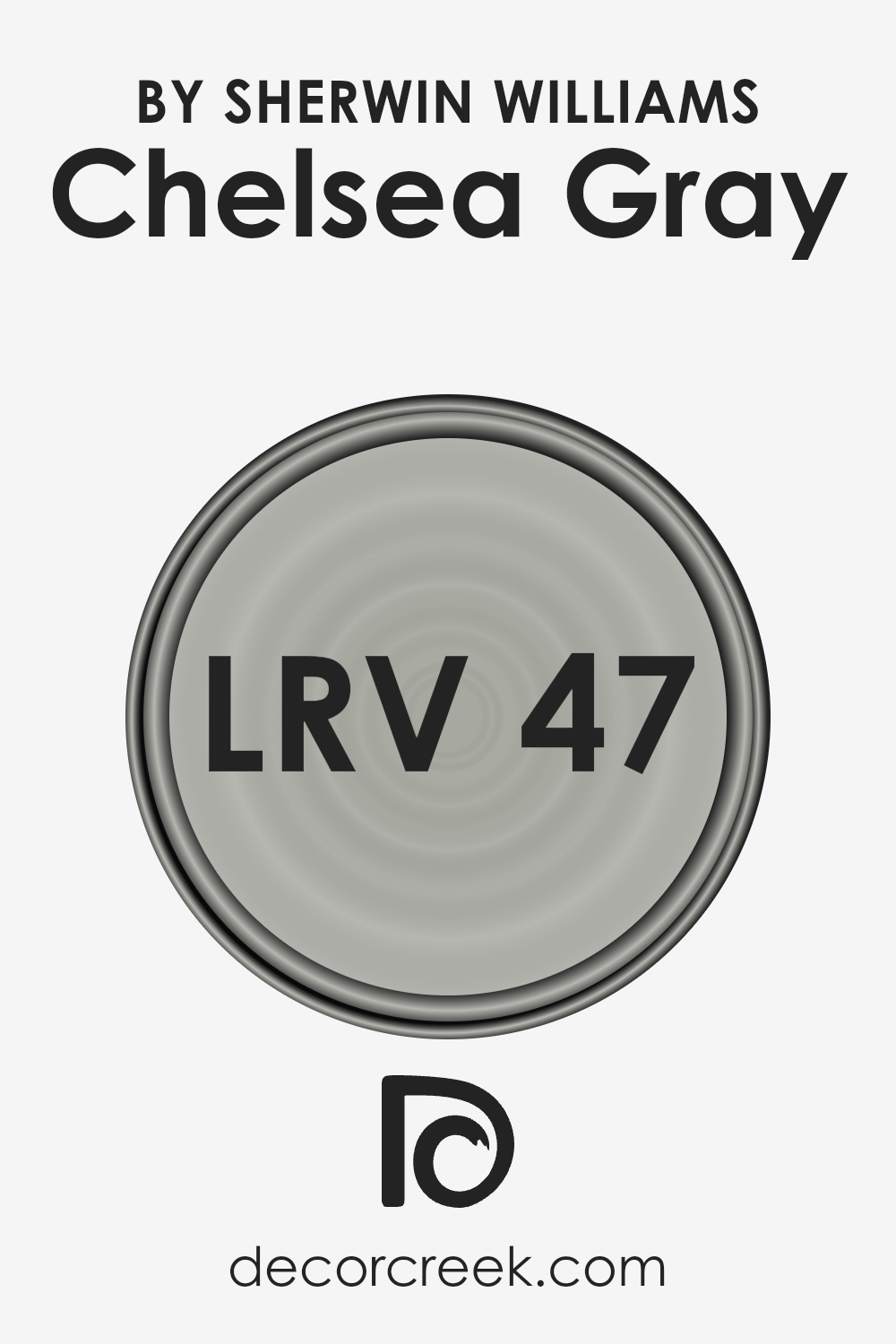
What is the LRV of Chelsea Gray SW 2850 by Sherwin Williams?
LRV stands for Light Reflectance Value, which is a measure of how much light a color reflects back into the room, on a scale from 0 (absolutely no light is reflected, which is pure black) to 100 (all light is reflected, which would be pure white).
This value is crucial when choosing paint colors because it can significantly impact the brightness of a room and how spacious it feels.
A higher LRV means the color reflects more light, making a room feel brighter and larger.
Conversely, a lower LRV means the color absorbs more light, creating a cozier and more intimate space but potentially making the room feel smaller and darker.
Regarding the color in question, with an LRV of 46.864, it sits in the mid-range of the LRV scale. This means it has a balanced characteristic, neither reflecting nor absorbing light excessively, but offering a moderate amount of both.
In practice, this LRV suggests the color can add depth and character to a room without making it feel closed in or too dark.
It’s versatile, working well in spaces that receive a lot of natural light or in rooms where you’re aiming for a warmer, more enveloping atmosphere.
Therefore, when applied to walls, this color can create a sophisticated backdrop that is neither too bright nor too heavy, making it an excellent choice for living areas, bedrooms, or even offices.
LRV – what does it mean? Read This Before Finding Your Perfect Paint Color
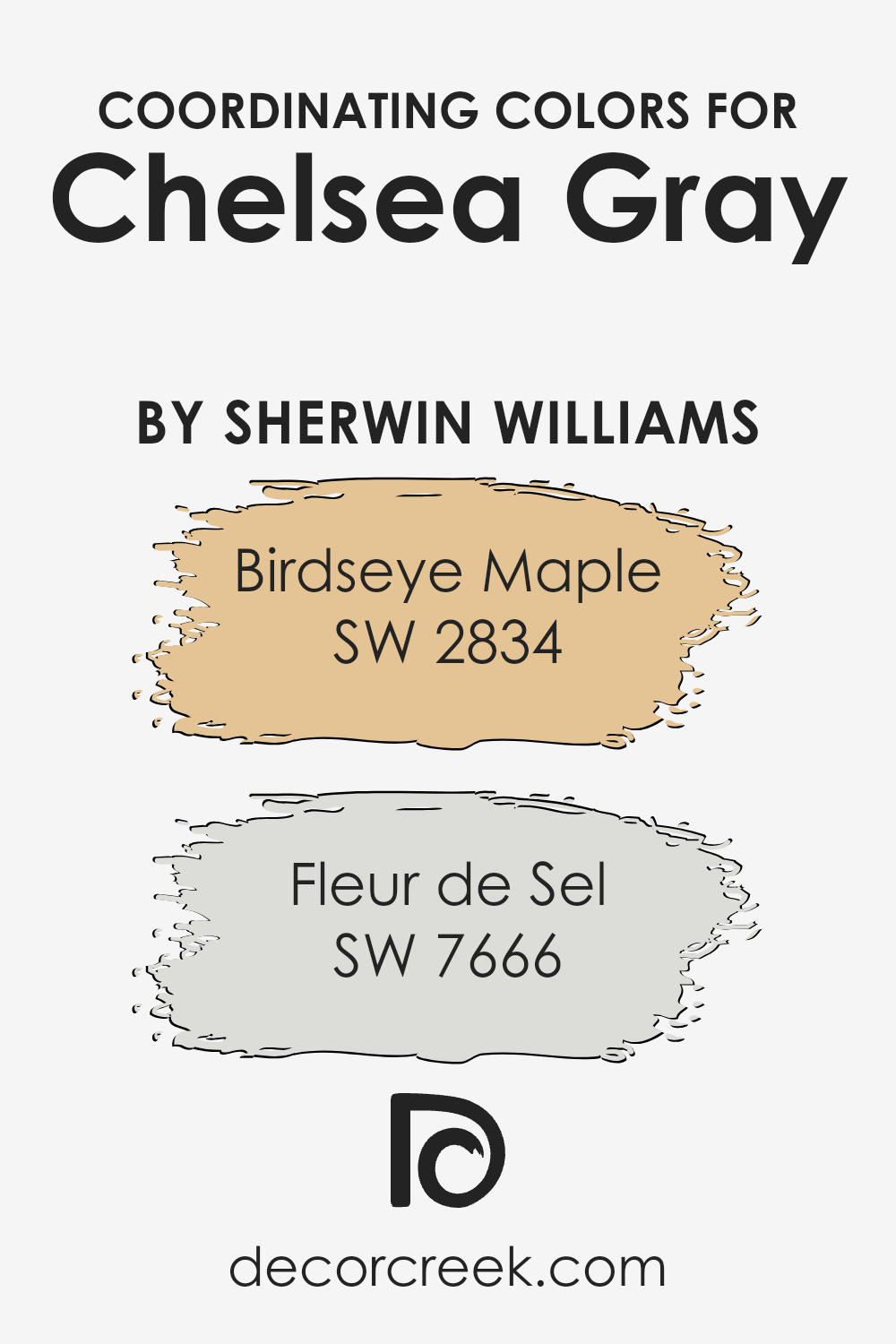
Coordinating Colors of Chelsea Gray SW 2850 by Sherwin Williams
Coordinating colors are shades that harmonize well with a primary color, enhancing the overall aesthetic of a space without causing a visual clash.
For example, if we look at Chelsea Gray by Sherwin Williams, finding the right coordinating colors can elevate the elegance of this versatile gray hue.
By selecting colors that work in harmony, you can create a cohesive and inviting atmosphere in any room. Coordinating colors should complement the main shade, allowing for a seamless transition between colors in a design scheme.
They can either be contrasting to add a vibrant touch or similar to achieve a more subtle and refined look.
Birdseye Maple (SW 2834) is a warm, soft tan that beautifully complements Chelsea Gray. It adds a touch of natural warmth, making it ideal for creating a cozy and welcoming space.
This color pairs nicely with the cool undertones of Chelsea Gray, bringing a balanced contrast that’s neither too bold nor too muted. On the other hand, Fleur de Sel (SW 7666) is a delicate, airy light gray that exudes tranquility.
It’s a fantastic choice for those looking to maintain a serene and light atmosphere in their room. This shade works wonderfully with Chelsea Gray, offering a subtle differentiation that enhances the sophistication of the space without overwhelming it with color.
Together, these coordinating colors can help achieve a harmonious and stylish look that complements Chelsea Gray’s timeless appeal.
You can see recommended paint colors below:
- SW 2834 Birdseye Maple
- SW 7666 Fleur de Sel
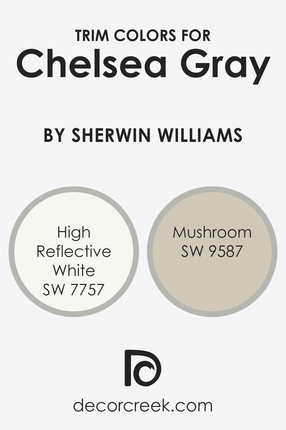
What are the Trim colors of Chelsea Gray SW 2850 by Sherwin Williams?
Trim colors are special shades used to paint the edges, frames, and borders around different parts of a room or exterior, like door frames, window sills, and baseboards.
Choosing the right trim color can significantly enhance the appearance of a main color by adding contrast, depth, or harmony to the overall design.
For a sophisticated and modern paint like Chelsea Gray by Sherwin Williams, selecting an appropriate trim color is crucial.
It not only accentuates the architectural features of a space but also complements the gray’s rich tone, making the room look more polished and cohesive.
High Reflective White SW 7757 and Mushroom SW 9587 are two trim colors that work beautifully with Chelsea Gray.
High Reflective White is a very bright white with a hint of warmth that brings out the depth of Chelsea Gray, making any room look more spacious and vibrant.
It’s perfect for creating a crisp, clean edge that defines the space elegantly. Mushroom, on the other hand, is a soft, nature-inspired hue that adds a cozy, welcoming vibe to the sophisticated Chelsea Gray.
It provides a subtle contrast that’s ideal for creating a gentle transition from the walls to the trim, offering an earthy balance that enhances the room’s overall ambiance without overpowering it.
You can see recommended paint colors below:
- SW 7757 High Reflective White
- SW 9587 Mushroom
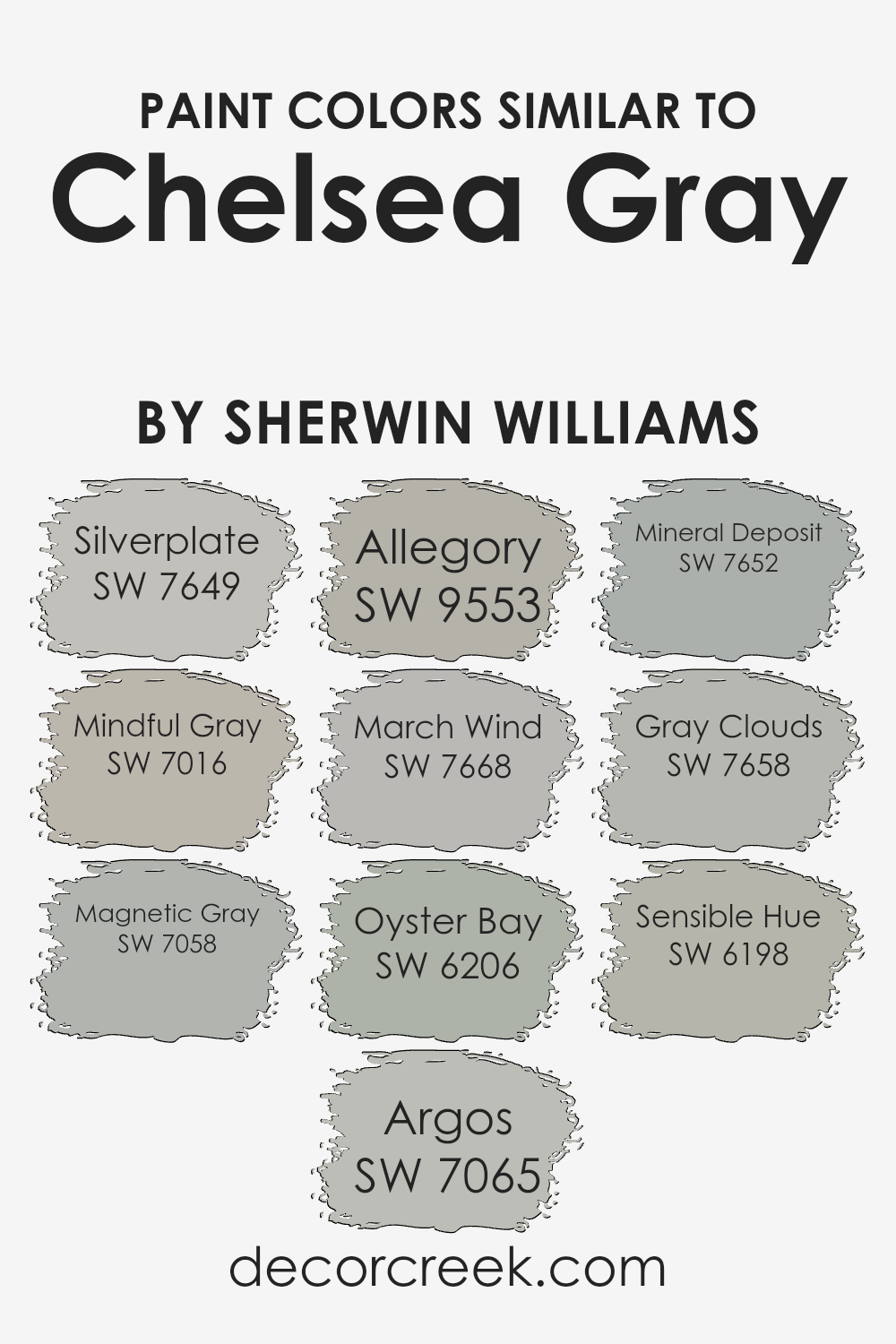
Colors Similar to Chelsea Gray SW 2850 by Sherwin Williams
Choosing similar colors is a vital process in design and decoration, especially when working with a base color like Chelsea Gray by Sherwin Williams.
Similar colors harmonize with each other, creating a cohesive look that feels intentional and fluid. For example, Silverplate is a lighter gray, offering a soft alternative that complements spaces seeking a gentle accent.
Mindful Gray leans towards a warmer hue, making it perfect for adding a cozy vibe without straying far from the sophisticated aura of gray.
Magnetic Gray, slightly deeper, brings a sense of strength and foundation to spaces, perfect for grounding designs. Argos offers a muted, almost ethereal gray, blending seamlessly into environments that favor subtlety.
Allegory introduces a unique twist with a hint of color, maintaining the gray theme while providing a slight divergence for visual interest.
March Wind is brisk and lively, offering a fresh take on gray that invigorates a space without overwhelming. Oyster Bay is another interesting variant, marrying the coolness of gray with green undertones for a serene, natural feel.
Mineral Deposit and Gray Clouds sit closely on the spectrum; the former provides a crisp, clean appearance, while the latter adds depth with a stormier demeanor.
Lastly, Sensible Hue bridges these concepts, offering a balanced gray that works widely across different designs, proving the versatility and necessity of selecting similar colors to enrich and complete any decorative scheme.
You can see recommended paint colors below:
- SW 7649 Silverplate
- SW 7016 Mindful Gray
- SW 7058 Magnetic Gray
- SW 7065 Argos
- SW 9553 Allegory
- SW 7668 March Wind
- SW 6206 Oyster Bay
- SW 7652 Mineral Deposit
- SW 7658 Gray Clouds
- SW 6198 Sensible Hue
How to Use Chelsea Gray SW 2850 by Sherwin Williams In Your Home?
Chelsea Gray SW 2850 by Sherwin Williams is a beautiful paint color that can add a stylish touch to any home.
Picture a rich, medium-dark gray that has just the right balance to make spaces feel cozy without closing them in. It’s a versatile color that works wonderfully in various rooms of your house.
Think about using it in your living room or bedroom for a calming effect, adding a sophisticated backdrop that complements both modern and traditional decor.
For those looking to refresh their kitchen, Chelsea Gray can bring a sleek look to cabinets, pairing beautifully with both marble countertops and wooden floors.
In smaller spaces, like a bathroom, it can create a luxury feeling, making your everyday feels like a spa day.
Using it as an accent wall is a great option too, to add depth to a room without overwhelming it. Pair it with lighter shades, like whites or soft blues, for a crisp, clean look.
Chelsea Gray SW 2850 makes it easy to transform your house into a home, reflecting your style while maintaining a warm and welcoming atmosphere.
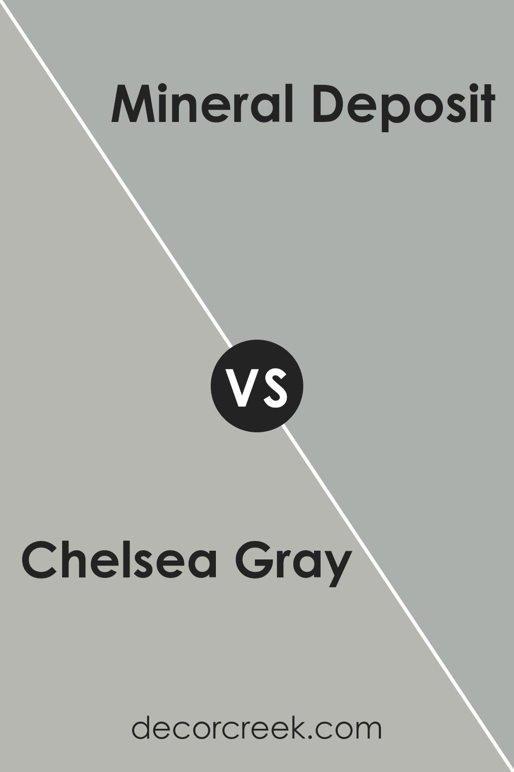
Chelsea Gray SW 2850 by Sherwin Williams vs Mineral Deposit SW 7652 by Sherwin Williams
Chelsea Gray and Mineral Deposit, both from Sherwin Williams, are distinct yet sophisticated colors. Chelsea Gray is a deeper, warmer gray.
It brings a certain richness and coziness to spaces, making it perfect for living areas or bedrooms where you want a comforting vibe.
On the other hand, Mineral Deposit presents a lighter, cooler gray with a breezy feel. This color has a refreshing quality, making it ideal for bathrooms, kitchens, or smaller spaces that benefit from a sense of openness.
While Chelsea Gray envelops you in a snug atmosphere, Mineral Deposit offers a crisp, airy environment. Whether you’re looking for depth and warmth or a light, refreshing feel, these colors provide versatile options for home décor.
You can see recommended paint color below:
- SW 7652 Mineral Deposit
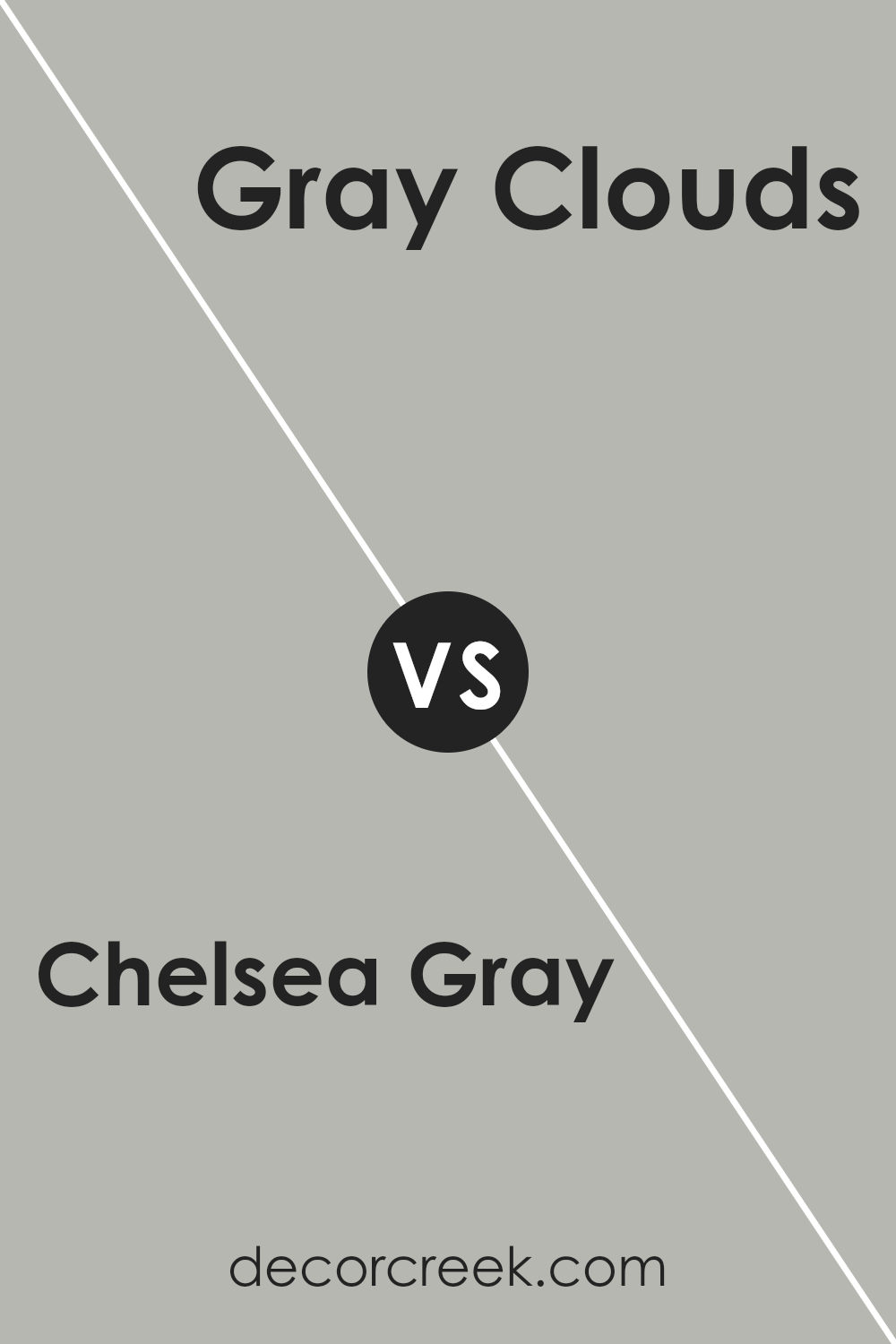
Chelsea Gray SW 2850 by Sherwin Williams vs Gray Clouds SW 7658 by Sherwin Williams
Chelsea Gray and Gray Clouds by Sherwin Williams offer subtle yet distinct vibes to a space.
Chelsea Gray is the darker of the two, providing a rich, robust feel to walls or furniture. It’s a type of color that brings a sense of sophistication and depth to any room, making spaces look elegant yet cozy.
On the other hand, Gray Clouds is lighter, delivering a more airy and open feel. It’s perfect for creating a calm, serene environment.
Think of Chelsea Gray as a warm, inviting, deep hug, while Gray Clouds is like a gentle, comforting whisper in a room.
Both colors can beautifully complement each other, with Chelsea Gray offering strength and solidity, while Gray Clouds adds a touch of lightness and tranquility, making them versatile choices for different styles and spaces.
You can see recommended paint color below:
- SW 7658 Gray Clouds
Chelsea Gray SW 2850 by Sherwin Williams vs Silverplate SW 7649 by Sherwin Williams
Chelsea Gray and Silverplate, both by Sherwin Williams, are popular paint colors that have their unique characteristics. Chelsea Gray is a deeper, sophisticated shade that offers a rich and warm presence in a room.
It’s the kind of color that makes a statement, particularly in spaces where you want to add a bit of elegance and depth. On the other hand, Silverplate presents a lighter, more neutral appearance.
It’s a versatile silver-gray that works beautifully to create a serene and modern vibe, making spaces feel open and airy.
While Chelsea Gray adds drama and intensity, Silverplate provides a subtle, calming effect, making it perfect for those looking to achieve a contemporary, minimalist look.
Both colors can significantly transform a space, but your choice ultimately depends on the atmosphere you’re aiming to create—cozy and bold with Chelsea Gray or sleek and soothing with Silverplate.
You can see recommended paint color below:
- SW 7649 Silverplate

Chelsea Gray SW 2850 by Sherwin Williams vs March Wind SW 7668 by Sherwin Williams
Chelsea Gray is a rich, medium-dark gray that feels like a cozy, warm blanket on a chilly day. Its depth gives it a lot of character, making it a perfect choice for adding some serious sophistication to any room.
Think of it as that go-to gray that’s not too light or too dark, but just right for creating a statement.
On the other hand, March Wind is a lighter, soft gray that feels like the first whispers of spring after a long winter. It’s much lighter when compared to Chelsea Gray, offering a breezier and more refreshing vibe.
This color is great for spaces where you want to add a touch of calm and serenity without darkening the room too much.
While Chelsea Gray commands attention with its boldness, March Wind brings a gentle, airy quality. If Chelsea Gray is the color of a stormy sky, then March Wind is the color of a clear, windy day.
Both are incredibly versatile, but the mood they set can be quite different based on their depth and intensity.
You can see recommended paint color below:
- SW 7668 March Wind

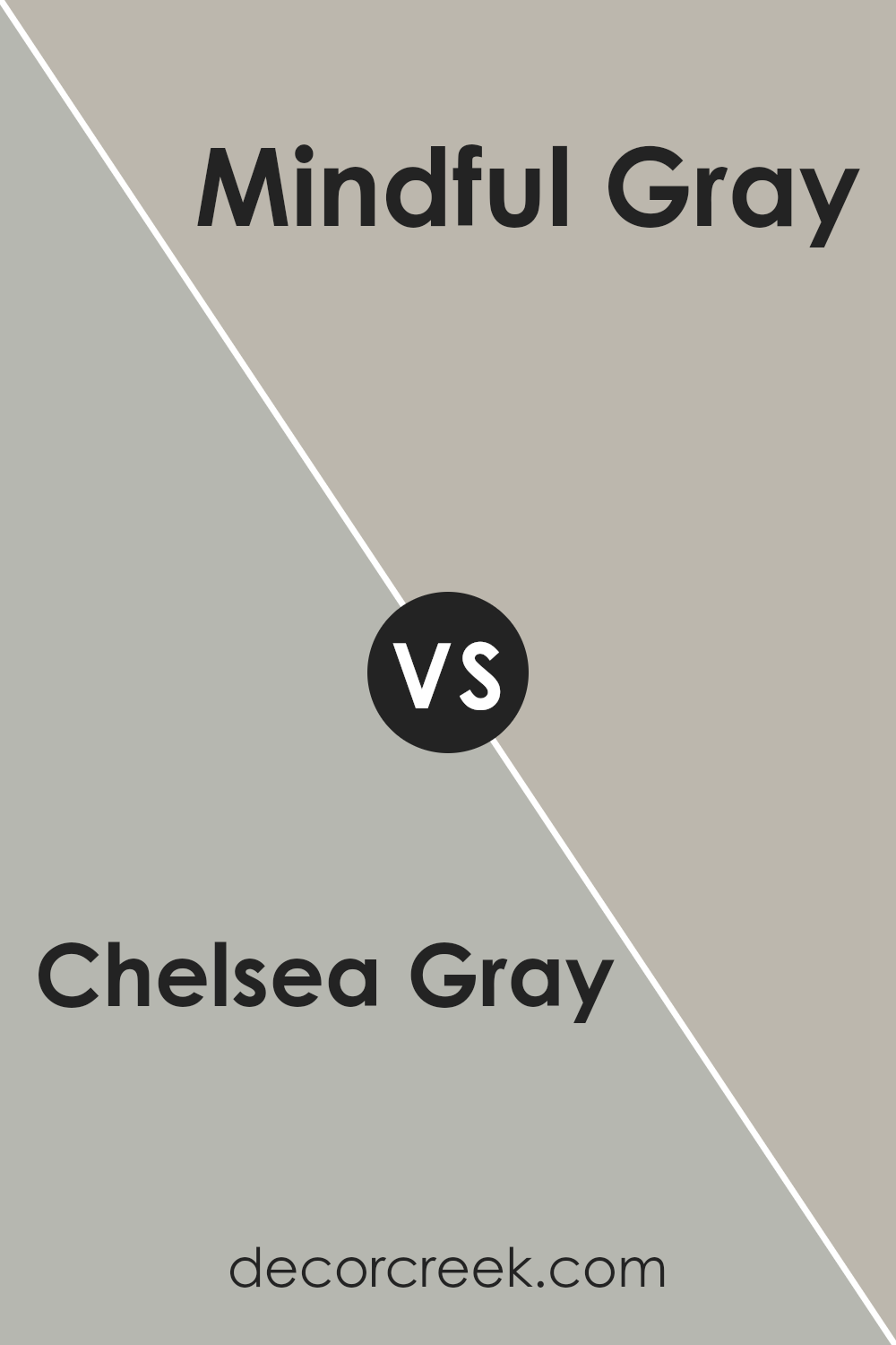
Chelsea Gray SW 2850 by Sherwin Williams vs Mindful Gray SW 7016 by Sherwin Williams
Chelsea Gray and Mindful Gray are both popular colors by Sherwin Williams, known for their versatility in various spaces. Chelsea Gray is a darker, more pronounced gray with a strong presence.
It gives a sense of sophistication and depth to rooms, making it ideal for accent walls or cabinets. On the other hand, Mindful Gray is lighter, offering a softer and airier feel.
This shade is excellent for creating a serene, welcoming atmosphere in living spaces, bedrooms, or kitchens. It acts as a neutral backdrop, allowing furniture and decor to stand out.
Both colors are gray, but Chelsea Gray leans towards a bold, statement look, while Mindful Gray provides a gentle, calming vibe. Choosing between them depends on the mood you want to set in your space.
Whether it’s the deeper, dramatic flair of Chelsea Gray or the soothing, minimalistic appeal of Mindful Gray, both shades can beautifully enhance your home.
You can see recommended paint color below:
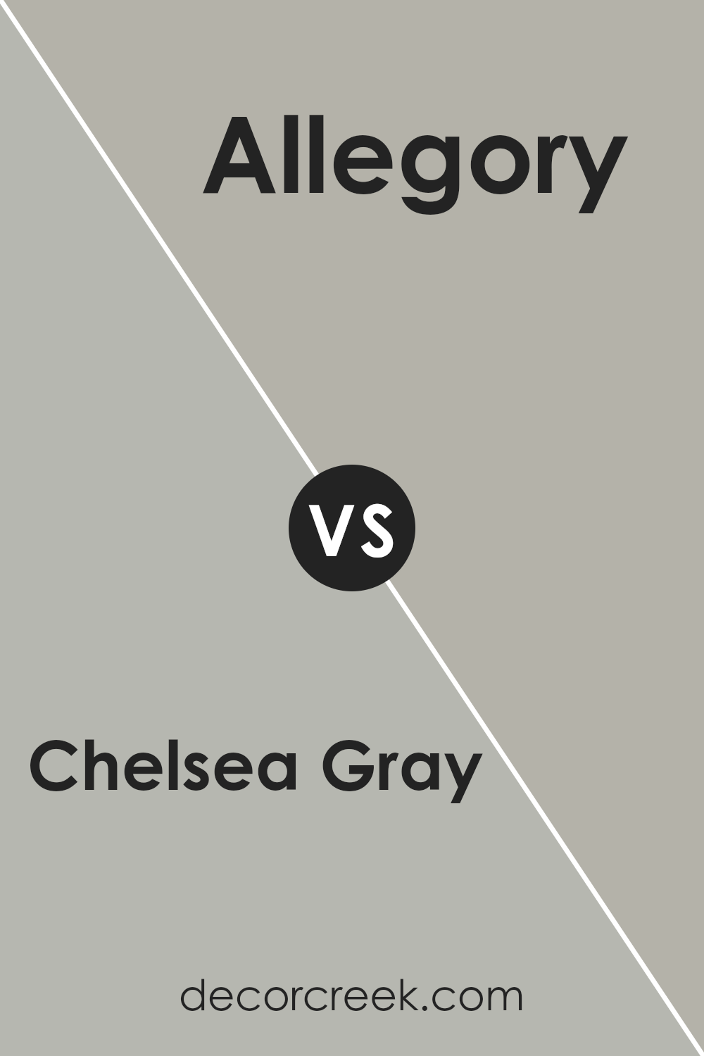
Chelsea Gray SW 2850 by Sherwin Williams vs Allegory SW 9553 by Sherwin Williams
Chelsea Gray and Allegory are both elegant colors from Sherwin Williams that offer distinct vibes to any space. Chelsea Gray stands out as a rich, medium-dark gray with a calming and sophisticated presence, perfect for creating a grounded and serene atmosphere.
It’s versatile, making it a great choice for both modern and traditional spaces.
On the other hand, Allegory leans towards a light, airy gray with a subtler tone, providing a fresh and uplifting feel.
It’s ideal for rooms aiming for a spacious and serene vibe, enhancing natural light and making smaller spaces seem bigger.
While Chelsea Gray adds depth and definition, making a strong statement in a room, Allegory offers a gentle backdrop, supporting other colors to shine.
Whether you’re looking to create a bold, focused setting or a light, relaxed ambiance, these colors offer wonderful possibilities, each bringing their unique character to interiors.
You can see recommended paint color below:
- SW 9553 Allegory
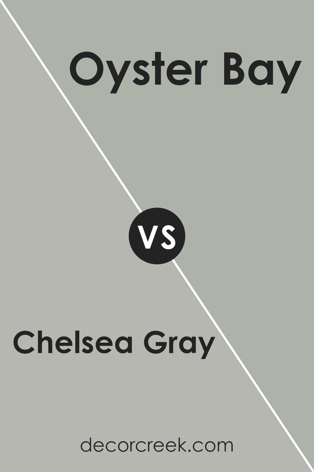
Chelsea Gray SW 2850 by Sherwin Williams vs Oyster Bay SW 6206 by Sherwin Williams
Chelsea Gray and Oyster Bay are two distinct colors from Sherwin Williams’ palette. Chelsea Gray is a deeper, more solid gray that carries a strong sense of sophistication and modernity.
Its rich, dark tone makes it ideal for creating a bold statement in spaces without overwhelming them. On the other hand, Oyster Bay is a much softer color, blending green and gray tones to offer a serene, calming vibe.
It’s perfect for rooms where you want a touch of color while still maintaining a neutral backdrop. The key difference between these two shades lies in their use and the atmosphere they create.
Chelsea Gray works well in settings where a dramatic, stylish flair is desired, while Oyster Bay is better suited for spaces aiming for a tranquil, inviting feel.
In summary, whether you prefer the robust depth of Chelsea Gray or the gentle tranquility of Oyster Bay depends on the mood you’re looking to achieve in your space.
You can see recommended paint color below:
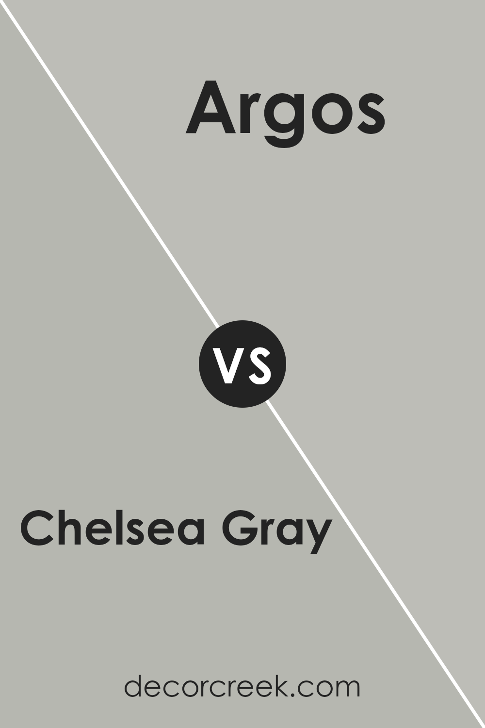
Chelsea Gray SW 2850 by Sherwin Williams vs Argos SW 7065 by Sherwin Williams
Chelsea Gray and Argos are two stylish colors by Sherwin Williams, each offering a unique touch to any room. Chelsea Gray is a deeper, warm gray that feels welcoming and cozy, making it perfect for spaces where you want to relax and feel comfortable
It carries an elegance that can easily elevate a room’s aesthetic. On the other hand, Argos is a lighter, cooler gray that brings a fresh and modern vibe to spaces.
It’s great for creating a serene and calm atmosphere, ideal for minimalist designs or spaces that aim for a clear, open look.
Comparing the two, Chelsea Gray offers a stronger statement with its deeper tone, whereas Argos provides a cleaner, more subdued backdrop.
Both colors work well in various lighting conditions, but their impact changes with natural light, with Chelsea Gray becoming more pronounced and Argos maintaining a gentle presence.
In essence, your choice between the two depends on the mood you’d like to set: warm and substantial, or cool and soothing.
You can see recommended paint color below:
- SW 7065 Argos
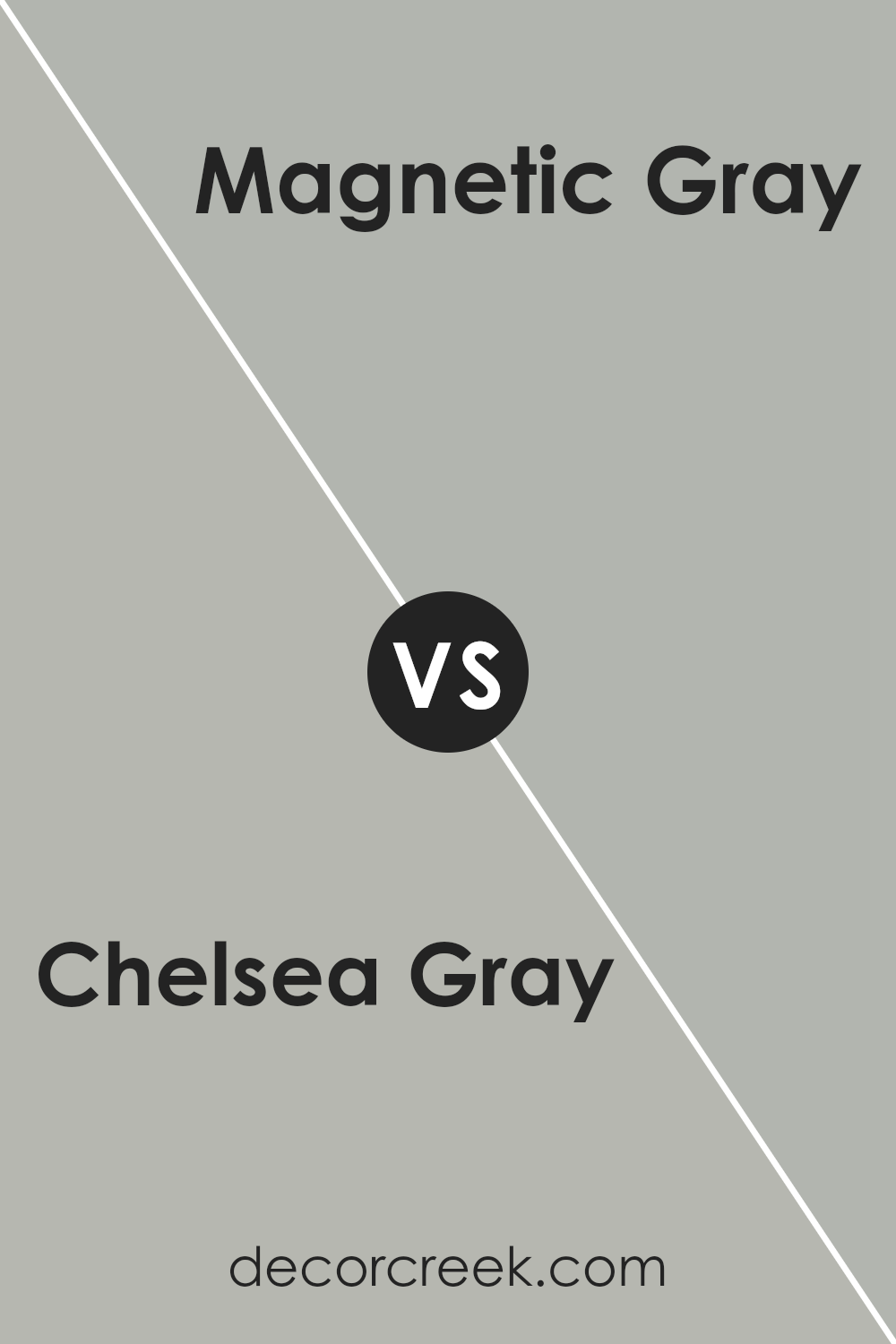
Chelsea Gray SW 2850 by Sherwin Williams vs Magnetic Gray SW 7058 by Sherwin Williams
Chelsea Gray is a darker shade, offering a deep and sophisticated look. It’s the type of gray that can make a statement in a room, adding a sense of elegance and strength.
Magnetic Gray, on the other hand, is lighter and carries a more subtle charm. It’s versatile and can create a soothing atmosphere, perfect for spaces where you want to relax.
Both colors are grays but bring different vibes to a space. Chelsea Gray, with its deeper tone, is great for creating a focal point or adding depth to decor.
It’s the kind of color that works well in a study or dining area, where its boldness can truly shine. Magnetic Gray is more laid back, ideal for bedrooms or living rooms, where a calmer, more inviting feel is desired.
In essence, Chelsea Gray stands out with its rich depth, while Magnetic Gray offers a gentle and serene touch. Both can beautifully transform a space but cater to different aesthetic preferences and functions within a home.
You can see recommended paint color below:
- SW 7058 Magnetic Gray
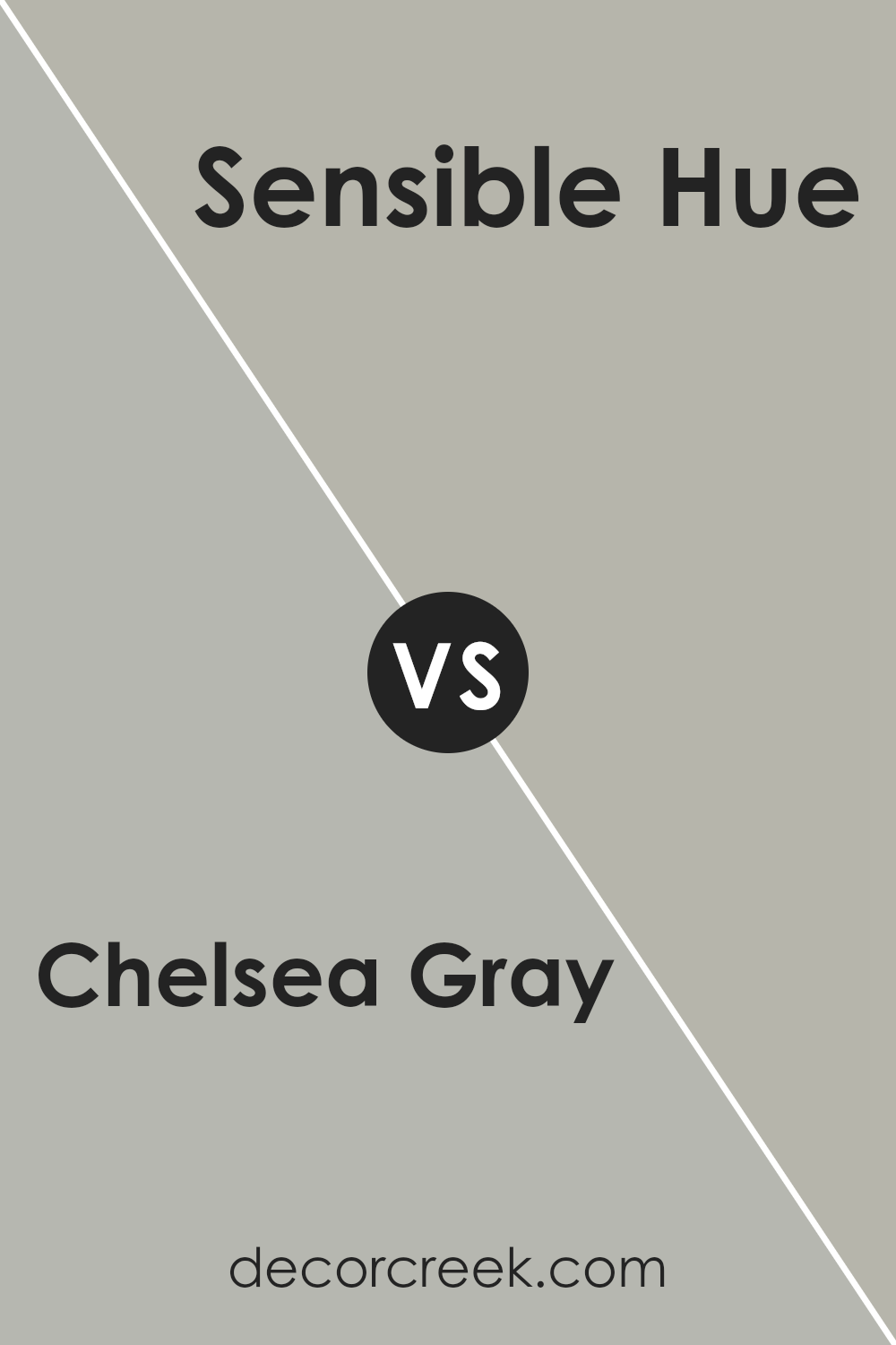
Chelsea Gray SW 2850 by Sherwin Williams vs Sensible Hue SW 6198 by Sherwin Williams
Chelsea Gray and Sensible Hue are both colors by Sherwin Williams, but they have distinct characteristics that set them apart. Chelsea Gray is a deep, rich gray with a strong presence.
It’s a color that can make a bold statement in a room, providing a sophisticated backdrop for both modern and classic designs. Because of its depth, it works well in spaces where a feeling of coziness and elegance is desired.
On the other hand, Sensible Hue is a lighter, softer gray that leans towards a neutral, calming presence. It’s versatile and can easily blend with a variety of decor styles, creating a serene and inviting atmosphere.
This color is perfect for spaces where you want to promote relaxation and peace, such as bedrooms and living rooms.
In summary, Chelsea Gray offers a bold and elegant feel with its deeper tone, while Sensible Hue brings a calming and versatile aesthetic with its lighter shade.
Both can enhance a space beautifully but serve different purposes based on the ambiance you want to achieve.
You can see recommended paint color below:
- SW 6198 Sensible Hue
Conclusion
In summary, Chelsea Gray by Sherwin Williams is a versatile and sophisticated shade of gray that has become increasingly popular for both interior and exterior use.
Its ability to complement a wide range of colors and materials makes it a go-to choice for designers and homeowners alike.
Whether applied in living spaces, bedrooms, or even on cabinets and doors, this color adds a chic and contemporary look that enhances the overall aesthetic appeal of a home.
Furthermore, Chelsea Gray stands out due to its adaptability in different lighting conditions, showing off a variety of gray tones that shift with the natural light.
This characteristic ensures that spaces decorated in this hue maintain a dynamic and inviting atmosphere throughout the day. The paint’s high-quality finish and durability are additional benefits, underscoring why it is favored for both residential and commercial projects.
Overall, Chelsea Gray by Sherwin Williams is an excellent choice for anyone looking to strike a balance between elegance and functionality in their space.

Ever wished paint sampling was as easy as sticking a sticker? Guess what? Now it is! Discover Samplize's unique Peel & Stick samples.
Get paint samples