Choosing the right paint color can sometimes feel a bit overwhelming with so many options out there, but White Sand offers a gentle and inviting hue that can make your room feel just right.
This color has a warm, creamy undertone that makes it perfect for creating a cozy and welcoming atmosphere in any room, whether it’s your living room, bedroom, or kitchen.
I find that White Sand works exceptionally well in spaces where you want to enhance natural light while keeping the mood soft and relaxed.
It pairs beautifully with a wide range of decor styles and colors, from bold and bright accents to more subdued wood textures and metallic finishes.
When you paint your walls with SW 9582 White Sand, it’s not just about changing a color; you’re setting a whole new tone for your daily living space. It’s an easy way to refresh your environment without overwhelming it. So, if you’re looking for a subtle yet effective transformation in your home, consider giving White Sand a try.
It could be just what you need to create the perfect backdrop for your life’s everyday moments and special occasions alike.

What Color Is White Sand SW 9582 by Sherwin Williams?
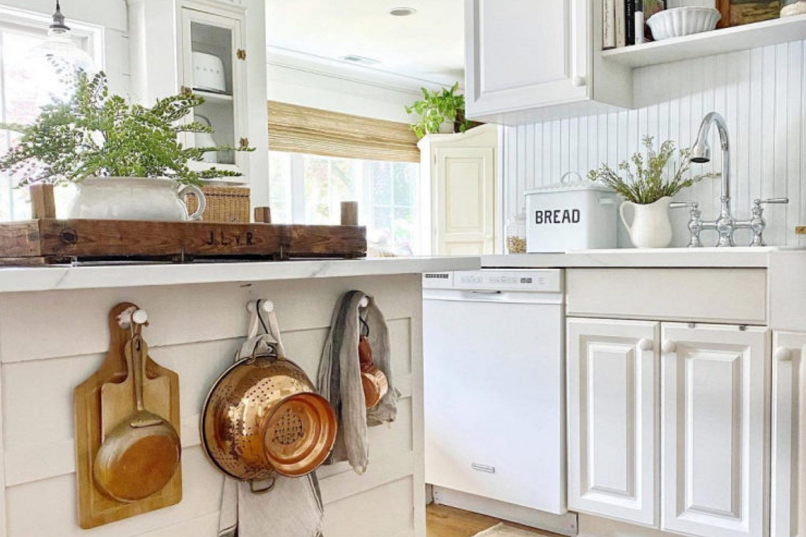
White Sand by Sherwin Williams is a gentle, warm white color that provides a soft and inviting atmosphere to any space. It has a hint of beige, which makes it incredibly versatile and easy to match with various decor styles and elements. This color is perfect for creating a cozy, welcoming environment without feeling too stark or clinical.
When it comes to interior design, White Sand works exceptionally well in minimalist, modern, and traditional settings. Its subtle warmth pairs beautifully with natural materials like wood, enhancing the grain and texture. It also complements soft linens and textured fabrics, adding depth and interest to the space.
In spaces that incorporate stone, such as marble or granite, White Sand helps highlight the natural veining and color variations, making it a great choice for kitchens and bathrooms. It’s also ideal for living rooms and bedrooms where you want to create a relaxed, comfortable ambiance. Pairing it with soft pastels can add a gentle contrast, while combining it with bold colors can create a striking visual effect.
Overall, White Sand is a flexible color that can seamlessly integrate with a wide range of materials and textures, making it a popular choice for anyone looking to refresh their space with a warm, inviting feel.
Is White Sand SW 9582 by Sherwin Williams Warm or Cool color?
White Sand by Sherwin Williams is a warm, inviting paint color that brings a soft and gentle atmosphere to any room in a home. This shade resembles the light, natural color of beach sand, giving spaces a cozy and comfortable feel. Because of its neutral tone, it pairs well with various colors, allowing for versatility in home decorating.
It is particularly effective in creating a bright, airy feel in smaller or darker rooms, as it reflects light well, making spaces appear larger and more open.
Homeowners often choose White Sand for bedrooms and living areas because it provides a clean and calming backdrop, ideal for relaxing or spending time with family. It’s also a popular choice for bathrooms and kitchens because it offers a clean aesthetic that complements various fixtures and finishes.
Overall, White Sand is a practical choice for those looking to create a welcoming, light-enhanced environment in their home without leaning towards stark white tones.
Undertones of White Sand SW 9582 by Sherwin Williams
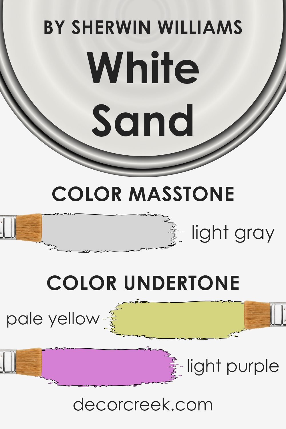
When choosing a paint color like White Sand, it’s essential to consider its undertones, as they greatly influence the ambiance and feel of a room. The undertones of White Sand include pale yellow, light purple, light blue, pale pink, mint, lilac, and grey. Each of these colors adds a subtle dimension that can alter the perception of the paint under different lighting conditions.
For instance, in a room with ample natural light, the pale yellow or light blue undertones might make the walls appear brighter and more refreshing.
In contrast, in a space with less natural light, the grey or pale pink undertones might become more noticeable, giving the room a slightly warmer or cozier feel.
These undertones can also affect how we perceive the size and temperature of a space. Lighter and cooler undertones like mint and lilac can make a room feel larger and more airy.
Conversely, warmer tones like pale yellow and pale pink can make a room feel smaller but more welcoming.
Using White Sand on interior walls gives the flexibility to play with different decors and themes. Depending on the furnishings and natural light, the underlying colors can either complement or contrast with the room’s elements, offering a range of aesthetic possibilities from calm and cozy to bright and airy.
Thus, when selecting a color like White Sand, considering how its undertones could affect the mood and feel of your space is crucial.
What is the Masstone of the White Sand SW 9582 by Sherwin Williams?
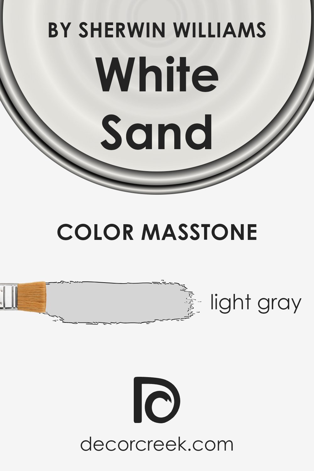
White Sand SW 9582 by Sherwin Williams, when seen in its masstone or purest form, has a light gray color. This specific shade is quite versatile, making it an excellent choice for home interiors. Since it isn’t too dark or too light, it helps create a warm and inviting atmosphere without overpowering the room.
This neutrality means it can work well in any space, whether it’s a busy kitchen or a quiet bedroom, and complements a wide range of decor styles and colors.
The light gray masstone is also practical because it doesn’t show wear and tear or dirt as easily as lighter colors might, which makes it a good option for high-traffic areas like living rooms or hallways. Moreover, this color has a calming effect, which can make spaces appear more spacious and open. It’s a classic choice that remains appealing over time, ideal for anyone looking to achieve a fresh, clean look in their home.
How Does Lighting Affect White Sand SW 9582 by Sherwin Williams?
Lighting plays a significant role in how we perceive colors in different environments. The hue, saturation, and brightness of any color can appear differently under various light sources.
For instance, the shade White Sand by Sherwin Williams can demonstrate subtle variations under different lighting conditions.
Artificial Light vs. Natural Light:
– Artificial Light: Under warm artificial lighting, White Sand tends to show a cozier and softer look, enhancing the creamy tones within it. In cooler artificial light, such as that emitted by LED bulbs, the color can appear slightly more neutral to pale, showing less of its yellow or creamy undertones.
– Natural Light: Natural sunlight brings out the truest form of White Sand, revealing its subtle warmth and making it look brighter. As the intensity and angle of natural light change throughout the day, so does the perception of this color.
Room Orientation:
– North-Faced Rooms: These rooms receive less direct sunlight, often casting a cooler, bluish tone over everything. Here, White Sand might look more muted and subdued.
– South-Faced Rooms: With ample sunlight, south-facing rooms highlight the warm, inviting nature of White Sand, making it appear brighter and more vibrant throughout most of the day.
– East-Faced Rooms: In rooms facing east, morning light can make White Sand look very warm and cheerful, but it may appear softer and cooler as the day progresses and natural light decreases.
– West-Faced Rooms: Rooms facing west often experience the reverse of east-facing rooms, with White Sand appearing cooler in the morning and warmer and richer towards the evening as the sun sets.
Overall, White Sand is a versatile color whose true characteristics and warmth are best visible in natural light. In environments with variable natural light, such as rooms with windows on multiple walls, it beautifully reflects these lighting changes, adapting its warmth and depth accordingly.

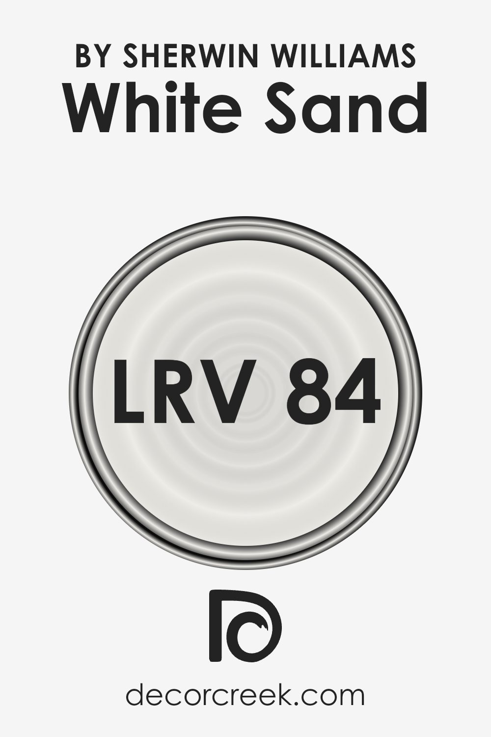
What is the LRV of White Sand SW 9582 by Sherwin Williams?
LRV stands for Light Reflectance Value, a measure used to describe the percentage of light a paint color can reflect. Essentially, it explains how light or dark a color will appear when painted on a surface. A higher LRV means the color reflects more light, making it appear brighter to the eye.
This makes such colors ideal for making smaller rooms feel larger or for brightening dimly lit spaces. Conversely, colors with lower LRVs absorb more light, which can make spaces look cozier but also smaller and darker.
Considering the LRV of White Sand (84.047), this color is quite light, reflecting a good deal of light back into the room. This characteristic makes it a great choice for use in areas of a home that might lack natural sunlight, as it can help brighten these spaces effectively. Additionally, White Sand’s higher LRV allows it to maintain its true color under various lighting conditions, providing consistency in appearance throughout different times of the day or in rooms with varying levels of light exposure.
It can be particularly helpful in visually enlarging a space, making it feel more open and airy.
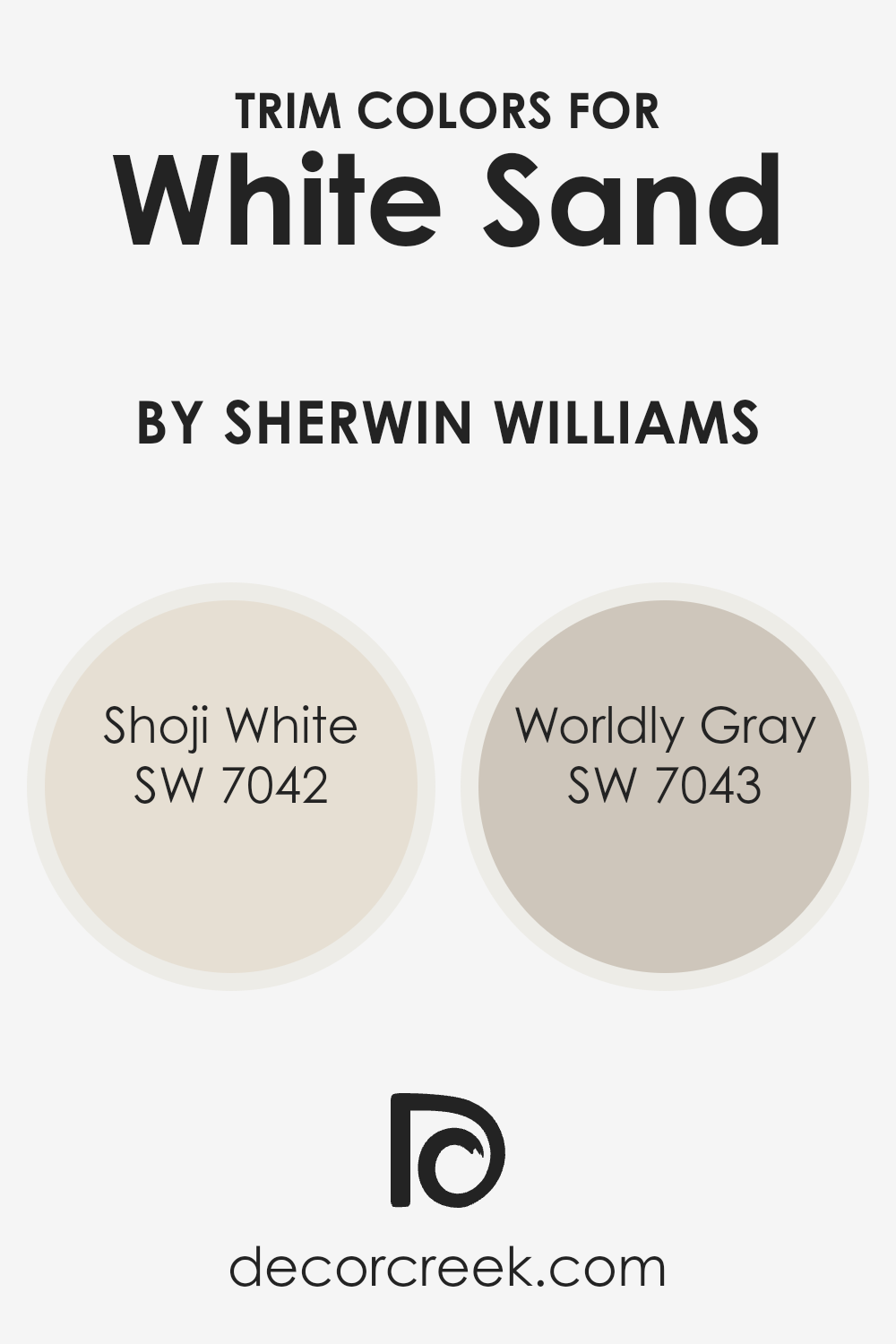
What are the Trim colors of White Sand SW 9582 by Sherwin Williams?
Trim colors, such as SW 7042 – Shoji White and SW 7043 – Worldly Gray by Sherwin Williams, play a vital role in interior design by defining and emphasizing the architectural features of a room. These colors are used for elements like door frames, baseboards, crown moldings, and window casings, creating a visual frame that enhances the overall appearance of the space.
Particularly when used with a base color like White Sand, trim colors can provide a subtle contrast that highlights these features without overwhelming the main color theme of the room.
Shoji White is a soft off-white with a warm undertone that provides a gentle, calming effect when used as a trim color. It forms a smooth transition between the wall color and trim, adding depth and continuity to the design. On the other hand, Worldly Gray offers a cooler, mid-tone gray that acts as a neutral backdrop, effective in adding a slightly stronger contrast to the room.
This color can help in making the trim pop against lighter colors like White Sand, increasing the architectural appeal and defining space with more precision.
Together, these colors offer flexible options that can complement and enhance various design elements in a room, making them both practical and stylish choices for trim.
You can see recommended paint colors below:
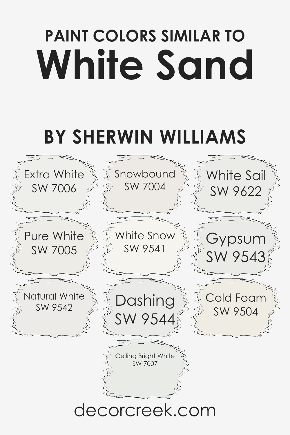
Colors Similar to White Sand SW 9582 by Sherwin Williams
Similar colors, like variations of white from Sherwin Williams, play a crucial role in achieving a cohesive and harmonious visual flow in any space. Colors like SW 7006 – Extra White and SW 7005 – Pure White are both crisp and clear, providing a fresh and clean backdrop that can make other design elements stand out.
The slightly warmer tones of SW 9542 – Natural White and SW 7004 – Snowbound offer a subtle contrast that remains soothing and unobtrusive, ideal for spaces that aim to maintain a light and airy atmosphere. These shades work well together by maintaining an overall unity while affording slight variations that lend depth and complexity to the decor.
Moreover, SW 7007 – Ceiling Bright White is perfect for ceilings due to its radiant and reflective quality, enhancing the overhead space and light dispersal. SW 9541 – White Snow and SW 9544 – Dashing bring a unique touch; the former offers a hint of softness, while the latter has a slightly more dynamic undertone, which can enhance architectural details beautifully.
Meanwhile, SW 9622 – White Sail and SW 9543 – Gypsum provide versatile options that blend seamlessly with many color palettes, thus uniting diverse decorative elements.
Lastly, SW 9504 – Cold Foam carries a breezy, slightly cooler tone, excellent for modern spaces looking to maintain a minimalist yet inviting atmosphere.
These colors, all similar yet distinctive, offer a wonderful toolkit for creating spaces that are coherent without being monotonous, ensuring every area is engaging in its own right.
You can see recommended paint colors below:
- SW 7006 Extra White
- SW 7005 Pure White
- SW 9542 Natural White
- SW 7007 Ceiling Bright White
- SW 7004 Snowbound
- SW 9541 White Snow
- SW 9544 Dashing
- SW 9622 White Sail
- SW 9543 Gypsum
- SW 9504 Cold Foam
How to Use White Sand SW 9582 by Sherwin Williams In Your Home?
White Sand SW 9582 by Sherwin Williams is a warm, inviting paint color that can make any room in your house feel cozy and welcoming. It’s a soft beige with a hint of creaminess that combines well with a wide range of colors and decor styles, making it very versatile.
You can use it in your living room to create a calm and pleasant space for relaxing and entertaining. It’s also excellent for bedrooms, where its soothing quality can help you wind down and get a good night’s sleep.
In addition, White Sand is light enough to make small spaces like bathrooms or hallways feel bigger and brighter. This color works beautifully with wood tones, from light to dark, enhancing the natural elements of your home. It’s also a great base for showing off decor items or artwork, as it doesn’t clash with other colors. If you’re looking to refresh your space with a new coat of paint, White Sand is a choice that can fit anywhere in your home.
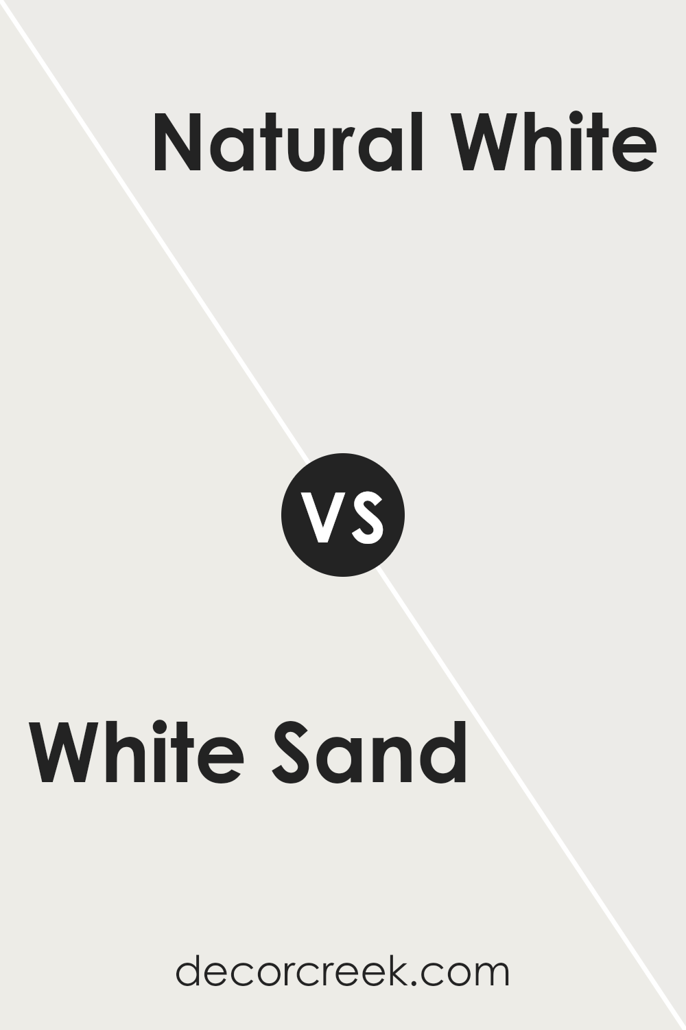
White Sand SW 9582 by Sherwin Williams vs Natural White SW 9542 by Sherwin Williams
White Sand and Natural White are both colors from Sherwin Williams that lean towards neutral tones, each offering a subtly different vibe for room decor. White Sand has a touch of warmth, mimicking the creamy hues found along a sunlit beach.
This color is versatile and can make a room feel cozy without overpowering other design elements. On the other hand, Natural White is closer to a pure white with a slightly muted intensity. It’s ideal if you’re aiming for a clean and straightforward look that doesn’t compete with bolder colors.
For spaces that need a bit of brightness without being stark, Natural White is a solid choice. Both colors provide a clean, fresh backdrop to any room but in slightly different ways – White Sand with a whisper of warmth, and Natural White with crisp clarity.
You can see recommended paint color below:
- SW 9542 Natural White
White Sand SW 9582 by Sherwin Williams vs Extra White SW 7006 by Sherwin Williams
White Sand and Extra White are two colors offered by Sherwin Williams that offer different tones and atmospheres. White Sand is a soft, creamy white with warm undertones that make it feel cozy and inviting. It works really well in spaces where a gentle, subtle touch of warmth is desired.
On the other hand, Extra White is a much brighter and purer white. It has a cleaner look that reflects more light, making it a great choice for modern spaces or areas where you want to maximize brightness. Extra White tends to work well in more minimalist designs or where a stark, clean feel is desired.
Both colors are versatile, but the choice between them largely depends on the mood and feel you want to achieve in your space.
You can see recommended paint color below:
White Sand SW 9582 by Sherwin Williams vs Cold Foam SW 9504 by Sherwin Williams
White Sand and Cold Foam by Sherwin Williams are two distinct colors that can create different moods and styles in any space. White Sand is a warm neutral with a soft touch that brings light and openness to rooms, making it ideal for areas where you want to feel relaxed and comfortable. It’s a versatile color that pairs well with brighter colors or other neutrals for a subtle and inviting look.
On the other hand, Cold Foam is a cooler shade that leans towards a muted gray. This color is perfect for modern spaces looking for a clean and minimalistic feel. It works well in areas that benefit from a calm and collected atmosphere, such as offices or bedrooms.
Both colors are neutral, but the warmth of White Sand contrasts with the cooler tones of Cold Foam, giving decorators two appealing but diverse options to fit different tastes and design needs.
You can see recommended paint color below:
White Sand SW 9582 by Sherwin Williams vs Ceiling Bright White SW 7007 by Sherwin Williams
White Sand and Ceiling Bright White are two paint colors by Sherwin Williams that have distinct tones. White Sand has a warm, creamy feel to it, making it a cozy choice for rooms where you want a soft, welcoming atmosphere. It works well in living areas and bedrooms where a gentle ambiance is preferred.
This color pairs nicely with earthy or rich shades, adding just the right amount of warmth without overwhelming the space.
On the other hand, Ceiling Bright White is much crisper and cleaner. This color is great for ceilings, as it helps to reflect light down into the room, making spaces appear larger and brighter. It’s particularly effective in places like kitchens and bathrooms, where a sense of cleanliness is important. Ceiling Bright White can also be used on trim to create a sharp, clean contrast with other wall colors.
Both colors serve different purposes but offer flexibility in achieving the desired effect in a space.
You can see recommended paint color below:
White Sand SW 9582 by Sherwin Williams vs White Sail SW 9622 by Sherwin Williams
The two colors from Sherwin Williams, White Sand and White Sail, though similar at a glance, hold subtle differences. White Sand has a slightly warmer tone, which can give a room a cozy feel, making it an excellent choice for living spaces where you want a snug ambiance.
It carries a hint of beige, which helps in making spaces feel more inviting.
On the other hand, White Sail leans more towards a pure, clean white. This shade is slightly cooler compared to White Sand, providing a fresh and crisp look. It’s particularly well-suited for spaces that aim for a modern or minimalistic aesthetic, as it provides a clear backdrop that allows other elements of the decor to stand out.
When deciding between these two, consider the mood and function of the room. White Sand works well where warmth is desired, while White Sail is ideal for creating a bright, clear space.
You can see recommended paint color below:
- SW 9622 White Sail
White Sand SW 9582 by Sherwin Williams vs Pure White SW 7005 by Sherwin Williams
White Sand and Pure White are both popular paint colors from Sherwin Williams, but they have different tones that can affect the mood of a room. White Sand has a warmer, slightly creamier appearance, which makes it a great choice for cozy spaces or traditional homes.
It can offset cooler colors nicely and adds a soft, welcoming feel to interiors.
On the other hand, Pure White is crisper and cleaner. Because it’s closer to a true white, it reflects light beautifully, making a space feel larger and brighter. It’s excellent for a modern look or for an area where you want to maximize the sense of light, such as a small room or a room with limited natural light.
Both colors are versatile, but the choice depends on the atmosphere you want to create. White Sand offers a touch of warmth, while Pure White brings a sharp, fresh clarity.
You can see recommended paint color below:
White Sand SW 9582 by Sherwin Williams vs White Snow SW 9541 by Sherwin Williams
White Sand and White Snow, both by Sherwin Williams, are subtly distinct shades of white. White Sand has a warm tone, possibly reflecting a hint of beige or ivory. This makes it a great choice for creating a cozy and inviting atmosphere in a room. It pairs beautifully with natural materials and soft textures, enhancing spaces with a gentle, welcoming vibe.
On the other hand, White Snow is a cooler white that seems to lean towards a pure, crisp white. This color is ideal for those looking to achieve a clean, fresh look in their interiors. It works well in modern or minimalist designs, giving a bright uplift to spaces that benefit from a lot of natural light.
In summary, White Sand offers warmth and softness, making it suitable for living areas or bedrooms where comfort is key, while White Snow provides a sharp, clean backdrop that can help to make other colors or decor elements stand out, perfect for kitchens or bathrooms.
You can see recommended paint color below:
- SW 9541 White Snow
White Sand SW 9582 by Sherwin Williams vs Dashing SW 9544 by Sherwin Williams
White Sand and Dashing are two distinct colors from Sherwin Williams that offer unique feels to any space. White Sand is a gentle off-white with a subtle warmth, perfect for creating a calm, light-filled room that feels open and airy. This color works beautifully in small spaces or areas without much natural light, as it helps make the room appear bigger and brighter.
On the other hand, Dashing is a deep, rich navy blue that adds a bold touch to interiors. It is ideal for making a statement whether on an accent wall or for cabinetry. This shade can add depth to a space and pairs well with a variety of colors, including neutrals like White Sand.
While White Sand reflects a lot of light, making spaces feel expansive, Dashing absorbs light, creating a cozier and more concentrated atmosphere. Both colors offer fresh and trendy options depending on whether you aim for a soothing understated backdrop or a dramatic focal point in your decor.
You can see recommended paint color below:
- SW 9544 Dashing
White Sand SW 9582 by Sherwin Williams vs Snowbound SW 7004 by Sherwin Williams
White Sand and Snowbound, both by Sherwin Williams, offer subtle differences that appeal to different design preferences. White Sand is a soft, creamy hue that provides a warm and inviting feel to any room. It has a light beige undertone that makes it especially suitable for spaces where a cozy, welcoming atmosphere is desired.
On the other hand, Snowbound is a cooler shade of white with gray undertones. This color leans more towards a clean, modern look, ideal for creating a crisp and fresh ambiance. Snowbound is also excellent for enhancing the sense of space in smaller rooms.
In summary, while both colors keep to a neutral palette, White Sand offers warmth with its beige undertones, while Snowbound provides a sharper, more contemporary feel with its grayish hints. Selecting between them depends on the mood and style you want to set in your space.
You can see recommended paint color below:
White Sand SW 9582 by Sherwin Williams vs Gypsum SW 9543 by Sherwin Williams
White Sand and Gypsum are both neutral colors by Sherwin Williams but they offer different tones that might suit various spaces differently. White Sand is a warm, creamy color reminiscent of a sandy beach. It has a soft, welcoming vibe and could make a room feel cozy and inviting. It’s a great choice for areas where you want a gentle, soothing backdrop that isn’t stark white.
On the other hand, Gypsum is cooler and grayer in tone. This color mimics the mineral gypsum, which can range from white to a soft gray. It’s a good option for spaces where you might want a more modern feel without going too dark or too cold, as it still maintains a lightness and versatility.
Overall, choosing between these colors depends on the mood and style you’re aiming for: warmer and softer with White Sand, or cooler and slightly more neutral with Gypsum. Both offer a subtle, clean look that works well in many types of rooms.
You can see recommended paint color below:
It’s really a soft and light shade of white that can make any room look fresh and clean. It’s like when you open a new book and all the pages are crisp and clear – that’s what this color can do to your walls.
White Sand is great because it works well in lots of different rooms, whether you want to use it in a busy kitchen or a quiet bedroom. It doesn’t clash with other colors, so you can use it with any other shades you like in your decorations or furniture.
From what I’ve gathered, it seems like this paint is pretty easy to live with. It keeps rooms looking bright, and it’s not too strong or dull; it’s just right. This kind of white is not like pure white, which is sometimes too bright. Instead, it has a touch of warmth that makes your room feel welcoming.
To wrap up, if you’re thinking about giving your room a new look, SW 9582 White Sand could be a perfect choice. It’s friendly and calm, and it makes every room feel just a little bit happier. It’s definitely a paint color worth considering for your next room makeover.

Ever wished paint sampling was as easy as sticking a sticker? Guess what? Now it is! Discover Samplize's unique Peel & Stick samples.
Get paint samples

