If you’re considering repainting your home or any area you cherish, you might have come across OC-54 White Wisp by Benjamin Moore. Before you settle on this shade, let me share a few insights about it. Choosing the right white paint can be tricky since each white has subtleties that react differently depending on lighting, surrounding colors, and room features.
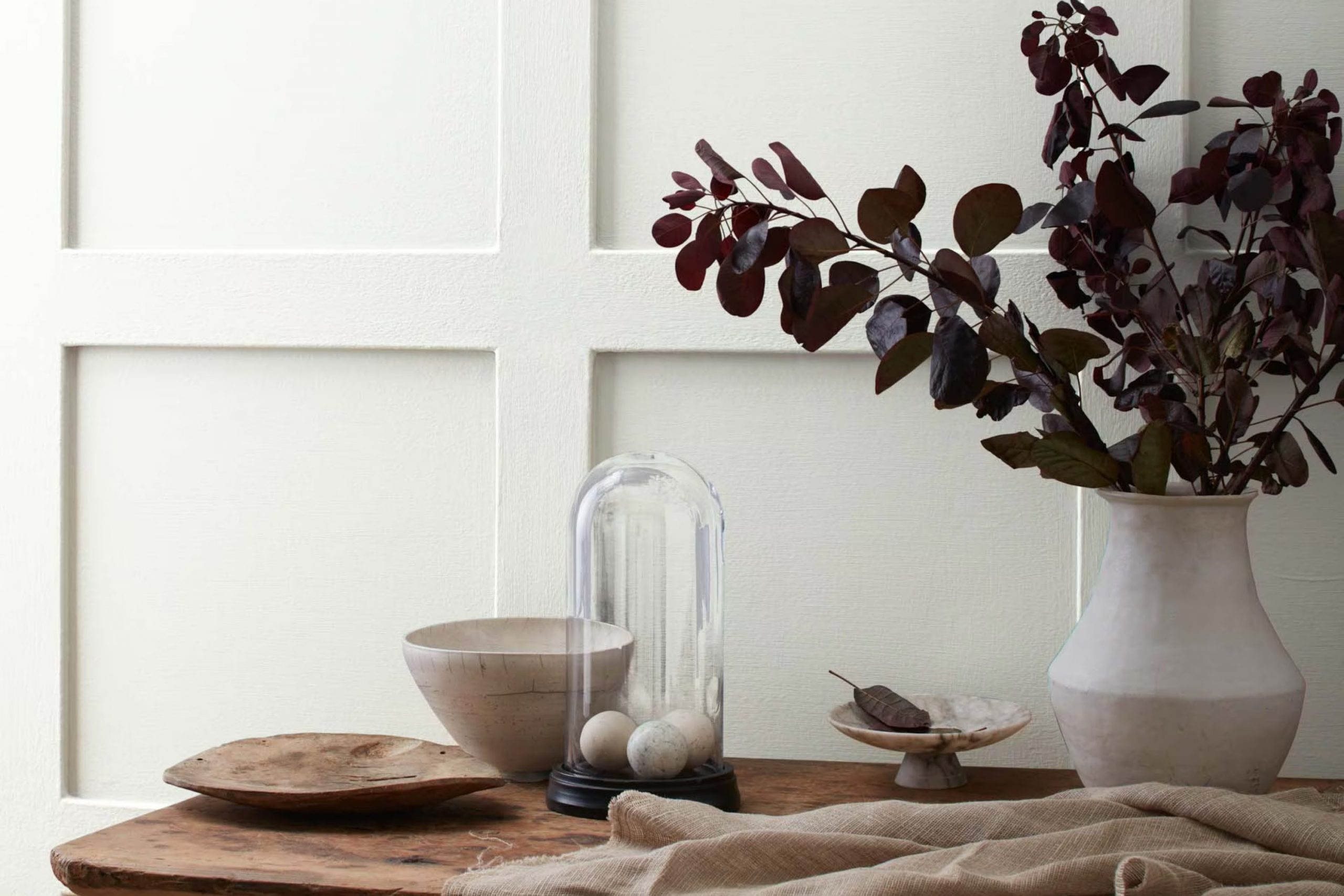
White Wisp is not just a plain white; it has an undertone that leans toward a soft, subtle gray, giving it a unique, airy quality. This means it can either cool down a room that gets a lot of sunlight or improve an area that’s geared toward a modern and minimalist aesthetic. It wonderfully balances being understated yet distinctive.
When I considered using OC-54 White Wisp in my own home, the first thing I did was to observe how it looks at different times of the day. Morning light brings out a crisp brightness, while during the late afternoon, it shifts to a calmer, muted hue.
This adaptability makes White Wisp an excellent choice if you’re aiming for a white that can handle various lighting scenarios without feeling cold or sterile.
Another tip is to sample it on different walls to see how shadows and furnishings influence its appearance.
Remember, the way you perceive color can change based on context, so it’s a good practice to test it thoroughly.
Is White Wisp OC-54 Right for My Home?
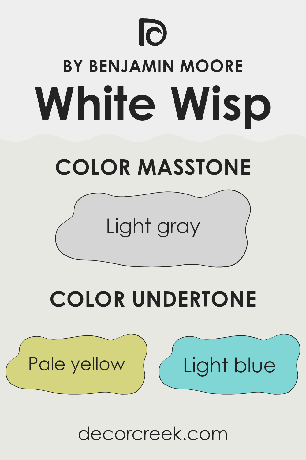
As I’ve worked with different paint colors, I’ve found White Wisp OC-54 by Benjamin Moore to be a unique, very light gray with a subtle blue undertone. This shade is perfect for creating a bright, open feel in any room. Its softness allows for a light and airy atmosphere, translating well into areas that need a touch of freshness without the starkness often associated with pure white.
In terms of interior styles, White Wisp is incredibly adaptable. It works wonderfully in modern and minimalist designs because of its clean and subtle nature. It’s equally at home in a coastal setting, where its hint of blue echoes the seaside vibe without overdoing it. I’ve also seen it used effectively in traditional interiors, where its understated quality can help update the area while keeping with a classic aesthetic.
Pairing materials and textures with White Wisp is quite enjoyable. The color goes well with natural wood tones, from pale beech to rich walnut, bringing out their warmth. In areas where I want to mix materials, combining it with elements like brushed steel or chrome adds a crisp, modern edge, and it reflects beautifully against glass accents. Soft, plush fabrics like linen or cotton in similarly muted colors create a cohesive look that feels inviting and comfortable.
What are the right undertones of White Wisp OC-54 ?
White Wisp is a unique paint color that can subtly change in appearance depending on the lighting and surrounding colors because of its diverse undertones. The undertones in White Wisp, including pale yellow, light blue, light purple, mint, pale pink, lilac, and grey, play crucial roles in how this color presents itself.
Firstly, these undertones help in softening the intensity of the white, making it more adaptable in different settings. When White Wisp is used on interior walls, it doesn’t just show as a plain white. Instead, the hints of pale yellow might give it a slightly warmer feel in sunlit rooms, making areas feel cozy and welcoming. Meanwhile, undertones like light blue and lilac can bring a subtle coolness, perfect for creating a calm atmosphere in an area.
The touch of grey helps to ground the color, preventing it from looking too bright, which can be overpowering in large areas. This makes it easier to decorate with, as it goes well with a wide range of decor styles and colors.
In rooms with varying lighting throughout the day, the color can appear to shift, reflecting different undertones at different times. This interaction makes White Wisp a dynamic choice for interior walls, as it interacts beautifully with both natural and artificial light, subtly altering its appearance and mood throughout the day.
Best Coordinating Colors to use with White Wisp OC-54 by Benjamin Moore this year.
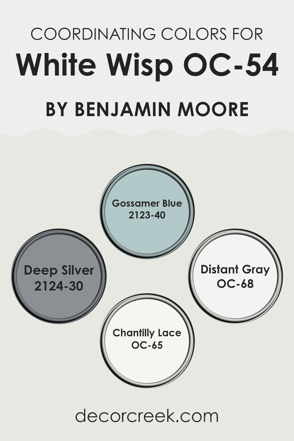
Coordinating colors are selected hues that complement each other and bring harmony to an area when used together. White Wisp OC-54 by Benjamin Moore is a adaptable neutral that serves as a perfect base for a palette.
Adding coordinating colors like Gossamer Blue, Deep Silver, Distant Gray, and Chantilly Lace creates a balanced and aesthetically pleasing environment. Each of these colors has unique properties, but they all work well with the subtle undertones of White Wisp OC-54, allowing for a smooth visual flow in any room.
Gossamer Blue, numbered 2123-40, is a gentle blue that has a calm and refreshing appeal, making it ideal for a room needing a touch of soft color. Next, Deep Silver, identified as 2124-30, offers a slightly bolder choice with its rich, deep gray tone that makes a statement without overpowering.
OC-68 Distant Gray is a clean, almost airy light gray that provides a fresh look when paired with whiter shades. Lastly, OC-65 Chantilly Lace is a pure white that adds a crisp and clear contrast, perfect for trim or accents that sharpen and define areas. Together, these colors can create a harmonious palette for any interior design project.
You can see recommended paint colors below:
- 2123-40 Gossamer Blue
- 2124-30 Deep Silver
- OC-68 Distant Gray
- OC-65 Chantilly Lace
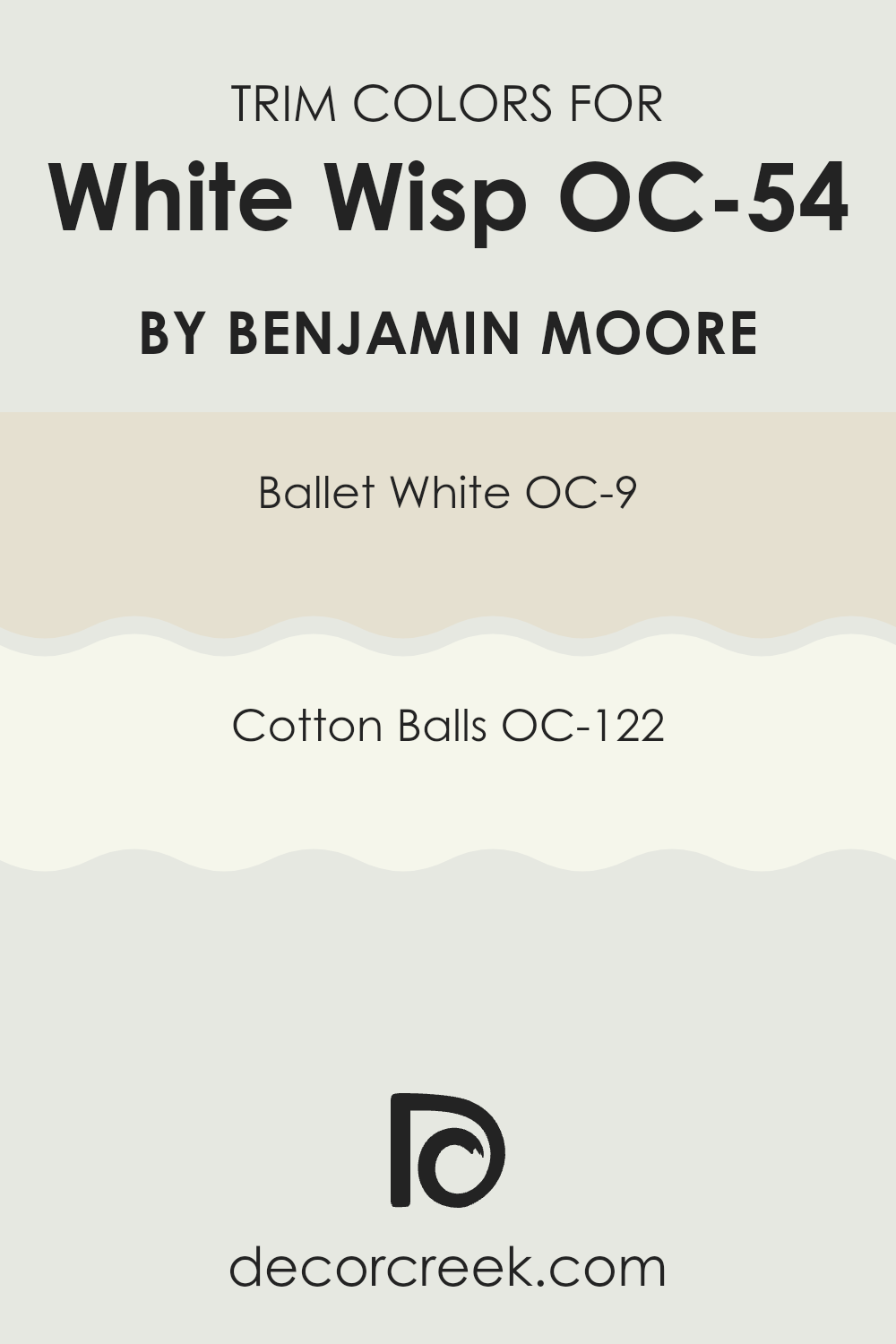
Trendy Trim Colors of White Wisp OC-54 by Benjamin Moore to use this year.
Trim colors are the contrasting or complementary shades used on architectural features like window frames, doors, moldings, and baseboards to accentuate and enhance the main color of a wall or area. In the case of a adaptable and neutral hue such as White Wisp OC-54 by Benjamin Moore, choosing the right trim colors is crucial as they help in defining the area and adding depth while maintaining a seamless look that complements the primary color.
For a harmonious yet distinct look, Ballet White OC-9 can be an excellent choice as a trim color with White Wisp OC-54. Ballet White is not a stark white but has a warm undertone that provides a soft, creamy contrast, making it ideal for creating a welcoming and gentle feel around the edges of a room without overpowering the main color.
Another wonderful option for trim is Cotton Balls OC-122, a pure, clean white with a slightly vibrant feel that offers a crisper framing effect. This trim color works beautifully to create a fresh and noticeable contrast, highlighting architectural features effectively without causing a harsh separation from the main wall color.
You can see recommended paint colors below:
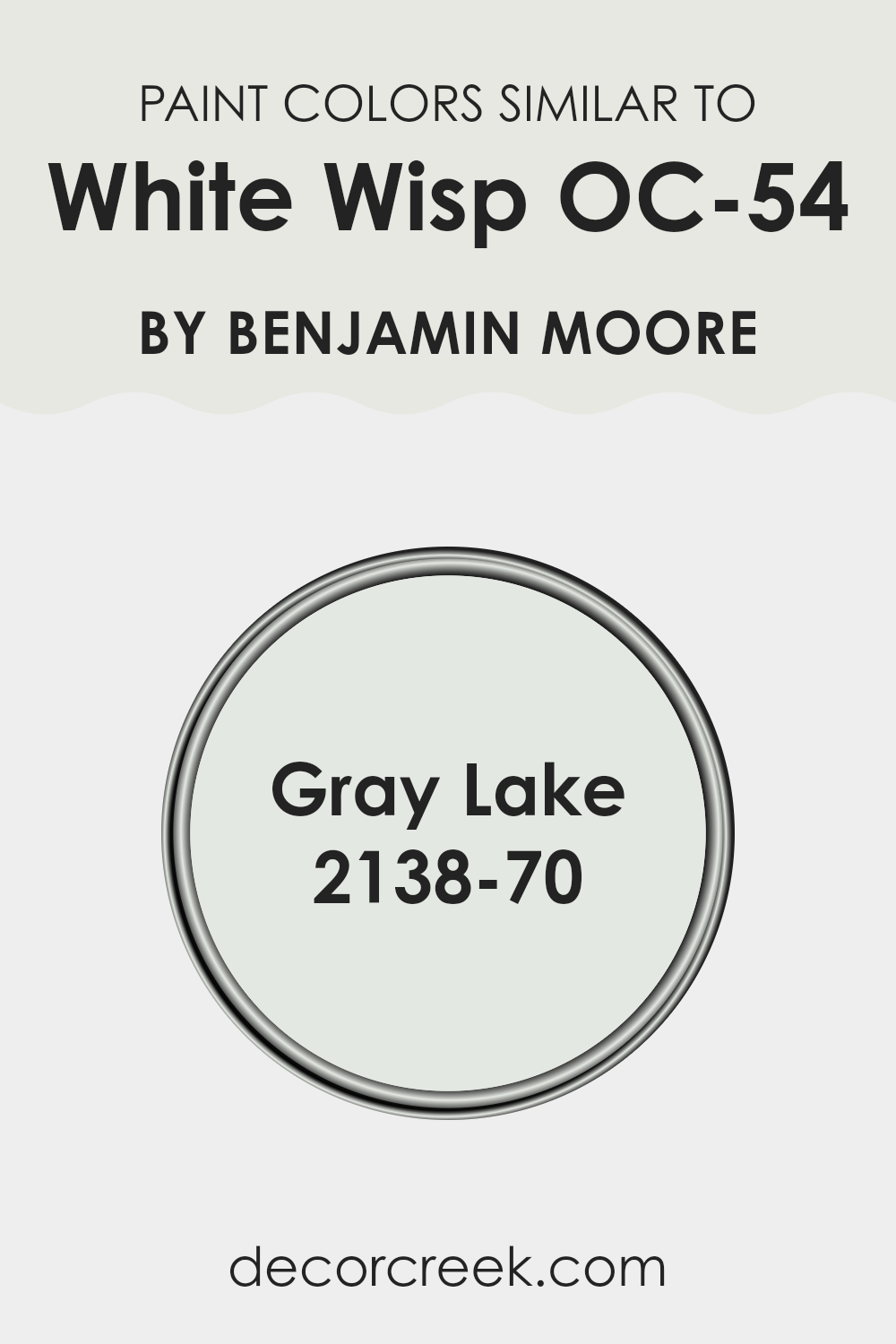
Evergreen Colors Similar to White Wisp OC-54 by Benjamin Moore
When decorating an area, choosing similar colors can create a harmonious and cohesive look, making the environment more pleasant to the eye. This is because similar shades belong to the same color family and, thus, naturally blend well together without creating a jarring contrast.
For instance, White Wisp OC-54 by Benjamin Moore is a gentle and light color that lays the foundation for calmness and lightness in a room. Pairing it with shades like Gray Lake 2138-70, which is close in tone, can improve this effect as both colors support each other, enriching the overall ambiance without overpowering.
White Wisp OC-54 is a soft white that has a hint of a gray undertone, making it a adaptable choice for various areas, from kitchens to bedrooms. It reflects light beautifully, helping even small rooms appear more expansive and airier. On the other hand, Gray Lake 2138-70 is slightly deeper than White Wisp yet maintains that breezy, light feel attributed to its subtle grayish tint. Choosing similar colors like these ensures that decorating decisions add to the feeling of unity within a room, giving all elements a sense of belonging under one cohesive aesthetic.
You can see recommended paint color below:
- 2138-70 Gray Lake
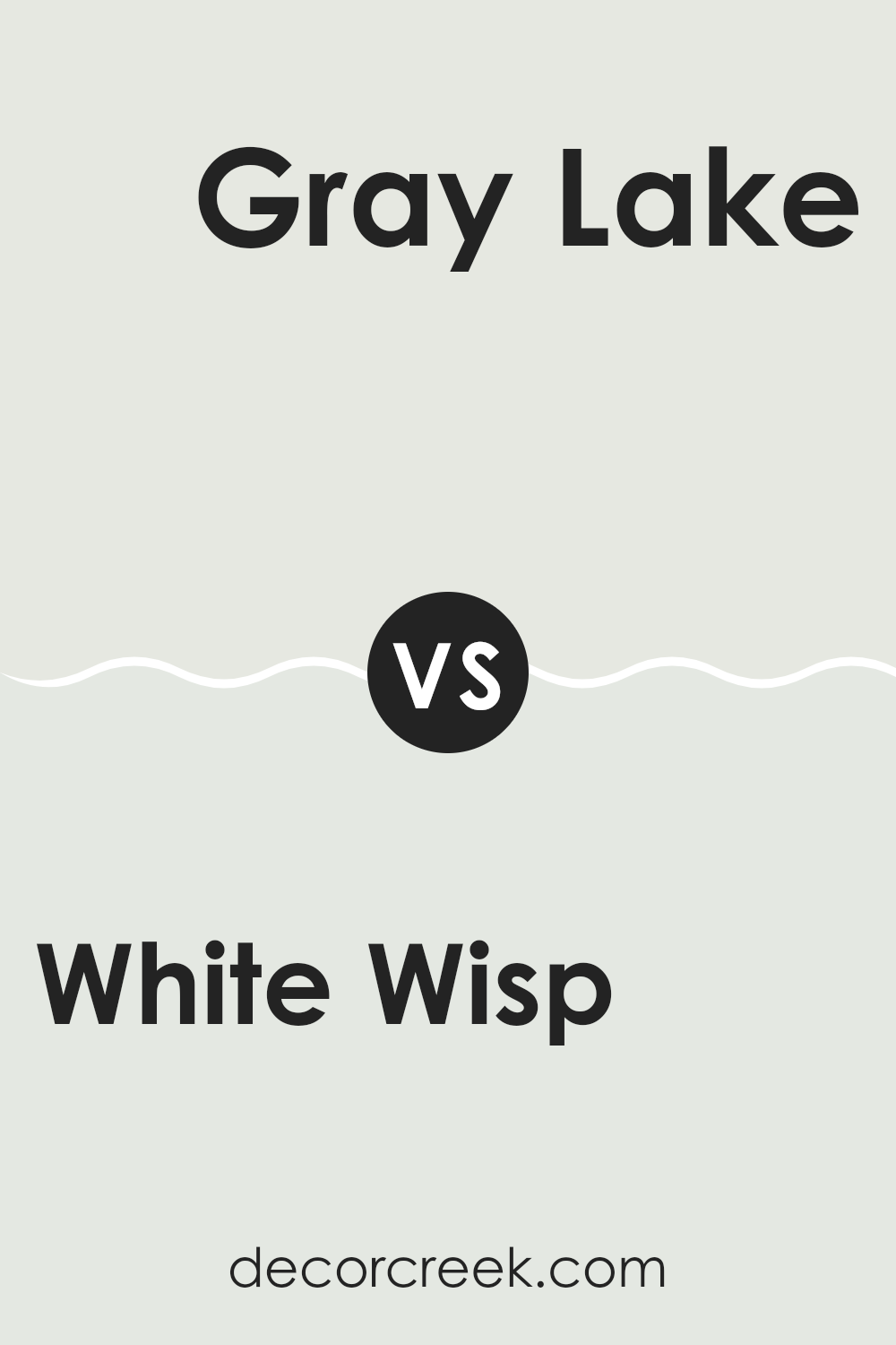
White Wisp OC-54 by Benjamin Moore vs Gray Lake 2138-70 by Benjamin Moore
White Wisp and Gray Lake by Benjamin Moore are two unique but subtle colors that can work beautifully in different areas. White Wisp is almost a pure white with just a hint of gray, making it a great choice for a clean and fresh look. It reflects a lot of light, so it’s perfect for making small rooms appear larger and more open.
Gray Lake, on the other hand, is a lighter gray with a noticeable but soft hint of blue. It creates a gentle, soothing atmosphere without feeling too cold, making it ideal for a relaxed area like a bedroom or a casual living area.
Both colors are relatively neutral and can serve as excellent backdrops for various decor styles. White Wisp is better if you’re looking for a crisp, clear base that lets other colors or elements in the room stand out. Gray Lake is a good option if you want something with a bit more character but still maintains an understated presence. They can also pair well together for a layered, nuanced look.
You can see recommended paint color below:
- 2138-70 Gray Lake
Wrapping up my thoughts on OC-54 White Wisp by Benjamin Moore, I can honestly say it’s one of my favorites for a fresh look in any room. This paint isn’t just plain white; it has a hint of gray that adds a special touch. It’s like when you find a shell on the beach that looks white at first, but when you look closer, you see all the beautiful colors mixed in.
What I really like about White Wisp is that it matches well with lots of different colors. Whether you put it with bright colors in a kid’s room or soft colors in a living room, it always looks good. It’s kind of like a magic paint that works everywhere! I also noticed it makes small rooms look bigger and brighter, like when you open the curtains on a sunny day. And for busy places like the kitchen or hallway, it keeps things looking clean and clear.
In conclusion, White Wisp by Benjamin Moore is a great choice if you’re thinking about giving your room a new look. Whether you’re fixing up your bedroom or giving the living room a new vibe, this color brings a fresh, pleasant feel without being too sharp or bright. It’s simple, neat, and always looks good.
Plus, it’s easy to apply and lasts long, so you won’t have to worry about painting again any time soon!
Ever wished paint sampling was as easy as sticking a sticker? Guess what? Now it is! Discover Samplize's unique Peel & Stick samples.
Get paint samples

