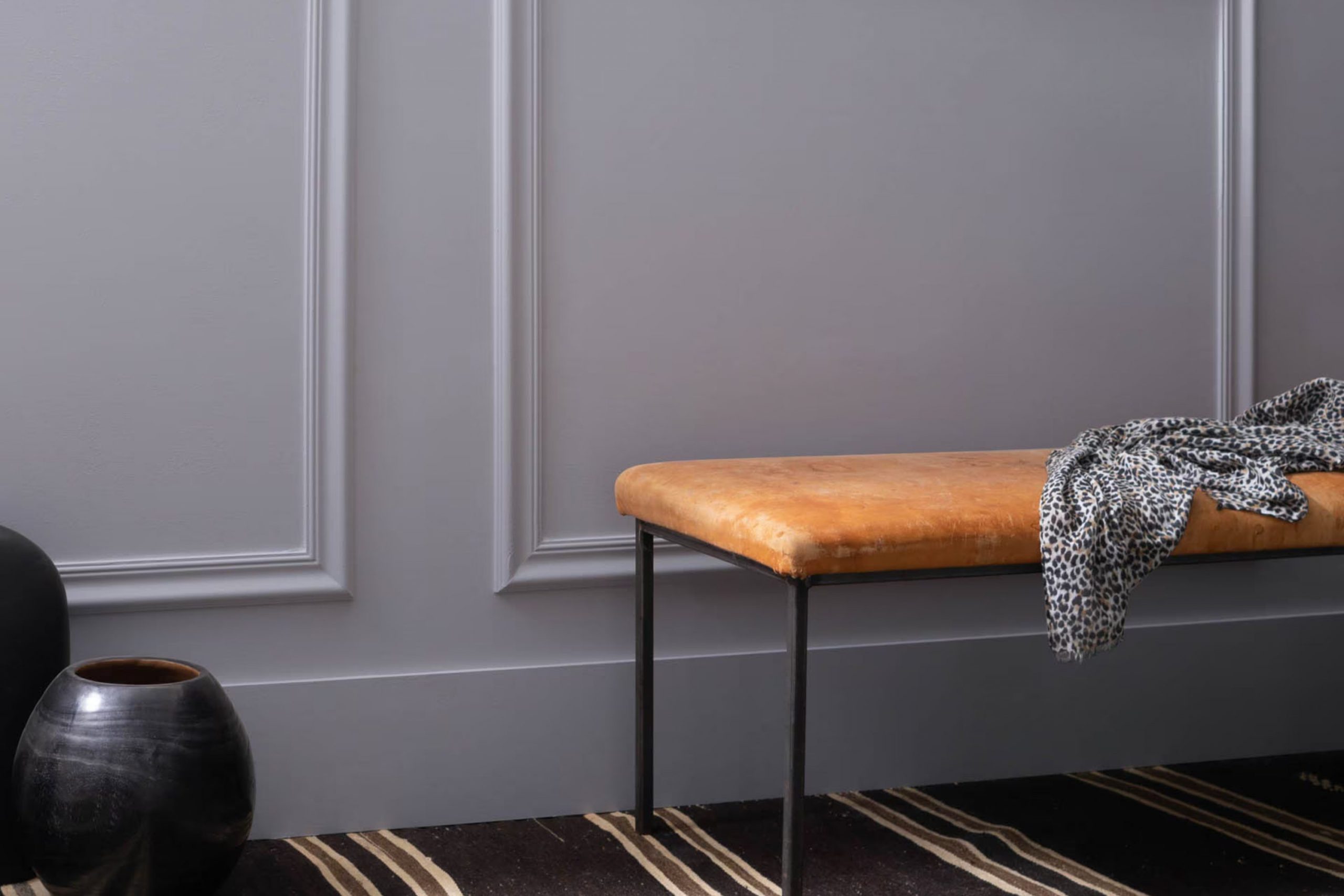
I recently chose AF-585 Wisteria by Benjamin Moore for a bedroom makeover, and I must say, it’s a decision that completely refreshed the room. This shade is part of Benjamin Moore’s Affinity Color Collection, specifically designed to create harmony and flow throughout your home. AF-585 Wisteria is a soft, muted purple that carries a subtle, calming vibe — perfect for areas where you want to unwind and relax.
The color is flexible enough to be used in various settings, whether you’re looking to paint a full room, an accent wall, or even furniture. It pairs beautifully with both light and dark colors, allowing you to customize your decor to fit your personal style.
In my experience, Wisteria works exceptionally well with soft grays, rich browns, and muted greens, providing a balanced palette that feels both cozy and contemporary.
If you’re considering a new look for any room, AF-585 Wisteria by Benjamin Moore is definitely worth considering. Its gentle purple hue can bring a fresh and calm feel to your living room.
What Color Is Wisteria AF-585 by Benjamin Moore?
Benjamin Moore’s Wisteria is a soft, muted purple shade that brings a gentle touch of elegance to any room. Its light and airy feel makes it an excellent choice for creating a calming atmosphere without overpowering the room with intense color. This subtle hue pairs beautifully with crisp whites and soft grays, offering a modern palette that can help small rooms appear larger and more open.
Wisteria works particularly well in interior styles that favor soft, pastel colors, such as Scandinavian and coastal designs, due to its light tone and understated warmth. It’s also a good fit in contemporary decor, adding a dash of color without clashing with minimalist elements.
In terms of materials, Wisteria complements natural wood finishes, from pale beech to rich walnut, enhancing the organic textures with its delicate color. It also looks stunning when matched with matte metals like brushed silver or soft pewter. Textures like linen, cotton, and soft wool in furnishings and decor help create a cozy feel that balances the coolness of the purple.
Overall, Wisteria by Benjamin Moore is a flexible paint color that can help create a light, fresh look in your home. Its ability to pair seamlessly with various materials and textures allows for adaptability in design and decor.
decorcreek.com
Is Wisteria AF-585 by Benjamin Moore Warm or Cool color?
The color Wisteria AF-585 by Benjamin Moore is a flexible shade of lavender that brings a soft yet lively atmosphere to any room. This light purple hue has a gentle presence that can make smaller rooms seem larger and more inviting, while also giving larger rooms a cozy feeling. Wisteria AF-585 works well in various home styles, from modern to traditional, due to its subtle warmth and freshness.
This hue pairs beautifully with whites, creating a clean and airy look. For those who like contrast, it can also complement darker tones, such as gray or black, adding a playful splash of color without overpowering the room.
It’s a wonderful choice for bedrooms and living areas where a calm but cheerful ambiance is desired. Moreover, in well-lit areas, Wisteria AF-585 reflects light charmingly, enhancing the overall brightness of the room. Overall, it’s a fantastic choice for anyone looking to refresh their home with a touch of joyful color.
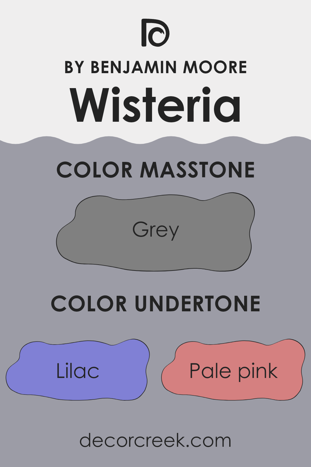
Undertones of Wisteria AF-585 by Benjamin Moore
Wisteria by Benjamin Moore is a unique paint color that contains a diverse palette of undertones, making it highly flexible and adaptable to different lighting conditions and decor styles. The undertones of a paint color are subtle hues that can be seen under different lighting conditions and they significantly influence how the color appears on the wall.
The presence of lilac, light purple, and violet undertones in Wisteria gives it a gentle touch of warmth, making rooms feel welcoming. These purple shades add a hint of softness which is ideal for bedrooms or areas where you want a calm atmosphere. Pale pink and light turquoise undertones offer a dash of freshness, subtly refreshing a room without overpowering it with bright colors.
Mint and light green undertones bring a sense of freshness and nature into the room, making it feel lively and energetic. This is particularly beneficial in living rooms or kitchens where a touch of vibrancy can improve the room’s dynamics.
In contrast, dark turquoise, navy, and dark blue add depth and richness to the color, making it more dramatic and pronounced. These darker tones make Wisteria a great choice for accent walls or for creating a focal point in a room.
On interior walls, the wide range of undertones allows Wisteria to interact dynamically with both natural and artificial light, shifting its appearance throughout the day. It can seamlessly complement various decor elements and adapt to different styles, whether modern, traditional, or eclectic. Overall, the undertones in Wisteria make it a highly adaptable color that can suit various rooms and moods, improving the aesthetic appeal of any interior setting.
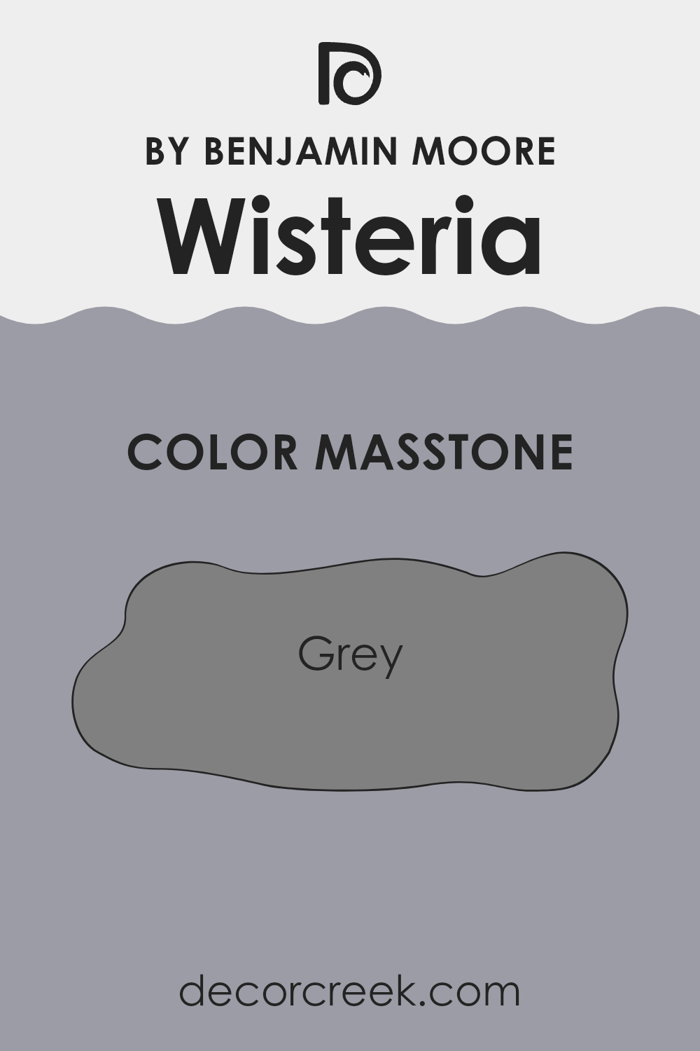
What is the Masstone of the Wisteria AF-585 by Benjamin Moore?
Wisteria AF-585 by Benjamin Moore has a masstone of grey, which means the main tone you see is a neutral grey. This shade is flexible for decorating because it serves as a calm, steady base that can fit into almost any room design.
Grey is known for being a go-to color that matches well with brighter colors or softer pastels, making it easy to pair with a variety of furnishings and decor. In homes, this grey offers a stable backdrop that allows other colors such as blues, yellows, or greens to stand out, but it’s just as effective when creating a more toned-down, muted room.
Since it isn’t a very dark grey, it can help make small rooms seem larger than they are while still giving warmth to the room. This color’s adaptability makes it suitable for common areas, bedrooms, or offices, maintaining a fresh and modern look without being too overpowering.
How Does Lighting Affect Wisteria AF-585 by Benjamin Moore?
Lighting plays a significant role in how we perceive colors in our environment. Different types of light can make the same color look very different. Color Wisteria AF-585 by Benjamin Moore is a fascinating example as it can change its appearance depending on the type and direction of light it is exposed to.
When viewing Wisteria AF-585 under artificial light, such as LED or fluorescent bulbs, it might appear slightly different from its appearance in natural sunlight. Artificial lights can either warm up or cool down its color, affecting how we see it. Under warm artificial lighting, Wisteria AF-585 might look more muted and softer, bringing out a cozy feeling in a room.
In natural light, this color behaves differently throughout the day and in various room orientations. In a north-facing room, which generally receives less direct sunlight, Wisteria AF-585 can appear cooler and more shadowy. This can give the room a calm and steady look but might feel a bit darker.
In south-facing rooms, where sunlight is abundant for most of the day, Wisteria AF-585 can look much brighter and more vibrant. The ample sunlight brings out the richness of the color, making the room feel lively and refreshing.
For east-facing rooms, where the morning sunlight is predominant, Wisteria AF-585 will brighten up beautifully in the morning but tend to fade into a softer tone as the day progresses and natural light diminishes. This gives a gentle transition feeling throughout the day.
Lastly, in west-facing rooms, this color will show a reverse pattern to east-facing rooms. It starts milder in the mornings and then grows richer and more pronounced as the sun sets. This can create a unique mood in the evenings when the room captures the glow of the setting sun.
Overall, Wisteria AF-585’s perception changes with lighting conditions, offering various vibes and atmospheres depending on the room’s orientation and the type of light it receives.
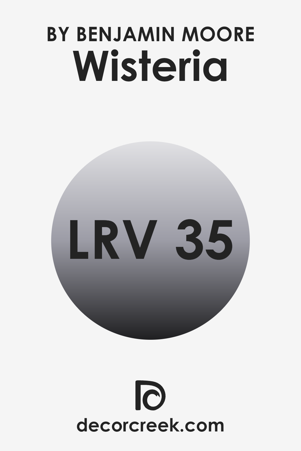
What is the LRV of Wisteria AF-585 by Benjamin Moore?
LRV stands for Light Reflectance Value, which measures the percentage of light a paint color reflects back into a room. In simple terms, it’s a gauge of how light or dark a color will appear once it’s on your walls.
Lighter colors have higher LRVs and make a room feel brighter by reflecting more light. On the other hand, colors with lower LRVs absorb more light, making a room feel cozier but potentially darker, which is something to keep in mind when choosing paint for a room with limited natural light.
With an LRV of 34.8, Wisteria, a shade by Benjamin Moore, is on the darker side of the scale. This means it will absorb more light than it reflects, giving a richer and more intense look, but could make a small room feel smaller or dimmer. This LRV rating suggests that it is best used in well-lit areas or spacious rooms to prevent the room from feeling too enclosed.
When used in a room with good natural light or strong artificial lighting, Wisteria can offer a lush, deep ambiance without making the room feel overly dark.
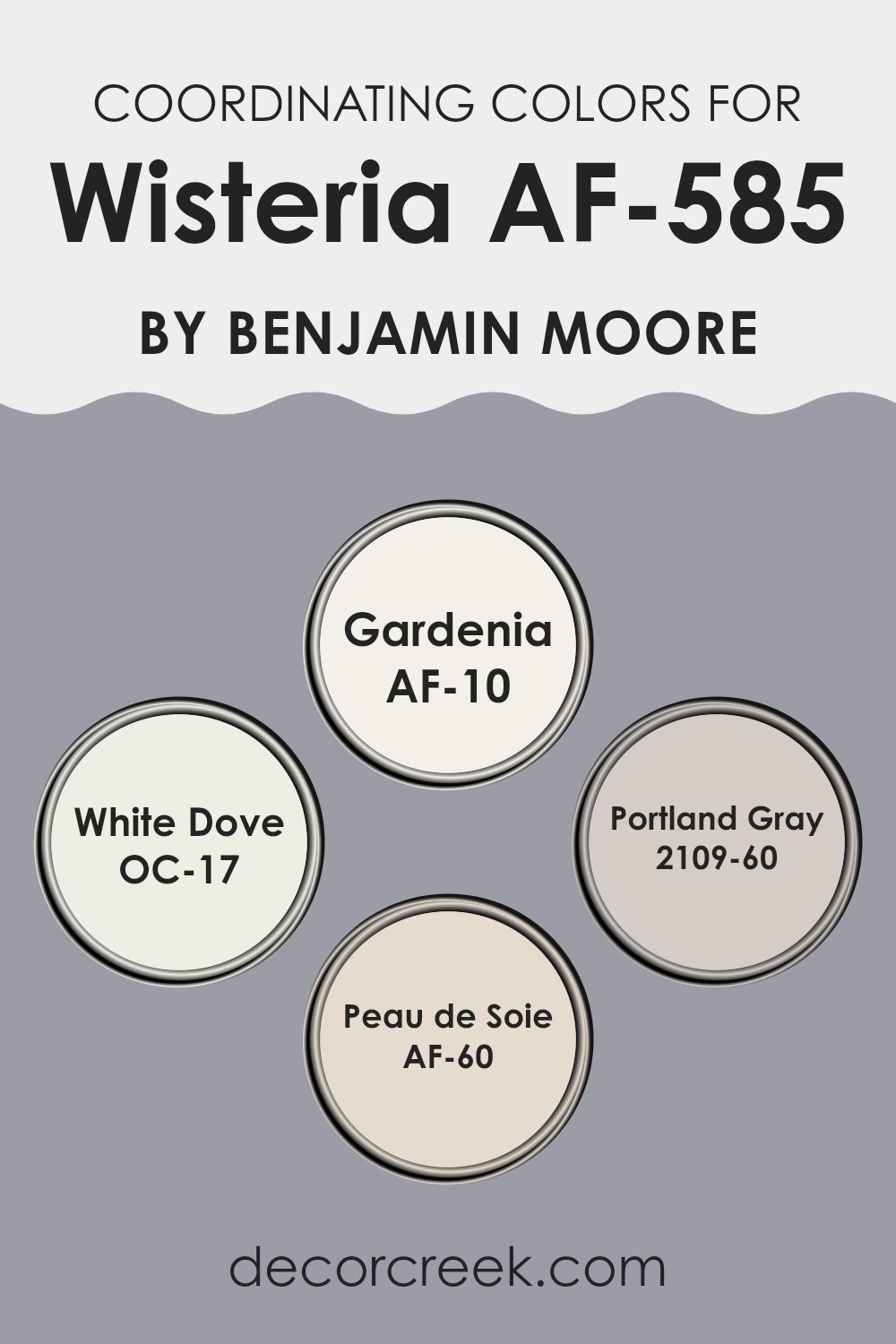
Coordinating Colors of Wisteria AF-585 by Benjamin Moore
Coordinating colors are select hues that complement each other when used together within a room, creating a harmonious and visually pleasing color scheme. These colors are often chosen by the paint manufacturers to help users create designer-quality looks effortlessly. For example, Wisteria AF-585 by Benjamin Moore is a beautiful shade with coordinating colors like Gardenia AF-10, White Dove OC-17, Portland Gray 2109-60, and Peau de Soie AF-60, which work well together to enhance the main color without overpowering it.
Gardenia AF-10 is a soft white with a subtle warmth to it, making it a perfect background that allows other colors like Wisteria to stand out. White Dove OC-17 is another white but with a neutral undertone that pairs seamlessly with a variety of colors, providing a clean look that is never stark.
Portland Gray 2109-60 is a light gray that offers a slight contrast to Wisteria, adding depth and interest to the room. Finally, Peau de Soie AF-60 is a pale pink that adds a gentle touch of softness, complementing Wisteria in a subtle and refined manner. Together, these colors form a palette that supports and enhances, without competing for attention.
You can see recommended paint colors below:
- AF-10 Gardenia
- OC-17 White Dove
- 2109-60 Portland Gray
- AF-60 Peau de Soie
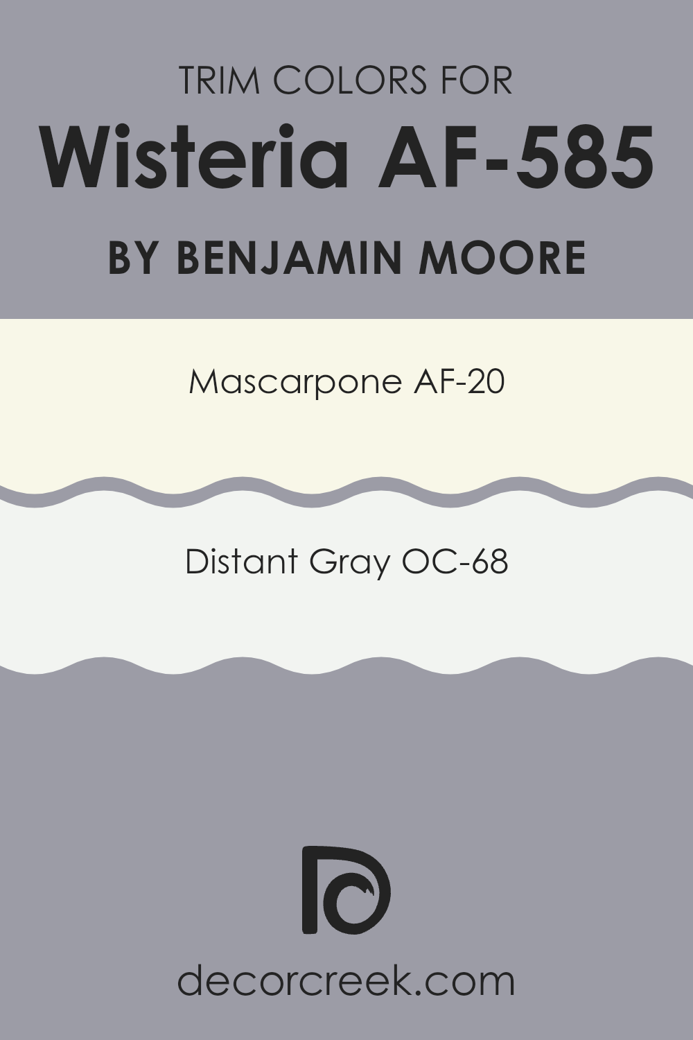
What are the Trim colors of Wisteria AF-585 by Benjamin Moore?
Trim colors are specific shades used to highlight or define the edges and accents of walls, windows, doors, and architectural details in a room. They are essential because they help frame the main colors used on walls, contributing to a cleaner and more organized visual experience. For example, when using a shade like Wisteria AF-585 by Benjamin Moore—a gentle and subtle color—the trim colors play a crucial role in ensuring that this hue stands out without overpowering the room.
Mascarpone AF-20 is a warm and creamy white that perfectly complements Wisteria AF-585, making the room feel cozy and inviting. It’s a great choice for trims as it gently contrasts with softer hues, providing a soft yet distinct boundary that enhances the overall look of the room.
On the other hand, Distant Gray OC-68 offers a cooler, crisper approach to trim, working beautifully with Wisteria AF-585 to give a sharper, cleaner edge to the room. This color helps to subtly define the room boundaries without creating a stark contrast, enabling a smooth visual transition from walls to trims.
You can see recommended paint colors below:
- AF-20 Mascarpone
- OC-68 Distant Gray
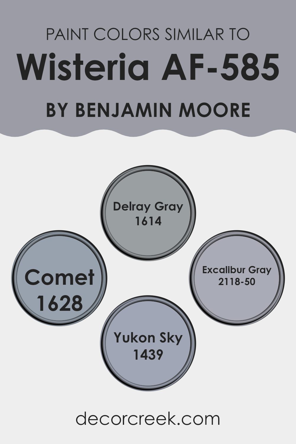
Colors Similar to Wisteria AF-585 by Benjamin Moore
When decorating a room, choosing colors that harmonize well can create a cohesive and inviting atmosphere. Similar colors, like the ones that resemble Wisteria AF-585 by Benjamin Moore, contribute significantly to this effect by providing a unified visual flow.
Colors such as Delray Gray, Comet, Excalibur Gray, and Yukon Sky are perfect for those looking to maintain a balanced and subtle color palette throughout their interiors. By opting for similar shades, the transition between different elements and rooms becomes smoother, promoting an overall cohesive look that is pleasant to the eyes.
Delray Gray is a gentle gray that carries a hint of warmth, making it flexible for both modern and traditional rooms. On the other hand, Comet is a tad deeper, lending a slight dramatic flair without overpowering a room. Excalibur Gray stands out with its robust depth, offering a stronger statement yet still retaining a gentle charm. Lastly, Yukon Sky is the lightest of the bunch, presenting a soft, almost ethereal quality that brightens rooms subtly. When these colors are used together or in different parts of a home, they help maintain a steady theme without creating stark contrasts, allowing the décor to flow naturally and effortlessly.
You can see recommended paint colors below:
- 1614 Delray Gray
- 1628 Comet
- 2118-50 Excalibur Gray
- 1439 Yukon Sky
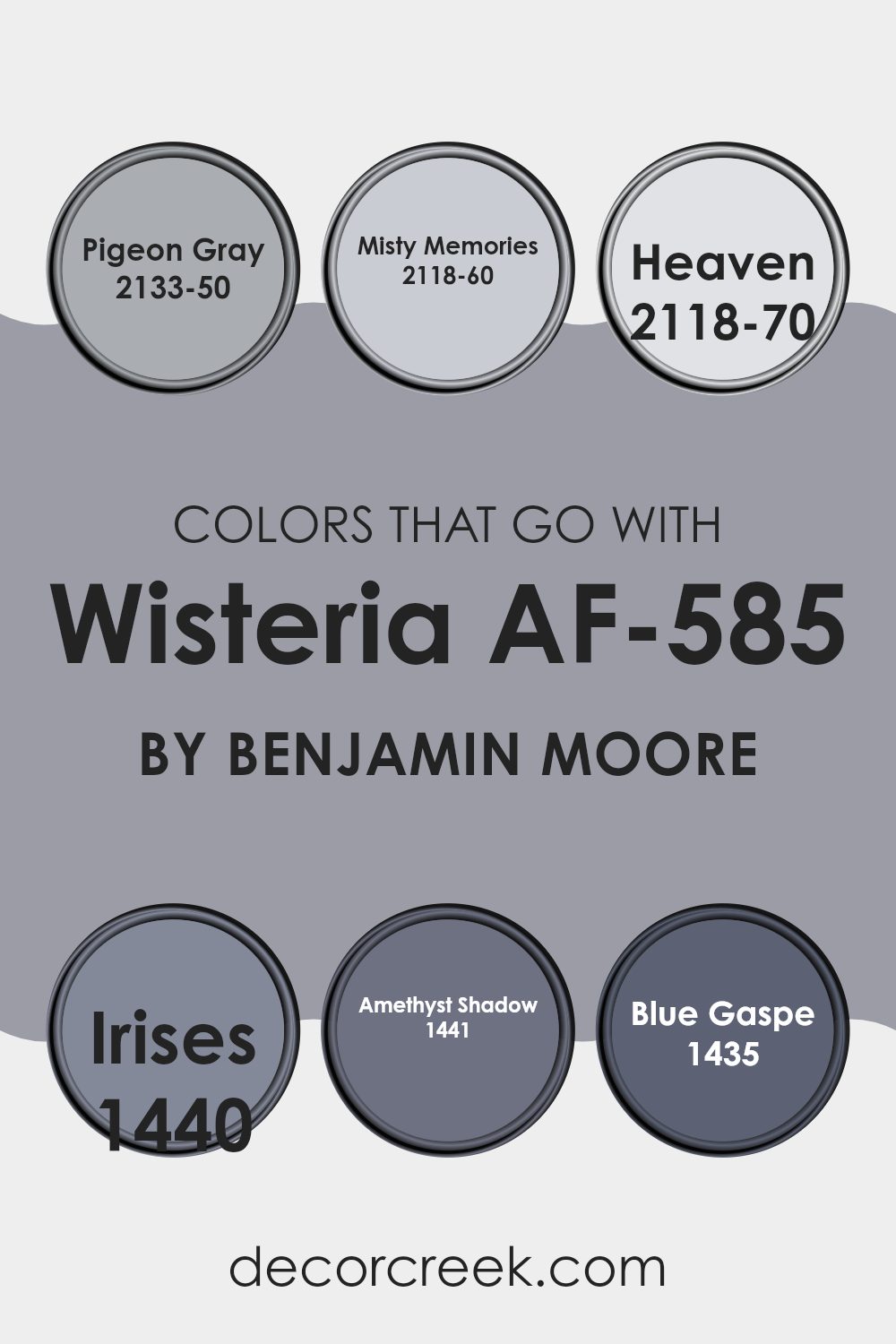
Colors that Go With Wisteria AF-585 by Benjamin Moore
Choosing colors that complement Wisteria AF-585 by Benjamin Moore is essential because it helps create a cohesive and visually appealing room. The colors that pair well with Wisteria have been carefully selected to harmonize with its unique tone, enhancing the overall beauty of any room they are used in.
For instance, Pigeon Gray is a gentle gray with soft blue undertones, making it a perfect neutral backdrop that allows Wisteria to stand out without overpowering it. Misty Memories offers a warmer touch with its subtle lilac undertones, providing a smooth transition when paired with the depth of Wisteria.
Heaven is a nearly ethereal color, very light and airy, lending a refreshing lift that complements the deeper hues of Wisteria perfectly. Irises, a richer, more pronounced blue with hints of purple, echoes the intensity of Wisteria, permitting a dynamic play between shades. Amethyst Shadow, as the name suggests, brings a darker, more mysterious purple into the mix, adding depth and interest to the palette.
Lastly, Blue Gaspé introduces a unique blend, a vivid blue with a whisper of purple, creating a striking combination that adds vibrancy and a playful spirit to the environment.
These colors work together to create rooms that are not only beautiful but also comfortable and inviting.
You can see recommended paint colors below:
- 2133-50 Pigeon Gray
- 2118-60 Misty Memories
- 2118-70 Heaven
- 1440 Irises
- 1441 Amethyst Shadow
- 1435 Blue Gaspe
How to Use Wisteria AF-585 by Benjamin Moore In Your Home?
Wisteria AF-585 by Benjamin Moore is a soft, muted purple paint that adds a gentle pop of color without being too bold. This shade works beautifully in rooms where you want to create a cozy yet light atmosphere. It’s especially great for bedrooms where a calming effect is desired, or in a bathroom for a touch of elegance.
You can use Wisteria AF-585 in your living room by painting all the walls or just one as an accent wall. This color pairs well with neutral furnishings, allowing the hue to stand out, or with metallic decor elements like gold or silver frames, lighting fixtures, and accessories to provide a chic contrast.
For those who enjoy a bit more creativity, Wisteria can be used in kitchen areas. It gives cabinets a fresh, modern look or can be used on the walls, complemented by white tiles and natural wood for a clean and inviting feel. This color is adaptable and works well with both contemporary and traditional home styles.
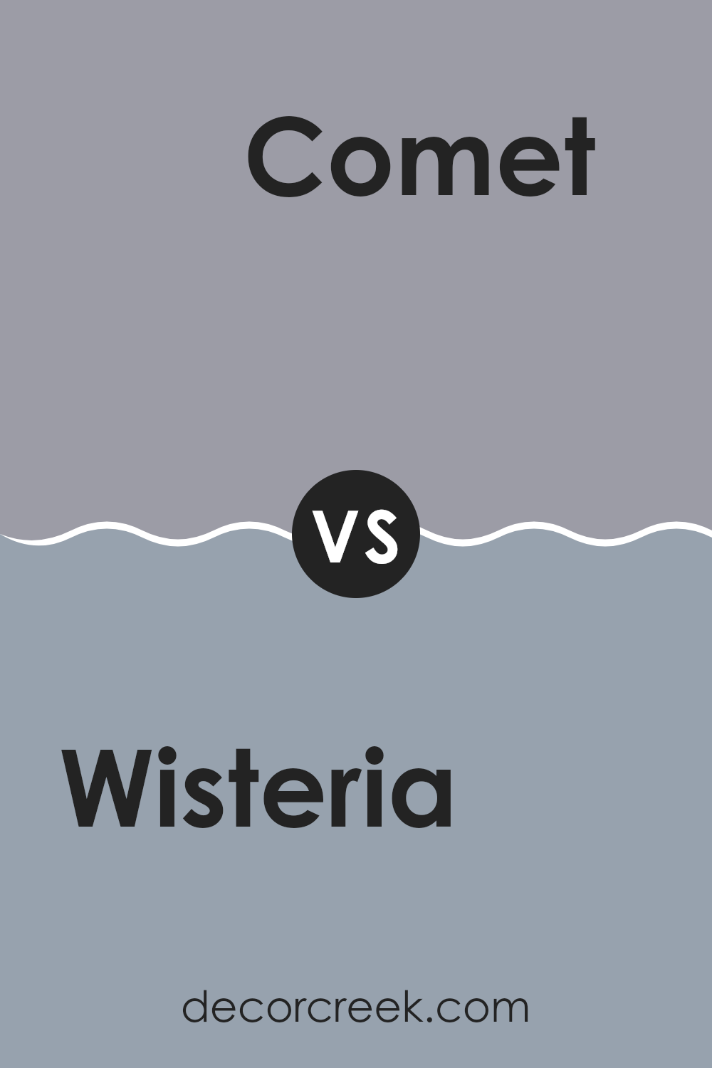
Wisteria AF-585 by Benjamin Moore vs Comet 1628 by Benjamin Moore
The main color, Wisteria, and the second color, Comet, both by Benjamin Moore, have distinct characteristics. Wisteria has a soft, gentle lavender hue that gives a light and airy feel to rooms. It’s perfect for bedrooms or any area where calming influences are welcome.
On the other hand, Comet is a deeper, neutral steel gray that carries a bolder, more solid presence. It works well in areas that need a sturdy backdrop or where you want to highlight other decor elements without overpowering them.
While Wisteria adds a hint of gentle color, Comet provides a strong base, making it flexible for various design needs. Both colors have their unique appeal and can be used separately or together to create a balanced look.
You can see recommended paint color below:
- 1628 Comet
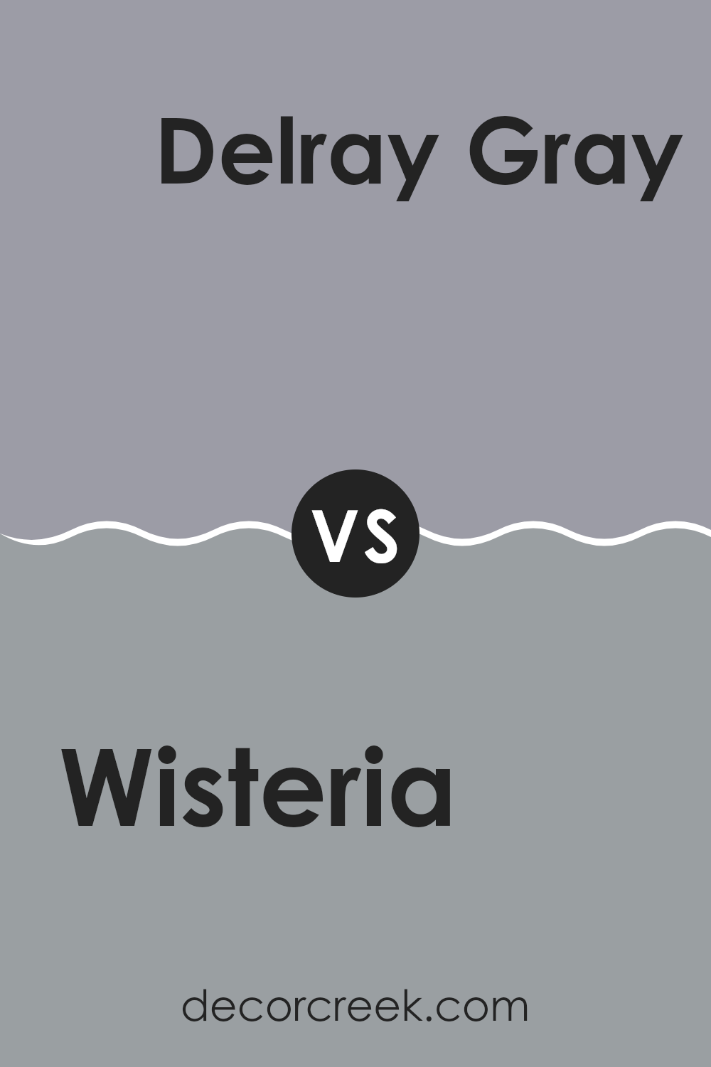
Wisteria AF-585 by Benjamin Moore vs Delray Gray 1614 by Benjamin Moore
Wisteria AF-585 and Delray Gray 1614 are both paint colors by Benjamin Moore, but they offer distinct tones for different moods and settings. Wisteria is a light, soft purple that gives a gentle and calming effect to any room.
It’s perfect for bedrooms or quiet areas where you want a soothing atmosphere. Delray Gray, on the other hand, is a mid-tone gray that provides a neutral backdrop suitable for various decor styles. It works well in rooms like living rooms or kitchens where you want a chic yet understated look that pairs easily with different colors and accessories.
While both colors are subtle, Wisteria adds a touch of color and warmth, whereas Delray Gray keeps things cool and balanced. These options are ideal for homeowners looking for flexibility and a touch of elegance without overpowering their rooms.
You can see recommended paint color below:
- 1614 Delray Gray
Wisteria AF-585 by Benjamin Moore vs Yukon Sky 1439 by Benjamin Moore
The two colors you’re asking about are both from Benjamin Moore but they bring different vibes to a room. Wisteria AF-585 is a gentle, soft purple with a calming quality, perfect for creating a calm and welcoming atmosphere in any room. It’s light enough to make small rooms feel bigger, yet has enough depth to add character.
On the other hand, Yukon Sky 1439 is much lighter, leaning towards a soft, muted gray with subtle hints of blue. This color is great for those who prefer a neutral palette that still offers a touch of uniqueness. It’s very flexible and can work well in various settings, complementing modern or traditional decor seamlessly.
When comparing the two, Wisteria AF-585 provides a touch of color, which can add a playful yet calm element to interiors, while Yukon Sky 1439 is more about keeping things understated and refined. Each would suit different decor styles and personal tastes depending on what feeling one wants to achieve in their room.
You can see recommended paint color below:
Wisteria AF-585 by Benjamin Moore vs Excalibur Gray 2118-50 by Benjamin Moore
Wisteria by Benjamin Moore is a gentle, soft violet color that brings a peaceful, calming vibe to any room. It’s light enough to make rooms feel airy and open. Excalibur Gray, on the other hand, is a medium gray shade that leans slightly towards blue, offering a cool, subtle backdrop that’s flexible for various decorating styles.
Although both colors are from Benjamin Moore and could be used to create calm and inviting environments, they serve different moods. Wisteria is more likely to add a touch of playful charm, perfect for a bedroom or bathroom.
Excalibur Gray is more neutral, making it a great choice for larger areas like living rooms or kitchens where you want a color that matches easily with other hues and furnishings. Each color provides a unique feel, helping you to set the right tone in your home rooms.
You can see recommended paint color below:
- 2118-50 Excalibur Gray
After learning about AF-585 Wisteria by Benjamin Moore, I feel it’s a great choice for anyone looking to freshen up a room with a new color. This paint shade is like a light purple with a hint of gray, making it really peaceful and easy on the eyes. It’s a gentle color that can make any room feel cozy and welcoming, whether it’s a bedroom, living room, or even a bathroom.
What’s really cool about Wisteria is how it seems different depending on the light in the room. In a sunny room, it looks a bit brighter and cheerier, while in a room with less light, it feels calmer and more subtle. This makes it a good match for lots of different places and home styles.
One thing to remember is when you see it on a paint chip in the store, it might look different at your home because of your home’s lighting. So, it’s a good idea to try a small sample first to see how it looks in your own room before painting a whole room.
Overall, Wisteria by Benjamin Moore is a beautiful choice if you want something light, fresh, and yet not too bold. It’s like adding a soft purple blanket to your room that makes everything look nice and feel cozy.
Ever wished paint sampling was as easy as sticking a sticker? Guess what? Now it is! Discover Samplize's unique Peel & Stick samples.
Get paint samples

