Color has the transformative power to shape and define the atmosphere of any living space. It is an essential element in interior design, acting as an invisible language that speaks volumes about a home’s character. Within this chromatic spectrum, one color that has been gaining popularity for its unique presence is Yukon Sky 1439.
This color finds a way to assert itself in a multitude of design settings. It’s an exploration into the essence of Yukon Sky 1439 that forms the basis of this article, from its temperature and undertones to the way it interacts with lighting, trim, and coordinating colors

What Color Is Yukon Sky 1439?
Yukon Sky 1439 is a color that captures the elusive light of the subarctic twilight. It’s a complex hue, embodying a blend of gray with a gentle wash of blue, reminiscent of the sprawling Yukon landscapes under the vast Canadian skies. This mid-tone color bridges the gap between a serene neutral and a subtle statement, making it versatile for various interior styles, especially those leaning towards modern minimalism and contemporary chic.
The muted quality of Yukon Sky 1439 allows it to pair exquisitely with natural materials like unfinished wood and stone, as well as with rich textures like velvety fabrics and woven textiles. Its understated elegance shines in spaces that aim for a calm, reflective ambiance.
Ever wished paint sampling was as easy as sticking a sticker? Guess what? Now it is! Discover Samplize's unique Peel & Stick samples.
Get paint samples

Is It a Warm Or Cool Color?
Yukon Sky 1439 resides in the realm of cool colors, bearing a soothing blue-gray essence that whispers tranquility. This cool nature lends itself to creating a serene and contemplative space, often sought after in areas of rest and relaxation. The coolness of Yukon Sky 1439 can make a room feel more spacious and airy, which is particularly beneficial in smaller or more crowded spaces.
Its presence on the walls can serve as a counterbalance to warmer tones within the room, establishing an equilibrium in the color palette that is both refreshing and grounding.
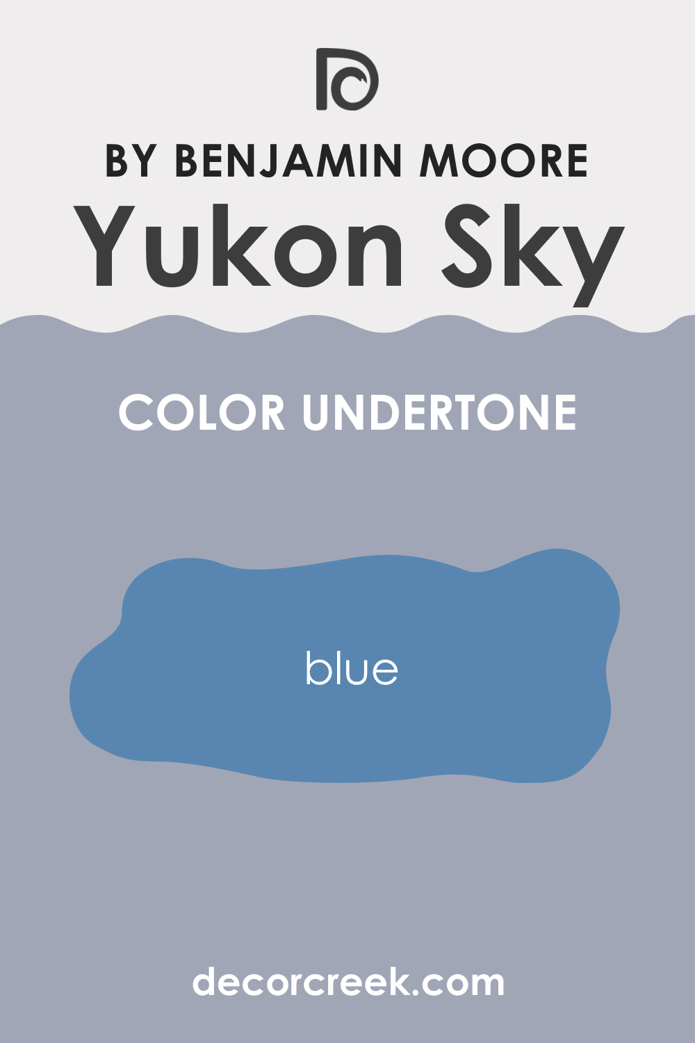
Undertones of Yukon Sky 1439
The undertones of a color are the whispering hues that linger beneath the surface, influencing its core identity and interaction with light and surrounding colors. Yukon Sky 1439 carries a subtle undertone of blue, which can become more prominent under certain lighting conditions, lending the color a serene and somewhat ethereal quality.
These undertones can make Yukon Sky 1439 appear cooler and more pronounced, especially when juxtaposed with warmer colors or in the soft glow of the golden hour. On interior walls, the blue undertones can imbue a room with a sense of calm and openness, as if bringing a breath of crisp, fresh air indoors.
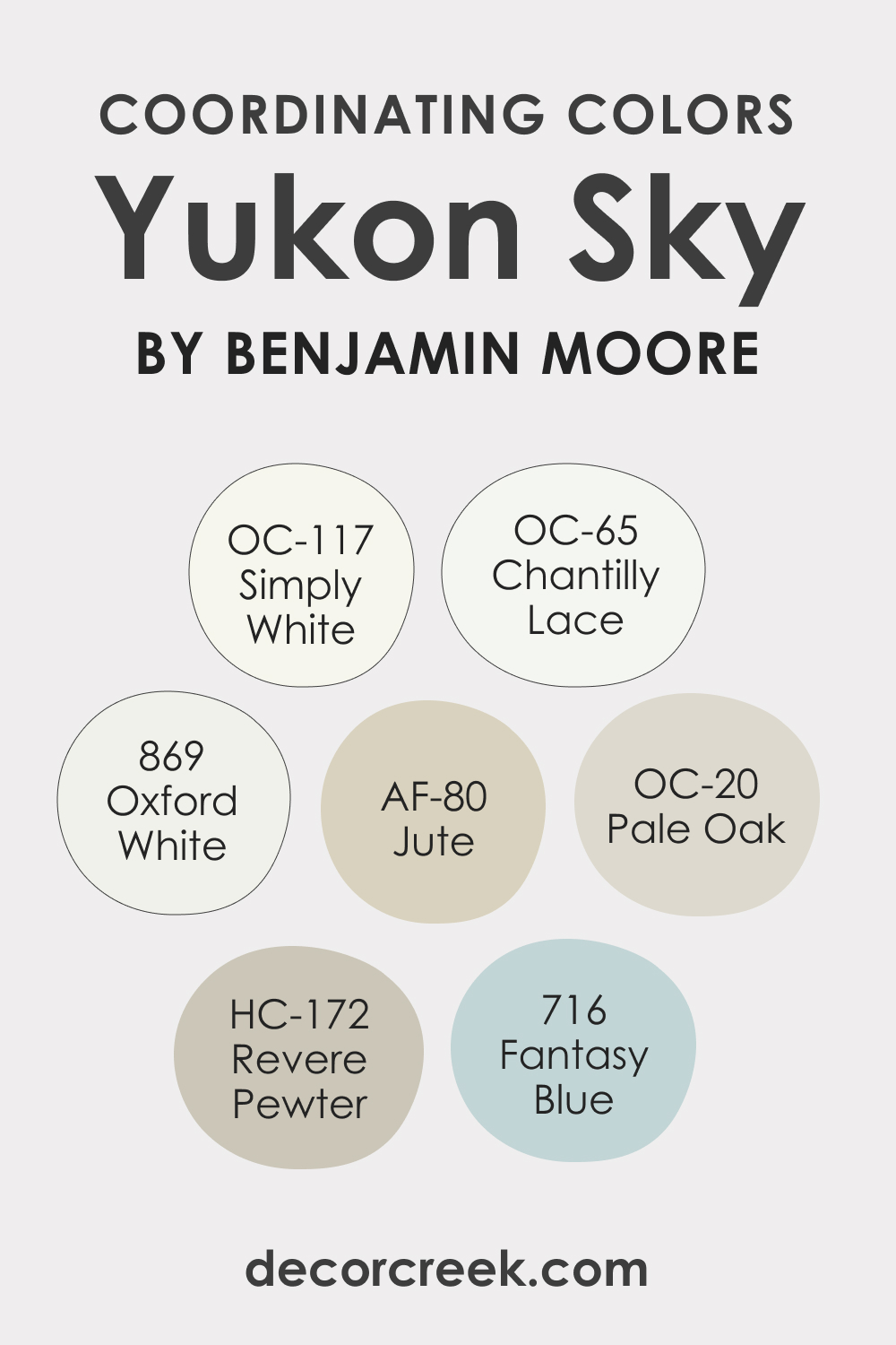
Coordinating Colors of Yukon Sky 1439
Coordinating colors are those that complement and enhance the primary color, creating a harmonious palette that can add depth and character to any space. Yukon Sky 1439 pairs beautifully with a range of coordinating colors:
- BM 869 Oxford White: A crisp and luminous white that brings out the cool tones of Yukon Sky 1439.
- OC-117 Simply White: A warm, soft white that offers a subtle contrast and softens the coolness of Yukon Sky 1439.
- AF-80 Jute: A neutral, sandy hue that adds an earthy warmth to balance the coolness of Yukon Sky 1439.
- BM 716 Fantasy Blue: A light, dreamy blue that echoes the blue undertones of Yukon Sky 1439 and enhances its serene aesthetic.
Additional coordinating colors that resonate well with Yukon Sky 1439′s serene palette include gentle grays and soft whites, such as HC-172 Revere Pewter, a warm gray that brings a cozy depth; OC-20 Pale Oak, a soft beige that adds a subtle warmth; and OC-65 Chantilly Lace, a clean, bright white that provides a sharp contrast.
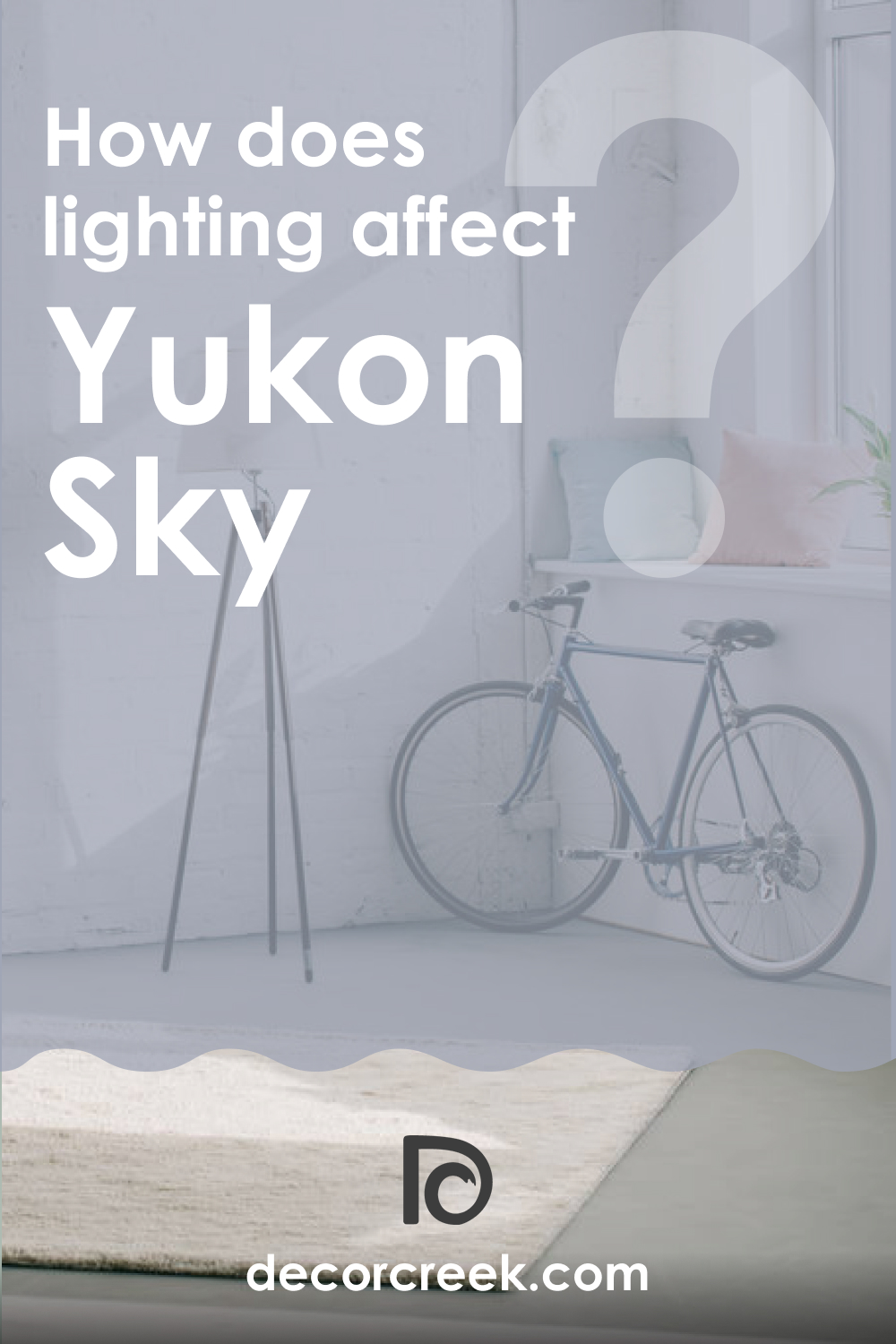
How Does Lighting Affect Yukon Sky 1439?
Lighting plays a crucial role in the perception of color, with Yukon Sky 1439 being no exception. Under artificial light, especially warm-toned bulbs, its blue undertones can become subdued, giving way to a more neutral gray. Natural light, on the other hand, can amplify its cooler aspects, making the blue more pronounced.
In north-facing rooms, which tend to have cooler, indirect light, Yukon Sky 1439 may appear more true to its cool essence. Conversely, in south-facing rooms bathed in warm sunlight throughout the day, the color may reveal a softer, more muted quality.
East-facing rooms will experience a transformation of Yukon Sky 1439 throughout the day—from a bright, cheerful blue in the morning light to a cooler, more contemplative tone in the afternoon. In west-facing rooms, the color may appear more neutral during the morning and significantly cooler as the sun sets.
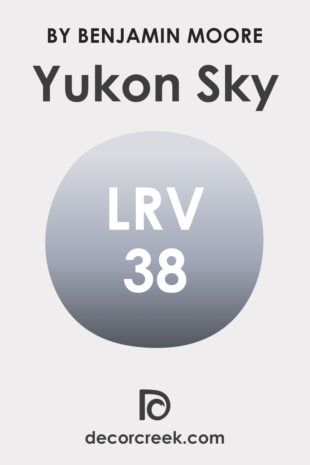
LRV of Yukon Sky 1439
Light Reflectance Value (LRV) is a measure of the percentage of light a paint color reflects. Yukon Sky 1439 has an LRV of 38, placing it in the mid-range category where it neither absorbs nor reflects light excessively. This LRV allows Yukon Sky 1439 to maintain its color integrity without significant lightening or darkening, making it a versatile choice for various lighting scenarios.
In a room with abundant natural light, this LRV will help Yukon Sky 1439 retain a consistent hue throughout the day, while in a less-lit space, it will prevent the color from feeling too heavy or overwhelming.
LRV – what does it mean? Read This Before Finding Your Perfect Paint Color
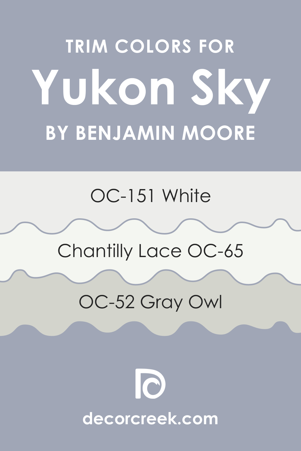
Trim Colors of Yukon Sky 1439
Trim colors are the accents that frame and define the architecture of a room, providing visual boundaries and contrast. The right trim color can enhance the primary wall color, creating a finished and cohesive look. With Yukon Sky 1439, trim colors in shades of white are particularly effective:
- OC-65 Chantilly Lace: A pure, clean white that offers a stark contrast to Yukon Sky 1439, accentuating its color.
- OC-52 Gray Owl: A soft, light gray with cool undertones that complement the cool nature of Yukon Sky 1439.
- OC-151 White: A pale, slightly cool white that provides a subtle trim accent without stark contrast.
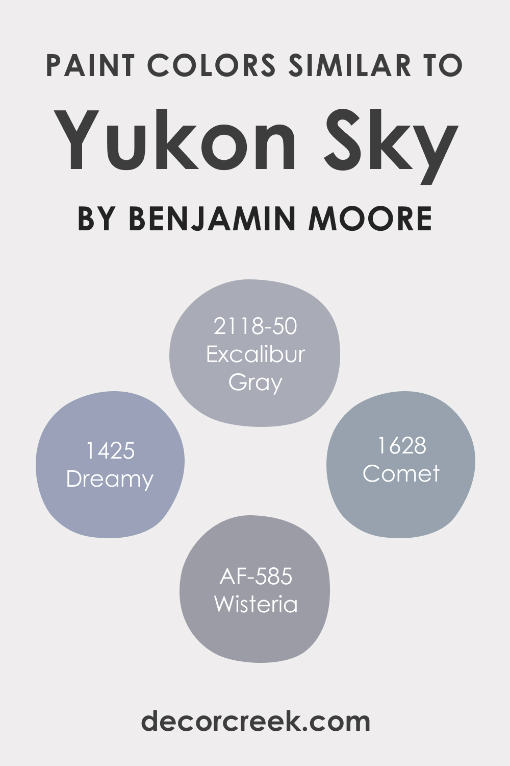
Colors Similar to Yukon Sky 1439
Knowing colors similar to Yukon Sky 1439 is essential for creating a palette that resonates with your design vision while providing alternatives that might cater to specific lighting or stylistic preferences. Similar colors include:
- BM 2118-50 Excalibur Gray: A mystical blend of gray and blue with a balance that echoes Yukon Sky 1439.
- BM 1425 Dreamy: A soft, airy blue with a touch of gray, evoking a sense of calm similar to Yukon Sky 1439.
- BM 1628 Comet: A deeper, more intense blue-gray that shares Yukon Sky’s cool essence but with a bolder presence.
- AF-585 Wisteria: Another kindred spirit, Wisteria offers a lighter approach to the cool gray-blue, reminiscent of a gentle sky at dawn.
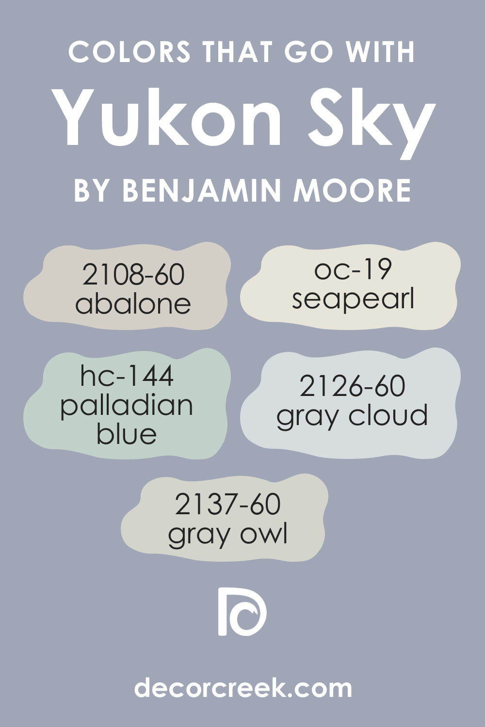
Colors That Go With Yukon Sky 1439
The importance of a cohesive color scheme is paramount in design, ensuring a visual flow and unity within a space. Benjamin Moore offers an array of colors that harmonize well with Yukon Sky 1439:
- BM 2126-60 Gray Cloud: A light, airy gray that complements the mid-tone nature of Yukon Sky 1439.
- BM 2108-60 Abalone: A warm, soft gray with a touch of lavender that adds depth when paired with Yukon Sky 1439.
- HC-144 Palladian Blue: A light blue with a hint of green, offering a refreshing contrast to Yukon Sky 1439.
- OC-19 Seapearl: An off-white with a warm undertone, providing a gentle backdrop that allows Yukon Sky 1439 to stand out.
- BM OC-52 Gray Owl: The cool undertones in Gray Owl create a harmonious connection with the cooler aspects of Yukon Sky 1439.
Each of these colors has been carefully selected to work in concert with Yukon Sky 1439, ensuring a palette that is both balanced and beautiful. Whether it’s the reflective quality of Gray Cloud or the subtle warmth of Abalone, these hues create a dialogue with Yukon Sky 1439 that enhances the overall design narrative.
How to Use Yukon Sky 1439 In Your Home?
Yukon Sky 1439, with its subtle blend of blue and gray, provides a versatile backdrop for a range of rooms and design aesthetics. It’s ideal for creating a serene bedroom retreat or a calming bathroom oasis. This color lends itself well to modern, Scandinavian, and coastal styles, promoting a light, airy feel. In living rooms, it pairs beautifully with soft textures and minimalist decor for a chic, contemporary look. For exteriors, Yukon Sky 1439 offers a modern twist to traditional palettes, complementing natural stone and wood accents.
In the kitchen, it can refresh the space with a clean, crisp vibe. Even kitchen cabinets can be painted in Yukon Sky 1439 for a touch of modern elegance, especially when paired with brushed metal hardware and marble countertops.
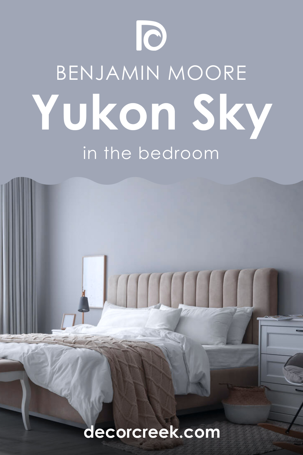
How to Use Yukon Sky 1439 in the Bedroom?
In the bedroom, Yukon Sky 1439 acts as a soothing presence, perfect for enveloping the space in a tranquil ambiance. Its cool undertones evoke a sense of rest and relaxation, ideal for walls behind upholstered headboards or as an accent in an alcove.
This color is adept at complementing natural linens, soft lighting, and bedroom furniture in light woods for a Scandinavian feel, or dark woods for a more traditional look. Pair with plush textures and subtle patterns to create a restful haven that beckons a peaceful night’s sleep.
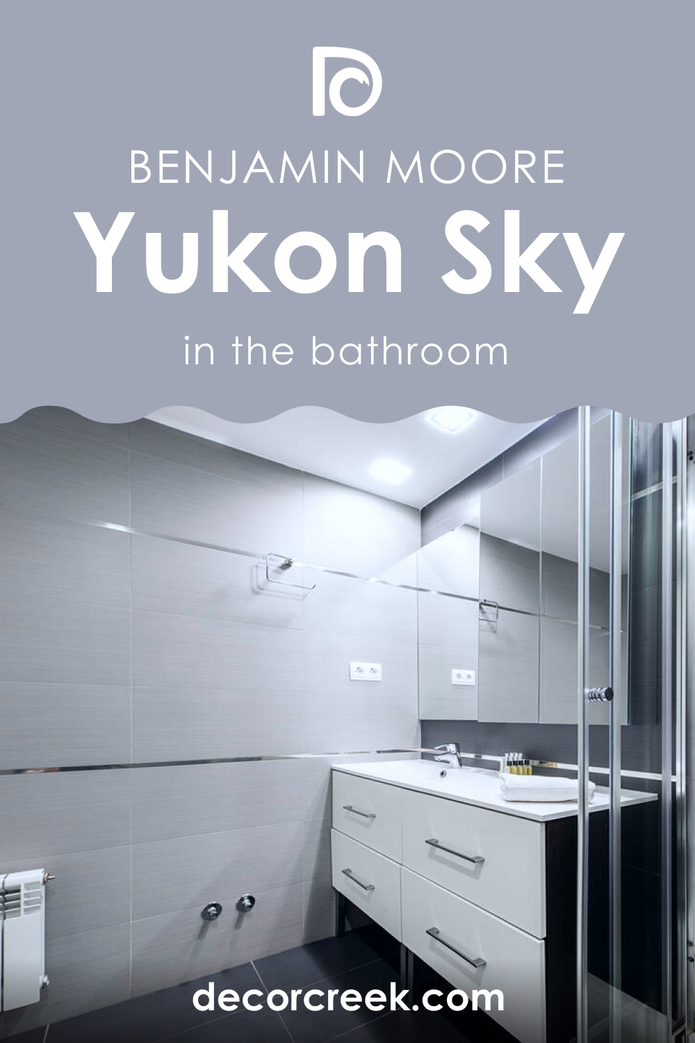
How to Use Yukon Sky 1439 in the Bathroom?
Transform your bathroom into a spa-like retreat with Yukon Sky 1439. This serene hue mirrors the calming effect of water, making it perfect for bathroom walls. It pairs well with crisp white bathroom fixtures and tiles, offering a clean contrast. For a cohesive look, incorporate elements like glass, brushed nickel, or chrome fittings that reflect the coolness of the color. Add in soft towels and a bath mat in coordinating colors like Oxford White or Fantasy Blue to enhance the tranquil palette.
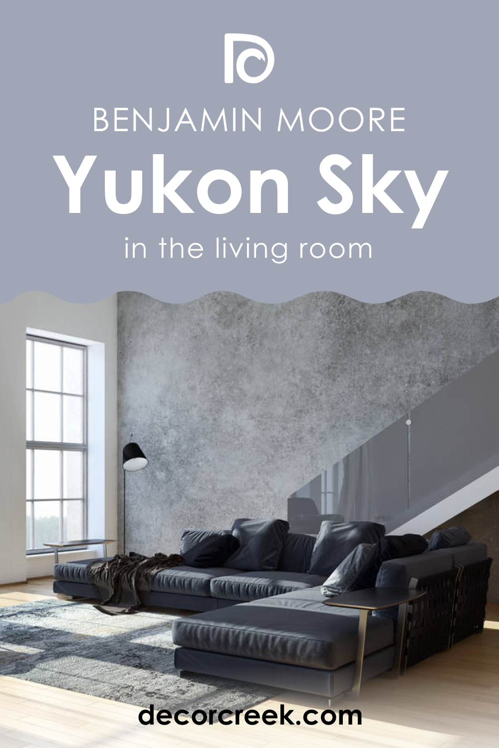
How to Use Yukon Sky 1439 in the Living Room?
Yukon Sky 1439 in the living room sets the stage for a serene gathering space. Its mid-tone nature allows for flexibility in decor, whether it’s against a large picture window or anchoring a feature wall. It’s a perfect canvas for monochromatic schemes or a springboard for more vibrant decor pieces.
Pair with rich textures like velvet cushions and soft throws to create depth, and use natural wood accents to add warmth to the room. Artwork framed in metallic or dark wood can pop against this color, adding personality and interest.
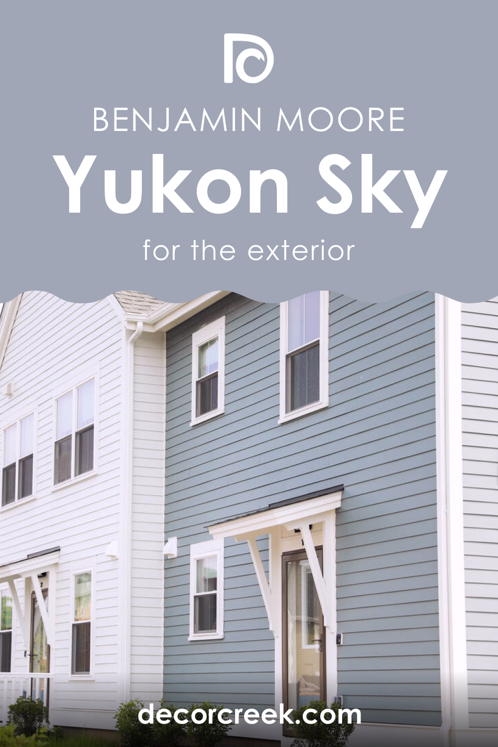
How to Use Yukon Sky 1439 for an Exterior?
Yukon Sky 1439 offers a contemporary and distinctive look for home exteriors. This color stands out in neighborhoods saturated with neutral tones, providing a breath of fresh air without overwhelming the senses. It complements natural exterior elements such as stone, wood, and brick, and works well for both siding and accent trim.
Paired with white or deep charcoal trim, Yukon Sky 1439 can make architectural details sing, while also harmonizing with the landscape, reflecting the colors of the sky and surrounding environment.
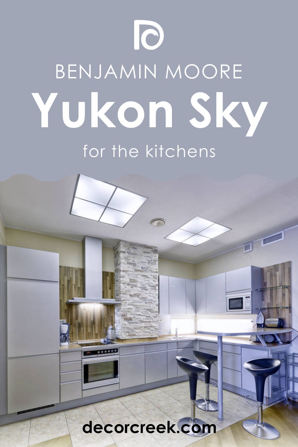
How to Use Yukon Sky 1439 in the Kitchen?
In the kitchen, Yukon Sky 1439 invites a clean and open atmosphere. It’s a refreshing alternative to the traditional whites, providing a subtle hue that enhances the feeling of cleanliness and order. Use it on walls to create a neutral backdrop that lets your countertops and cabinetry stand out.
For an airy feel, pair it with light woods or white marble. To create a dynamic space, introduce pops of color through accessories like vases, kitchen appliances, or an accent rug in a coordinating color like Jute or Fantasy Blue.
How to Use Yukon Sky 1439 on the Kitchen Cabinets?
Kitchen cabinets painted in Yukon Sky 1439 can redefine your kitchen’s aesthetic, infusing it with modernity and subtle sophistication. This color works particularly well on shaker-style cabinets, highlighting their clean lines and bringing a fresh dimension to the space.
Accentuate these cabinets with hardware in brushed nickel or matte black for a contemporary edge. Yukon Sky 1439 cabinets can be complemented by countertops in white quartz or light granite, and a backsplash in subway tiles, either in a similar hue for a seamless look or a contrasting color for visual interest.

Comparing Yukon Sky 1439 With Other Colors
Comparing different colors is crucial when designing a space because it provides perspective on how a color behaves in relation to others. It allows you to see contrasts, harmonies, and the unique personality of each hue. Comparing colors can influence mood, spatial perception, and aesthetic appeal.
Yukon Sky 1439, with its unique blend, can look vastly different when placed next to colors with varying undertones. Understanding these differences ensures that you select the right color combinations for a cohesive and visually pleasing design scheme.
Yukon Sky 1439 vs. SW 9135 Whirlpool
Yukon Sky 1439 and BM SW 9135 Whirlpool both share a tranquil blue foundation, but Whirlpool leans more into the depth of the ocean’s hues, offering a slightly more saturated and darker presence. While Yukon Sky whispers calm, Whirlpool speaks it more clearly, making it more dominant when used in a space. Yukon Sky is like the light blue of an early morning sky, whereas Whirlpool mirrors the deeper tones of the sea under a clear sky at midday.
Yukon Sky 1439 vs. BM 1437 Violet Mist
Violet Mist stands apart from Yukon Sky 1439 by introducing a subtle, more romantic purple undertone. While Yukon Sky is reminiscent of a cool, grayish-blue sky, Violet Mist evokes the ethereal quality of a hazy dawn. In a space, Violet Mist brings a soft warmth, contrasting with Yukon Sky’s cooler and more neutral calming effect. When placed side by side, Yukon Sky offers a more traditional blue while Violet Mist can add a touch of whimsy and softness.
Yukon Sky 1439 vs. BM 1418 Oriental Iris
BM 1418 Oriental Iris diverges from Yukon Sky 1439 by embracing a bolder, more floral-inspired tone. Oriental Iris contains a richness that echoes the petals of its namesake flower, while Yukon Sky maintains a crisp, airy quality. In an interior, Oriental Iris demands more attention and is a stronger statement, whereas Yukon Sky serves as a subtle backdrop that complements other design elements.
Yukon Sky 1439 vs. BM 1438 Lavender Blue
BM 1438 Lavender Blue is where the soothing nature of blue meets the gentle caress of lavender, offering a more whimsical and soft aesthetic compared to the composed calmness of Yukon Sky 1439. Lavender Blue can infuse a room with a touch of playful femininity, making it ideal for nurseries or restful reading corners, while Yukon Sky’s neutrality is more versatile across various spaces and functions.
Yukon Sky 1439 vs. BM 1440 Irises
Against BM 1440 Irises, Yukon Sky 1439 seems to step back, allowing Irises to lead with a stronger narrative. Irises has a more pronounced violet tone, reminiscent of the flower’s vivid hues, giving it a sense of creative flair. Yukon Sky, in contrast, has a restrained elegance that blends more seamlessly with a wide array of design elements, making it a go-to for those seeking a more subtle ambiance.
Yukon Sky 1439 vs. BM 1441 Amethyst Shadow
BM 1441 Amethyst Shadow brings a deeper, more mysterious quality to the palette than Yukon Sky 1439. While Yukon Sky reflects the light and openness of a clear day, Amethyst Shadow is more reminiscent of twilight’s dusky moments. This color can create a more dramatic and cozy atmosphere in a space, whereas Yukon Sky maintains an airy lightness.
Conclusion
The process of comparing Yukon Sky 1439 with other colors reveals the importance of context and relationship in color selection. Each comparison brings out different aspects of Yukon Sky’s character, from its calming neutrality to its cool sophistication. This exercise demonstrates that a color cannot be truly understood in isolation; it is the interplay with other hues that fully reveals its potential within a space.
When choosing colors for a design project, the comparisons provide invaluable insight into the mood and style one can curate. Yukon Sky 1439’s versatility is its strength, able to harmonize with a spectrum of colors, from the soft whisper of Violet Mist to the deeper narrative of Amethyst Shadow.
This adaptability makes Yukon Sky 1439 a reliable choice for those seeking a color that offers both tranquility and elegance, grounding a space without ever overpowering it.
Ever wished paint sampling was as easy as sticking a sticker? Guess what? Now it is! Discover Samplize's unique Peel & Stick samples.
Get paint samples
Frequently Asked Questions
⭐What undertones does Yukon Sky have?
Yukon Sky has subtle cool undertones, blending hints of soft blue and grey, creating a light and airy feel.
⭐ Is Yukon Sky suitable for exterior use?
Yes, its light and versatile nature makes it an excellent choice for exteriors, giving a fresh and welcoming appearance
⭐Can I use Yukon Sky in a kitchen?
Absolutely. Yukon Sky can create a clean and open atmosphere in kitchens, especially when paired with white cabinets and natural light.
⭐What complementary colors go well with Yukon Sky?
Soft neutrals, such as light greys and warm whites, or earthy tones like sandy beiges and soft greens, complement Yukon Sky beautifully.
⭐How does lighting affect Yukon Sky?
In natural light, Yukon Sky tends to look brighter and more vibrant. Artificial lighting, depending on its warmth, can enhance its grey or blue undertones.
⭐What finish is best for Yukon Sky in a bathroom?
A semi-gloss or satin finish is recommended for bathrooms, as it resists moisture well and makes the color pop.
⭐ Is Yukon Sky a good choice for small rooms?
Yes, its light reflective qualities can make small rooms appear larger and more open, making it an excellent choice for creating the illusion of space.


