If you’re thinking about refreshing your room and giving it a welcoming, airy feel, you might want to consider SW 7626 Zurich White by Sherwin Williams. Before you make your decision, it’s important to understand a few key aspects about this particular shade of white.
Zurich White isn’t just a plain white; it has subtle nuances that can dramatically affect the ambiance of a room depending on the lighting and surrounding colors. It’s a great option if you’re looking for something that will complement a variety of decor styles and color palettes.
I found it helpful to check how it looks in different areas of my home at various times of the day. Zurich White often reflects the colors around it, taking on a slightly different shade in morning light compared to what you see during sunset hours.
Moreover, you should consider the finish of the paint—whether matte, eggshell, or glossy—as it influences the final appearance. Each finish interacts uniquely with this shade, affecting its overall feel and ease of maintenance. By keeping these points in mind, you can better decide if Zurich White is the right fit for your next project.
Let’s look at the specifics and see how this color can work for you.
Is Zurich White SW 7626 Right for My Home?
Zurich White by Sherwin Williams is a delightful neutral shade that leans towards a soft, warm gray with subtle hints of beige. It’s the perfect background color because it’s not too stark, manages to add warmth while still being relatively light, and fits seamlessly into various rooms. It’s like a cozy hug for your room, setting a welcoming tone without overpowering other elements.
I’ve found that Zurich White works beautifully in modern and transitional interiors. It complements clean lines and minimalist designs superbly, providing a smooth, unobtrusive backdrop. This color also shines in rustic settings where its warmth enhances natural wood elements, adding a gentle contrast that highlights organic beauty.
When it comes to pairing materials and textures with Zurich White, the possibilities are exciting. I love matching it with polished marble for a touch of elegance in kitchens and bathrooms. Soft, plush textiles like velvet in deeper hues contrast wonderfully, making the room feel more layered and inviting. Matte finishes on metals such as brass or copper fixtures bring a lovely dimension and a bit of glow that makes the whole room feel more put together.
Overall, Zurich White is adaptable and easy to work with, helping other design elements stand out. Whether I’m dealing with wood, glass, or any kind of fabric, it provides a consistently beautiful backdrop that enhances the overall aesthetic of a room.
decorcreek.com
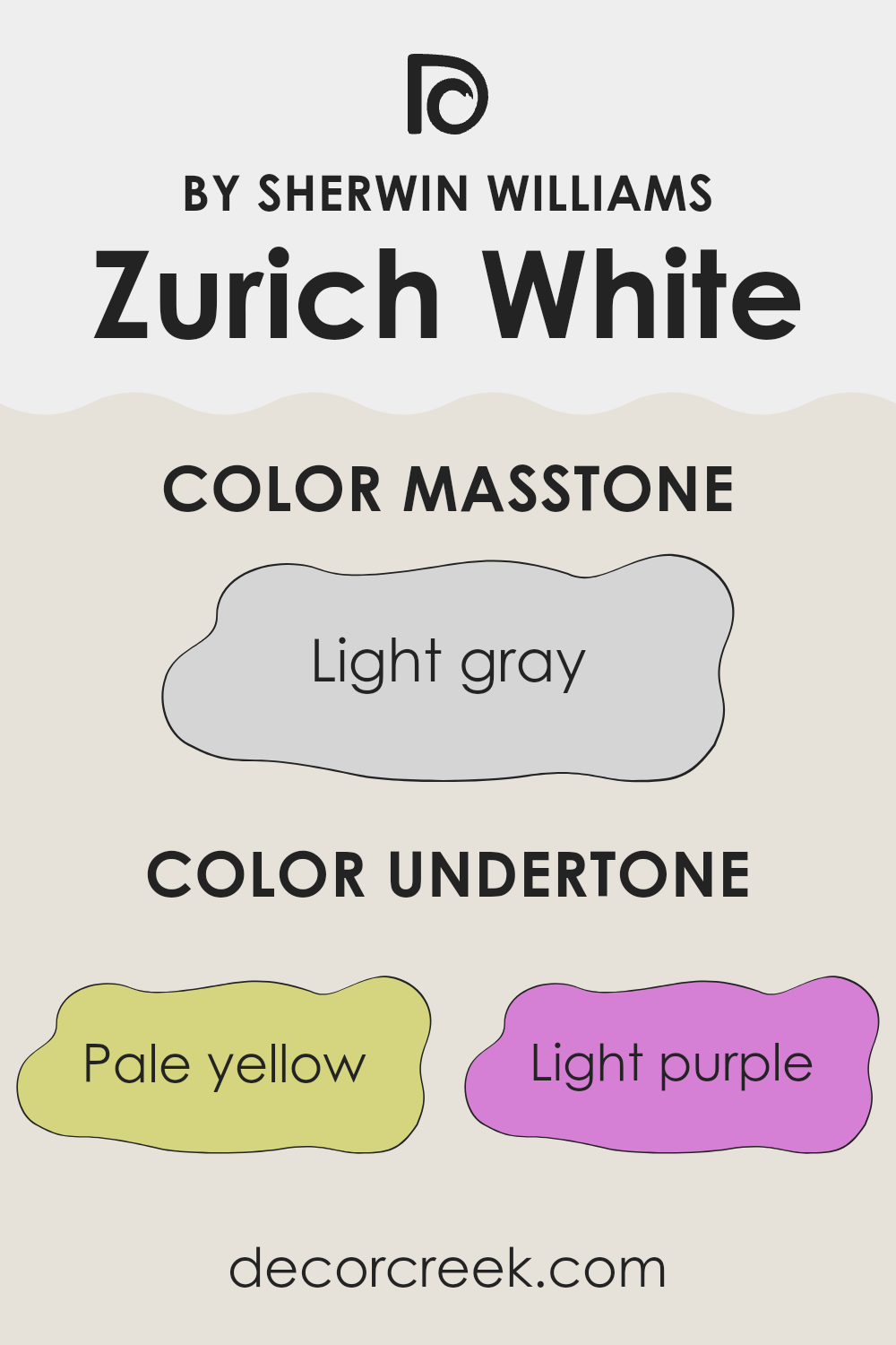
What are the right undertones of Zurich White SW 7626 ?
Zurich White is a paint color known for its adaptable nature and subtle complexity due to its mixture of undertones. Undertones are subtle colors that influence the main hue and can significantly affect how a color appears in different lighting conditions. For instance, a color like Zurich White might look differently in sunlight versus artificial light due to its undertones.
Zurich White is associated with several undertones including pale yellow, light purple, light blue, pale pink, mint, lilac, and grey. Each of these undertones contributes to the overall look and feel of the paint once applied to interior walls.
Pale yellow and mint undertones can make a room feel warmer and more inviting, radiating a soft, gentle aura. On the other hand, light purple and lilac bring a cool, subtle depth that can make a room feel more open and airy.
Light blue and pale pink also add to this cooling effect but bring their own unique softness to the environment, influencing the room’s aesthetic in a delicate manner. The grey undertone helps balance the other hues, ensuring that the color remains neutral and flexible, adjusting well to various decors and lighting conditions.
When used on interior walls, Zurich White with its rich blend of undertones provides a neutral backdrop that is far from plain. It allows for great creativity in decorating, as it can pair well with many different textures and accent colors.
The variety of undertones in Zurich White also means that it can react dynamically with natural and artificial lights, subtly shifting its appearance as the lighting changes throughout the day. This makes Zurich White an excellent choice for those looking for a color that offers both simplicity and nuance in their room.
decorcreek.com
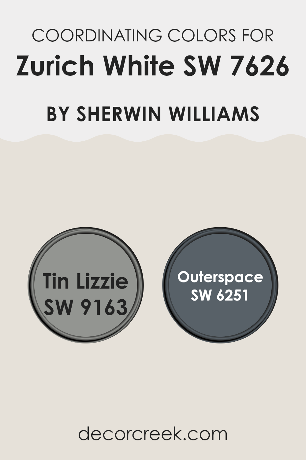
Best Coordinating Colors to use with Zurich White SW 7626 by Sherwin Williams this year.
Coordinating colors are those that work well together visually, enhancing each other when used in the same design room. They often share certain hues or tonal qualities that create a harmonious look. For example, when you have a base color like a soft white, choosing complementary colors can bring out the best in both the primary shade and its companions.
One such companion to a light neutral is SW 9163 – Tin Lizzie, which is a gray tone that leans slightly towards blue. This gives it a cool and calm appearance while still being solid enough to make a statement.
It pairs well with lighter colors by providing contrast without overpowering the softer shades. Another coordinating color is SW 6251 – Outerspace, which has a deep, charcoal-like quality that makes it robust and grounding. This darker color works effectively to provide depth and definition to rooms, especially when used as an accent against lighter walls. Together, these colors create a visually appealing palette that is harmonious yet dynamic, offering a blend of subtlety and strength.
You can see recommended paint colors below:
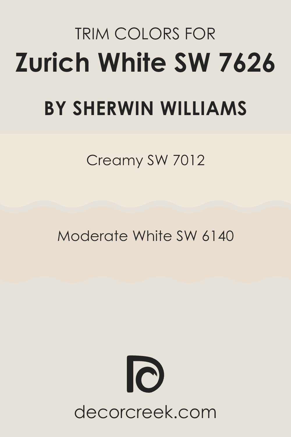
Trendy Trim Colors of Zurich White SW 7626 by Sherwin Williams to use this year.
Trim colors play a crucial role in enhancing the visual impact of a paint job, particularly with a base color like Zurich White by Sherwin Williams. Choosing the right trim color can effectively frame and subtly highlight the primary color, guiding the eye and defining architectural details.
For Zurich White, a hue like SW 7012 – Creamy or SW 6140 – Moderate White can be particularly effective. These colors offer a gentle contrast that can highlight the crisp, clean nature of Zurich White without overpowering it, establishing a smooth and pleasing aesthetic.
SW 7012 – Creamy is a soft, warm white that brings a slight hint of yellow, making it a comforting and inviting choice for trim. It’s an adaptable shade that works beautifully to soften transitions between rooms and enhance natural light.
On the other hand, SW 6140 – Moderate White leans towards a neutral, understated tone that blends well with many color schemes. This color is particularly beneficial for creating a subtle distinction that maintains a unified look while still offering enough contrast to make architectural features stand out. Both options ensure that Zurich White stands out attractively, providing balance and harmony within the room.
You can see recommended paint colors below:
- SW 7012 Creamy
- SW 6140 Moderate White
Evergreen Colors Similar to Zurich White SW 7626 by Sherwin Williams
Similar colors play a crucial role in creating a harmonized and aesthetically pleasing environment. When colors, such as those akin to Zurich White by Sherwin Williams, are grouped together, they produce a visually cohesive room.
This is because similar hues share a base tone, allowing them to blend seamlessly without clashing. They provide subtle variations that add depth and interest without feeling too intense to the senses. Such a palette is ideal for creating a restful and inviting atmosphere in areas like living rooms or bedrooms.
For instance, Heron Plume is a soft, understated gray with hints of beige, adding warmth without darkness. Toque White offers a lighter touch, almost ethereal, and pairs beautifully with a variety of brighter or darker shades. Aesthetic White brings a hint of gray, which makes it adaptable and easy to coordinate with other decors.
Pearly White has a luminous quality, reflective and subtle, perfect for rooms needing a gentle lift. Sunbleached provides a warm, creamy appearance, reminiscent of sunlit rooms. Eider White strikes a balance with a cool undertone, ideal for those who prefer a crisp finish. Origami White is clean and clear, providing a straightforward appeal to any room.
White Heron stands out with a pure, almost pristine quality, suitable for a sharp, modern look. Incredible White has a slightly deeper tone, offering a rich layer to the design palette. Lastly, Sanctuary has a barely-there pink undertone, providing a unique but understated warmth that makes rooms feel welcoming. These similar colors can create a smooth visual flow, making them perfect choices for crafting a cohesive interior design scheme.
You can see recommended paint colors below:
- SW 6070 Heron Plume
- SW 7003 Toque White
- SW 7035 Aesthetic White
- SW 7009 Pearly White
- SW 9585 Sunbleached
- SW 7014 Eider White
- SW 7636 Origami White
- SW 7627 White Heron
- SW 7028 Incredible White
- SW 9583 Sanctuary
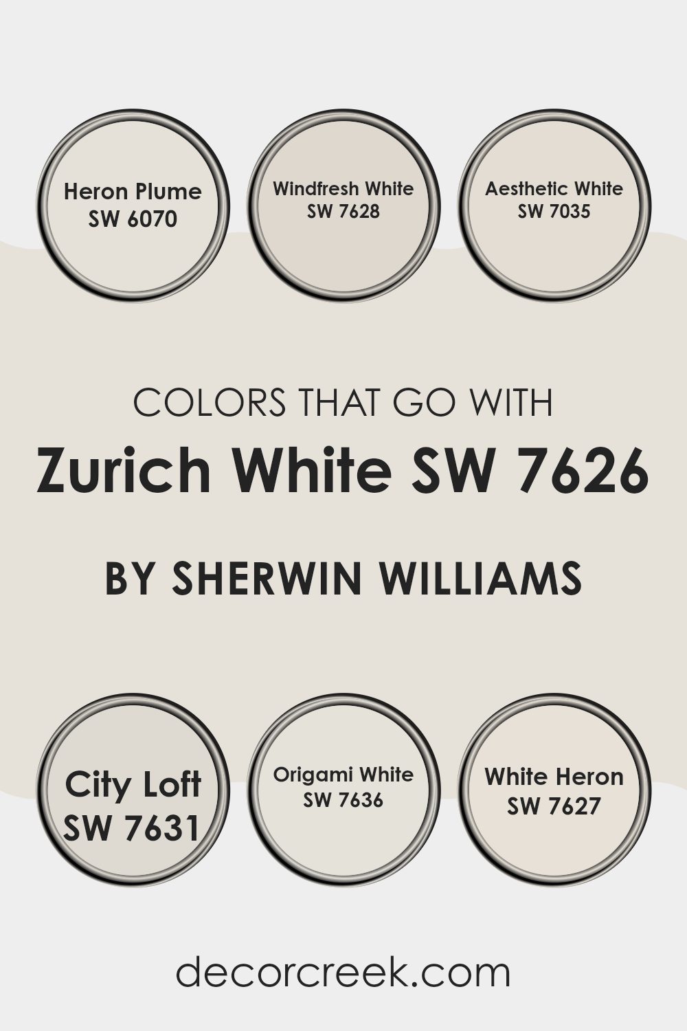
Colors that Go With Zurich White SW 7626 by Sherwin Williams
Choosing colors that complement Zurich White SW 7626 by Sherwin Williams is critical because it ensures that the rooms you decorate feel harmonious and visually appealing.
These complementary colors, such as SW 6070 – Heron Plume and others, work together by balancing the room’s ambiance and enhancing the overall aesthetic without overpowering the subtle nuances of Zurich White. Each color plays a role in achieving a cohesive look, be it in giving depth, contrast, or a sense of continuity within a room, making your design choices appear intentional and well-thought-out.
For example, Heron Plume is a soft and quiet color that offers a subtle contrast to the crisp Zurich White, providing a neat and unobtrusive backdrop in a room. Not too demanding, it allows other design elements to stand out. Windfresh White, on the other hand, is a bit cooler, providing a clean and fresh look, perfectly complementing the warm undertones of Zurich White to create a balanced and airy feel.
Aesthetic White brings a hint of warmth, ideal for cozy settings and pairs nicely with Zurich White for a smooth transition between colors. City Loft offers a slightly grayish tone, adding depth and interest to rooms without feeling too intense to the senses.
Origami White brings light and openness into the room, its purity and simplicity enhancing the contemporary feel when paired with Zurich White. Lastly, White Heron has a bright and inviting appeal, maintaining a refreshing look while staying grounded in simplicity, perfect for modern aesthetics where clean lines and minimalism are key. Together, these colors create an environment that feels well put together and pleasant for any living or working room.
You can see recommended paint colors below:
- SW 6070 Heron Plume
- SW 7628 Windfresh White
- SW 7035 Aesthetic White
- SW 7631 City Loft
- SW 7636 Origami White
- SW 7627 White Heron
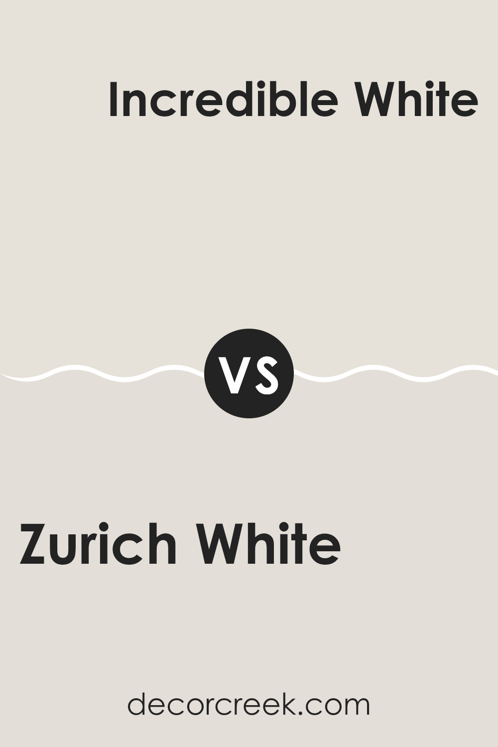
Zurich White SW 7626 by Sherwin Williams vs Incredible White SW 7028 by Sherwin Williams
Zurich White and Incredible White are both popular paint choices from Sherwin Williams, but they offer subtle differences. Zurich White tends to have a slightly warmer tone, which gives it a cozy and inviting feel.
This makes it great for living rooms and bedrooms where a soft, welcoming atmosphere is desired. On the other hand, Incredible White leans towards a cooler shade. It has hints of gray that deliver a cleaner, more neutral look.
This color works well in rooms that aim for a modern or minimalistic aesthetic, such as kitchens and bathrooms. Both colors are adaptable and can brighten up a room efficiently, but your choice might depend on the specific mood or style you are hoping to achieve in your room.
You can see recommended paint color below:
Zurich White SW 7626 by Sherwin Williams vs Sunbleached SW 9585 by Sherwin Williams
Zurich White and Sunbleached are two paint colors that each have a unique feel. Zurich White is a soft, warm white that has a cozy, welcoming vibe. It’s adaptable enough to work well in almost any room, offering a clean and calm background.
In contrast, Sunbleached has a more distinct look. It’s a light, faded gray with hints of beige, reminiscent of wood worn by time and weather. This color is great for creating a rustic or vintage atmosphere, adding a touch of nostalgia to rooms.
While Zurich White is more about purity and simplicity, Sunbleached brings an aged, relaxed charm. These colors can complement each other in a room, with Zurich White brightening the room and Sunbleached adding character and depth.
You can see recommended paint color below:
Zurich White SW 7626 by Sherwin Williams vs Pearly White SW 7009 by Sherwin Williams
Zurich White and Pearly White are two shades from Sherwin Williams that look quite similar at first glance but have subtle differences. Zurich White has a very soft, warm gray undertone, making it a great neutral option for walls.
It reflects light beautifully, which can help make small rooms appear bigger and more inviting. On the other hand, Pearly White is slightly warmer due to its beige undertone, giving it a creamier look.
This color is ideal for creating a cozy and welcoming atmosphere in any room. Both colors are adaptable in terms of matching with other hues, but Pearly White tends to create a warmer feel, making it better suited for living areas or bedrooms, while Zurich White is perfect for a more modern, clean look in places like kitchens or bathrooms.
You can see recommended paint color below:
Zurich White SW 7626 by Sherwin Williams vs Eider White SW 7014 by Sherwin Williams
Zurich White and Eider White are both popular paint colors from Sherwin Williams. Zurich White has a warm, creamy hue that gives a cozy and inviting feel to any room. It’s a great choice for living rooms or bedrooms where you want a soft, comforting atmosphere.
On the other hand, Eider White has a cooler tone, leaning slightly towards gray, making it look more modern and fresh. This makes it suitable for rooms like kitchens and bathrooms, or any area where you want a clean, crisp look.
Although they are both technically ‘white,’ the subtle differences in warmth and undertones mean they can create very different moods and styles in a room, with Zurich White feeling more traditional and Eider White feeling more contemporary.
You can see recommended paint color below:
Zurich White SW 7626 by Sherwin Williams vs White Heron SW 7627 by Sherwin Williams
Zurich White and White Heron are both popular paint colors from Sherwin Williams, but they have subtle differences. Zurich White has a warm undertone that gives rooms a cozy, inviting feel. It works well in rooms that need a soft backdrop, adding a gentle warmth without overpowering the room.
On the other hand, White Heron is slightly cooler, offering a clean and bright appearance that can help make a room feel more spacious and airy. This color is excellent for areas that receive a lot of natural light, as it enhances the light’s reflectivity without adding any color bias.
While both shades are adaptable, your choice between them could depend on the mood you want to create and the natural light in your room. Whether it’s the warm, subtle hint of Zurich White or the crisp, fresh tone of White Heron, both colors provide a beautiful and neutral base for any interior.
You can see recommended paint color below:
- SW 7627 White Heron
Zurich White SW 7626 by Sherwin Williams vs Sanctuary SW 9583 by Sherwin Williams
Zurich White and Sanctuary are two distinct paint colors from Sherwin Williams, each bringing its own unique vibe to a room. Zurich White is a soft, warm white that provides a clean and calming background. It’s perfect for making a room feel more spacious and bright without being stark or cold. This makes it a great choice for almost any room, especially if you want to show off other design elements.
On the other hand, Sanctuary is a deeper, more earthy color that could be described as a dusky taupe. It offers a cozy and inviting feel, adding depth to walls and creating a calming atmosphere. Sanctuary tends to work well in intimate rooms like bedrooms or reading nooks, where the goal is to create a peaceful retreat.
Together, these colors could complement each other nicely in a home, with Zurich White brightening up a room and Sanctuary adding interesting contrast and warmth.
You can see recommended paint color below:
- SW 9583 Sanctuary
Zurich White SW 7626 by Sherwin Williams vs Toque White SW 7003 by Sherwin Williams
Zurich White and Toque White are two popular shades from Sherwin Williams. Zurich White leans towards a soft, warm gray with a hint of beige, making it an ideal choice for a cozy, inviting atmosphere. It’s great for rooms where you want a neutral backdrop that adds a bit of warmth without overpowering the room with color.
On the other hand, Toque White is lighter and has a cooler tone, with a subtle gray influence. This color is perfect for creating a clean, fresh look in a room. It reflects light beautifully, making it a good option for smaller rooms or areas with limited natural light.
Both colors are adaptable and can work well in various design styles, but Zurich White’s warmer tones provide a more homely feel, whereas Toque White offers a crisper appearance. Depending on the mood you want to set, either could be a fitting choice for walls, trim, or cabinetry.
You can see recommended paint color below:
- SW 7003 Toque White
Zurich White SW 7626 by Sherwin Williams vs Heron Plume SW 6070 by Sherwin Williams
Zurich White and Heron Plume are both subtle and neutral colors from Sherwin Williams. Zurich White is a soft, warm white with a hint of gray. It creates a gentle and inviting atmosphere wherever it is used, making rooms feel cozy yet light.
On the other hand, Heron Plume has a slightly darker tone compared to Zurich White. It leans more towards a light gray color, providing a calm and quiet backdrop that is adaptable enough to complement a variety of décor styles and other colors.
When comparing the two, Zurich White is brighter and warmer, making it an excellent choice for rooms where you want to create an open, airy feel. Heron Plume, with its gray undertones, offers a sturdier look that can help define a room while still maintaining a soft and neutral palette. Both colors are excellent for creating a peaceful and inviting environment.
You can see recommended paint color below:
- SW 6070 Heron Plume
Zurich White SW 7626 by Sherwin Williams vs Aesthetic White SW 7035 by Sherwin Williams
Zurich White and Aesthetic White, both from Sherwin Williams, offer subtle yet distinct nuances in white paint colors that could subtly influence the mood and look of a room. Zurich White has a warm, creamy undertone that makes it slightly more inviting and cozy, ideal for living rooms or bedrooms where a soft, welcoming atmosphere is desired.
In contrast, Aesthetic White leans towards a greyish tone, giving it a neutral, more balanced appearance that works well in rooms that aim for a contemporary, clean look without feeling too stark.
Zurich White can help enhance a room with its gentle warmth, making it particularly effective in rooms with less natural light or in cooler climates to add a touch of coziness. Aesthetic White, being a chameleon, adjusts well to different lighting environments and decorations, maintaining a crisp and fresh look that supports various decor styles without overpowering them. Choosing between these two depends largely on the mood one wishes to achieve and the existing elements of the room.
You can see recommended paint color below:
- SW 7035 Aesthetic White
Zurich White SW 7626 by Sherwin Williams vs Origami White SW 7636 by Sherwin Williams
Zurich White and Origami White are both neutral shades from Sherwin Williams, but they have noticeable differences. Zurich White leans towards a warm, creamy white with subtle gray undertones. This makes it a cozy choice for living rooms where a soft, welcoming feel is desired.
On the other hand, Origami White is a bit cooler and crisper. It has a cleaner appearance, thanks to its gray and beige undertones, which give it a more modern vibe. The choice between them might depend on the lighting in your room.
Zurich White works well in rooms with natural light, enhancing a warm, inviting atmosphere. Origami White is ideal for areas with either natural or artificial light, offering a more neutral backdrop. While both colors share an adaptable palette, your final choice will hinge on the specific mood or style you want to achieve in your room.
You can see recommended paint color below:
- SW 7636 Origami White
In conclusion, SW 7626 Zurich White by Sherwin Williams is a wonderful paint color that anyone looking to brighten up their home should consider. It’s like a gentle white that isn’t too stark or harsh. This color reminds me of a cozy, soft blanket, making everything feel clean and fresh but still very warm and inviting.
What’s great about Zurich White is how well it goes with different colors. Whether you have dark furniture or light curtains, this paint makes everything look better together. It’s perfect for almost any room, from a sunny kitchen to a relaxing bedroom.
I’ve learned that Zurich White also does an excellent job of making small rooms look bigger and more open. This is super helpful in places like small bathrooms or narrow hallways. Plus, it’s nice knowing that this color won’t go out of style. It’s simple and will keep your home looking nice for a long time.
Choosing Zurich White from Sherwin Williams can really change how your home feels. It makes every room look clean, bright, and welcoming. I would definitely recommend it to anyone looking to give their home a fresh, pretty look.
decorcreek.com
Ever wished paint sampling was as easy as sticking a sticker? Guess what? Now it is! Discover Samplize's unique Peel & Stick samples.
Get paint samples

