When you choose a paint color for your home, SW 7014 Eider White by Sherwin Williams is a popular choice that you should consider. This shade is often praised for its flexibility, smoothly fitting into many settings and styles. However, like any color choice, Eider White comes with its nuances that you should be aware of before making your decision.
Firstly, it’s essential to note that Eider White is not a pure white. It has subtle undertones that can shift in different lighting conditions. In some lights, it may appear as a soft, warm gray, while in others, it reveals hints of a very light greige. This chameleon-like quality makes it a great option if you want a color with a bit more depth than a stark white.
Moreover, integrating this color into your rooms requires attention to the lighting and existing elements in your room. You will find that Eider White pairs beautifully with a variety of decor styles and other colors, serving as a perfect backdrop for bold accents or a cohesive base for more muted designs.
Whether you’re painting a sunlit living room or a cozy, dimly lit study, Eider White can enhance your room nicely.
This informed introduction will guide you as you consider adding SW 7014 Eider White to your home’s palette.
Is Eider White SW 7014 Right for My Home?
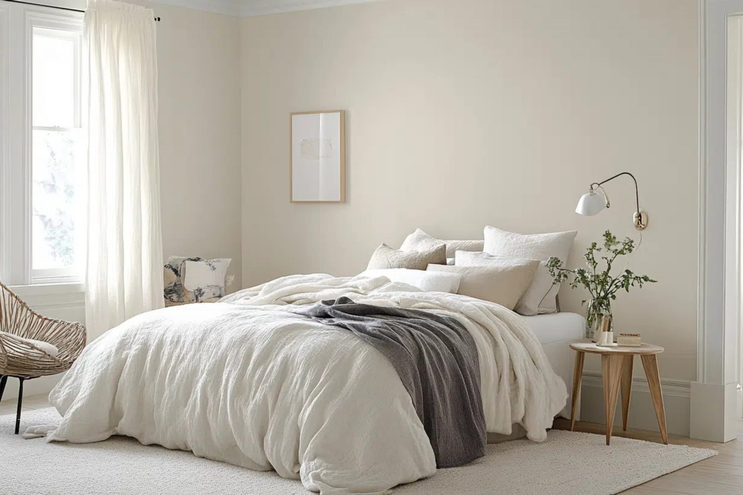
Eider White, a unique shade by Sherwin Williams, strikes a delicate balance between white and gray, with a whisper of a rosy undertone. In my experience, this color has a soft, subtle presence that makes it incredibly flexible for different interior designs, from minimalistic to modern, and even rustic styles.
The tone works especially well in rooms that aim for a clean and airy feel. I love using it in bedrooms and living areas where relaxation is key. Eider White goes beyond just walls—it looks fantastic on trim or cabinetry for a cohesive look.
When thinking about pairing materials, I find that Eider White complements natural wood beautifully, whether it’s a light oak or a darker walnut. The warmth of wood really brings out the color’s softness. Additionally, metallic finishes like brushed nickel or copper add a lovely contrast to its subtle hue. Textures such as linen or cotton in soft colors enhance the gentle nature of Eider White, creating a comfortable, inviting room.
Velvets and silks can also be lovely with Eider White for a bit of luxury without feeling too strong against its simplicity. Overall, I have found that Eider White serves as a fantastic backdrop that supports a range of materials and textures, allowing design elements to truly shine.
What are the right undertones of Eider White SW 7014 ?
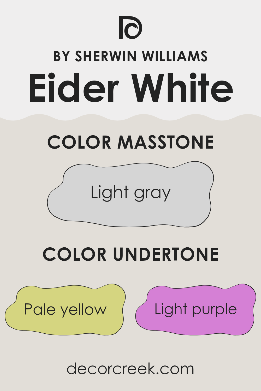
Eider White by Sherwin Williams is a popular paint color known for its subtle complexity, due in part to its range of undertones. Undertones are subtle colors that influence a primary paint color under different lighting conditions, affecting the main hue’s overall appearance. Eider White is primarily seen as a soft, warm gray, but it also carries undertones of pale yellow, light purple, light blue, pale pink, mint, lilac, and gray.
In the world of interior design, these undertones play a crucial role in how the paint looks on your walls at different times of the day. For instance, during the morning light, the pale yellow and light blue undertones might make Eider White appear cooler and more refreshing. As the day progresses into evening, the light purple and pale pink might come forward, warming up the room with a subtle, cozy glow.
When used on interior walls, the varied undertones of Eider White can make the room feel more lively and able to adjust to different furnishings and light conditions. This shifting quality means that it’s great for rooms that are used all day, like living rooms or kitchens, as the color gently changes with the light.
However, those considering this color should also take into account the orientation of the windows and other light sources, as these factors can highlight different undertones at different times. Overall, understanding and considering the undertones in Eider White can help achieve the desired atmosphere in a room.
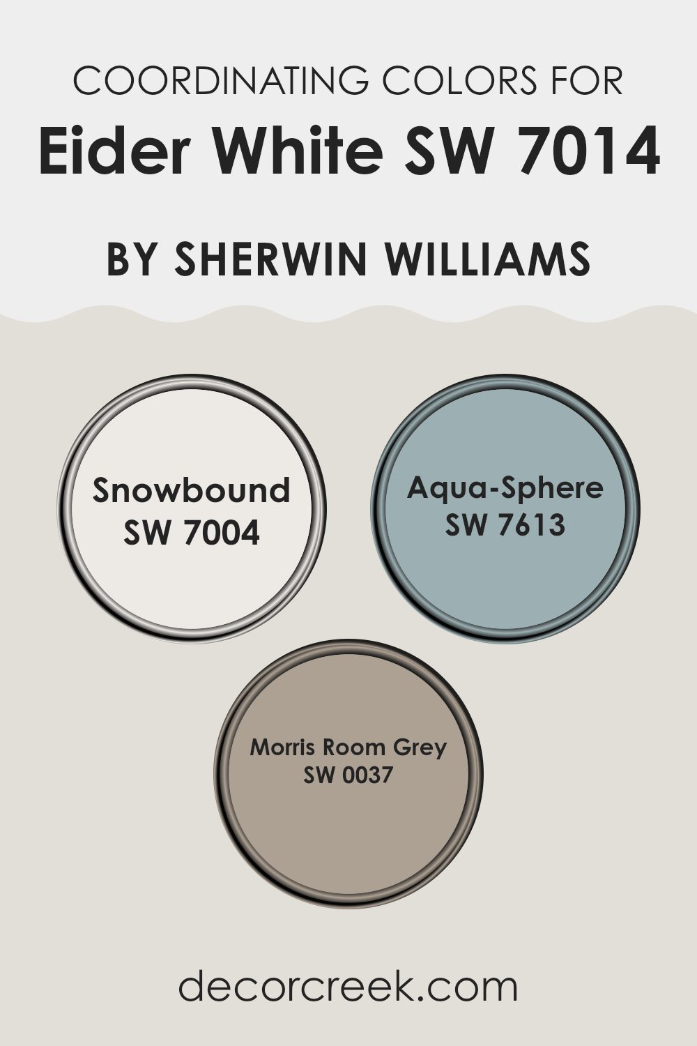
Best Coordinating Colors to use with Eider White SW 7014 by Sherwin Williams this year.
Coordinating colors are shades that complement each other and work well together in a room, enhancing the overall aesthetic without feeling too strong. These colors can either be contrasting or harmonious, depending on the desired effect. When you select coordinating colors for a room, you aim to create a balanced and visually appealing environment. This is particularly crucial in interior design where the colors must function well both in daylight and under artificial lighting.
For instance, Eider White can be beautifully paired with Snowbound, which is a lighter shade of off-white. Snowbound has slightly gray undertones that make it an excellent choice for trim or cabinetry to complement wall colors. Another coordinating color, Aqua-Sphere, adds a touch of softness with its muted teal hue.
This color is ideal for adding a subtle pop of color in accessories or as an accent wall. Lastly, Morris Room Grey offers a steady, grounding counterpoint with its deeper gray shade. It works well for furniture or even an accent wall, providing depth and contrast to the lighter tones of Eider White and Snowbound. Together, these colors create a coherent and pleasing palette.
You can see recommended paint colors below:
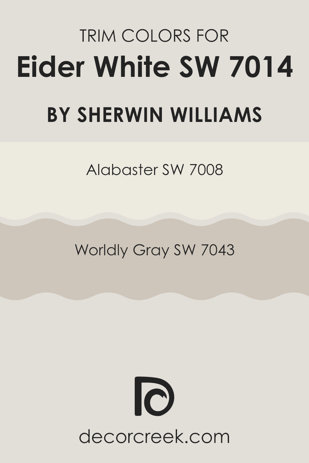
Trendy Trim Colors of Eider White SW 7014 by Sherwin Williams to use this year.
Trim colors play a crucial role in defining and accentuating the style and ambiance of a room painted in Eider White by Sherwin Williams. Choosing the right trim color can add contrast, highlight architectural details, and create a finished look that complements the overall color scheme. Alabaster and Worldly Gray are two effective trim colors that pair well with Eider White due to their subtle yet distinct tones that enhance without feeling too strong against the primary color.
Alabaster SW 7008 is a light, creamy shade that offers a clean and fresh appearance when used as a trim color. Its warm undertones help soften the edges and corners of a room painted in Eider White, providing a gentle transition between wall and trim.
Worldly Gray SW 7043, on the other hand, is a deeper, neutral gray that contrasts nicely with Eider White. This color helps highlight the trim while adding depth and interest to the overall color scheme, making architectural details stand out more clearly. Both these colors support the neutral palette of Eider White, enhancing its appeal without taking away from its main qualities.
You can see recommended paint colors below:
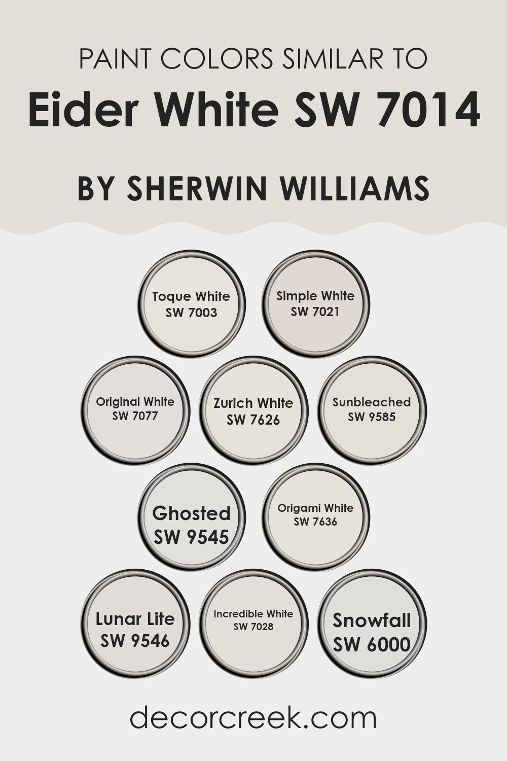
Evergreen Colors Similar to Eider White SW 7014 by Sherwin Williams
Choosing similar colors for interior rooms is crucial because it helps create a harmonious and visually coherent environment. When colors share similar tones or intensities, they work together smoothly, enhancing the aesthetics without feeling too strong. This continuity can make a room feel larger and more connected. Colors that are close in shade, like those related to Eider White, provide subtle variations that add depth and interest without the risk of clashing.
Toque White is a gentle hue with a hint of beige, making it warm and inviting. Simple White, as the name suggests, is straightforward and clean, offering a subtle brightness without starkness. Original White has a slight cream undertone, perfect for adding a cozy warmth. Zurich White bridges the gap between gray and white, lending itself to a modern yet soft look.
Sunbleached offers a washed-out grayish tone, evoking the feel of sun-faded materials. Ghosted is an airy pale gray, ideal for minimalist décor. Origami White provides a touch of gray, adding refined character in a subtle manner. Lunar Lite is almost weightless in feel, providing a faint grayish tint that reflects light beautifully. Incredible White offers more body with its gray undertones, suitable for a variety of lighting conditions. Lastly, Snowfall is crisp and clean, like freshly fallen snow, perfect for brightening up rooms. These colors, all similar yet distinct, illustrate how various shades can work together to enhance the overall aesthetic of a room.
You can see recommended paint colors below:
- SW 7003 Toque White
- SW 7021 Simple White
- SW 7077 Original White
- SW 7626 Zurich White
- SW 9585 Sunbleached
- SW 9545 Ghosted
- SW 7636 Origami White
- SW 9546 Lunar Lite
- SW 7028 Incredible White
- SW 6000 Snowfall
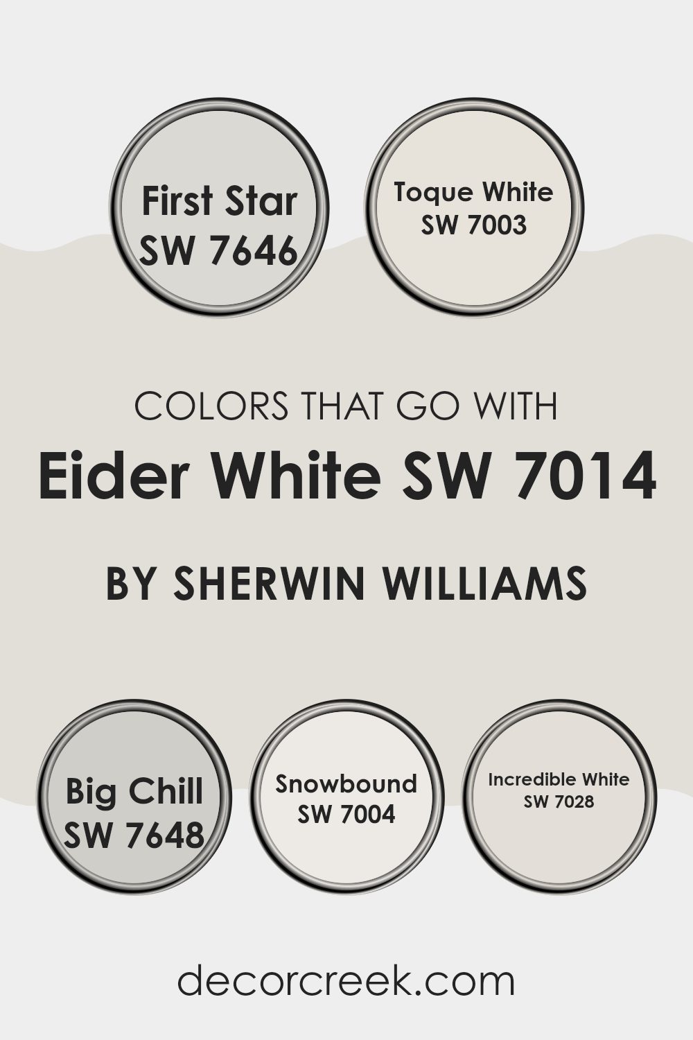
Colors that Go With Eider White SW 7014 by Sherwin Williams
Choosing the right colors to pair with Eider White SW 7014 by Sherwin Williams is crucial because it helps to create a cohesive look in your room. Eider White is a soft shade of off-white with a touch of gray, making it a flexible backdrop for many interior design schemes. When paired with the right colors, it can enhance the overall aesthetic and mood of a room.
For a clean and airy feel, First Star SW 7646 is an excellent choice. This color is a light grey that brings a fresh and light aspect to rooms, working well in areas that aim for a subdued yet inviting atmosphere. Moving toward a slightly creamier option, Toque White SW 7003 offers a warmer tone while still remaining fairly neutral, making it ideal for living rooms that want to maintain a soft, yet welcoming vibe.
Big Chill SW 7648 steps slightly darker, providing a cool gray ambiance that complements the subtle warmth of Eider White, suitable for modern environments that balance cool and warm elements. Snowbound SW 7004 offers a brighter, whiter feel, perfect for enhancing the natural light in a room and giving an impression of a more expansive room.
Finally, Incredible White SW 7028 is another fantastic match, as it leans toward a beige-gray color that adds depth and complexity to the combination, ideal for creating a refined yet comfortable setting. These colors together with Eider White set a foundation for endless creative possibilities, ensuring a beautiful and harmonious room.
You can see recommended paint colors below:
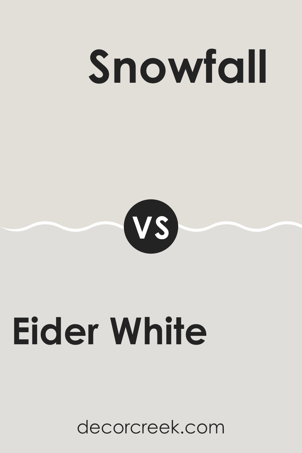
Eider White SW 7014 by Sherwin Williams vs Snowfall SW 6000 by Sherwin Williams
Eider White and Snowfall are both soft, subtle shades that present a clean and calming appearance, but they have different undertones and brightness that set them apart. Eider White has a hint of gray in its base, giving it a slightly cooler feel. This makes it an excellent choice for rooms where you want a gentle, neutral backdrop that doesn’t feel too stark or cold.
On the other hand, Snowfall is a purer white with a cleaner look. It reflects more light, making it ideal for areas that you want to feel brighter and more open. The purity of Snowfall can make smaller rooms appear larger and more inviting.
Both colors work well in a variety of settings, from modern to traditional, and can be paired easily with other colors. Depending on the mood you want to set and the natural light in your room, you might choose Eider White for a softer, more nuanced approach, or Snowfall for a clearer, more vivid impact.
You can see recommended paint color below:
- SW 6000 Snowfall
Eider White SW 7014 by Sherwin Williams vs Original White SW 7077 by Sherwin Williams
Eider White and Original White are both paint colors from Sherwin Williams, but they have distinct tones that set them apart. Eider White has a slightly gray tint, making it a cooler shade that can give rooms a subtle, modern look.
It works well in rooms that receive a lot of natural light, as the light brings out the softness of the gray undertone. On the other hand, Original White leans toward a warmer spectrum with its creamy base, offering a more inviting and cozy feel.
This color is excellent for rooms where a soft, welcoming aura is desired, like living rooms or bedrooms. When comparing both, Eider White appears more understated and neutral, whereas Original White provides a hint of warmth, making each suitable for different decorative styles and preferences.
You can see recommended paint color below:
Eider White SW 7014 by Sherwin Williams vs Zurich White SW 7626 by Sherwin Williams
Eider White and Zurich White are two paint colors offered by Sherwin Williams, each presenting a subtle and clean appearance. Eider White has a slightly gray undertone, making it a cool shade that gives a fresh and modern feel to any room. It works well in rooms that need a light and airy touch, but where you also want to maintain a neutral backdrop.
On the other hand, Zurich White leans more toward a warm tone with its beige undertones. This color offers a cozy and inviting atmosphere, making it ideal for living areas or bedrooms where comfort is a priority. It pairs well with rich colors and natural materials, providing a balanced look.
Although both colors are whites, their different undertones can significantly affect the mood and style of a room. While Eider White is perfect for those who prefer a more minimalist and contemporary style, Zurich White is better suited for creating a warmer, homely environment.
You can see recommended paint color below:
Eider White SW 7014 by Sherwin Williams vs Simple White SW 7021 by Sherwin Williams
Eider White and Simple White are both popular colors from Sherwin Williams, but they have subtle differences in their tones. Eider White has a slight gray undertone, which gives it a cooler appearance. This makes it a great choice for rooms where you want a soft, neutral backdrop that leans more toward the modern side.
In contrast, Simple White is a warmer shade, almost edging toward a very light beige or off-white. This warm undertone makes it feel more inviting and cozy, ideal for rooms where you want a comforting and welcoming atmosphere.
When used in home décor, Eider White works well in rooms that get a lot of natural light, as it maintains its crisp, clean look. Simple White, on the other hand, is excellent for rooms with less natural light, as its warmth helps to brighten the room. Both colors offer a fresh, clean canvas, but the choice between a cooler or warmer white can impact the mood of your room significantly.
You can see recommended paint color below:
Eider White SW 7014 by Sherwin Williams vs Ghosted SW 9545 by Sherwin Williams
The main color, Eider White, and the second color, Ghosted, both by Sherwin Williams, present subtle yet distinct differences. Eider White is a soft, warm gray with a hint of beige, making it very flexible for any room. This color gives a gentle, calming feel that blends easily with many designs and palettes, enhancing other colors it is paired with.
On the other hand, Ghosted is a cooler, pale gray. It leans more toward a true gray, without the noticeable beige undertones found in Eider White. This color provides a fresh and clean look, perfect for a modern aesthetic where a minimalistic and calm atmosphere is desired. It works well in areas with plenty of natural light, making rooms appear larger and more open.
Comparing the two, Eider White offers warmth and can soften a room, while Ghosted delivers a crisp and contemporary vibe. Their uses depend on the desired feel of the room and the furnishings involved.
You can see recommended paint color below:
Eider White SW 7014 by Sherwin Williams vs Toque White SW 7003 by Sherwin Williams
Eider White and Toque White are both colors by Sherwin Williams that share a similar neutral palette but differ subtly in tone and warmth. Eider White has a slightly grey undertone, making it a cooler shade. This can give a room a more open feeling, especially in well-lit areas. It is ideal if you’re aiming for a more modern look while still keeping the atmosphere soft and welcoming.
On the other hand, Toque White leans toward a warmer tone with a beige undertone. This warmth can make rooms feel cozier and more inviting, suitable for living rooms or bedrooms where comfort is key. Its creamier finish can also help soften the edges of a room visually, unlike the sharper contrasts that cooler tones might highlight.
Choosing between the two depends on the mood you want to set and your existing decor. Eider White works well in a contemporary setting, while Toque White is perfect for a more traditional feel.
You can see recommended paint color below:
Eider White SW 7014 by Sherwin Williams vs Lunar Lite SW 9546 by Sherwin Williams
Eider White and Lunar Lite, both from Sherwin Williams, are light shades but with distinct tones. Eider White is a soft gray with a warm touch, making it cozy and inviting. It’s perfect for creating a gentle, calming atmosphere in a room without feeling too stark. This color works well in areas that get a mix of natural and artificial light, reflecting subtly to keep the room bright.
On the other hand, Lunar Lite is much lighter, almost nearing white, but with a hint of cool gray. It gives off a clean, simple vibe and can make small rooms appear larger and more open. This color is ideal for modern interiors or minimalistic decor, helping to achieve a crisp, fresh look.
Both colors are flexible, but Eider White lends itself to a warmer palette, while Lunar Lite pairs well with cooler tones. Depending on your decor style and the mood you want to set, choosing between these could significantly affect your room’s overall feel.
You can see recommended paint color below:
Eider White SW 7014 by Sherwin Williams vs Origami White SW 7636 by Sherwin Williams
Eider White and Origami White are two popular shades by Sherwin Williams, each offering a unique take on neutral colors. Eider White has a slightly gray undertone, giving it a cooler feel, which makes it great for rooms that you want to feel more open and airy. It’s soft enough to act almost like an off-white without being stark, making it very flexible for different rooms.
On the other hand, Origami White leans a bit warmer due to its beige undertones. This warmth makes it an excellent choice for creating a cozy and inviting atmosphere in a room. It pairs well with a variety of decor styles and helps add a subtle richness to walls without overpowering the room’s design elements.
When deciding between the two, consider the mood and function of the room, as well as the natural light available. Eider White works well in modern and minimalist designs, while Origami White is ideal for more traditional or rustic settings.
You can see recommended paint color below:
Eider White SW 7014 by Sherwin Williams vs Incredible White SW 7028 by Sherwin Williams
Eider White and Incredible White are two popular shades by Sherwin Williams. Both colors are subtle and lean toward neutral tones, making them flexible for various rooms. Eider White has a slightly cooler undertone, often showing hints of gray that can give it a crisp, clean look. This makes it ideal for modern settings or areas where you want a fresh feel without starkness.
On the other hand, Incredible White is warmer and has a touch of beige, offering a cozier feel. This color works well in rooms where you want a soft, inviting atmosphere, such as living rooms or bedrooms. Its warmth can help make a room feel more intimate and comfortable.
Comparing the two, Eider White is better for a sleek, contemporary feel, while Incredible White suits rooms where a relaxed, warm ambiance is desired. Both colors are light enough to make rooms appear larger, but their different undertones can significantly influence the mood and style of a room.
You can see recommended paint color below:
Eider White SW 7014 by Sherwin Williams vs Sunbleached SW 9585 by Sherwin Williams
Eider White and Sunbleached are two paint colors from Sherwin Williams, each offering a unique vibe for home interiors. Eider White is a soft shade of gray with a warm, gentle undertone that makes it extremely flexible in various lighting conditions. It’s an excellent choice for creating a clean, subtle background in any room. This color can effectively brighten rooms while keeping a soft and inviting atmosphere.
On the other hand, Sunbleached is a much lighter and more neutral tone, closer to beige. It has an airy feel to it, mimicking the natural effect of prolonged exposure to sunlight on surfaces. This color works well in achieving a calm and light environment, ideal for relaxing rooms such as bedrooms and living areas.
When comparing them, Eider White leans more toward a muted gray, providing a slightly cooler touch, whereas Sunbleached offers a warm, almost faded look that gives off a cozy, worn-in charm. Both colors are understated, yet each brings a distinct character to interiors depending on your style preference.
You can see recommended paint color below:
In conclusion, SW 7014 Eider White by Sherwin Williams is a fantastic choice if you’re looking for a fresh and clean color for your room. It’s sort of like a very light gray that sometimes looks a little bit white, depending on the lighting. This paint color is great because it works well in any room, whether it’s your living room, kitchen, or even your bedroom. It’s like a chameleon because it can fit in with a lot of different styles and furniture colors.
Painting your room with Eider White can make it feel brighter and more open, which is really nice if you want a room that feels welcoming. It’s a good pick if you don’t want something too bright like pure white or too dark. Plus, it’s easy to match with other colors which means you can have your favorite colors like blue, red, or green in your room without them clashing with the wall color.
I tried this color in my own home, and I love how it turned out. It definitely makes the rooms look nicer and it feels like the rooms are a bit bigger too. If you’re thinking about giving your room a new look, I really recommend trying out Eider White. It’s simple, clean, and makes any room look pretty nice without trying too hard.

Ever wished paint sampling was as easy as sticking a sticker? Guess what? Now it is! Discover Samplize's unique Peel & Stick samples.
Get paint samples

