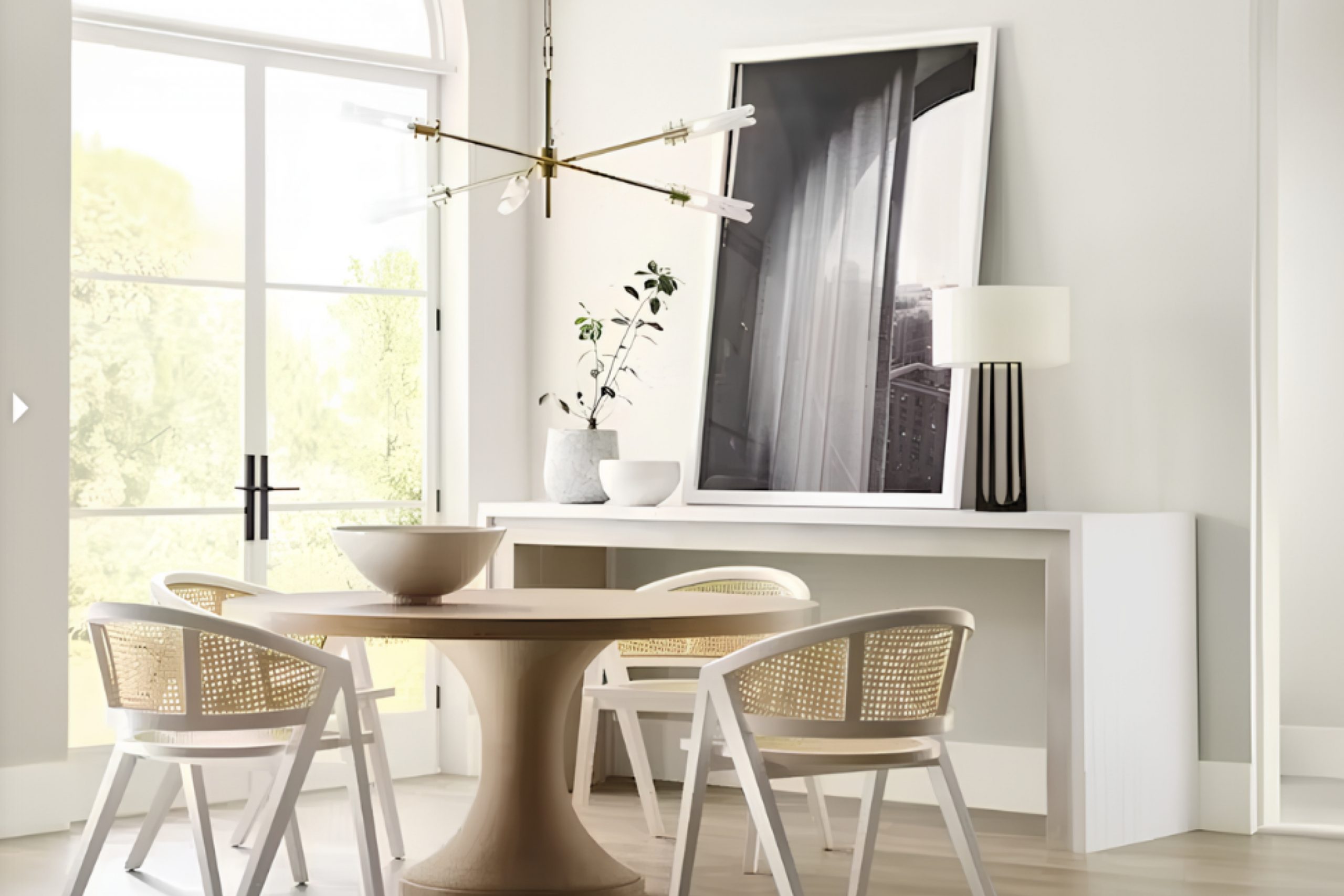
When I first came across SW 9585 Sunbleached by Sherwin Williams, it immediately brought a sense of calm to my space. It’s a gentle, muted hue that draws you in with its subtle charm, reminiscent of soft sands and warm, sunlit days. You find that the color doesn’t overwhelm the room but complements everything else effortlessly. It feels like the perfect backdrop, providing a quiet and soothing atmosphere.
As you spend time surrounded by it, you notice how the light plays on its surface, shifting and enhancing its calm nature. It resonates well in both large, airy spaces and cozy corners. What I like about Sunbleached is how it seems to blend seamlessly with a variety of styles – whether your décor is modern, rustic, or even something eclectic.
You can imagine this color in numerous places – a living room wall, a quiet home office, or a serene bedroom. It adapts beautifully, setting the tone without demanding attention.
SW 9585 Sunbleached truly proves that sometimes less is more, creating an environment where relaxation comes naturally and effortlessly.
What Color Is Sunbleached SW 9585 by Sherwin Williams?
Sunbleached (SW 9585) by Sherwin Williams is a soft, muted color that resembles the gentle hue of driftwood or weathered stone. It brings a sense of calm and subtle warmth to any space. This shade is a perfect choice for interiors that aim for understated elegance and simplicity.
It works beautifully in a modern or minimalist style, where clean lines and a neutral color palette are key. Sunbleached can also complement coastal designs, evoking a breezy, beach-like ambiance that feels open and airy.
In terms of materials and textures, Sunbleached pairs well with natural elements such as light wood, linen, and jute, which enhance its gentle and organic feel. It also looks great alongside raw materials like concrete or stone, suitable for industrial or contemporary designs. Soft, woven textiles in neutral tones can further enhance the warmth and comfort of a room painted in Sunbleached.
This versatile color works well in living rooms, bedrooms, or even kitchen spaces. Its understated tone makes it easy to pair with bolder colors, serving as a calm backdrop that allows statement pieces to shine. Whether aiming for a cozy retreat or a spacious sanctuary, Sunbleached offers a timeless option that harmonizes with many styles.
Is Sunbleached SW 9585 by Sherwin Williams Warm or Cool color?
Sunbleached SW 9585 by Sherwin Williams is a soft, muted color that works beautifully in homes. This light, sandy beige creates a warm and inviting atmosphere, making it a great choice for living rooms, bedrooms, and common areas. Its subtle undertones blend seamlessly with various design styles, from coastal to modern.
Sunbleached brightens spaces without overpowering them, making small rooms feel more open and airy. It pairs well with both bold and neutral colors, providing versatility in decorating. When used on walls, it reflects natural light pleasantly, adding a cozy yet fresh look to any space.
Additionally, Sunbleached works well with a variety of materials, including wood, metal, and stone, allowing homeowners to easily match or mix furnishings and decor items. Whether you have a home filled with natural light or need to brighten up a dim space, this color helps create a welcoming environment where family and friends can relax comfortably.
Undertones of Sunbleached SW 9585 by Sherwin Williams
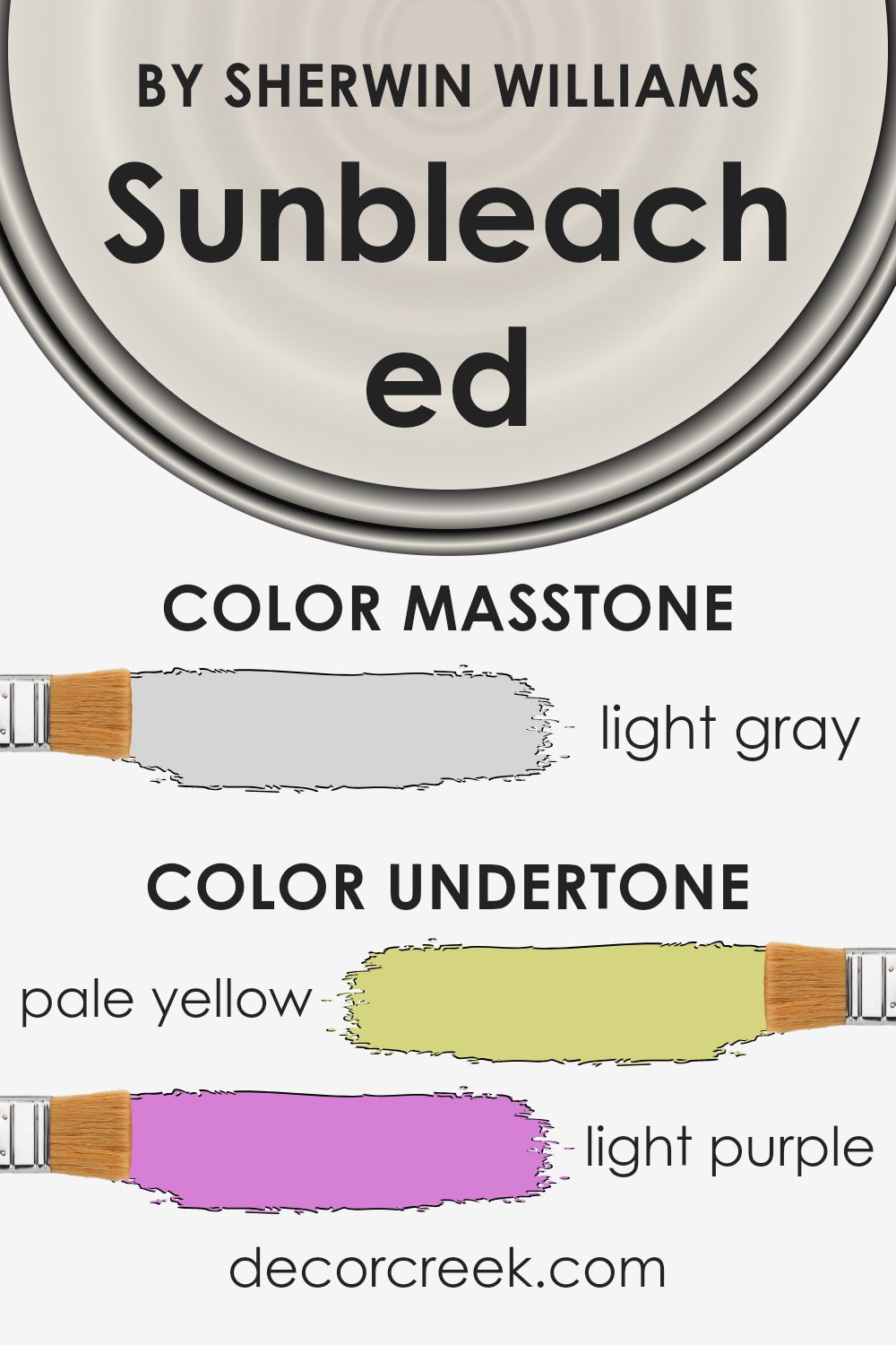
Sunbleached by Sherwin Williams is an intriguing color with a blend of subtle undertones. These undertones are the hints of other colors mixed into the primary shade. For Sunbleached, they include pale yellow, light purple, light blue, pale pink, mint, lilac, and grey. These undertones can change how the main color is perceived.
In general, undertones affect how a color looks because they can make a color appear warmer or cooler. For example, warm undertones like pale yellow and pale pink can add a cozy feel, while cooler undertones such as light blue and mint can bring a refreshing vibe. The grey undertone acts as a neutralizer, balancing the other tones and adding depth.
When used on interior walls, Sunbleached’s undertones work together to create a complex and versatile color. The pale yellow and pink tones can add subtle warmth to a room, making it feel inviting. Meanwhile, the light blue, mint, and lilac add a crisp, airy quality that can make the space feel more open and lively. The grey undertone ensures everything remains balanced, preventing any single color from dominating.
As a result, Sunbleached can harmonize beautifully with various decor styles, from modern to traditional, providing a gentle backdrop that adapts to different lighting conditions throughout the day.
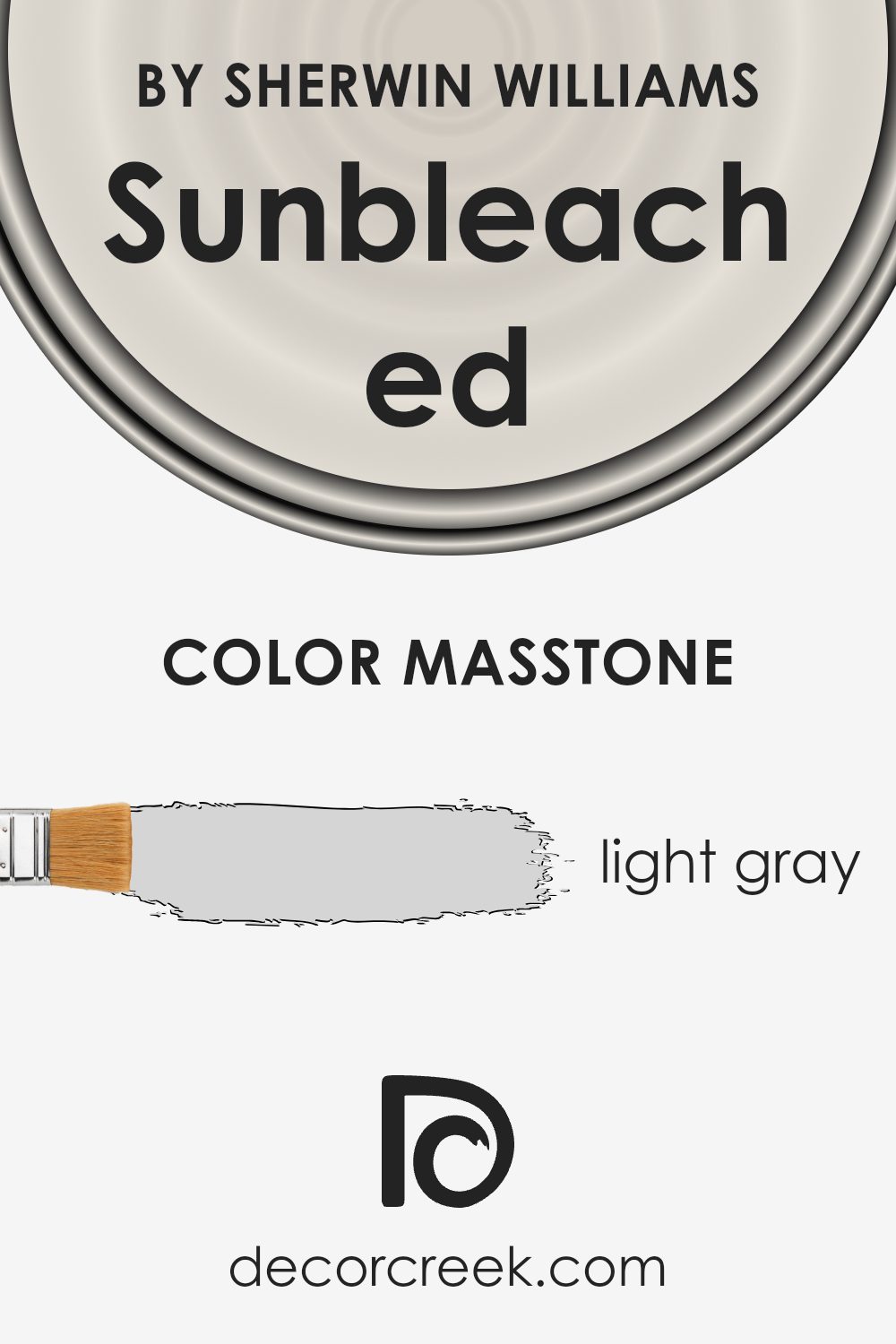
What is the Masstone of the Sunbleached SW 9585 by Sherwin Williams?
Sunbleached SW 9585 by Sherwin Williams is a light gray color that can create a calming atmosphere in homes. This soft shade of gray is versatile, working well in many different spaces. Because it is light and neutral, it reflects natural light, making rooms feel more open and airy. It pairs nicely with both cool and warm accents, such as blues, greens, or soft pinks, allowing for flexibility in decorating.
In living rooms, Sunbleached SW 9585 helps to create a relaxed environment, perfect for spending time with family or friends. In bedrooms, its soothing effect makes it easier to unwind and rest. Bathrooms painted in this shade feel clean and fresh, while kitchens can benefit from its modern, yet classic look.
Overall, the light gray masstone of Sunbleached SW 9585 makes it a practical and pleasing choice for those looking to create a peaceful and inviting home atmosphere.
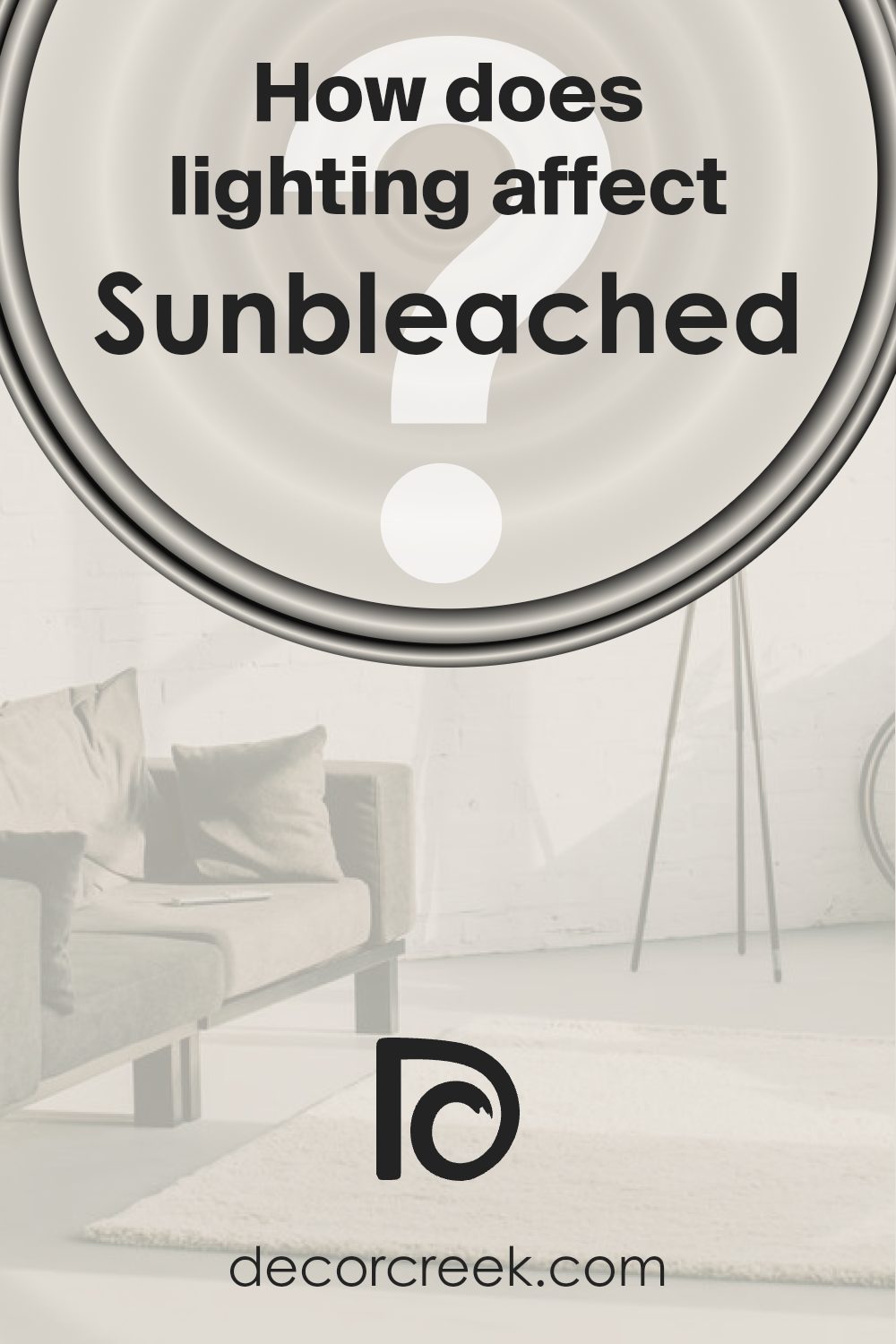
How Does Lighting Affect Sunbleached SW 9585 by Sherwin Williams?
Lighting plays a crucial role in how we perceive colors. It can change the appearance of a color depending on the type and direction of the light source. Sunbleached SW 9585 by Sherwin Williams is a warm, soft color that can look different under various lighting conditions.
In natural light, Sunbleached appears to be a gentle, muted tone. The quality of natural light can vary depending on the room’s direction. In north-facing rooms, the light is cooler and can make the color appear a bit more subdued or even slightly grey. These rooms often get steady, consistent light throughout the day but it lacks warmth, so Sunbleached may look less vibrant.
In south-facing rooms, the color will appear warmer and brighter. These rooms receive the most direct sunlight, especially in the middle of the day. The warm light enhances the natural warmth of Sunbleached, making it appear more inviting.
East-facing rooms receive bright, direct light in the morning, which tends to be softer and cooler later in the day. In the morning, Sunbleached looks bright and fresh, but it can look more shadowed and muted in the afternoon as the sun moves away.
West-facing rooms have the opposite effect. They have indirect light in the morning, so Sunbleached might look softer and a bit dim. However, in the afternoon and evening, the setting sun casts a warm glow, giving the color a richer, deeper appearance.
Under artificial lighting, such as incandescent or LED bulbs, Sunbleached can take on different qualities depending on the light’s color temperature. Warm bulbs can make it look more golden, while cooler bulbs might bring out cooler undertones. It’s important to consider these variables when choosing a color like Sunbleached for your space.
Lighting can dramatically alter its appearance, affecting mood and room ambiance.
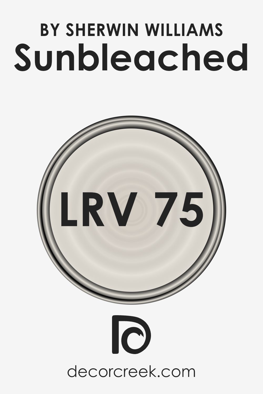
What is the LRV of Sunbleached SW 9585 by Sherwin Williams?
LRV, which stands for Light Reflectance Value, is a measure of how much light a color reflects. It is expressed on a scale from 0 to 100, where 0 means the color absorbs all light (pure black), and 100 signifies it reflects all light (pure white). When choosing paint, LRV is important because it can significantly impact how a color looks on your walls.
Colors with higher LRV make spaces feel brighter and more open since they reflect more light. Conversely, colors with lower LRV can make a room feel cozier and smaller because they absorb more light.
With an LRV of 74.752, Sunbleached SW 9585 is on the higher end of the scale. This means it is a fairly light color and will reflect a good amount of light in a room. It can make a space look more open and airy, which can be especially useful in smaller or darker rooms where you want to maximize natural light.
The high LRV helps the color stay true in different lighting conditions, maintaining its soft, warm appearance throughout the day. If you want your room to have a bright and cheerful atmosphere, Sunbleached is a good choice thanks to its high light reflectance.
What are the Trim colors of Sunbleached SW 9585 by Sherwin Williams?
Trim colors refer to the shades used on the edges and borders of a room, such as baseboards, window frames, and door casings, which help define the space and provide contrast against the main wall colors. Using trim colors is important for enhancing the overall look of a wall color like Sunbleached SW 9585 by Sherwin Williams because they help outline the walls and add a touch of subtle accent.
Sunbleached has a soft, warm appearance, and using the right trim colors can highlight its natural beauty. SW 7029 – Agreeable Gray and SW 9109 – Natural Linen are perfect choices for this purpose, as they bring out different elements of any room and make the main color pop without overshadowing it.
Agreeable Gray, with its neutral tone, adds a gentle contrast to Sunbleached, making it feel brighter and more inviting. It provides a calm backdrop that blends well with various decor styles, keeping the focus on the main color. On the other hand, Natural Linen offers a slightly warmer option, harmonizing beautifully with Sunbleached while imparting a soft, cozy feel. This blend results in spaces that feel connected and cohesive.
Both of these trim colors, with their subtle differences, serve to enhance the main color, boosting the room’s overall ambiance.
You can see recommended paint colors below:

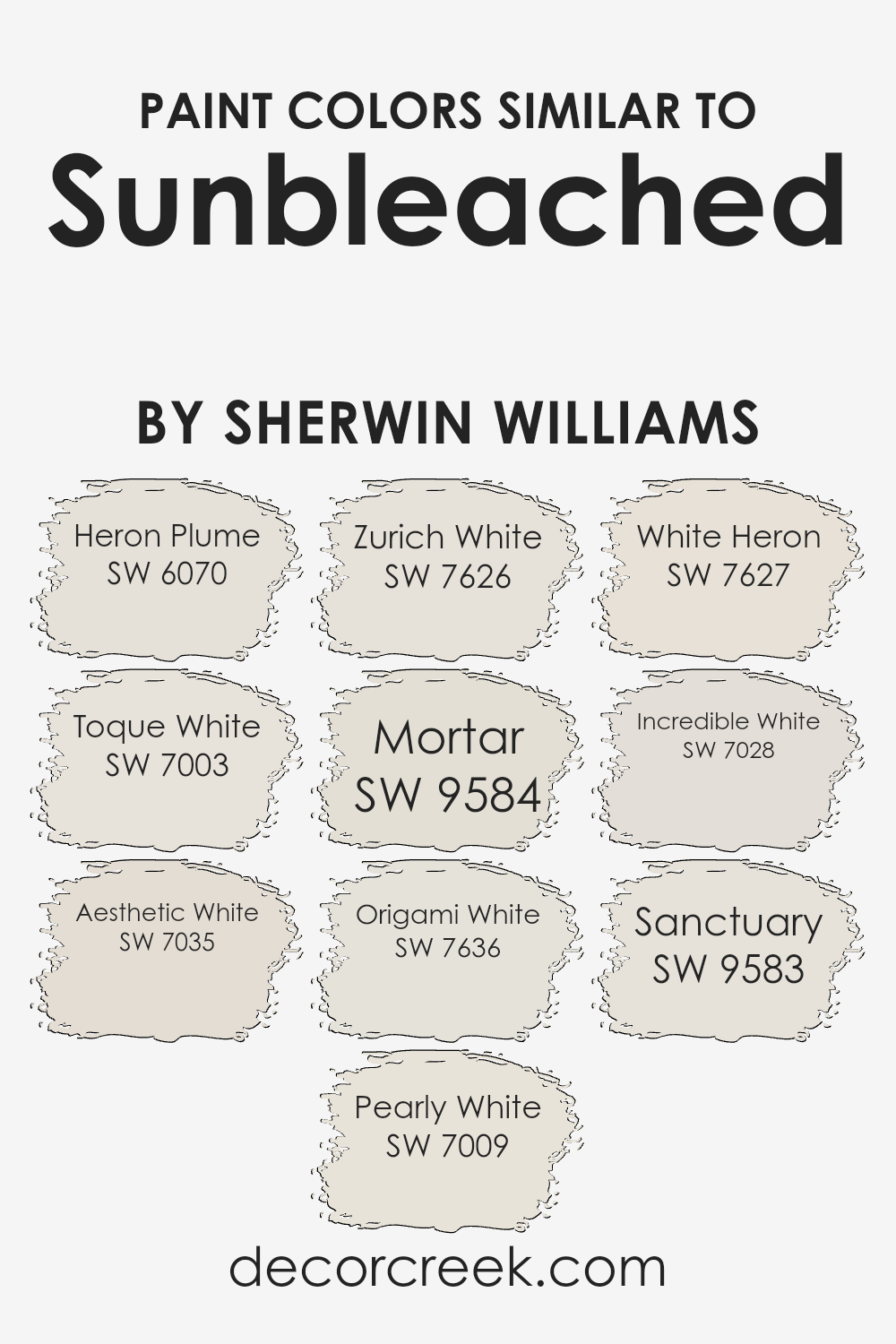
Colors Similar to Sunbleached SW 9585 by Sherwin Williams
Using similar colors to Sunbleached SW 9585 by Sherwin Williams can create a gentle and cohesive look in your space. These colors offer a spectrum of soft whites and light neutrals that harmonize well together. Heron Plume SW 6070 is a subtle off-white that lends warmth without being overpowering. Toque White SW 7003 is a bright, clean white that adds a touch of crispness to a room.
Aesthetic White SW 7035 brings in a neutral tone that feels calm and welcoming. Pearly White SW 7009 is a soft, creamy color perfect for creating a light, airy feel, while Zurich White SW 7626 offers a slightly cooler shade of white.
Mortar SW 9584 introduces a touch of depth with its hint of gray, making it a versatile color for almost any space. Origami White SW 7636 has an understated elegance with its warm gray undertones. White Heron SW 7627 is a clean white that pairs nicely with both traditional and modern styles.
Incredible White SW 7028 carries a light, almost invisible tint of warmth, making it versatile for many design schemes. Finally, Sanctuary SW 9583 adds a soothing, gentle tone with its subtle beige undertones, ideal for peaceful rooms. These colors together create a balanced and inviting environment, seamlessly connecting the different elements of your decor.
You can see recommended paint colors below:
- SW 6070 Heron Plume
- SW 7003 Toque White
- SW 7035 Aesthetic White
- SW 7009 Pearly White
- SW 7626 Zurich White
- SW 9584 Mortar
- SW 7636 Origami White
- SW 7627 White Heron
- SW 7028 Incredible White
- SW 9583 Sanctuary
How to Use Sunbleached SW 9585 by Sherwin Williams In Your Home?
Sunbleached SW 9585 by Sherwin Williams is a soft and airy paint color that can brighten up any home. It is a light, neutral shade that feels warm and inviting, making it perfect for both modern and traditional spaces. This color works well in living rooms, bedrooms, or even kitchens, creating a calm and welcoming atmosphere.
When using Sunbleached in a living room, pair it with natural wood furniture and soft textiles to create a cozy look. In the bedroom, it can serve as a soothing backdrop for colorful bedding or artwork. The subtle hue goes well with whites and grays, allowing you to mix and match different elements in your space easily.
Because it’s a neutral tone, Sunbleached can also help make smaller rooms appear larger and more open by reflecting light effectively. It’s a versatile choice that adds a touch of warmth to any home.
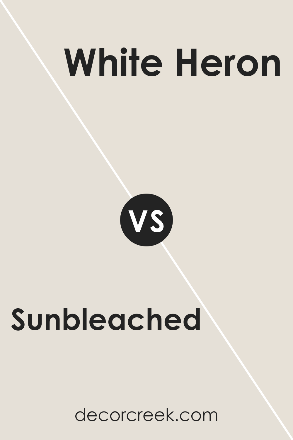
Sunbleached SW 9585 by Sherwin Williams vs White Heron SW 7627 by Sherwin Williams
Sunbleached SW 9585 by Sherwin Williams is a soft, muted beige with warm undertones that brings a gentle, laid-back feel to a room. It creates a welcoming atmosphere and pairs well with natural materials like wood and linen. White Heron SW 7627, on the other hand, is a crisp, clean white with a hint of coolness. It offers a bright and refreshing appearance, helping a space feel open and airy.
When comparing these two colors, Sunbleached is more calming and cozy, making it suitable for living rooms or bedrooms where a relaxed vibe is desired. White Heron, however, is crisp and invigorating, ideal for kitchens or bathrooms where cleanliness and brightening effects are a priority.
While Sunbleached provides warmth, White Heron offers a more modern, minimalist touch. Both colors work well as neutral backdrops but cater to different moods and room functions.
You can see recommended paint color below:
Sunbleached SW 9585 by Sherwin Williams vs Sanctuary SW 9583 by Sherwin Williams
Sunbleached and Sanctuary are two gentle and subtle colors from Sherwin Williams that offer distinct moods. Sunbleached is a light, creamy hue with a hint of warmth, reminiscent of soft sunlight filtering through a window. It tends to create an airy and relaxed atmosphere, ideal for spaces where you want to feel refreshed and light-hearted.
In comparison, Sanctuary is slightly deeper, with a richer undertone that leans toward a peaceful taupe. It suggests a grounding and comforting vibe, making it perfect for areas meant for relaxation or reflection. While both colors are subtle, Sunbleached feels brighter and slightly more energizing, whereas Sanctuary brings about a calm, cozy ambiance.
They both provide versatility and can complement a variety of styles, but your choice between them would depend on whether you prefer a brighter or more subdued setting.
You can see recommended paint color below:
Sunbleached SW 9585 by Sherwin Williams vs Pearly White SW 7009 by Sherwin Williams
Sunbleached SW 9585 and Pearly White SW 7009 are two popular colors by Sherwin Williams that bring different vibes to a space. Sunbleached is a soft, light warm neutral that has a hint of beige, creating a cozy and inviting atmosphere. It reflects a subtle warmth, making it ideal for spaces where you want comfort and relaxation.
On the other hand, Pearly White is a cool, crisp white with a hint of gray, giving it a modern and clean look. It’s versatile and works well in contemporary and classic settings, often making a room feel more spacious and airy. While Sunbleached tends to add a touch of warmth, Pearly White offers a refreshing, clean backdrop.
Both colors are versatile, but choosing between them depends on whether you prefer a warmer, more inviting look or a cooler, more minimalist aesthetic for your space.
You can see recommended paint color below:
Sunbleached SW 9585 by Sherwin Williams vs Incredible White SW 7028 by Sherwin Williams
Sunbleached (SW 9585) and Incredible White (SW 7028) by Sherwin Williams are both neutral colors, but they offer different feels. Sunbleached is a soft, light beige with warm undertones, adding a gentle brightness to a room. It creates a warm and inviting atmosphere, perfect for casual spaces or areas with lots of natural light.
On the other hand, Incredible White is a very light gray with subtle hints of beige. It leans more toward a cool tone, providing a crisp and clean look. This color is versatile and can match a wide range of other colors, making it suitable for both modern and traditional settings. While Sunbleached offers warmth and a touch of coziness, Incredible White provides a more understated, airy feel.
Both colors are perfect for creating a neutral backdrop, but their different undertones cater to different tastes and room styles.
You can see recommended paint color below:
Sunbleached SW 9585 by Sherwin Williams vs Mortar SW 9584 by Sherwin Williams
Sunbleached SW 9585 and Mortar SW 9584 are two closely related colors from Sherwin Williams, but they create different moods due to their subtle differences. Sunbleached is a light, soft shade that brings a sense of warmth and brightness to a space. It’s versatile and works well in rooms where you want to maximize natural light, making spaces feel open and airy.
On the other hand, Mortar SW 9584 is slightly darker and has a more earthy tone. This color creates a grounding effect, offering a bit more depth and richness compared to Sunbleached. Mortar can add a cozy, comfortable vibe to a room, making it ideal for spaces that benefit from a touch of warmth without losing brightness.
While both colors are from the same palette and can complement each other, choosing between them depends on whether you prefer the airy lightness of Sunbleached or the subtle depth of Mortar.
You can see recommended paint color below:
Sunbleached SW 9585 by Sherwin Williams vs Toque White SW 7003 by Sherwin Williams
Sunbleached SW 9585 and Toque White SW 7003, both by Sherwin Williams, are light and neutral shades, yet they offer distinct vibes. Sunbleached SW 9585 is a soft, muted beige with subtle warmth, exuding a relaxed and inviting atmosphere. It’s perfect for adding a touch of coziness to any room without overwhelming other design elements.
Toque White SW 7003 is a fresh, crisp white with a slight hint of gray, giving it a cooler undertone. This makes it ideal for spaces where you want a clean, modern feel. It pairs beautifully with both cool and warm colors, enhancing the brightness of a room.
While Sunbleached feels more like a gentle hug, perfect for cozy living spaces, Toque White offers a refreshing breath of air, ideal for minimalistic or contemporary settings. Both colors bring a sense of ease but cater to slightly different tastes and purposes in home decor.
You can see recommended paint color below:
Sunbleached SW 9585 by Sherwin Williams vs Aesthetic White SW 7035 by Sherwin Williams
Sunbleached SW 9585 is a soft, light-colored paint that feels airy and bright. It carries a sunny, warm tone that can lighten up any room, giving off a gentle, pastel-like vibe. On the other hand, Aesthetic White SW 7035 is more of a neutral off-white with a hint of greige—combining gray and beige tones.
This color is versatile, providing a calm and balanced backdrop for any decor. While Sunbleached is more sunny and warm, Aesthetic White provides a more subdued and classic look. Both colors can make spaces feel welcoming, but Sunbleached brings more of a cheerful warmth, whereas Aesthetic White offers a more neutral and adaptable setting.
If you’re looking to create a space that feels cozy yet bright, Sunbleached would be ideal. For a timeless and subtle environment, Aesthetic White is a great choice.
You can see recommended paint color below:
Sunbleached SW 9585 by Sherwin Williams vs Origami White SW 7636 by Sherwin Williams
Sunbleached SW 9585 and Origami White SW 7636 by Sherwin Williams are two gentle, versatile colors that can enhance any space. Sunbleached SW 9585 is a soft, muted tone with a hint of warmth, reminiscent of light sandy beaches. It brings a light and airy feel to a room, making spaces appear larger and more open.
Origami White SW 7636, on the other hand, is a clean, crisp white with a subtle touch of gray. It offers a neutral backdrop that complements a variety of colors and styles. While Sunbleached adds warmth, Origami White provides a cool and refreshing touch.
Both colors are easy to pair with bolder shades or to use on their own for a minimalist look. Sunbleached’s warmth can create a cozy environment, while Origami White’s neutrality works well in modern and traditional settings alike. Together, they offer a perfect balance.
You can see recommended paint color below:
Sunbleached SW 9585 by Sherwin Williams vs Zurich White SW 7626 by Sherwin Williams
Sunbleached SW 9585 and Zurich White SW 7626 are both neutral shades by Sherwin Williams, but they have different undertones and effects. Sunbleached is a soft, pale color with a warm undertone. It brings a gentle brightness to spaces, making them feel light and airy without being too stark. It’s a good choice for those who want a subtle, warm white that offers a hint of warmth.
Zurich White, on the other hand, is slightly cooler. It has a neutral base with cooler undertones that can give a room a clean and fresh feel. This color is more versatile, working well with both warm and cool color palettes.
Both colors can suit various styles and preferences, but your choice might depend on the lighting and other elements in your space. Sunbleached is ideal for adding warmth, whereas Zurich White is great for a crisp, modern look.
You can see recommended paint color below:
Sunbleached SW 9585 by Sherwin Williams vs Heron Plume SW 6070 by Sherwin Williams
Sunbleached (SW 9585) by Sherwin Williams and Heron Plume (SW 6070) are both soft, neutral colors, but they offer different vibes. Sunbleached is a light color with a warm, sandy tone that adds a touch of brightness to any space. It’s great for creating a clean and airy feel. On the other hand, Heron Plume is a tad darker and slightly cooler. It has a subtle grayish undertone, making it versatile for different types of decor.
Sunbleached feels more like a sunlit room that’s inviting and open. Heron Plume leans towards a cozy, relaxed atmosphere due to its muted shade. Both colors can make a room feel larger and more open, but Sunbleached might give a sunnier impression, while Heron Plume offers a gentle elegance.
When choosing between them, think about the mood you want to set in your room—whether it’s warm and bright or understated and calm.
You can see recommended paint color below:
Conclusion
SW 9585 Sunbleached by Sherwin Williams is a color that reminds me of a sunny beach day. When I look at it, I feel like I’m standing on warm sand with the sun shining down. This shade is all about bringing a bit of sunshine indoors. It’s great because it can make a room feel bright and friendly without being too loud or flashy.
I can imagine using Sunbleached in many rooms around the house. It would look wonderful in the living room, creating a warm and cozy place for family and friends to gather. In a bedroom, it can make the space feel light and fresh, which is perfect for relaxing. Even in a kitchen, Sunbleached can add a nice splash of warmth, making it feel welcoming to everyone who comes in.
The great thing about Sunbleached is that it works well with lots of other colors. So if you want to add some blues, greens, or even other shades of yellow, it will match nicely. It’s a color that makes everything around it feel happier. I think Sunbleached is like a little piece of sunshine you can bring into your home to make every day feel brighter and more cheerful.

Ever wished paint sampling was as easy as sticking a sticker? Guess what? Now it is! Discover Samplize's unique Peel & Stick samples.
Get paint samples

