If you’re considering a fresh coat of paint for your interior, Sherwin Williams’ SW 7009 Pearly White is a choice that might catch your eye. Before you commit to this shade, let me share some insights from my experience to help you make an informed decision. Pearly White is often celebrated for its soft, warm undertones that can brighten rooms without dominating them, offering an adaptable backdrop that complements various decor styles.
It’s essential to consider the lighting in your room, as this color can appear differently depending on natural and artificial light sources. Testing the paint in a small area first can provide a clearer idea of how it will look throughout the day.
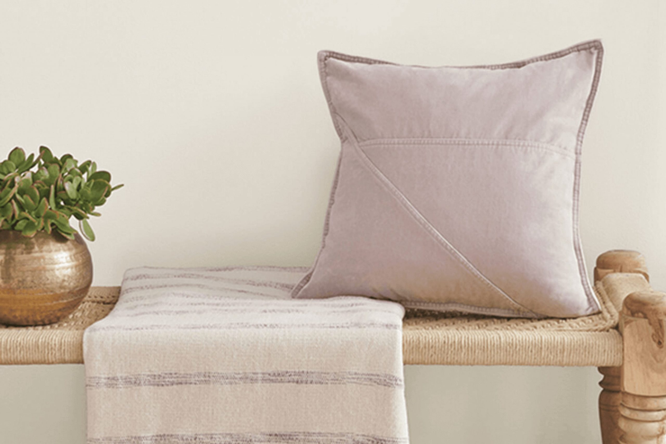
Matching Pearly White with the right accents and furniture can enhance its beauty, creating a cozy and inviting atmosphere in your home. Now, let’s take a closer look at how SW 7009 Pearly White might refresh your living interior.
Is Pearly White SW 7009 Right for My Home?
Let me tell you about the color Pearly White by Sherwin Williams, a soft and warm hue with a touch of creaminess that makes any room feel inviting. It’s an adaptable color that doesn’t dominate but instead provides a subtle backdrop that enhances the interior it occupies. Think of it as a gentle hug for your walls, blending seamlessly into various interior styles.
Pearly White works particularly well in interiors aiming for a classic look, like traditional or transitional designs. It’s also a great fit for farmhouse and shabby chic decors because of its warm undertones, adding a touch of rustic charm without going too deep into yellows.
When it comes to materials, Pearly White pairs beautifully with natural wood, whether it’s a polished oak floor or more rustic pine shelves. It contrasts nicely with darker woods, bringing out their depth, while with lighter woods it helps create a soft, cohesive aesthetic. Fabrics like linen or cotton in natural tones also go well with this color, contributing to a cozy, layered look.
Metals like brass or copper are also fantastic with Pearly White; they stand out against its creamy backdrop, adding just the right amount of luster without feeling intense. It’s truly a color that’s easy to live with, offering warmth and comfort to any interior.
What are the right undertones of Pearly White SW 7009 ?
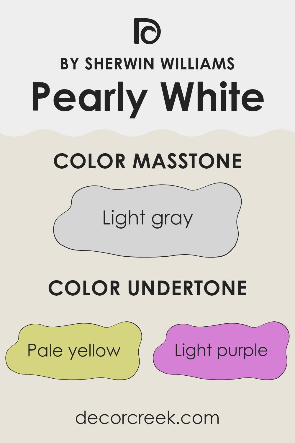
Pearly White by Sherwin Williams is an adaptable paint color with a complex mix of undertones that can subtly influence the appearance of interiors. The undertones include pale yellow, light purple, light blue, pale pink, mint, lilac, and grey. These shades add depth and allow the main color to adjust under different lighting conditions and in combination with other colors in the room.
Undertones play a crucial role in how we perceive colors. They can either warm up or cool down a primary color, and in some cases, they can even create visual illusions of interiors enlarging or contracting. Therefore, choosing the right color with the appropriate undertones is essential for achieving the desired mood in an interior.
When applied to interior walls, Pearly White displays a predominantly light and airy feel due to its pale undertones. Under natural sunlight, the pale yellow and light blue undertones can make the room feel brighter and more inviting. In artificial lighting, the light purple or lilac undertones might become more noticeable, adding a subtle hint of warmth. The mint and pale pink help balance the color, preventing it from feeling too cold.
The grey undertone is critical as it helps ground the color, ensuring it doesn’t lean too heavily toward any warm or cool extreme. This makes Pearly White a flexible choice for various decorating styles and pairs well with many colors and materials, enhancing the overall ambiance without feeling intense.
Best Coordinating Colors to use with Pearly White SW 7009 by Sherwin Williams this year.
Coordinating colors are complementary colors that work harmoniously with a base color to enhance the overall aesthetic of an interior. When choosing coordinating colors, the aim is to select shades that balance the room, either by contrasting or subtly building upon the base color.
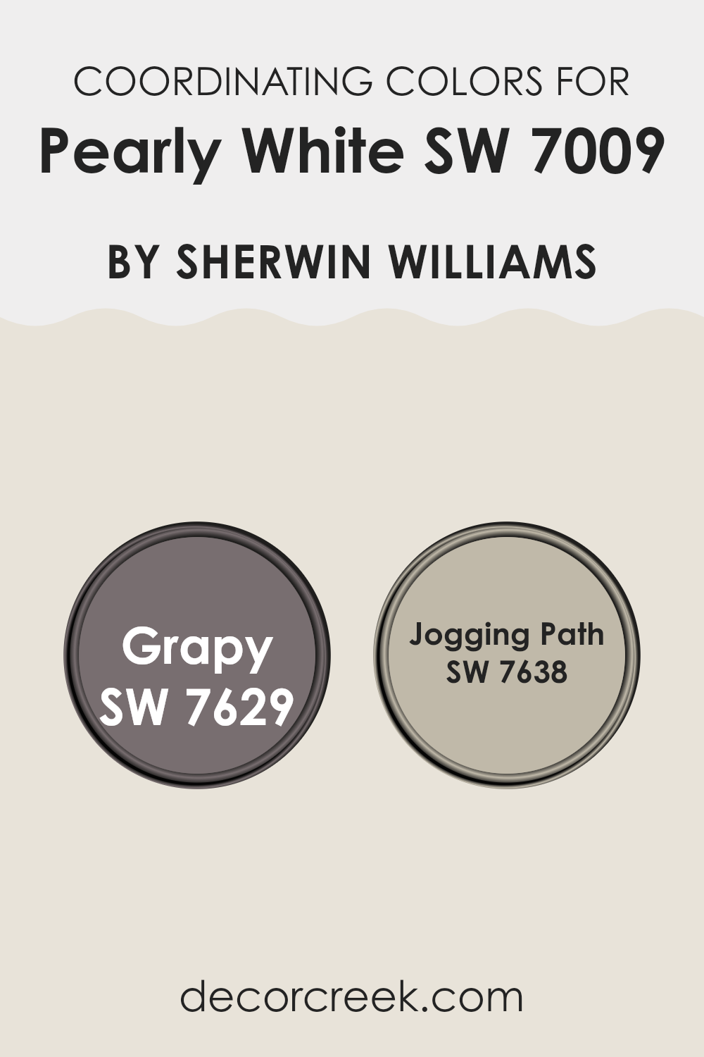
For example, Pearly White by Sherwin Williams is a soft and adaptable color that provides a neutral base, working well with a variety of coordinating colors. It sets a welcoming and calm background, which can be accented effectively by the right complementary shades, such as SW 7629 – Grapy and SW 7638 – Jogging Path.
SW 7629 – Grapy is a deep, muted purple that can add a touch of drama and depth to interiors when used alongside Pearly White. This color is perfect for creating a focal point in a room or for adding rich accents through decor items like pillows or curtains. On the other hand, SW 7638 – Jogging Path is a gentle gray with warm undertones that offers a more subtle contrast to Pearly White.
This shade is excellent for adding a sense of cohesion and continuity in larger interiors, contributing to a harmonious flow without feeling intense. Both colors support an adaptable design scheme that can adjust to various decor styles and personal tastes.
You can see recommended paint colors below:
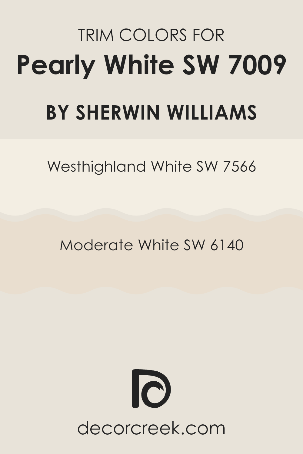
Trendy Trim Colors of Pearly White SW 7009 by Sherwin Williams to use this year.
Trim colors, like SW 7566 – Westhighland White and SW 6140 – Moderate White by Sherwin Williams, play a crucial role in defining and accentuating the architectural details of a room. They help highlight features such as doors, windows, and crown moldings by creating a contrast with the main wall colors.
For example, using either Westhighland White or Moderate White as a trim color with a base shade like Pearly White can create a subtle yet effective layering of whites, which enhances the overall aesthetic without dominating the interior. This approach helps in defining the interiors clearly and adding a clean, finished look to the room.
Westhighland White is a warm and inviting shade of white that offers a soft contrast, making it perfect for trims where a gentle definition is desired. This color harmonizes well with lighter shades, adding a touch of warmth to the overall feel of the room.
On the other hand, Moderate White leans toward a neutral, balanced white, which is adaptable for use in various lighting conditions, providing a more pronounced contrast against lighter wall colors while still maintaining a harmonious palette. This flexibility makes it particularly useful for rooms that serve multiple purposes or have varying light conditions throughout the day.
You can see recommended paint colors below:
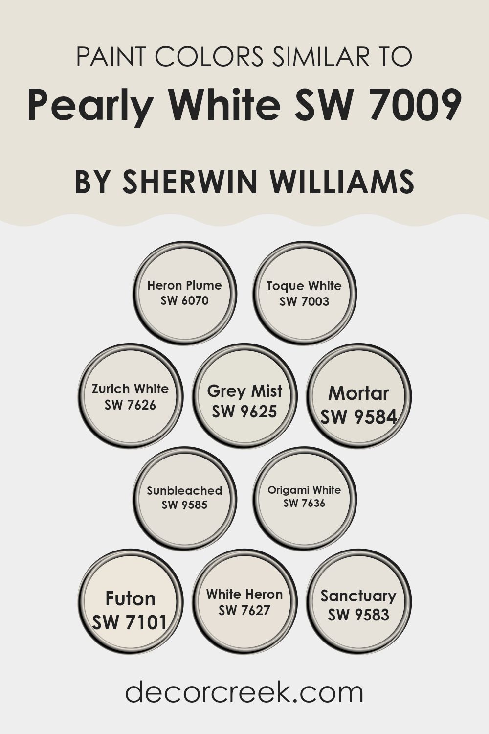
Evergreen Colors Similar to Pearly White SW 7009 by Sherwin Williams
Choosing similar colors in design can have a striking effect by creating a cohesive and harmonious look in any interior. By selecting shades close to Pearly White, such as Heron Plume, Toque White, and Zurich White, designers can ensure a smooth visual flow that enhances the feeling of continuity and openness.
These lighter shades work brilliantly to reflect light and make rooms appear larger and more open. Color subtleties in hues like Grey Mist or Mortar add a slightly different vibe, introducing a touch of contrast while maintaining the integrity of the overall aesthetic. A subtle distinction can bring depth and interest to the design without feeling intense.
Colors like Sunbleached and Origami White offer a fresh, clean backdrop perfect for showcasing artwork or furniture, highlighting these features without competing for attention. Futon and White Heron provide a neutral ground, supporting a range of decorative styles from modern to traditional.
Finally, a shade like Sanctuary can be used to gently break up the monotony of lighter colors without straying too far from the palette. This careful selection of similar colors allows for a design that feels cohesive and thoughtfully curated, making any interior more inviting and aesthetically pleasing.
You can see recommended paint colors below:
- SW 6070 Heron Plume
- SW 7003 Toque White
- SW 7626 Zurich White
- SW 9625 Grey Mist
- SW 9584 Mortar
- SW 9585 Sunbleached
- SW 7636 Origami White
- SW 7101 Futon
- SW 7627 White Heron
- SW 9583 Sanctuary
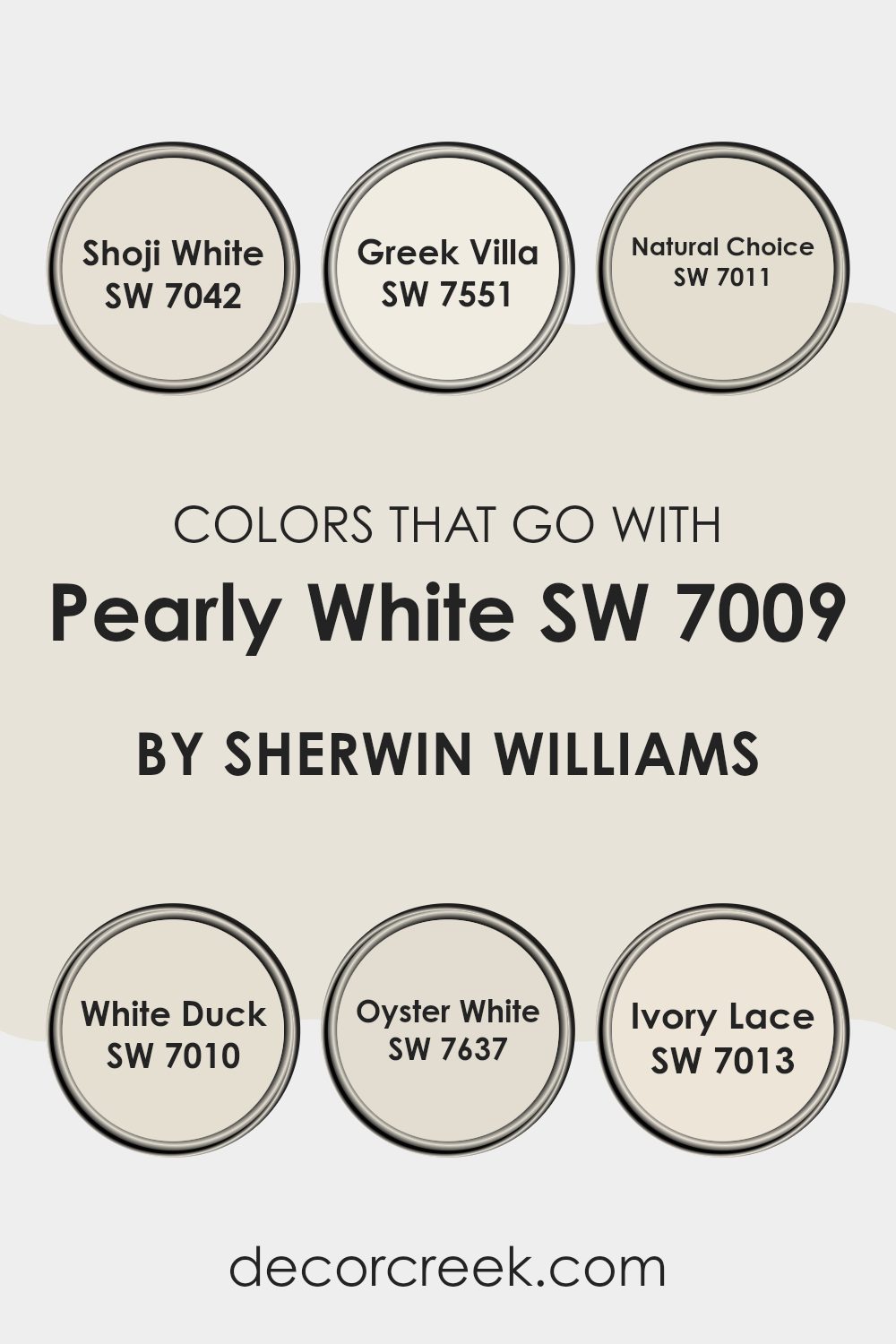
Colors that Go With Pearly White SW 7009 by Sherwin Williams
When choosing colors to pair with Pearly White SW 7009 by Sherwin Williams, it’s crucial to understand how these colors can enhance the ambiance of a room. Pearly White is a soft, creamy white that provides a subtle warmth, making it an ideal backdrop for a variety of coordinating colors. Colors like Shoji White, Greek Villa, Natural Choice, White Duck, Oyster White, and Ivory Lace each offer a unique twist while maintaining harmony with Pearly White.
Shoji White is a gentle off-white with a touch of gray, which gives it a clean but cozy feel; it’s perfect for interiors that need a touch of softness without feeling too stark. Greek Villa has a slightly more creamy tone, adding a touch of warmth to rooms that benefit from a sunny and inviting atmosphere. Natural Choice is another neutral, but with a hint of green undertone that brings a natural, earthy quality to the environment.
White Duck adds a splash of subtlety with its beige undertones, making it great for interiors that need a natural, understated look. Oyster White leans toward a gentle taupe, offering a hint of refinement without dominating the interior.
Finally, Ivory Lace is a very light cream that shines in areas where softness and a touch of warmth are desired without feeling intense. Pairing these colors with Pearly White allows for a harmonious palette that enhances the aesthetics of any room, whether aiming for a cozy, inviting atmosphere or a clean, fresh look.
You can see recommended paint colors below:
- SW 7042 Shoji White
- SW 7551 Greek Villa
- SW 7011 Natural Choice
- SW 7010 White Duck
- SW 7637 Oyster White
- SW 7013 Ivory Lace
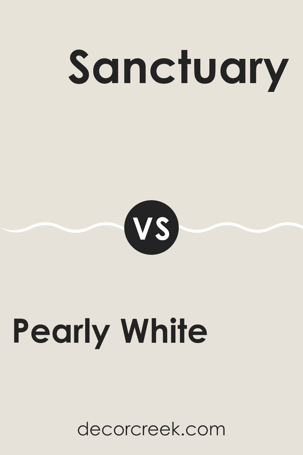
Pearly White SW 7009 by Sherwin Williams vs Sanctuary SW 9583 by Sherwin Williams
Pearly White and Sanctuary by Sherwin Williams are two distinct shades that can bring different vibes to an interior. Pearly White is a soft, clean white with a warm undertone that makes it perfect for creating a light and airy feel. It’s the kind of white that works well in just about any room, enhancing other colors or looking crisp and fresh on its own.
On the other hand, Sanctuary is a darker, cozier gray-green shade. It’s quite a contrast to Pearly White, offering a more enclosed, cozy feel that can make large interiors feel more intimate. It’s ideal for those looking to add a touch of nature-inspired calmness to their rooms, as its earthy tones help connect the indoors with the outdoors.
Together, these colors could complement each other in an interior, with Sanctuary grounding the environment and Pearly White adding some brightness and openness. Both colors fit well in modern decor schemes, although they evoke different moods and would be used in different contexts to enhance the desired atmosphere of a room.
You can see recommended paint color below:
Pearly White SW 7009 by Sherwin Williams vs White Heron SW 7627 by Sherwin Williams
Pearly White and White Heron, both by Sherwin Williams, are two light shades, but they offer distinct vibes due to their undertones. Pearly White has a warm, creamy feel, making it cozy and inviting. It’s perfect for interiors where you want a soft and subtle warmth, like living rooms or bedrooms.
On the other hand, White Heron stands out with a cooler undertone that gives a cleaner, crisper look. This color is great for areas that benefit from a bright and airy feel, such as kitchens and bathrooms.
When choosing between the two, consider the mood you want to set and the natural light in your room, as it can affect how these colors appear. Pearly White works well in rooms with less sunlight, while White Heron shines in well-lit interiors.
You can see recommended paint color below:
Pearly White SW 7009 by Sherwin Williams vs Grey Mist SW 9625 by Sherwin Williams
Pearly White and Grey Mist are two distinct shades offered by Sherwin Williams. Pearly White is a soft, nearly off-white color with a subtle hint of cream. It provides a clean and bright look, making interiors feel open and airy. This color is ideal for areas where you want to enhance natural light while adding a touch of warmth without going too yellow or stark.
On the other hand, Grey Mist is a light grey hue that leans toward the cooler side, but with enough warmth to prevent it from feeling too industrial. It’s an adaptable color that pairs well with both bright and dark colors, offering a calm and neutral backdrop. Grey Mist can make interiors feel more grounded compared to the lighter Pearly White.
Both colors work well in modern home décors, but Pearly White excels in interiors looking for a bright, uplifting feel, while Grey Mist is better for those who prefer a subtle, minimalist vibe. Each color suits different aesthetic preferences and functional needs, depending on the room and lighting conditions.
You can see recommended paint color below:
Pearly White SW 7009 by Sherwin Williams vs Mortar SW 9584 by Sherwin Williams
Pearly White and Mortar by Sherwin Williams are two contrasting shades that can be used effectively in different areas of a home. Pearly White is a soft, clean white with a subtle warmth, making it perfect for creating a bright and airy feel in interiors like living rooms or bedrooms. It’s ideal for those seeking a fresh and inviting atmosphere.
On the other hand, Mortar is a dark, rich gray that provides a strong, grounded feel. This color can be great for accent walls or for rooms where you want to make a bold statement, like a home office or a dining area. It works well in interiors that benefit from a more dramatic and cozy vibe.
When used together, these colors offer a balanced contrast, with Pearly White bringing light and openness, and Mortar adding depth and character. This combination can work beautifully in a modern home where you want to balance brightness with impactful design elements.
You can see recommended paint color below:
Pearly White SW 7009 by Sherwin Williams vs Heron Plume SW 6070 by Sherwin Williams
Pearly White and Heron Plume, both by Sherwin Williams, are subtle shades that can add a touch of elegance to any interior. Pearly White is a soft, creamy white that has a subtle warmth to it. It’s perfect for creating a cozy and welcoming atmosphere in rooms that get a lot of natural light or in interiors where you want a touch of brightness without feeling intense.
On the other hand, Heron Plume is a slightly darker shade compared to Pearly White. It has gray undertones that give it a more muted appearance. This color works well in areas where you might want a calm, neutral backdrop that still offers some depth and complexity.
Both colors are adaptable and can work beautifully in a variety of settings, from modern kitchens to calm bedrooms. While Pearly White adds a brighter, more airy feel, Heron Plume provides a more grounded and subtle aesthetic. Choosing between them depends on the specific mood and style you want to achieve in your interior.
You can see recommended paint color below:
Pearly White SW 7009 by Sherwin Williams vs Zurich White SW 7626 by Sherwin Williams
Pearly White and Zurich White, both by Sherwin Williams, offer subtle but distinct variations in their shades. Pearly White leans toward a soft, creamy finish, which gives a warm and cozy feel to any room. It reflects light beautifully, making it a great choice for interiors you want to feel brighter and more open.
On the other hand, Zurich White has a slightly cooler tone, with a hint of gray that adds a modern touch. This color works well in areas where you want a clean, crisp look without the starkness of a pure white. Its neutral undertone makes it adaptable for pairing with a wide range of decor styles and colors.
Both colors provide a fresh backdrop for any interior, but the choice between warmth and coolness can help tailor the ambiance you’re aiming to achieve. Whether you’re painting a busy family kitchen or a peaceful office, picking between these shades depends largely on the mood you want to set and the natural light in your interior.
You can see recommended paint color below:
Pearly White SW 7009 by Sherwin Williams vs Futon SW 7101 by Sherwin Williams
The color Pearly White is a soft, gentle white with a subtle warmth to it, making it a cozy choice for any room. It’s like a soft blanket of snow; light and welcoming without being too stark or cold. On the other hand, Futon is darker, leaning more toward a light grey with a hint of beige, giving it a neutral, balanced look.
This makes Futon a great backdrop in interiors as it pairs well with a variety of decor styles and colors, offering more of a grounding effect compared to the airy feel of Pearly White. While Pearly White lights up an interior with its brightness, Futon provides a soothing shadow that is understated yet impactful.
Both colors work well in a range of settings, but your choice would depend on whether you want the luminosity of a soft white or the subdued, gentle contrast of a light grey-beige.
You can see recommended paint color below:
Pearly White SW 7009 by Sherwin Williams vs Origami White SW 7636 by Sherwin Williams
Pearly White and Origami White by Sherwin Williams are both neutral shades, but they present subtle differences. Pearly White leans toward a soft, creamy hue that adds a gentle warmth to interiors.
This color is great for creating a cozy atmosphere without feeling too stark. On the other hand, Origami White is a bit cooler, showing hints of gray. This makes it a good choice for a modern, clean look where you need a neutral backdrop that doesn’t pull too warm or too cool.
Both colors work well in various lighting conditions, but Pearly White is likely better for interiors where a touch of warmth is desired, whereas Origami White excels in areas that benefit from a crisp, clear presence. Choosing between them depends on the mood you want to set and how much natural light your interior gets.
You can see recommended paint color below:
Pearly White SW 7009 by Sherwin Williams vs Sunbleached SW 9585 by Sherwin Williams
“Pearly White” from Sherwin Williams is a crisp, clean shade with a subtle warmness, making it adaptable for any interior. It reflects a good amount of light, which can make rooms feel bigger and brighter. This color pairs well with various decor styles and brings a fresh, airy feel to interiors.
On the other hand, “Sunbleached” is a much softer, muted color suggestive of faded wood or lightly toned-down beige. It has an understated warmth that is cozy yet light, perfect for creating a calm atmosphere in a room. Unlike “Pearly White,” which stands out more, “Sunbleached” blends smoothly into surroundings, providing a gentle background color that complements other shades.
Both colors have their unique appeal. While “Pearly White” is ideal for those looking for a more vibrant, reflective base, “Sunbleached” is better suited for someone wanting a discreet, soothing feel. They can also work beautifully together, with “Sunbleached” serving as an excellent complementary color to the brighter “Pearly White.”
You can see recommended paint color below:
Pearly White SW 7009 by Sherwin Williams vs Toque White SW 7003 by Sherwin Williams
Pearly White and Toque White are two popular shades from Sherwin Williams, but they bring different vibes to an interior. Pearly White is a soft, clean white with a very subtle warmth, creating a cozy and inviting atmosphere.
It’s perfect for making rooms feel airy and open. On the other hand, Toque White leans more toward a neutral gray, offering a slightly cooler tone. This color is ideal for those who prefer a more understated look that still provides a hint of warmth, without being too stark.
Both shades are great for walls in any room and will help brighten up interiors while maintaining a soft appearance. Choosing between them depends on whether you want the warmer, gentle touch of Pearly White or the more muted, understated refinement of Toque White.
You can see recommended paint color below:
In conclusion, SW 7009 Pearly White by Sherwin Williams is a great paint color for anyone looking to freshen up their room without making it too bright or too dull. It’s like a soft white that isn’t too sharp, which makes it perfect for places where you want to relax and feel comfy. It works well in all kinds of interiors, whether it’s your living room, kitchen, or bedroom.
What’s really nice about Pearly White is that it pairs well with almost any other color. This means you can use your favorite colors for things like pillows, curtains, or rugs, and they will all look good with the walls painted in Pearly White. It also handles different lights well, looking beautiful both in sunlight and in lamp light.
So, if you’re thinking about giving your room a new look, consider Pearly White. It’s a calm, pretty color that makes any room feel welcoming and warm. Plus, it’s easy to find at any Sherwin Williams store. This color might just be what you need to make your room look and feel just right.

Ever wished paint sampling was as easy as sticking a sticker? Guess what? Now it is! Discover Samplize's unique Peel & Stick samples.
Get paint samples

