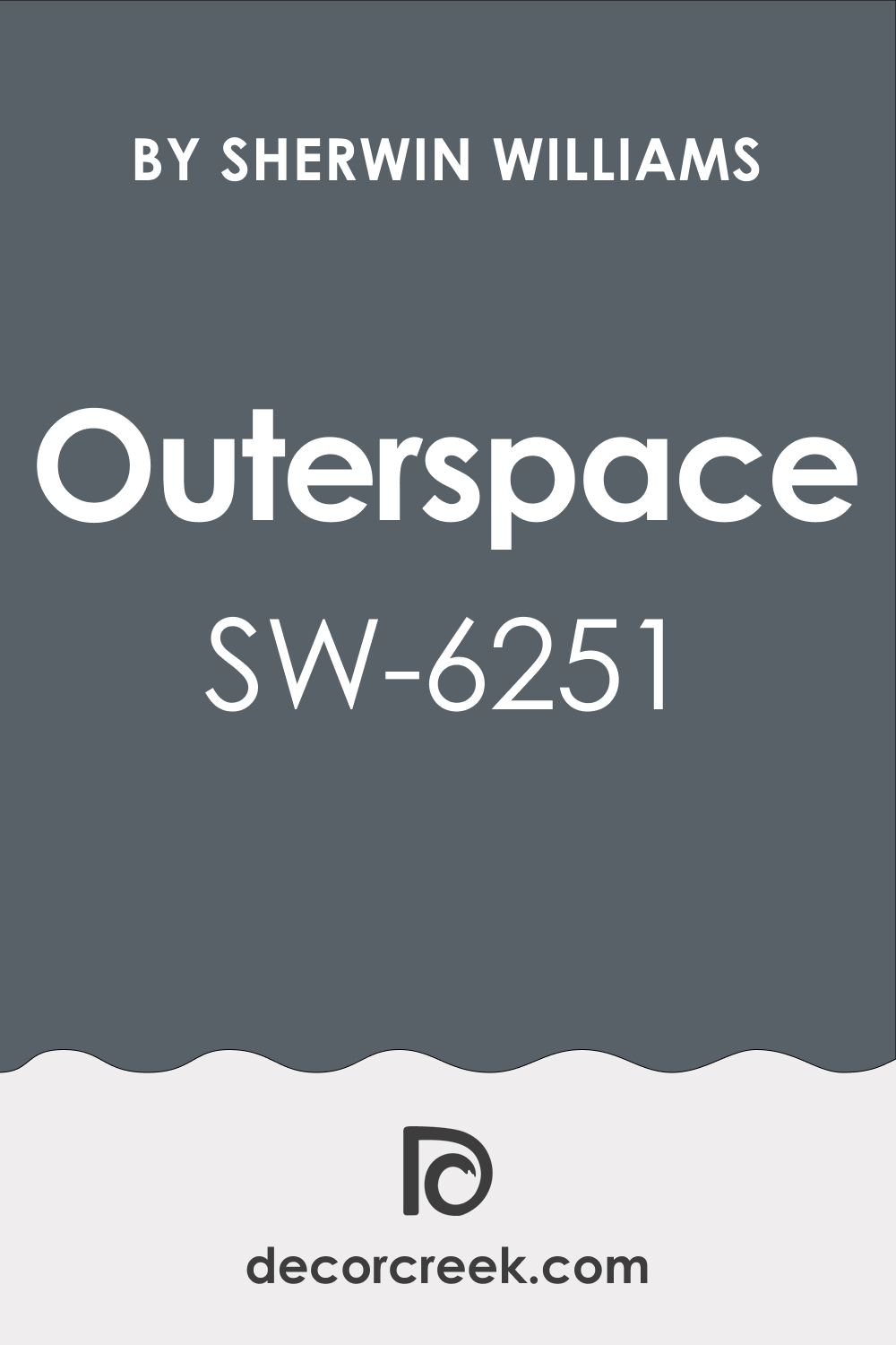
The palette of colors available for home interior design is remarkably vast, with every tone carrying its own distinctive character and ambiance. One such shade that has been turning heads in the design world is Sherwin-Williams’ SW 6251 Outerspace.
Let’s journey through this universe of color and explore its intriguing undertones, coordinating colors, lighting effects, Light Reflectance Values, trim colors, similar hues, and ways to incorporate it into your living spaces harmoniously.
What Color Is SW 6251 Outerspace?
SW 6251 Outerspace is a rich shade of gray with blue undertones, imparting a serene, soothing feel. It conjures up images of the twilight sky or a tranquil sea under a cloud-filled sky. This shade possesses an enigmatic depth that engrosses and intrigues, compelling the onlooker to explore its layers of complexity.
The hue strikes a delicate balance between blue and gray, offering a refreshing take on the traditional shades of these colors. It’s an elegant, sophisticated color that can provide a beautiful contrast to light, bright hues while also blending perfectly with darker tones.
Ever wished paint sampling was as easy as sticking a sticker? Guess what? Now it is! Discover Samplize's unique Peel & Stick samples.
Get paint samples

Is It a Warm Or Cool Color?
SW 6251 Outerspace is a cool color. It has undertones of blue and gray, which are both typically associated with cooler palettes. This coolness contributes to the calming and relaxing ambiance that this color can create in a space.
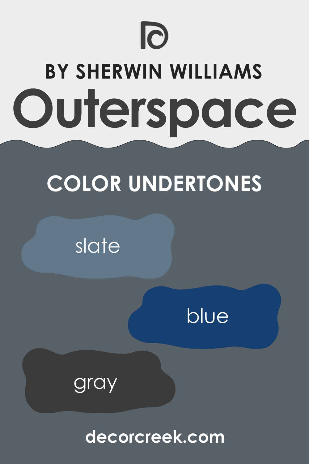
Undertones of SW 6251 Outerspace
Undertones significantly impact how we perceive color. They subtly influence the overall appearance of the color, often being the defining factor that gives it its unique character. Undertones can make the color appear warmer or cooler, and they can also impact how well the color coordinates with other shades.
SW Outerspace paint color has the following undertones:
- Blue: This hue lends the color its tranquil aura, reminiscent of the serene sea or a clear, starlit sky.
- Gray: It’s the gray undertone that provides the color its sophistication, grounding the color and preventing it from being overly cool.
- Slate: This underlying hint of slate adds a certain depth and richness to the color, making it versatile across various settings.
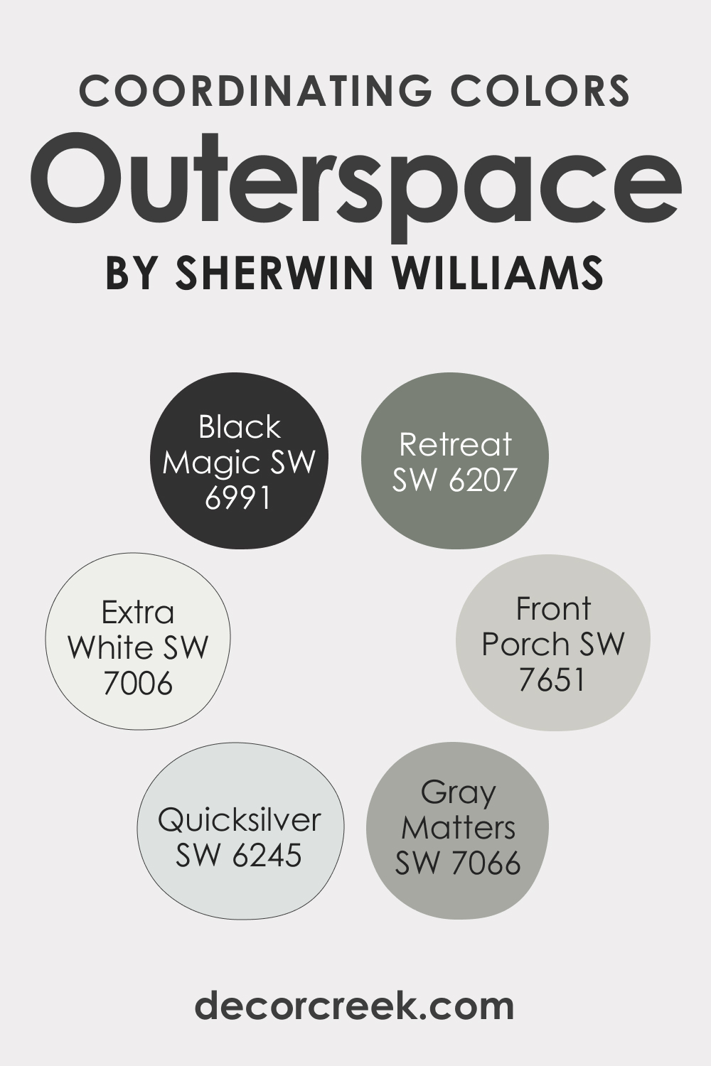
Coordinating Colors of SW 6251 Outerspace
Coordinating colors are those that harmonize well with a particular color, enhancing its aesthetic appeal. These colors can be used alongside the primary color to create a pleasing, balanced look.
- SW 6245 Quicksilver : A light gray color that creates a nice contrast with the depth of SW Outerspace, providing a lighter backdrop to its richness.
- SW 7651 Front Porch : A muted blue-gray, it resonates with the cool undertones of SW Outerspace, creating a serene palette.
- SW 6207 Retreat : A rich, muted green, it offers an earthy contrast to the coolness of SW Outerspace, evoking a sense of natural harmony.
Additional colors that coordinate well with SW 6251 Outerspace:
- SW 7006 Extra White : A pure, clean white, it offers a crisp contrast to the depth of SW Outerspace, making the color stand out.
- SW 7066 Gray Matters : This medium gray blends seamlessly with SW Outerspace, creating a monochromatic palette.
- SW 6991 Black Magic : A deep black can add drama and intensity when used with SW Outerspace, perfect for accent walls or furniture.
How Does Lighting Affect SW 6251 Outerspace?
Lighting plays a crucial role in how we perceive color, and this is especially true for SW 6251 Outerspace. In natural daylight, the blue undertones are more pronounced, giving the color a cooler, fresher look. Under incandescent light, the gray undertones are highlighted, making the color appear deeper and warmer.
This interplay of light and color can be used to your advantage when designing your space. If you wish to enhance the cool, tranquil side of SW Outerspace, ensure your space has plenty of natural light. For a warmer, cozier ambiance, use warm artificial light.
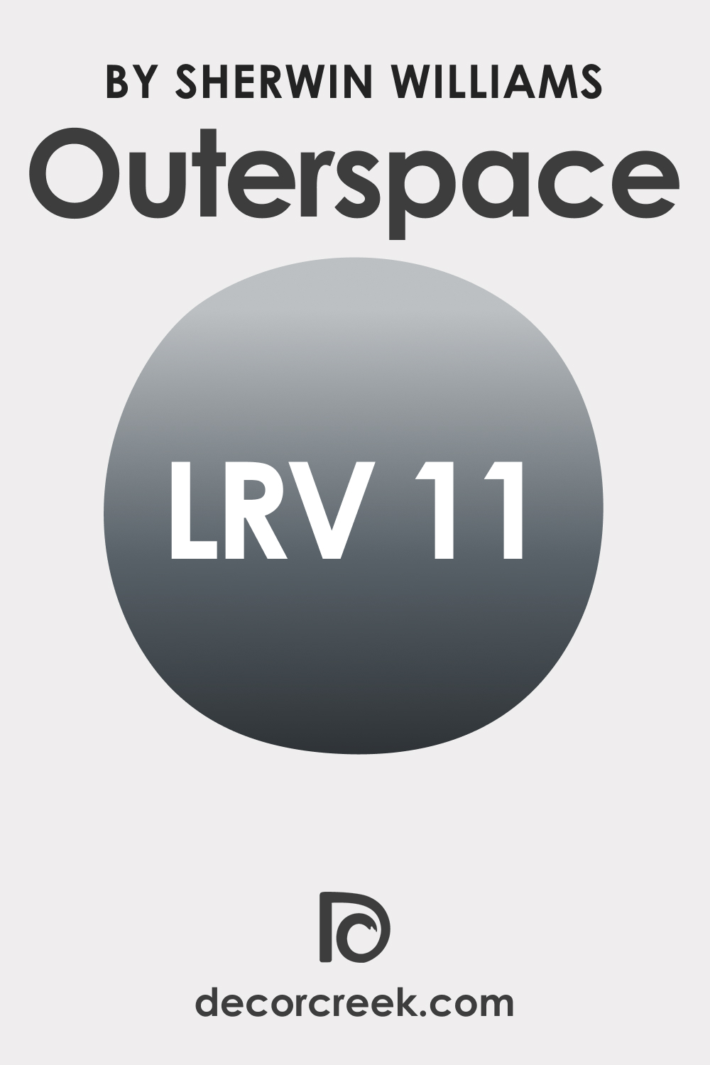
LRV of SW 6251 Outerspace
The Light Reflectance Value (LRV) measures the amount of light a color reflects. The LRV of SW 6251 Outerspace is 11, meaning it absorbs most light and reflects only a small portion of it. This makes it a darker color, perfect for creating a cozy, intimate atmosphere.
The low LRV means that this color can make a room feel smaller or more enclosed. However, this can be used to your advantage in larger rooms that you wish to make feel cozier. Also, when used judiciously in smaller spaces, like an accent wall, it can add a touch of elegance without making the room feel cramped.
LRV – what does it mean? Read This Before Finding Your Perfect Paint Color
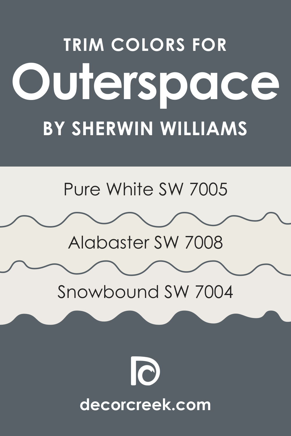
Trim Colors of SW 6251 Outerspace
Trim colors are the hues used on the trim, molding, and other decorative details of a room. They complement the primary wall color, accentuating the architectural features of the space. Here are three shades of white from Sherwin-Williams that would work well as trim colors for SW Outerspace:
- SW 7005 Pure White : This bright, clean white creates a striking contrast with SW Outerspace, making it pop.
- SW 7008 Alabaster : A warmer, creamier white, Alabaster can soften the coolness of SW Outerspace.
- SW 7004 Snowbound : A cooler, gray-infused white, Snowbound resonates with the gray undertones in SW Outerspace, providing a harmonious look.
Using the right trim color is important as it can enhance the aesthetic appeal of the room, draw attention to the room’s architectural details, and complement the primary wall color.
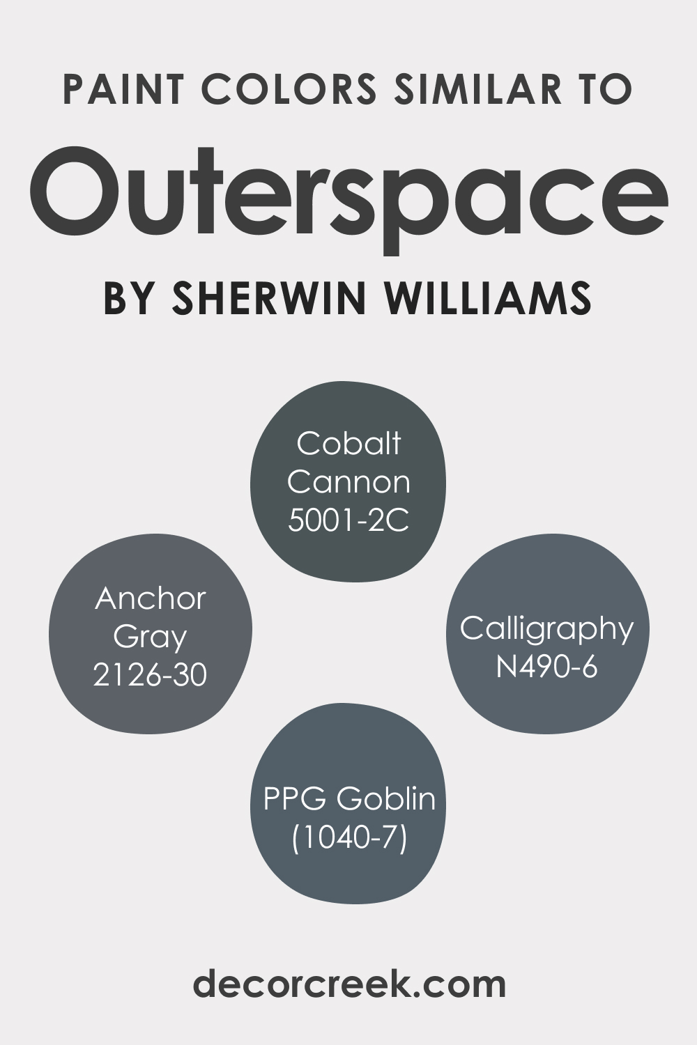
Colors Similar to SW 6251 Outerspace
Knowing similar colors to your chosen wall paint can be invaluable for several reasons. Similar colors can be used to complement your primary wall color and add depth to your space. They can be incorporated through furniture, textiles, and accessories to create a cohesive, visually pleasing palette.
For monochromatic designs, having a range of similar colors allows you to create subtle variations within a room. Also, similar colors can help create a smooth transition from one space to another when dealing with open floor plans or adjoining rooms. Finally, similar colors allow for easy touch-ups without needing an exact match.
SW Outerspace also has several color alternatives you should know about:
- Behr Calligraphy
- BM Anchor Gray
- PPG Goblin
- Valspar Cobalt Cannon
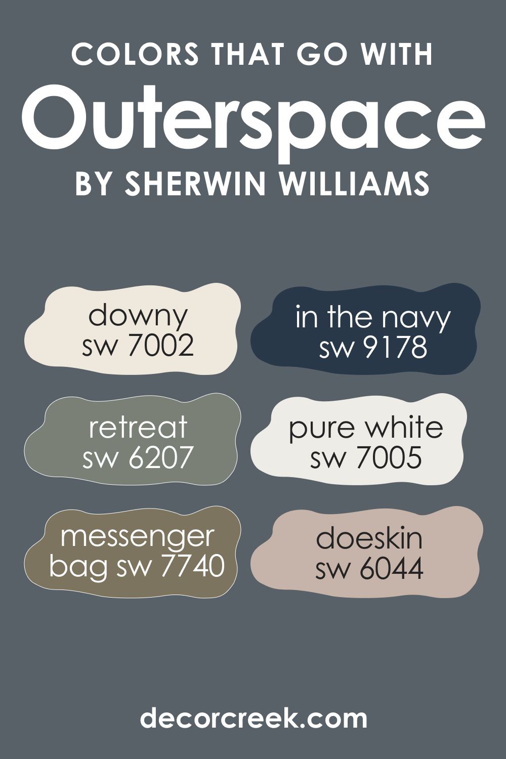
Colors That Go With SW 6251 Outerspace
Choosing colors that go well together is crucial when designing a room, as it ensures a balanced and harmonious look. Here are six colors that complement SW 6251 Outerspace:
- SW 7005 Pure White : The stark contrast of SW Pure White brings out the depth of SW Outerspace.
- SW 6207 Retreat : The earthy green of SW Retreat balances the cool tones of Outerspace.
- SW 9178 In the Navy : The deep, rich blue of SW In the Navy enhances the coolness of SW Outerspace.
- SW 7002 Downy : This light gray offers a soft, soothing contrast to the depth of SW Outerspace.
- SW 6044 Doeskin : A warm, neutral beige, SW Doeskin softens the coolness of SW Outerspace.
- SW 7740 Messenger Bag : A deep, warm brown SW Messenger Bag provides an earthy balance to the cool tones of Outerspace.
How to Use SW 6251 Outerspace In Your Home?
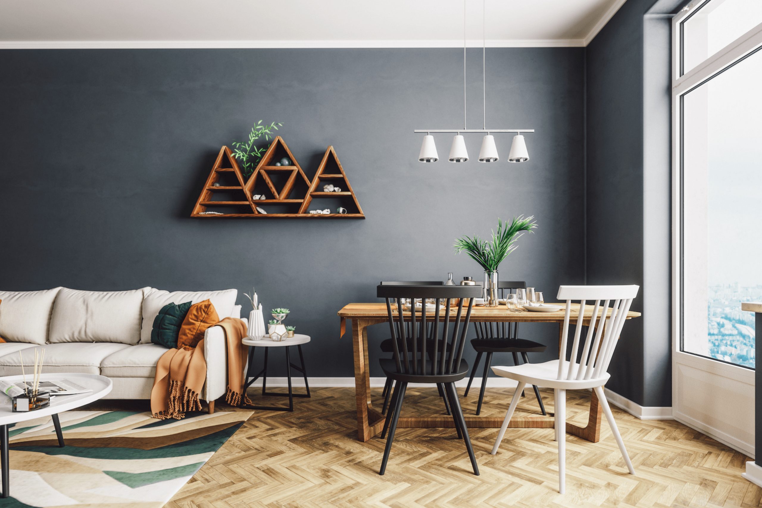
SW 6251 Outerspace can be used in various rooms and with several interior design styles. Its tranquil, soothing ambiance makes it an excellent choice for bedrooms, bathrooms, and living rooms. The sophistication of the color makes it fit well with contemporary, coastal, and modern farmhouse styles.
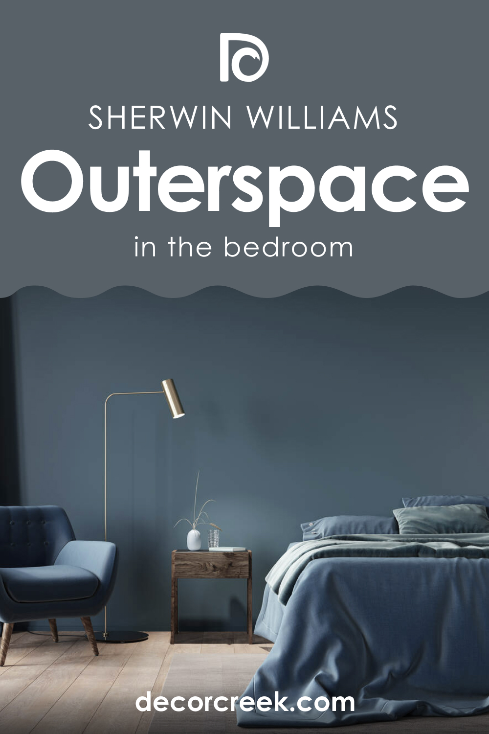
SW 6251 Outerspace in the Bedrooms
In the bedroom, SW 6251 Outerspace can create a calm, relaxing environment. Its cool undertones can promote a night of restful sleep, and its depth can add a touch of elegance. Try pairing it with lighter colors for the bedding and accessories for a balanced look.
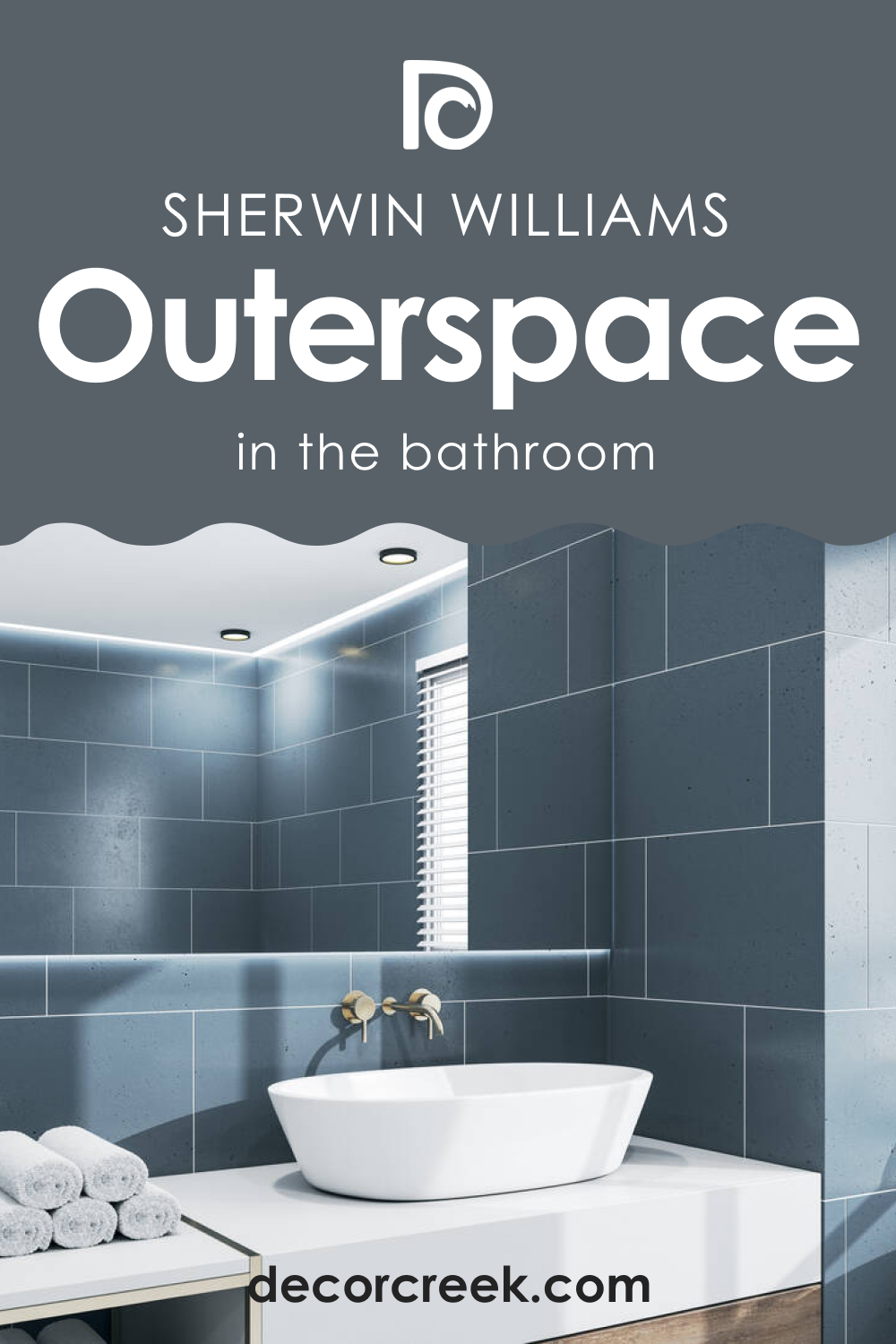
SW 6251 Outerspace in the Bathrooms
In the bathroom, this deep blue hue can evoke a spa-like tranquility. Its rich depth can counterbalance lighter, bright colors used for bathroom fixtures and accessories.
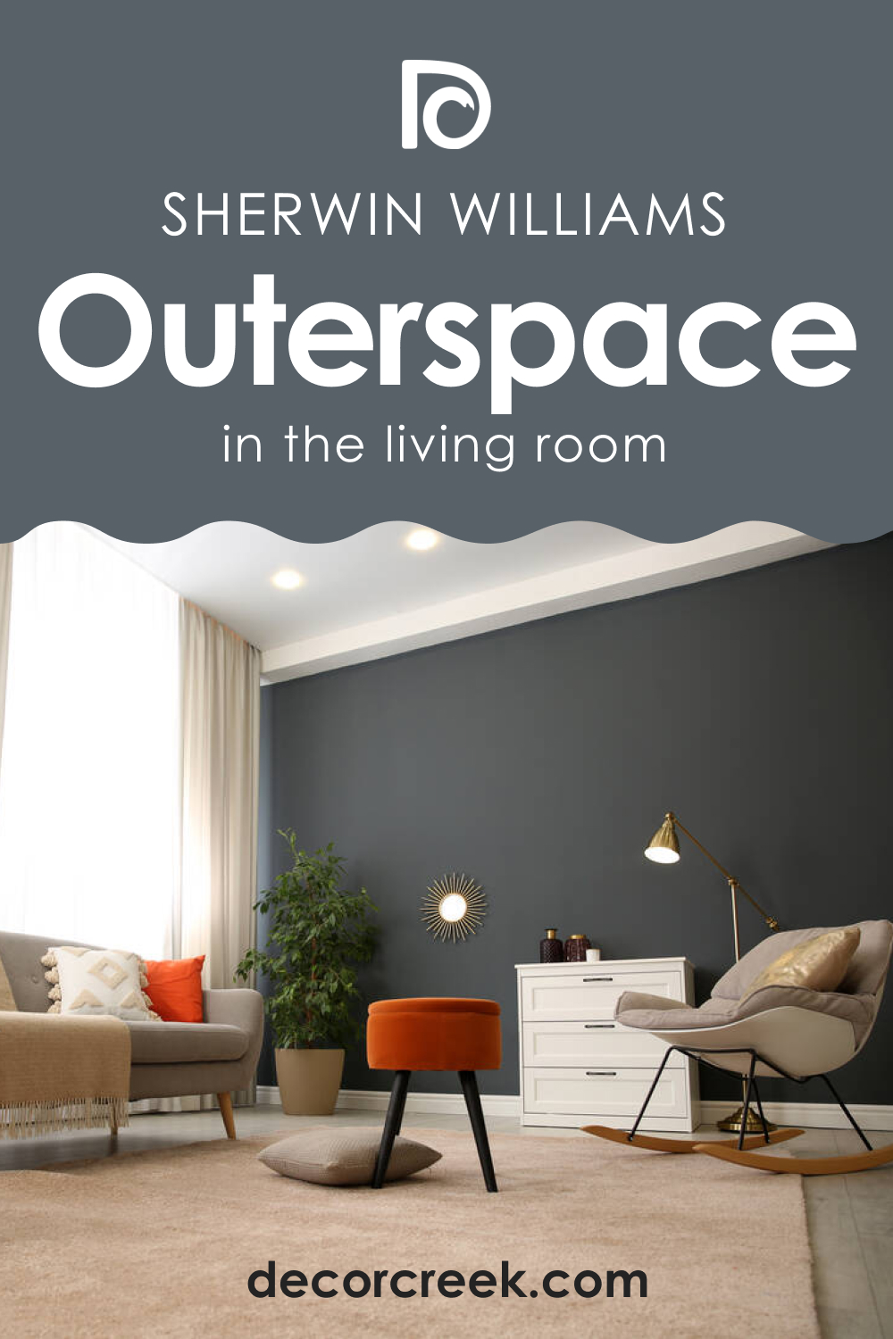
SW 6251 Outerspace in the Living Rooms
The living room is another excellent place to use SW Outerspace. This relaxing and deep hue can provide a serene backdrop for an array of furniture and decor colors, creating a cohesive, harmonious look.
SW 6251 Outerspace for the Exterior Use
When used for exteriors, SW Outerspace can make your home stand out in the neighborhood. Its cool, sophisticated vibe pairs well with white or cream trim, and its depth contrast beautifully with natural elements like greenery.

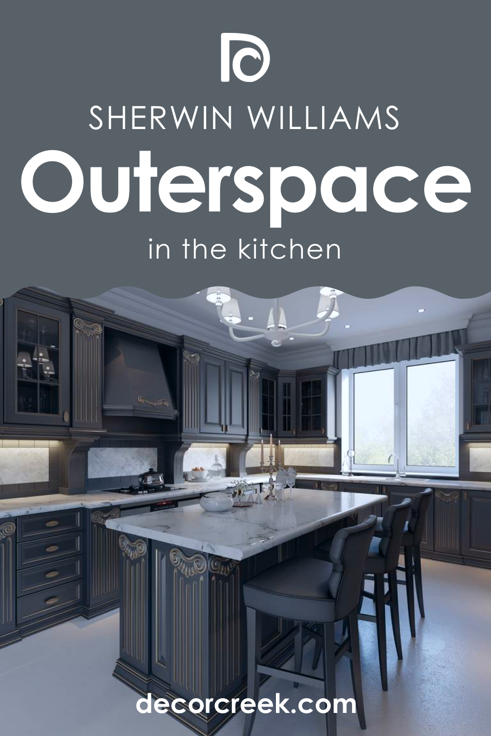
SW 6251 Outerspace in the Kitchens
For the kitchen, consider using SW Outerspace on the cabinets for a rich, deep look. Paired with lighter walls, it can create a beautiful contrast that’s sure to impress.
Comparing SW 6251 Outerspace With Other Colors
By comparing different colors, you can better see their distinctions and understand how LRVs and undertones work in making hues unique.
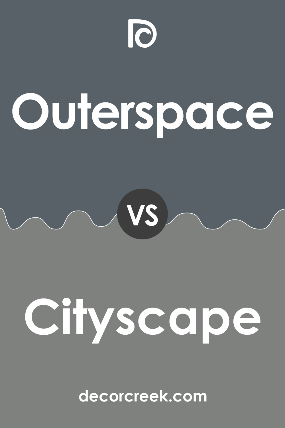
SW 6251 Outerspace and SW 7067 Cityscape
SW Cityscape is a sophisticated charcoal gray that carries an urban elegance. When compared to SW Outerspace, it brings out a darker, more somber tone. It exudes a different aura, but like SW Outerspace, it creates a sophisticated setting. Pairing these two can provide a balanced contrast, with SW Outerspace providing a softer touch to Cityscape’s striking depth.
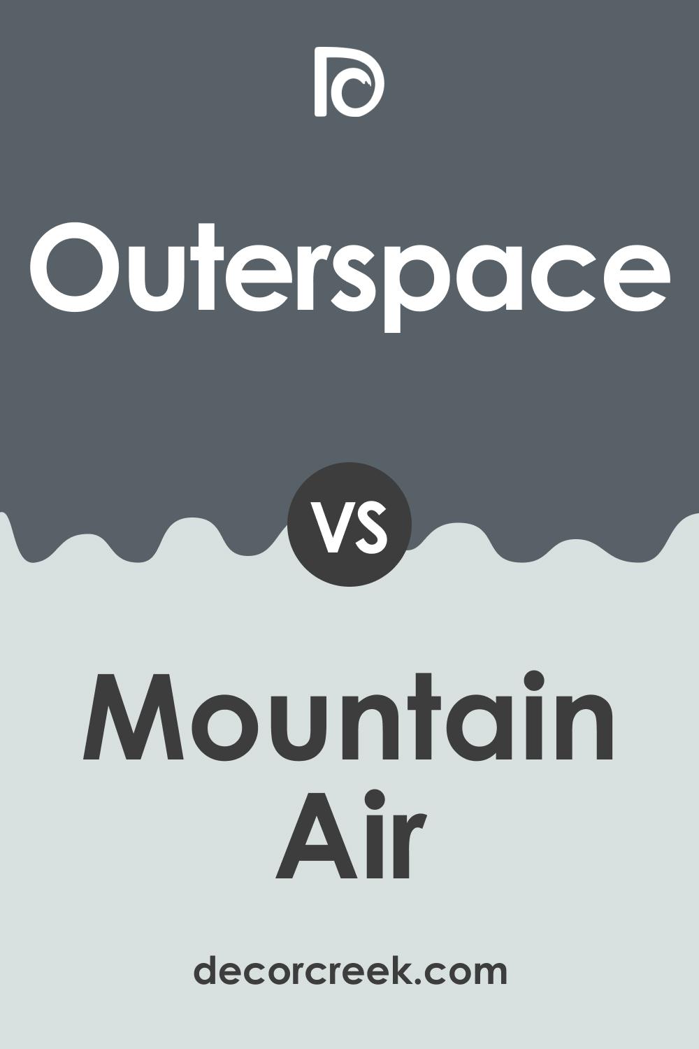
SW 6251 Outerspace and SW 6224 Mountain Air
SW Mountain Air is a muted , cool aqua color, significantly lighter than SW Outerspace. It invokes a breezy, tranquil ambiance, evoking images of a misty mountain morning. Next to SW Outerspace, it accentuates the latter’s depth and richness. When used together, they can create a soothing, cool-toned palette perfect for a peaceful environment.
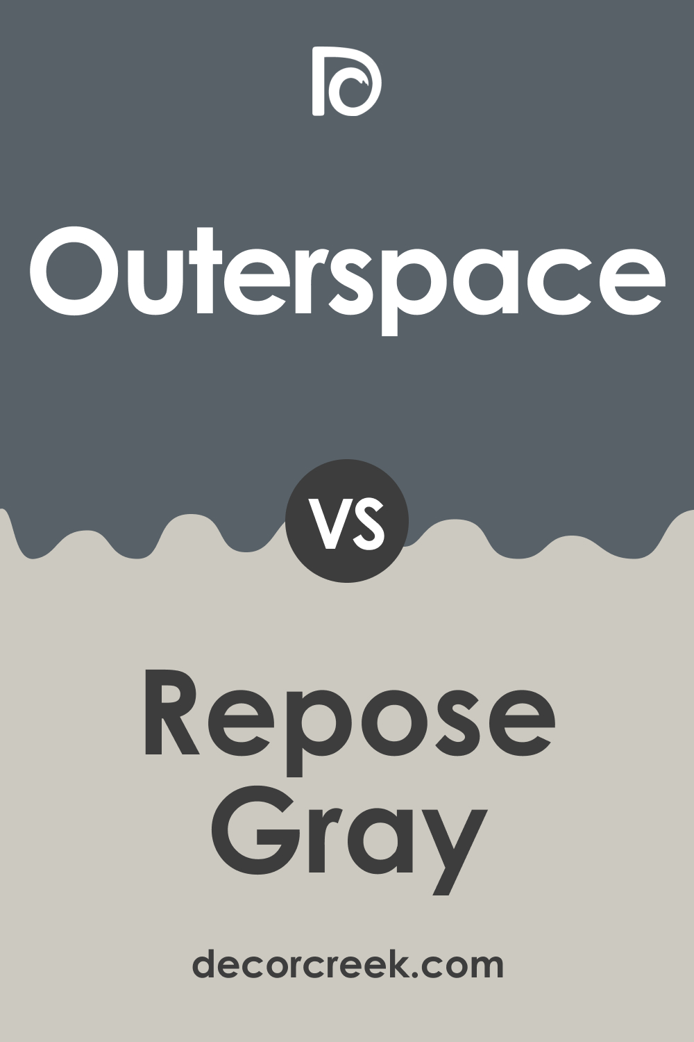
SW 6251 Outerspace and SW 7015 Repose Gray
SW Repose Gray is a light to medium gray with warm undertones. In comparison, SW Outerspace is deeper, cooler, and more intense. However, they both share a certain calmness. Used in the same room, they could provide a gradient effect, with SW Outerspace as an accent wall and Repose Gray for the remaining areas, creating a serene and balanced space.
SW 6251 Outerspace and SW 6244 Naval
SW Naval is a rich , deep shade of navy blue that exudes confidence and tranquility. It’s darker and more saturated than Outerspace, and its intense blue undertones are more pronounced. Placed next to SW Outerspace, SW Naval brings out the latter’s gray undertones. They can be used together to create a monochromatic look with a vibrant touch.
SW 6251 Outerspace and SW 7641 Colonnade Gray
SW Colonnade Gray is a medium gray with warm undertones. It’s a neutral shade, creating a comfortable and inviting atmosphere. Next to SW Outerspace, its warm undertones stand out, contrasting with Outerspace’s cooler character. When used together, they can create an interesting interplay of warm and cool tones, offering a balanced and harmonious look.
SW 6251 Outerspace and SW 6204 Sea Salt
SW Sea Salt is a light, muted green with gray undertones, presenting a refreshing, coastal vibe. When compared with SW Outerspace, Sea Salt’s green and gray undertones become more pronounced, offering a striking contrast to SW Outerspace’s blue-gray character. They can work together to create a tranquil, nature-inspired palette, with Sea Salt providing a light, airy balance to Outerspace’s depth.
Conclusion
Sherwin-Williams’ SW 6251 Outerspace is a truly versatile color. Its unique blend of blue and gray, combined with its cool undertones, gives it a sophistication and tranquility that can elevate any space.
Whether used in the bedroom for a restful ambiance, in the bathroom for a spa-like feel, or in the kitchen for a touch of elegance, SW Outerspace is sure to make a statement. And with careful consideration of lighting, coordinating colors, and trim colors, you can truly make the most of this unique shade.

Ever wished paint sampling was as easy as sticking a sticker? Guess what? Now it is! Discover Samplize's unique Peel & Stick samples.
Get paint samples
Frequently Asked Questions
⭐What type of color is SW 6251 Outerspace?
SW 6251 Outerspace is a rich, deep gray-blue color that evokes a sense of calm and sophistication. It carries a cool undertone, making it a tranquil and versatile choice for various spaces in your home.
⭐What are the undertones of SW 6251 Outerspace?
Outerspace has cool undertones with a subtle hint of blue. This creates a serene, tranquil vibe, making it an excellent choice for bedrooms, bathrooms, and any space where you'd like to evoke a sense of calm.
⭐What colors coordinate well with SW 6251 Outerspace?
Outerspace pairs well with a variety of colors. Lighter grays, deep blues, and shades of white make excellent pairings. For a balanced look, consider coordinating colors such as SW 6245 Quicksilver, SW 7651 Front Porch, and SW 6207 Retreat.
⭐How does lighting affect the appearance of SW 6251 Outerspace?
The appearance of Outerspace can change dramatically depending on the lighting. In natural daylight, its blue undertones are more pronounced, giving the color a cooler look. Under warm artificial light, the gray undertones are highlighted, making the color appear deeper and warmer.
⭐What are the best rooms to use SW 6251 Outerspace in?
Outerspace is an extremely versatile color that can be used in a variety of rooms. Its tranquil nature makes it an excellent choice for bedrooms and bathrooms. Its depth and sophistication make it a stunning choice for living rooms and kitchens, especially when used on cabinets. It also works beautifully for exteriors, paired with light trims.


