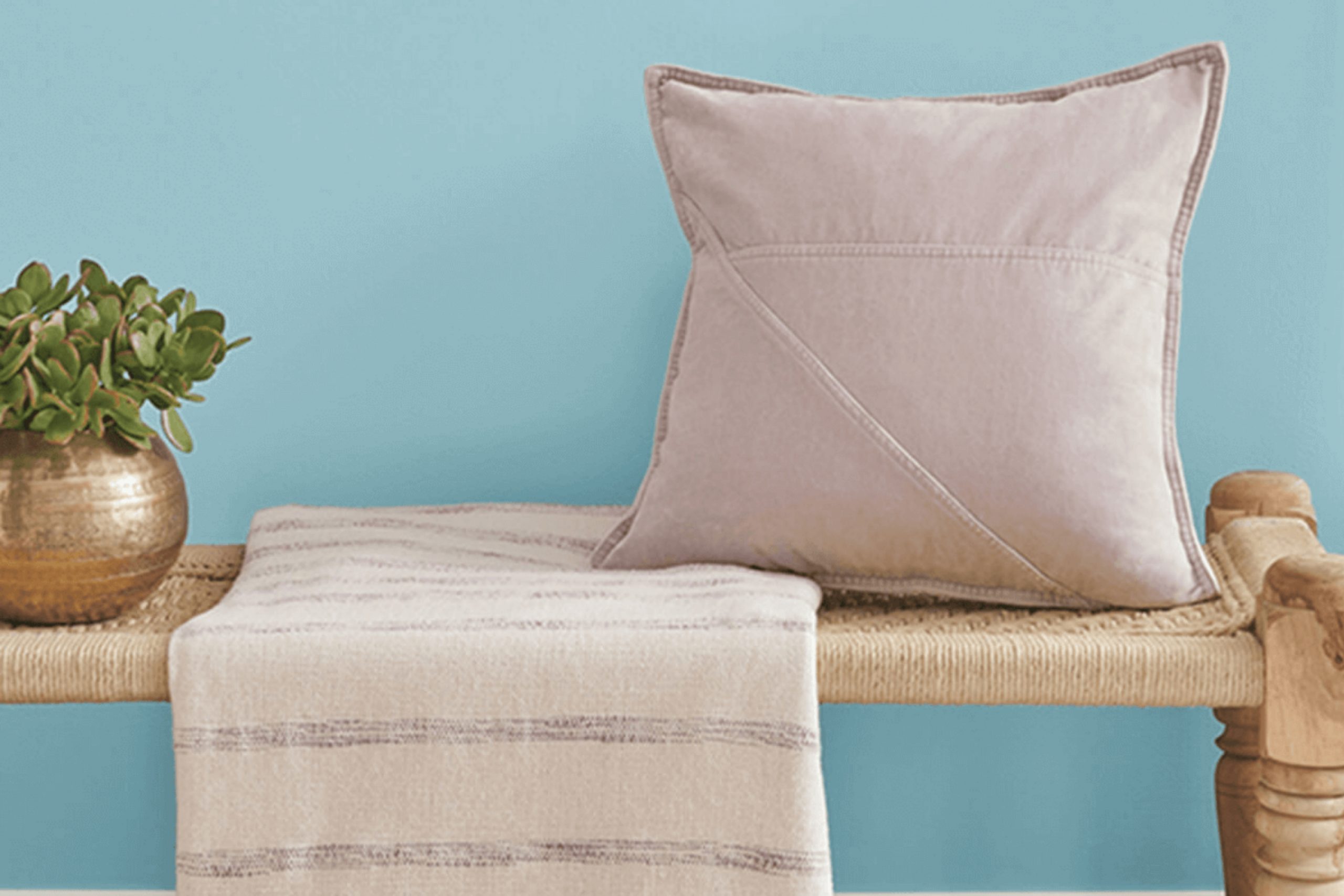
When you first come across SW 9053 Agua Fria by Sherwin Williams, you’re likely to feel an instant sense of calm. This refreshing color brings to mind the gentle flow of a clear stream, offering a peaceful retreat from the hectic pace of daily life. It’s a color that doesn’t shout for attention but gently makes its presence felt in the most soothing way.
Incorporating Agua Fria into your room feels like inviting nature itself into your home. Its soft tones create a balanced and harmonious environment, perfect for unwinding after a long day. Whether you’re redoing a living room, bedroom, or even a kitchen, this hue works wonders in bringing a room together with its understated elegance and charm.
The versatility of Agua Fria means it pairs well with a variety of other colors and textures. Whether paired with light neutrals for a soft look or darker accents for a more dramatic effect, it opens up endless possibilities.
It’s a color that gives you the freedom to express your personal style while maintaining an aura of serenity. Embracing Agua Fria feels like taking a gentle step into a more relaxed and inviting atmosphere, marking a significant shift in how your room feels and functions.
What Color Is Agua Fria SW 9053 by Sherwin Williams?
Agua Fria SW 9053 by Sherwin Williams is a cool, muted blue-green color that brings a calm and relaxing vibe to any room. This gentle tone is reminiscent of soft ocean waves and can fit nicely in various interior styles, including coastal, contemporary, and bohemian themes. It has an understated elegance that makes it flexible for many settings.
This color works beautifully in living rooms, bedrooms, or bathrooms where a calming atmosphere is desired. Agua Fria pairs well with neutral colors such as white, beige, or light gray, adding a nice touch of color without overpowering the room. It also complements natural materials like light wood, rattan, and linen, enhancing the room’s airy and laid-back feel.
For a more modern look, combine it with sleek metal accents or dark finishes to create contrast. Textures like soft cotton or wool work well with this color, adding warmth and comfort to your room. Using Agua Fria on walls or as an accent color can bring a fresh and airy sensation, allowing it to serve as a backdrop that highlights artwork or unique furnishings. Whether on walls, furniture, or accessories, it provides a sense of comfort and openness to various environments.
Is Agua Fria SW 9053 by Sherwin Williams Warm or Cool color?
Agua Fria by Sherwin Williams is a soft, cool blue-green color that brings a calming effect to home interiors. It works well in various rooms by creating a light and airy atmosphere that feels peaceful and inviting.
This color pairs nicely with neutral tones, such as whites and grays, making it easy to use in different room designs. When used on walls, Agua Fria can make a room feel more open and spacious, which is ideal for smaller areas or rooms that need a fresh look. It can be used in living rooms, bedrooms, or bathrooms to create a soothing environment.
Additionally, Agua Fria complements natural materials like wood and stone, making it a flexible choice for homes that feature rustic or modern elements. By choosing this shade, homeowners can achieve a harmonious balance that enhances the overall appeal of their living rooms while keeping the atmosphere comfortable and stylish.
Undertones of Agua Fria SW 9053 by Sherwin Williams
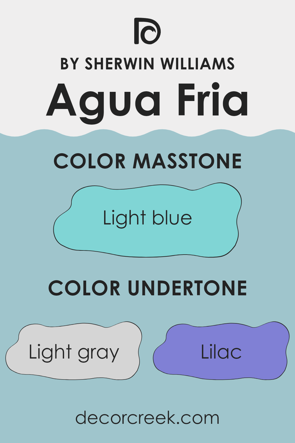
Agua Fria by Sherwin Williams is a flexible color that can change based on its undertones. This paint is primarily a cool shade, with various undertones that mix to create its unique appearance. These undertones include light gray, lilac, mint, and more, which influence how the color looks on walls.
Undertones are subtle hues that can shift the perception of a color. For example, if a paint has a gray undertone, it might appear more neutral. If it has a lilac undertone, it might have a slight purple tint.
Agua Fria’s undertones can make it appear different depending on the lighting and surrounding colors in a room. The blue, turquoise, and light purple undertones can give Agua Fria a calm and cool presence. In contrast, the pale yellow and pale pink undertones might add a touch of warmth. In a room with natural light, Agua Fria can appear brighter and more lively.
In darker rooms, the gray and dark turquoise undertones might make it look more muted and subdued. When used on interior walls, Agua Fria can provide a gentle, restful backdrop that subtly shifts throughout the day, making it an excellent choice for areas where a soothing, adaptable color is desired.
What is the Masstone of the Agua Fria SW 9053 by Sherwin Williams?
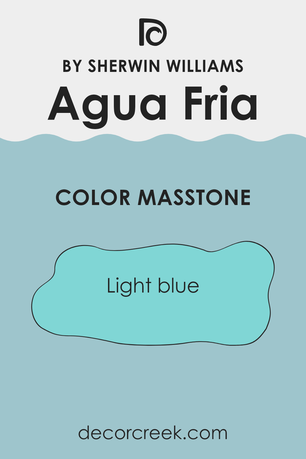
Agua Fria by Sherwin Williams is a soft, welcoming light blue color. Its masstone, the most prominent shade you see when you look at it, is represented by the gentle hue of #80D5D5. This color works well in homes by bringing a sense of calmness and openness to any room.
The light blue shade can make areas feel larger and more airy, which is especially beneficial in smaller rooms or areas that need brightening. People often choose this color for bedrooms, bathrooms, or living rooms because it adds a peaceful and refreshing touch.
The shade pairs nicely with neutral colors like whites and grays for a clean look, or with darker blues and greens for more contrast. It is flexible enough to work with various styles, from modern to traditional, helping create an environment that is both relaxing and inviting without overpowering the senses.
How Does Lighting Affect Agua Fria SW 9053 by Sherwin Williams?
Lighting plays a significant role in how we perceive colors. The type, temperature, and intensity of light can change the way colors appear in any room. Agua Fria SW 9053 by Sherwin Williams is a flexible color, but it can look different depending on the lighting conditions.
In artificial light, such as incandescent bulbs, which emit a warm, yellowish light, Agua Fria may appear slightly warmer and more muted. This can be pleasant in areas where a cozy atmosphere is desired. Under fluorescent lighting, which tends to be cooler and can sometimes cast a green tint, this color might take on a duller look, affecting its true tone.
Natural light changes throughout the day and varies with the orientation of the room. In north-facing rooms, light is often cooler and more consistent, making Agua Fria appear slightly bluer and cooler. This type of lighting can highlight the crispness of the color, which can be advantageous if you want a fresh and calm look.
South-facing rooms receive warm, steady natural light all day. This kind of light can enhance the warmth in Agua Fria, bringing out its softer tones. The result is a more balanced and inviting hue, perfect for places that see a lot of activity.
East-facing rooms get bright, warm light in the morning that becomes cooler later in the day. In such rooms, Agua Fria may look warmer and more vibrant in the morning light and cool down as the day progresses.
Lastly, west-facing rooms receive warm light in the afternoon and evening. This can intensify the warmth within Agua Fria, making it feel cozy and soft as the day ends and casting a more gentle mood over the room. Understanding these lighting effects helps in choosing the perfect placement for this color, ensuring rooms complement your desired feel and aesthetic.
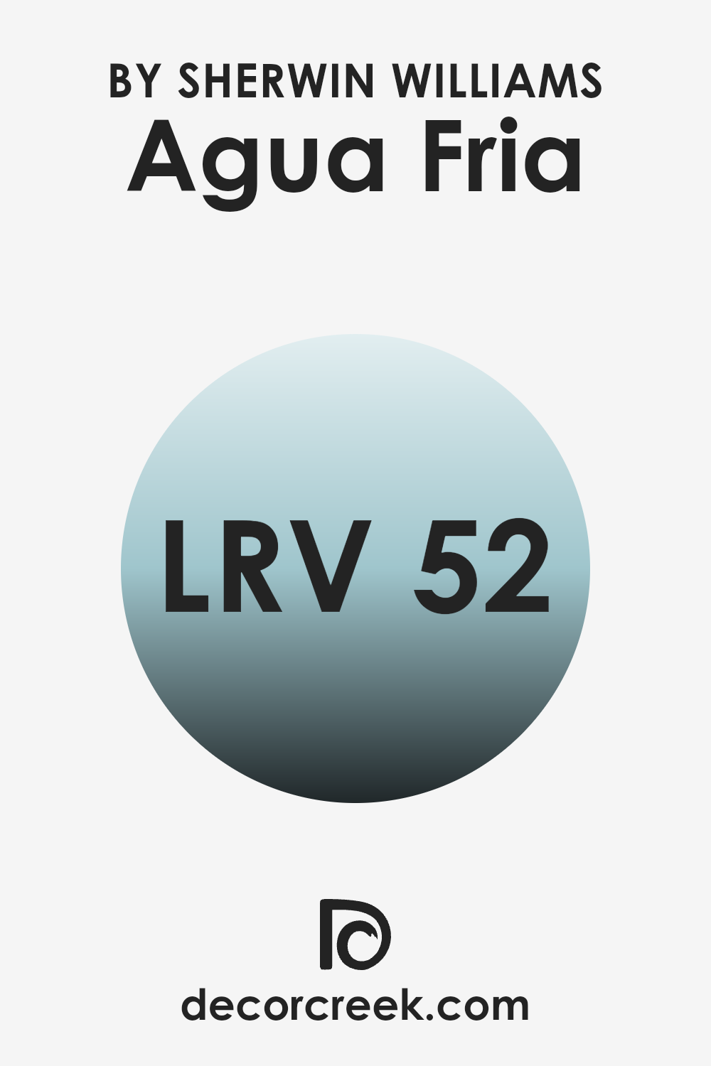
What is the LRV of Agua Fria SW 9053 by Sherwin Williams?
LRV, or Light Reflectance Value, is a scale that measures the percentage of light a paint color reflects. It ranges from 0, which indicates absolute black, reflecting no light, to 100, which represents pure white, reflecting all light. An LRV of around 50, like that of Agua Fria SW 9053, suggests a color that reflects about half the light and absorbs the other half.
This balance means the color won’t be too bright or too dark, offering a middle ground. The way a color’s LRV interacts with the light in a room can change how it looks; brighter colors with high LRV values make areas feel larger and more open, while lower LRV colors create a cozier, more intimate feel.
For the specific LRV of 51.631, Agua Fria sits just above the middle of the scale, meaning it can brighten up a room without overpowering it. It can help areas feel calm and balanced, as it neither reflects an excessive amount of light nor absorbs too much. This makes it a flexible choice that can work well in various room types and lighting conditions.
Its ability to reflect a moderate amount of light allows it to retain its distinctive character, adapting to surrounding hues and decor smoothly. Depending on natural and artificial light, it may take on slightly different tones, which adds depth to the overall aesthetic of the room.
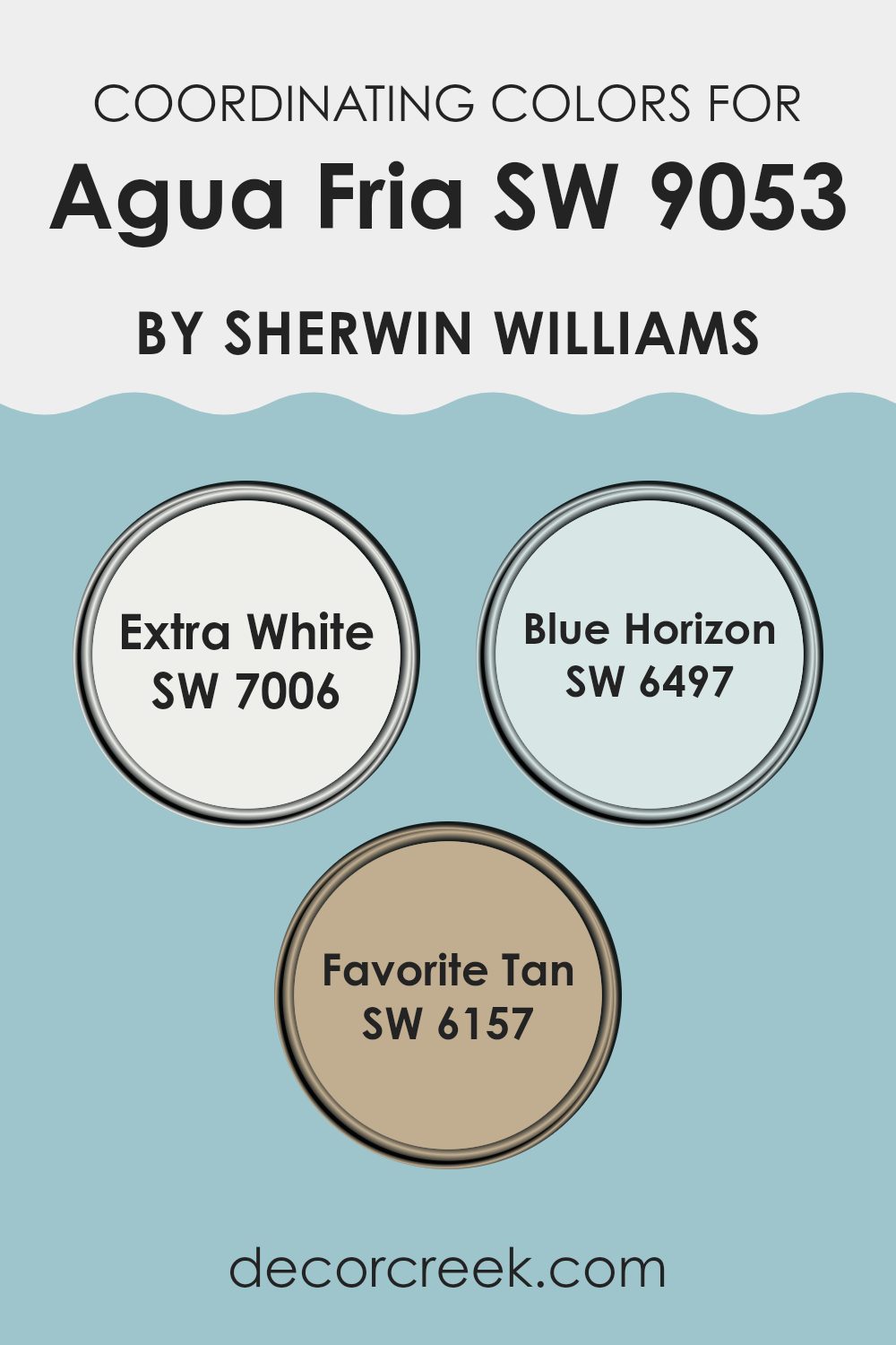
Coordinating Colors of Agua Fria SW 9053 by Sherwin Williams
Coordinating colors are hues that work well together to create a harmonious and pleasing look in any room. They complement each other by sharing undertones and balance, enhancing the overall aesthetic of a room. For the color Agua Fria by Sherwin Williams, some excellent coordinating colors are SW 7006 Extra White, SW 6497 Blue Horizon, and SW 6157 Favorite Tan. These colors can seamlessly blend with Agua Fria, making them ideal for diverse areas.
SW 7006 Extra White is a crisp, clean white that offers a fresh and airy feel. It pairs well with many shades, providing a bright contrast that highlights the deeper tones of Agua Fria. In contrast, SW 6497 Blue Horizon is a soft, calm blue that adds a cool and relaxing vibe to the room, perfectly harmonizing with the muted blue-gray of Agua Fria.
Lastly, SW 6157 Favorite Tan is a warm, inviting beige. It introduces a cozy touch, balancing the coolness of the blues with its earthy undertones. Together, these colors create a cohesive and inviting environment, each playing its unique role in complementing Agua Fria’s flexible charm.
You can see recommended paint colors below:
- SW 7006 Extra White
- SW 6497 Blue Horizon
- SW 6157 Favorite Tan
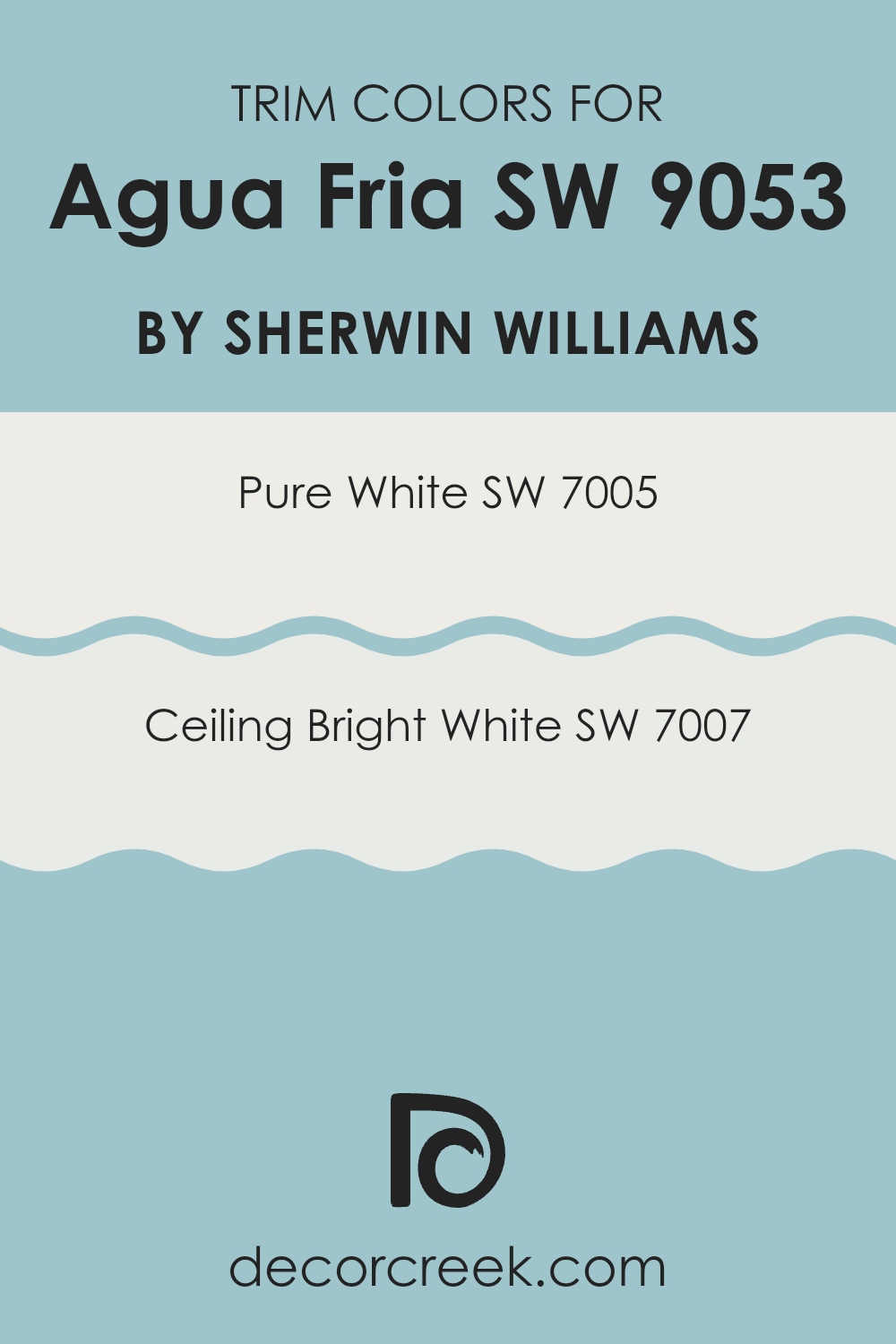
What are the Trim colors of Agua Fria SW 9053 by Sherwin Williams?
Trim colors are the finishing touches that can significantly influence the look and feel of a room or building. They are usually different from wall colors and provide contrast or harmony, enhancing the overall aesthetics. For the wall color Agua Fria SW 9053 by Sherwin Williams, using trim colors like SW 7005 Pure White and SW 7007 Ceiling Bright White can make a substantial difference. Pure White SW 7005 is a flexible and clean color.
It offers a soft and welcoming brightness, which works beautifully to frame windows, doors, and baseboards, highlighting architectural features without being stark. On the other hand, Ceiling Bright White SW 7007 reflects an abundance of light, making it perfect for areas where a fresh and airy feel is desired.
Using these trim colors brings out the cool, muted shades of Agua Fria, giving an inviting, polished appearance. Pure White is a practical choice for those who desire a neutral element that complements rather than competes with wall colors, bringing a crisp finish that’s both classic and adaptable.
Ceiling Bright White offers a similar brightness but with a touch more sheen, which can subtly accentuate the height and depth of a room. Together, these trim colors unify the room, allowing Agua Fria SW 9053 to be the focal point while maintaining a cohesive and comfortable environment.
You can see recommended paint colors below:
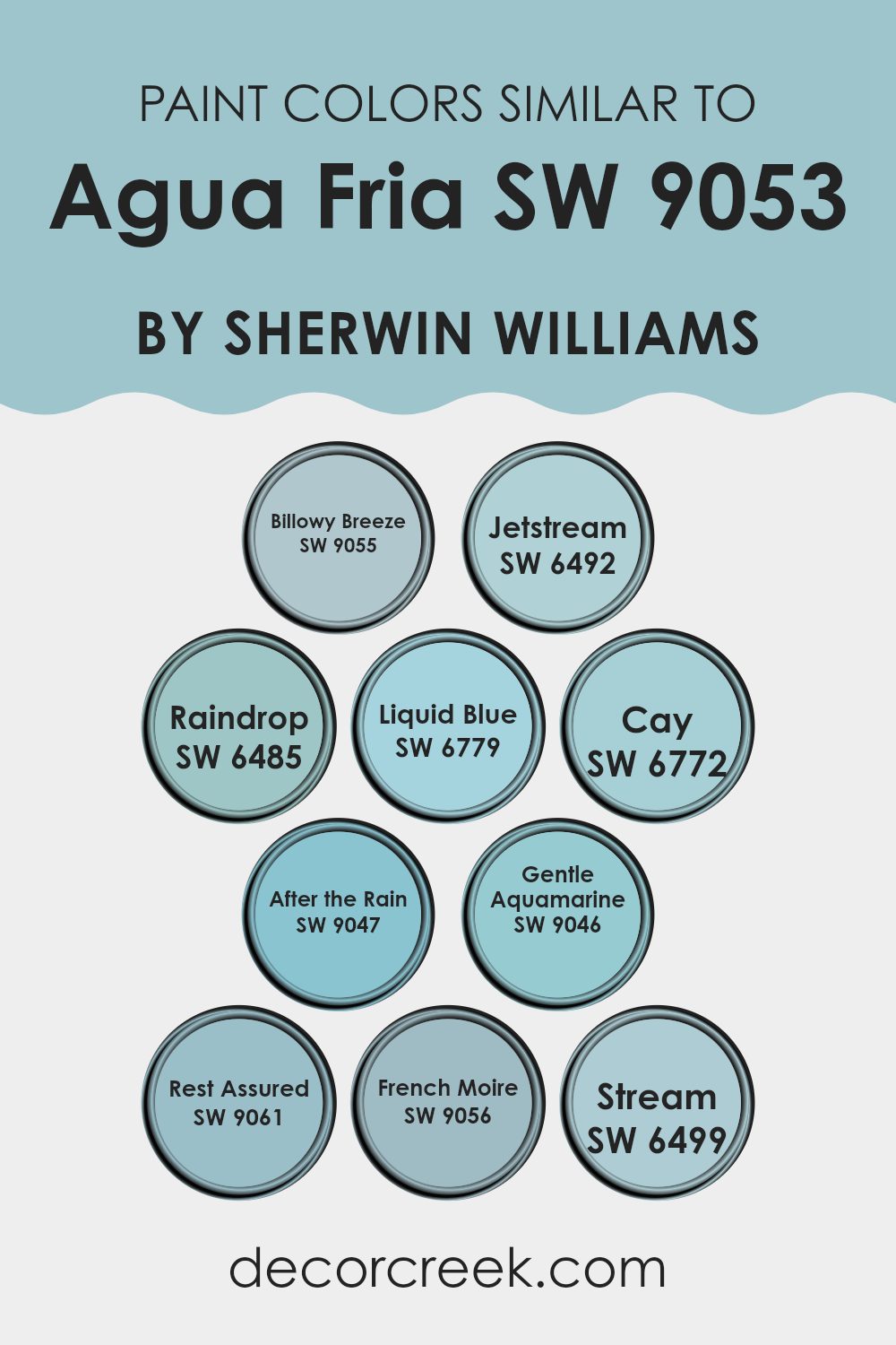
Colors Similar to Agua Fria SW 9053 by Sherwin Williams
Similar colors play an essential role in creating a cohesive and harmonious design. When you use similar colors to Agua Fria by Sherwin Williams, the room feels connected and unified. Billowy Breeze is a soft and airy shade, evoking a sense of lightness and calm. Jetstream carries subtle hints of the sky, providing a fresh and clean backdrop.
Raindrop brings a gentle wash of blue that feels both relaxing and refreshing, ideal for rooms meant to soothe. Liquid Blue is a bit richer, offering a deeper blue that still maintains a calm atmosphere. Each of these colors complements Agua Fria, enhancing its cool and inviting tone.
Adding to this palette, Cay offers a deeper, bolder shade that evokes the ocean depth while maintaining a peaceful vibe. After the Rain captures the essence of a freshly washed world, offering a clean and renewed feel. Gentle Aquamarine introduces a touch of green, bringing a hint of nature indoors. Rest Assured offers a rich blue that feels comforting and strong.
French Moire provides a subtle touch of elegance with its soft, muted green-blue tone, while Stream captures the essence of water flowing in its light and gentle hue. By integrating these colors, areas can achieve a balanced and unified look that feels both comfortable and inviting.
You can see recommended paint colors below:
- SW 9055 Billowy Breeze
- SW 6492 Jetstream
- SW 6485 Raindrop
- SW 6779 Liquid Blue
- SW 6772 Cay
- SW 9047 After the Rain
- SW 9046 Gentle Aquamarine
- SW 9061 Rest Assured
- SW 9056 French Moire
- SW 6499 Stream
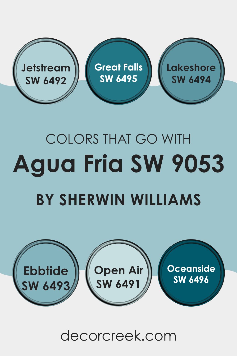
Colors that Go With Agua Fria SW 9053 by Sherwin Williams
Choosing colors that complement Agua Fria SW 9053 by Sherwin Williams can greatly impact the mood and harmony of a room. Agua Fria is a cool, soothing shade that can bring a calming atmosphere to any room, so it’s important to pair it with colors that enhance its beauty and create an inviting environment.
SW 6492 Jetstream is a soft, sky-like blue that brings a light and airy feel, making anreas appear more open and fresh. SW 6495 Great Falls has a deeper, richer blue tone that adds depth and can create a cozy, intimate atmosphere when paired with Agua Fria.
SW 6494 Lakeshore is a muted teal that introduces a touch of nature, reminiscent of calm waters, and pairs well by adding contrast while maintaining the tranquil vibe. SW 6493 Ebbtide offers a gentle green-blue tone that beautifully complements the more neutral characteristics of Agua Fria.
SW 6491 Open Air is a light, breezy blue with a hint of gray, perfect for adding subtle elegance and making smaller areas seem larger. Finally, SW 6496 Oceanside is a bold and deep teal that brings vibrant energy and can create a striking focal point when used alongside the more understated Agua Fria. Each of these colors works to complete a harmonious and cohesive look.
You can see recommended paint colors below:
- SW 6492 Jetstream
- SW 6495 Great Falls
- SW 6494 Lakeshore
- SW 6493 Ebbtide
- SW 6491 Open Air
- SW 6496 Oceanside
How to Use Agua Fria SW 9053 by Sherwin Williams In Your Home?
Agua Fria SW 9053 by Sherwin Williams is a calming, cool color that brings a refreshing feel to any room. It’s a light blue-gray shade, making it perfect for creating a relaxing atmosphere in the home. One way to use this color is by applying it to bedroom walls.
Its soothing tone helps create a peaceful environment that’s great for sleeping. In the living room, Agua Fria can be paired with white or cream-colored furniture and accents for a clean and bright look.
This color works well in bathrooms too, providing a spa-like vibe when combined with soft towels and natural materials like wood. In a kitchen, it can be used on cabinets or as an accent wall to add a splash of calmness. Whether it’s used as the main color or a gentle accent, Agua Fria is flexible and works well with various decor styles.
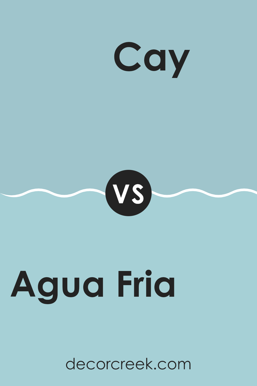
Agua Fria SW 9053 by Sherwin Williams vs Cay SW 6772 by Sherwin Williams
Agua Fria SW 9053 by Sherwin-Williams is a subtle, muted shade of blue-green. It has a calming and cool vibe, making it a great choice for areas where you want a relaxed atmosphere. It pairs well with natural materials and can add a touch of color without being overpowering.
On the other hand, Cay SW 6772 is a brighter, more vibrant shade of blue. This color is bolder and can bring energy to a room. It works well in areas where you want to create a lively and cheerful mood, like a playroom or a creative workspace.
While Agua Fria is more subdued and flexible, Cay stands out with its lively tone. Both are beautiful in their own ways, with Agua Fria introducing calmness and Cay adding excitement to any environment. When choosing between the two, consider the mood you want to create in your room.
You can see recommended paint color below:
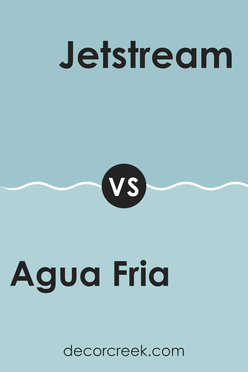
Agua Fria SW 9053 by Sherwin Williams vs Jetstream SW 6492 by Sherwin Williams
Agua Fria SW 9053 is a cool, muted teal with a touch of gray. It offers a calming and grounding vibe, making it ideal for areas where you want a touch of color without being too bold. On the other hand, Jetstream SW 6492 is a lighter, brighter blue with a hint of green, resembling the clear sky on a sunny day.
Jetstream feels fresh and airy, bringing a sense of openness to any room. While Agua Fria creates a cozy and relaxed atmosphere perfect for relaxing areas like bedrooms or reading nooks, Jetstream works well in areas where you want to feel energized and cheerful, such as kitchens or playrooms.
Both colors are flexible, but Jetstream is more suited for lighter, playful environments, whereas Agua Fria excels in creating a more intimate and calming setting.
You can see recommended paint color below:
- SW 6492 Jetstream
Agua Fria SW 9053 by Sherwin Williams vs Billowy Breeze SW 9055 by Sherwin Williams
Agua Fria SW 9053 by Sherwin Williams and Billowy Breeze SW 9055 are both cool colors but have distinct vibes. Agua Fria is a deeper, muted blue-gray shade, bringing a sense of calmness and subtlety to a room. It’s flexible and can complement many design styles, making it suitable for creating a relaxed yet refined atmosphere.
On the other hand, Billowy Breeze is a lighter, softer blue. It evokes a fresh and airy feel, reminiscent of a gentle sky or light ocean breeze. This color can make areas feel more open and inviting. Ideal for smaller rooms or areas where you want to enhance brightness, Billowy Breeze imparts a sense of freshness and lightheartedness.
While both colors belong to the same palette family, Agua Fria adds depth and a moody touch, whereas Billowy Breeze brings lightness and freshness. The choice between them depends on whether you want a cozy and intimate room or an open, airy one.
You can see recommended paint color below:
- SW 9055 Billowy Breeze
Agua Fria SW 9053 by Sherwin Williams vs Gentle Aquamarine SW 9046 by Sherwin Williams
Agua Fria SW 9053 and Gentle Aquamarine SW 9046 are both colors from Sherwin Williams, but they offer different vibes. Agua Fria SW 9053 is a deeper, more muted blue-green, giving a calm and grounded feel to any room. It’s a flexible color that can work well in living rooms, providing a modern and understated look.
On the other hand, Gentle Aquamarine SW 9046 is a lighter, more vibrant shade. It carries a fresh and airy quality, making rooms feel open and energized. This color is great for those who want to bring some brightness into a room without being overpowering.
While Agua Fria is ideal for creating a cozy yet sleek ambiance, Gentle Aquamarine adds a refreshing pop to areas. Both colors can be used to complement a variety of styles, but the choice between them depends on whether you prefer a more subdued or lively atmosphere.
You can see recommended paint color below:
- SW 9046 Gentle Aquamarine
Agua Fria SW 9053 by Sherwin Williams vs French Moire SW 9056 by Sherwin Williams
Agua Fria SW 9053 and French Moire SW 9056, both by Sherwin Williams, offer distinct vibes for a room. Agua Fria SW 9053 is a cooler, more subdued hue with a hint of blue. It suggests calmness and works well in areas where a relaxed feel is desired. It’s flexible and pairs nicely with neutral tones or other soft blues.
On the other hand, French Moire SW 9056 presents a rich, deeper color with gray undertones. This makes it feel more dramatic and bold compared to Agua Fria. It’s ideal for creating a cozy atmosphere and can add a touch of elegance to a room. French Moire can stand out on its own or be complemented with lighter shades to balance its intensity.
Both colors can be great choices depending on the mood you want to create; Agua Fria lends a calming, gentle touch, while French Moire offers a more impactful and cozy environment.
You can see recommended paint color below:
- SW 9056 French Moire
Agua Fria SW 9053 by Sherwin Williams vs Raindrop SW 6485 by Sherwin Williams
Agua Fria SW 9053 by Sherwin Williams is a muted, cool-toned blue that feels calming and grounded. It has subtle green undertones, giving it a natural, earthy vibe. This color is perfect for creating a peaceful atmosphere in a room, making it a great choice for a calming bedroom or a soothing bathroom.
On the other hand, Raindrop SW 6485 by Sherwin Williams is a lighter, more vibrant blue with noticeable aqua tones. It is brighter and fresher compared to Agua Fria. Raindrop feels crisp and lively, making it ideal for areas like children’s rooms or kitchens where you want a bit more energy and brightness.
When comparing the two, Agua Fria is more understated and refined, while Raindrop is youthful and cheerful. Both blues can bring a sense of relaxation in different ways, depending on the mood you want to set in your room.
You can see recommended paint color below:
Agua Fria SW 9053 by Sherwin Williams vs Rest Assured SW 9061 by Sherwin Williams
Agua Fria SW 9053 and Rest Assured SW 9061 are two calming colors from Sherwin Williams that offer distinct vibes. Agua Fria is a cool blue-green shade that feels refreshing and crisp. It evokes a sense of freshness, like a cool breeze on a hot day. It’s a color that’s flexible and works well in rooms where you want to feel awake and energized yet relaxed.
On the other hand, Rest Assured is a more muted blue with a hint of gray. It gives off a calming and peaceful vibe, perfect for areas meant for winding down, like bedrooms or living rooms. Rest Assured has a slightly softer presence than Agua Fria, making it feel a bit cozier.
Both colors can create a soothing atmosphere, but Agua Fria is more vibrant and lively, while Rest Assured offers a more subdued and gentle feeling. They each have unique strengths depending on the mood you wish to create in your room.
You can see recommended paint color below:
- SW 9061 Rest Assured

Agua Fria SW 9053 by Sherwin Williams vs Liquid Blue SW 6779 by Sherwin Williams
Agua Fria SW 9053 and Liquid Blue SW 6779 are two distinct colors by Sherwin Williams, each bringing a unique vibe to a room. Agua Fria is a cool, muted blue with a hint of gray. It creates a calm and balanced atmosphere, making it an excellent choice for bedrooms or living rooms where you want a relaxed setting. It pairs well with neutral colors and soft whites.
On the other hand, Liquid Blue is a more vibrant and lively shade. It has a brighter and more refreshing tone, perfect for adding energy and a touch of playfulness to a room. Kitchens, bathrooms, or accent walls could benefit from its refreshing hue.
While Agua Fria exudes subtlety, Liquid Blue stands out with its bold presence. Both colors can be harmonized with complementary finishes and decor to match the mood you wish to achieve in your room.
You can see recommended paint color below:
- SW 6779 Liquid Blue
Agua Fria SW 9053 by Sherwin Williams vs Stream SW 6499 by Sherwin Williams
Agua Fria SW 9053 and Stream SW 6499, both by Sherwin Williams, are subtle and calm shades. Agua Fria is a cool, muted blue with gray undertones. It creates a calm, refined atmosphere, making it perfect for living areas or bedrooms. This shade works well with neutral colors like whites and grays.
On the other hand, Stream SW 6499 is a light, airy blue with a hint of green. It’s slightly brighter and more lively than Agua Fria, bringing a refreshing, coastal feel to areas. Stream is ideal for bathrooms or kitchens where you want to feel refreshed and open.
When comparing the two, Agua Fria offers a more muted and understated look, while Stream provides a brighter and more cheerful vibe. Both colors are great for different moods and room styles. Pair either with whites and natural textures for a balanced, harmonious look.
You can see recommended paint color below:
Agua Fria SW 9053 by Sherwin Williams vs After the Rain SW 9047 by Sherwin Williams
Agua Fria SW 9053 and After the Rain SW 9047 by Sherwin Williams are both soothing colors, but they each bring a different feeling to a room. Agua Fria is a calming blue-gray shade, creating a cool and relaxed atmosphere. It works well in areas where you want to feel peaceful and composed.
In contrast, After the Rain is a soft green, reminiscent of lush gardens and fresh growth. This color brings a sense of nature inside, making areas feel more lively and fresh. While both colors are gentle and calming, Agua Fria leans more towards a modern and neutral tone, ideal for minimalist rooms.
After the Rain, on the other hand, is perfect for adding a touch of vitality and can complement natural elements like wooden furniture. Both colors can set a calm and inviting mood, but Agua Fria is more subdued, whereas After the Rain has a hint of fresh vibrancy.
You can see recommended paint color below:
- SW 9047 After the Rain
After reading about SW 9053 Agua Fria by Sherwin Williams, I feel like I’ve gained a good understanding of this paint color. Agua Fria is a cool, calm blue-green shade that makes me think of a gentle stream or a quiet pond. It’s a color that can be used in a lot of different rooms because it seems to work everywhere. Whether it’s a bedroom, where we want to feel calm and restful, or a kitchen where a fresh look can brighten up our day, this shade does the job.
One thing I noticed is how Agua Fria pairs nicely with both light and dark colors, allowing us to be creative. We could even use it for smaller items like furniture or doors to add a soft pop of color without taking over the whole room. It’s amazing how one color can bring a new feel to different settings.
In conclusion, SW 9053 Agua Fria by Sherwin Williams proves to be an ideal shade for those who love a gentle touch of blue-green in their room.
It’s pretty on its own and gets along well with other colors, making it a great pick when we want to refresh our surroundings at home.

Ever wished paint sampling was as easy as sticking a sticker? Guess what? Now it is! Discover Samplize's unique Peel & Stick samples.
Get paint samples

