Exploring the world of color, we often come across shades that instantly evoke feelings of tranquility and peace. One such color is Sherwin-Williams’ SW 6493 Ebbtide, a captivating hue that brings the calm serenity of a lagoon right into your interiors.
This article delves into the detailed analysis of SW Ebbtide, highlighting its undertones, coordinating colors, Light Reflectance Value (LRV), trim colors, and its usability in various interior spaces.
What Color Is SW 6493 Ebbtide?
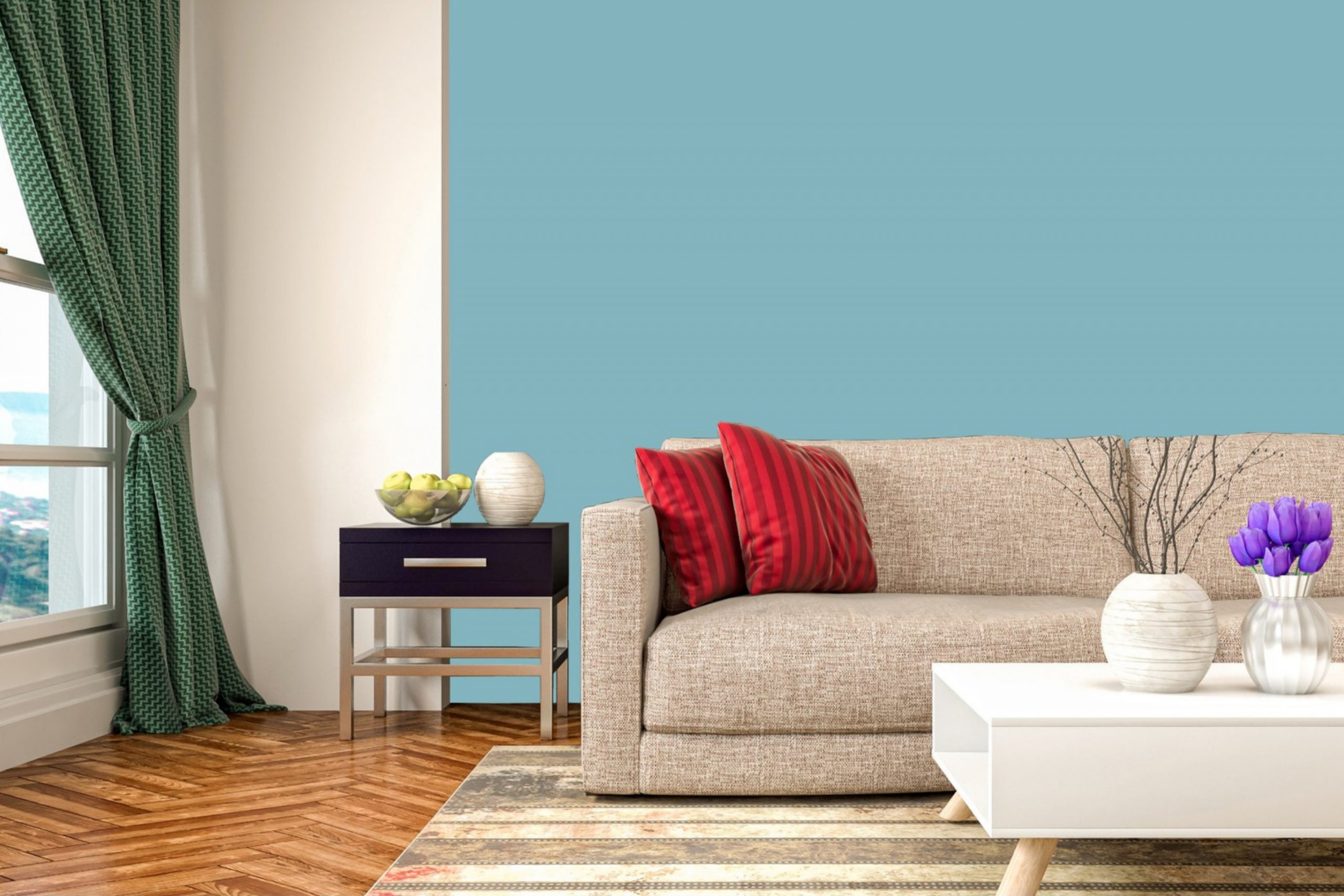
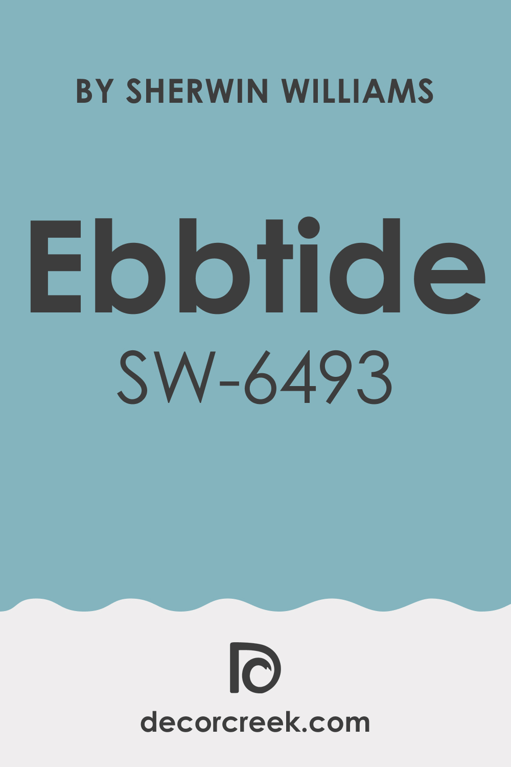
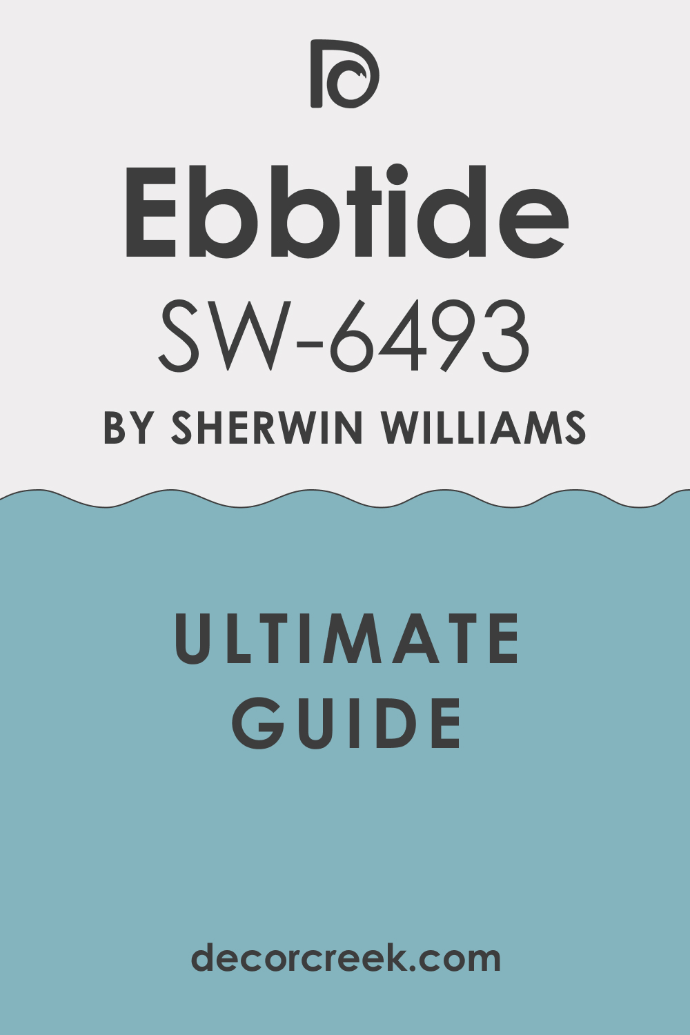
Sherwin-Williams SW 6493 Ebbtide is a muted, medium-dark aqua color with an enchanting blend of blue and green. It is reminiscent of a quiet sea under a cloudy sky, exuding a sense of calm and tranquility. SW Ebbtide is a unique hue with a remarkable balance of intensity and relaxation, bringing a touch of nature’s quiet harmony into your interiors.
SW Ebbtide’s calming appearance is versatile, bringing a soothing presence to any space it’s used in. It carries the refreshing aura of coastal environments, and yet, it has an undeniable contemporary appeal.
When combined with the right coordinating colors and under different lighting conditions, SW Ebbtide can turn a simple room into a sophisticated, tranquil retreat.
Ever wished paint sampling was as easy as sticking a sticker? Guess what? Now it is! Discover Samplize's unique Peel & Stick samples.
Get paint samples
Is It a Warm Or Cool Color?
SW 6493 Ebbtide falls under the cool color spectrum. Cool colors are known to recede in a space, giving an illusion of a larger room. They bring a sense of calm and relaxation, making SW Ebbtide an excellent choice for bedrooms, bathrooms, or any other space where you’d want to encourage a serene and calming environment.
Undertones of SW 6493 Ebbtide Paint Color
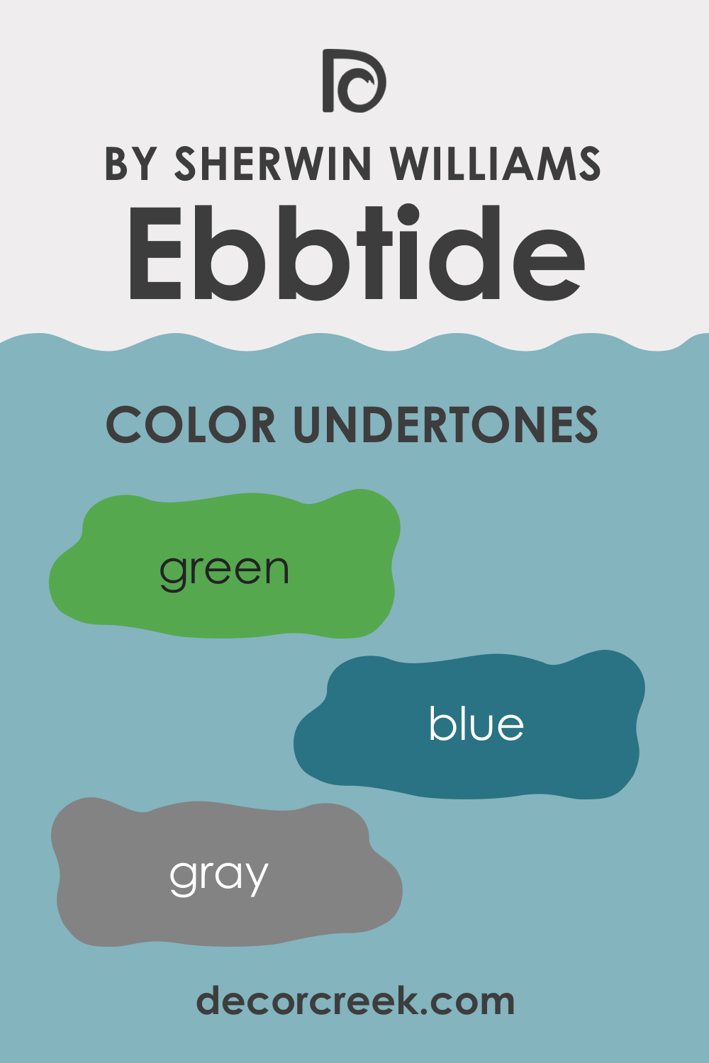
Every color carries undertones and subtle hues that underpin the dominant color. Understanding these undertones can significantly impact how a color appears in your space and how well it coordinates with other colors. SW Ebbtide has the following undertones:
- Green undertone: SW Ebbtide carries a green undertone that comes forward when paired with certain colors, especially warmer hues.
- Blue undertone: The blue undertone is more noticeable when placed next to cooler or neutral colors, enhancing the color’s aquatic feel.
- Gray undertone: SW Ebbtide has a gray undertone, contributing to its muted, soothing quality. This undertone becomes apparent when compared with more saturated blue or green colors.
These undertones affect how SW Ebbtide is perceived in different settings and against other colors. They can subtly shift the color’s appearance, making it more green, blue, or even grayish in some instances. Recognizing these undertones will help you use SW Ebbtide more effectively in your design projects.
Coordinating Colors of SW 6493 Ebbtide
Coordinating colors are those that work harmoniously together, creating a balanced and pleasing color scheme. They can be used in various ways – such as on walls, ceilings, trims, furniture, and decor items – to enhance the overall aesthetic of a room.
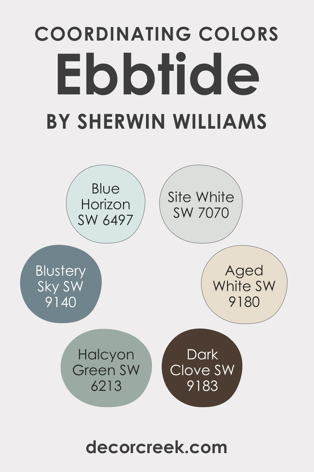
Understanding how to use coordinating colors can make the difference between a room that feels disjointed and one that feels thoughtfully designed. For SW Ebbtide, consider the following coordinating colors:
- SW 6497 Blue Horizon (CHECK A SAMPLE): This is a light, fresh blue color that pairs beautifully with SW Ebbtide, accentuating its green undertones and creating a serene, beachy vibe.
- SW 9180 Aged White (CHECK A SAMPLE): A rich, creamy off-white that provides a striking contrast to SW Ebbtide, making the latter’s unique hue pop out more prominently.
- SW 9183 Dark Clove : This is a dark, warm brown that can anchor the cool, airy feel of Ebbtide and give a sense of balance and warmth to a room.
As an option, you can also consider using the following colors to coordinate SW Ebbtide:
- SW 9140 Blustery Sky (CHECK A SAMPLE): A soothing mid-tone blue that enhances Ebbtide’s calming aura.
- SW 6213 Halcyon Green (CHECK A SAMPLE): A muted, grayish-green that echoes the green undertones of Ebbtide and ties the color scheme together.
- SW 7070 Site White (CHECK A SAMPLE): A pure, clean white that can provide a crisp edge or a fresh contrast to the cool tranquility of Ebbtide.
Coordinating colors, when chosen well, can help bring a cohesive, designer-quality feel to your space. They can balance out the dominant color, enhance its beauty, or provide interesting contrasts that add to the overall design’s visual interest.
How Does Lighting Affect SW 6493 Ebbtide Paint Color?
Lighting plays a pivotal role in the way we perceive color, and SW 6493 Ebbtide is no exception to this rule. Different lighting conditions can highlight or subdue the color’s undertones, thereby slightly shifting its appearance.
In natural light, SW Ebbtide displays a serene, calming personality with its blue and green undertones harmoniously co-existing. It almost mirrors the tranquility of a lagoon on a clear day. The balance between the blue and green undertones may tilt depending on the time of the day and the direction your room faces.
Artificial lighting can significantly affect the appearance of SW Ebbtide. Under the warm, yellowish glow of incandescent lights, the green undertones of this color may appear more pronounced, giving the color a more sea-green appearance. On the other hand, under cool fluorescent or LED lights, the blue undertones might be emphasized, shifting SW Ebbtide to resemble a pure blue.
Dimmed light or lower light conditions can make SW Ebbtide appear slightly grayer and more muted, enhancing its calming effect. It’s always recommended to test the color in your specific lighting conditions before fully committing, as the combination of natural and artificial light in your space will influence SW Ebbtide’s ultimate look.
By understanding how light interacts with this color, you can better plan your décor and lighting design to create the mood and ambiance you desire.
LRV of SW Ebbtide Paint Color
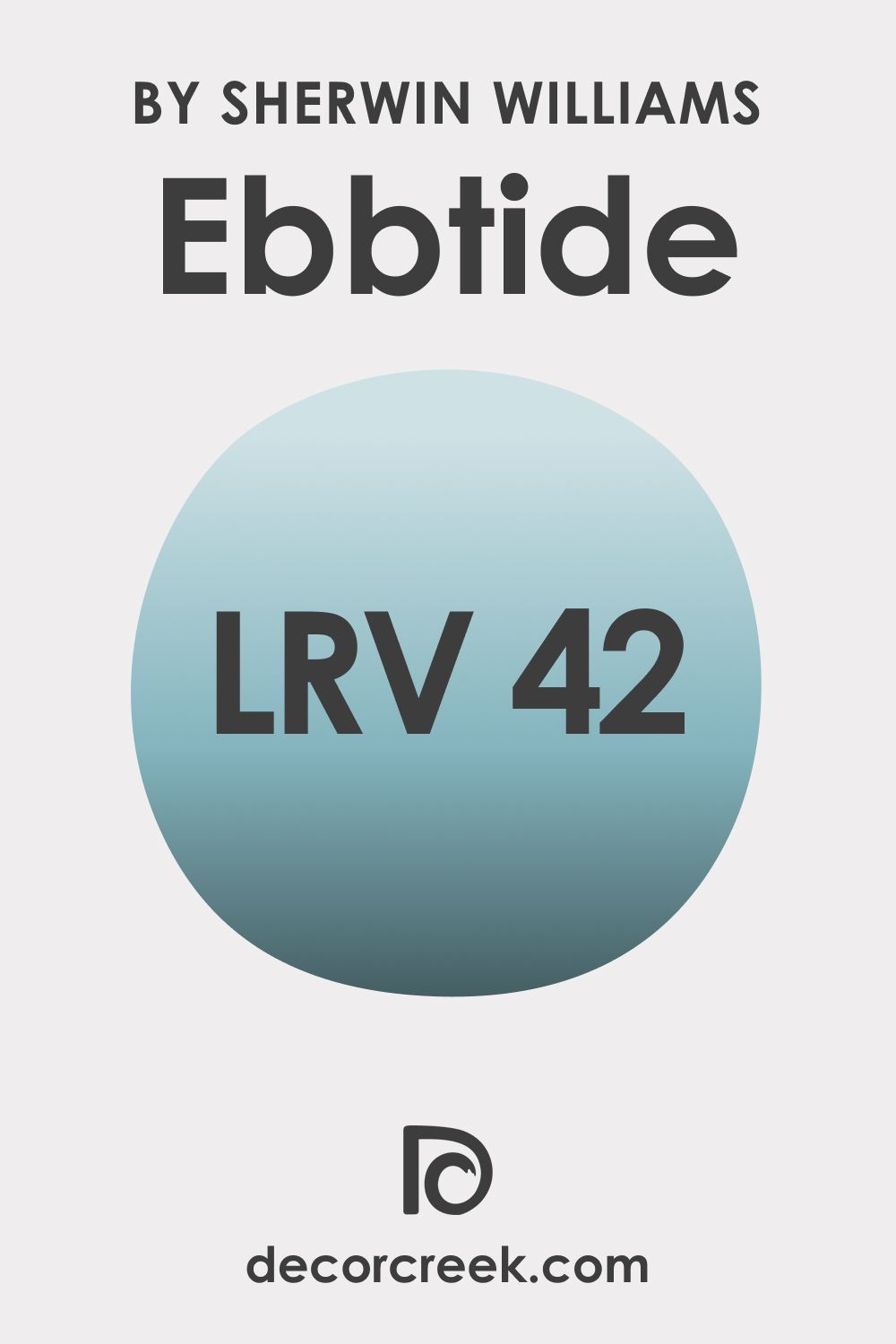
The Light Reflectance Value (LRV) measures the percentage of light a paint color reflects. In the case of SW 6493 Ebbtide, its LRV is 42. This puts it in the middle of the LRV scale, which ranges from 0 (absolute black, absorbing all light) to 100 (pure white, reflecting all light).
The paint color with an LRV of 42 signifies that it’s neither too dark nor too light. This makes SW Ebbtide a moderately reflective color, adding depth and dimension to a room without making it feel overwhelmingly dark or excessively bright.
The LRV plays a significant role in creating the mood of a space. With an LRV of 42, SW Ebbtide absorbs more light than it reflects, creating a more intimate and cozy atmosphere. Its moderate LRV also means it’s versatile, working well in a variety of settings, from smaller spaces needing a touch of color to larger rooms where it can be used to create a serene, relaxing environment.
LRV – what does it mean? Read This Before Finding Your Perfect Paint Color
Trim Colors for SW Ebbtide
Now, when it comes to trim colors for SW 6493 Ebbtide, the choice is mainly driven by the kind of contrast you want to create. Trim colors are generally shades of white used for architectural details such as crown molding, window and door frames, baseboards, and wainscoting. They create a delineation between the walls and these architectural elements, thereby enhancing the structural beauty of the room.
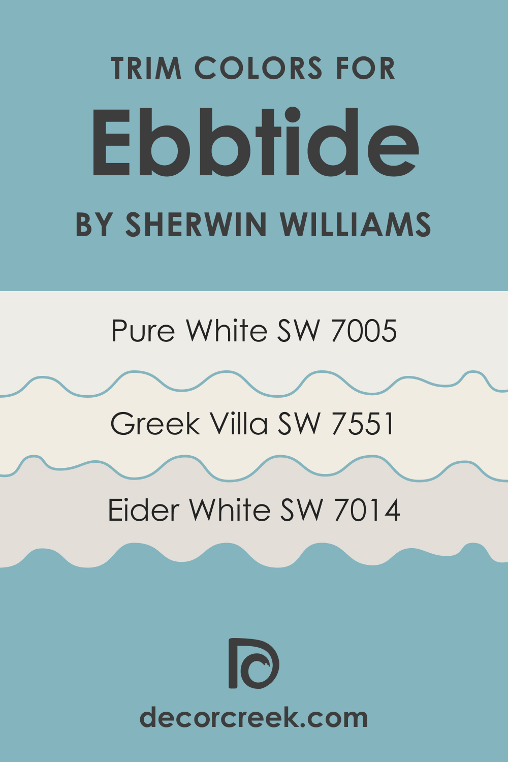
Here are three suggested Sherwin-Williams whites that would complement SW Ebbtide nicely:
- SW 7005 Pure White (CHECK A SAMPLE): This is a neutral white that works well with virtually every color. With SW Ebbtide, it provides a clean, crisp contrast that makes the room feel fresh and modern.
- SW 7014 Eider White (CHECK A SAMPLE): This white has a slight touch of gray, which complements the cool undertones of SW Ebbtide. It provides a softer contrast for a more seamless transition between the wall and trim.
- SW 7551 Greek Villa (CHECK A SAMPLE): Greek Villa is off-white with warm undertones. When paired with SW Ebbtide, it offers a muted contrast, bringing a cozy and inviting feel to the space.
Choosing the right trim color can elevate your space by adding depth, enhancing architectural features, and creating seamless transitions between different areas.
Colors Similar to SW Ebbtide
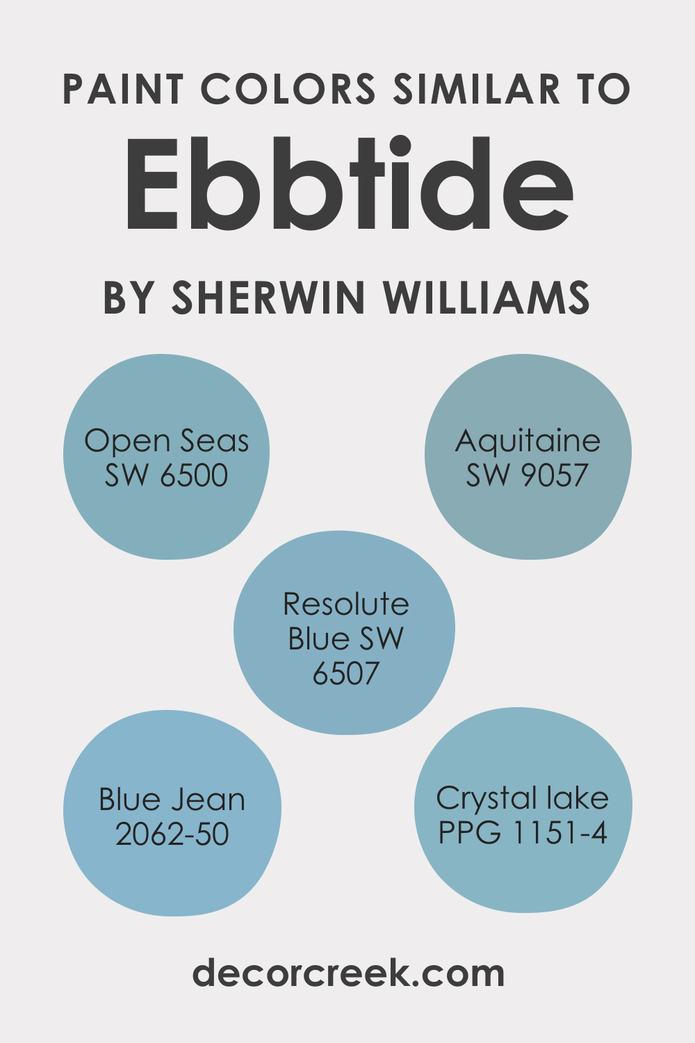
It’s a good idea to have several alternative colors at hand when you start a home-renovating project. This way, you can always adjust the interior palette easily should you need a slightly different hue. For SW Ebbtide, there are several similar colors you might want to check out:
- Open Seas (SW 6500) (CHECK A SAMPLE)
- Aquitaine (SW 9057) (CHECK A SAMPLE)
- Resolute Blue (SW 6507) (CHECK A SAMPLE)
- BM Blue Jean (2062-50) (CHECK A SAMPLE)
- PPG Crystal Lake (PPG1151-4)
Colors That Go With SW Ebbtide
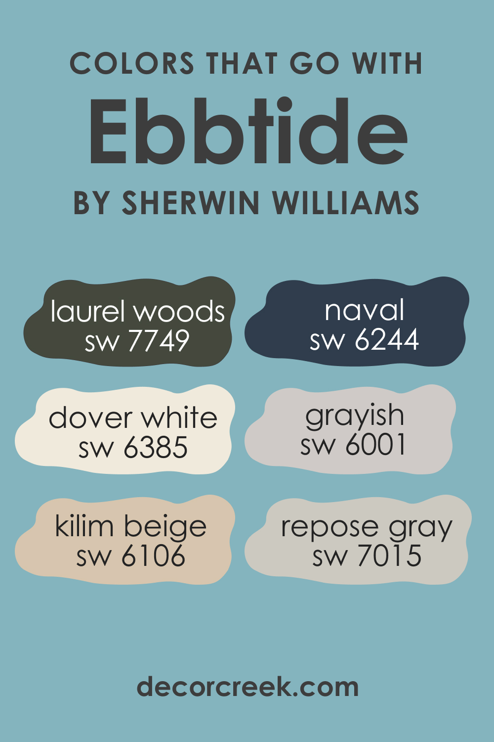
Creating a color palette that works well in harmony is vital for the overall aesthetic and mood of a room. When colors that go well together are used in the same room, it creates a cohesive and balanced design. Here are six colors that complement SW 6493 Ebbtide:
- SW 6244 Naval (CHECK A SAMPLE): This deep, rich blue contrasts nicely with Ebbtide’s cooler tones, creating a dynamic and engaging space.
- SW 7015 Repose Gray (CHECK A SAMPLE): A light gray can help balance Ebbtide’s intensity, creating a calm, serene atmosphere.
- SW 6106 Kilim Beige (CHECK A SAMPLE): This warm beige offers a soothing contrast to Ebbtide’s coolness, creating a balanced and welcoming environment.
- SW 7749 Laurel Woods (CHECK A SAMPLE): This dark greenish-gray adds depth and sophistication when paired with Ebbtide.
- SW 6385 Dover White (CHECK A SAMPLE): This warm, creamy white offers a bright contrast to Ebbtide, ideal for trims and ceilings.
- SW 6001 Grayish (CHECK A SAMPLE): This light grayish purple brings out the cool undertones in Ebbtide, enhancing its calming effect.
How to Use SW 6493 Ebbtide In Your Home?
The versatility of SW 6493 Ebbtide allows it to be used in various rooms and interior design styles. As a soothing blue-green shade, it can evoke feelings of calm and tranquility, making it ideal for bedrooms, living rooms, or any space where relaxation is desired.
Its moderate reflectivity makes it particularly useful in smaller spaces, helping to make them feel more open and airy. SW Ebbtide can also be used effectively in larger rooms or open-concept spaces, where it can add a touch of color without overwhelming the space.
Regarding interior design styles, SW Ebbtide fits well with coastal, contemporary, and Scandinavian styles due to its calming and cool hue. Its soothing tones are reminiscent of the sea, making it an excellent choice for coastal and beach-themed decors.
Its sleek and modern vibe aligns with contemporary styles, while its simplicity and versatility make it a great choice for clean lines and neutral color palettes. Below, you can read how this color may work in different rooms.
SW 6493 Ebbtide in the Bedrooms
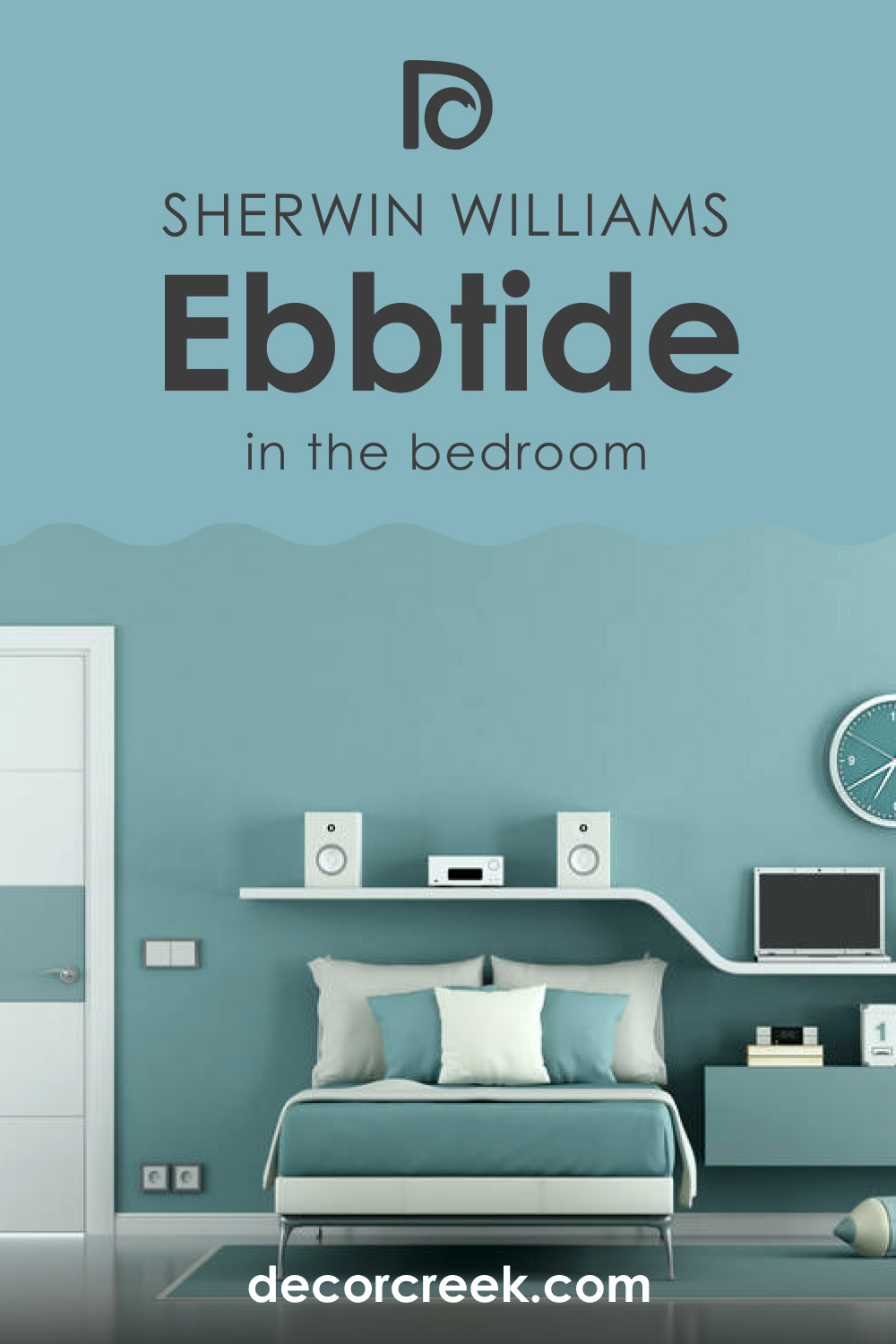
In the bedroom, SW Ebbtide can create a serene and calming atmosphere. Pair it with white trim and neutral-toned bedding for a fresh, clean look. For a more dramatic effect, you could pair it with darker colors like SW 6244 Naval on an accent wall or decor items.
SW 6493 Ebbtide in the Bathrooms
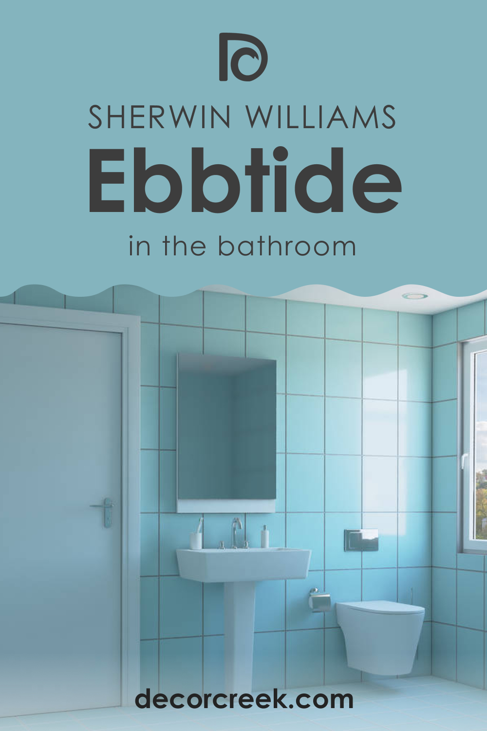
SW Ebbtide can work wonderfully in the bathroom as well. Whether it’s a small powder room or a larger master bath, this color can add a sense of tranquility. Pair it with crisp whites on the bathtub and sink or with warmer wood tones to create a spa-like retreat.
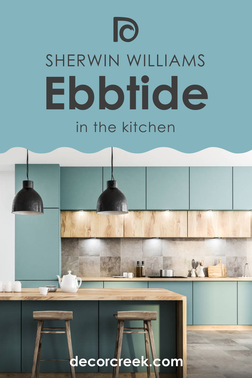
SW 6493 Ebbtide in the Kitchens
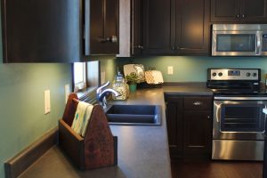
In the kitchen, SW Ebbtide can create a calming environment where you can enjoy cooking and dining. For a bright and airy feel, pair these color cabinets with white walls and light countertops. Or, for a bolder look, use SW Ebbtide on the walls with contrasting white cabinets and dark countertops.
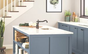
Using SW Ebbtide for kitchen cabinets can create a stunning effect. Pair these cabinets with white walls or a light-colored backsplash for a crisp, modern look. Alternatively, pairing SW Ebbtide cabinets with darker walls can create a rich, inviting environment.
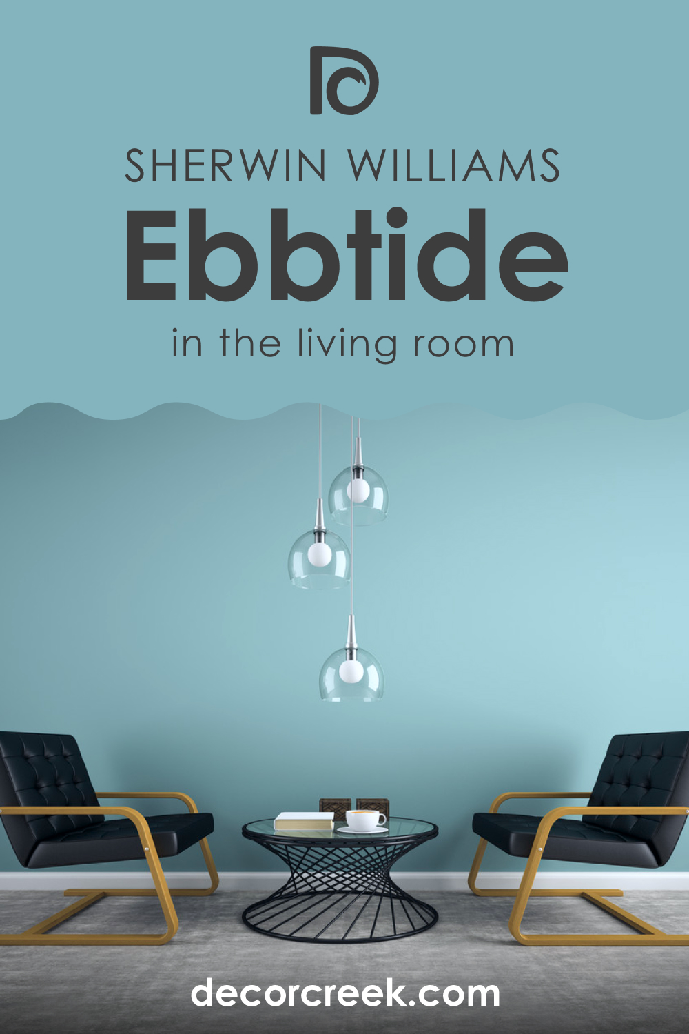
SW 6493 Ebbtide in the Living Rooms
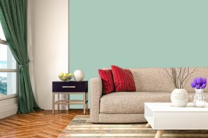
In the living room, SW Ebbtide can provide a soothing backdrop for various furniture and decor styles. You could opt for a monochromatic design scheme by using varying shades of blue and blue-green or create contrast with warmer tones like beige or wood finishes.
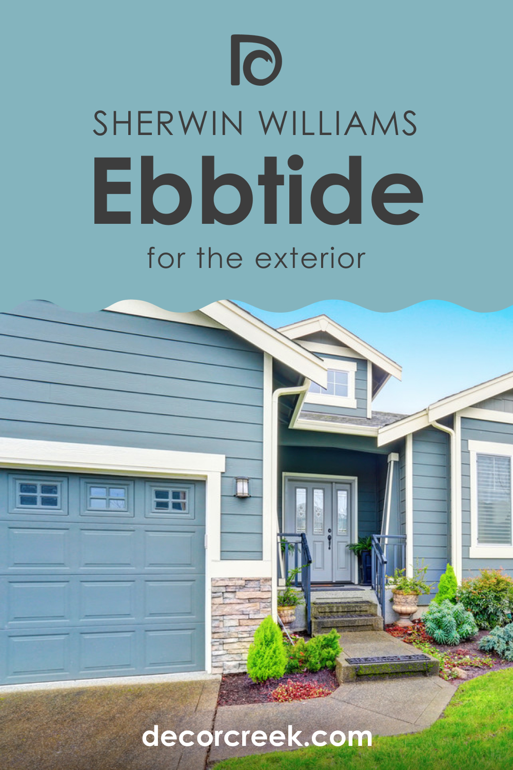
SW 6493 Ebbtide for the Exterior Use
For the exterior of the house, SW Ebbtide can offer a unique and stylish look. It’s particularly effective for coastal or beach-style homes but can also provide an inviting appeal for contemporary or traditional home styles. Pair it with white trim and a dark door for a classic yet fresh look.
Comparing SW Ebbtide With Other Colors
When you compare colors with each other, you can better see their differences and unique features. Below, you can read how SW Ebbtide looks against other colors. This way, you will get a better idea of how distinct LRVs and undertones make colors differ.
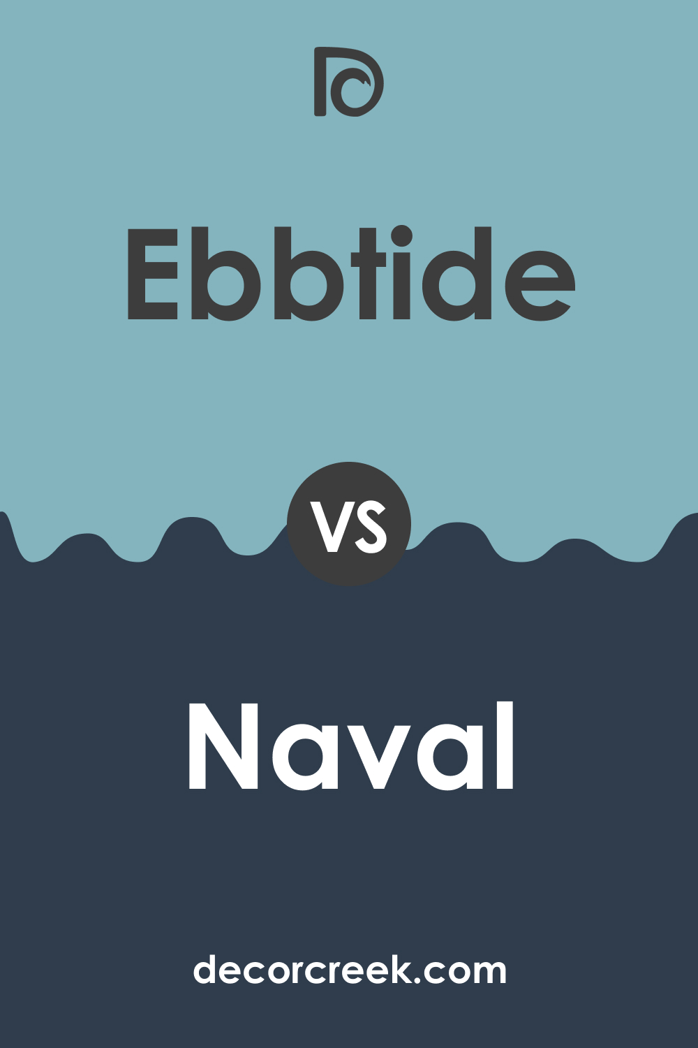
SW Ebbtide vs. SW Naval
When compared with SW 6244 Naval (CHECK A SAMPLE), Ebbtide appears lighter and cooler. While both are reminiscent of the sea, Naval’s deeper tone creates a more dramatic effect, while Ebbtide provides a softer, more tranquil vibe.
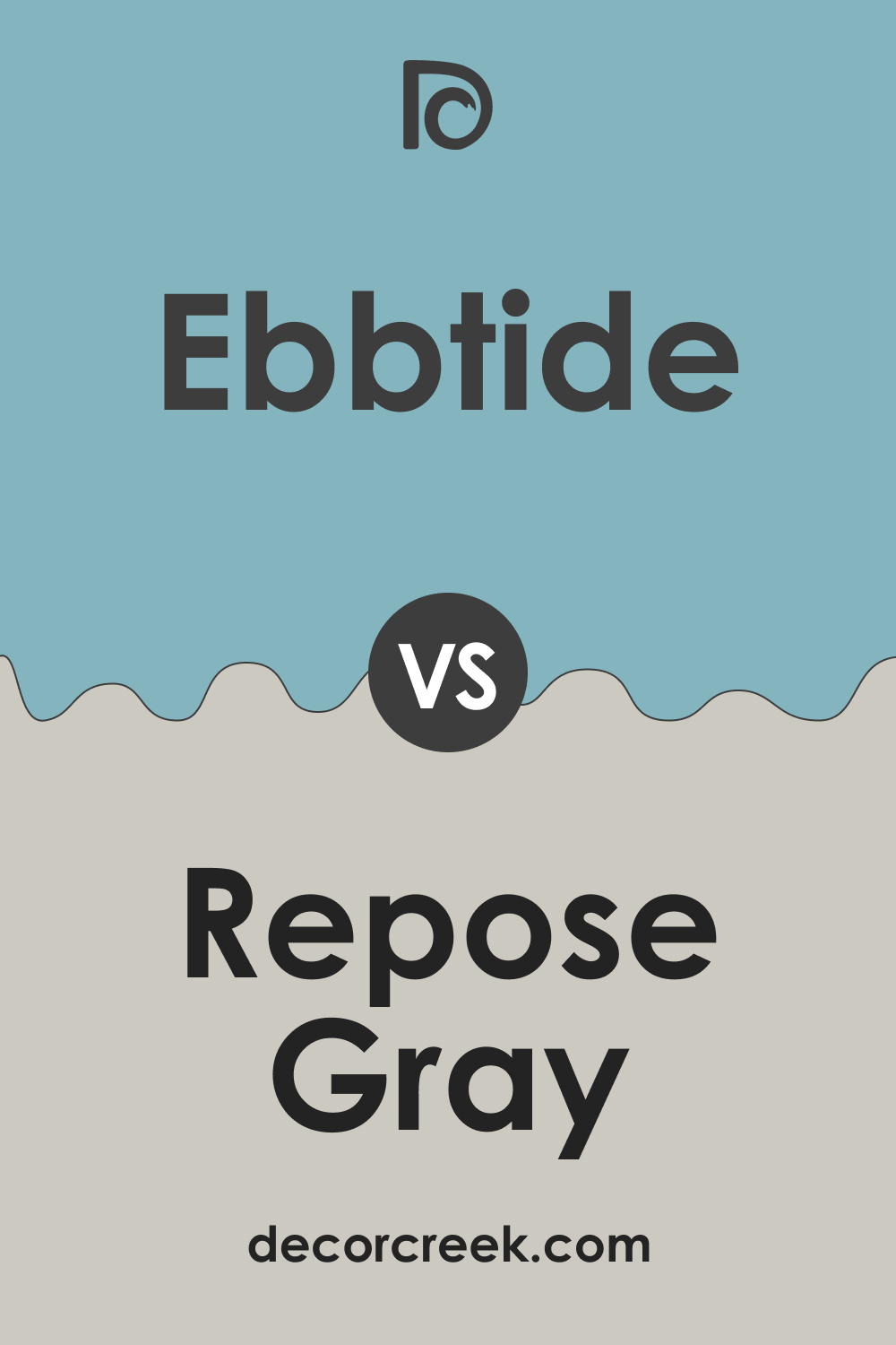
SW Ebbtide vs. SW Repose Gray
Compared to SW 7015 Repose Gray (CHECK A SAMPLE), Ebbtide has a more vibrant, dynamic feel. Repose Gray’s neutral tone makes it a versatile backdrop, while Ebbtide adds more character and mood to a space.
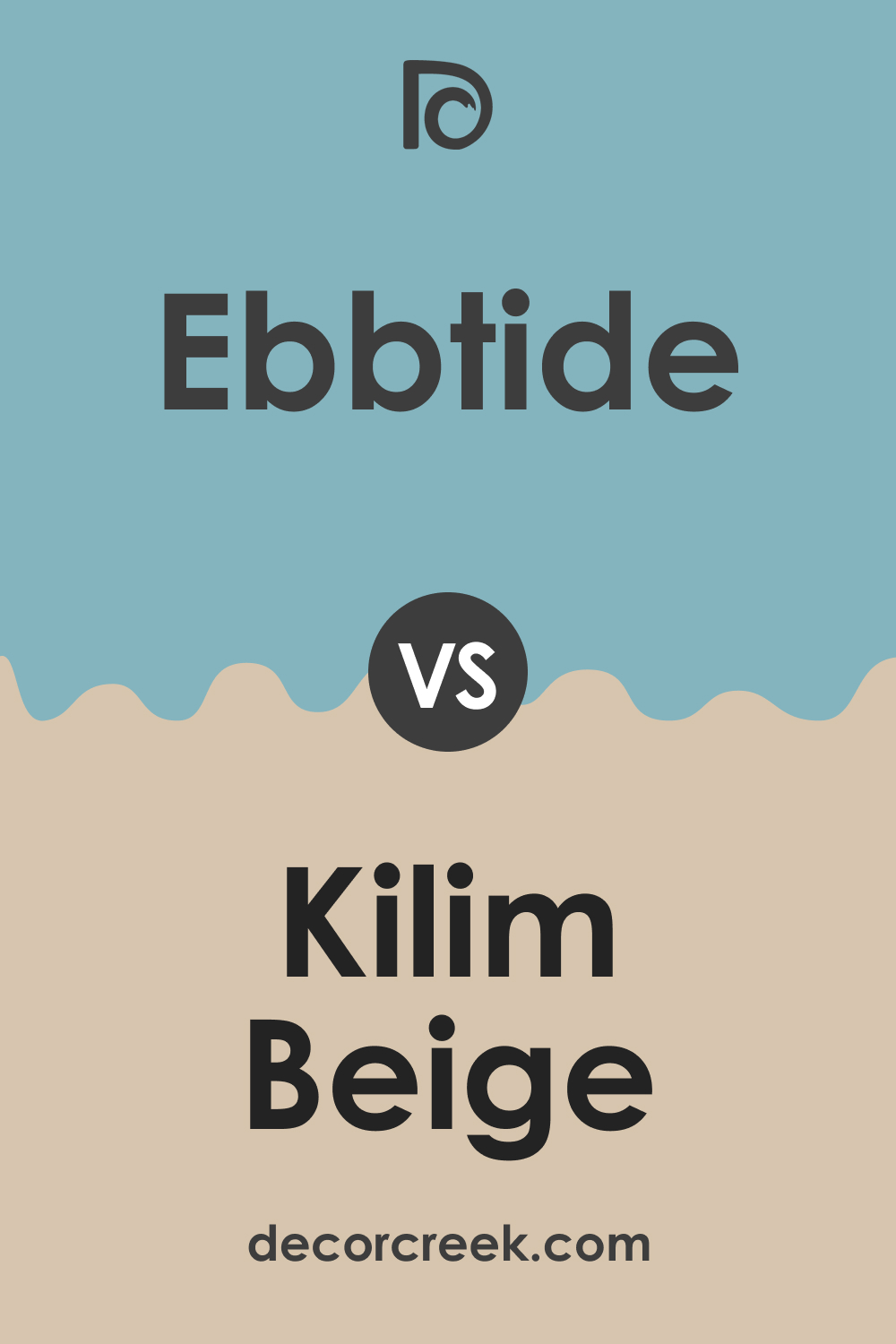
SW Ebbtide vs. SW Kilim Beige
When paired with SW 6106 Kilim Beige (CHECK A SAMPLE), Ebbtide’s cool undertones are highlighted. Kilim Beige offers a warm counterbalance to Ebbtide, creating a balanced, harmonious palette.
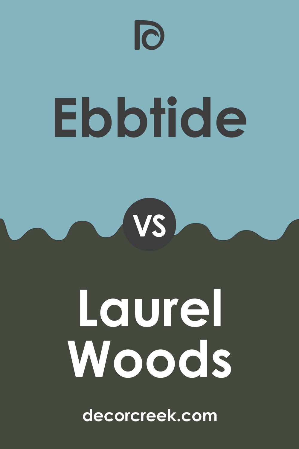
SW Ebbtide vs. SW Laurel Woods
Next to SW 7749 Laurel Woods (CHECK A SAMPLE), Ebbtide appears brighter and more vibrant. Laurel Woods adds depth and sophistication to the palette, making Ebbtide appear even more refreshing.
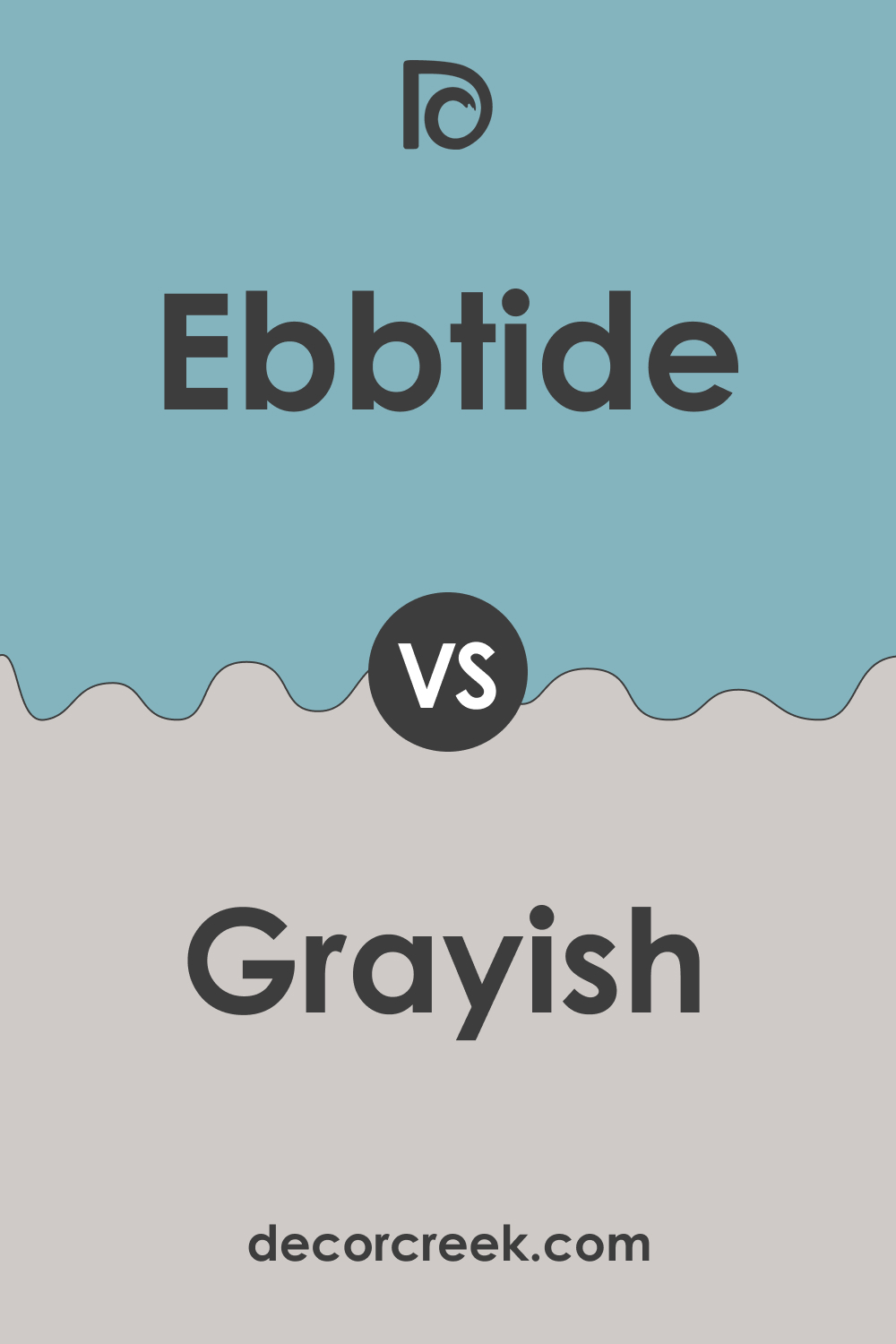
SW Ebbtide vs. SW Grayish
Compared to SW 6001 Grayish (CHECK A SAMPLE), Ebbtide feels more energetic and colorful. While Grayish is a muted color, it brings out the cool undertones in Ebbtide, enhancing its calming effect.
Conclusion
In conclusion, SW 6493 Ebbtide is a versatile color that can bring a calming and serene atmosphere to any space. Whether you’re looking to create a tranquil bedroom, a refreshing living room, a soothing bathroom, a vibrant kitchen, or a stylish exterior, SW Ebbtide is a great choice.
Remember to consider factors like lighting, undertones, coordinating colors, and overall design style to make the most of this beautiful color.
Ever wished paint sampling was as easy as sticking a sticker? Guess what? Now it is! Discover Samplize's unique Peel & Stick samples.
Get paint samples
Frequently Asked Questions
✅What color palette complements SW 6493 Ebbtide?
Ebbtide pairs well with a range of colors. It works beautifully with other blues and blue-greens, as well as with neutrals like grays and beiges. For a more dramatic look, consider pairing it with deep, rich tones like SW 6244 Naval or SW 7749 Laurel Woods.
✅Is SW 6493 Ebbtide a good color for a bedroom?
Absolutely! Ebbtide's calming and tranquil nature makes it an excellent choice for bedrooms. Its soothing undertones can help create a relaxing atmosphere conducive to restful sleep.
✅What style of home decor does SW 6493 Ebbtide fit best with?
Ebbtide's versatility allows it to fit well with many decor styles. It's particularly well-suited to coastal, contemporary, and Scandinavian themes due to its cool, tranquil vibe.
✅Can SW 6493 Ebbtide be used for exterior painting?
Yes, Ebbtide can provide a fresh and inviting look to a home's exterior. It's particularly effective for coastal or beach-style homes but can also offer a unique appeal for contemporary or traditional home styles.
✅How does lighting affect the appearance of SW 6493 Ebbtide?
Like all colors, Ebbtide can look different depending on the lighting. Under bright, natural light, Ebbtide may appear lighter and more vibrant, while under softer, artificial light, it may look more muted. Always test a paint sample in various lighting conditions before making your final decision.


