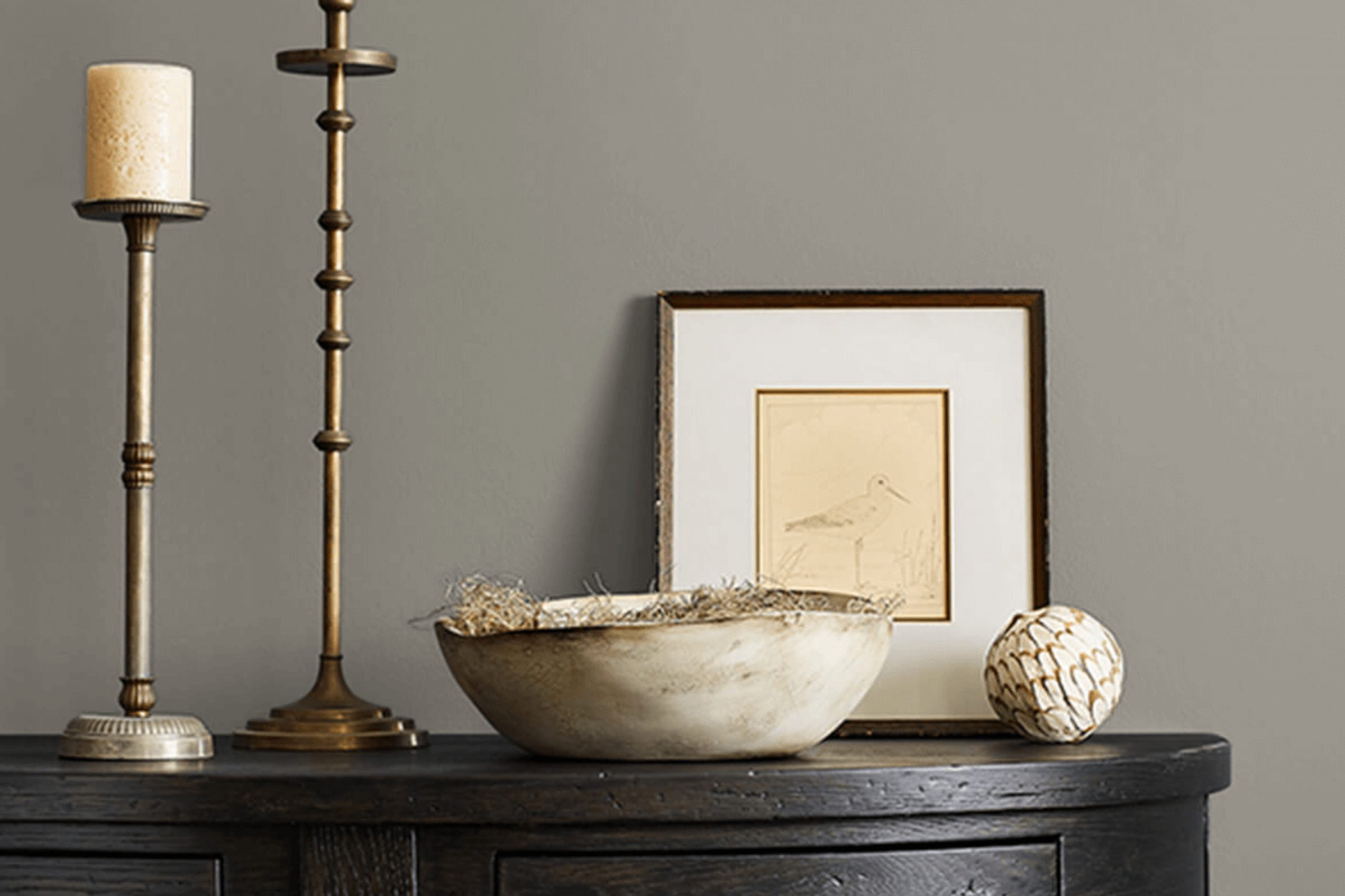
If you’re looking for a fresh take on interior colors, I recommend considering SW 9569 Alloy from Sherwin Williams. Entering the room painted with this shade, you immediately notice its unique charm—a blend that lends itself both to modern and traditional spaces.
Alloy possesses a subtle complexity that can truly redefine your living or work areas. Its versatility is key, as it easily pairs with various decor styles and other colors, making it a practical choice for redesigns or new decorating projects. Choosing this color, I observed how it stands out particularly well in well-lit spaces, highlighting its depth and enhancing the feeling of space.
Whether you aim to refresh a single room or your entire home, SW 9569 Alloy offers a balanced, sophisticated backdrop that can support a range of aesthetic ambitions.
This paint could be the reliable ally in your next decorating adventure, providing both the neutrality needed in a living space and enough character to make every corner interesting.
What Color Is Alloy SW 9569 by Sherwin Williams?
Alloy by Sherwin Williams is a unique and vibrant color that offers a fresh perspective on interior design. This color has a dynamic, modern appeal that stands out due to its deep, rich tone intersected with cool undertones, making it both striking and balanced. It works particularly well in contemporary and urban interior styles, as it brings a chic and trendy vibe to spaces.
Ideal for accent walls, Alloy can also be used effectively to highlight architectural features or to add depth to a room. When it comes to materials, this color pairs beautifully with natural wood, which complements its depth with organic textures. The contrast between the coolness of the alloy and the warmth of wood creates an inviting and balanced environment.
Additionally, metallic accents in silver or chrome enhance Alloy’s modern feel, adding a touch of glamour and sleekness.
In terms of textures, smooth and glossy finishes play well with this color, ensuring spaces feel more open and luminous. Alternatively, incorporating soft furnishings like velvet cushions or wool throws can introduce a touch of softness to the bold backdrop, making the interior feel cozy while still keeping it stylish and contemporary.
This versatile color offers an opportunity to make a strong statement in any home or space it is used in.
Is Alloy SW 9569 by Sherwin Williams Warm or Cool color?
Alloy by Sherwin Williams is a wonderful color choice for homes. It has a versatile, neutral gray tone that works well in almost any room. This color is especially great for creating a calm and inviting atmosphere.
Since it is not too dark or too light, Alloy can help make a space feel more cozy without making it seem smaller. It is also easy to match with different decorations and furniture styles, whether modern or traditional. If you’re considering painting your living room, kitchen, or even the exterior of your house, Alloy could be a perfect choice.
It tends to hide smudges and dirt fairly well, making it a practical option for busy areas. Alloy is also known for its ability to pair nicely with brighter colors or other shades of gray, giving homeowners the flexibility to add personal touches to their decor.
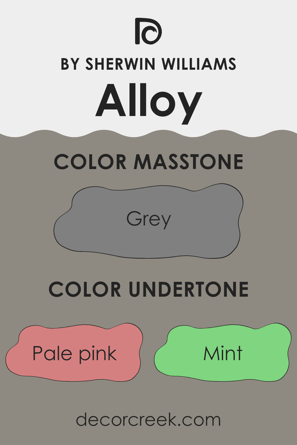
Undertones of Alloy SW 9569 by Sherwin Williams
AlloySW 9569 by Sherwin Williams is a versatile color with a complex blend of undertones that can significantly influence the ambiance of a room. These undertones include a range of shades like pale pink, mint, lilac, and light blue, among others. Each undertone contributes to the overall perception of the color in subtle ways.
Undertones are essentially subtle colors that lie beneath the surface of the main color, impacting how it looks under different lighting conditions and when paired with other colors. For instance, a pale pink undertone can give a warmth to the color, making it feel more inviting, while a mint undertone might inject a touch of freshness and vitality.
When applied to interior walls, the undertones of AlloySW 9569 play a critical role in the room’s overall feel. In natural light, lighter undertones like pale yellow and light turquoise can make the space feel airy and bright. In contrast, darker undertones like dark green and navy may come forward in artificial lighting, giving the room a more grounded, cozy feel.
The choice of decor and accompanying colors also interact with these undertones. For example, furnishing in shades that complement the olive or brown undertones can enhance a room’s warmth and welcoming feel. Conversely, matching with decor elements that highlight the lilac or light purple undertones can create a subtle, playful dynamic.
Using this color on your walls can therefore be a way to subtly influence the mood and visual impact of a space, depending on both the natural characteristics of the room and the lighting conditions. Whether aiming for a bright and lively atmosphere or a more subdued and cozy environment, understanding and utilizing the undertones of AlloySW 9569 can help achieve the desired effect with more precision.
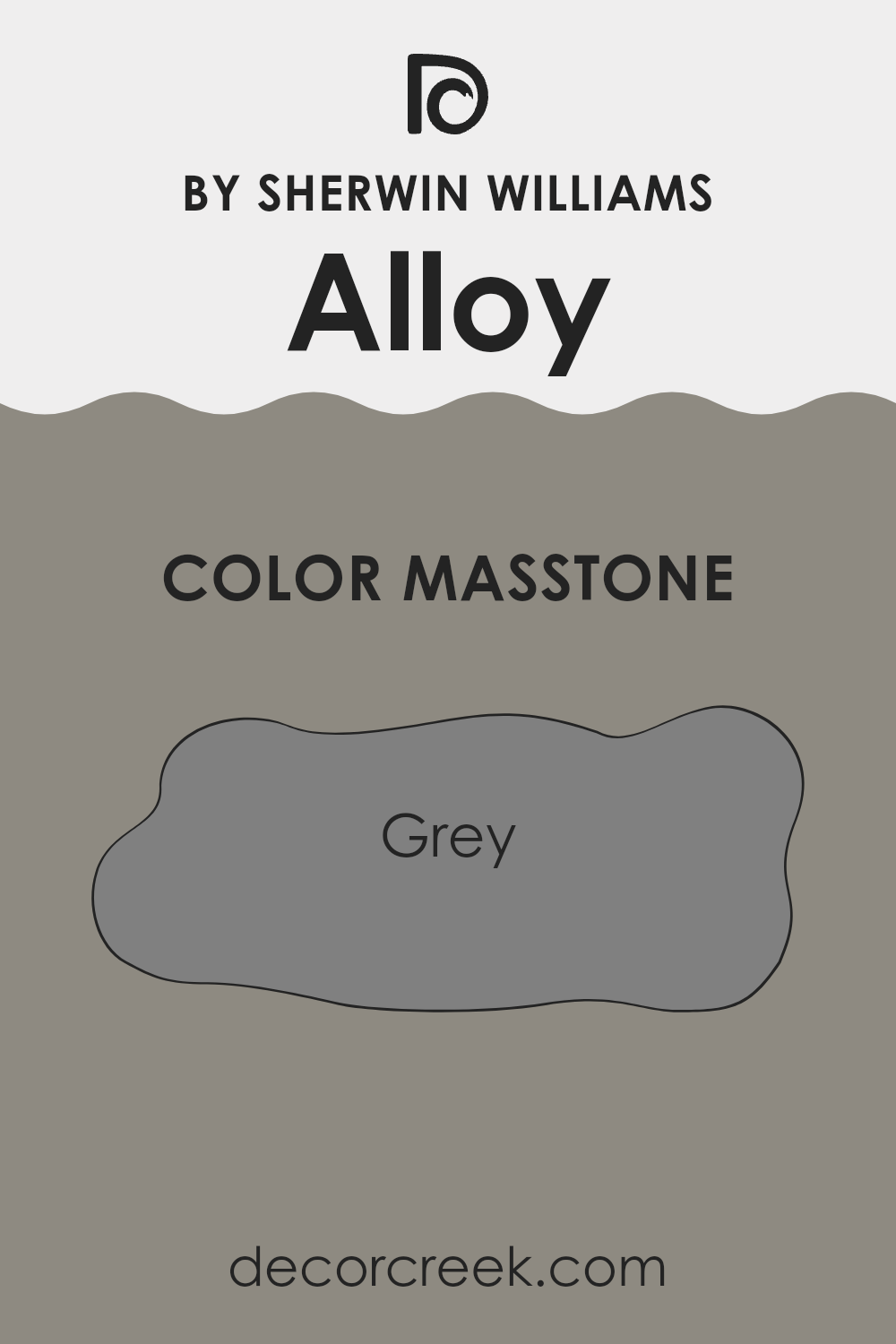
What is the Masstone of the Alloy SW 9569 by Sherwin Williams?
Alloy Grey (#808080) by Sherwin Williams is a balanced shade of grey that brings a clean and subtle look to any room. This neutral tone can work in various spaces, whether it be a bedroom, living room, or kitchen. One of the main benefits of using this shade is its ability to work well with other colors.
It can pair nicely with brighter colors by toning them down a bit while still letting them shine, or it can coordinate beautifully with other neutrals for a more toned-down aesthetic. This makes it a versatile choice for homeowners looking to easily match their existing decor and furnishings.
Alloy Grey provides a calming backdrop that doesn’t overwhelm the senses, making spaces feel more open and orderly. It’s particularly useful in smaller rooms or areas with limited natural light, as it doesn’t absorb light like darker colors might. This color offers a simple yet effective way to refresh your home’s interior without going too bold.
How Does Lighting Affect Alloy SW 9569 by Sherwin Williams?
Lighting plays a crucial role in how we perceive colors. The color of a wall, fabric, or any surface can look different under various light sources. Natural light from the sun brings out the truest version of colors, while artificial lighting can alter how colors appear. For instance, warmer light bulbs can make colors appear more yellow or orange, whereas cooler bulbs might cast a bluish tone.
Taking a specific color like Alloy SW 9569 by Sherwin Williams, we can see these effects clearly. In natural light, AlloySW 9569, which is a unique shade, likely appears in its truest form, highlighting its inherent qualities and undertones. Under artificial lighting, the impact would depend on the type of bulbs used. LED or fluorescent lights could either dampen or enhance its natural tones.
The orientation of a room also significantly affects how a color is perceived. In north-facing rooms, which generally don’t receive a lot of direct sunlight, AlloySW 9569 might look slightly cooler and more subdued. This could give the room a calmer and more consistent feel, as the color remains more shaded and true throughout the day.
In south-facing rooms, where sunlight is abundant for most of the day, the color might appear brighter and more vibrant. The warm, direct light can enhance the vivacity of AlloySW 9569, making it really stand out. It’s perfect for spaces where you want a lively atmosphere.
East-facing rooms receive sunlight in the morning when the light is golden and warm, making the color appear warm and welcoming in the mornings but cooler later in the day as the sunlight fades. Conversely, west-facing rooms get afternoon and evening light, which means the color could appear more muted in the morning but gain intensity during the sunset hours.
Each setting brings out a different facet of AlloySW 9569, demonstrating how lighting and room orientation can significantly influence the appearance and mood set by a color.
What is the LRV of Alloy SW 9569 by Sherwin Williams?
LRV stands for Light Reflectance Value, a measure that indicates the amount of light a paint color reflects or absorbs. This value ranges from 1 to 99, where lower values mean the color absorbs more light and looks darker, and higher values mean it reflects more light, making it appear lighter.
This measure is crucial when choosing paint colors for a room because it affects how bright or dark the room will feel once painted. For example, rooms with lots of natural light can handle colors with lower LRVs without feeling too dark, whereas a darker room might need a higher LRV to make it feel brighter.
In the case of the color with an LRV of 25.464, it’s on the darker side of the scale. This means it will absorb more light than it reflects, giving it a richer and more pronounced appearance on the walls. Such a color might be suitable for a space that aims for a cozier or more enveloping feel. However, if used in a small or poorly lit room, it could make the space feel smaller and darker. It’s always good to consider how much natural or artificial light your room gets before deciding on darker or lighter shades.

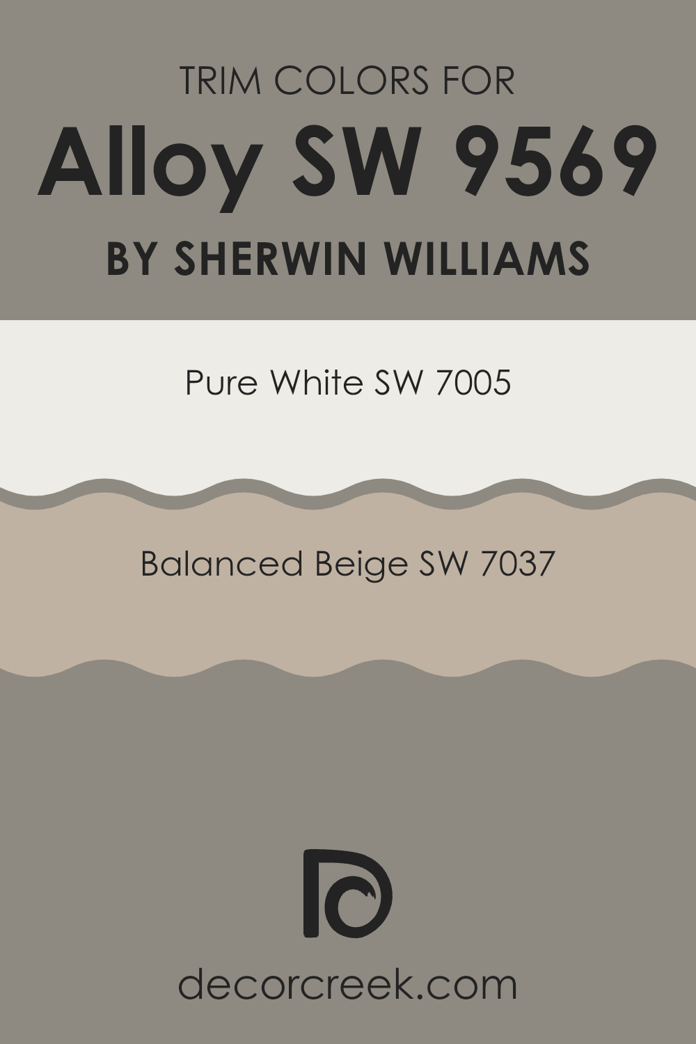
What are the Trim colors of Alloy SW 9569 by Sherwin Williams?
Trim colors are crucial in interior and exterior design as they help define and accentuate the architectural features of a space. When using a color like Alloy (SW 9569) by Sherwin Williams, selecting the right trim colors can enhance the overall aesthetics and create a visually pleasing contrast or blend with the main color. Pure White (SW 7005) and Balanced Beige (SW 7037) are two excellent choices for trim that can either brighten or soften the visual impact of Alloy.
Pure White (SW 7005) is a clean, crisp white that brings a fresh and clear finish to any space. It is particularly effective in making darker colors like Alloy pop and providing a clear visual boundary, which adds a neat and tidy appearance to the room.
On the other hand, Balanced Beige (SW 7037) offers a warm, subtle hue that complements the deeper tones of Alloy by creating a soft transition between the color and the architecture. This choice is ideal for those aiming for a more understated and harmonious look.
You can see recommended paint colors below:
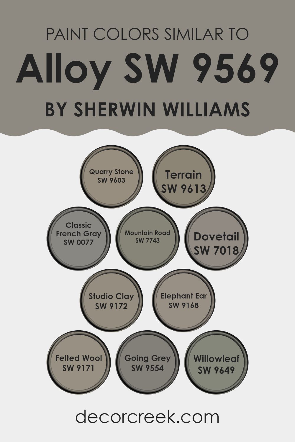
Colors Similar to Alloy SW 9569 by Sherwin Williams
Similar colors are crucial in design because they create a sense of harmony and unity in a space, making it feel cohesive and well-thought-out. By using colors that are close to each other on the color wheel, or that share a similar tone or saturation, designers can achieve a subtle and soothing visual experience. These nuances in shading help in blending elements seamlessly, providing a gentle transition between different components of a design, which can be pleasing to the eye.
For instance, Quarry Stone is a muted, earthy gray with hints of green, offering a grounded and natural feel to interiors. Terrain, by contrast, brings a touch of warmth with its greenish-gray tone, reminiscent of earthy elements. Classic French Gray is a timeless, medium gray which finds balance between contemporary and traditional styles, making it versatile for any space.
Mountain Road presents itself as a deeper gray with green undertones, excellent for adding depth to a colorful palette. Dovetail is a richer, warm gray that provides a strong but neutral base for bold or muted decor schemes. Studio Clay has a subtly warm, understated hue that complements natural materials beautifully in interior spaces.
Elephant Ear is a dense, earthy gray-brown that offers a strong statement without overwhelming, perfect for accent walls. Felted Wool has a soft, cozy feel through its muted gray presence, making spaces feel inviting. Going Grey delivers a light, fresh feel with its airy gray tone, ideal for modern, minimalist designs. Lastly, Willowleaf stands out with its unique gray-green hue, bringing a touch of nature indoors, offering a soft, organic aesthetic.
By integrating these similar colors, a designer can craft a space that flows smoothly from one area to another, enhancing the overall aesthetic appeal without the abrupt shifts that can occur with contrasting colors. This approach ensures aesthetic fluidity and a visually relaxing environment.
You can see recommended paint colors below:
- SW 9603 Quarry Stone
- SW 9613 Terrain
- SW 0077 Classic French Gray
- SW 7743 Mountain Road
- SW 7018 Dovetail
- SW 9172 Studio Clay
- SW 9168 Elephant Ear
- SW 9171 Felted Wool
- SW 9554 Going Grey
- SW 9649 Willowleaf
How to Use Alloy SW 9569 by Sherwin Williams In Your Home?
Alloy SW 9569 by Sherwin Williams is a unique paint color that can add a fresh look to any room in your home. It has a deep, rich tone that works well in many different spaces. When thinking about using this color in your home, consider it for areas where you want to set a calm and inviting atmosphere, like in a bedroom or a living room.
Its depth makes it great for a feature wall, maybe behind a television or bed, adding a touch of drama and interest to the space. You could also use it in your kitchen or bathroom cabinets for a bold impact that refreshes the look of the room.
Additionally, it pairs nicely with lighter colors and wood tones, helping to ground a room’s decor while providing a sense of warmth. This makes it a versatile choice for those looking to update their home without making too drastic a change.
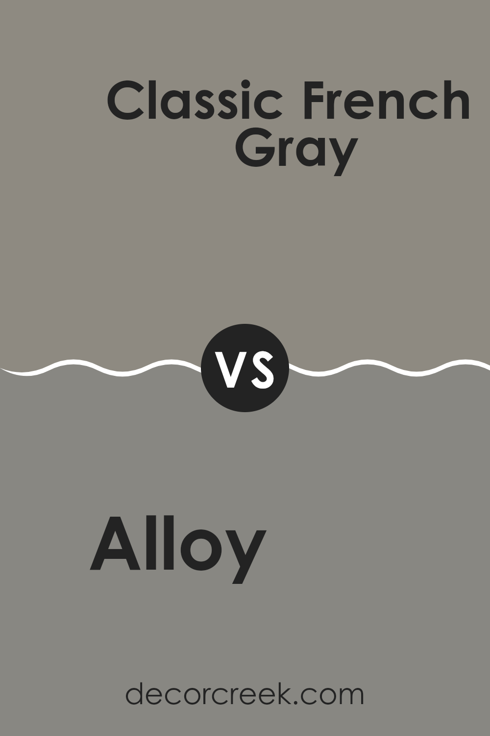
Alloy SW 9569 by Sherwin Williams vs Classic French Gray SW 0077 by Sherwin Williams
Alloy SW 9569 and Classic French Gray SW 0077 are both shades of gray from Sherwin Williams, but they present unique tones that could suit different decorating styles. Alloy is a darker, more intense gray, offering a bold and strong appearance.
This could be an excellent choice for those who want a more pronounced color impact in spaces like a home office or a dining area. On the other hand, Classic French Gray is lighter and softer, making it a great option for those who prefer a more subdued feel.
This color can work well in living rooms or bedrooms where a gentle and calming atmosphere is desired. When comparing their usability, Alloy may be better for feature walls or accents because of its depth, whereas Classic French Gray could be ideal for larger areas to keep the space feeling open and airy.
You can see recommended paint color below:
Alloy SW 9569 by Sherwin Williams vs Mountain Road SW 7743 by Sherwin Williams
Alloy and Mountain Road are both interesting choices from Sherwin Williams, but they offer different vibes for interior spaces. Alloy is a darker gray tone that leans more toward a concrete-like, solid feel. It’s great for creating a strong, grounding effect in a room and pairs well with bright colors for a balanced look.
On the other hand, Mountain Road is a soft, earthy green-gray shade that introduces a subtle touch of nature-inspired calmness. This color is lighter than Alloy and works beautifully to make small spaces appear more spacious and welcoming. Mountain Road is a versatile choice, compatible with earth tones and wooden furnishings to enhance a cozy atmosphere.
Choosing between them depends on what mood you’re aiming to create. Alloy is suitable for a modern, bold aesthetic, while Mountain Road is perfect for a gentle, relaxing environment. Both offer unique potentials to beautify a space.
You can see recommended paint color below:
Alloy SW 9569 by Sherwin Williams vs Going Grey SW 9554 by Sherwin Williams
Alloy SW 9569 by Sherwin Williams is a rich, deep gray with strong blue undertones, giving it a bold and vivid appearance. It’s a dominant color that stands out in any space, making it excellent for accent walls or furniture pieces. This shade can add a striking touch to areas that demand visual impact.
On the other hand, Going Grey SW 9554 by Sherwin Williams is a lighter, softer gray. This color is more subtle and is great for creating a calm and welcoming environment. It’s perfect for larger areas like living rooms or bedrooms, where it provides a gentle backdrop that complements various decor styles.
In comparison, Alloy is the stronger and more dramatic shade, ideal for more modern or minimalist spaces, while Going Grey offers a gentler, more laid-back vibe that suits traditional or relaxed settings. Choosing between them depends on the mood and function you want for your room.
You can see recommended paint color below:
- SW 9554 Going Grey
Alloy SW 9569 by Sherwin Williams vs Terrain SW 9613 by Sherwin Williams
Alloy (SW 9569) and Terrain (SW 9613) by Sherwin Williams are two unique colors, each offering a distinct vibe to any space. Alloy is a dark gray tone with a solid, robust feel. It’s perfect for those who want to create a strong, grounded atmosphere in a room. This color works well in both modern and traditional spaces, providing a sleek look without being overpowering.
On the other hand, Terrain is a lighter, softer brown. It offers a warm and welcoming feel, making it ideal for cozy spaces like living rooms or bedrooms. It pairs beautifully with a variety of decor styles, adding a touch of warmth to minimalistic designs or enhancing the homely feel of a rustic setup.
Both colors are versatile and can be easily matched with other hues. However, while Alloy lends a sharper, more defined finish, Terrain brings a gentle, soothing touch to interiors.
You can see recommended paint color below:
Alloy SW 9569 by Sherwin Williams vs Studio Clay SW 9172 by Sherwin Williams
Alloy SW 9569 by Sherwin Williams is a cool, deep gray that carries a subtle metallic undertone, reminiscent of steel or iron. This color gives a bold and strong feel that works well in modern spaces or as an accent to brighter colors. It can help create a grounded atmosphere in a room, making it great for areas that need a touch of seriousness or focus, like home offices or dining areas.
Studio Clay SW 9172, on the other hand, is a softer, warm beige with hints of gray. This color is very calming and neutral, making it versatile for use in almost any room of the house. It pairs well with a wide range of decor, adding a gentle warmth that makes spaces more inviting and cozy, especially in living rooms or bedrooms.
When looking at these two colors together, Alloy provides a stronger, cooler tone while Studio Clay is lighter and offers warmth. Despite their differences, both colors work together harmoniously for a balanced and aesthetic look.
You can see recommended paint color below:
Alloy SW 9569 by Sherwin Williams vs Felted Wool SW 9171 by Sherwin Williams
The two colors, Alloy and Felted Wool, both by Sherwin Williams, offer distinct tones that can greatly influence the atmosphere of a space. Alloy is a deep shade that leans towards charcoal with a subtle hint of blue. This deep and rich tone can make a strong statement in a room, perfect for creating a bold and cozy environment. It can effectively highlight areas or work as a striking backdrop for decor.
On the other hand, Felted Wool is a much softer color, providing a sense of warmth and comfort. This lightly muted gray has a welcoming touch that pairs well with a wide variety of other hues, making it extremely versatile for use in any room. Its gentle nature allows it to blend seamlessly with textures and furnishings, promoting a peaceful and inviting space.
Overall, Alloy offers a more striking and dramatic option, while Felted Wool is ideal for those looking for a subtle and warm background.
You can see recommended paint color below:

Alloy SW 9569 by Sherwin Williams vs Quarry Stone SW 9603 by Sherwin Williams
Alloy and Quarry Stone are two distinct colors by Sherwin Williams, each offering a unique ambiance for a room. Alloy is a shade in the gray family, but it leans slightly towards blue, giving it a cool, crisp feel that’s versatile enough for both modern and traditional spaces. It’s light enough to make rooms feel more open while still adding more character than a straightforward neutral.
On the other hand, Quarry Stone is a much darker gray. It’s almost charcoal, offering a bold and dramatic look. This color is great for making a statement, whether as an accent wall or for cabinetry. It can also give smaller spaces a cozy, enveloping feel.
When comparing the two, Alloy is better for those who prefer a softer, more understated look, while Quarry Stone suits those looking to make a stronger visual impact. Both colors work well in various settings and can match different decor styles, depending on the effect you’re hoping to achieve in your space.
You can see recommended paint color below:
Alloy SW 9569 by Sherwin Williams vs Elephant Ear SW 9168 by Sherwin Williams
Alloy SW 9569 and Elephant Ear SW 9168 by Sherwin Williams are both unique colors with different vibes and applications. Alloy is a bold, deep gray with cool undertones. It often gives spaces a strong, modern feel, making it great for accent walls or furniture. This color stands out and draws attention, so it suits areas where a splash of intensity is desired.
Elephant Ear, on the other hand, is a softer, warmer gray. Its earthy tones are calming and it is more understated compared to Alloy. It works well in spaces where a soothing, neutral backdrop is desired, such as living areas and bedrooms. Elephant Ear blends easily with most color schemes, providing a comforting and inviting atmosphere.
While both colors are versatile, Alloy is more striking and could be used in more energetic designs, while Elephant Ear is great for creating a cozy, subtle environment. Choosing between them depends on the desired mood and use of the room.
You can see recommended paint color below:
Alloy SW 9569 by Sherwin Williams vs Dovetail SW 7018 by Sherwin Williams
The main color, Alloy (SW 9569), presents a vibrant, deep shade of gray that has a noticeable blue undertone, giving it a cool, modern feel. This shade stands out for its depth and boldness, making it a great choice for accent walls or statement areas in a room.
On the other hand, Dovetail (SW 7018) is a lighter, warmer gray with subtle brown undertones. This makes it an excellent neutral choice that’s easy to pair with a wide range of colors and decor styles.
While Alloy provides a striking contrast and can dominate a space with its darker, cooler tones, Dovetail acts more like a backdrop, supporting other colors and contributing to a softer, cozier atmosphere. Both colors offer unique qualities, but they cater to different design needs: Alloy for impact and drama, and Dovetail for warmth and versatility.
You can see recommended paint color below:
Alloy SW 9569 by Sherwin Williams vs Willowleaf SW 9649 by Sherwin Williams
Alloy SW 9569 and Willowleaf SW 9649, both from Sherwin Williams, present distinct hues for different tastes. Alloy is a dark gray with a strong, bold presence. This color can make a statement in any space, lending a sense of strength and decisiveness. It’s perfect for areas where a touch of formality or professional vibe is desired, such as offices or home libraries.
On the other hand, Willowleaf is a softer, cooler green that feels fresh and calming. This color works well in spaces where you want to create a refreshing and welcoming atmosphere, like in bathrooms or kitchens. Its natural tones help connect indoor spaces with the outdoors, promoting a light and airy feel in the room.
Both colors offer unique aesthetic attributes, with Alloy providing a more anchored, powerful look and Willowleaf offering a cheerfully soothing experience. Their applications are versatile depending on individual preferences and room functions.
You can see recommended paint color below:
- SW 9649 Willowleaf
In conclusion, SW 9569 Alloy by Sherwin Williams is a really nice paint color that you might want to use if you’re thinking about giving a room in your house a new look. It’s a type of gray, but it has a bit of a special twist, making it different and interesting. When you put this color on your walls, it creates a feel that is both warm and inviting, which is great for any area where you like to spend a lot of time or have friends and family over.
This color works well in lots of different kinds of rooms. Whether it’s your living room, bedroom, or even the kitchen, SW 9569 Alloy can make the room look fresh and renewed without making everything look too bright or too dark. It’s a really good choice when you want to change something but keep everything looking nice and neat.
Overall, I think this paint color is a wonderful choice if you’re looking to paint somewhere inside your home. It’s pretty, stands out in a good way, and most importantly, it makes your space feel cozy and welcoming. So, if you were thinking of picking a new color, this might be the perfect one to go with!
Ever wished paint sampling was as easy as sticking a sticker? Guess what? Now it is! Discover Samplize's unique Peel & Stick samples.
Get paint samples

