In the vast palette of colors offered by Sherwin Williams, SW 9613 Terrain stands out as a particularly captivating hue. This color, part of a broader selection carefully curated by the renown paint brand, embodies the essence of the natural world, echoing the serene and wholesome qualities of untouched landscapes.
The beauty of SW 9613 Terrain lies not just in its visual appeal but also in its versatility. It has the unique ability to transform spaces, ushering in a sense of calm and grounding.
Design enthusiasts and professionals alike have praised SW 9613 Terrain for its adaptability, finding it equally at home in modern, minimalist settings as it is in more traditional or rustic decors.
This color can be the cornerstone for creating a soothing bedroom retreat, a welcoming living room, or even an inspired workspace. Its rich, earthy tone captures the warmth of the soil, bringing an organic, comforting influence into any interior space.
Moreover, Sherwin Williams’ commitment to quality ensures that SW 9613 Terrain is not just visually appealing but also durable and long-lasting.
Their paints are known for their excellent coverage, ease of application, and resistance to fading and wear, making SW 9613 Terrain an excellent choice for both residential and commercial spaces.
As we delve deeper into the characteristics and applications of SW 9613 Terrain, it becomes clear why this particular shade continues to capture the hearts of those looking to create inspired and harmonious spaces.

What Color Is Terrain SW 9613 by Sherwin Williams?
Terrain, a captivating hue from Sherwin Williams, emits a striking balance of warmth and sophistication. This rich, earthy tone embodies the essence of natural landscapes, providing a soothing and grounding effect in any space it graces.
The complexity of this color lies in its ability to morph under different lighting conditions, revealing subtle undertones that range from a deep, mossy green to a muted, soft brown.
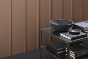
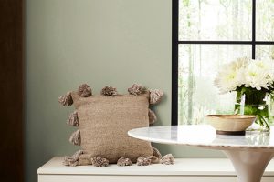
In terms of interior styles, Terrain shines in spaces that aim to blend the outdoors with the indoors. It’s particularly suited for rooms following a rustic, bohemian, or modern farmhouse design ethos, where its naturalistic essence can be fully embraced.
This color provides a stunning backdrop for natural wood finishes, from oak to walnut, enhancing the warmth and texture of the wood’s grain. Furthermore, it pairs beautifully with materials like leather, wool, and rough-hewn linen, adding depth and character to the design palette.
Textures also play a crucial role in maximizing the potential of this color. Incorporating elements like jute rugs, knitted throws, and terracotta accents can accentuate its earthiness, creating an inviting and cohesive space.
Metallic finishes in brass and gold can introduce a touch of elegance, while matte black fixtures add a modern twist. Overall, Terrain’s versatility and warm undertones make it an excellent choice for creating a serene, inviting interior that feels both refined and effortlessly natural.
Ever wished paint sampling was as easy as sticking a sticker? Guess what? Now it is! Discover Samplize's unique Peel & Stick samples.
Get paint samples

Is Terrain SW 9613 by Sherwin Williams Warm or Cool color?
The Terrain SW 9613 by Sherwin Williams is a versatile color that can dramatically alter the ambiance of a space, making it a popular choice for homeowners seeking to enhance their interiors. This unique shade embodies the warmth of earthy tones blended with a subtle hint of sophistication, making it adaptable to various decor styles, from rustic to modern.
Its depth adds character to walls, creating a cozy, inviting atmosphere that beckons one to relax and unwind. When applied in well-lit areas, the color illuminates, reflecting natural light in a way that makes the room appear more spacious and airier.
In contrast, in spaces with less natural light, it adds a rich, comforting depth, perfect for creating a snug, intimate setting.
The ability of Terrain to complement a wide array of accent colors and materials, from natural wood finishes to metallic tones, further underscores its appeal, ensuring it significantly enhances the visual appeal and warmth of any home.
Undertones of Terrain SW 9613 by Sherwin Williams
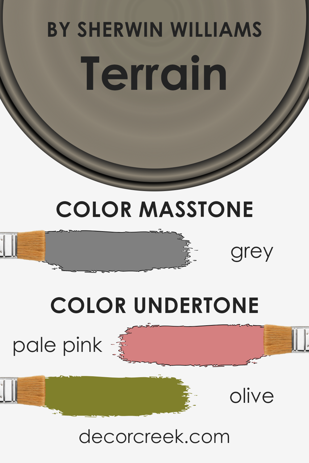
The intriguing nature of a color can often be attributed to its undertones, those subtle hues that influence perception and atmosphere. In the case of Terrain, a color by Sherwin Williams, its complexity is underscored by pale pink and olive undertones, which play a pivotal role in how the color is ultimately experienced.
Pale pink undertones imbue Terrain with a soft warmth, bringing forth a sense of comfort and gentle vivacity. This warmth allows the color to adapt beautifully in spaces that seek a cozy, inviting atmosphere, making rooms feel more intimate and welcoming.
On the other hand, the olive undertones introduce a grounding effect. This earthiness complements the warmth of the pink, adding depth and a touch of nature-inspired tranquility.
The combination of these undertones enables Terrain to transcend simple categorization, making it a versatile choice for interior walls.
In an interior setting, the undertones of Terrain influence its interaction with light and surrounding colors. Under natural daylight, the pale pink may become more pronounced, enhancing the room’s warmth.
In artificial light, the olive might become more dominant, emphasizing a serene, earthy vibe. This chameleon-like quality means that Terrain can harmonize with a wide range of decor styles and color schemes, from the soft and romantic to the more muted and natural.
As such, understanding and appreciating these undertones can be key to making informed decisions about color in interior design, ensuring spaces not only look beautiful but feel perfectly attuned to their intended ambiance.
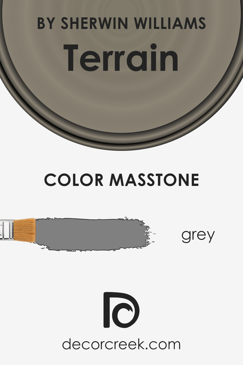
What is the Masstone of the Terrain SW 9613 by Sherwin Williams?
TerrainSW 9613 by Sherwin Williams, with its masstone of Grey (#808080), brings a spectrum of possibilities into home design. This particular shade of grey acts as a versatile anchor in any space, harmonizing effortlessly with both warm and cool palettes.
Its neutrality means it can serve various roles, from a calming backdrop to a dramatic statement depending on its application and the surrounding colors. In well-lit areas, this grey reflects light, making spaces feel more expansive and airy, an excellent choice for smaller rooms or those with limited natural light.
Conversely, in spaces with ample sunlight, it can add a layer of sophistication and depth, enriching the overall aesthetic. Its unassuming nature allows for creative freedom with textures and materials, making wood, metal, and fabric elements stand out.
Furthermore, this particular shade is adept at hiding imperfections, ensuring living spaces not only feel welcoming but also look impeccably maintained.
TerrainSW 9613 transforms homes into havens of balance and beauty, proving that a carefully chosen grey can elevate any interior to new heights of elegance.
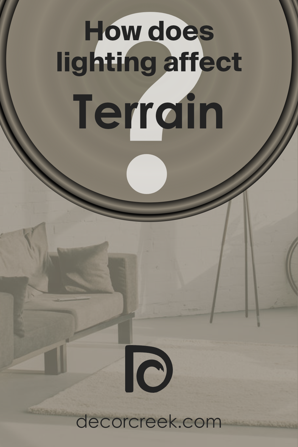
How Does Lighting Affect Terrain SW 9613 by Sherwin Williams?
Lighting plays a crucial role in our perception of colors. Understanding how lighting conditions affect the way we see color can greatly impact our experience of a space.
Whether illuminated by natural sunlight or artificial sources, the quality, direction, and intensity of light can transform the appearance of colors within an environment.
Considering a specific color, let’s discuss its interaction with light in various settings. This particular hue is a soft, nuanced shade that carries a versatile character, capable of adapting to different lighting conditions while maintaining its integrity.
In artificial light, the color can appear warmer and more inviting, as many artificial lights have a yellow or warm tone. This coziness makes it suitable for living spaces and areas where a sense of warmth is desired, especially during evenings or in spaces without ample natural light.
In natural light, the same color can exhibit a different personality. Natural light, particularly the clear, neutral light of midday, tends to show colors in their truest form. However, the direction and quality of natural light can vary significantly throughout the day and according to the orientation of the room.
In north-faced rooms, which receive cooler, softer light, the color may appear slightly more subdued and serene, retaining its richness but with a calmer demeanor. This makes it ideal for bedrooms or study areas where a peaceful atmosphere is beneficial.
South-faced rooms are bathed in warmer, more direct sunlight for most of the day, which can enhance the color’s warmth, making it appear brighter and more vibrant.
This lively quality is perfect for communal areas like the living room or kitchen, where an energizing color can enhance the room’s sociability and dynamism.
East-faced rooms enjoy the morning light, which is warmer and can bring out the subtleties and depth of the color, making it feel welcoming and cheerful at the start of the day. This makes it a great option for breakfast nooks or spaces used predominantly in the morning.
West-faced rooms, on the other hand, receive the intense, warm light of the afternoon and evening.
This can intensify the color, highlighting its warmer undertones and creating a cozy, inviting ambiance that’s perfect for dining rooms or spaces used primarily in the latter part of the day.
In each of these settings, the color in question adapts uniquely, demonstrating its versatility and the dramatic impact of lighting on our perception of color.
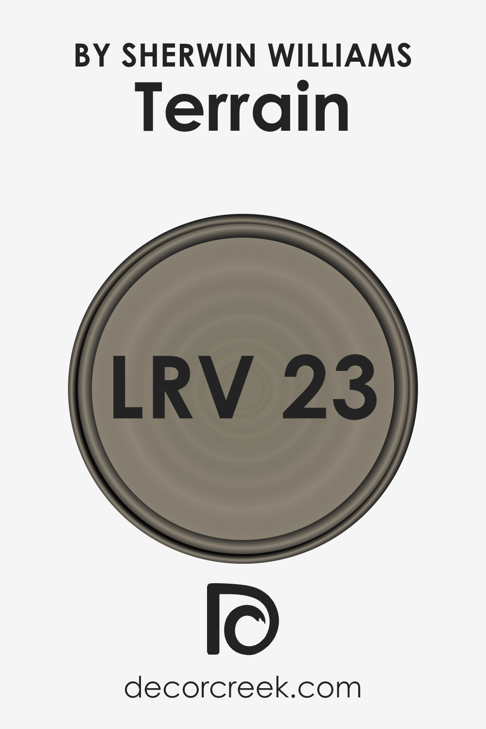
What is the LRV of Terrain SW 9613 by Sherwin Williams?
Light Reflectance Value (LRV) is an important measurement used to understand how light or dark a color appears once it’s applied to a surface like a wall.
It ranges from 0 to 100, with 0 being perfect black, absorbing all light, and 100 reflecting all light back, similar to pure white.
The LRV is crucial in design because it helps determine how much light a color will reflect into a room, affecting both the atmosphere and the perception of space.
Colors with higher LRVs can make spaces appear larger and more open, as they reflect more light.
Conversely, colors with lower LRVs absorb more light, which can make a space feel cozier but smaller, and they may require more lighting to brighten the space.
The specific LRV of 23.494 for the mentioned paint color suggests it is on the darker side of the spectrum, meaning it will absorb a significant portion of light rather than reflect it. In practical terms, this means when used on walls, this color can add depth and character to a space.
However, it might also necessitate additional lighting solutions, especially in areas where natural light is limited. Its relatively low LRV makes it suitable for creating intimate, warm spaces or accent walls, emphasizing architectural features.
Careful consideration should be given to the room’s size, purpose, and available natural light when deciding to integrate a color with this LRV value to ensure it enhances rather than overwhelms the space.
LRV – what does it mean? Read This Before Finding Your Perfect Paint Color
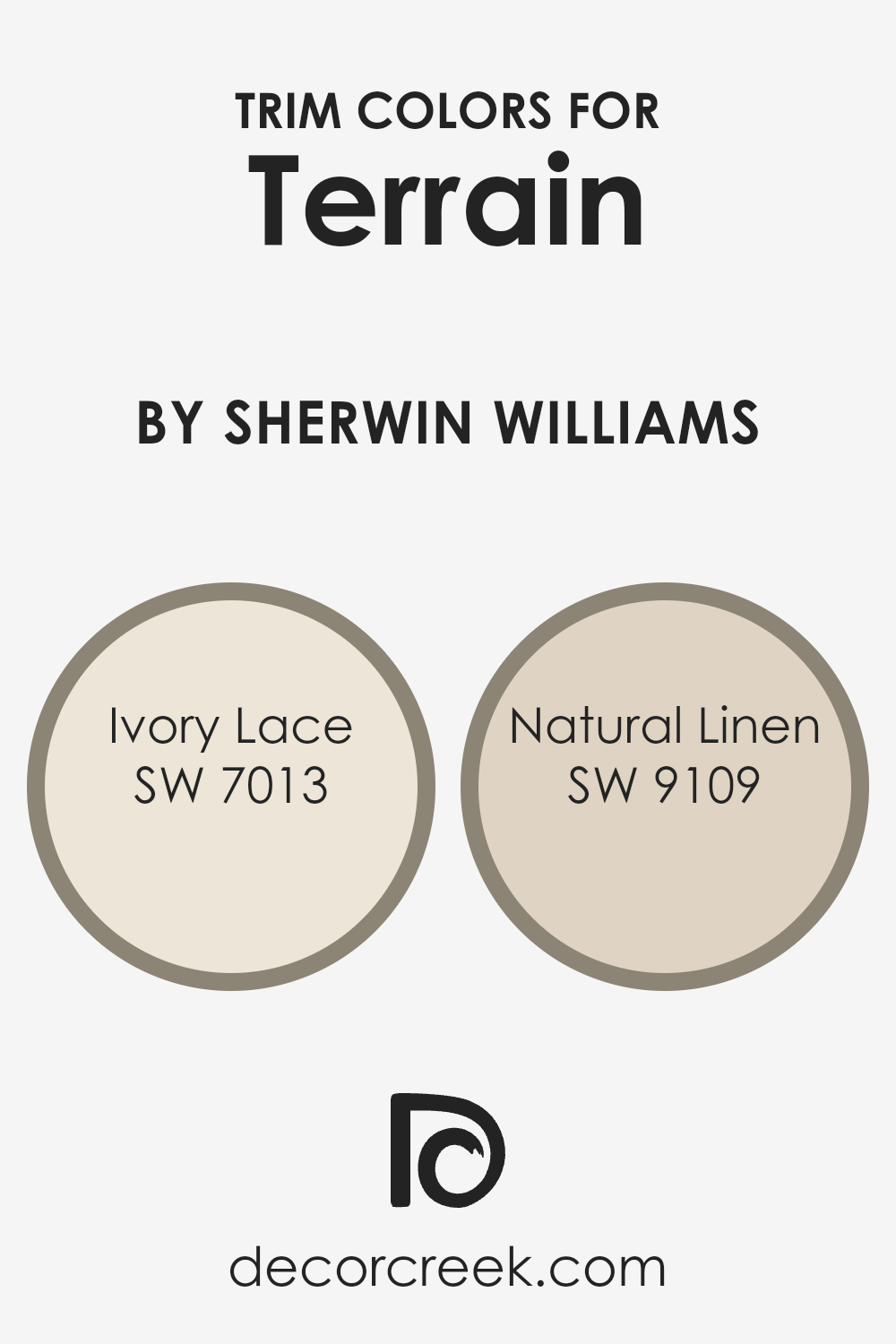
What are the Trim colors of Terrain SW 9613 by Sherwin Williams?
Trim colors in interior and exterior design are used to accentuate and frame the main colors of a room or exterior, focusing on areas such as door frames, window frames, moldings, and baseboards.
By carefully selecting trim colors, you can enhance the architectural features of a space, create depth, and amplify the aesthetic appeal of the primary color scheme.
For instance, when using a sophisticated hue like Terrain, a choice of trim colors that harmonize or contrast effectively can elevate the overall look of a space, adding layers of visual interest and character.
Properly chosen trim colors act as a subtle yet impactful finishing touch, seamlessly tying together the design elements of a room or home facade.
SW 7013 – Ivory Lace is a soft, warm white that carries an understated elegance, making it an excellent trim choice to gently contrast yet complement the richer, earthy tones of Terrain. This color brings a subtle brightness to spaces, softening the overall effect and ensuring that the area feels welcoming and spacious.
On the other hand, SW 9109 – Natural Linen offers a neutral, mid-tone beige that leans toward a natural, comforting feel.
As a trim color, Natural Linen works wonderfully to bridge the gap between the boldness of Terrain and softer or neutral-toned furnishings and accents, providing a cohesive look while maintaining a comfortable, grounded atmosphere.
Both Ivory Lace and Natural Linen serve as versatile choices that bolster the depth and sophistication of a design palette, highlighting the importance of selecting the right trim colors to achieve a polished and harmonious look.
You can see recommended paint colors below:
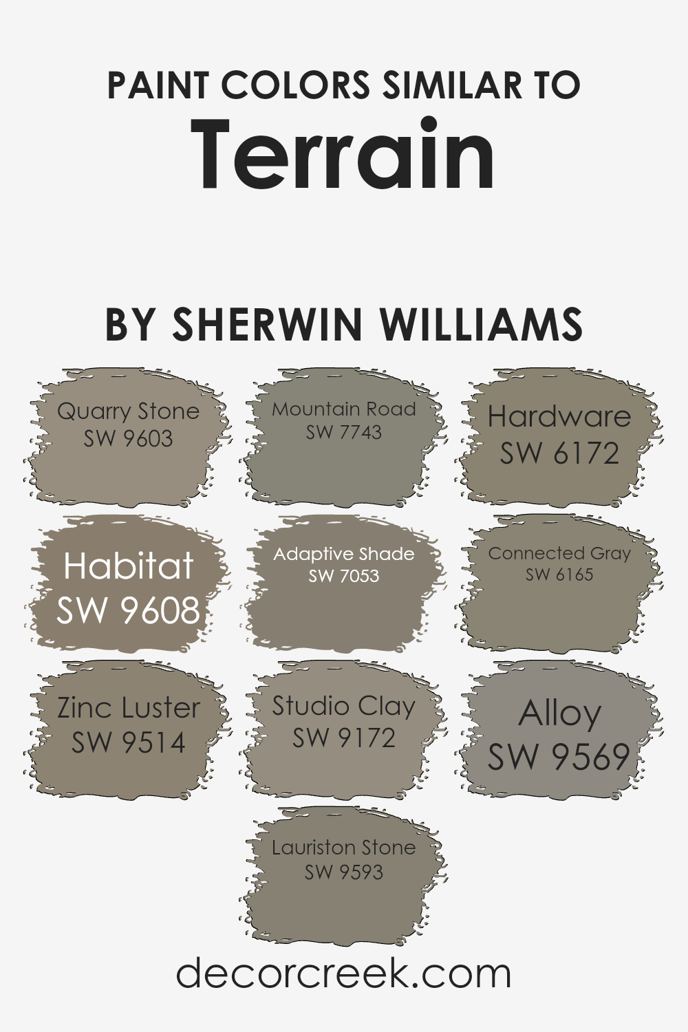
Colors Similar to Terrain SW 9613 by Sherwin Williams
The importance of similar colors in interior and landscape design cannot be overstated, especially when it comes to creating a coherent and harmonious environment.
Colors like Quarry Stone, Habitat, and others in the same palette, bring a sense of continuity and flow to a space, making it feel unified and thoughtfully designed.
These colors work together by sharing common undertones or intensities, allowing for a seamless transition from one area to another or from interior to exterior, thereby enhancing the overall aesthetic appeal and ambiance of a space.
Such a palette can also help in highlighting architectural features or in softening areas that might otherwise stand out too starkly.
Quarry Stone, for example, carries a robust, earthy presence, reminiscent of the enduring qualities of natural stone, while Habitat brings a slightly warmer, more enveloping feel, akin to the serenity and richness of a wooded landscape.
Zinc Luster, with its metallic hints, introduces a subtle sheen that can add depth and a touch of elegance. Lauriston Stone offers a lighter, more airy feel, perfect for spaces that aim to be bright and open.
Mountain Road, a deeper hue, provides a strong anchor, grounding designs with its solid, reliable tone. Adaptive Shade, on the other hand, showcases a versatile gray that can effortlessly adapt to various settings, making it a perfect neutral backdrop.
Studio Clay and Hardware introduce warmer, more nuanced grays, hinting at craftsmanship and precision, while Connected Gray and Alloy offer softer, more subdued alternatives, bringing a gentle, calming energy to spaces.
Each of these colors, with their unique characteristics, plays a crucial role in curating a cohesive and inviting atmosphere that speaks to the subtleties of personal style and the overarching vision of a design project.
You can see recommended paint colors below:
- SW 9603 Quarry Stone
- SW 9608 Habitat
- SW 9514 Zinc Luster
- SW 9593 Lauriston Stone
- SW 7743 Mountain Road
- SW 7053 Adaptive Shade
- SW 9172 Studio Clay
- SW 6172 Hardware
- SW 6165 Connected Gray
- SW 9569 Alloy
How to Use Terrain SW 9613 by Sherwin Williams In Your Home?
Terrain by Sherwin Williams is a sophisticated, warm beige hue that blends perfectly with various home styles and decors. Its natural earthiness brings a sense of calming elegance to any space, making it an ideal choice for creating a serene and welcoming atmosphere.
This versatile color can be used in several ways throughout the home. In living rooms or bedrooms, Terrain can serve as a soothing backdrop, complementing both light and dark furnishings while adding depth and warmth to the space.
In kitchens and dining rooms, it pairs beautifully with wooden cabinets and natural stone countertops, enhancing the room’s natural elements. For those looking to create a tranquil and chic bathroom, Terrain works well with white fixtures and soft textiles, offering a spa-like vibe.
Furthermore, its natural affinity with both traditional and contemporary styles makes it a go-to color for accent walls, trims, and even exterior facades, proving its adaptability and timeless appeal.
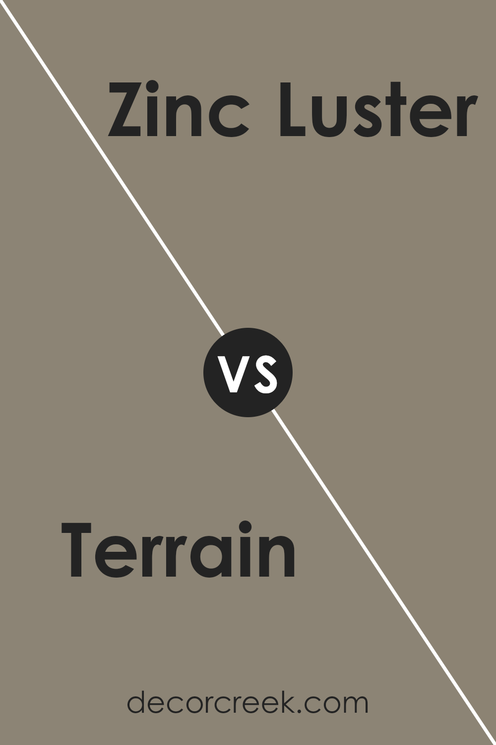
Terrain SW 9613 by Sherwin Williams vs Zinc Luster SW 9514 by Sherwin Williams
Terrain and Zinc Luster, both from Sherwin Williams, present unique palettes that cater to distinct aesthetic desires. Terrain is a warm, earthy hue that draws inspiration from natural landscapes, imbuing spaces with a sense of grounding and serenity.
Its richness adds depth and character to rooms, making it ideal for creating cozy, inviting environments. In contrast, Zinc Luster offers a cooler, more muted tone that leans towards modernity and sophistication.
This color, with its subtle metallic undertone, provides a sleek and elegant backdrop, perfect for contemporary spaces seeking a hint of industrial chic. While Terrain wraps you in the comforting embrace of nature, Zinc Luster elevates a room’s ambiance with its refined, understated elegance.
Together, these colors offer versatile options for interior spaces, from the warmth of rustic charm to the cool sophistication of modern design.
You can see recommended paint color below:
- SW 9514 Zinc Luster
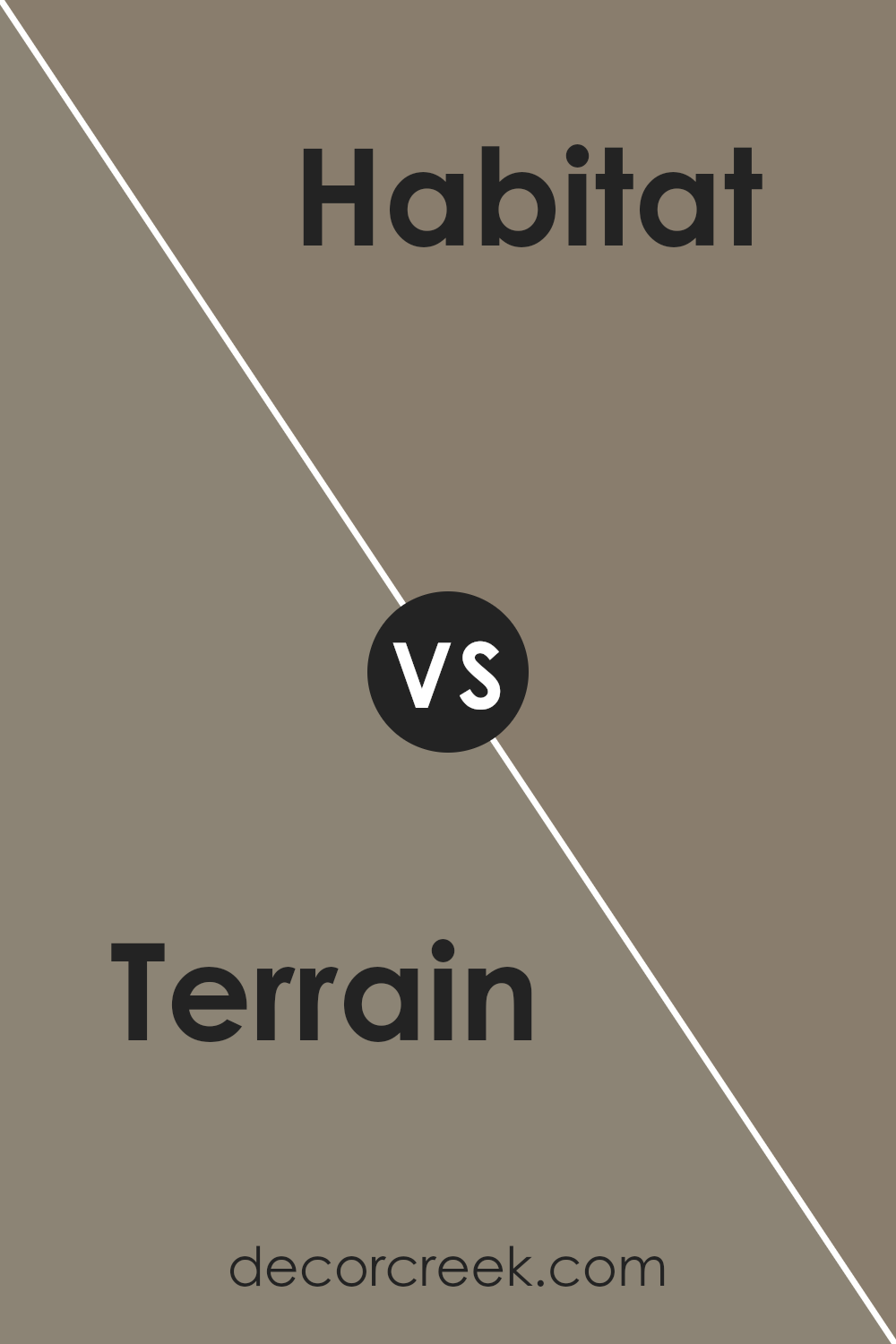
Terrain SW 9613 by Sherwin Williams vs Habitat SW 9608 by Sherwin Williams
Terrain and Habitat by Sherwin Williams are two distinct colors that each bring their own unique ambiance to a space. Terrain is a deeper, more earthy color reminiscent of rich soil or the serene underfoot of a forest. It carries a warmth and depth that makes it perfect for creating a cozy and inviting atmosphere.
On the other hand, Habitat is lighter and leans towards a neutral, sandy tone. Its subtle warmth is reminiscent of natural fibers and raw linen, making it ideal for brightening spaces while maintaining an earthy, grounded feel.
While Terrain offers a bold statement, adding depth and character to walls or accents, Habitat provides a softer, more versatile backdrop for a range of designs.
Both colors celebrate natural elements but do so in distinctly different ways—Terrain by embracing the profundity of the earth, and Habitat by highlighting the lightness and simplicity of natural landscapes.
You can see recommended paint color below:
- SW 9608 Habitat
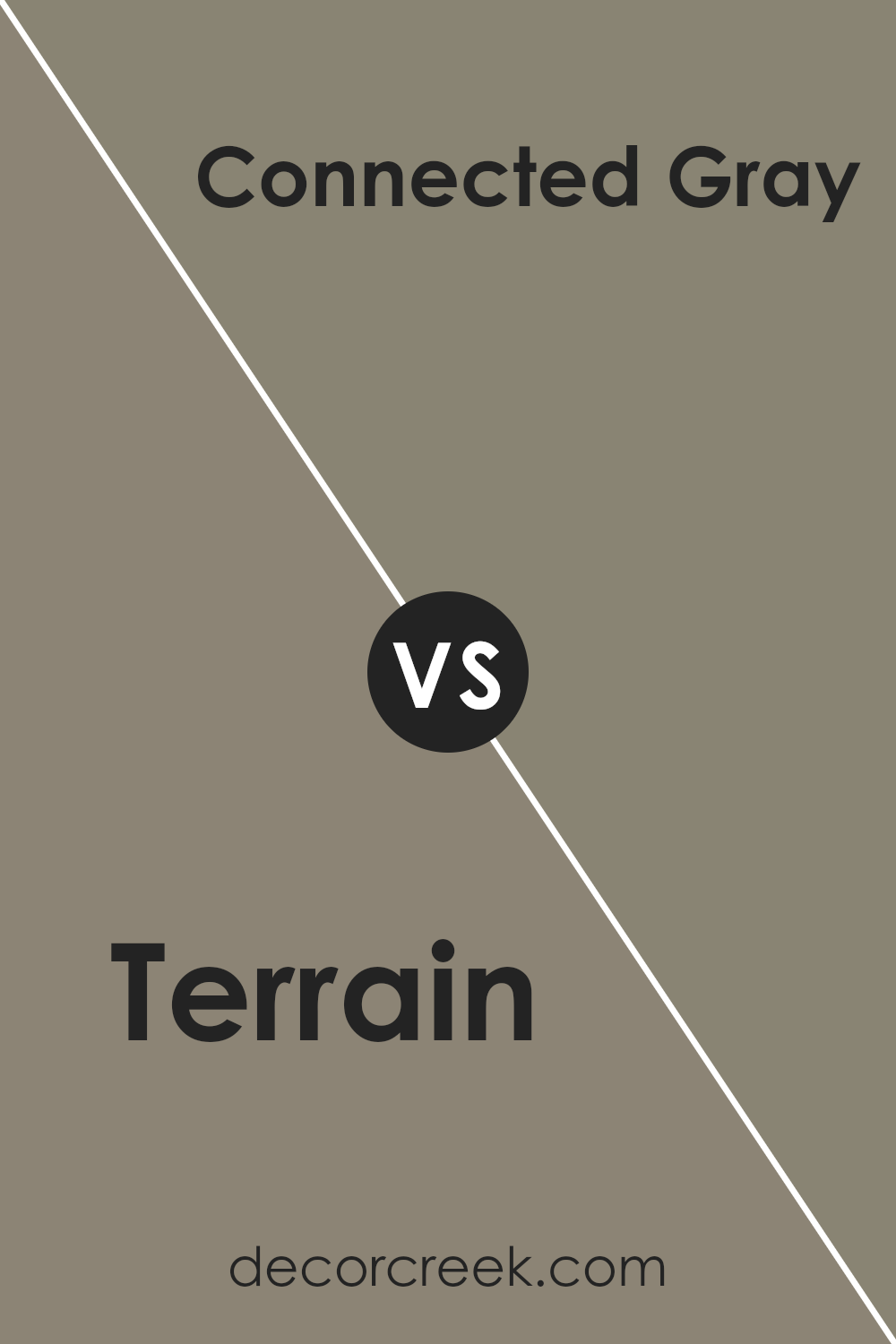
Terrain SW 9613 by Sherwin Williams vs Connected Gray SW 6165 by Sherwin Williams
Terrain and Connected Gray, both from Sherwin Williams, offer distinct takes on neutral tones, each evoking a unique ambiance. Terrain is a deeper, earthier tone, reminiscent of natural clay and rich soil. Its warm undertones can create a cozy, welcoming atmosphere, perfect for spaces meant to foster relaxation and comfort.
On the other hand, Connected Gray leans towards a cooler, more balanced gray, offering a modern and versatile backdrop for various decor styles.
Its subtle green undertones give it a sophisticated depth, making it ideal for contemporary living spaces that aim for a serene and grounded aesthetic.
While Terrain brings warmth and a sense of organic richness, Connected Gray provides a tranquil, refined essence. The choice between them hinges on the desired feel of a room—warm and inviting, or cool and contemporary.
You can see recommended paint color below:
- SW 6165 Connected Gray
Terrain SW 9613 by Sherwin Williams vs Studio Clay SW 9172 by Sherwin Williams
Terrain and Studio Clay, both from Sherwin Williams, offer distinct but harmonious earth tones that can add warmth and sophistication to any space. Terrain presents as a deeper, more saturated hue, reminiscent of the rich soil found in a well-tended garden. Its depth is capable of making a bold statement or anchoring a room as a grounding neutral.
In contrast, Studio Clay has a lighter, more subdued appearance, akin to the natural clay used by artisans. Its versatility serves to create a serene and inviting atmosphere, making it ideal for spaces intended for relaxation or contemplation.
While Terrain offers a strong base or accent, Studio Clay provides a subtle backdrop, allowing for a variety of decor choices.
Together, these colors can complement each other wonderfully, with Terrain providing depth and contrast to Studio Clay’s calming presence, embodying the essence of earth’s natural beauty and versatility in interior design.
You can see recommended paint color below:
- SW 9172 Studio Clay
Terrain SW 9613 by Sherwin Williams vs Lauriston Stone SW 9593 by Sherwin Williams
Terrain and Lauriston Stone, both from Sherwin Williams, offer distinctive tones that cater to varied aesthetic preferences. Terrain presents itself as a deep, earthy hue, reminiscent of the natural ground from which its name is derived.
It conveys a sense of warmth and robustness, making it a perfect choice for spaces that aim to feel grounding and enveloped in richness.
On the other hand, Lauriston Stone is a significantly lighter shade. It evokes the serene and subtle elegance of natural stone, providing a neutral backdrop that blends seamlessly into any decor.
This color is ideal for creating a bright, airy atmosphere, lending itself well to spaces that benefit from a sense of openness and light.
Both colors embody their unique charm and utility, with Terrain offering depth and drama, while Lauriston Stone brings calm and clarity.
Whether used independently or in combination, these hues can enhance the ambiance of any room, reflecting the natural world’s beauty and versatility.
You can see recommended paint color below:
- SW 9593 Lauriston Stone
Terrain SW 9613 by Sherwin Williams vs Hardware SW 6172 by Sherwin Williams
Terrain and Hardware by Sherwin Williams are two distinct colors that cater to different aesthetic preferences and spaces. Terrain is a warm, earthy hue that evokes feelings of natural elements and rustic environments.
Its grounding presence makes it an ideal choice for creating cozy and welcoming spaces. The color suggests a connection to the outdoors, offering a sense of stability and calm.
On the other hand, Hardware presents a cooler, more neutral palette. This versatile gray tone stands out for its ability to blend seamlessly into various decor styles, from modern to industrial.
Its understated elegance offers a sophisticated backdrop that can highlight decor elements or stand confidently on its own. Hardware’s adaptive nature makes it a favorite for those seeking a chic, timeless look.
When comparing the two, Terrain brings warmth and a natural aesthetic, while Hardware offers a clean, modern versatility. Both colors have their unique appeal, with Terrain suited for earthy, comfortable settings and Hardware excelling in sleek, contemporary spaces.
You can see recommended paint color below:
- SW 6172 Hardware
Terrain SW 9613 by Sherwin Williams vs Adaptive Shade SW 7053 by Sherwin Williams
The two Sherwin Williams colors in question, Terrain SW 9613 and Adaptive Shade SW 7053, offer subtle yet distinct tones that cater to different design preferences and atmospheres.
Terrain presents as a rich, earthy hue with a deep foundation, reminiscent of natural landscapes and outdoor elements, evoking a sense of warmth and grounding. Its robust character makes it ideal for creating cozy, inviting spaces with a strong connection to the outdoors or for accentuating wood textures and rustic interiors.
On the other hand, Adaptive Shade stands out as a versatile neutral with a cooler, more subdued appearance. This color seamlessly blends with a wide array of design schemes, lending a contemporary, airy feel to any space.
Its understated elegance and adaptability make it a fantastic choice for modern, minimalist, or transitional environments. While both colors share an inherent connection to nature, Terrain leans towards a richer, more vibrant expression, whereas Adaptive Shade offers a softer, more muted and flexible backdrop, ideal for a broad spectrum of design intentions.
You can see recommended paint color below:
- SW 7053 Adaptive Shade
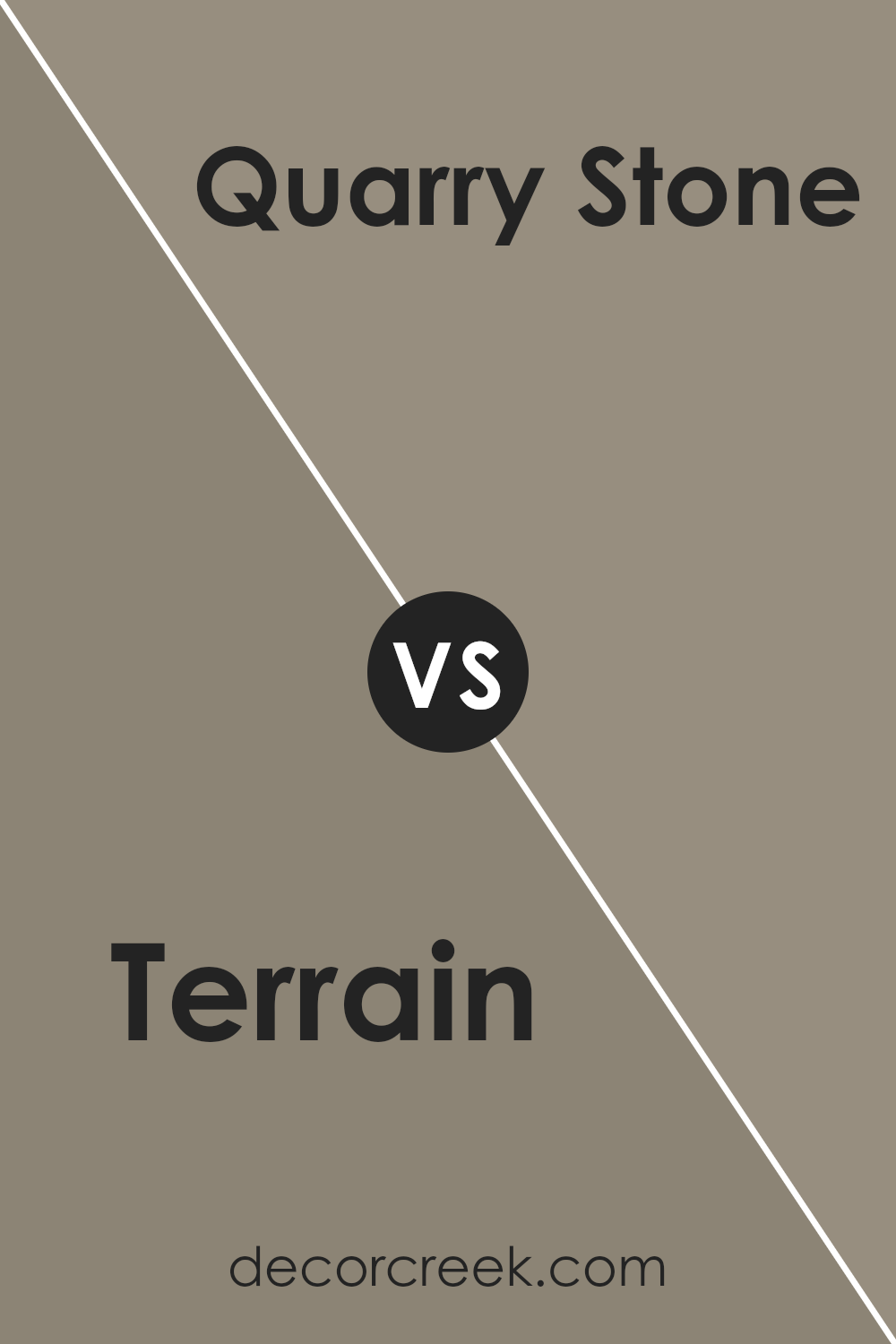
Terrain SW 9613 by Sherwin Williams vs Quarry Stone SW 9603 by Sherwin Williams
Terrain and Quarry Stone, both Sherwin Williams colors, present a compelling study in nuanced earth tones, each bringing its own unique vibe to interior and exterior spaces. Terrain, with its warmer, slightly more vibrant hue, leans towards a natural, sun-kissed clay, offering a cozy and inviting atmosphere.
This color shines in spaces meant for gathering, imbuing a sense of warmth and comfort. On the other hand, Quarry Stone exhibits a cooler, more reserved tone, reminiscent of the stony outcrops from which its name derives.
Its muted, subtle gray qualities render it exceptionally versatile, making it a perfect backdrop for bold decor or a sophisticated base for minimalist designs. The contrast between Terrain’s warm embrace and Quarry Stone’s serene, elegant poise highlights their potential to transform a space based on the ambiance one aims to achieve.
Whether seeking the earthy, vibrant touch of Terrain or the calm, refined essence of Quarry Stone, each color offers a unique palette to inspire creativity in home decor.
You can see recommended paint color below:
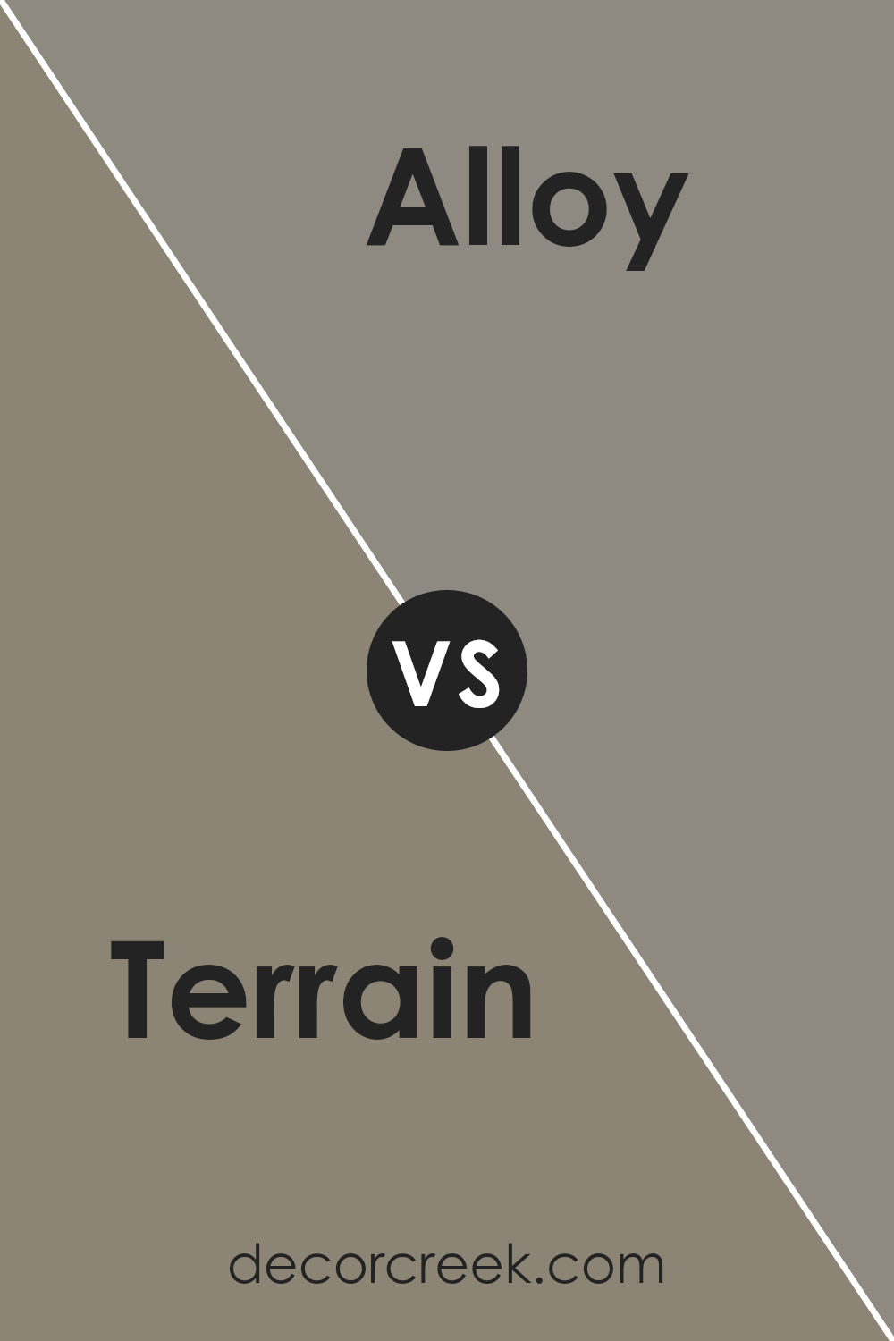
Terrain SW 9613 by Sherwin Williams vs Alloy SW 9569 by Sherwin Williams
Terrain and Alloy, both from Sherwin Williams, present a captivating contrast that enhances various design aesthetics. Terrain, an earthy, warm hue, invokes the feeling of nature’s solid ground beneath your feet. It offers a sense of comfort and stability, ideal for creating cozy, welcoming spaces.
This color tends to bring warmth to an environment, making it perfect for living areas, bedrooms, or any space where a touch of coziness is desired.
In contrast, Alloy embodies a cooler, more industrial vibe with its sophisticated, metallic undertone. This color suggests modernity and sleekness, making it suitable for contemporary settings or to introduce a sharp, edgy contrast when paired with warmer tones.
Alloy works well in kitchens, bathrooms, or as an accent in a modern living room, offering a balance to softer textures and colors.
The juxtaposition between Terrain’s warm, earthy embrace and Alloy’s cool, modern precision can create dynamic and balanced spaces where each color complements the other, appealing to diverse tastes and design preferences.
You can see recommended paint color below:
- SW 9569 Alloy
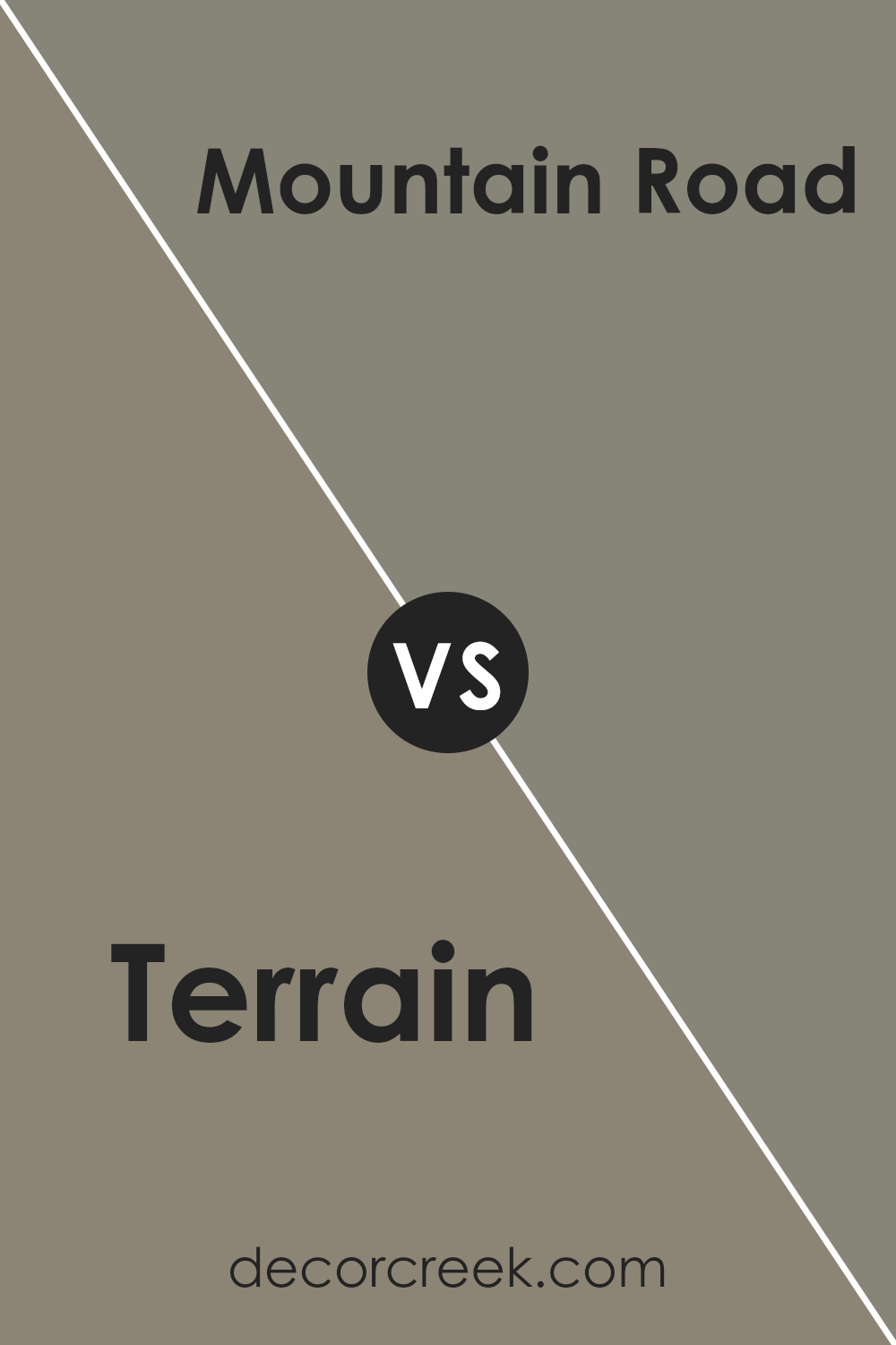
Terrain SW 9613 by Sherwin Williams vs Mountain Road SW 7743 by Sherwin Williams
Terrain and Mountain Road, both from Sherwin Williams, offer distinct yet harmonious earth-toned options for those seeking a natural and grounded aesthetic in their spaces. Terrain is a unique shade that embodies the warm, deep tones of the earth itself.
It brings a robust and inviting atmosphere into any room, creating a space that feels both comforting and rich in character. This color can add depth and warmth, making large rooms feel cozier and more intimate.
On the other hand, Mountain Road presents a more subdued, cooler tone that reflects the serene and majestic qualities of mountain landscapes. It’s a versatile gray with green undertones, providing a tranquil backdrop that can complement various decor styles, from modern to rustic.
Unlike Terrain’s depth and warmth, Mountain Road offers a sense of calm and tranquility, making it ideal for creating a peaceful retreat in bedrooms or a focused ambiance in home offices.
Both colors offer unique qualities; Terrain’s warmth versus Mountain Road’s serene coolness, allowing them to cater to different moods and design goals in home interiors.
You can see recommended paint color below:
Conclusion
The exploration of Terrain, a sophisticated hue by Sherwin Williams, underscores its versatility and warmth as a paint color. This rich shade serves as a harmonious backdrop for a variety of decors, seamlessly blending with both modern and traditional interiors.
Its unique charm enhances the aesthetic appeal of spaces, making it a favored choice among homeowners and interior designers alike. The color’s depth adds a layer of comfort and elegance to rooms, demonstrating its capacity to elevate the sense of sophistication within a home.
Terrain’s adaptability extends beyond mere aesthetics; its compatibility with a wide range of color palettes highlights its practicality in design considerations. Whether used as a primary color scheme or as an accent, it manages to infuse spaces with a sense of grounding and warmth.
The resounding appreciation for this Sherwin Williams color is a testament to its timeless appeal, proving it to be a valuable addition to any design project. Its ability to resonate with various styles and preferences marks it as a standout choice in the realm of interior design, solidifying its status as a go-to color for those looking to create inviting and stylish environments.
Ever wished paint sampling was as easy as sticking a sticker? Guess what? Now it is! Discover Samplize's unique Peel & Stick samples.
Get paint samples