Introducing SW 9603 Quarry Stone by Sherwin Williams, a paint color that brings a touch of serene sophistication to any room. This unique shade draws inspiration from the natural elegance of stone, offering a beautiful balance between warm and cool tones.
It’s a versatile color that enhances a variety of spaces, from cozy living rooms to sleek modern kitchens.
Whether you’re updating a single room or transforming your entire home, Quarry Stone offers a timeless backdrop that complements a wide range of decor styles and personal tastes.
Choosing the right paint color can be a daunting task, but Quarry Stone makes it easy to achieve a look that’s both stylish and welcoming.
Its understated beauty works well with different lighting conditions, providing a calming ambiance that encourages relaxation and comfort.
Whether you prefer minimalist designs or more eclectic aesthetics, Quarry Stone adapts to your vision, providing a solid foundation for your decorating projects.
In this article, we’ll explore the many ways SW 9603 Quarry Stone can enhance your home’s interior, offering tips and inspiration for getting the most out of this versatile shade.
From pairing suggestions to styling ideas, you’ll find everything you need to create stunning spaces that reflect your unique style. Get ready to transform your home with the subtle yet striking charm of Quarry Stone.
What Color Is Quarry Stone SW 9603 by Sherwin Williams?
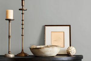
Quarry Stone by Sherwin Williams is a unique and versatile color that adds a touch of sophistication and natural elegance to any space. This color is a deep, muted shade of grey with underlying earthy tones that give it a warm, welcoming feel.
It’s like the color of stone found in a serene, undisturbed quarry, making it perfect for creating a cozy and inviting atmosphere.
This shade works exceptionally well in a variety of interior styles, including modern, industrial, and rustic.
Its natural earthiness brings a sense of calm and grounding to contemporary spaces, while its depth adds character and warmth to more traditional or industrial settings.
Quarry Stone is fantastic for living rooms, bedrooms, and even kitchens, offering a solid foundation that complements a wide range of décor.
When it comes to pairing with materials and textures, Quarry Stone is incredibly adaptable. It looks stunning with natural wood, bringing out the warmth in both elements.
Metal accents, such as brushed nickel or wrought iron, can give a sleek, modern edge to the color, while soft textiles in lighter shades create a pleasing contrast that highlights its depth.
Leather furniture and rich, plush fabrics also work beautifully, adding to the luxurious, grounded feel of the color.
Whether you’re aiming for a space that feels like a cozy hideaway or a sleek, modern haven, Quarry Stone is a choice that brings both warmth and sophistication.
Ever wished paint sampling was as easy as sticking a sticker? Guess what? Now it is! Discover Samplize's unique Peel & Stick samples.
Get paint samples

Is Quarry Stone SW 9603 by Sherwin Williams Warm or Cool color?
Quarry Stone by Sherwin Williams is a unique and strong color choice for any home looking for a touch of sophistication and natural beauty.
This shade draws its inspiration from the rich, deep tones found in natural stone, bringing a sense of earthiness and grounding to any space.
Its versatility allows it to work beautifully in various settings, whether you’re aiming for a cozy, warm ambiance in a living room or seeking to add a dramatic flair to a bedroom.
The great thing about Quarry Stone is how it complements both modern and traditional decor. In modern homes, it can add depth and contrast against lighter, minimalist furnishings and finishes.
For traditional spaces, it can highlight architectural features and woodwork, adding to the room’s overall warmth and character.
Moreover, this color can influence the perception of space and light in a room. In well-lit areas, Quarry Stone can appear more dynamic, with its undertones becoming more pronounced, enhancing the room’s natural flow.
In spaces with less natural light, it can create a cozy, enveloping feel, making it perfect for creating an inviting atmosphere. Overall, Quarry Stone is a versatile choice that can bring a touch of nature and sophistication into any home.
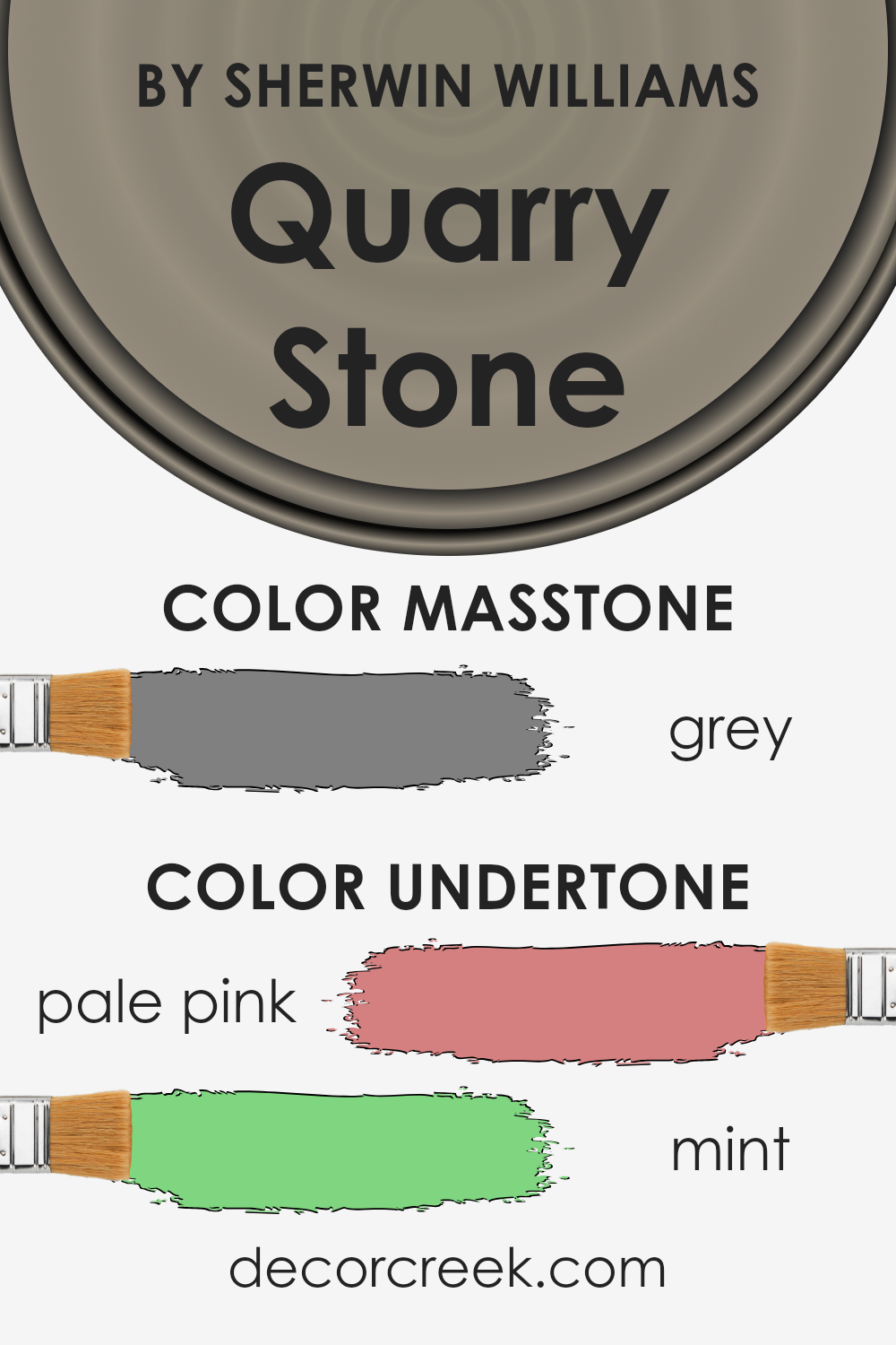
Undertones of Quarry Stone SW 9603 by Sherwin Williams
Quarry Stone by Sherwin Williams is a unique color that carries subtle undertones of pale pink and mint. These undertones play a crucial role in how we perceive the color, adding depth and complexity that might not be immediately noticeable.
Understand that an undertone is like an underlying tone in the paint that affects its overall hue, especially under different lighting conditions.
When it comes to interior walls, the undertones in Quarry Stone make a significant difference in the vibe and feel of a room. The pale pink undertone adds a soft, warm glow to the space, creating a cozy and inviting atmosphere.
It’s the kind of warmth that makes a room feel like home, turning stark spaces into welcoming havens.
On the other hand, the mint undertone brings in a touch of freshness and vitality, subtly balancing the warmth of pale pink.
This hint of mint can make a room feel more spacious and airy, providing a calming effect that’s perfect for spaces meant for relaxation and rejuvenation.
Together, these undertones ensure that Quarry Stone doesn’t just paint the walls; it transforms them.
Depending on the time of day and the kind of natural or artificial light hitting the walls, these undertones can shift the room’s mood, from warm and cozy to fresh and serene.
Understanding and leveraging these undertones can truly enhance your interior space, tailoring it to evoke the exact atmosphere you’re aiming for.
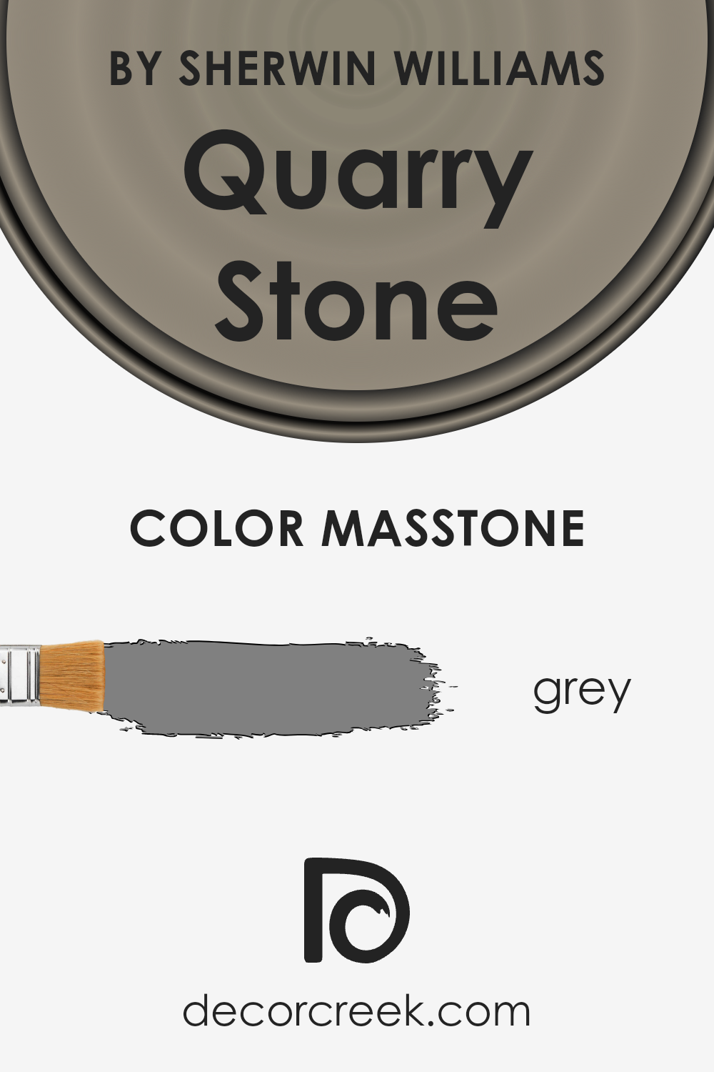
What is the Masstone of the Quarry Stone SW 9603 by Sherwin Williams?
Quarry StoneSW 9603 by Sherwin Williams showcases a grey masstone that sits perfectly at the heart of versatility. With its pure, balanced shade, this color brings a sense of calm and understated elegance to any space it graces.
Grey, at its essence, combines the extremes of black and white, achieving a perfect middle ground. This characteristic makes Quarry Stone an excellent choice for homeowners wanting to create a contemporary yet timeless ambiance.
Because of its neutral base, this paint color has an inherent flexibility that allows it to mingle seamlessly with both vibrant and muted tones.
It can act as a quiet backdrop for bolder colors to shine or work symbiotically with other neutrals to foster a serene and cohesive environment.
In spaces that crave a touch of modern sophistication without overwhelming the senses, Quarry Stone rises to the occasion, making rooms feel more expansive, brighter, and inherently stylish. This grey doesn’t just dress walls; it transforms dwellings into havens of chic comfort.
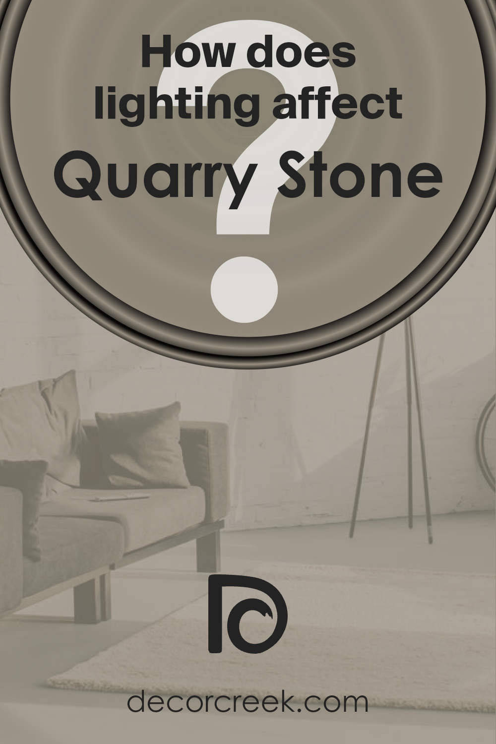
How Does Lighting Affect Quarry Stone SW 9603 by Sherwin Williams?
Lighting plays a crucial role in how we perceive colors, essentially acting like a filter that can modify the appearance of a color in different environments.
Different types of light, such as natural daylight or artificial light from bulbs, can significantly change how a paint color looks on your walls. Let’s explore how Quarry Stone, a specific color, interacts with various lighting conditions.
In artificial light, the perception of colors changes based on the temperature of the light bulb used. Warm light bulbs can make Quarry Stone appear more vibrant and slightly more inviting, adding a cozy feel to the space.
On the other hand, cooler light bulbs might make it look more muted, giving off a sleek and modern vibe.
Natural light brings out the truest form of any color but varies throughout the day and depends on the orientation of the room. North-facing rooms get less direct sunlight, which can make colors look a bit cooler and more shadowed.
In north-facing rooms, Quarry Stone may appear slightly darker and more muted, making the room feel intimate but possibly smaller.
South-facing rooms are flooded with warm, bright light for most of the day, which can make colors appear lighter and more vibrant. Here, Quarry Stone will likely look softer and warmer, enhancing the welcoming ambiance of the room.
East-facing rooms receive strong, warm light in the morning, which gradually transitions to cooler, softer light throughout the day.
Quarry Stone in an east-facing room can shift from a bright and lively tone in the morning to a more reserved and cooler hue in the afternoon, offering a dynamic visual experience throughout the day.
West-facing rooms experience the opposite light pattern, with cooler morning light that turns into intense, warm light in the evening.
Quarry Stone in these rooms can start the day looking subdued and gradually become more pronounced and warmer as the day progresses, creating a cozy and inviting space by evening.
Understanding how lighting affects colors like Quarry Stone can help you decide the best placement for this shade in your home, ensuring it always looks its best under different lighting conditions.
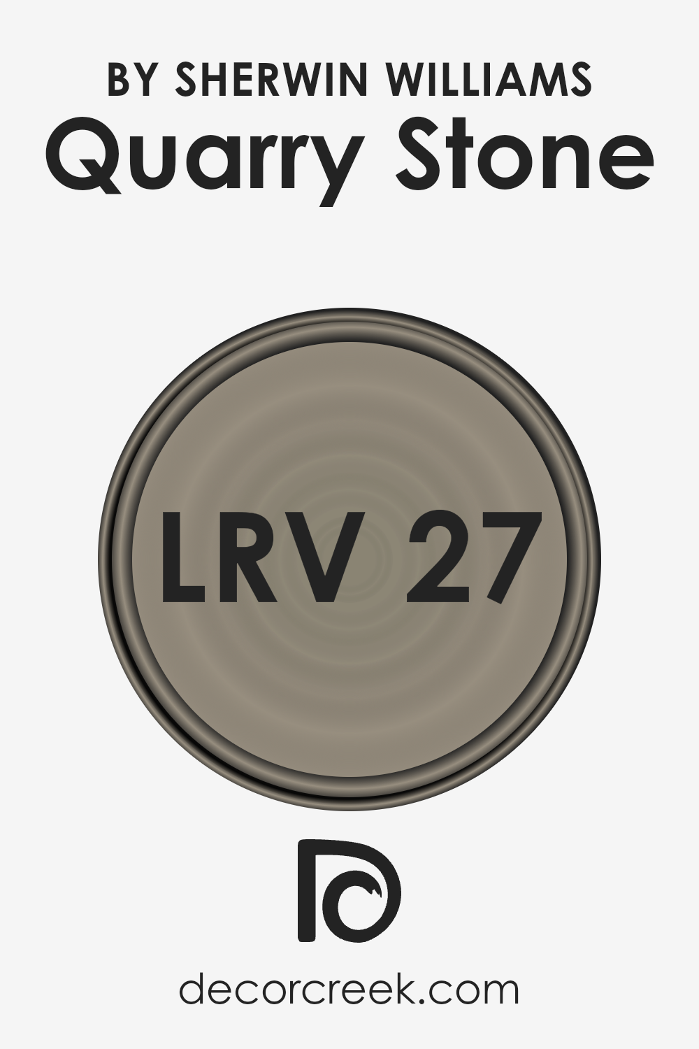
What is the LRV of Quarry Stone SW 9603 by Sherwin Williams?
LRV stands for Light Reflectance Value, which is a measure used to indicate the amount of visible and usable light that a color reflects or absorbs.
Essentially, it’s a scale from 0 to 100, with 0 being completely black (absorbing all light) and 100 being pure white (reflecting all light). This measurement is crucial when choosing paint colors for any space because it helps determine how light or dark a color will look on the walls.
A higher LRV means the color reflects more light, making the room feel brighter and more open. Conversely, a lower LRV means the color absorbs more light, which can make a room feel cozier but smaller and darker.
In the case of a color with an LRV of 27.342, such as the one mentioned, it falls on the darker end of the spectrum, indicating it doesn’t reflect a lot of light.
This means when it’s used on walls, it will create a more intimate and enclosed feeling in the space.
Such a color can make a large room feel cozier and more inviting, but it might make a small room feel cramped or gloomy if not balanced with adequate lighting or contrasting lighter colors.
It’s particularly impactful in how it can transform the perception of space and ambiance, significantly influenced by natural and artificial light sources, thereby affecting the overall mood and appearance of the room.
LRV – what does it mean? Read This Before Finding Your Perfect Paint Color
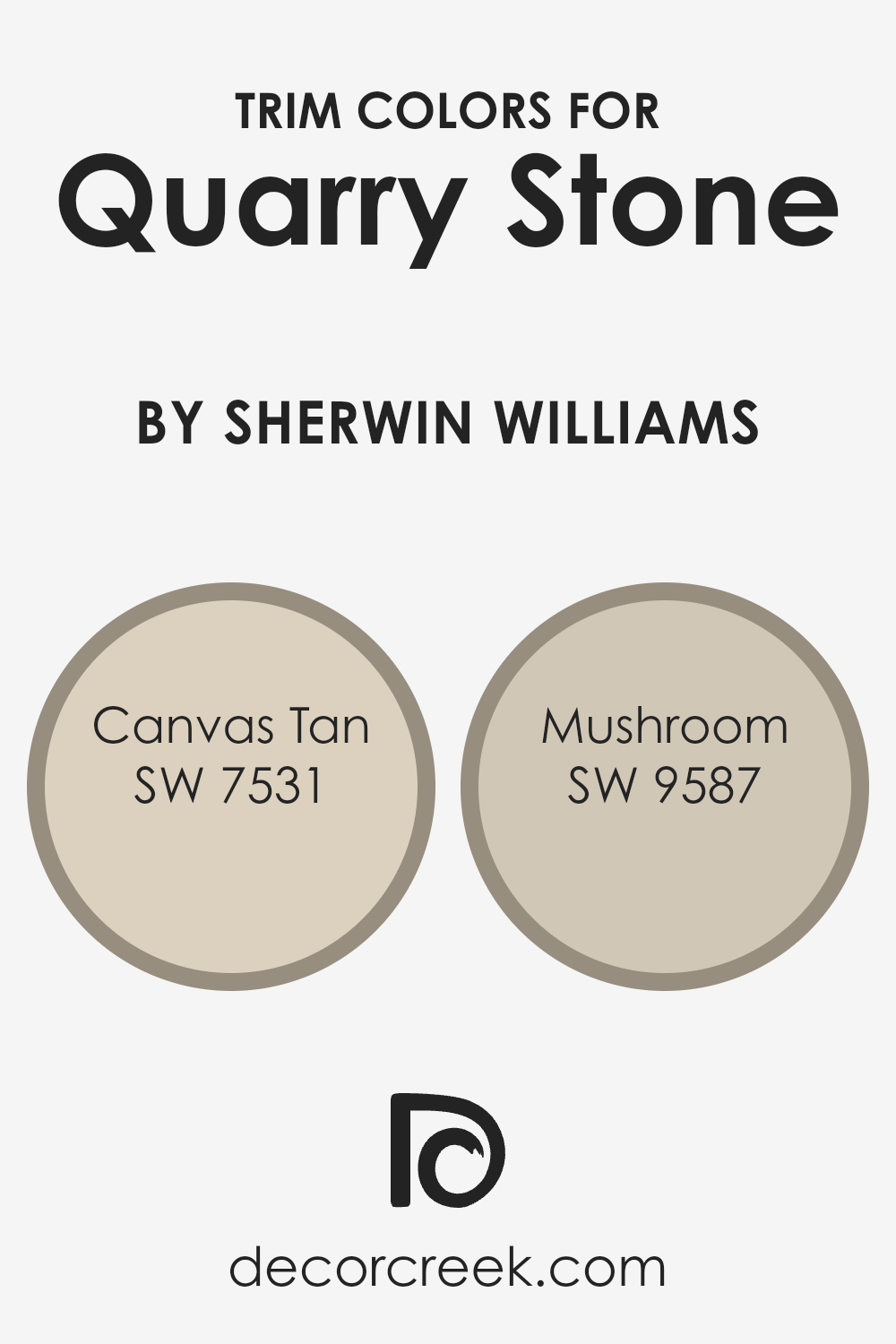
What are the Trim colors of Quarry Stone SW 9603 by Sherwin Williams?
Trim colors are essentially the hues selected for the decorative aspects of a room or exterior, such as door frames, moldings, and baseboards.
These colors play a crucial role in framing and accentuating the primary color of a space, in this case, Quarry Stone by Sherwin Williams.
Choosing the right trim color can enhance the overall aesthetic, create a cohesive look, and highlight the architectural features of a space.
They can either subtly blend with the main color for a seamless transition or starkly contrast it to draw attention and add character.
For a color like Quarry Stone, using SW 7531, Canvas Tan, as a trim provides a soft, neutral backdrop that enhances the natural, earthy tones of Quarry Stone without overpowering it.
Canvas Tan is a warm beige that offers a soothing and inviting complement, perfect for creating a harmonious and balanced ambiance. On the other hand, SW 9587, Mushroom, offers a deeper, richer contrast.
This color is a mid-tone brown with a grounded, organic feel that adds depth and sophistication to the Quarry Stone, making the overall appearance more dynamic and interesting.
Both Canvas Tan and Mushroom serve as excellent choices for trim, depending on the desired impact and mood of the space.
You can see recommended paint colors below:
- SW 7531 Canvas Tan
- SW 9587 Mushroom
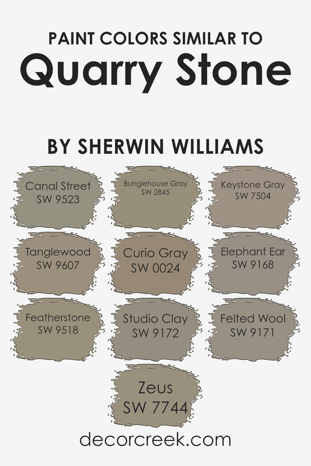
Colors Similar to Quarry Stone SW 9603 by Sherwin Williams
Similar colors are crucial in design and decoration because they create harmony and a sense of balance.
When colors are closely related on the color wheel or share a similar intensity or undertone, they work together to produce a cohesive look without stark contrasts that might otherwise dominate a space.
For instance, Canal Street, with its subtle undertones, complements environments that aim for a peaceful and seamless aesthetic, contributing to a serene and unified appearance.
Tanglewood, on the other hand, introduces a slightly deeper hue, adding depth and dimension while maintaining the overall calmness of the palette.
Featherstone offers a lighter, more ethereal option that can brighten spaces subtly without overpowering them with color. In contrast, Zeus brings in a stronger, more defined tone that can serve as a grounding element or focal point within a design scheme.
Bunglehouse Gray and Curio Gray both play into more traditional or neutral schemes, providing versatility while also ensuring that spaces remain inviting and warm.
Studio Clay and Keystone Gray offer a middle ground, with enough warmth or coolness to adapt to different styles and tastes.
Elephant Ear and Felted Wool, finally, contribute to the richness of the palette, offering options that can make spaces feel cozy and enveloped.
Together, these colors support a range of design objectives from creating minimalist, monochromatic looks to layering shades for a more dynamic and textured effect.
You can see recommended paint colors below:
- SW 9523 Canal Street
- SW 9607 Tanglewood
- SW 9518 Featherstone
- SW 7744 Zeus
- SW 2845 Bunglehouse Gray
- SW 0024 Curio Gray
- SW 9172 Studio Clay
- SW 7504 Keystone Gray
- SW 9168 Elephant Ear
- SW 9171 Felted Wool
How to Use Quarry Stone SW 9603 by Sherwin Williams In Your Home?
Quarry Stone SW 9603, by Sherwin Williams, is a versatile paint color perfect for adding a touch of elegance and warmth to your home.
Its unique shade can help create cozy and inviting spaces. This color works well in various areas of the house, including living rooms, bedrooms, and kitchens.
For living rooms, Quarry Stone offers a neutral base that complements both modern and traditional decor. It pairs beautifully with soft whites in trim and ceilings, bringing a balanced and harmonious look to your space.
In bedrooms, this color can help to create a serene and calm atmosphere, perfect for relaxing after a long day. It matches well with darker furniture pieces, adding depth and contrast to the room.
In kitchens, applying this color on cabinets or walls can add a subtle elegance. It’s great for those who want to achieve a sophisticated, yet understated aesthetic.
Quarry Stone’s versatility also extends to accessories and accents, where it can be paired with a range of colors from vibrant hues to more muted tones.
This makes it a fantastic choice for anyone looking to refresh their home’s look with a contemporary and stylish edge.
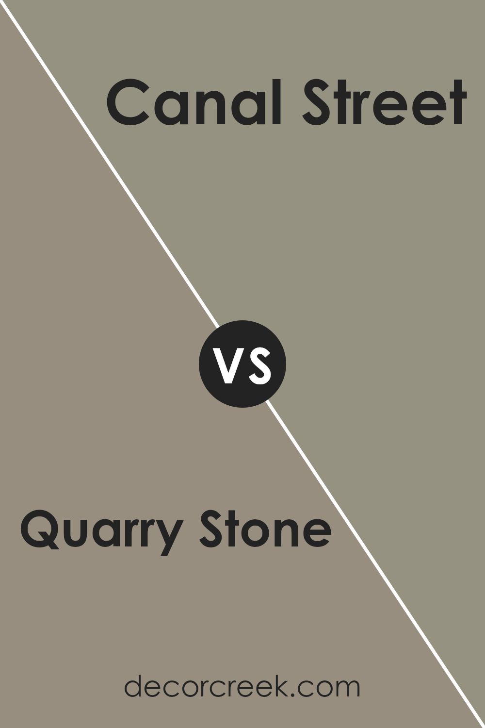
Quarry Stone SW 9603 by Sherwin Williams vs Canal Street SW 9523 by Sherwin Williams
The main color, Quarry Stone, and the second color, Canal Street, are both unique shades from Sherwin Williams. Quarry Stone has a rich, earthy tone that reminds one of natural stone shades you might find in a serene, outdoor setting.
It offers a warm and inviting feel, making spaces cozy and grounded. In contrast, Canal Street leans towards a cooler palette, bearing a hint of sophistication and modernity.
The color is reminiscent of the urban landscape, blending nicely in contemporary designs. While Quarry Stone gives a room a stable, comforting foundation, Canal Street brings a fresh, airy vibe, making it ideal for those seeking a more modern, sleek look.
Both colors have their charm and can dramatically influence the mood and style of a space. Whether you’re looking for warmth and tradition or coolness and chic, these colors offer distinct atmospheres.
You can see recommended paint color below:
Quarry Stone SW 9603 by Sherwin Williams vs Studio Clay SW 9172 by Sherwin Williams
Quarry Stone and Studio Clay are both unique paints by Sherwin Williams, but they have distinct vibes. Quarry Stone has a solid, grounded feel, like the earth beneath your feet in a dense forest.
It’s a bit dark but not overwhelming, perfect for spaces where you want a touch of nature’s depth without making the room feel closed in. On the other hand, Studio Clay offers a softer touch.
Its color reminds you of pottery – that warm, inviting hue that makes a room feel cozy and well-loved. While Quarry Stone feels like a deep breath in a pine forest, Studio Clay is like a warm hug in a room filled with soft, natural light.
Both colors add a touch of sophistication to any space, but while Quarry Stone leans towards a more serious and grounded atmosphere, Studio Clay brings in a lighter, more nurturing energy.
You can see recommended paint color below:
- SW 9172 Studio Clay
Quarry Stone SW 9603 by Sherwin Williams vs Bunglehouse Gray SW 2845 by Sherwin Williams
Quarry Stone and Bunglehouse Gray are two paint colors by Sherwin Williams. Quarry Stone is a unique color that blends gray with subtle brown undertones.
This mix gives it a warm, versatile appearance, making it a great choice for creating a cozy yet sophisticated vibe in a room.
On the other hand, Bunglehouse Gray is a bit darker and leans more towards a true gray, but it’s not without complexity. It carries hints of blue, adding a soothing and slightly more formal character to spaces.
This color is perfect for those looking to add a touch of elegance and depth to their interiors.
Both colors are excellent choices for interior walls, but their different undertones and lightness levels mean they set distinct moods in a room.
Quarry Stone, with its warmer, earthier look, creates a welcoming and comforting atmosphere. Bunglehouse Gray, cooler and richer, offers a serene and more refined ambiance.
Choosing between them depends on the atmosphere you’re aiming to create.
You can see recommended paint color below:
- SW 2845 Bunglehouse Gray
Quarry Stone SW 9603 by Sherwin Williams vs Zeus SW 7744 by Sherwin Williams
Quarry Stone and Zeus, both by Sherwin Williams, are two distinct shades that offer unique vibes for any space. Quarry Stone is a soft, muted color that brings a sense of calm and understated elegance to a room.
It’s like a gentle hug from a cloudy day, versatile enough to work in various settings without overpowering the space.
On the other hand, Zeus steps in with a stronger, more pronounced presence. It’s a darker hue that commands attention, bringing depth and sophistication.
This color can make a bold statement, perfect for creating a focal point or adding drama to a room’s decor.
While Quarry Stone whispers a soothing melody, Zeus speaks in a more assertive tone. If you’re aiming for a serene and welcoming atmosphere, Quarry Stone is your go-to.
But if your goal is to make a robust and chic statement, Zeus will not disappoint. Both colors provide distinct moods and aesthetic impacts, making them suitable for different design ambitions.
You can see recommended paint color below:
- SW 7744 Zeus
Quarry Stone SW 9603 by Sherwin Williams vs Elephant Ear SW 9168 by Sherwin Williams
Quarry Stone and Elephant Ear, both by Sherwin Williams, are unique colors that bring different vibes to a space. Quarry Stone has a cool, earthy tone that leans a bit towards gray with a subtle hint of green.
It’s reminiscent of natural stone, making it perfect for creating a serene and grounded atmosphere. On the other hand, Elephant Ear is a warmer, richer hue that combines gray with brown tones.
This color evokes the feeling of warmth and coziness, making spaces feel inviting and comfortable.
While Quarry Stone offers a more subdued and calming appeal, ideal for modern and minimalist decor, Elephant Ear provides a robust foundation that complements a wide range of colors, adding depth and warmth to any room.
The choice between them depends on the ambiance you’re aiming for: Quarry Stone exudes calmness and simplicity, whereas Elephant Ear embraces a homey and welcoming aura.
Both colors are versatile, but their distinct undertones and the feelings they inspire set them apart.
You can see recommended paint color below:
Quarry Stone SW 9603 by Sherwin Williams vs Tanglewood SW 9607 by Sherwin Williams
Quarry Stone and Tanglewood, both by Sherwin Williams, are two unique colors that bring different vibes to a space. Quarry Stone is a deeper, grayish hue that brings a sense of strength and stability to a room.
It’s like the color of stones you might find by a serene lake, offering a solid foundation for any decor. On the other hand, Tanglewood leans towards a softer, more beige tone.
It’s the kind of color that makes a room feel warm and inviting, like a cozy, sunlit nook on a lazy afternoon. While Quarry Stone adds a touch of seriousness and sophistication, Tanglewood offers a lighter, more relaxing atmosphere.
Choosing between them depends on the mood you want to create. Quarry Stone works well for a modern, sleek feel, whereas Tanglewood is perfect for a comfy, welcoming space.
You can see recommended paint color below:
Quarry Stone SW 9603 by Sherwin Williams vs Felted Wool SW 9171 by Sherwin Williams
Both Quarry Stone and Felted Wool by Sherwin Williams are unique colors, though they share a certain earthy charm. Quarry Stone is a richer, more pronounced hue, closely resembling the natural color of rocks found in a stone quarry.
It brings a sense of solidity and grounding to spaces, making it ideal for areas where you want to foster a feeling of comfort and stability, like living rooms or reading nooks.
On the other hand, Felted Wool has a softer, cozier vibe. Its color mimics that of wool that has been lightly processed, blending gray and beige to create a warm, inviting neutral.
This color works wonders in spaces intended for relaxation and warmth, such as bedrooms and family rooms.
While both colors promote a sense of calm and grounding, Quarry Stone leans more towards a bold, earthy impression, whereas Felted Wool offers a gentler, comforting feel.
Choosing between them would depend on the atmosphere you’re aiming to create – Quarry Stone for a statement of strength and Felted Wool for a hug of warmth.
You can see recommended paint color below:
- SW 9171 Felted Wool
Quarry Stone SW 9603 by Sherwin Williams vs Keystone Gray SW 7504 by Sherwin Williams
Quarry Stone and Keystone Gray are both Sherwin Williams colors that bring a lot of character to any space. Quarry Stone is a deeper shade that carries a strong presence.
It’s a bit more intense, making it perfect for areas where you want to add a hint of drama or sophistication. On the other hand, Keystone Gray is lighter, offering a more understated elegance.
This color is versatile, easy to pair with different decor styles and colors. It’s great for creating a warm, welcoming space without being too bold.
While both colors share gray undertones, Quarry Stone leans towards a darker, more muted ambiance, whereas Keystone Gray brings a softer, more airy feel. Choosing between them really comes down to the mood you want to set.
Quarry Stone sets a bold statement, and Keystone Gray offers a gentle backdrop.
You can see recommended paint color below:
- SW 7504 Keystone Gray
Quarry Stone SW 9603 by Sherwin Williams vs Curio Gray SW 0024 by Sherwin Williams
Quarry Stone and Curio Gray by Sherwin Williams are two colors that offer unique tones for any space. Quarry Stone is a solid, earthy color that brings a sense of stability and grounding to a room.
It has a warm undertone, making spaces feel cozy and inviting. Think of it as a hug from your home every time you walk in. On the other hand, Curio Gray sports a cooler vibe.
It’s more like a misty morning before the world wakes up. This color can make a room feel open, airy, and calm, providing a serene backdrop for your daily life.
Both colors are versatile but serve different moods and settings. Quarry Stone works well in spaces where you want warmth and an anchor, maybe in a living area or a study.
Curio Gray fits like a dream in bedrooms or bathrooms, places where you seek tranquility and refreshment. When choosing between them, think about what feeling you want to bring into your space: the cozy embrace of Quarry Stone or the calm breath of Curio Gray.
You can see recommended paint color below:
- SW 0024 Curio Gray
Quarry Stone SW 9603 by Sherwin Williams vs Featherstone SW 9518 by Sherwin Williams
Quarry Stone and Featherstone are two colors by Sherwin Williams with their unique appeal. Quarry Stone stands out as a solid, earthy tone that feels grounded and robust. It has a deep, rich presence that can bring a sense of calm and stability to any space.
Think of Quarry Stone as the perfect backdrop for a cozy, inviting room where every moment feels secure and comfortable.
On the other hand, Featherstone is much lighter and airier. It’s a soft, delicate hue that breathes a sense of openness and light into a room.
Featherstone can make small spaces appear bigger and brighter, offering a tranquil vibe that’s soothing and gentle. It’s ideally suited for creating a peaceful retreat, where relaxation is key.
While Quarry Stone brings depth and strength to interiors with its substantial character, Featherstone offers a refreshing lift, introducing clarity and spaciousness.
Both colors have their unique charm, whether you’re looking to ground your space with the warmth of Quarry Stone or give it a light, breezy feel with Featherstone.
You can see recommended paint color below:
- SW 9518 Featherstone
Conclusion
Quarry Stone by Sherwin Williams stands out as a paint color that brings a serene and grounding atmosphere to any room. Its unique hue works beautifully in spaces where a calming effect is desired, making it a superb choice for living rooms, bedrooms, and even home offices.
Ideal for those looking to add a touch of sophistication without overwhelming the space, Quarry Stone has the versatility to blend well with various décor styles, from modern minimalism to rustic chic.
The adaptability of Quarry Stone means it pairs effortlessly with both light and dark accents, offering a harmonious balance that enhances the overall aesthetic of a room.
Homeowners and interior designers alike appreciate the subtle elegance it adds to interiors, proving it to be a go-to option for creating spaces that feel both refined and welcoming.
Its ability to act as a neutral backdrop or a statement shade when used judiciously makes it a standout choice for a wide range of design projects.
Ever wished paint sampling was as easy as sticking a sticker? Guess what? Now it is! Discover Samplize's unique Peel & Stick samples.
Get paint samples