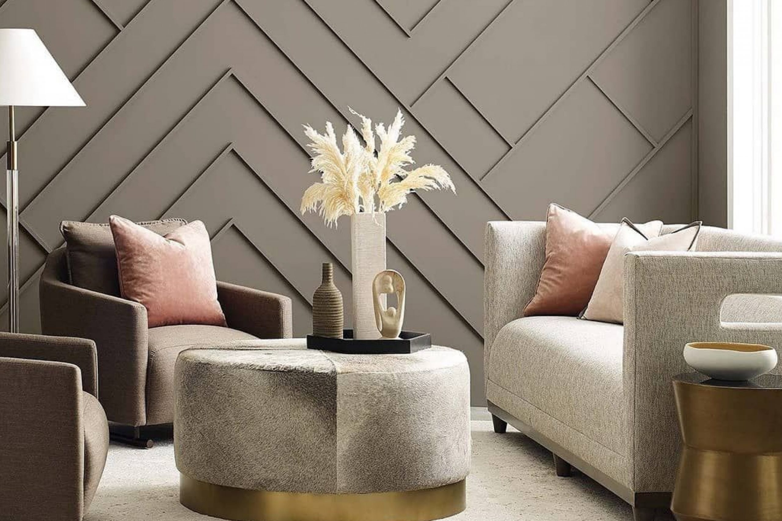
The first time you see SW 9171 Felted Wool by Sherwin Williams, you might be intrigued by its unique ability to set a calm, neutral backdrop in any room. This color, a rich blend of gray and brown, offers a sense of warmth and coziness, making it perfect for spaces where you spend a lot of time relaxing or entertaining guests.
Its versatility is perhaps its strongest trait, allowing you to pair it with a wide range of decor styles and colors. Whether you’re looking to create a serene office space or a welcoming living room, Felted Wool provides a sophisticated palette that enhances your furnishings without overpowering them.
The beauty of this shade lies in its subtlety and depth, which can transform your home in a gentle yet profound way.
Using Felted Wool, you can achieve an atmosphere that feels both refined and approachable, inviting anyone who enters to feel at home.
What Color Is Felted Wool SW 9171 by Sherwin Williams?
Felted Wool by Sherwin Williams is a rich, warm gray shade that carries a subtle hint of brown, adding a cozy yet modern touch to any interior space. This color is versatile, making it an excellent choice for various decorating styles, particularly rustic, modern farmhouse, and contemporary designs. It can be used as a base color for walls, creating a soothing backdrop that allows other decor elements to stand out.
In rustic interiors, Felted Wool pairs beautifully with natural materials like wood, stone, and linen, enhancing the earthy feel of the environment. For a modern farmhouse look, this color works well with textured fabrics like burlap and wool, as well as with distressed wood finishes, providing a charming yet updated aesthetic.
In contemporary settings, Felted Wool matches well with sleek materials such as glass, metallic finishes, and polished stone, offering a balanced contrast between the warm tone of the paint and the cooler textures of modern decor. It also complements vibrant accents like bold-colored vases or modern artwork, which can pop against its muted backdrop.
Overall, Felted Wool is a flexible color that can help create a cozy and welcoming atmosphere in a home while maintaining a sense of stylish simplicity. It’s a go-to paint choice for those looking to achieve a warm, inviting interior without overpowering the senses.
Is Felted Wool SW 9171 by Sherwin Williams Warm or Cool color?
Felted Wool by Sherwin Williams is a warm, inviting gray paint color that can make any space feel cozy and welcoming. With its subtle brown undertones, it brings a comforting ambiance that works well in various rooms, whether on living room walls, bedroom spaces, or even kitchens. This versatility makes it a popular choice among homeowners looking to create a calm and relaxed environment.
When applied, Felted Wool has a natural ability to complement different decor styles and colors. It pairs beautifully with both bold and muted accents, allowing for easy coordination with furniture and accessories. This paint color also has a unique way of connecting spaces; for example, painting adjoining rooms or hallways in Felted Wool can help achieve a seamless flow throughout the home.
Additionally, due to its neutral base, it can help brighten dark spaces without being too stark, creating an inviting, warm area that feels open and airy yet cozy. This color is an excellent choice for anyone looking to enhance their home with a timeless and adaptable shade.
Undertones of Felted Wool SW 9171 by Sherwin Williams
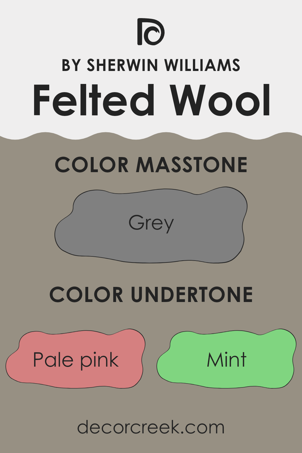
Felted Wool by Sherwin Williams is a nuanced color that subtly changes under different lighting conditions because of its various undertones. Undertones are underlying hues that influence the base color – in this case, Felted Wool – and they can significantly affect how we perceive the color.
For example, shades like pale pink and lilac lend a soft, gentle quality to the paint, making it appear warmer and more welcoming. On the other hand, undertones like light blue and mint add a hint of coolness, which can make the space feel more refreshed and airy. These variations are especially important in interior design because they help in setting the mood and atmosphere of a room.
When applied to interior walls, Felted Wool offers a complex array of reflections based on its extensive undertone palette. In natural light, the warmer undertones like pale yellow and light green can make a room feel cozy and sunlit. In artificial lighting, cooler undertones like light gray and dark turquoise might become more prominent, providing a more grounded and calm appearance.
Understanding the effect of these undertones can help in choosing decor and furnishings. For instance, leveraging the olive and brown undertones can enhance a rustic look, while highlighting the light turquoise or mint can contribute to a more modern aesthetic. Thus, the choice of lighting and decor with Felted Wool can create a variety of effects, making it a very versatile paint choice for any interior space.
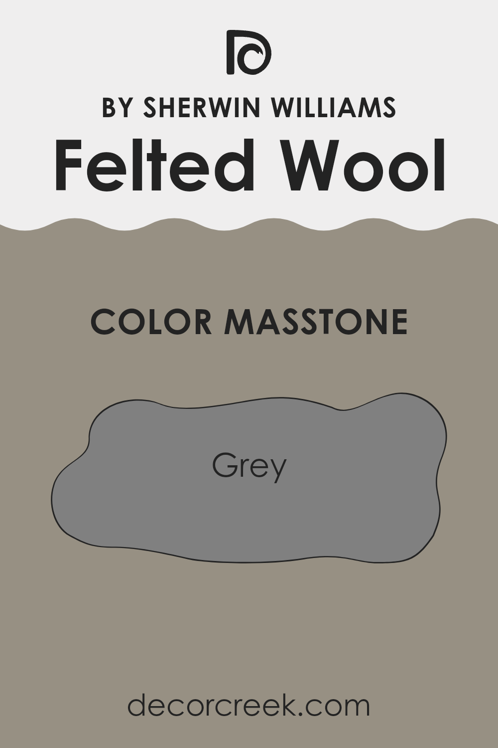
What is the Masstone of the Felted Wool SW 9171 by Sherwin Williams?
Felted Wool SW 9171 by Sherwin Williams, with a masstone of Grey #808080, is a classic and versatile color choice for any home. This distinct shade of grey provides a solid, neutral backdrop that can complement various decor styles and colors.
When used on walls, it brings a steady and calming presence to a room, making spaces feel more grounded and coordinated. This color works well in areas that receive a lot of natural light, as the light can soften the grey, giving it a more dynamic quality throughout the day.
Conversely, in rooms with less natural light, Felted Wool can lend a cozy, comforting feel, perfect for creating a snug retreat. Whether in a modern loft or a traditional style home, this grey is practical, disguising everyday wear and tear better than lighter colors. Overall, Felted Wool is a dependable choice that adapts well to any space, providing a simple yet effective way to style a home.
How Does Lighting Affect Felted Wool SW 9171 by Sherwin Williams?
Lighting plays a crucial role in how we perceive colors in a space. The type of light—whether natural or artificial—can make a color look completely different. For instance, Felted Wool by Sherwin Williams is a versatile color that can appear to change depending on the light it’s exposed to.
In artificial lighting, like that from bulbs or LEDs, Felted Wool tends to look warmer and richer. This is because artificial lights often have yellow undertones, which enhance this color’s cozy, welcoming vibe. It can make rooms feel relaxed and comfortable, especially in the evening when lamps are your primary light source.
Natural light, on the other hand, brings out the truest version of Felted Wool. In a room with plenty of sunlight, this color can look more balanced and neutral. It’s not too warm or too cool, making it ideal for spaces where you want a soft and subtle backdrop.
The orientation of your room also affects how Felted Wool looks throughout the day. In north-facing rooms, which get less direct sunlight, Felted Wool will appear more muted and shadowy. This could be perfect if you’re aiming for a cozier or more subdued setting.
South-facing rooms, bathed in more intense, direct sunlight, will showcase Felted Wool in its brightest form. Here, the color will look lighter and more vibrant, making the space feel airy and lively.
East-facing rooms receive strong morning light, making Felted Wool look soft and warmly lit in the morning, shifting towards a cooler tone as the day progresses. Conversely, in west-facing rooms, the color will stay cooler in the morning but gain warmth and depth in the afternoon and evening as the sunlight becomes golden.
Overall, Felted Wool is a flexible color that changes in different lighting conditions and can work beautifully to enhance the mood and character of a room based on its orientation and light exposure.
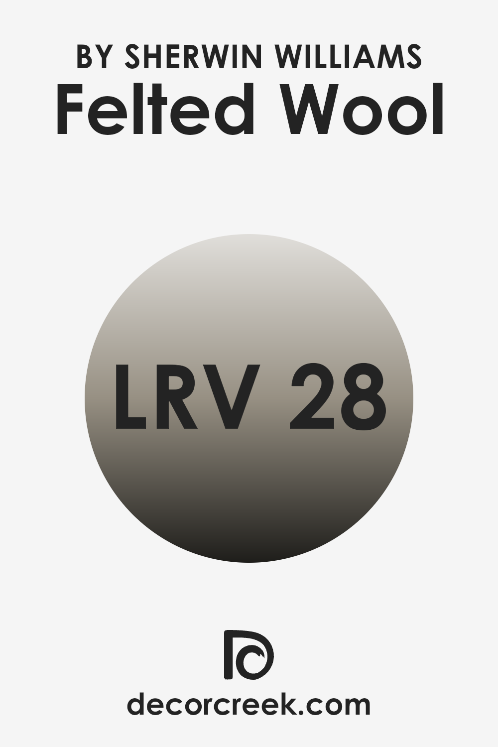
What is the LRV of Felted Wool SW 9171 by Sherwin Williams?
LRV stands for Light Reflectance Value; it is a measurement that indicates how much light a paint color reflects as opposed to absorbing. This scale runs from 1 to 100, where a higher value means the color reflects more light, brightening a room, and a lower value means it absorbs more light, making a space feel cozier or smaller.
This measurement is crucial when choosing paint colors because it helps determine how a color will look under different lighting conditions. For example, a room with less natural light might need a paint color with a higher LRV to make the space appear lighter and more open.
Regarding the specific color with an LRV of 28.064, it is on the darker side of the scale. This means it will not reflect much light, absorbing more instead, which can make rooms look more intimate and enclosed. It’s an ideal choice for creating a cozy atmosphere in places for relaxed activities, such as a bedroom or a study.
However, in a smaller or poorly lit room, using this darker shade might make the space feel even smaller and darker. Therefore, if using this color in areas with limited light, additional lighting fixtures might be necessary to counteract the absorbent nature of the dark shade.
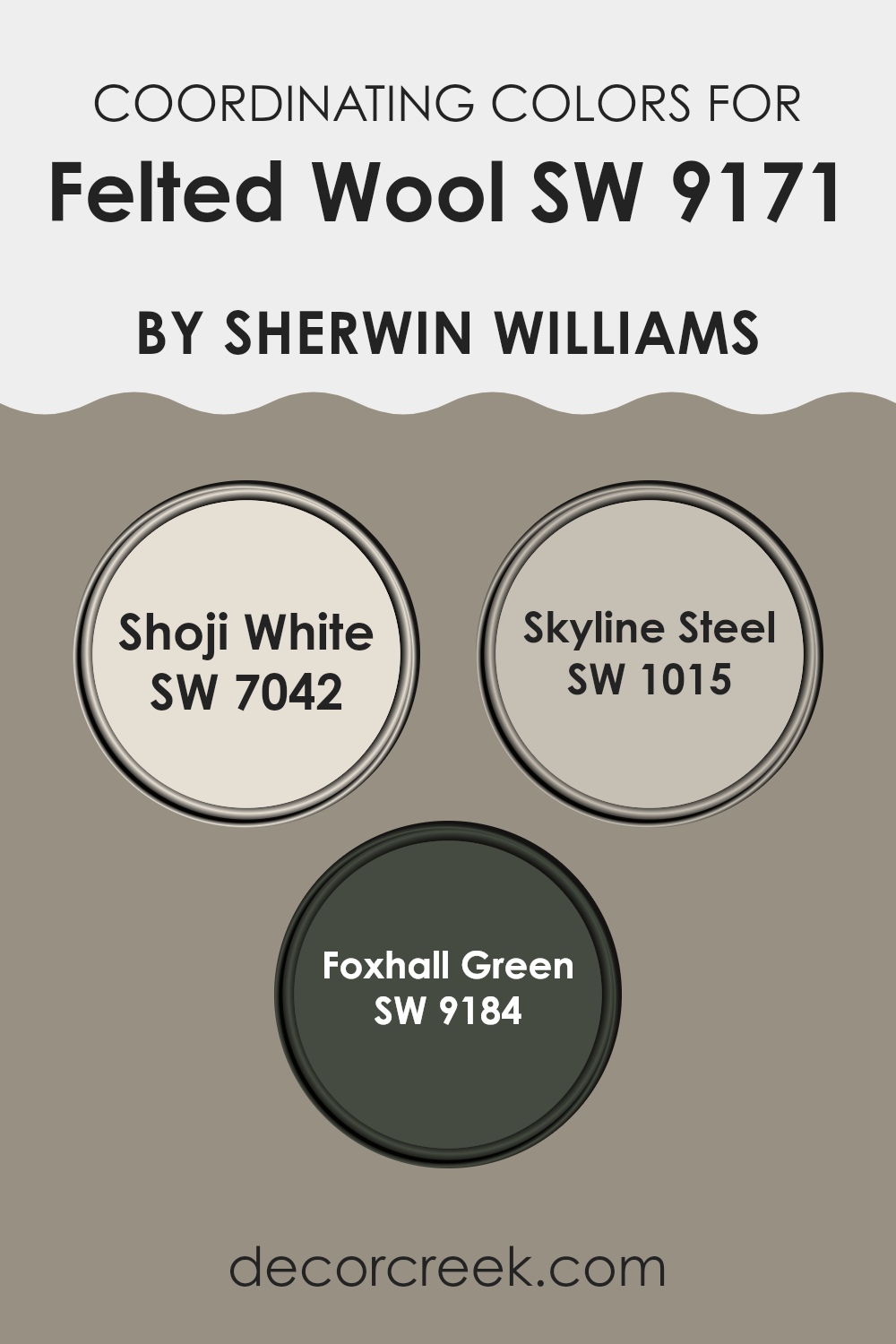
Coordinating Colors of Felted Wool SW 9171 by Sherwin Williams
Coordinating colors are those that complement each other well and create a cohesive look when used together in a space. They can enhance the main color by adding depth and interest, making decorating a room more harmonious. For example, if you choose a primary wall color, coordinating colors can be used for accent walls, trim, or in decorative accessories to balance and unify the overall aesthetic of the room.
One of the coordinating colors for Felted Wool by Sherwin Williams is Shoji White (SW 7042), a clean and calm white shade that provides a subtle contrast, making it perfect for trim or ceilings. It helps to brighten spaces and works well in various lighting situations, making it quite versatile.
Another coordinating color is Skyline Steel (SW 1015), a neutral gray that offers a sleek, modern look while still retaining a warm undertone, suitable for creating a refined atmosphere in living spaces or bedrooms. Lastly, Foxhall Green (SW 9184) is a rich, deep green with earthy undertones that adds a lively yet grounded element to interiors, ideal for accent walls or as a complementing color for decorative elements. These colors together can create a balanced and harmonious look, enhancing the primary color without overwhelming it.
You can see recommended paint colors below:
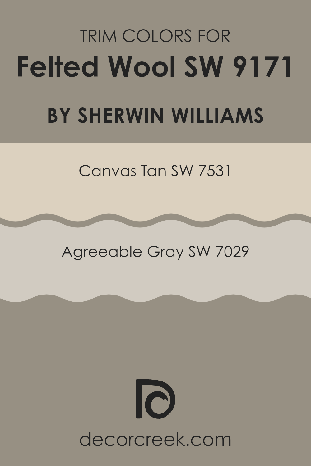
What are the Trim colors of Felted Wool SW 9171 by Sherwin Williams?
Trim colors are used to enhance or contrast the main color on a wall or surface, providing accents that define and complete the design of a room. For Felted WoolSW 9171 by Sherwin Williams, choosing the right trim color is essential to bring out its unique tones and complement the overall color scheme.
Using Canvas Tan SW 7531 or Agreeable Gray SW 7029 can create a subtle or striking contrast, respectively, allowing for a more finished and put-together look. Trim colors not only add a visual separation between walls and other elements like doors, windows, and ceilings but also have a crucial role in highlighting the architectural features of a space.
Canvas Tan SW 7531 is a warm, natural shade that echoes the hues of sand and earth, providing a grounding and cozy feel to any room. It pairs well with the depth of Felted Wool, offering a gentle transition from the darker to lighter shades. On the other hand, Agreeable Gray SW 7029 is a neutral gray that balances warmth with subtleness, making it a versatile choice that can harmonize with both warm and cool tones. This color works well to bring a modern and clean look, complementing Felted Wool by adding a sleek contrast without overwhelming the primary color.
You can see recommended paint colors below:
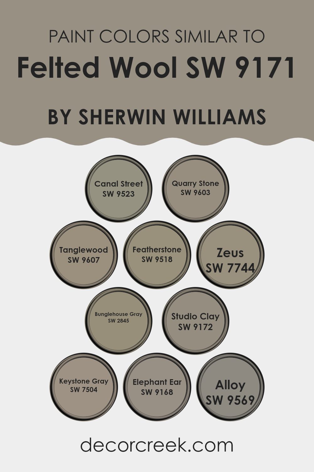
Colors Similar to Felted Wool SW 9171 by Sherwin Williams
Choosing similar colors in a design scheme can make a space feel harmonious and cohesively styled. By selecting colors that share a certain depth or undertone, like variations on the warm gray-brown hue of Felted Wool, you can create a subtle yet effective flow throughout a room.
For instance, Canal Street offers a deeper, slightly more neutral tone that complements a variety of decor styles, making it versatile for different spaces. Quarry Stone leans into a cooler vibe, its gray aspects bringing a calm contrast to warmer toned furnishings.
Tanglewood has a richer, earthier quality, perfect for adding a touch of warmth to a space without overpowering with color. Featherstone showcases a lighter approach, providing a soft backdrop that enhances natural light in the area. Zeus, a bold move in the selection, offers a graphite-like shade that anchors lighter surrounding colors, which is great for creating focal points.
Bunglehouse Gray includes a hint of blue, lending a unique yet understated twist that pairs nicely with similar neutral tones for a layered look. Studio Clay closely mirrors the original hue with a tad more depth, offering the option to create subtle distinctions between spaces like the living area and dining room.
Keystone Gray stands out with its slight hint of green, providing a fresh look when combined with natural materials like wood or linen. Elephant Ear adds a dusky, almost mysterious element to the color palette, making it ideal for creating cozy corners or accent walls. Lastly, Alloy brings a metallic hint, which can add a modern edge to traditional color schemes. By considering such similar colors, one can achieve a fluid visual experience that ties the various elements of a home together effectively and attractively.
You can see recommended paint colors below:
- SW 9523 Canal Street
- SW 9603 Quarry Stone
- SW 9607 Tanglewood
- SW 9518 Featherstone
- SW 7744 Zeus
- SW 2845 Bunglehouse Gray
- SW 9172 Studio Clay
- SW 7504 Keystone Gray
- SW 9168 Elephant Ear
- SW 9569 Alloy
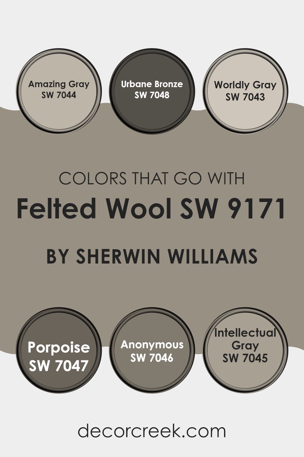
Colors that Go With Felted Wool SW 9171 by Sherwin Williams
Choosing the right colors to accompany Felted Wool SW 9171 by Sherwin Williams is essential for creating a harmonious and visually appealing space. Colors such as Amazing Gray, Urbane Bronze, Worldly Gray, Porpoise, Anonymous, and Intellectual Gray, offer a range of complementary shades that can enhance the overall aesthetic of a room. Each color supports Felted Wool by either contrasting or coordinating with it, allowing for a cohesive and visually interesting design.
Amazing Gray is a soft, warm gray that brings a subtle brightness to spaces, making it an excellent counterbalance to the deeper tone of Felted Wool. Urbane Bronze, on the other hand, is a dark, rich color that adds a striking depth and can act as a strong statement or anchor in a room.
Worldly Gray offers a lighter alternative, providing a soothing backdrop that works well in varied lighting conditions. Porpoise is a unique blend that bridges the gap between gray and brown, giving it a versatile hue that pairs beautifully with earthier tones. Anonymous is a cool, muted green, infusing a touch of nature-inspired calm into interiors.
Lastly, Intellectual Gray has a slight purplish undertone, creating a subtle complexity and warmth that complements the more neutral Felted Wool. Together, these colors create a palette that can be used to craft a space that feels cohesive yet dynamic, enhancing the beauty and functionality of any room.
You can see recommended paint colors below:
- SW 7044 Amazing Gray
- SW 7048 Urbane Bronze
- SW 7043 Worldly Gray
- SW 7047 Porpoise
- SW 7046 Anonymous
- SW 7045 Intellectual Gray
How to Use Felted Wool SW 9171 by Sherwin Williams In Your Home?
Felted Wool SW 9171 by Sherwin Williams is a versatile paint color that offers a soft, cozy vibe to any room. This shade of gray has a warm undertone, making it perfect for creating a welcoming atmosphere in your living spaces. It works particularly well in bedrooms where you want a calming, neutral backdrop or in living rooms to give a gentle, inviting feel.
Using this color in larger areas, like on main walls, can make your space look more open and airy. It’s also a great choice for painting cabinets or furniture to give them a fresh look without being too bold. If you have a home office, Felted Wool can help to keep the environment focused and free from distractions.
For a stylish contrast, pair it with brighter colors like blues or yellows in accessories like cushions, rugs, or art. This allows your main color theme to remain subtle, while still adding pops of color to energize the room.
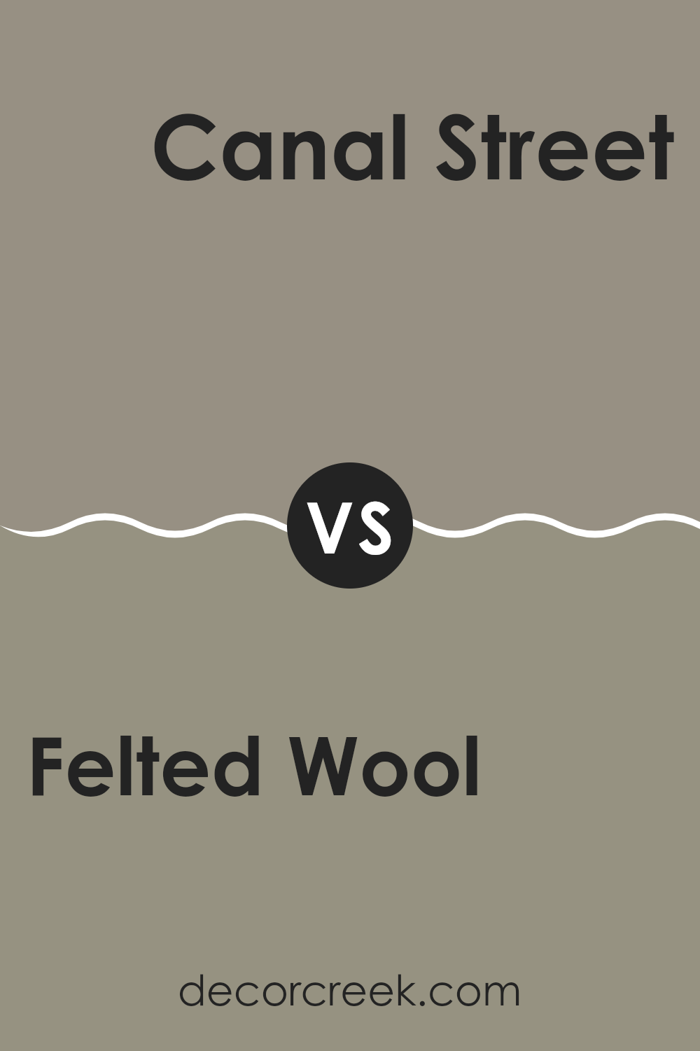
Felted Wool SW 9171 by Sherwin Williams vs Canal Street SW 9523 by Sherwin Williams
Felted Wool and Canal Street are two distinct paint colors from Sherwin Williams. Felted Wool is a deep, warm gray with a subtle earthy tone. It creates a cozy and inviting atmosphere, ideal for spaces where you want a soft, neutral background. It pairs well with a variety of decor styles, from rustic to modern.
On the other hand, Canal Street is a vibrant, deep green with a hint of blue. This color adds a touch of energy and freshness to any room, making it a great choice for areas where you want to bring in some life and color without overwhelming the space. Canal Street works well in kitchens, bathrooms, or as an accent wall in a neutral room.
Both colors offer unique vibes – Felted Wool for subtle warmth and Canal Street for lively freshness. Choosing between them depends on what kind of atmosphere you want to create in your space.
You can see recommended paint color below:
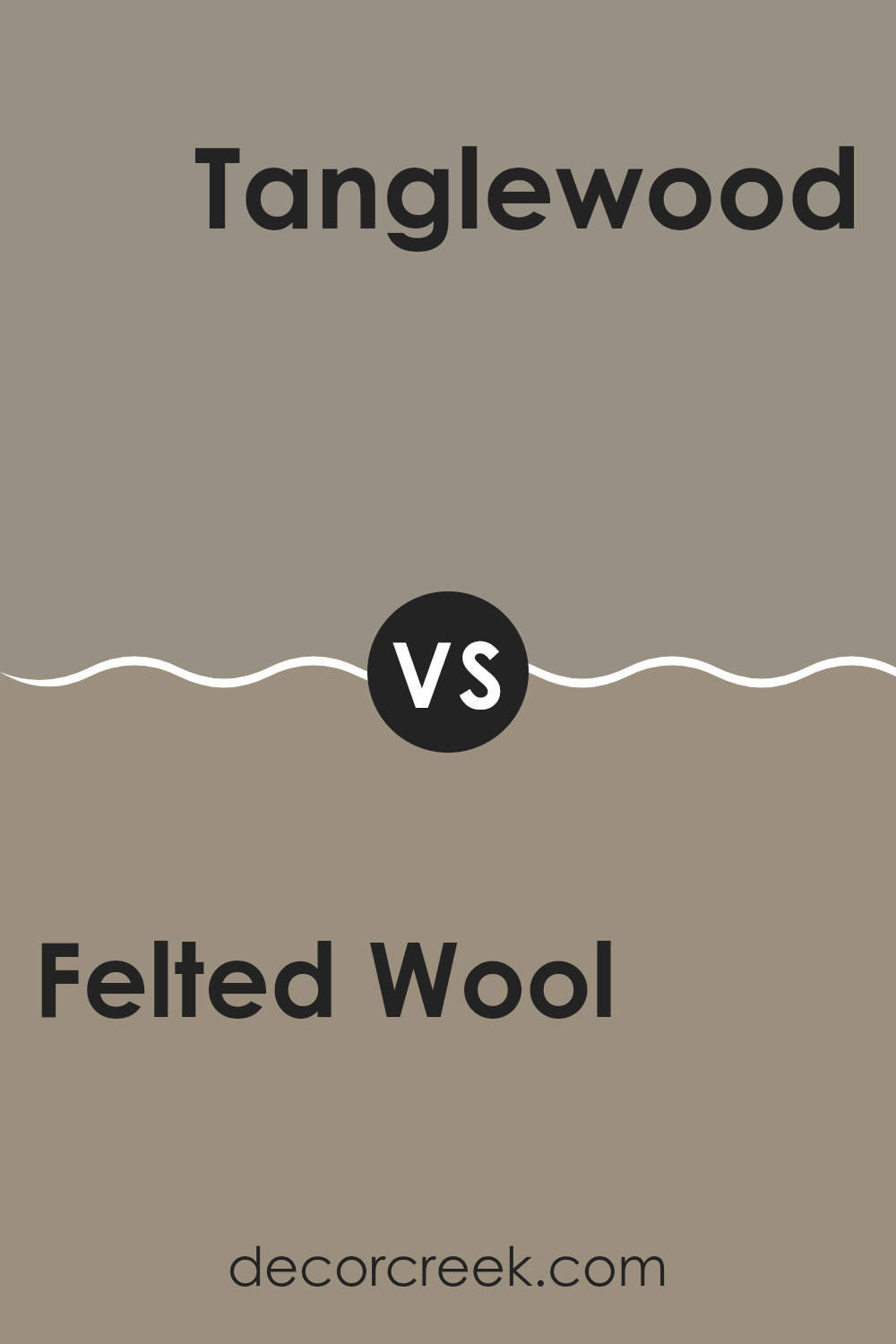
Felted Wool SW 9171 by Sherwin Williams vs Tanglewood SW 9607 by Sherwin Williams
Felted Wool and Tanglewood by Sherwin Williams are two distinct colors with unique qualities. Felted Wool is a deep, neutral gray that creates a strong, soothing background for any room. Its rich tone works well in spaces where a sense of calm or groundedness is desired. This color pairs nicely with both bright and muted shades, making it versatile for decorating.
On the other hand, Tanglewood is a lighter, warmer beige with a cozy feel. It offers a soft and welcoming atmosphere, perfect for living areas or bedrooms that seek a gentle, inviting vibe. Tanglewood tends to bring a sunny warmth to spaces, making it ideal for rooms that could use a visual lift without overwhelming brightness.
Together, these colors can complement each other beautifully in a home. Felted Wool can anchor a space with its depth, while Tanglewood can highlight areas with its lighter, soothing presence.
You can see recommended paint color below:
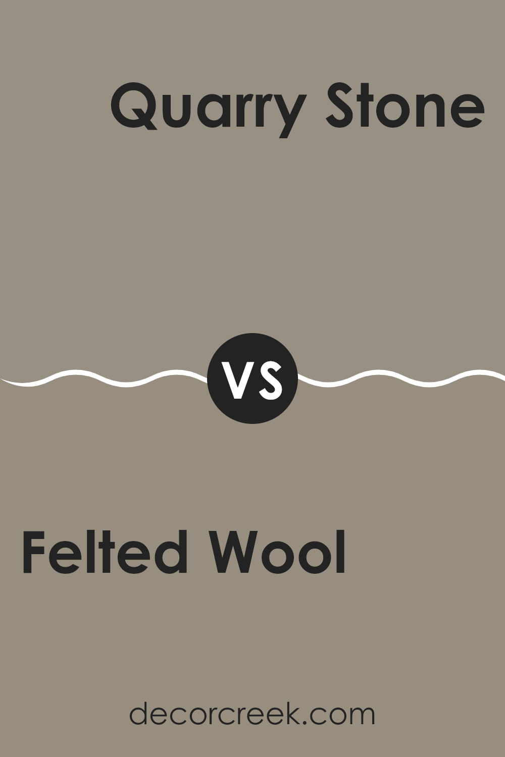
Felted Wool SW 9171 by Sherwin Williams vs Quarry Stone SW 9603 by Sherwin Williams
Felted Wool and Quarry Stone are two paint colors by Sherwin Williams that offer distinct tones suited for various spaces. Felted Wool is a soft, light gray shade that brings a calm and gentle aesthetic to rooms. It serves well as a backdrop in areas where a neutral, quiet presence is desired. It’s subtle enough to work in any space without overwhelming it and pairs nicely with brighter colors or furnishings.
On the other hand, Quarry Stone is a darker, more robust gray that resembles the color of natural stone. This shade offers a stronger visual impact and can be used to make a statement in a room. It’s particularly effective for accent walls or in areas where a more profound, grounding effect is sought.
Both colors share a gray base, but their differing intensities mean they serve unique purposes in interior decorating. Felted Wool is preferable for a lighter, airier feel, while Quarry Stone is ideal for adding depth and drama.
You can see recommended paint color below:
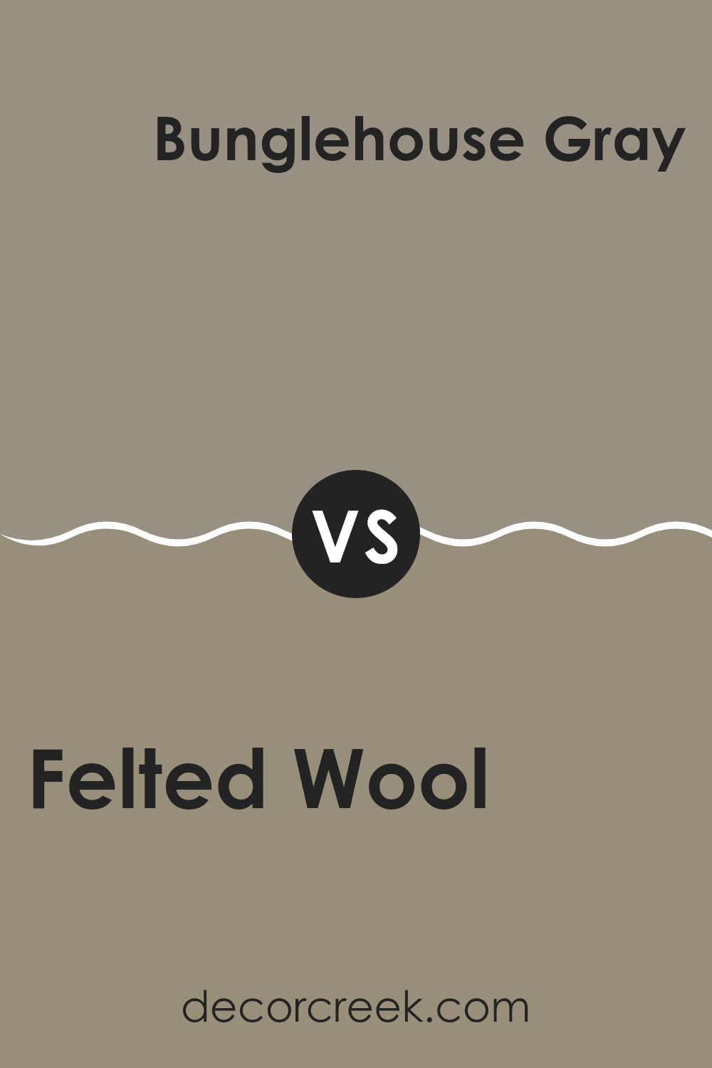
Felted Wool SW 9171 by Sherwin Williams vs Bunglehouse Gray SW 2845 by Sherwin Williams
The main color, Felted Wool, and the second color, Bunglehouse Gray, are both shades offered by Sherwin Williams. Felted Wool is a warm, cozy gray that brings a soft and inviting atmosphere to any room. It pairs well with wooden finishes and natural textiles, adding a gentle, homey touch to the space.
On the other hand, Bunglehouse Gray is a deeper, more intense shade. It leans slightly towards blue, giving it a stronger presence compared to Felted Wool. This color works well in spaces that aim for a more pronounced, yet still welcoming, look. It can beautifully accent modern decor and larger spaces, helping to define areas with its bolder tone.
Both colors offer unique vibes but serve different purposes in interior design. Felted Wool fits smoothly in relaxed, subtle designs, whereas Bunglehouse Gray stands out more, suitable for making a more noticeable impact.
You can see recommended paint color below:
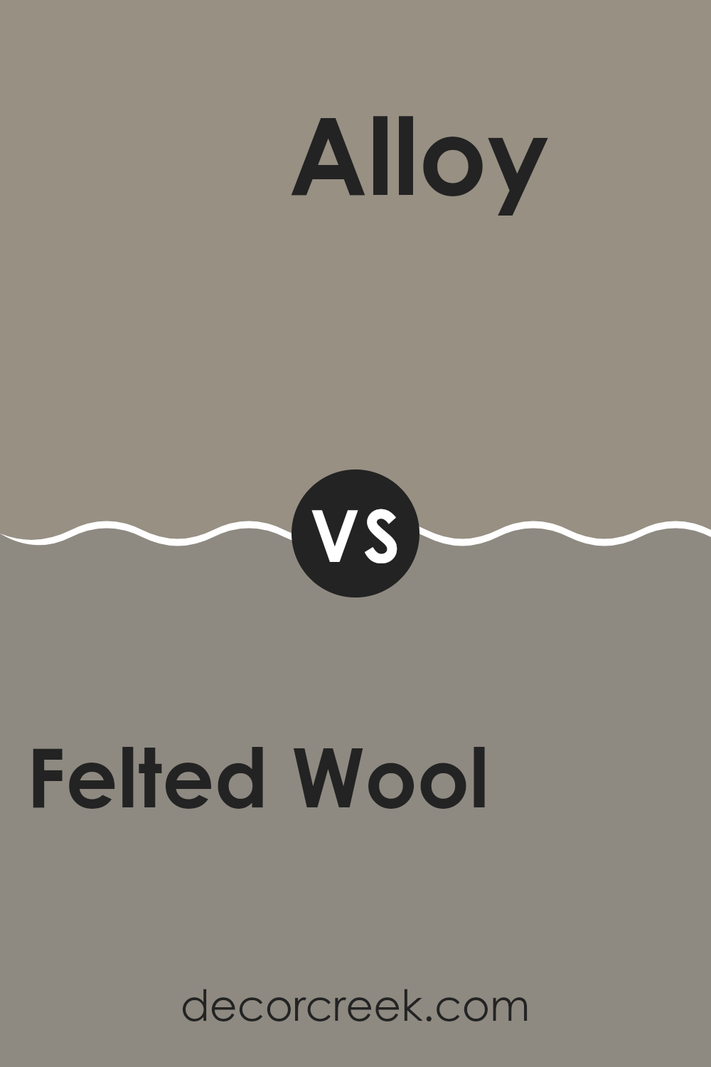
Felted Wool SW 9171 by Sherwin Williams vs Alloy SW 9569 by Sherwin Williams
Felted Wool and Alloy are two distinct colors by Sherwin Williams, each offering its unique charm. Felted Wool is a soft, muted gray with hints of brown, giving it a warm and cozy feel. It mirrors the natural color of undyed wool, making it perfect for creating a comfortable and inviting atmosphere in any space.
On the other hand, Alloy is a darker, deeper gray with a stronger presence. It’s a cooler tone, compared to the warmth of Felted Wool, and carries a modern vibe. Alloy works well in areas where a bold, striking look is desired, providing a sharp contrast to lighter colors.
While Felted Wool is more subtle and blends easily with a range of color schemes and decor styles, Alloy stands out more and can be a central color in a design palette. Depending on the mood and style you want to achieve, either color could be an excellent choice.
You can see recommended paint color below:
- SW 9569 Alloy
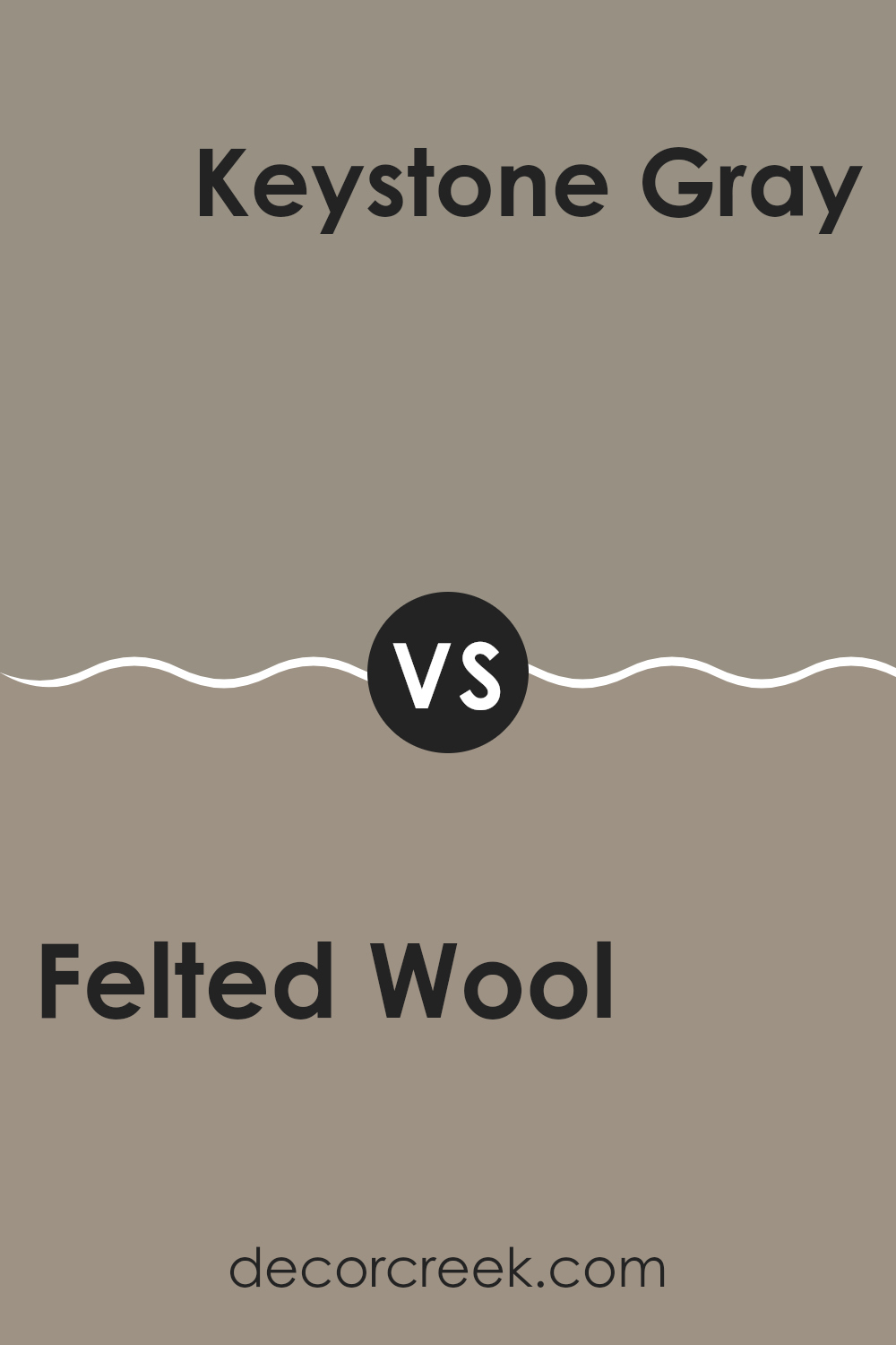
Felted Wool SW 9171 by Sherwin Williams vs Keystone Gray SW 7504 by Sherwin Williams
Felted Wool and Keystone Gray are two unique shades from Sherwin Williams that offer differing tones for interior spaces. Felted Wool presents as a soft, muted gray with subtle brown undertones, giving it a warm and cozy feel which makes a room feel inviting and snug. In contrast, Keystone Gray is a deeper, more pronounced gray that leans towards taupe. This color provides a stronger presence, adding a sense of richness and depth to spaces.
When deciding between the two, consider the mood and size of the room. Felted Wool works well in smaller areas or places where a gentle, soothing touch is desirable, such as bedrooms or living rooms. Keystone Gray, with its bolder character, is ideal for larger spaces or as an accent wall where you want to make a statement without overwhelming the senses.
In summary, Felted Wool offers warmth and coziness, transforming any space into a welcoming haven, while Keystone Gray adds a dash of elegance and grounding, perfect for creating a striking feature in a home.
You can see recommended paint color below:
Felted Wool SW 9171 by Sherwin Williams vs Elephant Ear SW 9168 by Sherwin Williams
The main color, Felted Wool, is a warm, gentle gray with slight olive undertones that creates a cozy and welcoming feel in a space. Its subtly rich tone makes it a great choice for living rooms or bedrooms where a relaxing atmosphere is desired.
Elephant Ear, on the other hand, is a darker shade of gray. It leans more towards a greenish-brown, offering a stronger and somewhat earthier vibe compared to Felted Wool. This color suits areas of a home where a more grounded, natural feel is preferred, such as studies or home offices.
Both colors are neutral enough to accompany a wide range of decor styles and pair well with many accent colors. However, Felted Wool’s lighter, softer tone is typically easier to match with brighter colors for a light and airy feel. In contrast, Elephant Ear’s depth enriches spaces when combined with similarly rich or muted colors, setting a more defined and cozy mood.
You can see recommended paint color below:
Felted Wool SW 9171 by Sherwin Williams vs Zeus SW 7744 by Sherwin Williams
Felted Wool SW 9171 and Zeus SW 7744, both from Sherwin Williams, present distinctly different tones that can affect the ambiance of a room. Felted Wool is a soft, muted gray with a warm undertone, making it gentle and soothing to look at. This color is versatile and works well in various settings, providing a calm and welcoming feel, especially in living spaces or bedrooms.
On the other hand, Zeus SW 7744 is a bold, dark gray that commands more attention compared to Felted Wool. This deeper gray has the power to make a striking statement in a room. It’s ideal for creating dramatic accents or for use in areas where you want to establish a strong, noticeable presence, like on a feature wall or in formal areas.
When deciding between these two, consider the mood you want to create. Felted Wool is better for a softer, cozier atmosphere, while Zeus suits more assertive, striking spaces.
You can see recommended paint color below:
- SW 7744 Zeus
Felted Wool SW 9171 by Sherwin Williams vs Studio Clay SW 9172 by Sherwin Williams
Felted Wool and Studio Clay, both from Sherwin Williams, are quite similar yet have subtle differences. Felted Wool is a soft, cozy gray that gives a sense of calm and warmth to any space. It’s like the color of a light gray sweater, versatile and easy to integrate into most decor styles.
On the other hand, Studio Clay is slightly darker and leans towards a taupe-gray. This color has a bit more depth, resembling clay pottery, thus providing a grounded, earthy feel to rooms.
Both colors are neutral and work well in various settings, from living rooms to bedrooms, but Studio Clay might be better for spaces where you want a slightly more defined and warm presence. When deciding between the two, consider the amount of natural light your room gets and the mood you want to set.
You can see recommended paint color below:
Felted Wool SW 9171 by Sherwin Williams vs Featherstone SW 9518 by Sherwin Williams
Felted Wool and Featherstone, both by Sherwin Williams, are distinct in their tones and the ambiance they set. Felted Wool is a deep, rich gray that has a warm undertone, making it cozy and inviting. It works well in spaces where you want to create a feeling of comfort and shelter, such as living rooms or bedrooms.
On the other hand, Featherstone is much lighter, almost off-white with a subtle gray tint. This color can brighten up a space and works well in areas that need a feeling of openness and light, like kitchens and bathrooms.
While both colors offer a neutral palette, Felted Wool tends to create a more grounded, secure atmosphere, whereas Featherstone gives off a fresh and airy vibe. These color choices can define the mood of a room, with Felted Wool anchoring the space and Featherstone expanding it.
You can see recommended paint color below:
In conclusion, SW 9171 Felted Wool by Sherwin Williams is a paint color that many people seem to really like. It has a warm, cozy feel, like a soft blanket, which makes rooms feel comfortable and welcoming. This color suits many places in a house like living rooms, bedrooms, or even kitchens. It’s great because it’s not too bold but still adds a nice touch of color to the walls.
What’s cool about Felted Wool is how it works with different styles and furniture. Whether the room has modern furniture or more classic pieces, this color seems to go nicely with everything. Plus, it changes a bit depending on the light, looking lighter in bright light and darker when it’s dim. That makes it pretty interesting!
After trying it out in various rooms and seeing how it blends with different settings, I’m really happy with this choice. It creates a warm and welcoming atmosphere without being too flashy, and many friends and family have complimented it too. If you’re thinking about a new color for your room, Felted Wool is definitely worth considering!
Ever wished paint sampling was as easy as sticking a sticker? Guess what? Now it is! Discover Samplize's unique Peel & Stick samples.
Get paint samples

