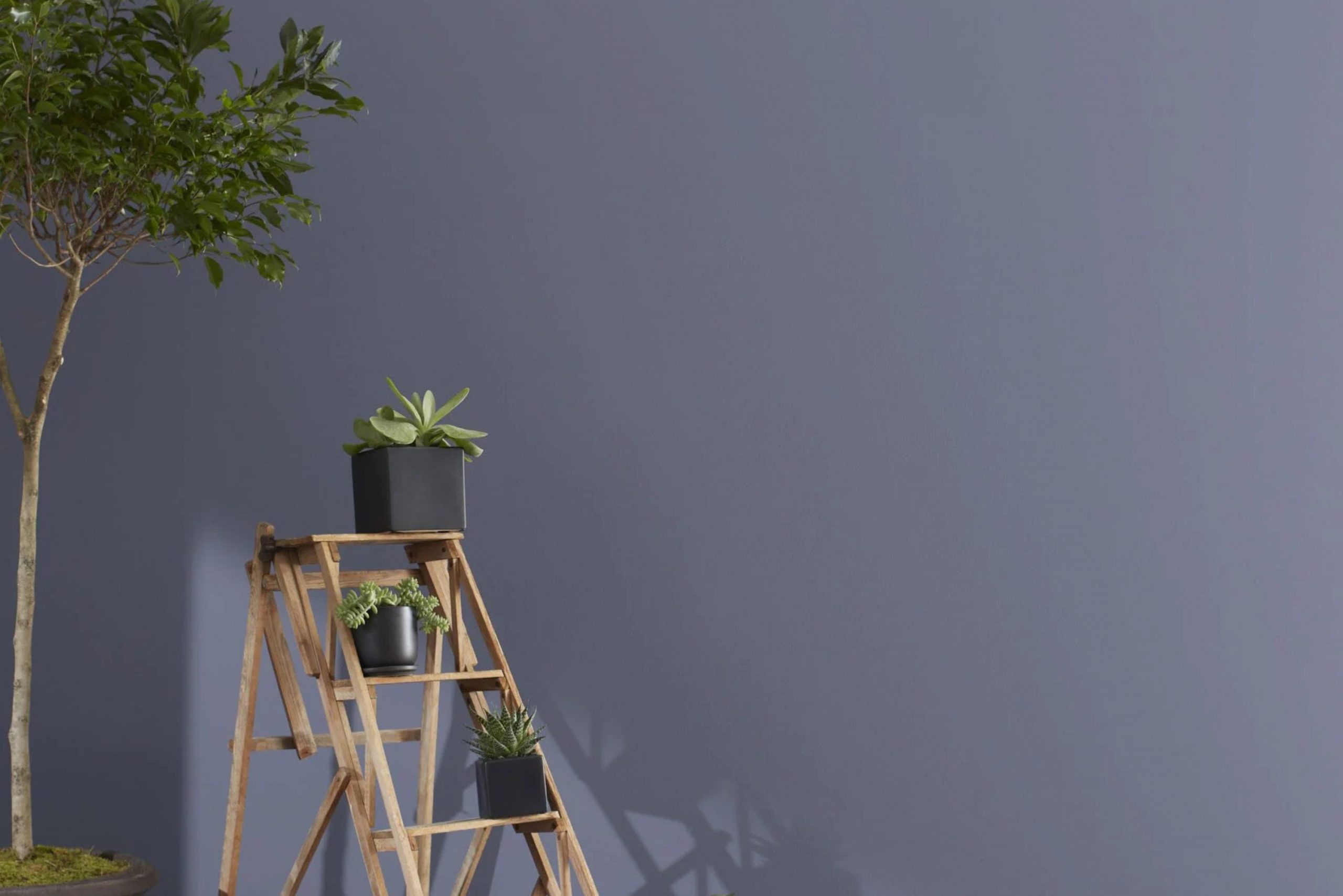
I recently chose the color 1441 Amethyst Shadow by Benjamin Moore for a small renovation project at my home. At first glance, this shade might just seem like another subtle purple, but upon using it, I found that it has a unique charm.
It’s soft yet rich, offering just the right amount of depth to make any room feel cozy and inviting without being overpowering. I opted for this color because I wanted something that could add a calm and refined touch to my room.
Amethyst Shadow turned out to be the perfect match as it pairs beautifully with a wide range of decor styles and colors, from stark modern whites to warm earthy tones. It’s been interesting to see how this color changes tone depending on the light, adding a dynamic element to the ambiance of the room.
Whether you’re looking to freshen up a bedroom or add a splash of color to your living area, Amethyst Shadow offers a flexible palette that encourages creativity in home styling.
What Color Is Amethyst Shadow 1441 by Benjamin Moore?
Amethyst Shadow (1441) by Benjamin Moore is a deep and rich purple with hints of gray, making it a remarkably flexible paint color. This shade can add a touch of elegance and depth to any room in your home. Its subtly muted undertone prevents it from being too loud, thus fitting perfectly with a variety of decorating themes.
Amethyst Shadow works exceptionally well in modern and contemporary interiors but it’s also a lovely choice for adding a modern twist to traditional settings. This color pairs beautifully with neutrals like soft whites or gray tones, which help to balance its intensity. Additionally, it looks stunning when combined with metallic finishes like brushed silver or gold accents, enhancing its luxurious feel.
In terms of materials, Amethyst Shadow goes well with natural wood, which can soften its boldness while maintaining a cozy and inviting atmosphere. It’s also a great companion for textures such as velvet or silk, which reflect light and add a layer of richness to the ambiance.
Consider it for areas like living rooms or dining areas, where it can create a delightful backdrop for social gatherings or a stylish setting for relaxed nights in.
Is Amethyst Shadow 1441 by Benjamin Moore Warm or Cool color?
Amethyst Shadow 1441 is a paint color from Benjamin Moore that features a unique blend of gray and purple tones. This color is flexible and can bring a fresh and cozy feel to any room in a house. It’s great for rooms where you want a bit of color without it being too bright or overpowering.
When used in smaller rooms, such as a bathroom or an office, Amethyst Shadow can make the room feel a bit more inviting and cozy. In larger areas, such as living rooms, it pairs well with light-colored furniture and decor to create a balanced look.
The subtle purple tones in Amethyst Shadow can also add a touch of warmth to rooms that get less natural light, making them feel more comfortable and welcoming. This color works well in various settings, adapting to different lighting conditions and complementing a wide range of interior styles.
Undertones of Amethyst Shadow 1441 by Benjamin Moore
Amethyst Shadow1441 by Benjamin Moore is a flexible color with a spectrum of undertones that impact how it appears in different lights and settings. Undertones are subtle colors that lie beneath the surface of the main color and can sway its perception in various environments. For example, under direct sunlight or in a brightly lit room, lighter undertones might make Amethyst Shadow appear softer or slightly different from its appearance in dim light, where darker undertones may be more noticeable.
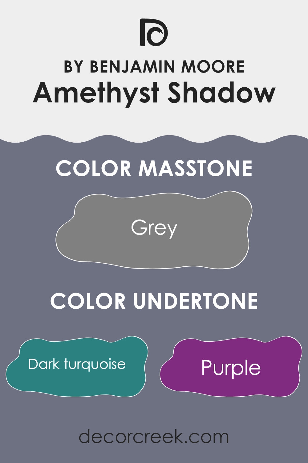
In the case of Amethyst Shadow1441, the undertones range from dark turquoise to yellow, including shades such as purple, lilac, and navy. These undertones enrich the primary color, giving it depth and complexity that can improve the aesthetic of a room.
On interior walls, the multifaceted nature of Amethyst Shadow means it can adapt to different decor styles and themes. The dark undertones like navy and brown provide a grounding effect, making the room feel cozy and well-defined. Meanwhile, lighter undertones like lilac and light blue can give a sense of airiness and light.
Choosing this paint color for interior walls could therefore affect the room’s mood and perceived room. Light-colored furniture and decor might highlight the lighter undertones of Amethyst Shadow, making the room feel more open, whereas darker furniture could bring out its deeper undertones, creating a more intimate atmosphere. This flexibility makes Amethyst Shadow a practical choice for many interior rooms, adapting subtly to both lighting and accompanying design elements.
What is the Masstone of the Amethyst Shadow 1441 by Benjamin Moore?
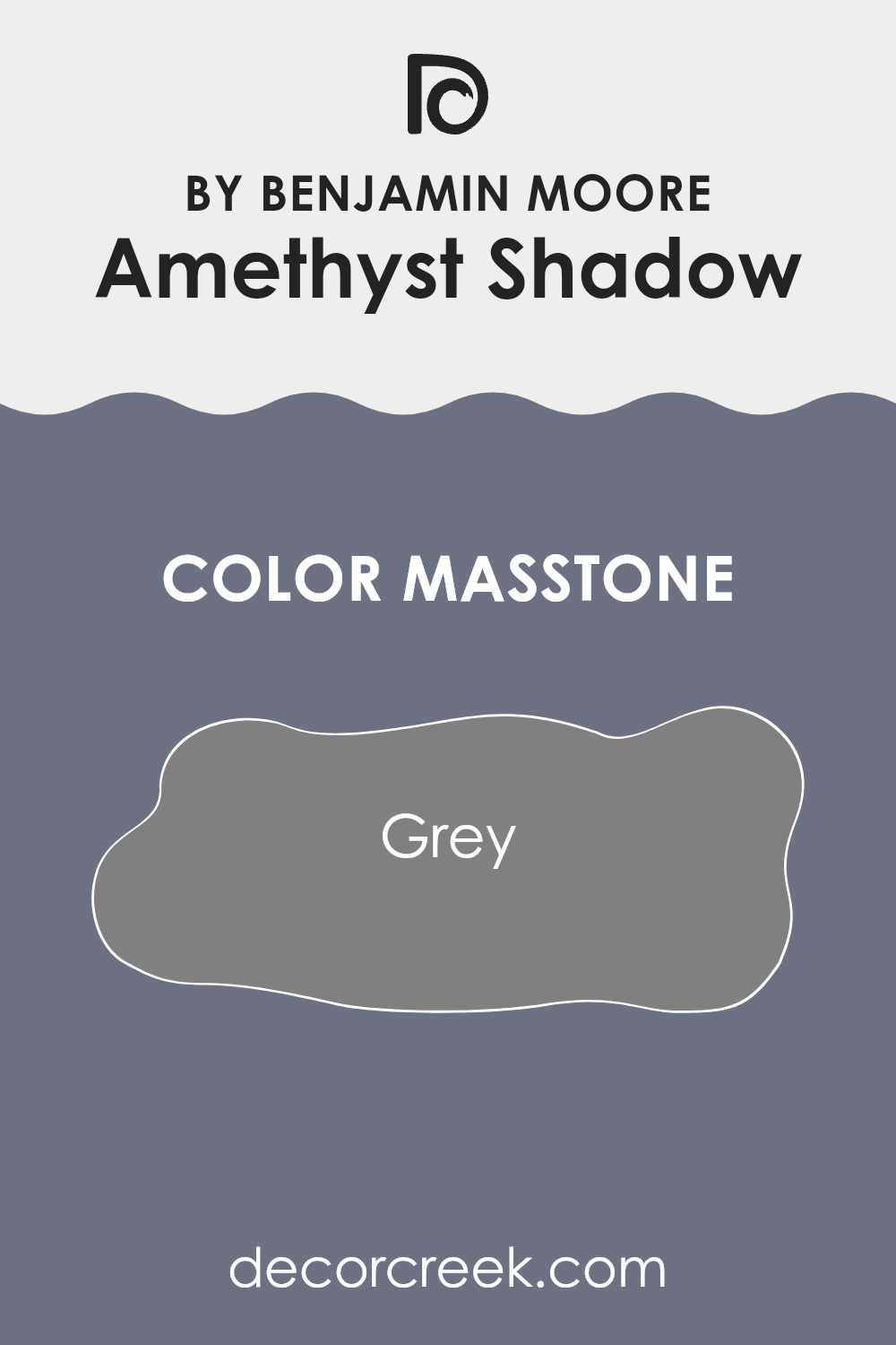
The main tone of Amethyst Shadow 1441 by Benjamin Moore is grey, a color that holds vast appeal due to its balance and neutrality. This grey, referred to by its color code #808080, serves as the backbone of the paint, creating a stable and calming atmosphere in any room. In homes, this neutral grey works wonders by blending seamlessly with other colors. It provides a solid base that allows other colors in the decor to stand out without overpowering the room.
Grey is exceptionally flexible; whether in a living room, bedroom, or kitchen, it maintains a clean and understated look. This makes it easy for homeowners to create a variety of styles and aesthetics without having to repaint or drastically change their interior.
Additionally, the neutrality of grey can make small rooms appear more spacious and well-lit, enhancing natural light. This color does not clash with bold colors but instead complements them, providing a harmonious look throughout the home.
How Does Lighting Affect Amethyst Shadow 1441 by Benjamin Moore?
Lighting significantly influences how we perceive colors. Different types of light can change the way a color looks, making it appear brighter, darker, or altering its hue. This is especially important to consider when choosing paint colors for a room.
Taking the color Amethyst Shadow by Benjamin Moore as an example, its appearance can vary dramatically depending on the lighting conditions. In natural light, this color generally appears more vivid and true to its original shade, which is a subtle and smooth purple.
Under artificial lighting, such as fluorescent or LED lights, Amethyst Shadow might look slightly different. Fluorescent lights tend to bring out cooler tones in the color, making it appear more blue, while incandescent lighting can warm it up, highlighting redder undertones.
The direction a room faces also plays a crucial role in how this color is perceived:
- North-Faced Rooms: North-facing rooms often get less direct sunlight, which can make colors appear slightly shadowier and cooler. Amethyst Shadow may seem a bit more muted and subdued in these rooms, emphasizing its gray undertones.
- South-Faced Rooms: These rooms benefit from abundant natural light most of the day, which can make Amethyst Shadow look lighter and more vibrant. The warm sunlight enhances the purple hue, making the color lively and rich.
- East-Faced Rooms: In east-facing rooms, the morning light can make Amethyst Shadow appear very soft and gentle. As the bright morning light gives way to less intense light during the day, this color might lose some of its vibrancy, but still retains a fresh look.
- West-Faced Rooms: Rooms facing west receive most of their sunlight in the late afternoon to evening which means that Amethyst Shadow will change throughout the day. It might appear shadowy and deeper during the morning while turning increasingly brighter and warmer toward the evening.
Understanding these effects can help in making informed decisions about paint colors depending on the room’s orientation and the ambiance you wish to create.
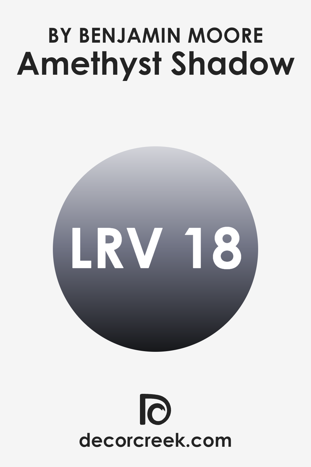
What is the LRV of Amethyst Shadow 1441 by Benjamin Moore?
LRV, or Light Reflectance Value, is a measure that indicates how much light a paint color reflects back into a room. This value, given as a percentage, helps determine how light or dark a color will appear once it’s on your walls.
A higher LRV means the color reflects more light, making a room feel brighter and more open, while a lower LRV means it absorbs more light, which can make a room feel cozier but smaller. When choosing paint, considering the LRV can help you achieve the desired effect in your room, whether you’re looking for a light and airy feel or a more enclosed, intimate atmosphere.
With an LRV of 18.29, Amethyst Shadow by Benjamin Moore falls on the darker end of the spectrum. This means it absorbs a good amount of light, and as a result, it will look rich and deep when applied to walls.
In rooms with less natural light or smaller rooms, this color might make the area feel more enclosed. However, in a well-lit or larger room, using this color can add a level of depth and warmth, making the room feel cozy and inviting without feeling too cramped. When using a darker LRV color like this one, it’s often a good idea to balance it with lighter colors in the decor to prevent the room from feeling too dark.
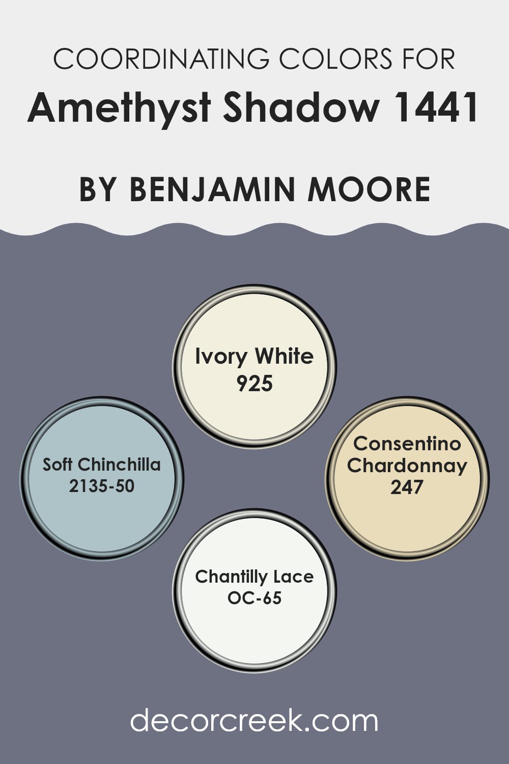
Coordinating Colors of Amethyst Shadow 1441 by Benjamin Moore
Coordinating colors are selected hues that complement or enhance each other when used together in a design scheme. These colors can provide balance, contrast, or harmonic visuals, depending on their placement and intensity. For instance, the chosen coordinating colors for Amethyst Shadow by Benjamin Moore include a range of subtle and harmonizing shades that can create a pleasing aesthetic when combined effectively.
The color Ivory White has a warm, creamy tone that softens the deep richness of Amethyst Shadow, adding a gentle contrast that is aesthetically calming. Soft Chinchilla is a mid-tone gray with blue undertones that offer a muted yet impactful presence; it works well to balance the intensity of deeper hues.
On the other hand, Consentino Chardonnay introduces a softer, light yellow that brings a light, airy feel to the combination, adding a touch of brightness without overpowering. Lastly, Chantilly Lace is a pure, crisp white that acts as a clean slate, providing clarity and freshness that can make other colors stand out beautifully. These coordinating colors retain a sense of harmony and appeal when used together, making any room feel welcoming and thoughtfully composed.
You can see recommended paint colors below:
- 925 Ivory White
- 2135-50 Soft Chinchilla
- 247 Consentino Chardonnay
- OC-65 Chantilly Lace
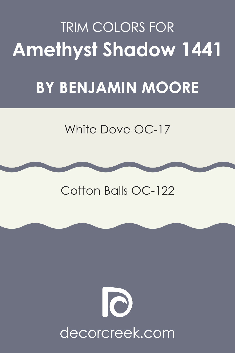
What are the Trim colors of Amethyst Shadow 1441 by Benjamin Moore?
Trim colors, such as the ones recommended by Benjamin Moore for Amethyst Shadow, play a crucial role in defining and enhancing the aesthetic of any room. Choosing the right trim color can effectively frame and accentuate the wall color, creating a subtle but significant contrast that highlights architectural details and brings a cohesive look to the room.
For instance, when paired with a distinctive color like Amethyst Shadow, a carefully selected trim color can enhance the depth and character of the walls while maintaining a clean and finished appearance.
Benjamin Moore’s White Dove OC-17 is a soft white with a hint of warmth that makes it flexible and easy to pair with deeper hues like Amethyst Shadow. It gently complements the bolder wall color without competing for attention, providing a smooth and harmonious boundary that is pleasing to the eye. Meanwhile, Cotton Balls OC-122 is a pure, bright white that offers a crisper contrast, giving any room a fresh and lively look. This shade is particularly effective in bringing out vibrant colors, ensuring that the walls stand out and the overall color scheme feels intentional and polished.
You can see recommended paint colors below:
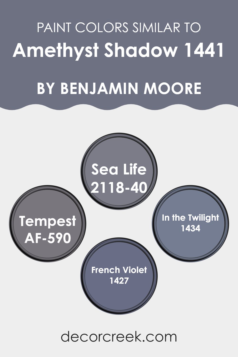
Colors Similar to Amethyst Shadow 1441 by Benjamin Moore
When decorating a room, choosing a palette of similar colors can create a harmonious and visually appealing atmosphere. Colors like Amethyst Shadow by Benjamin Moore have subtle yet deep effects when combined with colors in the same range.
Similar colors, such as Sea Life, Tempest, In the Twilight, and French Violet, enhance each other, providing depth and continuity to a room’s design. They work together by maintaining a consistent tone and mood, which allows for a smooth visual transition from one area to another, fostering a cohesive look without harsh contrasts.
For example, Sea Life is a gentle gray with hints of blue, bringing the calmness of the ocean. It offers a soft backdrop that complements the deeper shades in a room. Tempest is a more intense color, a moody blue-gray that adds a touch of drama. It serves as an excellent accent or focal point color when paired with lighter, similar hues. In the Twilight offers a slightly dusky lavender that works beautifully to bring a touch of warmth and color without overpowering the senses. Lastly, French Violet is a deeper, muted purple, perfect for adding depth and interest in a room decorated with lighter lavender shades like Amethyst Shadow.
You can see recommended paint colors below:
- 2118-40 Sea Life
- AF-590 Tempest
- 1434 In the Twilight
- 1427 French Violet
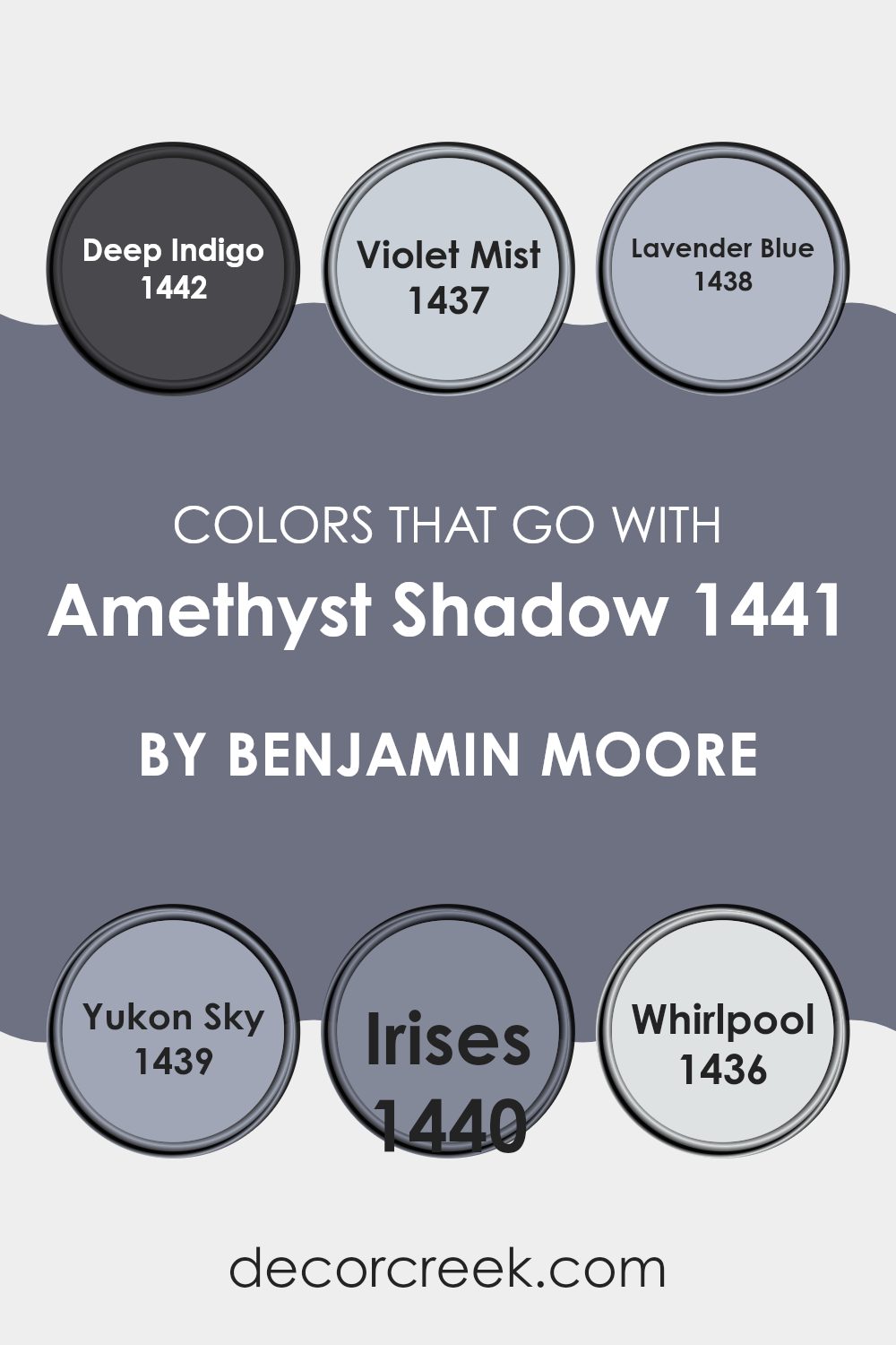
Colors that Go With Amethyst Shadow 1441 by Benjamin Moore
When considering painting a room in your home or office, choosing the right colors to complement a base shade like Amethyst Shadow 1441 by Benjamin Moore is crucial. The complementary colors not only enhance the ambiance of the room but also bring balance and harmony to the décor. Colors like Deep Indigo, Violet Mist, Lavender Blue, Yukon Sky, Irises, and Whirlpool have specific characteristics that make them ideal partners for Amethyst Shadow.
Deep Indigo is a rich, bold blue that adds depth and a sense of stability to the room when paired with Amethyst Shadow. It is perfect for creating a focal point or an accent wall. Violet Mist is a lighter, subtler shade that provides a gentle contrast, ideal for softening the overall look of a room while still giving it a colorful touch.
Lavender Blue, with its calm and welcoming hue, works well in rooms meant for relaxation and thought. It pairs nicely with Amethyst Shadow by offering a soothing touch. Yukon Sky is a neutral pale gray that acts as a balancing element, ensuring that the room does not become too overpowering by color. Its flexibility makes it a great choice for any room. Irises is slightly more vibrant, adding a playful yet refined look that stimulates visual interest and creativity.
Finally, Whirlpool, a cool and refreshing blue, invigorates the design scheme without overpowering the main hue of Amethyst Shadow, making it perfect for bathrooms or offices where focus and freshness are desired. Selecting the right combinations of these colors can greatly improve the aesthetic and mood of a room, creating an environment that is both inviting and stylish.
You can see recommended paint colors below:
- 1442 Deep Indigo
- 1437 Violet Mist
- 1438 Lavender Blue
- 1439 Yukon Sky
- 1440 Irises
- 1436 Whirlpool
How to Use Amethyst Shadow 1441 by Benjamin Moore In Your Home?
Amethyst Shadow 1441 by Benjamin Moore is a rich, deep purple paint color that can add a touch of drama and warmth to any room in your home. A great choice for those who want to include a bit of color without going too bold, it works especially well in bedrooms and living areas. It complements soft lighting and adds depth to the room, making it perfect for creating a cozy, welcoming atmosphere.
When using Amethyst Shadow 1441, consider applying it on one accent wall to serve as a focal point. This technique helps to introduce a splash of color without overpowering the room. Pair it with neutral furniture and decor to balance the darkness of the purple with lighter tones, enhancing the overall aesthetic of the room.
Additionally, Amethyst Shadow beautifully complements metal accents and natural woods, making it flexible for various decorative styles. Whether updating a single room or repainting multiple areas, this shade can make your home feel fresh and stylish.
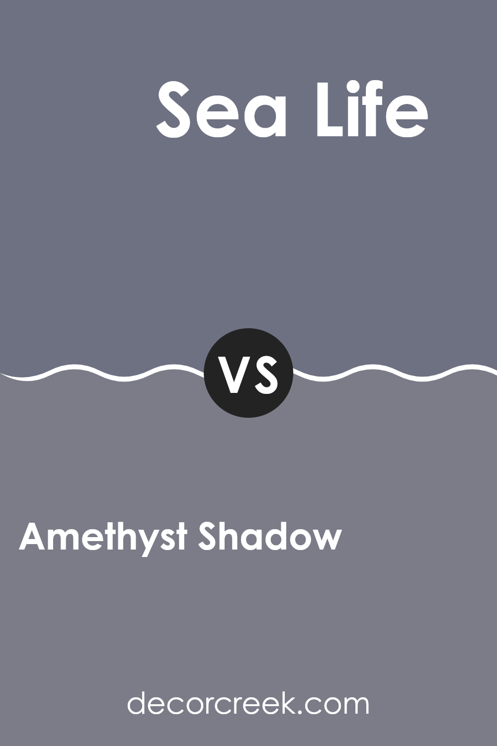
Amethyst Shadow 1441 by Benjamin Moore vs Sea Life 2118-40 by Benjamin Moore
The two colors, Amethyst Shadow and Sea Life by Benjamin Moore, offer distinct tones that add their unique flair to any room. Amethyst Shadow is a deep, muted purple that brings a cozy and subtle warmth, perfect for creating a quiet and welcoming atmosphere in rooms.
On the other hand, Sea Life is a vibrant teal with a lively vibe, reminiscent of ocean waters. This color can instantly brighten up a room and give it a fresh, energetic feel.
While Amethyst Shadow is more subdued and classic, making it suitable for places where you want to relax like bedrooms or living rooms, Sea Life stands out and would be great for areas that benefit from a refreshing splash of color, such as kitchens or bathrooms. Combining them could provide a unique contrast that balances warmth and brightness effectively.
You can see recommended paint color below:
- 2118-40 Sea Life
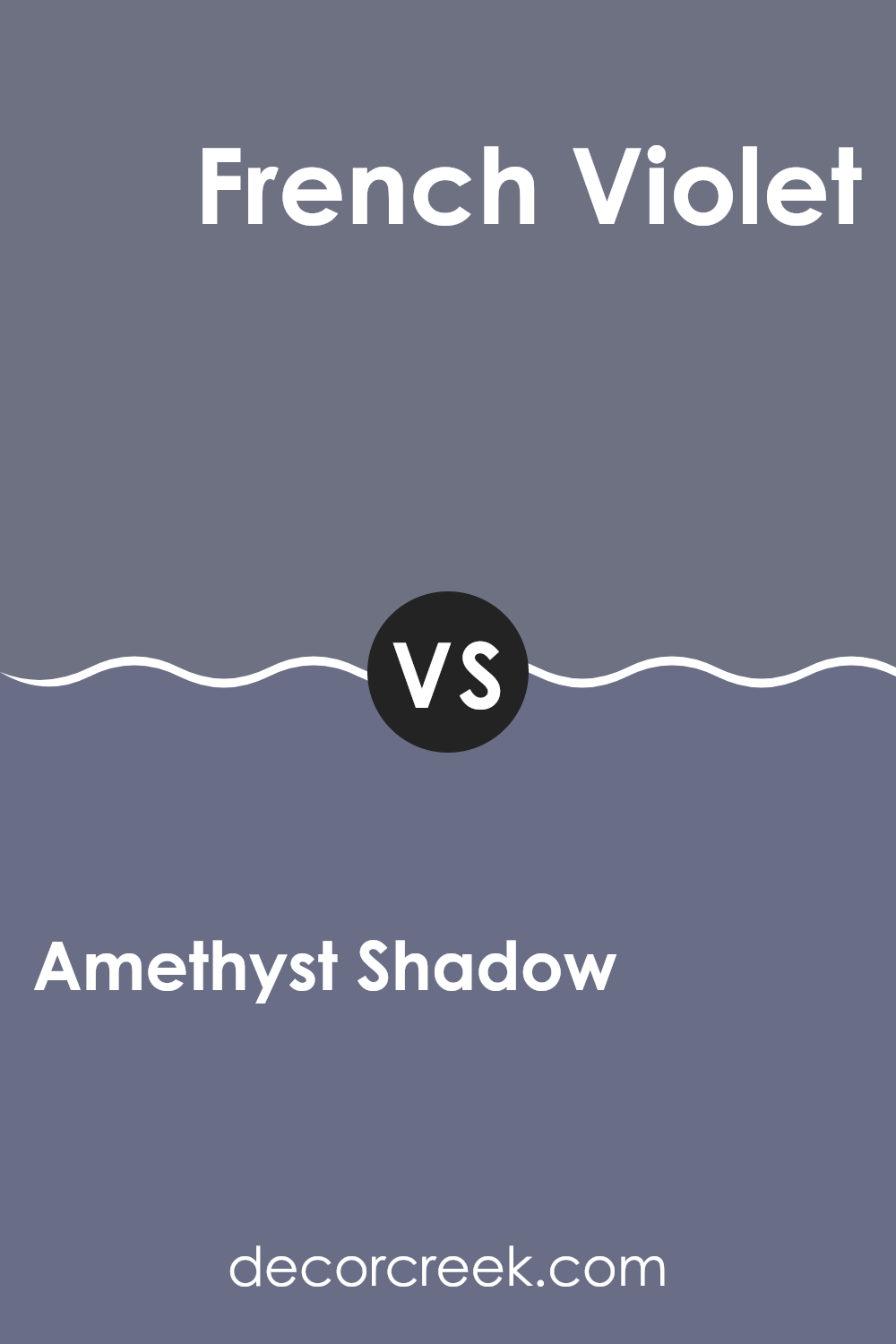
Amethyst Shadow 1441 by Benjamin Moore vs French Violet 1427 by Benjamin Moore
Amethyst Shadow and French Violet, both by Benjamin Moore, present subtle yet distinct differences in their shades. Amethyst Shadow is a deeper, grayish purple that gives off a calm, cozy vibe, perfect for creating a relaxed atmosphere in rooms like bedrooms or living rooms. This hue leans more toward a muted tone, which makes it flexible for pairing with various decors.
On the other hand, French Violet shows a slightly brighter, more vivid purple. It brings a fresher look, which can add a lively pop of color to an area without being overpowering. Its brightness is controlled, maintaining an elegant feel yet providing more vibrancy compared to Amethyst Shadow.
Choosing between these colors depends on your desired mood and room function. Amethyst Shadow works well for a subdued, cozy setting, while French Violet is ideal for rooms that benefit from a cheerful, yet not too bold, splash of color. Both colors offer unique possibilities for improving home environments with their distinct purple hues.
You can see recommended paint color below:
- 1427 French Violet
Amethyst Shadow 1441 by Benjamin Moore vs In the Twilight 1434 by Benjamin Moore
Amethyst Shadow, an elegant, richly purple hue, offers a deep and inviting tone that brings warmth to any room. On the other hand, In the Twilight, while still maintaining a base in the purple family, leans closer to a gentle gray, presenting a lighter and more subtle appearance.
Amethyst Shadow stands out more and is perfect for making a statement in a room, ideal for accent walls or furniture pieces. In contrast, In the Twilight works well as a calming background color, great for creating a calm and comfortable atmosphere.
It’s flexible for larger areas, blending seamlessly with most decor. Both colors share a purple foundation but vary significantly in their impact and use, with Amethyst Shadow as the bolder choice and In the Twilight serving as a more understated option.
You can see recommended paint color below:
- 1434 In the Twilight
Amethyst Shadow 1441 by Benjamin Moore vs Tempest AF-590 by Benjamin Moore
Amethyst Shadow and Tempest are both paint colors by Benjamin Moore, each offering a unique tone for interior rooms. Amethyst Shadow is a light, gentle purple with a subtle brightness that can make a room feel cozy and inviting. This shade is great for rooms where you want a touch of color without overpowering the area. It pairs well with soft whites and greys.
On the other hand, Tempest is a deeper, richer gray that leans towards a slate color. It offers a more striking presence, providing a strong backdrop that can complement bold accents like vivid blues or metallic finishes. Tempest is ideal for a modern look, adding depth and interest to a room.
Both colors offer distinct vibes: Amethyst Shadow brings a lighter, more airy feel, while Tempest adds drama and intensity. Depending on the mood you want to create, each color has its own charm and utility.
You can see recommended paint color below:
- AF-590 Tempest
After reading up on the Benjamin Moore paint color called 1441 Amethyst Shadow, I can say I learned a lot about what makes it special. This color isn’t just a normal purple; it has a certain depth that reminds you of a shadow or a soft flower. It’s quite unique because it’s gentle and can make any room feel cozy and welcoming.
I found out that 1441 Amethyst Shadow works well in lots of different rooms, from bedrooms to living areas and even kitchens. It pairs nicely with light colors like whites and soft grays, which helps create a calm yet attractive look. This color is pretty cool because it changes a bit depending on the light. Sometimes it looks more gray, and other times, you can see more purple in it.
Using this color in your home could be a great choice if you want to add a pop of color without making things look too bright or flashy. It’s perfect for someone who likes a subtle touch of personality in their environment. Plus, since it goes well with many colors, it’s not hard to match it with your furniture and other decorations.
In short, 1441 Amethyst Shadow by Benjamin Moore is a soft, flexible paint color that could make any room feel cozy and stylish. It’s a great pick if you’re thinking of giving your room a new look without going too bold!
Ever wished paint sampling was as easy as sticking a sticker? Guess what? Now it is! Discover Samplize's unique Peel & Stick samples.
Get paint samples

