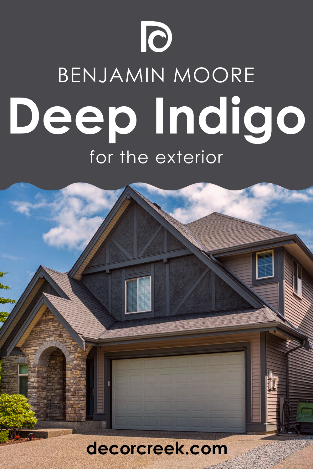
Deep Indigo 1442 by Benjamin Moore is a captivating and versatile paint color that adds a touch of elegance and depth to any interior space. Its name evokes visions of the deep blue hues found in the night sky, and this color lives up to that imagery.
In this comprehensive guide, we will explore the various aspects of Deep Indigo 1442, from its color characteristics to its compatibility with different interior styles and lighting conditions.

What Color Is Deep Indigo 1442?
Deep Indigo 1442 is a deep and alluring shade of blue that embodies sophistication and tranquility. This deep, almost velvety indigo boasts a timeless appeal, making it suitable for a range of interior styles. Its versatility shines in both traditional and contemporary settings.
Deep Indigo 1442 pairs exceptionally well with materials and textures that complement its richness, such as luxurious velvets, rich woods, and metallic accents. It can be used to create a cozy, intimate atmosphere in bedrooms, dining rooms, or as an accent wall in living spaces.
Ever wished paint sampling was as easy as sticking a sticker? Guess what? Now it is! Discover Samplize's unique Peel & Stick samples.
Get paint samples

Is It a Warm Or Cool Color?
Deep Indigo 1442 is a cool color, leaning towards the blue end of the spectrum. Its coolness lends a sense of calm and serenity to spaces where it is applied. This cool undertone makes it especially suitable for creating a soothing ambiance in homes, making it an excellent choice for bedrooms and bathrooms.
It can also be used strategically in living rooms to create a refreshing contrast against warm furnishings.
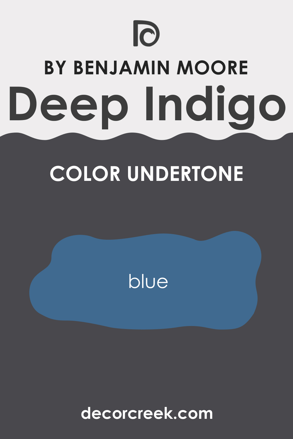
Undertones of Deep Indigo 1442
Deep Indigo 1442 has subtle blue undertones that enhance its overall cool and calming effect. Undertones are crucial as they influence how the color is perceived under different lighting conditions. In the case of Deep Indigo 1442, the blue undertones accentuate the color’s depth, making it appear even more vibrant and inviting on interior walls.
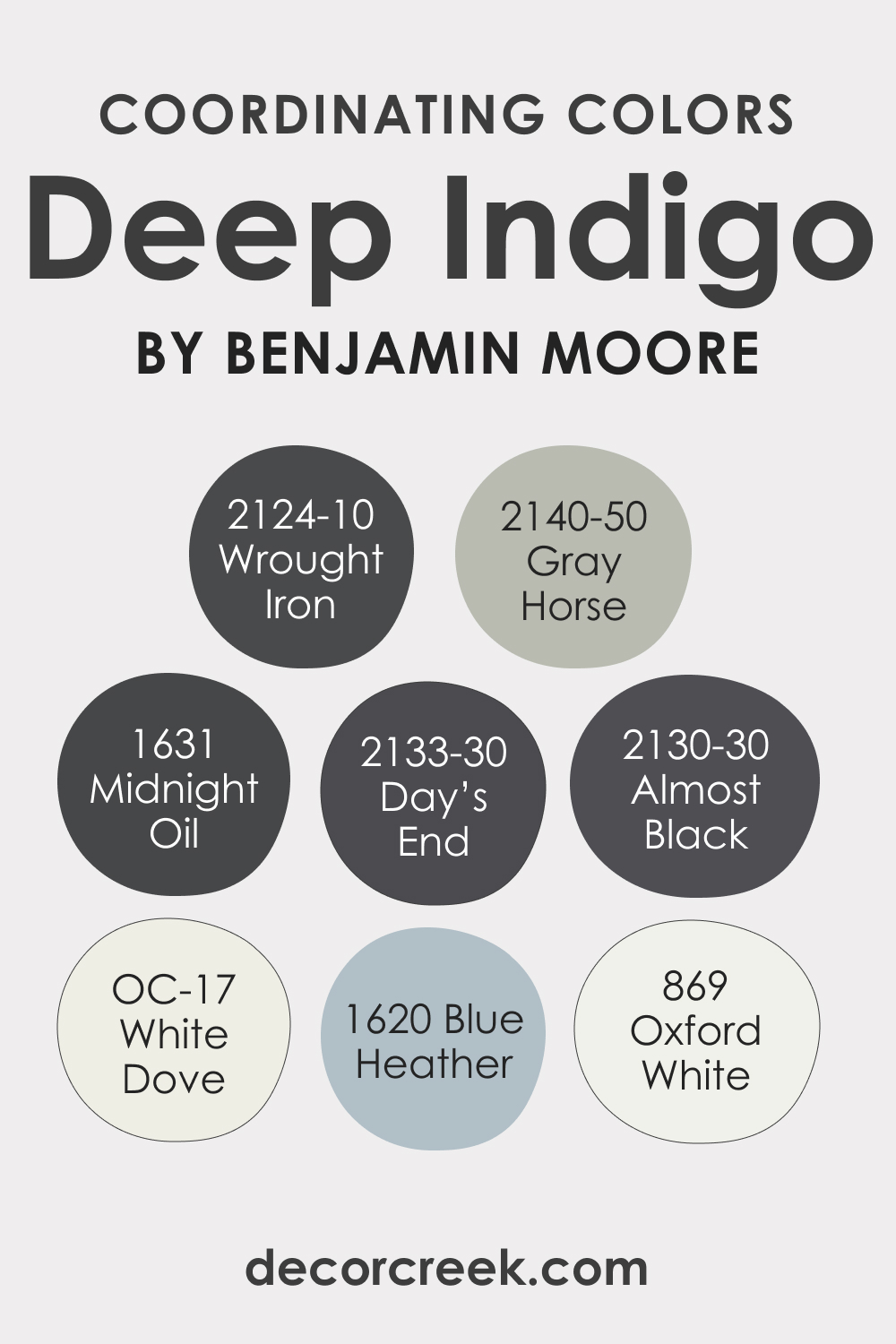
Coordinating Colors of Deep Indigo 1442
Coordinating colors are essential for achieving a harmonious interior design. With Deep Indigo 1442, Benjamin Moore offers several coordinating options. BM 869 Oxford White provides a crisp contrast, BM 1620 Blue Heather complements the color beautifully, OC-17 White Dove balances the coolness with warmth, and BM 2140-50 Gray Horse introduces a sophisticated gray.
These colors can be used for trim, accents, or in adjacent rooms to create a cohesive color palette.
Additional coordinating colors for Deep Indigo 1442:
- BM 2133-30 Day’s End : A slightly warmer, deep blue-gray.
- BM 1631 Midnight Oil : A darker, moody navy with depth and richness.
- BM 2124-10 Wrought Iron : A deep charcoal with a hint of blue undertones.
- BM 2130-30 Almost Black : A nearly black color with a touch of deep blue for dramatic contrast.
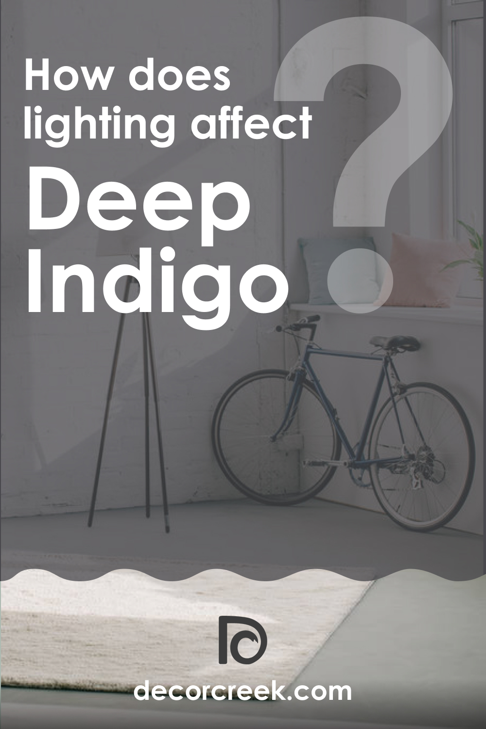
How Does Lighting Affect Deep Indigo 1442?
Lighting plays a significant role in how Deep Indigo 1442 appears in a room. In artificial light, it can appear more intense and dramatic, ideal for creating an intimate ambiance. In natural light, it showcases its rich depth, making it a striking choice for well-lit spaces.
In north-facing rooms, it may appear cooler and cozier, while south-facing rooms emphasize its depth. East-facing rooms can bring out its blue undertones, and west-facing rooms enhance its warmth.
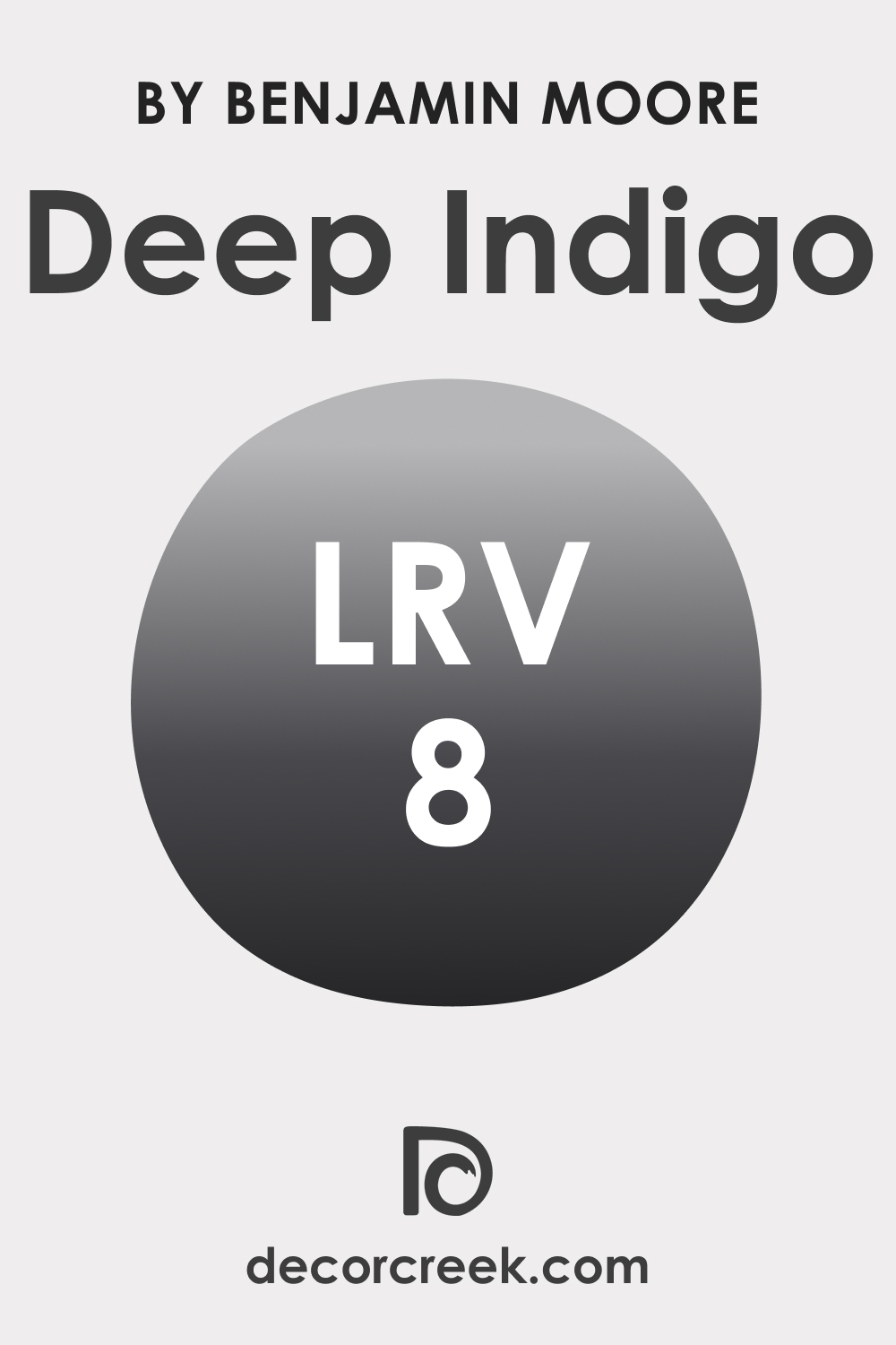
LRV of Deep Indigo 1442
Light Reflectance Value (LRV) measures how much light a color reflects. With an LRV of 8, Deep Indigo 1442 is a very dark color with low reflectance. This means it absorbs more light, creating a moody and intimate atmosphere. However, it may not be suitable for smaller, poorly lit spaces as it can make them feel even darker.
LRV – what does it mean? Read This Before Finding Your Perfect Paint Color
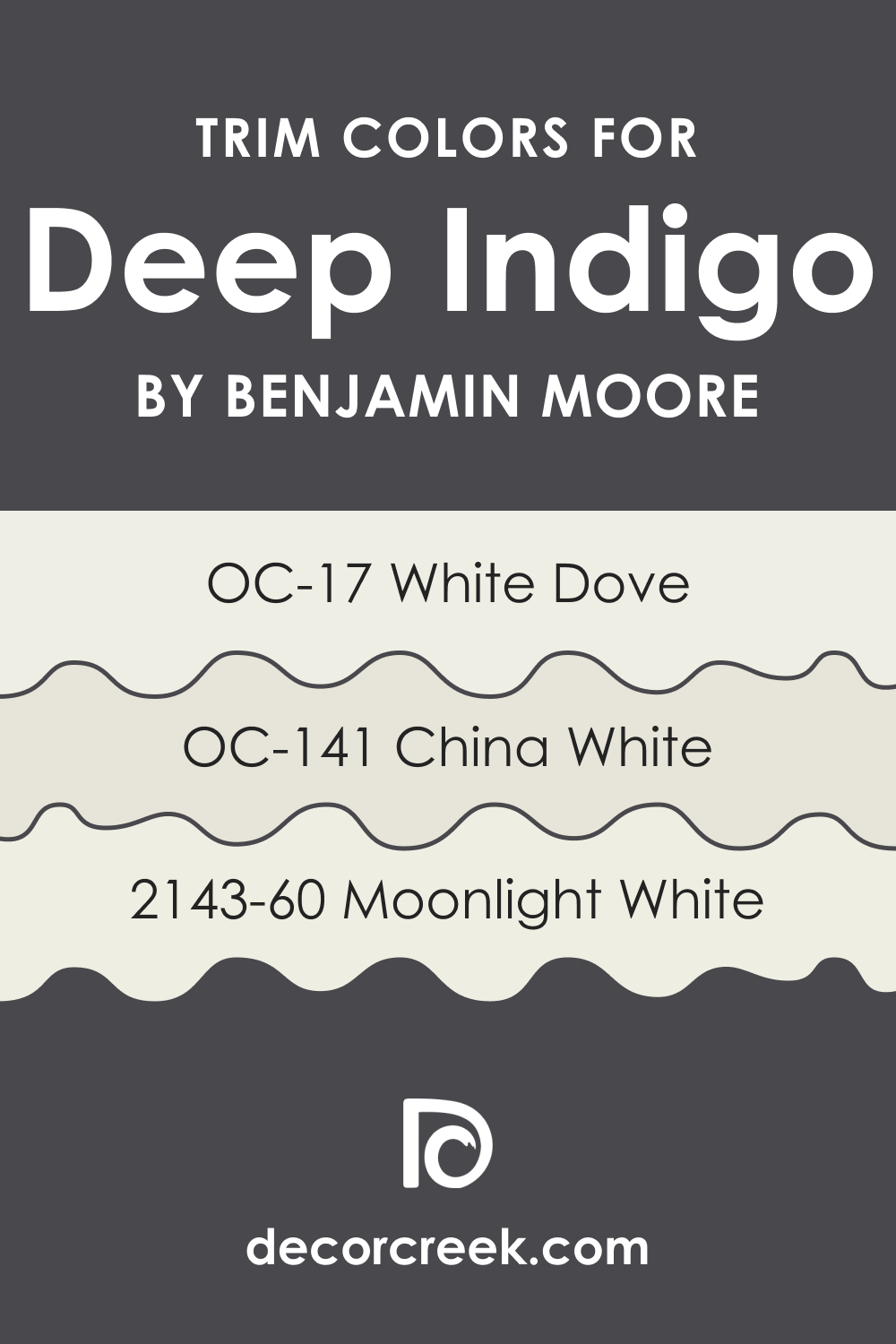
Trim Colors of Deep Indigo 1442
Trim colors are essential to provide a clean and finished look to a room. For Deep Indigo 1442, Benjamin Moore offers OC-17 White Dove , OC-141 China White , and BM 2143-60 Moonlight White as suitable trim color choices. These shades of white create a crisp contrast, highlighting the richness of Deep Indigo 1442 while maintaining a cohesive design.
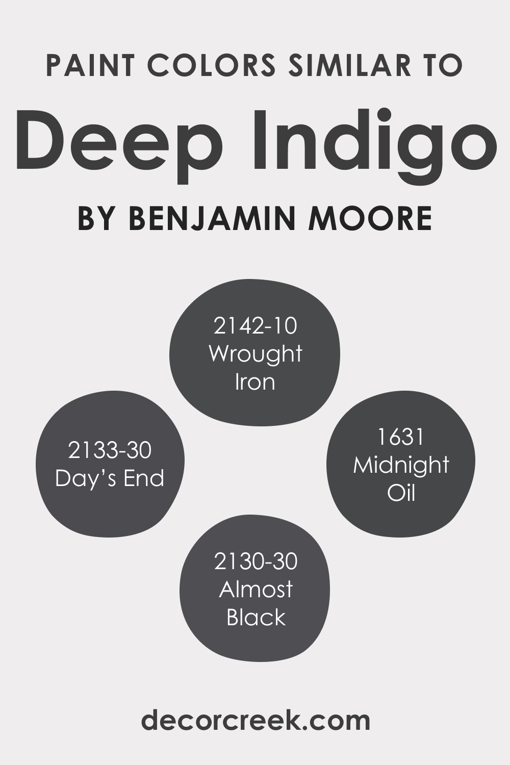
Colors Similar to Deep Indigo 1442
Knowing similar colors is important for flexibility in design. BM 2133-30 Day’s End offers a slightly warmer alternative, BM 1631 Midnight Oil deepens the intensity, BM 2142-10 Wrought Iron adds a touch of charcoal, and BM 2130-30 Almost Black provides a dramatic near-black option. Each of these colors can be used to achieve different moods and effects in a space.
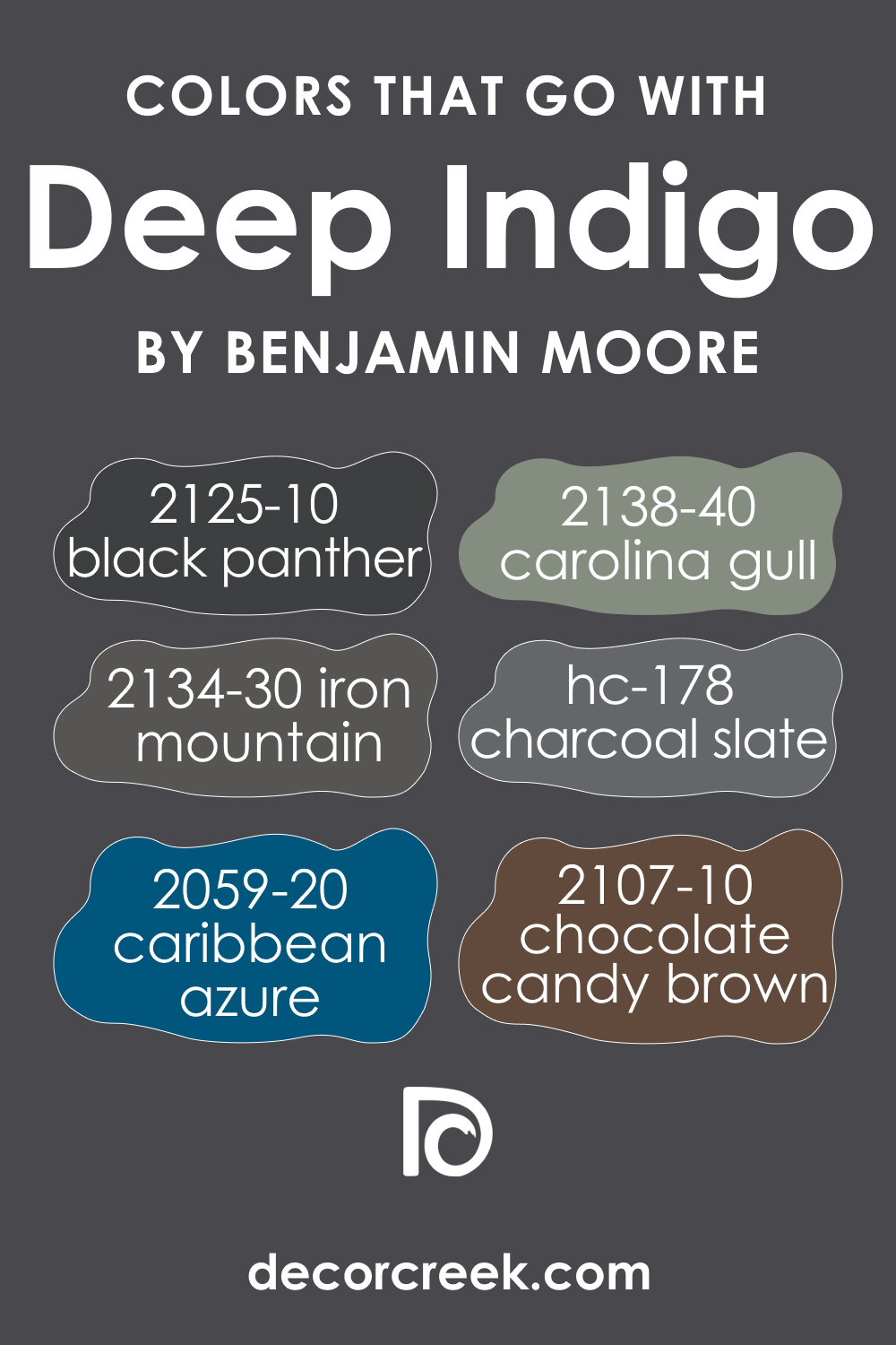
Colors That Go With Deep Indigo 1442
Using colors that harmonize well in the same room is essential for a cohesive interior design. Benjamin Moore offers several complementary colors that work beautifully with Deep Indigo 1442.
BM 2134-30 Iron Mountain , BM 2125-10 Black Panther , BM 2138-40 Carolina Gull , BM 2059-20 Caribbean Azure , and BM 2107-10 Chocolate Candy Brown , HC-178 Charcoal Slate are versatile options that can be used alongside Deep Indigo 1442 to create a well-balanced and visually appealing space.
How to Use Deep Indigo 1442 In Your Home?
Deep Indigo 1442 can be a versatile addition to your home’s interior. It suits various rooms and design styles. Use it in bedrooms for a calming and cozy atmosphere, in bathrooms for a touch of sophistication, or in living rooms as an accent wall to create a striking focal point.
For exteriors, Deep Indigo 1442 can be applied to front doors or shutters to make a bold statement. In kitchens, it can add depth and contrast, while on kitchen cabinets, it can bring a touch of elegance to the space.
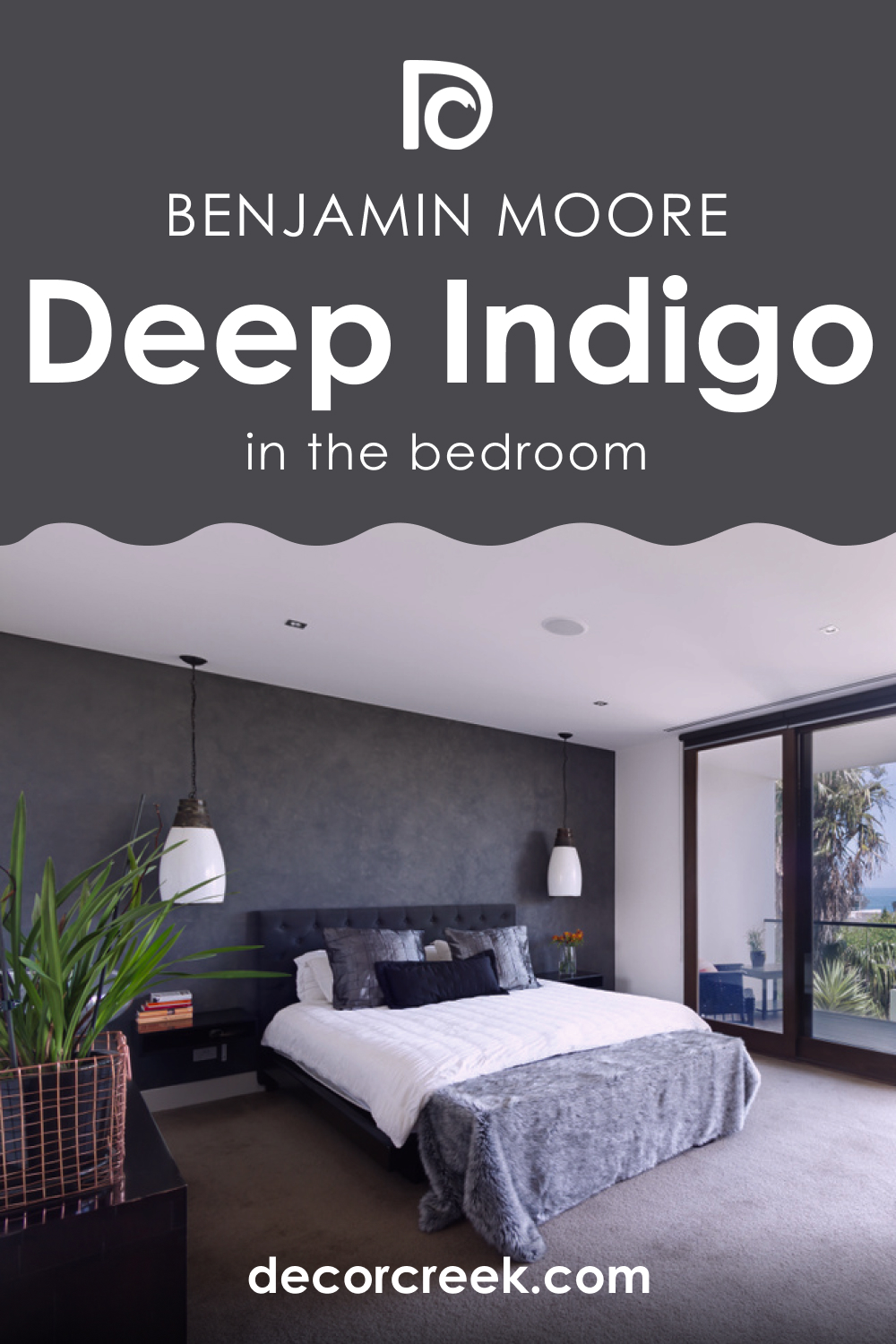
Deep Indigo 1442 in the Bedroom
In the bedroom, Deep Indigo 1442 can create a serene and relaxing environment. Use it on the walls to envelop the space in a calming atmosphere, or opt for bedding and decor accents in this color to add a touch of luxury. Pair it with soft textiles, like plush rugs and velvet cushions, for a cozy retreat that promotes restful sleep.
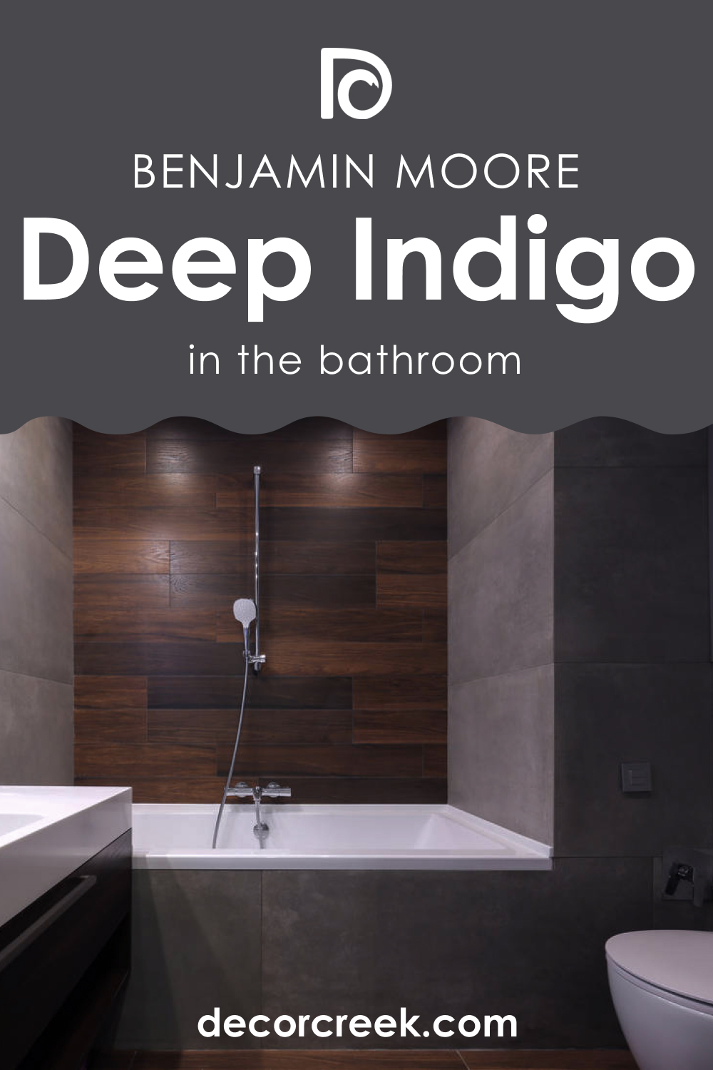
Deep Indigo 1442 in the Bathroom
In the bathroom, Deep Indigo 1442 can introduce a sense of opulence. Paint the walls for a sophisticated backdrop, and consider using it for bathroom cabinets or vanity units to make a statement. Complement it with gleaming chrome fixtures and white accents to achieve a timeless and spa-like feel.
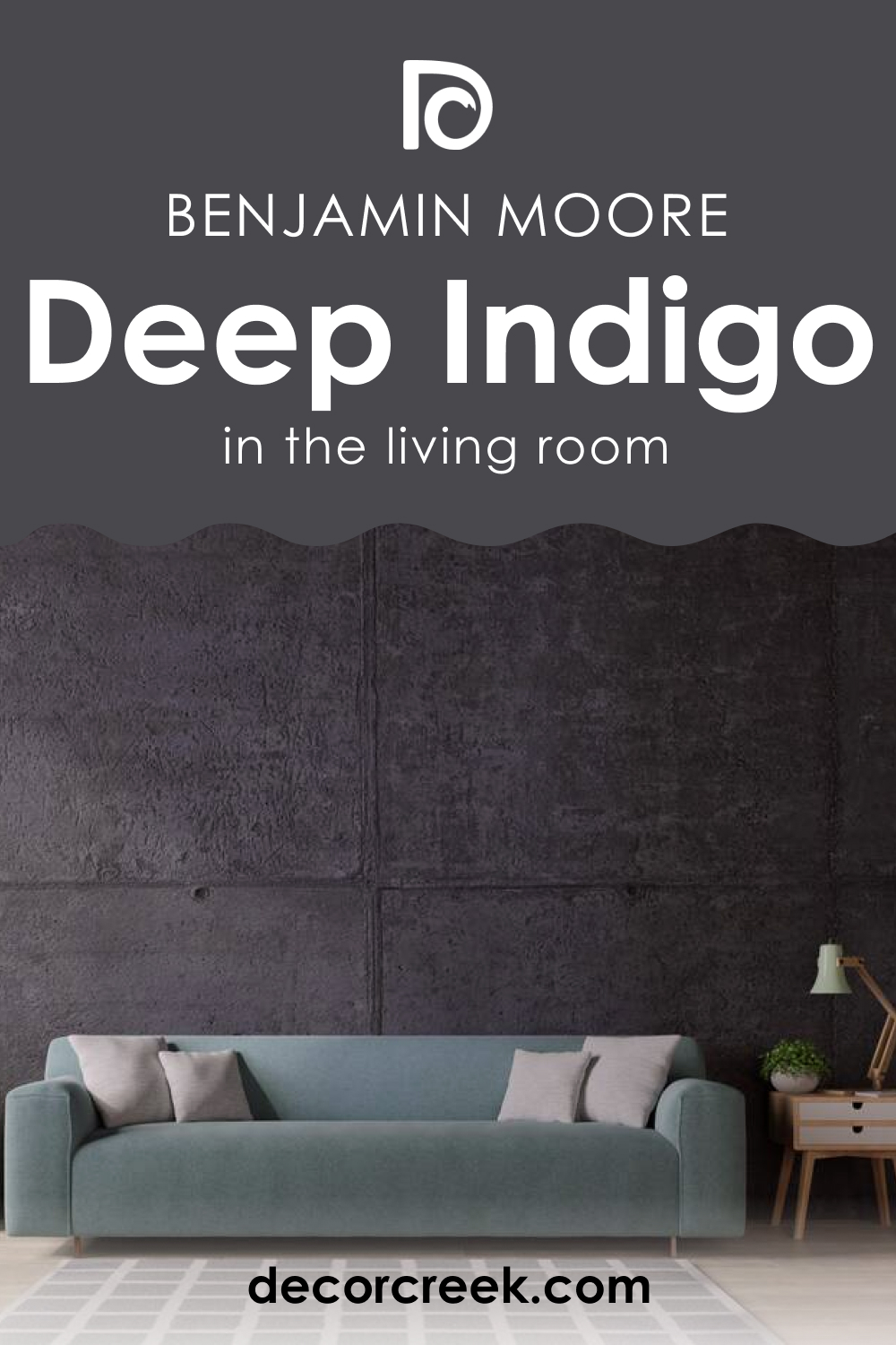
Deep Indigo 1442 in the Living Room
In the living room, Deep Indigo 1442 can serve as an accent wall or the dominant color, creating a sense of drama and elegance. Combine it with neutral furnishings and metallic accents to balance the richness of the color. Incorporate cozy textiles, such as deep blue throws or cushions, to enhance the inviting atmosphere.
Deep Indigo 1442 for Exteriors
For exteriors, Deep Indigo 1442 can be used on front doors or shutters to make a bold and welcoming statement. It pairs well with classic white trims and natural wood accents. This choice adds curb appeal and a touch of sophistication to your home’s exterior.
Deep Indigo 1442 in the Kitchen
In the kitchen, Deep Indigo 1442 can be used as an accent wall, backsplash, or cabinet color. It brings depth and a touch of luxury to the space. Combine it with white or light-colored countertops and stainless steel appliances for a balanced and contemporary look.

Deep Indigo 1442 on Kitchen Cabinets
Deep Indigo 1442 on kitchen cabinets can transform your kitchen into a stylish and modern space. It adds a touch of drama and sophistication. Pair it with light-colored countertops and backsplashes to create a striking contrast. The dark cabinets create a focal point while maintaining a sense of coziness.

Comparing Deep Indigo 1442 with Other Colors
Comparing different colors is essential when making interior design decisions because it helps homeowners and designers find the right color to achieve their desired aesthetic and atmosphere. Each color has unique characteristics, such as undertones and light reflectance values, that can dramatically impact how a room looks and feels.
By comparing colors, you can ensure that the chosen color harmonizes with the overall design concept, lighting conditions, and the mood you want to create in a space. This process allows for informed choices that result in a cohesive and visually pleasing interior.
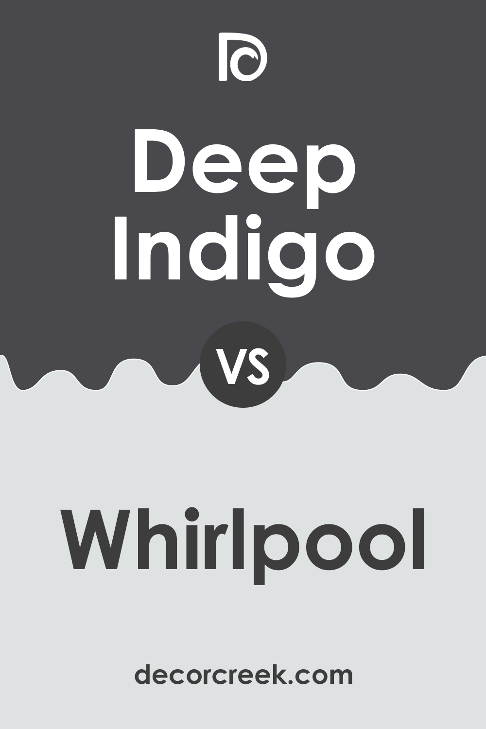
Deep Indigo 1442 vs. BM 1436 Whirlpool
While both are cool blues, Deep Indigo leans towards deep indigo with a hint of purple, creating a rich and moody vibe, whereas Whirlpool is a lighter and brighter blue with a fresh and airy feel. The choice depends on whether you want a cozy or open ambiance.
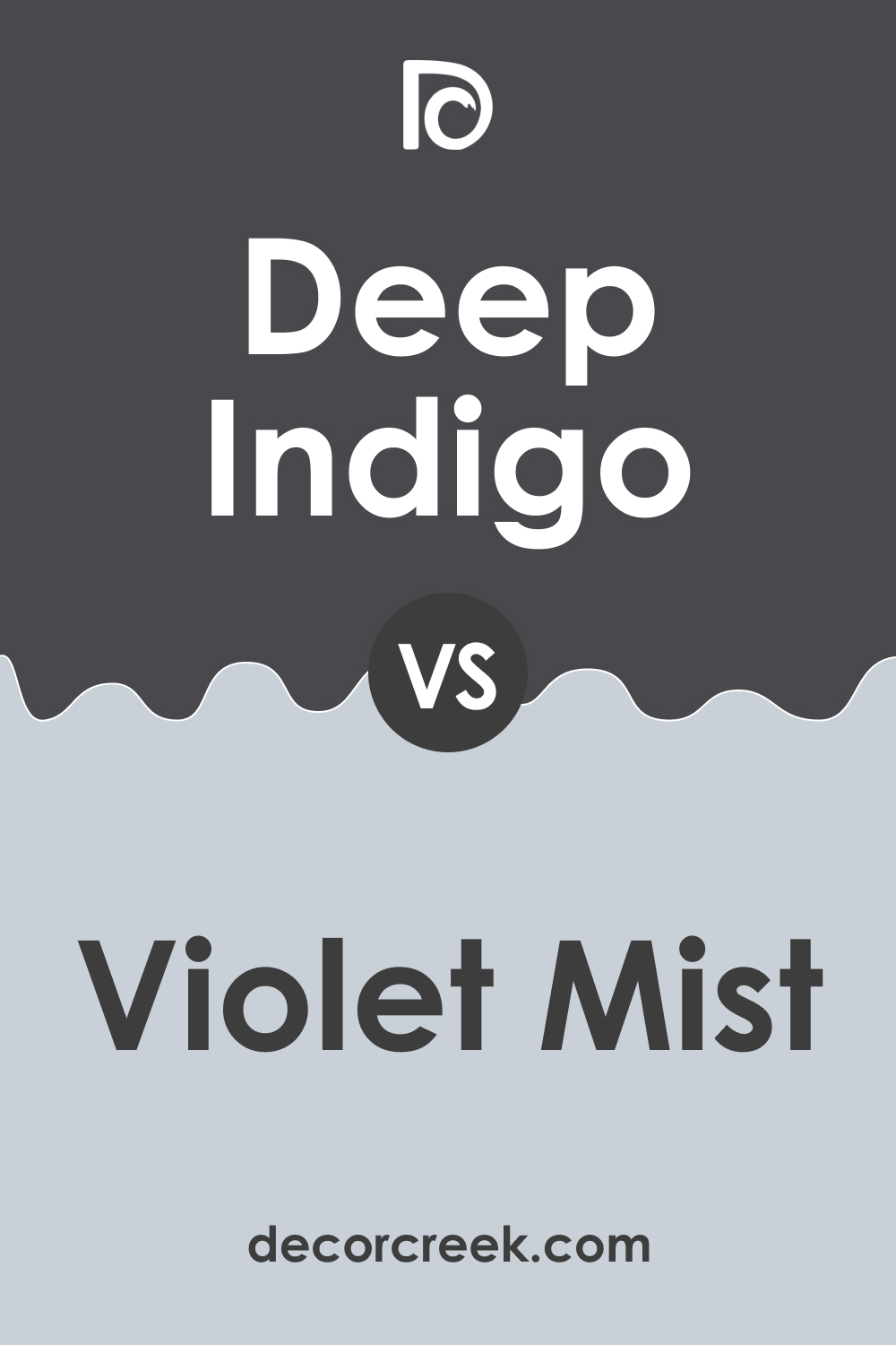
Deep Indigo 1442 vs. BM 1437 Violet Mist
Deep Indigo 1442 is a darker and more intense color, conveying sophistication and depth, while Violet Mist is a soft and delicate purple that imparts a sense of tranquility. The decision rests on the desired level of drama in the space.
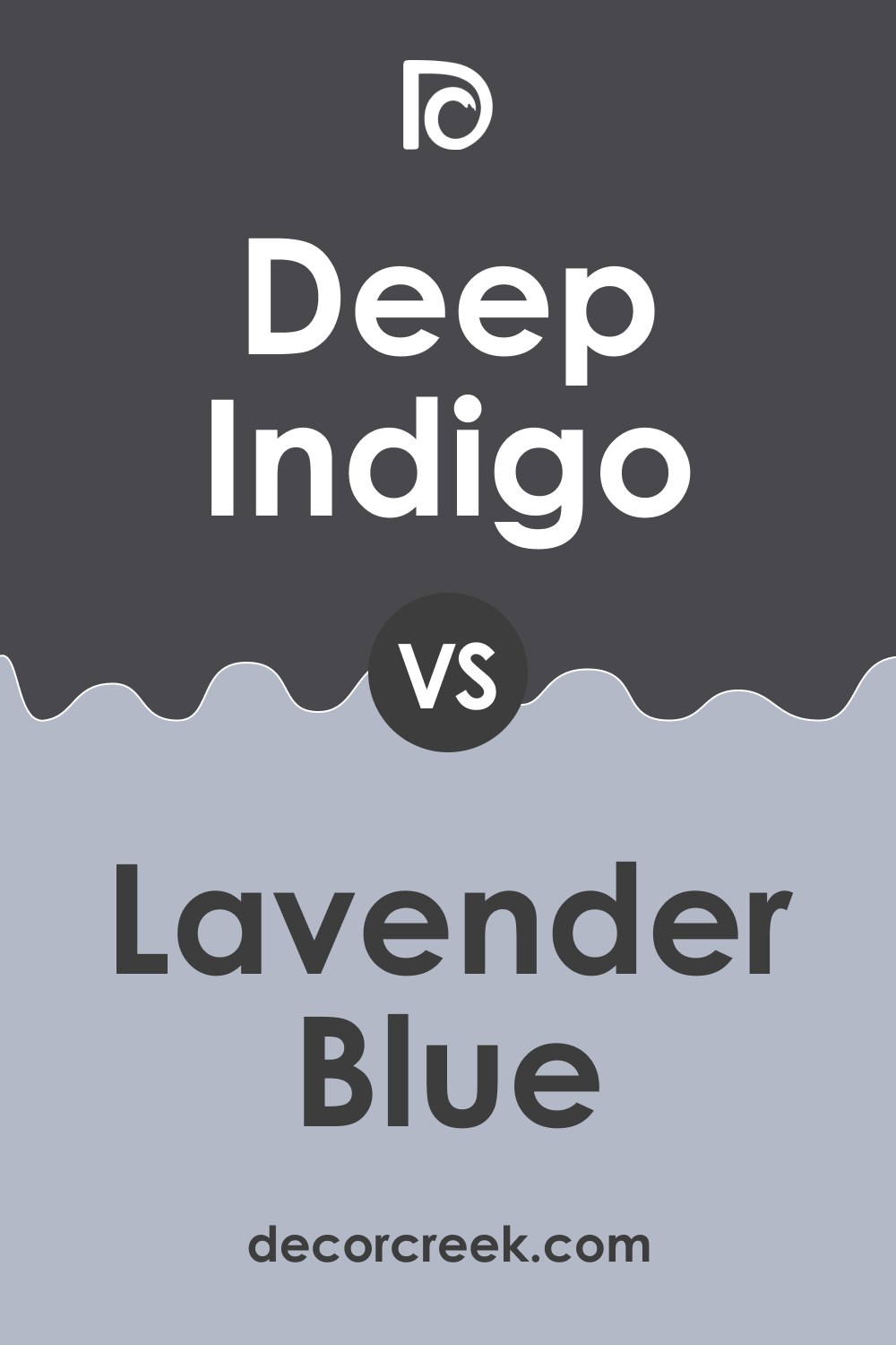
Deep Indigo 1442 vs. BM 1438 Lavender Blue
Deep Indigo 1442 is deeper and more saturated, making a bold statement, whereas Lavender Blue is a softer, muted blue with gray undertones, creating a serene atmosphere. The choice depends on the desired level of boldness.
Deep Indigo 1442 vs. BM 1439 Yukon Sky
Deep Indigo 1442 is a much darker, almost navy blue with richness, while BM 1439 Yukon Sky is a pale blue-gray with a gentle and airy quality. The choice comes down to the desired level of contrast and intensity.
Deep Indigo 1442 vs. BM 1440 Irises
Deep Indigo 1442 is a dark and mysterious hue, whereas Irises is a medium-toned purple with warmth. Deep Indigo is more dramatic, while Irises exudes a cozy and inviting feel. The decision hinges on the desired mood.
Deep Indigo 1442 vs. BM 1441 Amethyst Shadow
Deep Indigo 1442 is a deep and saturated indigo, creating a luxurious ambiance, while Amethyst Shadow is a mid-toned purple-gray that exudes subtlety and sophistication. The choice depends on whether you want to make a bold or understated statement.
Conclusion
Comparing colors is a crucial step in interior design as it allows you to choose the perfect shade to achieve your desired aesthetic and ambiance. Deep Indigo 1442, with its rich and moody quality, can be contrasted with lighter, softer shades like Whirlpool, Violet Mist, Lavender Blue, Yukon Sky, Irises, or Amethyst Shadow, depending on the level of drama, intensity, or warmth you want in your space.
Each of these colors brings its unique character to the palette, making it essential to consider the broader design context and lighting conditions when making your final color choice.