Every year, color takes on new meaning in our homes. For 2026, I’m seeing a beautiful balance between warmth and depth — a move toward shades that feel natural, thoughtful, and rooted in comfort. People are craving homes that look refined but still feel real, and paint color is where that story begins.
I love how the right tone can instantly shift the energy of a space — a soft neutral can make a room feel welcoming, while a moody green or clay can add quiet confidence.
When I work with clients, I always notice how they respond emotionally to color. Some shades feel like a deep breath, while others bring excitement and personality. That’s why paint trends matter — they reflect what we all need most in our homes at a given time.
In 2026, we’re seeing a return to layered neutrals, earthy greens, dusty blues, and sunbaked terracottas — colors that connect us to the world outside while keeping us grounded inside.
This list gathers my favorite shades from Sherwin-Williams and Benjamin Moore that define what’s ahead. These are the hues I trust most when helping homeowners refresh their spaces — tones that stay beautiful through every season, that photograph beautifully, and that always make a house feel like home.

Why I Always Trust Sherwin-Williams and Benjamin Moore for Neutral Pink Paints
When I am looking for the perfect paint color, especially something as nuanced as a neutral pink, I always turn to Sherwin-Williams and Benjamin Moore. They are simply the best in the business for a reason.
These companies don’t just create random shades; they employ teams of experts who study culture, fashion, and what makes people feel good. Their color scientists understand the delicate balance needed to make a pink look warm and sophisticated instead of childish
. They know exactly how much gray or beige to mix in to create that perfect “neutral” quality. Their paint is dependable, the colors are rich, and their collections truly set the standards for everyone else.
By choosing from their palettes, I know I am giving my clients a color that is high-quality, perfectly formulated, and will look refined and stylish for years.
I trust their expertise completely to guide my choices, which is why you see so many of their gorgeous shades on this list. Their commitment to superior color technology ensures that these complex neutral shades won’t fade or shift unexpectedly once they are on the wall. They offer a sense of confidence that is invaluable when decorating a home.
How I Choose the Perfect Neutral Pink Shade for Any Room
Picking the perfect neutral pink is a wonderfully rewarding process, but it requires a careful eye. My biggest secret is paying very close attention to the undertones and the light. A truly great neutral pink must have enough brown, gray, or beige mixed in to pull it away from feeling like a nursery pink.
The goal is a shade that makes your skin look lovely and your furniture look rich. I also think about the direction the room faces.
A pink in a north-facing room might lean a little cool, so I might choose one with more yellow or red to counter that. In a very sunny, south-facing room, a lighter, more muted pink prevents it from becoming too bright or intense. I also consider the purpose of the room.
For an entryway, I want something welcoming and warm, while a dining room might benefit from a deeper, richer pink for an intimate atmosphere.
I test every shade next to the existing fixed elements in the room, like flooring and countertops, to ensure they harmonize beautifully. It’s all about finding that happy spot where the color feels gentle, warm, and adds a beautiful, sophisticated glow that makes everyone feel instantly at home.

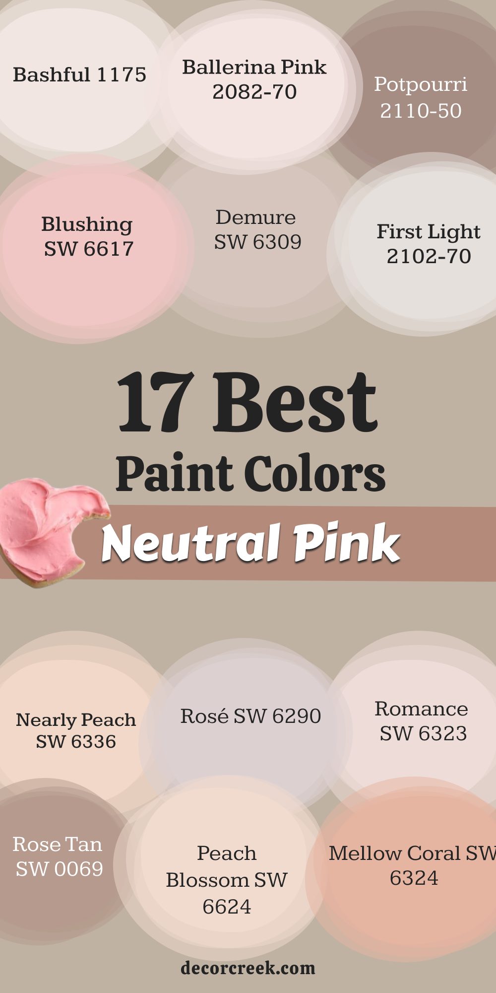
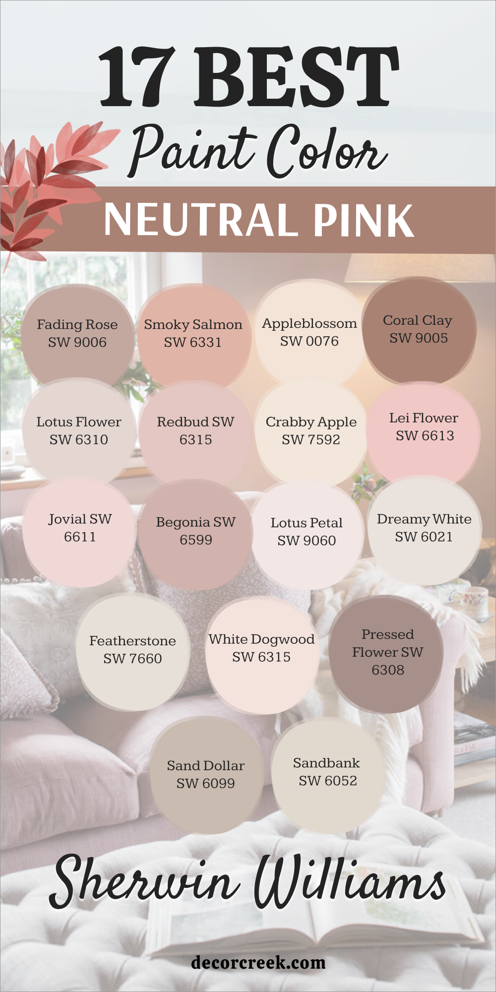
17 Best Neutral Pink Paint Colors in 2026
Malted Milk SW 6057
Malted Milk SW 6057 is a gorgeously soft, warm, and inviting pink-beige that feels like a gentle hug on the walls. This is a cheerful and comforting color that brings a lovely, rosy glow to any room where it is used. The shade is a very grown-up pink that is not sugary or childish but feels sophisticated and natural.
It is a wonderful color choice for a sunny bedroom, a bright nursery, or a welcoming entryway. The hue pairs beautifully with light gray, creamy white, and accents of brass or bronze metals.
It reminds me of warm desserts and comforting drinks, giving a room a sweet, gentle atmosphere. This fantastic way to introduce a blush tone without committing to something too bright or too intense. The color has a lovely depth that changes nicely throughout the day as the light moves across the room. It is a perfect color for creating a happy and very soothing feeling in a whole house. This gentle, sweet shade makes your home feel instantly cozy, cheerful, and very welcoming to guests.
🎨 Check out the complete guide to this color right HERE 👈
Romance SW 6323
Romance SW 6323 is a truly delicate, pale pink that has a beautifully soft and airy quality on the walls. The shade is a very light color, making it perfect for a bedroom or bathroom where you want just a hint of blush. It is an excellent choice for creating a light, bright atmosphere that still feels warm and wonderfully pretty.
The color has a gentle warmth that prevents it from looking cold, which is important for a light shade. This hue pairs wonderfully with pure white trim and light, natural wood furnishings like oak or birch.
It is often used for ceilings to give a room a gentle, uplifting pink glow that is very attractive. The shade is a lovely, classic pink that makes a room feel instantly inviting and completely fresh. It is a favorite for nurseries and children’s rooms because it feels innocent and wonderfully soft. This is a dependable shade that guarantees your home will feel light, bright, and beautifully refined. The color is a sophisticated choice that speaks of gentle optimism and a light-hearted, happy feel.
🎨 Check out the complete guide to this color right HERE 👈
Intimate White SW 6322
Intimate White SW 6322 is a wonderfully pale off-white color that carries just the smallest suggestion of soft, warm pink. This is perfect when you want a neutral that is mostly white but with a subtle, gentle warmth. The shade is a great choice for a whole-house paint color because it flows beautifully between different rooms.
It has a delicate rosy undertone that keeps it from looking stark or cold in any light. The color provides a fantastic backdrop for showcasing furniture and colorful artwork without competing with them.
This hue works well on both walls and trim, creating a soft, layered, monochromatic look that is very sophisticated. It is an excellent color for maximizing light in a room, making it feel open and wonderfully airy. The shade makes a room feel instantly fresh and clean, like a new beginning for your decorating project. It is a reliable and soft choice that truly makes decorating around it simple and enjoyable. This beautiful, sophisticated shade gives your home a quiet, welcoming glow that everyone appreciates.
🎨 Check out the complete guide to this color right HERE 👈
Blushing SW 6617
Blushing SW 6617 is a truly cheerful, medium-toned pink that has a sunny, happy warmth and energy. The shade is a clear, pretty color that reminds me of beautiful springtime blossoms and bright, sunny days. It is a wonderful color choice for a dining room, a bright office, or an accent wall in a cheerful living area.
The hue pairs nicely with light greens and deep navy blues for a beautiful, contrasting color scheme. The color has enough saturation to feel like a real color but not so much that it becomes harsh.
It is a great way to add a playful, welcoming punch of color to a room without using traditional primary shades. The shade makes a room feel instantly warm, fun, and full of wonderfully positive energy and light. It is a lovely color that works well with modern furniture as well as older, more traditional pieces.
The hue is a fantastic color that speaks of pure happiness and a joyous feeling toward home design. This dependable, sweet pink guarantees your home will feel vibrant, fresh, and delightfully spirited right away.
Redend Point SW 9081
Redend Point SW 9081 is a beautiful, warm blush-beige that feels like a cozy blanket for your walls. The shade is a grounded color that mixes the comforting feel of earth tones with a hint of gentle pink. It is perfect for creating a welcoming living room or a relaxing bedroom retreat.
The hue pairs wonderfully with natural wood tones and creamy white trim. The color gives a room a happy feeling without being too bright or loud.
It looks particularly wonderful in rooms that get a lot of natural afternoon sunlight. The shade is a sophisticated neutral that adds personality and depth to any design plan. It shows that neutral colors don’t have to be boring but can be interesting and inviting. The hue would look amazing in a reading nook or as a backdrop for artwork. This feels like a hug for your home, making everyone who enters feel instantly at ease and happy.
🎨 Check out the complete guide to this color right HERE 👈

Charming Pink SW 6309
Charming Pink SW 6309is a beautiful, soft, muted pink that has a refined, slightly dusty quality to it. The shade is a sophisticated color that feels very grown-up and wonderfully elegant on the walls. It is an excellent choice for a master bedroom, a sophisticated dressing area, or a handsome study.
The hue has enough gray mixed in to keep it from looking too sweet, giving it a very grounded feel. The color pairs nicely with deeper greens, navy blues, and rich, dark brown wooden furniture.
It is a great way to create a rich, warm atmosphere that encourages quiet relaxation and peace. The shade makes a wonderful backdrop for art pieces, allowing their colors to pop beautifully against the muted pink. It is a fantastic way to introduce a blush tone that feels serious and intentionally high-end in its design.
The hue is a delightful color that truly speaks of quiet confidence and a very refined, curated decorating style. This dependable shade guarantees your home will feel warm, well-designed, and very inviting right away.
🎨 Check out the complete guide to this color right HERE 👈
Innocence SW 6302
Innocence SW 6302 is an incredibly pale, almost white pink that offers a gentle wash of rosy color on the walls. The shade is perfect for maximizing light while still adding a touch of warm, cheerful color to a room. It is a fantastic color for ceilings or trim to give a subtle, beautiful glow without being distracting.
The color has a very light, delicate quality that makes a room feel utterly fresh and beautifully pure. The hue is a wonderful option for children’s rooms, especially when paired with light wood and crisp white accents.
The shade works well in all lighting, though it will look nearly white in very bright sunlight. It is an excellent choice when you want a neutral background that is just slightly warmer than a pure white. The color is a reliable one that is easy to decorate around and always looks clean and well-maintained. The hue makes a room feel light, airy, and full of wonderfully soft, gentle energy and warmth. This simple, lovely shade truly guarantees your home will feel bright, sweet, and perfectly welcoming to all who visit.
🎨 Check out the complete guide to this color right HERE 👈
Pressed Flower SW 6304
Pressed Flower SW 6304 is a rich, warm, dusty pink color that carries strong notes of brown and deep clay tones. The shade is a sophisticated color that reminds me of dried roses or the soft, aged look of old velvet. It is a fantastic choice for a dining room, a cozy den, or a beautiful, dramatic accent wall.
The hue pairs beautifully with dark wood furniture, black metal accents, and creamy white furnishings. The color creates an intimate, grounded atmosphere that encourages you to settle in and stay a while.
It has enough depth to look powerful, but the brown undertones keep it feeling wonderfully natural and easy to live with. The shade is a great way to add a touch of rich, earthy warmth that feels very intentional and designed. It is a beautiful color that speaks of quiet history and a refined, curated decorating style that I adore. The hue is a dependable color that guarantees your home will feel wonderfully warm, rich, and very inviting right away. This lovely choice is perfect for creating a cozy, sophisticated look that feels luxurious and deeply personal.
Polite White SW 6056
Polite White SW 6056 is a wonderfully soft, warm white that has a very gentle, muted pink-peach undertone to it. The shade is the perfect neutral when pure white feels too cold but you still want a very light, bright color. It is a fantastic color for entire homes, as it flows beautifully and provides a consistently soft feeling.
The color has a lovely, subtle glow that makes a room feel instantly inviting and pleasantly happy. The hue is a reliable color for trim and ceilings, as it works well with a wide variety of different wall colors.
The shade makes a room feel bright, clean, and beautifully well-cared for, which is great for staging. It is an excellent choice for maximizing light and making smaller rooms appear much more open and airy. The color is a sophisticated one that provides a very warm background that lets your decorations stand out. The hue is a dependable shade that truly makes decorating simple because it plays well with almost everything. This gentle, sweet color will make your home feel light, wonderfully airy, and very welcoming to everyone.
First Light 2102-70
First Light 2102-70 is a beautiful, soft, pale pink that acts as a delightful, modern background color for any room. The shade is a wonderful color because it is very light and airy, avoiding any strong, harsh feeling on the walls. It is an excellent choice for a master bedroom or a living room where you want a very gentle touch of color.
The color has a touch of coolness that keeps it incredibly fresh and modern in its appearance. The hue pairs beautifully with crisp white, light gray, and natural materials like wicker and light wood.
The shade is a great color for maximizing light and making a room feel bright, open, and cheerful all day long. It reminds me of a gentle sunrise or the soft, hazy light of an early summer morning. The color is a highly versatile one that works well with many decorating styles, from modern to classic. The hue makes a room feel instantly happy and light-hearted, adding a touch of gentle optimism to your day. This sophisticated pink makes your home feel clean, very welcoming, and wonderfully refreshed.
Proposal AF-260
Proposal AF-260 is a lovely, muted rose-pink that has a significant amount of gray mixed in, giving it an earthy feel. The shade is a wonderfully sophisticated color that feels very grown-up and completely intentional on the walls. It is an excellent choice for an elegant dining room, a cozy study, or a refined powder room.
The hue pairs beautifully with dark, rich wooden furniture and metallic accents like deep bronze or aged copper. The color creates a rich, intimate atmosphere that is perfect for gathering with friends or quiet contemplation.
It is a fantastic way to introduce a pink tone that feels strongly grounded and naturally sophisticated in its warmth. The shade is a reliable color that is easy to decorate around because the gray makes it act almost like a neutral.
It has a wonderful depth that makes the walls feel luxurious, especially when used in a matte or flat finish.
The hue is a beautiful color that speaks of quiet confidence and a very curated, thoughtful decorating style. This dependable shade guarantees your home will feel warm, well-designed, and very inviting right away.
🎨 Check out the complete guide to this color right HERE 👈
Pink Bliss 2093-70
Pink Bliss 2093-70 is a delightful, extremely light pink color that is incredibly soft and almost reads as a warm white. The shade is perfect for a room where you want just the faintest hint of warm, happy color on the walls. It is a great choice for maximizing light, as it is nearly white but without the coldness of a pure white.
The color has a very gentle, airy quality that makes any room feel incredibly fresh and wonderfully bright. The hue works beautifully with crisp white trim and light, minimalist furniture for a clean look.
The shade is a good option for ceilings to give the room an uplifting, subtle pink glow from above. It is a reliable color that is simple to decorate around and always looks neat and well-maintained. The hue makes a room feel light, happy, and full of wonderfully soft, gentle energy and warmth. This simple, lovely shade truly guarantees your home will feel bright, sweet, and perfectly welcoming to all who visit. The color is a sophisticated pink that makes your home feel clean, very light, and wonderfully refreshed.
Odessa Pink HC-59
Odessa Pink HC-59 is a rich, medium-toned pink that has wonderful historic depth and a beautiful, gentle earthiness. The shade is a sophisticated, grounded color that feels both warm and intentionally classic on the walls. It is an excellent choice for a formal dining room, a cozy reading nook, or a beautifully painted piece of furniture.
The hue pairs wonderfully with dark, traditional wood tones, deep olive greens, and creamy white trim. The color creates an intimate, refined atmosphere that is perfect for evenings and quiet conversation.
It is a fantastic way to introduce a pink that feels truly grown-up and carries a feeling of history and permanence. The shade has a nice amount of pigment that prevents it from ever feeling washed out or too pale. It is a beautiful color that speaks of established tradition and a very cultured, high-end decorating style. The hue is a dependable shade that guarantees your home will feel wonderfully rich, warm, and very elegant right away. This lovely choice is perfect for adding a touch of deep, rosy warmth to a sophisticated interior.
Bashful 1171
Bashful 1171 is a perfectly soft, very pale pink that has a fresh, slightly sunny quality to it. The shade is a wonderful, delicate color that truly brightens up any room without feeling harsh or strong. It is an excellent choice for a bedroom, a sunny nursery, or a light-filled bathroom where you want gentle color.
The hue has a light, cheerful warmth that makes a room feel instantly happy and sweetly inviting. The color pairs well with bright white trim and light wood, giving a space a clean, airy appearance.
It is a great option for a whole-house color when you want a light neutral that is warmer than just white or gray. The shade makes a room feel light, open, and full of wonderfully soft, positive energy all day long. It is a reliable color that is easy to decorate around, letting your furnishings take center stage. The hue is a simple, lovely shade that truly guarantees your home will feel bright, sweet, and perfectly welcoming to all who enter. This sophisticated pink makes your home feel clean, very light, and wonderfully refreshed.
Gentle Butterfly 2173-70
Gentle Butterfly 2173-70 is an extremely pale, airy pink that carries a very light, almost dusty rose quality. The shade is perfect when you want a white wall but desire just a whisper of soft, comforting pink warmth instead of coldness. It is an excellent choice for maximizing light and making a smaller room feel much more open and bright.
The color has a delicate, pure quality that makes a room feel utterly fresh and beautifully soft on the eyes. The hue works wonderfully with crisp white trim, creating a subtle contrast that looks highly refined.
The shade is a great option for ceilings, giving the room a gentle, upward lift and a soft rosy glow. It is a dependable color that is nearly white, so it pairs easily with any bolder colors in your furniture or artwork. The color makes a room feel light, airy, and full of wonderfully soft, gentle energy and peace. The hue is a reliable shade that truly makes decorating around it simple and highly enjoyable. This simple, lovely pink guarantees your home will feel bright, sweet, and perfectly welcoming to everyone.
Ballerina Pink 2082-70
Ballerina Pink 2082-70 is a very light, clear pink that feels innocent, gentle, and beautifully sweet on the walls. The shade is a great color for adding a touch of classic, happy pink to a room without using a bold or intense hue. It is an excellent choice for a child’s room, a light-filled bedroom, or an entryway that needs a dose of cheerfulness.
The hue has a light, airy quality that keeps the room feeling completely open and wonderfully bright all day long. The color pairs nicely with light gray, creamy white, and even small accents of black for a modern feel.
It is a great option for ceilings, casting a soft, pretty glow that makes the room feel warm and inviting. The shade makes a room feel instantly happy, light-hearted, and full of wonderfully soft, positive energy. It is a reliable color that is easy to decorate around and always looks fresh and perfectly maintained. The hue is a simple, lovely shade that truly guarantees your home will feel bright, sweet, and perfectly welcoming to all who enter. This sophisticated pink makes your home feel clean, very light, and wonderfully refreshed.
Potpourri 1312
Potpourri 1312 is a rich, medium-toned pink that has strong, noticeable brown and gray undertones, making it very grounded. The shade is a sophisticated color that feels very cozy, warm, and intentionally traditional in its appearance. It is an excellent choice for a dining room, a den, or an accent wall where you want a deep, muted color.
The hue pairs beautifully with dark wood, deep greens, and creamy, soft furniture fabrics. The color creates an intimate atmosphere that is perfect for gathering and quiet, thoughtful evenings at home.
It is a fantastic way to introduce a pink tone that feels earthy, refined, and beautifully grown-up in its warmth. The shade has enough depth to look powerful but the neutral undertones keep it from becoming too harsh or loud. It is a beautiful color that speaks of quiet confidence and a very curated, thoughtful decorating style that I appreciate. The hue is a dependable color that guarantees your home will feel wonderfully warm, rich, and very inviting right away. This lovely choice is perfect for adding a deep, rosy sophistication to a cozy interior.
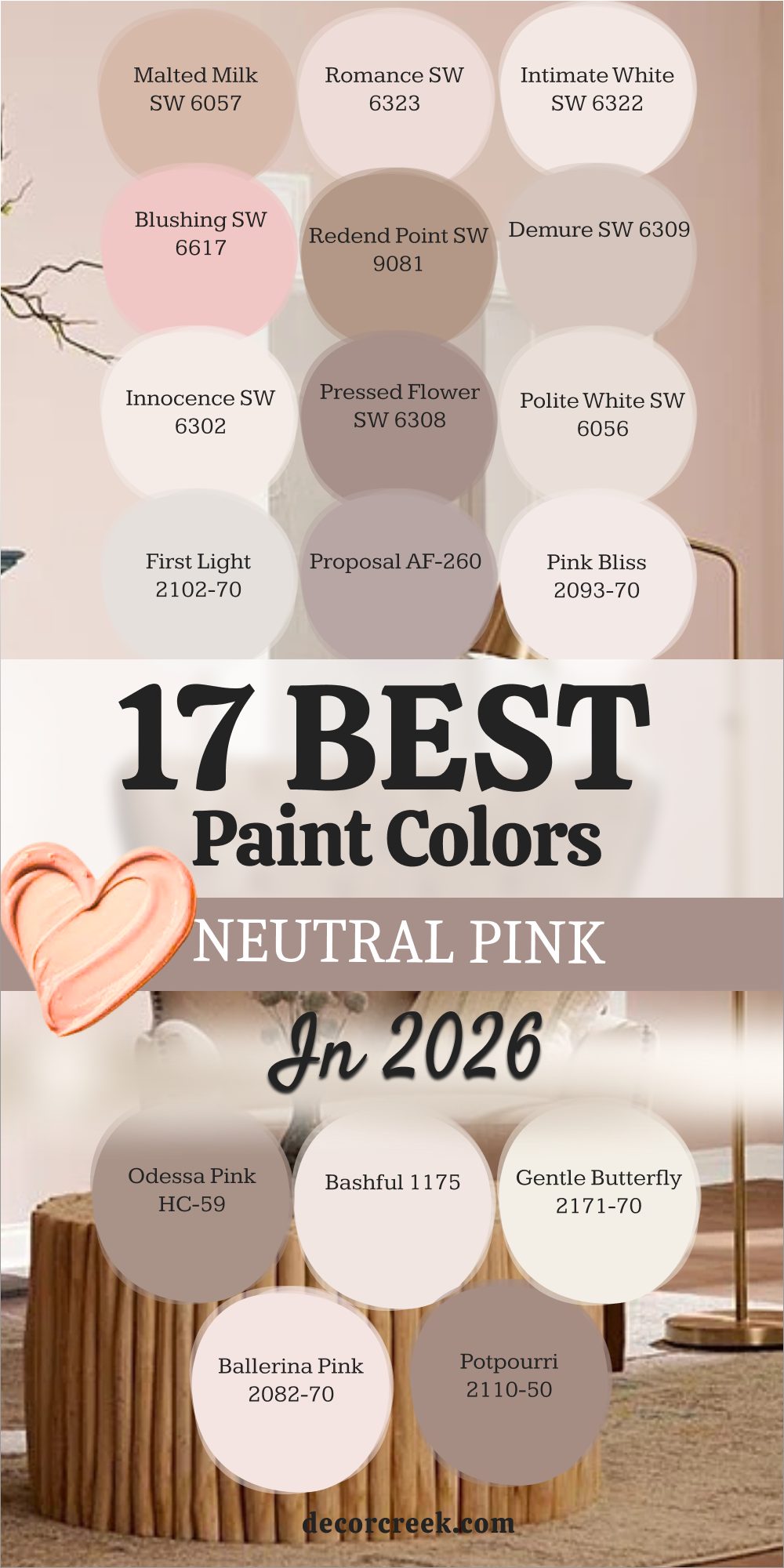
17 Best Neutral Pink Paint Colors trendy this year
Nearly Peach SW 6336
Nearly Peach SW 6336 is a light, sunny color that sits perfectly between a soft, gentle pink and a pale, warm peach. The shade is a cheerful color that brings a feeling of warm sunlight and happy energy into any room where it is used. It is an excellent choice for a bright living room, a welcoming entryway, or a kitchen that needs a cheerful hue.
The hue has a lovely yellow-red base that prevents it from ever feeling cold or gray on the walls. The color pairs beautifully with light gray, creamy white, and natural materials like woven rugs and wicker furniture.
It is a great way to introduce a warm, pinkish hue that feels highly modern and very current in its appeal. The shade makes a room feel instantly bright, sweet, and full of wonderfully positive, happy light. It is a reliable color that looks beautiful in both natural and artificial lighting conditions. The hue is a delightful color that truly speaks of gentle optimism and a sunny, light-hearted decorating style. This simple, lovely shade guarantees your home will feel bright, warm, and perfectly welcoming to all who visit.
🎨 Check out the complete guide to this color right HERE 👈
Rose Tan SW 0069
Rose Tan SW 0069 is a grounded, medium-toned pink that carries a rich mix of brown and dusty gray, making it truly neutral. The shade is a sophisticated color that feels very grown-up, earthy, and perfectly intentional on the walls. It is an excellent choice for a master bedroom, a cozy reading nook, or an accent wall in a refined living area.
The hue pairs beautifully with dark wooden furniture, matte black accents, and deep jewel-toned fabrics like velvet. The color creates a rich, intimate atmosphere that is wonderful for quiet relaxation and thoughtful time alone or with family.
It is a fantastic way to introduce a pink tone that feels strongly attached to the earth and beautifully natural in its warmth. The shade has enough depth to stand out nicely against light trim without becoming too dramatic or harsh. It is a beautiful color that speaks of quiet elegance and a very refined, curated decorating style. The hue is a dependable color that guarantees your home will feel warm, well-designed, and very inviting right away. This lovely choice is perfect for adding a deep, rosy sophistication to any cozy interior.
Peach Blossom SW 6624
Peach Blossom SW 6624 is a gentle, pretty pink that has a wonderful, soft peach undertone, making it feel fresh and light. The shade is a wonderfully cheerful color that brings a feeling of new growth and happy springtime air into a room. It is an excellent choice for a sunny bedroom, a bright kitchen, or a cheerful guest bathroom.
The hue has a light, airy warmth that keeps the room feeling open and full of wonderfully bright, positive light. The color pairs nicely with mint green, light blue, and crisp white for a truly fresh and clean look.
It is a great option for a ceiling color to give the entire room a soft, rosy, uplifting glow from above. The shade makes a room feel instantly happy, light-hearted, and full of wonderful, sweet energy and warmth. It is a reliable color that is simple to decorate around and always looks neat and beautifully well-maintained. The hue is a simple, lovely shade that truly guarantees your home will feel bright, sweet, and perfectly welcoming to all who enter. This sophisticated pink makes your home feel clean, very light, and wonderfully refreshed.
🎨 Check out the complete guide to this color right HERE 👈
Mellow Coral SW 6324
Mellow Coral SW 6324 is a beautiful, medium-toned color that sits between a soft pink and a warm, inviting coral hue. The shade is a cheerful, happy color that feels like a sunset glow, bringing warmth and energy to the walls. It is an excellent choice for a dining room, a bright office, or an accent wall in a lively living area.
The hue has a strong warmth that prevents it from ever looking cold or gray, even in low light conditions. The color pairs nicely with teal, navy, and creamy white for a beautiful, vibrant, and contrasting color scheme.
It is a fantastic way to add a playful, welcoming punch of color that is fully saturated without becoming harsh. The shade makes a room feel instantly warm, fun, and full of wonderfully positive energy and light. It is a lovely color that works well with both modern and older, more traditional furniture pieces. The hue is a fantastic color that speaks of joyful confidence and a spirited, happy feel toward home design. This dependable, sweet coral-pink guarantees your home will feel vibrant, fresh, and delightfully spirited right away.
Rosé SW 6290
Rosé SW 6290 is a sophisticated, light pink that has a gentle, refined dusty quality, much like a beautiful glass of wine. The shade is a grown-up, elegant color that feels very intentional and delightfully soft on the walls. It is an excellent choice for a powder room, a master bedroom, or a chic dressing area.
The hue has enough gray mixed in to keep it feeling highly neutral and surprisingly versatile with decorations. The color pairs beautifully with brass, deep charcoal gray, and creamy, textured fabrics for a high-end feel.
It is a great way to create a gentle, warm atmosphere that encourages quiet relaxation and refined peacefulness. The shade makes a wonderful backdrop for art pieces, allowing their colors to pop beautifully against the muted pink. It is a fantastic way to introduce a blush tone that feels serious, luxurious, and perfectly high-end in its design. The hue is a delightful color that truly speaks of quiet confidence and a very refined, curated decorating style. This dependable shade guarantees your home will feel warm, well-designed, and very inviting right away.
White Truffle SW 6029
White Truffle SW 6029 is a wonderfully pale off-white that carries a subtle, gentle warmth and a hint of pinkish beige. The shade is perfect when you want a neutral that is mostly white but with a pleasing, comforting warmth on the walls.
It is a great choice for a whole-house paint color because it flows beautifully and provides a consistently soft feeling. The color has a delicate rosy-brown undertone that keeps it from looking stark or cold in any light.
The hue provides a fantastic backdrop for showcasing furniture and colorful artwork without competing with them. The shade works well on both walls and trim, creating a soft, layered, monochromatic look that is very sophisticated. It is an excellent color for maximizing light in a room, making it feel open and wonderfully airy.
The color makes a room feel instantly fresh and clean, like a new, soft beginning for your decorating project.
The hue is a reliable and soft choice that truly makes decorating around it simple and highly enjoyable. This beautiful, sophisticated shade gives your home a quiet, welcoming glow that everyone appreciates.
Dressy Rose SW 6024
Dressy Rose SW 6024 is a rich, medium-toned pink that is perfectly muted with gray and soft brown undertones, true to its name. The shade is a sophisticated color that feels very grounded, cozy, and wonderfully elegant on the walls. It is an excellent choice for a dining room, a cozy study, or an accent wall in a refined living area.
The hue pairs nicely with deep charcoal gray, dark wood, and warm metallic accents like copper or bronze. The color creates a rich, intimate atmosphere that is perfect for gathering, reading, and quiet evenings at home.
It is a fantastic way to introduce a pink tone that feels strong but is perfectly balanced by its earthy, natural warmth. The shade makes a wonderful backdrop for lighter furniture pieces, allowing them to stand out beautifully against the muted pink. It is a great color that speaks of quiet history and a very refined, beautifully curated decorating style. The hue is a dependable color that guarantees your home will feel warm, well-designed, and very inviting right away. This lovely choice is perfect for creating a cozy, sophisticated look that feels truly luxurious.
Coral Island SW 6332
Coral Island SW 6332 is a bright, happy color that blends pink and orange into a beautiful, lively coral hue. The shade is a cheerful, sunny color that reminds me of tropical flowers and bright, warm, summer weather. It is an excellent choice for a sunroom, a lively kitchen, or a fun accent wall in a bedroom.
The hue has a vibrant energy that makes the room feel instantly awake and full of wonderfully positive light. The color pairs nicely with turquoise, light blue, and crisp white for a truly fun, coastal-inspired look.
It is a fantastic way to add a playful, bold punch of color that is saturated but still incredibly happy and welcoming.
The shade makes a room feel instantly warm, fun, and full of wonderfully positive energy and light. It is a lovely color that works well with modern furniture and sleek, clean lines in the design.
The hue is a fantastic color that speaks of joyful confidence and a very spirited, happy feel toward home design. This dependable, sweet coral guarantees your home will feel vibrant, fresh, and delightfully spirited right away.
Warm Blush 892
Warm Blush 892 is a beautiful, light pink that has a delightful, clear sunny quality, making it feel highly cheerful on the walls. The shade is a wonderful color for adding a gentle warmth and a happy glow to any room, especially one that needs cheering up. It is an excellent choice for a bedroom, a bright living room, or a powder room that needs a touch of rosy color.
The hue has a light, airy quality that makes the room feel open and full of wonderfully bright, positive light. The color pairs nicely with crisp white trim, light-colored furniture, and metallic accents like brass or gold.
It is a great option for a whole-house color when you want a light neutral that is undeniably warm and happy.
The shade makes a room feel instantly happy, sweet, and full of wonderful, light-hearted energy. It is a reliable color that is simple to decorate around and always looks neat and beautifully well-maintained.
The hue is a simple, lovely shade that truly guarantees your home will feel bright, sweet, and perfectly welcoming to all who enter. This sophisticated pink makes your home feel clean, very light, and wonderfully refreshed.
Damask Rose 2082-50
Damask Rose 2082-50 is a rich, medium-toned pink that carries a beautiful, velvety quality with brown and gray undertones. The shade is a sophisticated color that feels very warm, cozy, and wonderfully elegant on the walls. It is an excellent choice for a dining room, a cozy den, or a beautiful, dramatic accent wall.
The hue pairs beautifully with dark wood furniture, deep greens, and creamy, soft fabric textures. The color creates an intimate, refined atmosphere that is perfect for gathering and quiet, thoughtful evenings at home.
It is a fantastic way to introduce a pink tone that feels earthy, luxurious, and beautifully grown-up in its warmth.
The shade has enough depth to look powerful but the neutral undertones keep it from becoming too harsh or loud.
It is a beautiful color that speaks of quiet history and a very refined, beautifully curated decorating style. The hue is a dependable color that guarantees your home will feel wonderfully warm, rich, and very inviting right away. This lovely choice is perfect for adding a deep, rosy sophistication to a cozy interior.
Muskoka Trail 974
Muskoka Trail 974 is a muted, medium pink that has a noticeable brown-gray undertone, giving it a strong, earthy neutrality. The shade is a sophisticated color that feels very grounded and wonderfully intentional, reminding me of shaded woodland paths.
It is an excellent choice for a study, a bedroom, or an accent wall where you want a rich, quiet color.
The hue pairs nicely with deep charcoal gray, warm browns, and creamy white accents for a well-balanced look. The color creates a comforting atmosphere that is perfect for quiet relaxation and feeling securely wrapped up in your home. It is a fantastic way to introduce a pink tone that feels strongly masculine and completely grown-up in its sophisticated warmth.
The shade has enough depth to stand out beautifully against light trim without being overly bright or distracting.
It is a beautiful color that speaks of quiet confidence and a very natural, curated decorating style. The hue is a dependable color that guarantees your home will feel warm, well-designed, and very inviting right away. This lovely choice is perfect for adding a deep, rosy sophistication to a cozy, grounded interior.
Fond Memory 2088-70
Fond Memory 2088-70 is an extremely pale pink that is almost white but carries a gentle, warm, rosy glow. The shade is perfect when you want a neutral that is mostly white but with a subtle, soft pink quality on the walls.
It is a great choice for a whole-house color because it flows beautifully and keeps the home feeling consistently soft and bright.
The color has a delicate rosy undertone that keeps it from looking stark or cold in any light. The hue provides a fantastic backdrop for showcasing furniture and colorful artwork without competing with them.
The shade works well on both walls and trim, creating a soft, layered, monochromatic look that is very sophisticated.
It is an excellent color for maximizing light in a room, making it feel open and wonderfully airy. The color makes a room feel instantly fresh and clean, like a new, soft beginning for your decorating project. The hue is a reliable and soft choice that truly makes decorating around it simple and highly enjoyable. This beautiful, sophisticated shade gives your home a quiet, welcoming glow that everyone appreciates.
Sugarcane 1185
Sugarcane 1185 is a very pale, light pink that has a slightly yellow or creamy undertone, making it feel delightfully soft and warm. The shade is a wonderfully cheerful color that brings a feeling of gentle sunlight and happy energy into any room where it is used.
It is an excellent choice for a bright living room, a welcoming entryway, or a kitchen that needs a happy hue.
The hue has a light, airy quality that prevents it from ever feeling cold or gray on the walls. The color pairs beautifully with light gray, creamy white, and natural materials like woven rugs and wicker furniture.
It is a great way to introduce a warm, pinkish hue that feels highly modern and very current in its appeal.
The shade makes a room feel instantly bright, sweet, and full of wonderfully positive, happy light. It is a reliable color that looks beautiful in both natural and artificial lighting conditions. The hue is a delightful color that truly speaks of gentle optimism and a sunny, light-hearted decorating style. This simple, lovely shade guarantees your home will feel bright, warm, and perfectly welcoming to all who visit.
Frosted Petal 2089-70
Frosted Petal 2089-70 is a delicate, very pale pink that carries a cool, almost icy undertone, giving it a crisp, refreshing feel. The shade is a wonderful color for adding a gentle touch of color to a room while maintaining a very light and bright feel. It is an excellent choice for a bathroom, a bright bedroom, or a north-facing room where you want to keep things light.
The hue has a light, clean quality that makes the room feel sparkling and wonderfully airy all day long. The color pairs nicely with pure white trim, silver accents, and light gray for a clean, sophisticated look.
It is a great option for a ceiling color, especially when paired with a light wall, to give a gentle, upward lift. The shade makes a room feel instantly refreshed, clean, and full of wonderfully soft, gentle light.
It is a reliable color that is easy to decorate around and always looks neat and well-maintained.
The hue is a simple, lovely shade that truly guarantees your home will feel bright, sweet, and perfectly welcoming to all who enter. This sophisticated pink makes your home feel clean, very light, and wonderfully refreshed.
Rose Rococo 1275
Rose Rococo 1275 is a rich, medium pink that has a strong, deep, and slightly dusty quality, giving it an antique feel. The shade is a sophisticated color that feels very established, luxurious, and wonderfully intentional on the walls. It is an excellent choice for a dramatic powder room, an elegant dining room, or a handsome study.
The hue pairs beautifully with dark wood, gold accents, and deep jewel-toned fabrics like velvet for a rich feel. The color creates an intimate, refined atmosphere that is perfect for gathering and quiet, thoughtful evenings at home.
It is a fantastic way to introduce a pink tone that feels truly historical and beautifully grown-up in its warmth. The shade has enough depth to look powerful but the brown undertones keep it from becoming too bright or harsh. It is a beautiful color that speaks of quiet elegance and a very refined, beautifully curated decorating style. The hue is a dependable color that guarantees your home will feel wonderfully warm, rich, and very inviting right away. This lovely choice is perfect for adding a deep, rosy sophistication to a cozy interior.
Vintage Taupe 2110-70
Vintage Taupe 2110-70 is a muted, rich shade that perfectly blends gray-brown taupe with a noticeable, warm pink undertone. The shade is a sophisticated color that feels very grounded, warm, and wonderfully elegant on the walls. It is an excellent choice for a study, a master bedroom, or a cozy living room that needs a feeling of depth.
The hue pairs nicely with dark wood, creamy white, and soft, natural linen fabrics for a balanced look. The color creates an intimate, cozy atmosphere that is perfect for quiet relaxation and feeling securely wrapped up in your home.
It is a fantastic way to introduce a pink tone that feels completely grown-up and acts truly like a neutral on the wall. The shade has enough depth to stand out beautifully against light trim without being overly dark or distracting. It is a beautiful color that speaks of quiet confidence and a very natural, curated decorating style. The hue is a dependable color that guarantees your home will feel warm, well-designed, and very inviting right away. This lovely choice is perfect for adding a deep, rosy sophistication to a cozy, grounded interior.
🎨 Check out the complete guide to this color right HERE 👈


17 Best Neutral Pink Paint Colors by sherwin williams
Rojo Dust SW 9006
Rojo Dust SW 9006 is a beautiful, muted medium pink that carries a dusty, gray-brown undertone, making it soft and sophisticated. The shade is a wonderfully grown-up pink that feels cozy, warm, and completely intentional on the walls. It is an excellent choice for a master bedroom, a cozy reading nook, or an accent wall in a refined living area.
The hue pairs nicely with dark wood, creamy white, and metallic accents like brass or gold. The color creates an intimate, grounded atmosphere that is perfect for quiet relaxation and thoughtful time at home.
It is a fantastic way to introduce a pink tone that feels strong but is perfectly balanced by its earthy, natural warmth.
The shade has enough depth to stand out beautifully against light trim without becoming too dramatic or harsh. It is a beautiful color that speaks of quiet elegance and a very refined, curated decorating style.
The hue is a dependable color that guarantees your home will feel warm, well-designed, and very inviting right away. This lovely choice is perfect for adding a deep, rosy sophistication to any cozy interior.
Smoky Salmon SW 6331
Smoky Salmon SW 6331 is a rich, medium-toned color that is a beautiful mix of pink, orange, and soft brown, giving it a smoky depth. The shade is a sophisticated color that feels warm, happy, and wonderfully intriguing on the walls. It is an excellent choice for a dining room, a bright office, or an accent wall in a lively living area.
The hue has a strong warmth that prevents it from ever looking cold or gray, even in low light conditions. The color pairs nicely with deep teal, navy, and creamy white for a beautiful, vibrant, and contrasting color scheme.
It is a fantastic way to add a playful, welcoming punch of color that is fully saturated without becoming harsh. The shade makes a room feel instantly warm, fun, and full of wonderfully positive energy and light. It is a lovely color that works well with both modern and older, more traditional furniture pieces. The hue is a fantastic color that speaks of joyful confidence and a spirited, happy feel toward home design. This dependable, sweet coral-pink guarantees your home will feel vibrant, fresh, and delightfully spirited right away.
Appleblossom SW 0076
Appleblossom SW 0076 is a delicate, very light pink that has a fresh, gentle floral quality, like a springtime bloom. The shade is a wonderful, delicate color that truly brightens up any room without feeling harsh or strong. It is an excellent choice for a bedroom, a sunny nursery, or a light-filled bathroom where you want gentle color.
The hue has a light, cheerful warmth that makes a room feel instantly happy and sweetly inviting. The color pairs well with bright white trim and light wood, giving a space a clean, airy appearance.
It is a great option for a whole-house color when you want a light neutral that is warmer than just white or gray. The shade makes a room feel light, open, and full of wonderfully soft, positive energy all day long. It is a reliable color that is easy to decorate around, letting your furnishings take center stage. The hue is a simple, lovely shade that truly guarantees your home will feel bright, sweet, and perfectly welcoming to all who enter. This sophisticated pink makes your home feel clean, very light, and wonderfully refreshed.
Coral Clay SW 9005
Coral Clay SW 9005 is a rich, earthy color that blends pink and terracotta orange with a grounding brown undertone. The shade is a sophisticated color that feels warm, strong, and wonderfully intentional on the walls, like dried desert earth. It is an excellent choice for a dining room, a cozy den, or a beautiful, dramatic accent wall.
The hue pairs beautifully with dark wood furniture, black metal accents, and creamy white furnishings. The color creates an intimate, grounded atmosphere that encourages you to settle in and stay a while.
It has enough depth to look powerful, but the brown undertones keep it feeling wonderfully natural and easy to live with. The shade is a great way to add a touch of rich, earthy warmth that feels very intentional and designed. It is a beautiful color that speaks of quiet history and a refined, curated decorating style that I adore. The hue is a dependable color that guarantees your home will feel wonderfully warm, rich, and very inviting right away.
This lovely choice is perfect for creating a cozy, sophisticated look that feels luxurious.
Lotus Flower SW 6310
Lotus Flower SW 6310 is a beautiful, light pink that has a clear, pure rosy tone without being overly bright or sweet. The shade is a wonderfully cheerful color that brings a feeling of happy energy and light into any room where it is used. It is an excellent choice for a bedroom, a bright living room, or a welcoming entryway.
The hue has a light, airy quality that makes the room feel open and full of wonderfully bright, positive light. The color pairs nicely with light gray, crisp white, and natural materials like woven rugs and baskets.
It is a great option for a whole-house color when you want a light neutral that is undeniably warm and pretty. The shade makes a room feel instantly happy, sweet, and full of wonderful, light-hearted energy. It is a reliable color that is simple to decorate around and always looks neat and beautifully well-maintained. The hue is a simple, lovely shade that truly guarantees your home will feel bright, sweet, and perfectly welcoming to all who enter.
This sophisticated pink makes your home feel clean, very light, and wonderfully refreshed.
Redbud SW 6312
Redbud SW 6312 is a cheerful, medium pink that has a clear, lovely rosy tone and a good amount of happy saturation. The shade is a wonderfully spirited color that reminds me of beautiful, blooming trees in the springtime. It is an excellent choice for a dining room, a bright office, or an accent wall in a cheerful living area.
The hue has enough saturation to feel like a real color but not so much that it becomes harsh or loud. The color pairs nicely with light greens and deep navy blues for a beautiful, contrasting color scheme.
It is a great way to add a playful, welcoming punch of color that is vibrant and full of positive energy.
The shade makes a room feel instantly warm, fun, and full of wonderfully positive energy and light. It is a lovely color that works well with modern furniture as well as older, more traditional pieces. The hue is a fantastic color that speaks of pure happiness and a joyous feel toward home design.
This dependable, sweet pink guarantees your home will feel vibrant, fresh, and delightfully spirited right away.
Crabby Apple SW 7592
Crabby Apple SW 7592 is a light, warm pink that carries a gentle, almost peach-like undertone, making it feel inviting and soft. The shade is a wonderfully soft, neutral color that brings a gentle warmth to any room where it is used. It is an excellent choice for a master bedroom, a cozy nursery, or a welcoming entryway.
The hue has a light, airy quality that makes the room feel open and full of wonderfully bright, positive light. The color pairs nicely with light gray, creamy white, and natural wood tones for a balanced look.
It is a great option for a whole-house color when you want a light neutral that is undeniably warm and soft.
The shade makes a room feel instantly happy, sweet, and full of wonderful, gentle energy and warmth.
It is a reliable color that is simple to decorate around and always looks neat and beautifully well-maintained. The hue is a simple, lovely shade that truly guarantees your home will feel bright, sweet, and perfectly welcoming to all who enter. This sophisticated pink makes your home feel clean, very light, and wonderfully refreshed.
Lei Flower SW 6613
Lei Flower SW 6613 is a bright, clear medium pink that has a vibrant, truly happy energy, like a tropical blossom. The shade is a wonderfully spirited color that reminds me of lush summer gardens and sunny, warm days. It is an excellent choice for a dining room, a cheerful kitchen, or a fun accent wall in a living area.
The hue has enough saturation to feel like a powerful color but not so much that it becomes too harsh or loud. The color pairs nicely with deep teal, bright white, and lime green for a beautiful, vibrant, and contrasting color scheme.
It is a fantastic way to add a playful, welcoming punch of color that is vibrant and full of positive energy.
The shade makes a room feel instantly warm, fun, and full of wonderfully positive energy and light. It is a lovely color that works well with modern furniture and clean lines in the design.
The hue is a fantastic color that speaks of joyful confidence and a spirited, happy feel toward home design. This dependable, sweet pink guarantees your home will feel vibrant, fresh, and delightfully spirited right away.
🎨 Check out the complete guide to this color right HERE 👈
Jovial SW 6611
Jovial SW 6611 is a light, clear pink that has a truly happy, rosy tone without being overly bright or strong. The shade is a wonderful, delicate color that truly brightens up any room without feeling harsh or strong. It is an excellent choice for a bedroom, a sunny nursery, or a light-filled bathroom where you want gentle color.
The hue has a light, cheerful warmth that makes a room feel instantly happy and sweetly inviting. The color pairs well with bright white trim and light wood, giving a space a clean, airy appearance.
It is a great option for a whole-house color when you want a light neutral that is warmer than just white or gray. The shade makes a room feel light, open, and full of wonderfully soft, positive energy all day long. It is a reliable color that is easy to decorate around, letting your furnishings take center stage.
The hue is a simple, lovely shade that truly guarantees your home will feel bright, sweet, and perfectly welcoming to all who enter.
This sophisticated pink makes your home feel clean, very light, and wonderfully refreshed.
Begonia SW 6599
Begonia SW 6599 is a rich, medium pink that has a strong, deep, and slightly dusty quality, giving it a beautifully grounded feel. The shade is a sophisticated color that feels very cozy, warm, and intentionally traditional in its appearance. It is an excellent choice for a dining room, a den, or an accent wall where you want a deep, muted color.
The hue pairs beautifully with dark wood, deep greens, and creamy, soft furniture fabrics. The color creates an intimate, cozy atmosphere that is perfect for gathering and quiet, thoughtful evenings at home.
It is a fantastic way to introduce a pink tone that feels earthy, refined, and beautifully grown-up in its warmth. The shade has enough depth to look powerful but the neutral undertones keep it from becoming too harsh or loud.
It is a beautiful color that speaks of quiet confidence and a very refined, beautifully curated decorating style.
The hue is a dependable color that guarantees your home will feel wonderfully warm, rich, and very inviting right away. This lovely choice is perfect for adding a deep, rosy sophistication to a cozy interior.
Lotus Petal SW 9697
Lotus Petal SW 9697 is a delicate, very pale pink that is almost white but carries a gentle, warm, rosy glow. The shade is perfect when you want a neutral that is mostly white but with a subtle, soft pink quality on the walls. It is a great choice for a whole-house color because it flows beautifully and keeps the home feeling consistently soft and bright.
The color has a delicate rosy undertone that keeps it from looking stark or cold in any light. The hue provides a fantastic backdrop for showcasing furniture and colorful artwork without competing with them.
The shade works well on both walls and trim, creating a soft, layered, monochromatic look that is very sophisticated. It is an excellent color for maximizing light in a room, making it feel open and wonderfully airy. The color makes a room feel instantly fresh and clean, like a new, soft beginning for your decorating project. The hue is a reliable and soft choice that truly makes decorating around it simple and highly enjoyable. This beautiful, sophisticated shade gives your home a quiet, welcoming glow that everyone appreciates.
🎨 Check out the complete guide to this color right HERE 👈
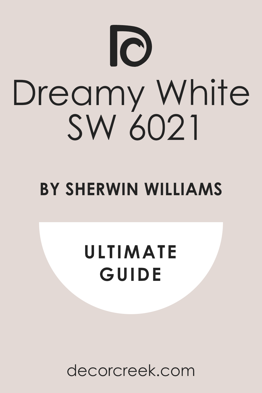
Dreamy White SW 6021
Dreamy White SW 6021 is a wonderfully pale off-white that has a very gentle, muted pink-peach undertone to it. The shade is the perfect neutral when pure white feels too cold but you still want a very light, bright color. It is a fantastic color for entire homes, as it flows beautifully and provides a consistently soft feeling.
The color has a lovely, subtle glow that makes a room feel instantly inviting and pleasantly happy. The hue is a reliable color for trim and ceilings, as it works well with a wide variety of different wall colors.
The shade makes a room feel bright, clean, and beautifully well-cared for, which is great for staging. It is an excellent choice for maximizing light and making smaller rooms appear much more open and airy. The color is a sophisticated one that provides a very warm background that lets your decorations stand out. The hue is a dependable shade that truly makes decorating simple because it plays well with almost everything. This gentle, sweet color will make your home feel light, wonderfully airy, and very welcoming to everyone.
🎨 Check out the complete guide to this color right HERE 👈
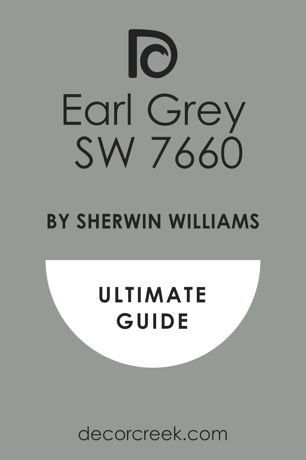
Earl Grey SW 7660
Earl Grey SW 7660 is a very light, warm beige that has a gentle, subtle pink undertone, making it a truly sophisticated neutral. The shade is a wonderful, delicate color that truly brightens up any room without feeling harsh or strong. It is an excellent choice for a whole-house color when you want a light neutral that is warmer than just white or gray.
The hue has a light, cheerful warmth that makes a room feel instantly happy and sweetly inviting. The color pairs well with bright white trim and light wood, giving a space a clean, airy appearance.
It is a great option for maximizing light, making the room feel open and full of wonderfully soft, positive energy all day long. The shade is a reliable color that is easy to decorate around, letting your furnishings take center stage. The hue is a simple, lovely shade that truly guarantees your home will feel bright, sweet, and perfectly welcoming to all who enter. This sophisticated neutral makes your home feel clean, very light, and wonderfully refreshed.
🎨 Check out the complete guide to this color right HERE 👈
White Dogwood SW 6315
White Dogwood SW 6315 is a light, clear pink that has a truly happy, rosy tone without being overly bright or strong. The shade is a wonderful, delicate color that truly brightens up any room without feeling harsh or strong. It is an excellent choice for a bedroom, a sunny nursery, or a light-filled bathroom where you want gentle color.
The hue has a light, cheerful warmth that makes a room feel instantly happy and sweetly inviting. The color pairs well with bright white trim and light wood, giving a space a clean, airy appearance.
It is a great option for a whole-house color when you want a light neutral that is warmer than just white or gray. The shade makes a room feel light, open, and full of wonderfully soft, positive energy all day long. It is a reliable color that is easy to decorate around, letting your furnishings take center stage. The hue is a simple, lovely shade that truly guarantees your home will feel bright, sweet, and perfectly welcoming to all who enter. This sophisticated pink makes your home feel clean, very light, and wonderfully refreshed.
Pressed Flower SW 6304
Pressed Flower SW 6304 is a rich, warm, dusty pink color that carries strong notes of brown and deep clay tones. The shade is a sophisticated color that reminds me of dried roses or the soft, aged look of old velvet. It is a fantastic choice for a dining room, a cozy den, or a beautiful, dramatic accent wall.
The hue pairs beautifully with dark wood furniture, black metal accents, and creamy white furnishings. The color creates an intimate, grounded atmosphere that encourages you to settle in and stay a while.
It has enough depth to look powerful, but the brown undertones keep it feeling wonderfully natural and easy to live with. The shade is a great way to add a touch of rich, earthy warmth that feels very intentional and designed. It is a beautiful color that speaks of quiet history and a refined, curated decorating style that I adore. The hue is a dependable color that guarantees your home will feel wonderfully warm, rich, and very inviting right away. This lovely choice is perfect for creating a cozy, sophisticated look that feels luxurious and deeply personal.
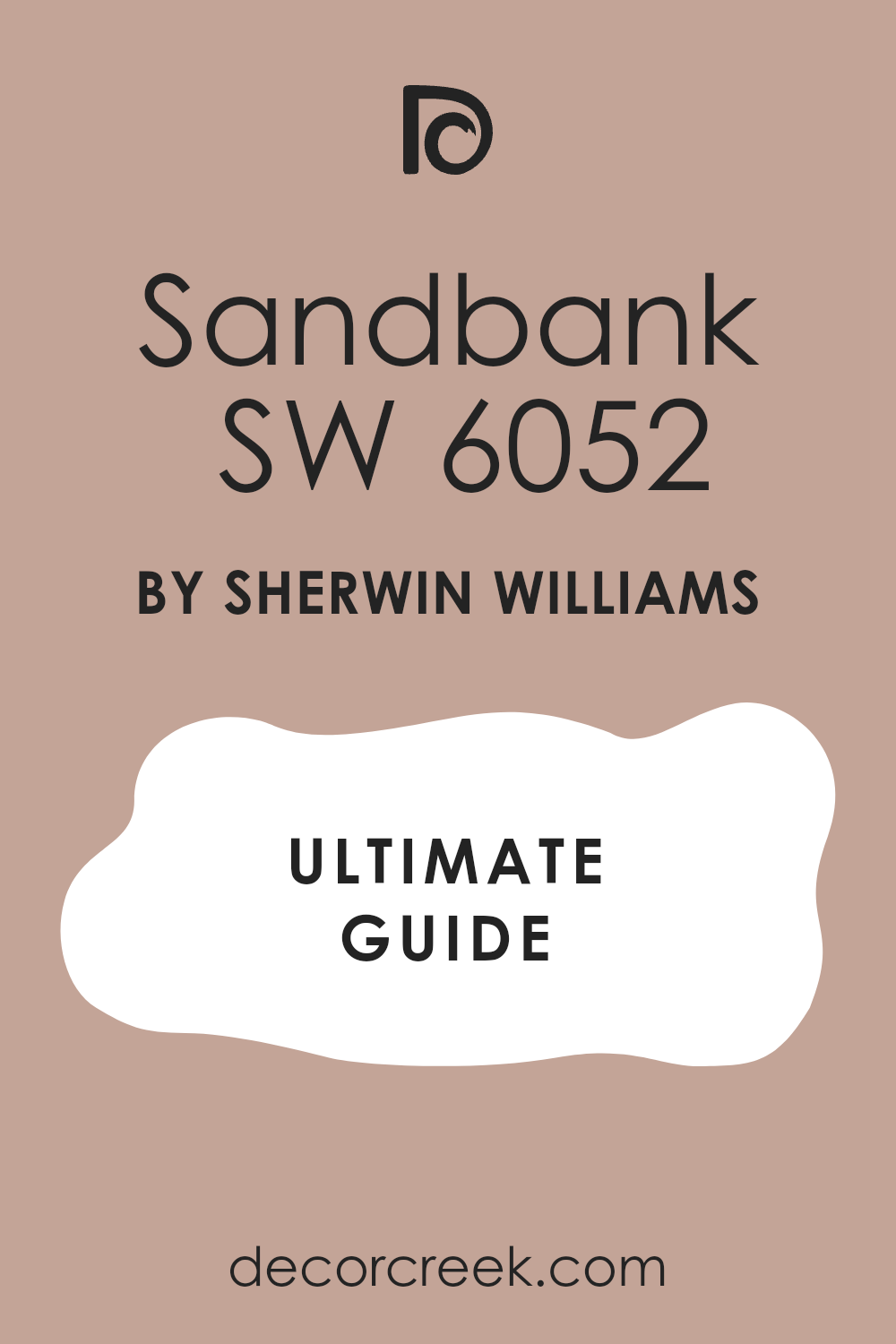
Sandbank SW 6052
Sandbank SW 6052 is a lovely, medium-toned color that is a perfect blend of warm beige, soft gray, and a delicate pink undertone. The shade is a wonderfully sophisticated neutral that feels very grounded and comforting on the walls. It is an excellent choice for a master bedroom, a cozy living room, or a welcoming entryway.
The hue has a strong warmth that prevents it from ever feeling cold or gray, even in northern light. The color pairs nicely with creamy white, light wood, and deep brown accents for a truly balanced look.
It is a great option for a whole-house color when you want a neutral that is richer than white but still incredibly versatile. The shade makes a room feel instantly warm, organized, and full of wonderful, quiet energy and peace. It is a reliable color that is simple to decorate around and always looks neat and beautifully well-maintained. The hue is a simple, lovely shade that truly guarantees your home will feel bright, warm, and perfectly welcoming to all who visit. This sophisticated neutral makes your home feel clean, very light, and wonderfully refreshed.
🎨 Check out the complete guide to this color right HERE 👈
Sand Dollar SW 6099
Sand Dollar SW 6099 is a light, wonderfully warm beige that carries a slight, beautiful pinkish undertone, making it a subtle neutral. The shade is a wonderful, delicate color that truly brightens up any room without feeling harsh or strong.
It is an excellent choice for a whole-house color when you want a light neutral that is warmer than just white or gray. The hue has a light, cheerful warmth that makes a room feel instantly happy and sweetly inviting.
The color pairs well with bright white trim and light wood, giving a space a clean, airy appearance.
It is a great option for maximizing light, making the room feel open and full of wonderfully soft, positive energy all day long.
The shade is a reliable color that is easy to decorate around, letting your furnishings take center stage. The hue is a simple, lovely shade that truly guarantees your home will feel bright, sweet, and perfectly welcoming to all who enter. This sophisticated neutral makes your home feel clean, very light, and wonderfully refreshed.
My Final Thoughts on 2026 Paint Trends
Looking at this incredible collection of 51 beautiful neutral pinks, I see a clear and very exciting direction for interior design in 2026. The coming year is not about extremes; it is fundamentally all about balance and creating harmony within the home.
We are witnessing a thoughtful fusion where the cozy, rich comfort of gentle earth tones, like the tender blush of Malted Milk and the sun-baked warmth of Canyon Clay, mixes beautifully with the powerful, grounded depth of deeper statement shades, such as the handsome Urbane Bronze and the rich, luxurious Naval.
This blending of light and dark, warm and cool, gives every homeowner the freedom to customize their mood.
Simultaneously, the importance of light, airy neutrals, including the gentle creaminess of Alabaster and the crisp brightness of Simply White, remains incredibly high.
These shades are essential for creating clean, bright backdrops that allow our more saturated color choices to truly shine without the room ever feeling heavy. They provide the perfect canvas for life.
My biggest and most heartfelt takeaway is this: the absolute best color for your home in 2026, or any year, is the one that truly makes you feel happy, comfortable, and deeply at peace in your own house.
Color is personal and should evoke joy. Whether you ultimately pick a restful, nature-inspired green like Evergreen Fog or a sophisticated greige like Revere Pewter, the ultimate design goal is to create a home environment that genuinely reflects and supports your best self and your most cherished memories.
I sincerely hope this carefully compiled list inspires you to find that perfect, meaningful shade that will bring a wonderful, refreshed feeling to your walls, your daily life, and your heart in 2026!