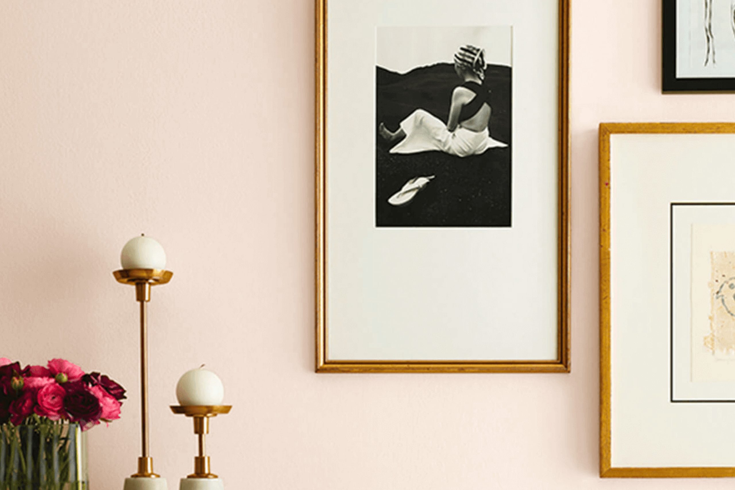
Imagine walking into a room bathed in a soft, inviting glow that instantly makes you feel at home. That’s the charm of SW 6336 Nearly Peach by Sherwin Williams. This delightful hue offers a subtle blend of pink and orange, softly veiled in a creamy peach tone that feels fresh yet soothing.
As you look around the room, the walls painted in Nearly Peach provide a comforting warmth that invites relaxation and calm. It’s not just a color; it’s a backdrop that enhances everything around it, from furniture to artwork.
In choosing Nearly Peach for your setting, you’re opting for an adaptable shade that works beautifully in a variety of rooms, whether it’s a bustling kitchen or a calm bedroom. The lightness of the color makes it easy to pair with darker hues, providing a balanced look, or you can keep things airy with similarly light colors.
It’s the kind of color that subtly reshapes the room without overpowering it, making it perfect for anyone looking to refresh their home in a gentle yet effective way.
What Color Is Nearly Peach SW 6336 by Sherwin Williams?
The color Nearly Peach is a gentle and warm tone that brings a soft, inviting feel into any room. This hue is light and subtle, making it perfect for creating a cozy and comfortable atmosphere. It’s an adaptable shade that pairs well with modern, minimalist, and even rustic interior styles, offering a fresh, clean backdrop to these rooms.
Nearly Peach works wonderfully with natural materials like wooden furniture and cotton or linen textiles, enhancing the cozy vibe of a setting. It also complements metallic finishes like brass or copper, adding a touch of warmth and charm to the contemporary decor. When used on the walls, it provides a light background that helps brighter colors pop, while also making small rooms appear larger and more open.
This peachy tone pairs nicely with textured materials such as earthy pottery, woven baskets, and plush throw pillows, which add depth and interest to the overall look of a room. When combined with greenery, such as indoor plants, it creates a lively yet soothing environment, ideal for living areas or even a home office. Overall, Nearly Peach is a fantastic choice for those who want a calm, inviting, and easy-to-coordinate color for their home.
Is Nearly Peach SW 6336 by Sherwin Williams Warm or Cool color?
Nearly Peach by Sherwin Williams is a soft and subtle shade that adds a warm and welcoming feel to any room. This light peach color is perfect for homeowners looking to create a cozy and inviting atmosphere without overpowering the setting with too much color. When used on walls, it provides a gentle backdrop, adding just a hint of warmth to the area.
Because of its light tone, it pairs beautifully with a wide range of other colors, from delicate pastels to deep, rich shades, making it extremely flexible for styling with furniture and decorations.
Moreover, in rooms with limited natural light, Nearly Peach helps to brighten the environment, reflecting even small amounts of light to make areas appear larger and more open. It’s particularly effective in bedrooms and living rooms, where a calming, gentle hue is often desired to promote relaxation and comfort. This color also works well in bathrooms and kitchens, offering a clean, fresh look that’s very appealing.
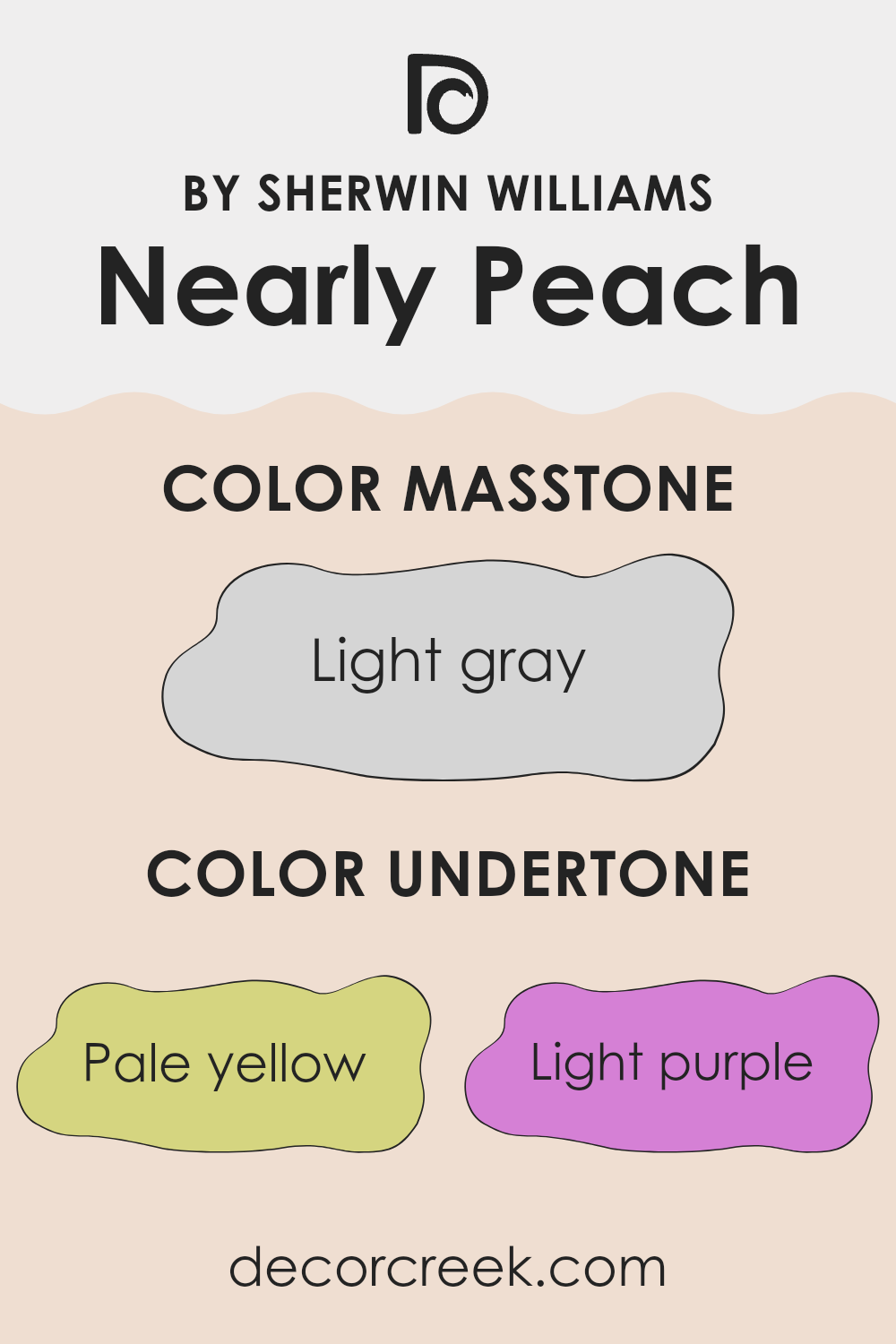
Undertones of Nearly Peach SW 6336 by Sherwin Williams
Nearly Peach has an intriguing blend of undertones that significantly influence how it appears in different settings. Undertones are subtle colors that lie beneath the primary surface color. They can enhance or counteract the main hue depending on lighting and surrounding colors.
This specific color includes undertones of pale yellow, light purple, light blue, pale pink, mint, lilac, and grey. These varied undertones make Nearly Peach highly adaptable and responsive to surrounding colors and light sources.
For example, in a room with natural light, the pale yellow and light blue undertones might make the color appear brighter and more vibrant. In artificial light, the lilac and light purple could be more prominent, giving the walls a slightly cooler tone. When painted on interior walls, Nearly Peach acts as a soft, flexible backdrop.
The mix of undertones allows it to complement a wide range of decor colors and styles. In a bedroom with soft white linens and natural wood furniture, the mint and pale pink undertones could provide a warm, welcoming feel. In a brighter, more eclectic living area, the grey and lilac undertones might stand out, providing a subtle contrast that enhances various decorative elements without overpowering them.
Understanding the role of undertones in Nearly Peach can help you choose décor and accents that either accentuate or balance these hues for the desired effect in your setting. This understanding ensures the color works harmoniously within your home to create a pleasing aesthetic.
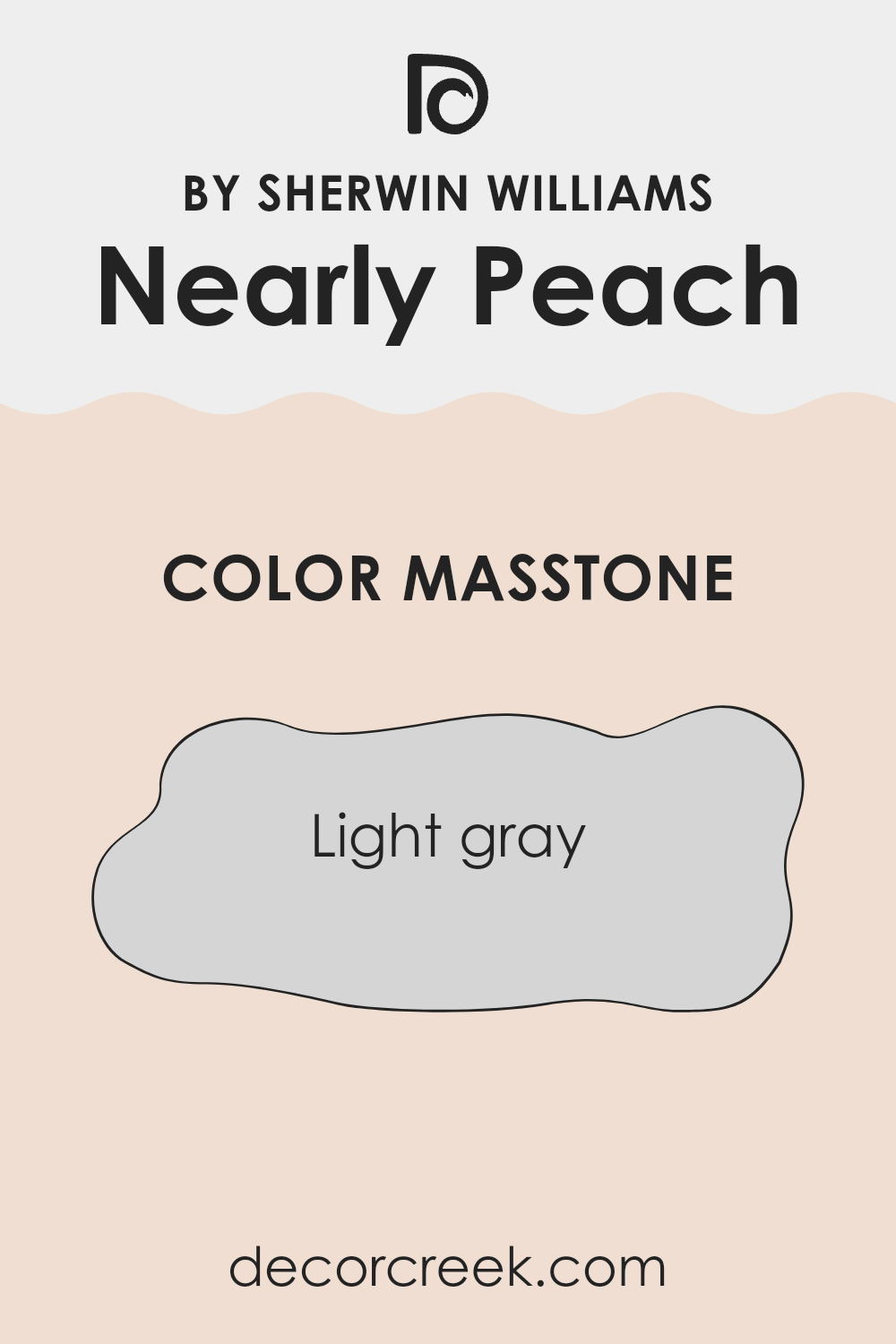
What is the Masstone of the Nearly Peach SW 6336 by Sherwin Williams?
Nearly Peach SW 6336 by Sherwin Williams, despite its name, shows off a masstone of light gray (#D5D5D5), which brings a very neutral and soft palette to any room. This grayish hue can easily become a base in homes, allowing for adaptable decorating with splashes of bolder colors in furniture and accessories without overpowering the setting.
Its lightness has a brightening effect on interiors, making rooms appear larger and more open. Moreover, because it is so muted, this color doesn’t draw too much attention and therefore works well in areas where you want other elements like artwork or statement pieces to stand out.
Because of its neutral shade, it can fit into many styles and rooms, from modern minimalist to cozy cottage. It’s also a practical choice as it tends to hide minor imperfections on walls better than darker shades.
How Does Lighting Affect Nearly Peach SW 6336 by Sherwin Williams?
Lighting plays a crucial role in how colors appear in different environments. When we observe colors like Nearly Peach, a soft, subtle orange-pink tone, its appearance can vary greatly depending on whether it’s under artificial or natural light, and the direction the room faces also affects its perception.
In artificial light, such as that provided by LEDs or fluorescent bulbs, Nearly Peach can look warmer or cooler. Under warmer lights like incandescent bulbs, this color tends to appear more cozy and inviting, as the yellowish tint in the light enhances the peachy tones. Cooler lights, like most LEDs, might make it seem slightly more muted and less vibrant.
Natural light impacts the perception of Nearly Peach even more dynamically. In rooms facing north, natural light is often softer and more diffuse. Here, Nearly Peach will likely appear softer and more subdued, maintaining a gentle look throughout the day. This can be ideal for creating a calm, soothing atmosphere in places like bedrooms or living rooms.
Southern exposure, however, provides abundant, direct sunlight throughout the day, which can make Nearly Peach look brighter and more vivid. In a south-facing room, this color could energize the setting, making it perfect for areas like kitchens or dining rooms where a lively, welcoming environment is desirable.
East-facing rooms receive strong light in the morning, which makes Nearly Peach look bright and cheerful. As the day progresses and the natural light diminishes, the color will take on a softer quality, making it ideal for breakfast nooks or bedrooms, offering a vibrant start to the day that mellows as the evening approaches.
For west-facing rooms, the situation reverses; the color will be softer in the morning and become warmly illuminated by the evening light. Nearly Peach will shift through these light changes, offering a restful backdrop in the morning that turns into a cozy, warm environment in the evening.
Thus, how Nearly Peach reshapes a setting depends considerably on the interaction between the color and the room’s lighting conditions, impacting both its mood and functionality.
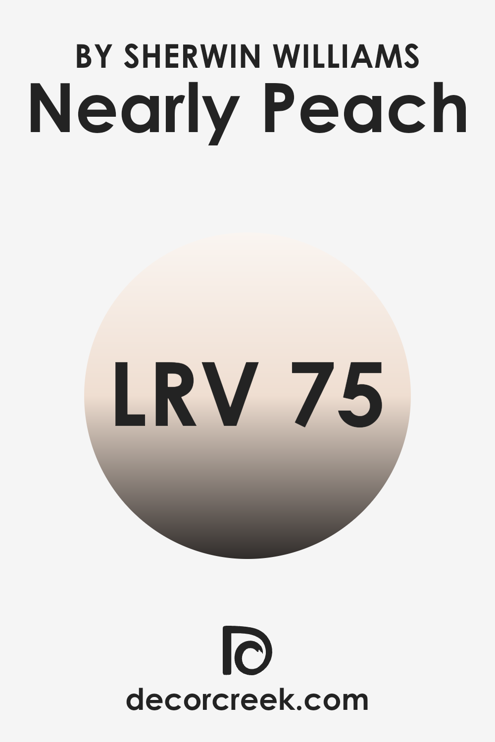
What is the LRV of Nearly Peach SW 6336 by Sherwin Williams?
LRV stands for Light Reflectance Value, which measures the percentage of light a paint color reflects back into a room. This value plays a crucial role in how bright or dark a paint shade appears once applied to walls. Higher LRVs indicate that a color will appear lighter and can make rooms feel more open and airy.
Conversely, colors with lower LRVs tend to absorb more light, making a room feel cozier but also potentially smaller. LRV is an essential factor to consider, especially in rooms that don’t receive a lot of natural sunlight, as it can significantly affect the overall atmosphere and visual perception of the setting.
In the case of the color with an LRV of 75.067, such as Nearly Peach, this high value suggests that the color is on the lighter end of the spectrum. This characteristic means it will reflect a substantial amount of light, making the room feel luminous and more expansive.
When applied to walls, a color with such a high LRV can help brighten dim areas and make them appear more inviting. It’s also an excellent choice for smaller rooms or areas without ample natural light, as it can help counteract the shadows and darkness, giving an illusion of a more open setting.
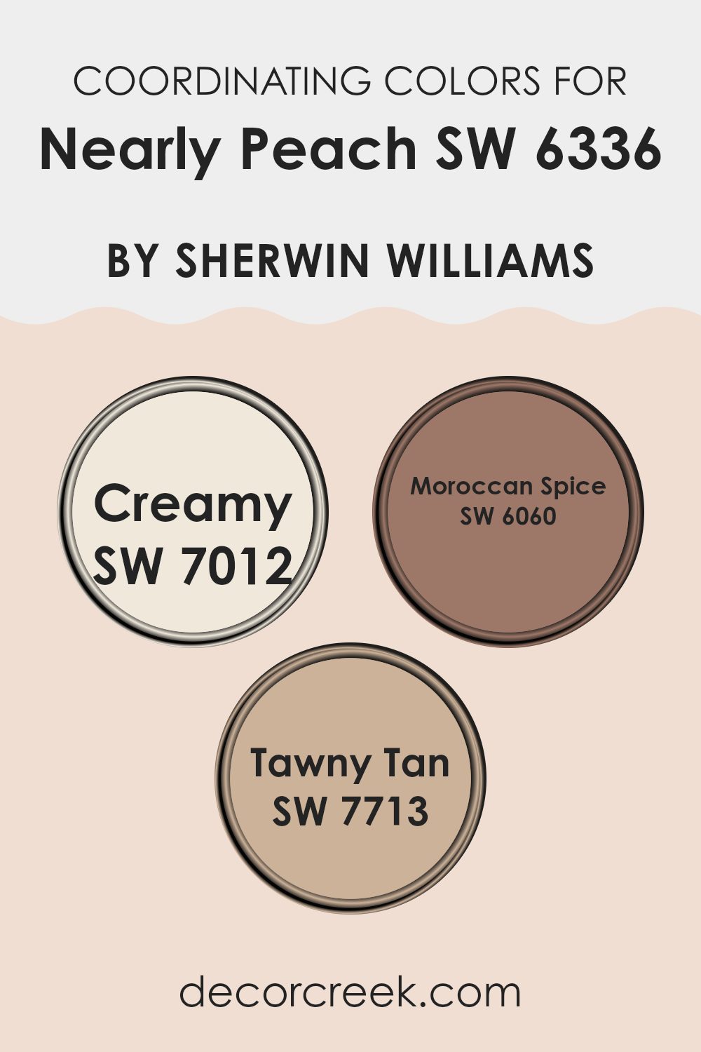
Coordinating Colors of Nearly Peach SW 6336 by Sherwin Williams
Coordinating colors are hues that complement each other and work well together to create a visually appealing scheme. They often share similar undertones or are positioned in a way on the color wheel that they enhance each other’s beauty without clashing.
For example, when working with a base color like Nearly Peach, choosing coordinating colors can be key to achieving a balanced and harmonious look. Colors like Creamy, Moroccan Spice, and Tawny Tan are excellent choices as they offer a variety of moods and contrasts that bring out the best in the peach tones.
Creamy is a soft, warm white that provides a gentle contrast to the softer vibing Nearly Peach, helping to brighten and lighten the setting it’s used in. It’s subtle enough not to overpower the peach, but provides a clean backdrop that makes the peach really pop. Moroccan Spice, on the other hand, is a rich, deep orange that complements the warm undertones of Nearly Peach.
It adds a vibrant energy and warmth to the room, making it feel cozy and inviting. Lastly, Tawny Tan brings an earthy richness to the palette, offering a muted, natural hue that works well with both Nearly Peach and the bolder Moroccan Spice, helping to tie the entire color scheme together seamlessly.
You can see recommended paint colors below:
- SW 7012 Creamy
- SW 6060 Moroccan Spice
- SW 7713 Tawny Tan
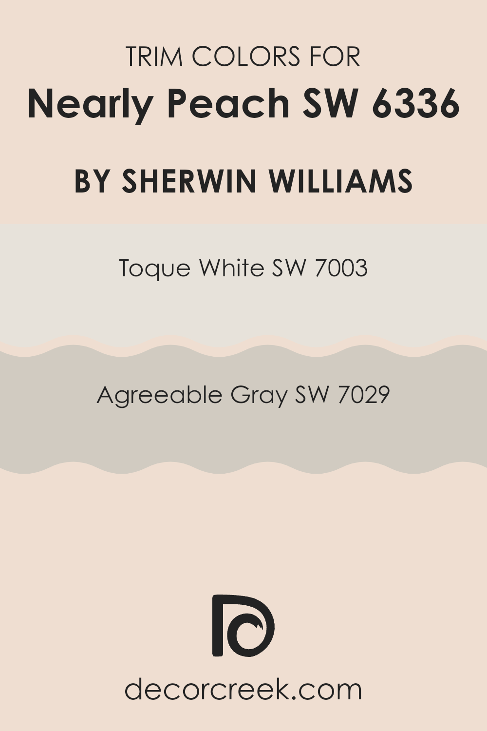
What are the Trim colors of Nearly Peach SW 6336 by Sherwin Williams?
Trim colors are utilized to highlight architectural details and frame the primary color on walls, offering a finished look to a room. Choosing the right trim shade can enhance the aesthetic of the primary wall color, creating a harmonious and pleasing environment.
For a wall painted with a peachy, soft hue like Nearly Peach by Sherwin Williams, trim colors like Toque White and Agreeable Gray can be particularly effective. These trim shades provide a subtle contrast that can effectively frame the wall, making the peach shade stand out more prominently without overpowering the setting.
Toque White SW 7003 is a very light gray with warm undertones, almost appearing as an off-white. This color is mild and unobtrusive, perfect for creating a gentle boundary that complements the softness of a peachy wall. On the other hand, Agreeable Gray SW 7029 is a neutral gray that balances warm and cool tones. This adaptable gray serves as a fantastic trim choice for adding a slight, but noticeable contrast to lighter wall colors, providing a crisp outline to architectural features without creating a stark contrast.
You can see recommended paint colors below:
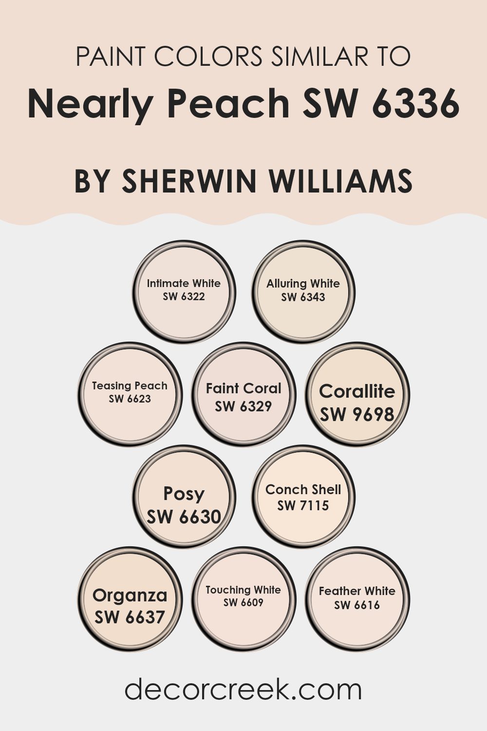
Colors Similar to Nearly Peach SW 6336 by Sherwin Williams
When decorating a room, choosing similar colors can create a harmonious and visually pleasing environment. Colors that are closely related, like variants of peach and soft neutrals, provide a subtle diversity while maintaining a unified look. This approach is particularly beneficial in achieving a consistent theme without causing a visual disturbance due to contrasting colors.
For instance, Intimate White has a gentle blush tint, offering a hint of warmth, perfect for softening interiors with elegant ease. Alluring White, slightly richer, brings a cozy glow to any room, making it ideal for rooms meant to be inviting and comfortable.
Teasing Peach introduces a playful lightness with its subtle peachy hue, energizing rooms without overpowering. Faint Coral adds a touch of soft reddish undertones, enriching rooms with a mild, cheerful vibe. Corallite, slightly bolder, lends an earthier coral quality to rooms, ideal for accent walls or decorative elements. Posy and Conch Shell both contribute to the peachy palette, with Posy showing a bit more pink vibrancy and Conch Shell leaning towards a muted, almost sandy shade.
Organza offers a faint peach whisper, almost neutral, perfect for achieving understated elegance. Touching White and Feather White both act as clean slates, with Touching White leaning towards a creamy feel and Feather White presenting a crisp finish, both blending seamlessly with other hues for a balanced look.
You can see recommended paint colors below:
- SW 6322 Intimate White
- SW 6343 Alluring White
- SW 6623 Teasing Peach
- SW 6329 Faint Coral
- SW 9698 Corallite
- SW 6630 Posy
- SW 7115 Conch Shell
- SW 6637 Organza
- SW 6609 Touching White
- SW 6616 Feather White
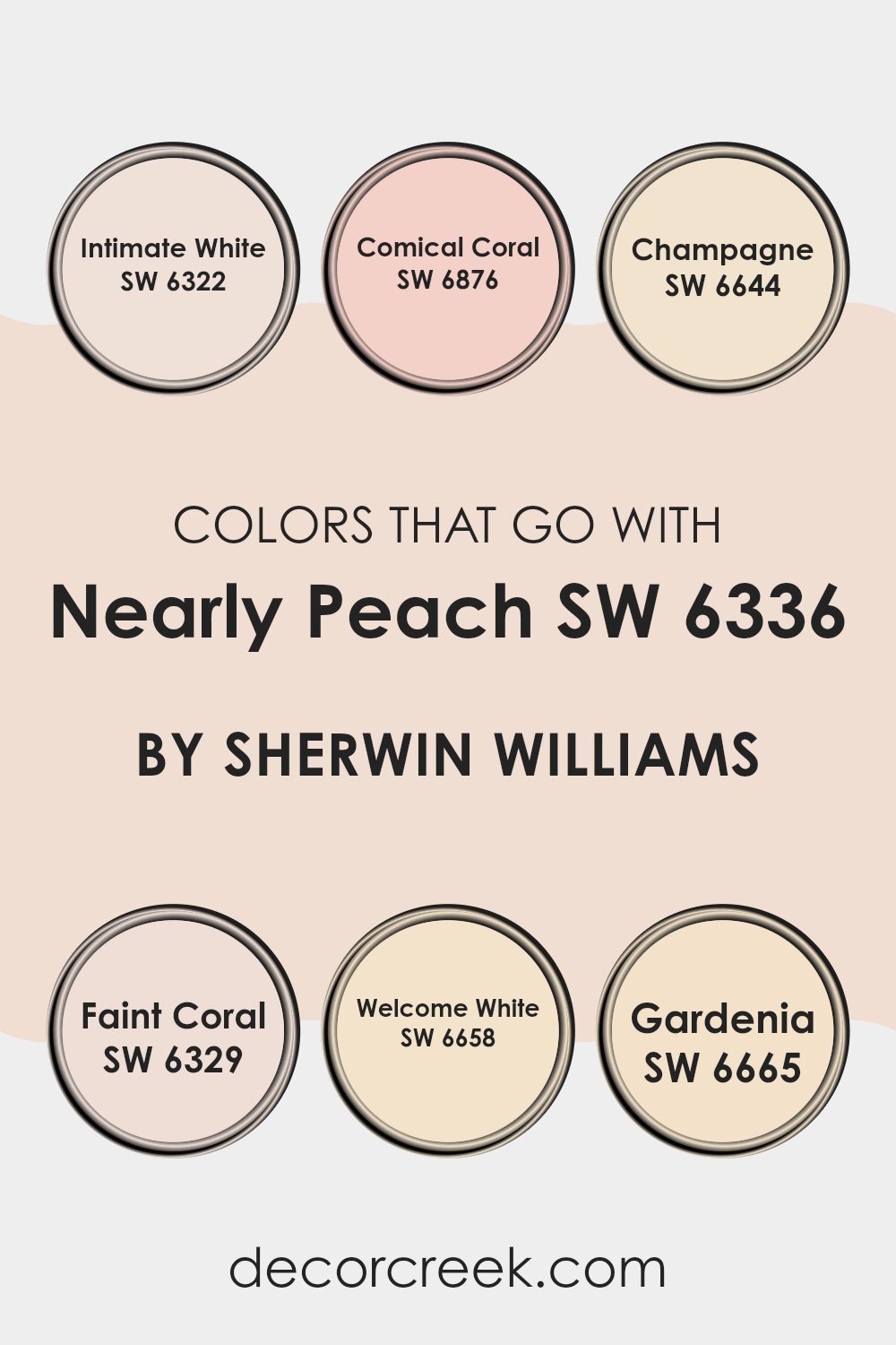
Colors that Go With Nearly Peach SW 6336 by Sherwin Williams
Pairing the right colors with Nearly Peach SW 6336 by Sherwin Williams is crucial for creating harmonious and visually appealing rooms. Nearly Peach itself is a soft, muted shade that exudes warmth, making it an adaptable choice for a variety of settings. When matched with colors like Intimate White and Welcome White, it brings out a crisp, clean look, with these shades offering a subtle brightness that enhances the peach tones without overpowering them.
Intimate White is a delicate off-white with a whisper of warmth, perfect for trim or ceilings, while Welcome White has a slight creamy undertone, making it ideal for creating a gentle contrast with Nearly Peach. On the other hand, combining Nearly Peach with more vibrant tones like Comical Coral, Champagne, Faint Coral, or Gardenia can add a playful yet balanced dynamic to any room.
Comical Coral is a lively and playful pink with a touch of orange that injects energy into areas, while Champagne, a light, neutral beige with a hint of yellow, softens the overall ambiance, providing a subtle elegance. Faint Coral gives a softer echo of the bolder Comical Coral, which is great for layering hues.
Lastly, Gardenia, a rich creamy white, offers a robust counterpart to the lighter peaches and whites, enriching the palette with its depth, making the environment feel warm and welcoming. These combinations ensure that Nearly Peach works well in settings ranging from traditional to modern, making the choice of accompanying colors both functional and refreshing.
You can see recommended paint colors below:
- SW 6322 Intimate White
- SW 6876 Comical Coral
- SW 6644 Champagne
- SW 6329 Faint Coral
- SW 6658 Welcome White
- SW 6665 Gardenia
How to Use Nearly Peach SW 6336 by Sherwin Williams In Your Home?
Nearly Peach SW 6336 by Sherwin Williams is a soft and inviting shade of peach that brings a light and airy feel to any room. This color works wonderfully in living areas where you want to add a touch of warmth without overpowering the room with too much color. It’s perfect for creating a cozy corner in your living room or giving your kitchen a cheerful uplift.
You can use Nearly Peach in smaller rooms like bathrooms and entryways, where it can make the setting seem larger and more welcoming. This paint color pairs nicely with whites and creams for a gentle contrast or with earthy tones like greens and browns for a more grounded look.
Nearly Peach is also a great choice for a child’s room or a craft room, as it offers a playful yet calm backdrop that stimulates comfort and creativity. To finish the look, add accessories in teal or soft yellow for a pleasing color scheme that feels warm and inviting.
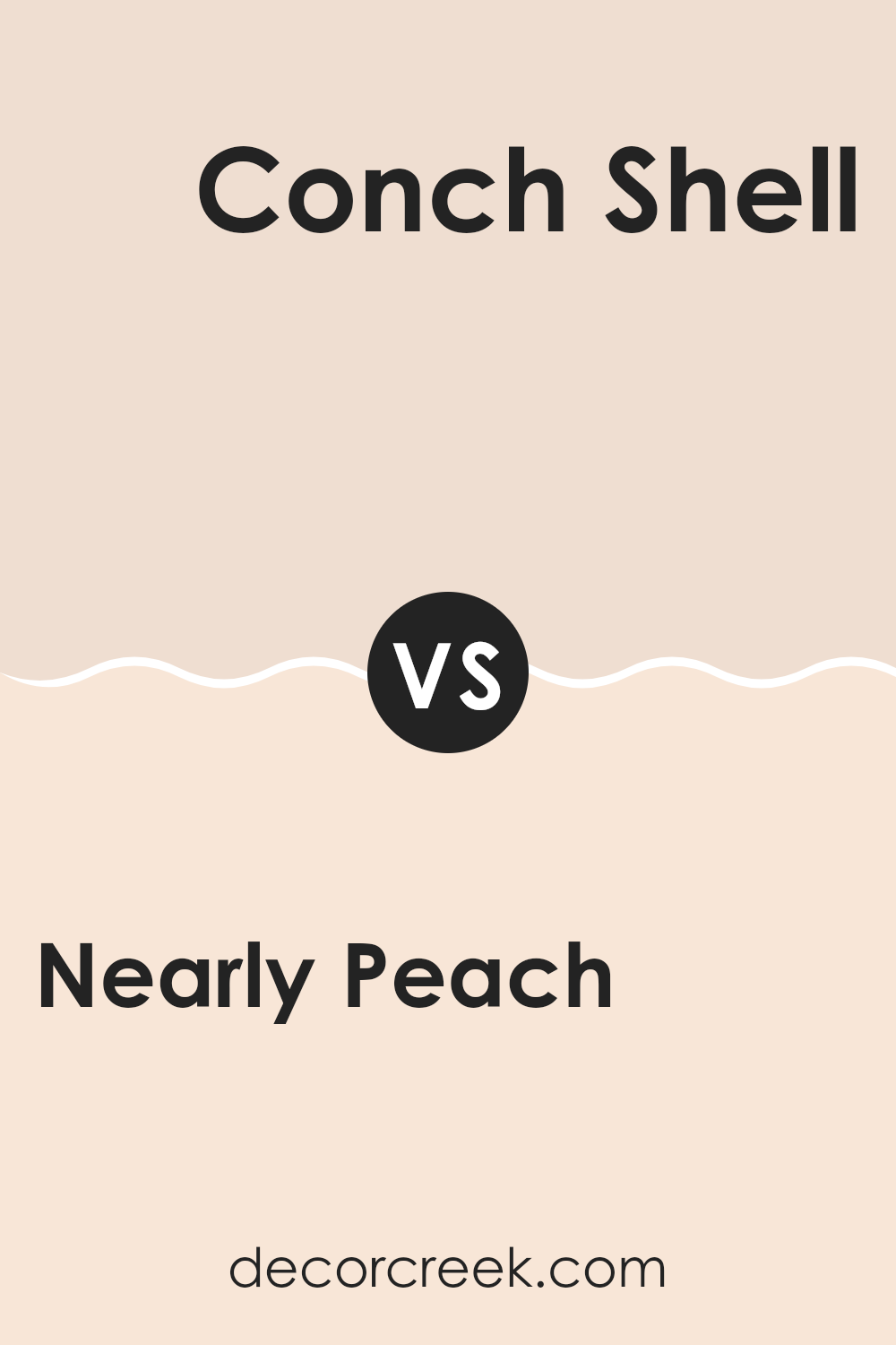
Nearly Peach SW 6336 by Sherwin Williams vs Conch Shell SW 7115 by Sherwin Williams
The main color, Nearly Peach, is a soft, light orange with a subtle warmth that can brighten up any room, making it feel cozy and welcoming. It works well in living areas and bedrooms where a gentle, soothing atmosphere is desired.
On the other hand, Conch Shell is a muted pink with a hint of beige, giving it a more neutral and adaptable appeal. This color is excellent for rooms that aim for a calm and understated elegance, such as bathrooms or minimalistic living rooms.
When comparing the two, Nearly Peach leans towards a warmer tone, bringing a hint of cheerfulness, whereas Conch Shell offers a more restrained and neutral look that can blend easily with various decor styles. Combined, these colors can create a harmonious balance, ideal for someone looking to pair warmth with soft refinement.
You can see recommended paint color below:
- SW 7115 Conch Shell
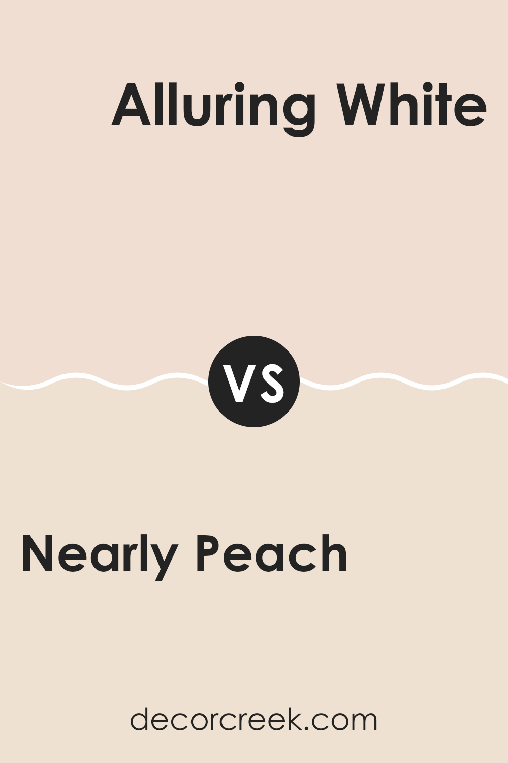
Nearly Peach SW 6336 by Sherwin Williams vs Alluring White SW 6343 by Sherwin Williams
Nearly Peach is a light, soft color with a hint of peach, giving it a warm and welcoming feel. It’s perfect for creating a cozy and cheerful atmosphere in areas like living rooms or bedrooms.
On the other hand, Alluring White is a clean and bright shade with subtle creamy undertones. This color is ideal for making areas feel bigger and more open, and it works well in areas that get a lot of natural light, like kitchens or bathrooms.
When comparing the two, Nearly Peach offers a touch of warmth that can make a room feel more intimate and inviting, while Alluring White provides a crisp backdrop that can highlight other colors or decor elements. Both colors are adaptable and can be easily paired with different furnishings and accents to achieve various looks.
You can see recommended paint color below:
Nearly Peach SW 6336 by Sherwin Williams vs Posy SW 6630 by Sherwin Williams
Nearly Peach is a soft, muted shade that looks like a blend between pink and orange, leaning more toward a light peach tone. It’s very subtle and doesn’t overpower a room, making it a good choice for someone who wants a hint of warmth without bold colors. This color is ideal for creating a cozy, welcoming vibe in areas like living rooms or bedrooms.
Posy, on the other hand, is a more vibrant and cheerful color. It’s a clear, bright pink that adds a lively touch to any setting. Posy is perfect if you’re looking to bring some fun and energy into your room. It stands out more than Nearly Peach and can make a strong statement whether used on an accent wall or throughout a room.
In comparison, Nearly Peach is more understated and gentle, while Posy is bolder and more energetic. Choosing between them depends on how much you want the color to stand out in your decor.
You can see recommended paint color below:
- SW 6630 Posy
Nearly Peach SW 6336 by Sherwin Williams vs Touching White SW 6609 by Sherwin Williams
Nearly Peach is a soft, warm shade that creates an inviting atmosphere in any room. It has a subtle hint of peach that adds a cozy, gentle feel without being too bold or overpowering. This color works well in rooms like living areas or bedrooms where a peaceful, friendly vibe is desired.
On the other hand, Touching White is a very light neutral with a slight warm undertone, making it incredibly adaptable. It’s excellent for making small rooms appear larger and brighter, as it reflects more light than darker colors. Touching White is perfect for rooms that get less natural light or for walls where you want to show off colorful artwork or bold furniture because it doesn’t compete for attention.
Both colors offer warmth, but Nearly Peach provides a hint of cheerful color, whereas Touching White offers a clean, simple backdrop suitable for any style. They can work beautifully together, with Nearly Peach adding personality and Touching White serving as a calming element or a contrasting lighter detail.
You can see recommended paint color below:
- SW 6609 Touching White
Nearly Peach SW 6336 by Sherwin Williams vs Corallite SW 9698 by Sherwin Williams
Nearly Peach is a gentle and warm color, close to a soft orange. It creates a cozy and inviting atmosphere, ideal for living rooms or bedrooms where you want a friendly, relaxed vibe. Corallite, on the other hand, is a vibrant pink with a coral influence.
This color is more lively and energetic, making it perfect for rooms like kitchens or kids’ rooms where you want to inject some fun and brightness. Despite their differences, both shades bring their own unique charm to a room.
Nearly Peach offers a subtle, soothing presence, while Corallite adds a punch of cheerfulness. Either color can enhance the mood of a room, just in their own distinct ways. Choosing between them depends on the atmosphere you’re aiming to create in your room.
You can see recommended paint color below:
- SW 9698 Corallite
Nearly Peach SW 6336 by Sherwin Williams vs Teasing Peach SW 6623 by Sherwin Williams
Nearly Peach and Teasing Peach are two colors from Sherwin Williams that both offer a warm and inviting feel, but they do so in slightly different ways. Nearly Peach is a soft, muted shade that leans towards a pinkish-cream tone. It creates a gentle backdrop, making it easy to decorate around and great for creating a cozy atmosphere in rooms like living areas or bedrooms.
On the other hand, Teasing Peach has a bit more vibrancy and richness. It has a stronger pink undertone that gives it a more lively look. This color is perfect for adding a pop of warmth and character to a room without overpowering it. It works well in rooms that receive a lot of light, enhancing the brightness of the setting.
Both colors pair well with neutral tones, but while Nearly Peach provides a subtle, soothing effect, Teasing Peach offers a cheerful and slightly more playful energy. Depending on the mood you want to set in your room, you can choose the softness of Nearly Peach or the joyful warmth of Teasing Peach.
You can see recommended paint color below:
- SW 6623 Teasing Peach
Nearly Peach SW 6336 by Sherwin Williams vs Faint Coral SW 6329 by Sherwin Williams
Nearly Peach and Faint Coral are both warm and inviting colors from Sherwin Williams, but they have subtle differences that set them apart. Nearly Peach is a soft, muted shade that closely resembles the light, dusky pink of a peach’s skin.
It brings a cozy, gentle feel to a room and pairs well with soft whites and earthy tones. On the other hand, Faint Coral has a slightly bolder hue with a touch more pink, giving it a fresher, more youthful vibe.
It’s a bit brighter than Nearly Peach and can liven up a room while still maintaining a soft and welcoming atmosphere. Both colors work great in rooms where you want to add a hint of color without overpowering the senses. They are perfect for bedrooms, living areas, or any setting where comfort is key.
You can see recommended paint color below:
Nearly Peach SW 6336 by Sherwin Williams vs Organza SW 6637 by Sherwin Williams
Nearly Peach and Organza are both warm, inviting colors from Sherwin Williams, though they offer distinct tones that could serve different design needs. Nearly Peach has a soft, subtle pink hue that feels light and airy, making it perfect for creating a cozy, gentle ambiance in a room. It’s ideal for areas where you want a touch of warmth without overpowering the setting with bold color.
On the other hand, Organza leans more towards a creamy, beige color with a hint of yellow undertone, giving it a slightly warmer and more neutral look compared to Nearly Peach. Organza is great for those who prefer a more understated look but still want a room that feels welcoming and bright.
Both these colors work well in rooms that get plenty of natural light, enhancing their warm undertones. Nearly Peach might be better suited for bedrooms or bathrooms where a tender, soothing feel is desired, while Organza could work beautifully in living areas or kitchens due to its more neutral, adaptable nature.
You can see recommended paint color below:
- SW 6637 Organza
Nearly Peach SW 6336 by Sherwin Williams vs Intimate White SW 6322 by Sherwin Williams
Both “Nearly Peach” and “Intimate White” by Sherwin Williams are subtle and gentle colors, but they each set a different tone. “Nearly Peach” is a soft, muted orange that adds a warm, cozy glow to any room, making rooms feel inviting and comfortable. This color works well in living areas and bedrooms where a touch of warmth can create a homely atmosphere.
On the other hand, “Intimate White” is a very light pink that offers a neutral backdrop with a hint of warmth. It’s less about adding color and more about creating a soft, delicate ambiance. This shade is perfect for rooms that aim for a minimalistic or calm feel, such as bathrooms or small sitting areas.
In comparison, “Nearly Peach” offers more warmth and presence due to its deeper shade, effectively enhancing small rooms or north-facing areas. “Intimate White,” while less impactful in color strength, offers adaptability and can serve as a foundation for various design elements. Together, these colors can complement each other nicely in a home, blending warmth with understated elegance.
You can see recommended paint color below:
Nearly Peach SW 6336 by Sherwin Williams vs Feather White SW 6616 by Sherwin Williams
Nearly Peach and Feather White are two distinct colors from Sherwin Williams. Nearly Peach has a soft, warm tone that mimics the subtle blush of a peach. It’s gentle and welcoming, making it ideal for creating a cozy atmosphere in rooms like living areas or bedrooms.
On the other hand, Feather White is a clean and crisp white with a very slight hint of warmth. This shade is perfect for making smaller rooms appear more expansive and bright. It provides a neutral backdrop that can easily be paired with bolder colors or used alone for a minimalistic look.
Both colors offer their unique benefits. Nearly Peach adds a touch of warmth and can help in creating a cheerful, inviting environment. Feather White, being more neutral, offers flexibility in decor and can be a go-to choice for creating a bright, open feel in any room. Whether you choose Nearly Peach for its cozy charm or Feather White for its bright simplicity, both colors are adaptable and can enhance different design styles.
You can see recommended paint color below:
- SW 6616 Feather White
After reading all about SW 6336 Nearly Peach by Sherwin Williams, I must say I’m impressed by this lovely shade of paint. It’s a super soft and gentle peach that looks almost like the inside of a peach fruit—sweet and light. I found that using this color in a room makes everything feel warm and cozy, just like sitting in a sunny spot on a cool day.
I learned that this paint isn’t just pretty, but it’s also really good at making small rooms seem bigger and more open. That’s a cool trick for making a cramped setting feel like there’s more room to play and move around. People who have used this color shared that it works great in places like bedrooms or bathrooms where you want to feel relaxed and happy.
Honestly, it seems like Nearly Peach is a great choice if you’re thinking of giving your room a new look. It’s gentle enough not to catch all the attention when you walk in but has this warm vibe that makes the room feel just right.
So, if you or someone you know wants to give their room a cozy, inviting feel, this color might just do the trick!
Ever wished paint sampling was as easy as sticking a sticker? Guess what? Now it is! Discover Samplize's unique Peel & Stick samples.
Get paint samples

